

Understanding Basic Color Theory: Artist Fundamentals
Learn the basics of color theory—from the color wheel to emotional color combinations—and see how artists use it to inspire, evoke, and express.


Color theory may sound like a complex thing that requires extensive knowledge of the science of light and aesthetics. But it isn’t.
With just a basic understanding of colors and how they interact with each other and the viewer, you can use color to your advantage with balanced hues, effective contrast and attractive results.
This article will help you learn to use color with purpose, and create work that feels intentional, looks cohesive, and connects with your audience. It will also encourage you to have a good time while creating!
What Is Color Theory–and Why Does it Matter to Artists?
It can be difficult for today’s creatives to imagine a world without color theory based in the science of light and aesthetics. In reality, it took centuries to arrive at the current understanding of color theory: the scientific understanding and creative use of color.
Historical Roots
People have considered and theorized about color for thousands of years. From ancient times until the Renaissance, the predominant idea was that all colors were a combination of darkness and light with black and white.
For example, Aristotle posited that deep crimson was the mixture of black with sunlight or firelight. For a world without artificial light sources or the technology to break down pigment, this is an understandable explanation.
Leonardo da Vinci, in the late 15th century, discussed the contrasts between certain colors, which we now call complementary colors. He also perpetuated the long-held view that the four elements influenced most systems. Da Vinci organized a hierarchy of colors, beginning with white and yellow for earth, then green for water, blue for air, red for fire and finally black.
By the 17th century, however, Isaac Newton had used a prism to separate white light, and within a few decades, he produced the first known color wheel.
Bridging Art and Science
When Newton split light with a prism, he was operating on the notion that color theory should develop from laboratory scientific experimentation. His work showed that white light could be broken into seven distinct colors:
- Red
- Orange
- Yellow
- Green
- Blue
- Indigo
- Violet
Note: While this article focuses on a color system, wheel, and theory that uses red, yellow, and blue (RYB) as the primary colors, the world of light and printing uses a second color wheel with cyan, magenta, and yellow (CMY) as the primary colors.
This visible (to humans) spectrum (often called ROYGBIV) opened doors for the understanding of electromagnetic radiation, and the fact that parts of our eyes are sensitive to their wavelengths. Before anything, color is a scientific measurement of energy.
Interestingly, in the Romantic era, writer and thinker Johann Wolfgang von Goethe challenged the strictly scientific color theory. Going back to Aristotle’s idea that color was a mixture of darkness and light, he emphasized the psychological effect colors have on people.
Color and how colors interact with each other may be based on hard science. But for creative disciplines, color theory must be about more. Because it evokes moods and emotions, it’s essential to think of color theory within cultural contexts of time, place and who might be viewing your work.
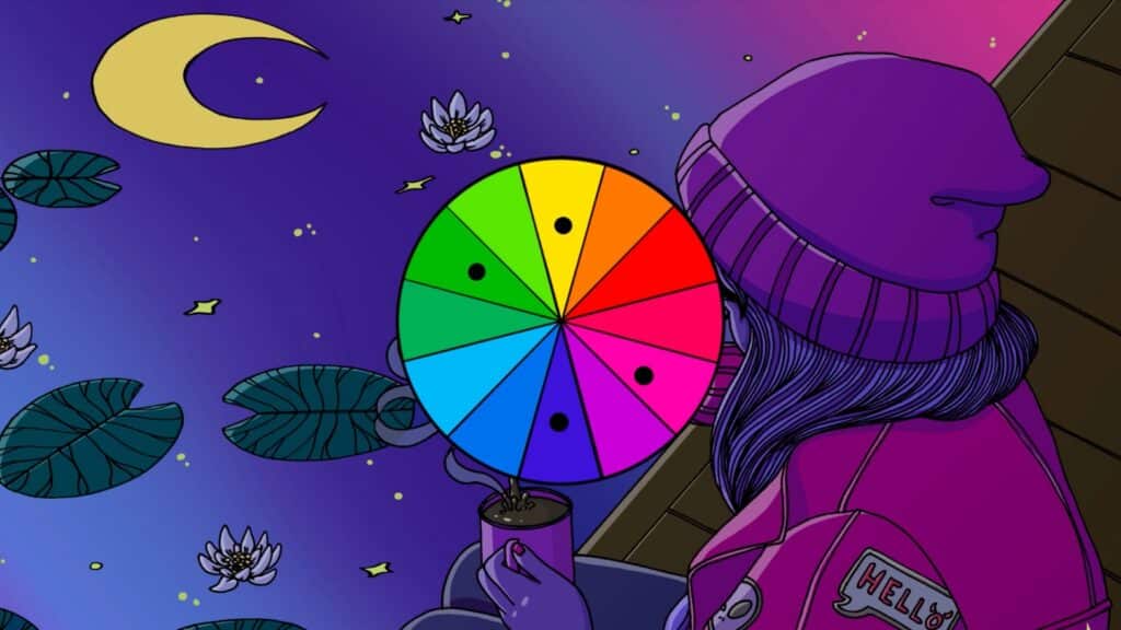
What Are the Building Blocks of Color?
Although the seven colors of Newton’s ROYGBIV remain the scientific, visual spectrum of colors, the color wheel is based in threes. These individual colors can then be manipulated by combining them or adding blacks and whites.
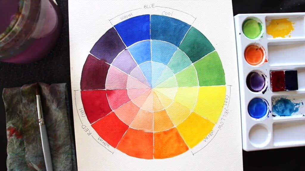
Primary, Secondary, and Tertiary Colors
The individual colors themselves can be categorized as:
Primary colors, which cannot be created with color mixing:
- Red
- Blue
- Yellow
Secondary colors, which are made by mixing primary colors:
- Orange (red and yellow)
- Green (yellow and blue)
- Purple (blue and red)
Tertiary colors, which are made by mixing primary and secondary colors:
- Red-orange
- Yellow-orange
- Yellow-green
- Blue-green
- Blue-violet
- Red-violet
Tint, Shade, and Tone
Once you have the basic colors (also called hues), you can manipulate the colors with white or black—or a mixture of black and white, which is gray. Doing this alters the hue’s saturation (purity, absence of white or black, also called “chroma”) and value (how light or dark a color is).
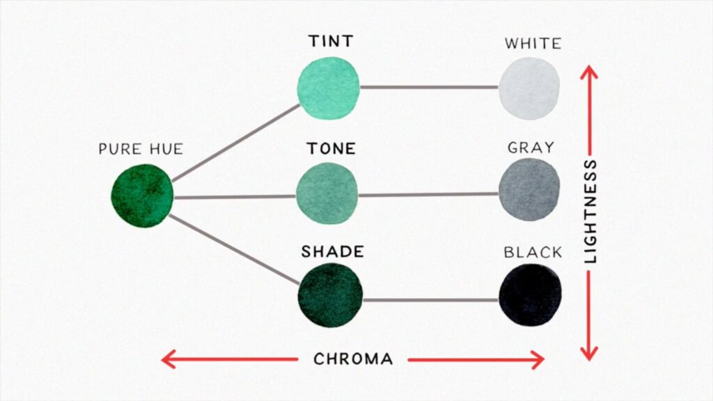
Tint
Tinting is adding white to the color, thus lightening it. Think of adding white to red to make pink, or lightening a purple to lavender. The tint of a color is not automatically considered pastel, though the softening influence of the white is often part of making pastel versions of a hue. Start with the pure color or white and add the other, depending on how light you want the tint to be.
Shade
Shading is adding black to the color, thus darkening it. Think of adding black to blue to make navy, or darkening a green to forest green. Adding black to a color will increase drama and intensity without making things brighter. Only start with black if you want the result to be almost black. Otherwise, begin with the pure color and add small bits of black.
Tone
Toning is adding gray to the color, thus dulling it. Think of adding gray to orange for a rusty look, or dulling down a yellow into mustard. The reduction of intensity can actually make colors more neutral and pleasant for things like walls and counter tops. You can make the tone lighter or darker by adding more white or black to the gray.
How Do Different Color Schemes Work?
A color scheme is an arrangement or combination of colors chosen explicitly for art or design. The range of color schemes is vast, but certain ones are used most often by artists and designers.
Monochromatic

A monochromatic color scheme uses only one pure color in a range of saturations and values. So it will include the base hue and then variations of the hue with white, black and gray added.
Complementary
A complementary color scheme uses colors that are directly across from each other on the color wheel, along with tints, tones and shades of both. Be aware that using bright, highly saturated versions of the colors can cause them to fight for attention.
Analogous

An analogous color scheme uses colors that are adjacent on the color wheel, such as blues and greens or reds and oranges. Because analogous colors have a lot in common, you’ll need to use white and black (on their own or with tinting and shading) to create visual contrast.
Triadic
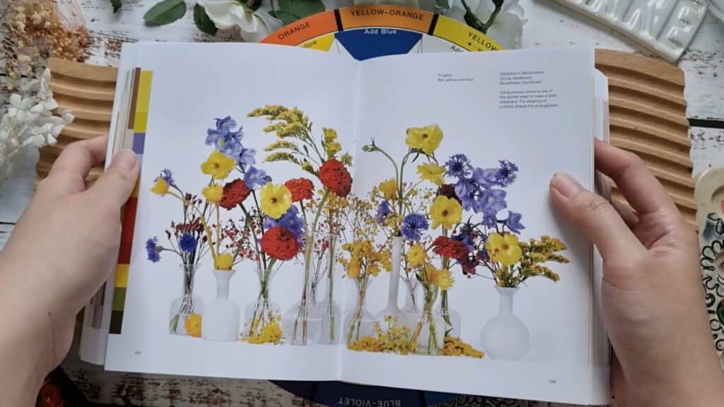
A triadic color scheme uses three colors that are evenly spaced from each other on the color wheel. While the three primary and three secondary colors each are triadic, relying too heavily on the pure hues could be jarring to the viewer. One way to avoid this in your triadic palette is by selecting one of the three colors to be dominant and the other two to be secondary to it.
Tetradic/Square
A tetradic color scheme forms a rectangle on the color wheel and contains two pairs of complementary colors.
A square color scheme is a type of tetradic scheme, but forms a square on the color wheel with four colors that are evenly spaced from each other.

In tetradic color schemes, it’s best to pick one dominant color and use the other three as accents, as the contrast will be significant and could overpower the piece.
How Does Color Impact Emotion, Perception, and Meaning?
Scientific studies on the impact of color are relatively new and inconclusive. Still, as we know, people like Goethe have considered the psychological effects of color for over 200 years. Certain colors do seem to have specific impacts on many people.
For example:
- Red suggests passion, either of a romantic sort or of anger.
- Blue suggests coolness, either of relief or iciness.
- Black suggests mystery, but also strength
- White suggests purity, but also nothingness
- Yellow means joy to some, and caution to others
- Green is associated with both lushness and illness
Warm colors, meaning red, orange, and yellow, invoke images of fire, heat, spice and vibrancy. Cool colors, meaning blue, green, and purple, invoke images of the ocean, winter scenes and calm.
While these associations are often evident in how people select and use colors, time, place, and culture also play a significant role in color interpretation. Take orange, for example. Someone in the United States might think of fruit juice, the sun, and other bright, warm-weather things. In the Republic of Ireland, however, wearing orange may be considered offensive.
This applies not just to individual colors, but to color schemes and palettes. Not only can you suggest moods, but specific color groupings indicate settings, time periods and cultures.
“Understanding themed palettes can help you quickly access the right colour choices to communicate the mood and message you want to give the viewer. Quiet, Rich, Earth Tones, Cultures, Eras - all these and more have specific palettes associated with them.”
Where Does Color Theory Show Up Beyond Fine Art?
Color theory is evident everywhere. Organizations create branding and advertising based around the colors they've determined will attract their target market. From the earliest color printing to the color grading and correction of graphic design, color is in every aspect of numerous cultures.
Red suggests urgency, so fast food restaurants sometimes use it to encourage immediate visits. Green is associated with money, so financial establishments include it to send the message of saving cash.
In a different world, places like spas and yoga studios want to appear as centers of calm, clean, and improvement. They tend to use softer colors, like lavender and neutral tones, bringing to mind natural settings, gentle surfaces, and the opposite of urgency.
For those who work in marketing or who are trying to build a brand themselves, it’s worth exploring the specifics and differences between color theory for illustrators, color theory for graphic design, and color theory in fine art to get a sense for what works best in your particular industry, medium, and style.
Color Theory Isn’t Law—Honor Your Intuition
When all is said and done, color theory is not physics. It’s never a bad idea to work with the colors you want to use and go from there to create something you love. At the same time, and especially in professional settings, core knowledge of color theory will serve you well. Find the balance that works for you, and enjoy the process!
Related Reading
Katie Mitchell
Katie lives in Michigan with her husband, kids and pets. She enjoys cooking, travel and live music.
Learn to Paint with Skillshare – Start Your Free 7-Day Trial Now!
Get Started- Explore a variety of paint mediums
- Unlimited access to all classes
- Learn offline with Skillshare's app


