Transcripts
1. Welcome To The Class!: Hello, everyone. My
name is Will Elliston, and today we're continuing
our journey into color theory by
turning our attention to the magic of secondary colors orange, green, and violet. In this class, we'll
explore how to use these three expressive hues to unlock exciting
approaches to watercolor, becoming a foundation
of expressive, harmonious paintings. Through a series of
swatches and exercises, we'll discover the
beauty of limiting our palette while expanding
our possibilities. The final demonstration will
be a striking rose painting, created entirely with
secondary colors to show how much depth, contrast, and atmosphere
can be achieved. I've been a professional
artist for many years, exploring lots of different
subjects from wildlife and portraits to cityscapes
and countryside scenes. I've always been entranced by the possibilities of watercolor. But when I started,
I had no idea where to begin or
how to improve. I didn't know what
supplies I needed, how to create the
effects I wanted, or which colors to mix. Now I've taken part in many
worldwide exhibitions, been featured in magazines, and been lucky enough
to win awards from well respected
organizations such as the International
Watercolor Society, the Masters of
Watercolor Alliance, Windsor and Newton, and the SAA. Watercolor can be overwhelming
for those starting out, which is why my goal
is to help you feel relaxed and enjoy this medium
in a step by step manner. Today, I'll be guiding you
through a complete painting, demonstrating a variety
of techniques and explaining how I use all
my supplies and materials. Whether you're just starting out or already have some experience, you'll be able to
follow along at your own pace and improve
your watercolor skills. If this class is too challenging
or too easy for you, I have a variety of classes available at different
skill levels. I like to start off with a free expressive
approach with no fear of making mistakes as we create exciting textures
for the underlayer. As the painting progresses, we'll add more details to bring it to life and
make it stand out. I strive to simplify
complex subjects into easier shapes that
encourage playfulness. Throughout this class, I'll be sharing plenty of
tips and tricks. I'll show you how to turn
mistakes into opportunities, taking the stress out of
painting in order to have fun. I'll also provide you with
my watercolor mixing charts, which are an invaluable tool when it comes to choosing
and mixing colors. If you have any questions, you can post them in the
discussion thread down below. I'll be sure to read and
respond to everything you post. Don't forget to follow me on Skillshare by clicking the
follow button at the top. This means you'll be the
first to know when I launch a new class
or post giveaways. You can also follow me on Instagram at Will Elliston
to see my latest works. So let's get started and
uncover how embracing secondary colors can unlock new levels of creativity
in your watercolor work.
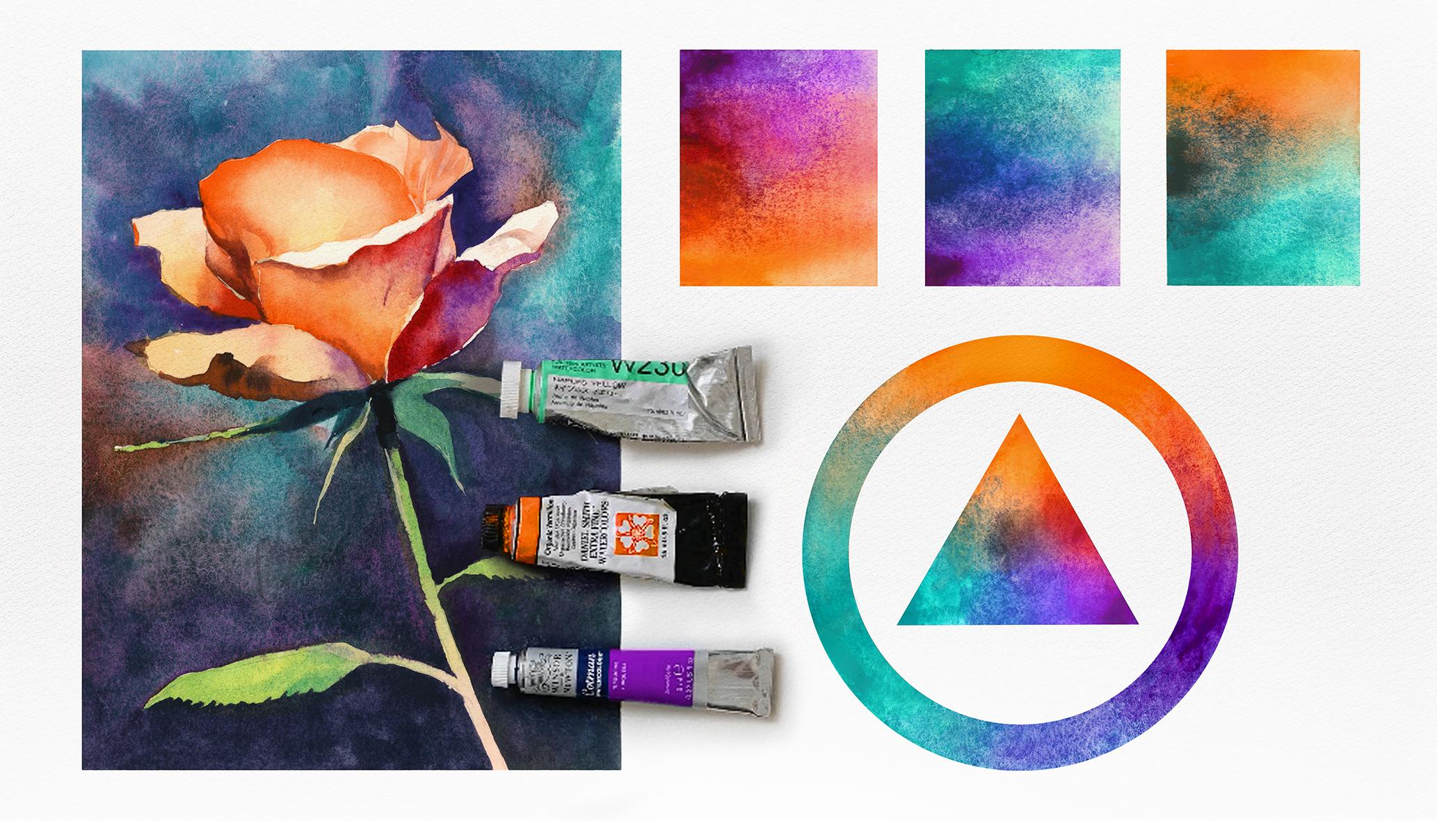
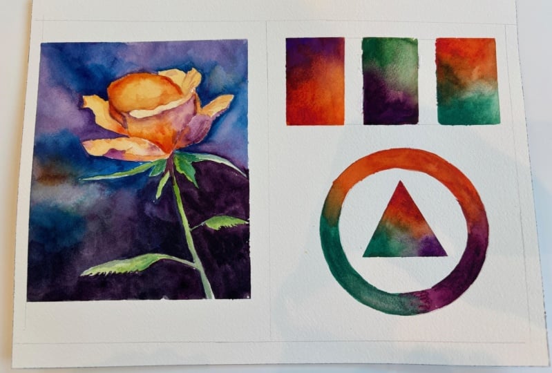
2. Your Project: Thank you so much for
joining this class. I'm excited to guide you through this exploration of secondary color
harmony in watercolor. We'll be working exclusively with green, orange, and violet, diving into how they relate
to one another, how they mix, how they can stand
out on their own, to create expressive
eye catching work. We'll create swatches using different
pigment combinations. We'll explore a
color triangle and a secondary color wheel to visualize, balance,
and contrast. Then we'll apply those
techniques in a final painting. This is a great
opportunity to push your creativity and build
confidence in color mixing. In the resource section, I've added a high
resolution image of my finished painting
to help guide you. You're welcome to
follow my painting exactly or experiment with
your own composition. As we're going to be focusing on the painting aspect
of watercolor, I've provided templates
you can use to help transfer or trace the
sketch before you paint. It's fine to trace when using it as a guide for
learning how to paint. It's important to
have the underdrawing correct so that you can relax and have fun learning the
watercolor medium itself. Whichever direction
you take this class, it would be great
to see your results and the paintings you
create through it. I love giving my
students feedback, so please take a photo
afterwards and share it in the student project gallery under the Project
and resource tab. I'm always intrigued to
see how many students have different approaches and how they progress with each class. I'd love to hear
about your process and what you learned
along the way, or if you had any difficulties. I strongly recommend
that you take a look at each other's work in the
student Project Gallery. It's so inspiring to see
each other's work and extremely comforting to get the support of your
fellow students. So don't forget to like and
comment on each other's work.
3. Materials & Supplies: Before we get started with the exercise and the paintings, let's go over all the
materials and supplies I generally use
throughout any painting. Having the right materials can greatly impact the
outcome of your artwork. So I'll go over all the supplies I use for
this class and beyond. They're very useful to have at your disposal and we'll make it easier for you
to follow along. Let's start with the
paints themselves. And like most of the materials
we'll be using today, it's a lot to do
with preference. I have 12 stable colours in my palette that I
fill up from tubes. They are cadmium
yellow, yellow ochre, burnt sienna, cadmium
red, Alizarin crimson, Opramarne blue, cobalt blue,
serlean blue, lavender, purple, viridian, black, and
at the end of the painting, I often use white gouache
for tiny highlights. I don't use any
particular brand. These colors you can
get from any brand, although I personally
use Daniel Smith, Windsor and Newton
or Holbein paints. So let's move on to brushes. The brush I use the most is
a synthetic round brush like this escodaPurl brush
or this Van Gogh brush. They're very versatile because
not only can you use them for detailed work
with their fine tip, but as they can hold
a lot of water, they are good for
washers as well. They're also quite affordable, so I have quite a few
in different sizes. Next are the mop brushes. Mop brushes are good for
broad brush strokes, filling in large areas and creating smooth
transitions or washes. They also have a night tip that can be used for smaller details. But for really small details, highlights or anything
that needs more precision, I use a synthetic
size zero brush. All brands have them,
and they're super cheap. Another useful brush to have is a Chinese calligraphy brush. They tend to have long bristles
and a very pointy tip. They're perfect
for adding texture or creating dynamic
lines in your paintings. You can even fan them
out like this to achieve fur or feather
textures as well. And that's it for
brushes. Onto paper. The better quality
of your paper, the easier it will be to paint. Cheap paper criinkles easily
and is very unforgiving, not allowing you to
rework mistakes. It's harder to create
appealing effects and apply useful techniques
like rubbing away pigment. Good quality paper, however, such as cotton based paper, not only allows you to rework
mistakes multiple times, but because the pigment
reacts much better on it, the chances of
mistakes are a lot lower and you'll be more likely to create
better paintings. I use arches paper because that's what's available
in my local art shop. A water spray is
absolutely essential. By using this, it
gives you more time to paint the areas you
want before it dries. It also allows you to
reactivate the paint if you want to add a smooth
line or remove some paint. I also have an old rag or t shirt which I use
to clean my brush. Cleaning off the paint
before dipping it in the water will make the
water last a lot longer. It's always useful to
have a tissue at hand whilst painting to
lift off excess paint. Also, you never know
when an unwanted splash or drip might occur that
needs wiping away quickly. I also have a water dropper
to keep the paints wet. When you paint, it's
important to have them a similar consistency to what
they're like in the tubes. This way, it's easier to
pick up sufficient pigment. A hair dryer is useful
to have for speeding up the drying time and controlling the
dampness of the paper. And lastly, masking tape. And this, of course, is just to hold the paper down still onto the surface to stop it sliding
around whilst painting. Also, if you plan on
painting to the edge, we'll allow you to create a
very crisp, clean border. And that's everything that I
use even beyond this class. So let's go and
start the exercises.
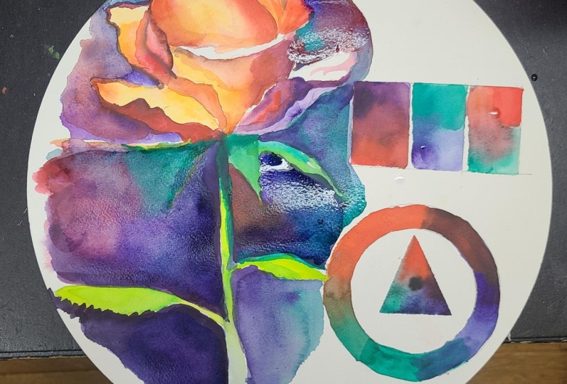
4. Preparing The Rose: Let's start off by drawing
out these exercises. I'm just going to roughly guess or estimate where the middle is. It doesn't need
to be so precise. Just a few light pencil marks. And then on the left hand side, that's where I'm going
to draw my rows, starting with swirly lines, a circle for where
that rose head is, and then notice how I'm changing
the grip on my pencil to achieve a nice gesturial kind of loose movement
with the pencil. Just to lightly go over
the shape of the rose. Of course, I've included
the outline that you can use to trace it onto your paper if you
want to speed this up. Likewise, with the templates
on the other side. I've chosen to paint
the rose on the left because I don't
want to smudge it with my hand on the other side
because I'm right handed, but if you're left
handed, you can, of course, paint it
the other way around. My hand isn't even
touching the paper, so I'm keeping it nice
and free and loose. This depends on the size that
you're painting as well. If you're painting small,
then maybe you have to use more of a wrist action
rather than your arm action. Or if you're painting larger, you want to use the
whole of your shoulder to move and create those nice swirly loose markings because that's where
the energy comes in. We start with these loose
lines to create the energy, and then we go with a bit
more definition after that. Often I start with that
thick lead on the right, you can see it
next to the paper. But I figured it's okay. We're just doing this
for an exercise. It's not going to be
a separate painting. I mean, you can, of course, do it on a separate piece of paper, but I like to when I work with a limited
palette like this, I like to do my swatches and color wheels on the same sheet, just so that I can observe
and have it as reference. Because it's all a
journey in the end, and I'm actually more
interested in learning watercolor and growing my own skills than
creating masterpieces. So I find this type of exercise more interesting
than separate paintings. I like exploring and seeing the depths of what watercolor
can do, its potential. So now I'm just going back
over with a harder line.
5. Preparing The Exercises: So now we've got that rose
pretty much drawn out. We can come back to it later if we want to fix it a bit more. We can draw a little
border around it. I will be using my ruler. Just to create a nice clean
border, a nice straight line. And we'll be using masking
tape actually on top of this, but I just want to map
everything out just to know that everything's
nicely spaced. But I'm not really measuring
anything accurately. I'm just using my eye to guess. I want to leave quite a bit of space for the masking tape. I don't want it to
be too close to the edge and match the kind of distance from
the bottom to the top. And, of course, on the sides. So I'm just kind of
adding a little box here. So we can put tape around there. And I want to add
a little gap in between the left hand side and the little
exercises on the right. So we've got two halves now. And now, within this
second half on the right, we can think about how to draw it out. I'm
going to use a template. I used masking tape to help
me with the color wheel. I didn't freehand
draw the circle. You can use a glass, a mug, whatever size you want to do. And then because it's a wheel, we have to create
an inner circle. Luckily, the length
of this masking tape, the thickness of
it matches quite well with the thickness
of the wheel I want. So for me, that was
quite simple to do. You might have to
find a couple of different size cups or
glasses if you want to do it. And then, again, I estimate where I want the triangle to be. So I look at the very top and it's about a
centimeter down, and then of course, because a triangle is in thirds, I'm trying to match it
on the left and right. You can of course, be very light with your
pencil to begin with, just to make sure
it looks right. Again, I have the outline that I upload into
the resource section. So that's going to be very accurate and
you can use that to trace if you don't want to
fiddle around like this.
6. The Paints I'm Using: So I have everything
taped down now. You can paint these exercises on a separate sheet
of paper to the rose. If not, I'd suggest taping down the rose first and
then these color swatches on top of the
masking tape so that we can peel off the tape after painting this and still have
tape there for the rose. Also, I'd suggest using a
pencil just to write in the top left hand corners and the bottom hand
corners of these swatches, the color that you're going
to use before you even add the paint just
so that you don't get confused in the rush
of it all and so that we have a nice matching layout. So I'm using specific
colors for this. They're all Daniel Smith. But what's exciting
about this exercise is that violets and purples are in so many different
ranges and subtle variations. So you don't have
to use the same, and you can see
how different hues and colors affect the results. But I'll tell you specifically
what colors I'm using. This purple violet color is by Daniel Smith called
Cobalt Violet Deep. And I love this.
I'm going to use purple and violet
interchangeably because they're both kind of
similar terms and it'll make things easier because you can easily
use a purple or a violet. It's not so strict.
And then the orange that I've got is Pyl
orange from Daniel Smith, which is a lovely
vibrant orange. It tilts towards red
rather than yellow. And I'll get into more about how these secondary colors are influenced by the primaries and wherether they, for example, go to more yellow or
red for this orange. And then for the turquoise, the green that I'm going to use, it's cobalt teal blue
by Daniel Smith. I love this because it's like
a turquoise kind of color. It's not necessarily a definitive idea of
what a green is, but that's the exciting
thing about color theory. It teaches us how we can break the rules or manipulate them.
7. Violet & Orange: So we're well into
this first swatch. But while I was going over
the colors that I was using, I didn't really explain
how I approach this. But it'll be the same
with every single swatch. I use it directly from the tube. I squirt a little bit
of pure pigment in the top and bottom corner
on the left hand side, and I gradually blend it out until they
meet in the middle. And I'm keeping the
pigment strong on the left and then slightly fading to the white
of the paper on the right. Again, I'm squeezing more of that pigment
because I want it to be so rich on
the left hand side. I want to see what it's like
in its pure pigmentation opposed to how it grades out and we see some of the
transparency on the other side. Because the nature of these
pigments are very unique. Some of them when
they're dry like this violets very dark. Yet this orange color, even when it's at its thickest, it's not that dark at all. It's very vibrant and opaic. So when these two colors mix in the middle, how they react. That's what we're trying to do here to get an understanding. And it's these exercises that go beyond my advice and words. You actually learn it yourself by doing it and feeling it and seeing it and
experiencing it. And that's the main
way we can learn about watercolor by actually
doing these exercises. I was finding it
difficult to mix such pure pigment in
the center there. So on the masking
tape next to it, I'm actually putting pure
pigment and mixing it on the masking tape so
it can remain thick, but I don't have to lose control of it when it
actually touches the paper. And I want to point out a very interesting phenomenon
going on here, because usually
secondary colors, the whole name suggests that they're made from primary colors because
they're secondary. So orange is made from red and yellow and purple is
made from red and blue. So why for some reason, when mixing these two colors, it's making a red in the middle. It goes against
the normal rules. And it's these kind of things
that really open our eyes and breaks our preconceived
notions of how colors react. And to be honest, this is
something that I didn't realize until I did
this very exercise.
8. Green & Violet: So I think we're done
with that swatch. It doesn't need to
be nice and clean. It just needs to demonstrate
and show a nice range of all the thicknesses and the
gradual mix of the color. The nice thing about
the masking tape is it'll keep a
nice clean border. I've pasted this turquoison very strongly because
through experience, I know that its potency isn't that strong compared to the purple that we'll
use down below. So I need to add more
than expected for this. So I just got started
with the green, just to get an idea of what it's like and then clean my brush completely and just blocking out all the white of the paper, but still keeping it thick
on the left hand side, gradually blending it there. And like on the previous swatch, where we somehow created a red, notice how this is
creating a blue, which is, again,
a primary color, which is very odd how we can use secondary colors to
create primary colors. We don't even need a blue. We can just have
purple and green. From what we're
seeing right now, that's a very real possibility, and I'm going to use
this information for the painting that we're going to paint
later with the rose. Now that I know that
these colors can do that, I'm going to make use of that
and bring out that blue. And what's so magical about
it about creating this blue, it's not a generic
blue from a tube. It's an organic blue that
we're mixing ourselves. So it's got this harmony and connection with the
rest of the painting. It's a limited palette, but within this limited
palette of free colors, we're creating a whole spectrum. So on that previous swatch, we created that
kind of rusty red, almost like a isarin crimson. And on this one,
without adding blue, we've got this kind
of cobalt blue. I'd say it is maybe a
bit of serlean in there. Even though we haven't
added that color, that's the color that it's made. That's because of the
pigments I've used, and if you use these
exact pigments, that's what you'll achieve. But I'll be intrigued
to see if you don't have these colors and you want
to explore your own green, maybe more of a yellow
green, how that affects it. The reason it happens is because my green does edge
towards blue a bit more, and my purple, my violet
goes a bit towards blue. It's not blue itself, but in terms of the color wheel, you have warmer colors
and cooler colors. So a purple can be a bit more reddish or it
can be a bit more bluish.
9. Orange & Green: Likewise, with greens, we can look at the color wheel
and see what's next to it, and it can be a yellowish green or it can be a bluish green. Still be green, but it has an influence from
what's next to it. Likewise, we orange, we
can have, like we said, a more yellow orange
to a more red orange. And the reason we managed
to create red there is because the orange is very close to a red
rather than a yellow. And the green that we've used is more close to a
blue than a yellow. So that's how the blue
nature comes out of it. It wouldn't be the same if it
was more of a yellow green. So what will happen here when we mix this green with the orange? Let's find out. If it
becomes too messy, you can always clean off your brush and scoop
the paint out with a clean brush and put on a little towel or a sponge like I've got here or
clean it in the water. This is actually creating a
kind of a monotone color, a gray color, which is very useful to know because
we don't always want vibrancy in our paintings. We want even within a scene, maybe it's raining scene, and we want vibrant
street lights, but the rest of the painting
maybe it's more gray, and we now know how
to achieve that. If we mix these two
colors together, we have this kind of
interesting muted color. That is arguably
more interesting than just a black color that
we dilute to make gray. By mixing a gray like this, we've got actually two
different pigments within it. We've got orange and green. So when you look at a
painting in real life, you'll see up close
orange and green. And then when you stand back,
it'll just look like gray. So it has this magical
effect that can only be achieved with
effects like this. Be careful when
you mix colors on the masking paper that you don't accidentally touch
the previous swatch. I was dangerously close to touching that previous swatch
there, as you can see. Don't be afraid to
get really thick with your pigments on
this left hand side. And whilst it's wet and wet, you can just dab out gradually. You don't always need to
swirl the brush on the paper. You can just add little
drops on the brush.
10. Creating Primaries: I'm just going to go back to the middle swatch because
on the left hand side, it doesn't seem dark enough. And I'm actually going to mix these two colors
on the palette, mix that green and purple on there because I
want it to be really thick and I don't want to agitate too much what's
already on there. And the purple I've
got in my tube is exactly the same purple
that I have in my pan, so I just took it
from there instead. And look how blue that is. You're welcome to use a palette
as well or a plate if you prefer to mix separately and
then add it to the swatches. You're also not necessarily
limited to one pigment. If you want to mix
multiple greens, you can do that if you've got different reds in
your collection, maybe you want to
mix Caban red with Elazar crimson red
to experiment. That's perfectly fine. So we've just used three pigments and mixed them in every
single possible combination. And in doing so, we actually
have six colors now. Of course, we've got the violet, the orange and the green, but we've also got that red, that blue, and that gray. I'm just cleaning
my palette here because that orange is
very high in staining. Stains my palette as
well as the paper, so you got to be careful
with that vibrancy.
11. The Triangle: So let's start with
this triangle. A similar process to
the swatches above, but of course, this is a
three angled approach. And I'd say this out of the three exercises is the most difficult because
at least with the ring, it's a clean transition from
one color to the other. With this one, we're thinking of three different
things at the same time. But it's the same approach. We're using thick
pigment from the tube, orange on the top,
green on the left, and violet on the right. And instead of going all Brook of the colors
straight away, I'm going to activate
each of them individually and bring them together in a somewhat
controlled way. Mixing to see the
general color on the palette this is the green that I tend
to use viridian, but that's actually not
the green that I'm going to use in this study. But you can see how
they're both green colors, but they have a different
nature to them. The viridian green on my palette is actually pushed towards
yellow a little bit, even though you don't see yellow directly in there, it has, like, the warm or the glow
from the yellow more than the kind of coolness of the green that I've chosen
to use in these exercises. But let's quickly go
back to the basics. What are secondary colors, and how are they different
from primary colors? So we've established
the secondary colors the green, orange, and violet, and they're usually mixed by two primary colors. But unlike primary colors, which tend to feel bold, direct and dominant, secondary colors are a bit
more subtle and complex. They carry with them a kind
of memory of their orangins. Like, they embody
the relationship between colors rather than
standing alone by themselves. And that makes them more
nuanced and expressive and opens up a wider emotional range when we paint with them.
So it's a useful thing.
12. Limited Palette: So what we're doing with
this class is actually using a limited palette, and that's specifically a limited palette of
secondary colors. And how does this enhance our creativity rather than actually limit it,
which is in the title. It's ironic that it
does the opposite thing because using just
secondary colors might sound like a restriction, but in watercolor, it's
actually the opposite. By limiting ourselves
to just green, orange, violet, it becomes
a kind of creative spark. It pushes us to stop thinking so literally and to start
interpreting more expressively. So instead of just
copying what we see, we start asking,
What can I use here? How can I shift this color
to suit the painting? That way, we stretch the
potential of each hue. And by hue, I mean, the
title of the color. And how mixing, layering, adjusting values
affects the result. And as an outcome of that, we grow our understanding
of contrast, color relationships,
and overall harmony. These gradients watches, the
triangle that we're painting and the color wheel that we're painting next after this are
more than just exercises. We're creating them for visual maps really of
how color behaves. As we blend from
violet to orange, green to violet, et cetera, we're seeing this push and pull this kind of dance between
warmth and coolness, light and dark,
intensity and calm. And these transitions
are rarely predictable. And that's what makes
them so powerful. So by observing them closely, we learn how to use these
shifts with intention in our paintings to create movement
and motion and contrast. All by using a very
limited palette. Each secondary color inherits the traits from
both its parents, so the warmth or coolness of the primaries we choose
will influence the result. For example, if you mix a
warm red with a warm yellow, your orange will be fiery
and intense, for example.
13. The Colour Wheel: I just made sure that everything was completely dry before taking the tape off because you
don't want any smudge marks, and we needed to take the tape off to paint this
last color wheel. Let's have a quick
color theory refresher, going right back to
the core principles of the terms, the
names of things. So we're doing the
color wheel now. This is a limited color wheel, but a typical color wheel
generally maps out 12 hues. Three primaries, three
secondary colors, and six tertiary colors
in between those. And it helps us see how all these colors relate
to each other, basically. We often talk about
color in terms of hue, and that's the actual name of the color like green or violet. Then we have value. That can be thought as separal of color, but it is a trait
of color itself, how light or dark it is, tints if we add white and
shades if we add black. Then we have
saturation or chroma, how intense or
pure the color is. So if we want to
paint neon vibrancy, the saturation will go up, but if we want to paint
a foggy kind of day, then the saturation
will come down. Then we have temperature
whether a color feels warm like orange or red or
cool like blue or violet. And then there are
color relationships. Complementary colors sit
opposite each other on the wheel like blue and orange
or red and green. And these are great
for high contrast. Then we have ogurus colors, and they are neighbors
like green and green, blue, turquoise, and then blue. They create softer, more
cohesive harmonies. Then we have triadic colors, and they're more
evenly spaced out. And that's what this is. We're painting with
triadic colors now, which is orange, green, violet, but you can also use
the primaries, yellow, red, blue, but it doesn't actually matter whereabouts
on the color wheel. You could divide it in three anywhere and match
up those thirds. But let's take a closer look one by one at secondary colors. We have orange, which is really the color of
energy and warmth. It comes from red and yellow, which are both warm hues, so it's no surprise that orange
itself is extremely warm, vibrant and attention grabbing. All these colors have
a history to them, and a lot of symbolism. Orange symbolizes
creativity, enthusiasm, harvest time, and even appetite. Think of spice markets or golden sunlight
or autumn leaves.
14. Colour Variations: Then there's variations
of orange, too. You have a red orange
which feels bold, dramatic, and more like fire. Then you've got yellow orange, which feels sunnier
and more inviting. Orange is great for
suggesting closeness, warmth, and intimacy, especially when
placed next to blue, which is its
complimentary color. Let's move on to green. Green is the result of yellow and blue. And that means that its temperature can swing either way, depending
on the mix. So a yellow green feels
fresh, citrusy, spring like. A blue green is deeper, more sophisticated, like this, it's a teal, kind of a
deep sea kind of color. Green is generally
calming, grounded. It's used to represent
health, growth, stability. That's why a lot of
currency is used as green because it has that
connotation with growth. In painting, cooler
greens tend to recede into the background while warmer greens
tend to come forward. So when you mix green with
red, it's complimentary. You can neutralize it into beautiful earthy grays
and natural tones, a lot like this swatch we've
done on the left there. Then let's move on to violet, which is a very
mysterious color, which is obviously made
from red and blue. Generally a cool color, but it can be shifted
depending on your mix. If you have a reddish violet, it leans towards
magenta and passion, whereas a blue violet, blue purple feels a bit
more melancholy or dreamy. We can use violet to
convey twilight skies, imaginative scenes because it's quite an artificial color. It can convey a lot of mood. And it mixes well with yellow, which is its
complimentary color, and that can mute intensity or create soft earthy
tones as well. If we go back to
the history books, Roman emperors used
to wear purple in their robes because it
was so rare and luxurious. Even now, it's
associated with royalty.
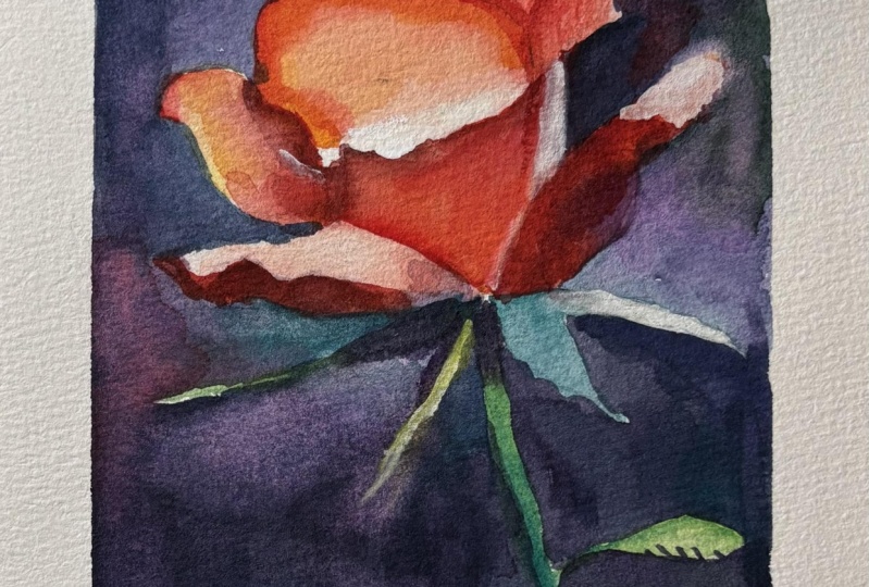
15. Rose Underlayer: We're going to
start off with some light underlayers for this rose and see how I'm using yellow
to mix my own green here. I found in hindsight,
this was a mistake. I really wish I left it with the green that we used
for the exercise and kept it pure and in line with the color palette and the exercises that we
already established. But even so it's not necessarily breaking the rules because
it's still a green. We're still using
a secondary color, even if we use yellow to mix it. But you'll see yourself how the choice to use this color
makes it stick out rather than keep in line and keep in harmony with
the rest of the palette. But that's a lesson in itself. The main thing about
this painting is how each of these colors plays a specific and expressive role. We're going to use
their characters to amplify and make the most of what they are because the orange acts as a source
of light and warmth. And, of course, that's what
we're going to use for the rose to add glow and energy, even without using the yellow. And then the violet becomes
our kind of anchor. It brings it into
shadow, mystery. Into depth. And we're
going to use a lot of that blue in that
middle swatch where we created where we
mixed violet and green to create that
kind of bluish violet. It lets us reach dark values without having to turn
to black or white because you can see that violet that we've used is the darkest
pigment we've got. So that's the darkest
we can achieve, which is actually dark enough. When it's so concentrated
like that, it looks black. And then we have green,
which naturally we already associate with
leaves and the stem. But here, we're going
to take it further. We're going to make
it do more than that because it acts as
a balancing force, and it neutralizes areas, and it creates contrast, and it helps the background feel grounded and atmospheric, especially when we blend
it with the other hues. We can use it to make the gray
with the orange, as well. So it's interesting
how we're going to use these colors not
just by themselves, but as relationships
to other colors and the interplay and the surprising mixing
possibilities that emerge. One of the most exciting things about painting with secondaries is how they can behave
like primaries again. It's almost like they loop back around on the color wheel. The skills and the
awareness that we're building in this class doesn't just apply to roses, though. We're just using
that as an example. This approach of working
with secondaries and learning to create harmony
from a limited palette, it can be applied to so
many different subjects, not only florals, but landscapes, abstracts,
still lifes, even portraits. It gives us confidence
in mixing and it helps us understand
value more intuitively, how to make bold expressive
choices with color.
16. Edge Control: Notice how I referred to
the swatch in the top left to mix a red basically using that orange and violet color. The swatches and
exercises we did, we were very free and we were encouraging pushing it to its limits without
so much control. But the painting
of this rose adds another element to it
because we have to be a bit more conscious. And that's another element
of the painting process. We're not just painting things randomly at
the end of the day. So we've got to take what we've learned in
those exercises and focus it and work the
part of our brain, kind of the muscle
in our brain that thinks a bit more about how to apply and our own
personal decisions and what we want to express. And one of the ways we
can do this is through edge control and not only making the use of the
vibrancy of the colors, but using neutral colors to shift the vibrancy to
make certain areas pop. So we want it to be a bit more neutralized in the background to make the leaves and
the rose really pop. Because we're not
just thinking about color when it comes to paint. I know this is a
color theory class, but actually color
doesn't stand by itself. It's affected by all
the other elements. They're interlinked with tone, how it interacts with
form and space edges. And edges, in fact, play a huge part
in this painting. The crisp, defined
edges of the petals. That's what pulls the
viewers focus while we have soft blended edges of
the background to help everything else
fade away gently. So that contrast
between sharp versus soft is just as powerful
as light versus dark. And we can use color to take
that to the next level. You can see we're already
experimenting with tone on the bottom of that rose.
17. Starting The Background: Now everything's
pretty much dry, especially the
leaves and the stem. We're going to
negatively paint them. So we painted the outline
a bit further than we planned just so that
we can reach the edge, and now I'm going to
go back with a dark, neutral kind of color to
negatively paint that stem. So it's going to be a kind
of light on dark subject. Mixing up a lovely neutral
color using green and violet. And we can even add a
bit of orange in there. Like in the center
of our triangle, it's very neutralized
and gray there. When you mix secondary colors
in just the right ratios, you can get those
beautiful gray down tones like smoky blue grays, it feels ethereal or you've got muted purples or
even earthy browns. And it's these subtle
colors that create balance in the painting because they're all made
from each other. They have the same not genetics, but they have the same heritage, so they work together as
part of the same family. I'm going to use
this background to be very expressive and make the most of the more unpredictable part
of watercolor, especially when we're mixing
all three of them together, and we're trying to achieve
a muted tone anyway. So it's a perfect
time to be a bit wild and let yourself go
with watercolor, especially. I mean, you could do these
things in acrylic and oil, but what I enjoy
about watercolor is the expressive nature
of the water and the pigment and how they can move in ways
out of our control. We don't always control
what the pigment does. Sometimes it flows, it blooms. Creates those little
hard edged explosions. It surprises us. So rather
than forcing it in this area, we can learn to respond, practice that side of it, where it doesn't really matter. We can learn to listen
to it, experiment. It becomes less about
imposing our will on it and more about
collaborating with the paint. That mindset of working with the medium
instead of against it. And that's something that stays with us outside
of painting, actually. I'm having fun experimenting with little gradual
shifts in the color. So you can see it's a bit
darker at the bottom, at maybe a bit bluer, cooler. And as we're going up, it's almost pure violet
in that section. And then let's add a
bit of green into that again to vary it a bit more. I have to make it
particularly dark because I don't want to see any of that underpainting of
the stem and the leaf. You should have your
pencil drawing quite clearly drawn out so that you
know which parts to leave. It's always important
to experiment with your pigments before
you work on them on an actual final piece
because there's going to be challenges and pitfalls that we don't know until we've
actually interacted with them. Now, while we can mix secondary colors
with pure primaries, that's not what
we're doing today, achieving clean, vibrant virgins isn't always
straightforward.
18. Pigment Bias: There's something
called pigment bias, which means that if we want to create or mix vibrant
colors from other colors, it's not necessarily
as theory puts it. For example, if you want to
make a nice vibrant purple, mixing red and blue theoretically
would be how you do it, but it's not always
going to be the case. If you mixed a warm
red with a cool blue, the violet will actually
turn out muddy or dull. If you wanted a brilliant green, using a cool blue and a
cool yellow is usually best rather than using a cool
blue and a warm yellow or a warm blue and
a cool yellow. So understanding your
individual pigments, not just the color names, but how they behave is crucial. And sometimes you
can determine it. Like I said, if you see a
color like green and decide and observe whether
it's a warm green or a cool green and likewise, of any pigment, whether
it's a warm red or a cool red, a warm yellow, cool yellow, you can look at a color wheel and
kind of distinguish it, know what you're mixing it with, and you can kind of predict
the results of that. But if you want to
do it intuitively, this is basically how we do
it through trial and error. Sometimes theory can overwhelm us because it's so
much information, and they're just rules, basically, rules that
feel like limitations. So it's easy to
become overwhelmed, but of course, we're
drawn to theory, and we look out for theory
and composition rules and all the technical
knowledge because it gives us something
to hold onto, something we can mentally grasp. So it's reassuring, in that way. It's clear, it's logical, and it gives us a framework
that makes us or makes the creative process feel more
structured and manageable. And in many ways, that's a good thing because
you do have to know the nature and how
the techniques are done. As the famous saying goes, you have to learn the rules
before you can break them. There's a comfort in
learning the rules, and it's satisfying to understand
why certain colors work well together or why a
composition feels balanced. And that intellectual
understanding gives us a sense of progress and makes us feel like
we're doing things right. But there's a little
bit of a paradox because it's something that
it took me a long time to realize only quite recently
that the very thing that helps us feel more in control can also become the
thing that holds us back. When we become too
focused on theory, too obsessed with
getting it correct, we start to fill our minds
with expectations and mental checklists instead of responding to the painting
moment by moment.
19. Breaking The Rules: When we don't respond to
the painting in the moment, we start judging it and analyzing every move we
tighten up, we second guess. And then that natural
expressive energy, that spark that makes a painting feel alive,
it starts to fade. We might spend hours
thinking about color temperature
contrast ratios, but we lose touch with
the intuitive voice that simply knows what
the painting needs. We might have every
rule memorized, but still feel stuck because
we haven't practiced that more intuitive
expressive side. Because real art, so to speak, the kind that resonates with us, the kind that moves us, it doesn't come from following
the rules perfectly. It comes from somewhere deeper, from a willingness to let go, to listen to feel, to surrender, control, and respond
to the moment. Of honesty, and it
sounds a bit airy fairy and because it is. It's coming from an area that can't be written
down in textbooks, and it's the area that
I struggle with about how to let go of theory sometimes or at
least stop clinging to it. And that's when the magic begins to happen once you've kind of internalize the theory
to let go of it a bit. And we stop overthinking, we start feeling our
way through the work, begin to trust ourselves, not just our skills,
but our instincts. We start painting from
presence, from emotion, from something more raw
and alive, something that, again, can't be written down in textbooks, something real. And often what emerges in those moments are the
spontaneous brushstrokes, the unexpected color blend, the soft edge we didn't plan. It's something far more powerful than anything we could
have calculated, because it's real, it's
human and it has soul. So theory isn't the enemy. It's a tool, and that's
what this is about, and we have to know our tools. It's a language, a
support structure, but it's not the destination. We learn the rules so that we can move through them and
eventually paint with freedom, with clarity and confidence. Because at the end
of the day, we're looking for what really draws us to painting
in the first place. It isn't just to get it right. It's to feel something and to express that feeling
with honesty. However, imperfectly it may be, that's where the
real art comes from. And it can take a lot
of bravery to do that. But that's why we break it down and experiment with
limited color palettes. Experiment with primary colors, experiment with
secondary colors, practice with toe,
practice with edges. Still working our way
around the background, you'll find that most
of this painting is actually negative painting. So once we've painted
the background, the rose has actually appeared. By painting the background,
we're painting the rose.
20. Complementary Colours: We're not actually using the complimentary colors of the secondary colors
in this painting. Hence why it's a
limited color palette, but we should talk
about them anyway, because when we use them, they can be used for
harmony and contrast. Each of the secondary colors has a complimentary primary color
that it doesn't contain. So orange doesn't contain blue because it's made
from yellow and red. Green doesn't have red in it because it's made
from yellow and blue, and violet doesn't
have yellow in it. So these combinations
create maximum contrast. Perfect for when you go forward with this outside of
limited palettes, and you want to create
a strong focal point or a high impact emotional
moment in your painting. When you have these two colors next to each other, not mixed, because when mixed together, that's when we create
those grays or the browns or the neutral
tones we talked about. That helps us control
the vibrancy, bring balance and the tones. These secondary colors also work well with anoglus combinations. For example, green,
blue green and violet. That creates a kind of gentle, naturalistic kind of palette. A. Now mixing another
dark combination of colors down in the bottom. So it's going to be much
darker at the bottom and fades up to a lighter mix at the
top. See how gray it is. One of the most common
assumptions in painting, especially for
those starting out, is that we need black or even blue to create strong
shadows or dark values. It feels natural to reach
out for those deep pigments when we want to add this
strong contrast or structure. But what this class
shows is that well, the truth is we don't need them. Within a limited palette, even, we can still achieve a
full expressive range of values from the softest, lightest tones to
deep dramatic shadows without ever even touching
the black or blue. It all comes down to
understanding how value works and learning to trust
the power of our colors, even when we're working with
unexpected combinations. It can feel a bit
wrong initially to use such thick dark pigment
in watercolor because we usually associate it with
light washes or illustrations that are just for
sketches rather than finished final paintings that
require full tonal depth.
21. Tone Without Black: We can still manipulate tone and drama without
using black or blue, like I said, and get
the full tonal range. We can still shape the form
with light and shadow. And we're using layering
to do a lot of this. Let's say we want to create shadows on one side of the rose. Instead of reaching for
called blue or black, we can use violet, and it carries that
cool, moody quality. And by gradually building
building it up with a thin, translucent layer, we can push the value
darker and darker while still maintaining
that subtle transparency that's unique to watercolor. Likewise, if we're working
on the stem or background, we can deepen the green. A green that might start off soft and fresh can become
rich and earthy when layered. With this green that
we're using today, this cobalt teal, it
doesn't get too dark. We can see on our swatches. But if you look at my pan, that green viridian green, that goes very, very dark. That has a big tonal range. And then we want to mix in
orange into that or violet, then it may not give
us a solid black, but it gives us
something better, and it keeps it
more atmospheric. It adds complexity to the
shadows rather than just a dull, motionless black. So this approach teaches
us something important that darkness doesn't
have to mean dullness. Shadows don't have to
be flat or colorless. When we build our darks
from within the palette, we already have, they feel connected to the rest
of the painting. They harmonize with
the light areas. They carry the same energy and mood because they're made
from the same colors. And in a way, it's more
honest, more unified. The whole painting feels like it belongs to the same world. So instead of
relying on blacks or blues as shortcuts outside
of this class even, we can start to see value as something we create, not
something that we add. It's a process of observation, of layering of subtle shifts. Now that we've finished
the background here, you can see how blue it is, despite not using blue at all, using that cobalt
teal and the violet. Once you've experienced
how much depth and richness you can achieve
with just a few colors, you realize you don't need
those extra pigments. It's incredibly empowering. And we will always go to the art shop and get inspired by a new pigment
and buy it anyway. But that's also okay, too, because they have
different qualities to them apart from just
the hue and the color. And we can talk about
that in the next lesson. It's not about having
more colors, ultimately. It's about using what you have with clarity
and confidence. And when you learn to do that, you can push value within
a limited palette, and your entire approach to
painting starts to shift, and then you know you have that much more power with
fresh pigments that you buy. So begin to trust yourself and start seeing color as
something fluid and expressive. And then you'll find
your work gains, unity, subtlety, emotional
depth without even needing a drop of black. Oh
22. The Nature of Pigments: Let's take a moment
to shift our focus directly from color theory and think about something
a bit more subtle within this element of pigment. Something that's
easy to overlook, but plays a huge role
when we come to choosing our colors and how our
paintings come to life. Specifically in watercolor and how the pigments
behave in water. Because we often talk about
color in terms of hue, orange, green,
violet, and how to mix or layer the paints. But in watercolor, pigments
aren't just colors. They're actually living
reactive substances, especially these
Daniel Smith pigments, you can see that they
use actual rocks and minerals from real elements. And they all have
their own personality. And learning how
to work with them like really with them can
transform the way we paint. Some pigments are
bold. They charge across the paper at the
moment they touch wet paper, like the orange in this
is just super spreadable. You just tap it and it's
potent almost impatiently. And it stains my palette. It's like they want to
take up as much space as possible because the
pigments are so thin, they just travel with the water. Yet, the green, this
teal, it's quite quiet. They need a bit
more encouragement. They settle in quite gently. They stay where they
are. They barely move unless they're encouraged. And then like this green, it's very granulated.
They like to granulate. They break apart into
little specks and they settle into the texture of the paper or the teeth of the paper as it's
generally known as. It creates soft,
sandy, magical effect. Unlike, again, the orange, which is thin, it's
smooth, it's seamless. It flows like silk, basically. The problem with this
orange, as vibrant as it is, like I said, it stains. Once they touch the paper,
they're there for good. I mean, you can take the
thickness of it out, but it's going to be orange
paper no matter what. Yeah, others lift very easily, and we can use
that to reshape or soften or even completely
remove it if we make a mistake. And if you look in the tube of the watercolor paint watercolor
tubes or the paints, they have little logos that tell you the nature
of the pigment. It's like a little hidden
world of watercolor. It's not just what we paint, but how our materials behave. And the better we
understand this, the more we can let go
of control and paint in harmony with the
medium rather than constantly wrestling against it.
23. Tricky Green: And then there's green,
a color that can be made from a huge variety
of pigment combinations. Some greens are smooth
and transparent, perfect for laying,
like viridian. Others have beautiful
granulation like the one we're using today. I think we should
do a deeper dive into green and the nature of it, because if there's one color that causes more
frostration than any other, especially for
beginners, it's green. That makes sense because green shows up everywhere
in landscapes, florals, still lifes, yet it's not really
straightforward. In watercolor, green
isn't just one color. It's like a whole
spectrum within itself. Green is often tricky because our expectations
of it are so strong. We see green in
nature all the time, grass, trees, plants, moss. But in reality, the most
natural greens are muted, complex, and they're constantly changing rather than
just the same hue. They're full of shadows,
temperature shifts, and subtle variations. But many of the greens
we get out of a tube, especially synthetic
ones, they're incredibly strong,
artificial and overpowering. So when we use
them straight from the pan or the tube
without any modification, the results can look unnatural, flat or jarring and
almost cartoonish. So that's where the
struggle begins. There are, in fact, more
variations of green available than almost any
other color on the palette. And each one behaves
differently. Some are warm, lean
towards yellow, like sap green,
green gold or olive. And then we've got
some cool greens that lean towards
blue like palo green, viridian, or cobalt green. And in fact, some
greens dry much cooler than they appear wet. So, of course, in the
context of this painting, we can warm up a cool green by adding a touch of orange
and we can cool it down, cool yellowy green down by
mixing a little bit of violet. And with just these
small little shifts, we can take a green from looking artificial to feeling
quite earthy. The green in this painting is
very artificial, actually, but because it's inside
the limited palette, it kind of works. It
just makes sense. But if we were trying to
create a more natural, realistic looking scene, would have to be a bit
more conscious of that. If we were working outside of a limited palette
with any color, we could use red. It's
complimentary color. We're not using it in
this cast, of course, but we can create
similar effects by adding it depending on
what green we're using.
24. Observe Nature: The main idea with
greens is to only ever use it in mixes,
not in isolation. Instead of thinking of green as a standalone color, that
should just be the base. You should always mix it with
violet or orange or red, or any color, you
can just experiment. You can look at my color charts and see the
versatility of it all. And a good practice that you can do in your day to day life is to observe nature more
closely because nature never uses one green. Even a single little leaf can contain a little yellow green for highlights or
a cool green for the midtones and a
deeper kind of violety green for the shadows or even like stems of
orange and red. So being observant and assessing whether
it's a cool green or a warm green in real
life could just help make you understand it,
which is a useful thing. I'm adding a few highlights to this rose at the moment,
just using white. So that's still allowed
because it's white. It's nothing to do with hue. It's about tone. Being
ever so subtle with it, though, I don't
want to overdo it. Just a few little indications of highlights just makes it pop. It's very easy to overdo it with highlights. I've
done it many times. But it's that holding back, that little indication
where it's still visible, but just adds a bit of
clarity, bit of precision, bit of fnesse just makes it look a bit more
sophisticated than if we just add big
sploges of it. Like this little leaf. I'm not sure it's called a leaf that's coming from the
bottom of the rows, a little thin line. We know it's a highlight,
but it has that sharpness.
25. Final Thoughts: Welcome back, and
congratulations on completing this class of unlocking color theory
using secondary colors. I hope you enjoyed the process
of playing with orange, green, and violet just
as much as I did. From swatches and theory to
our final floral painting, we saw how a
restricted palette can actually open up more
expressive possibilities, enhancing our understanding of color harmony,
temperature, and contrast. Remember, watercolor painting is not just about technical skills, but also about expressing your creativity and
personal style. I encourage you to continue
exploring, experimenting, and pushing your
boundaries to create your own unique
watercolor masterpieces. As we come to the
end of this class, I hope you feel
more confident and comfortable with your
watercolor painting abilities. Practice is key when it comes
to improving your skills, so keep on painting
and experimenting. I want to express my gratitude for each and every one of you. Your passion for
watercolor painting is so inspiring and I'm honored
to be your teacher. If you would like feedback on your painting, I'd
love to give it. So please share your painting in the student projects
gallery down below, and I'll be sure to respond. If you prefer, you can
share it on Instagram, tagging me at Will Elliston, as I would love to see it. Skillshare also loves
seeing my students work, so tag them as well
at Skillshare. After putting so
much effort into it, why not share your creation? If you have any questions
or comments about today's class or want any specific advice
related to watercolor, please reach out to me in
the discussion section. You can also let me know about any subject wildlife or scene you'd like me
to do a class on. If you found this class useful, I'd really appreciate
getting your feedback on it. Reading your reviews
fills my heart with joy and helps me create the best
experience for my students. Lastly, please click
the follow button up top so you can follow
me on Skillshare. This means that you'll be
the first to know when I launch a new class
or post giveaways. I hope you leave this
class feeling inspired to use these techniques in your
own watercolor paintings and to use watercolor in interesting new ways until then happy painting Bye for now.
 Will Elliston, Award-Winning Watercolour Artist