Transcripts
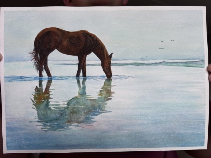
1. Welcome To The Class!: Hello, everyone. My
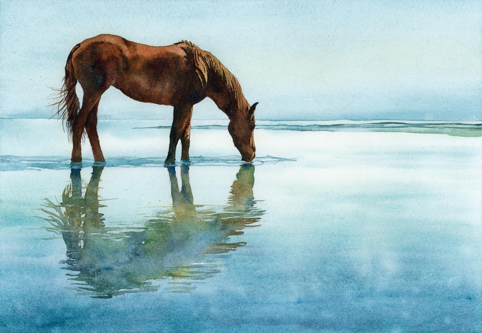
name is Will Elliston. And today, we're painting a
wild horse in quiet wetlands. This scene is a
lesson in restraint, clear silhouettes, and
the poetry of reflection, we'll use a limited palette of earthy browns and blue greens, letting soft gradations
turn the form while saved paper and a few decisive darks anchor the legs and muzzle. The horizon stays gentle, the water broad and calm, so the reflection can
carry the design. Even if you simply watch, seeing how few well chosen moves build the painting
is very valuable. I've been a professional
artist for many years, exploring lots of different
subjects from wildlife and portraits to cityscapes
and countryside scenes. I've always been entranced by the possibilities of watercolor. But when I started, I had no idea where to begin
or how to improve. I didn't know what
supplies I needed, how to create the
effects I wanted, or which colors to mix. Now I've taken part in many
worldwide exhibitions, been featured in magazines, and been lucky enough
to win awards from well respected
organizations such as the International
Watercolor Society, the Masters of
Watercolor Alliance, Windsor and Newton, and the SAA. Watercolor can be overwhelming
for those starting out, which is why my goal
is to help you feel relaxed and enjoy this medium
in a step by step manner. Today, I'll be guiding you
through a complete painting, demonstrating a
variety of techniques, and explaining how I use all
my supplies and materials. Whether you're just starting out or already have some experience, you'll be able to
follow along at your own pace and improve
your watercolor skills. If this class is too challenging
or too easy for you, I have a variety of classes available at different
skill levels. I like to start off with a free expressive
approach with no fear of making mistakes as we create exciting textures
for the underlayer. As the painting progresses, we'll add more details to bring it to life and
make it stand out. I strive to simplify
complex subjects into easier shapes that
encourage playfulness. Throughout this class, I'll be sharing plenty
of tips and tricks. I'll show you how to turn
mistakes into opportunities, taking the stress out of
painting in order to have fun. I'll also provide you with
my watercolor mixing charts, which are an invaluable tool when it comes to choosing
and mixing colors. If you have any questions, you can post them in the
discussion thread down below. I'll be sure to read and
respond to everything you post. Don't forget to follow me on Skillshare by clicking the
Follow button at the top. This means you'll be the
first to know when I launch a new class
or post giveaways. You can also follow me on Instagram at Will Elliston
to see my latest works. So, let's get started and
invite stillness onto the page.
2. Your Project: Thank you so much for
joining this class. I'm very happy that you're
here painting with me today. Our aim is to capture presents
rather than description. Keep the horse as a clear,
elegant silhouette. Let colour drift warmly
across the back and cool into the shaded belly and allow the wide pool to remain
open and spacious. The reflection mirrors
the main shapes, softened, so edges
feel slightly delayed. A limited palette
keeps harmony high while the small ripples
adds life without clutter. Think balance, breath, and calm light moving
through water. In the resource section, I've added a high
resolution image of my finished painting
to help guide you. You're welcome to
follow my painting exactly or experiment with
your own composition. As we're going to be focusing on the painting aspect
of watercolor, I've provided templates
you can use to help transfer or trace the
sketch before you paint. It's fine to trace when using it as a guide for
learning how to paint. It's important to
have the underdrawing correct so that you can relax and have fun learning the
watercolor medium itself. Whichever direction
you take this class, it would be great
to see your results and the paintings you
create through it. I love giving my
students feedback, so please take a photo
afterwards and share it in the student project gallery under the project
and resource tab. I'm always intrigued to
see how many students have different approaches and how they progress with each class. I'd love to hear
about your process and what you learned
along the way, or if you had any difficulties. I strongly recommend
that you take a look at each other's work in the
student Project Gallery. It's so inspiring to see
each other's work and extremely comforting to get the support of your
fellow students. So don't forget to like and
comment on each other's work.
3. Materials & Supplies: Before we get started
with this horse painting, let's go over all
the materials and supplies you'll need to
paint along in this class. Having the right materials can greatly impact the
outcome of your artwork. So I'll go over all the supplies I use for
this class and beyond. They're very useful to have at your disposal and we'll make it easier for you
to follow along. Let's start with the
paints themselves. And like most of the materials
we'll be using today, it's a lot to do
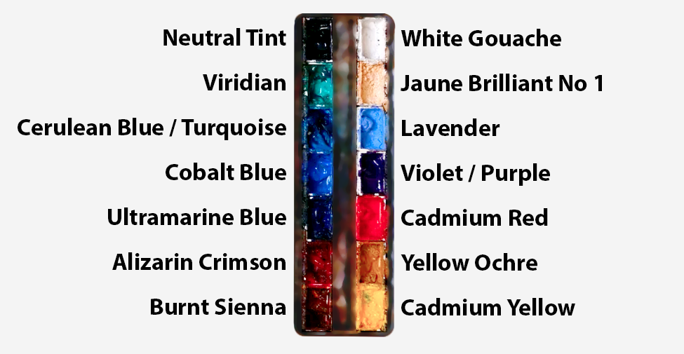
with preference. I have 12 stable colors in my palette that I
fill up from tubes. They are cadmium
yellow, yellow ochre, burnt sienna, cadmium
red, Alizarin crimson, Opramarne blue, cobalt blue,
serlean blue, lavender, purple, Bidian, black, and
at the end of the painting, I often use white gouache
for tiny highlights. I don't use any
particular brand, these colors you can
get from any brand, although I personally
use Daniel Smith, Windsor and Newton,
or Holbein paints. So let's move on to brushes. The brush I use the most is
a synthetic round brush like this Escoda Purl brush
or this Van Gogh brush. They're very versatile because
not only can you use them for detailed work
with their fine tip, but as they can hold
a lot of water, they are good for
washers as well. They're also quite affordable, so I have quite a few
in different sizes. Next are the mop brushes. Mop brushes are good for
broad brush strokes, filling in large areas and creating smooth
transitions or washes. They also have a nice tip that can be used for smaller details. But for really small details, highlights or anything
that needs more precision, I use a synthetic
size zero brush. All brands have them,
and they're super cheap. Another useful brush to have is a Chinese calligraphy brush. They tend to have long bristles
and a very pointy tip. They're perfect
for adding texture or creating dynamic
lines in your paintings. You can even fan them
out like this to achieve fur or feather
textures as well. And that's it for
brushes. Onto paper. The better quality
of your paper, the easier it will be to paint. Cheap paper cuinkles easily
and is very unforgiving, not allowing you to
rework mistakes. It's harder to create
appealing effects and apply useful techniques
like rubbing away pigment. Good quality paper, however, such as cotton base paper, not only allows you to rework
mistakes multiple times, but because the pigment
reacts much better on it, the chances of
mistakes are a lot lower and you'll be more likely to create
better paintings. I use arches paper because that's what's available
in my local art shop. A water spray is
absolutely essential. By using this, it
gives you more time to paint the areas you
want before it dries. It also allows you to
reactivate the paint if you want to add a smooth
line or remove some paint. I also have an old rag or t shirt which I use
to clean my brush. Cleaning off the paint
before dipping it in the water will make the
water last a lot longer. It's always useful to
have a tissue at hand whilst painting to
lift off excess paint. Also, you never know when an unwanted splash or drip might occur that needs
wiping away quickly. I also have a water dropper
to keep the paints wet. When you paint, it's
important to have them a similar consistency to what
they're like in the tubes. This way, it's easier to
pick up sufficient pigment. A hair dryer is useful
to have for speeding up the drying time and controlling the
dampness of the paper. And lastly, masking tape. And this, of course, is just to hold the paper down still onto the surface to stop it sliding
around whilst painting. Also, if you plan on
painting to the edge, we'll allow you to create a
very crisp, clean border. And that's everything you'll need to follow along
in today's class. But I encourage you to use
whatever tools you're used to or even experiment with whatever tools
you want to try out. Let's get on and sketch out this scene
before we paint it.
4. Preparing The Composition: This painting is quite a minimal
painting because really, the only thing we've got
to draw out is the horse, and we had a few other lines just to indicate
where the horizon is. But we're creating that
illusion of a whole scene, but with hardly any
details at all, the horse is basically
a silhouette. So we just have to
focus on getting the horse right in this drawing and work
everything around that. And we start off by blocking out the shapes with
a rough pencil. And then gradually
building on top of it. And once we feel like the general shape of
the horse is correct, then we can go in with
a fine pencil like this and focus on
that silhouette. I'm not thinking about
the details within it. I'm just getting the
silhouette right. And then when it comes
to the paint later on, then we can start thinking
of the details because the most important part
of the drawing is getting that foundational
structure right because no matter or no amount of
pigment will fix a bad drawing. Of course, you can use the
template I've provided in the resource
section to help you get it as accurate as possible. I'm adding a few lines inside the silhouette now
just to help guide me, but they're only going to be
subtle little influences. Nothing too strict that
I'm going to follow. And then for the reflection, it's a very abstracted shape
that I'm only going to subtly suggest and imply that will be done purely
with a pigment later on.
5. Pre-Wetting The Sky: Now, we're going to start with the easiest part of
the whole painting, and that is just pre wetting the paper above
the horizon line. So hopefully, you've
marked out with your pencil lightly where
the horizon line is, and we're just going
to fill that area up with pure water. I'm using this mop brush
because it can hold a lot of water and has
a nice clean edge. You can, of course, do it
with any brush you want, but it'll take more time
with a smaller brush. That's the only reason
I'm using a large one. And the reason we're filling this area with water
to begin with is because when it comes
to adding the pigment, we want a nice clean wash for the sky with no hard edges because this is going to be
a very minimalized painting. And I'm using cerrillan blue. That's my favorite color
for skies and water. Maybe a touch of ridian.
6. Painting The Sky: So I'm going to continue using this mop brush because, again, it holds so much water and pigment that I don't have to
interfere with it too much. I just let the pigment fall onto this page
above that horizon line. And because this is
such light pigment, I don't mind painting
on top of this horse because we're going to use strong brown pigment
for the horse. So when we paint over it, we won't even see the horse at all or rather the blueness
of the sky in the horse. If it's too wet,
I use the sponge to balance the moisture
so there's no pools. Sometimes the paper
will crinkle. I'm sure mine will, too,
with all this water, but as long as we try not to encourage the pools from happening by applying
too much water, there'll be a nice smooth sky. Adding a bit of yellow
ochre in there, just a subtle diluted amount. We don't want it to turn green, but it takes away the monotony of having
just one pure color. And funnily enough, even
though it's so minimal, it adds a feeling of realism. I'm taking away some
of the pigment now, so you can see just
how light it is. Maybe add a bit more at the top, and you can see that it's
not absolutely sod and wet so that no
pooling of water will happen because that's
when unevenness happens and it dries with blooms
and unwanted marks. We want the sky to
be nice and smooth. I just like to say
that yellow ochre is not actually necessary. Sometimes I just
have feelings and impulses to add
pigments sometimes. But there's no reason at all for you to do it
if you don't want to risk interfering
with a simple wash. Whilst it's still wet now, I'm using a smaller brush because I want a
bit more precision. I'm applying a bit more
of this serlean blue at the bottom to help
define that horizon line. And because the
wash is still wet, it will be a nice smooth
transition upwards. This is another example
of how we can do little tweaks to make something a bit more interesting whilst
keeping it quite simple. So adding this extra
bit of pigment at the bottom gives it
a bit more depth, a bit more realism, makes
it a bit more intriguing. But the key is to make sure
that the wash is still wet. We wouldn't want to do this if it was already halfway
drying because it would create unevenness and it wouldn't gradually blend out.
7. Pre-Wetting The Water: Now, if you want, you
can get a tissue like I am now and just dab away at the horse so that this
blue line isn't so strong. This is, again, not
super essential because we'll be coming
back with deep pigment, but just out of reassurance, it's barely
noticeable, actually, because my serlean blue
is quite high staining, so it's quite hard to take out the pigment to lift it away. But that's something you can do in other paintings as well. It's a useful
technique to practice, even if it's not so necessary. Now, I completely dried the sky, and we're going to start painting the water
now, the wetland. There's multiple ways
to paint this painting. Maybe we could have painted the bottom first below the horizon line and then
painted the sky above. But the idea is still the same. I'm pre wetting this area, and I'm being very
careful not to touch the sky because I want that clean horizon line to be there. I think I did
incidentally just nudge it with my brush there. And these mistakes happen, but that's why I made sure the sky was completely dry with a hair dryer beforehand so that if I were to
splash water on there, it wouldn't agitate it and
create a cauliflower bloom. Even though we're not
touching the sky, it could have stayed wet, but it would have created a mark. So I'm just going to
leave that little splash that I did
on the sky there. It's barely perceivable. But if you started touching away or use a tissue to try
and take out that water, then you'd take pigment with it, and it would be way too obvious. So I'm going to continue pre wetting this whole area so that we can start
painting the water.
8. Starting The Water: I'm going to use basically
the same colors as the sky, but with emphasis on green, I'm going to add some more
ridian into this color. So starting at the top, notice I'm not
using my mop brush. I just use that to
fill it in with water. Taking it right to the top and because the areas
already wet with water, it'll already push the
pigment to the edge. So I don't need to paint
all the way up to the top, but it doesn't
particularly matter if a few areas touch it. It doesn't need
to be so precise. Because if you think sometimes when you look at the horizon, sometimes it's
indistinguishable the sea or the water to the sky. So some areas, I'm trying
to match the tone. So areas I want it to be lighter and some areas
I want it to be darker. So I want to play around a bit with the dynamics
of this horizon line. And it's a good
exercise for you to practice where the sea might be lighter than the sky or the sky might be lighter than the sea or trying
to match it again. And then I lighten it up a bit in between the
horizon and the horse. But where the horse's
legs meet the water, I'm purposely going
a bit darker there, but keeping it wet on wet so that there's nice
smooth shapes going on. And all my brush
strokes are horizontal. Trying to limit my vertical
brushstrokes or not use any at all to create that
feeling of ripples. So I'm using pure colors. Basically, I used serian above, and now I'm using viridian, and they're going to mix
on the paper themselves. So I don't need to really use my palette at all
to mix these colors. And I'm just building
it on bit by bit. Of course, when the paper
is very wet like it is now, they're going to spread
out and become super soft, and a lot of these brush strokes in a few
minutes time will be completely lost and spread out so that you
can't even see them. But we're going to bit by bit
add them on so that there's a nice range of
complete softness to eventually complete hardness. And we're getting darker and
darker as we go lower down. So we can go a bit stronger at the bottom and then use
what pigment we have on the paper and using these horizontal strokes
again to agitate them up. And those vertical scribbles, I just added there is, again, just to move the pigment around because the paper is already
so wet at the moment. Those vertical strokes
are just going to spread outwards and you won't
see them at all. I'm not applying strokes for
how I want to see them now. I'm applying strokes to what
I imagine they'll be in 5 minutes once the mortar and pigment have moved
around a bit more. Some patches are a bit
more serle and blue, and some patches are a
bit more viridian green. There's no order or rule
that I'm following.
9. Water Transitions: Now the top part of this
wash, this water section, we're painting has had a bit more time to dry because we haven't
been working on it, and there's no pigment
there, just pure water. When I apply strokes on
that area at the top, they'll hold their
shapes a bit more. Because we've been working
on the bottom half and we're adding more
pigment and water, it remains a bit more
wet than the top. And often, like I
just did there, I just apply one or two
strokes just to see and get a feel of
the wetness level before I commit to
anything a bit stronger. And it was still a bit
too wet and damp for me. So I'm going to
continue working on the bottom bit until the
top bits a bit drier. Now I'm incorporating
a bit of purple. And when you first see
it there on the paper, it looks quite
strong and jarring. But by the end of this
painting, you won't see it. I will have blended out. And although it still
influences the color, we won't see that area of
the painting and think, Oh, there's a purple
brush mark there. And you can experiment
with this in your own way with
whatever color you like. Applying little influences of colors that aren't perceivable
but have an influence. Now I'm going a bit bolder. And likewise, with the
paper getting drier, the thicker the pigment is, the more likely the stroke
will hold its shape. So you can see
I've created a bit of gap between these strokes, allowing a bit of
lightness in between them. And they're not
perfectly straight. They're a bit tilted, much like ripples would be
in the first place. And now I'm adding thinner
strokes, using the same brush, but because I'm using
a different pressure, it's becoming a bit thinner. I'm being a bit more
playful, as you can see, adding a few random
arbitrary strokes that might look
odd at this stage, but I can tell that the papers wet enough
to get away with it. So all these abstract marks are going to blend out
and soften out in a bit, and it's just a fun, playful way to paint, to free myself up a bit, feeling a little less
precious about it. It builds your confidence a bit more and it allows you to
feel a bit more freedom. See how the purples are dissolving in there and
becoming less visible. I don't mind having a bit
more texture at the bottom, as well, because this
is not deep water, so maybe there's sand or soil underneath there that we need to add a
bit more texture to. This water isn't something
that I particularly want a lot of attention on. So I don't need to make it
nice and bold or detailed, flicking a few splashes on there to increase that
feeling of texture. Making it feel a
bit more ethereal. There's a few little
pigments that are concentrated that I'm just
agitating to loosen up a bit. You can see how there's
a transition from the whiteness above to the cool, bluish purple pigments below. But it's not clean. I haven't tried to keep
it in a nice smooth transition, keeping it playful.
10. Distant Ripples: So I've allowed it to
completely dry again. And that's basically the
main wash for the water. Now we can add a
few minimal details to make it a bit
more convincing. So hard ripples, some little
hard lines that can maybe imply some banks of land or just little ripples
in the distance. So I'm using the same colors, but a bit more concentrated. That cerlan blue,
viridian green, and a bit of my violet purple, but you can mix that by using a zarin crimson and
serlean blue, if you want. This is a very simple
detail that I'm adding now, but it has a lot
of impact because I'm applying this
horizontal ripple or line, but purposely leaving a gap
where the horse will be, but continuing it
along the other side. Little elements like this give it a bit more of
a realistic feeling, but it also anchors the piece, gives it a bit more depth. We can extend this line and do the same thing
behind the head as well, painting up until the head and then continuing it
on the other side. We don't want to paint over the top of the horse for this one because
it's a bit too dark, unlike with the sky where we could get away with
it and the water. These ripples or banks of land, would be a bit too obvious. I'm purposely keeping
this line a bit jagged and it gets gradually
closer to the horizon line, but it doesn't actually touch. So there is this
little lightness of the paper below in between
this area and the sky. This is a very
minimalism painting because not only is there
basically one clear element, the horse, but very limited
colors, a limited palette. We're just using basically serlean and green with a
few touches of purple, but the purple is an
obvious, barely perceptual. So two colors for the
water and sky and then for the horse is just gonna be
burnt sienna and black. So not many colors at all. And if you wanted to
simplify it even more, you could probably take
away the viridian green and just leave it blue and brown. Compositionally,
this horizontal line we're just painting now, it helps direct the eye. Even though it's very
thin, there's a kind of zig zag element for
the eye to follow, like a path across the painting, so we can go left to right, and then we'll
connect to the horse. There'll be another
ripple there. So it connects the painting.
11. Ripples Under The Horse: Now I'm going to
add a few ripples where the horse's legs meet
the water because, of course, there'll be some agitation there with the horse
moving gently, but only subtle ripples. And really, this works as a
compositional tool as well. Like I was saying before,
it's almost like an arrow. So this shape that
I'm painting now, if you follow it along
the path of your eye, it goes up to the other
side of the painting. It carries your eye across and rather than just
block this area out, I'm adding little strips or little gaps of
the paper below. So I'm not just blocking
it out completely, and see how I use
a tissue there to blot it out in
some areas so that there's lighter areas
and darker areas. Using a smaller brush
for this because, again, I want little fine
lines in some areas. Especially around the mouth area because maybe the
legs are quite still, but the mouth where he's having a little sip,
a little drink. A few rings, ripples there. The general idea
of this painting, what we want to convey
is the pure stillness, a single horse, a wide horizon, and a gentle reflection
of the horse. Upon first looking
at the painting, it feels like the horse
is the main subject, which, of course, at the
end of the day it is, but it's really the space
that's the actual subject, that feeling of
peace and vastness. And that feeling
comes from restraint. In this painting, nothing
is trying to impress. There's nothing loud. Everything is allowing
the viewer to settle, which would be quite a
relaxing impression. Most of the image is soft. It's an open space of
pale blues and greens. And that open space
is the main event. And the horse becomes powerful because there is so little
competition around it. And it's a reminder
that emptiness can be a compositional
tool as well, not just a problem to solve, because many times me included, as well as students can feel like we have to fill up
the entire page of things. But as you can see, there's
not much going on the sky, not much going on in the water. The horizon is gentle and high, and it divides this composition
or this world that we're painting into air and
water without any drama. And because the
horizon is quiet, the horse reads as
the only firm anchor, and that creates a sense
of solitude and peace because the horse itself
isn't in an action pose, it's in a very
relaxed pose as well.
12. Horse Underlayer: Now it's time to
paint the horse and we can keep it as
simple as possible. There might be a few slight
details that we paint later, but it's more of an
illusion of detail rather than actually taking
the time to paint the detail. We're going to break it down
in a very simple process. So I've mixed well,
I've diluted, not necessarily mixed some yellow ochre for
this underlayer. And then I've got a bit
of burnt sienna as well. And this is just to fill out the area with some warmth
and get the area wet. It really doesn't
matter at this stage, whether it's too much yellow ochre or too
much burnt sienna. We just want to think about that clear silhouette of
the horse to begin with. And as you can see, I'm
using a medium size brush, not even a small brush. But with my pencil markings, I'm clear about how the
silhouette is because, again, as I said before, if your pencil drawing
isn't correct, the painting will
not correct it. So you have to be super
sure that you're happy with your drawing first.
It's the structure. It's the skeleton to the painting for which
everything else is built on top. So I haven't really added much more pigment than
that initial brushstroke, and I'm using water just
to fill this area out. And if I do feel it
gets a bit too light, then I can go back to my palate and drop some more pigment. I'm not necessarily
rushing myself, but I do want to fill this area in without
any hard lines. I won't use this
wash over the tail, but I will start to paint over
this leg area at the back.
13. Extending The Wash: Notice how I kind of rotate between the
edges so that one area, one side doesn't dry
before I'm ready. So I'll spend a bit of time working on the
head on the area, but then I'm aware that I've got the two legs with
hard edges as well. So in a few seconds time, I'm going to move on to the
next and then over time, you'll have this automatic
awareness to do that, so there's no
unwanted hard edges. And I see them as checkpoints so that even if I do happen to forget or some random emergency happens where I have
to stop painting, I've painted it to a
point on the leg area where I could easily correct
it or smooth it over. Again, this is
just a underlayer. So it's not that
important anyway. You can see now how it wasn't so important to avoid painting blue over the top of this horse
when doing the background because this brown is already dark enough
to hide that blue, and then later on we'll
go even darker anyway. Ear, I haven't bothered to paint out because that's going
to be pure black anyway. So this is just the
main area and we can gradually build on
more and more texture using wet on wet technique, going back over the
area that we first started because it was
already starting to dry. I'm just tapping the brush to allow that pigment to
fall off my brush. I'm not stroking it. I'm allowing it to fall off onto the paper and somewhat
do its own thing. We want to keep this silhouette as strong as possible so
that it's easy to read. And of course, there's
details in there, and the end result might
feel somewhat realistic, but even within that realism, it's minimal because
it's just a silhouette.
14. Building Up The Tones: Now, whilst it's still wet, I'm going to add
some darks on there and see how I'm not
going to use black, at least not straightaway. I'm going to mix my darks by
using blue and burnt sienna. So you can use ultramarine like I'm using because that's
the darkest blue I have. And together with
the burnt sienna, it's pretty much
as dark as you can get or at least as dark as
we need for this painting. Sometimes I just go to black
just to save some time. But when I can help it, I just mix some
complimentary colors to create that neutral tone. At this stage, it looks like I'm painting quite
specifically trying to scalp out the shapes. But if you look at
the final painting, you can see how actually I go over this bit
and simplify it. What I'm really doing at
the moment in my mind, is thinking about how to
paint the rest of this horse, not necessarily just the area that I'm doing
at the moment. I'm thinking about which area to paint next whilst
I'm painting this. I'm making all
kinds of decisions or exploring different thoughts like how dark I should go. That's why I'm taking my time. It's not so much that I'm trying to get the anatomy right. I'm starting off gradually
building a bit more tone. So you see now I'm
going much darker. And this is pure ultramarine, but because it's on
top of the brown, it almost looks black. And to me, that makes it
look a bit more exciting. So at the back of
the horse here, I'm avoiding painting the
tail at the moment and the legs because I know there's not much
transition in this area, so I can just come back
to it later on with the same dark tone and
reconnect it seamlessly, almost like a checkpoint. But I want to make the most of the
wet areas in this wash, so I carry on moving across this horse to get those wet and wet transitions
where it matters. Again, I'm assessing the tones. I might go darker, but
for the time being, I'm holding back the gas, so to speak, rather than going
full on dark straightaway, I'm gradually building
up the tones. Even if I do eventually
end up much darker, it helps me assess the tones
a bit more accurately. Because this area
of the paint of this horse is not
the abstract part. But that doesn't
mean to say we need to rely on heavy detail. I still want it to be
elusive and immersive. But at the same
time, make sense.
15. Darker Pigment: Because even within
a silhouette, there will still be some
influence or form in there. I've personally gone with
Brown for this horse. But it would be interesting
to see your interpretations. Maybe you can take
away color completely and paint a solid
black horse with just a few subtle
shimmering highlights. Or maybe you can take
it a bit lighter, still use gray scale and paint a kind of gray murkish
monotone horse, not necessarily white because
we need that contrast, but you can still play with tones using a
lighter gray color. Or maybe you can try kind of
speckltors which transitions from gray or white on one
side to brown on the other. The message that I
would like to get through is that this is not necessarily a subject
that needs to be copied exactly in
order to succeed. This is a kind of
painting that's built on feeling, judgment, atmosphere, so
naturally every versin will be a little different. In fact, if every virsin
looked identical, we would lose the most exciting
part of this painting, which is seeing how each person interprets the same subject. So the aim is not really to reproduce my
painting perfectly, although you can, if
that's what makes you feel more comfortable or that's what helps
you learn the most. But we can use this subject
as a way to explore what it means to be or express
calm, simplicity, reflection, and personal
expression because there's no single correct
way to paint this scene. Only more or less
convincing ways of expressing your own
response to it. Maybe the sky can
be a bit different. Maybe you want to add a
warm sky and a cool horse. Starting to indicate the
tail with light strokes, very thin strokes
just to kind of map out where I want the tail to be, and then filling in where I
know it will be blocked out. And then gradually connecting
it to the rest of the wash, like I said, as a kind of check mark before we
can reconnect it. And wherever I want
it to be dark, I just use the blues on my
palette rather than the black. So I haven't actually
touched the black yet. Then the tail goes all the
way down to the bottom, and it's quite thick the pigment because the
pigment dried up on my palate. So it creates a kind
of dry brush texture, which also helps with that detail because this
area specifically right now, the tail is the
most kind of rough, sharp area because everywhere
else is very smooth. But this is the area
of most movement. These fine lines that are all concentrated
and overlapping. You can gradually build that up. And of course, the closer the hairs and strands
get together, the thicker it gets until it eventually becomes the
body, the back of the legs.
16. Painting The Mane: I just want to explain
or reassure you that this painting doesn't
have to look like mine because when I
was starting to learn, and I know many
students when following my classes aim to paint something that
resembles my painting. And I want to let you
know that instead of success being does my
painting look like yours? You can redefine it as, Did you create a
painting that feels calm, spacious, and intentional? Because watercolor
is so unpredictable, and we can vary so
many aspects of it within our control
and also outside of our control that even if I
were to paint this again, it wouldn't necessarily
look the same. So just because it doesn't
look the same doesn't mean there's a right
or wrongness to it. You can still create
your own unique painting that conveys calm, spaciousness and
atmosphere without it, ending up looking like mine. You can ask yourself
questions that are a bit more useful for yourself. Like, did you simplify
with confidence? Did you make thoughtful choices about the blends or the
ripples or reflections? Did I overwork the sky because the sky looks like a very simple
part of the painting, but we did add
that little bit of extra pigment at the bottom
that blends upwards, which could be
easily overworked. And did you let the
painting become yours? Were there moments
when you could have added your own
influence to it, but you chose to be safer
and follow what I was doing, which, again, I'm not I don't have a personal
judgment about that. You're perfectly
happy. I'm perfectly happy for you to follow
exactly what I do. But to allow you to build
your own confidence, sometimes exploring your own direction,
whatever the cost, whatever the outcome
can be a more successful or at least a better way to determine
your success in a painting when it comes to
developing skills and vision. And sometimes it
can be difficult. We can look at a
scene like this, and it could take a
while to think about how we can interpret it differently or add
our own influence to it. Even if we all start
from the same reference, each notice slightly
different things. Some of us might focus
on the stillness, some on the reflection, some on the warmth of the horse against the
coolness of the water. And often it comes through the process
of painting itself. It just comes up. Maybe a
happy accident happens or just slight different
alterations in the brushwork change the direction and add a uniqueness to it that, again, is not wrong or right. It's personal, and that personality is
what makes it special. That difference is
what brings the magic. Possibly, you might
want to leave more space than I
do and zoom out even further and make the horse smaller or the other way around, maybe you don't
want so much space. Maybe you zoom in and focus
on the horse a bit more. And we've got some details going on in the man of
the horse there where the light is catching some strange kind of dry
brushy shadows going on there. Maybe you want to forget
about that and just add a pure silhouette.
17. Painting The Head: It's very easy to look at my work or an
instructor's work, any teacher here on
Skillshare to look at their finished painting and feel that yours should somehow
arrive at the same place. But that's really not
how painting works, especially with watercolor, because watercolor
is responsive, fluid, and full of
small variations. So each painting naturally
develops its own character. If your reflection is
a little more broken, if your colors are
a little cooler or your horse is slightly
more simplified, that doesn't mean
that it's worse. It simply means it's yours. And sometimes the very
qualities students worry about are the ones that actually make their work feel
more personal and alive. And very often, it's difficult to see
that within ourselves. A lot of my um, favorite paintings
haven't really been exciting to other people, but a lot of the paintings
that I weren't so happy about, some people were drawn
to for some reason. So it's not even if we paint
our painting our sows, that doesn't mean that
the other people who see it have the same
judgments as us. So a painting doesn't
have to imitate another painting in
order to be successful. In this painting, there
aren't many moving parts, which means even a small
change in placement, color, softness or mood can create a noticeable difference in emotional effect and atmosphere. And that's quite exciting
because it shows us that we're not trapped
inside one correct outcome. At the end of the day, we're not just trying to copy
a horse in water, we're interpreting a mood. So this means we
can ask ourselves, do I want mine to
feel cooler and quieter or warmer and louder? Maybe a bit more sunlit. Do I want it to feel
misty and dreamlike? Do I want it to feel a bit
more crisp or coastal? And that opens the painting up. I know there's many students
who are used to painting a bit more detailed
and there's some that like to be a
bit looser as well. So you can choose
whether to be a bit more descriptive of your horse
or a bit more simplified. Maybe you can find your own reference and have a different pose for the horse. Maybe you can soften the anatomy and focus more on
the silhouette. Or when it comes to
painting the reflection, you can make it more abstract. Maybe you can reduce the
horizon to almost nothing. Or as you can see
with the water, as we've got a bit darker
as we go lower down, maybe we can exaggerate
that contrast and make the water even deeper or a different color,
a different temperature. Maybe it would be nice to
have a kind of softer, pinkish dawn tint in the sky
or the other way around, a more silvery gray coastal
palette instead of blue. If you put your mindset into a space of exploration
rather than pressure, the whole painting
process will be much smoother and
forgiving on yourself. And also, you learn much faster with that
approach as well. So moving forward, rather than asking yourself whether
your painting matches mine, try asking whether it feels
true to your own choices.
18. Front Legs: I've purposely placed the
horse left of center, which gives the painting a bit more space to breathe
on the right hand side. And that empty space
is not unused. It's part of the design
and part of that feeling. Then the reflection
we'll paint later creates a second large
shape beneath the horse, giving balance and
weight to the coosition. And the horizon
line is very high, but it's quite subtle. Which keeps the water dominant and again,
reinforces that spaciousness. In terms of the value
structure of this painting, it's a very high key painting
with one clear silhouette. So the horse is the darkest
value family obviously. And the reflection, it's
more of a mid tone. It's slightly lighter, softer, which makes it believable. And it also prevents it from competing with
the horse as well, because if it was just as dark, then be a bit too
jarring for the eyes. And if it was too light, it wouldn't give it that
sense of completion. And then, of course, the water, the sky stay very pale with gentle shifts
rather than strong contrasts. So the whole painting really depends on that
feeling of restraint, especially with values, very light values or
very minimalized values. There's a lot of minimalism in all kinds of elements
of this painting. The colors minimalized. The energy is minimized, the tones are minimized. We've got a contrast, but it's a simple contrast. That's why a light horse wouldn't necessarily make
sense in this painting, unless you made the sky and the water much
darker, of course. We kind of need the horse dark enough to anchor the scene. Again, the horse is painted
with warm earthy notes, burnt siennas, yellow ochre. And we've used instead of black, I don't think we still haven't
touched the black at all. We're using
ultramarine blue as a neutral to get
those shadow areas. With the reflection
of this horse, there will be some color
of the horse in there. But instead of
painting it brown, we're just going to a bit more take out the
coolness of the water. So the reflection won't be blue, but green because green has a bit more warmth
to blue inside it. So it helps feel a
bit more integrated, and it helps transition the
horse and the water in terms of the color. M.
19. The Tail: In every painting, there needs to be some
kind of order of attention or focal hierarchy. So the focal area is the
horse's head and neck. That's what takes
most of the attention and where most likely your
eye will go to first, not only because it's in
the center of the image, but that's really where
the gesture lives. Then the body of the
horse is secondary. It supports the main posture. And then the reflection
is the third focal point. It's essential to the design, but not the first thing
we should look at. So that's why we lighten up the tone a bit
for that reflection. And then the water sky and horizon is the quietest
element of all. It's a weird thing
because we've painted it, but it's not really noticeable, even though it's a main
part of the image. That's why minimalism is quite interesting
concept because this painting works because it's willing to leave so much unsaid. Because the empty water
is not blankness, it's atmosphere,
light, and quietness. So minimal subjects like
this depend on confidence because every extra mark matters because there are
actually so few of them. Within this horse, I want
to make everything smooth so there's no hard lines
inside this horse. Just the edge, the silhouette is what's strong when it
comes to painting this horse. When painting this tail
and the hairs around it, I want to create this
kind of illusion of it being curled around
or spiraling around. So the shadows are going to
help with that illusion. So just a few strokes that
bend diagonally upwards, give it that feeling of twisting and moving around in the wind. Even though I've painted this horse in
different sections, I'm trying not to break
up the horse with too many internal
details because, again, the silhouette is carrying the main
identity and feeling. If the outer shape reads well, we can afford to be a bit more expressive
inside and elusive. See how these warmer
browns of the horse feel even warmer because everything around them
is so cool and pale. The coolness of the sky
and the water helps to contrast and push the
warmth of the horse.
20. Back Legs: So whilst you're painting
the horse in particular, you should be asking, Are you painting that
mood of stillness, or are you accidentally
overworking it? Because it's very
easy to overwork. This is the kind of subject
that depends on calm. Unless you want to make your own interpretation,
and of course, if you're painting a horse in a different pose with
a bit more activity, then this doesn't apply so much. But if you're following
along exactly as I am, the pose is relaxed
and unhurried. So if our brush work becomes
too busy or correctative, so to speak, the painting
can lose that quality. If it feels calm, then we want to
protect that feeling. But if you're at a stage of the painting where
it's not really, then maybe it's because we've added too many extra marks in the water or we're fussing with the silhouette of the horse or strengthening edges that don't actually need to be that
strong within the horse. A quiet painting often
improves when we remove energy rather
than adding to it. So it can still take a bit of a while to smoothing things out. It doesn't necessarily
mean that it's quicker, but we can ask ourselves whether each new stroke supports the silence of the scene or
interrupts that silence. And you can ask yourself,
is the horse clearly the darkest and most solid
shape in the painting? Because the main subject carries
the deepest value range. So if the environment
stays pale and spacious, the horse provides that anchor. But if we've lost that focus
or it's floating apart, maybe the water or the
foreground becomes too dark or the reflection is as dark
as the horse itself, or the horizon is
strengthened too much. If we lighten or soften the surrounding areas rather than darken the horse endlessly, there'll be a better
balance to it.
21. Finishing The Horse: One of the reasons this
type of painting feels minimal is because the color
logic is uncomplicated. We have a very simple, warm subject against a
cool environment. So you can ask yourself, does my color relationship
feel simple and harmonious? And if the answer is yes, the painting will feel
unified and natural. But if the answer is no, maybe there are too many
unrelated colors creeping into the water. We did add that purple, remember, but that
was very subtle. It's imbeceivable at the moment, even though it does
have some kind of influence over the composition. As I've said, many times this painting is conveying this feeling of
stillness and solitude, but maybe you can add other elements to
it to change that. Maybe a few birds in the sky. Just a few small ones can give a feeling of freedom
or openness. They can lift the
painting a bit, give it a bit more
of a hopeful mood, or maybe a few distant boats can give a feeling of nostalgia. Makes it a bit more story
driven or reflective. Maybe you can add a few waves or wind streaks or a
few more clouds to give it more
energy and weather. That makes it feel a
bit more dramatic. And as I said before, maybe you want to add a bit
more warmth into the sky, add that pinkish, reddish tint. And then the horse becomes a
silhouette inside that glow, and that makes it
a bit more poetic. So even though I've been
talking about how we can create a painting
that conveys stillness, it doesn't mean that you have
to follow it completely. We can still have a general
feeling of stillness, but add other elements
to alter it slightly. There's really no right
or wrong way when it comes to exploring your
own vision in this.
22. Ripple Reflections: Now we're going
to start painting the reflection of the horse, and to start off with, I'm just going to use
a bit of serlean blue. And where we already have
some of that rippling water, I'm just going to connect
the brown part of the leg down to the edge of the ripples just to make
it a bit darker there. Nothing too technical,
blocking that area out. To create that illusion
of reflection. And you can experiment.
You don't have to use cerlan blue if
you don't want to. I'm mixing a bit of
ridian green in there. You can use ultramarine
blue, cobalt blue. Basically, any cool
color you want. It wouldn't make sense to paint it brown at this stage because it's just the
reflection we're painting. But it's quite ambiguous. I'm trying to match the tone of the leg above close enough.
Nothing too precise. For example, that
leg central leg on the right hand side is
basically a pure black, so I'm making that
reflection a bit darker than on the left hand side where it's a lighter
brown on the leg. So I'm making it slightly
lighter there, right here. And it's quite it's not
really a transition. It's quite a contrast. I'm not actually blending
it in that much. But again, it doesn't
have to be that specific. It's just chipping
away at the details, and it's quite insignificant. All these little
patches are quite easy to do individually, but they build up to
something quite dramatic.
23. Horse Reflections: Now I'm going to start painting the main reflections
on the water, and I'm pre mixing a lot of this pigment to begin
with, first of all, with viridian green, and then putting a bit of
yellow ochre in there. To brighten it up a bit. But then I also want to mix this yellow ochre with some blue to make a bit of a
more natural looking green. And even I used some of the
color already on my palette to make a kind of it's
a muted yellow, really, a muted yellow ochre, but it looks like a kind
of muted green when it's brought down a bit like that when it's
less saturated. And I've only got
rough pencil lines there just as a suggestion. I'm not going to follow
them so directly. I'm not going to be
absolutely loyal to them. The key to painting a good
reflection is to make sure that it's all basically one wash and
everything's connected. If we start painting one section and it dries
and we paint another one, and there's hard edges and
there's no smooth linking. It will look odd
and disconnected. So by keeping everything
pretty much the same tone and smooth transitions
connected together, then it will be a
bit more believable. But really, a reflection is often treated like a
technical problem, something to get right, so
the scene feels realistic. But in a painting like this, the reflection is not so
much a secondary effect. It's actually a second
presence, basically. It has its own voice,
its own softness, its own kind of temperament. Because the horse
above, of course, is real, the real solid subject. It's got weight to it and
it's living in the open air. But the reflection is the horse's kind of other
self, not physically separate, but it has this
emotional quality, this emotional
distinctness about it. It's quieter, maybe a bit
more fragile, less certain. It feels like the horse
translated into water. Almost you can think
of it a bit mystical, like a memory in the atmosphere. And when you think
of it this way, the reflection stops being a mirror image and becomes something a bit
more poetic an echo, a shadow, a thought. So an echo repeats
the essential shape, but not the full intensity. It carries the identity yet
arrives with less force. And that's what a
convincing reflection does in a calm scene like this. It's not allowed reflection. It repeats the silhouette,
not with authority. And the colors are muted, and the gesture is a bit more distorted
and elusive, as well. This less force makes it
a bit more believable.
24. Reflection Tips: A reflection feels almost like a virgin of the
subject that can't quite hold onto itself because the horse itself stands
firmly in the world, while the reflection
is constantly slipping away from certainty. And you can see as I'm
coming down this reflection, I'm connecting it all, but
I'm transitioning the colors. So at the very top where
it connects to the feet, the lines are a bit harsher because it's a bit
closer to the subject. It's a bit darker, and
then it transitions, gets a bit lighter and a bit more distorted as
it reaches the bottom. Then that yellow ochre, that green comes in, and eventually the blue comes
in at the very bottom, too. That's why reflections
can feel so emotional because they resemble memory. They have the same
kind of traits. It's incomplete information. So you can see
enough to recognize, but not enough to
own, so to speak, and the form is present, but it's always abstracted. The soft transitions and
even the edges are broken. They're not clean defined
edges because of the ripples. I'm purposely adding
the tip of my brush to break those edges,
add that distortion. Creating that dynamic
contrast of above the water is the horse and below the water is that expressive
feeling of the horse, that immersive dissolving below. It's an important mechanism in this painting that the top half is real and the bottom
half is dissolving. It creates that kind of visual philosophy of the
horse stands in the world and the reflection
belongs to time and is imminent or fading. The water is always moving
even when it looks still. So the reflection is always
on that edge of disappearing. That's why it feels so alive, not because it has detail, but because it has instability. And we've got to express that
instability, that tension, that contrast as calm
because that's how life is. There is this presence, and then there is passing. And the further we go down, the less the water can hold. So that once we reach the very bottom, it's
almost unrecognizable. But at the top, as you can see, it's a bit more defined,
a bit more like a mirror. But I'm only using
horizontal lines, wavy horizontal lines to
agitate it as we go down. There's no vertical
lines at all. I'm allowing little white
gaps or areas of the paper below to come through and
slightly break the wash, but it's all connected. Then as it's still
wet, we can drop more pigment on the areas that we think need
a bit more depth, not necessarily matching the
tones of the horse above. But just indicating
this is the part of the painting that
absolutely requires expression rather
than overthinking because it can't
be planned at all. And if I were to paint this
again 100 different times, they'll be different
all of those times.
25. Adding Textures: Now I want to make this
reflection a bit more ethereal. So I'm going to splatter
some water onto there, pure water to purposely create some blooms and cauliflower, so to speak, depending
on what you call them. Often with detailed paintings, this is something that
we want to avoid, but because we're creating
feeling and expression, I'm purposely
creating more texture and making the most of what's
possible with the medium. Some of these blues are
a bit too concentrated, so I'm loosening them up a bit. Of course, this
reflection is taking advantage of the
idea of symmetry, which is if used correctly, can be a very satisfying
element in a painting. This is a bit of a
distorted symmetry, but it still gives
that sense of order, like a tidy room or a
sense of resolution. This painting leans
into that satisfaction. It's almost perfectly
aligned in terms of weight. But it refuses to be perfect. So that refusal is the kind of human flaw that creates that real feeling
of authenticity, that small imperfection, that truth that keeps the
image from turning into something a bit generic
because everything else is quite minimal and
precise, so to speak. So this element of breaking that cleanliness as
that deeper feeling. It's still not a crazy, abstract reflection because this water
is still very still, and the whole painting is trying to create a general
feeling of calm. It's not like a
white raft stream. It's a very calm, still wetland. That solitary horse in an
open space of air and water, it asks for serenity,
not dramatic theater. So an almost mirror
arrangement supports that mood before any
detail is actually read. And then we use these ripples to create a
floor that keeps it alive. The little deviations, little
shifts in the reflection, slight breaks in the water, small interruptions at
the edges of the shapes. Now that the paint is dry, I'm going over with
some white guash to extend the whiteness
of those ripples because it would
have been almost impossible to do that during
the expressive stage. Using the fine tip, we can further create that
illusion of ripple. And these ripples create that feeling of
movement, actually. Movement, time, motion. It saves the scene from
decoration because decoration tends to go
towards perfect repetition, but there's not much
perfect repetition. There's patterns, but
there's a flow to it. There's a broken shape. But despite this expression, we don't want to overwork it. So we want to always
usually hold back. And if we struggle to ask ourselves what to do next,
that means it's done.
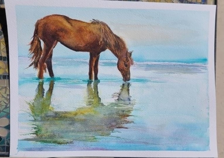
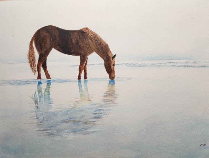
26. Final Thoughts: Welcome back and
congratulations on completing this watercolor class on painting a wild horse
in quiet wetlands. We explored how a
clear silhouette, limited palette, and thoughtful
edges can hold a large, peaceful scene, how
reflections read as shapes before detail and how generous white paper
lets light do the work. The same priorities translate beautifully to wading birds, cattle in shallows and any subject where still
water and quiet rhythm lead. Remember, watercolor painting is not just about technical skills, but also about expressing your creativity and
personal style. I encourage you to continue
exploring, experimenting, and pushing your
boundaries to create your own unique
watercolor masterpieces. As we come to the
end of this class, I hope you feel
more confident and comfortable with your
watercolor painting abilities. Practice is key when it comes
to improving your skills, so keep on painting
and experimenting. I want to express my gratitude for each and every one of you. Your passion for
watercolor painting is so inspiring and I'm honored
to be your teacher. If you would like feedback on your painting, I'd
love to give it. So please share your painting in the student projects
gallery down below, and I'll be sure to respond. If you prefer, you can
share it on Instagram, tagging me at Will Elliston, as I would love to see it. Skillshare also loves
seeing my students work, so tag them as well
at Skillshare. After putting so
much effort into it, why not share your creation? If you have any questions
or comments about today's class or want any specific advice
related to watercolor, please reach out to me in
the discussion section. You can also let me know about any subject wildlife or scene you'd like me
to do a class on. If you found this class useful, I'd really appreciate
getting your feedback on it. Reading your reviews
fills my heart with joy and helps me create the best
experience for my students. Lastly, please click
the follow button Utop so you can follow
me on Skillshare. This means that you'll be
the first to know when I launch a new class
or post giveaways. I hope this class encourages you to use simplicity and
design for impact. I look forward to
seeing you all in future classes until then Bye
for now and Happy Painting.
 Will Elliston, Award-Winning Watercolour Artist