Transcripts
1. Welcome To The Class!: Hello, everyone. My
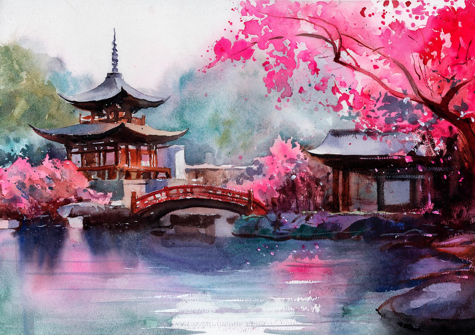
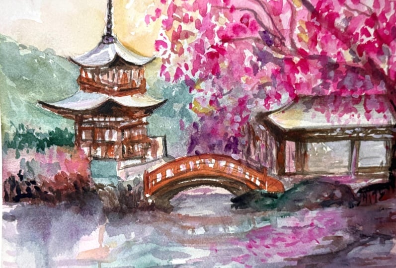
name's Will Elliston. And today, we're painting an expressive Japanese
blossom scene in watercolor. This subject is a joyful
balance of opposites. The structured shapes of
the temples and the bridge set against the loose
organic nature. We'll let a harmonious
palette do the singing, such as pinks and
magentas drifting into cool blue greens
and quiet neutrals. All around a design with
big readable shapes. Expect expressive brushwork and reflections that feel
suggestive rather than literal. The goal is atmosphere
and feeling, not perfection or heavy detail. I've been a professional
artist for many years, exploring lots of different
subjects from wildlife and portraits to cityscapes
and countryside scenes. I've always been entranced by the possibilities
of watercolor. But when I started, I had no idea where to begin
or how to improve. I didn't know what
supplies I needed, how to create the
effects I wanted, or which colors to mix. Now I've taken part in many
worldwide exhibitions, been featured in magazines, and been lucky enough
to win awards from well respected
organizations such as the International
watercolor Society, the Masters of
watercolor Alliance, Windsor and Newton, and the SAA. Watercolor can be overwhelming
for those starting out, which is why my goal
is to help you feel relaxed and enjoy this medium
in a step by step manner. Today, I'll be guiding you
through a complete painting, demonstrating a
variety of techniques, and explaining how I use all
my supplies and materials. Whether you're just starting out or already have some experience, you'll be able to
follow along at your own pace and improve
your watercolor skills. If this class is too challenging
or too easy for you, I have a variety of classes available at different
skill levels. I like to start off with a free expressive
approach with no fear of making mistakes as we create exciting textures
for the underlayer. As the painting progresses, we'll add more details to bring it to life and
make it stand out. I strive to simplify
complex subjects into easier shapes that
encourage playfulness. Throughout this class, I'll be sharing plenty
of tips and tricks. I'll show you how to turn
mistakes into opportunities, taking the stress out of
painting in order to have fun. I'll also provide you with
my watercolor mixing charts, which are an invaluable tool when it comes to choosing
and mixing colors. If you have any questions, you can post them in the
discussion thread down below. I'll be sure to read and
respond to everything you post. Don't forget to follow
me on Skillshare by clicking the Follow
button at the top. This means you'll be the
first to know when I launch a new class
or post giveaways. You can also follow me on Instagram at Will Elliston
to see my latest works. So let's get started
and paint a scene where structure and
nature sing together.
2. Your Project: Thank you so much for
joining this class. I'm very happy that you're
here with me today. Think of this painting as a conversation between
form and flourish. Let the architecture
stay calm and elegant. Simple silhouettes,
restful neutrals, while the blossoms
arrive as gestures of color drifting and echoing
in the water below. Choose a limited palette
that feels musical to you, letting warm and cool notes
weave through branches, stone and foliage and allow a few crisp moments to guide
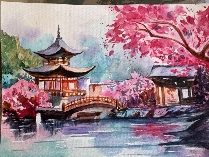
the eye across the bridge, roof line, and tree. In the resource section, I've added a high
resolution image of my finished painting
to help guide you. You're welcome to
follow my painting exactly or experiment with
your own composition. As we're going to be focusing on the painting
aspect of watercolor, I've provided templates
you can use to help transfer or trace the
sketch before you paint. It's fine to trace when using it as a guide for
learning how to paint. It's important to
have the underdrawing correct so that you can relax and have fun learning the
watercolor medium itself. Whichever direction
you take this class, it would be great
to see your results and the paintings you
create through it. I love giving my
students feedback, so please take a photo
afterwards and share it in the student project gallery under the Project
and resource tab. I'm always intrigued to
see how many students have different approaches and how they progress with each class. I'd love to hear about
your process and what you learned along the way or
if you had any difficulties. I strongly recommend
that you take a look at each other's work in the
student project gallery. It's so inspiring to see
each other's work and extremely comforting to get the support of your
fellow students. So don't forget to like and
comment on each other's work.
3. Materials & Supplies: Before we paint
this blossom scene, let's go over all
the materials and supplies you'll need to paint
along in today's class. Having the right materials can greatly impact the
outcome of your artwork. So I'll go over all the supplies I use for
this class and beyond. They're very useful to have at your disposal and will make it easier for you
to follow along. Let's start with the
paints themselves. And like most of the materials
we'll be using today, it's a lot to do
with preference. I have 12 stable colors in my palette that I
fill up from tubes. They are cadmium
yellow, yellow ochre, burnt sienna, cadmium
red, Alizarin crimson, Opramarne blue, cobalt blue,
serlean blue, lavender, purple, ridian, black, and
at the end of the painting, I often use white gouache
for tiny highlights. I don't use any
particular brand. These colors you can
get from any brand, although I personally
use Daniel Smith, Windsor and Newton,
or Holbein paints. So let's move on to brushes. The brush I use the most is
a synthetic round brush like this Escoda Purl brush
or this Van Gogh brush. They're very versatile because
not only can you use them for detailed work
with their fine tip, but as they can hold
a lot of water, they are good for
washers as well. They're also quite affordable, so I have quite a few
in different sizes. Next are the mop brushes. Mop brushes are good for
broad brush strokes, filling in large areas and creating smooth
transitions or washes. They also have a nice tip that can be used for smaller details. But for really small details, highlights or anything
that needs more precision, I use a synthetic
size zero brush. All brands have them,
and they're super cheap. Another useful brush to have is a Chinese calligraphy brush. They tend to have long bristles
and a very pointy tip. They're perfect
for adding texture or creating dynamic
lines in your paintings. You can even fan them
out like this to achieve fur or feather
textures as well. And that's it for
brushes. Onto paper. The better quality
of your paper, the easier it will be to paint. Cheap paper qwinkles easily
and is very unforgiving, not allowing you to
rework mistakes. It's harder to create
appealing effects and apply useful techniques
like rubbing away pigment. Good quality paper, however, such as cotton based paper, not only allows you to rework
mistakes multiple times, but because the pigment
reacts much better on it, the chances of
mistakes are a lot lower and you'll be more likely to create
better paintings. I use Arches paper because that's what's available
in my local art shop. A water spray is
absolutely essential. By using this, it
gives you more time to paint the areas you
want before it dries. It also allows you to
reactivate the paint if you want to add a smooth
line or remove some paint. I also have an old rag or t shirt which I use
to clean my brush. Cleaning off the paint
before dipping it in the water will make the
water last a lot longer. It's always useful to
have a tissue at hand whilst painting to
lift off excess paint. Also, you never know when an unwanted splash or drip might occur that needs
wiping away quickly. I also have a water dropper
to keep the paints wet. When you paint, it's
important to have them a similar consistency to what
they're like in the tubes. This way, it's easier to
pick up sufficient pigment. A hair dryer is useful
to have for speeding up the drying time and controlling the
dampness of the paper. And lastly, masking tape. And this, of course, is just to hold the paper down still onto the surface to stop it sliding
around whilst painting. Also, if you plan on
painting to the edge, it'll allow you to create a
very crisp, clean border. And that's everything you'll need to paint along
in today's class. But please, if you want to experiment with
other tools or colors, you're welcome to test them out. Let's sketch the scene out.
4. Preparing The Composition: So this painting
has a balance of structure and a lot
of organic elements. So the man made structures such as the bridge, the temple, the pavilion, kind of
anchor or the chaos that's going on with
the organic trees and the misty backgrounds
and the water. But even still we start off with very organic shapes
with a loose pencil. I'm repeatedly going over the same lines just to
kind of map it out, and then I'll swap to a
finer pencil later on. Of course, before any
painting goes down, it helps to understand what
the composition is really balancing because that balance is the reason the scene
feels the way it does. We have two worlds living
together on the same page. One is the organic blossoms, the foliage, and the other, of course, the temples
I was talking about. So when those two
worlds are mapped out, it'll allow us to be a bit
more intentional with paint. I'm not thinking in terms
of drawing every detail. With the man made options, the structural kind of
objects like this temple, I have to be a bit more
defined than the trees, but the trees are
just very organic, marked out quite roughly
because they are organic, will allow the paint to do
most of the work for us, so we don't need to be
so precise with that. These shapes stop the whole
image from floating away. So there's a bit
of back and forth. I'll have to use the rubber to soften it up and then go back
to refine it a bit more. But let's get on
with the painting.
5. Mixing The Colours: So let's start by pre mixing
some of the colors because color is actually the most important
element in the scene. It's vibrant pink
and the contrast of the greens that really makes it eye catching
in the first place. And there's an interesting
interaction between this cobotle viridian mix and the opera pink
that I'm going to use. I'd just like to
quickly add that I put my opera pink in the same
pan as my Alizarin crimson, which is second from
the bottom on the left. I treat it as the
same color family, but it's only really
a guest appearance. So I add it in with my isn and crimson that's always
there because eventually, I'll use it all up
and it'll blend into each other in
an organic way. I don't really want to have a separate pan just
for opera pink, and Alizarin crimson is
the closest color to it, so I'm fine with that. You can see which opera pink
I'm using on the screen. I don't even know
which brand it is. It's just this random cheap one. I think it was the
cheapest one I found in the art store, so it
really doesn't matter. I know that Daniel Smith, possibly Windsor Newton have
their equivalents, too. So whichever you use,
it's perfectly fine. I in fact, am mixing Elizarin crimson into
that opera pink, so it's not a pure opera pink because it's just
too artificial. For a blossom tree. But notice this purple
that I've just mixed is made from this opera pink
and the viridian green, which I always think is very odd because usually when
we think of purple, we think of red and
blue mixed together, not pink and green, but it happens to
work perfectly, and we can actually
use that purplish blue for the distant
trees in the background, even though they're made
up of pink and green, they look like a completely
new different color.
6. Soft Trees: Now we have the colors mixed up. I'm pre wetting the area where I want these
pigments to flow. Basically, I'm keeping
the sky white, but I want the trees to kind
of blend out into the sky. That's why I'm just pre wetting the paper so there's
a nice soft edge to them. I also want to add that like how I'm using the opera pink
in the sarin crimson, I'm also inside the
Vidian green pan. I'm using cobalt teal
by Daniel Smith, again, because they're in the
same family of colors, and they just have a slightly different granulation
and quality to them. So I think it'll create
an interesting effect, but it's not important
for the painting. If you've just got Varidian
or if you've just got bot blue, the painting
will still work. It's adaptable. It can be experimented with and
adapted to your tastes. So I'm pretty much wetting
the whole of the sky. There may be a few edges
around the temples that I want to stay away from. But the first application
of the paint is very light, barely perceivable, just
a bit of opera pink. Because as I was
saying, I just want it to blend out into the white of the paper and very gradually just tapping it out a very overloaded brush
so that rather sucking water or liquid from the
paper, it's dropping it on. Now we can work down to where
we marked out the trees with pencil and drop that cobalt teal
Varidian mix in there. If you don't have
cobalt blue teal, you can just use
Varidian and mix in a bit of Cerlean or turquoise. If you look at my color charts, you can see how to achieve
any color you want without having to specifically
buy all the paints. Now, I'm taking this
purple kind of mix, and it's an interesting purple, bluish kind of purple. Again, mixed from
opera pink and Vidian. It's interesting
because the ridian is a very thick pigment. It it's diluted, but
the granules in there, the particles are quite large. So they land in the
grooves of the paper a different way to the opera pink because the opera
pink is so fine, so small, you can't
even see the granules, the pigmentation in there. So when mixed up on the palette, it looks like a solid kind
of purply blue color. But you'll see when you apply it onto the
paper how over time, the texture of the paper
creates a unique effect because they land on top of each other and create that effect that can only be done
with watercolor. It can't be done
with acrylic or oil. So I'm applying these strokes in between the green
that we just did. Nothing too precise, fading
out with a nice soft edge.
7. Blossom Underlayer: Now whilst the area
behind the tree, the blossom tree is
still wet wet paper, we can start adding this
pink to the background, getting nice soft edges because I don't want there to
be hard edges all the time. I want there to be a few
controlled hard edges later. But to create that
feeling of depth of form, I want there to be
some soft edges here, and we achieve that by
applying it onto wet paper, wet on wet, as they say. And then gradually as
the paper starts to dry, the shapes will be
a bit firmer and we can go a bit darker
with the pigment. You can take your time to look at the temple on the left and see how I haven't
painted over the temple. I've painted around it, so I allowed the edge of
that to remain clean. Allowing a few white
gaps in between this pink because again, it's just an underlayer
to begin with. Now there's a different kind of green we're using
in ascender here. It started off with
aridian but I used yellow ochre to give it a
kind of a warmer green. The turquoise green is
obviously cooler because it's got turquoise in. Turquoise is a cooler green
than the yellow ochre green. There's not much of
there, just an influence. Mixing more of that
purplish kind of gray. It's these kind of
things that require experimentation because
I would never have guessed that green
and pink would make a more purple color because usually they're
complimentary colors, which would mean a gray. So green and red do make gray, but I guess because the pink is a cooler red and the green
is also a cooler green. They somehow mix
to make purple. Y.
8. Background Trees: Now I'm going to start to add a bit of that yellow
ochre green on the left hand side just to stop it from being
too monotonous, using the same green everywhere. But it still uses
that Vidian in there. So even though it looks like a brand new color,
it's like a cousin. It's still connected
because it's still got that green in there that is the same green in
the other green and has this harmony
that isn't obvious, but it's not like a
completely random color. Painting underneath the
curve of this temple. Now I'm going to start
to add a richer, darker green, again, mixing the green and the
pink to make that purple. The thing that excites me about this painting is that
it gives us the chance to combine several really
interesting ideas at once. So we have the architecture
of these temples, which gives us structure and
clarity anchoring the scene, and then we have the
blossoms and the water, which gives us softness,
color, and energy. And then how these
relationships, these two opposites of
structure and organicness, so to speak, overlap
and connect. Learning how to let the big color masses do
most of the work, especially when we add
this rich pink later on. At the moment, we're
just chiseling away, negatively painting this temple, creating a bit of atmosphere,
elusiveness to it. And then of course, we'll use these darker
structural accents like the pagoda, the pavilion, the bridge, even the trunk of the
tree to anchor it down. So all these atmospheric
shapes that we're doing now that are quite
random and elusive, they have something
solid to play against. So this is where we should be
most playful at the moment, not being so defined. It can be a little bit lighter, it can be a little bit
darker. It's perfectly fine.
9. Pink Foliage: Now I'm going to start adding some pink bushes in the
foregwd in the front, but you've got to make sure that the edge the green bush above is completely dry or
at least don't touch it. Allow a little gap
because you don't want it to contaminate and spill across. We want there to be a nice
hard edge on this bush. So I'm just filling the area in, but instead of it
being a flat wash, I'm dropping in inconsistencies, so different thicknesses of
pigment, maybe a bit later, some pure water, a bit of cadmium red
into that pink mix too. Just so that it's not a boring
wash. You can experiment. Maybe you want to add a
bit of purple in there. There's different options
or ways to play with that. Separating the edge
at the bottom, too, allowing some of the
white of the paper to stay. And creating that unevenness, like, creating a
bit more distortion gives the illusion of detail. It's not something that
I'm consciously planning, but if it was flat, it
would just look a bit odd. So messing around with those inconsistencies
gives a bit of life to it. Similar thing here with
this bush in the middle. Fling it out, and I'm trying not to touch the area above
that's still a bit wet. You could, of course, use a
hair dryer to dry it out, but I'm risking
it at the moment. I can see that it is being
slightly contaminated. It's touching the top of it, and some of the grayness
is spilling in. So I'm aware of that
and might have to get a tissue to dry
it out that edge. I can use the tissue to further disturb the textures
on the left, creating, again, the
inconsistencies, the areas that are drying
faster than the other areas, even dropping in some of that viridian in there and you can see how it doesn't
look green. It looks gray. So varying the tone a bit. This opera pink looks much more vibrant when it's wet
than when it's dried, so I'm countering
that in as well. Blending out the edge
a bit more there.
10. Playing With Edges: Now I'm going to add
a bit more depth to the scene by adding
a few more layers, so I'm going to darken the trees up at the top,
just a little bit. Using a nice mid tone
green because we've got that nice soft brush work in the background that creates that feeling
of atmosphere. And then as it gets closer, it gets a bit more defined. And whilst we're
painting this bit, I just wanted to talk a little bit about how I never
want anyone to feel like a painting is too
advanced for them because this can be seen as quite a
complicated painting and put a lot of people off, but they shouldn't feel that they need to wait
until they're better before they attempt
something that feels ambitious because while I
understand why the fear exists, because we all want
our paintings to look good and it's easy to assume that difficulty
equals failure, but actually, I found the opposite to be
true for me, at least, especially when learning because the paintings that taught me the most were often the ones that felt slightly out
of reach at the time, the ones that
looked intimidating and ones that I knew wouldn't actually be
a complete success, but they're the ones
that made me think. And I may have had no idea how I'm going
to pull this painting off, but because of those paintings, they were the kind of paintings
that forced me to grow because they didn't allow
me to stay comfortable. They demanded that I
look more carefully, that I had become more curious. And that I develop my own way
of solving problems rather than relying on a routine that only works when
everything goes smoothly. When I was teaching myself, I didn't actually have
someone beside me to ask, What do I do here or
why did that happen? Or how can I fix this? I had to learn by
noticing what went wrong and turning that moment into a question and then chasing an answer as
honestly as I could. And the truth is, those questions are where the real improvement lives
in a difficult painting, it doesn't just test
your technique. It creates situations
that you can't ignore. It puts you face to face with the exact edge of
your understanding. For example, you may lay down a wash and suddenly
get an unwanted bloom. And it looks like the paper
has betrayed you somehow, the medium is just
not working for you. But instead of seeing that as evidence that
you're not good, you can turn that moment
into a useful question. Why did that bloom happen? Was it a difference in wetness? Was one area drying faster? Did I introduce
wetter paint into a surface that had
already started to set. And then when you start asking
yourself these questions, you begin to see watercolor as something that
you can understand, not something you simply
hope will behave. And sometimes the
question goes even further because you
realize that what you called an accident
might actually be a gift if you learn
how to invite it. And that's when the work
becomes exciting because instead of trying to ask how to eliminate
blooms entirely, you begin to ask, how can
I create them on purpose, and how can I place
them so that they feel like atmosphere rather
than a mistake? How can a bloom become mist
in a landscape, for example, this is the kind
of thinking that transforms your painting
because you stop seeing watercolor as a
battle against accidents and start seeing it as a way to turn even messy parts into
something meaningful.
11. Building Underlayers: Now I'm using a very light wash to paint some of the underlayer tones for the
buildings and the bridge. Just a light kind
of pinkish brown, really, just to take the
whiteness of the paper off. To go back to what I
was talking about, the same goes for
all other challenges that only show up when
you push yourself. You might attempt a scene with glowing light
and you realize you can't get the brightness you want you can turn
that into a question. Is your light being stolen by too many darks or by
too many midtones, or are you giving the light
a clean place to exist? For example, with this painting, we need the pink to glow. We can't use dark
tones with the pink. So in order to make it glow, that's why I added that dark
green above the bush there, and why this building will have some dark
tones and the bridge, and even the trunk
of the tree later on will really contrast with the brightness of the
leaves to make them pop. You might attempt this scene
and think it's quite busy, and maybe it becomes too
chaotic. That's a good thing. Then you can turn
that into a question, and you can ask yourself, you lose the big
value structure? Did you allow too many
competing accents? Did you forget to simplify everything into a
few clear groups? A difficult painting makes these questions quite
unavoidable because you reach these points where you
have to learn to ask them. You start building
a skill that is far more valuable than
any single painting. You build the ability to
diagnose and to problem solve. And that's the real
skill of painting, not actually producing
perfect results every time, but becoming an artist or someone that can respond
to whatever happens, especially with watercolor
when it's so unpredictable and h. Things have to change, and I could say one thing now
and then contradict myself later because the watercolor has kind of forced this change. So this is also why I'm such a believer in letting
yourself attempt paintings that are beyond
your current level because the goal is not to
get a flawless final result. The goal is to learn
something real. Even if your painting does not turn out the
way you imagined, you'll almost always
discover something useful and that discovery
becomes your progress. That's why when I give
feedback to students, even if they're not happy, I actually see their results
as a more successful result than if they were happy with it because it means
they've really pushed themselves and they're
doing something that is uncomfortable to them. And in that process, even if
they're not conscious of it, they have learned
something in that. Even if they can't
put their word on it, their intuition has
learned something, and their next painting
will be even better. It might be something as simple
as realizing that you can actually be looser than you thought and still create
something readable, or it might be the
moment you notice that your best passages or washes happened when you stop trying to control
every single edge. So those lessons do not arrive when you only paint
what feels safe. They arrive when
you give yourself permission to step
into uncertainty.
12. Water Underlayer: Now I'm starting to paint the underlayer of the
water and the reflections. When I say underlay, it's really just the main thing because we'll only come back with
a few details later, maybe some ripples or shadows
underneath the rocks. So I'm pre wetting the
paper first and only subtly mirrowing the
colors from above. So we have a slight
greenish kind of color with the background
trees in the middle. And then we'll add a bit of
pink on the right hand side. But I think you'll
notice in this class, I'm not really going into every single detail
of what I'm doing. And it's not because
I'm trying to make things harder for you or
keep anything hidden. It's because I generally
believe that one of the most valuable skills you can develop is the ability to notice what's
happening and turn it into a clear question and then explore your own
way towards an answer. That is how I taught myself, and not having that quick fix when reaching a point of confusion can get you
to slow down and think, what is actually going on
here? Why did that happen? Why do I need to change, and what happens if
I try the opposite? Of course, you can ask
me these questions in the discussion
section as well. But actually, a lot of
the questions are quite personal to your own
tastes and vision. So you can ask yourself, what is actually going on
here? Why did that happen? Why do I need to change that or what happens if I try
the opposite or wait a little bit longer or use a little less
water or more water? What happens if I simplify
this shape a bit more? That process of questioning is what created
my understanding, and I think it will help improve
your understanding, too. And I don't want to rob you
of that same opportunity. If I narrate every
single brushstroke or explain every little
adjustment, yes, you'll be able to copy the painting more easily
in the short term, but you'll not necessarily
gain the deeper skill that transfers to every
other painting that you do outside of a class. When you learn how
to ask yourself the right questions,
you become independent. You become someone who can
sit down with any reference, any subject, any
lighting situation, and eventually make sense of it. And this is what I want for you. I want you to be able to
paint without needing me and still feel
grounded and capable. Especially in this wash
that we're doing right now, which is very random
and personal. Like, the colors don't
make that much sense. I'm not consciously
thinking about it. It's more intuition. I've left this
little white gap in the middle with a
few ripply lines, but it's quite organic shape.
13. Bridge Reflection: There is another reason why
I'm taking this approach of talking about something
bigger than technique. A painting like this is not
only a technical exercise, but an opportunity to explore mindset and
decision making, because it's actually
quite a loose painting. We've got a few details
to give its structure, but a lot of organic, random shapes, it almost
looks unfinished by the end. This scene is about balancing
structure with softness, clarity with suggestion
and control with freedom, which is the main
aspects of watercolor and allowing that atmosphere to exist and letting
the paint breathe, accepting that watercolor is at its best when it's
allowed to move and speak. And those ideas are quite
hard to communicate when giving you extra detail on all the different
actions that I'm making because a lot of them are quite repetitive and need to be observed rather
than explained. So for this class, I'd like to use some of the time to help you see how
the painting is held together and while
it feels the way it does and what kind of
thinking creates that result. Because once you understand
that way of thinking, you can really apply
it to anything, not just these
blossoms and temples. Right here I'm playing around. Now that we've added the wash, I'm dropping in pure
water as well as drops of opera pink, seeing how that will end up not something necessarily
that you have to do, but you can explore that. Maybe you want to use
a different color. Maybe you can use cobalt
teal green or viridian. Of course, when I
make classes that are specifically aimed at beginners, I tend to do the opposite. I focus much more on the fundamentals and the practical techniques
step by step because that is what
beginners need most or want to build that confidence, that
initial confidence. They need clear steps
or clear definitions and a simple path to follow so they don't
get overwhelmed. But if you're
watching this class, especially up until this point, it's very likely
that you already have somewhat of a foundation. You already understand how
watercolor behaves in general. You have a sense of
timing, layering, how to control your
brush somewhat, and most importantly, you already have the
ability to observe things. So you can see what's
happening on the page. You can notice when a
shape is becoming too busy you can tell when something needs to be
softened or simplified, and you can start making
decisions without needing me to overdescribe what I'm doing. You can see what I'm doing and kind of work it out with your own personal
interpretation. So as you follow along, I encourage you to watch
it in that kind of way.
14. Pagoda Underlayer: If you look at the painting
so far at this stage, you can see that it's
basically just mid tones. Of course, we've got some
whites on the paper, but we're going to paint
over that except the sky. So now we're going
to start working on the building and start to
use a bit of a darker tone. So I'm using a muted
purple at the moment, but the most important
part is that it's muted. I don't want it to be a big
glaring color at the moment. It's almost like a gray, but with a little
bit more vibrancy. I don't know why I chose purple, maybe because we've
already got a bit of purple going on in
the composition, but it could be a muted
green, a muted pink. I really doesn't matter. So
working from the top down, What I'm trying to work out is the tones
more than the color because we've got some areas where it's light behind and some areas where
it's dark behind. If you look at the
top roof section, on the left hand side, it's a darker background, and on the right hand side, it's a darker roof with
a lighter background. Now working on that
second layer of roof. And I've slightly
changed the color there to a kind of brown color, just for a bit of variation. A lot of these decisions
aren't set in stone. They're just kind of whimsical. It's spontaneous decisions. I'm using a smaller
brush as well since I've been painting this building because it has a nice point. The other areas were
quite large shapes. I'm making this
wash a bit varied. So we've got a bit of purple
on the left hand side, and it transitions to a brown
on the right hand side. And I'm even dabbing a bit of blue turquoise kind of
color at the top there. Even when it comes to
painting this building, which is a man made structure, not so organic, we can suggest detail
rather than paint it. We're going to allow a few
hard edges to support it. But even with the hedges, those pink hedges, you can
see those hard edges, too. So this painting has got
a real contrast in soft, ambiguous edges and
hard edges, as well. But all of it is
fairly ambiguous. Like, especially at this stage, you can see most of it's
under layer at the moment, and everything's
blending and merging. It's almost kind of dreamy. I mean, in a kind of like
a surreal kind of sense, it's definitely making the most of our artistic license in this painting. Scrubbing
that bit there.
15. Arcitectural Bits: And now I've dried it
out completely with a hair dryer so that
we can go back to this building with a darker tone because as I was saying before, most of it is mid tone. We don't even have
any strong darks, maybe just above that
hedge, that pink hedge, on the left hand side, we've
got a bit of darkness, but now we're going
to be painting the woody parts of the
building and the bridge. So I'm just using a
burnt sienna for that. You can see it's a lot
thicker, a lot richer. And here's where I really
rely on the drawing because everything else
is a bit ambiguous. But these windows here, this kind of small
bit of detail of sharpness is what
really anchors it. And gives it that sense of form, kind of
makes sense of it. I mean, it doesn't
have to be accurate, but we just got to create
some sharp details that kind of give
structure to the piece. We don't want everything
to be completely wavy and random and organic. But before you even get to painting all these
architectural details, it's wise to take a
step back and look at the painting as a set
of big relationships because really the
strength of a scene like this is not in the
tiny little details. It's how the large shapes speak to each other
across the page. What I was trying to work out in my thumbnail sketches and preliminary drawings is the kind of balance from left to right. On the left, we have the pagoda, this building structure
that we're doing now, which gives us this kind of lovely upright
structure shape. Okay. It feels somewhat
elegant and stable. Then on the right, we have
a big blossom canopy. And later on we'll
define that as well as the dark trunk mass that will help lead
the eye across, too, and it'll feel much
looser and more organic. But they are just as
important visually. So already, we've worked out, at least with the
composition in mind, this contrast of the
architectural and clear on one side and
something softer and more abundant around it. And neither side, hopefully
will feel isolated. We connect it, and
that's why the bridge is such a useful element
in the middle. And it's an important
shape because even though it's smaller than the
pagoda or the blossom tree, it does a lot of quiet, subtle but important work. It links the two sides together, which is always important
in the painting to have everything linked and connected. It gives the eye a natural
pathway through the painting, and it adds a gentle curve
to a scene that otherwise has lots of verticals
and horizontal passages, as well as the reflection
of it in the water as well. So the bridge is actually more
than just a little detail. It's a compositional hinge. It wouldn't really
work if it was a solid straight bridge. The fact that it's curve adds this kind of
flowing element to it. And then we can talk
a bit more about the water when we get to
the ripples later on.
16. Painting The Bridge: So now we can paint the pavilion on the
left and the bridge. And whilst doing that,
we can think about the difference or variety
in shapes that we can include in this painting
and how they interact. Because we're painting
these roofs at the moment, and in a minute the
archway on the bridge. But then they're
going to contrast with the soft blossoms
that we're going to add and the distant trees that are softly
fusing into the sky. The water has a kind of
horizontal element to it. And each of these shapes belongs to a different
visual family, so to speak. And the painting kind of
comes together from letting those stay distinct enough
to play off one another. If we made everything soft, we would lose the structure. And if we made everything
sharp and defined, we wouldn't have any
atmosphere left. When painting these
bridge details, I'm not being so neat and precise with all that
architectural detail. In fact, I'm trying
to achieve a kind of dry brush mark as it sounds, getting rid of the
moisture on my brush and using the tooth or the
paper to create that texture, did it a bit on the
pavilion as well. You might have to
have a little tissue if your pigments are
too wet and runny, or you can use a sponge like
I've got in the top corner. But often I have paint that's dried up on my palette and
I use that dry paint to help dry out the paint that's on my brush to achieve
that dry brush effect. Also, tilting your brush to the side rather
than the point, helps to achieve that dry
brush effect as well, because we're not pushing hard into the teeth of the
paper, the valleys. We're just touching the surface. And this only works
on textured paper. H.
17. Dark Tones: So we've done the underlayer, and then we went back and
did this brown layer. And now we're going
to go back for a third layer to add
the darkest dark. So I'm using pure black now. And this is really
what's going to make it pop and give it structure. I'm not going to use the
black anywhere else except the architectural bits
that anchor the scene. Maybe on the right hand side of the painting with the branch
and the trunk of the tree, I'll use some dark pigments, but definitely not full
on black like here. And although we haven't
painted the tree yet, I think it's helpful to
notice that the center of the painting is not packed
with the heaviest objects. There was a bit more atmosphere
and light in the middle. And that design choice is because it stops the middle
from becoming clogged. As I mentioned before, the bridge works as
a bridge to connect. It allows the eye to move
through the scene rather than bumping into
overloaded information. We can see this pagoda
on the left hand side. I'm using thick
pigment to begin with, and then pure water
to fill in the gaps. And then I allow the pigment and
the water to react the way it needs to
react within that space. And then once it's
runny, I can just use the brush to fill in
the gaps on the paper. I don't need to go back
to my palette that often because it's
already wet enough. I can just repurpose the moisture that's already
on the paper and the brush. Now on this second roof, going back to that black, and I'm using the brown mixture
I've got on my palette. And it's just filling
in that space and then connecting it to the brown that we've
already painted down below. This is where value is
more important than color. It doesn't really matter because we've already
got the brown there, and then the black, I see more as tone than color. One of the first
things I want to understand for a painting
is the value structure, because that is what quietly holds all the color and
the atmosphere together. And it's actually much simpler than it might
seem the value design, keeping it simple is
what makes it strong. I mean, of course, we've got
a little details in here, but that isn't really to
do with the value design. We have the blossoms, of course, to come later,
which we need to think about. But these buildings, the water, all these little visual events going on throughout
the painting, it's really just resting on just a few carefully
organized value families. It's not actually a painting
full of high contrast, even though we have some
contrast in some areas. It doesn't rely on
strong darks everywhere. In fact, I'd say, even though we're painting the
darkest areas right now, one of the reasons the
painting is what it is because of the emphasis
of middle tones, how much of this painting
is just middle tones. Blossoms are going to
be in midtones, too. We do have a handful of dark accents to give
that scene structure. But once we recognize that, the subject becomes
much easier to manage.
18. Bridge Shadows: Darkest shapes are doing
a very practical job. And we've basically
painted them in already on that
building on the left. We're doing a few
more on the bridge here and then some on the
pavilion on the right. Maybe also for the trunk later, but I'll have to use my
judgment when that time comes. But basically,
these dark accents are what give the painting
enough weight and definition. And without them,
Ath would feel a bit too soft or a bit
too similar in tone. With all paintings, but
especially a painting like this where everything
can be a bit expressive. I find that it's helpful to keep squinting your
eyes at the scene, and that helps reduce all
the detail and lets me see whether the larger value
pattern is still working. If everything starts collapsing into one general middle tone, then I know I probably
need to regroup the dark or recover
some lighter passages. If I can still clearly
see the main anchors or the soft blossom masses
or the pale atmosphere, then the structure is
probably still doing its job, and then the little details are just bits of add ons to help
boost the scene a bit more, not the main structure. So it's a good subject
for reminding us that color and value are not actually the same thing because a blossom might
be bright pink or magenta and still sits in
the lighter value range. Adding a bit of form
to this foliage. That this darkness of the
shadow makes the pink pop. It's one of the
things that helps watercolor stay luminous
using that contrast. And we can have plenty of color without making
everything very heavy. So while I'm working
with these dark tones, I'm really trying to
protect that hierarchy. What I mean by that is
the value structure here is giving the
painting order. It's helping us
separate what needs to stand forward and what
needs to say softer.
19. Using Thick Pigment: I know so many of
you like to explore your own unique voices
and interpretations. So in a scene like this, there's plenty of opportunities to mix it up and experiment. It's not a subject
that depends on exact replication because
it's built from mood, color harmony, soft atmosphere, grouped masses, and a
few structural anchors. But this means that we can make different choices each time and still create
something beautiful, convincing, and completely
unique to your own. Because as you go
through this class, I don't want you to think that my version is the absolute,
definitive, correct way. It's just simply my version. It's one way of arranging
the blossom masses, one way of balancing the architecture or
softening certain shapes or dealing with the reflections or even what mood I'm creating with the colors
for the whole scene. It naturally allows for
variation because of its expressiveness and almost randomness in so
many of the washes. We can make the blossoms
softer or bolder. We can make the architecture
much more simple if we want, or much more precise if you want to draw it out and
take more time of it. You can change the
colors as well. We can make the water
a bit more reflective, like a mirror or even
more abstract and misty. So like with every class, I want to give you permission to let your painting
become your own. You don't need to
match mine exactly. You don't even need to
use the same colors or even the same
pink that I use. I say this because
it's important that students know if they ever feel discouraged when you notice your painting is drifting
away from the demonstration, it's so easy in that moment
to think mine is going wrong when really it may simply just be becoming different and different
is not failure at all. In fact, in a class like this,
specifically this class, difference is often a sign that you're responding
to the subject in your own way because it
relies on that intuition. You can't plan everything
out to this paint. That's often why I talk
about principles rather than specific techniques
because when we understand a shared set
of principles and allow those principles to produce different results
in different hands, we create a very interesting
student project gallery and can learn from each other. I see things in students' work that make me think,
why didn't I do that? Just little things that can't be planned and are very magical. In a way, it's what makes
watercolor so exciting. It's not a medium that rewards rigid control
in every moment. It often rewards sensitivity, openness, and a willingness to respond to what's
happening on the page. So if one of those
blossom passages blooms a little differently or your water turns out to
be a little cooler or your composition feels
slightly more open than mine, that's not something
to panic about. It actually might be where
some of that charm begins. I also think that there's
something freeing in realizing that the demonstration is not the finishing line, it's purely a guide and a companion, a
starting off point.
20. Painting The Branch: Now it's time to paint the main eye catching
element of the painting, which is the tree, the main blossom tree. And we're going to start off painting the branches
from the trunk, using that same kind of brown color that we
used for the buildings. Just to get the structure.
And these branches actually work as leading lines. So this tree is most well, the major part of the
painting for several reasons. And it's the reason
why the scene feels so rich and cohesive. First of all, it creates a strong visual weight
on the right hand side. And without that, the pagoda
building on the left would dominate too heavy and the painting would
lean in one direction. But this tree gives
us a counterweight, but in a very different kind of language, a different vibe. As I said before, the building
on the left is structured, but this is very
organic and irregular. So we're not balancing
like with like, we're balancing clear man made form with
loose natural mass. And that contrast is what makes the composition feel interesting
rather than predictable.
21. Painting The Blossom: So I've added some splats of pure water on top
of these branches, and where we'll paint the green leaves just to create that
unpredictable ambiguity. And when I get to this
blossom area of painting, one of the biggest things
I try to remind myself is that I'm not painting
hundreds of separate flowers. I'm painting masses of
color and atmosphere that reads as blossom because of how they're all
grouped together and how they sit in
the composition. And how their edges behave because we've added that
soft pink in the background, and now we're adding
the hard edges above. And I'm using the tip of my brush and just twisting
it back and forth, trying to create that
well, mimicking nature. So that shift in thinking is really important
because the moment we start treating every blossom like a tiny individual object, the painting can become
very stiff very quickly. So if I ever feel like
I'm tightening up, I purposely go a bit
mad and splatter and do something crazy just to break that stiffness and
get fluid again. And what I think makes
blossom scenes look so intriguing from
other artists. And what I'm trying to
convey in this one is not that accuracy of every flower and branch and every element. It's that sensation of abundance of softness,
that lightness, the use of pink that
you can't really use so strongly in other paintings and how they all gather
together in these, like, drifting little clusters. So rather than asking myself, how do I paint these flowers, I find it much more
helpful to ask, what's the overall
shape of this mass? And you can get various
reference images, and you can squint to see how the mass as a whole
reads compositionally, whether it's
balanced, where it's denser, where does
it soften out? Where does it break
up into the air? Almost think of them
like cloud forms. And notice where
the larger areas sit and where the blossom
clusters are thickest, where they overlap branches, where they overlap each other. And when they start
to fragment towards the outer edges and get
a bit more detailed, I'm using splatters
now to create a lot of basically flowers, but I'm not painting
the flowers. I'm just splatting
them on. It saves a bit of time and also
keeps it organic. They're really a kind
of organized chaos. They are regular,
they're broken. They have little gaps
every now and again, and the more you overthink it, the more that nature
of it gets lost. It's very easy to
do. But the fact that they have those gaps
and some are softer, some are denser, that's
what makes them feel alive. If we painted them all with the same little repeated
mark and the same spacing, they'll feel too
decorative and flat. So it's better to get them
more abstract than too tight. Keep a lot of variation in them. Some soft areas,
some misty areas, almost just a kind of pink haze, as you can see, I'm
softening it out.
22. Painting The Pavilion: We have all the elements
painted in now, basically. We just have to tighten it up, darken some areas out, soften some areas, maybe
refine, maybe soften. And then we'll add the
water in a bit later. But by now, you can see
what has the visual weight. The pacoda building on the
left has a lot of weight because it's dark and it's
structured and recognizable. And then the blossom
above has a lot of weight because of its size, its color. And later on, we
might have to darken that branch or add a
strong trunk to it. So we have the two major
anchors one on either side. And then, of course, as
I was saying before, the bridge sits between
them to connect them. Because when you hear
the word balanced, it could mean or you can imagine that everything needs to
be evenly distributed. But that's not really
what's happening here. They feel different, but they hold the same
amount of weight.
23. Some Rocks: Now I'm going to
do a little bit of soft blending flowing with the water using that thick
pigment that we put on before. I'm going to apply some
different pigments. This is a viridian at the moment and put some on the
rocks above and then use pure water to just let
it flow down all by itself. And this water is doing
something quite important too, compositionally,
because it's giving the whole scene
space to breathe. Without the water, the
painting could feel too crowded because we
already have blossom, architecture, foliage, and a lot of tone and color activity
happening in the upper half. And it's easy to feel that we should compensate for that at the bottom and
match it somewhat. But we're really going
to keep it quie abstract and allow the watercolor to
do whatever it really wants. It doesn't really
relate to what's above it opens everything up. And it also creates this
kind of calm element to the lower half that reflects and softens what's above. It's not like a mirror. So when we look at
the composition, we're not just thinking
about objects. We're thinking about where the
eye gets to rest, as well. Which is it's a strange thing
to think about, really, because when we paint, we want to paint things that are interesting and captivating. But sometimes it's nice to allow an area with
not much going on, like, trying to create
that calming effect. So I'm very roughly sculpting. I wouldn't even say sculpting, just cutting away some rocks. In the bottom corner,
very abstract. Just using the pigment
that we already had below and keeping the color scheme somewhat related to the rest. I mean, we've got
this kind of redness. This kind of it's a muted pink, really, a maroon kind of
color, along with the purple. The bluish kind of thing. The blue goes well with the kind of brown
maroon color as well. And this thick pigment that we've applied on
the left hand side, I'm going to wet and I'm
using a large brush, and I wet the whole
area to begin with, and then I go back
to agitate it. So I'm allowing the water to move the pigment by itself
now. I can encourage it. But to get that feeling of reflection with it not being a mirror and allowing that softness
to come through, I really have to allow the
watercolor to do it itself. Then we can start bringing it down all the
way to the bottom. I don't mind if there's
a bit of texture. It's really just
playing around at this stage, having a bit of fun.
24. More Shadows: I've seen after replying back and speaking to so many
students who have shared their projects and
written a bit about their process and
experience of it, that they're much
more satisfied with their painting if they watch
the whole thing through first and then paint afterwards at their own speed or then going through
the video again, pausing step by step. Because I don't want this to feel like a sequence of instructions that only
works for this one image. I want us to understand the principles underneath
what we're trying to do, because once we
understand those, we can take them into all kinds of future
paintings as well. So yes, of course, I try and have somewhat of a step
by step element to it. And visually, you can see
everything that's going on. But while we're doing that, I want to keep on asking
a deeper question, which is why does this choice work here or what
is the principle behind it? For example, when we
group the blossom into larger masses instead of painting all the
flowers individually, we're not just following a step. We're learning
something more useful, which is that abundance usually reads more beautifully
when it's simplified. In other words, how
grouped shapes often feel richer than scattered detail. That is a principle we
can use again and again, whether we are painting blossom, foliage, clouds, or
even crowds of figures. And the same is true
when we simplify the pagoda building
and the bridge. We're not simplifying them
just because it's quicker, we're simplifying them because in an atmospheric
painting like this, a strong silhouette and a clear design matter more
than excessive detail. Another example, when we soften the reflections
in the water, it's not just a step to copy. It's a way of understanding
how reflections behave in an atmospheric
expressive painting. They usually work best when they feel like softer echoes
of the world above, not exact mirror duplicates. If we understand that principle, then later on in another
class or in our own painting, we can apply it to a river upon a wet pavement or a seascape.
25. Adding Some Ripples: Just a few more adjustments to do before we can call
this painting done. I think I need to darken some
of this trunk and branches. A few smaller wispy ones
to connect everything. I talk about adding your
own interpretation to this, which can feel very overwhelming because you can look at a
finished painting and think, How on Earth can I change it or adapt it to my own vision? One of the best ways you can start is by changing the
color or playing with color because I
can understand how it's difficult to change the drawing or the
composition as a whole, especially if you're
building confidence. But color feels a bit
more approachable. I can give you a way to
make the painting feel like your own without needing to
reinvent the whole scene. And with a blossom kind of
garden subject like this, it's one of the most
natural or organic forms of experimentation because we can just switch the colors out. For example, you don't need opera pink to paint
this painting at all. You can just use Alizarin
crimson or cabium red. I did mix camiumRd into
this opera pink anyway. It's not pure opera pink. You could make the
blossom yellow or cooler. Maybe you can make it a bit
more lilac or lavender. Maybe you can, like, forget that it's blossom and just paint it
as a regular tree, a different kind of green. You could create a
version that is sunnier, feels a bit warmer, perhaps more like late
afternoon or early evening. And to do that, we could move the blossom towards a kind of peachy salmon warm
rose kind of color. Soft apricot tones, so to speak. The light in the mist could have a faint golden
warmth rather than this cool green at the moment. And then the water can pick up that ochre feeling, that warmth. We could still have
cooler notes in there, but they would be more of a gentle supporting
role rather than the big vast screens we have at the moment or the
coolness in the rocks. That's just one
way we could make the scene completely different just by changing the colors, making it more
glowing or radiant. Maybe the architecture
could have warmer browns and be a
bit more red than yellow. You could also experiment with a monochrone version because it might be overwhelming
all these colors. Maybe you just use
gray and pink. Those are the only two colors. You use gray fat,
everything else, the distant trees, the building, and use pink or Elazar and crimson for the trees
and the reflections.
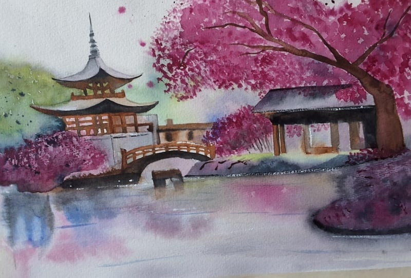
26. A Few Highlights: I hope that as you
finish this painting, as you're tying
everything together, you don't feel that you've simply followed a
sequence of steps. I hope that you feel that
you've understood some of the ideas underneath
the process as well. Things that I've touched
on a few times now, grouping the blossoms
into a larger mass, using architecture as an anchor, balancing warm and cool color, and keeping the reflection softer than a world above them. Those are the kinds
of principles that matter far beyond
this one class, things you can experiment
with without being worried of the outcome just
because we're here to learn, and it doesn't matter if the end result isn't
a masterpiece. We're practicing the principles. They are what help us
move from imitation into understanding and
from understanding then into confidence and
personal expression. As you can see at this stage, I'm adding just a few final white highlights
with white quash. There are not many of them,
and that's quite deliberate, because in a painting like this, they become important
very quickly. If I use too much,
they can start to feel decorative or artificial. But if I place them carefully, they can really help wake
up the painting and bring a little extra clarity
to a few key areas. As a habit, I try to leave these white highlights till
the very end of the painting. That's because by this point, I can see exactly where the
painting needs a small lift. I'm not using the
gouache to rescue the whole painting
or redraw anything. I'm just using it to place a few controlled accents where the light would
naturally catch, perhaps on the bridge, some areas that I overpainted, a roof edge, a tiny reflected
sparkle on the water. Or just a few blossom
notes that need a little separation from
the darker passages. I've even used white gouache, allowed it to dry and
then gone back over with pink to add some pink
pops in some areas. It's almost like punctuation. It works best when
it's selective, but it's easily overdone.
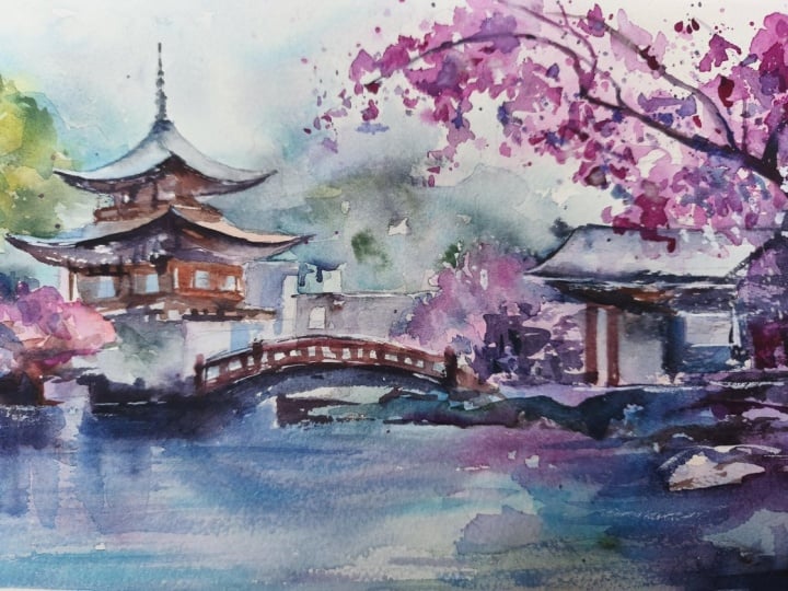
27. Final Thoughts: Welcome back. And
congratulations on completing this watercolor class on painting an expressive
Japanese blossom scene. We explored how a
strong value design and simple architectural shapes can hold space for loose
lyrical foliage, how selective edges and
saved whites create sparkle and how to connect
water, trees, and buildings. The same ideas translate beautifully to
garden courtyards, riverside bridges,
and park scenes where color and structure meet. Remember, watercolor painting is not just about technical skills, but also about expressing your creativity and
personal style. I encourage you to
continue exploring, experimenting and pushing
your boundaries to create your own unique
watercolor masterpieces. As we come to the
end of this class, I hope you feel
more confident and comfortable with your
watercolor painting abilities. Practice is key when it comes
to improving your skills, so keep on painting
and experimenting. I want to express my gratitude for each and every one of you. Your passion for
watercolor painting is so inspiring and I'm honored
to be your teacher. If you would like feedback on your painting, I'd
love to give it. So please share your painting in the student projects
gallery down below, and I'll be sure to respond. If you prefer, you can
share it on Instagram, tagging me at Will Elliston, as I would love to see it. Skillshare also loves
seeing my students work, so tag them as well
at Skillshare. After putting so
much effort into it, why not share your creation? If you have any questions
or comments about today's class or want any specific advice
related to watercolor, please reach out to me in
the discussion section. You can also let me know about any subject wildlife or scene you'd like me
to do a class on. If you found this class useful, I'd really appreciate
getting your feedback on it. Reading your reviews
fills my heart with joy and helps me create the best
experience for my students. Lastly, please click
the follow button up top so you can follow
me on Skillshare. This means that you'll be
the first to know when I launch a new class
or post giveaways. I hope you feel
inspired to paint with more expression in
your future landscapes. I look forward to
seeing you all again in future classes until then, happy painting and bye for now.
 Will Elliston, Award-Winning Watercolour Artist