Transcripts
1. Welcome To The Class!: Hello, everyone. My
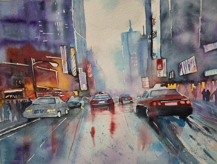
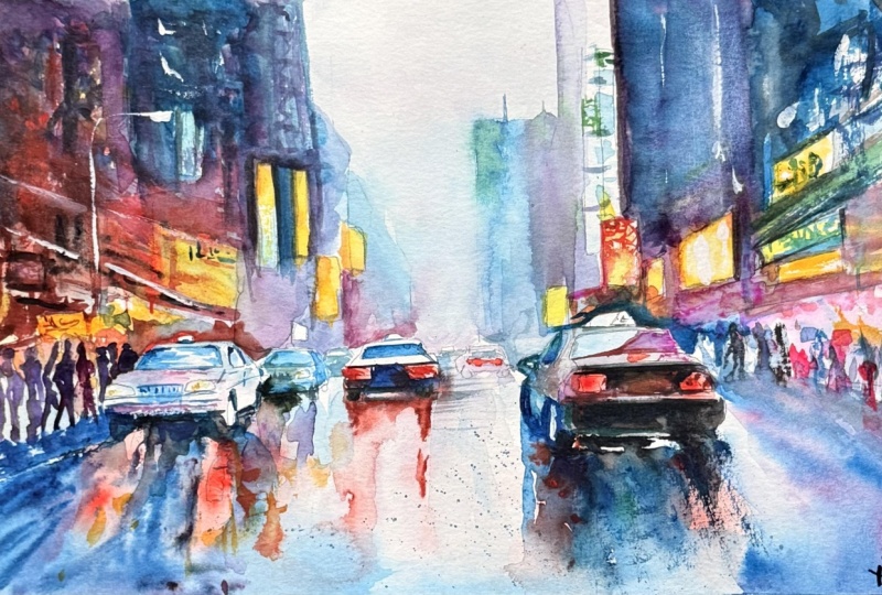
name's Will Elliston. And today, we're painting a rainy neon scene
in watercolor. Think Tokyo, Times Square, or any bright city after rain. At first glance, it
looks technical, yet the scene is held together
by very simple anchors, rectangles in easy perspective for the buildings and signs, broad car shapes and
calm reflections. With a limited palette, the city stays unified
while the billboards and lights provide your
individual pops of color. Even if you simply watch, seeing how detail is implied rather than drawn
can be eye opening. I've been a professional
artist for many years, exploring lots of different
subjects from wildlife and portraits to cityscapes
and countryside scenes. I've always been entranced by the possibilities of watercolor. But when I started,
I had no idea where to begin or
how to improve. I didn't know what
supplies I needed, how to create the
effects I wanted, or which colors to mix. Now I've taken part in many
worldwide exhibitions, been featured in magazines, and been lucky enough
to win awards from well respected
organizations such as the International
Watercolor Society, the Masters of
Watercolor Alliance, Windsor and Newton, and the SAA. Watercolor can be overwhelming
for those starting out, which is why my goal is
to help you feel relaxed and enjoy this medium in
a step by step manner. Today, I'll be guiding you
through a complete painting, demonstrating a
variety of techniques, and explaining how I use all
my supplies and materials. Whether you're just starting out or already have some experience, you'll be able to
follow along at your own pace and improve
your watercolor skills. If this class is too challenging
or too easy for you, I have a variety of classes available at different
skill levels. I like to start off with a free expressive
approach with no fear of making mistakes as we create exciting textures
for the underlayer. As the painting progresses, we'll add more details to bring it to life and
make it stand out. I strive to simplify
complex subjects into easier shapes that
encourage playfulness. Throughout this class, I'll be sharing plenty
of tips and tricks. I'll show you how to turn
mistakes into opportunities, taking the stress out of
painting in order to have fun. I'll also provide you with
my watercolor mixing charts, which are an invaluable tool when it comes to choosing
and mixing colors. If you have any questions, you can post them in the
discussion thread down below. I'll be sure to read and
respond to everything you post. Don't forget to follow
me on Skillshare by clicking the Follow
button at the top. This means you'll be the
first to know when I launch a new class
or post giveaways. You can also follow me on Instagram at Will Elliston
to see my latest works. So let's get started and turn rain and Non into atmosphere.
2. Your Project: Thank you so much for
joining today's class. I'm so happy that you're here. The goal is to create a lively, rain washed street that feels expressive
rather than fussy. Keep most elements in one family of muted
blues and violets, so the scene holds together. Then choose a few confident
notes for signage, brake lights and windows. Use simple rectangular
placements to suggest the architecture. Let edges wonder
where rain softens forms and allow reflections
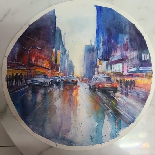
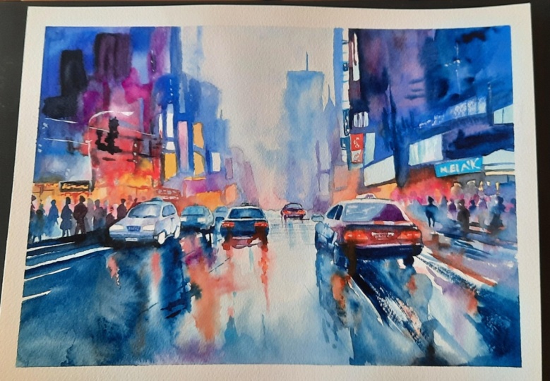
to carry color down the page. In the resource section, I've added a high
resolution image of my finished painting
to help guide you. You're welcome to
follow my painting exactly or experiment with
your own composition. As we're going to be focusing on the painting aspect
of watercolor, I've provided templates
you can use to help transfer or trace the
sketch before you paint. It's fine to trace when using it as a guide for
learning how to paint. It's important to
have the underdrawing correct so that you can relax and have fun learning the
watercolor medium itself. Whichever direction
you take this class, it would be great
to see your results and the paintings you
create through it. I love giving my
students feedback, so please take a photo
afterwards and share it in the student project gallery under the Project
and resource tab. I'm always intrigued to
see how many students have different approaches and how they progress with each class. I'd love to hear
about your process and what you learned
along the way, or if you had any difficulties. I strongly recommend
that you take a look at each other's work in the
student project gallery. It's so inspiring to see
each other's work and extremely comforting to get the support of your
fellow students. So don't forget to like and
comment on each other's work.
3. Materials & Supplies: Before we get started
with this city scene, let's go over all the materials and supplies you'll
need to follow along. Having the right materials can greatly impact the
outcome of your artwork. So I'll go over all the supplies I use for
this class and beyond. They're very useful to have at your disposal and we'll make it easier for you
to follow along. Let's start with the
paints themselves. And like most of the materials
we'll be using today, it's a lot to do
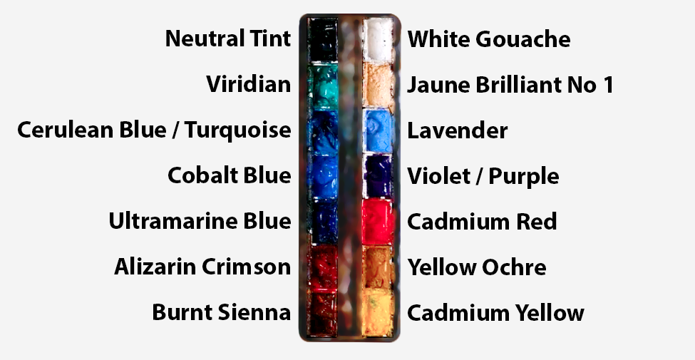
with preference. I have 12 stable colors in my palette that I
fill up from tubes. They are cadmium
yellow, yellow ochre, burnt sienna, cadmium
red, Alizarin crimson, Opramarne blue, cobalt blue,
serlean blue, lavender, purple, ridian, black, and
at the end of the painting, I often use white gouache
for tiny highlights. I don't use any
particular brand, these colors you can
get from any brand, although I personally
use Daniel Smith, Windsor and Newton
or Holbein paints. So let's move on to brushes. The brush I use the most is
a synthetic round brush like this Escoda Purl brush
or this Van Gogh brush. They're very versatile because
not only can you use them for detailed work
with their fine tip, but as they can hold
a lot of water, they are good for
washers as well. They're also quite affordable, so I have quite a few
in different sizes. Next are the mop brushes. Mop brushes are good for
broad brush strokes, filling in large areas and creating smooth
transitions or washes. They also have a nice tip that can be used for smaller details. But for really small details, highlights or anything
that needs more precision, I use a synthetic
size zero brush. All brands have them,
and they're super cheap. Another useful brush to have is a Chinese calligraphy brush. They tend to have long bristles
and a very pointy tip. They're perfect
for adding texture or creating dynamic
lines in your paintings. You can even fan them
out like this to achieve fur or feather
textures as well. And that's it for
brushes. Onto paper. The better quality
of your paper, the easier it will be to paint. Cheap paper qwinkles easily
and is very unforgiving, not allowing you to
rework mistakes. It's harder to create
appealing effects and apply useful techniques
like rubbing away pigment. Good quality paper, however, such as cotton based paper, not only allows you to rework
mistakes multiple times, but because the pigment
reacts much better on it, the chances of
mistakes are a lot lower and you'll be more likely to create
better paintings. I use archers paper because that's what's available
in my local art shop. A water spray is
absolutely essential. By using this, it
gives you more time to paint the areas you
want before it dries. It also allows you to
reactivate the paint if you want to add a smooth
line or remove some paint. I also have an old rag or t shirt which I use
to clean my brush. Cleaning off the paint
before dipping it in the water will make the
water last a lot longer. It's always useful to
have a tissue at hand whilst painting to
lift off excess paint. Also, you never know when an unwanted splash or drip might occur that needs
wiping away quickly. I also have a water dropper
to keep the paints wet. When you paint, it's
important to have them a similar consistency to what
they're like in the tubes. This way, it's easier to
pick up sufficient pigment. A hair dryer is useful
to have for speeding up the drying time and controlling the
dampness of the paper. And lastly, masking tape. And this, of course, is just to hold the paper down still onto the surface to stop it sliding
around whilst painting. Also, if you plan on
painting to the edge, it'll allow you to create a
very crisp, clean border. And that's everything
you'll need to follow along
in today's class. Now, let's sketch out this
scene so we can paint it.
4. Preparing The Composition: So even when it
comes to the sketch, we can take these steps
as simple as possible. We can break it down
into a few shapes. So we start off
with horizon line, which is just off center,
just below the center, and you can see I've
added some circles, and that's where
there'll be cars, and they're just a bit
distorted circles. And it's just to work
out the placement. And then, likewise, with the
people, the figures are, again, just circles but maybe stretched a
bit more vertically. Then the rest are
basically rectangles. So we added a few rectangles to come up with
the silhouettes of the buildings and
flat rectangles for the signage and
the billboards. Some of them are pure vertical and pure
horizontal, as you can see, a nice strong silhouette, easy to read shape
of the buildings. But some of them also are
following that horizon line which leads to a vanishing
point dead center in the page. So we're keeping their
perspective very simple. Now we're going back
to these circles, and we're filling them
out with a few details. Basically just
defining the outline and a few of the key features, which is the windscreen,
the head lights or the reverse lights and
where the wheels may be. And when it's dead
center in the middle, it's just a flat shape and the fervor it goes
away from the center, the more distorted it is. But you can use a line going towards the center as guide, your
perspective guide. So if you look at the
corner of the car, it follows that vanishing point.
5. Starting With Yellows: So we're going to
go step by step, starting with the easiest
step of them all using some yellows like yellow
ochre or even cadmium yellow, just to paint the
underlayer of some of these billboards and signs
because everything use, the buildings, the car, most of the people will be
that monochrome blue color. So the only other colors
we'll use are the lights, so we can be a bit
adventurous with them. I've kind of arbitrarily drawn in these billboards,
these rectangles, a lot of them have a kind of vertical emphasis because
that vertical aspect really grounds the composition. Then some of them are
following the perspective going towards the horizon
line and vanishing point, specifically right
in the middle. At the moment, my
tones are mid range. They're not too light and
they're not too dark. I'm starting with yellow because that's the
classic light color. I'm using a small brush, not necessarily because
I need more precision, just because I can create a bit more texture and expression with the
tip of my brush. I want to allow the luminosity of the paper to come through. So I'm thinking about what
areas I want to preserve, but I'm not necessarily
being clean. I'm just looking at the rectangles and
filling some of them in. Not all of them
because I want to experiment with some
different colours in them. Try not to be too precious or
spend too much time on this because most of this area
will be painted over. We're just trying to create
an interesting mix of colors, and we're using
the yellow just to start us off and get
comfortable with the paint.
6. Colourful Underlayer: So now that we're done
with the yellows, it's time to incorporate
some other colors. And I'm using Cerlean
blue because it's the more vibrant blues
that I have in my palette. Turquois has a lovely
color as well. And again, I'm just looking at the rectangles that I've drawn, and I'm even going outside of the lines filling
some areas out. Some are quite random. Some are purposely inside
those little boxes. I can add a few more
vertical brushstrokes. Because as you can see, there's an emphasis on vertical lines. Take a moment to look at
all the vertical lines going on in my painting. That anchors the
composition and the chaos. We can just create a lot
of abstract marks now, and then when it comes to
painting the buildings, adding those
verticals grounds it and helps us make sense of the chaos so
we can be more free, and it creates that illusion
of control and detail, even though it's quite random. And then apart from
those vertical lines, you can see the
rest of the lines are basically those kind of star shaped diagonal lines heading towards that
vanishing point. I know I'm repeating
myself quite a lot talking about
this vanishing point, but I just want to make clear that that is a
good guide for you. If you get lost, you can use that vanishing
point to help ground you and it leads your decisions if you ever feel overwhelmed with what
to do with a painting. When it comes to painting
all these abstract shapes and you don't know
what to put there, you can experiment with
adding a rectangle in which the lines direct
towards that vanishing point. There's nothing
scientific about it. I'm not being loyal
to any photo. If I were to paint this again, it would be just as
random as this go. Of course, having the drawing as a guide to begin
with really helps out. It helps direct the
mind so that you can be a bit more
playful because you know your anchors are
already on there. The drawings, the skeleton
and the paint of the flesh. So once you have that
foundation down there, you can be free to explore and experiment because
it's already grounded. So I've incorporated
some other colors now, some blues, pinks, a bit
of orange going on now. Some of them are intermingling
and blending together. Some of them are by themselves. I still want to keep some
white of the paper to come through for the
bright highlights. I'm just painting
the top of this car, the outline, then
blending it out up above. This is your chance to be
unique with your colors. They can be as
vibrant as you want, or they can be as subdue
as you want. Okay.
7. Car Lights: Now it's time to
paint the car lights, the headlights and
their reflections. So on the left hand side, the cards are coming towards us and the other cars
are going away from us. But I'm going to
add a bit of color, even though the
cars coming towards us won't have the red lights,
like the brake lights do. I'm still going to add a
bit of color in there, but I'm pre wetting the paper first so that when I
drop in the red color, the water carries
the pigments and creates its own
interesting texture. And this is a perfect example of allowing watercolor to
do the magic for us. We're not forcing anything. We're preparing the paper
and the pigment and then allowing it within the
confines of what we set up. So I'm adding a little
bit of red on the left. Like I said, maybe it's
reflecting some of the light from the signage
and the billboards. Because I'm not going to
paint these headlights red just the reflections. And by the time we've added
all the other pigments later, it could well be
covered up anyway. But it's these little
subtleties that also add that illusion of definition. Often watercolor
creates these effects that look impossible to
paint, which they are. But it tricks the view into thinking that I
consciously did it. And that's why sometimes these paintings can
feel intimidating because it looks too complex, but actually, I'm allowing the watercolor to
create that complexity. It's not me consciously
doing it with a small brush. This red looks quite bold and dark at the moment.
But don't be afraid. It needs to be powerful because we're coming over with
pure black pigment, deep dark pigment later on, and then the red will pop. And if you don't put enough red, it'll look too pale and diluted. It won't be punchly or vibrant. So you need to consider
that later on.
8. Painting The Sky: So I've allowed
everything to dry now, and we're going to paint
the sky wet on wet. And actually, I
say paint the sky. We're going to leave
most of it white. There's going to be
no color in the sky, maybe a bit of tone for
atmosphere and clouds maybe. So pre wetting the paper with pure water and going right
to the tops of the cars. And then to the edges of the buildings on
the left and right. I'm just thinking
about the area that I want to paint and
wetting it all, sectioning it off, basically. I'm using a brush
that has a nice tip but can hold a lot of water, so I don't have to keep on
going back to my water jug. When it's nice and wet, I
can start mixing my colors. First of all, just a nice diluted carillon
blue or turquoise, just to take it off white. It's very subtle, but it just takes the whiteness
of the paper off. Mixing a bit of purple in there. I've mixed that
purple myself using a sarin, crimson and ultramarine. More than I think,
it's dull color. It's not very vibrant,
it almost looks gray when it's diluted, but it's actually purple. That gives it a bit
more life and that's going to be the cloud that
goes across the building. And then as we go down, we're going to make
it a bit stronger. And we don't have to
be very strict to ourselves about
what color we are using because it's
more about tone. This could be red, yellow, even green,
possibly, purple. It's more about the tone,
the difference in tone. It's very subtle actually. Even putting a bit of
pure red in there, then blending that into the
colors already on the paper. Now, the sky looks quite plain, actually, and I want
to keep it that way. I'm not too interested
in doing a fancy sky because I really want
to focus actually on that distant
building on the right, and I want to be
playful with my edges. So I want to have a hard edge at the top and a soft
edge at the bottom.
9. Lost & Found Edges: So in order to achieve a soft edge at the bottom
and a hard edge at the top, so lost and found into
one single shape, we had to speed up the drying
time at the top so that the papers dryer and has a harder edge and leave
it wet at the bottom. So I just use a piece
of paper or card to cover up half the
building and used a hair dryer to create
that unevenness. So you can see now when
I fill in this building, how the top is hard. It's basically dry.
It holds its shape. But as it goes down, you can see the wetness of the paper draws that
shape, the pigment out. And what that does
visually is convey the kind of
atmosphere in the air as you go down the rain clouds, possibly if you want to simplify this painting even more and make it easier to do, when it comes to painting
these buildings, you can use Panes gray
instead or any monotone blue, some gray blue color
because at the moment, I'm using quite a vibrant color, and I'm going to tone it down, mix black into it on the paper. I don't actually own Pains gray, but the end result
almost looks like it. And that means you won't
have to do any color mixing. You can use it straight
from the tube and just keep all the building
colors with that pigment. So you can see
there how we've got a nice hard edge at the
top and then it goes soft and transitions to the sky at the bottom and the right hand side
of the building, it doesn't matter
because we're going to connect that to the
rest of the buildings. I just want to make sure
the left hand side of the building has that
nice effect to it. But if you are unsure
about that technique, you're not so advanced
into experimenting with lost edges and hard edges. You can just paint
it all with a clean, hard edge, keeping that strong
vertical line going down. Now let's connect
the right hand side of the building to the
rest of the buildings. So I used a more cobalt blue ultramarine kind
of blue for that. It's not important
that it is that color. So even I tell you
what color it is, it's more just out of curiosity, not as a kind of direction
you should necessarily go because I could have quite easily chosen a purple
or a green, a turquoise. So when it comes to following this class or any of
my classes really, you don't have to try and
figure out exactly what colors I'm using because often it's more to do with
getting the tones right. As long as the tones is correct and the edges are similar, then usually the painting comes together in its own unique
way that makes sense. So now we can start painting
the buildings on the left because there's still a bit of dampness on the
paper in the sky, so we can have some
softness there, too, but it still
holds its shape. Just using a tissue to
touch up that building.
10. Painting The Buildings: So I'm obviously playing
around with cool colors. I'm using all the blues that
I've got the Cerlean blue, cobot blue, ultramarine blue, if I really want to
get a bit darker. And then I'm using my purples. The purples, again, I pre mixed using a Larin crimson
and ultramarine blue. But you can also buy
your own purples. So on this left hand side, there's a billboard that
I'm painting around. I want to keep that
rectangle nice and clear. Now I can start introducing
a bit more warmth. So we have that blue, and rather than just adding
red directly in there, we can blend it to the blue
to make a kind of purple, a warm purple rather
than a cool purple. You can see on the right
hand side, there's purple, but it's very cool and sits quite comfortably
with the blue. And then on the left hand
side, that's still purple, but it's much warmer so it
feels a bit more contrasted. Working the wash down
to the top of the cars. And you can see now
how the sky itself, now that it's done,
is just off white. It basically doesn't exist, but we've painted the sky by actually filling out the
silhouette of these buildings. And gradually, as the pigment gets a bit stronger
at the bottom, it creates that feeling
of atmosphere and rain. Because it's an
overcast day, right? It's raining, so
we don't need to add blues or sunset
color in there. And now we're chiselling away through the billboards
that we've drawn. So just basically,
again, rectangles. And all the other marks that we painted are hidden underneath. Reveal these clear shapes, easy to read rectangles.
11. Bold Foreground: We're going to be very bold
now and use thick pigment, and it has to be thick because I want some texture on the paper, and you can't really do
that it's wet and diluted. You can see I'm
applying heavy pigment. And when I use aggressive
brushstrokes very fast, it just touches the
teeth of the paper, and the valleys underneath of the textured
paper remain white, so it creates that
dry brush effect. And you have to have strong and fast brush strokes
to achieve that, and the pigment has to be very thick and as the name suggests, dry dry brush, of course, it's not completely dry, but it's dry in comparison to the wet
washers we've used so far. And these dry brush
marks that we're adding here are underlayers. So often we think of underlayers
as washes or light tone. But actually, we're
using the dry brush as an underlayer here
because rather than writing out the pictures or the words that will
be on these billboards, these little textures,
these dry brush textures will kind of imply
the billboards, the designs, whatever
the adverts are. You can see how I'm mixing most of these
colors on the paper. I use the palette
just to fully absorb the brush to get the right
consistency that I want. But I'm doing all
the color mixing. So you can see, and it kind of helps having
the video sped up a little bit or clicking through the
video and going back again, just to see how the
color shifts from time to time because
it started off blue. Then it was purple, and
then I added the red. And now I want to
dull it down a bit. So I'm using some
black basically now. And I keep on shifting it and changing it
until it just feels right. Of course, if you're
using Pains gray or want to use a completely
limited palette, you don't have to be
concerned with this. You just got to match the tone. Now, as this wash
reaches the bottom, I'm using the tip
of my brush just to imply signage and again, match that perspective
direction.
12. Playing With Texture: So I'm finding it's
a little too red than I wanted it to
be and I intended. I wanted it to be
a limited palette and I'm adding a bit
too much red there. So I'm using a tissue just to sponge off
some of that pigment, and I'm going to be a bit more controlled
and limited with it. Really, this is
still an underlayer. I want to create
a few red signs, so I have to paint
the background first, and then later on, we can paint on top of it to cut away some
of that redness. Changing to a smaller brush, chiseling away at a few calligraphic marks.
There's nothing specific. I'm not painting the people yet. I'm reaching the car and painting a bit of
the outline there. Going up towards the billboards, using pure black
now and dropping it in whilst it's wet on wet
so that it'll bleed out. I'm adding a bit
more blue because I want to be an emphasis on blue, but I don't want to mix the
blue directly with the red. So I added that purple
as a kind of transition. There's quite a lot of chaos
going in this section. But where I can, I add clear brushstrokes heading
towards that center point, that vanishing point, and
that gives it context. Whilst we're using this red, you can see there's a big play with color and temperature. Cool blues and violets
dominate most of the scene. But these warm reds and oranges and the yellows that we painted at
the very beginning, they appear in these
shop signs and windows. And the reflections later on will echo these warm notes
vertically on the ground. So the reflections are vertical, a lot like the buildings. So there's a very
vertical narrative. And while these things aren't
conscious to the viewer, that helps them understand
the composition, and it kind of makes sense
on a subconscious level. It grounds them, I
anchors the scene. So it looks chaotic and complex, but it's these elements that we use that make such an abstract painting
actually make sense. Most of the city is
in the cool family. So all the warm spots
that we see feel like electricity because they're
warm due to the electricity, the lights, the
billboard, the cars. Now, as this sectu is
starting to dry up, I'm applying very thick black
pigment to add a few more, again, rectangles at different
sizes and distortions. So the rectangles are
clear verticals again. And because the papers wet, these soften and blend out. So they're not clear
descriptions. It's feeling. It's the magic of watercolor, taking it and making
it feel a bit more ethereal rather than
being distracting. And as this paper is half dry, I can go back and
add dark pigments around these billboards
so that it emphasizes that hard edge and then bleeds out blends out into
the rest of the shape. So the mood at the end of the painting
will be very energetic, but it'll be quite moody and atmospheric Will all those
blues in the background.
13. Right Foreground Buildings: Now it's time to do a similar
thing on the other side except I'm not going to have a big vibrant red
patch on the other side. I'm going to keep
it more monotone, so there's a bit of
variety in there. But the idea, the concept
is still the same. I'm basically thinking
about a clear, easy to read shape, and then cutting away some rectangles. Ones that I have already
drawn down on the paper. So I'm using nice bold pigments. But and using a lot of water, just to fill it out and
I don't over mix it. I'm encouraging the
paper to create interesting textures by letting it intermingle how it sees fit. My only job is to see where
I've drawn the boundaries, fill it out, and then where
I'm adding thick pigment, where I'm adding thin
pigment is quite random. I'm not overthinking about it. Just as long as
I've got some kind of variety and variation, and I know where I'm going to. I know how far down I'm going to the tops of the heads of the people
and how far left I'm going. Once I know my boundaries and the little areas that I need
to save for the billboards, I'm just trying to
fill in the area with as much watercolor
spirit as much as I can, and then try not to interfere
with it too much either, because I find increasingly
that if I overwork it, if I stop the watercolor
from doing what it's doing, then the magic is lost. The kind of that quality that you get from interesting
paintings gets lost, and I still do it sometimes
without thinking. I see something
that doesn't look right and I agitate it a bit. I use my brush, and
it kills the magic. So even if it looks
a bit off and wrong, usually that feeling of that loose expression that captures feeling would
still come through. Of course, that's
sometimes easier said than done to
just leave it alone. Of course, it comes down
to practice and intuition because you've got to consider how much paint
you've got on your brush, the thickness of it in order to allow the watercolor to do what you want it to do. And I made mistakes
in this as well. For example, I didn't
go heavy enough. It looks heavy, but I wanted
it to be much heavier. So if I knew in hindsight, I would have added much
thicker pigment to begin with. And then when I add the rest
of the water to fill it out, there'd be sufficient
pigment there so I could allow it to mix itself. But it wasn't like that, so I had to go back
and it's through these things that you learn and improve with each painting. My goal is for a painting
to almost look inevitable, like it makes sense, like the pigment magically ends
up the way you want it to. And the key to doing that is to allow the
watercolor to do it. And if you start messing around, it's obvious that
the artist has been there and manually
tried to fix it, and it's perfectly
understandable to feel the desire to
want to perfect things. I definitely feel
that pull, as well. So I have to remind myself
that if I'm feeling that way, I'm probably trying to
overdetail things, and really, I should just get the
main shapes there and the rest should just be
suggestive and elusive. So if you look at
the painting now, really, there's a few clean, clear shapes like the rectangles and the silhouettes
of the buildings, but the rest is actually very abstract and it's no
specific details at all, especially if you squint
your eyes a little bit.
14. Suggestive Signage: So we've reached the bottom
of these billboards, and now we've got to
figure out how to connect them with the people
and the street level. So I'm not going to
paint the people yet. I think they're just going to be suggestive silhouettes
of people. Nothing too detailed at all. But I want there to be a
bit more artificial glow where the neon lights will be. So I'm going to use some
opera pink, actually. I don't have that in my palette, so I'm going to find a
tube and just squirt it into the Alizarin crimson pan because that's the
closest color it matches in the color wheel,
the color of family. So I don't mind that mixing
with my ultramarine. And you see how that red
can blend down there. And I'm just using the TIF my brush just to
agitate it a bit, trying to get organic shapes, allowing some of the white
paper to come through, so I'm not filling
it out completely. Using the Tip my brush
to find that outline of that car Then using dry brush, the side of my brush,
scraping it along the side of the paper to kind of blend it out until we reach the street. And now that that area up
above is pretty much dry, I want to encourage more texture by dropping pure water on there. Now we can go the other side of the car and fill that area in. So connecting those central distant buildings
to the foreground. Trying to match the same tone, observing where the rectangles
are painting around them. Connecting the two sides. Using water, basically, just to connect the
two pigments together, and then they'll blend
themselves, however they may. To get a seamless transition, I use pure water and go a
bit further than the wash is intended so that it blends out into that pure water so
there's no hard edge there. And if it gets too busy in some areas, I just fill it out. If it's too distracting
or eye catching, it means there's too much
going on, too much detail, and you might not notice it
until you're at that stage until a bit later because when we're zoning in painting
on a certain section, we don't see the larger picture, the full picture, so to speak. So even me as I'm painting this, I could be making mistakes
as I'm painting it, and then later on
have to correct it or go against
my past decisions. There's always a back and forth, and you don't need to
be harsh on yourself if your judgments are wrong at certain stages because
the painting transforms. We're allowing the watercolor to not necessarily dictate
where we're going. But if the watercolor wants
to do something, we allow it. So it's not
necessarily mistakes, it's happy accidents and
if it wants to do it, that's how it shall
be and that's where the magic comes in,
as I was saying before. See how the white of the paper, the underlayer that we did
at the very beginning is so pale now because of this
bold pigment we used before. That's why I encourage
students to watch this even if they don't
intend on painting it. Even beginners can take
something away from it because watercolor can be
counterintuitive or deceiving. Even by seeing these
things without painting, you can get a better
understanding of the nature of
watercolour. But
15. Underlayer For Figures: One of the biggest
challenges for me, learning to paint
watercolor is coming up with that mental image of what we were trying to paint. You can collect
different references, draw out or sketch out
different compositions. But when it comes to
painting the scene itself, even if you're doing
it in real life, it's a good idea to have the core ideas in your mind
to give yourself direction. So with this picture, this painting, it's
basically a conversation, an interaction
between three things. We have a cool, unified city mass for
the buildings above. We have a few warm chroma, highly saturated signs
and signals billboards, then of course, later on, we'll have their
reflections as well. Those are the three
main messages, the ideas in this painting. Everything else can be put away and it's not something
we need to actually focus on. If we hold those
relationships close, the scene feels inevitable. And no matter how loosely
anything is stated, as long as we concentrate
on those concepts, we use those as an anchor, it can guide us and help to make the message
clearer for the audience. And it doesn't even matter if it ends up abstract
because the message, the idea will be clear. It'll make sense. At the moment, just adding a bit of underlayer to the figures that we'll
be painting in a minute. Because I'm going to paint
the figures quite dark, but I just want to add a bit of background
before we do that.
16. Car Underlayers: So the design anchors
that I'm using, we've talked about
a few of them. But you can see if
you squint your eyes, there's a kind of a V or
a U shape in the middle. The big U shape of value, the dark left block, the dark right block, the paler, wet street in
the center in the sky. And the viewer reads the the
V and steps into the scene. Of course, this is all
about the perspective. Because the Vs and the reflections later
on will lead towards the center and draws the viewer
in like a visual magnet. So I've talked about that
a lot quite a lot already. The next anchor,
if you get lost, is the focal point. Now, we haven't painted
the focal point yet, and the focal point
is actually the cars, but specifically the
car in the center. We're starting to paint
the car on the right now doing a kind of underlayer, painting the wind screens and the bottom using blue on the left and a kind
of warm purple on the right. Nice mid tone. Doesn't need to be too precious
at the moment. I'm just taking the
whiteness out of the paper. But our eyes will
settle on these cars. So we might take we're
still simplifying them. We don't want to
add lots of detail. We want to convey
these cars with as few brushstrokes
as possible, ideally. And within the composition, we can use visual communication to make sense of these cars. So obviously, we've
got the highlights, the windscreens, and the
wheels or give away a car. So as long as we simplify
that and those aspects, it'll be an easy read. And then we have three
object families only. So we have rectangles for
the buildings and sides. We have the wedges for the cars, and a kind of low soft
band for the figures. So we want to keep every mark loyal to one of these
families for clarity. There's not many circles going so we're thinking
rectangles for the buildings, wedges for the cars, even some of the rectangles
are in the cars, and the figures are
kind of abstract bands.
17. Subtle Figures: Now we painted the underlayer for the car on the left before, so it's very dry now. And that means we can
paint the figures. But by doing so, we're
actually painting the outline of the car because we're using
negative space. So the background's going
to be darker than the car. So we're kind of
chiseling the shape of the car around it. Again, I'm not thinking
how a human looks, how accurate it is, because that's not the
center of the attention. We don't want it to steal
the center of tension. If anything, I don't want
people to look at these people. I'm using dark pigment.
But that's a it's wet. Once I add more water
to draw it out, it'll be the same tone
as the buildings so they won't draw attention. They won't be jarring.
Again, there's a clear value structure
going on in this scene. We think 2.5 values. We have the Deep City
masses that we did above, and then the mid lights
for the signage, the windows, trying to keep
these people quite ambiguous. Just a simplified shape, not very anatomically
correct at all. We've got a head, a torso, and a couple of feet. I'm keeping them
quite cool as well, same color as the
buildings, really. It's just the lights
that I'm keeping warm, and the warmth ironically kind of indicates
human activity, of course, like I was saying
before with electricity. But the people themselves,
I'm keeping cool, which is kind of ironic, but it's nice to
have that contrast of cool on top of red.
18. The Cars On The Left: So starting to paint the
first car on the left. Now, of course, most
cars don't have these little bits on the top, but it's one of those iconic
things that you can add for visual communication just to make it a bit more
interesting and readable. It makes it more
defined as a car and helps make the perspective a little bit clear about
it being too technical. Because if you can see
the little bobbly bit on top of the car on the
left is closer to the left, and the one in the
middle is dead center, and then the car on the right, it's twisted more to the right. So it adds to that feeling
of perspective without it having to be too
technically precise. So painting out the windscreens, I'm going to leave
the lights white, but the little kind of grate in between the
lights, I'll paint too. So there's a lot of
illusion of detail going on because at the moment, we've just painted three
shapes, basically. Just adding a little
bit of whiteness in between or in the middle
of the windscreen, again, it's not
technically difficult. I'm not making it nice
and clean and smooth. It just gives that
feeling of light reflecting the sky above in
between the cool buildings. And then underneath, it's just an ambiguous black mass extra black
where the wheels are. And then I leave a little bit of ellipse where the hubcap is. Now let's paint the windows
on the right hand side. And when it comes to the
top and the bottom, again, I'm getting those lines facing towards the
vanishing point. You can actually
see the point on my paper because I marked it
out with a piece of paper. In the top right hand
corner of the car, there's a little dot, and I'm keeping an eye on
that all the time. And especially when
painting out these cars, I'm leading the lines there. Dropping in some pigment around the front lights
so that they pop. Now we can start
agitating some pigment, adding water underneath but I won't paint the
reflections yet. I'll wait until most
of the cars are done, and then that way, we can connect all
the reflections so that they're
not disconnected. We want them to be combined because a lot of the time
reflections are soft. Especially if the floor
has got more texture on, they're going to blend
into each other. That's again, where
we can exploit the fun nature of watercolor
to create exciting marks. So this car behind
is a lot easier. We're basically filling it out. We're just only using that
headlight to define it. Maybe a few dots for the hub caps and the wheels
and the one behind it. It's just basically two
brush marks like that. So the smaller or the
further away something is, the less detail we
have to put in there. But there's again, an
illusion of detail because that front car, even though I wouldn't necessarily say
it's that detailed. You saw how we just added a few shapes and
it came together. It implies detail in
the rest of them.
19. Starting The Reflections: Now that we've finished
the cars on the left, we can start painting
their reflections. And I'm pre wetting
the paper because I don't want to paint
the reflections on the right hand side yet, so I want it to
blend out softly. So starting from the
bottom in the center, I've got to work my way up. Notice how we're not actually
painting the ground at all. We're leaving the ground white, even though in real life, of course, it's
going to be tarmac. It's going to be gray or dark. But I'm not painting
that. It's a wet floor, so it's actually going to be reflecting that
whiteness from the sky. In fact, I'm keeping the ground
even whiter than the sky. It's pure paper. And whilst it's still wet in
that center at the bottom, I'm going to start working
my way from left to right, painting around those
red reflections. So I'm adding water there. And with this strong
turquoise blue, I'm not painting over them. I'm just painting up to them and letting the water to decide
what it wants to do. Dropping the pigment,
connecting it to that wet paper and allowing
it to do its thing. And you can see now how that
red makes a bit more sense, even though the lights
from the car isn't red, maybe it's picking up some of that warmth from
the building above. Even though they're very
soft lines, there's, again, a kind of emphasis on vertical lines and
brush strokes here. And the white of
the paper that I left on the left hand side, they look like brush marks, but it's just preserved
white of the paper. And, of course, those converge towards the
vanishing point. So playing around
of some pigments, always going darker now. Adding some purple at the
very bottom, some black, agitating the bottom
of the car so that it seamlessly blends
into this pigment. I'm trying not to
fiddle, and by that, I'm not so much correcting as I'm still building up the pigment because the
paper is still very wet. So what I'd call fiddling
or correcting is once it's almost dry or completely dry and then
going back and editing it. If it's still wet on wet, we've got lots of opportunity to create
interesting effects. So I'm experimenting
and exploiting that stage whilst
everything's wet and setting the stage for hopefully interesting
things to come. I'm starting to lose that
reflection on the left. So what I'm going to
do is take a tissue and just dab away
that heavy pigment. But I don't want there to be
a hard line there so much, so I still want to agitate
it with pure water.
20. Building On The Tones: So this is the same kind of blue color that
we used above. And if you're using Pains Gray,
you can use that as well. And maybe if you really
want to simplify the scene, the only two colors you'll
need is red and Pains green. You can do the exact
same painting, but with a much more
limited palette. This is already a
pretty limited palette because I'd say there's
four colors going on, four families of colors. We've got blue, we've got red, we've got purple, and
we've got yellow. Those are basically all the
colors in this painting. So moving on to the reflection
of the next car along, notice how I haven't
used blue for that. I didn't want it to be one
block of the same color. I've used a kind of diluted warm wash because I want there to be a
bit of a contrast, but if we had to
look for an excuse, maybe we could say the
warmth of the building behind comes through and between those cars
and comes down. And that fades out
into the middle. We don't want there
to be a hard edge between these reflections. Because we want middle
ground to be nice and white. Now, the middle
is slightly damp. It's not bone dry yet. And I'm going to use that to add the reflections of
the back car lights. So they're going to be nice soft brush strokes,
not hard ones. Where I can, I'm trying to
keep everything connected. Of course, we've painted this in lots of different
stages and steps, but if you look at
one part of it, it should be somewhat connected somehow to the rest of it
in one way or another. Of course, there's
some exceptions like the car lights or small
shapes or the billboards, isolated objects, but everything else can be
seen as one unique shape, really, one unique wash. I don't think the headlights
on the left car pop enough, so I'm just going to boost
them a bit by making it a bit darker on the bonnet,
increasing that contrast.
21. The Middle Car: This middle car is even
more simple to paint. We want it to be nice and clear. A nice strong contrast so that it's eye catching
because it's the focal point. So the windscreen is going to
be this nice, vibrant blue. But there's still a sharp, little line that disconnects
it from the wash below, and that sharpness
is eye catching. Of course, that little
bobbly bit on the top. I really like the look of
this blue against the red, but we're not going to leave the white of
the paper there. We're going to paint the
back bonnet of the car with dark pavement so that the blue and
the red really pop. So I'm allowing a little bit of space on the
top of the bonnet. Of course, we're looking
at it from an angle, so it looks like a line. But that line does a lot of difference. It has a statement. There's not a lot of detail. It's just suggestive we're using clean shapes and
lines to block it out. But it looks a bit boring
cleanly blocked out like that. So we've got to agitate it and create some interesting
shapes of watercolor. So taking some pure
water on my brush, just dropping it around
the edge of those lights, not in the middle because I want to preserve the reds in the
middle of those lights. But I want them to blend
out softly and downwards. I want to preserve
a little bit of white underneath the car where the light comes in between the wheels and underneath the bottom of the
car, of course. Then connecting them underneath with a kind of warm purple. It's almost like a marooni red. Then I'm dropping
some thick cabium red using the tip of my
brush to connect it, and then Exaggerating those
highlights a bit more now. Exemplifying those verticals. Transitioning to blue a bit as it goes down
to the bottom. Softening them out a bit. A
22. Adding Warmth To The Reflections: There's not much reflection of that red glow on
the left hand side, so I'm just going to add a little bit more
warmth on top of it. And also, we can use it to create a bit
more perspective as well by preserving some
of the underlying layer. Then adding brushstrokes
in that direction. Going to use a tissue
just to pull away some of that pigment because
I don't want it to be overly saturated. If the reflections
are too bright, it actually competes
with the lights above. We want the reflections to be maybe a step lower in value and chroma to the thing
that's being reflected. I can use a very
thin line to connect it to this car in the middle. I'm asking myself, is the street surface clearly
wet and reflective, not just dark for
the sake of it? Because a wet street
has, of course, the vertical streaks or patches of light that
are pulled downwards. And there's soft, slightly
blurred reflections below lights or specifically
the car lights and lamps? And there's a slight variation. So we can keep a lot of
abstract shapes in there. We can keep shiny puddles or some duller patches in there. If it looks just
like a dark road, then we haven't echoed the lights above as
the reflections below. Or we've painted the street too flat and even wash with
no vertical movement. Or we've only used one
uniform dark color.
23. The Right Car: Now it's time to
paint this last car. Which again, we're
going to simplify into shapes that are easily readable and quite achievable.
You can break them down. We're going to use clear shapes
to identify it as a car, and then we could be
expressive so that we can be elusive with the details. Because at heart, every car is just a low box
with a roof, basically. Much like every building is a tall block with a few cutouts. We want those simple solids to read clearly before we
worry about any details. We don't want any fiddly bits. We can make sure there's
a clean silhouette. Leave that chromi hubcap. Then when it comes
to the reflections, we can connect it above so we don't really need to deal with the bottom of
the car at all. I'm using a mix of
blues and reds, which, of course,
includes purple as well. So a few smartly
placed highlights can do a lot rather than
over descriptive details. So see how I fill in
the back of this car, leaving a clean edge for
the bonnet on the back. So there's a sharp
contrast there. It's not complicated, but
it makes sense visually. Then we paint around the lights. To allow that glow. And that glow of
the lights almost distracts us from
any actual detail. Then we can fill in some of that detail because we've
got a clear silhouette. We've got that
window on the left, which is obviously a window. It's a kind of diamond shape. But the lines again,
follow that perspective. Then we've got a
clean reflection on the right hand side
of this back window. We've got an underlayer of blue behind it, which
is much lighter. And then this very
simple but clean shape. It doesn't need to be a perfect shape because it's so simple. It's just a kind of half window. But it describes the reflection of a car without overstating it. I think we can make the
values a bit stronger on that central car so that
the reds pop even more. And then we can start
doing the same thing on this right hand car using thick black pigment where the wheel is at the
bottom, the darkest point. I'm trying to get a nice
clean horizontal line Not because this line is
going to be clear at the end. I'm just using it as a kind of guide to which areas
I need to fill out with black before
I wash some water on. So filling in this area.
24. The Darkest Tones: And then I've got to connect the bit above the
lights with the bit below it. And as we already have the
structure all laid out there, we've already painted the
details that we need to paint. We won't need to add any
more details than this. I'm just going to add pigment at the bottom for the
reflections we'll add, and we're just going to apply pure water maybe add a bit more blue because
I don't want it to be complete black down there. Making sure it's very thick. You can see the dry brush marks because the pigment is so thick. Had a bit of warmth just around the outskirts of these lights in the middle preserving
that thin line and connecting it on
the right hand side. Even these tail lights
are a very simple design. They can even again,
be pure rectangles. I just happened
to give a kind of diagonal line to
them on the inside. But it doesn't matter anyway because I'm
blending them out. I'm using pure water, leaving the very
centers untouched with water so that they
remain that vibrant red. Pure water on my brush, agitating that pigment
we've already placed. Now it's time for
another strong vertical on the left hand
side of this car. But equally, thinking of the
vanishing point, as well. So adding that vertical
and then leaving a little white
strip of the paper, little nuggets of white that keep that diagonal perspective. And then I want, of course,
the reflection of this light. Red actually looks more
vibrant when it's lighter. If you keep on adding
more and more red, it actually dries a
lot darker and kills that vibrance, that
translucent quality. See that wash was coming out and ruining that kind
of vertical feel, so I just use a tissue
to dab it away. And now that that
area is nice and wet, I'm dropping in loads of blue. Again, I don't want
many hard edges here, except when it gets
close to the object. The reflections
will be hard edge when it connects with the car, but as it drifts
down further away, the reflections will be softer. And now you can see the
water that I added, the pure water is picking up that red pigment and drawing
it down into the body of the car and the reflections and connecting everything in an organic way.
25. Abstract Sections: Now we can start suggesting people on the right hand
side in the distance. Just silhouettes. We can start doing a few
abstract reflections just to fill in
that white space. Again, kind of mirroring
the buildings above, but in an abstract way, just connecting shapes, not
by manually blending them, but just painting patches of color and then just
touching the sides of them together whilst
they're wet so that the pigments interact
like kind of magnet, and then the gravity or the
water push them around. I don't want it
perfectly blended. I'm trying to imitate
that feeling of water, and you do that by allowing
the water to do itself. The figures on this side
are even more abstract, little bubbles,
almost like spikes. The shoulders and the heads together look a bit like spikes. No feet at all, legs. Now that the water started
to dry, on this reflection, I can start adding a
bit more pigment around the lights without being rolled that it's going
to blend into that red. I think it should be even
darker down here by the bonnet, just to make those
reds pop even more. And now you can
see the contrast, the difference between at the beginning of the painting
when we add this red, and it was the darkest
thing at that stage when we added these tail like
reds at the beginning, it was by far the darkest
thing on the paper. And now it feels light
and vibrant. It glows. So this reflective
area is very abstract and we've reserved some of the whiteness of
the paper below, again, to give it
that illusion of perspective so that
it draws forward, almost has a feeling
of speed and movement. We can make some of the tones a bit darker
on this car as well. A, some horizontal lines
there in the distance too. Because as the lines meet the
horizon, they flatten out. So as the name suggests, anything that's close to the horizon line are
horizontal lines. The top of the
cars, you can see, are all flat lines basically, and they're all in line. Adding a bit of texture where
the ground meets the top
26. Scratching Away Pigment: Adding another reflection
on top of the bonnet. These are just tiny
little tweaks that again, give it that illusion of extra detail without it
being overly technical. It's certainly not
precise or specific. It's just suggesting
that sharp reflection from the windows above, the lights and signs above. Because, of course, you
can't have everything soft. We have the wet areas, the rainy areas, the buildings, the ground, very soft. Everything's very blendy,
no hard edges there. But we need some sharpness
to contrast that, and that's where the cars
come in and the billboards. That sharpness is the anchor and everything else
is very wish washy. Like if you go
through the painting and look at what's hard
and what's a soft edge, you can see how
abstract the painting actually is and
how it's grounded. So now I'm going to
add a few splatters. Maybe there rain drops. You don't have to do this if you're worried about
jeopardizing the painting. I'm angling the brush so that the splatters are also in direction of that
vanishing point. And then using a tissue
to soften them up. Now, I'm using the vaporizer, the spray to re wet evenly
some of the pigments. I'm not heavily wetting it because I don't want
it to run about. I just want to rehydrate
the pigment so that I can use a sharp tool
like this palette knife, just to scratch away some of the pigment to again,
suggest details. I don't want to
say that there are details because they're so subtle and imprecise. If you were to zoom
in on that section, they don't look like
details at all. They just kind of suggest
what something should be. Then, of course, using the
white gouache at the end to make some areas
pop even more, and the lamppost though
these are just little dots. Maybe the little dots
on the buildings can signify the lights
on the buildings. The offices increase
that feeling of depth. Also in these reflections, I don't want to jeopardize the wash whilst I'm painting it, so adding these little dots can further define the shape
without overdetailing it. Of course, you
guessed it, a lot of them are vertical lines or pure horizontal lines or lines that converge towards
that vanishing point. They're not completely
random these lines, and they shouldn't be
that obvious, either. I don't want to paint a huge
amount of gouache on here. And that's it.
27. Final Thoughts: Welcome back and
congratulations on completing this class on painting a rainy
neon scene in watercolor. We explored how a
limited palette and a clear value plan keep
busy subjects calm, how rectangles in gentle
perspective, anchor the design, and how edges splatter, lifting, and broken color
imply more than they describe. Reflections became vertical
pathways for light while selective neon notes
gave the painting its voice. Remember, watercolor painting is not just about technical skills, but also about expressing your creativity and
personal style. I encourage you to continue
exploring, experimenting, and pushing your
boundaries to create your own unique
watercolor masterpieces. As we come to the
end of this class, I hope you feel
more confident and comfortable with your
watercolor painting abilities. Practice is key when it comes
to improving your skills, so keep on painting
and experimenting. I want to express my gratitude for each and every one of you. Your passion for watercolor
painting is so inspiring, and I'm honored to
be your teacher. If you would like feedback on your painting, I'd
love to give it. So please share your painting in the student projects
gallery down below, and I'll be sure to respond. If you prefer, you can
share it on Instagram, tagging me at Will Elliston, as I would love to see it. Skillshare also loves
seeing my students work, so tag them as well
at Skillshare. After putting so
much effort into it, why not share your creation? If you have any questions
or comments about today's class or want any specific advice
related to watercolor, please reach out to me in
the discussion section. You can also let me know about any subject wildlife or scene you'd like me
to do a class on. If you found this class useful, I'd really appreciate
getting your feedback on it. Reading your reviews
fills my heart with joy and helps me create the best
experience for my students. Lastly, please click
the follow button Utop so you can follow
me on Skillshare. This means that you'll be
the first to know when I launch a new class
or post giveaways. I hope this class makes complex urban scenes
feel more inviting. I look forward to
seeing you all in future classes until then happy
painting and Bye for now.
 Will Elliston, Award-Winning Watercolour Artist