Transcripts
1. Welcome To The Class!: Hello, everyone. My
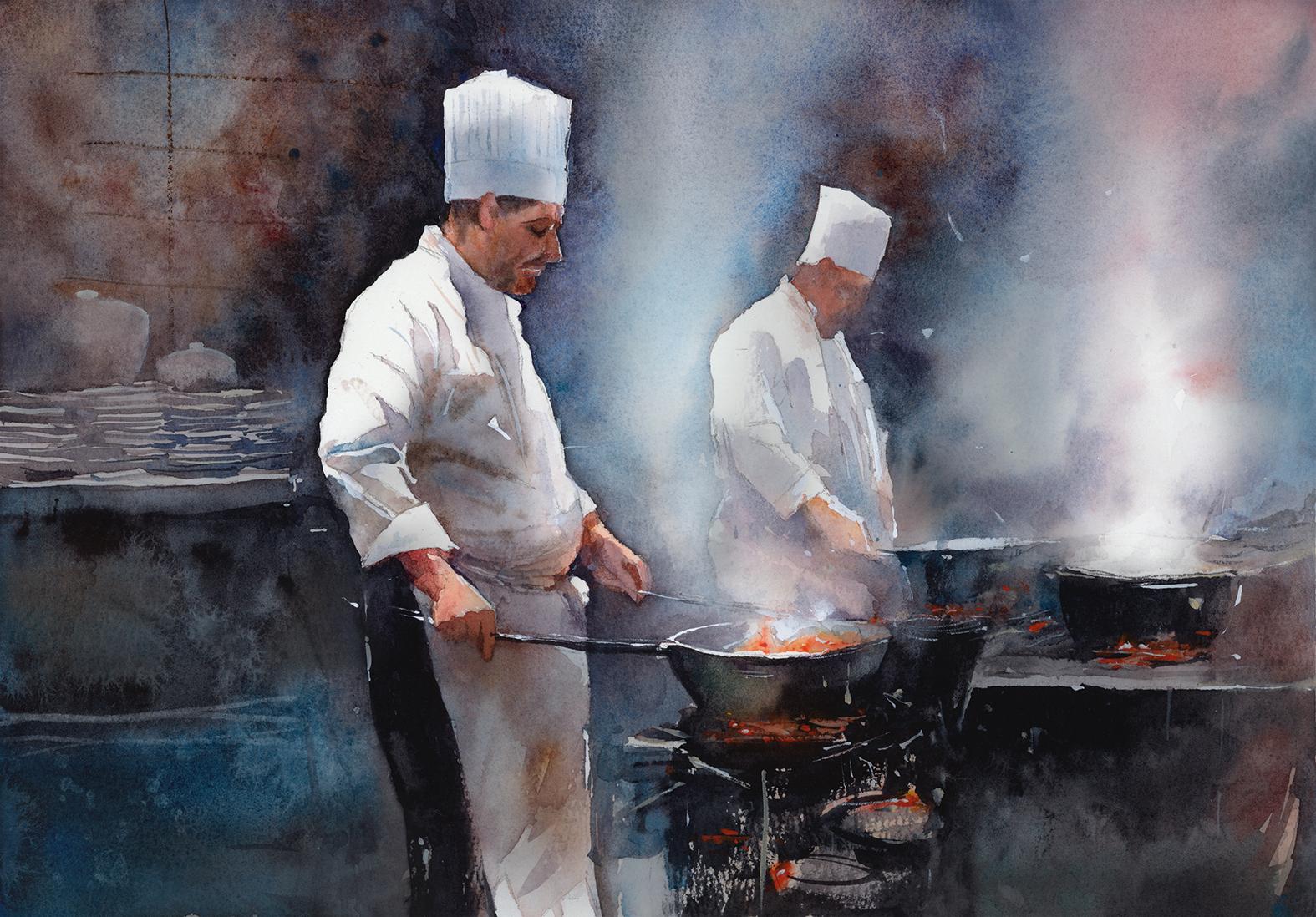
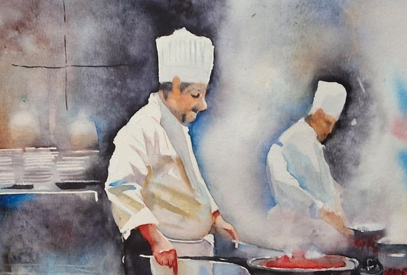
name is Will Elliston. And today, we're painting an atmospheric scene
of chefs at a stove. It's a perfect
subject for learning how suggestion
beats description. Steam dissolves edges, light
flares against aprons, and a few crisp notes
carry the character. We'll use a limited palette
of cool and warm contrasts, easily readable silhouettes and edge variety to create the illusion of
detail without labor. Most forms stay
suggestive and ambiguous. Even if you simply watch, seeing how suggestion replaces description is eye
opening at any level. I've been a professional
artist for many years, exploring lots of different
subjects from wildlife and portraits to cityscapes
and countryside scenes. I've always been entranced by the possibilities
of watercolor. But when I started,
I had no idea where to begin or
how to improve. I didn't know what
supplies I needed, how to create the
effects I wanted, or which colors to mix. Now I've taken part in many
worldwide exhibitions, been featured in magazines, and been lucky enough
to win awards from well respected
organizations such as the International
Watercolor Society, the Masters of
Watercolor Alliance, Windsor and Newton, and the SAA. Watercolor can be overwhelming
for those starting out, which is why my goal
is to help you feel relaxed and enjoy this medium
in a step by step manner. Today, I'll be guiding you
through a complete painting, demonstrating a variety
of techniques and explaining how I use all
my supplies and materials. Whether you're just starting out or already have some experience, you'll be able to
follow along at your own pace and improve
your watercolor skills. If this class is too challenging
or too easy for you, I have a variety of classes available at different
skill levels. I like to start off with a free expressive
approach with no fear of making mistakes as we create exciting textures
for the underlayer. As the painting progresses, we'll add more details to bring it to life and
make it stand out. I strive to simplify
complex subjects into easier shapes that
encourage playfulness. Throughout this class, I'll be sharing plenty
of tips and tricks. I'll show you how to turn
mistakes into opportunities, taking the stress out of
painting in order to have fun. I'll also provide you with
my watercolor mixing charts, which are an invaluable tool when it comes to choosing
and mixing colors. If you have any questions, you can post them in the
discussion thread down below. I'll be sure to read and
respond to everything you post. Don't forget to follow
me on Skillshare by clicking the Follow
button at the top. This means you'll be the
first to know when I launch a new class
or post giveaways. You can also follow me on Instagram at Will Elliston
to see my latest works. So let's get started and turn heat and light into a
captivating painting.
2. Your Project: Thank you so much for joining
me on this cast today. Think of this painting
as rhythm and glow, chefs emerging from vapor, metal catching sparks, shapes linking into a
few clear value groups. Keep most marks loose
and economical, letting steam soften transitions and darkness knit the
background together. Save a handful of crisp notes for where attention
belongs, the edge of a pen, a wrist, the notch of a cheek, and allow warm flickers to
punctuate the neutrals. Plates, burners, and cables
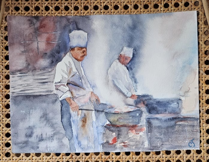
can remain abstract. In the resource section, I've added a high
resolution image of my finished painting
to help guide you. You're welcome to
follow my painting exactly or experiment with
your own composition. As we're going to be focusing on the painting aspect
of watercolor, I've provided templates
you can use to help transfer or trace the
sketch before you paint. It's fine to trace when using it as a guide for
learning how to paint. It's important to
have the underdrawing correct so that you can relax and have fun learning the
watercolor medium itself. Whichever direction
you take this class, it would be great
to see your results and the paintings you
create through it. I love giving my
students feedback, so please take a photo
afterwards and share it in the student project gallery under the Project
and resource tab. I'm always intrigued to
see how many students have different approaches and how they progress with each class. I'd love to hear
about your process and what you learned
along the way, or if you had any difficulties. I strongly recommend
that you take a look at each other's work in the
student Project Gallery. It's so inspiring to see
each other's work and extremely comforting to get the support of your
fellow students. So don't forget to like and
comment on each other's work.
3. Materials & Supplies: Before we get started
with this painting, let's go over all the materials and supplies you'll
need to paint along. Having the right materials can greatly impact the
outcome of your artwork. So I'll go over all the supplies I use for
this class and beyond. They're very useful to have at your disposal and will make it easier for you
to follow along. Let's start with the
paints themselves. And like most of the materials
we'll be using today, it's a lot to do
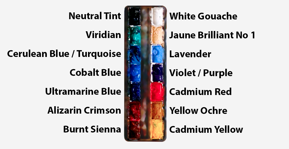
with preference. I have 12 stable colours in my palette that I
fill up from tubes. They are cadmium
yellow, yellow ochre, burnt sienna, cadmium
red, Alizarin crimson, Opramarne blue, cobalt blue,
serlean blue, lavender, purple, viridian, black, and
at the end of the painting, I often use white gouache
for tiny highlights. I don't use any
particular brand, these colors you can
get from any brand, although I personally
use Daniel Smith, Windsor and Newton,
or Holbein paints. So let's move on to brushes. The brush I use the most is
a synthetic round brush like this Escoda Purl brush
or this Van Gogh brush. They're very versatile because
not only can you use them for detailed work
with their fine tip, but as they can hold
a lot of water, they are good for
washers as well. They're also quite affordable, so I have quite a few
in different sizes. Next are the mop brushes. Mop brushes are good for
broad brush strokes, filling in large areas and creating smooth
transitions or washes. They also have a nice tip that can be used for smaller details. But for really small details, highlights or anything
that needs more precision, I use a synthetic
size zero brush. All brands have them,
and they're super cheap. Another useful brush to have is a Chinese calligraphy brush. They tend to have long bristles
and a very pointy tip. They're perfect
for adding texture or creating dynamic
lines in your paintings. You can even fan them
out like this to achieve fur or feather
textures as well. And that's it for
brushes onto paper. The better quality
of your paper, the easier it will be to paint. Cheap paper criinkles easily
and is very unforgiving, not allowing you to
rework mistakes. It's harder to create
appealing effects and apply useful techniques
like rubbing away pigment. Good quality paper, however, such as cotton base paper, not only allows you to rework
mistakes multiple times, but because the pigment
reacts much better on it, the chances of
mistakes are a lot lower and you'll be more likely to create
better paintings. I use archers paper because that's what's available
in my local art shop. A water spray is
absolutely essential. By using this, it
gives you more time to paint the areas you
want before it dries. It also allows you to
reactivate the paint if you want to add a smooth
line or remove some paint. I also have an old rag or t shirt which I use
to clean my brush. Cleaning off the paint
before dipping it in the water will make the
water last a lot longer. It's always useful to
have a tissue at hand whilst painting to
lift off excess paint. Also, you never know
when an unwanted splash or drip might occur that
needs wiping away quickly. I also have a water dropper
to keep the paints wet. When you paint, it's
important to have them a similar consistency to what
they're like in the tubes. This way, it's easier to
pick up sufficient pigment. A hair dryer is useful
to have for speeding up the drying time and controlling the
dampness of the paper. And lastly, masking tape. And this, of course, is just to hold the paper down still onto the surface to stop it sliding
around whilst painting. Also, if you plan on
painting to the edge, it'll allow you to create a
very crisp, clean border. And that's everything
you need to follow along in today's class. Now, let's go ahead
and start the drawing.
4. Preparing The Composition: When sketching this out,
it's important to start off with nice organic shapes and not go straight
into the detail because as long as we set up the main
shapes to begin with, the details are less of a priority because of this suggestive
nature of watercolor, we won't even have that
many details in them, so there can be exaggerations in the forms and shapes without having to be as accurate as we think we
actually need to be. So it's all about setting the
stage with a few anchors. As you can see, I
started off with a soft lead pencil applying marks that just
map out the general area, and then I'm going back
with the same pencil, actually, I'm using
a soft lead pencil, mechanical pencil just to
further define the areas. And I'm thinking
about light and dark. Even though with a pencil we're thinking about we're
only using line, I'm thinking about
what's going to be light and what's
going to be dark. And they're just kind of
guides to set us off. When it comes to
the paint, we're going to be a bit
more expressive. We're not going to follow
these lines exactly, and I'm just going
to suggest areas rather than adding
lots of detail where I know I'm going to be a bit more expressive with the paint. For example, this second chef in the background doesn't
need to be as detailed. It just needs to be
enough information to help me think about it
when it comes to the paint. Likewise, with these pots
and pans and stoves, just a general suggestion. A.
5. Starting With Shadows: Starting off with
my neutral tint, you're welcome to use
black or Pain's gray, any neutral color. And by the way, you're
welcome to do this painting in pure black and
white, if you want to. As long as you have
some red sparks for the fire later on,
it'll still make sense. But I'm going to play
around with color just for the sake of any
advanced painters who want to experiment
with a broader palette, but this can easily be done
with a limited palette. And I'm starting off painting the shadows on the main chef in the foreground, of course. And there's a lot of negative painting and
negative space in this. So a lot of the painting will
be done by not painting it. One of the main
aspects is the steam, and the way to paint steam is to ironically not paint
it, to paint around it. Likewise, with the
bold white coats that these chefs wear, we're
going to leave it white. So to create that shape, we're going to paint around it. So we're first of all,
painting the under layer, the shadows before we actually
paint the silhouette. So when it comes to
exploring colors, if you want to follow
along exactly, in these shadow areas, I see gray as the middle ground, and sometimes I shift to a warm gray or a blue
gray at the moment. You can see there's a bit
more warmth in there, and then I connect it to that
neutral gray up the top. But then I'll balance it out by dropping
some blue in there. It doesn't matter what blue. I've gone with turquoise blue
because for some reason, that just connects
with being a bit more. But there's no wrong blue. If you want to use
ultramarine or cobalt, it's up to your personal taste. On the palette that I've set up, you can see I've got some
purple and some brown as well. So I'm going back and forth. But the key element is
that I'm graying it down. I'm making it a
bit more monotone. So I'm using the pencil lines
just to fill out this area because even though we're jumping straight into
these little details, most of the painting
is very suggestive. But the nature of watercolor is that we have
to paint these areas first. We can't paint the background and then come back
to this because we'll be painting over
it in the wrong order. So on the sleeve, I'm not over detailing
the subtle shadows. I'm kind of creating a
simplification of it. So they're almost like
bendy little arrows. As the folds reach the middle, they get thinner and thinner
to their little points. And then as they connect with the torso into the shadow area, they get larger and larger. And that's all it is.
It's not specific. It's quite arbitrary,
but it's quite organic. They're not all the
same shape and size. And I'm allowing a few
wispy little bits of white little bits
of gap in between, just to again, suggest
detail when it's really not defined detail. It's nothing specific. It's
just a little white gap that gives the
illusion of detail.
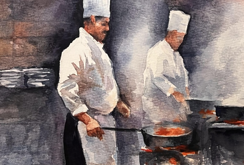
6. Applying Thicker Pigment: Now once we've done
this first wash, we can start building on
it with thicker pigment so that it bleeds out and
creates a smooth line. So we started off
with a mid tone that wasn't too dark
and not too light. And I'm just dropping thicker pigment in between the little gaps where the
shadow will be a bit darker. And when you first
apply these strokes, they'll be very dark
and much like a line. But because the wash is wet and we're using
wet on wet technique, over about a space of 5 minutes, the water will pull
away this pigment, and it won't look so rigid. When we first apply
these strokes, it looks rigid and it
can feel a bit odd. But if we allow the water and the pigment to do its
thing and trust the process, I'll change over time. A lot of watercolor
is about trusting the process and surrendering to it because it can
feel uncomfortable. A lot of it's counterintuitive. So as this first chef
is the focal point, the center of attention, I'm adding these
sharp contrasts of pure white and hard lines. So that will catch the eye because it's within our nature as humans to focus on something. We're always searching for
the thing to focus on. So we're deliberately
creating that to create a pleasing
painting to look at. If everything was equally
detailed or equally blurry, we'll get a bit lost so now I'm bringing this wash down to the bottom of the apron.
7. Hands Underlayer: Now, I'm just going to
drop this warm red in with the neutral gray that
I created up above because I'm going to fill in the
underlayer for the hands. I also put a little bit of yellow ochre in there because I don't want it to be pure red. Skin tones tend to have a
bit more orange in them, so that yellow ochre makes
it look a bit more natural. And because the wash of the apron underneath
is still wet, there'll be a bit of a softness
to this with the hands, they can be a bit
fiddly and distracting, and I don't want to
have to deal with that. So I'm kind of cheating in
a way, by using suggestion. I'm going to suggest the hands so the viewer can see
that they are hands, but we don't need to
worry about the details. We don't need to
spend a lot of time, maybe just a couple of well placed dots for where the highlights might
be or a single finger. But at the moment, it's
just an underlayer. Using a mid tone, a pinkish
orange kind of color. And even within these so
called detailed areas, I want it to be a
bit more expressive. I don't want it to
look too rigid, so I'm using pure water on my brush now and just
dropping it on there. And again, you won't see
anything straightaway, but over a few minutes, the water will push
around the pigment and it'll create some
organic shapes.
8. The Second Chef: Now it's time to paint
the background chef, and this one is just
a supporting actor. We just need to suggest
the details there. It's more to create a feeling
of depth because we'll have this more detailed
chef at the forefront and the more subdue
one that's smaller, softer, and it sits
a bit further back. So we don't need to
add as much detail further simplifying the shapes using a
very neutral color, basically just using the
gray, that cerllan blue, and then again with the hands connecting it to the
rest of the piece. And it doesn't look like much, but when we chisel out the template by negatively
painting the silhouette, it will look quite convincing. Now we've given that first
chef a bit of time to dry. We can go back on and apply a few more strokes
that again will hold their shape a bit longer
because the papers dryer. I wouldn't want to add these
strokes straight after painting that wash because
they just disappear. The water would
completely even them out. So there's a little
sweet spot of time when it would
be a bit too late, because if we waited
two more minutes or five more minutes, the paper would be completely dry and the lines
would be way too hard, but you can see that
the lines exist, but they are much softer. And we can be quite
expressive at the bottom there because at the
bottom of the apron, we're drifting away
from the focal point, so we want to put less
detail down at the bottom. Likewise, with the face
that we paint in a minute. We don't need to put
much detail on the face. We, of course, sketched it out with quite a lot of detail. But I'm going to use
soft washes to do that. I don't want to describe
the face much more than making it
convincing as a face. I want it to look like a face, but in the least amount of effort as possible because I don't want the focus to
be on the face at all. Starting to paint the hat. And now I'm using notramarin with a bit of gray
in there to tone it down. Maybe dropping a bit of
warmth at the bottom. But barely perceivable. It's kind of like a pain's
gray kind of color, and it transitions to
white at the very top. So the tip of the
hat is pure white. Little transition because
I want that contrast between the black
background we'll paint later and the
whiteness of the hat. That's what's the most striking
element of this painting, the contrast between the
white and the black. And also, whilst it's wet, dabbing in the ears there.
9. Background Underlayers: Now we can start applying the underlayers to the background elements
of the painting, such as these
plates on the left, which I don't want pure white. I don't want there to
be any other white in this painting except the chefs and that
main protagonist. And you can use any color. I'm using a bit of purple. I pre wetted the whole
area that I want to go to and just dropping
in some pigment. Maybe I could start painting
in this second chef's hat. Similar idea, adding a bit
of coolness at the bottom, and then gradually fading white. Maybe we can add a bit of warmth to this second chef
because at the moment, it's just cool colors. At the bottom, we've
got a bit of warmth, but maybe on the collar, just add a little bit
of subtle warmth. It's a bit too strong there, so I'm just using pure
water to scrub it out. You can use a tissue
to pick it up. It's quite a high staining
pigment that I used there. But it's not too much of
a problem because we're going to becoming a lot deeper
with the pigment later. Now, when painting the underlayer
for the pots and pans, you've got to be a
bit careful about where you want the
steam to rise from. Everything below the tops of the pans is pretty fair game. I'm adding neutral browns
there at the moment, a bit of burnt sienna, with a touch of red to give it some warmth because there'll
be so much coolness in this painting in the
background that I want there to be some warmth
where the stoves are. A bit of a sarin crimson there, just underneath the stove. I mean, the stove doesn't
necessarily need to make sense. Again, I just suggesting
the idea of a stove, some pots and pans because when it comes to
painting it later, there'll be a lot of expressive
abstract brush marks just to exploit the exciting
nature of watercolor.
10. Main Chef Face: Now I'm mixing much
richer pigments using camien red
and burnt sienna, and it's time to paint the face or at least suggest a face. I don't want to be too detailed. I'm literally just
blocking it in. So I see my pencil lines and
I see how far I need to go. And at the moment, it's just coloring
that blocking using that warm, slightly brown color. Maybe a bit of elasarin
crimson at the top, on the cheek where there's
more blood vessels, so it's a bit redder on
the cheeks and the nose. Using the tip of my brush. And then I've got
to suggest where it might be lighter on
the face where maybe lights reflecting on the top
of the cheek and maybe it's darker underneath the
chin or behind the ears. So time to drop in some
pigment around the eyes, where the eye sockets go in, there'll be less light, so
it's slightly darker there. But again, nothing too
detailed at the moment. You can see it's just very
suggestive and elusive. There'll, of course, be
a bit of shadow where the hat meets the head and
maybe he has dark hair anyway, so we can make that
a bit more elusive. Wet on wet pigments, allowing the water to
spread the pigments around. And then as it starts to dry, we can refine it, but we don't need to spend
an awful lot of time. In fact, the more time
we start spending on it, after a certain point,
it looks overworked. So we don't want to
spend too much time. We just want to
work on it until it gets dry and then hope that that's enough because the face isn't the focal point, really. It's more the light display going on with the
shadows on the apron, which is actually
the focal point. Drawing some pigment away from the ear because I
felt it was too dark. I have to remind myself
that the pigments dry a lot lighter than they
look when they're wet. So it might look exactly
how I want it to right now, but I know that once it's dry, it'll look too light and weak. So unfortunately, I have to go back in
with more pigment now. And this is just pure
neutral tint at the moment. At the top there. Just dropping pigment into those three spots the eye sockets or where
the eyes are rather. It's easier to paint figures
where their eyes closed. So especially if
he's looking down, maybe the eyes look
closed anyway. And underneath his nose, where the light creates
the shadow then where his chin and jaw
line meet his apron, his collar, it'll
be darker there. So those are the three areas that you need to
drop pigment in. And you can allow the
watercolor to do what it wants. You don't have to
be too specific. Now, the highlights
are a bit light, so I'm going to have to tone them down a bit because there's
a bit too much contrast. It's a bit too eye
catching at the moment. So I'm going to go back
to that red flesh color and tone it down a bit. It's not so much that I'm
fiddling around with it. It's that as the paper
is starting to dry, I can create different marks because of the
dampness of the paper. So I'm using the
tip of my brush.
11. Second Chef Face: And now we can move on to suggesting the face
in the second figure, which can be far more
expressive and suggestive, literally filling in the block, maybe creating a little
gap where the eye is, with that same orangy pink tone. And that's all it is really. Just filling it out with color. Instead of using
black or neutral tint for the shadows on this figure, I'm just going to drop
in some cobot blue. So those shadows are
very soft and subtle. I'm using pure water
so that it blends out. So there's no hard edge there. Now that the first
wash has dried, I just want the area beneath
his hand to be a bit darker, and I'm going to seamlessly transition it into the
rest of the apron. And then get a bit
darker as we go down, making it a bit cooler as well. So I used serlean blue then. Then I can drop in
some warm as well. So when this brown and
blue mixed together, it neutralizes to create a gray. Where I can, I
like to experiment with blue and brown
playing with them together because they're complimentary
colors and the way the watercolor interacts with
them can be very pleasing. And it's fun to let the watercolor do what it wants because either way it goes, whether it ends up too
blue or too brown, they work together,
so you don't have to fuss about it too much. You can just let it do
what it wants to do. Using the tip of my brush to add some vertical strokes
on the top of the hat, using pure water to roughen it up a bit so
it's not too precise. A.
12. Starting The Background: And that's our figures painted. Next is to start working
with a background to paint around the silhouettes of these figures to create that
interesting bold contrast. So let's premix the colors
before we get into it. Again, like I said, in
the previous lesson, I like to use browns
and blues a lot. So I've mixed a
kind of warm blue at the top because it is
a bit closer to purple. So I've used ultramarine and a bit of a lizarin
crimson to reach that. And then I've got a nice rich brown made with
burnt sienna primarily. And then at the very top, I have neutral
tint or black that I've diluted a bit because
it's so thick inside my palette I want
some pre diluted. And I've moved to a
larger brush here. It still has a nice
point so that I can get a clean edge around the chefs, and notice how I've painted down to the
plates on the left. You can't see them as plates at the moment, but
that's what they are. Starting off with a
mid tone of warmth, then applying a few
drops of purple. And that's how we're
going to do it. We're just going to drop bit
by bit building up the tone, using a large brush so that
we can get a nice clean, thick stroke in one go. We don't want to
paint the outline of these hefts with lots of little tiny strokes repeating
along the same line. We want a nice fluid
confident stroke. And there's more interest. There's more to be
said with one stroke that can be technically
wrong or look incorrect. It can be more emotionally
charged than if you apply ten strokes
and it looks correct, but it's empty of emotion
because it's been overworked. So the emotion, the captivation comes in through
the confidence in your strokes rather than holding back and
doing it bit by bit. I'm trying to paint
around this outline, the silhouette in one
long connected stroke. Of course, sometimes I have to refill my paint with a
pigment from my palette. But you can see how it's all connected in
rhythm. It's all fluid. I don't want it to look like
I've chiseled away at it. And because the rest
of that side is wet, it's going to blend
out smoothly. Okay.
13. Painting The Plates: Next, I want to paint these plates very suggestively
again on the left, but I don't want there to be a hard line at the
top where the hat is. So you can see very subtly
how I've used pure water to keep it engaged so that it won't dry and I can
connect it easier later on. But to paint these plates, I'm using the tip my brush, and I'm just adding little
horizontal zigzags. Some of them aren't
even zigzags. They're just pure thin
horizontal strokes. We're painting the shadow, not the object itself. With everything
in this painting, basically, 90% of it, we're painting the shadow
and the shape around it, the light, interacting with it rather than the
object itself. And that's actually what
brings out the best in watercolor painting the
light and the shadow work. Because it allows us to be
more elusive and suggestive. We're not defined
by the rules of the object anymore
because we're not painting the object,
we're painting the light. And everything is connected. So, of course, these
white little areas that we've preserved from the
background have their own shape, but they're all
connected through this one wash that we're working down using the
tiff of our brush. I'm not too concerned
about getting a nice, clean, flat wash in
this background area. In fact, quite the opposite. I'm purposely agitating it. I'm intentionally trying to
create texture and a mess, which is such a liberating
feeling to do and ironically, makes the painting
look more technical. But actually, I'm
just being messy. I'm adding pure water, then pure pigment colors
all over the color wheel. Allowing it to dry a bit
and then adding more water, then more pigment
just very random. There's not much method or
rules to it, just playing. Then I connect that down there, just using that little
bit in the corner to connect it so that
nothing separated. It's all in harmony together. Then it was a bit
warm on this side. So coming from the bottom, I'm going to add some coolness, some pure serlean blue. And you can see I'm not being too strict with my brush work. I'm being very random, swiggling it about up
down round and round, just trying to
disperse the pigment in a way that I don't have
to overthink about it. Then I start going
back and forth, picking up pigment
from the top and then dropping it down
below and then vice versa picking up pigment
down below and dropping it up above so that the
colors are harmonious.
14. Extending The Wash: Now we can start extending
this wash to the rest of the composition using
the same colors. And this is what
will make a painting unique for you because
whatever colors you choose, even if they're
different from mine, if you connect those colors
all around your composition, then it'll be harmonious
within itself. Notice how I start
with pure water, and the space in
between the two chefs, I'm leaving very light
because this is how we create that steam
effect, that feel of steam, just like the negative painting
we did of the chef's top, we paint the steam
the same way by painting around it and
not painting it itself, except with the chef's top, we've got a very hard edge. And with the steam, by contrast of that, we
have very soft edge. So we painted the left
hand side of the chef a very different way to the way we're painting the
right hand side. The right hand side,
we're starting off with the silhouette,
the outline. So working from top to
bottom, we're going down. I'm not being so bold and
confident as the other side. But I'm still filling
out that shape, and I'm using pure water this
time rather than pigment. And allowing that pigment to be drawn out by itself
into the water. And other than that, we don't have much control. We know however it dries, there'll be some
kind of transition between the pigment and
the white of the paper, and within that transition, as it dries, the illusion
of steam will be created. So it's not something
we actually do. We just set it up
to do it itself. And for me, that's
the magical part of watercolor and the
very exciting part. And when I look for a subject, that's what I aim for areas
where I can really allow the watercolor to do its best work and for me to do as little
as possible, basically. It also creates that
feeling of atmosphere, much like when you
paint cityscapes or landscapes with fog in, it has a certain mood
to it, ambience, or when you go and watch a theater
performance or a band and they use that fog machine. So in between the
two chefs here, it's not necessarily steam. It's just a compositional tool
to create that atmosphere, and I don't want to
be pure white here, so I'm just adding a
bit of pigment just to keep that contrast
between that secondary chef.
15. Building Up The Pigment: Now that the left hand side is starting to dry a bit more, I can see it needs darkening
with more pigment. Because again, pigment dries
lighter than when it's wet. And it's also an excuse to add a bit more texture because
it's hard to achieve impossible to achieve texture
actually when the paper and paint is still very wet because it'll even itself
out before it's dry. But if you allow the
paper to dry, 60%, 70%. The closer it is to drying
before you agitate it again, the more texture they'll be. So if you want extreme texture, you can wait until
it's almost dry so that it's dry to the touch and you can
feel that dampness, and then you can apply
pigment or splatters, and then you'll
achieve cauliflowers, blooms, all those good things. Now I'm filling out that space, negatively painting
that second chef. I purposely want there
to be less contrast with this second chef so that it doesn't compete with the
main chef main figure. You can start to see now how
abstract the background is. It's just about filling
space in an interesting way. It can be done so
many different ways. You can use different
colours, different tones. You can just have fun with
the background, really. I can start filling
in the space down below in between his
apron and the stove. Again, at the top, I've made sure to pre wet the paper
so that it's still active. I don't want there to be any
strong hard edge up there. And because it's still
down at the bottom here, even though I'm using
quite strong pigment, there's a nice soft transition. I don't need to be too
precious about this pot or this pan because most of
it will be black anyway. Now, I'm dropping
in some pure water into that area on the left to
create a bit more texture. And notice how I just used
more pure water up at the top to start
bringing out that wash, that background wash
towards the right. Always going back
to that area on the left as it starts
to dry more texture.
16. Starting The Steam: To paint the steam coming
from the pot on the right, we have to be a bit more cautious than our expressive
side on the left. It's still going
to be expressive, but we have to have a few safeguards there to
protect that steam coming up. So I'm starting off
with pure water, and then at the top, we can add a few drops
of any color we want. I used a bit of red in the top corner and
then that kind of neutral cool gray on
the left side of it. Then as it comes
down on the side, I'm using pure serlean blue. And then where the water
comes up from the pan, it's completely clean pigment. There's no color
in there at all, pure water so that
when it dries, it remains the
white of the paper and gives that
illusion of steam. And I don't want to
agitate it too much at all because I don't want to risk any pigment going through the middle and ruining that illusion of the
white space there. And if the pigments
strong enough, it won't spill out too much. The more diluted
your pigment is, the more likely it'll
spread across the page. So when adding this pigment on the right hand side
of the right chef, I'm starting strong right
in the middle there. But I'm cautious
that I don't want to add so much pigment
that it spills off and works its way all the way over the steam on
the right hand side. So it's quite a thirsty brush, and by that I mean, it's
not very full at all. I don't need to worry
about the pencil markings down below because I
can still see them. I just want to make sure that I leave the white of the
paper above that pot. That's the key, and it
has to be wet on wet. There can't be any hard edges where the steam is involved. Now I'm mixing a
very dark neutral. To mix my own neutrals, I use burnt sienna, Alizarin crimson,
and ultramarine. This has a bit more ultramarine. As you can see, it's a
bit more blue, purplish. And then my second
second brushstrokes are a bit more brown and there's even a bit
of green in there, too, but it doesn't matter
because they're so muted. It's more about the
tone. And you can see the pigment was a lot thicker so that it
holds a bit more. If it was very diluted, it would start washing
out a bit too much, but the thickness of the pigment holds it
together a bit more, but it remains soft, which
is an important thing.
17. Shaping The Steam: I shouldn't have to go back to my palette for the time being, at least for this wash because I've already put most
of it on the paper, and I'm just going to use the pigment that
I've already got on my paper to move it
around the way I want. And that will keep it
harmonized and better balanced. That also gives me more control because if I was working
with less pigment, it would be moving around. It'd be too diluted and agitate with the
water a bit too much, but I want some more control. So if I start off thick, the pigments will
hold their place, and then I can choose how and when I want to spread
them out a bit more. So that's what I'm
doing now. I'm using a kind of safer strategy. Of course, it doesn't
seem intuitive that way. Most people starting out, start with soft pigment and
gradually build up going over it and over again until they reach the darkness
that they want. But ironically, there's a bit more control than
doing it the other way, starting off with heavy
pigment and taking away or replacing it
around the composition. So I started with this
pigment around the figure and then brought it up and around the other
side of the steam. And as the paper is
starting to dry now, I'm more reassured that I can preserve the
whiteness of that paper. So I can be a bit more playful without it jeopardizing
that steam, again, because that steam is really the highlight
of the painting. It's not necessarily
the focal point. The figures the focal point, but we need that illusion for
the painting to make sense. I want there to be more depth around the face, more contrast. So I'm adding a bit more
pigment around there. That same warm blue color. It might sound strange to
call blue a warm color, but you can have a cool blue, which is a bit more green. And if you add red
or purple to a blue, it adds a bit more warmth to it. So with any color, I think of it in
terms of temperature. There's a cool shift and there's a warm
shift to any color, and you can play around. So you can do a painting that has a blue theme like this one, and you can play
around with the warm. So I just applied a
cool blue to this chef. So that turquoise Cerlean
blue is a cool blue. And the play of those colors
can be quite appealing. This looseness actually creates that feeling of action
and stops them from being static because the
big idea is that we're trying to capture
people working in a high energetic
environment rather than just figures or
static mannequins. The gesture and the posture are much more important
than perfect anatomy. And likewise, we have the
other elements like the plates or the stoves that we'll be painting later,
the pots and pans. It's not about painting them in a realistic way that
imperfection in it, the expression is
what gives it energy and creates that feeling
of hustle and bustle, and it excites our emotions, our experience of
looking at the painting.
18. Painting The Hands: Really, the kitchen itself is a character rather than the figures that we're
trying to paint inside it. That's why sometimes when I talk about painting
the figures, I say it rather than him
because I'm thinking in terms of elements rather than the actual people inside it, because we're using
the watercolor to paint invisible things
really hot air, vapor, glow and splashes. How we can use very
soft washes and lifting paint to create steam and smoke rather than actually drawing and directly
painting it. Of course, we wouldn't
want to use white paint or gouache to paint the vapor. We want to paint around the vapor and let the
paper do the job for us. We are suggesting the
atmosphere by what we leave out as much
as what we put in. I think this painting's a
good exercise for any level, really, even if you're
just starting out. I think there's
something to learn for even a beginner because you
shouldn't as a beginner, be expected to paint
masterpieces anyway. You're trying to learn the
potential of the medium. And here we can
learn where to be careful and where
to be carefree. It's, of course, a
kitchen scene, obviously. But the actual main story
is the play of light on all these objects on the coat or the top that the
chefs are wearing, the plates, the pans, the smoke. So everything other than that
can be a bit more abstract. Of course, we've got
to add some detail like we have to the face just for it to be
recognizable as a face, but everything else can be
softer and more abstract. 60% of this painting is
very abstract and isn't necessarily a thing other than
a bit of texture or shape. Likewise, with these hands, we're just painting enough
for it to make sense as a hand. Maybe not even that. Maybe we can just imply a
hand because we've painted the rest of the figure and the minds just fill
in the gaps for us. So maybe when it comes
to painting these hands, we don't need to
suggest any detail at all other than a
warm kind of glow. A and that's how we learn by practicing that balance between control and looseness, putting our effort into tiny areas and then letting the rest melt
into suggestion. One of the things I hope you
take away from this class is that feeling to be more comfortable leaving big
areas unresolved without feeling guilty about it because it feels wrong
during the process, but once it's finished, it's what creates that
excitement, actually.
19. Painting The Trousers: This becomes a general
compositional habit for any complex scene, really, because most paintings are based in something
that's very complex, whether it's portraits, street scenes,
countryside scenes. There's an infinite
amount of details, and we as artists
have to learn how to adapt it to
pigment and paper. So we have to be
transferable with this exercise of keeping
big areas unresolved. And this is one of
those exercises where you have a lot
of freedom to do that. When I'm painting,
I'm not trying to overthink about the
technical side of it, only so much as to execute the vision that I'm trying
to think of and imagine. So most of what I'm doing
when painting is to try and get in touch with the emotional tone
that I want to convey. So I think, what is this
environment that I'm painting? It's not a relaxed cafe. It's a high energy
working kitchen. So I want there to be an element of focus, professionalism,
concentration. So their poses,
they're looking down. They're active. There's
a lot of heats, some noise, intensity going on. So that's where we want to exploit the abstract
nature of watercolor. We're painting that
feeling of concentration. These chefs are not posing for us. They're deep in their work. And these are the kind of
thoughts that I'm having in my head whilst I'm
daydreaming painting, I'm thinking, maybe these two have been working
a long shift. There might be a
service going on outside the frame and
orders coming in. Maybe the nearer chef feels like the senior figure,
the one in charge. And then this second one is
a kind of supporting act and mirrors him or
maybe doing a side job. Maybe he's a sous chef. And then when it comes to
painting little details, maybe the exact moment when the flames lick up
and flick around the pan when you add some
moisture to the pan or water, and it sizzles and
creates that steam. Just trying to picture what it would feel like,
the smells, even. Maybe they're cooking
onions or garlic or the clanking of metal
on metal on the stove, the sound of the roaring flames, just visually thinking about how it would what would
sound like the senses, what it would smell
like, trying to immerse myself mentally
into the scene, and then that conjures up the decisions that I want to make what
colors I want to use, the textures, the tones. It's rather than thinking
about it mathematically, it's more about playing
with the ideas in my mind and then allowing
them to come up. And that's what you can do,
and that's how you explore your own style and voice. Maybe for you when you
imagine the scene, you have different
associations with it. So maybe it's not a blue color. Maybe you go for a much warmer kind of tone
or maybe it's greener. Maybe it's not that
colorful at all. Maybe it's more monotone, of course, a lot of
kitchens are monotone. It's chrome, it's
metal, it's black. There's not much color involved. It's not like we see inside
the food, inside the pan. So whatever image
comes up in your head, that's your own
personal intuition. There's no right
or wrong to that. And you can make it
work with practice and exploring the whole
range of watercolor. O
20. Starting The Fire: Beyond the figures, light, steam, and fire are characters
in the painting, too. And that's what we're
going to start adding now, little glows of red underneath
where the flame can flick up this scene is quite
well illuminated. We've got strong light
coming from above and multiple different angles really from the side hits on the
jackets and the hats, and that kind of
illuminates them and separates them
from the dark kitchen. And then the steam hides and
reveals part of the scene, almost like that curtain
moving across a stage. And now we're applying
the tiniest specks of orange and red underneath the pan that adds a
burst of energy too. The idea of fire energy,
maybe subtle danger, some action using
pure pigment and then pure water on top
of that on the paper directly to spill out a
bit in an organic way. And exactly when
I'm painting this, I'm thinking about that
crackle of the flame, that is of the oil, the clattering of
pans and plates, maybe the smell of spices, all thick in the air, the
energy of a busy kitchen. This pan that I'm
painting now is actually the only pan
that we'll see inside of the other pans have steam
coming out or they're in a perspective that we can't actually see inside
because there's three pans, really, the one in the distance, which is too flat for
us to see inside, the one on the right there too much steam coming out
for us to see inside, and we don't need to add detail. And then this third one
that we're painting now, we're just implying some warmth. The reason I'm using red is because it fits in
with the color scheme, not necessarily because he's cooking meat or anything red. Just if I were to
add green there, it wouldn't match
the color scheme. So that red matches the warmth from the flames
below, the skin tones. It's all harmonious
within the composition. And again, it's
not too detailed. It's abstract shapes really. A
21. The Pots & Pans: Now it's time to paint
the pots and pans. And before we get nice and abstract and get all expressive, we need to kind of
set up the stage for that and paint the
areas that ground it. So I'm adding a bit more
contrast to the top, the other side of
this pan, and it will blend out nice and smoothly
into the chef above it. No hard edge is there,
except that lip of the pan, that you've got that
contrast between the hard edge and then
it fading out above it. I want to darken the other side on the left
hand side of the pan. But I can see whilst
I'm doing that, that it's making the
hand pop too much. There's too much contrast there. It's taking too much
attention that hand there. So I'm actually going
to smudge it out a bit. I'm going to take away some
of the details of that hand, leave that little highlight on the top where the thumb
is top of the hand, and that's all we need to do
to suggest a hand, really. Then we can use
dark paint just to start sculpting
this pan, really. We want there to be
a clean silhouette, read, and then anything within can be a
bit more abstract, but we need the side
of this to be clear as a pan and maybe a dark edge, and then it transitions to
a lighter color inside. I'm tapping it a
bit of green here, but it's not going
to be too obvious. I'm going mute it a bit. It won't be rich by the
time we're through with it. Likewise, if you want to
paint this in monotone, you don't have to worry about
the range of colors at all. You can paint the whole
thing in monotone and then keep the skin tones warm and red and the
fire, of course. Underneath this pan, you
can see how messy it is. It's really very abstract. There's no rule, rhyme
or reason to it. A few dry brush
marks just to create some rough texture
because everywhere else is so smooth
and soft, really. Then at the top here,
we could start blocking out that silhouette of a pan. I don't even mind or care
if it makes sense or not, the general idea of a pan. We know what a pan
generally looks like. So just playing with it. I have to be a bit careful here. I don't want to
jeopardize that steam, so I'm softening the edge with pure water dropping
in some pure red. There, of course, it mixes with the other
pigments on there, so it blends nicely. Just implying some warmth at the bottom there
for the time being. I don't mind losing the edge of this pan
because I'll come back with some white
wash at the end just to add a few
dots of highlights. I'd rather achieve
a nice fluid wash with fun textures without worrying about the highlights because I know I can come
back later and restore them. Whereas if I had to think about all these little highlights
in random places right now, it would hinder me. It would keep me a bit
chained up, so to speak. I would stop me from fully expressing and
exploiting the medium. Whereas at the moment,
I just want to feel free and have fun. So I've allowed that to dry. Now we can start going back. I'm not too happy
with the way it went, so I'm deciding to just
increase the tone a bit more, make it a bit darker
cause if it's dark, it becomes mysterious and we don't have to add
as many details.
22. The Stove: Also, I feel that there's a
bit too much color there. Like I said, it was
a bit too green. So I'm going to mute it out
by adding a bit more black. So that the green
is very subtle now. It's basically just a gray with a touch of
green inside there, not too striking or
jarring anymore. So you can still incorporate
any color you want, but you have to mix some of the other colors
in the composition to make sure that it's
in harmony with it. Trying to define
the edge a bit on the right hand side
of this pan or pot. I'm trying to also achieve a sense of flow and
rhythm in this painting. So if I disconnect
completely with the subject, forget that it's a kitchen scene or chefs or pots and pans, I want to think
about how there's a feeling of flow coming
down from the main chef, and then his hand on the handle connects us to the pots
and pans on the stove, and then that gets followed up the steam
on the right hand side, but it comes background like
a circle to the second chef, and it's almost like a spiral. It keeps on going round
and round, arguably, it goes over to the very
left coming down to the plates so that wherever your eye lands
on this composition, it can follow the direction and be led around
the composition. There's basically three main
elements of this painting. We've got the luminous whites from the aprons and the steam. Then we've got the machinery
in the bottom right. And then we've got the small warm sparks coming up as well. Arguably, those plates on the left are an element as well, but we could even
take those away. They're not
completely necessary. If you want to simplify
your composition even more, you're welcome to leave out
those plates and keep it more elusive and bring that abstract
wash all the way down. You can notice and observe the edge play,
the variety in edges. We've got crisp edges on the shadows on the
arms, the plates, the pans, and then we've got a lot of soft
edges where the steam is. And then there's some
completely lost edges that we don't even see like the deep darks in the stove,
the abstract backgrounds. It's that variety that makes
the painting quite dynamic, but also helps make the composition a bit easier
to paint because when we think about the silhouette of the main figure and
other elements, too, just the idea of
strong silhouettes, we can read what an object is just by a few defined shapes. So the clear hat, the apron, and the forearm define
the figure as a figure, but the rest is very
loose and soft. Likewise, with the
pans and on the stove, we've got a few obvious shapes, but the rest is just
very abstracted. We've kept the majority
of the kitchen in kind of blue
violets or cool grays, only allowing the warmth to appear as the flame
and the flare. And having that second
figure really adds to the feeling of depth and
rhythm because he's smaller, lighter, and he's
partly veiled by steam, and like the rhythm is repeated. So we have the same hat, the jacket, but a
bit further back. And it balances
the canvas so that the left side doesn't
carry all the weight. It's like a soft echo
of the main chef.
23. Suggestive Details: Let's take a minute
to talk about the value structure of this
painting because really, color can be a distraction. The most important elements are held together by tone and value. And the easiest way
to think about it is breaking it down
into three families. So we have lights, mid tones, and darks. So let's look into these
groups now to help understand them and how they relate
to this composition. So the lights, we can see that the chef's jackets and hats and the steam are the lightest
areas of this painting, especially when you
squint your eyes. There's the lightest areas. And then the mid tones, most of the background are mids. We've got some flesh tones
that are mid tones as well, softer parts of the second chef and the counter surfaces
and some areas of the pans. Then for the dark areas, the darkest areas
of the composition, we've got the interior
of the stoves, the undersides of the
pans and counters, the trousers, maybe
the deepest shadows under the counter on the left. And if we keep these three
families clean and organized, the painting will have
an understandable read, even if we strip
away all the color. The main chef, of course, is the largest light shape, the clearest defined
shape in the image. And that's an important
element to get right. His jacket and hand are mostly
in the light family value, and it certainly
has the strongest contrast in the
painting as well. We carve the form with a gentle mid tone for the
shadows on the jacket. But we don't lose that
impression of overall lightness. And we need the background to be darker or else he disappears. The steam on the left
is equally light, but it's less attention seeking because of the
softness in the edges. It's more elusive. So it's
the contrast doubled up with the light on the left hand figure that
makes it the focal point. And of course, there's
other areas as well, the small highlights on the
pans and the metal surfaces, the plates, and the bits of reflected light
on the counter. But we treat these as supporting sparks never as big or as
strong as the main light. The majority of the painting
is filled up with mid tones. But actually, it's
the dark areas, the darkest areas of them all, the pure Blacks that
anchor the painting. And it's those areas that give
the weight and the drama, the inside of the
stoves, under the pans, the lower parts of the
figures like the trousers, a few fin lines around
the hands and the tools. We avoid scattering
that same deep dark all around the background, or the painting would
become too heavy. But we're using them
as kind of low lights, not highlights, but low
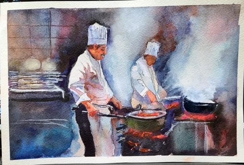
lights to anchor the scene. And now that we've finished
filling in those dark areas, we're using pure white guash to make the white areas
pop glisten a bit, a few punchy areas to indicate those sharp reflections that
you see on metal objects. H.
24. Dry Brush: Now that we've pretty much done the pots and pans
and the plates, we can see how we've
simplified the environment. Most of the appliances, plates, they're reduced to just a few horizontal or vertical shapes with a few soft edges. The viewer filled in
the rest of the details because the context is clear. We've created a kind
of anchor of context, and then the rest is just
a complete abstract mess, really, but it kind of makes
sense from the painting. I'm also adding a few
horizontal lines here, maybe implying some tiles in the background to anchor that perspective and increase
that feeling of direction, so the eye can go down to the plates and
then across to the left. Just a compositional kind
of tool to help guide the eye to give more
context to frame it better. So going back to
painting details or rather the lack of painting details
and plying details, we're saving or save
that drawing energy for that hand on the left and the face and the
main figure, basically. Right now I'm using pure
water to paint the shape of a few pots and pans
behind the plates there. You can't see me paint
in with pure water, but wetting that pigment so that I can rub away
and lift off the shape. And I'm using my
brush to agitate that so that it picks up as
much pigment as possible. Again, just implying
the shape rather than spending a lot of time fussing and painting
the detail of it. Maybe a smaller pan
right next to it. Quite thick pigment here, so I need to use my brush
to reactivate that pigment and then clean tissue to
quickly swipe and rub it away. I want to sculpt steam,
this vapor a bit more. So using pure water And then just cleaning
up that edge, giving it a bit more direction.
25. More Steam & Fire: All these textures add to
the energy of the painting, the splatters, the
loose brush marks. They can suggest sparks, droplets of oil, just the general chaos
of a busy kitchen. Slightly scratchy or
dry brush marks can hint at the worn surfaces of
the metal or the counters. I'm using these
textures mainly in the lower half of the
painting near the pans. Most of the top half is all soft because of the atmosphere
and vapor in the air. Because we don't well, we want just enough
texture to feel lively, but not so much that
we lose the clarity. Just a few random specks cleverly placed around
the heat source can say much more than
meticulously painted flames. And for most of the background, we're allowing
watercolors natural behavior like blooms and soft edges to stand in
for energy, smoke, steam. So when it comes to the
end of your painting, if you squint at it, is the main chef clearly
the star of the scene? We want the primary
chef to read as a strong light shape with
the jacket and the hat, clearly separate from the darker background
and stoves and larger and more defined than the secondary figure or any other element in
the painting, really. And then does the gesture of
each figure feel convincing? Or do we need to edit the
details, soften them out a bit? Because the gesture means the overall posture
and flow of the body, the tilt of the spine, the angle of the heads and the arms? To try and avoid them looking
too stiff and awkward, we might have drawn the
figure piece by piece, not as one flowing
line, connected wash. Even if we paint the
washes in different times, we can connect them by
using soft transitions. Then also, you got
to ask yourself, does your steam look
light and translucent, not like heavy gray smoke. You have to make sure it's
pure white of the paper.
26. Final Thoughts: I Welcome back. And congratulations
on completing this class on painting an
atmospheric chef scene. We explored how a restrained
palette unifies complexity, how silhouettes
anchor the design, and how lost and found edges
with a few refined accents, create believable
bustle without fuss. Steam became a tool
for simplification, while small warm notes
suggested heat and life. These principles carry
beautifully to cafes, musicians on stage, and any subject where light
cuts through haze. Remember, watercolor painting is not just about technical skills, but also about expressing your creativity and
personal style. I encourage you to
continue exploring, experimenting and pushing
your boundaries to create your own unique
watercolor masterpieces. As we come to the
end of this class, I hope you feel
more confident and comfortable with your
watercolor painting abilities. Practice is key when it comes
to improving your skills, so keep on painting
and experimenting. I want to express my gratitude for each and every one of you. Your passion for
watercolor painting is so inspiring and I'm honored
to be your teacher. If you would like feedback on your painting, I'd
love to give it. So please share your painting in the student projects
gallery down below, and I'll be sure to respond. If you prefer, you can
share it on Instagram, tagging me at Will Elliston, as I would love to see it. Skillshare also loves
seeing my students work, so tag them as well
at Skillshare. After putting so
much effort into it, why not share your creation? If you have any questions
or comments about today's class or want any specific advice
related to watercolor, please reach out to me in
the discussion section. You can also let me know about any subject wildlife or scene you'd like me
to do a class on. If you found this class useful, I'd really appreciate
getting your feedback on it. Reading your reviews
fills my heart with joy and helps me create the best
experience for my students. Lastly, please click
the follow button Utop so you can follow
me on Skillshare. This means that you'll be
the first to know when I launch a new class
or post giveaways. I hope this inspires you to tell richer stories with suggestion, contrast, and edge control. I look forward to seeing you in future classes until
then Happy painting.
 Will Elliston, Award-Winning Watercolour Artist