Transcripts
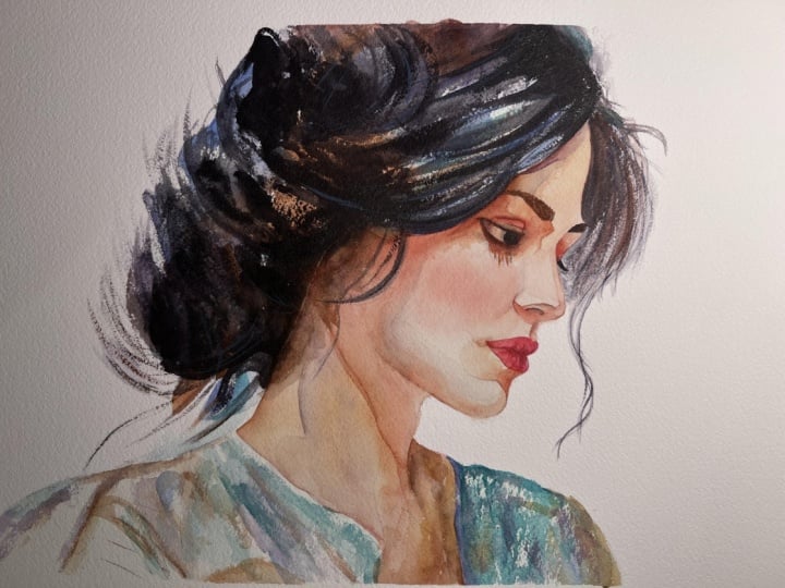
1. Welcome To The Class!: Hello, everyone. My
name is Will Elliston. And today, we're painting a profile portrait
in watercolor. What makes this
subject so exciting is the contrast between
control and freedom. The face is shaped
with calm warm notes, while the hair and
clothing dissolve into loose deep blue violet
painterly marks. We'll focus on a clear
silhouette, elegant proportions, and a soft balance of edges so the eye naturally
settles on the brow, nose, lips, and jaw line. We'll explore
softness, restraint, and the power of
leaving things unset. I've been a professional
artist for many years, exploring lots of different
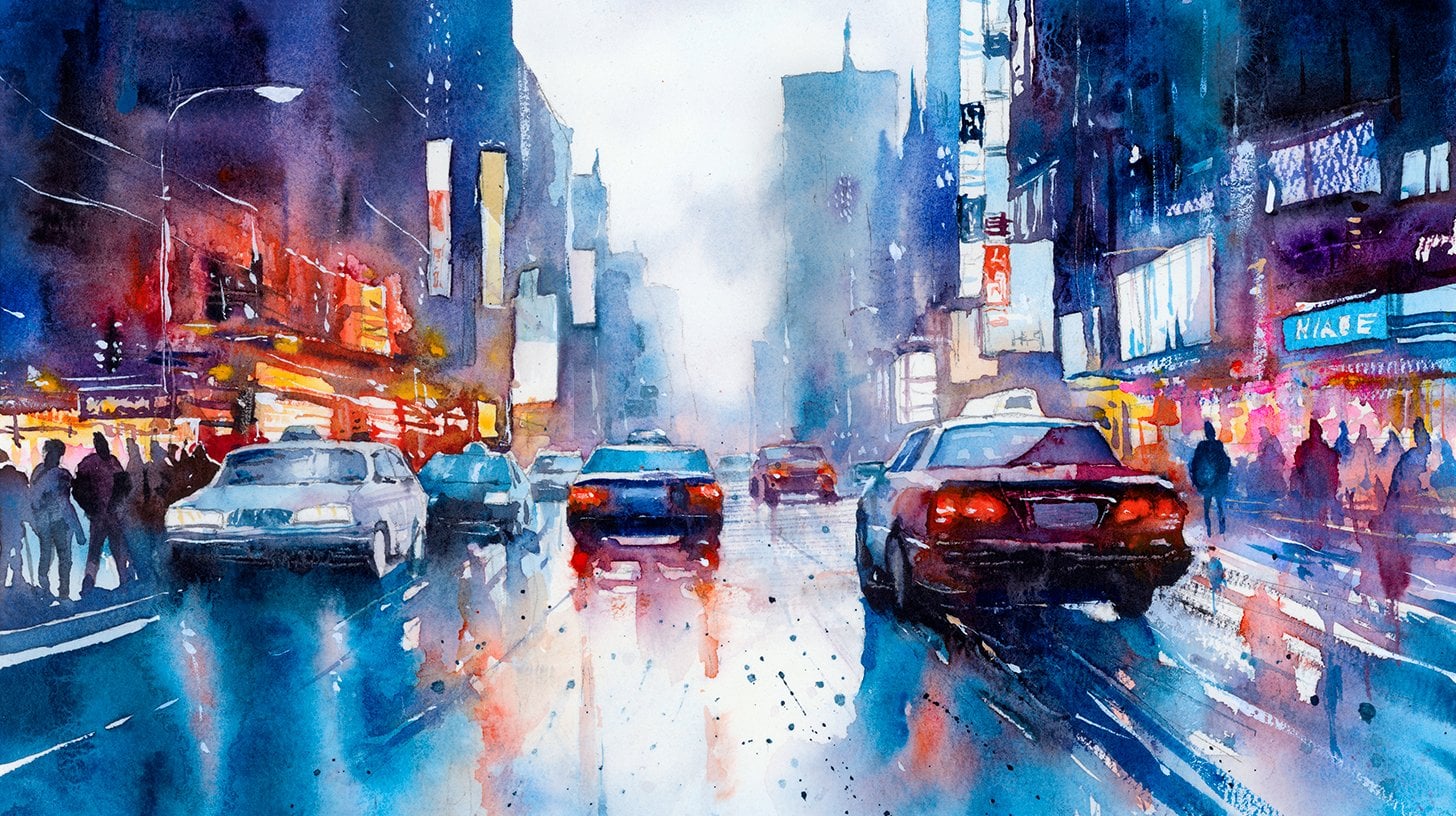
subjects from wildlife and portraits to cityscapes
and countryside scenes. I've always been entranced by the possibilities
of watercolor. But when I started,
I had no idea where to begin or
how to improve. I didn't know what
supplies I needed, how to create the
effects I wanted, or which colors to mix. Now I've taken part in many
worldwide exhibitions, been featured in magazines, and been lucky enough
to win awards from well respected
organizations such as the International
watercolor Society, the Masters of
watercolor Alliance, Windsor and Newton, and the SAA. Watercolor can be overwhelming
for those starting out, which is why my goal is
to help you feel relaxed and enjoy this medium in
a step by step manner. Today, I'll be guiding you
through a complete painting, demonstrating a variety
of techniques and explaining how I use all
my supplies and materials. Whether you're just starting out or already have some experience, you'll be able to
follow along at your own pace and improve
your watercolor skills. If this class is too challenging
or too easy for you, I have a variety of classes available at different
skill levels. I like to start off with a free expressive
approach with no fear of making mistakes as we create exciting textures
for the underlayer. As the painting progresses, we'll add more details to bring it to life and
make it stand out. I strive to simplify
complex subjects into easier shapes that
encourage playfulness. Throughout this class, I'll be sharing plenty of
tips and tricks. I'll show you how to turn
mistakes into opportunities, taking the stress out of
painting in order to have fun. I'll also provide you with
my watercolor mixing charts, which are an invaluable tool when it comes to choosing
and mixing colors. If you have any questions, you can post them in the
discussion thread down below. I'll be sure to read and
respond to everything you post. Don't forget to follow
me on Skillshare by clicking the Follow
button at the top. This means you'll be the
first to know when I launch a new class
or post giveaways. You can also follow me on Instagram at Will Elliston
to see my latest works. So let's get started and see how simplicity can create
real emotion and depth.
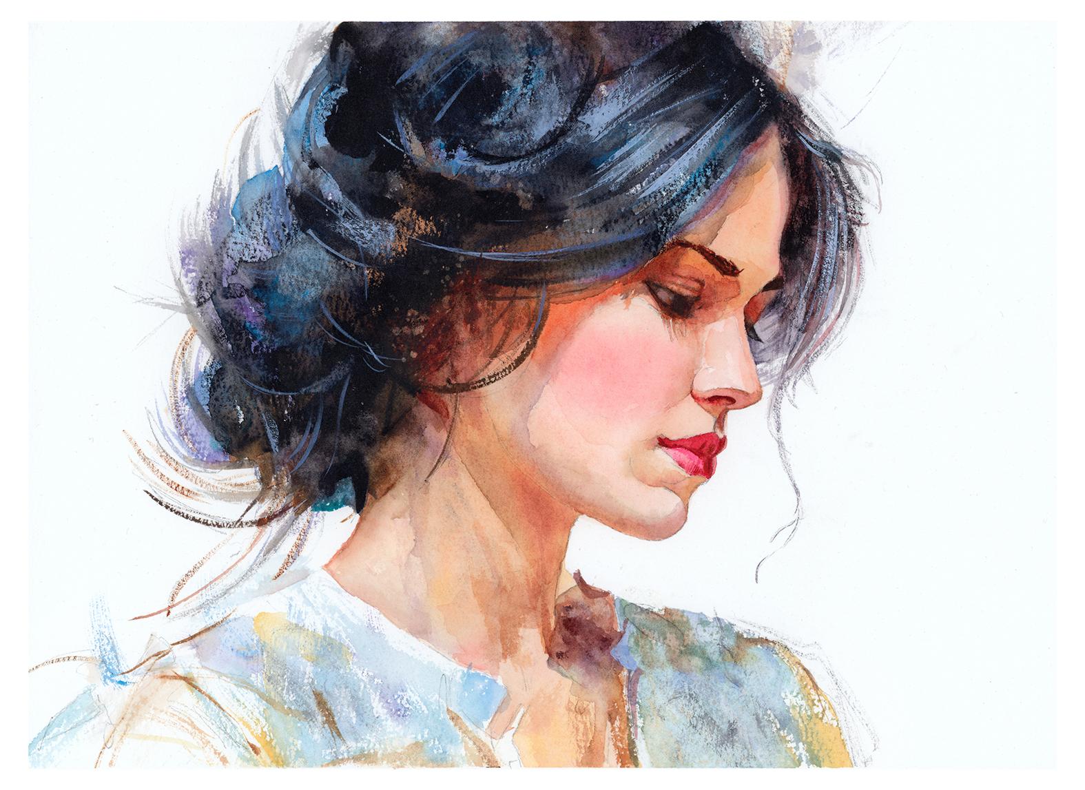
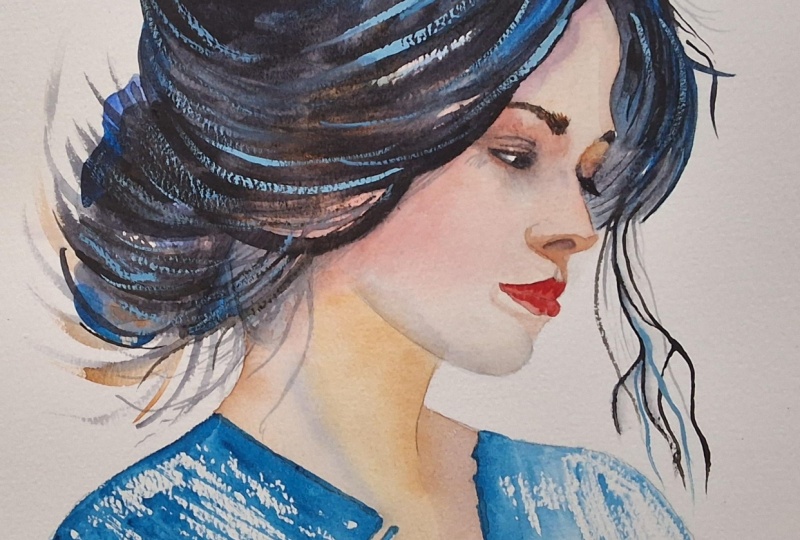
2. Your Project: Thank you so much for
joining this class today. In this project, the real beauty lies in the balance between
suggestion and definition. The face carries the
quiet precision, while the hair and neckline, and clothing give us freedom to be more painterly
and instinctive. Think about how little
is actually needed to create character, the
tilt of the head, the curve of the nose,
the shape of the lips, the softness of the eyelid, the rest can remain open,
broken, and expressive. Let color shifts stay subtle, let edges breathe,
and allow the white of the paper to become part of the portrait's
composition. In the resource section, I've added a high
resolution image of my finished painting
to help guide you. You're welcome to
follow my painting exactly or experiment with
your own composition. As we're going to be focusing on the painting aspect
of watercolor, I've provided templates
you can use to help transfer or trace the
sketch before you paint. It's fine to trace when using it as a guide for
learning how to paint. It's important to
have the underdrawing correct so that you can relax and have fun learning the
watercolor medium itself. Whichever direction
you take this class, it would be great
to see your results and the paintings you
create through it. I love giving my
students feedback, so please take a photo
afterwards and share it in the student project gallery under the project
and resource tab. I'm always intrigued to
see how many students have different approaches and how they progress with each class. I'd love to hear
about your process and what you learned
along the way, or if you had any difficulties. I strongly recommend
that you take a look at each other's work in the
student Project Gallery. It's so inspiring to see
each other's work and extremely comforting to get the support of your
fellow students. So don't forget to like and
comment on each other's work.
3. Materials & Supplies: Before we get started
with this project, let's go over all the materials and supplies you'll
need to follow along. Having the right materials can greatly impact the
outcome of your artwork. So I'll go over all the supplies I use for
this class and beyond. They're very useful to have at your disposal and we'll make it easier for you
to follow along. Let's start with the
paints themselves. And like most of the materials
we'll be using today, it's a lot to do
with preference. I have 12 stable colors in my palette that I
fill up from tubes. They are cadmium
yellow, yellow ochre, burnt sienna, cadmium
red, Alizarin crimson, Opramarne blue, cobalt blue,
serlean blue, lavender, purple, viridian, black, and
at the end of the painting, I often use white gouache
for tiny highlights. I don't use any
particular brand. These colors you can
get from any brand, although I personally
use Daniel Smith, Windsor and Newton,
or Holbein paints. So let's move on to brushes. The brush I use the most is
a synthetic round brush like this Escoda Purl brush
or this Van Gogh brush. They're very versatile because
not only can you use them for detailed work
with their fine tip, but as they can hold
a lot of water, they are good for
washers as well. They're also quite affordable, so I have quite a few
in different sizes. Next are the mop brushes. Mop brushes are good for
broad brush strokes, filling in large areas and creating smooth
transitions or washes. They also have a nice tip that can be used for smaller details. But for really small details, highlights or anything
that needs more precision, I use a synthetic
size zero brush. All brands have them,
and they're super cheap. Another useful brush to have is a Chinese calligraphy brush. They tend to have long bristles
and a very pointy tip. They're perfect
for adding texture or creating dynamic
lines in your paintings. You can even fan them
out like this to achieve fur or feather
textures as well. And that's it for
brushes. Onto paper. The better quality
of your paper, the easier it will be to paint. Cheap paper qwinkles easily
and is very unforgiving, not allowing you to
rework mistakes. It's harder to create
appealing effects and apply useful techniques
like rubbing away pigment. Good quality paper, however, such as cotton base paper, not only allows you to rework
mistakes multiple times, but because the pigment
reacts much better on it, the chances of
mistakes are a lot lower and you'll be more likely to create
better paintings. I use archers paper because that's what's available
in my local art shop. A water spray is
absolutely essential. By using this, it
gives you more time to paint the areas you
want before it dries. It also allows you to
reactivate the paint if you want to add a smooth
line or remove some paint. I also have an old rag or t shirt which I use
to clean my brush. Cleaning off the paint
before dipping it in the water will make the
water last a lot longer. It's always useful to
have a tissue at hand whilst painting to
lift off excess paint. Also, you never know when an unwanted splash or drip might occur that needs
wiping away quickly. I also have a water dropper
to keep the paints wet. When you paint, it's
important to have them a similar consistency to what
they're like in the tubes. This way, it's easier to
pick up sufficient pigment. A hair dryer is useful
to have for speeding up the drying time and controlling the
dampness of the paper. And lastly, masking tape. And this, of course, is just to hold the paper down still onto the surface to stop it sliding
around whilst painting. Also, if you plan on
painting to the edge, it'll allow you to create a
very crisp, clean border. And that's everything you'll need to paint along
in today's class. But I do encourage you to
explore your own expression and use whatever colors you might want to use to
follow your own voice. Now, let's get on it and
sketch out this portrait.
4. Preparing The Composition: So in the early drawing stage, I'm just mapping out with a single circle where the
placement of the head will be, and I'm using these
diagonal lines to work out the proportion and the tilt and the basic
structure of the head. And every day, as a
matter of practice, I draw out this structure
broken down into thirds because these are just
general proportions that you can map and bend around
to any portrait. So I practice drawing heads
at lots of different angles, so I've basically memorized it. So it's not so much about remembering or
trying to work out the likeness of a
specific person. You remember the
general proportions, and you can adapt them, tweak them to create the kind
of likeness that you want. I want to understand
the shape the skull, the position of the jaw, the line of the neck, where the placement of
the eye socket is. And the general relationship
of the nose and the mouth. But I don't need every line
to be committed heavily. In fact, at this stage, lighter
and more flexible lines are often much better
because they allow me to adjust as I go. I also try to move around the drawing rather than settling
into one area too soon. And that habit
helps enormously in portraiture because if I
spend too long on the lips, I lose the forehead or if I
become obsessed with the eye, I may stop seeing how it relates
to the rest of the face. So you can, of course, use the template I provided.
5. Mixing The Colours: As always, I'm going to
try and break this up into as simpler steps as
possible to make it easier to work with, basically. I do this for myself,
not just for students. I try to break every scene
or portrait down into the most simple steps
I can do to make it less intimidating to myself. So starting off just
using pure water and wetting every area
where there'll be skin. So I'm not touching the clothes and I'm
not touching the hair, just the neck, the cheek, the lips, the eyes,
the forehead. Not applying any pigment
for the time being. And now, whilst
we're waiting for that water to soak
into the paper, we can start mixing
our skin tones, which I basically have as a limited palette because these few colors that
I'm going to use, yellow ochre, burnt sienna, zarin crimson can be molded
into any skin tone you want. Those are the base colors. I can include cadmium red
into that as well. Basically, I'm splitting
it into three colors. I've got my yellows, my browns, and my reds. And you
can see that there. We've got brown at the top, yellow in the middle
and red at the bottom. And it's all just a different ratio
depending on the face. And I'll explain a bit later where we might want a bit more red or where we might want a bit more yellow or brown, et cetera.
6. Light Base Layer: At the moment, those
colors are a bit strong, so I'm just really diluting it and starting
very gently because the paper is wet we obviously made it wet before and we're just dropping it in. And it's not like I'm
overthinking it at this stage. I was trying to
get a base layer. The forehead, I don't want
it to be overly pink, at least not at this stage. So it's a nice neutral
color of all three of them, basically, not too red, not too brown, not too yellow. And it can feel a bit strong applying
pigment at the moment. I added a bit more red to the nose there.
It's a lot lighter. But just to mention, I'm adding a touch more
red on the nose there. But as I was saying, it can
feel quite intimidating applying pigment to the face before we have applied
the hair or the clothes, and it can be easy to go
too light at this stage. Of course, we don't want
to go very, very dark, but considering that at
least with this portrait, we're going to paint black hair and darker shadows
on the clothes, we need to think ahead
and compensate for that. The skin looks very dark now, but believe you me, by the time we come with solid
blacks for the hair later, it won't look so dark at all. That's why I'm compensating
a bit for that there. So I've painted in the
neck and the cheek. You can see that the neck line is a little bit more yellow, a little bit more
yellow ochre there, and then the cheek, especially down by the jaw
line for the time being, a bit more warmth. They're very subtle,
very subtle tones, and it doesn't need to
be precise, really. It's almost ibeceivable
these little changes, and I could quite easily put
it the other way around, maybe a bit yellower in the
cheek and redder on the neck. You can see it's
not so specific. It's basically
almost a flat wash with a few subtle differences. A few yellow strokes
at the bottom there.
7. Wet on Wet: So that's the first
base layer, basically. And it's still wet
because, of course, we added that pigment
that had more water on, so it's not drying anytime soon. So we could still mess
around with wet on wet. Just testing a few
strokes there. That was a bit too yellow at the top there,
a bit too strong. So I've made a bit more
warmth and blending it out. I'm thinking about the
planes of the face where the folds and the curvature of the skull,
the face would be, so it's going to be a bit
darker underneath the eyebrows, maybe some shadow on
the bridge of the nose. I'm choosing to go
a bit pinker there. Of course, I'm telling
you what I'm doing as I'm painting along because I'm reacting to the
pigment on my paper. For example, I'm
dropping a lot more red, some lysarin crimson on the
cheek there because that's usually where there's a red glow on the cheek there and
it adds a bit of form. But I'm seeing the way the pigments reacting
on the paper there, and I'm adapting to that, and your painting might
be a bit different. Likewise, if I were to paint
this again multiple times, it might react
differently each time. So the instructions
that I give step by step might not necessarily
be as relevant. So sometimes I think
it's more useful to talk about the larger concepts
or basically the strategy, the plan rather than directly
what I'm painting because sometimes it can
be misleading if your painting is too light or
too dark compared to mine. I wouldn't want to say I'm adding more pigment now
because it's too light. If yours is already
good enough or I need to take some
pigment away because it's too dark when again, yours is already light enough. So I think I should talk a bit
about the main strategies. Likewise, if my color, my skin tones are a bit too yellow and I want to
add a bit more warmth, maybe yours are
already well balanced. So I need to talk about
what aims we want with a skin tone rather than
directly referring to my piece because as we go
further into the painting, naturally, the
painting will change. So we need to just
a goal that is independent from my outcome here so that you can use it
in future paintings as well. It's a bit of a shadow as it curves underneath
the shin there, so I'm just dabbing
a bit more pigment.
8. Light Shadows: So I have actually completely
dried the painting now, so that's the first layer done. So before you go forward, try and match what
you see on screen now as close as you can before we go into
the second stage. The next stage, we're
not going to do a full wash over the whole
skin like we just did. We're going to separate it
out into different sections. So I'm starting with a few of the warm shadows on
the neck. Area now. You can see with
that paste wash, we started very lightly, and that's always
the way I work. I always prefer to begin gently. I want the painting to
open up gradually rather than arriving too hard or
too fast because watercolor, especially in portraits,
rewards that kind of patience. The skin can lose its freshness very quickly if we
force it too early. The moment the painting
becomes heavy at the start, it's often difficult to recover that sense
of delicate light, that smoothness
because there are on subtle changes there. There's only the light
wash, the first layer. So my first thought is usually about
protecting luminosity. Where is the lightest
area of the face? Where do I want the white of
the paper to remain active? You can see the lightest
areas around the nose, the lip area above the chin. Those kind of areas. What areas only need the faintest
suggestion to feel alive? I'm not trying to model every
single plane at this stage, a foundation that
I can build on. And this is where the medium is doing something very
special for us. Watercolor gives us the
chance to build skin through transparent layers rather
than through thickness. That means the paper itself
participates in the painting.
9. Extending The Shadows Up: So I'm going to jump
back and forth between my overall strategy and what I'm specifically doing whilst
I'm painting at the moment. So I just painted the light shadow area over the neck to
give a bit of form, and the colors that I was
using in that were purple, violet and yellow ochre. And a bit of burnt sienna, but mainly yellow ochre and purple because those are
complimentary colors, and they blend
together to create a kind of a neutral gray, I wouldn't say mud, but they add a tone without it being too strong and
keeping it harmonious. It's very subtle. You can't
really detect the purple in there because it mixes
with the yellow, and the yellow looks quite
natural as a skin tone. And then we've added
a bit of burnt sienna because burnt sienna is my personal favorite
all the pigments. For skin tones. And we're following that
wash up to the jaw line. And then it gets a bit
stronger as we reach the ear. I'm going to use a bit of a
cheat and not paint the ear. I'm going to keep
that bit fairly abstracted in shadow and
behind the hair a bit. So again, we're building up
using light layers at a time, and there's not really
that many harsh shadows in this portrait. We haven't got strong darks. So in these early washes, I'm thinking less about detail
and more about presence. I want the portrait to begin
breathing, so to speak. I want a slight warmth
in some of the shadows, a hint of structure
around the jaw, perhaps a little shift around the neck as
it curves around. I don't want it to feel
locked in too soon. A useful mindset
here is to treat the first washes just like a little whisper to get you started to get the
wheels running. They're introducing the
painting and not finishing it, so they shouldn't
feel too stressful. They're there to simply suggest where things
are going to go later, and they establish
the temperature, the softness, and the direction. They don't need to carry the
whole portrait on their own. And the reason I like to break all the steps down
is that there should never really be a point when it's all getting chaotic
and under control. We're trying to break
it up bit by bit. I'm just softening
some of the edges of this shadow at the moment.
10. Shadows Around The Eye: I think one of the
reasons students and sometimes me when I forget because I often have to
remind myself of this. One of the reasons we feel anxious at the start
of a painting, particularly a portrait, is because we think every
stroke matters too much. And of course, it matters
in some kind of way. But the first few layers don't
need to solve everything. It's only one or
two simple layers, and it's allowed to be simple and it's meant to be
incomplete on purpose. And it's encouraging us or it's allowed to leave
questions for later stages. We don't have to decide
everything all at once. And actually, that's one of the most helpful things to remember with
watercolor in general. We're not painting every
answer all at once. We're building towards them, we're giving ourselves
something to react to, and we're allowing the
painting to unfold. That's where we take
advantage of the medium. So I'm still staying
quite light. And you can see that
first wash is actually starting to look a
lot lighter now that we're working on some mid tones as we're working on
those shadows of hair, the hair shadows that are going up towards the side of the face. I still don't want
to go too dark. It's far easier to add strength later than to take all
that heaviness back out. And freshness is one of the most precious
things in watercolor. And it's these early decisions that do a lot to
preserve that energy. Even when I'm working
on the eye here, I'm just looking at
the general shape of the shadow and which areas of light I need to protect and how they all
connect to each other. So this is actually
still technically connected to those
soft neck shadows we painted at the bottom, rather than a collection
of separate features, trying to link
them all together. Especially with this kind of profile view, this side view, trying to have that flow painting a side view like
this is a different strategy, of course, than painting
a front view of the face. We have a front facing portrait. The viewer often reads the eyes first or the symmetry
between the features. But in a profile,
the outer contour, the forehead, the
bridge of the nose, the lips, the chin, et cetera, does much
more of the work. All that movement that
goes down that we'll be refining later on. If that outer rhythm works, then all these little
details don't actually have to be that significant because they're not
actually the vocal point. It helps also that the subject is not directly looking at us. The portrait feels
more reflective. It has a more peaceful mood
because she's looking down.
11. Chin Shadows: Let's talk a bit about color
strategy when it comes to selecting pigments and
colors for painting portraits. Because once you
have a general idea about what works or
what route to go down, then it'll help you make your own decisions
with future paintings, as well as if you feel
a bit lost in this one. One of the main shifts that can really help with
painting skin is to stop chasing a
single flesh color and start thinking more
in terms of temperature. Because skin is never really
just one flat mixture. It's full of all these
subtle little shifts, warmer passages,
cooler passages, areas that feel a bit flushed
like the cheek there, colors that recede a bit and areas that catch the light in a
completely different way, depending on the setting
or the nature of the light that's
glowing the subject. So in a portrait like this, I'm not asking myself, what color skin should I use? I'm asking, where does
the face feel warm? Where does it feel quieter? Where is the light passing
through in a thinner area? Because sometimes there's
little capillaries, even if we don't see
the detail of them, it affects the general
composition of the skin. Where is the structure
becoming firmer and cooler? That way of thinking makes
the painting feel much more alive because skin obviously has got a transparent
nature to it, so it's not just
kind of the skin. The cheek can hold a kind of beautiful warmth that gives
it life and softness, especially in that first
wash where it's wet on wet and has that nice
smooth transition. Then the nose can move through the warmer pinks and maybe even softer earth colors
depending on the light. The jaw and the neck may shift slightly cooler or
at least neutral. Even the shadows can
hold some warmth if the overall portrait needs that feeling because usually we
think of shadows as cool. If the flesh itself is warm, then to compliment that
we use cool shadows, which we have done a bit there. On the neck and the jaw, we've used that purple,
but around the eye, those are still warm
shadows, actually. So that's the kind of
decision you can make. It's not necessarily
a strict rule. So rather than mixing one fixed tone and
using it everywhere, I prefer to let the
skin move and adapt and it's not strict.
It's flexible.
12. Neck Shadows: We've actually painted a
majority of the shadows here. Of course, we've
still got the nose, the lips, and one of
the eyes to paint. But the shadow work
is mainly done, just a bit more adjusting, just a stroke of brown there, a similar tone to
that warm shadow up above around the eye. Because I need to emphasize
this curve a bit more. You can see that so far
it's not realistic at all. It's not meant to be
super realism at all. It's actually quite abstract. So we only need a few details to anchor the painting and give that illusion
of full detail. I'm kind of re using the pigments I already
have on my palette. I like to think of these colors as a kind
of small family of hues rather than using the whole or every single
collection of paint I've got. I just a few warm reds, a yellow or an earth yellow, burnt sienna, as I said, so much of this shadow work is just pure burnt
sienna, actually. Maybe some cooler notes. I haven't used any blue yet, just purple, but you can
play around with that. The reason I haven't
actually used any blue is because I'm going to be using a lot of blue
in their hair later on. So I've got that
contrast to play with. But other than that,
that's enough. What matters is not
having endless options. What actually matters is how
those colors are balanced. As I touched upon before, I think temperature is one
of the great ways to bring a portrait into life to
feel expressive and real. Sometimes a portrait can be
technically well executed, but the skin can
still feel lifness because everything has
been treated too evenly. So once we start
introducing warmth and coolness within
the painting, the face begins to
feel a bit more human. Just using a bit of sensitivity around those
contrasts between cool and warm.
13. Nose Shadows: There might be some
paintings that ask for exaggerating contrasts. Maybe that's your kind of style. You want a louder, more deeply expressive painting rather than a more quiet one. I'd say this painting is a bit
quieter in its expression. I'm not really exaggerating the contrast for the sake of it. I'm trying to be a bit more alert or conscious to subtlety. Some other portraits,
classes are obviously a lot louder and ask for
more attention. But here, for example, maybe a small warm note near
the cheek can do so much. It's a very subtle detail
or a cooler shadow around the temple can make the warmth beside it
feel more luminous. And then parts the
painting interact or have some kind of relationship
with the other part. It feels a bit more
harmonious because each area influences the next. So if you want skin
to feel more alive, the answer is often
not more detail. It's often more sensitivity or experimentation with the
temperature of the color. That's what gives skin
its variation and its delicacy and
its inner movement. When painting areas
like the nose, for example, this little shadow
area underneath the nose, I think about it as a
full shape to begin with, rather than a mixture of
different tones, so to speak. So it's all a flat shape, and then I gradually build
on it and define it. So I think of it as a plane
rather than a feature. So it's almost like a
flat area under the nose. Because the moment we begin
to become too focused of the idea of a nose
or an eye or a mouth, we can start treating them like separate objects pasted onto
the face when in reality, the whole face is
actually connected through a set of planes turning
through light and shadow.
14. Warming Up The Cheek: Thinking about light, shadow, and the angle of the
different planes, the different sections
is particularly helpful in a side
profile like this. Of course, it's useful
with every portrait, but specifically for this
because the forehead, the nose, the upper lip, the
lower lip, the chin, the jaw, they're all part
of one changing structure. The light is moving across those planes in different ways, even though it's the
same light source. And our job is to observe
where that turning happens, where it's gradual or where it's sudden and how the values
shift as a result. That's why you've got some hard lines and some soft
lines where it's sudden, you're going to get a hard
line like the nose area, where it's gradual,
it's going to be soft like the bottom of the
chin or even the cheek. So when I paint the
nose, like we just did, I'm not thinking about only the nostrils and the outlines. That's the last
thing I think about. I add that at the end. I still haven't painted the deep darks of
the nostrils yet. I'm thinking about how the
bridge catches the light. And in turn, how the side planes are affected by the
shadow or the light, how the underside
tucks into shadow, and whether transitions
are either sharp or soft. And very often, what
makes a nose feel convincing is not all those lots of little bits of detail, but it's the
relationship between just a few carefully
judged planes and edges. And then that nostril is just one thick, squiggly
line, basically. And after practice
and repetition, of course, no one can
be expected to learn this all in one or two goes. But repeated practice
through muscle memory, you kind of recognize
similar shapes, similar planes because
most likely light is coming from the top down, so all noses will have this kind of plane
underneath and the bridge. So it becomes learnt.
15. Painting The Lips: And the same is
true of the mouth, which we're going to
start painting now. I'm using opera pink
actually for this because I like the
vibrancy of it, and again, that's not essential. You can just use a
sarin crimson or go for a more natural
color if you want. But even when painting lips, lips can look wrong very quickly if we think of them as colored shapes with
a line around them. But if we think
instead about volume, about how the upper plane
turns away from the light, and the fuller lower plane
catches more of the light, and the corners settle back. They kind of sucked
into the shadow. So you've got the
dark batches of shadows in the
corners of the mouth. Then the mouth actually feels more integrated into the face. And like I was saying before, even if we go past
the main features, every area of the face has
some kind of plane to it, some kind of relation to
the light and the shadow. Even the cheek is really a
meeting place of these planes. The soft blush or
a warm shift can do so much because it sits
over a broad turning surface. The door, especially
in profile like this, can be so elegant when
it's handled as a kind of gradual shift rather
than a cut out shape. This way of thinking also helps
us prevent over painting. If I know that the viewer only really needs a few
planes stated clearly, then I don't feel the need to
explain every little thing. I can be selective, and I can let the painting
suggest the rest. And that's important
because one of the greatest dangers in portraiture and
often many paintings of different subjects, we become so afraid of getting
something wrong that we keep on adding more information
to compensate for that. But too much information is
not the same as clarity. So one of the ways
I try and avoid that is to always come
back to that question. Where is the plane turning? Is it a strong turn
or a gentle one? Does it need a hard or
soft edge or transition? That kind of thinking keeps
the painting grounded in form rather than symbols that are just stuck on like
a nose or an eye or a cheek.
16. Rightside Hair: Now, before I paint the
shadow area of the right eye, the eye behind the nose, I'm just going to paint
a little bit of the hair because I don't want to agitate the eye after
I've already painted it, having to paint the hair on top, whereas it actually goes underneath the eye in
terms of perspective. I'm mixing my own
gray there just because there was brown in
this part of the palette, rather than cleaning it out, I'm just using blue to neutralize it and
make my own gray, but you can quite
easily use black, neutral tint or
whatever tone you want. I want to achieve a dry
brush mark so you can see it's not a very wet brush. I'm using a tissue to
dab it out and my sponge also so that when it brushes against the
texture of the paper, the tooth of the paper, it achieves that dry brush effect. And then I can soften
it a bit if I want with a bit of water on
my brush after that. Using fast brushstrokes, I feel helps the
flow a bit better. If I go slow, they're a bit jagged and they're not
so smooth and bendy. They're not flowing like
hair naturally does. And I'm still actually
keeping the eye area intact. Adding a bit of
warmth in there too. See, I'm not thinking of hair as hundreds of
different strokes, so I'm suggesting the hair, just using the
texture of the paper. There's a little strand coming
down that section of hair, and for the most part, I'm going to just
keep that pencil and no one will know
the difference. But I am going to use the tip of my brush just to emphasize
it a bit and again, try and achieve a
dry brush mark. If you find that you aren't
achieving dry brush marks. It means that your
pigment is obviously too diluted or your brush
is too full of water, so you have to get
a tissue and just dab it out and experiment. It's easier to dry
brush more than you think rather than
accidentally have a solid brush mark when you want to achieve
dry brush, that is. Now we're starting
to work on the eye, and it's the same burnt sienna, slightly warm burnt
sienna mixture that I've made so that it's in harmony with the rest of the kind
of shadow tones I've got. And even though the
eye is less frontal, in perspective in this
kind of side view, it's still one of the
most sensitive areas in a portrait because eyes
naturally gather attention. At the moment, it looks
like the eyes are closed, but I think I'm going to suggest
that they're open later, but because they're in shadow, I'm going to be a
bit more elusive. Generally, when I'm
painting things, whether it's a portrait
or a street scene, and I think that in a shadow, I keep wet on wet and
smooth transitions, and I think that's
in direct light, I keep quite harsh. Generally. And because
these eyes are in shadow, I'm going to be a bit
more loose with them. But even still, a tiny shift here or there can
change the expression, not necessarily in a bad way. That's why all these
paintings are going to be unique and why I enjoy painting portraits because
you truly don't know what expression
specifically will come up until
you've achieved it. That's what exciting for me. Tiny little shifts
here and there can affect all of that,
even the age, the mood, or the
elegance of the face. Oh
17. Painting The Eye: So although it may
occupy less space, the eye areas than in a
front facing portrait, it still deserves a
lot of attention, especially the eyebrows as well. They're very expressive,
even though they're basically two single lines. In a profile like
this, a side view, one of the eyes is partly
hidden of course by the angle, which can actually be very helpful for many
reasons, actually, because it means we don't need to explain it too much
because it's out of sight, but we're also not dealing with both eyes and
their full symmetry together and all
the complications that might come
with a direct gaze. Instead, we can work with
a more understated eye. The one on the left can
contribute to the mood. Rather than dominating it. The eyes aren't necessarily the strongest part of
this painting because they're going to be quite
soft and understated. But the eyebrows, even
though they're simple, they are an important feature. Because they frame the eye. It also helps establish
the rhythm of the forehead and the
bridge of the nose. In this portrait,
the brow has a kind of simplicity to it. It needs enough strength
to hold its place, but not so much that
it becomes heavy. I want the eyebrow
to feel intentional, but still soft enough to
suit the overall portrait. Then the eye itself becomes more about shape and
value than detail, much like all the other shapes and sections that we've painted. I think about the weight
of the upper lid, the softness beneath it, the shadow inside the socket, and the delicate,
very delicate and subtle indication of lashes and the shadows of those lashes. In fact, the shadows of the lashes are more
pronounced than the lashes themselves because the shadows the lashes
are in shadows, so I've made them a bit softer, and I'm using the shadow
of the lashes to actually define and convey
what they look like. The whites of the
eyes are, of course, never actually white, especially not when they're in
shadow like this. But I'm not just going to
paint them gray because they're affected by
the surrounding color. By the warmth or
coolness of the face. I was going to keep them that same kind of
shadowy color as the rest to make it feel a bit more integrated
rather than isolated. And that's one of
the easiest ways to make an eye feel natural, not to make the lightest
part too bright too soon, but allowing it to
belong to the face. I think that the eye in this profile view is a wonderful place to
practice restraint, actually, because it would be very easy to
overdfine this area.
18. The Importance of Values: Now I'm going to apply
some darker shadows underneath the
neck and the chin, basically, on the
shoulder kind of area. Even in a portrait where color feels like the most
important aspect, value is still doing
a great deal of all the heavy lifting because value tells us where the light is where the structure is strongest and where
forms separate. Values also unify shapes as well as establish hierarchy where you want
your focal areas to be. Really just a way of
saying where the painting wants the viewer to look at first or second, and then third. The main tonal contrast
in this painting will actually be the dark hair
and the lighter face. That'll be the clearest
value relationship. That contrast immediately
brings the face forward, and it gives the skin
a luminous quality because it's sitting beside
something much, much heavier. That's particularly
why I wanted to use such a strong black later
on in the painting. And that's one of the
most useful things we can do in the portrait, support lighter passages with stronger
surrounding shapes. If you were painting
someone with blonde hair, we would need to
darken the background, not have a white background to really increase the
contrast of that. Inside the face, though, the values remain a
bit more restrained, even though they look
quite contrasted at the moment between the lights
and the darks of the eyes.
19. Expressive Hair Underlayer: Now we're going to start
painting the hair, and even with the hair, we're going to break it down
and turn it into a fun, expressive step in the painting. So I'm just going to mix
some colors to begin with, using yellow ochre and burnt sienna and
around the ear area, I'm going to mix the same tone
as the shadow on the face, that warm shadow so that it transitions into
the hair because a lot of the hair is
going to be a cool color and I'm not being clean. In fact, trying to
be very rough with my shapes to try and
create a lot of energy in this hair because by
creating a lot of expression and exciting textures
in the hair, we kind of make the details in the face look even sharper
and more sophisticated. So I'm not really
following any strategy. I'm trying to think about
creating flowing strokes, maybe some rhythms going on there so that the eye
can follow around. But basically, for
the time being, everything will be covered up. This is just going
to be an underlayer that allows a bit of a
glow to come through. I'm also wanting to
achieve a lot of dry brush marks for
this underlayer. So it's not going to be a
flat wash, a lot of texture. I'm using a larger brush now, a mop brush because that helps me achieve
broader brush strokes, of course, because it's larger. And whilst we're at
it, I'm going to add some of these dry brush marks to where the clothes will be. Now, some violet or purple.
Alongside that blue. When it comes to me
painting a portrait, before I even go to my sketchbook to work
out a composition, I need some vision, some kind of key element that is the driving force
of the painting before everything
else is worked out. Actually, the starting off point for the whole of this
portrait was the idea of cool colors in the hair and warmness
in the skin tones. I wanted there to be bluish
purplish hair tones. And then somehow complement that in the skin tones as well. So the relationship between
warm and cool for me is the most important goal or outcome that I wanted to
achieve in this portrait. The skin feels warm, delicate and softly lit, while the hair
holds these cooler, deeper blue black notes, and that relationship
is doing a huge amount of work both emotionally
and structurally.
20. Adding Cool Tones: Colour temperature goes just beyond the flesh tones
that we painted before. It's such a powerful tool in the whole of the composition, whether it's portraiture or city scenes or whatever
you're painting are still alive because it can describe form and mood
at the same time. A warm cheek feels alive, and a cooler shadow or a cooler strand of
hair can create depth. A black mass or a blue, purple mass of hair can make the face feel more
luminous, more glowing. Colour temperature
is not just about realism because blue hair, well, you can obviously have blue hair and still
make it realistic. But blue in this
circumstance is more about boosting the energy
and the atmosphere. In this portrait, the
cools in the hair create a quiet drama to it, which sounds kind of
contradictory, a quiet drama. Because, of course, warm colors feel more alive and active and cool colors seem
a bit more subdued. So the temperature of the
color will be calming, but the expressiveness of
it will be very abstracted, as you can see, using lots of abstract marks, quite messy, and purposely trying to
create areas of ugliness, so to speak, abstraction. Some soft bits, some
harsh bits, layed, ugly edges, purposely trying to create those bloom
or cauliflower marks. I feel out of control in this section
and that's intentional. I'm trying to make it feel ambitious because it conveys
a feeling of confidence, even if I don't feel
like I have control, I'm personally losing control
at the moment because it actually conveys a feeling
of strength and confidence, even though that's not
what it actually is. It's an illusion because we're being messy, it seems brave. But only because
it contrasts with the more detailed area of the face where we've
had more control. They work together
actually because without these cool darks, the portrait would
feel much lighter and maybe a little
less anchored as well. But without the warm skin, the darks might feel too heavy and they'll definitely
feel way too abstract. It's the relationship and the conversation between them that makes the whole thing work. You need this abstract section with the more refined section. To keep the palette limited
and also in harmony, the clothing will
pick up some of these cooler notes as well
without being too definite. We've been adding a bit
of turquoise by the way, now, another cool color. So we've got blues,
purples and greens. Turquois or Vidian. You can use viridian
if you want.
21. Painting The Clothes: This is a very useful
thing to think about with portrait
classes generally. But again, it relates to all different subjects because so many times people
are curious as to why I make my decisions or they want to see
a reference photo where actually I have hundreds of different
reference photos. This isn't a specific
reference that I'm copying. It's not like I'm looking at a face and trying to match it. I've done sketches, I've tried
to work out a light plan, shadow plan, and it's not those things that
lead my decision. So something that can
help you going forward is rather than asking
what color something is, it can be more useful to ask what temperature
role is it playing? I think in terms of temperature rather than specific colors. Is this area warming the
painting or cooling it? Is it supporting
the focal point or receding or connecting
one passage to another? That kind of thinking
helps color feel much more intentional because we stop choosing colors only
because they seem to match. We start choosing
them because they support the larger
mood and design. And again, that can be changed throughout a painting because watercolor is unpredictable. Maybe you're mixing a color and it comes too strong
in a different direction. So in your personal painting or my variation of a painting, it takes a different root. So you have to be
adaptable with it. That is one of the reasons
why a portrait can look more compelling even when it's not actually literal or
realistic in color. We're not only
painting the surface, we're painting the
relationships. A cool note beside a warm
one changes both of them. Or a muted area, one that's desaturated, can make a saturated
area really sing. The clothes that
I'm painting now, I'm trying to get
a muddy kind of color, a muddy cool color. So I'm starting off
with this green and then going over
with this blue. I don't want it to
be vibrant at all. And the reason is by having
these muted clothes, it adds that glow of the face. So the hair, that cool, dark mass really lifts a
pale face into clarity. The color in this portrait
is not really about copying. It's more about design
or orchestration. What I try to achieve
in my portraits or the kind of portraits
that I aim for are ones that give us
the chance to work both with boldness and sensitivity
at the same time. So usually the face asks for that definition,
a bit more care. The features want more accuracy and the proportions,
of course, matter. But luckily, you can use the template to
help you with that. The edges matter as well. And, of course, the
timing with watercolor. But then all around that, there's still so much
room for suggestion, abstraction, softness and
expressive brushwork. In fact, spatially, most of the painting is
expressive and abstract. So the painting is more
than just likeness. I'm not aiming for
likeness, actually. It starts to carry mood. That's what I'm aiming for, and it might look like a
completely different person.
22. Starting The Dark Hair Tones: Now we've done the expressive
underlay the hair. It's time to go back with the
deep dark black pigments. And I'm starting off with the little strands that
are coming out the sides, and then I'll work my
way in afterwards. I'm trying to achieve
a dry brush mark, and I'm using a slightly
small brush now, and going back to
my synthetic brush with a nice tip and
these little wispy bits. I just meant to add to that
feeling of flow and movement. When it comes to hair,
it's one of those areas where it's very easy to
become lost in detail. We see all the little strands, all the little tiny twists, maybe the little flyaway
shapes that we're adding now, and we feel tempted
to capture them or convey them one by one. But usually, that's exactly what makes painted hair
look less convincing. The more we chase every strand, the more likely the
hair is to become bussy or flat or over explained. So nearly always, I begin with thinking of
the hair as a mass. What's the overall shape of it? Where is the main dark? Where is the main
movement, as well? What's the direction
of the hair flowing. And where are the
larger divisions before we even think
about the smaller ones? Because it's quite
chaotic at the moment. So I often, even though
we're painting in a very abstract way, I spend more time thinking
about how to make sense of the hair than
the features of the face, not because we're
painting more details, but because I'm trying to paint something abstract
in a way that makes sense. The hair in this portrait and most portraits is a
big design element. It's not just an
accessory to the face. It usually works as
a kind of frame. It provides the
darkest value range in the painting is where our
deepest blacks will come. And like I was saying before, it gives us cool blues against
the warmth of the skin. So it gives the composition
weight and contrast. At the moment, I'm just blocking out some of the very dark areas, and then I'll figure out
how to connect them later, how to make them
flow seamlessly. So there's not many soft
edges at the moment. I'm just using
very thick pigment and pasting it on basically. Achieving I have to scrub it
on sometimes like I am now. I want some dry brush sections
too. So it's not smooth.
23. Dry Brush: Because I want that
blue to come through. So if it's a very diluted wash, it's still going to gray it out. But at least with the dry brush, it's actually gaps in the pigment that
allow that blueness, that vibrancy to come through. So even though that
texture doesn't actually exist in real life, it allows us to have a more
colorful black, so to speak. And there's going to be a
lot of give and take and push and pull because I'm going to create hard edges and then soften them out
or I'm going to paint black and then have
to scrub away a bit just until it feels
right because basically, I'm using my imagination
to try and make it work right to test it and play around whilst
I'm actually doing it. But until that stage,
at the moment, we're just using very
thick dry brush marks. Then we can reactivate
it later with pure water So even though it's quite hard to see because it's so textured
with the dry brush marks, there's basically
this big curvature coming down on the
side of the face, and I'm starting to
define it a bit more now that the pigments getting
a bit more diluted, trying to work out not
necessarily the strands, but just the general
flow to work from. I'm being a bit
more selective now. I certainly don't want to
be literal with every line. I'm just thinking in
terms of larger shapes. More like a sculpture than
an actual real head of hair, a solid mass basically
for the time being. Again, I didn't want
to paint the ear, so I'm going to abstract that with this dark
brown shadow basically. Maybe we can imply a
bit of a ear later on. And have that blend into
the dark blacks as we go a few well chosen strands often do much more
than hundreds of evenly painted ones because the viewer reads the suggestion
and fills in the rest. So even though it looks very
incomplete at the moment, once we connect it all, we'll allow the water and
the pigment to intermingle together and do a lot of
the elusive details for us. Of course, we've got to think
about the light as well, how the light is catching the tops of the
hair more than the bottom, so these shadowy areas
underneath can be much darker. It's interesting how sometimes
the more abstract parts can be more difficult to get right than the
detailed parts. The hair can hold both
softness and texture, so it's trying to find that balance because
some passages, not strands, but curves of
hair can remain broad and atmospheric while others can be sharpened later with that
dry brush mark again, or even darker accents. So it's the variety,
what gives it life. So, we started with that underlayer that was
very expressive and we're basically bit by bit gradually
shifting away at it, trying to make a bit more sense, but not so much that we
lose all that expression. So there's a judgment
call or a sweet spot when we're starting to take away these textured markings using
water to soften them out.
24. Blending The Hair: At this stage then,
I keep asking myself whether I'm still
thinking in masses. If I stop thinking in masses and only start in little strands, that's usually the
moment I need to take a step back or reconsider. I definitely want to leave
this little blue edge there. I'm actually painting
the shadow onto the face a bit more using purple as a kind of highlight, using that light
blue as a highlight. Because it's really at that point with the
blueness of the hair, touching the warmth of the skin where there's a big
contrast in temperature. This is where hierarchy
becomes very important because not all contrasts
needs to be equal. The greatest contrast might sit between the
hair and the face, and then there might be smaller contrasts that sit
around the lips and the eyes, and then the clothing
can just stay quiet. I don't want ideally, I don't want anyone to
look at the clothing, just painting enough just
to make it have sense, but it's definitely not
the focal point at all. It still, of course,
contains color and movement, but it remains secondary
because the value contrasts are not trying
to rival the face. It's a very mid tone kind
of element of the painting. So it should support the
portrait without shouting. And that's again, why
values matter a lot and why when practicing for
classes and working out my compositions and even daily practice in
my sketchbooks, I only paint in monochrome. I have a variety of fun
little monochrome inks that I practice just working out the tonal
relationships of things. By the way, this little
strand that I added, a circle little strand coming down and going past the ear, is quite an eye catching part. It's just one single stroke, but for some reason, whenever I check a composition, it's got a sharpness to it, maybe because it's
dry brush as well that just helps with the
flow of the painting. So that's the reason value
design matters so much. It's not only about realism, it's also about
emphasis because it tells the viewer
what matters and it gives the eye a path because as I kind of nodded to before, the skin tones are
very adaptable and it's quite a
limited palette. So we can just work that out quite
spontaneously as we go. So while I'm painting,
I'm not only asking whether a certain shape is correct or whether the color itself,
the hue is correct. I'm also asking whether
it's too strong or too weak relative to the
rest of the portrait. Because a portrait is never just a collection
of correct parts, of course, has to function
as one visual whole. I'm just adding a few
more wispy bits of hair at the back
of the neck here. Again, not painting individual
strands, just generalizing. And now the deep tones of
the hair are painted in, you can see how light the
skin actually looks now. Remember I said at
the very beginning how the tones would look
too dark initially, but now they're
contrasted with the hair, they contextually
make more sense. So when it comes to
painting this yourself, make sure you do compensate by painting darker than
you think. Okay.
25. Making It Pop: One of the hardest
parts of a painting, of course, is knowing
when it's finished. Not finished in a kind of absolute sense because paintings can nearly always be
adjusted in some way, but finished in the sense that they're already saying
what they need to say. And that can be
especially difficult in portraits because the
stakes feel quite high. There's still so much
left unsaid seemingly, but is the message across? We see every little thing. We notice every
little asymmetry, every edge or value shift. So there's a lot
of temptation to keep refining and correcting, hoping for some
perfect final state. But often a portrait reaches its strongest moment before
we actually realize it. And if we keep pushing
beyond that moment, we start losing the freshness that gave it life
in the first place. So when I get towards the end, I change the questions
I'm asking myself. Instead of asking,
what else can I add? I ask, What actually
still needs attention? Where does the
portrait still feel unresolved in a kind
of meaningful way? Or what's distracting? Is there an element that you
just catching the eye that shouldn't or what's
missing structurally? Are there any final accents?
That's what I'm doing now. I'm adding these tiny
little accents to the hair because the hair is
still a very abstract piece, but these little
wispy highlights just contextualize
it a bit better. Those are some better finishing questions that
you can go through. Sometimes the answer
is just an edge, softening it or hardening it. Sometimes a slightly
deeper note in the hair, or sometimes the mouth needs a little more
integration to the face. And sometimes it needs
almost nothing at all, and you disconnect from
it for a few days, and you realize that actually you don't see those issues
that you saw before, and you're glad you
just left it alone, it is what it is, and you can take what you learned
into the next place. I try to preserve the
difference between the main areas and the supporting ones
right at the very end. The face may receive a few
final careful accents, and the hair might get one or two stronger lines
or deeper passages, or the clothing may need
a little bit softening or a light touch just
to keep it connected, but not every area deserves the same attention
or level of detail. And it's that kind of restraint that often makes a
painting feel confident. I just splattered pure water
mainly around the ear area, but also spontaneously
around the hair, and I let it absorb it
and reactivate the paint, and then I just use a
tissue just to rub it off quickly to abstract
that area and again, give it a little
bit of atmosphere. There's something about
these splats that give it this illusion of detail or
doesn't add more detail, but it kind of gets rid of
the need to add detail. It kind it feels like an
excuse not to put in detail, but not in a cheating
kind of way, but an intriguing kind of way. Some of the accents I've
added are a bit too strong, so I'm just softening, and usually the last thing
is not adding but softening.
26. Final Thoughts: Welcome back. And
congratulations on completing this portrait
painting class in watercolor. In this study, we looked into how mood can come from shape, spacing, and selective detail just as much as from
likeness itself. The profile gave us a
strong elegant structure, while the loose treatment
of the hair and clothing kept the painting feeling
live and contemporary. We also explored how dark
and light work together, not just to model form, but to guide attention
and create atmosphere. Remember, watercolor painting is not just about technical skills, but also about expressing your creativity and
personal style. I encourage you to continue
exploring, experimenting, and pushing your
boundaries to create your own unique
watercolor masterpieces. As we come to the
end of this class, I hope you feel
more confident and comfortable with your
watercolor painting abilities. Practice is key when it comes
to improving your skills, so keep on painting
and experimenting. I want to express my gratitude for each and every one of you. Your passion for
watercolor painting is so inspiring and I'm honored
to be your teacher. If you would like feedback on your painting, I'd
love to give it. So please share your painting in the student projects
gallery down below, and I'll be sure to respond. If you prefer, you can
share it on Instagram, tagging me at Will Elliston, as I would love to see it. Skillshare also loves
seeing my students work, so tag them as well
at Skillshare. After putting so
much effort into it, why not share your creation? If you have any questions
or comments about today's class or want any specific advice
related to watercolor, please reach out to me in
the discussion section. You can also let me know about any subject wildlife or scene you'd like me
to do a class on. If you found this class useful, I'd really appreciate
getting your feedback on it. Reading your reviews
fills my heart with joy and helps me create the best
experience for my students. Lastly, please click
the follow button Utop so you can follow
me on Skillshare. This means that you'll be
the first to know when I launch a new class
or post giveaways. I hope this class
opens the door to a more poetic approach
to portrait painting. I look forward to seeing you
all again in future classes, happy painting, and bifanw.
 Will Elliston, Award-Winning Watercolour Artist