Transcripts
1. Introduction: Everyone, and welcome to this master study
of Wasil Kandinsky. I'm so excited to have
you here as we dive into the expressive world of one of the pioneers of abstract art, whether you're a seasoned artist or just beginning your
creative journey, this class will help
you explore color and movement and abstraction
in new and exciting ways. Wasil Kandinsky was a visionary. He believed that art was more than just a
visual experience. It was a way to communicate emotions and energy
much like music. Described certain
colors and shapes as having their own
rhythms and harmonies, almost like a
symphony on Canvas. In this class, we'll take a closer look at
Kandinsky's work, his influences, and the revolutionary way
he approached painting. We'll explore four of his most
fascinating pieces to me. Anyway, squares with
concentric circles, 30 houses in Munich and upward and translate his techniques into
our own creative practice. Each project is designed
to help you understand Kandinsky's unique artistic
language while also allowing you the
freedom to bring your own personality
into the work. You'll experiment with color,
composition, mark making, just as Kandinsky
did so that you can develop your own
voice in abstraction. I'm Denise Love, an artist
and creative educator, and I'm excited to
bring you this fun and exciting dive into
Willy Kondenski. For this class, you can use a variety of mediums watercolor, acrylics, soft pastels,
even mixed media. So if you're ready to explore
the world of Kandinsky, grab your supplies, set
up your creative space, and let's begin our
journey into abstraction.
2. Class Project: Class project, you'll create your own Kandinsky inspired
abstract painting, incorporating what you've
learned from studying his work. This will be your
chance to explore color and composition and movement in your own unique way while using Kandinsky's
techniques as a guide. Choose your inspiration,
gather your supplies, paint with emotion and intuition and add some final touches
and share your work. As a bonus, write a few
sentences about your painting. What inspired your choices? Did you discover something
new about abstract art, and I can't wait to
see what you create.
3. Why Study Kandinsky: Who was Kandinsky,
Wail Kandinsky, 18 66 to 1944, was a Russian born
artist and theorist, widely regarded as one of the
pioneers of abstract art. Initially trained in
law and economics, he didn't pursue painting
seriously until his 30s, proving that artistic journeys can begin at any stage of life. His early works were influenced by impressionism and favism. But over time, he developed a bold and unique visual
language that moved away from representational
art towards abstraction. Kandinsky believed that
color and form had the power to communicate deep
emotions, much like music. This belief led him
to create paintings that didn't rely on
depicting physical objects, but instead focused on rhythm, harmony, and the interplay
of shapes and colors. His transition from
representational to abstract art was influenced
by various factors, including his exposure
to the expressive use of colors like Henry Matist
and the post impressionist, as well as his own deep interest in spirituality and philosophy. Throughout his career, Kandinsky was also an influential teacher. He taught at The Bauhaus, a revolutionary German
School of Art and Design, where he explored new ways of thinking about
color and composition. His ideas not only shaped
modern abstract painting, but also influenced
future generations of artists and designers. I study Kandinsky. Kandinsky's contributions
to abstract art go beyond just painting. He developed theories
on color, form, and the emotional impact of art that remains relevant today. He believed that art should be a spiritual experience capable of evoking motions without
needing to represent reality. His ideas were groundbreaking
because at the time, art was still expected to
depict the physical world. Kandinsky challenged
that expectation by proving that abstraction
could be just as meaningful, if not more so than
realistic representations. One of his most important
contributions is his book concerning the
Spiritual and Art 1911, where he discusses how colors and shapes can have an innate, psychological and
emotional impact. He associated different colors
with specific emotions, yellow with warmth and energy, blue with depth
and spirituality, red with passion and movement. His studies on how color
combinations affect viewers continue to influence
modern art and design. Studying Kandinsky allows us to explore not only how
abstraction evolved, but also how we can
harness color, shape, and composition to express
emotions in our own art. Key themes in Kandinsky's work, one, the spiritual power of art. Kandinsky saw art as more than
just a visual experience. He believed it had the
power to touch the soul. He often compared
painting to music, where different elements work together to create
an emotional impact. Two, music inspired
compositions. Music was a major influence on Kandinsky's
approach to painting. He believed that
just as a symphony can evoke deep feelings
without words, a painting can do the same
through its colors and shapes. His abstract paintings
often feel like visual music with elements
that dance across the canvas. Three, emotional abstraction. Unlike artists who use abstraction purely for
formal experimentation, Kandinsky saw abstraction as a way to communicate
emotions directly. His use of color, line, and composition was
always intentional, designed to create
a certain mood or feeling in the viewer. By studying Kandanski, we can learn how to approach
painting with emotion and intuition using
color and composition to express feelings rather than simply replicate
what we see. His work invites us
to embrace creativity with freedom and trust
our instincts as artists. Let's now take a
closer look at some of his most famous
paintings and explore how we can incorporate
techniques into our own work.
4. PDF Guides: Class, I have made several PDFs to go along with the class that you'll be able
to print out and then have, and some of them are super fun. I think you're really
going to enjoy them. I just thought I'd go through
what the different PDFs are so that you got an understanding of how
you might use them. The first PDF that
I've got here is exploring condenses
techniques in your art, this PDF goes along with the
book video where I just show you some book options
that you might consider and some talking
points in the books. I've just bullet pointed some different points that even if I talk about them
or don't talk about them, you could just have that information,
which is interesting. That goes along with
the Kandinsky books. Then I have one for exploring Willy Kandinsky 40
bite sized facts, and I think you're going
to really enjoy this one. Because it just goes through some very interesting fun facts about Kandinsky that you could just have at
your fingertips. That's super fun. Things
like abstract watercolors. He experimented
with watercolor as a way to explore
abstraction more freely. Um, wrote about
color psychology. He believed that colors
could evoke emotions, for example, Blue felt
deep and spiritual. So it's just some bite
size facts about him. I thought you might
like to have that. Then the next PDF I have for you goes along
with that color one, and it's understanding color
and emotion in abstraction. This one just goes a
little bit deeper. In his philosophy and what the different
color meetings have. And so I think you're really
going to enjoy that one. It was fun to create and it just gives you some
good key points about each color and using it and the feelings and
stuff behind it. So that's a really good one to have and just keep and keep
using it going forward. Enhancing your understanding of Kandinsky's abstract art is another PDF that I've
created for you, and it's a companion guide
to your master study. It includes exercises,
activities, and reflections to deepen your
understanding and help you apply his techniques in
your own artistic practice. This is just some
information and then also, a little condensed version
of that color theory, and then it gets into
some activities that you could think on
and do yourself, breaking down the visual
elements of Kandinsky's art, and then the activity
is look at one of his paintings and sketch a
simplified version of it, focusing only on the
placement of shape and lines. This will help you understand
his visual rhythm. It's got some fun
activities in here, talking about composition and
color and art meditation. And maybe creating
some many abstracts and just giving you
a bunch of ideas that you can use to enhance your understanding
and reflection here on the Kandinsky class. That was a fun one. That one's enhancing
your understanding. Then I've made you
some project guides. There's some projects
that we're going to do in class and we can use
the guide in class. Now with the prior master
studies that I've done, I've done one master
study where we did the master's color palettes. We looked at a master's
painting and we pulled the colors out and created
our own abstract art with it. The next master study that
I did was on Gustav Clem, on his master study, we actually took
little sections of a painting and we replicated the little
section of the painting. This one, I want to do it
a tiny bit different also, where we take the idea of the painting and
rather than trying to create it exactly,
maybe we study it. We understand the concepts and such that he was going for, but then maybe we create our own version
of that painting. The project guides just go along with a little
information about the painting, gives you some
suggested mediums, and then gives you
some ideas on what you might create and reflect from
the piece that we studied. Then some final thoughts. This project is about
exploration, not perfection. Kandinsky viewed color as
an emotional language. So let yourself play and see
what resonates with you. Share your completed
work in the group. And so I just thought this would give us one step forward in the study of the paintings
and then help us come up with some paintings
inspired by Kandinsky, but not necessarily identical to the work that he created. So I did one for
Concentric Circles, which is squares with
concentric circles, which is one of
my very favorite, and this is something I'll
continue to take forward. I like making concentric
circles already. The circles, the colors, and then mark making
in the circles. This is one that you'll see me do over and over through
the years and I've done this concentric circle idea quite a few times in the past. I love this project,
so that's one of them. Another project that
I really like is 30. What this is, his
painting is 30 squares. Just black and white, mark
making and having fun. And so the project guide again, gives you what the painting
explores and then gives you some ideas and suggestions
and some bonus variations. So I've really gone through some final thoughts and
put a lot of thought into each of these to kind of enhance each
painting that we do. So this is another one that I really, really like personally. So this was houses in Munich, and I like the simplified
abstraction of the city street. You know, you could do
any city out there. It doesn't have to be the
one that he did and get that simplified box and color configuration of a
city street or city blocks. A lot of European cities have very interesting row houses that would fit into this
type of project. And this project focuses on a reimagine of a cityscape using his approach
to abstraction, bold colors and
geometric structures. This was in 19 081909. It captures his transition from representational
abstract art emphasizing simplified forms and vibrant contrast rather
than realistic details. In this exercise, you'll create an abstracted landscape
inspired by his unique style. You could try to replicate
his if you wanted. It's not so overdone that it would be a
difficult one to do. P's paintings would have
been impossible to try to do the whole thing in a
decent amount of time. He took years to
do those, but this is something that you
could do in maybe a 30 minute sit
down of paint play, which is what I
really like about his way of art is you can do it in small bits
and end up with something that you really love because I really love that. You might look at
different cityscapes. You could try doing
one of his cityscapes, but I've got some materials
and some ideas for you for replicating that and some bonus variations
and some final thoughts. I really like that. That's another project I
wanted to do in class. And then this one is upward,
which is a painting. I thought we would do
three or four projects in class and then I've given you some extra
guides after that. Upward is another one
that I really like. I like how it's simple with
some geometric shapes. This project explores Kandinsky's
later abstract style, focusing on upward movement
and symbolic meaning. His painting upward
is a prime example of how a huge geometric
geometric abstraction and layered composition
to create a sense of spiritual ascent
and dynamic energy. In this exercise, you'll
experiment with shapes, brushstrokes and layering to create an upward flow
to your composition. Some of the way that he
creates an upward flow, it's almost like a
balloon floating in a sky because this
is almost like a sky with some clouds and you can see we've got this shape
that then ends in an arrow pointing
up and so it's all lifting up and this is up and then
this is further up. He's creating that
upward movement with direction of his elements.
I really love that. I thought it would be
another fun one to do. And so I give you some ideas, whether you paint this exact one or come up with
your own version. We are painting
inspired by his piece. And then I've got some
bonus PDFs for you. So these are not ones I
planned on painting in class, but I thought it
would be fun to have some extra bonus ones of
some of his other paintings. Several circles I really like because of the
circle composition. I would totally do this with a different colored background because maybe the black
is not my favorite, but I love the idea of
the overlapping circles. And so this project explores Kandinsky's fascination with pure abstraction
and cosmic form, focusing on the dynamic use
of overlapping circles, transparency and
spatical balance. Several circles is one of
his most striking works. Demonstrating his
belief that circles are most harmonious and
spiritual shape in art. This exercise will encourage you to play with color contrast, and layering to create your own abstract
cosmic composition. You can see how
studying and then taking that concept
in your own art, taking it to heart and creating pieces off of it really
allows you to maybe get into the mindset
that he might have been in or he might have been exploring in the
different pieces. Several circles is a fun one. And then this one,
composition number eight. He did a whole series of these abstract type
pieces where he just named them composition
one, composition two, composition three, where
he was really exploring these big abstract
pieces that we see here. I've got composition
seven, composition eight, and then yellow, red, blue, which was another
in that series. I just thought it would be
fun to take on a project. The focus is on geometric abstraction, movement
and violence. This one focuses on his most complex and
ambitious composition. Um, composition number seven, it's chaotic yet
harmonious explosion of color movement and
overlapping forms. Then this red, yellow,
blue is inspired. One of his most
striking composition, the painting
showcases contrasting geometric and geometric
and organic forms divided into two
distinct sections. One dominated by structure, angular shapes, and the other by more fluid, organic elements. You can see some differences
in each of those paintings that he started to explore
in his works also. I thought that would
be a really nice, well rounded view of some of
the works that he created, give you some ideas
of how you could take his ideas into your own art. Then some of the ones
that we'll do in class, I think you are going
to be super fun for exploring the different things
that he did in his work, and I can't wait to
get started on these. I hope you enjoy the bonus
PDFs that we've got in class. I've tried to make them really valuable and
interesting for you to have and I can't wait to see what we do with these
different projects. I'll see you back in class.
5. Kandinsky Books For Inspiration: Take a look at some
of the books that are out about Wassily
Kandinsky just in case you're interested
and we can do a little flip through so you can decide if you want to have a book or not, but I've given you a whole
lot of information in the class and so it's not really necessary to have a book. I've given you lots of larger paintings and
such in the PDFs, you've got enough
that you could look at if you didn't
want to buy a book. One of the books
was not available to buy as a book
that I could find, but it was available as a
kindle and it was only $0.99, which was fantastic because it's a fairly large size book, if it were published. It's 400 and something pages, it's called Masters of
Art Wasili Kandinsky. What I like about
this one is it goes through his early life
and a lot of highlights and information and what he was doing throughout the
different stages as we go. Um, his early works were influenced by
impressionism and fauvism. You got lots of bright colors, loose brushwork and
hints of landscape, we can see that as we are flipping through a
few of these pages. The blue writer is
a good example of that right in here where you've got the blue rider on the horse. I like that. Before
diving into abstraction, Kandinsky painted figurative
and landscape works inspired by Van Gogh and Matis. You can really see
that influence here on these first paintings. The use of expressive
color foreshadows, how he would later
treat color as an emotional force. I
love that about it. Around 1908 to 1910, his paintings became
more abstract, focusing on color and shape over realistic detail. Um,
so that's pretty cool. The birth of abstraction
started around 1910 to 1914, and it emphasized chaos. What you might look for in those paintings are
compositions, impressions, chaotic swirling forms,
expressive colors around 1910, he completely abandoned realism moving
towards abstraction. He believed that painting
should look like music, free, expressive and capable of evoking emotions without
recognizable subjects. And as I'm flipping through
some of our book here, you can see how he has
started to really loosen up and you don't see the detail as strongly
as his earlier works. His brushstrokes became looser, forms seemed to float or collide representing his belief
in energy through art. Composition seven is one
of his most complex works. He layered color, movement, emotion into a single piece, and that was part of
those composition sets that I had talked about. It's just interesting to
see the progression here. And how much looser
and expressive and color that he gets in some
of the work that he's doing. Um so in his Bauhaus period, he worked on geometric
abstraction, structure meets spirit. He worked on clean
geometric shapes. I don't know why I keep saying geometric when I'm reading
this geometric shapes, precision and a mix of
color and structure. You can see as we're again working through
some of his pieces here, how he starts really changing his style and the different
things that he does. This one right here
is composition eight. What was this one? This one was stories. He did a whole series of those
composition ones where he was exploring with this
is composition seven, which is very abstract. Let's just zoom in, you can
see, very abstract, chaotic. There's a lot of
movement and color. So in his geometric and
abstract and Bauhaus periods, structure meets spirit. You can see in these you
get clean geometric shapes. You get precision, a mix
of color and structure. He was influenced heavily by
the Bauhaus design movement. After World War I, he moved to Germany and joined
the Bauhaus where he became a teacher
there at the Bauhaus. Composition eight is a great
example of this period. Look at the way that
he uses circles, triangles, and precise
color movement. He called the circles the
most spiritual shape, believing they symbolize
the universe and harmony. There's lots of good
going on in there. He created these ten compositions
between 1909 and 1913. You can really tell he was experimenting with
those if we go through and look at some of these pieces and the
details. I like this one. This is a building and the sun is behind it and everything's
radiating out almost. Interesting to look
at abstract art and see what can I see
with this piece? This one takes your eye off in this direction
with that triangle, this little circle here moves
your eye around the piece. There's a lot of movement
and good detail going here in these pieces and then you have the sun
or radiating up. Then several circles. So in the later years, he was in Paris from
the 1930s to the 1944, and he got into organic
geometry and playfulness. Now we're looking at
softer biomorphic shapes, playful colors, a
sense of movement. Examples of that was
the red, yellow, blue painting that
we looked at upward that we talked about
in composition ten. And you can see just
a distinct change in some of these
works that he did. If we go a little further, here's a chronological view
of the different paintings. What I like about that is we go through and find specific
paintings that we want to look at and study and the years that they might have been painted and the names, and it really gives
you a good view of where he started
and then when he started to get really
abstract and chaotic, we've got some fun
sketchbook pieces in here. Then we've got into more of the geometric things that
he was interested in. Then there's many
circles, several circles, and then here's the one
that I was just talking about the upward and you can see all the
geometric shapes. You can almost see a
face in there with the eyeball and maybe
this is the lip and you can see the upward
transition there of the triangle moving up and the circle those
stepping up also. I really like that piece and the way that he uses
the elements to draw your eye through the piece. Um, so
that's really cool. His later works
blended structure and form with playful
organic shapes, almost like a mix of Bauhaus and his earlier expressive
extraction. He used transparency layering, almost like stained glass
and watercolor effects. You can really see
that in this piece. Composition ten was one of his final works and his
colors became more muted, but they were still
deeply expressive. So that is the Kendall book, in case you're
interested in that. Then I have two Kandinsky
books and I want to say, I was confused there
for a long time because a lot of times you see them saying silly WAS LLI. Then sometimes you see
Vasil ASLY I thought, Wow, two artists with the same unusual last
name, but it's not. He was Russian and so there
is some discrepancy or some different schools of thought there on how his name is translated because there's not a true WA in the translation,
I don't believe. So sometimes it's translated as the silly and sometimes
it's translated as Willy. So just so you
know, same artist. This one here is
the Tashen book. I actually normally love the Tashen books because they're so thorough
and complete. But this one did not
have concentric circles, which was one of my favorite. I felt like it was
really more of a condensed version
of his books like maybe a top however
many top 50 of his books of his works
instead of his whole catalog. So we do see some of the
more famous works in here and explanations
and photos to look at. But we don't have all
the stuff that he made. When I want to buy
an artist's book, I want to see all of it. Personally, I want the
big clunker of a book. But I couldn't find one for this except for the
one on the Kindle. I do like having it, but
I would not say it's my favorite of the
Tahin type books. It's more of a condensed
version of him. Then the silly Kdenski around the circle is another one
that I found, which again, I really like having books to look at because
I'm very textile and I want to be able to
see it and look at it and study it without it
being on a computer screen. And it does have a lot of his works also in here and a few of the things that
he experimented in his sketchbooks,
something like this. I was thinking in one of
our warm up exercises, we could do some type of pen
and ink starter because this is the sketch of the final
piece there that he did. But I thought it may be ink on paper would be a
fun little warm up. It works with lines and different mark making
and just some fun. I thought that would be a
good warm up to play in. And so this book I do like a little bit better
than the Tashen book. Does have some of the
pieces that we're looking at doing in class. Out of the two books, there's the Mini circles,
several circles. Out of the two books, I
like this book better. But the book on the Kendall
was nice because it included a much larger selection of his works and his history. That was fun. I do want some a book of
sketches and stuff. This one's also
very interesting. Vasili Kandinsky
around the circle and Kandinsky by Tashin
then the book here, in the Kindle was Masters
of Art Willy Kandinsky. That is a cheap way to get a look at his stuff
if you wanted to have something to look
at that was about $1, or at least it was when I
bought my version of it. That's some of the
books that you can look at and be inspired by. I do give you quite
a few PDFs in class where you have a lot of works that you could
work from in class. You don't have to have
a book, but I just thought I'd show
you what I had come across in my research and I'll see you
guys back in class.
6. Supplies: Let's take a look
at your supplies that you can use in class. This class is all
about, in my mind, using what you have on hand and adapting your master study to supplies that
you've already got. WosiliKondinski used a whole
lot of different supplies. He used oil paint,
he used watercolors, used pastels, he used lots
of things in his own work. And I'm choosing to duplicate
some of these and learn how his mind work and his techniques and some of the
marks that he made and stuff, but I don't want to
work in necessarily all the same materials
that he worked in. I've adjusted my project to
work with similar things that will give me a similar look
without being exact exact. And so we start off this
class doing a warm up. And in the warm up, we actually turn our warm up
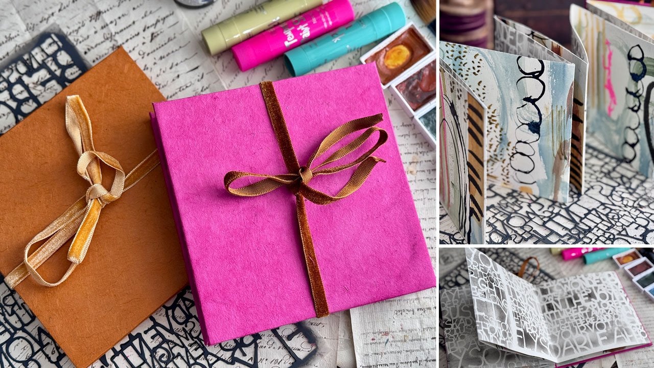
into a fun concertina book. So for the concertina book, you're going to need
a big piece of paper. I've used a piece of 18
by 24 watercolor paper. You could use the Cc in Excel. I've used the paper that Michael's has the artists
loft. I'm a big piece of that. You can use smaller
paper if you want, but it really is fun if
you have a big piece, and you'll end up with a book
that's about six by six. You might want a
piece of ribbon if you want a pretty
closure on the book, and then glue stick. I'm using the UhuGluStick
to assemble my cover. You might want a utility
knife and a bone folder and some bookboard which bookboard is basically thick cardboard. So if you've got
a watercolor pad of paper or any pad
of paper, really, this piece of cardboard is the same thickness or
maybe even a smidge thicker. So it makes perfect bookboard. So this can be the cover for your book if you've got a pad where you can
steal the back of it, or you can order bookboard. I've ordered a bunch of bookboard because I
made a lot of books. Then I've also used a
handmade paper that I found at the Blick to
do my cover with, but you could you could paint the bookboard if you
want the bookboard painted. You could put a piece
of art on there. You could use a piece of fabric, kind of your choice there
on how you finish it off, but I think the pretty handmade
papers make a nice cover. So that's the first project. We paint and draw and then create a little
book out of that. So for the drawing on here, I've just used a pasca pin, so maybe a black and white pasca would be a good choice
to have on hand. I have also used
for the other side, I wanted it to be fun
and I wanted it to be fast and I wanted it
to dry pretty quickly. So I have used the shuttle
art tempera sticks, and I've got just all kinds
of colors to pull from. They are super fun for
a project like this. You can do this project with
anything you have on hand. You can do it with watercolor, you can do it with
acrylic paint. You can do these
with any drawing or markers or paint
pens, anything at all. It really is going
to turn out well, no matter what you use. I'm just showing you
what I used in class if you've got any
of those and you want to use those
too, that's fine. But if you don't use
what you got on hand, this is about learning and discovering and playing
with different techniques, not necessarily
duplicating everything that he used or that I used. There's our first project. Second project we end up
doing is concentric circles. And so for concentric
circles, I used watercolor. So in a couple of projects, I've used my Kurataki
watercolors, which I love those. They're more like a
guash than a watercolor. You can do this project with anything that
you've got on hand, whether it be watercolor or um acrylic paints
or what have you. This was super fun with
the watercolor and then using some
mark making things. You could use No Color tools. You could use paint pens. You could use any pencils that you've got on
hand on top of that. I've got the polychromas that
I pull out for a project. Those are an option if you've
got any colored pencils. I also use some oil pastels. I've got the Mongio oil pastels, which are some of my
favorite and I list all these on my favorites list
also, so you can use that. If you use those, you'll need to seal the piece that you
use any oil pastels on. I do that with the sanela
oil pastel fixative, but if you don't use
any oil pastels, then you don't
have to fix those. Like those tempera paints,
you don't have to fix those. So use your favorite
things and incorporate the different things
that we're learning with some tools that you have on hand that are already your favorites. I do love the Neo
Color two crowns. Those would be perfect on
most of these projects. So any of those would be good. I also use some acrylic
paint on some of these. So when we get to
the second project where we are looking
at his painting 30 and the third project where we are looking at his
painting houses in Munich, those are acrylic paints and No color two crayons
that I've used, and we look at his
painting upward, those are watercolors
that I've used, the kurtoki watercolors which really amazingly
enough come out really super similar to the
painting that he did in oil paint on cardboard. I mean, it's amazing
how close that got. It was amazing. And with
each of these projects, I've got project guides that will guide you into
some other directions that you could think
of for your projects and give you some
bonus variations and tell you a little bit about, um, Kandinsky is painting
to get you started, lots of options there. I also have some
paint markers that I used on a couple of these
for some mark making. I like the Artix
paint markers or the paska markers would
be great for that. For this, I did use a circle template that I've
had since I was in school. So if you've got a circle
template or a glass, I could have used my water cup to replicate a circle
or something like that. I did actually use some
type of shaper for the more geometric
things that I had in and then I also
use some fine liners. I've pulled out the prisma color fine line markers
because I have them. You could also use the
Pigma fine liners. If you've got
those, the microns, those are probably the ones
people most commonly have because in our observations and are looking very close
at the paintings, we notice maybe sometimes he outlines things in a
very thin black line, so that's how I replicated that. I think that's about all
that I've used in class, but this isn't necessarily about doing everything
exactly the way I've done it. I want you to see
what I've done, see what I've pulled out, and then look at what
you've got and say, Okay, what can I do?
How can I create this? What can we make today and see what kind of fun
you're going to have? Looking at his paintings
and just kind of, you know, putting his thoughts
and ideas into practice. I hope you enjoy class. I can't wait to see
what you create. Definitely come back and share some of your projects with me, and I'll see you in class.
7. Dynamic Line & Shape Exploration Warm Up: Let's do two warm up projects. This is going to
be the first half of the warm up projects.
I'll be number one. What I want to do
in this one is I want you to get as big a
piece of paper as you have. It doesn't have to
be as big as mine, but we're going to do
something really fun with these and I think
you're going to enjoy it. I want you to get as large
a paper as you have. If that's nine by
12, that's fine. If it's ten by 14 ",
that would be fine. I'm going to use an 18 inch by 24 inch because what we're
going to make when we're all done is going to be
so super cool that I just wanted to go ahead and do it with the larger
sheet of paper. So for this first exercise, what we're going to do on the front side or the back side, we're going to use both
sides of this paper in the warm up one
and the warm up two. So we're going to start
with the warm up one. What I want to do is focus
on dynamic line and shape. I want you to use some
type of black something, whether it be a
marker, a brush pen, or ink, and a paint brush, you can use pastels or colored pencils and I want
a big piece of paper. What I want you to do is start drawing free
flowing lines, close your eyes,
take a deep breath, and create a series of lines on the paper thinking of Kandinsky's belief that
lines can carry energy, let your hand move naturally. I'm going to start mine with
a black wing matt pencil. It's close to black. But I
want you to close your eyes. And I'm trying to
keep my hand on the paper to keep us
hopefully focused, but I want you to just kind
of not look at the paper and intuitively draw and just
see where does your hand go? You know, maybe keep an edge, your hand kind of on the
edge to stop yourself, but don't worry
too much about it. And then after you've kind of covered what you think
might be most of the paper, then look at it and
see where we're at. Okay. That's pretty cool. I actually looked up and did not pay attention
to the paper. Then I want you to add
shapes and layers, introduce geometric
and organic shapes with in and around the lines. Circles, triangles, arcs, were all key elements in
Kandinsky's compositions. Now we can come back
and start adding other details all around these lines and adding
in just mark making, filling it up anyway
that your heart desires. We're not worried about
composition at this point. We're not worried about where
things are being placed. If you want, after
you do all of this, you can use some color
to add contrast. Fill in some of the areas with color leaving others empty. Play with overlapping
and transparency. In reflection, after
we look at this, what mood or energy does
your composition create? Does it feel musical,
calm, or chaotic? This is a good exercise
where you might put on some music and just let your mind roam free
and the music guide the feeling and the lines and the different things that
you put into the piece. So let's just create
and have fun. And while you're doing this,
it might even help to have one of Kandinsky's books
or some of the PDFs available just to
kind of look at and just to get some ideas of some of the stuff that
he added into his pieces. I really liked these
where they were you saw the sketch and the different and we can
see in this piece here, we've got lines that
cross over each other. We've got hash marks, we've got lines
implying a direction. We've got some
interesting shapes. I really like this
funky crown shapes. I might even do some
of those in mine. I want you to be inspired
by maybe some of the pieces and elements that are in his without necessarily trying
to duplicate his drawing. That's fun. I like that
little crown shape. I might even put
another one over here. What I like about
exercises like this. We're not trying to duplicate something that
he's already done. Rally enough, I like
these eyeball shapes. I might want to even move to a black marker because my hand is moving
this stuff around. I might pick a Posca pen in
black, make sure I got that. I like these little eyeballs
with the eyelashes, so I could put some of
those in my pieces. And just have some little
eyelashes looking at us there. This is a super
fun way to explore a master without
trying to overwhelm yourself by trying to actually
like the finer point of my smaller Posca pen
without trying to overwhelm yourself trying to
recreate an exact painting, which for an old master study, I prefer to do because I'm never going to be able to create an exact painting the way that
they did for some reason. That just doesn't seem to be
the way my mind operates, but I really like looking at the different elements and studying different
pieces and say, Okay, how can I create something with that without
recreating exactly that? That's hilarious. This is actually super fun to
look at it and say, Okay, that's a fun element. Can I put that in here somehow? That's exactly
what I want you to do with this particular project. This particular drawing, which is untitled 1939 ink on paper, which comes over here to 1940 untitled Guash
on black paper. This is 152 and 153 here in
the around the circle book. I'll try to add another
PDF to our PDFs with this in it so that we
have it also to look at in class in case you
don't want to get the books. But I do find looking
at this piece, look at this right here that we can include these elements, but still make this our own. That's what I like about
studying the master, but not necessarily trying
to recreate his exact piece. You've made it your
own when you do that. These little elements over here. So I might just do
some of that and just continue
working on this bit, maybe looking back at the
different elements and seeing how can I do
something similar. I like these pieces
on here too that look like great big long, I don't know, staagttes that
are not quite going down, you might find in a
cave. Those are fun. Mine are tiny bit different, but it gets the impression. You get the idea there. I I don't know what
that thing is, but we'll try
something like that. It's just a good way to
try different marks and different stuff in your work that you maybe would not
have done otherwise. Like this little thing here. I want you to fill
the whole page. Not worrying about
where anything is. You're going to love
what we make with these when we're done with both sides. It's going to be fun. And kind of like some of these line elements that I'm not really doing there, so maybe I can do
a few of those. Mine looks more like a railroad
track, but that's fine. Still still kind of working in an inspired
Kandinsky set of marks. Some of these marks go into dots and other things. We could
do something like that. You could look at any of
his paintings and do the same let me create something
but slightly different. We've got some funky
triangle pieces here, which we could hatch
mark off like he's done. That might have been
good in pencil. Then this comes this way and we've got some
lines going this way. And then we've got
some element there, ending it off with
some circles in it. That's fun. Then you've got long lines coming
through there. Just looking at the different
elements and saying, how many of these things can I incorporate on this
big piece of paper. So that little donut
looks like it's got little If you can't see it, take a picture of it or zoom in with a magnifying
glass because some of the things in the
books are too little to really see as good as
I want to see them. Then feel free too to put in some of your own favorite
marks if you've got some favorite marks
that you love and you want to incorporate
some of those also. Feel free to do that also. I've got some circles with some wagon spoke things
coming out of it. Too, some of this, I want you to think of
how fast can you do it? Maybe set yourself a
timer for 30 minutes, create and draw and
experiment with 30 minutes. But I don't want you
to overthink this. This is not meant to
be something that takes days and days and days. I want you to set yourself a timer so you don't
get so hung up on what anything looks
like or where it goes and then work fast, get some energy in some of these pieces and just
see how fast can you do? Whatever it is that
you're trying to do. I like less control of my pen. A lot of times I will hold a pen way further back so
that I have less control. I'm not looking for
straight lines, I'm not looking for perfection. I want this to be fast
and energetic and let's just see where
we can make it go. And how fun can that
abstraction be? No, he did a lot of
triangles and circles, so he might do some
triangles in here, just kind of taking some of those elements and
including them somehow. Maybe some fun just
scribbly mark making, whatever it is that
you're kind of feeling. I want you to let that go. And then you can color
in some of these, so they're nice and dark
and they're not all white. On a piece like
this, I am trying to mostly go edge to
edge because we're going to use the whole sheet of paper when we're
done with both sides. So do kind of try to
get edge to edge. Don't stop away
from all the edges because I need that to keep going for what
we're going to do next. So go edge to edge with
whatever it is that you end up being inspired to do. Don't forget concentric circles. We know that he liked
concentric circles. So we could do concentric
circles in black and white with some mark making.
Those would be fine. So just taking inspiration. Oh, that still had paint on it. Just taking all the
inspiration that we can through all the
lines and the marks and the lights and the
darks and the triangles and the circles and all
the mark making. I'm still just looking at that
and being inspired to say, maybe I could do some of these great big things
right over here. And then do I have
most of it covered? I think now I do have
most of it covered. And so at this point, if you've hit your 30
minutes and you're like, Okay, I've hit 30
minutes, then stop. Stop right wherever you're at, and we're going
to go for it. This is the first half of
our two warm up projects, and we're going to use the
other side of this for the second half of
our warm up projects. This paper is got some use. Don't get rid of it yet, and
then we're going to come back in warm up number two,
so I'll see you there.
8. Emotional Color Exploration Warm Up: Move on to the second
part of our warm up. And this second part, I'm going to flip the page over. The second part is going
to be all about color. I'm going to set
this out here so that my camera stays focused. But what I want you to focus on this side is color and line. It's going to help you tap into intuitive mark making and emotional expression
through abstraction. Materials that you can
use on this side or anything you have on hand,
watercolor, acrylics, soft pastels, I'm going to use temper sticks because
they're easy. I can make big areas of color if I want and they
dry really, really fast. So even though it's not a traditional medium that
Kandinsky would have used, I think if it had
been available, I think he probably
would have used it. For this, I want you
to pick an emotion, choose a mood or a feeling
that you want to express, happiness, calm,
excitement, chaos. You can see from each of
those how they would evoke a different set of colors and moods that you might
be trying to convey. I'm thinking that I want
to express happiness, maybe calm, maybe chaos. I don't know, maybe a
little bit of all of that. And based on your emotion, pick three to five colors
that you feel represented. Kandinsky believed colors
carried their own energy and try to feel which ones
match your chosen emotion. That one's going to be
that's going to be hard. I want all of those. Happy
could be sunshine colors, calm, could be blues and greens. Chaos could be, you know, different different colors that maybe match or don't match. I think I'm going to maybe do the blues and greens
because I'm kind of obsessed with some
of these right in here. And then we've got that color. Maybe I want maybe I'm
feeling blue and green and purple in that realm.
Maybe a dark one. Look, I'm kind of feeling it. Oh, my gosh, what are we
feeling? I don't know. We're you let's just pull all these out and
see what we can do. It's it's not about making
anything in particular. It's about pulling something
a color together, something. I'm thinking blues and greens. Let's just pull all
our options out here. Some purples, but I'm
not feeling purple, though I do like
that dark green. I've got a whole little
collection here. I missed all these
greens, didn't I? Okay, so I got
plenty to play with. What I want you to do is apply the colors freely
without sketching anything. Start applying the
colors in broad strokes, dabs and blended washes. Let your intuition guide
where the colors go. See how the colors interact. Do certain combinations, feel
more harmonious or jarring, and then adjust it as needed.
I'm feeling pretty good. I've got a whole
collection of colors. And so now we're going to start doing some fun
intuitive mark making. Okay, so I'm just going to
start with my favorite color and maybe do just some mark
making and intuitive lines, and this is going
to dry real fast. It's tempera paint. I love that. So I'm just going to start
just swapping these out. It doesn't matter
what's sitting next to what and what we end up with. I'm not going for
something specific. I could look back at his pieces and try to do some
of his mark making, but really more than anything, I'm just I'm just going for it. I'm releasing my inner Candenski
picking different colors. We're looking for spring
and happy and chaotic. I think that's where I'm
going to go with mine. Just some fun. Doesn't matter
where everything goes. Wait till you see what we're
going to do with this. Afterwards, I got
something fun planned. Ooh. This is kind
of invigorating, just being able to draw
different shapes here. For some reason, this
don color is one of my very favorite colors out of these little tempera sticks. And what I like about it
is they're fast drawing. I can draw right on top of other colors I've
already put down and then keep on moving
and not have to really have any dry
time, which I love that. This is pretty fun, actually. Just keep on picking
different shades. Look at this color. What?
Wow, look at that color. Oh, my gosh, look at that color. Whatever you just feel
intuitively inclined to make. Again, try to go edge to edge with these because
we are going to be doing something fun and you'll want to have these go all the
way to the corners. They had a tiny
bit of pink on it. We threw a pink in there. Look at this color. This is really close to that
color but a shade darker. I think this one
along with the don. These two right here are some
favorites, super favorites. Do these even have
names on them? They don't have names on
them, but that's okay. These temper sticks
are shut Lart. Both of these colors are
the shut Lart sticks, but I love them. Almost. That might be what that
color is or it's real close to something I've already
picked up, so that's fun. Let's see. Let's do this one. H. Some of these, I thought I was trying to
get them out of my way, but some of these look identical to some of the ones
I've already put out. Okay, I think I want some more green before I get out of here. I think there was still
one or two greens I didn't get I spy. I spy them over there. How did I miss any? I did. I missed several. How
did I miss those? Why didn't you say, Hey, there's more greens. I like this one. It's like an olive. It's like an olive green. Okay.
We're getting there. Just having some fun. I'm not trying to create
anything specific. It's just about the
mood and the emotion. What emotion was I going
for a little bit of chaos, little bit of happiness. I think a little bit of
calm, maybe. I don't know. I felt a whole bunch,
there's a dark green. There's a dark
green. I don't know. I feel like there's a whole
lot of all of that in here. You know what I think these
would be really great for also is the Houses in Munich painting where we do
a simplified color scheme. I think these would be perfect
for that type of painting. Thinking forward to
what I might want to create for some
of my projects. I feel like here's another one of those Cladon.
Did I already use that? I feel like I might have
maybe. I don't know. Yeah, I'm feeling like This would be the perfect way to do the buildings
and then the outlines, and then the houses,
and then the roads. I can see this being the perfect type of material to do that really
quick and really fun. You could do a
bunch of these with this type of temper stick. I'm just think in my mind, what would I want to work with and I feel like these are it. This is still a shuttle art, this one feels like a
lipstick a little bit. Rather than it's a waxier
feel. I like to do that. I like to observe in
my different supplies. What does this supply feel like? What's it doing? How is it different than some of these other ones that I'm doing? I'll take down some
of that blue with a color that did not really
take it down, did it? Get my little concentric
circle going in there. This one is more like a
neon, I don't want that. I don't feel like I want
either one of those. These two are almost the same. That's why I feel like those are similar. Let's just come back. I'm getting close to being done. Again, this is the
type project too. You might set yourself
a timer and say, I'm going to give
myself 30 seconds here. I'm sorry, 30 seconds, 30 minutes and then
we're going to wrap that up at the
30 minute point. Um, so that you don't keep
going and overdoing it. I feel like for this,
I might be there. Let's take a moment and
look at what we created. These warm up exercises aren't meant to be
finished pieces. They're about
freeing up your mind and embracing abstraction. Kandinsky often worked from
feeling rather than form. Let this exercise prepare you for the larger
projects ahead. Now that you've explored
color, movement, and emotion, you're
ready to dive into your first Kandinsky
inspired painting. But before we do that,
I'm just talking for a moment while these are drying because it's going to
take a moment to dry. These dry fast, but still takes a moment
for those last layers. Now we've got crazy color
on one side, super fun, black and white on the
backside and meet me in the next video
where we're going to turn this into
something super fun. I'll see you in the next video.
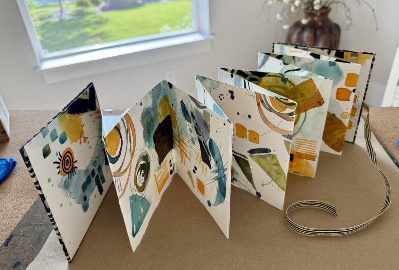
9. Creating A Concertina Book From Warmups: All right. So what I thought
that we could do out of this super fun page that's got writing on one
side and color on the other. I've put a big cutting
mat out here on my board is I want to cut
these into three strips. And what we're going to do is make our own little
concertina book. So I have my piece
of paper painted. I also have a piece of bookboard which this could be the back of a sketch pad if you had the back page
of a sketch pad handy. That's just as thick as
bookboard that back page is. And you could steal
the back page of one of your watercolor pads. Then I also have some
book binding tape, which you don't need.
You can use sketch. You can use. Wait a minute. So now that I pulled that out, I actually have artist tape. That would be just fine also. I might just use the artist tape now that I thought of that. A tape is fine. You
need it to be just thick enough to hold the edges of two pieces of paper together, three quarters of an
inch to an inch is perfect and that's the supplies. I'm going to cut
this into thirds. We're going to measure off. This page is 18 " by 24 " and so we want three
strips of 6612, 18. Yes. That's what
I'm going to do. I'm going to mark
this at 6 " and 12 ". And then do I have
that on the edge? It's kind of hard to tell from where I'm looking on top of it. Yeah, it's close enough. If it's not perfect perfect, don't beat yourself up. Close enough is good enough. And then I just go ahead
and mark it down here. And then you want a
utility knife or some type of knife that you can cut. And I don't think, do I
have a longer All right, so I have a well, it's actually too long for
my paper. That's okay. We're going to use
our short ruler. So basically, what I'm
going to do is line these up and I'm going to
cut these into strips. And so it doesn't
have to be perfect. We can kind of finigle it
at the end if we need to. If we didn't cut it exact. I'm just going to cut
that straight down. You could do that with scissors
if you've got scissors, draw yourself a line, do
it with some scissors. That'd be fine, too. That one might not have
been perfectly straight, but like I said, don't
get hung up on perfect. Because when you're done, you're not gonna be able
to tell anyway. There's so much going on, it's just going
to add character. So now what we want to do is we're going to
join all three pieces, and we're gonna make
these into a zig zag. So basically, we're
gonna fold these in half with one side over here, and then we're going to fold
it back just like this. And if you've used
pencil and you're going to smear anything like I'm
going to smear if I do that, you can have a piece
of wax paper handy, and I do like to have
a bone folder handy. If you've got that, you can use the back of a spoon,
anything like that. I like to just really
firm those edges down so that we have
a fun little zig zag, two sided, super fun. And we're going to go
ahead and continue that. Kind of looking at it, thinking, Is that Yep, that's
gonna continue it on. So here we go. Then fold this one over. If you've got a
definite up or down, then you'll want to
keep that in mind, but I don't think I have
a definite up or down. I have a I have a fun chaotic up or down might be more
interesting if it were flipped kind of composition, so I don't have to
worry about that. But if you got a definite
direction going on yours, keep that in mind when
we get to the next step. Because these are so
cool. I'm telling you. Then again, just a bone folder, the back of a spoon is fine. Anything to press that down. Now, I want to tape the edges
together just like this. I'm using white tape, I think it will blend in better
since that page is white. That's why I was going
with that book tape, but then I remembered I
had white artist tape. I wanted to be on the side that you're really not going
to be able to tell that it's not super obvious is what I'm
thinking, not super obvious. Just get that lined up
and then tape that off. Oop. Got of green
paints coming over. And then just trim that edge. If it's not a perfect
straight edge because one book is slightly
fatter than the other, just take your scissors right here and trim them
up so that the seam, it is straight, you don't even realize that one side was a different side
than the other. That's why I said it doesn't really matter if it's perfect, but get it as
straight as you can. But when you're done,
you're not able to tell, don't get hung up on, Oh, no, it's not perfect because
that's how we'll hide that. Just as close as you can. And then tape it, and then you can make that edge look perfect
when you're done. Doesn't have to be perfect. Okay, and then we got this one. Let's go ahead and cut that. Okay, this one slightly off, so I'm gonna cut it
straight and kind of cut that a tiny
bit so they match. Don't have to be perfect. And
then once you've got that, I feel like I have a tiny
edge sticking out over here. There we go. There we go. Okay. Now, once you've got
that Oh, look at that. Oh, my goodness. Now we
can take our bone folder, our spoon or whatever and
just really press that good. And now we have made ourself
a concertina two sided. Fun. What I really love about this and we're going
to put a cover on this, which is going to
make it complete. We are going to
sacrifice one side, but I'm going to let
it be this side. What I love about this is
now we've ended up with some very interesting
compositions that we never would have thought of or come up with on our own. And we can look at and
admire how those turned out. Again, the same way
for this backside, you can admire
different compositions and the way that the pieces
ended up. That's super cool. Now we are going to take
our bookboard and I've got a little T square to
make it easier on myself, and I'm just going
to mark the size of that we're just getting close, doesn't
have to be exact. And we're going to cut
this with our ruler here. I like this big one because
then as I'm cutting, I'm less likely to come off on my hand because this
side is a little thicker. I love that. And you just want to slice a couple times until you're through it. And then I don't know. On this side, yeah, I'm not gonna have
enough for two, so I'm gonna go ahead and
just mark it right here. You could have just done two marks and drawn
a straight line. If you wanted to, that
would have been just fine. I just like using my baby T
square 'cause it's so cute, and it's fast and it's easy. Okay, so now I'm going
to get another one exactly the same size or it's closer you can get.
Doesn't have to be exact. And then I'm going
to get some I've got some handmade papers that
I found at the art store. I'm going to cover this
with a handmade paper. You can cover it
with a piece of art. You can cover it with a
piece of handmade paper. You can leave a bookboard. You can paint this bookboard a color if you want
to paint it a color. So a lot of choices on how you could do the cover, but
this is gonna be the cover. We're making a full
little book here, 'cause I thought
that would be cool. Okay. And now, let me go get
a piece of handmade paper. So since I picked crazy
colors of blue and green, I have this fun color
in my paper stash, which would go
perfect with this. And so what we need
to do is just cut ourselves two pieces
of this paper, a little bit larger than this. So you really want
to give yourself about an inch all
the way around. I think that gives
us the mine's edge. Doesn't have to be perfect, so you could just
kind of eyeball that. And then I'm going to
use an hu glue stick. You get a second one of these. Again, you're not going
to see the inside, so it doesn't have
to be perfect. And then I'm going
to get a glue stick, which I have right
here on my desk. And we're going to see if there's a right
side or a wrong side. Feel like, This is
the right side. We're going to glue
these down to here. And I'm gonna cut the
edges so that I can fold these over like a
nice little package. Let me glue it down first. All right. And then I'm
going to glue these down, edge to edge, and
then edge to edge. So that we get a nice even pull. So it doesn't pull it crooked. That's why I go side
to side, side to side. Then there is our first cover. So I'm going to glue
the other one down. And then cut my
little edges here. I just want to give yourself
about a millimeter there. You want to have
enough to overlap, but not so much
that it won't give you a clean corner, really. Then we can glue these. And we're not gonna see the
inside when we're done, so you just need enough
overlap so that it's clean. There we go. Now, I want to make sure they're all
going the same direction. Yeah, there we go. Then I want to make sure I get this going
the right direction. Yes. Now we're going to glue down this paper to
this thing right here. I'm just going to go all around on the paper
just in case. And then we'll be ready
to stick this down. I'm going to open
it up a little bit. Here we go gluing
it down to my pad there and get it nice and even making sure that I've got it kind of even there before
it really glues down. Just shifting anything I
need to shift slightly. Then I'm going to
glue this side down. If you wanted a ribbon on here, we should have glued the ribbon before I glued all these down. I could still add a ribbon. We can still add a ribbon. Let's just go get
a piece of ribbon. This is a little piece of velvet ribbon and that's
glued down. Hang on. I might just go ahead and have the ribbon right through
the center here. Before I glue it to that,
let's this is a piece of velvet ribbon that
I have on a spool. That's about the center, so
I'm just going to center it there before we glue this down. And I want the ribbon
to go side to side. So it is good that I
glue that before in the direction I want it to go and I want this to move
down a tiny, tiny bit. There we go. Is that
where I want it? Just double checking my spacing
and where everything is at Yeah, there we go. Look, see. That's what we're looking for. And we might take
our bone folder on both of those and just go ahead and make sure that
we're nice and firm down. Doesn't take this
glue long to dry, so we don't have to
wait very long, really, but we're going to let
it set a little bit. Then I'm going to go
ahead on this side. Same thing, really get that
down with the bone folder. And then I picked a green because we're
still in the blue green. And now I've got about
three links of the book, a little more than three links wrap around wrap around
and then see that you've got enough because now we
can tie this lovely ribbon into a bow and that's our
closure for our book. How pretty is that. Then we can look at the book
because now we've got a lovely cover and we can look at the book
from either side that we want to look at it
because it's two sided. How super fun is that?
Coolest thing ever. I'm obsessed with making little
tiny art books like this. Alright, so you don't have to make a book
if you don't want, but I thought super
creative way to turn our warm up into something really lovely
that we can enjoy. So I hope you enjoy
the warm up project, and I'll see you
guys back in class.
10. Expressive Color Play: Concentric Circles: This project, I want to focus on squares with
concentric circles. I've got the PDF
project guide for you. Let's go through
the project guide really quick and
then we will create our own variation of
this lovely piece. This project explores
Kandinsky's use of color theory. And its emotional impact through a playful structured exercise, squares with concentric circles, 1913 is one of his most
recognizable works created as a study in color
relationships rather than a formal painting. It demonstrates how
different color combinations can evoke various
moods and feelings. Through this project, you'll
experiment with color, layering and composition
to better understand Kandinsky's approach to
abstraction and emotion in art. So in this one, you can use any materials
that you got on hand. I have a few
suggested materials, watercolor, acrylic paints, pastels, colored pencils, anything that you'd
like to work with. I'm thinking that I'm
going to work with my Kurataki watercolors because we've got a lot of fun colors that we might work with there, and I've pulled out a
whole little selection of colors that I was thinking that I might
play in that are kind in a muted color tone, but I've got a good range
of brown and a turquoise, and then there's a blue, and then I've got a couple of greens and we've got a pink, and then we go back into
orange and ochre yellow. It's a fun range just
to experiment with. And if you look at squares
with concentric circles, the whole painting, he's got a variety of ones
that he's used. He's done some color mixing with some neutrals in
here that I can see, which would be mixing opposites on the color wheel like purple, and green or orange and blue. So in this case, he
probably did mix orange and blue because
there is a reddish, vermilion kind of color
and a blue in there, so he probably did do some
color mixing in there, evaluating the relationship of what those colors did mixed. He's got a variety
of starting with brighter colors in the middle and darker colors in the middle. And then there's little
rings and big rings, and then each color ends off with a different
color on the outside, even some split colors. So that's interesting. So it's just it's just
an exercise to play. This to me is one of my
favorite pieces of his. I already love concentric
circles in some work that I do, and then you can mark make in
the circles and really get creative with the things that you add on top of that to
truly make it your own. But this is a nice, relaxing, easy, low stress project. Tools, watercolor paper,
I'm working on a piece of Hana Mule coal press
watercolor paper because it's the watercolor paper that I
happen to prefer working on. Then other supplies
might be some tape. I'm going to tape off our edges, a ruler to make our grid, and if you want to do
some color mixing, then a little color mixing
palette would be good. So you want to prepare your grid by drawing out your grid lines. I'm probably going to do maybe the three by three
grid because this is a nine by 12 piece of paper, so that would give
me four by three. So that's what I'm
going to go for. Choose your color palette. That's what I've done with
these grade down colors. Kandinsky believe colors had emotional and spiritual
significance. See the expanded color guide for some deeper insights if you're interested in those and
you haven't seen that yet. And then select a mix of warm and cool colors to
explore contrast and mood and feel free to premix colors if you're wanting to create
some unexpected harmonies. So paint concentric
circles in each square, start from the center
and work outward, adding layered rings of
color and experiment with blending one color into another one or using
bold contrast. Try varying your
brush techniques and pressure and opacity to
create depth in your piece, and experiment with
color relationships. Observe how different colors interact when placed
next to each other. Ask yourself, does a
certain color vibrate or feel more dominant? Try reversing color orders, place light colors inside a
dark rings and vice versa. Add some personal touches, consider using mixed
media techniques such as oil pastels over
acrylic for add texture, ink outlines to emphasize
certain areas and scraping or blotting techniques
for visual interest. So definitely start
to play after you've laid your color down and then come back with
the next layer. It's just about the
play and experimenting and see how these different
things react to each other. And with the different squares around it. Then
reflect on your work. Step back and analyze, how
do the colors work together? How does the piece
make you feel? What emotions do
certain squares evoke? If you were to title your
piece, what would it be called? Then some bonus
variations that I've given you here,
monochrome challenge, use different shades
of the same color for interest and tonal effect, a mood based approach, choose colors based on
an emotion you want to express like calm or
excitement or nostalgia. We could almost call my
muted color range there like a nostalgia color range,
layered transparency. Try glazing over
previous layers to see how transparency affects
color interaction. This project is about
exploration, not perfection. Kandinsky viewed color as
an emotional language, so let yourself play and see
what resonates with you. Then don't forget to
come back and share your project with me
because I love, love, love logging in and seeing people's projects
that they've completed, especially on these master
studies because it takes a little bit of dedication
to sit out and say, Okay, I'm going to commit
to a master study. Let's see what we can create and then actually
do the projects. So many people just watch
it and then don't do the projects and you
really learn by doing. I'm guilty of not doing projects too in
classes that I watch. But with the master studies, I actually really enjoy doing these showing up and doing the project is
part of the fun for me. Well, I was going to
do my little T square and get that really straight, but might not work. Since I'm not on the
edge, well, Alright, let's just go ahead and mark this at three inch intervals. I've got a tiny edge
there, a tiny lip there. I think I'm going to
come just a smidge over from my 3 " so that
when I'm done, hopefully they're mostly even. Actually, if I do that, and
this one in the center. I'll make those even and if they're not,
it is what it is. I'm not too worried
about it. I'm just going to go ahead
and draw the lines. Lines can be there when we're done. I'm not
worried about that. Just to give us a stopping and starting point for
each of our elements. All right. Now that we've
got our lines on here, I'm just going to go ahead
and wet down my colors. I've got the colors I chose are 47 raw nberdep five
oh six shadow green, six oh one grayish
blue, 54 olive green, four oh five green gold, 17 coral pink, four
oh two Mars yellow, and 44 yellow ochre. And I've just picked a
variety of grade down colors. You could go with all primary colors and a white and black and
have a mixing palette. Those are out of the 48 piece Kurataki and the
art novoqe Kurataki your choice on how you want to work your colors and your
concentric circles there. But I'm going to go ahead
and just wet them down. I'm going to grab
my favorite brush for doing concentric circles, which is the Princeton
Neptune Oval Wash. I've got some water up there. I'm just going to be able
to dip my color thing in. Then what you might do
just to stop yourself. Let's see, I got one,
two, three, four, five, six, I've
got eight colors. I could go ahead and pull
a little plate down to be a mixing palette because
what might be nice is if we have a different circle in the center of
every one of these. We could just go ahead and
start with the circle. You could also do this
with a round brush. You might prefer a round brush. So you might have
one of those handy. Let's see what I've got here. Princeton Neptune Round number eight would be a good choice. I got a bigger one
back there too. Is this it? Yeah, the ten. Probably the eight or the ten
in the Princeton Neptune. But I like the oval
wash because I get wonkiness out of it and
the wonkiness is what I want. I'm just going to spread these around so they're not necessarily in the
order of my palate. Just for fun, just for fun, no set reason, and we'll
just see what we get. Maybe some of your
centers could be crooked. They don't all have to be the same size or the same color. We can come back and
mark make on top. We could keep our project guide handy so that we can see wonky
is the name of the game. So keep that right
there beside me. Oh, I didn't mean to
do that. Let's go ahead and just pick that up. It doesn't really matter. We can mesh that in
when we get to it, but we'll just go ahead
and move it around, so be mindful that your
watercolors are wet. Let's try this blue and
this green gold and see what we get there.
Oh, that's pretty. Look how pretty that color is. Oh my goodness. That's actually a
super pretty color. A little similar to
those, but it's fun just to see what would
we get if we mix, say, orange and blue?
What color is that? In that case, we should
get some shade of a brown. Maybe if we mix yellow
ochre and that aqua color. I just mix several
colors, but that's okay. We got that green that's
real similar to that. That's very interesting. Maybe if we go in with
some orange and this pink, what would we get
then? Oh, yeah. That's pretty cool
there. I actually like that orange pink mixture. Now I'm just going to start
coming and making circles. They're going to
be wonky circles. My paints still wet, now
we're going to get to see how any of these might interact with the layer that
we put around it. That's part of the
fun of this for me. I'm just going to pick
some different colors to loop around the
different ones, not really being specific
about what goes where, but you could certainly be a lot more deliberate than I'm being. It really is about
the fun for me, what if I do this
or if I do that? I'm not trying for
any specific outcome. And then I might do this with all reds and oranges and pinks, like the colors that are beside each other on the color
wheel. That would be fun. Also might do one of
these in shades of blue because I like
shades of blue, and I think all the shades
of blue would be super cool. We lost our center on that one with the brown.
The brown dominated. Let's go over here with
little bit of green. Keep in mind too, we can
layer on top of this. It's not just going to be
whatever color here that we do. Maybe a little pink and
orange mixed together. Oh my goodness, these
are already fun. Let's put pink on the
outside of this one. This is a good way to see
different color palettes and what would happen if you've got some color that
you're interested in, and you're like, I'm
interested in blue and orange. What would that do? This
is a great experiment. Now, if you don't want
the color circles running into each other
like I've got going on, I want them to do that, but if you don't want them
to run together like that, um let each layer dry. You don't have to have
them running together. You could even come
back in and do a loop in the middle.
That would be fun. Okay, this one's coming out fun. I want maybe a little
tiny loop on that one. I'm loving this one
actually. Let's come back. I want some more of this
color around there. I like this aqua color, so maybe we'll come
back with some of this. Around these edges,
maybe, really, I'm actually up to
the edge on this one, so I may go ahead
and make it an edge. Again, the goal is
not perfection. If you look at our
original inspiration, these overlap and run into each other and they're
not perfect squares. I'm not trying to get an absolute straight,
perfect square. You could tape each square off
if you really wanted that, but that's not my goal and
that was not Condensi's goal. I'm trying to channel his playful experimental goal that he had here with
working with these. I actually find
it easier to make these straight lines
with my round brush so I might swap back and forth. I really like that, but
what if we added in say, a touch of orange.
Maybe some yellow. Look, we got our first square. Wow. Maybe a dot of something right there in the
center. That's super fun. Let's just again, vary your
brush pressure so that you get some white and
skinny loops there. They don't all have to be the same opacity
or the same size. You can have some skinny
ones and some whiter ones. I'm just picking colors at random and just seeing
how it makes me feel. I really like how that
color right there was. I don't know what
that was, but I loved it. That was pretty. Oh, it must have been that one there because that's pretty. I don't want a blue edge
next to a blue edge, so I'm not going to
blue edge that one. I'm going to come back with
a different color there. Oh, I like that color a lot. Let's take the round
brush and get that color. What color was
that? That was the grayish blue six oh one. I like grayish blue six oh one, grayish blue six oh
one for the wind. See how that gives me a
little more control if I'm using the different brush
you could also use. It's got a oh, no, a little brush piece
that let go in there. There we go. You could also use a square brush
with a square edge. If that is easier for you to play and experiment with
your different supplies. It's not about being perfect. It's about the play
and the experimenting, which is why this master
study appealed to me so much because I'm all about
the play and experimenting. That's what I enjoy in
the painting process. That's what I try to
do when I show up at my table is what can
we create today? I'm not worried about trying
to make a masterpiece, which is what I find frustrating is trying to create something amazing and then being stuck or not creating
what you thought. So I let go of that expectation. My little rings are running into each other more than
they are staying to find, but I'm okay with that, too. That's part of experimenting. I'm just going to keep on maybe with this round brush because those are
working pretty good. Okay, that's looking
super cool, actually. Then we can come
back in and define circles if we disappear or
circles as we're going. So don't get hung up on, oh, my circle went away because we're going
to add layers we're going to let that dry and
then add layers on top. So don't despair. We're
going to get there. Hi are more defined, so it almost feels
like he's using maybe some mediums that did get an opportunity to
perhaps dry in between, but I'm not looking for that, so I'm good with the play
like we're doing it. Master studies for me, I
don't want that green there, I don't think are all
about, yeah, I do. I do want the green there. Learning the master's techniques and philosophies and
how they looked at painting and doing the
different things that they did. But then looking at
it and evaluating how can we take that
learning into our own work? It's not necessarily to duplicate or make
exactly what they made. Some master studies are,
that could be your goal, but my goal is to learn
methods and what drove them to create in
the way that they created and then embody that. That's where I get interested, which is why when I
do master studies like the color palette one, we're studying the
color palettes, not exactly what they painted. And then the lemt one, we were studying the patterns
that he used and how we could maybe work those
into our own work. And then with this one, we're
studying the paintings, but I like his ideas and his philosophies and
what drove him to create and the way that he created and how did
he get where he got. So that is in the different things that
I look for and take away from a master study
in a way that I've learned something that I can actually take forward with me. And if you don't want your squares running
into each other, like I just did, um, let one square dry before you do the one that
bumps up next to it. I just went straight on into it. I'm okay with that
bumping in because it's not about Exact imperfection. It's about exact perfection. It's about the
imperfections for me, and I think it's kind
of cool when they do funky stuff you
did not expect. Okay, so thinking maybe a green
because we got that blue. Even though that last
circle there was green, we can do a different opacity
so that it's different. I'm just having some fun
with some colors here. But if you have any areas
that really pull up terribly, you could just take a tissue and pick up some of that color. We're getting to the very
last one and I wasn't being super specific in how I picked up color and
where I put them, but it is interesting to see just where you gravitate towards as you're going
and what you end up with. So going to do this
last one and then we'll let this layer dry
and then we'll be ready to just add some fun layering
marks on top of this. This was actually
super cool even doing this part of it because it's beautiful just like it is. Okay, so once you get all
your squares painted, not looking for perfection, looking for interest,
looking for each one to be different enough
from each other that you can tell it is a
different square in there. Mine are a little less vivid
than our inspiration piece, but that's what I was going for because I actually want
to end up with a piece that perhaps I would frame as a tribute to doing a
master study to Kandinsky. Okay, so let's let this
dry and I'll be back.
11. Concentric Circles Mark Making: All right, we are dry and now it's time to pull out every favorite
thing you've ever wanted to experiment with
and just see what we could then add to this
as marks or lines. We could come back in.
I'm interested in, say, some line making. Got some different pins up here. These are just some
prisma color fine liners, so we could do some lines.
I've just picked one. This is the 03, and now we could
just come back in and redefine some circles
if we wanted to do that. I like that as this square, not necessarily
trying to redefine the lines at all for
the squares themselves, but it is fun to come
through and say, Okay, for this one, I'm
going to add in some circles in the
black fine line pin. That's fun. We could also come in with
some neo coolorraons. We could come in with
some oil pastels. We could come in with
acrylic markers. The possibilities are endless. This is some of my
neolor two crayons and I'm going to stick in
the same color palette. But now I can come through and add to my circles in there with some different
colors like that. Come over here with
some you're fine. So now is the time to really look at these and start
experimenting and playing and don't worry too hard about what
color goes where unless this is an actual final art piece that
you're creating, which for me in a master
study, that's not the goal. The goal is to learn
from the master, to take from his techniques, to get excited about
the way he created and see how can I add
that into my own process? It's about the learning
part of that for me. I like that, doing some little outside square work almost to the circle
with a crayon like that. I like that. Then I've
also got old pastels. I've got acrylic markers, maybe I'll pull the markers out because these colors do fit in. These are the Artyx markers. I like them because I have the I think it's
called the anime set, but I like the colors
in this particular set. They're not the
bright bright colors. They are more muted. This is something
where maybe I could come in and maybe
even mark make. Maybe we'll do some dots or some different shaped somethings
just to add a variation, like our own little take on, say, a project that we're doing. It doesn't have to
be something that jumps off the page at us, but it's certainly
something that could add just a few fun details in
a way that feels good. It's all about going
where it feels good and riding that moment and really channeling
our inner Kandinsky, looking at the way the colors
interact with each other. I love, love, the dot thing. Those are fantastic.
Oh my goodness. This is a pretty color here
and I might come in again with maybe just something
out over on this one. Just something fun.
Maybe up here. Because you do it once, you
want to do it a couple times so that it actually goes
in with what you're doing. Doesn't look like a random one off mistake or something.
Okay, I love that. I love that. Oh, my goodness. I'm getting excited because this is coming out. Super cool. And maybe I want some oil pietlls or we could
even do temper sticks. We could do any kind of
pencils that you've got. I like the polychroma pencils now that I just
thought of pencils, I do have pencils over here. So the polychroma
pencils are oil based, and I like them because
of the colors and the smoothness that they
draw on top of other things. And say for instance, I might take an orange. And this would work
in the same way for me on this
that the No coolor two crayons are working, so I wouldn't
necessarily say that you would need both in a
project like this, but it is interesting. I like how smooth they are. I like the variation
that we can get by adding just some other
interesting materials. So much fun. This might be my favorite
project I've ever done for a master study just because it's all the elements
that I already like. It's the mark making. It's the concentric circles, which I actually already enjoy so this could be
a fade fade for me. I like that. I like
the way that the pink looks on the
green gold color. Start noticing a few of
these as you're going. Is there something
particular that you're like, oh, I really, really
like the way, that's doing compared to the color I just set
it on right there, that's super gorgeous, maybe
even with just some lines, not necessarily all
the way around. I love that one. Oh, my
goodness. Oh, my goodness. There are a lot of
color choices in the polychroma so I don't feel like I'm
limited in my choices. I feel like there's something
in all parts of this that we could pull
out and utilize. We might do even some
interesting scribble kind getting in with some of the interesting things
that he puts more in his work abstracting a
square. That one's pretty. Oh, I love it. I love it. Oh, I love those. Alright. So those are fun. So don't limit yourself on what you pull
out and consider using, pull out all the stops. Just pull it all out. And then white pasca
might be fun on here, little white dots, possibly. Maybe even some oil pastels, which I've already got
out over here because I'm already thinking
of those I love them. Now on an oil pastel, I would spray this with
a fixative at the end, the senile oil pistle
fixatives so that these actually dry because I do want them to actually dry. Then this is an
opportunity for us to really pull some
structure back in. If we've lost all the
structure of our piece, we've lost all the structure
of this piece here. Now is the time to maybe
pull structure back in with a supply
like an oil pistle but what you don't
want to do with an oil pistle is this probably
needs to be the top layer because you're not going
to really be able to layer more on top
of the oil pastels in the way that you can some of these other pastels
that we've used. That's a crazy color and that should have
been introduced. Now I feel like I need to put a little of that somewhere else so that it didn't look
like a random mistake. So go ahead if you've got something weird,
that you're like, oops, spread that around and
just make it part of the piece and just don't
even be mad about it. Because in the end, are you even going to
notice it? Probably not. The goal of this is the entire
piece when you're done, not the individual piece
as you were going. So it's more like stand back and look
at it and say, Okay, that did not detract in a way
that I thought it was going to and then just make
some peace with it. Oh, I like that. I love these. What else do we got?
What else do we got? We got this greenish color here. I feel like I need to come
back in with some of that. I love it. I don't
know if I love that, but we did it anyway. Oh, my gosh, maybe
I want it down here. Oh, I do like
it down there. But you can see how
now we can bring some definition back in
where we've lost it. If you really lost what's
going on in that circle, that square, you can pull
some of that back in. It's not gone, gone. And really, the more crazy that you make
something like this, the better it probably is
gonna be when you're done. Just, you know, have
some fun with it. If there's a color in
there that you just love love, and you're like, oh, I need to bring
more of that out, then go in and do some
little detail work and just pull that
color back in there. If you've lost it
somehow in the range of all the color mixing,
pull that back in. Go back in and add some and
introduce that color back in there somehow with
the pastels or the pencils or maybe with
some more watercolor paint. Um Let's see what we got that we can do down here. I like the texture
and the vibrancy that oil pastels give you on
top of, say, watercolor. So that's why you see
me going back and re emphasizing some spaces
with the oil pastel because I love the difference in the intensity and the fun
that it gives a piece. I enjoy that extra pop
on the top of that. Whatever your favorite bits in your artwork are,
pull that into this. It doesn't have to all be
something that the master used. This is pulling this
into how you enjoy working and the bits that you enjoy pulling
into your study. I'm really loving that, thinking that this could be my piece, so let's go ahead
and peel the tape and see what our concentric
circle looks like for today. There's more. You could come
back in and keep working it. Actually, now that
I've said that, I do feel like this one needs a little something
extra that it didn't get. I don't know. Let's see. You could continue
working on them, but I don't want you to spend forever on this one project. It's meant to be
fun and just see. And you can do this in 1
million different color ways. It's so fun. And I have pencil marks on my outside edges because the first one I
drew was crooked. I didn't want this
to be crooked. So in a case where
you've done that, once you peel your tape, if you come back with
a high polymer eraser, we can just pull those
lines off of our edge. This is one of the
better ones for working on watercolor paper without
damaging the paper, but really cleaning
pencil marks off. So this is the kind I'd
recommend the high polymer. This is the pentail
high polymer one, but it gives you the
cleanest cleanup. In my opinion. Because
I've got several erasers, but some of them just
do not do the job. And I didn't have
to tape it off, but I like peeling tape
and the piece being a final presentation with a white rim around it because
I don't think on condenses, he might have been
doing that on Canvas, though, when we were
doing that on paper. Okay. Oh, my gosh. Look at our concentric circles. Holy Moly. That is super cool. I love the project
that we ended up with, and I think that we embodied
the project that we were attempting to do
and in the spirit of experimentation
and play and color, which is what Kandinsky did. I'm super excited with how my concentric circle
end piece came out. I'm going to totally
frame this I'm delighted. I'm going to spray it with
the oil pastel fixative just to make sure that sets up, and then I think we're done. I don't even think it
needs any extra marks or details or anything. I hope you enjoy this project. This is one of the most fun things that I
think in a project I've done. I hope you enjoy this and
get as excited as I do about doing some fun concentric
circles for yourself, and I'll see you guys
in the next project.
12. Dynamic Composition: Thirty: This project, let's
concentrate on's 30 painting. What this is is 30 squares of black and white boxes with the opposite in
some mark making. It was just a fun
exercise in testing out different ways to come
up with some abstract marks. This project explores Kandinsky's
approach to movement, rhythm, and balance through
dynamic composition. His painting 30 from 1937 is an excellent
example of how he combined geometric and organic
shapes and lines and color contrast to create a
sense of energy and motion. Through this exercise, you'll experiment with
spontaneous mark making, layering to build a balanced yet expressive
abstract composition. You can choose to
do this project in black and white or a color. So suggested materials. I've actually been playing with the different blacks that
I have, and in the end, I've decided that
the acrylic paint is going to be the one that
I want to work with. These are Higgins Black Ink. This one is the
kerataki zero black, which is supposed to
be ultimate black. They just they kind
of thin down and look gray in the way that I'm going to be moving them around on the paper
to make a square. The acrylic paints really did
give us the cleanest look. Suggested mediums,
acrylic, watercolor, mixed media, watercolor paper, mixed media paper or canvas. I'm going to be working on
watercolor paper personally. Um, different tools that you can consider brushes,
palette knives, sponges, or even unconventional tools like credit cards or
fabric for texture, and other supplies masking tape, a spray bottle for water
effects, or collage elements. Some of this assumes
that you're going to vary off of his original design, which in a master study, you might choose to do
his original design or you might choose
to veer off of it, but take in the different
elements that he incorporated. So your choice there. So prepare your canvas and your mindset. Kandinsky approached painting
like composing music. Think of this as creating a visual symphony where different shapes and
colors harmonize. Start with a loose
gestural underpainting using diluted paint
or soft pastel marks. Begin by placing three
or four dominant shapes to serve as focal points. Consider the balance of circles, triangles, and organic
forms to create contrast. Think about asymmetry, Kandinsky's hallmark to
add dynamic tension, use free flowing lines to connect elements in
the composition, try different line weights, thin and delicate versus
bold and assertive. Add marks that mimic
musical notations, dots, dashes, sweeping strokes. You could possibly introduce
color and layering, choose a limited color
palette to create cohesion, work in translact parent layers to build depth and complexity, if you want, experiment with overlapping colors and shapes to create a sense of motion. These are all just
ideas on how you could venture off of this painting into some other
elements to your art. Um, you could
incorporate texture and contrast and then step back and adjust and assess whether it looks symmetrical,
feels balanced. Does it have visual rhythm? Do your eyes move across
the canvas naturally, and then you can add
any final accents that you need to finish it off? Bonus variations. You can do a spontaneous
composition challenge, close your eyes,
make random marks, and build a structured
composition from them. You could do layered
collage experiment and cut out shapes from painted paper and arrange them before hearing. You could do color
and energy studies. Create two variations, one
using only colors and using only cool colors and the
other one with warm colors to see how color
impacts the rhythm. Kandinsky's work
is about feeling the movement of a piece
rather than over planning it. Let yourself explore
spontaneity, contrast, and motion
in your own way. Then, of course, when finished, please come back
and share those. I'm going to probably stay fairly close to the original in that I'm going to do
black and white squares, and I'm working on
a nine by 12 piece of watercolor paper, so what I'm going to do
is mark off squares. It's nine see if we
were eight by 12, we'd really be even
in our squares. But I think I'm going
to do the nine by 12, just like I did on the concentric circles and we'll have 12 squares instead of 30, but that will definitely get us into our piece in
an interesting way. And I'm marking just a
little off of my mark because I'm going
to take this off again like I did the
concentric circle. I'm just going to go ahead and draw my grid
because we can use the high polymer eraser to erase marks off the edges
when we get there. I'm just marking
it slightly off of that 3 " to account for my tape. So just visually looking at it, it'll look even because I'm taping just a tiny
bit of the edge. I like using a
little mini T square because it makes it faster
than trying to line up lines. I love a little T
square. Oh, my gosh. I didn't even know they had many little T squares like that, and, you know, I did
drafting in college, so I like a T square
just to really simplify how fast you can get a straight line
without marking it, marking it, lining those
up, eyeballing it. You can just get the edge
of the paper to do it. And I didn't even know they
had a little mini ones. I just haven't looked. And I found one at the at
the art store one day, and I was like, Oh, my
goodness, I gotta have that. All right. I'm going to
be using acrylic paint. I've just pulled out
my blkmtacrylic paints because I like them.
I use them a lot. They are a higher quality
student grade paint, we'll call it because they're
nicer than a craft paint, but they're a lot less expensive than a nice paint that like
your artist grade paints, but they're very pigmented and you get a lot of good color. I'm going to just go ahead with my Princeton umbrella
58 inch square a tip here and we're
just going to paint some black squares and then come back and paint
some white squares. I could just leave
the paper white, but I don't want to
leave the paper white. I'm just going to
go ahead and Oh, my gosh, already got
into my white there. But I'm going to go
ahead and come back and you could tape off each
one and really get exact. It's really not
about perfection. It's about catching the
spirit of what he was doing. So it's not perfect,
don't despair. I'm going to paint every
other square black and every other
square white and get us started and then we'll
be ready to come back and playfully hopefully
playfully make on top. We'll see. But, you could take these off if you feel you want them
perfect perfect. Any way that makes
you do the project, enjoy the project, and
when you're all done, you're proud of the project,
whatever that is for you. Wonky is fine with
me. I like wonky. I spent so many
years using graphic, using CAD software to design blueprint kitchens
and bits and stuff that now, if I never see a straight line
again, I'm okay with that. I get way more enjoyment out of the play and the crookedness
than I ever thought I would. So I embrace that
now. All right. We've got all our black and white or black squares painted. I'm going to let these
dry and then I'm going to paint the white squares
in the exact same way, and then I will be ready to add some fun mark baking
so I will be back. Right, so I've got my black
and white squares painted. It's not perfect. If
you need perfect, feel free to tape them off and go slow with painting them. Then I've got my
inspiration piece over here and I'm going to just pick. I've got 4812 of the 30s. I'd be doing this set
or this set or pick out a selection of these and
just see what you could get. And if you want to
work with paint pen, I might work with a
Posca marker on some of these black areas
we could test out, is that going to work? Or not. And actually, it does
look like it'll work okay I shake these up and really get that
paint nice and thick. I think that actually
would work pretty good. You can work with paint. I've got some paint
up here also. It's just all about
creating something fun in the spirit of
what he's created. I like this I like
a lot of these. I really like this
line thing here also. I think I'm going to
create the lines. I've got a dot there, so whatever we do is going to
have a dot right there. But I think I'm going to
create the lines and create that little grid on our
sample piece there. Again, if you need
straight lines, feel free to use a ruler and do however it is that's
going to make you enjoy your project. This is a really nice way to do a sampler of favorite
mark making, also, just playing and
seeing what you can create with some of your own favorite marks in
a grid like this, what feels good, what you
would put next to each other. Would you do this in a set of colors rather than
black and white? I love it. I also really like
this organic shape that he has got there. Why don't we where
we've already got a white dot here come in with this organic shape,
something similar to that. It doesn't have to be exact, but something fun and
come down and come up and come down let's come
over here and over this away. He's got some of
these little things. Then this came over this away. Sure. And then we've got some fun little circles drawn in there, but I'm going to make them dots. You could use a fineer
pen if you want it to be a finer line than what I've ended up creating
here a fine line. One would have been a good choice because
then we could have got really fine
lines, but I'm good. I really like this water and half eagle and
arrowhead looking piece. So now that I've talked
about the thin line one, do that. Let's just
do that right here. I'm going to start off
with like that big thing, and then we've got about right here and then
another little triangle. These go off in a feather shape. That was more of a triangle. Then we've got this one
little arrow shape here. Mine looks more like a jug that maybe you would
collect water. We'll call mine a
water collecting jug. Then we've got
something that implies a stream or water floating
down. That's fun. Then let's see what else
we got on here that we I like this one here
just because of the movement and the
marks and the lines. Maybe I'll put that
here. We've got this that goes out this way with some different
lines crossing over. And we've got this one that
kind of comes out down here. Wow. Again, some random lines, and then we've got a series
of dots and a square. Right, that's super fun. Definitely is interesting. I hope these are dry. I really like this one, where we've got part
of a horseshoe. I'm going to do this down here. We're going to have two lines. I got part of a horseshoe. Maybe we've got a line and then we've got some pieces
that come off of that. Then above that, we've
got some dots that should have been
taller because now I've got too much
space up there. Then we've got some different
size lines over here. Let's go ahead and
put us some lines. Then we've got some
coming out this way, a little different sized ones. Then a little square down here. Because I have left
space above this, I think I'm going to fill that in by going up a
little bit different than what he's got going on here I might come up a tiny
bit above this one here. You're looking to
fill the square, be shape and balance and not
be too far off of any of it, so it's way out of bounds, but don't fawn if
it's perfect or not. Okay, so because I did kind
of that one over there, kind of wondering do
we want this one with the great big Prinss there
and a little music thing. I kind of like that. Why
not? Let's just do that one. We're going to do this
with the large kind of I apostrophes. We've got some lines
coming out here. It's a music thing because he was all about music and art. We've got a square
down here and a line, and we've got two lines
and then we've got a curve and a line and line and a tall line and
then a curve over here and a little line and a
tall line and a little line. It's like a music grid there. Now we've got all
our black and white. Now we're going to
come back in with a black one I'm just using a scrap piece of
paper to get mine started. I like this grid. I really like this grid here
and I like this line thing. I like these swirly things. I like this swirly
thing with some lines. I just like a lot
of these actually. I might counteract this one
right here with a grid. Let's just go ahead and do that. A Alright. And then I really liked I
like the swirly things. I'm feeling swirly thing here.
Let's do that over here. You got to do little
noises with that. It kind of goes with that like. I kind of fit with that. I
think that he would approve of that with the music and the lines and the noise.
Okay, so I'm loving that. I really like kind
of this one over here with those
funky swirly things. Maybe we'll do that here. So we've got W let's
just make some noise. I know he would approve. Got some little eyelash things popping off of these almost. I got a little half curve. Got some little thing here with some lines
coming off the side. And then a dot and a dot. Okay. Now, that looks like
a little bit like a dragon. Do you feel dragon out
of that or a snake? Could be a snake,
dragon or a snake. Okay, I like that. Feeling good there.
I'm really digging this big Wu zigzag. So I'm feeling zigzaggy.
Let's do that up here. So we've got, a. Dude, you got to make noises
with me because it adds to the whole feeling
that we are trying to convey here with
his music and sound and that whole little I really
adds to the experience. Now we've got our
little W there. I feel like I need
something else. I'm missing something here. I'm not completely centered, but I'm going to go with it. I actually really like the
big arrow that's facing up. So let's do that. I'm going
to do a big arrow facing up. I go right here. This is a whole lot more
fun with a posca pen than I think I would have had
with a paint brush just in case you're wondering, which I know that
he did not have a posca pen available to him, these would have
all been painted. But in the sake of, I want to sit and have fun
in an afternoon and play. I really think if he had had
these tools at his disposal, he definitely would
have embraced them. Let's get two of those
little marks there. We got a little square over here and I got a little dot up here, little square dot. I like that. Then we just need one more. What else are we feeling here? I'm thinking that
this square thing is fun, let's just do that. We're going to do a
square right here. You can do all your
own marks in here. You certainly don't
have to follow his, but I'm just having
some fun here experimenting with some of the things that he created and enjoying that and trying
not to put my hand in them. We've got that. We've got this triangle thing
coming out of here. Then we've got two lines right here and a line here
and a line here. I really feel like
on some of it, if we do something that he did, we really get the feel of
what his abstraction was. Whereas on some of
the other things, I like to change it
up a little bit and use his ideas in a way
that works with my art. Then we've got this little
thing here and it goes off like that. What like that? Oh, my gosh, that
was the last one. Look at there. We have a
fun all black and white. Little thing here. And in
the spirit of his piece, I think we did excellent. Let's peel our tape
and see what we got. This has actually
been super fun. Now I can see doing
this project with your own mark making and ideas
in different color ways, definitely, like we did with the concentric circles and just seeing what
could we create? This would be a great art
journal exercise to do different color ways and
having a mark making library. Again, I like the
high polymer eraser to get rid of any pencil
lines that we have outside in our framing since I drew it
before I taped down. Cleans it up quite nicely. A lot of the other
erasers do not, you could probably use
the needed eraser too. I've got one of those
over here also. Alright. Oh, my
gosh, check it out. That is our version
of the painting 30. I hope you have a whole lot
of fun with this project. This was actually more fun
than I even was anticipating, and I thoroughly enjoyed looking at his different
marks and saying, Okay, how can I create
that and see what I can come up with?es hope
you enjoy this project. Definitely come back
and share these with me and I'll see you guys
in the next project.
13. Abstracted Landscape: Houses in Munich: Project, I thought we would take a look at houses in Munich. So this is a gorgeous painting. I love how simplistic
the buildings are. I like how he lines
things in black. I like how there are
some things painted in maybe not colors that
are normal, maybe the sky. Well, I guess it
could be a sunset, but a lot of times
he'll paint things that seem to be should
be one color, like say, a green tree, but he'll
paint in a different color, maybe it's a blue or tree or a green or red tree
or something else. He'll paint things in colors
that are a little different. So this project focuses
on re imagining a cityscape using Kandinsky's
approach to abstraction. Bold colors, geometric
structures, houses in Munich, 1908 to 1909 captures his transition from
representational to abstract art, emphasizing simplified forms and vibrant contrast rather
than realistic details. In this exercise, you'll create an abstracted landscape
inspired by his unique style. The project guide
is here to give you some extra ideas and
things going forward. You can paint houses in
Munich for your project, which is probably
what I'm going to do. Um, but you could also have
a picture of a cityscape. A lot of the
European cities have some really cool rows of buildings that would be appropriate for
something like this. You could do your Town Square, wherever it is that you live. Just get creative and
maybe the first painting you do is the
painting I'm doing. And maybe future paintings, you'll use this guide to
push you a little further. So suggested materials. Acrylic watercolor of
collage or collage. I'm using acrylic
paint today for this. Services, watercolor paper,
I'm using watercolor paper. I'll be using the Honamle paper, which is my favorite
paper to use. I always have a pad
of that available. And then tools.
You'll need brushes, palette knives, maybe, fine tip pins,
pastels for details, your choice there, and
then maybe some scissors, glue, if you using collage, masking tape for clean edges. And what I've done
here on this one is, I think I want the
cityscape to be within the page and a great big border. So I have taped close to 2 ". It's probably an inch
and three quarters because I have two
rows of tape there. I thought that would be cool. Choose your landscape,
inspiration, select a cityscape or an
architectural reference, a photo of your town,
a famous skyline, an imagined village. Observe basic shapes
rather than small details, think about reducing
buildings to geometric forms. Sketch a simplified composition. Lightly draw the most
essential shapes, rectangles, triangles, curves, arrange the elements in a way that feels dynamic rather than rigid and experiment with overlapping structures
and exaggerated angles. Introduce Kandinsky's
color approach. Instead of natural colors, pick bold contrasting hues. Example, blue trees,
yellow houses, red sky, consider color
harmony and emotional impact, warm versus cool contrast, and block in colors with
loose brush strokes focusing on energy
rather than precision. Add lines in movement use black or dark outlines
to define certain edges, much like Kandinsky did
in his early works. You see, he's
outlined everything in some dark color there, experiment with mixed media, and then step back
and adjust as needed. Painting does your
painting capture a sense of structure
yet abstraction, are the colors vibrant and expressive rather
than realistic? Then consider adding
small accents or mark making to
enhance the piece. Bonus variations,
nighttime cityscape, collage experiment
and dramatic angles, distort perspectives. That's pretty cool. Then some final thoughts
and share your work. Kandinsky's landscapes
weren't about reality. They were about mood and
structure and energy. As you abstract your cityscape, allow yourself to play
with bold color choices. When finished,
share your work and observe how others have approached to
abstract landscapes. All right. Super cool. We're going to go for this
one. Um I'm going to compare. This one's a tiny bit
wider, but not really. This one just making sure I've got all the pieces in here. I'm going to take a pencil and because I'm working
in acrylic paint, I have picked out some
bold colors here. I'm just using the
Blick mat paint. I like these because they
are very high quality, nicely pigmented high
quality student grade paint. They're less
expensive than, say, artist grade paint for doing
studies and all the things I like to do in my sketchbooks and play. There's a ton of colors. So if you like playing with convenience colors, which I do, there's plenty of
colors to pick from, and they are not much more
expensive than a craft paint. I'd rather use something like
this than a craft paint if you're looking for paints to use and keeping
the cost down. I've got blue violet,
deep, deep blue, red deep, orange deep, and yellow oxide as
my color palette. Those two blues
are very similar, but I can add white
and black because I always also have white and
black in the mat paints. A another reason why I like these is because they are matte. They are not shiny, which to me is a bonus because
I don't like shiny paints. I do a lot of times mix
in gesso to my paints, which makes them
more spreadable. I might put some
gesso down here, maybe some white gesso. I like the liquitex gesso, makes them more spreadable, and gives them some nice grit. If you wanted to do
more pastel work or other things on
top of the paint, you very easily could do that. That is my color choices. Then of course, I've got some lovely Filberts around
in the Princeton umbrella. Line and I'll just be working
with some number sixes. This round one is a number ten, and this Filbert this is
a flat 158 inch flat. I just got a variety of choices here for
my paint brushes. Then let's go ahead
and sketch out a little simplified city scene
and then we'll paint that. I've got my inspiration piece. You could work with any piece that you get that you've already got a photo of. We've got a little
road right here. And then I got a few
people sitting out here. We could say there's
some people out here if we wanted to put
the people out here, I'm just simplifying
the forms here. There's some people walking. I'm not trying to get
anything specific there, just the representation that there are people sitting there. And then it looks
like there's a buggy, like a cart or horse and buggy, so I'll come back to
that kind of wanting to just get a some buildings out here without being
too super exact, doesn't have to be perfect. We're not looking
for perfection here. We are looking to
observe and just get an idea of how they create when we do a
master study like this, just learning to
simplify shapes, which is why on
something like this, it might be easier to look
at one that's already been simplified so that
the next one that you do, you can be like, Oh, okay, I see how I could simplify that. Putting in some of these. Windows, just giving
myself some placeholders there's a little
fireplace off of this one and this
one comes around. Then we've got coming down here, And then there's some kind of
tree or something in here, so we might put
that tree in there. And then there's other
things kind of on front and some little
trees over here. And some little bushes or trees over here,
down on my thing. But again, it's not
about perfection. It's about just
capturing a mood and a feel and then this
up here is sky. Then I think we've got
enough in there to at least get us started and
then you can continue adding details as
you're painting. Now I'm going to just start playing and mixing and
moving some stuff around. Feeling like we've got some green down here at the bottom. I didn't pull a green, so
we could very easily make a green with some
blue and yellow. And I could put some
gesso in there. It's probably not going
to be a green green because that yellow
is a puky color. I might pull some
more green out. I'm just going to start
laying some color down. It's not about perfection. I might come back and put these
people in after the fact. But it's about just
getting stuff moving, go fast, lay those marks down, have some other colors
in those marks. It doesn't have to be
just the one color. That's way too much
of that color. This is a good way to test out what are your
paints going to do for you? What is it when you're
mixing that you're going to get the layers and stuff you
can keep layering on here. It's just about the play for me. Then we've got coming
up through there, we've got a little bit of
this here in this building. Maybe a little bit over
here in this tree. Then I might just get another Filbert handy because I've got reds and oranges
and stuff going here, so maybe we'll mix in a
little of this yellow with this orange for the
top of this building. You can spend as much time as you need playing
and working these, but I want to go a little faster and just kind of work it a little bit
faster and not spend, give yourself, 30 minutes to go a little faster and just
see what can you create? Can I need a smaller I
need a smaller brush. That's not going to
get me what I want. Let's do some sky up here. Maybe a bigger brush that's
not going to give you what you want is actually
the better way to go. Now that I think about
it, maybe that's the way to get yourself
to loosen up and be abstract about stuff
because if you're too close to it and your
brush is too small, you're just less likely
to be loose and abstracte and fast and motion and movement and getting
all that in there. Things to think about
as I'm painting. Okay, I like that, actually. Let's do this down here. It's a little bit of pink and a little bit of blue and
a little bit of red. So, this would be
a fun project like set yourself a timer
and say, well, how fast can I go and still
get what I'm trying to get? Can I do a fun painting
in 30 minutes? Can I do it in an hour? Can I do it in 5 minutes?
Try five minute one. That might be fun. I'm going
to pick up a brush here. It actually has some black
coming through the road, so we're going to define some
spots here with some black. I could have done
the black after this dries, but that's okay. We're just going to go ahead and work it a little
bit as we're going. Now, I might come back up here. I think I'm going
to leave that one mixing that one all into
lots of stuff there. I kind of need a
little tiny brush. Maybe I'll pick up a little one. These are just the
random brushes that are up there on my brush thing. Nothing specific here. It's actually some
blue right here, so let's throw some blue in. I actually need that brush
to be stiffer than that. Let's see what else
I got up here in my random little brush dash. I want a small stiff brush or
something that'll at least give me this size actually for some of
these black details. Let me pull that one down. That's a sketch box
Filbert number four. I think, I want this one. That's what I want. This one is a little corneln 18 11,
three eighths of an inch. I think this is what
I want. Let's just put that Felbird up there. I want it to be stiffer. I need some stiffness. This is more almost like
an oil paint brush. It probably is. But I
need that stiffness. I want the looseness and the stiffness and
I want to be able to get some stuff going in here but
scrub my paint around. As you're playing with these, these will be how you discover what's going to
work for this painting? What do I need this brush to do? And just play with your different brushes and
stuff that you've got and just see what
can this do for me? It's really fun if you're not usually into
representational, the buildings and stuff,
I like more organic. Things and just working
my way around something. This is really fun
for testing you out on something that you're
not normally doing, working with brushes
that you don't normally work with and just playing around and
seeing what can you create in a different style. Even though I do mostly
abstract mixed media work, I do like abstracted landscapes
and stuff like that. If I ever created something
that I really loved, I definitely would be tempted to framing and hang it up because I could
be like, I made that. Okay. I need a smaller
one than that. Where's that little one?
Let's do this one here. To, it'll teach you something
like detail brushes and is the brush that you
pick the right brush? Maybe not. Maybe you need
a smaller one like I need. Then we might put some of
these little windows in here and they're fast and
not real super specific. So now I'm just kind of mixing around some colors and
getting some stuff going. This one's got black on it.
Let me get this off there. I want to come back up
to that kind of fun orange sky up there and get a little tighter
in on a roof, maybe. I just throwing some
more color on there. It's not perfect. I'm not
trying to get perfect. It's more like when you look
back, when you stand back, do you get the abstraction
that you're seeing, just the geometric form
and abstract look there. Right now I'm still blocking
out large abstract squares. Then in a moment we
will come back in and it doesn't have to be
exactly identical to his, but I'm trying to
get at least close. I'm just letting this
paint really mix up real good on my brush
rather than using a clean brush because for
me that helps me stay loose and not concerned
about the colors as much. But you could separate
out your colors if you needed to really be
more exact about it. I got a tree in here, so let's pull this tree. And we got this bush over here. Oop. I've got some more. I got another building
back there. I can add in. And that building's
kind of yellowy then we might not can tell
that's trees and bushes, but it's not a big deal. We've got a big yellow. We might even need to
let some layers dry to add onto that as we're going. If you're not
getting enough color and definition
where you want it, I'm going to put some of
this back here on the road. Like that. Then I want to come back in with
maybe my black brush, start adding in some details. If you really want to keep
yourself from overthinking it, put yourself on a timer and just start moving and
going faster and just seeing what can I create in this limited amount of time Okay, now I'm putting in
windows and stuff, and we'll come back in with some other little mark
making here in a moment. It's almost like he used
the black to really define, I'll put a building here
or this is a separation. It's how he figured out adding in separations when
he was creating. This has got some other
little marks here. Let's just put some
of those in there. I got a little
pinky mark up here. Get some of this There we go. A little pinky mark. Got some other little
marks here on this one. Then we've got some
green up here on these. We've also got some yellow as little sashes up here, so maybe we'll do some of those. What else do we got? We've got some other little colors
down here on this one. B I don't have nearly as much
brightness as he's got on his that might be something where we
come back and add a whole other layer
on here later, adding in some brightness. I got some lightness
coming in here. Maybe we'll come back on the road with some
little bit lighter. Got some here that I didn't
outline in the black. I need a green green and we can come back on here with
some mixed media. If we need to come back on top of that, that would be fun. We've got some street
lamp right here. That's fun. Then he goes
back in with some blue. Details here. Maybe
I'll pick up some blue. You got a little bit of blue. And we had a car right there
or some kind of buggy. Okay, my buggy is being
drawn by a Datsun. And then we've got some
wheels on that buggy. An extra leg on the dog. Then we've got some
people down here, so I could come back in. Walking in the dark, we can put some
more color on them. Getting a little bit of maybe some implication
of some clothes. Then we had some people
sitting down over here. I mean, I don't
have to be perfect. Just a little implication that
something's there is fine. And then you can sit back
and start looking like, how did you do versus
your original? It's the very first
abstracted landscape that I've ever done. It was fun to
experiment and play. It's not what I would
normally think to do, but I'm going to peel
the tape and just see where did we even end up? We could keep adding details, we could let this dry and keep
adding stuff on top of it. Matter of fact, I might go
ahead and just dry this some because we could bring
some brightness back. We could put in some details, but it's not really what this
exercise was about for me. It was about abstracting shape, just kind of seeing like
what is in the frame. How did he outline stuff versus
what I might normally do? Just kind of interesting to
experiment there with that. Let's just peel the tape
and see where we're at. And this is something where if you like abstracted landscapes, then you could go
around taking pictures in your own city and
make this a project. This would be a great
100 day project. Set yourself a 20
minute timer and then start abstracting
your shapes down to some basic shapes
and color and see. What did you get? What
could you end up with? And this is why I
wanted it to have a great big frame,
too, because to me, some of these landscapes look
really better with a frame, and it's like, ha
ha, you're finished. If it's framed out
really nicely. Let's just see. I always have one project that's
like little wonky. When I did the clempt one, I
had a wonky one, the tree. When I did the color
palettes of the masters. Some of those were less wonky because it was
still in my style. How fun is that, though? I wasn't too bad for
a first go with, say a 20 minute timer on us. His a little brighter. Now I can look back at the
different things and say, Okay, he's a little brighter. I've got a few more
details in there. I could come back with
some other mark making and goodies on top, pencil, color pencil, No
color to crayon, cause at this point,
I could let this finish drying and then I
could come back in here. And maybe start adding some
more detail to make it look a little more more depth than defined because
at this point, it looks a little flat and maybe it needs the extra definition of more color and playing with some No Color to crayons
might give that to us. You can really see
some of that too when you dry the painting
and then you're like, now I can see what else I need and where
else I can go with this and start to play and
experiment the lighter one. You can start to define some
elements a little better, just getting more
color in there. My paint's not completely dry, but what I like about the mat paint is you still
have a surface to draw on, whereas with shiny
acrylic paint, you don't. Even though I've got a little bit of gesso in
here, it's not a lot, but I've still got enough
that it's going to let me draw on here with
other materials. I like that about it. I actually like that house a lot better now that we did that. Let's do it's a
some yellow here. It's given me some of that
brightness that we're missing. Don't be afraid
once you've painted if you're like,
still dark and dull. Add some stuff on top to bring some of that color
back out for yourself and mix the colors because
more than one color in there will give it that
depth that you're missing. I like that better. Brought
that out a little better. Again, I'm not taking my
time, I'm not going slow. I'm still working a little fast. I'm looking for
energy for movement. I don't want to get
hung up on perfection. And I want it to look
choppy and kind of fun. Oh, I like that. Okay, so
what do we want to do here? I need some blue in there.
How about this blue? I still got some wet paint. I'm moving some of that white
around, but that's okay. This is definitely
adding the extra that I needed just with
the paint itself was super flat and that
kind of bothered me. But now, now I'm getting the fun variations and
differences that I wanted that we definitely see over here in his piece
that I was missing. I mean, that's another
interesting observation that you'll do as you're going. Why is yours flat? What can you do to give it
more energy and depth and maybe mark making with crayons on top of it is what
you're needing. Then this, I want to go
back to this red color. Well, maybe the orange And then that tree needed green, but I think my tree is wet. But I can come over
here to this one and add some in here and I'm trying my best to
stay in the frame, but I might get out of
the frame accidentally. Then too, down here
with all this movement that we've got on
this bottom part, we can come back in down there too and start marking in that. So what you might
do is block it all off in the paint like
I just did and then come back with crayons or color pencils or posca pen or
anything that you've got to then start adding some
details and color back in because that's making me much happier now with
our landscape is getting these other bits in
there that maybe my big fat paint brush
wasn't allowing me to get. I love adding the details now. I'm getting some good
fun variations now. So that's super fun
and we got a little more close to the brighter
color that's in there. It's not about perfection. It's not about getting it exactly like your piece
that you're getting. And if you really want to
kind of change things up, you take pictures around your town and come back and
abstract those buildings into some geometric shapes
with dark lines for windows. It's just about playing and abstracting it down to something that you're
like, that's fun. Then when you stand way back, you're like, that's
a city center. That's the goal there. And so there was a tree in here. I still got some wet paint, but might not even be able
to tell that's a tree, but we've got the tree
somehow in there. Now, there we go. I
don't think that was too bad for say a little
30 minute challenge, lay your big blocking out
with your acrylic paint, and then come back on top
and abstract it out with some brighter color with
some crayon or something. That's a super fun project. I want you to look at
this as an adventure. Doesn't have to be perfect. Might not even be your
style of painting, which certainly is not mine, but we learned some
interesting things by observing and then
adding and saying, Okay, I'm getting
closer to there, how did he get the brightness? I had the dullness with paint. How did he get to
a brighter point? I can see that for me, getting to that
brighter point was coming back in with you know, some type of brighter on
No Color two type crayon. I got some stuff in here that I didn't get in
there, but that's okay. It's not about getting
every single element. It's about figuring
out if it's dull, how do we make it brighter? How can I get some
more movement? What colors might add in there? What happens if I do
something like crayon on top? It's about the learning and the abstraction.
It'll be really cool. If you try this, I'd
love to see it if you try your own cityscape or something you took
while on vacation that had a really cool row of
buildings in Charleston. There's like Rainbow Row. I took pictures of that one
year and that would have been a cool picture to dig
out of wherever it is. I've got it hiding. That
would have been cool. Whatever it is that you
choose on that project, set yourself a timer, 30 minutes an hour,
whatever it is. I don't want you to spend
days and days on this, I want you to move fast,
get the energy going, make the problem solving
within that timer, set yourself in actual timer
so you feel that rush of, I got to get to a
stopping point. Let's go ahead and
move a little faster. You don't get caught
up in the details, and then I'd love to see what you ended up coming up with. I hope you in project and I'll see you guys
in the next project.
14. Upward Motion: Upward: This project upward,
this is one of his paintings that are looks to me like
watercolor and such, but it may be some
different stuff in there. This project explores Kandinsky's
later abstract style, focused on upward movement
and symbolic meaning. His painting upward is a
prime example of how he used geometric abstraction
and layering composition to create a sense of spiritual
ascent and dynamic energy. In this exercise, you'll experiment with
shapes, brushstrokes, and layering to capture an upward flow in
your composition. This painting was 1929, and it was oil on cardboard. So I'm going to do watercolor on paper
because I think I can get these yummy tonal variations in here with the
watercolor just fine. In this project, you
can either try to do something similar to
his original piece and you can tell
all the elements. You've got this triangle that
points up and then you've got these pieces that
continue to go up. Upward motion is what this
one is leading you to and it's got this
little black piece that leads you that way. So that is the idea. Suggested materials. If you want to do something
similar but not exact, acrylic mixed media ink. I'm going to be
using watercolor, paper of your choice, brushes of your choice, plan
your composition. Think how can you create
a sense of rising energy? This would be through
stacked forms, vertical brush strokes
or ascending lines. Lights get your
composition focusing on layered geometric
and organic shapes. Kandinsky often use triangles, arcs, and intersecting
lines to suggest movement. Consider incorporating
these elements. Select a limited but
impactful color palette. Diski's later works use refined color harmonies
to enhance movement. Choose three to five colors that evoke a sense of elevation, light blues, yellows,
contrasting reds and blacks. Consider using gradients
or fading effects to reinforce the transition from
grounded to elevated space. Build movement through
brushstrokes and shapes, introduce contrast
and visual tensions, final details and refinements,
bonus, variations. You could do a minimalist
approach only black, white in a color
for high contrast. You can do collage
and mixed media, add torn elements and layers
to emphasize structure, expressive ink washes, create fluid ink based shapes that bleed upward for a soft
dream like motion. There's some different
little variations that we have suggested for you
that we can do there. Kandinsky's upward
captures an abstract sense of growth, transformation,
and energy. As you create your own piece, focus on the feeling of rising motion rather than
replicating exact forms. When finished, share your work and see how others
interpreted this. I'm actually going to maybe
do something similar. It doesn't have to be exact. This one actually has very structured lines and so you could use a ruler and structure those out if
you wanted to do that. I'm using watercolor, we're going to be able
to see these lines and just got to keep that
in mind as you're going. And there we've got our
initial thing and I'm going to use my polymer pencil, my polymer eraser, pencil my polymer eraser to
get that going up. I'm going to go and grab a circle templates.
I'll be right back. I found one of my older
drafting templates. I had to go look
for that. I'm like, Where did I even put these? This actually has a line
that goes up and it actually goes up almost to
about right there. Then we've got a half circle on the one side that goes probably three
quarters of that way up. Let's see. It doesn't
have to be exact, but I just thought
we could get close. Maybe this one. No, wrong one. I was looking at
the different lines at the top and the bottom. Let's try again. Which 1:00 A.M. I actually lined up with? I'm actually lined
up with that one, that's the good
one. Let's do that. And then there's also this
one here that kind of starts about right there and goes all the way
to the top there. So let's see where did I say? About right there. So is that one going to go
to the top? Let's see. A that's close enough. I'm going to pick that one
and then trim my line. Down to where this one
stops, we'll call that one. Good. Good enough.
I'm happy with it. I actually see that
this goes a tiny bit further and gives me a line. I could have actually
extended that further over. Maybe I'll do that.
Let's do that. Let's extend that
one further over. Because I just want to
create this line right here and go all the way down. It doesn't have to be perfect. I'm just getting close to the elements that he's got in there and then we'll paint them. Then we've got something straight through
the middle here. Then we've got an
eyeball over here. Then we've also got two elements that come
out about right here. And one that's thinner, but longer about right here. Then we'll just cap those off. Then we've actually got a
square right down here. Then we've got some weirdo
thing right up here. I think I got all the
elements in there, so now we're just going to replicate or just get
close with color. And I think I'll use a
round brush for that. Do I have a smaller round one? Yeah, I have a smaller
round one too. I'm thinking big color that
can do its thing and dry. And then little color in these. There's one mark right here. We're going to get rid of that. Then we'll just see
what we get. I've got some kurataki paints here and I'm going to pull out
maybe some of these colors. I've got ivy green, and then I want some
pretty blue there. Which looks like a
teal all in here. I might pull out this turquoise
blue because remember, we're going to mix these and
get them to blend and flow. There is another color in there. Is it the dusty blue? Could be. This is the grayish
blue six oh one. Maybe we'll mix all those
colors together to get that. Then we've got some
dusty pink there, and we've got a
lovely orange there. So this is a Lazard in Crimson three oh
four, Mars yellow. I think the Mars yellow is that. We've got some ochre in here. I'm definitely going to
pull out some ochre. Yellow ochre 44, get
that color in there. Then we've got
black and there is a black in the Kurataki
it's number 20 black. This looks like the yellow ochre and maybe some of
this tan color. 16 kr beige. I think we're pretty much there. We've got some darker
a rust color in here to go along
with that one there, so maybe 46 burnt sienna. And, okay, I think
we're kind of there. I think that's where we're
going to sit with our colors. So I actually got
most of those out of the Art Nouveau Kotoki set and some of those out
of the larger set, but I feel like
that's our colors. So that's we'll set
these to the side, and we'll put some water
on those and just see. What can we create? Again, I'm not looking
for perfection. I'm having fun. I'm identifying
what we've got out there. I'm going to start with
the blue green, I think, the blue green turquoise
and just start missing the colors around and letting them blend and flow
and do fun things. I'm just going to mix them
all in together as I'm going. I do see that I stopped that in a different place
and he stopped his, but I'm not going to get
stuck on exact details. We're close and
sometimes close is good enough just in something that we're
experimenting with and playing. Don't get hung up. If you get to the end of this point and then
you're like, Oh, wait, that line went the other
way, don't worry about it. It's not a big deal. It's about the observation and the playing and
the experimenting and just having some fun with the project without
getting hung up on, it's not perfect or wherever
it is that we get stuck. We get stuck when we're
doing a painting. I'm just mixing all these colors together and quite a bit of water just so that they do this funny molting thing that it's doing
in that painting. Is why I like working too with the round brush with
a tip because it does let me get
that tip in corners and edges that I'd
like to get it. You could use a square brush
if that is better for you. Make sure I got some
water in there. I want to mix some of these. I want to do some
granulating and some tricks. I want some trick paints. I like my paints to do tricks. Then when it dries, watercolor, it's going to work its magic. We could do this in mixed media. If we get this drawn on
here and we're like, I need some Mart making in some mixed media, you
can certainly do that. These projects are up
to interpretation. We're not duplicating the
materials that he worked in. I'm duplicating a look and
a feel in materials that I already own and have on hand in a different
size because again, it's all about
observation and play, not being 100% exact. Now a lot of master
studies do get exact, but that's not the way I
like to do a master study. I like to play experiment and make it doable and easy for me to complete
and actually enjoy. Without being 100% a copy, I'm not good at actually, you know, copying a painting, really. That's not my thing. But I do want to learn from the different techniques and things that a master
has to show us. So I enjoy studying the master, even if I don't replicate
everything identically as the master. Okay. Now that we've got the
background in there like that, I'm actually wanting
that to dry before I go in and add the next colors,
so I'll be right back. I just realized when
I was painting, I skipped that part right there and it's almost
completely dry. I'm just going to come
back in here and add that in before before it's done because I need it.
I need that in there. I'm just adding extra water. It's just going to add into
what we've already got going. I don't think it's going to
look bad at all because we've already got quite a bit of the Yummy molten
color going there, which is exactly what
his painting is doing. I love it. Because
we're definitely getting this whole yummy look that he got
in that painting. I think that's pretty cool.
That was pretty easy to replicate here in watercolor. So I'm just adding
that on there and then it going to go ahead
and let it finish drying. I did not use a heat
gun on this at all. I wanted it to do what
it was going to do. So now that I looked
at it and I thought, Oh, no, I forgot that part. We're going to let that
dry. I'll be back again. All right, this is 80% drive. I've got one little spot
there that's being stubborn, but I can paint around now. I think what I'm going
to do because I've got some places like this little
gray piece right here, I'm going to also use
some acrylic marker because I can get a color that I want and it
can just be right in there. I've got some little
Arty markers over here and we'll just turn this into a true mixed media piece because look how fun
and easy that was, and it's got a little
black line around it. I've got some fine liner pins. This is the prisma color
fine line marker pens, but we could mark around some of these with marker pins.
What did I just pull out? I pulled out the 03,
which is a nice size, and I can very deliberately make that very thin Black line. I love it. I love it. Yeah. That made that so much easier. I also have the black, so I might as well come
up here with the black. I'm going to go ahead and
move this around so I can really control that. I do a straight line best if I'm moving this
away. I know this. You might as well move
the paper around to get however it is that you can get a straight line the best when you're doing
something like this. Or you could tape it off, but that's way more
than I'd want to do on something like this where I'm doing a
fun little study. At least, it should be
fun. It shouldn't be so hard that you're like, I
don't even want to do it. I want this to be enjoyable
and we're learning something and we haven't made it so hard that we don't even
want to get started. Let's do that. Then there's some yellow line
going across up here, so we're just going
to pick a yellow and make that line yellow. It's already rimmed out
with the color pencil, so I'm going to leave that. Well, we could go ahead. I mean, it is rimmed
out with black, so we could come with
our little fine line pen and very finely make that line. Of course, now it's a tiny
bit larger than it was originally. There we go. I'm feeling good about that. Now, feeling like I could take that black
right down here to this, which now that I see, this goes to the tip,
so I need to tip that. What did I do with my pencil? I need to tip that right there. Instead of where
I put that line, that needs to go right there. It's going to be a little bigger than we
originally had it, that is just fine. And then we get our true
point for going up. Ah, got it. I know I'm silly. Alright, so what else do we got? Let's see here. So now I'm going to start
over here on these. I've got orange and kind of this maybe some ochre
and that cream. And this orange on this part, I'm just looking here at our piece right
here, I've got those. I can see a little bit of pastel or mark
making on top of these. After we get the watercolor
doing its thing, we can come back on top with other mixed media which
works perfect since I have started the
mixed media game with my markers, the
acrylic markers. I like that they're
acrylic paint, they're not regular markers, so we're not veering too far
off of painting a piece. We're just using a
different material. I'll go ahead and line it out and then we'll mix in
some color variations. It does have a slight
line around it, so we might line it when
it's dry with our pen. Again, I'm going to let the
watercolor do its magic, so I'm not going to dry. I'm not going to use a hair
dryer on any of these. Okay. I like that. I
like it. I like it. This right here, this line
right here is actually black. I'm going to go ahead and
put these in with my marker. And this one's black. I definitely don't put your
hand in the wet paint. That's what I'm thinking there. I got to do this one down here with this creamy
color and then dip a little tiny bit
of that orange in it because I can see the
color variation down here. And then these are more
of that reddish orange, maybe even with a
tiny bit of pink. Way too much on my brush
for that tiny spot. It turns a little
more pink here. Then even a little
more pink, excuse me, I've got that little plate that we were using
earlier over here, might just get that
pink and add water into it to get that
really light color. Then this turns into the orange. Even though I've got it on the other side of
the line and that one had, I'm still going to follow
mostly what it's doing, it's more of a pinky orange, so I could just go ahead and get that pinky orange.
Oh, yeah. Look at that. It's going to go down into
that pink a little bit, but I'm okay with that
we're going to come back and line those with a pin. Then it goes up into this
yellowy, creamy color. God, don't want
that right there. Let's just pick a
tiny bit of that up. Pow. That worked great. Close enough, and that went down
into my orange. Let's try that a little bit. A you let me push it back
up. That was kind of fun. And while that's
doing its thing, it's not completely dry, but it did let me push it
back up, so that was nice. I'm going to go ahead and make our little round black
eyeball with our marker. Not perfect, close
enough, though. And we've got pretty blues on this side and
pinks down there. So we could take the pink
in here with some water. I got to take a tissue
and I'm going to pick up some paint because it's
real light at the bottom. I'm going to go ahead and
let that lightness be light. Actually, I like what
that did right there. Then we can just let the
rest of it dry because it's, it's darker and it's lighter, so I'm going to
let that do that. Then I don't want it coming outside of that,
though. There we go. The same with the blue. I'm going to use this
dusty blue to do that. Then we've got a
little extra blue line around the eyeball and we could actually do
that with a paint pen. There we go. Well, I like it. All right. We're going
to let this dry. Then the last thing that
we're going to do is take our fine line pen and we can fine line mark around our elements, and then
I think we're there. Let's let this dry and
I'll be right back. Okay, so while that was drying, I did take my fine
line pen and just draw along all the edges like I
can see in his original. Now I think we are ready to peel the tape because this one was actually super fun
and I really enjoyed making the colors blend and flow and look modeled
there like his do. I thoroughly enjoyed
this project. And I would definitely
play in this style again, drawing some elements like that and then painting
and filling them in. That ended up super cool and really close to
our inspiration piece. So in this project, you can do what he
did and just take in all the elements because then
it makes you observe where the lines are and what the
different pieces are doing. Whereas if you're just
looking at the painting, maybe you don't see
all of those elements, which is what I like
about a master's study, you really actually study
it and you think, Oh, how do I get this or oh, look at that little
black outline that I might have missed
had I not been doing this. W. Look at that.
Oh, my goodness. Now, I would say,
for a replication, I did the best job in this project out of
all the projects, so that was actually
super duper fun, and I enjoyed this
one thoroughly. I hope you enjoyed
watching upward motion and you look through your project guide for
possible variations and ideas, or you could do like
I did and paint the original in maybe some
paints that you like. This was a fun one. I hope
you enjoy doing this one. Definitely come back
and share your projects with me and I'll see
you guys back in class.
15. Recap Of Projects: We could do a quick little recap of everything that
we did in class. This class was super fun, and I love that we started
off with a warm up of his different ideas with the black and white and
all of the mark making, and then moved on to some fun just play and color
and experimenting and movement and just really having a whole lot of fun and then
turning that bit of fun into the most lovely
concertina book that kind of plays out. That's the coolest thing, and I hope you enjoy that
project because what you end up with is the
coolest little book to put in your art library. And then I had a
whole lot of fun doing 30 with you guys
with black and white. That's pretty cool.
I think that one came off super duper good. A project that I will
continue doing over and over personally is
concentric circles, and I love that on this one, we varied the colors up a little bit off of the colors
that he used just to kind of show us that we can
veer off of what Kandinsky did without losing the point and practicing his
different ideas. I loved my project there. Fantastic. Then we did the
painted abstracted houses, and when I finished it, I
was like, I think I love it. But now that I was
looking over at it on my table and
looking back at it, I it. I think I did great for something that I'd
never done before. I never done an
abstracted cityscape. I actually think it turned
out pretty darn good, and I'm super happy with
that after we added our extra marks on top with
the Neo color two crayons. So this one I thought
turned out fantastic, too. Then this last one is probably
the one besides the 30, the black and white
one that I did probably the closest to
his actual painting. I thought, good that turned out. These were some good
paint projects, and I tried to pick
out ones that I thought these would
give you some wins. You would be able to implement the things that we learned. You'd be able to
if you wanted to replicate one of his projects, it wouldn't be so
hard to do that, and you could do it in
a one paint session, and then you could take
those learnings forward. I hope you enjoyed studying
the Wil Kondenski with me. The couple books that we went
through at the beginning, you could take one of these. This one's my favorite
one, the VasiliKondenski. Around the circle, it has
more of his art in it, and I just feel like it's
a better representation of his works to look at and
study and maybe duplicate. Then has the lovely
ink drawings in here that you could pull from like I did the one
that we pulled from. I do like this one
best out of those. I hope you enjoy the
different projects. Then using the project guides to take you in a different
direction and maybe study a few of the other project
guides that I've included in your class and just see
what can you create, where can you go with it and what part his philosophies
and paintings, can you move forward
in your own work. So I hope you
enjoyed this class, and I will see you
guys next time.
16. Final Thoughts: We wrap up this master
study of Willy Kandinsky. I hope you've gained a
deeper appreciation for his revolutionary approach to color and form and abstraction. Kandinsky's work
wasn't just about creating visually
appealing compositions. It was about expressing
emotions and energy and movement in a
way that goes beyond words. Through four painting projects, you've explored how he used
color to evoke feeling, how he built dynamic
compositions, and how he transformed familiar subjects into
abstract expressions. More importantly, you've
had the chance to bring your own creative
voice into the process. I encourage you to
take what you've learned and keep experimenting. Try combining Kandinsky's
techniques with your own style or explore new ways to express emotions
through abstraction. Don't be afraid to
push the boundaries. Kandinsky certainly wasn't you created a final project,
I'd love to see it. Share your work, reflect
on what you've discovered, and celebrate the
progress you've made. And remember, the most important thing is
to keep painting, keep exploring, and most of all, keep having fun with your art.
 DENISE LOVE, Artist & Creative Educator