Transcripts
1. Welcome To The Class!: Hello, everyone. My name is
Will Elliston, and today, we're venturing into the
world of color theory with a focus on the expressive
potential of primary colors, red, blue, and yellow. In this class, we'll explore
how these three colors can unlock a world of creative possibilities in
our watercolor painting. Through a series of exercises. We'll experiment with
blending, layering, and mixing to discover the vibrant range of hues
and tones we can achieve. The final demonstration
will be a candle painting, where we'll use just these
three primary colors to create death,
light, and shadow. I've been a professional
artist for many years, exploring lots of
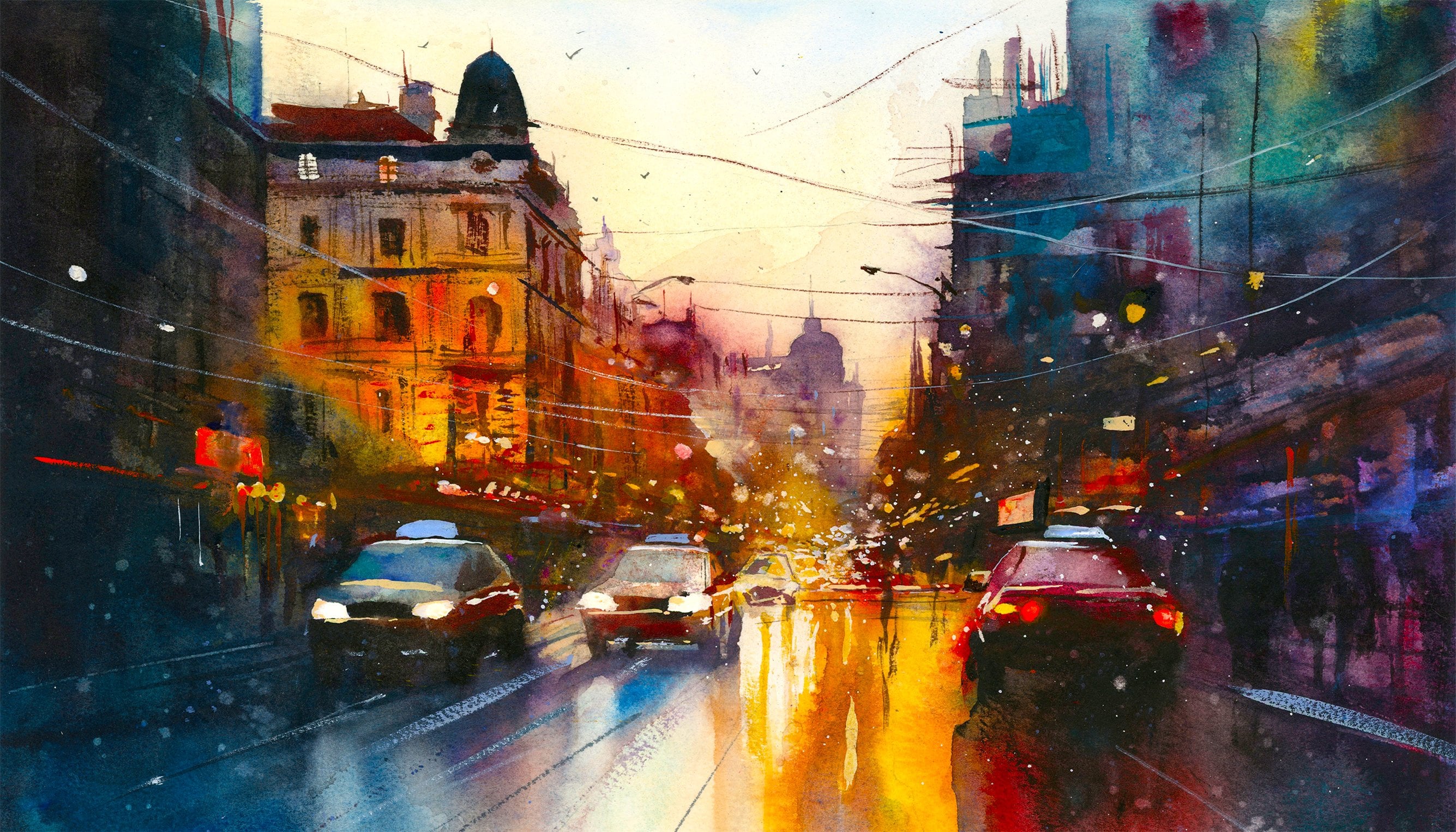
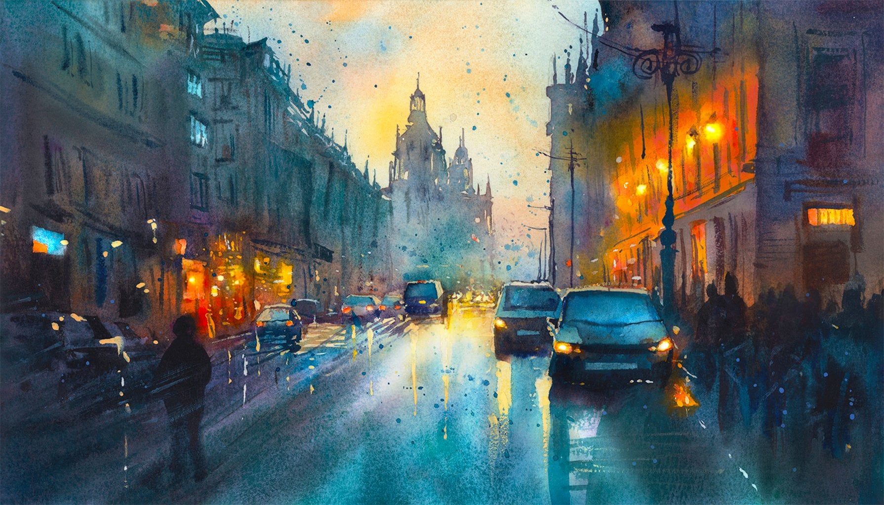
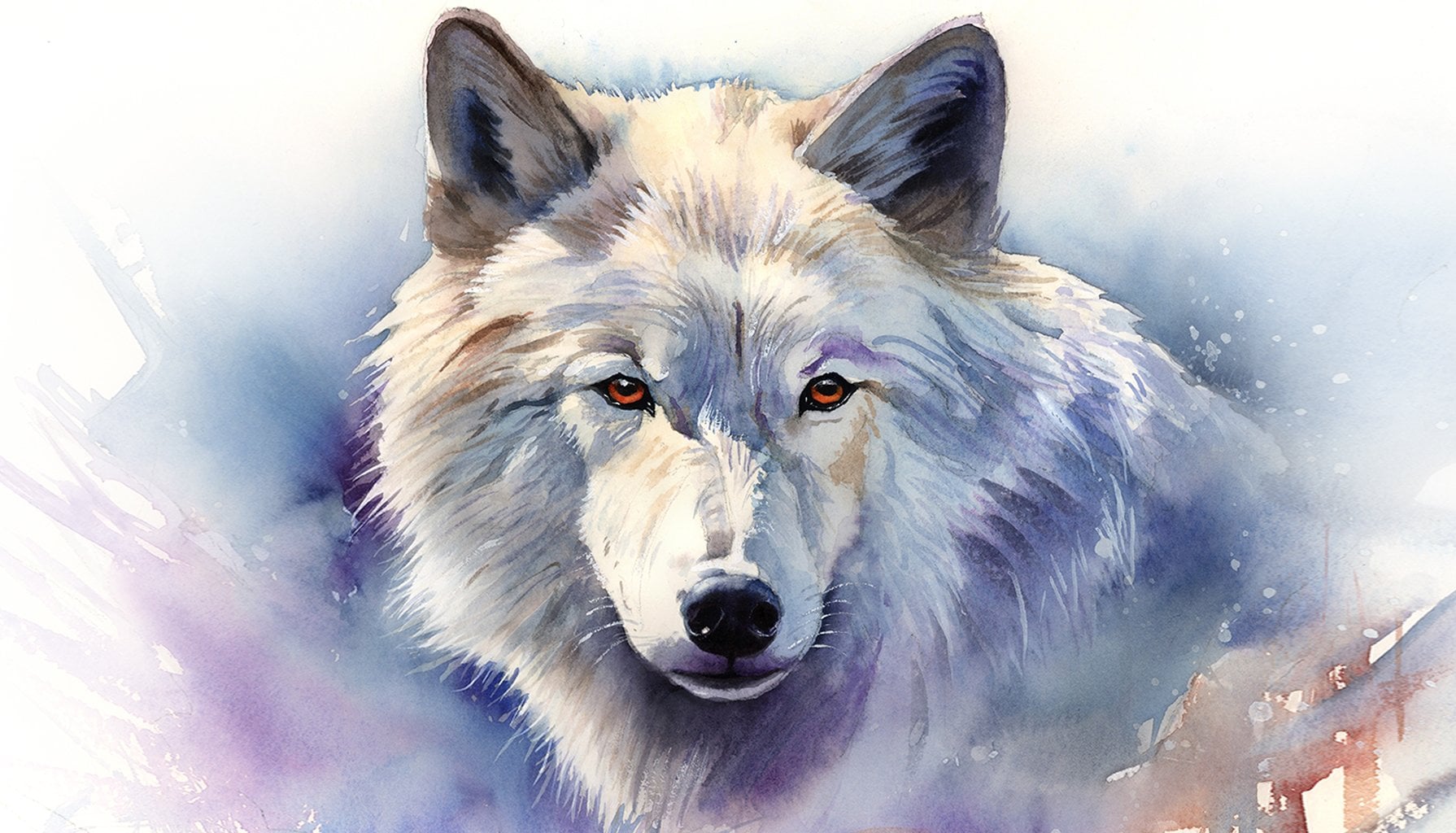
different subjects, from wildlife and portraits to cityscapes and
countryside scames. I've always been entranced by the possibilities of watercolor. But when I started, I had no idea where to begin
or how to improve. I didn't know what
supplies I needed, how to create the
effects I wanted, or which colors to mix. Now I've taken part in many
worldwide exhibitions, been featured in magazines, and been lucky enough to win awards from well
respected organizations, such as the International
Watercolor Society, the Masters of
Watercolor Alliance, Windsor and Newton, and the SAA. Watercolor can be overwhelming
for those starting out, which is why my goal is
to help you feel relaxed and enjoy this medium in
a step by step manner. Today, I'll be guiding you
through a complete painting, demonstrating a variety
of techniques and explaining how I use all
my supplies and materials. Whether you're just starting out or already have some experience, you'll be able to
follow along at your own pace and improve
your watercolor skills. If this class is too challenging
or too easy for you, I have a variety of classes available at different
skill levels. I like to start off with a free expressive
approach with no fear of making mistakes as we create exciting textures
for the underlayer. As the painting progresses, we'll add more details to bring it to life and
make it stand out. I strive to simplify
complex subjects into easier shapes that
encourage playfulness. Throughout this class, I'll be sharing plenty of
tips and tricks. I'll show you how to turn
mistakes into opportunities, taking the stress out of
painting in order to have fun. I'll also provide you with
my watercolor mixing charts, which are an invaluable tool when it comes to choosing
and mixing colors. If you have any questions, you can post them in the
discussion thread down below. I'll be sure to read and respond
to every think you post. Don't forget to follow
me on Skillshare by clicking the Follow
button at the top. This means you'll be the
first to know when I launch a new class
or post giveaways. You can also follow me on Instagram at Will Elliston
to see my latest works. So let's get started and
uncover how mastering these primary colors can elevate our watercolor paintings to
a new expressive heights.
2. Your Project: Thank you so much for
joining this class. I'm thrilled to guide you
through the fascinating journey of using primary colors to express your creativity
and watercolor. Today, we'll explore
how red, blue, and yellow can create
an entire spectrum of colors even within
a limited palette. We'll delve into the
fundamentals of color mixing, contrasts and
harmony, and then put our skills into practice
by painting a candle. We'll look closely at
how the interplay of these colors can
represent light, shadow, and atmosphere, showing that
even with just three colors, we can create a rich and
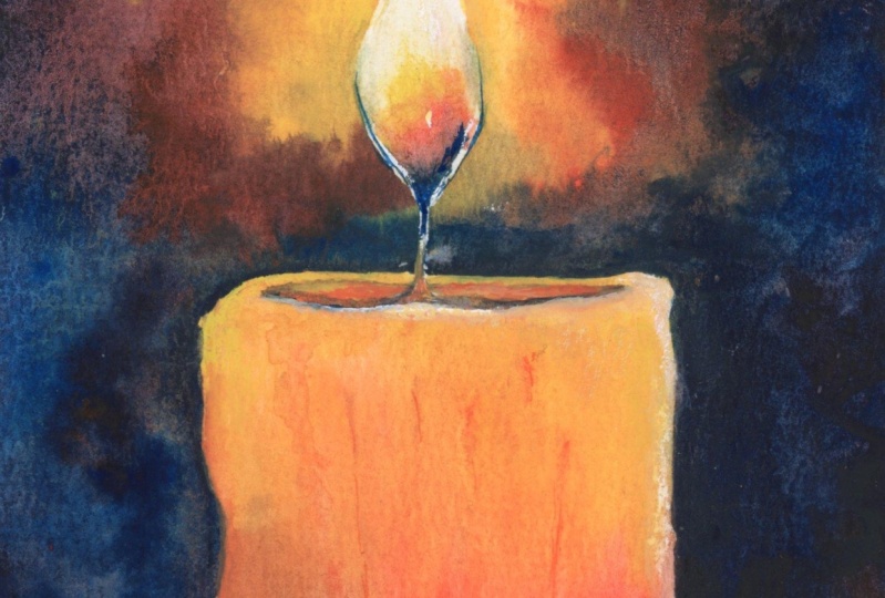
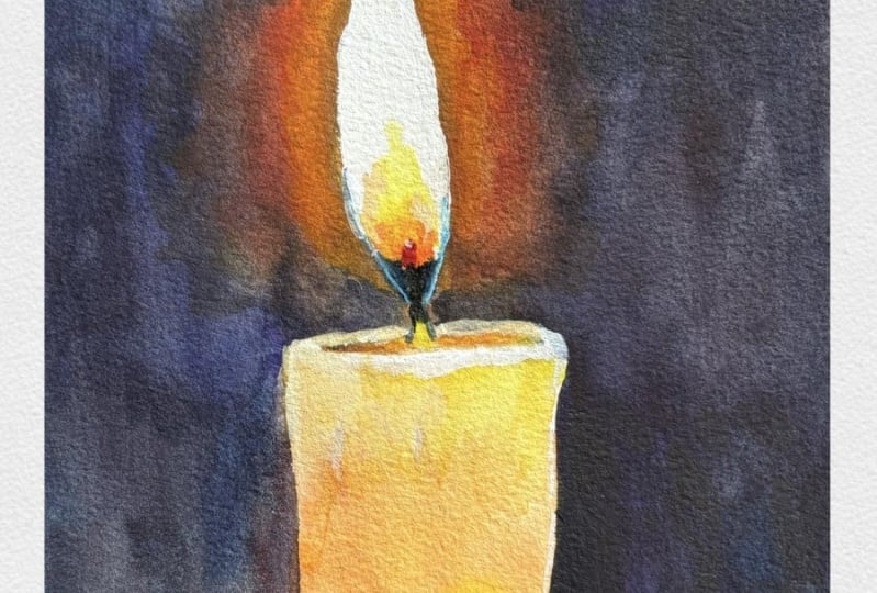
expressive piece of art. In the resource section, I've added a high
resolution image of my finished painting
to help guide you. You're welcome to
follow my painting exactly or experiment with
your own composition. As we're going to be focusing on the painting aspect
of watercolor, I've provided templates
you can use to help transfer or trace the
sketch before you paint. It's fine to trace when using it as a guide for
learning how to paint. It's important to
have the underdrawing correct so that you can relax and have fun learning the
watercolor medium itself. Whichever direction
you take this class, it would be great
to see your results and the paintings you
create through it. I love giving my
students feedback, so please take a photo
afterwards and share it in the student project gallery under the project
and Resource tab. I'm always intrigued to
see how many students have different approaches and how they progress with each class. I'd love to hear
about your process and what you learned
along the way, or if you had any difficulties. I strongly recommend
that you take a look at each other's work in the
student project gallery. It's so inspiring to see
each other's work and extremely comforting to get the support of your
fellow students. So don't forget to like and
comment on each other's work.
3. Materials & Supplies: Before we start the painting, let's go over the materials
and supplies I use. Having the right materials can greatly impact the
outcome of your artwork. So I'll go over all the supplies I use for
this class and beyond. They're very useful to have at your disposal and will make it easier for you
to follow along. Let's start with the
paints themselves. And like most of the materials
we'll be using today, it's a lot to do
with preference. I usually have 12
colors in my palette. But of course, today, I'll just be using the three
primary colors, red, yellow, and blue. My personal preference
for these colors are Naples yellow by Holbein, for my yellow color. Turquoise by Cotman
for my blue color, and organic vermilion by
Daniel Smith for my red color. But that doesn't mean you
have to use the same. If you don't have these colors or would prefer to
use your own red, yellow or blues,
that's perfectly fine. I don't use any
particular brand. These colors you can
get from any brand. Although I personally
use Daniel Smith, Windsor Newton, or
Holbein paints. So let's move on to brushes. The brush I use the most is
a synthetic round brush like this ascoda polar brush
or this Van Gogh brush. They're very versatile,
because not only can you use them for detailed work
with their fine tip. But as they can hold
a lot of water, they are good for
washes as well. They're also quite affordable, so I have quite a few
in different sizes. Next are the mop brushes. Mop brushes are good for
broad brush strokes, filling in large areas and creating smooth
transitions or washes. They also have a nice tip that can be used for smaller details. But for really small details, highlights or anything
that needs more precision. I use a synthetic
size zero brush. All brands have them and
they're super cheap. Another useful brush to have is a Chinese calligraphy brush. They tend to have long bristles
and a very pointy tip. They're perfect for
adding texture or creating dynamic lines
in your paintings. You can even fan them
out like this to achieve fur or feather
textures as well. And that's it for
brushes onto paper. The better quality
of your paper, the easier it will be to paint. C cheap paper crinkles easily
and is very unforgiving, not allowing you to
rework mistakes. It's harder to create
appealing effects and apply useful techniques
like rubbing away pigment. Good quality paper, however, such as cotton based paper, not only allows you to rework
mistakes multiple times, but because the pigment
reacts much better on it, the chances of mistakes
are a lot lower, and you'll be more likely
to create better paintings. I use arches paper because that's what's available
in my local art shop. A water spray is
absolutely essential. By using this, it
gives you more time to paint the areas you
want before it dries. It also allows you to
reactivate the paint if you want to add a smooth
line or remove some paint. I also have an old
rag or t shirt, which I used to clean my brush. Cleaning off the paint
before divving it in the water will make the
water last a lot longer. It's always useful to
have a tissue at hand whilst painting to
lift off excess paint. Also, you never know
when an unwanted splash or drip might occur that
needs wiping away quickly. I also have a water dropper
to keep the paints wet. When you paint, it's
important to have them a similar consistency to what
they're like in the tubes. This way, it's easier to
pick up sufficient pigment. A hair dryer is useful
to have for speeding up the drying time and controlling the
dampness of the paper. And lastly, masking tape. And this, of course, is just to hold the paper down still onto the surface to stop it sliding
around whilst painting. Also, if you plan on
painting to the edge, we'll allow you to create
a very crisp clean border. And that's everything
you need to paint along. I encourage you to experiment and explore what's best for you. And let's get ready to
start the exercises.
4. Sketching It Out: In today's class, I'm
going to do the drawing of the candle on the
left hand side and the exercises on the
right hand side. I'm just using a pencil to
find the halfway mark and then second pencil to
find the quarter mark. And then I work out where the halfway point is vertically and just
mark that lightly. This will make sure
that our candle is completely straight. Of course, as always,
there's templates. I have a template
just for the candle, I have a template
for the exercises, and I also have a
template that includes the candle and the exercises
on the same sheet of paper, depending on which exercises and when
you want to do them. But if you want to draw it out completely, this is
how I'm doing it. It's a very simple
drawing really. You can make the candle as thick as you want,
as high as you want. I've created the
top of the candle so that it reaches
halfway down the paper, and then the flame, of course, goes into the top half, and that can be as big
and small as you like. One thing I will note
is that I'm creating a little gap here at the
bottom of the flame. Now I'm changing to a finer
line pencil to really define the drawing
and the line work. That's pretty much
it for the candle. On the right hand side, you can use any circle
for the color wheel. I'm using a roll of
tape as a guide.
5. Masking The Flame: When it came to
drawing the rest of these exercises out and putting the tape on and
even painting them, it turns out that the
camera wasn't in focus. I'm going to show you quickly
basically what I did. For the flame, I added
a bit of masking tape. To make sure it was
accurate, I cut a bit off. And I just laid it over
the pencil marking. I'll just use the pencil lines for this color wheel
as an example, and then scratch it a bit
with your fingernail. Then when you take it off, it leaves a bit of a
residue of that lead. So then you know what shape
your flame is and you can get your scissors
and cut that off so that it matches and
then you can stick it onto the flame so that it masks the white of the paper and preserves it when
we paint on top of it. Now, I'm going to repaint
these color exercises for you, but it's useful to show you then what we're going to do
before I actually start. So I have it all taped up
on this new piece of paper.
6. Exercise 1: Blue-Yellow: Funnily enough, this
little sketchbook, I take everywhere and I use
it for all my exercises, there's no pressure
in this sketchbook. It's just for a bit of
experimenting and a bit of fun. So it's good to show
you that as well. I'm happy to show you what
I use outside of painting on my regular pieces of paper
that I do for the class. You can see in the corners, I've written the
letters of the color. I'm going to start with a
blue in this top corner, and you can notice with all
of them that I'm starting on the left hand side because I'm also intrigued with
how the tone works. On the left, it'll be
thick pigment, thick tone, and on the right hand side, we're going to have the light of the paper coming through. So I do advise that you write the letters down so
that you don't forget it. It can easily happen. So
you can see how I start it. I don't attack the thick
pigment straight away. I start off of a
clean water brush from the right and slowly
integrate into it. Because, like I say, on
the right hand side, I want there to be the
white of the paper, so I don't want all
to wash out there, so I'm trying to control my
pigments quite smoothly. So I've just got the blue
started for the time being. I'm leaving thick
pigment on the right. And now I need to
integrate the yellow. So this is good practice because it helps us
control our water. We don't want too much water, as wise it's going to spill everywhere and be an even color. We want there to be a
nice smooth gradient. And that halfway point in
between the yellow and blue is ideally where the colors will be completely
balanced and even. See I've even got a
little bit of yellow, so I'm turning it around
because there's a bit of the green dripping into
that yellow there. I don't want that blue to
touch that corner at all. We don't have to
make this perfect. We want there to be nice, organic mixes of color so that we can see the
nature of the pigment. We want to create every single tone possible
with these two pigments. You can see blue is a
very thick dark pigment, and yellow is quite
a light pigment. That's why I chose
this particular blue, actually, this turquoise, because a bit like
ultramarine blue, when it's thick, it's
very dark and very black. We will use that
later in our painting to create the dark
background of the candle. And you can notice that I'm cleaning my brush all the time. And if I'm not cleaning it, I'm going back to my towel to get rid of some of the water. I'm always going back
and forth between my water container and my towel to control how
much liquid there is. And now I'm moving on to the organic vermilion by Daniel
Smith red that I'm using. I like that because
it's a very potent red. It's a very vibrant red. Azar and crimsons also are red and you can
experiment with that, but it's not a very vibrant red. You can always go back and forth even when
you're moving on to the next exercise because you want to make sure there's a nice evenness
to this exercise. If you can notice it
drying and you can see the tones aren't
matching the way you'd like, then you can always go
back, which is what I'm doing right now on the blue to yellow square.
7. Exercise 2: Red-Blue: I'm squirting the
whole tube in there. I use these colors anyway. I pretty much know
how they react. I know that this red
is a very potent red, and I don't even need
that much on there, so I'm going to use some of that red and move it
onto the next square, but just because I know
10% of that red is just as powerful as
80% of the blue. So it's going to overwhelm it. That's why I don't need
to put so much on there. You can already see
how potent it is. Like we did with the first one, we just started with a first color without
interacting with a second. They're not blended yet. We
just need to first of all, create a nice gradient
on its own as a color, and then we'll link
it up in the middle. And you can see how dark these colors are when
they're mixed together. This will all vary depending on your choice of blue and red. This is quite a warm red, and it's a greenish
blue, or turquoise blue. When they mix together, there will still be an
element of purple. You can see there is some
purple going on there, but it's very dark and it's
desaturated and almost gray. And that can be a limitation
when it comes to pigment and the color wheel in
terms of painting and pigments rather than the
color wheel of light. I'll get more into that later. I'll make that a bit
clearer later on in the process because
there is a difference between the color
spectrum of light and the way we perceive it and the color spectrum of pigments
when it comes to painting.
8. Exercise 3: Yellow-Red: But it's easy to think that limitations are a bad thing
and you want to avoid them. But when it comes to
learning and practicing, we've got to discover
these limitations so as to not have obstacles when we actually want
to create our art. By doing these exercises, we're allowing us to get
a better understanding and build our intuition
with how colors react. You can read books
about color theory, but it's really this hands on practice that will get your brain really
understanding how colors work. For example, with this yellow to red square that
we're doing here. You'll see with almost
every kind of red and almost every kind
of yellow that the red always overpowers
the yellow. That's just one of the
things that you'll work out by doing
these exercises. So you can see when I
applied the pigment, I applied much more
yellow than red.
9. Variations On Primary Colours: And now I'm going to have to add even more yellow pigment
just to balance it out. I'm trying to push some of
that red pigment back down. If there's too much
red in my brush, then I have to wash it off as to not contaminate
the yellow up above. Now, of course,
color is a spectrum, and we all have an idea
of what yellow is, but eventually, yellow comes from green
and turns to orange. You've got warm yellows
and cool yellows. The same goes for red and blue and every color
on the spectrum. Our idea of color is quite general because you've got all different types of reds and all different types of blue. We have an idea of what it is, but they all vary slightly. When you mix these
colors together, they all vary slightly too. So we've finished the main
part of these squares, but I'm just going to
keep an eye on it. I'm not going to use
the hair dry just yet. I'll wait until the water
is not running anymore, then I'll finish off
of the hair dry.
10. Exercise 4: The Triangle: Now let's move on
to the triangle. It's a similar idea
with the squares, except we're incorporating the three colors
into one exercise. You can also see that I've noted the corners of the letters
to not confuse myself. I've got the yellow at the top, the red on the left hand side, and I'll put blue on
the right hand side. You can see a very
faintly added lines in the middle to create
little divisions. The bottom third will be where the red
blends with the blue. On the left where the red
blends with the yellow, and of course, on the left where the yellow blends with the blue. Now, these exercises are
increasing in difficulty. This one's a bit more
tricky than the other one. But the same principle applies. We start off just
wetting the top color, the first color, and before
we interact the two, we start the other. We just get a feel
of the pigment before we connect
the two of them and create a little gradation
in their own colors. And then we clean the brush, and then we connect
them in the middle. I'm trying to stick within that pencil line
that I marked out. Again, it doesn't
have to be perfect. By the end of the techno size, these segments will all be
blended and blurry anyway. But it's just to start
off keeping it clear. You can see that purple
that we've mixed in there. The whole idea of mixing the three colors together
is that in the center, it will be a pure gray
because all the colors mixed together make a gray because
they're all complimentary. We've got the purple,
we've got the orange, we've got the green, we've
got all six colors here. And we swirl them around in the middle and you can
see it's a bit red there. That means the red, of
course, is overpowering it. We've got to neutralize it by getting some of the other side in there,
so a bit of green. Now it's a bit too orange, so I need to add a bit
more blue into there. These are things
you can work out. You can work it out
just by looking at it, so you can see
it's a bit too red and what's the opposite of red? It's green, and to get green, we need to add a bit more blue because there's not
much of it there. Now I'm lacking a
bit of the green, so I got to mix that yellow
into the blue a bit more.
11. Seeing The Potential: It's a very potent red. Bit more yellow because it's being overpowered by
the rest of the colors. It is a bit more complicated
than the two colors because we've got three
colors going on in our mind, and technically we've got six because they blend together. So working our way around, we've got yellow, green, blue, purple, red, orange, and then we return to yellow. Now you can clean it up, but at the moment, I'm seeing a mix of
all the colors there, and it doesn't need to be clean. As long as we've
pretty much mixed every possibility and mix
available with these colors, we can just let it dry. Just because the green
happens to be a bit closer to the yellow than
the blue, it doesn't matter. We can see the potential, and that's what's important. Now, I'm happy with
the way it is now, ideally, I would just
leave it to dry as it is. But because it's so wet, I know that as it dries, it's going to mix more and it's not going to look the
same when it's dried. So I'm just going to keep
an eye on it as it dries, and I can go back to
the squares now and dry them completely with
the hair dryer. And this is them now,
they've completely dried. You can see it's not a
completely clean transition, but we can see all the potential of those
colors within that triangle. We can see orange, green, bit of purple in
there, red and blue, and you can see the relationship of these colors
in terms of tone. You can see how dark the
blue is. That's a triangle. Now we can start taking the
tape off these ones too. Of course, if you're
painting this on the same sheet of
paper as the candle, you don't have to take
the tape off yet. You can paint the
candle first and then take the tape
off at the very end. It's always so
satisfying peeling off the tape and revealing
the nice crisp edges. That's why it's important
when using masking tape to go right and over the edge to make sure there's
no white gaps. Also, when you try
this yourself, be careful not to overlap
and paint on the other side. Keep the two colors separate
from the other colors. I know that might be an
obvious thing to say, but when it comes to painting and all the chaos
involved in it, it's easily to get a
bit distracted and maybe be a bit too
enthusiastic with the brush stroke and it crosses over into the next square, so it's just st to keep in mind. You don't have to do this
with just primary colors. Any two colors you want to explore, you can
have a go with, and you can stick
these on your wall or have them out as reference
for future paintings. These look pretty just by
themselves just to see the potential of color.
It's very exciting.
12. Exercise 5: The Wheel: Now let's move on to the final exercise before we actually get on to
painting the candle. I'm going to paint this ring matching the
colors of the triangle. Yellow at the top, blue on the
right and red on the left. I suggest you do this one last. It makes sense to do this last because you have to understand
the nature of the colors, and you will learn more
about the nature of the colors by doing the
first two exercises. You'll know how powerful your red is or how
weak your yellow is so you can compensate as
you paint along the ring. And a tip for doing this is
paint the inside of the ring to begin with and
then go towards the edge at the end at
the end of the stroke, rather, at the very
end of the painting, but when you paint new ground, don't go right to the edge
of the pencil to begin with. Like the triangle
in the squares, I first of all paint
the separate colors, and then I connect
them in the middle rather than mixing them
straight from the beginning. I meet the two in the middle, and when I'm ready, I can start connecting them
with a clean brush. Then I can start dragging a bit and I just
zig zag my brush, go back and forth, taking a
bit and bringing a bit back. Dab, cleaning my brush. Now, this one's a bit
tricky because not only are we concentrating on
blending the colors, but we're also painting
within quite a defined area, quite a thin line. Don't be worried if
you're not happy with your final result of this. You can do it as many
times as you want. It's not about the
final product actually. This is a fantastic exercise for brushwork and hand mobility. And figuring out how to use your brush because of
course, it's a complete circle. Even though we're not painting
a particular subject, we're not observing
something and trying to convey anything
in particular. This is an exercise that
purely focuses on technique, which is incredibly
helpful because it releases the pressure of trying to create a
captivating piece of work. We can forget about that for the time being and just focus on technique and
improving our ability. When it comes to
painting the candle, that's when we can start
incorporating personality and uniqueness and our own choices with what we want
to do with color.
13. Finishing The Wheel: These exercises can
still be unique as well. You have your own
personal preferences for colors that might
be different from mine. In fact, it might be a
more popular choice to use ultra marine blue
rather than turquoise. For some reason,
my vision of blue, my ideal blue, my favorite
blue is this hue. It might not be
the best pigment. It's certainly not
the most expensive. Cotton watercolor is
the cheapest out there. But for some reason, I really like the vibrancy of this blue. And the reason when it
mixes with this red here. The reason it's not so purple, it's almost gray is because this is not
actually a perfect blue. It's got green
elements in there. Even though it doesn't
look like green, it's not what the
color wheel would say is a perfect blue. Because it's got that green in, you can see that green is
opposite red on this wheel. So it's a complimentary color. And green and red make gray because they meet in the
middle of the color wheel, and they're directly
opposite each other. That's why this turquoise
blue is not so purple. Now, if I chose a blue that was a bit
more on the warm side, a bit less green, so to speak, like ultramarine, then it would definitely
look like a purple. So these are the kind
of experiments that really help build your
knowledge in color theory. So I've been talking a lot about the potential of these
colors and how we can mix whatever color we want from them to use
in our paintings. But we can also take it
the other direction. We can use these exercises to figure out what colors
we don't want in there. And a good example in
this case is the green. In the painting we're going to do of the candle after this, I don't want there to
be any green in there. So I can see how strongly the screen is when you mix
the blue and the yellow. So I've got to be extra
cautious not to have that happen when painting the candle. When it comes to painting
this ring yourself, you're welcome to rotate your painting board or piece of paper to make it easier for you. But also, depending
on how brave you are, you can force yourself
to keep the paper as it is and try and improve
your dexterity skills. But you don't have to
if you don't want to, if you're not
comfortable with that, if you'd rather work on creating a clean wheel then by all means, rotate the paper to get
it as smooth as possible. This top left corner is always
the most difficult for me because The angle of the brush is hard to
get that smooth line, so I have to be very careful just using the
point of the brush. Now I'm just trying to do the finishing touches
of this ring, just trying to clean up
any rough transitions. I don't want to
overwork it because then I could cause more
problems for myself. If there's any overlaps, then we can clean it up
later with some white gash. Once it's completely dry. Now I'm going to
get the hair dryer and dry it completely.
14. Exercise 6: The Candle: Before we start the painting, let me show you my practice paintings for this
demonstration. You can see these exercises
don't have to be so clean. You can keep them quite
expressive if you don't want to tape the
different sections off, you can just free form it. Here's an alternative version. If you want to add
a bit of green in there, you can do that. You can experiment with
the whole spectrum of colors by just using
these three primaries. Now, like I said
at the beginning, you can use masking
tape or even masking fluid to preserve the
flame of the candle. I'm just making sure
it's pressed down firmly because we don't want water getting
underneath that. I'm going to start by completely wetting the background
using a big brush, doesn't matter how big. I'm only using a big
one because it's faster to wet everything. You can also use a
mop brush like this. I'm using this
calligraphy brush. No pressure. Now, we're going to start off by painting
the color of the candle. I'm going to choose a yellow, but with a slight bit of red mix in to make it a
slightly orange yellow. I'm going to take that
straight from the tube onto my palette. Maybe a bit more. Now the reason I've chosen this whole bine Naples yellow is because it's quite opa. It's not a translucent yellow. The reason I've chosen
organic vermilion for my red is because
it's a super vibrant red. It's going to help
make the candle glow. I've got those free colors
on there at the moment. I'm not going to touch the
blue for the time being. I'm just going to get
some of this yellow onto my brush and put it
right in the middle. Right at the top of the candle. We can go over the
flame as well. Getting a bit of red and you see just a little bit
of red how powerful it is, I already turns the
yellow into an orange. Such a potent red. But because it's so potent, it really makes the
yellow a nice warm color. Now, you don't have to
be so careful about the background here because
we'll paint that over later. I've already run
out on my yellow, so I'm adding a bit
more of that on there. Because we pre wet the
background with water, we've got a bit more time to think about things
before it dries. One thing I will add
when doing this candle, painting the actual color
of the candle is to be more generous
than you think about this yellow and orange. It might look dark
at the moment. But because we're
basically painting black, you see how dark that purple is when mixing the
red and the blue. You see how dark it is. When we paint that over the top, it's going to make this
yellow seem very light, so we have to
compensate for that by painting super dark now. Well, not super dark, but more dark than is
comfortable at this stage, because when we're
painting this, it's actually out of context.
15. The Properties Of Colour: Go back to the
properties of color. While I talk about them, you can see which
colors are mixing. I've got my blue, of course
at the bottom of the palette, red in the middle and
yellow at the top. You can see when
I take the brush off to clean it and when I use the sponge to soak
off some of the water. So the first property we're
going to talk about is hue, and that basically refers to
the actual color, itself, so to speak, the characteristic, and what we will think
of as the color itself. For example, blue, red
and yellow, are all hues, and each hue has a
different wave length, which gives its specific
place on the spectrum. And hues are what allows us to differentiate between colors
like green, purple, orange. They are all the
basic form of color, and they form the foundation
of the color wheel itself. The second property
of color is value, and value describes the
lightness or darkness of a hue. A colors value is determined by how much white or black
is mixed into it, or how much of the whiteness
of the paper we leave. We refer to light values
of a color as tints, while dark values
are called shades. For example, if you
add white to red, it creates pink, which
is a tint of red. Likewise, if you
add black to red, it creates a deep maroon
color, a shade of red, and Value is crucial in painting because it helps create
contrast and depth, and it makes objects appear
more three dimensional. Now, I've dried out
the paper completely, and on the palette, I'm going to start
mixing my blue and red to make as dark a
pigment as possible. Basically black, because we're going to start painting
the background, and I want to have it pre
prepared on my palette. I'm going to start painting
where the flame is, because I don't want there to
be black around the flame. I want it to be a
smooth transition. Let's talk about the
third property of color, and that's chroma or sometimes
known as the intensity. This refers to the purity
or strength of a color. High chroma colors
are bright and vivid, while low chroma colors
are more dull or muted. For example, a pure
red has high chroma. You can see how vibrant the
red is in this exercise. But if you add gray to it, it becomes less intense, and it creates a more subdued
version of the color. Even though it's the same hue, it's got a different chroma. And understanding this helps us control the emotional and
visual impact of work, and often intense colors
draw more attention, especially if we know how to use the contrast of intense colors
to more subdued colors. So now that I've started
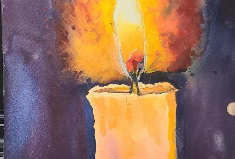
painting around the flame. I'm going to take my large
brush with a very pointy tip. Take this dark pigment and paint the outline or the
silhouette of the candle. We're negatively painting it. And you can see it's
interacting with the wetness of the paper above.
16. Starting The Background: And I'm going to have to mix a bit more pigment because I
haven't mixed enough there. You have to be very bold
with this. Don't be shy. We're trying to create a very dark background
to make this candle pop. And you can see the
purple right there. You can see the nature of
that purple coming through. I might not be the highest chroma purple as we
just talked about, but you can see the
purple elements in there. It's interesting how We're
using primer colors, so blue is in there, but only mixed into the purple. We're not actually going to
use blue as a main color. We're only going to use blue as a means of mixing purple
and the background. To get a good idea
of how colors work. It's a good idea to understand
how we perceive color, and color perception is such a fascinating
process because it depends on how our eyes
and brain interpret light. In reality, color is not
actually part of the object we're looking at
whenever you see something like an apple, for example, what we
are actually seeing is the light reflecting off that object and
entering our eyes. When light strikes an object, certain wavelengths
of light are absorbed into that object while
others are reflected, and each color responds to a different
wavelength of light, and our brain processes these wave lengths
as distinct hues, such as red, blue, and yellow. For example, a red apple
appears red because it reflects the longer wave lengps and absorbs the
other shorter ones. Similarly, a blue sky reflects the shorter blue wave lengths while scattering other
colors and wave lengths. Which explains why we perceive a blue sky as a blue
sky and a red one, a red apple as a red apple. This is also why
the same object can look different under various
lighting conditions. In a dim light, colors
may appear duller, while under a bright light, colors may seem more intense. Or if you have an AAD light that has multiple
color settings, you can see how the
colors of the room are affected by changing the
different colors of the lights. So understanding how this
light affects color can help us create more realistic and expressive works of art. And the color itself is a visual representation of this relationship
between colors, and it is directly
tied into how we perceive the different
wavelengths of light. The wheel is organized
around the primary colors, which represent the purest
hues in the spectrum, at least the visible spectrum. And from these primary colors, all other colors can be mixed. So as a whole, the color wheel is
divided into 12 sections, three primary colors,
three secondary colors, and six tertiary colors. Primary colors are
the building blocks of all other colors. As we know, they consist
of red, yellow, and blue, and these colors can't be created by mixing
other colors together, which is why they
are fundamental. And every single
other color is formed by combining these three colors in various different ways.
17. Secondary Colours: Then we've got secondary colors, and secondary colors
are created by mixing two primary colors in
equal proportions. The three secondary
colors are orange, which is of course
red and yellow, green, yellow and
blue and purple, which is of course blue and red. These secondary colors help
expand the color palette, allowing for even more diversity
to the colors available. Then we have tertiary colors. T tertiary colors
are made by mixing one primary color and a
neighboring secondary color. For example, red and
orange combined to make red orange and blue and green come together
to create turquoise. These colors provide a more
subtle or nuanced variation that are useful creating
depth and complexity in art. Then we've got
complimentary colors. They are pairs of colors that are directly opposite
each other on the wheel. For instance, red is
complimentary to green. Blue is complimentary
to orange and yellow is complimentary
to purple. When placed next to each other, complimentary colors
create high contrast, making each hue
appear more vivid, and artists use complimentary
colors to create striking visual effects or to create balanced compositions. Then we've got neutral colors. Now, technically, neutral
colors are not actually colors, and they're not found
on the color wheel, and they include black, white, gray, and
sometimes brown. These colors do not have a
strong queue, if at all, and that's what makes
them useful for toning down more intense colors
or creating contrast. Neutrals are often used as background or accent
colors in artwork because they allow
colors to stand out. Those are the main
fundamental concepts of color theory and
everything else is related to that and
build it up on that. So as a beginner, that's all you really
need to know to start building your ideas
around color theory. As you can see, we're practicing all elements of that
in this demonstration, we're using, of course, hue to choose what
color we want. Then we're using chroma to decide how vibrant
we want the colors. And then we're,
of course, value. Value is quite a big
part of this painting. We've got a very
dark background, and we've also got the
white of the flame. Of course, it's got masking
tape over it at the moment. But when we take away
that masking tape, it's really going to pop. You can see how I've used red in between the flame and the
darkness of the background. There's quite a lot of blue in the darkness of
the background. Like I said before, I don't
want green in this painting, so I've used red to block out the mixing of blue and yellow to stop it from
making that green. I'm going back through
adding more pigment and trying to control
the tones. The values. All these exercises that
we're doing today are so important for exploring and experimenting with
these primary colors. Of course, this candle can
be seen as a final painting, a pretty painting, but it's
more about the exercise. Because when it
comes to painting, especially with watercolors, learning to work with
these primary colors is fundamental to understanding color theory and expanding our creative potential or
even refining our skills. These three colors form the foundation for
all color mixing.
18. A Limited Palette: And it might seem like a limited
palette is constrictive, but it actually liberates us. What separates watercolor
from other mediums is the transparency of it and the laying play that has
such a significant role. So it's by experimenting with
these that we find and get insights into how these pigments interact with each
other on the paper. And you can see by
mixing different ratios, we can produce not only
bright and vibrant hues, but also soft and muted tones. This ability to control
colors allows for greater flexibility
as subtle shifts in hue can dramatically alter the mood or
depth of the painting. And beyond technical mastery, working with primary colors encourages creative exploration. We have just three colors, we are challenged
to think critically about how to combine and layer pigments to
achieve the desired effects. This limitation
sparks innovation, and it pushes us to discover new ways of approaching
color harmony, contrast, and balance
in our compositions. And it's actually what allows us to find our own voice
and find our own style. Of course, while painting of a limited palette is fundamental for
learning color theory, it's important to
recognize that there are some limitations
when it comes to working with actual
water color pigments. Because unlike light where red, blue and green combine
to form all colors, Pigments work through a
different color model, which has some constraints. For example, the issue
of pigment bias. Watercolor pigments are not pure versions of red,
blue, and yellow. In practice, each pigment
tends to lean towards either a warm or cool version of that primary color
rather than the pure one. For example, some reds may lean towards orange or
towards purple. Similarly, a blue, like
the blue I'm using today, might have a bit of a greenish
bias or a purplish bias. This means that mixing
certain primaries together may not always yield the expected
secondary colors. As we can see with
this, the purple made between the red and the blue isn't such a strong,
vivid purple. It's quite subdued. Then we come to the nature of transparency and granulation, which water colors
are known for.
19. Variety Of Pigments: Not all pigments
behave the same way. Some pigments are more opaic and others
exhibit granulation, which can affect the
final appearance of the colors when
they're mixed. And this variability can limit the predictability
of mixing primary colors, especially when
trying to achieve smooth blends or
consistent hues. For example, granulating
pigments may produce unexpected textures
or uneven washes, which can both be
an advantage or a challenge depending on
what your intention is. That's the reason
why experimenting with these primary colors
is vital practice, especially when working
with watercolor, because these limitations
themselves offer valuable learning
opportunities as we develop a deeper
understanding of our materials and how to work around and
embrace these challenges. It can help us build
color intuition. By experimenting
with primary colors, it allows us to develop a strong intuitive sense
of color relationships. By repeatedly mixing
primary colors and observing how they interact, we gain a more nuanced
understanding of how colors can be manipulated
to achieve our goals. And working with a
limited palette, such as primary colors. It fosters creativity
and problem solving. Since we are constrained
by only three colors, we must explore how to use
them in innovative ways, whether it be to convey light, shadow, mood and atmosphere. This practice can result
in a greater appreciation for subtle color shifts and
refined painting techniques. Notice I've added some splats
just where the flame is. And as the paper is not dry, these splats will have
soft edges and blend out, and it'll be almost like there's a bit of
dust in the atmosphere.
20. Harmonious Colour Schemes: Since primer colors naturally
relate to each other, they can form the basis for many harmonious color schemes, such as complimentary colors by experimenting with
these relationships, they help us build a more cohesive and
balanced composition. For instance, when using a limited palette
of primary colors, It can make it easier to
ensure that all colors of the painting are in
harmony with one another, and it contributes to a sense
of unity in the artwork. We are naturally forced to become more proficient
in color mixing. Instead of relying on pre mixed tubes of secondary
or tertiary colors, we learn to mix these
hues ourselves. This hands on experience deepens our understanding
of color theory, helping us to internalize how
different colors interact. We become more
attuned to the hues, the basic family of color, like red, yellow, blue, green, as we talked
about before, and how they shift with the introduction
of other pigments. We can discover to create strong vibrant colors
and also how to reduce their intensity or
chroma or a color to create a more
subtle muted tone. And limiting our palette also
means that we focus more closely on value or the lightness
or darkness of a color. By controlling how much water we use or mixing in small amounts
of complimentary colors, we gain greater control
over our values, which are crucial for
creating depth or contrast. So through this process of constant color mixing
and experimentation, we begin to see how
even small changes in color ratios can produce
a wide range of hues. And this improves our
technical skills, but also builds a deeper, more instinctual
understanding and more automatic
knowledge, so to speak, that enables us to make quick and confident decisions while painting when
things get hectic, because watercolor
can get quite hectic, and another advantage to using this limited
palette is that it strengthens our focus
on compositional aspects. It's quite overlooked, but using a limited palette allows us
to focus on the composition, the bigger picture, rather
than getting caught up in the infinite
possibilities of color choice. With a few colors to distract
us or even overwhelm us, we can spend more
time considering the other critical aspects
or elements of painting, such as line, shape, form, and contrast. M.
21. Depth & Dimension: We can explore how
to create depth and dimension with just a
few colors and how to draw attention to the
most important parts of the composition through
strategic color placement, and the lack of color
options forces us to rely on value and color temperature to create focal points
rather than simply using bright or contrasting
colors to direct attention, and by stripping
away this excess and working through a
limited color scheme. It challenges us to create more thoughtful,
deliberate compositions, and that in the end, results in a stronger and
more focused work of art. So I've used the hair dryer
to dry it out completely. And there's a few overlaps here, so I'm just using
a clean brush just to clean away that dark pigment. You can also come
back at the end with that opaic yellow
we've been using. And now we're going
to work on the flame. I'm going to take the
masking tape off the flame. I'm going to make sure that
it's completely dry first. I've just added a bit of
yellow where overlaps, and it's barely noticeable now. I've got a few splashes
on there, too, but maybe I'll wait
to do that later. I'm going to flick the
rest of this yellow just around the outskirts of this flame because of course, it's going to get lighter,
the closer it gets the flame. But again, I have to
make sure the paper is completely dry before I attempt to take the
masking tape off. Artists can often struggle
to create a signature style, a recognizable quality that
makes their work unique. By committing or at least experimenting
with limited palettes, we not only hone our
technical skills, but also develop
a more consistent and identifiable
approach to color. Because it forces us to
think about other aspects, we also grow in
the other elements of a picture such as tone
as we talked about before. The repeated use of the
same few pigments across different pieces results
in a visual coherence, which can become a
hallmark in your work.
22. Warm & Cool Tones: A point that I've talked about
a few times in this class is how we tend to think
of primary colors. Red, yellow, and blue, a fixed, straightforward colors that we see and define them directly. But in reality,
each primary color can have its warm
and cool variations, because light has so
many transitions, it's completely
infinite, really. In fact, if you were to be able to zoom in on a color wheel, going deeper and
deeper further in, to look at the transitions of color even beyond
our own perception, where do the colors
become yellow and blue? Because it's all the transition,
it's all the spectrum. There'll be one point when it's green and it slowly
turns into blue, and then from that
blue to purple, but where does that green disappear and suddenly
turn into purple? The more you zoom in, the minute those gradations will be, but they still exist. So it's really impossible actually to define a
color as pure red, pure blue, pure yellow, pure, whatever, because they all
have minute gradations. Each color can either have
warm or cool variations. So understanding the difference between warm and
cool tones within these colors is
essential for creating these harmonious balanced
and dynamic compositions. It affects how we mix colors and the overall mood and
atmosphere of our work. What are warm and cool tones? Warm and cool tones refer to the temperature, of
course, of the color, it's a concept that's tied to the emotional and
psychological response that colors can evoke. While this might seem like
an abstract idea at first, it's easy to grasp once we see how the colors
behave and interact. Warm colors, are those
that tend to feel energizing, vibrant
and stimulating. They, of course, include red, oranges and yellows, colors that remind us
of the sun, the fire, and heat, and cool colors
are those that evoke calm serenity and often
a sense of distance. These colors include blues, greens, and some purples. These are colors that are
reminiscent of the ocean, the sky and shaded areas. However, of course, the idea of warm versus cool tones isn't just limited to secondary
or tertiary colors like orange or green. Each primary color has both
warm and cool versions, which can dramatically impact the resulting mixes
and the overall mood. Let's talk about what
these moods are. So a warm red has an orange undertone
leaning towards yellow. Sen in colors such
as cadmium red. It's a bold and intense, often associated with
energy and passion. Then you've got cool reds, which has a bluish
undertone leaning towards purple as seen in
alizarin crimson. It's a more muted and
less vibrant color because the chrome
has gone down in it, and that means when you
mix it with other colors, it tends to lean towards purple.
23. Painting The Flame: Now, blue exists with
warm and cool forms too, and warm blue has
a greenish tint, leaning more towards
yellow, like Cerillan blue. Of course, it's not yellow. You can't see the yellow in it, but it sides more towards
yellow than purple. And this blue often feels
brighter and more vivid, often reminiscent
of tropical waters. Then you've got cool blue, and this does lean more towards purple, like ultramarine blue, and it's deeper, it's moodier, and it's often associated with
shadows or Twilight skies. And yellow, can be categorized
as warm and cool as well. Warm yellow obviously leans towards orange, like
cadmium yellow, and it feels sunny,
glowing, and radiant, and it's perfect for creating warmth in highlights
or sunlit areas. Then you've got a cool yellow, which has a slightly
greenish undertone like lemon yellow, and it's crisper,
and it's more muted, and it's often better suited for mixing greens or
cooler color schemes. Now, in my main
palette of 12 colors, I have a warm and cool
version of each color. So I have got cadmium red, alizarin crimson,
which is a red. I've got ultramarine blue, and I've got seran blue, and I've got and I've
got not lemon yellow, but I do have a cool
kind of yellow, and also Yellow ocha is what
I use for my warm yellow. And then the rest
of my palette is made up outside of primac. So of course, I've got
the neutral tones, which is black and white, and then I've got
a purple in there, and I've got a green. So it helps you become
aware of your choices. Once we understand the nuances
with these warm and cools, it can help us approach
how we want to use color.
24. Mixing Warms & Cools: When we mix two warm colors, such as warm red
and warm yellow. The result is often rich
and vibrant, an orange. Similarly, mixing
a cool blue with a cool yellow gives us
a bright, clean green. But mixing a warm
and a cool primary, like a warm red and a cool blue will typically result in a
more muted desaturated color, such as a brownish orange or a grayish purple,
like in this, This is because the cool blue contains some yellow undertones, which cancel out the vibrancy of the red warm undertones,
creating less saturation. Knowing this difference between
warm and cool primaries allows us to anticipate whether our mixes will be
vibrant or neutral, helping us make
intentional decisions about color mixing based on the mood or the effect
we want to achieve. If we want to paint a lively
green field, for instance, we would choose a warm yellow
and a cool blue to achieve a crisp clean green while a more muted olive
tone could be achieved by using a cool yellow
with a warm blue. And another aspect to warmth and coolness is its relationship to depth and dimension
within a painting. In painting, warm
colors tend to come forward and create a sense
of closeness or intensity. While cool colors recede and create distance or
a calming effect. This principle is
particularly useful when we want to create a sense
of spatial depth. For example. Well, for instance, if we were painting a
field or a landscape, we might use warmer tones for
elements in the foreground, such as the sunlit areas
of trees or grass, while cooler tones
will work well for distant hills or
mountains or even the sky. Even with a single object like
a portrait or still life. Warmer tones in the areas
that catch light and cooler tones in the shadows can create a sense of three
dimensional form. And with watercolors
in particular, this becomes even more powerful because of the transparency
of the medium, and by layering cooler washes
over warmer underlays, we can create very atmospheric, even magical like effects. We can control focus, and we can guide the viewer's eye through the composition. For example, with this painting, we're using warmer yellows and reds near the flame
to emphasize its warmth. And then we're
using cooler blues, and you can see a bit
of purple in there to convey the coolness of
the surrounding shadows.
25. Mood & Emotional Impact: And ultimately, all these
things come together to create an emotional impact
or a feeling of mood, a sense of mood, and mood is driven by the balance
of warm and cool colors. As we've already touched upon, warm colors convey feelings
of excitement, passion, and warmth while cool colors
evoke calm tranquility, or even sometimes melancholy. And by being mindful of whether we're using warm
or cool primaries, we can shape the emotional
atmosphere of our work. Another example, if
we wanted to paint a scene that feels
peaceful and meditative, we might lean more heavily
towards cool primaries, such as cool blue and cool
yellow to create soft, serene, greens and purples. On the other hand,
if we're aiming for something energetic
or full of life, using warm reds,
warm yellows and warmer blues can create a sense of vibrancy
and immediacy. Another example could be if we wanted to paint
a sunset scene. We might begin with warm
reds and yellows in the sky, then cool them down with blues and purples
in the shadow area, creating a balanced yet
almost evocative atmosphere. You can use the
color wheel to help achieve color harmony
and also contrast. And with this understanding
of the temperature of colors, we can better achieve
this balance. Warm and cool primaries can be used strategically to create harmony through similar colors or colors next to each
other on the color wheel, or we can use contrast through
complimentary colors which are colors
opposite each other. For example, in a
predominantly warm painting, such as a scene bathed
in golden sunlight. That scene will benefit from the subtle addition of cool tones to create
contrast and balance. The cool tones will keep the warm colors from
becoming too overwhelming, and it'll add variety and also
interest to the painting. Similarly, in a composition dominated by cool
blues or purples. Even a small touch
of a warm primary, such as a warm red
or yellow can create an extremely striking point of contrast that immediately
draws the eye. This interplay between
warm and cool tones is a very powerful tool, and it can help guide the viewers attention and also
maintain visual interest.
26. Finishing Touches: So now the painting is
coming to a close now. I'm just taking some
of those splats and turning them into slight
textures on the candle. I'm making the most of
accidents, basically, turning mistakes
into happy accidents by turning those accidental
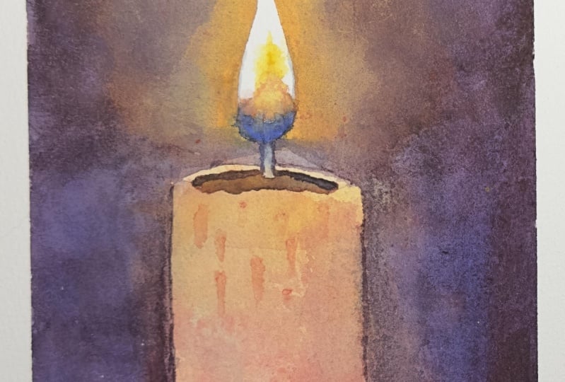
splats into textures. You can see in the end, we did use blue right at the
bottom of the flame there. We did use that blue, and
to achieve that blue, we had to maintain the white of the paper because we rely
on the transparency, the whiteness of the paper
to make that blue glow. You can see now that we have
the whiteness of that flame, how powerful it looks. It really does look
like it's glowing, like there's some artificial
light making the paper glow, but that's just the power of contrast and the trick
it plays on your mind. I've taken the tape
off and you can see how we've decided which colors we want to use and which
colors we don't want to use, and all using these
three colors. The yellow, Naples
yellow from Holbein. Then we've got Turquoise blue from and organic ion
by Daniel Smith. Those are the colors
that I use, of. However, I'm interested to
see what pigments you choose.
27. Final Thoughts: Welcome back and
congratulations on completing this class on unlocking color
theory with primary colors. I hope you enjoyed the process as much as I did
guiding you through it. From blending vibrant hues to mastering the balance
of warm and cool tones, we've explored how
primary colors can be the foundation for any
expressive watercolor painting. In our demonstration
of the candle, we saw how to create
depth, light, and a sense of warmth, just using red,
yellow, and blue. Remember, watercolor painting is not just about technical skills, but also about expressing your creativity and
personal style. I encourage you to continue
exploring, experimenting, and pushing your
boundaries to create your own unique
watercolor masterpieces. As we come to the
end of this class, I hope you feel
more confident and comfortable with your
watercolor painting abilities. Practice is key when it comes
to improving your skills, so keep on painting
and experimenting. I want to express my gratitude for each and every one of you. Your passion for watercolor
painting is so inspiring, and I'm honored to
be your teacher. If you would like feedback on your painting, I'd
love to give it. So please share your painting in the student projects
gallery down below, and I'll be sure to respond. If you prefer, you can
share it on Instagram, tagging me at Williston, as I would love to see it. Skillshare also love
seeing my students work, so tag them as well
at Skillshare. After putting so
much effort into it, why not share your creation? If you have any questions
or comments about today's class or want any specific advice
related to watercolor, please reach out to me in
the discussion section. You can also let me know about any subject wildlife or scene you'd like me
to do a class on. If you found this class useful, I'd really appreciate
getting your feedback on it. Reading your reviews
fills my heart with joy and helps me create the best
experience for my students. Lastly, please click
the follow button up top so you can follow
me on Skillshare. This means that you'll be
the first to know when I launch a new class
or post giveaways. I hope you feel inspired to
continue experimenting with these principles and incorporate them into your own
artistic practice. I look forward to seeing you all in future classes until then, keep on exploring
and happy painting.
 Will Elliston, Award-Winning Watercolour Artist