Transcripts
1. Color Theory Basics Course Introduction: You just getting started on your journey with
painting and are totally confused or maybe
even overwhelmed with everything that there is to know about color theory
and the color wheel? Maybe you just don't
know where to start, and you're looking for a course where everything that
you should know as a beginner painter is given to you in one same place
in one same package. Maybe you find color
temperature confusing, and you want to be able to tell warm colors from cool colors. You want to get more
comfortable with color mixing or maybe you're a little bit farther ahead and you want to a method, a strategy that you can use to set yourself up with a color palette
that is original to you that has colors
of your choosing that will help you create
work that shows a use of color that you really enjoy and that has
yourself in it. Maybe you're tired of those ready made watercolor sets that you buy at
art supply stores, which always include all of these colors that you
end up not using. If you can relate
with any of this, this course is for you. My name is Erica, and I'm
a traditional media artist working with a range of
drawing and painting mediums. And my day to day life revolves around creating
and selling art, as well as teaching artists
all over the world. Along with my one oh one
classes that I teach online, I also regularly create helpful content and resources for beginner and
intermediate artists. I share via my website, my YouTube channel, and, of course, my membership site. I have over 15
years of experience working in creative
and artistic fields, first as a graphic designer, and then I worked
as head art teacher in a school environment
for many years. And during this time, I
started teaching artists of all levels and mediums out
of my own home studio. After a while, I decided to
take what I was doing local to the online space in order
to reach even more people. And this is what I
have been focusing on over the last few years, really growing
online so that I can get my message out there
to even more people. I'm really passionate about
getting the message out there that anyone can develop their drawing and painting
skills if they want to. And I love encouraging
others to stay on their artistic paths
so that they, too, can enjoy all of the
beautiful things that growing as
artists can bring, not only to you but
to those around you. In this color theory course, I cover absolutely
everything that I wish I had known as
a beginner painter in one same package. We talk about the color wheel. I cover primary, secondary,
and tertiary colors, essential color
relationships that you should understand for
better color mixing, color temperature,
color schemes with actual examples of paintings created by knowledgeable artists in history so that
you can actually see how this information
was put to use in a practical sense to
create successful art. And for our course project, we put to use all of this information that
we have learned in previous classes to create a 12 part color
wheel from scratch. More specifically,
we are working on a split primary color wheel. In a split primary color wheel, we bring in warm
and cool versions of our three primaries. So before jumping into our
color wheel and filling it in, we take time to choose a warm
and cool version of our red a warm and cool version of our blue and a warm and
cool version of our yellow. And with those six colors, we're going to be filling
in the wheel and creating all necessary color mixers in order to fill in
all of our spaces. So in order to fill out a
split primary color wheel, you need to understand
color temperature in order to choose
your primaries. The other reason why working on a split primary color wheel
exercise is so powerful is because it really deepens
your understanding of color, and you understand that if
you have those six primaries, you are set up to paint
pretty much anything, whether it's landscapes,
still life, animal paintings, whatever it is that
you enjoy painting, you really only need
those six primaries, and you can actually
set yourself up with a color
palette of your own that includes your favorite
warm and cool primaries and a few other neutrals and convenience colors
if you want to. A because you chose those colors strategically and it's a
limited amount of colors, you end up with
results that are not only more cohesive
and harmonious, but that have a lot
of yourself in them because those
paintings were created using colors that you chose. Though I'm going
to be working with watercolor in this course, and I have chosen a color
wheel design that will help watercolor artists continue developing their water
and brush control. This exercise can be done
with any painting medium. And the information that
I'm going to be sharing in this course is essential
for any kind of painter. And I do have a watercolor one oh one course here
on Skillshare. So if you're just getting
started with watercolor, I would highly recommend
checking that one out before jumping
into this exercise. Alright, with all
this said, let's go ahead and get started
with our first class.
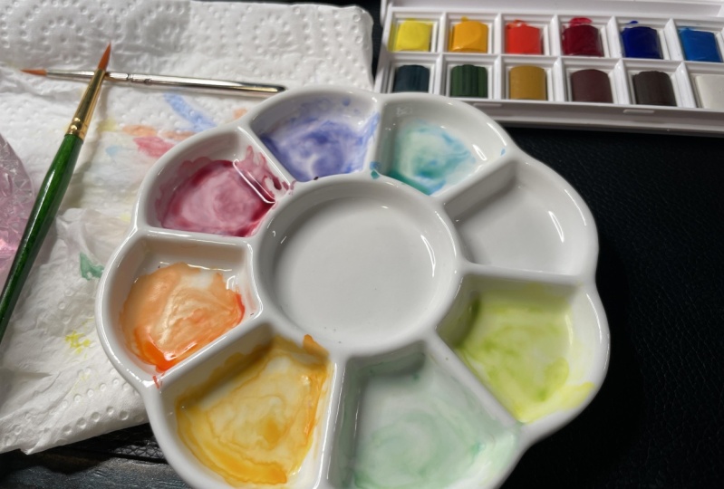
2. Art Supplies and Tips for Success: Hey there and welcome to this short class where I'm
going to be talking about the supplies that I would
recommend you have on hand in order to get the
most out of this course. Even though the split primary
color wheel is certainly an amazing exercise to try with any type of drawing
or painting medium, I personally am going
to be using watercolor. This color wheel
design that I've brought in is going
to help us continue developing much needed
watercolor skills like water control
and brush control. I'm going to have watercolor
painting supplies on hand, a few sketching
supplies on hand, and other random objects that
I'll explain in just a bit. I'm going to be using
a couple of sheets of this watercolor paper
from Hahnemuhle plus a few scrap pieces of
paper that I have in my studio for some
color swatching that I'm going to be
doing along the way. This paper is great
for practice drills and explorations
in smaller pieces. It is a £140 or 300 GSM in
heaviness or thickness, and it is cold pressed paper, which means it has some
amount of texture to it. I also have a few sketching
supplies on hand. I have an HB drawing pencil. Any kind of pencil
will do really. I have a soft eraser
with me and I also have one of these pigment
liner pens from Sadler, and this is a completely
optional item. You can bring in any pen or even a Sharpie or
anything like that. Because we're going to be doing some labeling throughout
our color wheel. In order to draw our
color wheel template, I'm going to be using
a few random supplies or items that I had
around in my house. Essentially we need
to be able to draw or trace three circles, a larger circle,
a medium circle, and a small circle
right in the center. This has to do with the
specific color wheel design that we're going to
be practicing with. For my largest circle, I'm going to be using
an old kitchen plate. I just have to make sure that that kitchen plate fits
into my watercolor sheet. Then for my medium-sized circle, I found this old
little Chinese bowl that I thought would
be a great size for that medium circle. Then finally, for
my smallest circle, I'm going to be using my
camera lens protector. You can use any
three circular items that you have around your
house or studio that are going to help you create those three concentric circles that are going to form
your color wheel. Don't worry, I'll walk you step-by-step through
how to create your color wheel template in a later class in this course. Aside from those
aforementioned items, I also have a couple of my
watercolor sets on hand. These are pan sets that
I have in my studio. One of them is from
St. Petersburg. It has full pans and the other one is my half
pans set from Van Gogh. The reason why I have
both of these on hand is because as you can see, some of my colors for my St. Petersburg set are
empty and I need to have other options on hand so
that I can adequately pick my warm and cool primaries
that I'm going to be needing to fill in my
split primary color wheel. Don't worry, I'm going to
explain all about how to pick your warm and cool
primaries before we get started with our
actual color wheel. What's important is that you have different options of reds, different options of blues, and different options of
yellows in your watercolor set. As long as you
have a few options available for each
of your primaries, you're probably going
to be fine with using just one single watercolor set. But you can also do what
I'm going to be doing and combine colors
from different sets, and that's no issue at all. Aside from my watercolor sets, I also have my paint
mixing palette. I'd recommend making sure that your mixing palette is nice and clean before getting
started with the filling of our color wheel. Because any color that you have leftover on
your palette can contaminate or pollute a
color that you're creating, and that can certainly
affect the results. Color correctness is pretty important in this
type of exercise. I have a container
with clean water, which I'm going to
be changing several times along the way, It's very important to work with clean water when you are working on this
kind of exercise. I would highly recommend to keep your eye on your
water along the way. Whenever you see that your water starts becoming dirty or murky, go ahead and change
it before continuing. You can even work with two or even three
containers if you'd like. This way, you can rinse out your paintbrush in
one of them and the majority of that color or paint stays in that container, and then you can use water from your cleaner container or
containers whenever you need to bring out a little bit of water into your color
mixtures to thin them down a little
bit more or for any softening that
you might need to do. You can take that from
your cleaner containers. Whatever the case may be make sure that when
you're working on a color wheel exercise that
your water is nice and clean. The reason why this is
so important is because that dirty water can certainly have an impact on how
your color looks. As I said before, color correctness is very important with this
kind of exercise. I'm going to be using one
single round brush for this entire process
and this is a Size 12. I would recommend
using anything from a Size eight to a Size 14, or maybe even having two
different paint brushes on hand. One for the larger
areas and one for the smaller areas in your color wheel in case you want a little
bit more control. But try not to go super
small with your paint brushes because you're trying to paint in those sections quickly, and if you go very small or use smaller paint brushes for those medium-sized
or larger areas, you're probably going
to be left with lines and undesired textures because you're not going
to be able to load up your paint brush
well and paint fast. That paper is going to start
drying on you and it's more likely that you're going to struggle with those
kinds of effects. Just like what I mentioned
when I was talking about your mixing
palette and your water. Make sure that you're rinsing out your
paintbrush bristles completely as you move through the filling in
of your color wheel. Because otherwise you
can risk contaminating this new color that you're
dipping your paint brush into with your previous color. As you can see indirectly, we are tackling and practicing
various watercolor skills as we're moving along with our studying of color
and color theory. Moving on to the next thing. I have my blue Scott
absorbent towel with me. You can use any type of absorbent towel or even
regular kitchen paper towels. But it is very important to
have some sort of towel on hand in order to stay on top of water control along the way. That is going to
do it in terms of the supplies that I would
recommend having on hand to create our split
primary color wheel and also to move on to the swatching exercises for our secondary colors that we're going to be
doing after that. Remember that you
have a whole bunch of different downloadable
resources available for you over at the
projects and resources tab. For this one, I've
included photos of my warm and cool
primary swatches, my finalized color wheel, my finalized
swatching exploration for my secondary colors, templates for the split
primary color wheel, and also for the secondary
color swatching process. I've added in a list of actual paint colors
and you're going to be able to find out there and what color temperature those
paint colors are, and also my supply checklist. Whenever you're ready
with your supplies, go ahead and join me for our next class where
I'm going to be explaining all about
the course projects that we're going to be
working on together. Thank you so much for
checking this one out, and see you in the next class.
3. Course Project: Hey, everyone, and welcome to this class where I'm going
to be explaining about the different
exercises that we're going to be working on
together in this course. So after classes three and four, where I'm going to be
sharing essential must know information on color
theory and color temperature, they're going to help you build a solid foundation to jump
off from and will also enable you to more successfully work on your color wheel and the other exercises that we're
going to be doing. Please don't skip
classes three and four. But after that, we're
going to be essentially working on three
major exercises. In class number six, we're going to be choosing our warm and cool
primaries that we're going to be using to fill
in our color wheel. I'm going to be
walking you through my own color selection process, and I'll be sharing lots of information along
the way that's going to help you tell when a color is warm and when
a color is cool. Once we're done with
our color selection, we're going to be creating a split primary color
wheel from scratch. I'm first going to be walking
you through how to create your color wheel template using the supplies that I shared with you in the previous class, and then we're going to be
filling this color wheel in with the colors that
we have pre selected, creating all necessary
color mixtures for our secondary colors and
tertiary colors along the way. And finally, for
exercise number three, we're going to be exploring all possible secondary
color mixtures that we can create with
our six chosen colors. This is so that we
can really observe the difference between
all possible orange, purple and green color
combinations that we can create with our warm and cool primaries that we chose. Meaning, what happens when we mix together two warm primaries, two cool primaries, or a
warm and cool primary? The outcomes for those oranges, purples and greens
are quite different. And this last exercise is
going to help us explore all those possible
color combinations that we didn't necessarily create when we were working on our split primary
color wheel. All right. And that
is it in terms of the three super
powerful exercises that we're going
to be working on together in this course. To post a photo of your
work here on Skillshare, all you have to do is click on the Projects and Resources tab. Once you're in, you'll see this purple button on the right
that says submit project. When you click on this button, you'll be taken to a
new page where you'll easily be able to both upload
a photo of your piece, as well as share any thoughts, experiences, struggles or questions that you
might have for me. Here, you can create a
title for your project, and click on that larger
content section underneath. And if you want to add in
that photo at the beginning, you can go ahead and click on that image icon on the bottom. Find the photo that
you're wanting to share on your
computer or device, select that file, click Open, and it will be immediately added into this content section. Then under your image, share anything that you'd like, whether it's
struggles, questions, wins, aha moments that you might have had
throughout this course, anything that you'd
like to share, I always love hearing from you. At the bottom of this
content section, you'll see different icons. One is for formatting your text. The other is to add emojis, the Adimage icon, which
we just talked about, and you can also embed link. Free to add in even more
pictures if you'd like. They can be process pictures, supply pictures over
here to the right, we have this preview area
where we essentially see a thumbnail or cover
image for your project. You can go ahead
and change it to a title image that you have created in a more
horizontal format. Or you can just go
ahead and leave it as is and have it just be a cropped section of
one of the images that you have uploaded into your
content area. It's up to you. Once you're ready, go
ahead and scroll back up. Click on the green Publish
button and you'll be all done. I'm excited to move on to
the next class with you, where I'm going to be explaining all the basics on
the color wheel, why it's such an important tool for artists to know about. I'll be explaining
all about primary, secondary, and tertiary colors, basic color schemes with actual examples of
famous artwork, essential vocabulary
on color that you should start knowing
about and much more. Whenever you're ready, I'll
see you in the next class.
4. Introduction to Color Theory: Hey everyone and welcome to this introduction class
on the color wheel. In this class, we're going to be talking about what
the color wheel is, why it is such an important tool for artists to know about. I'm going to be covering
what primary colors, secondary colors and
tertiary colors are. We're also going to be talking
about basic color schemes. Let's go ahead and
jump straight in. The first color wheel
was invented by Isaac Newton in the
late 17th century. Isaac Newton was a scientist, a mathematician
and an astronomer among many other things. He did lots of studies
on light and color. He was the one who decided to
take the color spectrum and arrange it into a circular
form or a wheel and of course, within this wheel, colors have a very specific arrangement or positions that are based on his findings when he was
studying light and color. He was even starting to come up with theories on which were the primary colors through which you are able to
create the other colors. Even though nowadays there
are different kinds of color wheels and a
different artists use different color wheels, they are all the same in that the locations or positions of these different colors within that wheel are very important. No matter what color
wheel it is that you decide to use color
wheels are so important for us artists
because they enable us to understand
color relationships. In other words, they help us
know which colors we need to mix together in order
to create other colors. Aside from this,
they also help us plan great color schemes for new pieces made up of groups of colors that
work very well together. Color wheels are
incredibly helpful tools, not only for fine artists, but also for illustrators
and designers of all kinds, from interior designers
to graphic designers, to fashion designers and
visual artists of all kinds can greatly benefit from understanding and learning
about the color wheel. It'll help the drawing or
the painting process go a lot more smoothly for those
of us who draw and paint. But also the final result
of whatever it is that you're creating will look
a lot more integrated, a lot more harmonious
and it will more effectively transmit the
mood, message, idea, or story you're looking to
transmit to the viewer of your artwork or to whoever
is experiencing your art. At the end of the day, color is an incredibly
important element of art or art fundamental to start
learning about and to continue improving your
understanding and use of, throughout your
entire art journey. Because again, color plays an incredibly important role in making a visual composition look harmonious, look cohesive. Because as humans we
are influenced and impacted by the colors that we see on a psychological level, as artists, we can mindfully and
strategically make use of color to transmit the messages that we want to
transmit to the viewer. At the end of this class, I'll be sharing examples of famous artworks that'll
help you start getting an understanding of how
artists made strategic use of colors and color
schemes to create beautiful and very
impactful artwork. With all this said, let's go ahead and talk
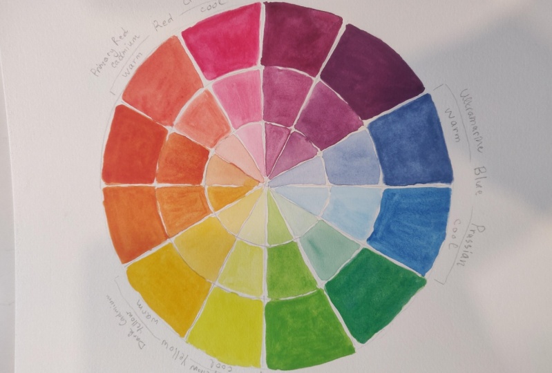
more about primary, secondary, and tertiary colors. I'm going to be
explaining all of this with this 12 part color wheel, which is the one that so many
of us learn color theory with when we're in
art school or are taking some art course nowadays, sometimes you're
going to come across six part color wheels and only have the primaries
and secondaries. The six part color wheels
are often taught in primary school to children so that they can start
understanding color. But because we're older and more advanced and we wish to make
the progress as artists, we're going to
jump straight into the 12 part color wheel, which contains not only the
primary and secondary colors. The primary colors are
red, yellow, and blue, and the secondary colors are
green, orange, and purple. But this 12 part
color wheel also contains the tertiary colors. Tertiary colors are babies of one primary and
one secondary, and they are usually
the colors that have a hyphen in them. Red-orange, blue-green,
yellow-green, red-purple. All of those are
tertiary colors. Secondary colors are babies
of two primary colors. No matter what
color wheel you're looking at the three
primary colors, which are often referred to as the most important
colors of all. Especially when you've
learned the color wheel in the traditional
sense like I did, because the three primaries
basically, with them, you're able to create any
color in the color wheel, and even browns and
blacks and neutrals. But without the primaries, you wouldn't be able to create a blue or red and a yellow. In other words, if I am
teaching the painting class, I absolutely 100
percent must have red, yellow, and blue paint
in my classroom or in my studio because I'm not going to be able
to create them. But if I have those three
primaries and I run out of a green or an orange
or a purple or I, all of a sudden me
to make a brown, there is no problem as long as they have those
three primaries. But anyway, you're
always going to find the primary colors within any color wheel in a triangular positioning
from each other. Right here you can see the three primaries blue, the red, and the yellow pointed out by
this equilateral triangle, which by the way, we can refer to this as
a triad color scheme. Wherever you're able to draw an equilateral triangle touching three colors in the color wheel, that would be a
triad color scheme. Now, this is probably something that you've already
seen if you've jumped into color
theory to any degree or maybe learned about color theory in primary or secondary school. You've probably already
heard that the color wheel can be divided into two halves, one half being the cool half and the other half
being the warm half. However, it's a lot
more nuanced than that. Because seeing color in
this way it's not wrong, it's just that it's very
generalized, very simplistic. It's leading us to
think that all purples, all blues and all greens
are cool and that all reds, all oranges, and all
yellows are warm. If you see it in this
way, Yes, it's true. However, we can also have warm and cool versions
of each color. We can have warm and cool blues, we can have warm
and cool purples. We can have warm and cool reds, warm and cool yellows, et cetera, and so forth. That is what we're trying to understand and develop
that skill to be able to tell whether the pigment on hand is warm or cool bias because
this is going to have a great impact on our color
mixing that we do throughout the painting process and
also on our end result. Another thing that is super, super important to understand is that whether we
judge a color to be warm or cool bias
is really going to depend on the colors around it. The other colors that I have also been used in
that composition. What I mean by this is the exact same color can be used in two
different paintings. If the colors around that
color are very different, we're going to judge that
color completely differently. It may look warmer in one painting and it may
look cooler and the other. Makes sure that you check out the next class in this
course because that one is a 101 on
color temperature. I talk much more about
this topic in depth. Explain how to tell if a
color is warm or cool and lots of must know information on color temperature with examples. But for now, let's go
ahead and move on to the last thing that I want
to talk about in this class, which are color schemes. Here are the seven
basic color schemes that you should start
familiarizing yourself with. Color schemes are
essentially groups of colors that work
very well together. These color schemes have been
used by artists throughout history in order to
create a harmonious, interesting, well
balanced compositions that are able to
transmit a mood, message, idea, or story. Once you know about these, you're going to be able to find these color schemes in
artworks that you come across. But also a couple of these colors schemes are
essential for us to know about because they
will help us with our color mixing and with arriving at the
color that we want, especially when it
comes to shading. I'll explain more
about that in a bit. Let's go through these. First of all, we have the
monochromatic color scheme. The monochromatic
color scheme is when an artwork has been created
with one single color, or primarily with
one single color in different tints,
tones, and shades. In other words, the
artwork has been created with different variations
of the same color. A tint is created when you
mix a color with white, a tone is created when
you mix a color with gray and a shade is created when
you mix a color with black. Moving on to the
analogous color scheme. Analogous colors are groups of three to four colors
that are next to each other in the color wheel. Wherever in the
color wheel you have three or four colors
next to each other, those are analogous colors. Because these colors are right next to each other
on the color wheel and oftentimes have a little bit of the same color in them, they oftentimes lead to
less contrasting results. At the end, It's
almost like these are part of the same family. They lead to a beautiful
color harmony that tends to be less
contrasting than say, the complimentary color scheme, where the colors are very far
apart in the color wheel. Of course, the artists can
always play with value, meaning the lightness to
darkness of the color on hand, and also play with saturation levels for
the different colors used in order to make them more different from
each other visually. Analogous colors are also important to know
about for painters because you can make use of analogous colors for
shading purposes. For artists who are looking
for very fresh, vibrant, and lively colors in their work, using analogous colors for shading can be
incredibly powerful. Mixing analogous
colors together is always going to lead to
very vibrant colors. You can always use analogous
colors to do shading. It's going to depend on
what you're painting. For example, if I were
painting an orange, I can use my lighter orange as a base color for my orange
and use a red-orange or a red to do my shading in those
darker areas throughout the orange instead of
bringing in brown or black, which is going to
mute the color down. Moving on to the
complimentary color scheme. With this one, we have two
colors that are sitting directly opposite to each
other in the color wheel. Anywhere where you can
draw a straight line, crossing right in the middle of the color wheel and
touching two colors, those two colors are
complimentary colors. You can imagine that
because they are complete opposites to each
other on the color wheel, if you use complementary
colors in a piece, you're going to create
higher levels of contrast. However, a beautiful
color harmony is still going to be created. It depends on the level of
contrast that you're after. A complimentary color scheme can certainly be very impactful. Another thing that is important that you know about
when it comes to complementary colors
is that when you mix two complementary
colors together, you're going to get a
brown or a gray because complementary colors
mute each other down. This is also a key piece of information for those
of us who paint or use color in our work
because this means that whenever we want
to tone a color down, we can bring in a bit
of its complementary to do it or if we're looking
for a brown or a gray, we can also just mix two
complementary colors together. You can also do
shading by bringing in your base colors complementary. Of course, this is going to lead to less vibrant results in those areas that you're
shading in because complementary colors
mute each other down. Right here in this example
of this green apple, you can see how those areas with the darker values look a
little bit more muted down. They start to get a
little bit brown. You can see this green
plus red mixture more clearly in the cast shadow. To paint in this cast shadow, I mixed almost equal
amounts of red and green. Notice how it looks
like a brown. By bringing in a
color's complementary, you can not only
darken the color but also mute it down
simultaneously. In real life, most of the colors around us are desaturated. They are muted down
to different degrees. This is why colors
straight out of the pan or tube look very unnatural,
very unrealistic. You can imagine that using complementary colors is
incredibly helpful for artists who are looking for
higher levels of realism or are simply
into muted color. Moving on to the split
complementary color scheme. With the split
complementary color scheme, you have three colors. It's like a complementary
color scheme, but you pick a color
anywhere in the color wheel, and instead of dragging one straight line
across the color wheel, it's actually the two
colors adjacent or next to that color that
would be the complementary. This is like an isosceles
triangle because these three colors would
form a triangle that has two equal sides
and one shorter side. Moving on to the triadic
color scheme or the triad. A triad color scheme is made
up of three colors that form an equilateral triangle
anywhere in the color wheel. For example, the three
primary colors, red, yellow, and blue, form an
equilateral triangle in the color wheel. Moving on to the
tetrad and this is a rectangular positioning
anywhere in the color wheel. A tetrad is also referred to as a double complementary
color scheme. Finally, we have the
square color scheme. Wherever you're able to
form a perfect square, which in a 12-part color wheel, you'd have two colors
in-between each color. Those four colors are going to create a square color scheme. Now that we've quickly gone over these seven basic color schemes, I want to mention a couple
of important things. The first thing is when you're planning the color that
you're going to be using for a new piece or
you're choosing your color scheme that you're
going to be working with, you want to choose
one color to be your dominant or most
important color. You're going to plan
for the colors that are supporting that main color. In other words, you
don't want to use equal amounts of your
different colors in your color scheme
because they would compete with each
other way too much. You want to make sure
that you're using more of your dominant or main color
and less of your other color. I would recommend
experimenting with ratios or percentages that you're using each color in your
color scheme with. As an example, let's just
say that you are going with a complementary color scheme where you're going to
be using red and green. Maybe you choose red to
be your dominant color. Because you've chosen red
to be your dominant color, perhaps you're going to be using 60 or 70 percent red throughout your piece in
different tints, tones, and shades, and 40-30 percent of your piece is going
to be painted with greens in different tints, tones, and shades. If you're going with
a color scheme that has three or more colors in it, choose your main color
based on the idea, emotion, message, story, or mood that you're trying to transmit to the viewer
and plan for how you're going to be making
more use of that color throughout your piece
than your other colors. Perhaps you're going to be
using it in the focal point or in larger areas or
you create a type of under-painting with
that dominant color that you choose or
you're going to be mixing in a little bit of your main color into
your different colors. There are many
different ways that you can play around with this. The other thing that
I wanted to make sure to mention is that you can always bring in
neutrals, so black, white, browns into your
drawings or paintings, and these colors are not going to affect your color scheme. You can even neutralize or desaturate the colors
in your color scheme, get them more towards an
earthy hue or whatever it is that you need to do by
adding black or white or brown. It's still going to be
seen as that color scheme. For example, if I'm using a triadic color scheme with
red, yellow, and blue, and I'll add in a
little bit of a brown into my yellow to
neutralize it and get it a little bit more towards
the yellow ocher side that can still be seen
as a yellow all-in-all, when seen together,
the composition is still going to have that
triadic color scheme. This is all to say
that there are many ways to play with color, and you can bring in
extra colors that are separate from the colors
in your color scheme as minor colors that you use
here and there and it's still going to be seen
as that color scheme. As long as the main areas of
your piece are colored in or painted in with
those main colors in your color scheme
that is what matters. Now that we have gone over all of this important
information, let's go ahead and observe
and analyze some examples of all of these color schemes
used in famous artworks. The first example that I
want to share with you is this beautiful piece
created by Renoir. This is a monochromatic piece. Red-orange is the
main color use here, and it was used in a large variety of tints,
tones, and shades. Here's a beautiful piece
created by Van Gogh. In this one we see the
use of analogous colors. We see a combo of green, blue-green, and blue. Moving on to the
example that I have here for a complementary
color scheme. This is a beautiful piece
created by Singer Sargent. In this one, we see blue
and orange being used. But notice how he made use of
a more neutralized orange. Here's a self-portrait by Van Gogh where complimentary
colors were used. You can see the
complementary colors and this one are green and red. Here's a beautiful example
of a painting showing a split complementary
color scheme by Matisse. In this one, he used
red-orange, green, and blue. Moving on to another example of a split complementary
color scheme, and this is another
one by Renoir. Notice how this style
for this painting is completely different from
the previous one by Matisse, but the color scheme
is exactly the same. In this piece, Renoir also
made use of red-orange, blue, and green for
his color scheme. Here's a beautiful example of a triadic color
scheme by Gauguin. The major colors in this
piece are the primary colors, blue, yellow, and red. You can see how a little bit
of green was brought in, but those green details
are quite small. Here's another beautiful
piece created by Cassatt. In this one, we also see
a triadic color scheme. I see yellow, I see blue, and I see red. Even though these colors
are way more subdued, they are toned down, there's the addition of grays, browns, and whites, etc. This is still a
triadic color scheme. Here's another
beautiful piece by Cassatt showing a
triadic color scheme. In this one, I see
a combination of green, orange, and violet. Here's a great example
of a painting by Marc Chagall showing a tetrad. In this one, I see yellow, green, red, and violet. Finally, here is an example of a square color scheme in a
famous painting by Dora Maar. In this one, I see
red-violet, I see blue, I see yellow-green, and I see orange as
the main colors. Hopefully, these examples
really helped you understand the different
ways that color schemes can be used no
matter what kind of art style or subject it is
that you draw or paint. I want to encourage you to
continue doing research on your own and try matching
different famous paintings, especially those
created in the past, with different color schemes
that we talked about today. That is going to do
it for this class. I'm looking forward to sharing the masterclass on color
temperature with you next. Make sure to delve into
that one next because I explain all the things
that you need to know in relation to
color temperature, which is going to be key in order for us to be able to move on to filling our split primary
color wheel effectively. Thank you so much for
checking this one out and see you in
the next class.
5. Color Temperature 101: Hey everyone. Welcome to this
class on color temperature. This is an important
topic inside of color theory and it's quite confusing for lots of
people getting started. I wanted to make sure to add in this masterclass that I
created into this course. It is chock full with all of the important
information that you should know about as
a beginner getting started with color
and color theory. I answer tons of questions that I often get on this topic, provide lots of
examples along the way. The split primary color wheel that we're going to be
working on in this course, really revolves around working with warm and cool primaries. Color temperature is
essential to understand. With all this said,
hope you get a lot from this class and
that you enjoy it. One of the most confusing topics to learn about
when we're getting started on our journeys with painting is color temperature. Color temperature is inside
of this larger topic, which is color theory. In this video, I'm going
to be including all of the essential information
that at least in my opinion, it's essential that you know about and understand
as a beginner, getting started with any artwork really that involves
bringing in color, whether it's
painting or drawing. I'm going to do my
best to explain everything in the
simplest way possible. I'm going to be bringing in little color swatches
and little squares onscreen so that I can actually provide visual
examples for you. I'm just going to
explain everything in a way that I would
have personally liked if someone
had explained to me in the beginning
of my own journey. In this video, I'm
going to be covering five things that are important
that you know about. The first thing is, I'm going to explain what color temperature is exactly and why it is so important for us to understand color
temperature as artists. In the second part
of today's video, I'm going to be
explaining how to tell if a color is warm or cool. In the third part of this video, I'm going to be explaining
what happens with browns and grays because these are not really in the
color wheel and are referred to as neutral colors. But they can have a
color temperature, so what's up with that? Then we're going to
be moving to Part 4 of today's video in
which I'm going to be explaining why it really is all relative when it comes
to color temperature. Finally, in the last
part of today's video, I'm going to be
sharing five tips that I would highly recommend using as you're getting started with understanding
color temperature, as you're painting in order
to avoid undesired accidents. Let's get into the first part. What is color
temperature exactly? Color temperature refers to how warm or how cool
a color appears. Understanding about color
temperature as artists is incredibly important because
if we don't understand it, then we're not going to be able to mix colors effectively. In a technical sense, we have to be able to know
whether a color is warm or cool in order to create the
color mixtures that we need. If we don't know what
we're mixing together, it's a sure-fire
way to arrive at undesired colors that
we don't want or mud. Let's just say, for example, that you're trying
to mix a purple. You grab yourself a red and
you grab yourself a blue. But what if you grab
yourself a red that is a very warm red that has
some yellow in it. It's more towards
the red orange side. You grab yourself a blue
that's more like a blue-green. A cool blue, it has a
tiny bit of green in it. You're actually mixing together three or four colors
instead of two. You can accidentally
create a color that is more muted down, or maybe two of the colors in your mixture are
complimentary colors, so you create a color
mixture that is more brownish or super muted. What I'm getting at, is
you're mixing together three or four colors
instead of the two that you were thinking
you are mixing together. It can be super frustrating
when you're trying to mix a color and the color is not turning out the way
that you wanted to. It's very important that you're able to take a paint color, whatever it is, that
you're able to swatch it out on a scrap piece
of watercolor paper, and that you're able to
tell its temperature, that you're able to tell if that specific paint color has two different colors in it, because this is going
to enable you to make much better color choices for your different
mixtures that you may need for the painting on hand. But aside from this, understanding color
temperature will enable us to create better visual
compositions in the sense that we're going to
be able to make better use of color to
communicate the idea, emotion, or message, or mood that we're wanting to
transmit through our piece. This has to do, of course,
with color psychology, which is a part of
color temperature, which goes inside of this
larger color theory, umbrella. A lot of us are
already well aware that warm colors, reds, oranges, yellows,
they are used to transmit emotions
that are stronger. Whether they're positive
or negative emotions, it can be anger, it can be excitement, it can be playfulness, it can be anxiety, anything like that,
emotions that are stronger. While cool colors, greens, blues, and purples, are used to communicate
softer, more mellow emotions. But those emotions can also
be positive or negative. Melancholy or relaxation,
peace, sadness, that thing. Something I would
recommend to start making more mindful use of color
psychology is ask yourself, what are you trying
to communicate through this piece
that you're creating? Is it more energetic, powerful, strong emotions, or is it
more calm, peaceful emotions? It's not that you can't bring in cool colors into pieces
where you want to transmit stronger emotions
or vice versa that you can't bring in warm colors into
more peaceful pieces. It's just, you have to think of a hierarchy when you're
making use of colors. Perhaps you're using
more warm colors in the pieces where you
want to transmit stronger emotions for
energetic emotions, and in pieces that you want
to transmit a more peaceful, calm vibe, then maybe use a less amount
of warmer colors. Color psychology is
very important and it definitely goes hand-in-hand
with composition. But we also have to understand
the fact that color plays a huge role in making visual compositions look
harmonious and cohesive, and through making a balanced, interesting use or
interesting play with warm and cool colors, we're going to be able to
create something that is way more visually pleasing
for the viewer. Also by understanding
warm and cool colors and making a play with warm and cool colors in
our visual compositions, we're able to create very
interesting visual effects. We're able to create depth, we're able to create contrast, because warm and cool colors create great contrast
with each other, especially when they're used
in a more saturated state. But also always remember that warm colors
are going to pop out towards the viewer while cool colors are going to recede. This is something that
comes in when we're talking about aerial or
atmospheric perspective. If you've checked out any
of my tutorials where I am painting landscapes
or natural scenery, you've probably
heard me talk about aerial or atmospheric
perspective, where the color that I use for the elements that
are farther away, say mountains that are
off way in the distance, I add a little bit more
blue into that green, and that makes it look like
they are farther away. Also, of course, elements in the distance are lighter
in value usually. Just by using cooler colors in elements that are
farther away and pairing that with making them lighter in value when compared to the elements that
are closer to you, that in itself can create a great and believable sensation of open space and
depth in a piece. You're playing with color
temperature but don't think that this only applies to more realistic pieces where
you're actually seeing a scene or a landscape or
whatever the case may be, because you can still use
these same principles with a completely abstract
piece where you're just seeing shapes and lines. The shapes that are warm
are going to pop out and the shapes that are
cool are going to recede. One final idea that I wanted to make sure to include
in this section of the video in terms of different ways that artists
make use or play with warm and cool colors
in their pieces for greater success and better
visual compositions is, bring them in for light
and shadow areas. A lot of artists do this super
successfully when they're painting outdoor scenes
or even objects. What they do is, when the light source in
the environment is warm, they paint lighter areas where that light
source is hitting or reaching that object or
subject with warmer colors. Then the shadows,
they make cooler. They add in cooler
colors into the shadows. When the light source in
the environment is cool, they paint those lighter
areas where the light source is hitting directly
cooler in temperature, and then they make the shadows
warmer in temperature by adding in warmer colors
into those shadows. That difference in temperatures
can be quite subtle. Don't think that you have to
make an area super red or super orange or super
yellow to make it warmer, or super blue, super green, super purple to make it cooler. Remember that it is all in context here and it
is all relative. I'll be talking more about
this later but the way that we judge a color has to do
with the context it's in, with the colors around it. Sometimes the change in temperature is going
to be very subtle. We just have to make sure that this color that we're
using over here is a little bit warmer
or cooler than this color that we're
using over here. Let's get into the next
part of this video, in which I'm going
to be explaining, how to tell if a color
is warm or cool. A lot of us who
were lucky and had that regular art class and elementary and secondary
or high school, we learned about the color
wheel in a very basic way. Probably you at least learned about the six
part color wheel, which includes primary
and secondary colors. In those very basic art classes, a lot of us were also taught
that the color wheel can be divided right in half and one half includes
the warm colors, which are red,
orange, and yellow, and the other half
includes the cool colors, which are blue,
green, and purple. However, when we advance in our journeys a little bit more, and gain a little bit more
understanding about color, we discover that color is a little bit more
nuanced than that. It's not that that
initial color wheel and dividing the color into warm and cool halves is wrong or anything like that, it's just a very
basic way of seeing things and we need to
delve a little bit deeper, understand things
a little bit more. Not to mention different artists use different kinds
of color wheels. It's a great place
to start for sure, but it's just a jumping point. When we start painting, we start discovering that every single color can
be warm or cool biased. We can have a warmer
blue and a cooler blue, a warmer red and a cooler red, a warmer yellow and
a cooler yellow. Things can start getting a
little bit more confusing and overwhelming when you start
learning more about painting. It's like the more we learn, the more we understand
how much there is left to continue learning about or
how little we actually know. Don't allow this
to overwhelm you. For me, the simplest
way to see it is, if a color looks
like it has red, yellow, or orange in
it, it's warm biased. If a color looks like
it has purple, blue, or green in it, it's cool
biased. End the story. Don't allow yourself
to get stuck there or overthink it
because once again, as I said before, it's always going to come
down to using that color alongside many other
colors in a full painting, a full visual composition. That color is not going
to be standing alone. It's going to be used within a greater context
with more colors. A color is only
going to be warmer or cooler than the
colors around it. Yes, absolutely 100 percent. Understand color temperature so that you're able to swatch out a color and be able to tell
if it's warm or cool biased, but don't get stuck there. Once you understand that, move on to actually using that color in
combination with others. Playing with warm
and cool colors, seeing what you like and
what you don't like. Seeing those visual effects
that you're able to make happen by combining
them in the same piece. This is what's going
to help you ultimately move forward because
we're trying to understand color in order to use them in full compositions. When you see a yellow, that leans more towards
the orange side, that is a warm yellow, because it has a teeny
tiny bit of red in it. When you see a yellow that leans more towards
the green side, that is a cool yellow, because it has a teeny
tiny bit of green in it, which is a cool color. When you see a red
that is leaning more towards the orange side, that has a tiny bit of yellow
in it so it's a warm red. When you see a red
that is leaning more towards the purple side, like a winish red, that is a cool red
because it has a teeny tiny bit of blue in it. When you see a blue that leans more towards the purple side, like an ultramarine blue, that is a warmer blue because it has a teeny tiny
bit of red in it. When you see a blue, that has a little
bit of green in it, that is a cool blue
because those are two cool colors mixed
together, green and blue. I will say that blues
have always been a little bit more tricky
for me personally to tell, and there seems to be
more controversy and conflicting thoughts amongst
artists in terms of, what's a cool blue and
what's a warm blue? But for now, I would
recommend keeping things simple and going by
what I just shared. There is one thing
that I want to share with you in this video. This is that there are
certain colors that some artists consider to
be pure primary colors. What I mean by this is
these primary colors are neutral or right smack in
between warm and cool, meaning they are
neither warm nor cool. Even though there are lots of artists out there
who think that every single color
that you may come across is either
warm or cool biased, there are lots of other
artists out there who do think that there are certain
primary colors especially, that are pure colors, so neither warm nor cool. Many of these artists
who do believe in pure primaries think
that cobalt blue, for example, is a
pure primary blue. That is neither warm nor cool. Final little important note to add into this section
of the video is, when you're working on
color wheel exercises, which are exercises
that are really intended to focus
specifically on color and understanding
color relationships so that we can then
make better use of color in actual artwork and just do our color
mixing more successfully. But when you're working on
a color wheel exercise, usually unless they are specific color wheel
exercises or you're working on like a split
primary color wheel, you want to make sure
that you're bringing in three warm primaries for your
different color mixtures, or three cool primaries for your different
color mixtures. Because if you bring in a couple of primaries
that are cool, and then a third primary that is warm or vice versa, again, you could be mixing
more than two colors together in your different
sections of your color wheel. That can lead to
undesired colors, which can certainly
be an issue with that exercise where color really matters
throughout that wheel. Moving into the next
part of this video, and this is what is up
with your browns and your grays which are not
included in the color wheel? How can you tell whether browns and grays are warm or cool? In the general sense, grays and browns are referred
to as neutral colors. However, they have an
undertone to them, and that's how you
judge whether that gray or that brown
is warm or cool. Unless you have a
specific paint color that says neutral tint, neutral black or something
along those lines, usually it's going to have an
undertone and you're going to be able to tell when
you swatch that color out. Sometimes the undertone is
going to be super obvious. For example, with
the burnt sienna, which is a reddish brown, you can tell right away that
it's a very warm brown. Payne's gray is a gray that is well known for
having blue in it. It's a cool gray. Other times it's going to be a little bit trickier to tell. I would recommend
swatching that color, noticing perhaps if it has undertones that are a
little bit more reddish, a little bit more
yellow or orange. Sometimes it right away
it looks warmer to you, and other times it's
going to look less warm. It's going to look bluer. If you swatch out
that color and you can't tell whether
it's warm or cool, maybe it's almost neutral. Or another tip
that I can provide is swatch another
color next to it. Because again, once you have
another color next to it, you're going to be able to have a point of comparison and
you're going to be able to tell whether it
looks warmer than the other one or cooler
than the other one. Getting into part
4 of this video, and in this one I just
want to make sure that you understand that color
temperature is relative. Why? Because it's all about how we're going be
using that color in combination with other colors in this greater
context of a painting. We may think a color looks warm by itself or
in one context, and then we use
that same color in another context
and it looks cool. The way that we see a
color is greatly affected or impacted by the colors
used around the color. This is all to say that yes, a single color in
and of itself alone, yes, it is warmer,
cooler, neutral. But ultimately
you're going to be using that color in
a full painting. In that end product, that color is going to be
warmer than or cooler than. It's not going to be 100 percent
warm or 100 percent cool because it's always
going to be affected by the colors around it
by that full context. Just to finish up this video, I'm going to be providing five practical tips that are
going to help you stay away from undesired accidents as you continue developing your
knowledge of color temperature. Tip number 1 is going to be
to always make time to swatch the different colors that
you're going to be using for a new piece before getting started with the
painting process. I would recommend not only swatching out the
individual colors, but also the colors that you're thinking of using
in combination. Swatch out those color mixtures to see what they look like. Tip number 2 is, make sure that as
you're choosing those different colors
that you're going be using for a new piece, and you are thinking
of the colors that you're going to be
using in combination, so mixing them together, make sure that you're not mixing complimentary
colors together, unless of course, you're
looking for muted down tones. Remember that complimentary
colors are opposites in the color wheel and they
mute each other down. Tip number 3 is, understand that you can alter or change a
color's temperature. A color has a
specific temperature right out of the pan or tube, but you can always alter that
and I would recommend doing so by adding in one of
the three primaries. This is very helpful
because you don't have to bring in colors that you don't
really need to bring in. Let's just say that
you're painting a natural scene or landscape, and you already chose a cool green to use in
your faraway mountains. Well, you can bring in a yellow to add into that green to create a warmer green for plants and elements
that are going to be closer to the viewer. You don't have to bring
an extra green in. Always ask yourself how you can reuse colors
that you've already chosen and don't bring in a ton of different
colors into your piece. Oftentimes, the less
amount of colors you bring in and reusing
those colors in different ways is
going to lead to much more integrated and
more harmonious end results. Key tip number 4, and this one is to
always give thought to the different
optical illusions and sensation of contrast
that you're going to be creating via your use of
warm and cool colors. You don't want to
accidentally call the viewer's attention to an area that isn't
the focal point. You don't want to have two
or three competing areas in a visual composition. Always think of what
your focal point is, where you want to call
the viewers' attention towards immediately. Think of the mood, idea or message that you're
trying to portray and use either more warm colors are cool colors depending on that, and consider what
you want to push forward and bring back. Finally, tip number 5 is
whenever you are in doubt, you have swatched out a color
and you still cannot tell, go to the brand or company's website and
do some research. Research the color
temperature for that specific paint color or pigment and for that
specific brand. Usually, this information
is going to be somewhere in the paint tube or pan packaging or the
box that they came in. But if you lost that or
you cannot really tell, most often than not, this information is going
to be available for you in the company's website. It's important to
do this anyway, every now and then
because recipes that different brands use for their
colors change over time. I've known of colors
that were once cool and are now
warm or vice versa. Also a specific brands, Alizarin crimson
could be different to another Alizarin crimson
from another brand. Get used to doing that research
as well and looking up information on
different pigments and paints whenever you need to. Congratulations for
completing this class. I really hope that you got
a lot of value from it. I'm excited to dive into the next one where we're
going to be choosing our warm and cool primaries
that we're going to be using for our split primary
color wheel exercise. Whenever you're
ready, see you there.
6. Choosing Warm and Cool Primaries for Color Wheel: Hey there and welcome to this class where we're
going to be choosing the warm and cool primary
colors that we're going to be using to fill in our split
primary color wheel. I'm going to be sharing my
color swatching process with you on a separate sheet of
watercolor paper and providing key tips and information that are going to
help you pick out your colors successfully for
your color wheel exercise. I would not recommend
jumping into this class if you
have not checked out the previous one where I
explain all the must know information for beginners
on color temperature. Makes sure that you
check that class out because it's really going to help facilitate the process
of choosing your colors. Without much further ado, let's go ahead and
jump straight in. I'm going to be working with at least one or two colors
from my van Gogh half pan set. Other colors that
I'm going to be using for this color
wheel are going to be for my St. Petersburg White
Nights full pan paint set, which is a paint set that I've been currently using a
lot for my tutorials. This is another question
that I often get asked. Can I combine different brands? Is it okay? Yes. In my opinion,
it's perfectly fine. I do it all the time as long as the quality of the
paint is similar. I would never combine
a very cheap, low quality paint with
a higher quality paint. I really want to encourage you guys to work
with what you have. Unless you do these things, these suggests that exercises that I'm going to be
sharing with you right now and you
absolutely don't have a warm of the three primaries or a cool of the
three primaries, then it's going to be very
difficult for you to do the color wheel that we're
going to be working on next. I have my container
with clean water and I'm going to make sure to
constantly change my water, not only throughout this
process of picking out my colors but would also during the actual color wheel painting. I'm going to be using the ultramarine blue
for my warm blue, and either a fellow
blue, a Prussian blue, or a cerulean blue
for my cool blue. I think I'm going to go with the Prussian and I'm
going to swatch these out for you because
I want you to notice the difference between the two. What we have to take into
account first and foremost, when we're picking out our
warm blue and our cool blue, is that warm blue
is going to have a purple bias and cool blue is going to
have a green bias. Let's test these out and see
if we can find that in each. This is regular
ultramarine blue, beautiful purpley
blue right there. I'm going to rinse out all of
that ultramarine blue from my paintbrush bristles
and I'm going to do some swatching with
the Prussian blue. Very, very deep
cool-biased blue. As you can see, these
blues are super different. This is the ultramarine blue, and you can see how it's biased more towards
the purple side. This means that it's warmer. Then this blue over here, this is the Prussian
blue and it's biased towards the green side. This means that
it's a cool blue. Another thing that I
want to point out here, which is super important
for you to understand, is that there are colors
are going to be inherently lighter than others and
that is something else. When it comes to painting
with watercolor, we have to add a
greater amount of water to make that color more diluted, to make it lighter, to
make it more transparent. We can use that same color
in a more saturated state, in a thicker state so to speak, to get a darker value to make it more saturated and to make
that same color darker. We can create a wide variety of different values
with one same color. The reason why I'm
saying this is because just notice these two. I'm actually going to lay down more of this
ultramarine blue right here so you can see it in its most saturated state
right here at the top. The reason why I'm
saying this is because when we're
painting with watercolor, we have to take into account that there are certain
colors are going to be inherently lighter than
others and are not going to allow us to create
a full value scale. The value scale is
not going to be as wide you could achieve
with darker colors. If I were to use, for
example, this yellow, yellow is an inherently
light color. Yes, even though I
can create a lot of different values and
translucency levels with yellow, I'm not going to
be able to create as many different values as a very dark color like the Prussian blue or even something like this,
like the ultramarine. Take that into account
because when we're going for higher levels of realism or mid to higher levels of realism, developing a wide variety
of different values, so translucencies when it comes to working
with watercolor, but also learning how to create our different color mixtures
and adding in a little bit of this color to
make it darker or another bit of this color
to make it lighter, we have to be able to create a wide variety of different values and
translucencies if we're looking for something to look on the more
believable side of the spectrum and we're
almost never going to be using only one single color. This is why knowing how to
mix colors is so important. That is something
that I really wanted you to just understand. This is not going to
allow me to create a huge variety of different
values and translucencies. If I were going to
be using this to maybe paint something
like the sunflower or something like that I
would definitely have to think of what other
color or colors I would have to bring
in to develop deeper values and cast
shadow effects and stuff like that in-between petals because this in and of itself is not going to allow me to create a sense of
form and depth. It's too light. It's not that it's
not necessary. Of course, these lighter
colors are unnecessary. For example, whenever I want to paint grass or
something like that, I know that I need a yellow on hand to be able to
create lighter greens. Then I deepen and
darken my greens by adding in blue oftentimes. We're done with this. I'm going to be using
my ultramarine blue. Let me actually write
it down right here. Ultramarine blue and
this is Prussian blue. This is going to be my cool, and this is going to be my warm. Take time to swatch out your
different blues and come to a conclusion as to
which warm blue you're going to be using
for your color wheel, which cool blue you're going to be using for your color wheel. You can definitely see
right here how this blue, you can see how it has a
little bit of green in there. Then this one, you can
definitely see how it's leaning more
towards the purple side. Let's move on to our yellows. Before doing that, I'm going to change my water so that I don't make things green because blue
plus yellow equals green. I'm going to just do that
before moving forward. I have my clean water with me. My paintbrush is
all rinsed out and I'm going to go ahead and
pick out my yellows now. Go to the yellows that you have. In this case, I have these two and I actually think
that these are the same. Both of them are lemon yellow, it's just that this one has
a little bit of green in it because I was using it the other day to paint a landscape. Notice these two yellows. Can you tell how this
one is leaning more towards the orange
side and how this one, it looks more like a
lemon yellow like it's almost a little bit more
biased towards the green side? That means that this is a warm yellow and this
is a cool yellow. I'm just going to go
ahead and pick these out. Let's actually see
them swatched out on paper because
oftentimes it's not until we actually swatch
these out that we have a better understanding of
what they actually look like. [NOISE] This one is
cadmium yellow medium. My St. Petersburg set. Rinsing out my paintbrush
bristles completely. This is cadmium lemon. Yes. Very different
yellows as you can see. They will do just perfectly for my split primary color wheel. As you can see, it
looks very orangey, it's going more towards
the orange side and this one is going more
towards the green side. This means that this one is warmer and this one is cooler. Here we have our warm, and here we have our cool
yellow and this one is cadmium lemon, cadmium
yellow medium. I have my two yellows for my split primary color wheel selected and
prepared for myself. They're nice and clean. It's super important
that we keep those pens or colors well separated and not polluted in your color mixing palette if you're using
something like that. Whether a color is warm
or cool has nothing to do with whether a color
is light or dark. In terms of my blues, you can see how my
cool blue is darker, deeper, than the warm blue. Over here, you can see how my cool yellow is way
lighter in value, even at its most
saturated state, than the warm yellow. A color can be warm and
be very light or very dark and a color can be cool and can be very
dark or very light. I'm going to pick out
two reds from this set. This one has a bunch of different reds but I want
to make sure that I'm using a couple of
different reds that are relatively more common. I have pre-selected a couple of different reds right here
and you can tell right off the bat that this red looks
way cooler than this red. Can you tell how this red is a lot more orange
than this red, which looks a lot
more whitish red? Take time to swatch
them and see them on paper and see the
difference between the two. I'm going to change my
water once again to make sure that I don't
pollute my reds. Clean water, clean paintbrush, and let's do this. This is cadmium red
light right here. You can see how it's more
on the reddish orange side. I'm rinsing out my paintbrush and I'm going to
go ahead and test out my madder lake red light. You can immediately tell
how this red is way more orange and how this one is
almost on the wine side, which means it's more
on the purple side, more on the blue side
of the color wheel. I am going to write down the names of these colors
just so that I can have them on my colors that
I'm going to be using for my color wheel written down for me and I don't accidentally
grab another one. This one is cadmium red light, madder lake red lights. I have my warm and cool red, warm and cool yellow, and I also have my
warm and cool blue. Now just as a final little note here that I want to add in, for me at least, the most difficult
to tell whether they are warm or
cool are the blues. There also so many
different types of blues and so many
different brands refer to a specific blue
as being a warm and then another brand says that the same blue is actually cool. You can even come across
two artists that say that for one of them it's cool and for
the other it's warm. Just get into the habit
of swatching colors out and noticing these
biases for yourself. We're all done here. Take your time swatching
and really just coming to a conclusion on the specific colors
that you're going to be using for our split
primary color wheel. Take as long as you need. Once you're ready, we're
going to go ahead and get started with our color wheel.
7. Preparing Color Wheel Template: Hello again and welcome to this class in which I'm
going to be taking you through the process for creating our 12th part color
wheel from scratch. I'm going to be explaining essential information to
know in regards to how we're going to be filling in
this color wheel and we're going to be doing our
labeling as well. This will help us avoid
accidents as we're filling in our color
wheel in the next class. Let's go ahead and get
started with drawing in our color wheel template. I'm going to be first
creating a circle and dividing it into 12 pie pieces. Now, if you don't want
to do this by hand and you don't want to stress
out about using a ruler, I am going to be attaching
a template that you can transfer onto your sheet of watercolor paper if
you prefer to do that. But I am still
going to go through the steps on how I
just do this by hand. I'm just going to be using
an old kitchen plate that fits into my watercolor
sheet that's nice and big. Here I'm just going to trace, use my plate to trace
a perfect circle. Now I am going to be
using a ruler to help me divide this circle
into 12 pieces. Now, don't worry so much
if your pie pieces are not super precise and
they're not super exact. What matters most ultimately
in this exercise are the colors and the order of the colors that we're
going to be painting in. Don't stress out too
much about getting your pie pieces
exactly the same. You can place a
little dot somewhere in the middle of the circle
and then that is going to help you know where
to place your ruler for that initial vertical
and the initial horizontal. Then once you have
these four parts, we're going to be
dividing each into three parts because
we need 12 parts, 4 times 3 equals 12. This means that we
have to divide each of these spaces
into three parts. If you find it helpful, you can place a
couple of tick marks. Use your observational skills to visually measure
out approximately how wide each pie piece would be
so that at least you have an approximate angle to place that ruler in when
you're drawing that line. But sometimes they're
a little bit off. I find that having tick
marks there is just helpful so that you can
do something like this. Make sure that you
just cross over that central dot right
there. We have one. These tick marks are
definitely off and I'm just using them
as best as I can, make sure that I'm crossing
in that central dot and I'm missing one last line. Now as I was mentioning before, we're going to be creating two more circles inside of this color wheel
because we're going to be practicing developing
different values or using each color at different
translucencies inside of each triangle. Find a couple of different circular things to trace that are smaller
than your initial circle. These are just two
things that I've found around the house, which I think will work. As I said, the little spaces don't have to be super perfect what matters more is our practice with the
colors that we're using. We'll see and then let's
see if this is good. I'm going to use
a smaller circle. Nice. I think my
camera lens protector could afford that middle one. We have to have two empty
spaces in-between each primary. These two are going to be
the blues then we have two empty spaces then we have these two which are
going to be the yellows. Then we have two empty spaces and then we have these
two which are going to be the reds and we have two empty spaces between
the reds and the blues. Now, what's slightly
more complex about this split primary color
wheel is that we have to make sure that we have the warm and the cool primary
in a specific way. For example, right here and let me actually write
this down with my pen. I highly recommend writing it down with your pen as well so that we have less of a
chance of messing up. We're actually filling
in our colors. Let's just say that the
blues are going to be here. From here to here, we have our blues. Now as I said, we need a two empty spaces between
the blue and the yellow, so I'm just going to rotate. Then from here to here
we have our yellow. Now I am going to
rotate this once again, leave two empty
spaces right there. These two are going
to be the red, tick mark, tick mark. Nice little curve as best
as you can and there we go. We have marked out where we're going to be painting
in our primaries. Now, as I mentioned
in past classes, the primaries are referred to, especially by those
of us who learned the color wheel in a
traditional sense, they are referred to as the
most important colors of all. Because you cannot create the primaries by mixing
together other colors and yet, if you have the three primaries
you can basically create any color in the color wheel and even browns and
neutrals and grays. We're going to get
started by painting in the primaries because
there are the most important of all and then
we're going to move on to filling in the
spaces in-between. We're going to be
using the color in a relatively saturated state in the outer wheel or outer circle. That in a slightly less
saturated state in the middle circle and then in a very translucent
state just as best as we can by watering
down our color in the middle circle
right in the center. That's the idea. What slightly more
complicated about this color wheel is that
we have to make sure that we have the warms and cools for each
of our primaries in a specific way so that the yellow and the
red are coming together in a specific way. The blue and the
yellow are coming together in a specific way, and the blue and the red are coming together in
a specific way. What I mean by this is, we have to make sure that the
warm blue is here and that the cool blue is in here and then let's
move on to the yellow. We have the cool yellow and
then we have the warm yellow. This is going to be my warm red and this is going
to be my cool red. The reason why I made sure to write
this down is because I want to make sure that
I'm mixing together a cool blue with a cool yellow, a warm yellow with a warm red, and a cool red with a
warm blue right here. Because we're going to
be mixing these two together and these two together, and these two together to
create the babies in between. As you can see right here, I have my cool red mixing
together with a blue and this is the only
section in which I'm mixing a cool with a warm. All of the others are cool
with cool, warm with warm. The reason why this is
important is because this is the way
that we're going to arrive at the brightest colors. It's important to just have an account that if you're mixing together a warm with a cool sometimes with certain colors, you're going to arrive
at a muddier color, maybe a color that you
weren't anticipating. Important to know that sometimes when you mix together
warm with cool, you could arrive at color
that you didn't want. Which is, again, just avoid
all of this by just swatching whatever colors you're
planning on using on your painting out before getting started with the
painting process. Swatch them out
individually but also swatch out the colors that
you're intending to mix. That'll help you avoid
creating colors that you don't want as well as muddiness
as you're painting. All right my friend, so
we have now selected our warm and cool
primaries and we have created our
color wheel template. We're now ready to get started with filling in our color wheel. Super excited to jump into
this exercise with you. Whenever you're ready, go ahead and join me
in the next one.
8. Filling in Split Primary Color Wheel: Hey there and welcome to this class where
we're going to be finally filling in our
split primary color wheel. Now that we have our
warm and cool primary selected and we have our color wheel
template ready we are all set to get started. Let's go ahead and
jump straight in. I have, as always, my absorbent towel to stay
on top of water control. I have my clean water with me, let's do our yellows first because it's the lightest color. I'm going to fill in
my cool yellow first, and I'm just going
to try to leave a little tiny sliver of paper in between my two
colors so that I can go ahead and just jump on over to working on the warm
when I'm done with the cool, when we're painting
with watercolor, if we don't leave a little
sliver of paper in-between or we don't allow that previous section to dry completely before
moving on to the next, which you can do
whatever you prefer, that color is going
to start merging into the new section of
wetness that we create. I'm just going to
make sure to leave a little teeny tiny
sliver of paper in-between each color so
that I can just continue working and I know that the colors are not going
to merge together. I created a nice juicy
puddle of cadmium lemon, my cool yellow right here, and my well, on my
color mixing palette. I'm going to load up my
paintbrush bristles, and I'm going to go ahead and
get started with filling in this cool yellow shape, just wet on dry. I'm trying to fill in the outer sections in the
colors more saturated state. I'm just taking more color
as I go and I'm not grabbing any extra water because I don't want to dilute that
paint, so there we go. Now, what I'm going
to do now is I'm going to just dip my
paintbrush in my container of water and that
in and of itself should help me paint in a
more translucent state. If you start painting
in a little bit and you don't see much of a
difference between the two, simply dip your paintbrush in your container of
water once again, remove the excess water
and continue painting in and if you want a little
bit more of a difference, just go ahead and do it
again and there we go. Maybe a little tiny sliver
in-between the two yellows. Give it a chance to dry there. You can hopefully
see that this is slightly more
translucent than this because I dipped my
paintbrush bristles in my water so I'm just going to do a couple of more dips into
my water and I'm going to paint this most
translucent section in. Freely, I just loaded
up my paintbrush bristles one time prior to getting started with
this outermost section and then once I move
on to painting, the middle section and
this innermost section in which I wanted my color
to be more translucent, I just dip my
paintbrush bristles in my container of
water and that in and of itself is going to dilute that color because a
little bit of that color falls off into that container of water and then
at the same time, your bristles absorb
more water and dilute that color that is
inside of the bristles. Just continue doing that
as you go moving towards the center and if you
start painting in a section and the color is
looking way too similar, go ahead and dip
your paintbrush in your container of water
again a couple of times, remove the excess water and
continue painting it in. You should eventually see a difference if
you continue being careful and just dipping your paintbrush again
into your water. That exercise in and
of itself is going to help you with your
water control. I'm going to move on to painting in my warm yellow and I'm going to change my water until after I finish
with the yellow. Make sure again that you create a nice saturated color mixture on your color mixing
palette so that you can try to paint
in the outer section in as saturated color
that the color allows. You can leave a
teeny tiny sliver of paper in-between
your two yellows. If this yellow was still
wet and I was painting all the way to the edge there, my cool yellow would start
merging into the warm so leave a teeny tiny sliver of paper in-between
your two colors, and you should be fine. There's the warm cadmium yellow medium right there so I'm not going to take
anymore of my paint, I'm just going to
dip my paintbrush in my container of water
a couple of times, remove the excess
water and paint in my second little section, which already looks way
more translucent than the first because of those tipping things that
I did into my water. I'm going to do a couple
of more dippings, 1,2, remove the excess
water and let's see if it's translucent enough. Nice and translucent. Beautiful. Now I'm going
to go ahead and change my water before moving on to painting in the red sections, I highly recommend
you do the same. Moving on to the reds, have my cadmium red lights and my madder lake red
light right here. My paintbrush is nice and clean, I removed all of the
yellow from those bristles and I'm going to go ahead
and get started with the warm red first. You prepare a nice
saturated color mixture, I'm going to load up those paintbrush bristles
and I'm going to go ahead and get started with painting in the red and you can rotate your color wheel
as you go if you find it more comfortable. What's important
with this exercise, aside from making sure
that you're cleaning out your paintbrush bristles
in-between your colors, is that you are focusing, paying attention to make sure that you're
painting your new color in the little space that you actually want that
color to be painted in. I've messed up with color
wheels before and then I have to redo them once
again since the beginning. I painted in my warm red in
its most saturated state, I'm going to go ahead and
dip twice or three times, remove that excess water and color and paint in
the second section. I'm going to try to leave
a little teeny tiny sliver of paper in-between and if you start painting
that section in and it looks more translucent
than the first, but that's what you want. I'm going to dip my paintbrush and my water 2-3 times again, remove the excess water, especially for those innermost
very small sections, you don't want to go
in with a ton of water because you can lose
control very easily. We're doubling up
or even tripling up with this exercise
because not only are we studying color relationships and practicing color
mixing in a bit after we've placed our
primaries but we're also really practicing developing
different values, watering down color, we're getting in that
water control practice. I removed all of this red from my paintbrush bristles and
I'm going to create a nice, juicy, saturated madder lake red light color mixture in one of these walls on my
color mixing palette. I'm going to go ahead and
start painting this in. My cool red leaving a little sliver of
paper in-between. I started touching right there, I hope that you can see how
the warm red is bleeding into the cool red so that was
an accident right there. You can leave it like
that if you want, it's not going to completely
ruin your color wheel, but if you'd like to fix it, just going to go in with
my absorbent towel, lift up all of that
warm red that I can and I can go back in with my cool red make sure that
I'm leaving a little section there so that the warm red does not start bleeding
into it again. There we go. I'm going to do a couple of dips into
my container of water, remove the excess water and
paint in the middle shape. Had some nice bleeding
happening right there. I'm just going to leave that
because it's the same color, so it's not that
big of an issue. I'm going to dip my
paintbrush in my container of water two to three
times, four times even, remove the excess
water if you have any beating of water in
that furell of the brush, you can also help yourself with your absorbent
towel to remove it and paint this color in a
very translucent state, right here in the middle
of the color wheel. We'll pick up some of that
excess paint and water that I left in there by
using my paintbrush bristles as a little
absorbent sponge. Okay, so now we're
going to be moving on to painting in the blues. So I'm going to change this once again because I don't want my paint to start turning purple because red plus
blue equals purple. My paintbrush is clean. It's time to move
on to painting in our last two primaries, which are warm and
the cool blue. So I have my ultramarine blue and my Prussian blue right
here and I'm going to do the exact same
thing and prepare two juicy saturated
color mixtures that are going to allow me to use the color in its
full level of saturation, full darkness, so to speak, that it allows or as
close as possible to that full level of saturation while still having a bit of
water in that color mixture. Loading up my
paintbrush bristles, I'm going to go ahead and
get started with painting in my warm blue right here
next to the cool red, which is the ultramarine blue. Grabbing more paint so
that I can continue using this color at its
full saturation. When we're painting
on dry paper, it's very important that
we paint pretty fast because that paint starts drying immediately when you
place it on paper, and when your paper is dry, it soaks up that paint
immediately versus when you do some
pre-wetting with clean water and then
you drop in your color, you have a little bit
more working time. Because these are small shapes, it's not that big of an issue. But when you're
trying to fill in a large shape on dry paper, it can be very aggravating
because you can be left with texture and patches
that you didn't really want. I'll do two, three dipings
of my paintbrush in my container of water,
remove that excess. Let's see if this
is light enough. I think it is. I want to make sure that
you have a difference between these spaces
as you're moving in. Two, three extra dips
of my paintbrush, remove that excess
water and paint. I think I want a little
bit more of a difference. I want it lighter, so I dip my paintbrush in my
container of water again, remove the excess, and I think this time it
should be light enough, making sure that I don't
have too much water on my bristles because that's
such a small shape. Awesome. Now we're only
missing our cool blue. Remove that excess water. This is my Prussian blue
from my Van Gogh set, and I'm going to go
ahead and just start creating this blue puddle, the cool blue puddle right here in this wall of my
color mixing palette. Nice, dip cool blue. Here we go. I like this blue so much. I really like cool blues, though I use the
ultramarine all the time to create dark color
mixtures and my grays. When it comes to using
blue by itself on its own, I really enjoy cool blues much more than the ultramarine, that's just my taste. I think it's so important to start discovering the
colors that you like. I've painted in my
most saturated section of cool blue with
my Prussian blue. I'm going to dip
twice, three times, remove that excess water on paint and paint the
middle section in. So there's the middle section. Now I'm going to dip
my paintbrush into my container few more times. See if I can create a very, do it once more. Remove that excess
water here and create a very translucent version
of this Prussian blue. If you're having trouble, if you find that you're
placing way too much paint or water in this
very small section, remove the excess water and paint from your
paintbrush bristles and use your paintbrush as a
little absorbent sponge. All of the primaries
are painted. It is time to get started with the babies that are
in-between the primaries. So right here,
in-between these two, we're going to be using
these two colors, so your cool yellow
and your cool blue to create your green
color mixtures, greenish color mixtures. Then over here you're going
to be using your warm yellow and your warm red to create
the babies in-between, which are going to be the
reddish orange color mixtures. Then right here in-between the cool red and the warm blue, you're going to be using
this color combo right here to create the
babies in-between, which are going
to be the reddish purples and the purples. I'm going to get
started over here. I need to take my Prussian blue, which is this blue right here. Remember, the colors
that you're creating are created by the colors
on either side, so just take these two colors and you're going to be
creating your color mixtures right here by using these
colors in different ratios. I need my Prussian blue and
I need my cadmium lemon. Those are the two colors
that I'm going to be using to paint in these
babies in-between. It's just that when I
paint this section in, this one is going to have
more Prussian blue in it than cadmium lemon and this one over
here is going to have more cadmium lemon in
it than Prussian blue. But the colors right
here are always created by the colors
on either side of it. So these are always the
babies of these two, these are always the
babies of these two, and these are the
babies of these two. I have a little puddle of
cadmium lemon right here. If I want to, I could
just go ahead and add some Prussian blue
into that so that I can use my space and my
color mixing palette right here and I don't have to clean it out and waste paint. As you can see, I've created
a green right here by mixing together my Prussian
blue and my cadmium lemon. This color mixture has a lot more Prussian blue
in it than cadmium lemon. I'm going to go ahead and use it to paint in this
upper section. There's this green and it's
at its most saturated. Now I'm going to do the
exact same thing and make it more translucent
as I am moving in. So dip, dip, dip, remove the excess
water and paint, and paint in the next section. Dip, dip, dip, remove the excess water, and painting in the most
translucent section right here in my color wheel
closest to the center. See that there is too much water beating up in that
very small section. Just use the bristles
of your paintbrush to absorb that excess water and
paint, and there you go. We have a nice looking
green right there. This is a cooler green for sure. It has a lot of blue in it. Over here we're going to
be creating a green that is warmer or at least
warmer than this green. Even though we're using to
cool primaries right here, the green that I am going
to be painting into this area by just
the fact that it has more yellow in
it then blue in it it's going to be
warmer than this green. I am now going to
be creating a green that has more cadmium lemon
in it than Prussian blue, and I'm just going to be
adding to this puddle right here so that I can just stay
away from wasting paint. You can see the huge difference between this green
and the green that I just painted in. Beautiful. I'm going to do the same thing. Dip, remove, dip, remove, maybe dip again. Hopefully you can tell how
when you see them side by side this green is
warmer than this green. This looks like a blue-green
and this looks like more of a medium yellowish green color even though we used a cool
blue and a cool yellow. Just because we use more yellow in this green
than in this green, this is going to be
warmer than this. This blue-green has
lots of blue in it and this green has more
yellow in it than this one. Let's move on to our red, oranges over here and I
am going to make sure to change my water once again
before working on that. My water is clean, my paintbrush is also clean. I am going to go ahead and grab my cadmium yellow medium
and my cadmium red light. These two colors. Whichever tool you chose for
your warm yellow and your warm red are the two that you need for the babies in-between. This is the spot where I was
preparing my cadmium red, so I can go ahead and
use this same well to work on these next
two color mixtures. Make sure that you
stay on top of which color is already
in your color mixing palette if you're doing what I am doing and are using
the paint that is already there to create these new color mixtures
because if you start adding in, for example, your
yellow into this red, which is a cool red, that is going to mess up
your entire color wheel. If you're doing what
I'm doing and are using that color that is
already there for you that you were using before, just make sure that
you're adding in your new color and
creating your mixture in the actual red or yellow that it is that you
need for this space. I'm going to try to make this
orangey color right here. This one has to have way more of the cadmium yellow in it than
of the cadmium red light. I think this is a nice orange. This is huge and tricky when you're working
on a color wheel too, is that you want to make
sure that there is enough of a difference between
your colors. As you're moving along creating your different color mixtures, there has to be enough of a
difference between the two. Make sure that you're
using more, maybe 60, 70 percent of your yellow in this one over here
versus over here, the 60, 70 percent
has to be the red. You're just shifting the ratios so that this one over here has more yellow than
red and this one over here has more
red than yellow. I think I'm pretty good with this orange color that
I created right here. I'm going to try it
out, beautiful orange. Now I'm going to do
the exact same thing and remove a little
bit of color and water to paint in
the middle sections. Once again, one, two, three, scrape, and beautiful. Pick a little bit more up and get a little bit more
translucent before it dries. There it is. There's a
nice secondary orange. Now I'm going to
go ahead and just add more of that cadmium red into this color mixtures so that I can paint in
this section over here. We're going to get a red
orange in that section. Let's see if this
looks like a good, yeah, it looks like
a red orange to me. Dip, dip, dip remove that
excess water and paint, fill in that section
in the middle. Dip, [LAUGHTER] remove
that excess water and paint and paint in that
last little high piece. I have to work on the purple and the red
purple right here. I am going to change
my water once again and I'll be right back. Final two little sections. Paint brush is nice and clean. I'm going to remove a warm
red and warm yellow from my mixing palette and
I'm going to take my cool red and my warm blue. My cool red is madder
and lake red light, and my warm blue is
my ultramarine blue. I can use either of these wells because these are madder
and lake red light and this is the ultramarine
so it doesn't really matter. I can create my mixtures
in either of these. Let's do the one closest
to the cool red. I'm just going to add a good
amount of this cool red into my mixing palette and some blue. If I add more blue into
it, it, of course, turns into a purple because
red plus blue equals purple. It's a beautiful
purple there but I think that one would be
best for this section. I'm going to add more of
the madder lake red light, which should lead
to a red purple. You can always test how
your color mixtures on a scrap piece of
watercolor paper before painting in the area, if you're more
comfortable doing that. We have a nice red purple. Now that my saturated spot has been painted in I'm
going to swivel or dip, remove the excess water
and paint and paint in. A little bit too much
of that paint was removed from my bristles. Just took a little bit more of that color from my
paint mixing palette, just a teeny tiny bit. I don't want to go in with
way too much color in this section that I want to
make look more translucent. There it is. Dip only once. I'm going to paint in
this last section. There's the red purple. I'm going to swivel this clean out my paint
brush bristles. What a beautiful red purple? So bright, so vibrant. Now all I have to do, really, is add more of my
ultramarine blue into this color mixture
in order to get it more towards the
secondary purple. Just modifying the ratios of the colors in
your color mixture there and we have a
beautiful purple here. You can see how vibrant
these color mixtures in-between the cool red
and the warm blue look. Let's paint in the
medium little area. Dip, dip, and paint in the last most
translucent section. All right, my
friend, if you made it through this exercise, congratulations, that
is not easy to do. We're all done with
our split primary color wheel exercise
and we're now going to be moving on to the next and last exercise in this course where
we're going to be exploring all of our
different color combinations that we can use to
create secondary colors. But before jumping
into that exercise there's a short class
coming up next in which we're going to be making
some observations about our color wheel
and connecting what we found here with some
of the key points that I was sharing about
in class number 3. Whenever you're ready,
see you in the next one.
9. Observations: Hello and welcome to this class where we're
going to be talking about some observations that we can make now that we've finished
up our color wheel. There are many
different color wheels that you might
decide to work on. In this case, for this course, we were working on a split
primary color wheel. The difference between how
we created this color wheel versus others that you might decide to work on in the future, is that with the split
primary color wheel, we're bringing in a total of six primaries because we're choosing a pair
for each primary, a warm and a cool whereas with other
color wheel exercises, you're really just
bringing in one blue, one red, and one yellow. But I really love the split
primary color wheel exercise because it takes things
at an extra step forward. We bring in color temperature, and it helps us understand
color temperature more deeply as we continue
practicing our color mixing. There are always going to be similarities in color wheels. It doesn't really matter how you are creating
your color wheel. For example, the
primaries are always going to be a triangle
in the color wheel, we have red, we have yellow, and we have blue. Or you could have
yellow, red, and blue. It doesn't really matter, but they're always going to be an equilateral triangle
in the color wheel. Then we're always going
to have secondaries and tertiaries in-between
the primaries. Blue plus yellow is always
going to create green, yellow plus red is always
going to create orange, and red plus blue is always going to lead to
purple in-between. Right here we can definitely
see the tertiaries. We see a blue-green, we see a red-orange, we see a red-purple right here. We're always going to have primaries, secondaries,
and tertiaries. However, in this case, because we have two spaces
occupied by each primary, six spaces in total, six pie pieces are occupied, are taken up by just
the primaries as opposed to the other one in which they're only using three. In the other one, we
have six tertiaries. In this case, we are
really only creating one tertiary because
we already have a lot of difference between
each of the primaries. Now aside from this, just as a quick little review, remember that
complimentary colors are opposite colors
in the color wheel. Wherever you're able to draw
a straight line across, those are complimentary colors. Blue is complimentary to orange, red is complimentary to green, and purple is complimentary
to yellow, etc. Remember that it's
important to know that complimentary colors
mute each other out. That is very useful
because if you're looking to desaturate a color
too, in many cases, make it look a little
bit more believable just by adding in
a little bit of the opposite color to that one in the color wheel
adding in a little bit of, for example, read into your
green is going to mute it, it's going to make it look
a little bit more natural. That's why knowing about complimentary colors
is so important. If you don't want that
to happen and want to make use of only vibrant colors all throughout your piece, then you really have to
make sure that you're not accidentally mixing
complimentary colors or colors that are very different
in your color mixing palette as you're
painting because you're going to be
creating a muddy color or a desaturated color when you weren't really
planning for that. That said, muddy colors or desaturated colors
certainly have a place. As we said before,
if you're looking for a more realistic style, then most likely than not, you're going to look for ways to desaturate your colors
and make them look more natural versus just using colors straight out
of the pen or tube. It's not to say that
desaturated colors are wrong or that you
should never use them, it's just that you
should know what's going to happen when
you use them and you should anticipate what's
going to happen when you mix colors together and
do it in a mindful, intentional way if
you're going to be using desaturated colors, and also if you're going
to be using pure colors, or fully saturated colors. Now, analogous colors
are colors that are next to each other
in the color wheel. Three colors that are next to each other in the color wheel, those are analogous colors. These, if you combine
analogous colors together, that's always going to lead to a very vibrant look because these are colors
that are similar, they're kind of in the
same family, so to speak. Whenever you mix these
colors together, know desaturation
is going to happen. They're still going
to look very vibrant. When you mix any set of two
or three analogous colors, that color combination is
still going to lead to a very vibrant look because those colors are next to each
other in the color wheel. Black and brown
would be somewhere in the middle of
the color wheel. They can be created in so many different ways
that you really don't even need to have blacks
and browns on your palette, whatever palette it is
that you're preparing for yourself or even the
ones that you buy. I definitely always
like to have browns and neutrals and my palettes
because I use them a lot. But what I'm trying
to get at here is that you can create them by having these colors so you
don't really need them. Browns, I would consider
convenience colors that I add into a palette that I'm
preparing for myself so that they can facilitate the
process of color mixing. I don't use too much of specific colors and I don't
run out of them too fast. There are always convenience
colors that you can add in after having
selected your primaries. Whether you're going for
just three primaries, or whether you're going for a split primary palette that you're creating
for yourself. You can have, for example, your six primaries
when it comes to the split primary palette, and then you can select
convenience colors for yourself, whether it's a green
that you really like, or a purple that
you really like, or something like a
quinacridone gold or something like that. You can also bring in
neutrals like browns, burnt sienna, burnt umber, raw sienna, yellow ocher, all of those are neutrals. There's so many different
ways that you can create blacks and browns. For example, I really
like creating my grays. Instead of reaching out
for a ready-made black, like an ivory black or a Mars Black or
anything like that, which tend to be
very flat and dull. I really loved the combo of blue plus dark
brown. For example. I really loved the combo of ultramarine blue plus burnt
umber or even burnt sienna, that creates a very
beautiful deep dark, almost black-looking color
when you haven't added more saturated on your color mixing palette and if you
water it down, it looks like a gray. At the same time, dark blue plus dark
brown is very versatile because you can
modify the ratios of your colors in
your color mixture. If you have more brown
than blue in it, it's going to look like a dark brown by just adding a
little bit of blue into it, you're going to deepen
and darken that brown. If it has more blue
than brown in it and you use a little bit
of brown in your blue, it's going to deepen
and darken that blue. Then if you have a 50-50
amount of brown and blue, you're going to create
that very deep, rich dark color that
looks black at its most saturated that you can then water down and it's
going to look great. You can also create a black-looking color by mixing together a
green and a red. For example, Permanent
Alizarin Crimson and thellow green can really lead
to a very deep dark color. But there are other
recipes as well. There are a lot of
different recipes. When it comes to brown, you could just combine the three primaries and that
is going to lead to a brown. But of course, most
of us don't want to manage and have to deal with mixing three
colors to create a brown in the middle of
the painting process. Another way to make brown would be to mix together
blue and orange. That also creates a very
nice-looking brown. There are many different
recipes to create brown. Keep your colors in your palette limited
as much as possible, especially in the beginning. A lot of beginners getting
started with painting mediums, they feel that the more
colors that they have on their mixing
pallets or their sets, the better off
they're going to be, but in reality,
it's the opposite. You could just get away with using six different
colors in your palette. That in itself, by limiting the amount of colors that
you're preparing for yourself, you're going to get
to know colors a lot more and you're
going to get so much more comfortable with
color mixing so much faster than if you have
a whole of the colors, possible, 64 colors on your mixing palette or
something like that. That is too much and
it's overwhelming. Not only that but also if you
keep your colors limited, you're going to make
it a lot more likely that at the end your pieces
are going to look a lot more harmonious because you are repeating certain colors in your mixtures and in your
painting and that in itself leads to a more
harmonious looking result. Now that we've completed our
split primary color wheel, it is going to be time to explore the different
color combos that we can use to
create our secondaries. How we can combine these
primaries that we have selected these warm
and cool primaries to create different oranges, different purples,
and different greens. Why is this important? Because in the color wheel, we really have only tried a few different
ways and there are still other ways to
create our secondaries. For example, right here in the
split primary color wheel, we really have only
created our greens by mixing together the cool
blue with a cool yellow. But what happens when
I want to create a green with my warm blue, which is the ultramarine
blue with the warm yellow, or with the warm blue
plus a cool yellow, or the cool blue plus a
warm yellow, what happens? How will the greens look
different if I were to use those color combos versus the cool blue and
the cool yellow? The same thing happens with the oranges and
with the purples. Right here with the oranges, I really have only tested
out creating my orange and my red-orange with the warm
yellow plus the warm red. That's how I got these. But what would
happen if I wanted to combine my cool
yellow with my warm red or my warm
yellow with my cool red, or the cool yellow
with the cool red, I would still get an orange
but the orange would be slightly different from these
two that I have right here, which I created by combining
the warm and the warm, and same thing with
the purples over here. This purple and
this red-purple was created by combining my
cool red and my warm blue. But what would happen if
I combined my cool blue with my warm red or my cool
blue with my cool red, or my warm blue
with my warm red? I would still create purples, but they would look
different from these. By creating or by testing
[NOISE] out all of the possible color
combos that we could use with these split primaries that we've selected
for ourselves, we're going to have a
much better understanding of the different secondaries and the different color mixtures
that we have available to us with the palette that we
have prepared for ourselves, the different colors and combos that we can use
for future pieces. This is what we're going to
be doing in our next class and our last exercise
in this course. We're going to be exploring all possible secondary
color combinations. Congratulations for making
it through another class, and I look forward
to continuing with our color exploration in
the next. See you there.
10. Exploring Secondary Color Mixes: Hey there, and welcome to this last class where we're
going to be exploring all possible color
combinations that we can use to create our
different secondaries. Let's go ahead and
jump straight in. I've measured things
out with a ruler and a graphite pencil before adding in my labeling
with my sharpie. I am going to make this available for you as
a downloadable in case you'd like to
transfer it and don't want to measure stuff
out on your own, but if you don't, you can even just swatch it out and not even
measure things out, if you're more of a type of B personality and not
[LAUGHTER] so much a type A, and you don't want to pull
out that ruler or whatever. Really it's just a matter
of organizing your space in such a way that you have 12 spaces available
for your oranges, 12 spaces available
for your purples, and 12 spaces available
for your greens, so that you have a warm yellow plus
cool red equals this, warm yellow plus warm
red equals this, cool yellow plus cool
red equals this, cool yellow, warm
red equals this. You have essentially
three spaces, three spaces, three
spaces, three spaces, a total of 12 for the orange, a total of 12 for the purple, and a total of 12 for the green. As you can see, I've labeled all of the possible color
combinations that you can do with your split primaries for each of the secondary. Whether you want to
do little circles, or fill in little squares, or just do little swatches, create somewhat of an
organized little division of your watercolor sheets so that you can have this
as a future reference. Hey, so I made sure
to change my water, and I actually took time to
clean out my mixing palette. I'm just going to go
ahead and get started with the orange side. I'm going to fill in all
of the warm yellow spaces. I feel it'll save me time and trouble cleaning out my
paintbrush bristles. Of course I make sure to take the warm yellow that I've
selected for myself. After filling in the
warm yellow spaces, I remove all of that warm yellow from my
paintbrush bristles, and I go ahead and fill in
the cool yellow spaces. Cleaning up my
paintbrush bristles. Moving on to the cool red. Cleaning up my paintbrush
bristles here, and I am going to
move on to fill in the warm red spaces now. All those pure colors
have been filled in, and it is time to now work on my color combinations
for my orange. I'm working on this
first one at the top. For that one I'm going
to be mixing together my warm yellow and my cool red. It's very important
to keep your mind in the game when you're working on these color combinations, so that you don't
accidentally use a color that you weren't
intending to use. As you can see, it
was helpful for me to completely clean
out my color mixing palette so that I don't
[LAUGHTER] confuse myself with any of the colors
I already had in there. I can make sure that I am mixing the appropriate
colors for each of these spaces that I'm
going to be filling in. I'm just going to be
making my way down. First with the warm
yellow plus cool red, then once I'm done with that I'm going to
completely rinse out my paintbrush bristles and
I'm going to be moving on to mixing together my warm
yellow plus my warm red. I'm going to clean out
my paintbrush bristles and I'm going to just
go down from there. As I am mixing my colors I'm
making sure to create nice, juicy, saturated color mixtures that have a good amount
of water in them as well, but I want to make sure
that I'm painting in these third squares in a
relatively saturated state, so that I can truly just get the full information out of that swatch that
I am painting in. As you move on painting in your little orange
squares, or circles, or whatever it is that
you are using for your own color
mixing exploration, try starting to tell the differences
between your oranges. Start noticing if a particular
orange looks more vibrant, looks darker, looks lighter, maybe looks even more
translucent than another. The level of a translucency
of the mixture that you are using is really going to depend on the colors
in that mixture. As you're probably
already well aware, when it comes to watercolor. Paint colors have different
characteristics to them. Some of them are opaque, some of them are semi-opaque, and some of them
are transparent. In my case I am using a
couple of different cadmiums. Cadmiums usually have some
opaque qualities to them. I'm pretty sure that some of
these orange color mixtures and the others are going to have certain opaque
qualities at the end, because those initial colors
are a little bit opaque. If you're using colors that
are fully transparent, then the end result is going
to be transparent as well, and usually pretty vibrant. Higher quality paint always comes with a greater
amount of information, usually in relation to the
different colors in your sets. Make sure to check that out if you're already buying
higher quality paint. Usually it's somewhere
in the wrapper or in the box of your paint set, or maybe you can even find
it in the brand's website. But anyway, right here I've just finished painting
in my oranges, you can see how different
they look already, but I am going to allow
them to dry completely. Watercolor usually looks
darker when it's wet, and when it's dry it looks
a little bit lighter. But I definitely want to judge these colors after
they have dried. I am going to go ahead and
change my water once again, because my water is looking
pretty murky, pretty orange, and it would definitely mess with my purples
and my greens. I'm going to go
ahead and do that. I'll be right back. Let's go ahead and get
started with the purples. Cleaning out my paintbrush
bristles very well, and I'm going to need
my warm and cool blue, and my warm and cool red, to create my different purples. Let's go ahead and get started. I'm going to start by
placing my warm blues, which is my ultramarine blue, in all of the warm blue spaces. Let's do the cool blue now. Let's move on to the reds. Removing all of the blue
from my paintbrush bristles. Let's start with a warm red. Moving on to my cool
red rinsing out all of that previous red from my paintbrush bristles and
going into the cool red. Let's work on our
color mixing now. So warm red and cool blue. Re-trying to rinse my
paintbrush bristles in-between my colors so that I don't
pollute my paint pans. But if I do, that's okay. I just have to clean them out. Mix, mix, mix until
you see a purple. Interesting purple here. Wow, this looks very gray. Now I know that
this is definitely not a combo that I would use to create a purple if I were to create a purple from these
split complementaries. I would definitely not be using my warm red
plus my cool blue. It looks too dark, too gray. There's the closest
thing that I could get to purple with
that color combo. So now I know that this warm
red and this cool blue are definitely not the combo that
I would choose to create a purple unless I'm looking
for a very grayed-out purple, that's probably not the combo
that I would choose to use. So let's see what would give me a combo for purple
that I would like. So let's try the warm
red and warm blue. Let's see what happens. I'm going to clean
out this bit of cool blue that I have left on my paint pan here
from my warm red. Here we go, nice and clean. I'm going to start preparing my warm red plus warm
blue color combo to see what purple I get. That's a lot easier to create. This is a nice-looking purple. So let's move on to the
cool red and the cool blue. So cool red and cool blue. Rinsing out my
paintbrush bristles. Cool red and cool blue. This is another very
nice vibrant purple, I can tell right away. So some of these may be difficult to see
through the screen, especially the purples
because they're so dark. But I'm going to make
sure to take a photo of this finished exploration with my secondary colors and I'm going to
make it available as a download in case you'd like
to have it as a reference. So now cool red and warm blue. Let's see what happens
when we combine these two. Another nice bright
purple and this is the actual combo that we
created in our color wheel. So we already know that this
combo is going to lead to a nice bright, clean purple. So these right here, I can even see that
they're starting to separate a little bit. It's looking very gray and it's barely looking
purple anymore. I actually really like this
one is super, super vibrant. Let's move on to the final
secondaries, the greens. I'm going to make sure
to change this because it has a lot of red in it. Red plus green is going to
start turning brown so make sure that you change
your water and clean out your
paintbrush bristles. Ready to go with the
final secondaries. I have my clean water, have a clean paintbrush, clean out a couple of spaces, at least my color
mixing palette. So warm blue, let's paint
in the warm blues first. For me, this would be
my ultramarine blue. Let's move on to the cool blue, Prussian blue for me. Warm blues and cool blues
have been painted in. Now I need my cool yellow, I need to remove some of
that red that's in there. So let me go ahead and remove
that cool yellow painted in here and my warm yellow. Let's get mixing now. So warm blue plus
cool yellow would be my ultramarine and
my cadmium lemon. For me, it's going to have an opaque quality to it
because it's a cadmium. How opaque cadmium are
depends on the brand, but usually, they do have a certain level of
opaqueness to them. So here's my green
that is created with my ultramarine blue
and my cadmium lemon. Moving on to the warm
blue and the warm yellow. Here's another space over here. Interesting green. Rinsing out my
paintbrush bristles. Cool blue plus cool yellow. Very, very bright and vibrant. As cool plus cools usually
create very vibrant colors. Not a very
natural-looking green, but it's a very,
very vibrant one. Finally, we have a cool
blue plus a warm yellow. Let me clean up another
little space here. We're all done with
this exploration of secondary color combinations
using our split primaries. So you can see how
we've arrived at very different results for each, for the orange, the purple, and the green, depending on whether we're
combining a warm or the cool or warm with a
warm or a cool with the cool. This is what happened for me, for my particular colors
that I chose for my palette. Depending on your own
color combination it's you're going to arrive
at different results, different oranges,
different purples, and different greens. What's cool is starting to notice the difference between
what's going on here. What I am seeing with this
one is that it's now starting to look more like purple
after it has dried. It's important to just realize that watercolors
always going to look slightly lighter when it
dries versus when it's wet. But it's just super, super interesting to see the
different results for each. Another thing that
I would highly recommend noticing
after you finished with this exercise is notice which
colors look most saturated, most unnatural, most vibrant, and which lead to a more muted out more
natural-looking result. For example, in terms
of the oranges, I feel that this is
the most saturated, brightest orange
that I arrived at. It's created by a warm
yellow plus a warm red. But if I were going to be
using a more muted out orange, I would be going for
something like these. These would be lovely
for a fall palette. Then in terms of the purples, I think that the cool
red plus the warm blue leads to the most
vibrant-looking purple, which is the purple that we
created in our color wheel. Then these over here
are more muted out. When it comes to the greens, I think that this one for me, the cool blue plus cool yellow, led to more vibrant,
bright result. See how your own colors look and try to take notice
of these things. My friends and with that, we're all done with
this last class in this Heller theory/split
primary color wheel course. I really, really
hope that you got a lot from these
classes and that you're able to give all of these
exercises a goal for yourself, and that you had lots
of fun with them. Remember to share
your studies and color explorations in the
projects and resources tab. I really look forward to seeing your work and reading
about how it went for you. Congratulations for making it through this course and putting in the practice work to
make progress as an artist. See you in the final
closing video.
11. Thank You + Outro: You made it to this
point, congratulations. I really hope that you enjoy this course and that you learned many new things that
you can take with you as you continue on your
journey with painting. Don't forget to share
your project in the Projects and Resources
tab here on Skillshare. I can't wait to see your
work and to help out with whatever feedback you might need or whatever
questions you may have. Don't forget to follow me
here on Skillshare because I have many new art courses coming down the
pipeline for you. And also make sure
to check out all of the free resources that I am making available via my website, my YouTube channel,
and my Instagram. Because every single week, I share new videos and instructional and motivational
posts that will help you stay consistent and continue making
progress as artists. Thank you so very much for
joining me on this one. I wish you a wonderful
rest of your day. Enjoy your art practice and
see you very, very soon.
 Erika Lancaster, Watercolor + Sketching + Artist Mindset