Transcripts
1. Introduction: Hi, everyone. It's Larissa. It's been a while,
but I'm glad I'm back with another color
scheme shot class. This class is part of my
color schemes class series. In this series, we
will be looking closely at these commonly
used Cali schemes, monochromatic, analogous, complimentary, split
complimentary, triadic, and tetradic. We will understand how
these calor schemes work and how to put together a
color palette accordingly. After that, we will create a floor painting in
each color scheme. In my last two classes, we have talked about the
monochromatic color scheme and the analogous Cali scheme. Today we will take a look at the complimentary Cali scheme. We will learn how it works, how to put together a
complimentary color palette, and we will use
that color palette to paint the floor
painting in guash. So without further ado,
let's get started.
2. Supplies & Resources: As usual, we will need the following supplies
when taking this class. Gouache or acrylic gouache or acrylic paints, paint brushes, watercolor paper in a
four or a five size, a pink palette, a
water container, and drying cloth
or paper towels. Just a quick reminder that watercolor paints are probably not a good fit for this class, only because the
methods are used to mix paints don't
apply to watercolor. But if you know how to use watercolor and you manage to put together a complimentary
color palette in that way, then go ahead. I have prepared the following
resources for this class. First, is this
infographic that shows all the possible combinations
of complimentary cals. You can use it as a
reference when you put together a complimentary
color palette. I will explain it a bit
more in lesson three when we do a deep dive into the
complimentary coal scheme. You will find the link to the infographic
under this class. Second is this printers board of images I have taken
over the years. They are part of my
inspiration library showing plants that I find
beautiful and interesting. I've added some new photos to the board for the
last few months. I hope you will also take your own pictures and use them for your painting
in this class. But if you don't have
anything ready to use, feel free to use my
images as a reference. You will also find the link to the printers board
under this class. In the next lesson, we will take a closer look at the
complimentary color scheme.
3. What is Complementary Color Scheme: To understand how the
complementary color scheme works, we need to understand
the following concepts. All the theories
about color schemes are based on the color wheel, which contains primary colors, secondary colors,
and tertiary colors. We have been using the
color wheel to explain the monochromatic
color scheme and the analogous color scheme
in the last two classes, and we will continue
to use it while we talk about the complimentary
color scheme here. We also talked about the term color family in the last class. It means a group of colors that all have the same hue
on the color wheel, but they vary in tints,
tones and shades. For example, if you have the
color red in your palette, you can add white to it
to make a light red, add black to it to
make a dark red, and add gray to it
to make a muted red. And all these colors together is a color family because they
all come from the color red. By the way, if the terms hue, tin, tone, and shade
seems unfamiliar to you, I highly recommend that you check out my Color Well class in your spare time so you can get a better understanding
of these terms. You will find the
link to my color Well class in the
descriptions below. Now let's come back to the
complimentary color scheme. It is created by
two color families that are on opposite
sides of the color wheel. By this definition,
we can easily identify six variations of a
complimentary color skein. They are the red and
green color families, the red orange and blue
green color families, the orange and blue
color families, the yellow orange and blue
purple color families, the yellow and purple
color families, and the yellow green and
red purple color families. So why is the
complimentary color scheme used in art and design? Complimentary colours
provide viewers with a high contrast
visual experience by making each other stand out. When you place complimentary
colors next to each other, they will appear brighter
and more noticeable. The complimentary
color scheme is perfect for catching
the viewers attention. So if you want to create
vibrant and eye catching work, you may consider using
complimentary colors. In the next lesson,
we will put together a complimentary color
palette for our painting.
4. Preparing a Complementary Color Palette: Now that we understand how the complimentary
color scheme works, we can start putting together a complimentary color
palette for our painting. You can bring up my infographic and pick a color
combination in it, but I have one
suggestion for you. Once you've picked a
complimentary color combination, you need to decide which color
family is more prominent than the other to avoid them competing with each
other in your work. We have learned that
complimentary colors can grab people's attention by providing them with a high contrast
visual experience. But the arrangement of
colors needs to be done with intention so that the visual experience
can be pleasant. Making one color
family dominant in a complimentary
color palette will enable the other color family
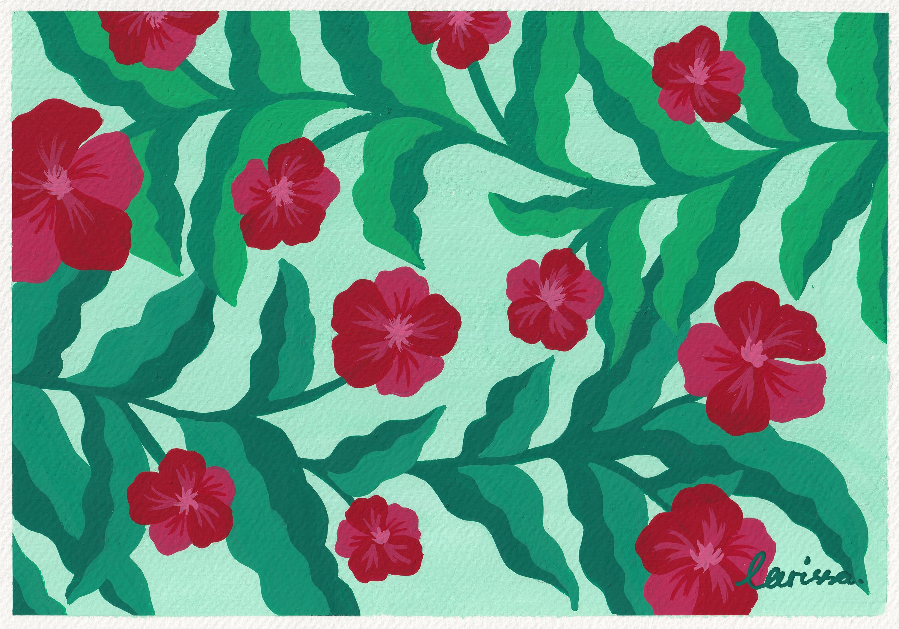
to complement it well. I will use my painting to
explain this point further. You can see I have picked the red and green color
combination for my work. Intentionally, I have made the red colour family
stand out more than the green color family
because I'm painting floals and I want to highlight the flowers
but not the leaves. That's why the red colors on the flowers are bright
and highly saturated. And by comparison,
the green colors on the leaves are darker
and less saturated. All I'm saying is when you put together a complimentary
color palette, think about which color family you want to send out
more than the other, and make sure you arrange
the colors accordingly. So in my case, to put together this complimentary
color palette, I have mixed these
paints to create the main red and then add white to it to create the
other two red colors. I have mixed these paints to create the main green and then add black or gray to it to
create the other green colors. I have also added
a lot of white to the main green color to create a pale green background
color for my painting. So please take some
time to put together a complimentary color
palette for your painting. Think about the
six variations of complimentary colors that
I mentioned earlier. See which one you
would like to pick and then assemble the
colors accordingly. When you're ready,
you can move on to the next lesson and see how I use my complimentary color
palette on my painting. O.
5. Painting a Floral Pattern in Complementary Colors: Okay, let's paint a floor painting using
complimentary colors. I will use this picture that I took as a reference
for my painting, which can be found on the printers board I shared with you in the
descriptions below. But if you can use
your own picture for reference,
that's even better. And again, I'll be using this complimentary
colour palette that I put together in the last
lesson for my painting. So I want to point
out here that when I was painting this
top out of the leaves, I wasn't happy with
that green colour. I think it was a bit too light. So I added a bit of black to that green to make it
a little bit darker. What I'm saying is, feel free to tweak the colors in
your palette as you go, just like what I'm doing here. Even though we have prepared the palette for the
painting beforehand, it doesn't mean you have to
stick to it no matter what. You can always be
flexible about it. In fact, use your knowledge about color since we've
been learning about color so much to
decide how you would tweak your color palette to make your painting
look better. So that's it for this class. I hope you will have
fun painting and artwork using
complimentary collies. And don't forget to
share your work in the project gallery so I
can give you some feedback. I look forward to seeing it. Thank you again, and I will
see you in the next class.