

The Color Wheel: A Guide
Learn the color wheel including primary colors and secondary colors in this guide to basic color theory.
Table of Contents


With an endless number of colors out there, have you ever wondered how artists always seem to know just the right ones to use? It all comes down to a principle called color theory and a tool known as a color wheel.
The earliest mentions of color theory can be traced back to the 1490s in the notebooks of legendary artist Leonardo da Vinci, but it didn’t take off as a practice until the mid-17th century. Wondering who invented the color wheel? It was Sir Isaac Newton who created the circular color spectrum in 1666.

Using a blend of art and science, Newton determined that certain colors on the spectrum look good together, known as complementary colors or contrasting colors. He designed a basic color wheel that could be used to find these harmonious combinations.
The color wheel has been used ever since to discover what pairings bring about certain emotions in the mind of the viewer.
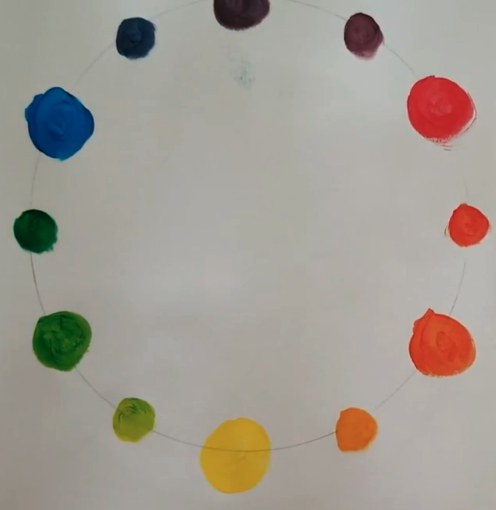
But exactly what is the color wheel? The simplest complementary color wheel follows an RYB (red, yellow, blue) scheme with 12 colors. You might also see this referred to as the subtractive color wheel. It helps artists to determine their overall color palette, or the different colors they want to combine in their artwork.
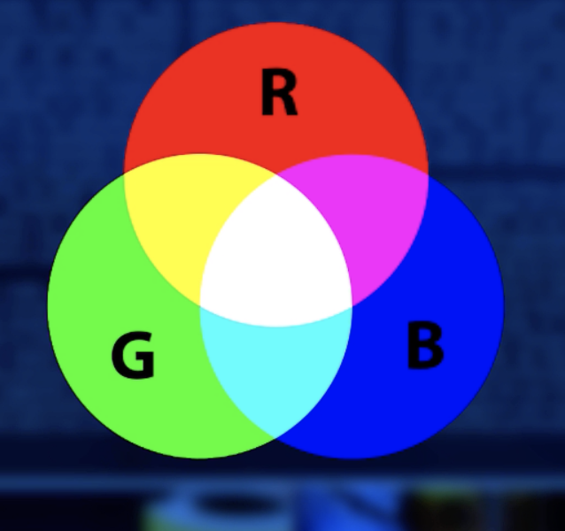
With the invention of the web, the additive or RGB color wheel (red, green, blue) was developed to help digital creators find suitable colors for use on screens and in digital media. Tools like the Adobe Color Wheel help digital artists determine the right colors for their projects and save their color palettes to reuse across multiple designs.
Color Wheel Basics
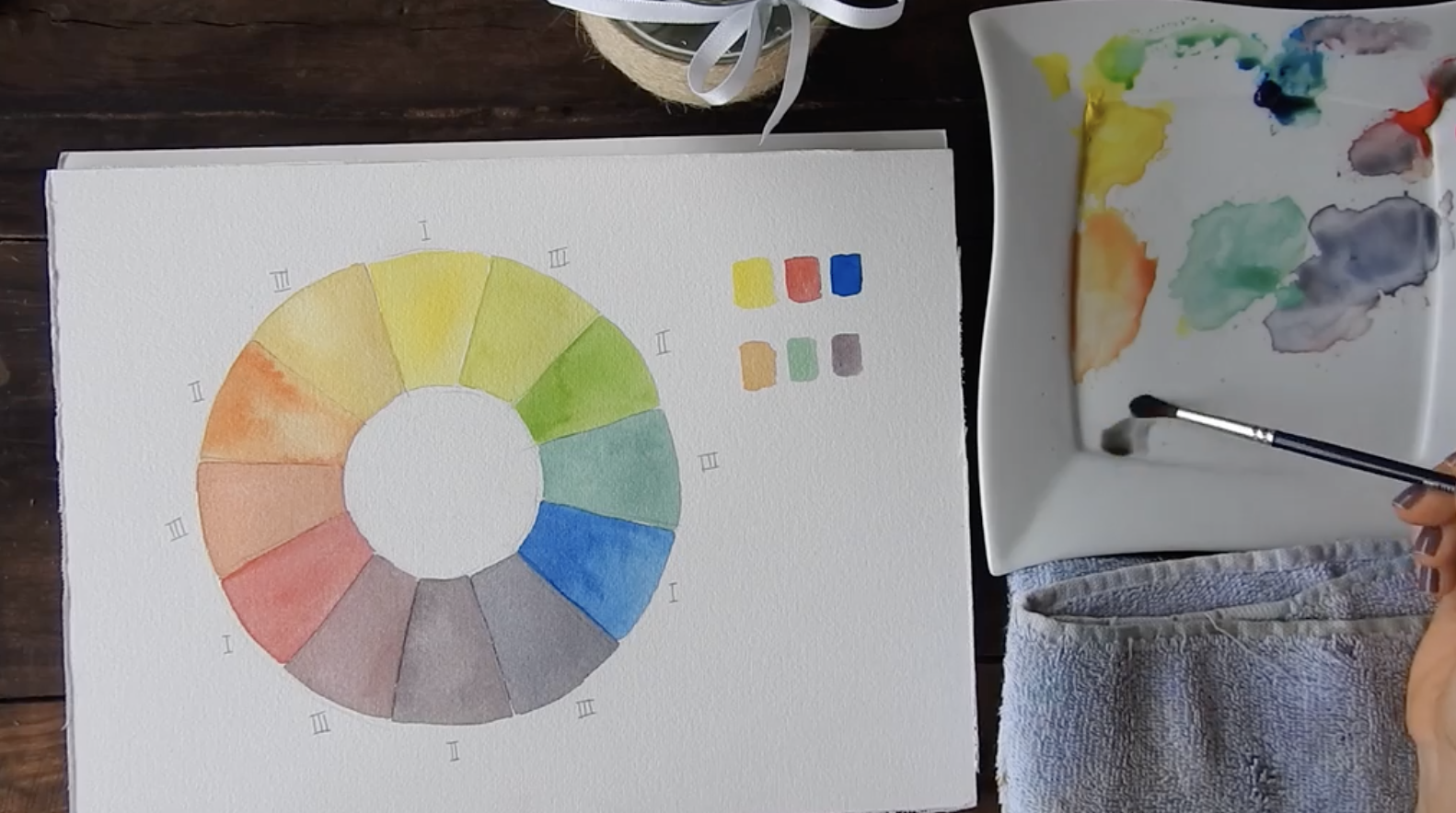
Using an RYB color wheel, the original 12 colors are broken down into three main categories: primary, secondary, and tertiary colors.
Primary Colors

Red, yellow, and blue are the only colors that cannot be made by mixing any other colors. This is what makes them primary colors. When you’re learning how to make a color wheel, you’ll start with these three options and build from there. Every other color in the color wheel can be made using combinations of these primary colors, which is how we create secondary and tertiary colors.
Secondary Colors
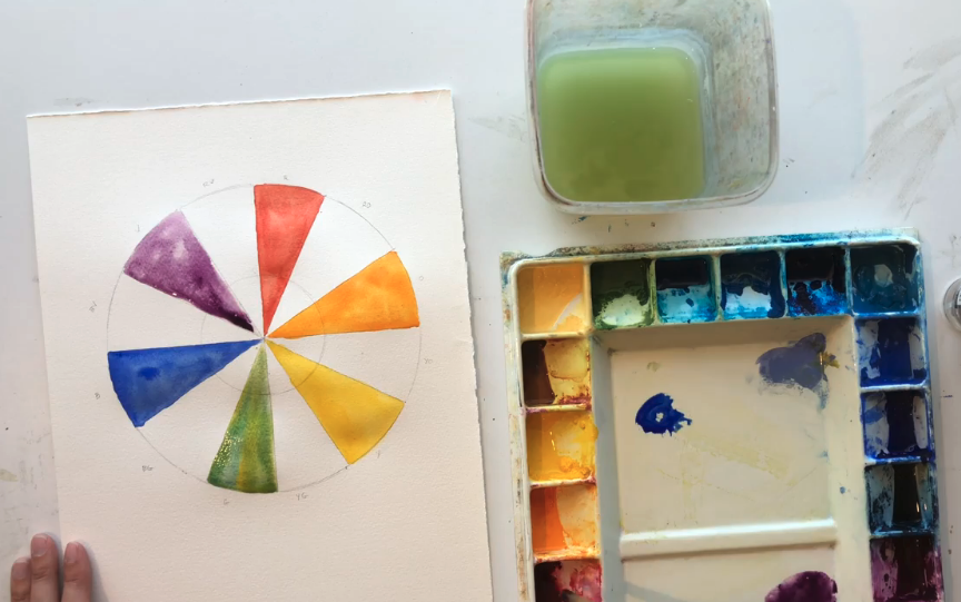
If you think about a color wheel in tiers, this next “layer” is made up of the colors that can be created when you blend two primary colors. These are purple (red and blue), orange (red and yellow), and green (yellow and blue).
Tertiary Colors
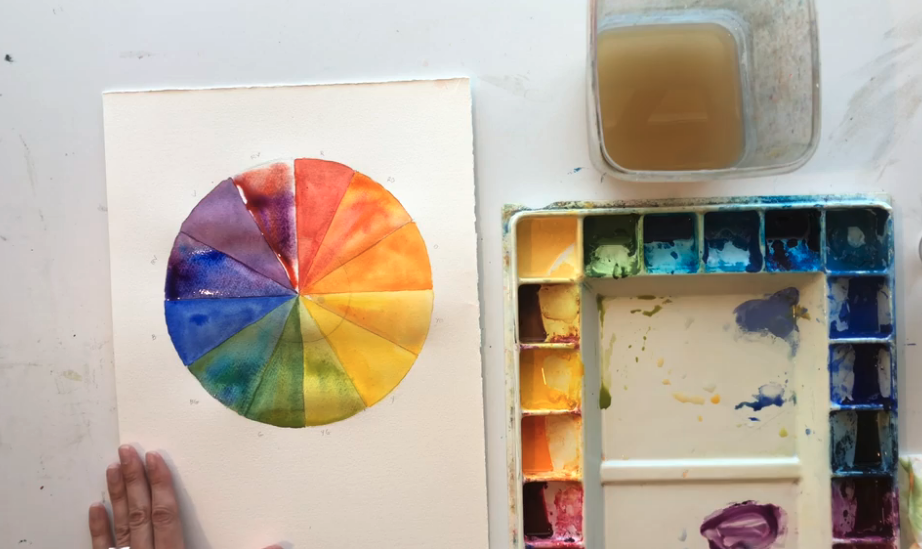
Tertiary colors are the final layer of the basic color wheel. These are the colors that are made by mixing a primary color with the secondary color that it’s next to. The possible combinations are yellow-orange, red-orange, red-purple, blue-purple, blue-green, and yellow-green.
Wondering where brown is on the color wheel? Brown is a composite color, which is made by mixing primary and secondary colors that aren’t featured on a traditional 12-color wheel. On an RYB wheel, it’s created by blending orange with black, whereas on an RGB color wheel, brown is made by combining red with green.
If you have paints on hand, try mixing the colors and learn how to make a color wheel of your own. This is the best way to practice your understanding of beginner color theory before moving on to more complex techniques.
Learn Color Theory for Graphic Design!
Graphic Design for Beginners Part 3 - Learn and Apply Effective Color
Complementary Colors

If you’re trying to determine a color scheme for your painting or home decor, working with a combination of two complementary or contrasting colors is a great place to start. Using a complementary color wheel, choose colors that sit across from each other to create a high-contrast look. Using this approach creates energy, but it’s important to use both colors equally so that there isn’t an imbalance.
Triad Colors

Want to expand beyond complementary colors? Triad colors incorporate a third option into your color palette, forming a triangle within the color wheel. Like with complementary colors, a triadic scheme creates even greater contrast but retains a harmonious feel. You can adjust different shades of these colors to create a bolder or softer look depending on the emotional response you’re trying to elicit.
Monochromatic
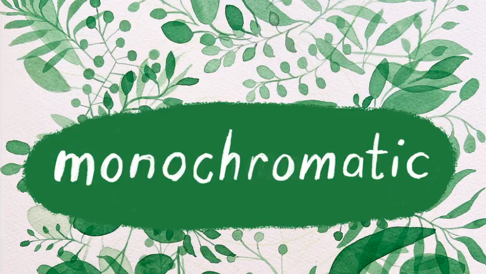
From the Ancient Greek meaning “to have one surface,” a monochromatic color scheme does exactly this. A single color is used, but with varying shades and tints to create a put-together look. Although this doesn’t require as much understanding of how to use a color wheel, a monochromatic scheme is one of the most difficult to do well without appearing too boring or intense.
Hue

A hue is defined as the origin of the color we see in the color wheel. This is the most basic form of the color before any variations are made to create darker or lighter versions of that color (shades and tints). Color charts are the combination of the basic hues from a color wheel and all of the subsequent variations that color can be made into by adding black or white to the original.
Warm Colors vs. Cool Colors
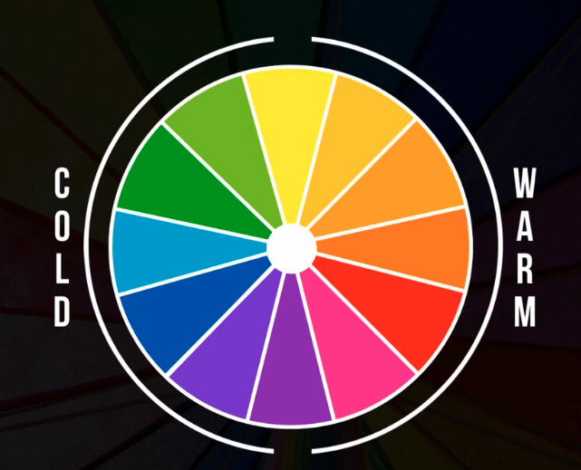
Think about how certain colors make you feel. Do they give off a warming temperature or do they feel cool and calming? The color wheel can be evenly divided between these warm and cool colors, with orange, red, and yellow on the warm side, and purple, green, and blue on the cool side. When you’re using a color wheel picker, think about the tone that you want to convey in your artwork and choose from the side of the wheel with colors that fit this feeling.
Now that you have a better understanding of the basics of color theory, it’s time to start working on your own designs.
Paint With Your Own Color Wheel!
Easy Color Theory for Watercolor: A Beginner’s Guide
Try Skillshare for free! Sign up for a 7 day free trial today!
Get Started- Unlimited access to every class
- Supportive online creative community
- Learn offline with Skillshare's app


