

Understanding Opponent Process Theory: How the Brain Sees Color in Contrasts
Why do some color pairings vibrate with energy, while others feel muted or jarring? The answers lie deep in our biology.
Table of Contents
- The Trichromatic Theory of Color: The Precursor to Opponent Process Theory
- The Science Behind Opponent Process Theory
- Complementary Colors and the Opponent Process Theory
- After Images and Other Visual Illusions
- How to Use the Opponent Process Theory in Art and Design
- Putting The Opponent Process Theory Into Action


Color can completely transform the way you perceive the world. A hotel room decorated with deep blues, muted purples and emerald greens can transform a simple space into a dark and moody hideaway. A movie scene with airy whites, bright yellows and pastel blues can infuse a moment with more joy and light-heartedness.
Your brain is constantly working to analyze the colors around you and transform them into meaningful representations of the world. Opponent Process Theory is one aspect of our understanding of color and color psychology that demonstrates how humans interpret color through three opposing color pairs: blue-yellow, red-green, and black-white.
The Trichromatic Theory of Color: The Precursor to Opponent Process Theory
The brain processes color through photoreceptor cells called cone cells, also known as cones. Located in the retina of the eye, these cone cells are what make color vision possible. Your retina houses about 6 million cones, which are broken down into three different types. The fact that humans perceive color through three types of cone cells, each sensitive to red, green, or blue light, is known as the Trichromatic Theory of Color and was first proposed by Thomas Young and Hermann von Helmholtz in 1802.
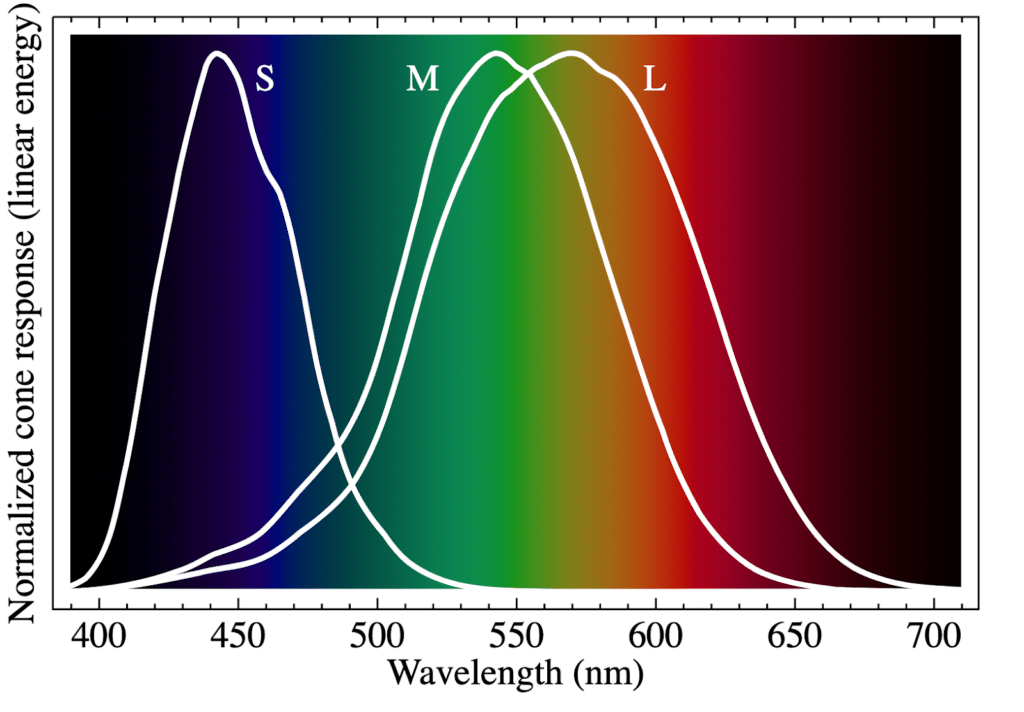
About ten percent of your cones are short-wavelength sensitive cones, or S-cones. These S-cones are blue-sensing. Thirty percent of your cones are medium-wavelength sensitive and are known as M-cones. These M-cones pick up the color green. The most common type of cones in your retina are long-wavelength sensitive cones, or L-cones, and they take in the color red.
Yellow is perceived by both M-cones and L-cones at the same time. Violet is perceived by both S-cones and L-cones. Orange is perceived by M-cones and L-cones.
The Science Behind Opponent Process Theory
The Trichromatic Theory of Color explains how humans detect color but the Opponent Process Theory dives deeper into how humans process color in relationship to other colors. German physiologist Ewald Hering first developed Opponent Process Theory in the late 1800s after discovering that humans could not perceive colors such as bluish-yellow, reddish-green, or whitish-black as they did colors like orangish-red or bluish-green.
He believed that there were three opposing channels in human vision: blue versus yellow, red versus green and black versus white. His theory was later confirmed when scientists found that retinal and thalamic (LGN) cells are stimulated by one color and suppressed by another.
Since it is biologically impossible for your brain to see opposing color pairs at the same time, your brain sees shades of green rather than bluish-yellow, shades of brown rather than reddish-green and shades of grey rather than whitish-black.
Complementary Colors and the Opponent Process Theory
If you know a little bit about color theory, you might have noticed that these opponent color pairs—blue and yellow and red and green—are also complementary colors on the color wheel. What you might not know is that complementary colors and their high-contrast, vibrating effect aren’t just aesthetic; it’s psychological.
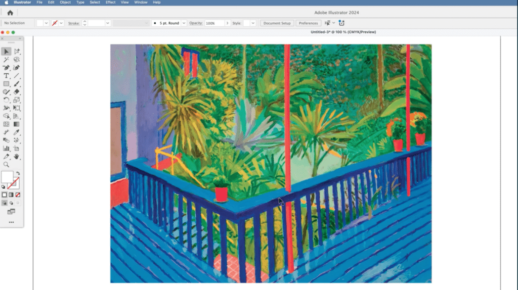
Your opponent channels are firing in conflict, which creates visual tension. This is why red-green and blue-yellow or blue-orange paintings pop in a way that blue-green doesn’t. Notice how David Hockney uses complementary colors and opponent pairs to draw the eye into his painting Garden No. 3 seen above.
After Images and Other Visual Illusions
Opponent pairs don’t only explain the contrast you’ll see in the complementary color pairs like blue and yellow, but they also explain weird optical illusions like afterimages, simultaneous contrast illusions and optical mixing.
Afterimages are images you see even after you’ve stopped looking at the original object. They will often appear after you look at a bright object and then shift your visual focus. Afterimages will be in the same location in your visual field, usually lack clarity and are almost always the complementary color of the original object.
If you Google “color red square” and then stare at the square for thirty seconds and look away to a white wall or screen, you’ll see a little blue square still in your visual field. That is an afterimage.
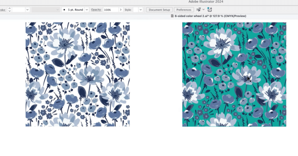
Simultaneous contrast illusion happens when colors look different depending on what colors they’re next to. For example, a color will appear lighter when it's next to a darker color, and its shade may seem different when it's adjacent to other colors or to cooler or warmer shades. This is the case in the image of the flower patterns above.
Optical mixing occurs when your vision perceives a combination of adjacent colors as a single color. You’ll find artists using this principle in the painting technique Pointillism, where painters use small, differently colored dots to create larger images. You might recognize A Sunday Afternoon on the Island of La Grande Jatte by Georges Seurat or Paul Signac’s The Port of Saint-Tropez.
How to Use the Opponent Process Theory in Art and Design
Now that you understand the biology behind the Opponent Process Theory and other visual quirks, it’s time to look at how you might use the theory to create clarity, contrast and emotional impact in your visual work.
Painting and Illustration: Optimizing Your Color Palettes
The colors you choose within your artwork can completely transform its mood and energy. If you’re looking to create something that feels more dramatic and high-contrast, try to construct your color palettes with opponent pairs in mind. Playing with red-green or blue-yellow pairs will trigger neural conflict and can make any scene pop.
To find any color’s complementary color just look at the color opposite from it on the color wheel.
UI/UX: Emphasize With Contrasting Colors
Color theory plays a big part in graphic design as well as user interface (UI) and user experience (UX) design. Using contrasting colors can help draw your users’ eyes to important buttons, such as “Add to Cart” or other key actions and alerts. Color in UI/UX design is especially important when it comes to accessibility, as not everyone perceives color in the same way.
Visually impaired users could have trouble reading text that is too light, italicized or not contrasted against its background. Red-green color blindness is also common, which you might also consider while using opponent process colors.
Photography and Film: Color Grading with Intention
Color can change the entire mood of a photo or film. Cool blues are typically used at night or to represent feelings of isolation, melancholy, coldness, or calmness. Purple is used to evoke a sense of ethereal, mystical, or ominous atmosphere in a scene. Professional colorists consider the hue and saturation of each color as well as the overall color scheme when color grading.
The complementary color scheme, monochromatic color scheme, analogous color scheme, and triadic color scheme are all used in color grading for filmmaking to create distinct emotional tones and visual harmony.
Putting The Opponent Process Theory Into Action
Understanding how your brain processes the world around you can help you better communicate your creative ideas. This week, try exploring opponent process theory in your own works of art by using blue-yellow and red-green color pairs, recreating existing designs with opponent process theory color pairs or revisiting an old work of art and seeing how color contrast enhances or detracts from the overall message.
Color is one of the essential elements of graphic design, art and visual communication, so just remember to enjoy exploring this new theory in your work so that you can best convey the desired mood, emotion and meaning of your piece.
Related Reading
Calli Zarpas
Producer & Writer by occupation. Ceramicist & Newsletter Editor by avocation.
Try Skillshare for free! Sign up for a 7 day free trial today!
Get Started- Unlimited access to every class
- Supportive online creative community
- Learn offline with Skillshare's app


