Transcripts
1. Promo: In this class, we will learn everything about color in UX UI design. We will start off with all the basics about how to pick, mix and match colors, and then dive a little deeper and set up our own style sheets. During the course of the class, we will cover the following subjects. Common techniques, tips and tricks on how to combine colors. Converting colors between print and screen design. Color values such as hex, RGB, Pantone, and CMYK. What are they and when do we use them? Covariance, what are they and how to set them up? Naming colors DO right way. We're going to the 60, 30, 10 rule, a really great way of distributing your colleagues for a solid hierarchy. We're going to look into accessibility. And in the end we're going to make sure to document those collars for development. And I'm going to show you a really great way on how to do this. By the end of this course, you will be able to use colors in UX UI design with confidence. This is a course by very learning dose IM.
2. Introduction: Let's talk about color in UI design. And together we're going to have a look at the following topics. We're going to start with the basics and learn about what is hex onto be Pantone and CMYK, and which ones do we use for our UI design? We then going to talk about converting those colors from print to screen. And the other way around. We're going to talk about how to choose colors and how to mix and match them like a pro, we're going to learn what variants on how to create them, how to name colors the right way. We're going to talk about a system colors and how to document your colors for programming. And we're also going to talk about the so-called 60, 30, 10 rule, a very handy way of distributing your colors the right way. So let's get started with our first topic.
3. Course Material: You may want to work alongside me, so I prepared some files for you to download in the course you're taking simply navigate to project and resources. And there you'll find all the information and the link we can download the material or you can navigate to my profile. Well, you'll also find a direct link to the download page. And this page you'll find a variety of downloads. You can simply pick the cause that you're currently taking and then just click Download. And it will automatically download the file for you. To open a Figma file to download it, It's important that you have a Figma account. Inside your account, navigate to new, impress Import. You can then choose a file that you would like to open. It might take a moment as they're quite large, but once you imported them, they will be on your account and you do not need to repeat this process. I am working with Google fonts for most of my designs. So if you're working with the Figma app, then you don't need to do anything. All Google fonts are preloaded automatically. If you want to work with Figma in the browser, then you just need to search the font that it's showing you as missing. For example, Poppins, I use a lot. And then you can directly download this font installed on your computer and you're ready to go. Or resources are free for existing students and you do not need to enter any additional information. You can, of course, also download any of the other files in case you're interested. So under general are always add Anything that I think might be useful. So there is, for example, a Bootstrap template and then a list with links for inspiration books and blocks that are really great for UX UI design. This list of downloads is steadily growing, so make sure you come back and have a look from time to time.
4. Pantone CMYK HEX & RGB ?!: So colors can be no sits down in different ways. The most common ones that you will probably come across, our Pantone, CMYK, hex, and RGB. The first two, Pantone and CMYK are typically used for print. Now the difference between the two is, is that Pantone is that specific mix of ink, so it's 100% the same color anywhere in the world. Now you cannot print a Pantone color on your home printer. It's something that in the print shop they would get that specific ink and then add it to your print. However, you can go to a print shop and have a look at a so-called Pantone book, or you could even buy one yourself. Within that book, you see all the different colors, watches, and a corresponding codes. The EU at the end of the number corresponds to uncoated paper. And you might see a seat for coated paper or some more versions. So even though you might be given a Pantone color because it is the most reliable way to reference a color imprint. You'll probably only use it for a logo or for larger companies for their brand colors because it is quite expensive to print with Pantone. So most of the time you'd use CMYK and CMYK and Pantone correspond. So CMYK is cyan, magenta, yellow, and K is for black. So with those four colors, printed mixes together to color that you're looking for. Now, it is important to understand print values and what they are, especially Pantone if you need to look at the reference, but you will not be able to use those values online. What we use for our UI design is to so-called hex and RGB values. Rgb stands for red, green, and blue. So our screen mixes those three colors to create a color just as in print, we mixed CMYK. So it's a very different system to create a color, which is why print and screen will never look exactly the same. Hex is also a form of RGB. It's just a much shorter way to noted down. Hex stands for hexadecimal and it's a six digit code with a hash in front of it. So it's very short and easy to handle. You can display the same color with an RGB or a RGBA value to a hereby stands for the opacity. So you can alter that. For example, if you put nor 0.5 view at 50 percent opacity, It's exactly the same. So you can use hex or RGB. However, I recommend using hex because it comes in a string format which is shorter and easier to handle and copy and paste and share. So for you, I designed just giving the hex value for all of your colors will be more than enough. Now there's one thing that you really need to be aware of when it comes to color and color reference in UI design. Now we've learned that in print design we have the so called Pantone colors. That is our universal reference of how that color should look. Now this does not happen with collars on screen. Now, even though we have our hex values, they will look pretty different on different screens. Not going to be a completely different color if you're choosing a red, it's not going to turn out a green, but it will be a little different. What you can do is open this presentation on, for example, your desktop and your phone. And you will see that there's most likely a slight difference in the colors. Now this is just how things work in screen design. And as long as your colors have enough contrast and a harmonious amongst each other, then that is also no problem. It's just important that you're aware of it because sometimes your client is not aware of it. And if they, for example, gave you a Pantone reference, they expect your design to look exactly the same, which simply isn't possible.
5. Converting Colours from Print Design to Screen and Back: So in some cases, you might be asked to convert from print to screen yourself, or to just find the corresponding value. So let's have a look how we could do that. Now if you're giving an RGB value and you want to hex or the other way round. That is super easy. In any design software, you can just open the color and then you'll usually get a color wheel or something like this. And this is, for example, in Figma, you just have a little drop-down. And then you can choose your RGB color, and then you will see the difference here. If you have an RGBA, you would just put the last digit. Let's say it's no 0.5 in here, and it will give you the opacity. Now, if you've been given a print color and asked to convert it into a web colored, that is a little more tricky. There are converters online, but most of them are not very good. The one that I like using is the official Pantone website converter. Now you can use that anytime that you convert Pantone CMYK or anything from print to screen design. And the other way around, what you do is you go up here to find a Pantone color and open disk search tool. So if I have been giving a Pantone value, I go to Pantone, pantone, and then I paste my value in here. And I pick it. And NIC here gives me the swatch. And if you select a swatch, then you see on the Swatch to RGB value that hex and the CMYK value. If you having those physical swatches here, There's actually one called color bridge. And you can also see a directly on the swatches. Now this would also work the other way around. Let's say we only have our hex values and we want to find a corresponding print value because we are very nice and we want to help the print designers. So in that case, we go to RGB CMYK in hex converter. Click on here, and then you can choose here what the value that you want to enter. I have Hex, I enter my value, I search it. And again, you get into the swatches and it's gonna make some suggestions and the best match and picking again. And you can see I find my corresponding swatch here. Now, this is a really great way to convert colors, and I highly recommend using those Pantene converters. However, it will never be 100% the same on print and on screen because it is just some very different color ranges. But it's probably the best result you get. And always remembered those converters are there to help you and not to create a hurdle. So if you feel that the hex value you give him needs to be adjusted a little bit. That is just fine.
6. Pick Mix and Match Colours Like a Pro: Let's talk about how to pick colors and mix and match them like a pro. You might have a natural flair for picking and mixing color, and that is absolutely fine to just then go ahead and use it. If you're However, feeling a little insecure about setting up your own brand colors. I'm going to show you some techniques that you can use. On the screen, you see a RGB color wheel, which is what we use for screen design. There are 12 main colors in this wheel. They can be divided into cool and warm colors. In your design software, this will look like this and you can pick colors from here. I'm going to use a simplified version for my examples. In this way, we can see the different color segments a little better. A great starting point for choosing colors for your brand is also did Google color palette. On the Material Design website, you can navigate to color and then call a system. It's a great system in general to explore. And here you find the color palettes and he can see different colors and it makes it just a little easier to get started and like pick your first colors. Now I'm going to go back to the color wheel and show you how to combine those colors. So our first approach is the monochromatic approach. That means that you pick your color. For example, there's red, orange shade, and then walk towards the center of the color wheel. So you get a very nice shading. You can use pretty much any color, however, yellow and the light green is a little more tricky. Screen is usually working wonderfully if you're just starting and wants something very safe to work with. Now you might hear a lot about the association with color, like blue is calming and red is very dynamic. But to be honest, I rather focus on the way that I combine them because this is where I create the tone. As you saw in a monochromatic approach, both red and blue had quite a soft calming effect. Let's look at our second approach, which is to analogous approach, whereby we pick colors that are next to one another. So they don't need to be exactly on the same hide just within an approximate 90 degree angle. In this way, you can create a little more dynamic, but you still have this very professional and elegant look. If you're looking for something even more vibrant, then you should use the complimentary approach. So I'm starting with my blue again, but then I add the color from the opposite side of the wheel. And I can loosen this up a little bit by adding some more shapes. Now you can push this even further. And instead of going down the color wheel, you can use the so-called split complimentary approach, which basically mixes this approach with the analogous approach. And you just pick a color next to it. If I want something very lively, this is the approach I use because I am mixing warm and cold and I'm having a dynamic of colors yet still everybody working beautifully together. Just note that when using a split approach, I will recommend that you stay within the same distance from the center to pick your colors. Otherwise it can get a little messy again. Let's sum up. We had a look at the monochromatic approach, which is whereby we go down to color wheel and we get a very soft and sophisticated look. You could use the analogous approach, which is where we pick colors next to one another. Here My, we add a little more vibrance, but we still have this very calm and soft feel about it. If you're looking for a little more dynamic in your design, then I recommend using the complimentary or split complementary approach where you mix complimentary colors. There is more ways that you can mix colors, but this is really the three approaches that you can get started with. And you will have something that you can work with nicely and easily.
7. Colour Inspiration: So setting up a color system and all the technical things around it is really great. But sometimes you just want a bit of inspiration to get that mood right. Sometimes it's also the case that there is no established brand colors, but there is already a product, awesome imagery or pack shots around a product. So let's see what giving this image, what we can do is then just add that to our design software and just pick the colors from the image to create our color scheme. We can then later adapt that color scheme and use a variant picker or adapted a little bit in our system to find some complimentary colors. What you can also do if you just want some general ideas for moods, you can go to Pinterest and just put in color palette. And then you'll get some really great ideas. Generally, there is some fantastic things that are related to nature images and then just pick colors from there. So this is really great moves that you can also use on a mood board. For example, if you like one of them, you can just click on Add and then you will get more similar images like it. Another great place is color palettes. That also gives you a great range of different palette and inspiration. Another one I like using is color space. With color space, you can add your color here and then you can click Generate. And it will just generally it's a really nice, so watches to go together for you. And up here what I like especially is the gradient tool. So you can pick two colors. You can also obviously adjust them. And then you can put gradient, and then you can see the gradient here. And you can change directions of the gradient. And then down here you'll get to CSS code right away and a gradient you can just set up in your design system with the colors that you're given here. And a last one that you might want to take out is colors minded double o in the spelling. And there's also a just generates color swatches for you. So here you can see this in any color. You can really do quite a lot with it. So you can, you can see all the variance in here. You can upload pictures. And you can like have one that adjusts or just really, really go and play around with it. Because you can really do a lot in this tool.
8. Colour Variants in UI Design: Let's have a look at variants, what they are, and how to set them up. So a variant is basically a lighter or darker version of that color. So one thing that might come to mind is to use transparency. In that way you could create lighter shades of the color. However, this is only the case on a light background because they're see-through them. So this is something you can use for an overlay or different effect, but it's not really a variant. A very end is a full version of a color in a lighter and darker tone. So let's see how we could find that. You could make your own variants by altering the hue value. But I find it much more convenient to use an online converter. There are many different converters out there and you can simply add the color that you chose, and then it will create a bunch of variants for you. There is no rule about how many variants you need for your design. And you can always add more as you get along. The important thing is to have one base color and from that one you create your variants. So to create my variance, I like using material design. You go to Material Design, color and color system. And any few scroll down, you find the color pellets here. In the color pallets. You can either play with the color you have if you're still looking for color, or you can just paste the one you already chose. And then from that selection here, and you will get all the variance. So you could also adapt to color, for example, you can just change it here and then it will adapt the value for you or you can pick up here and it will always create the variance around. Let me get back to an orange that I actually like using. So I think it should be this one here. Yeah, exactly. I like this orange and I'm probably going to use this tone here. So what it does is two things that you can see here. One, it's going to tell you what color you should use on top. And on the other hand, it gives you those numbers down here. Now those numbers are not the name of the color. The name of the color is once you hover over it, the hex that you see on top. And this number down here, there's 900, 250 is basically the number for the variant. And this is really free. You don't have to use this system. You could also name your variance 10, 20, 30, 40. Don't name them 1, 2, 3, 4, 5 because you might want to have a variant in-between or something light or something darker. So always make sure you have a system that allows for something to be added later on. I personally like using that system that material design is giving me. So I use this annotation. And what I like doing is the color that I'm using mainly like my main color is the 500. And in this way I can go up and down without any problem. I also like going into a 100 step, so I like using 300 and then 100 and then upwards, I am using seven hundred and nine hundred. And only if I notice that this is not really giving me the result, I can still put in there eight hundred and four hundred. You can also add your secondary color and create your variant. Or you can choose a complimentary color, analogous color, and, or triadic color, which is a little more complicated. So unless you have really good with colors, I wouldn't really go there. Now let's just add this secondary color. I copied the blue, the complimentary color that I want to use. Um, and then what you can do is you can go view in color tool, which is really great. And so that gives you an overview of what your colors would actually look like in a design which is super cool. And then the important bit here is that you check your accessibility. And you can check what text and what colors you can use together on top of your variants and on top of your main color. And this is really, really important that you always check this. So once I am happy with my colors and variants, I just pick hexadecimal instead. They gave me in my Google Material Design tool and then transfer this to my design sheet. So in my style sheet, I note them down as my main color is the 500. And from there I'm having a lighter and darker version. So as you can see, I used 200 steps and in case I wanted a 400 color in-between here as well later, I can just add this end. My system is still going to work fine and be all logic for my secondary. Now, I just picked the blue. I'm not sure if I even need a variant right now. So I'm going to note this down still with the 500 at the end. I know this is my base for the secondary. And in case I want to add some variants, as many as I want later on, I can just do so.
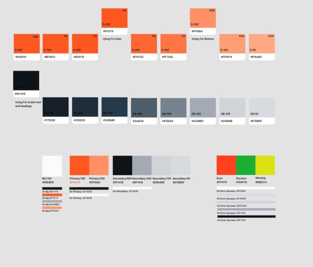
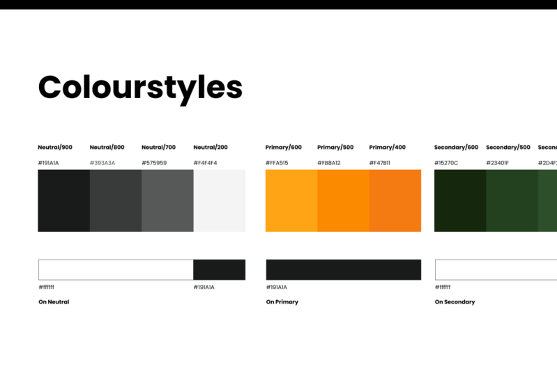
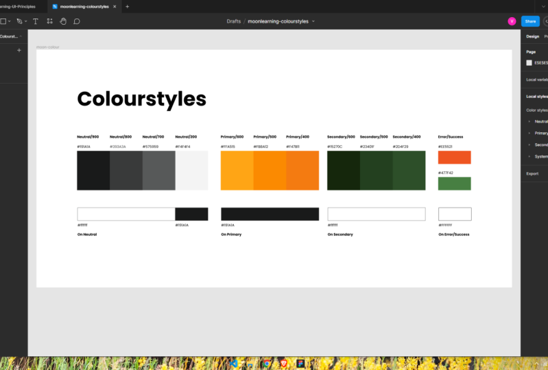
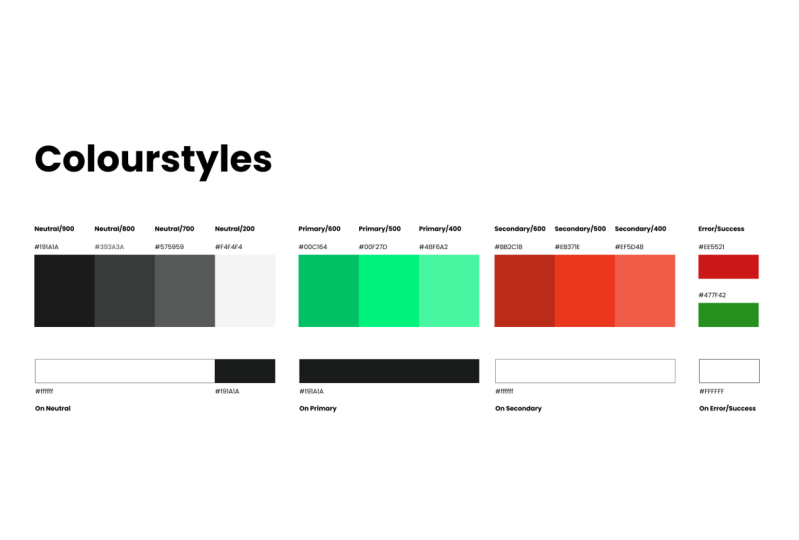
9. Naming Colours the Right Way: It's very important to have a proper system when naming colors in UI design. So once you pick your color, you would document it in the style sheet and on your design system. So what you usually see is that you give a preview of your color, you give it a name, and you add the hex code. Now it's very important that you don't name your color after the color itself, like red and blue and so on. But it must be something generic. It doesn't really matter what name exactly you use. The important thing is that it is descriptive and consistent. So why is this important? Well, colors might change over time. So if you name your color, for example, mint cream, and then in the last minute, it's changed to purple is just not very convenient. It's also good practice to name your colors accordingly to the function that they hold in your design. So for example, you would have something like background colors or neutrals for something that is like grade or beige, which you use in the background to create some more dynamic, but it's not really part of your brand. For your brand colors. I like using primary and secondary, but they could be just as well be called brand and highlight color, for example. In this way, you're telling your design team and your development team right away what function that collar holds. And it's very unlikely that someone's gonna use the color called neutral for call to action. They will know that the highlight color is responsible for that role. That is also going to help you to be very organized with your colors. One little tip when you have variations of your color, like I do here with my primary, don't call them 1, 2, 3, 4. Because later on you might want to have something a little lighter or you might need something a little darker or just that tone in between. So I am using 500 as my standard color and then I'm going up and down in 200s. However, you don't have to do it that way. You can also call it 10, 20, 30 to only thing is make sure there is some room in-between of those colors. And below and above the collar you're using.
10. Feedback Colours: The so-called feedback colors are not part of your brand. They're there to give feedback and interact with the user. You send that feedback can be divided into danger or error, warning, information and success. You can use them as full color, like the writing below the input field we just saw. Or you can have some sort of banner that has a percentage background of the color and then uses the color on top with the information. Just make sure that when you do that you have enough contrast between the background and the information on top to make this readable to everybody. I sometimes like using variants of my brand when it comes to information and success messages. The one that you should not change and always leave in bright red is the error warning. You can still adjust the tone of red, but it should always stay in red because it's very important that we're consistent with our Arab warning.
11. Documenting Colours: Let's talk about documenting our colors for our UI design. So instead of just saying this is the brand colors, take them and go ahead. I want to show you a systematic approach. So what elements do we have? Let's break it down. We have our background color, then we have a primary color. I'm using a dark shade here. This might just be something completely different for you. And then we have our secondary color. I'm calling them primary and secondary in this example, you might also call them something completely different. Just make sure that it's generic and descriptive. The amount of brand colors that you need is also up to you. You might just get away with one primary and a few versions of that. Or you might need more colors. I would recommend to stay between 23 colors. That usually gives quite a nice result. And then for each of those colors I have here, one variant usually are probably add a few more, like I would say between 25 variant is usually what I use. Again, really depends on your design and with variance, the great thing is that you can totally adapt that later on as well. In addition to my neutrals and my brand colors, I am having something called feedback colors as well. For this example, I set up an error cholera in red and a success color in green. Now you might have as well a color for warning, which is usually an orange, and information which is blue. I am adapting that with my brand colors. The important thing is they're error warning that needs to be there and that needs to be in red. And then this is the important part, and this is the smart part about our color sheet. We're going to add another line of colors, which we call our own colors. Now this ONE color defined everything that goes on top of our color. So that means texts that goes on top of it or things like icons. Dri, then this ONE color is really great to add to your style sheet is because it makes you double-check your design for accessibility. And to avoid the so-called muddy range, I'm going to show you a little more on how I check this. So what I like using is the Material Design. I go to Material Design, color, and then color system, and into the color palettes. And then here, for example, you see the range of colors. And it shows you what color goes on top to make sure that you have perfect readability and accessibility. And then you can like go along those colors here. Anyone see here is the range where muddy range is where it starts changing. So I will try to avoid this for having, for example, icons placed on top of something like this. Because down here you can see it gets much clearer and have a clear result. I can also put in my orange, for example here, and then I can see that I should use a dark tone on top of that. This tool is super grade, by the way, also to find your complimentary colors and analogous colors and everything to do with color combination. What I am taking in the Google material tool, however, it's just that I am using white or a very dark gray, blackish color on top of something. If you want to combine different colors, what you should do is go to a contrast checker. I'm for example, using web aim here. And you can just put in your color and it will tell you whether your color combination is accessible. So let's say this orange on top of white, you can see that it feels everywhere. And then you can just like play with it here and change your colors and you will see where it starts parsing. So what you can do is either adapt your color to your needs or you can put in the colors that you are having here and then see which ones you can combine and which ones you can't. So by checking this, I noticed that here, for example, I should definitely use a darker color. Another aspect that I really like about this setup is that it keeps my colleagues have very flexible to change. Let me give you an example. In this setup, the primary color is set to a dark gray. So if I just hand over colors, most likely my text is also going to be set in this color. And you probably going to use this in your design file as well. Now, if I want to change that primary brand color to, let's say a blue, then suddenly all my texts will be in a blue as well, which is not so great. But I would need to go through bit by bit to change that back. The approach we're having with our own colors, I can change my brand colors, and then I can separately change the colors on top of my elements. So it is really gives you a great flexibility with playing with colors. And just to stress it again, it is totally adaptable to your needs. You can add those variants you need and where you need them, and just add an on color for each of the colors you're using.
12. 60 30 10 Rule of Colour Distribution: Now an important part besides what colors you use is how you use them. The 1630 10 rule is a great rule of thumb. It basically means that you use your base color, that makes up 60% of your design, then 30 percent of your design as your primary color. And just to highlight, use your secondary color for 10%. Now we obviously don't exactly measured a color. It's more a feeling of distribution. So that is great because it also gives you space to play with variations as you see in my example. As you can see what it does. It, it gives you a very solid base and a really great structure and really gets the attention to where you need it to your call to actions. In case you would need to change the colors. That also works beautifully without much retouching. As usual, this is just a rule of thumb to get you started, use it and make it your own. There is a pretty amazing tool, biomaterial design called color tool. And what it does is, it shows you this 1630 10 rule basically. So you can pick a primary color, and then you can just pick any secondary color. And it shows you pretty well what that will look like in your design. And material design uses this as well, that you have that text on primary, texts on secondary. So here, for example, you could set a separate text color to anything you like. And then on the accessibility, you can check if your colors are accessible if they have enough contrast. And in here you can just skip through and see different versions of your design. And you can of course, customize everything about it.
13. Summary of Colour in UI Design: So let's summarize everything that we've learned about colors in UI design. So generally, we define colors in hex codes. We usually use two to three colors, but you're free to use as many or as little as you need for your design. We use variants of those colors for more depth. Named colors after they use. So don't name then orange or blue, but primary, secondary or something like highlight. However you name them, it's up to you, but be consistent. Document your colors the right way. Always check the contrast to make sure your colors are accessible to everyone. And uses 60, 30, 10 rule to balance your colors across your design.
14. Thank You: Well done for finishing this course. Feel free to reach out to us at moon learning dot io, we're always interested in hearing your feedback. You would also do as a great favor if you could just take a minute and leave a review right here. If you enjoyed this course and also make sure that you have a look at our additional courses. At Moody Learning dot. We cover all subjects from the very foundations of UX UI design through to Figma and even some code basics. Make sure you visit our website at Moody Learning dot IO, where you can also sign up to our newsletter.
 Christine Vallaure, UI designer, speaker & educator