Transcripts
1. Intro: Hi. I'm Christine,
a UX UI designer. And today, we will
have a look at how images work in UI design. In order to really get
best results online is crucial to understand
screen resolution first. So this class is set
up in two parts. First, we will demystify
screen resolution, really understand what it means, why we use points
and not pixels, and what screen sizes we actually use to
base our design on. Understanding screen
resolutions will be a great advantage to all aspects
of your your eye design, especially when it comes to handing off your
design to development. Once we got the basics down, we will then have
a look at images, what kind of images there are, where to find them, and how to handle them to make
your design shine. This is a course by learning.
2. Resolution: Points, Pixel and Screen Resolution: Let's talk about pixel
points and screen resolution to understand what size your
designs need to be set up. Let's first understand
what pixels are. Well pixels are basically the little dots a
picture is made of. They're the smallest
element in an image. Note that pixel
sign pictures only. Typography and backgrounds
or buttons are vectors. That means they're made of
mathematical equations. This is why they can scale
up and down to any size, and screen resolution really
doesn't bother them at all. However, pixels are not really a reliable measurement because they depend on the
screen resolution, the so called DPI or also
known as PPI, pixels per inch. This measures how many
pixels are in 1 ". The higher a screen DPI is, the more pixels are
crammed within that inch, and thus the sharper
the image is. So as you can see, a
measurement, for example, or four pixels would
be very different in physical size on different
screen resolutions. The DPI is determined
by a user's device, so you won't know that in advance and you also
cannot influence it. So what we need is some sort of measurement of space regardless
of screen resolution, but still in relation to pixels, and this is where
points come in. But let's start at
the very beginning.
3. Resolution: Why We Design at 1x: In the old times one point equal bm pixel and life
was pretty simple. On many screens, this is
actually still the case today. However, screen resolution was improved first by Apple
with the retina display. Suddenly, within the
same physical space, you would fit four
pixels instead of one. I doubled the DPI while keeping the same
physical screen size. This went even further
with displays such as the super retina in
the iPhone 11 Pro, for example, that
tripled the DPI. This means pixel was no longer a reliable
way of measurement, as it would mean very different things on different screens. This is why point we're
introduced to have a measure as a physical size of your design regardless of
the screen resolution. By the way, I'm just using
iPhones here as an example, but this would be exactly
the same for desktop design. Now, the most common question and it's probably in
your mind too is, so what is the size I do
use to set up my design. The largest possible?
No. We always and I can't stress this enough, always always design at
the so called one x. This might sound a
little confusing, but I'll show you
why we do that. So let's take the iPhone
four retina as an example. So for this grain,
just as for any other, we can get the
pixel measurements, and we can get the
point measurements. Remember that at two x, one point will look
like this in pixels. So to set up our designs, we always use the
point measurements and not the pixel measurements. In this way, we
set up our design automatically to one
point equals one pixel, and we're designing at
the so called one X. In all UI software such
as Figma or Sketch, you have preset artboards
that you can use, and you'll notice
they're all set up at one X ready for you to use.
4. Resolution: Getting Best Results on All Resolutions: So how does designing
at one X still guarantee good quality on
all screen resolutions. So this is our design set up at one X where one point
equals one pixel. So elements like
typography buttons, vector based icons, and illustration will
adapt themselves. They're so called
vector elements, and that means they're made
of mathematical equations. So in the background, they just scale up to
any size necessary. The screen basically doubles the pixel by itself
behind the scenes, and you do not need
to do anything? That's the same for
spacing, by the way. So let's say you have a 40
pixel spacing on your one x, that will automatically
scale up to the same physical size
on your retina display. So absolutely nothing
to worry about. You'll probably hear a lot of people talking about 40 pixel spacing or 16 pixels
font like I just did. They actually mean points because at one X, it's the same. So don't get
confused about this. However, remember that images are purely made out of pixels, so they do not scale
automatically. Most of the time, they're
stored in a file on the server and then literally pulled in by the code
when we need it. So the code can only pull
in what you provide. So if you provide
only a one x image for a two x resolution, it will look very blurry
on a retina display. So what you do is that you
provide those images in a one, two x, and three x resolution. The code is set up in such a
way that it can pick up on the screen resolution and then simply pull in
the right image. This is also why you
have this little suffix of two x and so on on your image name to identify the right size for the
right screen resolution. That's also why
it's so important to use a proper UI
software such as Figma or sketch
that allows you to do that and not something
like photoshop. Don't get me wrong. I
really like photoshop, but it's made for photo editing and not for setting up I design because you won't
be able to export your images at a larger
size afterwards. So with the right design
software, this is super easy. Here, I'm in Figma, all
I do is I pick my image, and then on the right hand
side here, I add port. And you will see it will
start at one x. I'm going to choose a JPEG as this
has no transparency, so JPC will be just fine. And then as you add plus, you can add further exports. All I do, I'm going to
change them to KPC as well, and you can see that it
automatically added a a two x for the two times for
the retina resolution, and three x four and
even higher resolution. The one X usually
doesn't have any suffix, so you can leave
it just like that. You can then just click
here on Export and it would export those images in
the file that you choose. The great thing in Figma is you don't even need
to export them all yourself because if you give access to your development
team in Figma, then they can just pick
those images and they can export them at
any size they wish.
5. Resolution Summary: Let's sum up. We use point. Point is a measurement of space regardless of
screen resolution. And we always design at one x. This is where one point
equals one pixel. Typography spacing and
all vector based elements adapt to higher pixel
density per default, so you do not need
to worry about this. Images need to be exported
or made available for export for higher resolutions to your
development team.
6. Images online: SVG JPG and PNG When and Why: In this video, we're going
to talk about images in UI design and how to
place and handle them. When dealing with images online, you can be given three
different file formats. The first format would be SVG. SVGs are for vector files, so it would be something
like logos or icons. Images cannot be stored as SVGs as they're not vector
based, but pixel based. For images, the first choice
would always be a JPEG. Unless your image
has transparency, then you would save it as a PNG. You would also use a PNG if you want to save something
like a circle or something that is basically not a rectangular image because then the background would
have to be transparent. Regarding file size, it would also work in the
order presented here. SVG is always the smallest. If you can save
your images as SVG, but that only works
if the vector based, like for example, icons. Sometimes you see an SVG and
the same image as a PNG. This is because the PNG hereby
will be a fallback image. If you're dealing with standard
pictures and photographs, then JPG will be
your first choice. This will always be
smaller than a PNG. Therefore, you only pick a PNG if you need
the transparency.
7. Images online: Where to Find Images: Let me show you some
places where you can find images that you can
use in your UI design. It is important to know
that you need to own the rights to any image that
you're using in your design, or you need to find so
called royalty free images. You cannot just
pick any image on the Internet and just
put it on your site. It's very important
that you respect this because there might
be legal consequences. My absolutely favorite
page for images is Splash. Splash not only has a great
selection of photography, but it also is royalty free. That means you can use all
of those images for free. In splash, you can either just search an exact image
you're looking for, or you have these nice
categories up here. So for example, let's jump
into health and wellness, and then you'll find
really, really great stuff. Also, if you're looking for
large background images, this is great if you go
to their nature section, for example, you can see
that you're having really, really great pictures
to pick from. Unsplash also provides plug
in for sketch and for Figma. So this is really
great to work in, then you can just search
all the unsplash database directly and put
the images there. Otherwise, just click on here, you download your image, and then you can just
insert it into your design. Pixabay and pixels are two more pages that work
just like Unsplash. Even though they're
royalty free, there's still some rules, always make sure that you check the license that will
tell you exactly what is allowed and some things that you need to consider if you
want to use those images. Sometimes you might be
looking for something a little more specific
or more exclusive. Then I recommend
having a look at Shutterstock or iStock photo. They have a really
great selection for a really fair price. By the way, most of those
pages that I just showed you also have illustration
and video files. If you have a looking for
illustration in particular, then I want to
recommend you a page called Blush that
I absolutely love. This is by Pablo Stanley and
it's absolutely amazing. It comes with a Figma
and a sketch plug in, so you can use that really easily directly in
your design files. And what Blush does, is it has a selection of
different illustrators, and then you can mix and
match the illustrations. That's for example,
jump in here. Then you can see there's
different elements, and then later in
your design file, you can just put them together, you can change the colors, and you can make really,
really great illustrations.
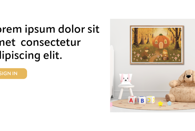
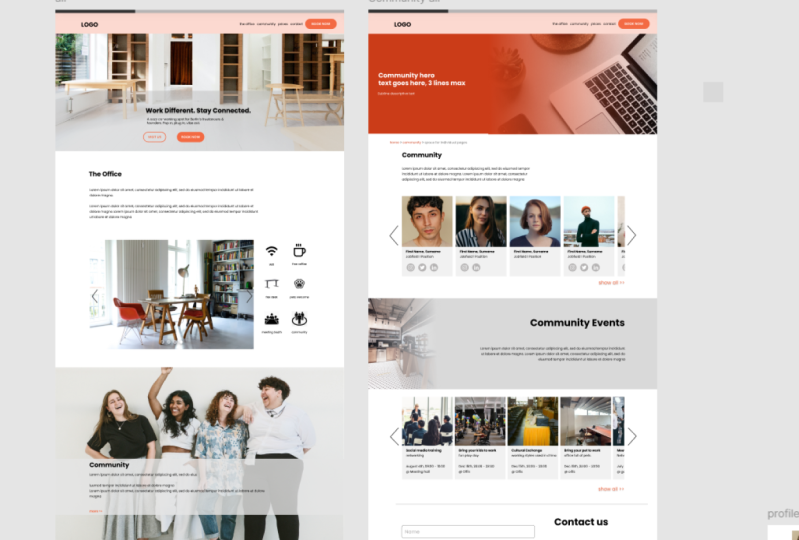
8. Images online: Placing Images and Aspect Ratio: Let's have a look at how images should be
placed in your design. You can either place
your images within the grit or as a full width
image outside of the grid. You can join as many rows
of the grid as you wish. So here, for
example, I join two, but then make sure that you don't place it on
the gutter if you're placing the next image or some
text or any other element. Whenever it makes
sense, I recommend to use an aspect ratio
for your images. Aspect ratio is the relationship between the image
width and height. You don't have to,
but I quite like using an aspect
ratio of 16 to nine. And this is quite common. For example, this presentation
slide is 16 to nine. You can also use other
aspect ratios such as one to one four square or five to four or four to
three are quite common ones. Aspect ratios are really
handy because in this way, you know that all your images will always work well together. For example, you might
have started with placing your image
at a two grid, and then later you
want to enarge it at a four grid with
some other images. That is no problem
with an aspect ratio because all images will always proportionally have the same height when
you resize them. As usual, remember, this is something that
should help you. So sometimes an aspect ratio might not be the right choice. For example, here on the right hand side, my background image. If I would make that
the 16 to nine, it will most likely fill the whole screen, and
I do not want that. So I just make those
ones a little smaller. You can either just
calculate the aspect ratio yourself or you can use an
aspect ratio calculator. So here, for example, if I would change
this one to 1,500, it would automatically
calculate the height for me. I can, of course, then
round up to full pixels. Then you can also
choose here between different aspect
ratios and you get directly to the new pixel size.
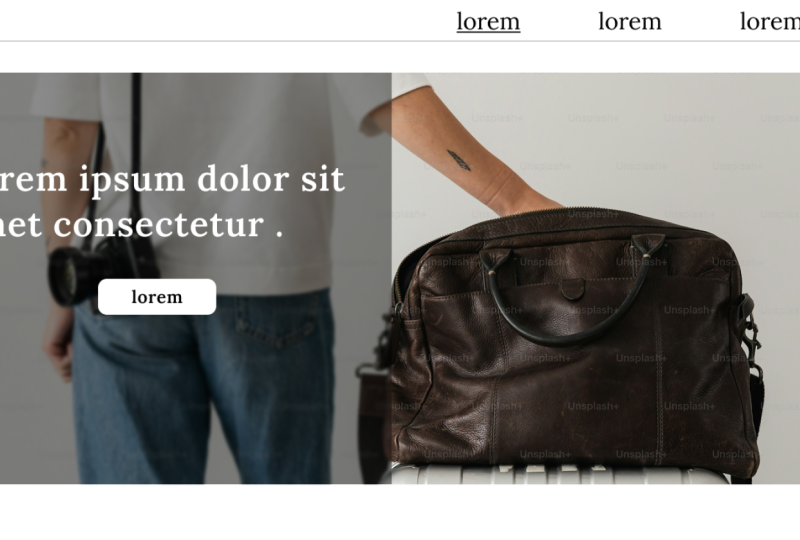
9. Images online: Text on Background Images: Now let's talk a bit about combining background
images with text. This is something often used in the so called hero or stage, which is the first big thing
you see when opening a page. So you're setting this
up in your design, and it looks perfect. You find this free nice
spot for your text to be placed and your client
absolutely loves it, and then real life sets in. UI design is not static. It lives in the browser. So on this size, you might
even still get away with it, but you can see that the
smaller the image gets, the more the button will
disappear in the orange. And if you would change
this for a busier image, then you can just imagine that it's not going to
work on all devices. So what can we do? One solution would be if you're having
a relatively empty image, just like this, to fix
your image to one side. Here, for example, I
fix it to the left. So my copy stays where I put it, but my chair gets cut
off a little bit, which is okay in this case. For mobile design,
you would just provide a whole separate
image altogether. In my case, I just cut off the chair and
use it like this, but you can also use a completely different
image for the background. Now, you might also have
the case that you have very busy images and you still want to use them,
like in this case. What you can do in this
place is to add an overlay, and you can play with
the transparency here. As you can see, the overlay not only makes the
text more readable, but also adds more of your
brand color to the design. And it just gives it this
much more sophisticated look. By the way, you can
add this overlay over the whole picture
as well and just go a little down
with the opacity. That also gives a
really nice result.
10. Images online: Dealing With Small Images: Sometimes you might be
given images that you want to use as a hero
image on your page, but they're simply not large enough and would look pixelated. You can check the
size by either simply dropping that image into
your UI design software, and it will then show you
the dimensions in pixels. Or you can write collect on
any image on your computer, and it will give you
the information. Here, for example, I
know I'm having a JPEG. That's the size of the image, and this is the dimensions in pixels that I'm looking for. So my image here is
1,200 pixels wide. That means on my canvas as
I'm designing on one x, I'm going to use it
around 600 pixels wide. This guarantees me that
later on I can export it at double size of 1,200 for retina and still
have good results. This is, however, definitely not large enough for
a background image. So let's see what we
can do to play with it if we still want to
use it in our hero. Images don't always need to be full size to shine
in a hero section. As you can see here, I simply added some color to
spice it up a little. You'll notice that if
you play around with it, you can still get
really nice results. Also, while most of your
content should really sit and behave with the
grid, with a hero image, you can make an exception, so you could, for example, take it out of the grid or give it some really nice animation. The great thing about working
with smaller images in the hero section
is also that they scale down really
nicely onto mobile.
11. Images Summary: Let's summarize what we've
learned about images. Use JPEG for images
whenever possible online. For transparency, for example,
a transparent background, save images as P and G. Try to save your images with an aspect ratio
whenever possible. Consider size and
resizing behavior when choosing large
background images. Use an overlay on busy images. You should also always provide
an all text for images. This is really important
for accessibility.
12. Thank You: Well done for finishing this course. Feel free to reach out to us at moon learning dot io, we're always interested in hearing your feedback. You would also do as a great favor if you could just take a minute and leave a review right here. If you enjoyed this course and also make sure that you have a look at our additional courses. At Moody Learning dot. We cover all subjects from the very foundations of UX UI design through to Figma and even some code basics. Make sure you visit our website at Moody Learning dot IO, where you can also sign up to our newsletter.
 Christine Vallaure, UI designer, speaker & educator