

Complementary Colors on the Color Wheel: Explained
Learn the complementary colors of the color wheel and color theory with examples and complementary pairings.


Creating a work of art is an incredible skill, but understanding the colors that should go into your painting, illustration, or decor pulls from an entirely different bank of knowledge.
Learning the basics of color theory before you start your next project—whatever medium you choose to use—will help you to take your work from good to great, as it gives you the opportunity to influence what a viewer thinks and feels about your design simply from the colors that you’ve used.
But where do you begin when it comes to choosing colors? That’s where complementary colors come in. Here, we’ll give you a rundown of everything you need to know about how to find complementary colors, how color wheels can help you, and examples that can inspire your next creative project.
Complementary Color Basics
Let’s start with a quick complementary colors definition. On a standard RYB (red, yellow, blue) color wheel, complementary colors are those that sit directly across from each other. These create the highest possible contrast compared to any other pairings on the wheel—think of it as an “opposites attract” thing.
Complementary colors are visually pleasing thanks to some amazing science happening in your eyes. The photoreceptor cells in your eyes (the cells that figure out what you’re actually looking at) will perceive different colors along the light spectrum whenever you look at something. Looking at these colors for a long time and then moving on to something else can create a brief visual in that color’s complementary color.
Here’s an example: If you look at a green light for a while and then you suddenly turn to look at a white wall, for a split second, you’ll see a red light on the wall, which is green’s complementary color. (Try it!) This is what’s known as an “afterimage,” and it’s your brain’s way of processing the changes your eyes are seeing as light changes along the spectrum.
Your brain and eyes do all the hard work for you, but what does that mean for you as an artist? This science is a good reminder as to why these colors work well together. Your viewers’ eyes will naturally look for the colors that are complementary to the ones that you’re using, so adding them into your work will create an overall balance that’s difficult to find in any other way.
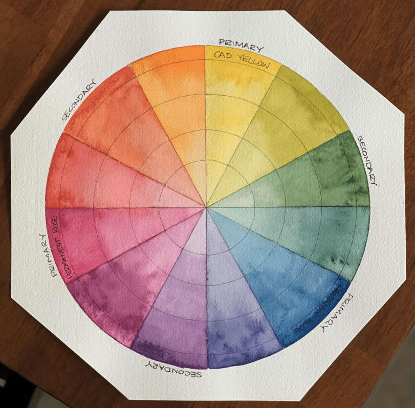
What Are the Complementary Colors?
So what are complementary colors? When you’re trying to find complementary colors, pick up a color wheel and draw a line from one color directly across to its opposite.
Here’s the full complementary colors list using a standard 12-color wheel, if you’d like to memorize it ahead of your next creative project:
- Blue and orange
- Red and green
- Yellow and purple
If you’ve worked with a color wheel before, you’ll probably notice that each complementary pair is made up of one warm color and one cool color. This is what ultimately creates the contrast—they appear brighter than any other pairing and so are perfect for catching the viewer’s attention.
Understand the Basics of Color Theory
Color Theory: Get Inspired by Color!
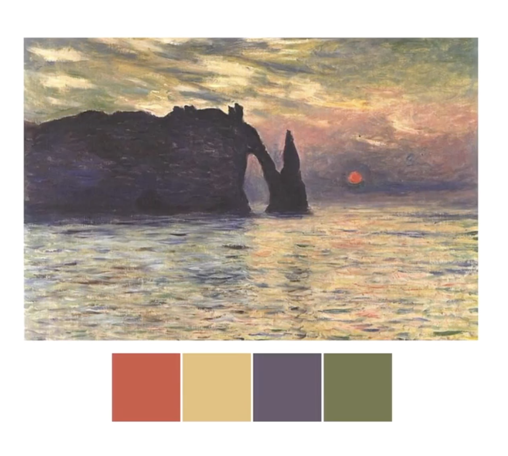
Examples of Complementary Colors in Art and Design
Complementary color combinations are usually incredibly bold and are often used in graphic design pieces to attract the viewer’s eye and keep their attention in a visually pleasing way.
Here are a few complementary color examples that demonstrate why this concept works so well.
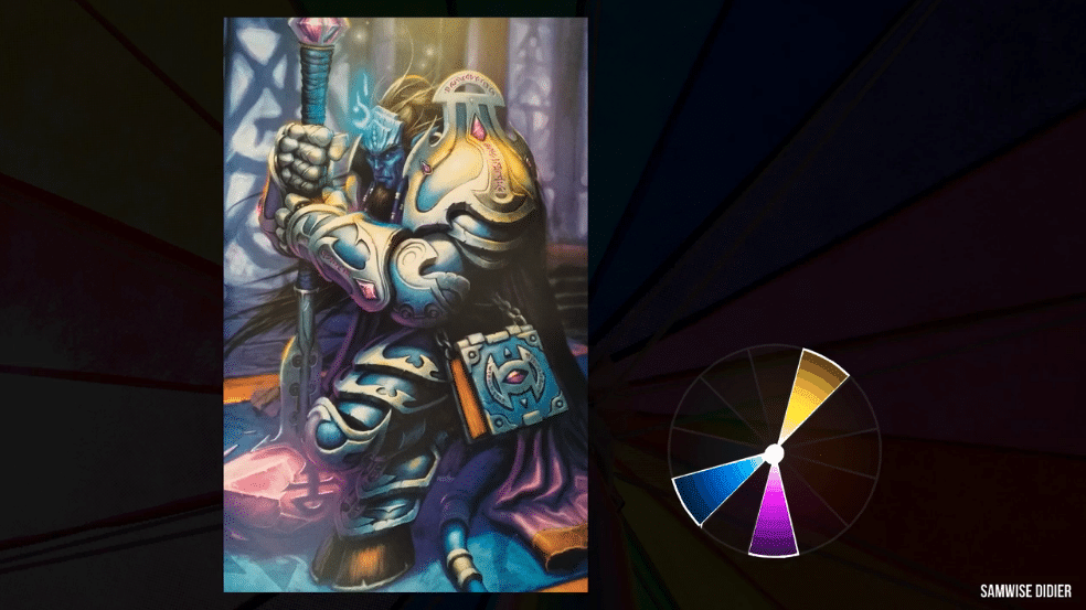
Classical Painting: Blue and Orange
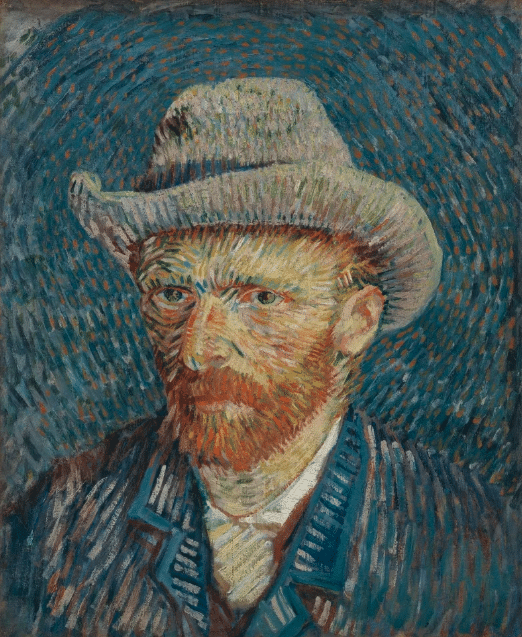
Van Gogh’s self portraits are a great example of using blue as a focus, with hints of orange to highlight features of his face.
Interior Design: Red and Green

A popular choice for the festive season, red and green are excellent complementary colors to use in interior decorating.
Product Photography: Yellow and Purple

Don’t feel that you need to go with exact match color wheel complementary colors. Test out different shades (for example, the deep purple of blueberries) alongside your primary color (in this case, yellow) to see what works best.
Graphic Design: Blue and Orange

Logos are a great place to use complementary colors—they’re bright and eye-catching, which makes them easier to remember.
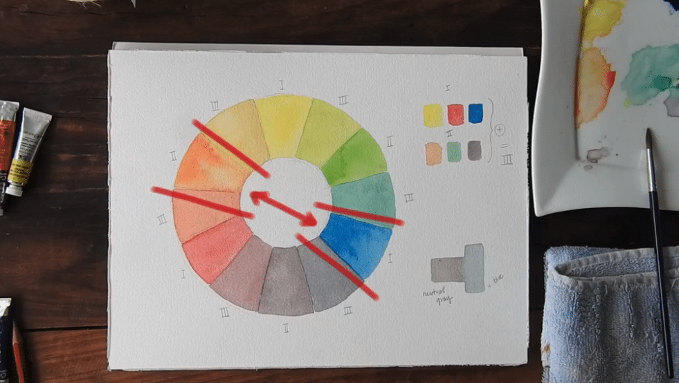
What Happens When You Mix Complementary Colors?
Exploring different color options to expand your palette is one of the most exciting stages you can get to as an artist or designer.
The easiest place to begin is to start mixing complementary colors together to create highlights or shadows in your work. Keep in mind that the more you mix your complementary colors, the more neutral the combined shade will become. Dig out your painting supplies and start testing quantities of each color until you find a shade you like.
What Are Split Complementary Colors?
One final concept to note: Split complementary colors are color combinations using a primary color and the two analogous colors (colors that are next to each other on the color wheel) to its complementary color.
For example, the complementary color of blue is orange, so the two colors you would use in a split are yellow and red-orange (since they’re on both sides of orange on the color wheel).
When you’re trying to find complementary colors but don’t want to go for something as vibrant as the true complementary color, splits are the perfect way to tone down the intensity of the contrast but still retain the visually pleasing aesthetic.
Explore More Color Combos
Color Theory: Color Combinations That Work
Try Skillshare for free! Sign up for a 7 day free trial today!
Get Started- Unlimited access to every class
- Supportive online creative community
- Learn offline with Skillshare's app


