

Embrace the 8 Essential Elements Of Graphic Design
Bringing balance to your designs is an art and a science. Master these principles to create visual communication that is both informative and aesthetically pleasing.


As a discipline, graphic design is primarily concerned with communicating an idea or message in a visual way. In order to do so, there are some key elements of graphic design that you need to be aware of.
The first thing to grasp is the basic fundamentals, including how these shapes and forms come together.
What Are the Basic Elements of Graphic Design?
Line, shape, form, texture, space, imagery, typography and color. Understanding each of these basic elements of graphic design in isolation will help you see how to bring them together and open a whole world of creative possibilities.
Line
Described as the building blocks of design, lines can be continuous or broken, straight or curved, smooth or zigzagged and beyond, and are used for more than just outlines or dividing up content. For example, they can convey movement or tie together your composition.
Shape
You’ll often use lines to create your own shapes. They can be geometric (usually drawn with computers or rulers) or organic (usually found in nature and drawn freehand). When you’re making your own shapes or designing a logo, don’t forget to lean on your software to make sure the elements are properly aligned and symmetrical.
Form
Making your shape three dimensional gives it form, which is another essential element of graphic design. Just like shape, you can have organic or geometric forms and these create very different impacts—geometric forms tend to convey order and can seem sterile, while organic forms feel more natural.
Texture
The surface quality of your designs is called texture, and it can bring another dimension to your piece. There are many ways to go about adding texture in graphic design, from making your own brushes to give texture to lines, to drawing your own patterns, using opacity masks to add grain textures or blending colors. Just be aware that adding texture to illustrations often needs a lot of computer power, so you need to have access to the right tools.
Space
You’ll need to think about both positive space (the focus of the design) and negative space (the background) while creating your assets. You can be really creative with this: it’s possible to use positive space in a way that recedes as your eyes track down the design, or to draw the eye towards a shape in the background with negative space.
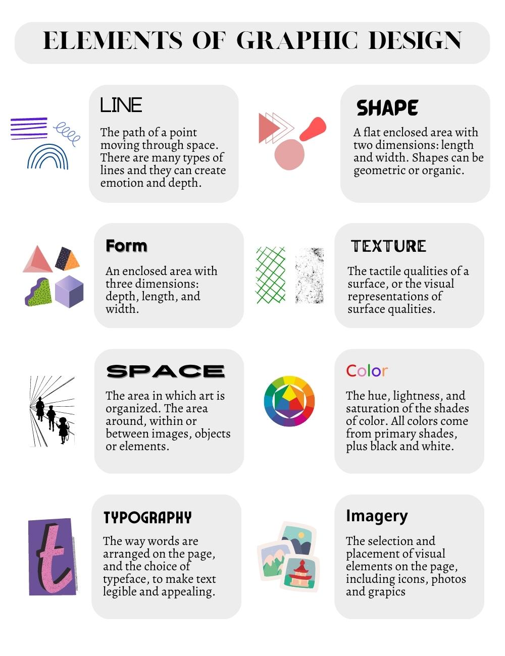
Imagery
If an image is worth a thousand words, knowing how to use them wisely will let you deliver the message in a more effective way. Your first step is to decide whether you want to bring a touch of reality with a photograph, use an illustration to visualize key information, or add icons to help viewers digest the message.
For a cohesive design, choose images that are contextually relevant, convey the right message and tone, and look authentic. That means steering clear from overly posed stock photography, low resolution images and anything that is too hard to understand in the context of your design.
When you’ve selected your image, there are a few ways you can manipulate it:
- You can transform its impact by cropping it. A close crop can give a more abstract feel, or play with the sense of intimacy, for example.
- It’s possible to play with the framing and positioning of your image. If you use a border to host your image, it’ll make it feel like a separate object within the design—but if you use a full bleed to extend an image all the way to the margins, it’ll seem more immersive and immediate.
- You could also edit the coloring of the photo so it aligns with the tone and color scheme of other graphic design elements.
Typography
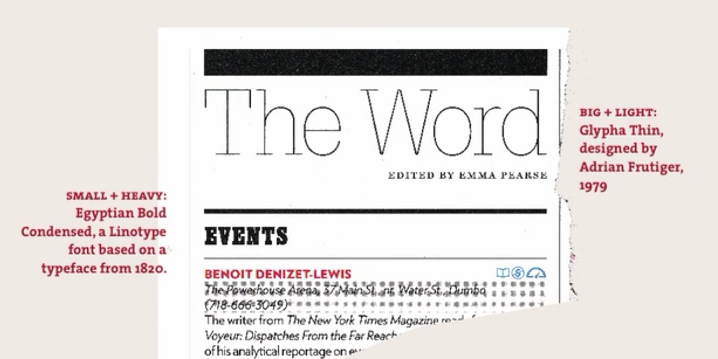
Many designs include some kind of copy on them, which means typography is another basic element of graphic design that you need to understand. It can be a challenge to get the balance between setting the tone with a stylised font and using something that everyone can digest.
When it comes to picking fonts, headers will usually call for a display typeface. These draw the most focus but are distracting and hard to read if used for blocks of text. This means that you should do the opposite for body copy and stick to serif or sans serif fonts, since they’re easier to comprehend.
Whichever typeface you choose, make sure there are variations in a range of sizes, weights and thicknesses. If you want to use small caps, for example, make sure the font offers this variation instead of committing the typography crime of simply reducing the size.
If you want to mix fonts, some experts warn you should stick to just two or three different styles, while others think you can be bolder with the range of types you use. The secret to mastering typography for graphic designers is to choose fonts with a shared characteristic to avoid your work looking confused.
You can also make bold choices about how and where you position your wording. You could use a dropped capital to start your copy and give a literary feel, for example. But to really excel in typographic composition, make sure you anchor the letters to the grid and align it to other elements on the page.
It’s good to remember that no matter which font you choose, you’ll be able to customize it by:
- Adjusting the space between the lines of text (the leading).
- Condensing or expanding the gap between characters (the tracking), but this tends to be used for capital letters only.
- Change the spacing between specific characters (the kerning), but this is often reserved just for headers in display fonts.
Color
You might think your options are infinite when it comes to choosing a color palette, but a key element of graphic design is understanding the color wheel and how to find the right shades with it. When selecting your color palette, you could go for complementary colors, triad colors or monochromatic shades, and try to stick to cool or warm colors instead of choosing a mix of the two.
Learning the graphic design theory of color and contrast is a worthwhile investment of time if you want to work with some bespoke palettes, but if you’re a beginner you may prefer to get the tools to do the hard work for you. Color Hunt has a lot of presets for you to choose from, with hex codes you can copy and paste into your design software. Alternatively, Coolers will generate color schemes until you find a shade you like, lock it, and keep generating options until you find the perfect combination.
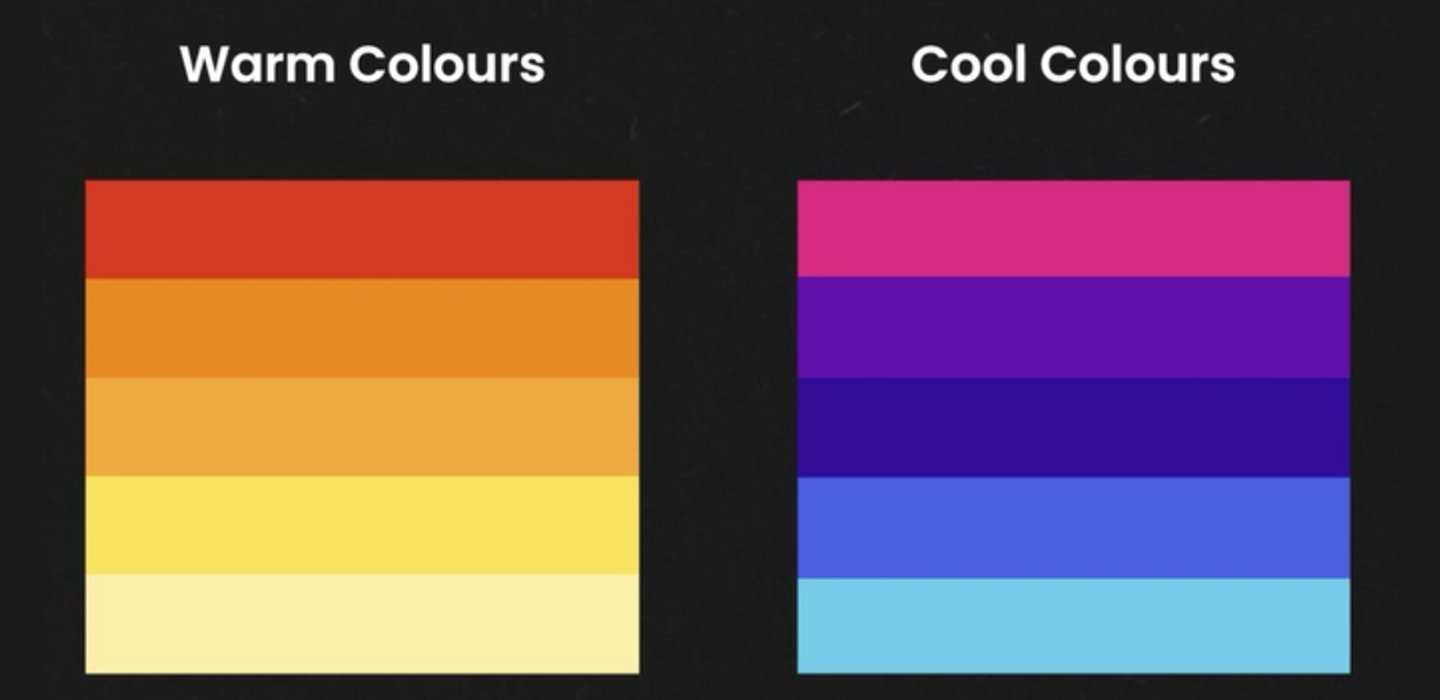
But before you settle on color choices, don’t forget to consider how your design will be used. For example, if it’ll be printed then sticking with simple colors will reduce the cost. If it’s a digital design with interactive elements, you need to think about hover and active colors as well.
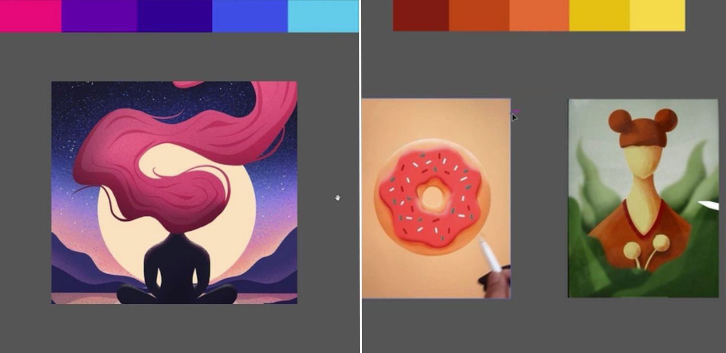
Alt: A composite image showing one design that uses pinks, purples and blues and two other images that use reds, oranges and yellows, to achieve very different impacts.
Designer and illustrator Sophia Yeshi adds color to her work as one of the final steps, using it to set the tone and mood of the piece. By defining her own color palette, she’s been able to create a portfolio that feels cohesive.
<a href="https://www.skillshare.com/en/profile/Sophia-Yeshi/919051993" target="_blank" rel="noreferrer noopener">Sophia Yeshi </a>covers the basic elements of graphic design in her Skillshare Original class, <a href="https://www.skillshare.com/en/classes/Great-Graphic-Design-Create-Emotional-Gripping-Typographic-Art/9403043" target="_blank" rel="noreferrer noopener">Great Graphic Design: Create Emotional, Gripping Typographic Art</a>.
How To Tie Together Your Graphic Design Elements
The next step is to understand how you can get each of these eight elements of graphic design to relate to each other and create a composition that makes sense.
Alignment
It’s always a good idea to start your graphic design on a grid that’s got the margins and gutters already set up. It’s the foundational architecture of your piece and will give you the raw guidelines on which to arrange your work.
As you start to lay down the various design assets, make sure you align them to each other, and the grid. Graphic design basics should never be underestimated—they can help your audience to take in the information you present and make it look more cohesive and professional.
Knolling
One of the most fundamental graphic design principles is to align your elements so they sit parallel or at 90 degree angles to each other. It’s called knolling, and it’s the secret to the pleasing layouts you’ve probably seen all over your Instagram feed.
Hierarchy
Using a visual hierarchy will give order to your design and help the viewer make sense of the content quickly. Instead of restoring to large fonts, which can come across as shouty, you can create a sense of hierarchy by adding little things to signal a difference.
Some simple ways to establish a visual hierarchy include:
- Scale. The eye is drawn to the biggest thing, so use this to your advantage and make sure that’s where you place the element that you want your audience to look at first.
- Color and contrast. Use bright or contrasting colors for key information, or use muted colors for things you want viewers to consider secondary.
- Contrasting styles and shapes. Grab attention by using a style or shape that feels very different from the rest of the design.
Balance and Symmetry
A surprising factor that can make or break a design is balance. There are three types of balance:
- Symmetrical, when everything is equally balanced. Humans tend to prefer symmetrical design, so this type of balance feels naturally pleasing.
- Asymmetrical, when the elements are different sizes and shapes but the design still feels balanced. It’s less comfortable for the user, which forces them to think twice about what they’re seeing and you can hold their attention for longer.
- Radial, when the parts are arranged around a central point. This draws the viewer to the center of the image and works particularly well for icons and logos.
Follow along as <a href="https://www.skillshare.com/en/user/ellenlupton" target="_blank" rel="noreferrer noopener">Ellen Lupton</a> and Jennifer Cole Phillips explain the relationship between symmetry and asymmetry in graphic design. Learn more in their Skillshare Original class, <a href="https://www.skillshare.com/en/classes/Graphic-Design-Basics-Core-Principles-for-Visual-Design/1539782161" target="_blank" rel="noreferrer noopener">Graphic Design Basics: Core Principles for Visual Design</a>.
Balancing Art And Science
While it’s very much a creative practice, you still need to know how to apply the key elements of good graphic design to ensure that viewers are able to take away your key message.
Instead of seeing these graphic design elements as restrictive rules, it helps to consider them as helpful tips and guidelines that can finesse your work. After all, you need to understand the rulebook before you can tear it up.
Graphic Design with Skillshare – Start Your Free 7-Day Trial Now!
Start Your Free Trial Today!- Unlimited access to all classes
- Graphic design classes for all levels
- Learn offline with Skillshare's app


