

Creating Contrast and Harmony with Complementary Colors
Complementary colors are the yin and yang of the color wheel, bringing balance and contrast to design. Discover how to use them to create eye-catching visuals.


Close your eyes and imagine a sunny, yellow duck gliding along the surface of a deep blue lake. Now, think of a goose soaring through an early morning, pink-hued sky. Notice how the wings of the goose almost blur into the background of the rosy sky, while the duck’s bright yellow feathers seem to pop out from the blue water behind him.
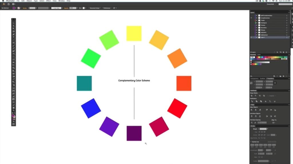
This contrasting color interaction is partly caused by complementary colors, which are colors that are opposite each other on the color wheel.
What to Know About Complementary Colors as a Creative
Creatives use complementary colors in artistic fields like interior design and fashion design because these color pairs create a striking visual contrast when placed side by side. Made up of one primary color and one secondary color, complementary colors can also be defined as an artistic tool that you can use to convey certain emotions, energy and moods within your art.
Red and green, purple and yellow and blue and orange are the three pairs of complementary colors.
Using a Color Wheel For Better Art
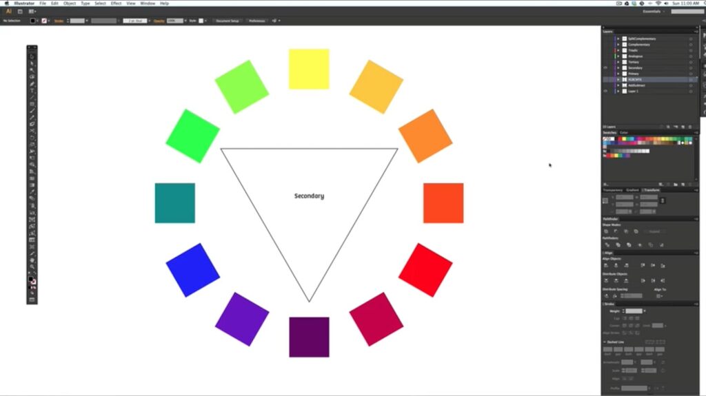
With its kaleidoscopic hues, the color wheel is a circular illustration of the color spectrum and the relationships each color has with each other. The visual tool shows the connections between primary, secondary and tertiary colors and acts as a color theory-based roadmap for painters, designers and artists who want to create art with feeling and visual intrigue. By helping creatives find harmonious color schemes, the color wheel can be used to help you find complementary colors and choose the colors for your new logo, living room design or battle of the bands poster.
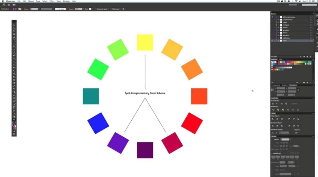
Exploring the Split Complementary Color Scheme
Creatives love complementary color palettes because they’re both high contrast and high impact. Two similar-hued purples will melt into each other within a watercolor sunset, but an abstract painting of a yellow circle on a purple background will pop off the canvas.
Split complementary color schemes are when you choose a base color and then the analogous colors, or the colors to the left and right, of its complementary colors.
In the color wheel above, the artist has chosen yellow as their base color and then blue-purple and purple-red as the other colors in their split complementary color scheme. This tool allows artists and designers to use complementary colors without so much tension and contrast. While the finished product will be less bright and attention-grabbing, it can create a more balanced and harmonious finished product.
Test your interpretation of complementary colors and split complementary colors by looking at these two paintings by Mark Rothko. Painting No. 10 uses split complementary colors while Untitled Painting uses complementary colors. Take a minute to notice how each of these paintings makes you feel and what imagery and memories come up for you as you observe them.
Creating Your Own Complementary Color Schemes
With complementary color generators, your color combinations can be both harmonious and eye-catching, which can help elevate you as a designer or artist.
Canva
If you’re looking to find the perfect complementary color to any hue on the color wheel, Canva has a complementary color generator you can use. By just selecting one color and then clicking “complementary” within the drop-down menu, you’ll get a pair of color codes you can use for your creative project.
Adobe Color
For an even more in-depth tool, you can check out Adobe’s color calculator. First, you’ll select any color within the color wheel and Adobe will make five-color color palettes based on a complementary color pair.
Finding Complementary Color Examples Around You

The vibrant world of complementary colors encompasses creative fields like advertising, branding and interior design as well as crafts like embroidery, sewing and painting.
Eye-Catching Logos
The better you get at spotting complementary colors in the world around you, the easier it will be for you to use complementary colors in your own work. Brands like Mountain Dew and Fanta and sports teams like the Los Angeles Lakers and the New York Knicks have used complementary colors to help their brands stick out on the grocery store shelves as well as on the court.
Harmonious Illustrations
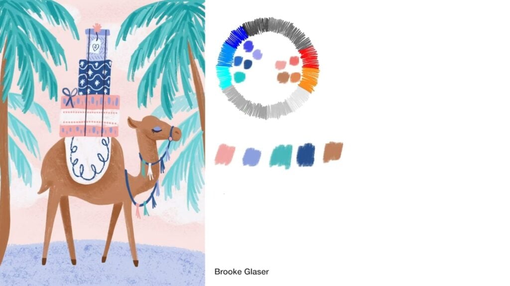
Sometimes the ways artists use complementary colors are more subtle than an electric blue paired with a fiery orange. Here the artist chose blue and orange complementary colors and then played with the different hues near and within the pair. A pale pink, sandy brown and periwinkle help better differentiate the objects in the illustration without creating a final image that is too discordant and in your face.
Impactful Photography
When working with complementary colors and photography, your job as a creative will be a little different. Instead of choosing and adding certain colors to your canvas or digital design, you’ll be searching for complementary color pairs already present in the world.
This might mean finding a man dressed in a green and red suit or a bright blue door against an orange brick home. Using complementary colors in your photographs can help get more attention and create interesting contrast within your shots.
Compliments to you, Complementary Color Master!
Complementary colors are a powerful tool that can help elevate any colors within design projects. From logos to clothing design, these harmonious or contrasting pairings can create dynamic visual effects.
To take your understanding of complementary colors even further, try experimenting with different color schemes on your own. Mix and match complementary colors in your art or search for complementary colors to photograph. With a little practice, you'll be a color scheme master in no time!
Calli Zarpas
Producer & Writer by occupation. Ceramicist & Newsletter Editor by avocation.
Try Skillshare for free! Sign up for a 7 day free trial today!
Get Started- Unlimited access to every class
- Supportive online creative community
- Learn offline with Skillshare's app


