Transcripts
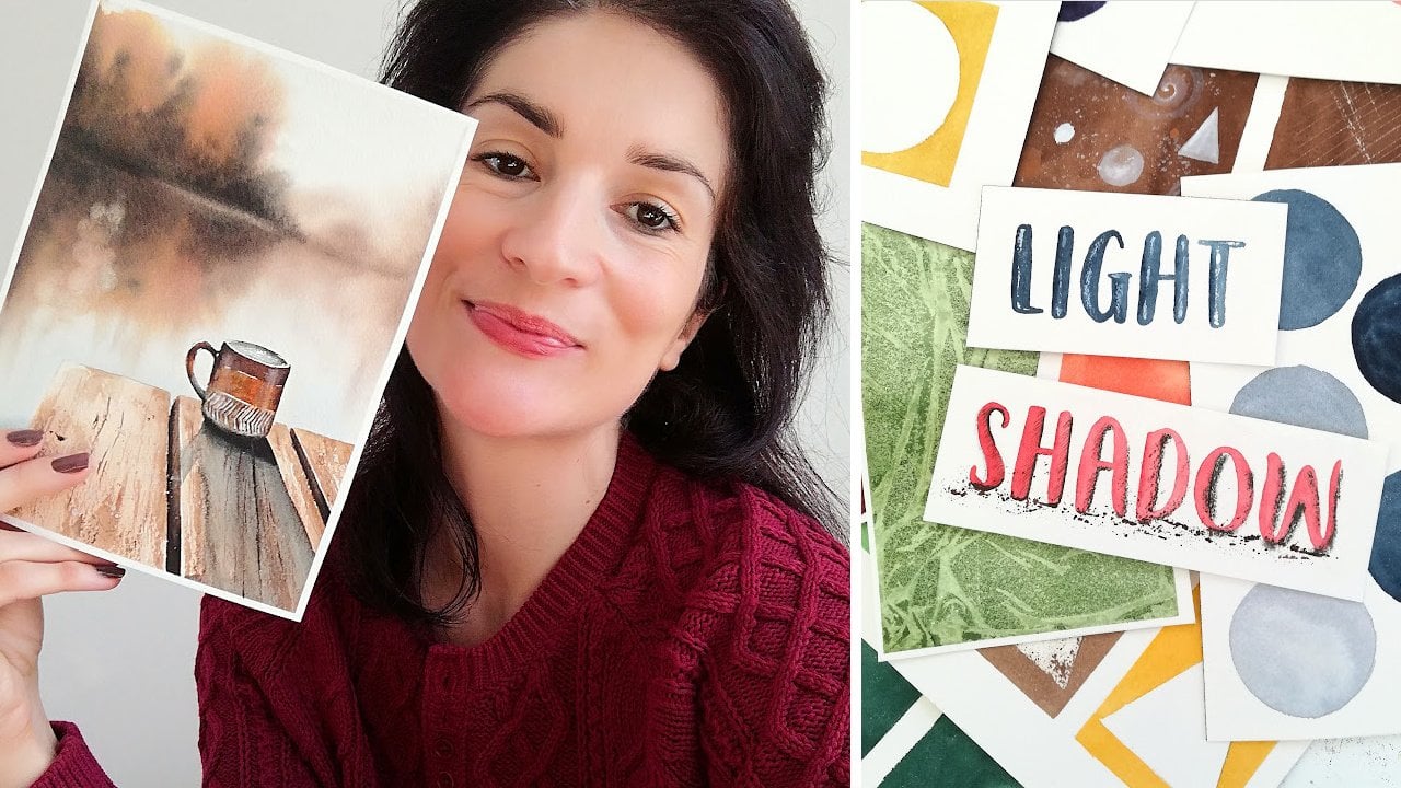
1. Introduction: [MUSIC] Do you own a watercolor pencil set
you have never used because you have no idea how? This is exactly what happened to my watercolor pencils
until I decided to study them and teach myself how to use them to
their full potential. Hi, my name is [inaudible]. I'm a realistic
arts teacher and I love to experiment with a
variety of art mediums. I created more than
500 art pieces within the past three
years and I had the opportunity to
partner up with several art brands and grow a large following
along the way. My art journey started out with a lot of
colored pencil work, and later I switched
to watercolors. Yet I couldn't figure out watercolor pencils
the first time I tried them and like many others, I just set them aside
and forgot about them. I know I'm not the only one and that's why in this
class you're going to learn the basics of
watercolor pencils so you can use them too, and see how fun and versatile
this medium truly is. I'm fairly new at creating
with watercolor pencil and yet I noticed basic techniques is all you need to get going. This is why first we will go through the supplies we need. Then I'll have you practice blending and layering
watercolor pencils, as this will set you up for success when it comes to
working with this medium. Later we'll paint the project, a beautiful apple
with a simple sketch, easy blending and
layering techniques and some fun techniques to add texture to a watercolor
pencil piece of art. This class will suit anyone who's interested in
watercolor pencils, and you do not need any experience with colored
pencil or watercolor. Instead, I encourage
you to join me on this fantastic watercolor
pencil discovery journey. Meet me next to learn more about the project we're
going to create. [MUSIC]
2. Class Project: [MUSIC] The class project is a realistic watercolor
pencil apple painting. With this class, I'm
going to show you how awesome watercolor pencils are, way faster than colored pencils, and so much easier
than watercolor. All you need to get
started and create gorgeous pieces are
the basic techniques. This is why we will be
focusing on the process of blending and layering
watercolor pencils, similarly to colored
pencil, only faster. Later we'll also be adding texture and we'll use a fun and surprising techniques for more of a watercolor-like experience only
even more relaxing. To make the most
out of the class, I recommend to go through
the exercises as they are foundational for
your understanding of how watercolor pencils work. You can also download my supplies list,
reference photos, and photos of the
finished artwork from the resources section
of the class. Please reach out in the
discussion section if you need any help and to share your project with me
and other students, you can post it to the project
and resources section. We're ready to start. Maybe next to learn about the supplies
we're going to need. [MUSIC]
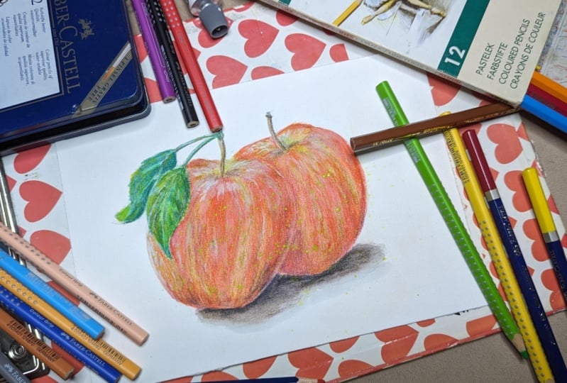
3. Supplies: [MUSIC] In this lesson, I'm going to show you exactly
what supplies to use for today's class and that work well for watercolor pencil
art in general. First, we need some
watercolor pencils. I have a Faber Castell Albrecht
Durer set of 60 pencils. These watercolor
pencils are some of the best and most popular
ones among all brands. You might also be familiar with the Derwent Inktense pencils. They are pretty
similar and excellent too even though
they're ink based. This is a comparison
between Faber Castell and Derwent using the techniques
I'll be teaching you today. Any other brand will
do to get started. So, do not worry
if you don't own Faber Castell or Derwent
watercolor pencils. Those are just my
preferences and suggestions. Be mindful, watercolor
pencils can easily be mistaken for colored
pencils and vice versa. Boxes are very similar
from one brand to another. Let's make sure it says
watercolor pencils on the box. My color picks for
today's project, are cadmium yellow lemon. The next one is a
deep scarlet red. This is a middle cadmium
red for shadows. This is indanthrene blue. Any blue that's not
too light will work since we will also be
using this for shadows. This one here is
a van **** brown. I recommend to swatch your own watercolor
pencils to better decide on the colors that fit this project in your
own paintings best. You can pull up a
reference photo of the apple we're
painting today, as well as a list
of the supplies from the resources section. Watercolor paper works best
for watercolor pencils. I found 100 percent cotton
cold press watercolor paper, gives me the best results. This one is Arches. It brings the colors
out a lot better and layering and
blending colors is easy. If you don't have 100
percent cotton papers, you can go for watercolor
papers that are cheaper, like the ones made
out of wood pulp. It will be fine as long
as they are cold pressed. Look at the difference here. I tried a cold pressed
paper on the left, which means it has more texture, it is grainy and colors
are vibrant and deep. I was able to layer easily too. On the right, I tried
a hot pressed paper, which means it's surface is very smooth and it was hard to
get the pigment to show. I didn't feel I can layer
the pencils that well, especially when I
tried a second layer. The reason for this is a smooth paper with
barely any tooth, like hot pressed
watercolor paper makes it hard for
pigment to grab onto. It becomes saturated very fast. We will need a small
sheet for practice, a seven by seven inches
sheet for the project, and a scrap piece of any watercolor paper for a technique I will
show you later. Two paint brushes will be
enough for this project, a round and pointed
paint brush at the tip like this silver brush black velvet and one
basic round paintbrush. Otherwise two simple
round paint brushes will do since there is not a whole
lot of detail on the apple. Notice the paint brushes
are neither too big nor too small for the paper
sizes we'll be painting on. A pencil and eraser will
be useful for the sketch, as well as some masking tape. Masking tape is not a must but useful and it will make it
easier to draw and paint. We will need one paper towel
to remove excess water from my paint brushes
and two jars of water, one to wet the paint brushes, one to rinse them after use. I'll be using a little
bit of white gouache. You can substitute that
with a white gel pen. If you don't have neither, you can still go ahead with
the project as we will use those for a few
final highlights only. I recommend having a
pencil sharpener nearby. This type is called the
mechanical sharpener and it's great for sharpening
pencils into a fine point. I'll be using my
heat gun to speed up the drying time between layers. A hairdryer works just as fine or you can wait
for the paper to dry. We'll be working
with little water, so that shouldn't take long. We're ready to explore
watercolor pencils. So, meet me in the
next lesson for our first very important
blending and layering exercise. [MUSIC]
4. Exercise 1 : Layer & Blend One Color : [MUSIC] In this exercise, we're going to learn
the very basics of layering and blending watercolor pencils by
practicing with only one color. As a learner, I found this is
a great exercise that will allow you to understand how
watercolor pencils work, because most times
beginners are confused about how to turn pencil
marks into watercolor. We will implement the techniques I'm going to show
you in the project. I highly encourage you to give this and the
next exercise a try. I'm using a small
piece of cold press of 100 percent cotton
watercolor paper that I taped to my workstation
using masking tape. [NOISE] Let's use red. The first thing I
do is to sharpen the pencil if the tip is blunt. A blunt tip is not bad since
we will add water later. But it won't let you deposit as much pigment as a sharp one. This paper is quite grainy, yours will be too if
it's cold pressed. We want to be able and get
into the nooks and crannies of it fast and a sharp tip
will help you do that. If you're used to
colored pencil, you might have learned
to color with care in small circular motions with a goal of having
only a few specks of paper showing at the end
and a very smooth finish. With watercolor pencils, it's a similar process, except we don't need to
be as careful and this is because the water will
help the blending later on. This is why I'm able to
cover the area fast, I apply some pressure and
I move in large circles. Circular motions,
avoid making streaks that might come through
after we wet this. [MUSIC] As we reach to the right side of the rectangle let's
press even less. [NOISE] I'm going to layer more color by repeating
the steps several times. [MUSIC] Each time I apply more pressure, but I also stopped sooner
to make sure there is less and less pigment as I get to the far-right
in this rectangle, well, building a nice
and even gradient. [MUSIC] This could look like it's
not going to be enough, but for watercolor
pencils it is. A little goes a long way. Color will become a lot
more intense with water. It's especially true with higher range watercolor pencils. We need to paint from the
lightest area to the darkest one so we can keep our
gradient looking accurate. This is very important
and in my opinion, the absolute foundation of a successful color
blending experience with watercolor pencils. If we do the opposite
starting with a dark parts, we will keep transferring all the pigment over to
those lighter areas, and this is not what
we want to keep our coloring effective once wet. I wet my paintbrush and
I dab it quickly on my paper towel so it's
not dripping with water. [MUSIC] I start with the area that is almost
white and I blend in circular motions
to help dissolve the pigments and help
pencil marks fade away. [NOISE] [MUSIC] It's helpful to wash the paint brush
often when blending. Otherwise it will just be
transferring pigment to the other parts when you already have all
you need on paper. You will see more or less
leftover pencil marks beneath the watercolor. This is a part of how
watercolor pencil painting is. That's what makes it different
from colored pencils or watercolor and this
is charming in a way. You will see how to use this to our advantage with a project. Be aware not all brands perform equally when
it comes to blending. If you're seeing many
streaks with your pencils, it could be because there are kind that don't blend as well. Otherwise it can be pressed
too hard when you're recoloring and you created some marks by
indenting the paper. Remember to keep
your pencils sharp, to color in circular motions, to vary pressure for
more or less pigment, to blend the light parts first, and to remove excess pigment often while blending by
rinsing the paintbrush. Great job with this exercise. You can share it with everyone
in the project section. If you want to share
also about how your watercolor pencils
behaved when you blended them, I'm sure this will be extremely
valuable to everyone. Let's move on to a slightly
more complex exercise. See you in the next lesson. [MUSIC]
5. Exercise 2 : Layer & Blend Two Colors: [MUSIC] In this second example, we'll be layering and
blending two colors. It's a bit harder
than what we did in the previous exercise since one color is bright and light while the other
one looks pretty dark. Let's sharpen these
yellow and blue pencils. I'd like you to
imagine before we start how this
kind of blue could completely overpower this light yellow during the
blending stage. This could cause a lot of beginners to give up
on watercolor pencils, and that's why we're going
to learn how to avoid it. First, let's start
with a light color. Previously we had to
rely on only one color, red, and we built a gradient by adding
more or less of it. Here, the gradient will take place through two
distinct colors. This is why in this exercise
we're going to simply color one half in yellow
and the other one in blue. I use a little bit of pressure and larger circular motions. [MUSIC] Let's do the same with blue. [MUSIC] We need to overlap blue
onto the other color a bit. It's important so the
gradient looks nice. [MUSIC] To make the blending with
water easier later on, I like to overlap the
light color over the top. We now have yellow, blue, and yellow again
all in one place. [MUSIC] I find that I need
more blue over there so let's add that. [MUSIC] Now like we did before, we can wet our
paintbrush and remove excess water so it's wet but
not dripping with water. [MUSIC] Blending yellows
alone is pretty easy. As we reach the area where blue comes into play,
it gets trickier. To keep it blue from mounting
the yellow parts too much, I make sure to avoid
back and forth movement with a
paintbrush, and instead, because blue is so much darker, I push the yellow and
blue pigment towards the left to keep the gradient
where I actually want it. Don't forget to rinse
your paint brush, especially with
changes of color. [MUSIC] We're done with our exercises. Please share them in the
project section of the class. Remember with two
or more colors, start with the light color. Overlap with the other colors. Layer more of the light
color over the top. Apply water to the
lightest color first. With strong dark pigments, avoid any back and forth motions and push them
away from light pigments. Now you know my secret of blending and layering
watercolor pencils easily. Let's meet in the next
lesson and draw an apple. [MUSIC]
6. Apple Part 1 : Draw the Apple: We're ready to get started on our project in apple painting. First, grab your seven
by seven inches paper. We will use masking
tape in two ways here. First to tape the sheet, so it's steady while
we've color and paint [MUSIC] Then we can use
it to trace a circle, which will be a
great way to draw the apple easily and
make sure it is centered on the sheet [MUSIC]. When you take a look
at the reference, you'll notice not all parts of the apple are perfectly
round and shape. We're going to use the circle as a base and adjust parts of it. I start at the top [MUSIC]. Then I adjust the sides, if this is not
completely accurate, do not worry because
the shape of an apple will vary
from one to the next. Here the sketches will make
our painting look realistic. Although ideally we want
it to be recognizable as an apple [MUSIC]. Let's erase this last lines [MUSIC]. Now we can draw the stem [MUSIC]. That's it, fruits are simple to sketch for a quick experiment,
I think they're great. Remember to use masking tape
to make drawing easier, to use objects around you
to trace certain shapes. To soften sketching lines
when they're too strong. I'll meet you in the
next lesson to get started with color [MUSIC].
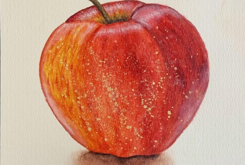
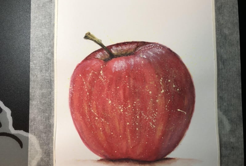
7. Apple Part 2 : Base Layer ( Coloring): In this lesson,
we're going to color this apple with the
watercolor pencils. Let's use yellow or green depending on what you
picked, and a bright red. I went for yellow and red
because when you take a look at the reference photo and you concentrate on the lightest
and the brightest tones, you will notice most parts
located on the left side and bottom are of very light red with a lot of
yellow patches showing. That's why it makes
sense to me to start with these two colors. Both colors are quite light, even though this
red will probably overpower this yellow
a bit when we blend, and this is why I
start with yellow. This way I make sure
I'll have it in all the spots I
want it to be at, regardless of stronger
and darker colors. Remember to work with
a sharp pencil for more pigment and
circular motions for a smooth drawing and new
streaks of color showing. On top, there's also a lot of yellow
showing in the stem, so I will apply it there too. With watercolor pencils, similarly to colored
pencils and watercolor, we can layer more colors even after we activated the
first layer with water. This means to make the
process in blending easy, I find it interesting to
start with the light colors and leave all shadows
aside for later. There could be other
ways to do it. I find this one more of a step-by-step and less
overwhelming approach that allows us to make
adjustments bit by bit. [MUSIC] Now let's cover
everything else in red. [MUSIC] Notice how I have my coloring follow along
the shape of an apple. [MUSIC] I add a lot of red onto
those yellow parts since we can only see patches for yellow
on the reference. I don't copy exactly what I see. It's not necessary for
something like an apple. I used a reference photo as a guide more than anything else. Don't be afraid to layer. Layering is great because it
will help intensify a color. For example, if you apply
more red pigments somewhere, it will become even more intense there when
water is added. With layering, you
can also create new colors and make this apple look more realistic
because of it. For instance, when I apply more yellow in places on top of red to tie both colors together for this base layer and
tone to the reds down, I can already tell
we're going to get more of an
orange color there. [MUSIC] Let's add more red
pigment in places here because I don't want all
red areas to look the same. Some should look more
intense than others. It doesn't really matter where, it's just nice to have
a variety of tones. [MUSIC] Let's work with brown now to
add the lightest shadows, just so we end up with
a good base layer. I'm adding a little
bit to the stem. [MUSIC] Then a little at the very bottom because there's a shadow there. We really want to keep this light and use
very little pressure. [MUSIC] I noticed there's a
little bit of red and yellow in that shadow,
so let's add them. [MUSIC] Finally, a bit more
brown here, [MUSIC] and also towards the
top because this is a hollow area and it makes
sense to make it a bit darker. [MUSIC] Remember to study
your reference photo, to apply a light base now, take care of shadows later, to match strokes to the
shape of the subject, and in this early stage, to layer as a means to intensify colors or
create new ones. Let's get ready for
some paintings, so see you in the next lesson. [MUSIC]
8. Apple Part 3 : Base Layer (Painting): [MUSIC] Welcome back.
In this lesson, we're going to activate the colors we just
applied to the apple. This is the most fun and satisfying part of working
with watercolor pencils, and it's surprisingly
fast to do. We want to paint brush like
so in one of the water jars, and then don't forget
to dab it quickly on the paper towel because we
don't need tons of water here. I prefer my round and
pointed one because it is better for detail than a
basic round paintbrush. Note that there is a
lot of detail here, but instead tight
spaces to get into and the fine tip will make it
easier to blend these areas. Too much water will
make it difficult to blend each area
of the apple with a control that we need to render the coloring
into watercolor. I start with a yellow
parts in the stem and then moving towards the
brown parts of the stem. Doing this the other
way around will muddy your yellow
parts with brown. Now we have brown pigment
on the paint brush. This is why we're going to rinse this in the second jar of water and dab it again on paper towel to keep
blending with clean water. Now let's activate this
light yellow area. Notice I take care to
outline this part of the apple as a way to
separate each area. I also take care not to touch
too much of the red part. Otherwise the yellow parts
will turn orange or red. [MUSIC] With red, it's the same. I outline the edge
of the apple first. Then I push red towards yellow, so both colors meet. [MUSIC] I add strokes of red
within the yellow part, just like the ones we can
see in the reference photo. Doing this reinforces
the impression of shape. Let's keep going. On the left side of
the apple itself, both colors are
already mixed up, so we're not going to try
and avoid one of them. Remember, these are
light colors that work well together and the way they appear here is okay to just paint over
the entire area. However, they are two things
to take into account. To make the apple realistic. First, we direct our strokes to paint the apple as if
he was a real one, and we want to avoid
back and forth movements with the
brush so we don't lose the colored
patterns and turn this into a flat and
solid orange mush. In the first exercise
I had to plan one single color with circular
motions to make it smooth. Here's difference since we have more than one color
and we want to preserve all the shapes and details we added one coloring. You can see this is working. We can see the texture
of an apple coming to life with fast,
clean strokes. I find this is one thing about watercolor pencils that
makes them so fun to use. Because when you know
how to blend them, it's pretty quick
and relaxing to do. You plan the outcome
with the coloring and make it come to
life with water. Unlike watercolor, harsh
paint lines that have tried to fast or not
as much of an issue. But we will still have a
few hard edges showing if we were to stop halfway
and finish blending later. [MUSIC] Do not worry about remaining pencil lines beneath
the watercolor. It is part of what
watercolor pencil is, even if some brands do better than others with
blending capacity. I learned to embrace the way watercolor
pencil work looks like, and I think we can
take advantage of those pencil lines to create more texture
in an art piece. For an apple like this one that there is not
much of an issue. The lightest part has
been taken care of. We can keep moving onto the red areas section
after section. [MUSIC] When it comes to
the bottom shadow, we're not painting
inside a shape here. Instead, the very bottom of the sheet should
remain white and we need to blend a pretty dark tone of
brown right next to it. To manage easily, let's once more move
from light to dark. Similarly as what we did
in the first exercise. With a wet paint brush, I start adding water underneath
the coloring and I move up slowly because the
closer we get to the apple, the darker the color
is going to be. By moving in this direction, we make sure to keep the
bottom of the shadow very light and the
top a lot darker. [MUSIC] I'm going to try this
with my heat gun. Remember to wet the paint brush, then remove the excess
water with a paper towel. To clean the paintbrush and
repeat when switching areas. To outline important areas
with a wet paint brush. To keep shape
accurate with stokes, to afford any back-and-forth, and to always move from
light to dark areas. I hope this lesson
helps you better understand how to use
watercolor pencil. Feel free to add
photos of your work in progress in the project
section of the class. Let's add some depth to this
apple in the next lesson. [MUSIC]
9. Apple Part 4 : Shadows & Texture (Coloring): [MUSIC] Our apple is
looking great already, but we could add some vibrancy
and a few shadows to keep a nice contrast to it and make it look all
the more realistic. This is why in this lesson, we'll be coloring
some more to place the shadows and increase
texture and vibrancy. We'll be using all five pencils. I add more yellow to the stamp. [MUSIC] It's still lacking shadow, but with brown, it doesn't come out so well and
it's a bit boring. This is why I picked blue. Blue is a cool color and it's perfect to bond with
red and yellow, warm colors, and add nice contrasting
shadows to our apple. [MUSIC] Let's add some in the hollow
area of the apple too. [MUSIC] More red, the dark
version of it this time as a way to add
subtle shadows in some of the red parts and also texture with more lines to
emphasize the round shape. [MUSIC] On the left side of the apple, since this is the lighter
one in the reference photo, I suggest you stick to the bright shade of red
from our vibrancy there and take advantage of layering to add lines
and more texture. [MUSIC] Towards the right, we can switch to the
dark red pencil because this area clearly is
darker on the photo. [MUSIC] Don't forget to layer both
shades of red where they meet to make sure the
transition comes out smoothly. [MUSIC] Let's add yellow
now on top of this. I insist on the left side
where there's more of it. I'm really looking
for vibrancy here. This is why I press harder
with a pencil at this stage. I want to fill out the remaining tooth in
the paper with it. It is okay to do now since we
already have a base layer. [MUSIC] Let's add a bit
on the right side too to tie these
colors together. [MUSIC] We're going to add a
little bit of blue to the right side of the apple
for striking shadows. We don't need too much of it. A little will go a long
way once we add water. [MUSIC] Remember to layer a second
time to add the vibrancy, shadows, and texture. To use a cool color like blue to balance warm colors
when possible. To add very little of
the darkest color, here blue, for subtle
but striking shadows. That's it. Wait to see
until we blend it all in. Let's meet in the next
lesson to do just that. [MUSIC]
10. Apple Part 5 : Shadows & Texture (Painting): In this lesson,
we're going to blend our second layer of
watercolor pencils, and I can't wait to see
how the apple turns out. We're going to proceed
exactly like we did last time we blended the
colors on this apple. Let's start with the stem, light greenish part first, dark brown and blue parts next. [MUSIC] Like we did before, we want to clean the paintbrush since there are dark
pigments on it now. In this area of the apple, remember we added a little
bit of blue for the shadow. I wouldn't want to muddy the yellowish parts that's above. I'm going to blend it first and avoid touching the
dark blue parts. Now we can blend
the darkest parts. [MUSIC] Finally, the red parts. Remember to move the
paint brush as if the area was round
like on a real apple. [MUSIC] I clean it, then dab the paint brush, and now we can move on to
the left side of the apple. We keep moving as if
this was a 3D surface, so our strokes emphasize shape
and help create realism. No back and forth, instead, we want clean strokes to keep all the coloring beneath from melting into one single color. I suggest to keep the
darkest parts the last. [MUSIC] You can see here how the blue
pigment we added is coming through and how it helps create
an impression of shadow. [MUSIC] At the very bottom of the apple, we're going to
blend the shadow in the exact same way
we did before. We start by adding water on the paper all around the shadow, and we merge toward to base of the apple where the
colors are darkest. [MUSIC] Great job on getting to this
point, we're almost done. I'll see you in
the next lesson to add the highlights
and some fun details. [MUSIC]
11. Apple Part 6 : Highlights & Final Details: [MUSIC] In this lesson, we're going to paint the
fun details and highlights. You will need a scrap piece of any watercolor paper you have, some white gouache, or white gel pen if you
don't have gouache, and the yellow watercolor pencil we used in the previous lessons. [MUSIC] Let's drop some of the white gouache on
the scrap piece of paper. We're going to
thin it a bit with water so it becomes creamy. [MUSIC] Next, I grab my
second paintbrush, the brown one I showed you in
the lesson about supplies, and I'm going to wet
this area of the apple. [MUSIC] Let's drop the
white gouache there now and clean up the edges with our round paintbrush to help them fade into the
painting better. [MUSIC] We can repeat this technique
elsewhere on the apple, where highlights are visible. This is going to
emphasize the shape even more and increase
realism in this apple. [MUSIC] Something very fun to do now is to splatter paint on the apple, to create additional
texture and add color. To do that, we need liquid paints so we
can make splatters. How do we get liquid paint
at a watercolor pencil? It's not as hard as
you might think. All you need to do is scribble on a scrap piece of paper with a pencil and then reactivate
the paint and pick it up. The only problem
is yellow is not going to show very
well on these reds. To fix this, let's mix it up with a
little bit of gouache. [MUSIC] I splattered the
mix all over now. It's perfect to create more of those little specks of colors that we can see on
the reference photo. When you splatter it, be mindful of the amount
of water on your brush. Too little water and the
splatters don't come out. Too much and the
splatters will be huge and dry, very light. If you're not sure, you
start with little water, try splattering and add a bit more if it doesn't
come out easily. [MUSIC] To add highlights
with the gel pen, simply tap the gel pen
in the lightest place. Because the wires that come
out of it are very sharp, I like to fade them
with my finger. [MUSIC] Remember to thin white gouache to create subtle highlights. To use a gel pen for
sharper highlights, turn them down with your
fingers if you need to. To scribble, reactivate, and use the mix as liquid
watercolor paint, to mix liquid watercolors to white gouache to
make them opaque, and to adjust the amount of
water for the splatters. Congratulations for
finishing this apple, please post your
finished project to the project and resources
section of the class, and see you next for
some final thoughts. [MUSIC]
12. Final Thoughts: Congratulations for
completing this project. Please post your painting to
the project gallery and let us know how you enjoyed working
with watercolor pencils. You're welcome to let me
know what you thought of the class with a review and if you'd like
to keep in touch, follow me here on Skillshare. You can also find
me on Instagram, and YouTube for more
about watercolor pencils. To connect there
and show your work, use the hashtag
createwithfrancoise. Thank you so much for
watching this class with me today and see you
in the next one.
 Francoise Blayac, Professional Artist