Transcripts
1. Welcome to Class!: This is not watercolor, not colored pencil, and
no, not pastel either. This is watercolor pencil. With this class, I'm going
to guide you through essential techniques to help
you paint anything you like. Hi. I'm Francoise, and I'm a stay-at-home
mom of four with a passion for watercolors
and teaching. I started sharing my process
online as a beginner, and fast-forward to today, I've developed my
teaching skills with over 20 painting classes here
on Skillshare, in Patreon, and a weekly watercolor class at my local art school and workshops that I host
and teach at festivals. With all the student
feedback that I gathered online and locally, I noticed that many of
us aren't enthusiasts, own a box of watercolor
pencils that we are not using primarily because there are so few resources on the
topic to even teach us. That's why, in this class, we're going to paint three
simple illustrations to explore and practice essential watercolor
pencil techniques. These are the techniques
that I've had to teach myself at first and that now I frequently use
in my paintings depending on the topic and the effect
that I'm looking for. First, I'll show you
what supplies you need, then we'll sketch our
illustrations, and from there, I will guide you throughout the entire process of creating a finished piece with
10 techniques that built on top of each other
flawlessly for the class, but that you can mix and
match in any painting. This class is ideal for
anyone who wants to learn to use watercolor
pencils effectively and make the most out of them. Aside from practicing, a beginner will leave
this class with a great overview of what can be achieved with
watercolor pencils, while someone with a
little bit more experience will learn new tricks, new techniques, and the
most effective ways to use this amazing medium. Join me in class and
let's get started.
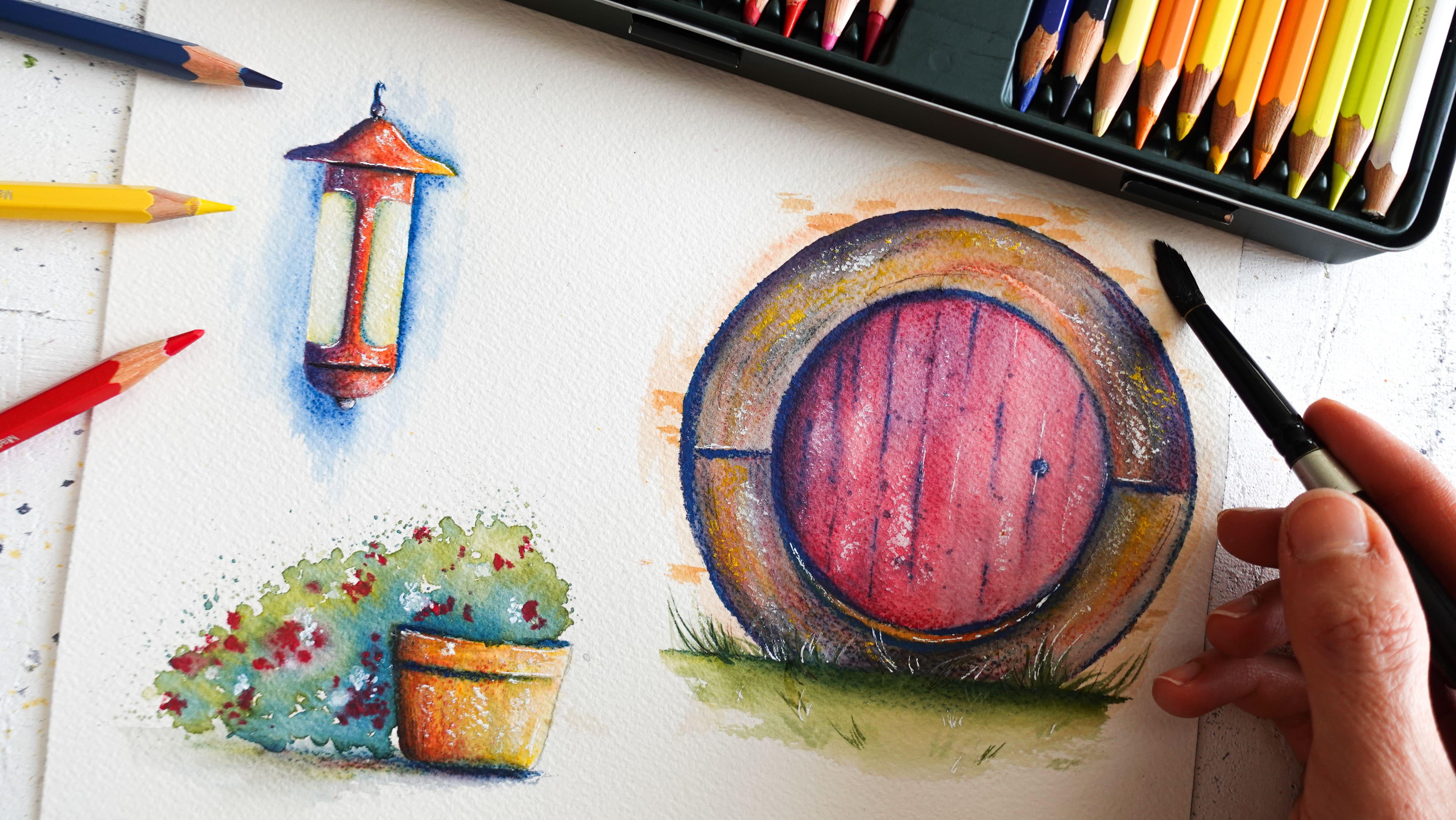
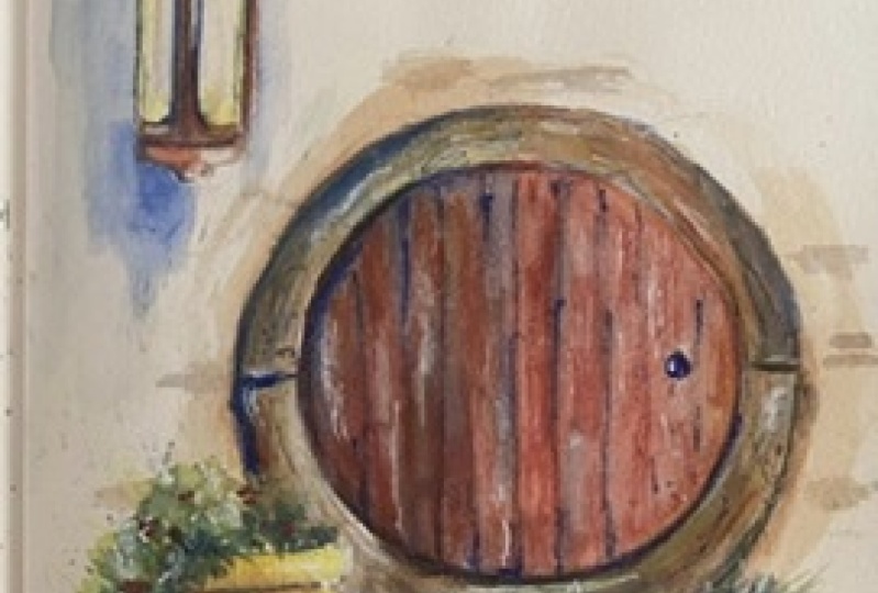
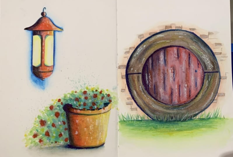
2. Your Class Projects: In this class, you'll
get to learn to paint three simple projects, a lantern, a flower
pot and a door. Three small projects. It's easier for you to
explore all techniques and see how you can apply
them to different subjects. As you might have noticed, these illustrations are inspired by the habitat and
village in New Zealand. It's a place that can
actually be visited. It gained a lot of popularity with Lord of the Rings
and The Hobbit movies. You can download their
free stock photos, I used to create our projects, as well as the list
of the supplies, the line art and a photo of my painting rise in
the resources section. When you're ready,
just have a photo of your art download it to
the project section. If you feel like it,
you can even share the process with us and
ask me for feedback, we're ready to get started. Let's meet Max to take
a look at the supplies
3. Useful Supplies: In this lesson, I'm
going to talk to you about the supplies
that you will need to paint absolutely anything that you want with
watercolor pencils. That includes the projects that we're going to paint today. Remember that there is
a list of supplies in the resources
section that you can download to find
all the references. The first thing we'll
need is watercolor paper. Today I'll be using some
actual watercolor paper, is 100 percent cotton paper, is 300 grams per square
meter and it's cold press. You can very well use a cold
press or hot press texture, which would be a lot
smoother than cold press. It's fine with
watercolor pencils. I wouldn't recommend
a rough texture because it will be
very hard to color. Otherwise, some mixed media
paper works well too. Usually those mention
that they're okay for a light wash of paint so you know that watercolor pencils are going to go well on those. For today's project, the
sheet we'll be working with is 7.8 by 9.8 inches, which is 20 by 25 centimeters. We will need a scrap piece of watercolor paper
or a mixing pad. This is just plain
watercolor paper that I know that I'm
not going to be using, I'll just throw it away. I'm going to use that
if I want to work with watercolor pencils to create
little swatches of paint. I'll show you how that
looks like later. Or you also have the option of purchasing a palette
like this one. Caran d'Ache makes that one. That's really awesome because
you have two sides to it. There's a smooth side where you can mix just regular
watercolors, gouache, things like this. Then you have a rough side, which is really great
for watercolor pencils, but also for water
soluble pastels. In today's class,
I'm going to be using this palette primarily, but you can very well use paper, anything that you have at home. As you might have guessed, you'll need watercolor pencils. The ones I'll be using today are my favorite watercolor pencils. They're the Faber-Castell Albrecht Durer
watercolor pencils. They are an awesome
quality. I love them. One thing that I want to
bring to your attention is that not all watercolor
pencils are equal. Some cheaper brands
are not as great. The layers will
break more easily, they will be dry and very hard to deposit on paper
and not very pigmented. While mid to higher
priced watercolor pencils like the Faber-Castell
Albrecht Durer, the letter more sturdy,
they're creamier, they're more pigmented, they're just easier to paint with. Just be aware of that. But in this class I'll be showing you some
techniques that you can use with cheaper brands as well and still get
great results. The colors I picked for
today are very basic. You'll notice they're
the primaries. We have red, blue, and yellow. I'll make sure to list
the precise reference and name of the colors in the supplies list that
you can download. We also have white. If you don't have the
exact same shades of red, yellow, and blue,
it's absolutely fine. We'll be using blue
for the shadows. If your blue was to
be a very light one, you could still add
brown or black. There's many options. You don't have to go exactly
by what I'm doing here. One thing that's
useful to have is the white pencil
to add highlights, but if you don't have that, we can still substitute that with white gouache
or white watercolor. For paintbrushes I'll be using
my favorite silver brush, black velvet paint brushes
sizes four and eight. I love them because they
are round but they're also pointy at the end so
for details, it's great. For small illustrations
they work very well. Then I also like to have a round paintbrush
like this one. This is going to be useful
for things like splatters. That's why I'm including it. Any paintbrush that you have
that's going to be small enough to cover the area
inside our illustrations, it's just going to be fine. Don't worry about getting the exact same
things that I have. Then for watercolor pencils, you need one jar of water. You can have two if you like, but usually the water doesn't get that dirty with
watercolor pencils, unlike watercolor,
so one is enough. Then paper towels
are always useful. You'll see that I use them a lot for blending
watercolor pencils. I'll show you exactly
how to do that. Masking tape is one of my favorite tools to
use with everything, watercolor and
watercolor pencil. You'll see that I
won't just use it to maintain the paper
into place today, but also use it to draw. Whenever there are pencils, there are pencil
sharpeners and I have mine ready here
in case I need it. For the sketches, we'll need a regular pencil and
ruler and an eraser. Completely optional but
useful is a white gel pen for highlights and also fine liners for little shadows
and little details. Optional as well is a
heat gun or a hairdryer just to let the paint dry a little faster than
it normally would. With watercolor pencils,
usually the paint dries fast, so I don't always use it. I like to have it just in case
4. Let's Get Ready with Sketches: It is time to draw our
sketch in this lesson. First, I'm going to tape the sheet onto the
surface I'm working on. [NOISE] The masking tape really helps me paint without worrying about
the sheets moving around, that's the only reason why
I'm going to use it today. Then we'll need a pencil, a ruler, and an eraser
to start drawing. We're going to draw a lantern, a flower pot, and a door. You don't have to draw them all on the same sheet if
you don't want to, you can even use a
sketchbook if you like. I just thought it
would be nice for today to use a larger
piece of paper and how all three elements elegantly positioned all around. I'm going to start with a
lantern and the flowerpot. They're going to be
on the left side, and then we'll place the
door on the right side to create some a balance
between all three. With a lantern, we're going to start with a horizontal line, so we want to place it
towards the top of the sheet. I'm careful not to press too
hard because I don't want to indent the paper in
case I need to erase. This is my line. I'm going to
find the middle of it now. I'm drawing a vertical line, and it's going to be
longer than this line here because the lamp is pretty
narrow and elongated. I really wanted to
render that look. Now let's draw a
horizontal line again, it's going to be a shorter one than the one that you have here. This is the main
body of the lamp. I trace each line on either
side of the main one here. Now we have this, we
can finish the lamp. Then a little circle on top. I'm erasing those lines. Now I'm doing the
same at the bottom. This looks like half a circle. Then I can add another half
circle here, just smaller. Now we need to finish the body. I took inspiration from reference photos that I linked
to the resources section. If you wanted to have a look. This was actually a
very small lantern on the photo and I wanted to
work on it a little better. That's why I made it bigger. Something you can do you don't necessarily have to
copy a photo exactly. You just take elements that you like and just focus on them. There we go. Now we can
erase this main line here. That's it for the lantern. I decided to position the flowerpot on the
left side as well. But I want to create some a
balance between all elements. I'm just going to place it to the right
side and a little more. Here again, we want to trace a horizontal line and
find the middle of it. Trace a vertical line
and there you can decide how long
you want it to be, then the shape of
your pot will change. Now I'm tracing another
horizontal line down there. I just wanted to be a little shorter than the one up here. Now I'm just going
to link those dots. Here we go. We have
our main shape. We can erase the main line. What I like to do
is give this plot a little more realism by just
making curvy lines up here. We can add some detail. You can customize
this as you wish. You can also make the corners over here
a little more round. You'll notice the
spacing is similar between the top of the
lamp here and the sheet, as well as the bottom of
the pot and the sheet. I didn't measure anything for it to be precise, but usually, you can tell where things
should end and start. Now you see that the middle
of our sheet is around here. That is where the
door is going to be. It's going to be centered
right in the middle. I'm going to use my
masking tape whenever I have an object at home that
I can use for my drawings. I love to do it. I'm
trying to center it. We're not looking for
perfection at all. I'm going to use the
inside to draw the door, and the outside to draw
the wood around the door. The frame, I guess you
could call it. There we go. We can also draw the knob. That is really all we need. We don't need to draw on budget, It tells some
watercolor pencils. In the next lesson, I'm going to show you
a first technique to start filling up those
pretty shapes with color.
5. Color and Paint: In this lesson,
we're going to go over a common technique for watercolor pencil that
everyone should know about, is going to be useful at
every stage of the painting. You'll see that we can leverage
that for certain effects. We're going to start
with a lantern, and I'm just going to use
my three primaries for now. I decided that I wanted my
lantern to be mostly red, so that's what I'm
going to apply. You'll notice that my
pencils are sharp, but they don't need to be
for watercolor pencils. They can be blunt
if you want for coloring and that's because we activate them with
water afterwards. We don't really need to
fill out all the nooks and crannies at first the water
is going to do that for us. I don't press a
whole lot either. These are creamy pencils, so the pigment comes
out pretty easy. If I want an area to
be a little lighter, I just either add no
pencil and I'll pull the paint over there
later with water. Or I can just press
less and less pigment. I'm going to keep going. What I love with this
technique is that you really get to see where
the coloring is going. At the end of this, you should be able to tell
what your illustration is going to look like because all the main
colors should be on there. A good thing to do
is to overlap colors so you don't end up with
one block of solid color. It's just nicer when there are several shades in the painting, and here if I add a
little bit of yellow, this is going to turn
into an orange shade. We're going to have a nice
gradient between red, orange and we can add
more yellow elsewhere, for example over here, because I didn't
add that much red. I really tried to
build a gradient. You'll see that
overlapping color really helps with
realism and harmonious beautiful paintings,
really important. Usually paintings or drawings, even now just one color tend to look a little
more cartoony. That's why I really
love to overlap. Now you might notice we having a little problem and that's that we do not see the lines that we traced
earlier that much, and that's why I'm going to start using the blue color now. I'm going to start
marking those lines that those are going
to be shadows. I don't want to overdo it, be careful with blue because blue is just great for shadows, but it also is
very overpowering, so you don't add too much. I'm just adding a little shadow
here over there as well. Here, for instance, I
completely lost my line. If you feel the need to do that, you can go over this again with the main color
which would be red. Especially if you
added a lot of blue, you don't want blue to overpower
that painting too much, so adding more red
on top will make it a little more red than blue. This looks pretty good
and like I said before, you can really see where
the coloring is going here. Now I'm adding a little
bit of yellow where the glass panes are and we really don't want
a whole bunch of it. Just a little try and leave some of the areas
here totally blank. We're done with the
coloring of this lantern. Now the coloring is done, you want to grab your water jar. You also want to have
your paper towel nearby and we're going to work with
one paintbrush for now. I'm going to grab the smaller one because this one is going to be the best one to paint
in these tiny areas. We're just going to activate
the pigments and for this, you'll need to rinse
your paintbrush first then and that's very important to blend
watercolor pencils don't have a bunch
of water in there. You want to keep
the control and you want to make sure the
pigments blend in, in the way that you apply them. I'm just going to
dab my paintbrush on my paper towel to get
rid of the excess pigment. Then I'm going to start with the lighter parts to make sure I don't dirty the yellow parts
here with the blue parts. I'm just starting here. Because my pencils are creamy, pigment really dissolves
well and is very vibrant, as you can notice,
it will not be the same with all
watercolor pencils. Now I have a lot of pigment
on my paintbrush and I'm moving towards another area
that's going to be more red. I'm going to wash my
paintbrush, I rinse it, and then again, I dab it on the paper towel
and I keep going. With watercolor pencils, you really want to blend
section after section. You can take your time. This is not watercolor,
it's very different. Again, this is getting darker, so I'm going to
rinse my paintbrush, dab it on the paper
towel, and keep blending. There's a little bit of texture that's visible underneath from the pencil scribbles and
it's actually very pretty, has this term to me looks
rustic, so I like it. That's an effect
that you get with watercolor pencils that you will not be getting with watercolor. Now I'm repeating
this but on top here, rinsing my paintbrush
every time and then again. You see the shadow is
really visible with blue, it really does a good job at
adding shadows and contrast. That's why I feel like the three primaries
are often enough. We even get some
purplish tone here. I keep rinsing my
paintbrush and blending. I started with the lighter
colors and now I'm moving towards the darker parts. I keep going. For the very light areas here, make sure that your paintbrush
is completely clean. I rinsed it very well. Then because I have
a lot of white parts and I want them to stay white, I'm going to start
applying water right there even though
there's nothing. I'm going to start
on the white areas and then I move towards
the yellow areas. I keep rinsing my paintbrushes because there's a
lot of pigment. It's pretty pigmented, vibrant, and I don't want too
much vibrancy on there. I want it to be subtle, so it's okay to add more water. If like me, you added a
little too much pigment. See I'm just rinsing
my paintbrush. I dab it on the paper towel and I go remove some paint
while it's still wet. I press it at all. It helps me make
this part lighter. We can even press harder to get the white
of the paperback. I'm going to do the
same over here. This looks pretty good. This technique is great for
small areas as you can see, for maximum control and
for predictable painting. The downside of
it is it can give you a slight streaky look, depends on the quality of
the pencils once more. But it's also charming and there's a little
rustic feel to it, so it depends on what you like. In the next lesson, I'm going to show you
another technique to paint a base layer with a different
look and no streaks.
6. Activate Your Pencils Lead: In this lesson, we're going
to use a fun technique to apply a base layer
on an illustration like this or any painting
and you'll see it's very different from this
first technique I showed you before
with the coloring. Here, you will need
the same pencils, but this time we're going to activate the paint
right from the lead. You'll need a small paintbrush
once more, you wet it. Then I'm just going to keep
all three of my pencils in hands and I'm going to wet
the lead here directly. I'm picking up paint
right there from the lead lead then I'm going
to apply it to my painting. You can see it's very
vibrant, very pigmented, a little too much to my taste so I'm just going
to dip my paintbrush in the water and I'm going
to pull that paint over to the side to
create a gradient. It's interesting to
use that technique of the gradient by just
adding more water. You can clearly see it here. The closer we get
to the right side, the lighter it gets. I just rinse my paintbrush and I'm going to go in with red. I'm just going to
add a little bit. You add it wherever
you feel like. I wouldn't recommend to cover
up everything you've done before with yellow just so you have several colors showing. I rinse my paintbrush if I feel like I have too
much pigment on it. Make sure it's not too wet, so you dab it on paper towel, and then you can move
the pigment around, create a little bit of texture. Now, let's add a little
shadows with blue. Remember it's a
very strong color. I'm going to have to rinse
my paintbrush often and make sure it's not full
of water, and I repeat. It's better to do that when the paint is still wet
from the previous colors. You can even add a
little bit of blue, blue paint up there. I'll add some florals later on, but I still want the hollow
area up here to show. Then while it's still wet, maybe I'll add a little
bit of blue down here, but really not much. You can see that this was a
very fast technique to use. It's great for small areas, it's fast, and it's smooth. It really looks
like watercolors. Now, it's not as great
is that for large areas it will be very tedious to
work with the pencil leads. You can see the paint
is also very light. It will need more definition. When you compare
it with a lantern, there's a lot more vibrancy
here, a little more pigment. Here, we added more water so
it's just not as visible. But don't worry about that
because we'll fix it later, as you might have a guest. In the next lesson, I'm going to show you
another technique to blend watercolor pencils for
larger areas like this door.
7. Make Smart Swatches: In this lesson, we're
going to explore another technique to
bend watercolor pencils, to add a base layer to painting, and with all three
ways to do that, you will be equipped to
paint absolutely anything, absolutely any base
layer you want for any topic that you choose. We're going to start with
our palette if you have it, or a piece of paper. I'm going to demonstrate
it with a pallet is exactly the same with a
paper so don't worry. We're still going to be
working with our three colors. This time I'm going to grab a bigger paintbrush just because the door is
a little larger, so it will be easier
for me to paint so you have to decide whatever
fits you best. I'm going to be
working on the rough side of this palette. What we're going to do
is create swatches. [NOISE] I start with yellow, [NOISE] then I'm
going to use red, [NOISE] and finally blue. [NOISE] Remember we're still working with one paintbrush, a few paper towels, and a jar of water. That's all we need to apply watercolor pencils and
blend them together. I've decided that my door will be red and then I want to add a little bit of blue in it
to create purple tones. I'm going to wet
my paintbrush and then I'm going to activate
the wet paint here. You see that I don't
need a lot of it, a lot of pigment to actually
create a nice swatch. Now what I'm going to do is
apply directly on my drawing. If it's very saturated, if it's hard to paint with, just dip your
paintbrush into water to add more and you'll
see it gets a lot easier, a lot faster, and it's a little more
like watercolors. I'm using the same
principles I used before so I keep dipping
my paintbrush in the water and I pull the
paint over to the right side, and that creates
a nice gradient. I'm trying to do this fast because I don't want
the paint to dry. I want to have time to add
another bit of blue in it. Now I have this, I'm
just going to rinse my paintbrush and go
and activate blue here and then apply it
directly in the red paint and you can see how
beautiful this is and how well colors I'm
mixing together. I can start making
little strokes here to mimic the wood
planks in the door. The more I get to
the right side, the least I add. For a base layer, we don't want to overdo it. This is already very good. We're going to add more
to it anyways later. Now, I'm going to mix all three colors to create
some a brown shade. It's going to look like wood. Now will be the frame
all around the door. You have to try different
amounts of each color to see what yields you
the best shade. Here I get orange, and if I add a
little bit of blue, it gets a little darker, turns into something
that's brown. I keep playing with
all the colors and this looks satisfying. Again, I don't want it to
be too dark, too fast. I'm just going to
apply this all around. If you're concerned
that the paint in the middle is not dry yet, you can leave a little
bit of space in between the door and the paint. I'm not worried about it
too much because I know that I'm going to
come back on it later and just add to it. We're going to create
shadows there. It doesn't really matter if the paint bleeds
in a little bit. I try to switch from
one side to the other so the paint doesn't
have time to dry. Because if I just keep going on this side is going to dry there, we're going to have a line. So I just keep going
from one side to the other until both ends meet. Now, I want to add
a little bit of a wall effect all
around, not much. I'm just going to blend
red and yellow together. There you can grab
another paintbrush. We're going to work
with two of them. On one of the paint brushes, you have this orange color that you just created
with red and yellow. Then your other hand, you have that paintbrush
that's clean. We're just going to wet it. We're going to make sure to
remove the excess water. Then we're going to apply
a little bit of paint, then we can fade the
edges if we want to dry. I'm re-wetting it again. You fade the edge like this. If you don't have to do this, you can also create
nice effects like this, for instance, or you
can do a mix of both. I like to mix both types. Strong, harsh lines here
and faded lines over there. You see some parts are a
little larger than others. I like it to not be
the same everywhere. It just looks a little
nicer when you look at it. Realistic art can be hard in the sense that you have to find a balance between making things
look like what they are, but at the same time not
being too perfect about them. Being little loose
without being too loose, just depends on what you like. That can be achieved
with practice. Then you can find your own
style and see how much realism you want and how much of
a loose effect you want. I really like that. I think it looks really nice. I'm just going to
leave it like this. You can see that this technique with a pallet or the piece of paper is great for larger
areas much faster. It also will help you achieve a very smooth watercolor like effect where colors are
able to mix together. You can paint skies with it, you can really do anything, paint water and it will
look like watercolors. That's the beauty about it. Now, a downside with this
technique is that you can see there is less vibrancy once more because we
were using more water. That means we'll
have to come back later and add more
with a pencil. That's actually what
we're going to cover in the next lesson with layering.
8. Add Some Layers: In this lesson,
we're going to talk about layering and
actually practice it. Layering is just adding a coat of paint on top
of a previous one. You need a base layer
like this, the case here. What you want to be
aware of is that the paintings need
to be completely dry, it's the case with mine. If yours are not dry, make sure to dry them with a hairdryer or a heat
gun or something. We're going to use our
three colors again, we'll keep white for later. Right now it's just
still the primaries. I'm going to sharpen the
layers a bit because when I wet them earlier
with the second technique, it melted them a little bit. [NOISE] Remember, you don't need to have
very sharp layers. They can be blunt. Of course, for smaller
illustrations like this, it's easier if the layers
are a little bit precise. For large areas like a door, for instance, it wouldn't really matter if the layer was blunt. Now, the goal of layering is really going to
be to emphasize the colors and the
shadows where we want them so that the painting, especially these two, are not
as bland as they are now, because right now
they're boring. They need a little bit more. Even that one could use
a little bit of shadows. We're going to start with blue. I actually feel like
these areas here are a little bit too
much of a one-color, it just yellow and I want
to add something else. I'm going to add a
little bit of blue, tiny bits, because it's
going to turn into green. I really don't
want to overdo it. I'm just adding that
in the corners. Now what I think would
be really nice to make this lantern a
little more 3D is, first of all, to add
a little hook here. Blue is a great color
since it's so dark. Then to also add shadows all around just to get the
impression that the lantern is close to the wall
and it will make these light areas here
stand out very much. I don't press a lot, so I just add a
little bit of blue. Remember, this is going
to turn into something very vibrant when
we activate it. You can see already how this part stands out
a little more now. I'm going to add a
shadow down here. There are areas where I
press a little bit more, just depends on the
effect that you want. I think it's good. Don't forget we can pull
some paint when we wet it. Now, with a pot,
I'm just going to do the same and add some colors. I don't want to go
straight in with blue because we really need to add a little bit more
yellow and red here. Depends, do you want to add
more yellow or more red? I think for a change, I would like this to be a
little more yellow than red. I'm just going to add
more yellow overall. The benefit of having a light base layer,
if you're wondering, is that you still have
those light colors underneath that you
can keep in areas. It's also always
easier to start from something than from nothing at all when the paper
is completely bare. The base layer can be helpful, especially for landscapes,
things like these. Since I want it to
be mostly yellow, I'm just going to add
a little bit of red. Then I'm going to end with blue. Emphasize this
hollow area up here. I leave some room in the
middle for the plant. In the same way we did
it for the lantern, we could add a
shadow underneath. This would be the
ground and you can make it whatever color you want. I'm just going to make
it blue, but actually, we could just add
more colors on top, overlap to make
maybe a brown color. There's going to
be a plant here. That's why I'm adding a
little shadow over here. Let's press a little
harder down here. I now add a little bit
of red and then yellow. The shadow looks brown, maybe not completely blue. This is looking good. Now we're going to move on to the door. For the door, same thing. I really want a red door, so I'm going to add more red. We don't have to add it
everywhere the same. There are areas here
that I miss on purpose, others that I focus some more. Again, we're not
trying to be perfect, just trying to make things look natural and you can see that I'm shaping
the planes once more. That's overlap a
little bit of blue. I'm actually going to
press a lot harder around here because the door is further back
compared to the frame, so we want to render
this with a shadow. That's also why it didn't really matter earlier when
the paint started to bleed into each other because I knew I was going to
add pencil here. I'm going to make the lines thicker over here and that really reinforces
that 3D effect. You can probably see it
already from just that. Now here I'm also going to
add a shadow all around. It will help the door
pop off the wall. [NOISE] Over here, we can
create a brown line. [NOISE] You can see the benefit
of starting with light colors as we're
able to go over and actually make
it as we want and just hide some parts that
we don't want anymore. Now I'm going to start adding some strokes directly
with the pencils. To suggest that this is
the frame a little better. With some wood texture. We don't have to do that
all around it needs to be a little more spontaneous. Over here I want to add
a little bit of yellow. I'm going to add some red and with the blue
paint that's here. This was turned into
something round which is exactly what I want and
worst case scenario, will be orange, which
is absolutely fine. Now we do need more
color around here. First I'm going to
draw planes here. We want to overlap yellow onto blue here to create
a green shade. In here, I'm going to overlap red and yellow [NOISE]. I like to make some parts a tad darker than others and for that, what's better than blue? A little bit of yellow [NOISE]. More red because I don't want
any green color up here. If I add just yellow
and blue is going to turn to green layering. What's great is you
can really work on a painting again and again
until it's like you wish, if the paper is good quality, there's no reason why
you couldn't do that. For now, when I just look
at the coloring itself, I like the way it's looking I think we're heading towards
the right direction. So like I said, you can really already have another view of what the painting would look, just looking at the coloring. Now this is great, but we
need to activate the paint. So I'm going to grab my small paintbrush to work
on the lantern first and remember again to use your water jar
and also a paper towel. Make sure it's not too wet
and we start with light areas first We keep rinsing the paintbrush and I
like this more shadow, this addition here is creating, is what I was hoping for. It actually looks more
magical this way. That's why it's so important
to overlap colors. Now I have just one. Now we need to activate
the dark parts. It looks a lot better already. For these areas here now, all around the lantern, which you can do to
make sure that you have no harsh lines all around, you can start blending with clear water in the white area. I showed you that earlier
and it really helps the paint to blend in
without the harsh lines. Then you rinse your paintbrush. You get rid of the excess water and you can keep
on adding to it. You can also move
the paint around, so if you want to create a
little bit of texture up here, can do that. In a sketchbook, this
would be awesome. Look at how this part
is popping off now. I'm just pulling it out a
bit of paints onto the side. So it looks natural, almost like a wall. See, I just pulled
the paint and I add more texture all around [NOISE]. I want to make sure this
side is a little lighter. I hope you're enjoying
yourself doing this, I love it. It's so relaxing. You see how having
those darker parts and lighter parts fiddly makes
it so much more beautiful. Now I'm going to take
care of the flower pot, going to start with the top. Now go from light to dark. So I just wet the
lighter area first and move towards the darker areas. I can move the paint around, create some texture.
I do it again. This really adds
to the flower pot, makes it a lot more vibrant. Now we're going to take
care of the shadows. So again, we're doing
in the same way that we proceeded here, just wetting the
whiter the paper first and going upwards. I actually like to
see all these colors. Remember, we added yellow, blue, and red and it's just a nice
mix now, looks very rustic. Remember that I
pressed a lot harder underneath and it really
shows more pigment there. It looks beautiful. Now we can move on to the door and
I need my larger brush. I'm going to start
with the door itself. You can't wet the shadow all
around too at the same time. Just make sure to rinse
your paintbrush every time. It's better to wet a design in the way that whatever it is that
you're painting is going, so for example, the planks, they're going this way
they are vertical. So I'm just making
vertical strokes and not horizontal strokes
that's important to mention. Don't worry about the
doorknob for now, we'll use another technique
later to paint it. Now let's take care of
the frame all around. It's probably better to start
with the lighter areas. What's great with
watercolored pencils is you can pick up where you left off when you
activate the paint. There are some lines showing
of the paint has dried, but it's not as visible
as it would be with watercolors I find
gives you more time, it's just less stressful a
lot more meditative to me. The importance of
adding so much blue on the sides here on the
edges it's a lot darker. For the small area here
that's mostly yellow and red. We're just going to
do this separately to make sure it stands
out a little bit. Now let's move on to the ground. I'm going to start once more, where the white of the paper is and move towards
the grassy area. While you're activating this, a good thing to do
is to pull paint, to create grass. Why not? I hadn't planned to do this, but this is a technique
that you can use [NOISE]. Wanting more grass to
show in the front you could add it later
directly with a pencil. Looks great and then you
add a few strips over here, I think we're good here. So you can see how this layering technique is
great to add the shadows, but also add vibrancy
and add contrast, and shape to anything
that you want to paint. The only thing that
we might need is a little bit more
texture and for that, we're going to study new
techniques and I'll see you in the next lesson
to get started on that.
9. Use a Dry Paintbrush: In this lesson, we're
going to start exploring ways to add texture to a
watercolor pencil painting. We're going to start with
a dry brush technique. Just make sure first
that everything is completely dry
before you start. I don't find that for the lantern we need
to add anything. I think it looks
great the way it is because we use the coloring
technique right away. That's also because this is
such a small illustration. It was very convenient to
use the coloring technique. We're going to
leave it that way. Now for the pie, I want to add a little bit of texture
and the door too. I'm going to grab my
palette, a paintbrush. Can I start with red? I'm going to add a
little bit of red and actually yellow, so that'll be orange to the pot. I'm just mixing the two
right on the palette. Then what's important here
on the dry brush technique, you want your paintbrush
to not be too wet, so make sure to remove the excess water on
your paper towel. Mine is already pretty
dry, I can tell. Now, if you just hold it
horizontally to the paper and you just brush
gently over the surface, you should see some
nice texture forming. The grain of the paper should come through it a little bit. The more rough the
paper is going to be the more texture
you're going to get. If you want, you can press
a little harder in places, so more paint gets
deposited there. Then let the brush do the rest. See that's enough. We
don't need to overdo it. Just a little bit
of texture is fine. [NOISE] Now let's say we want to add some purplish
texture onto the door. We're going to mix red and blue. Again, make sure the paint
brush is not too wet, and then brush it gently. Here, I'm using more of
the tip of my paintbrush, so that the planks
show a little better. But I could just keep adding to it just to make
some parts a little darker. I really don't
want to overdo it, so I'm going to
leave it at that. Here, however, I'm going to add a
little bit of yellow. Make sure the paintbrush
is almost dry. This really adds a vibrancy to the tan color that
we mixed earlier. It's very subtle. While we're doing that, why not add a little
bit of brass? You can make it as dark
or as light as you want. It just depend on
the quantity of yellow versus the
quantity of blue paint. I think that's enough. Something interesting we
can do is also to add bricks with a little
bit of orange. You just going to keep your
paintbrush horizontal again, then just create a brick shape. Doesn't have to be
perfect or anything. We're just suggesting
bricks pretty much. [NOISE] I'm going to stop here for the bricks. I really don't want
to add too many. You can see how
this technique is great to add more detail, but also emphasize a
more weathered look, or even just a realistic look. There are more ways
to add texture, and I'll see you in the next
lesson to explore that.
10. Paint Wet-on-Dry with a Pencil: In this lesson, we're going
to use another way to add texture and also
highlights at the same time. We're going to use
a white pencil. If you don't have
a white pencil, just use white watercolor or
white gouache will be fine. What you want to do is wet
the lead of your pencil. Just the lead, try not
to get the wood wet. Once it's wet, the pigment should be a little bit
dissolved on there. You just want to hold your
pencil horizontally to the sheet and then press it to deposit a little
bit of pigment. That was just going to
create beautiful highlights. Their crisp, then add it to the rustic look
of watercolor pencils, and are just as great as white gouache or
white watercolor. [NOISE] You can
also use the tip, of course, to color inside the shape if you want it
to be a little lighter. I'm going to repeat because
every time we use the lead, then that pigment just goes
away and I need to re-wet it. Going to do the same
here on the pot. [NOISE] I turn the pencil around like this to get most of the dissolved
pigment out of it. Now we're going to do
that again for the door. You should see that here. It's going to look beautiful because this area is quite dark. To add some highlights is
really going to brighten it. The most difficult with
this technique is to not get carried away and add
too many highlights. You can also, of course, do that with another
pencil, let's say yellow. Begin to dip the
yellow pencil in water and add some crispy
yellow highlights over here. While I'm at it,
I'm just going to draw a few tufts of grass here so they stand out a little
more on those dark areas. [NOISE] I'm going to add some highlights on
the door, just slightly. If possible, not in the
same areas all the time. You really want to switch. You see see sometimes I
just add a little bit, sometimes I add more. This seems enough to me, maybe a little bit down there. We're already done
adding highlights. I was very quick,as you can see. This is really the
best technique for crisp and bright texture. But we're not done
yet because I have more ways to add
texture for you next.
11. Leverage Color Mixing: Before we add a
little more texture, I want to talk about
color mixing a little more because we didn't
address that in detail. That's really something you can leverage with
watercolor pencils. We're going to do this in this lesson and then
add more texture. You'll need your
three colors again. I would advise you to watch this lesson as well
as the next two now, just so you know what to expect because we'll be working on wet, so we'll have to
be a little fast. But don't worry,
it's not going to be difficult and if
the paint dries, it's no big deal. You'll be just fine. I'm going to use the
palette again in this lesson and this time I really want to
work with green. I told you before
that depending on how much of a color
you add to another, you'll get a different shade. Now we're going to make it
green, so again, yellow. I prefer to have it placed right next to blue. It's easier. Here we have yellow,
here we have blue, and in the middle, we
get green if we mix it. I wet a paintbrush
and I mix the two. Then I'm going to rinse my paintbrush and then I'm going to activate
the blue part. Rinse that and activate
the yellow part. It will be easier
for this part to work with a round
paintbrush like this one. That's because we're going
to tap the paint brush onto the paper to create
a foliage effect. I find it easier when the
tip is not very pointing. What I suggest you do for
something like a green color, like foliage, is to
start with yellow. You pick up a lot of yellow, you get to start applying it by tapping the paint
brush onto the paper. You can add a little
bit of water. It's important to
leave wide areas in-between because
foliage tends to look like a big block of
whatever color you made it if you don't
leave those blank parts. I think that's important. I'm just going to make
the plant end here. Now we have that base. We can leverage color mixing. We already mix the colors here, but we can also
leverage that on paper. I'm just adding that
average green over here. By average green I
mean it's just a light green with equal parts
of yellow and blue. I'm just adding it inside so it has time to
melt into the rest. That's important. Now we can pick up a
little bit of blue. You'll see that creates
a dark green shade now. I tried to add more over
here and then in places, to add a little bit of
contrast to this plant. If you find that you
need more color, because this looks
very light to me, you can just pick
up more pigment. I'm just going to reactivate
a little bit of yellow here that I had an add this. You can keep working on wet
like this for a long time. As long as you
maintain the humidity on paper by adding to it, just make sure to always
keep those white parts. Then I just look at
what I want to add. I need more green or
shadows, maybe more shadows. That's it for the color
mixing technique. You can use this 3D for all your watercolor
pencil paintings. In the next lesson, we're going to leverage
this technique with the watercolor pencils
and we're going to see how to improve
this plant next.
12. Make Some Splatters: In this lesson, I
want to show you another way to add texture, and we're going to do
that with splatters. You might be familiar
with splatters if you're into watercolor. It's better to add splatters to something like this
when it's still wet, if it has dried do not worry. I'm just going to
mix a little bit more [NOISE] of my green color. Now I'm going to activate it, and it's important to work with your round paint brush here, it will be easier to splatter. Now you have pigment
in the paint brush, you just going to flick it
like this at the paper. It's better to be close, otherwise the
splatter bad going to get on everything else. I know that when you've
never done it before, it can be pretty difficult. It's something that
comes with practice. I'd like to add some all round. We can also add dark
splatters, so with blue. [NOISE] You see that this
turns into something green. The more water you're going
to add to your paint, the bigger those
splatters will be. I just added water and they're
getting bigger already. If nothing comes out, it means there's not enough
water in your paint brush. If you get paint somewhere
you don't want it, just wipe it off
before it dries. Now we're good with
the splatters. I'm just going to show you
another [NOISE] technique. Just wet your paint brush. Make sure it's not soaking wet, there's just a little
bit of water in it, and you do the same thing
with water this time. Then you'll get to see blue is forming and in that watercolor pencils are
just like watercolor, it really acts the same way. This can be a great effect to have with plants
with foliage, we can see we lost a lot
of the white areas here, and by adding water blooms, we can recreate them. [NOISE] While this is still wet, I like to improve the look of my plants and I want
it to be darker here. This is something you have
to decide for yourself. Do you need more shadows or not. I think it looks better already. [NOISE] Splatters are something that you can use everywhere. We can even use
them on the door. We're going to make purple
splatters; red and blue. I'm going to do the same, just platter a little to add
to the texture of the wood. It looks great. I'm not
going to do it anymore because I don't want
again to add too much. Now we're ready to move on to the next lesson
where I'm going to show you another technique
to add more texture. There's really a lot
of things to deal with watercolor pencils.
See you next.
13. Paint Wet-in-Wet with a Pencil: In this lesson, we're going
to work with the leads of the pencils again
to add crisp details, but this time we're
going to do that with a wet lead on a wet paper. Before, remember we did it with a wet lead on dry paper when
we added the highlights. Let's say we want to add
red flowers into the plant. It's better if the
paint is still wet. If it's not, don't worry, you can still do it. I'm just wetting the
tip of the lead here. Be careful not to
get the wood wet. Then I'm just going to press, and this will add
little flowery effects. Try not to grip them all like in very neat predictable way. Try to make some big
ones, some small ones. For me, it's difficult
to make it look natural, so I try my best. Already, a little dry air, and you see still
works. It's fine. I just find it's more beautiful when the
paint's wet because then the wrapping that
I'm adding now is actually mounting into
the previous layers. You can re-wet your lead whenever you feel
like you need to. I'm trying not to add some
everywhere, it's very hard. If you want to brighten up
this plant a little bit, you could also do the
same with whites. It's a nice way to
add highlights. It doesn't show as well as red, but it adds a little touch. I like the way this is looking, so I'm going to stop here. Now I want to show you
another way you can use that wet lead on
wet paper technique. I'm just going to sharpen
my blue pencil really well, it will be useful. Now this is dry, so I'm just going to wet it. Wet the door, just the door, with clear water quickly because I don't want to remove the highlight I added earlier. If you just brush
the wet paintbrush over that, it will be fine. Shouldn't go away. Just
don't go back and forth. Now, with the tip
of your pencil, you can actually wet
it for maximum effect, but you don't need to, you
could also use it dry. Now you can create more
visible lines here, and in the same way, you could draw the knob here. Now it's very pigmented. If you don't like
some of those lines, you can fade them with
a wet paintbrush. You just soak the
excess water off of it and you just work on it
to get in a little more. I like the way this is looking, so I'm going to
leave it like that. We could enhance some
of the shadows over here with our wet lead. Very effective, even
on dry as you can see. You can really do a lot of
things with leads alone. While I'm at it, I'm doing the sides again a little more. You don't have to go around, we can just cover some areas. I'm just relaxing
into the process. I don't know if you
can tell I would be able to add details
all day long, but we need to
know when to stop, and I think this is fine. Actually, it's not. I want
to add a little bit here. If you're not sure,
sometimes you step back from your painting, just come back to it in
two or three minutes, and then you'll be
able to see things that you hadn't
thought at first. You see how great this
technique is to paint flowers that actually melt into the rest of the foliage and add nice details that
are really sharp. With our last technique
in the next lesson, I'm going to show you some
magic tools that you can use in combination to watercolor pencils.
So see you then.
14. Enhance Your Watercolor Pencil Art: In this lesson,
we're going to use some magic tools that will
help us enhance a painting like this one and the
ones that I like to use are a white gel pen and
also some fine liners. I love those CPR fine liners because they add to that rustic, authentic look that I like. But you can very well use
black ones if you want. I'm just going to start with the dark ones with
the fine liners and I need to find one that will be thin
enough like this one. This can help you emphasize the dark
areas in your painting. You really don't want
to add too much, just a tiny bits like this and you want to avoid and trace a whole
line with a fineliner. See, I just added some here and then I left
the other side alone. We want it to look very subtle. I'm going to enhance the hook and now what could I
do in the flower pot? Your additions might be
different than mine. It depends on what you
want to emphasize. You can very well add some
lines if you want. Just a bit. Then in the door, I'm trying to see maybe more
grass so it shows. You can add a little
bit of texture. Be careful not to overdo it. This is just an example
of what you could do. We don't really even need to do that or see there was
a crack in the wood. You could add this
with a fine liner. Now with the white gel pen, we're just going to emphasize
the lightest parts. For example, on the hook, I don't have any light part. I'm just going to add
a little bit tiny. Then up here also, I'm
missing something. You can fade the gel pen
with your finger and just be very careful
not to add too much because it tends
to show very much. Here I'm just
emphasizing the side. Could do the same over here. If you're missing some
white parts over here, you can add them. It's really up to
you to see where and how you can
improve your painting. I'm trying as you can see, not to add too much
again, just a little. Then for the pot, I might
add a little bit over here. You can add some
lines once more. We could why not add to the flowers directly
with a gel pen. It's very crisp. Just a little. Over here, I might emphasize
the knob a little. I'm just going to feed that into the dark shape I
had in here maybe. Emphasize the small
step slightly. Again, I'm avoiding to
trace a straight line from one side to the
other. Same here. We could also emphasize
some of the planks and again, the graphs
could be a good idea. It's actually more effective than the white
watercolor pencil. I really don't want to
add too much though. That will work well on
those very dark areas. I think we're good. You can see the beautiful
texture on the lantern. It really looks
like it comes from another time then the florals. The weathered look in the door. Beautiful breaks and I really hope you enjoyed
this as much as I did. Please don't forget to
post your project in the project section
to share with me and other students and
if you need some feedback, just ask for it. I'll be happy to
help you out and I'll see you next for
some final words.
15. Final Thoughts: I hope that learning about essential watercolor
pencil techniques in this way will help you to
create more art of your own. Remember, you can share
your project with me and the community in the project and resources section of the class, and you can also leave
a review to help potential students decide if a class is a right fit for them. For more of my watercolor and
watercolor pencil classes, you can follow me here
on Skillshare to get notified each time I
publish a new class. You can also find me
on Instagram, YouTube, Patreon, and my website under the name Painting
and Chocolate. Thank you so much for
taking this class with me today and see you
in the next one.
 Francoise Blayac, Professional Artist