Transcripts
1. Introduction: [MUSIC] Hi, I'm Haas Weizza, I'm a self-taught watercolor
and mixed media artist, and I teach art full-time. I found that I love to
break down the what, why, and how behind
what I create. I love to see my students make progress and find
inspiration to do more. Over the years, I
have grown a large following of art
enthusiasts on YouTube, Instagram, and here
on Skillshare, and I've been collaborating
with multiple art brands. More recently, I
expanded to teaching workshops and classes
in my local community, so that's very exciting. Watercolor is a fantastic
medium, it's so versatile. You can relax into creating highly detailed and realistic
paintings if you choose, or you can paint loose
and fresh scenes in a matter of minutes. In today's class, I'd like
to give you a taste of both tiles with
watercolors, guys. Here are one of my
favorite things to paint, they are fast to create, relaxing and so beautiful. Our project is a loose
and dramatic pastel sky, we'll add a touch of elegance too with some graceful birds. First, we'll go through the supplies I use
to create skies, then we'll mix our colors. We will work in loose layers of pastel shades and add the
birds to finish the painting. This class is suitable to artists who want
to learn to paint quick and simple
watercolor landscapes that look stunning. If this is your first
time using watercolor, this previous class I made to help early beginners
understand and practice the basic water control and color mixing skills will
be a great foundation. Otherwise, let's go ahead
and jump into this class and learn to paint this
beautiful pastel sky. [MUSIC]
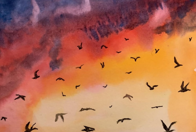
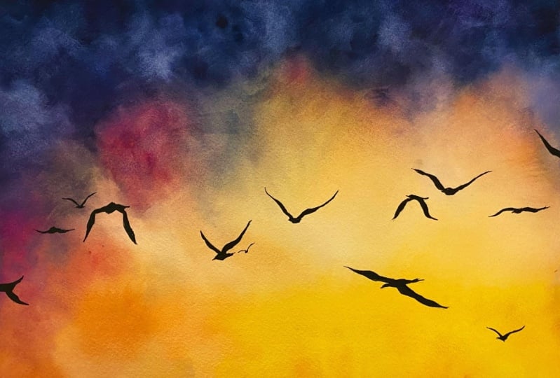
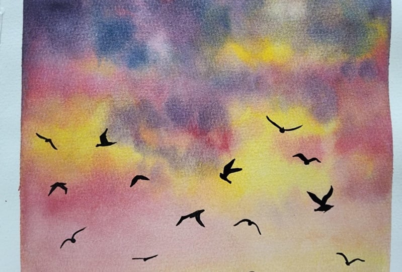
2. Class Project: [MUSIC] Today's project is a dramatic pastel sky
painting with birds. The background is pretty loose, and it will be a
great way for you to experiment with basic
watercolor skills, such as color mixing,
blending, and layering. You will also learn my
tips and tricks for improving any
watercolor background. The birds will be an
opportunity to appreciate how powerful a little
bit of detail can be. With this project, you'll
gather exploration to create more skies with your
own watercolor palettes and more fun bird additions. To make the most
out of the class, I would suggest to have watched the painting process first so that you know what to expect, and you can get into the
painting more relaxed. You may also download my sky and birds reference photos
as well as my painting, and the list of the supplies. Last but not least, please reach out in the
Discussion section down below. If you'd like, you can post your project to the Project and Resources section to share
with me and other students. Meet me next where I'll look at the supplies
we're going to need. [MUSIC]
3. Sky Painting Supplies: [MUSIC] Watercolor sky painting doesn't require a
lot of supplies. In this lesson, I'm going to
show you exactly what I use. First, some watercolor paper. For today's project, I'll be using a 6 by 9 inches sheet that I
cut out of a paper pad. For anything like a sky, a simple background, a galaxy, we want colors to
be able to flow and mix to each other as
easily as possible, and a 100 percent
cotton paper with a cold press finish will
give you the best results. This kind of watercolor
paper is also very thick. The cotton fibers help with water retention and
colors flowing nicely. The one I like best
is some Archer, but you can download
the supplies list from the Resources section to find more references
and alternatives. Next, we'll need
watercolor paint. You can use any brand
you already have. Whether it is a student grade or a professional-grade paint, that does not matter much
when practicing and it won't affect the outcome
as much as paper might. I picked indigo, black,
yellow, and pink. I will touch on colors a bit
more in the next lesson. I recommend at least one
round paintbrush like this. Mine have natural hair
fibers that will hold water better and help with getting
smooth washes of paint. Select one whose size will make the painting
process easier. For example, we don't
want this paintbrush to feel like it's too big or
too small for our paper. [MUSIC] I often use round and pointed paint brushes like this one in my works. Here we will use it to help color transitions look better, but most importantly, it will allow us to paint fine
lines for the birds. You will need a palette or something to mix your paint in. I like to use these
built-in wells because they're roomy, and for sky painting, I enjoy making large
mixes of paint. I recommend some
construction masking tape or a scrapbooking washi tape, whatever you have, and
we will little use it to keep our paper from moving
around as we paint. Get some paper towels ready. They will come in handy
whenever we need to remove excess water
from the paintbrushes. You'll need two water jars, one to wet your paintbrushes,
one to rinse them. Grab a pencil and eraser as well for our final bird additions. Finally, to speed up
the painting process, I recommend using a hairdryer or a heat gun
in-between lessons. Let's meet next for
more about colors. [MUSIC]
4. Color Mixing: [MUSIC] There's no need for a lot of different or
specific colors to paint pastel skies that look
dramatic and in this lesson, we're going to prepare
our color palette for the project to come. We're getting ready for painting when mixing colors like this, so I suggest to tape your watercolor sheet now
on the surface you will be working on [MUSIC]. For mixing I'm going to be using a random
brush because I'm a bit lazy to clean
the paintbrushes I picked for the project
but of course, it doesn't really matter
what you use for this step. Let's mix pink first. If you're using pans like I do just watch your
paintbrush and get some pigment on it then
deposit it in the well, add water to it and keep
alternating between pigment and water until you get a nice amount of this mix. I find this step is
a bit faster when getting the paint directly
from a tube rather than the pan but pans help me
make sure that I don't have too many leftovers
because we take the amount of paint
that we need from pans, whereas it's harder to estimate how much you
need with a tube. You can see this mix stays quite watery and that's because for
our first layer of a sky, or a galaxy, or a background of any kind you want your colors to flow, and for that we need water. Now we also want them to show, so we need some pigment too. Don't forget to rinse
your paintbrush when you switch colors and we'll mix yellow now [MUSIC]. Now we're going to be mixing
pink and indigo together. Notice how these two make very nice shades of
purple and this is why I picked these colors [MUSIC]. The last color we'll mix in this lesson is indigo in the same way
as the other ones. Black will be used a bit
later for shadows and for the birds so we're not going
to worry about it now. We'll have plenty of time to mix more color later [NOISE]. Remember to start a
painting by mixing colors and taping the
edges of your paper. For topics like skies, it's best to start with
water and mix as a paint. Leverage color mixing
whenever you can. Here are my paint mixes colorful and ready
at the same time. Let's meet in the next
lesson to start painting. [MUSIC]
5. Base Layer : Placing Pastel Tones: [MUSIC] We're ready
to start painting. We're going to place
the main colors on paper in this lesson. You will need your water
jars, paper towels, as well as one or two
round paintbrushes. You can also download the reference photo
for this guy from the resources section
as it will help you better understand the
approach we'll be taking. For colors to blend beautifully and look
all the more dreamy, the best watercolor technique to use is to wet the paper first, then apply the paint. I use this technique all the time when I need to
get a smooth look. Make sure to wet one of your round paintbrushes
really well, drop water on the paper, and do a lot of back and forth until all the sheet has
been covered with it. We want to give the
water a chance to seep inside the
fibers of the paper. This way it will
stay wet longer. On a sheet this size, it takes me about a
minute to do this on this 100 percent cotton
cold press quality. When the water seems to
have penetrated the paper, I add a little more on top. [MUSIC] From now on, we need to apply
all main colors on the sheet without waiting
for it to start drying. Let's start with
yellow. The bottom of the sky is very light, and this is why I'm going to wet my paintbrush and
thin a little bit of my yellow mix so it appears even lighter
than it is now. Let's apply this at the bottom where these very light
shades are located. I would normally start
painting from the top of the sheet and move
towards the bottom, but I find it's better to work on the lightest shades first. Don't forget to rinse your paintbrush once
you're finished with yellow and now add
pink in the same way. [MUSIC] I repeat with a
little bit of purple then with water so
it stays very light. These colors will
dry even lighter, and that's okay as we'll create nice contrast with what
we're applying next. At this point, the whole sheet
has been covered in color, even though the only
part of the painting that needs to be very
light is the bottom. I have to do this because re-wetting everything buys us some more time to
keep adding colors. This time we're adding colors as we mix them in
a previous lesson. We're using them to
create the clouds. For natural-looking clouds, I like to tap the paintbrush and paper and I try to stick to what I see on the
reference photo, but I also allow
some spontaneity. [MUSIC] Look at how pretty
this looks already. Now let's do the same
thing with pink. Don't forget to overlap
it on the yellow parts and remain spontaneous.
[MUSIC] It is time to add purple, and we're going to apply it in the upper part of the sheet. Notice how I start with
lighter colors always. It's easy to cover up light
colors with darker ones, but it doesn't work
the other way around. That's why you
will often hear to start light and watercolor. [MUSIC] Now a little bit of indigo to start building up
some contrast here. While yellow and pink adds to the pastel looks
for this painting, indigo and purple are going
to make it more dramatic. With the right amount of those dark colors just to
touch on top of the sky, we're able to end up with
a dreamy yet dramatic sky. If you want to
apply my techniques on the sky of your choice, keep in mind you can create a certain atmosphere through
your choice of colors. That's one of the reasons I never get tired of
painting skies. When I find some
of the colors look a bit harsh next to
others in a painting, I help them blend in with a
clean and damp paintbrush. It doesn't matter
which one you choose. Just rinse the paintbrush
and dab in on a paper towel. You want it to be neither
dripping wet and/or dry. Now help color gradients
look a little better by tapping the paintbrush
on those harsh transitions. [MUSIC] To keep
building contrast, we're going to use the
lifting technique. Clean the paintbrush
we're just using, and this time remove enough water with your paper
towel that it's almost dry. We call this a thirsty brush. A thirsty brush will soak
up water where it finds it, and that's why we're able to lift paint off the paper here. To get the whites in the
paper to show again, I press quite hard and I
remove paint where I want to. Paints tends to creep back in an area with its color from, and it might take two
or three attempts to get some whitish
parts to show. We want to keep it settle, so there's no need to
insist for too long either. [MUSIC] We have a very nice and
smooth base for the sky. Let's dry it completely. [MUSIC] Remember that for
beautiful skies, wet the paper first, then apply the paint. Start with the light colors
and end with the dark ones. To shape the clouds, tap the paintbrush on paper. Overlap colors with each other. Help gradients look better with a clean and
damp paintbrush. Lift paints with a thirsty
paintbrush to build shape and contrast. Great job. We completed the most important
step in the painting. So let's meet next to add some character to
this pastel sky. [MUSIC]
6. Second Layer : Adding Character: [MUSIC] Welcome back. We're ready to paint
the second layer on the sky to make it more
vibrant and dramatic. Take advantage of this
step to mix more paint, clean your paint brushes, and change the
water in your jars. I'm mixing all of the colors
we worked with previously. Only this time I'm making the mixes slightly
creamier than before. To achieve that,
simply add less water. [MUSIC] I add a little bit of black
to indigo so it looks darker. You're probably
noticing how much lighter the sky looked
after we dried it, and the second layer is
going to help us revive it. Let's wet one of our
round paint brushes. We're going to proceed
as we did previously. I wet the paper starting
from the bottom because sometimes paints can slightly
be reactivated with water, and starting with the dark spots might muddy the whole painting. This time it shouldn't take more than 20-30 seconds to wet the paper because it's not raw anymore so it
should be faster, and besides we're working with creamier mixes so the paper
does not need to be as wet. I start with yellow. I apply it in the same spots
I previously did but roughly because the purpose
of a second layer also is to keep
overlapping colors, so new shades are created, so it looks more natural. You can already see here some pinks are showing
through in places. [MUSIC] Let's thin a little bit
of this yellow paint and apply some at the bottom
to intensify it slightly. Let's add pink now
in the same way. [MUSIC] Notice how much more vibrant the second layer is
looking already. I thin the paint once more and
add it towards the bottom. [MUSIC] Now let's add purple. [MUSIC] Finally, let's add indigo, a tad because adding a lot of
it could turn the sky into more of an atmospheric one and we might lose
the dreaminess. With my thinnest paint brush, I want to add color
to the yellow areas because I find it as lacking a connection with the
rest of the painting. We need more of the other colors there. We'll start with pink. More yellow touches
towards bottom. I'm trying to avoid
a rainbow look where stripes of colors
are following one another. With clouds, there are often little pieces that
detach themselves from the main ones and tapping the paintbrush once more
here helps create that. We want a light version of the
purple one with more water to create subtle shadows and this bottom part
of the painting. When you find you went a bit overboard with color intensity, you can tone it down with a clean and damp paintbrush as long as the paint is still wet. This is what I'm
doing right here. Now let's clean the
harsh transitions between dark and light colors. [MUSIC] Once more, you can clean and dry paint brush to lift paints and build up
contrasts some more. [MUSIC] This sky is looking great, a lot more vibrant
than before, too. Let's dry it completely. [MUSIC] Remember to use layers
to build up contrast, vibrancy, and fix mistakes. Wet the paper more
superficially than before. Use creamier mixes of paint, and keep overlapping the colors. You're almost done
and the best part is coming up with our
finishing touches. So let's meet in
the next lesson. [MUSIC]
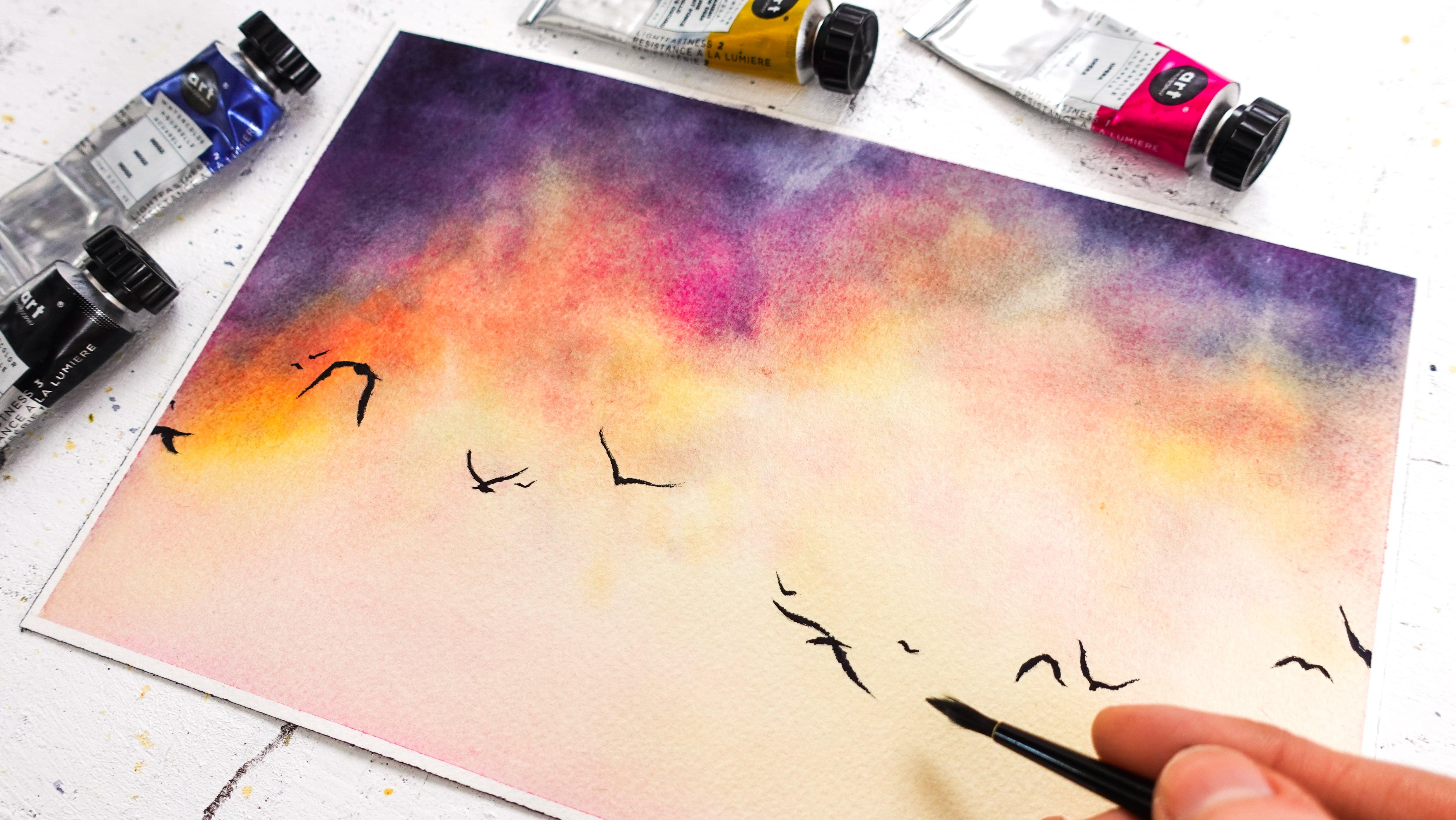
7. Enhancing a Sky Painting with Birds: [MUSIC] In this lesson, we're adding some
birds to our painting. It's a beautiful way to finish any sky and you can customize
this part to your liking. Combined with different
sets of colors, you can keep creating many
different sky paintings. In watercolor when you
want to create details, there is no need to wet the
paper like we did before; otherwise, all details
would spread out and fade. First I'm going to
sketch the birds. You can start painting
them straight away if you're feeling inspired. I like to sketch them first so I see exactly where
I'm going with them. How many to add, where, etc. [MUSIC] I like this. Notice I chose to
add them towards the bottom mainly
because this is where the background is slightest
and I know they will enhance this part
beautiful being so dark. For our birds to
pop off the page, I recommend to use a very dark and thick
mix of paint this time. Let's mix more of our
indigo and black. [MUSIC] This mix should allow
the paintbrush to glide easily while looking
very opaque. If you have trouble
painting with it, you will need to add a
little bit of water. With my thinnest paintbrush, I start from left to right
since I'm right-handed. [MUSIC] Let's add a few more birds. [MUSIC] That's it, we're done. Look at how beautiful
the sky is. Please share your painting to the project section
of the class. I would love to hear about
your experience as well, so feel free to let
me know about it. See you one last time
for some final thoughts. [MUSIC]
8. Final Thoughts: [MUSIC] Congratulations for creating a beautiful dramatic pastel sky. Please post your project to the Project Gallery and feel free to ask for some
feedback if you'd like. You may also leave
me a review to let me know what you
thought of the class. For more watercolor classes, you can follow me here
on Skillshare and also on YouTube and
Instagram for art tips, tricks, and inspiration. On social media, you
can use the hashtag, createwithfrancoise, to
share your work there. Thank you so much for
taking this class with me today and see you
in the next one. [MUSIC]
 Francoise Blayac, Professional Artist