Transcripts
1. Introduction: Hi, my name is Francoise, and I'm a watercolor and mixed
media artist from France, and I started painting
two years ago after practicing with dry
mediums for some time. I have been teaching
painting for beginners on YouTube, Instagram, and Skillshare for some time
now and in the process, I have grown an audience
of art lovers and I have formed several
partnerships with art brands. I love that, with practice, watercolor makes
it easy to paint many subjects in a variety of styles and I appreciate that it pairs up so well with
other mediums as well. When you learn and practice
watercolor painting, you'll quickly realize that
you can paint anything you'd like in a couple
of hours or much less. In this class, I'm going
to teach you how to paint whites using color. First, I'm going to show you what supplies I use then we'll learn how whites can be painted
with a simple exercise. Then we'll sketch a snowman, we'll mix basic colors
in a way that helps us achieve a magical
feel in our painting. After that, we'll start painting our winter landscape with
a creative background, the snow details on our snowman, and finally, some white gouache techniques for more
snow effects fun. This class is suitable for
anyone who enjoys to learn new things and create beautiful art without
being overwhelmed. If you're still at a
stage where you're experimenting with
watercolors and you want to learn
how to paint snow to create more winter
landscapes of your own, this class is definitely
going to help you boost your confidence
and knowledge. Let's go ahead and jump into
this class to learn how to paint this beautiful
snowman landscape painting. Let's get started.
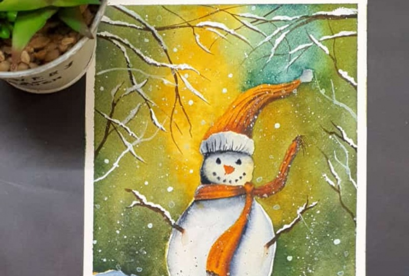
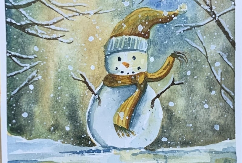
2. Class Project: This project is a magical winter scenery featuring a lot of snow
and acute snowman. In this class, we'll be focusing on painting whites with color. To do that, we'll be using several techniques throughout
the class from using watercolors to create
the impression of white to leveraging whitewash
for more useful effects. To make the most
out of the class, I would suggest to go through
the exercise as there you will understand
what makes paper that has been painted look white. To make the process
smoother and more relaxing, feel free to pause the
videos at any time, and even watch each lesson ahead of time before
you start painting, just so you know what to expect. You're also welcome to
download the supplies list, the reference photo, and the painting photo from the resources section
of the class. You can reach out down here in the discussions section of this class to ask for any help, and if you'd like to share your project with me
and other students, you can post it to the "Projects
and Resources" Section. We're ready to start, so
maybe next to learn about the technique that I use
to pain whites with color.
3. Technique : Painting Whites with Watercolor: This lesson is going to help you get an
understanding of how to make whites look white
in watercolor painting. I traced two circles for a demonstration of
this technique. You're welcome to
try this as well. Any color is going to work
with the short exercise, although a dark tone is best. I picked indigo and I diluted it into a lot of water to
make it very light. On the left circle, I'm going to paint the area
around the circle only. You can see the paperwhite
circle pops really nicely against this
very light indigo tone. Using the white
from the paper is one common and easy way to random white in
watercolor painting. I like to work my paintings in the more realistic
style and that's why I traced another circle. This time, let's get
rid of the white of the paper by
painting the circle. You can see I'm still using
this light indigo mix. Now if you compare our paperwhite circle
and our painted circle, you can clearly identify the left one as the white circle. But, and this is why the
exercise is interesting. With colors, it's
all about balance. Let's say we paint around
a right circle with a dark and thick indigo mix to create a strong contrast
between the two. To do this, you can add some paints to the light
makes we made previously, and it will get darker fast. Add enough that the texture of your mix becomes quite creamy. Now when you take a
look at both circles, it's still obvious the
left circle is wider. I did say wider because at
now our right circle appears quite white in comparison to the dark tone of indigo
we painted all around. What I would like you to take away from this exercise is that whites don't necessarily
need to be white. They can be painted. There can even be
some darker tone in those areas that must appear
white in the painting. All matters is for a much
darker tones to balance these lighter ones to create
an impression of white. Something I often do with watercolors is to use whitewash. This helps me increase whites
where I want them very crisp and as bright as
the paper would be. As seen here I
also use whitewash to fix small mistakes without
it being obvious at all. We will be implementing this in
our snowman project and we're going to go over
the supplies you will need. Meet me next.
4. Class Supplies: Let's talk about supplies. The first thing we need
is watercolor paper. I suggest to cut a seven by
seven inches sheet out of a bigger sheet or you
can go for something slightly smaller or
bigger if you'd like. I enjoy 100 percent
cotton watercolor papers. They make a huge difference in the outcome as the
water flows better. The ones I use are
entirely cotton. The finish is cold-pressed and the paperweight is 300 GSM. Great brands I have tried
and love are Arches, Winsor Newton, Canson (I'Heritage),
and Saunders Waterford. Next, some construction or
scrapbooking masking tape will help to tape
the paper down to the surface you plan to work on. The paintbrushes
I'll be using are large round one
like this to paint the background and
two slender ones they are called round
and pointed pen brushes. They're great to
paint details too. You can download a detailed less from the
resources section of the class if you'd like
precise references on all my supplies. In general, make sure the
size of your paintbrush will be convenient for the size
of paper you are working on. I'm going to use my
art philosophy paints. There are tubes I have poured
into paints and I like it as I can also use those
as well to mix my colors. I'll be using
permanent yellow deep, yellow-orange, Hooker's green, Prussian blue, and burnt umber. To simplify the colors, keep in mind it's okay
to use any yellow, orange, green, blue, and brown shades you own. The fact precise
sheets don't matter that much in a painting
is one thing I have learned and experienced over time is really
repetition of the process and techniques
that will give you the desired outcome,
not the colors. As mentioned in the exercise, I'll be using white gouache
and any brand will do. We will also need a
pencil and eraser and you can also have a
ruler nearby if you'd like. Finally, we'll need some
paper towels to soak that excess water out of our
paintbrushes if we need to. Two jars of water, one to wet and one to rinse. I also love to use this
heat gun so I don't have to wait in between each
step for the sheet to dry. You can use a hairdryer too or just let the paint dry on
its own when necessary. We are done with the supplies, so I'll see you next for
drawing our snowman.
5. Part 1 : Sketching a Snowman: Welcome back. In this lesson, we'll draw a snowman. I'm going to draw a
line for the snow at about one-third of the page
starting from the bottom. I do it by roughly
measuring with my fingers but if you
feel more comfortable, you can use a ruler. What we want is this line to be somewhere around the bottom
of the sheet and we're going to make it almost
straight but not quite as this is
the snowy ground. Now let's place the top of its body towards the
center of the page. It doesn't have to
be very precise. Don't worry if it's a bit off, and a trick is to trim the edges of the paper later
when the painting is done to center the
subject more accurately. Let's place the head now. There should be some room above it as we'll draw a hat soon. I'm now drawing the scarf, and you can check the reference
photo I used for this in the resources section of
the class and you will notice I tweaked
a lot of things. You can do that
too if you want to change the shape of the snowman, hat or any other elements. With the hat, I'm trying to make it
look like it's flying, just like the scarf is. Now, all we need is to erase and we are done
with the sketch. See you next for
some color mixing.
6. Part 2 : Preparing the Colors: In this lesson, I'm going to help you prepare your color mixes for
the snowman painting. I usually start with watery
mixes when painting, but this time I wanted to
show different techniques. I'll make our paint creamy with some water and a lot of pigment. The first one I'm preparing
here is a golden yellow. To get this shade, I am using mostly
yellow and adding some brown in it just enough to
give it this golden look. Next, let's do the opposite with mostly brown and a
little bit of yellow. I decided to mix colors
in this way to render the warm yellow shades we get to see in the ornaments
around Christmas time. The next mix is Hooker's green, and I add a little bit of
Prussian blue to make it more like a winner
pine tree gray. Then we'll need to mix a Prussian blue
or any blue is fine too. Finally, I'm adding burnt umber or brown
to this blue to make it a way darker and use it for
shadows and the eyes and mouth. You can see color mixing is
very handy and effective. With just a few regular colors, you can get a lot
of nice shapes. These are the main
shades we'll use. We'll need some plain yellow
and orange here and there too and later also
makes whitewash. Meet me in the next
lesson to start painting.
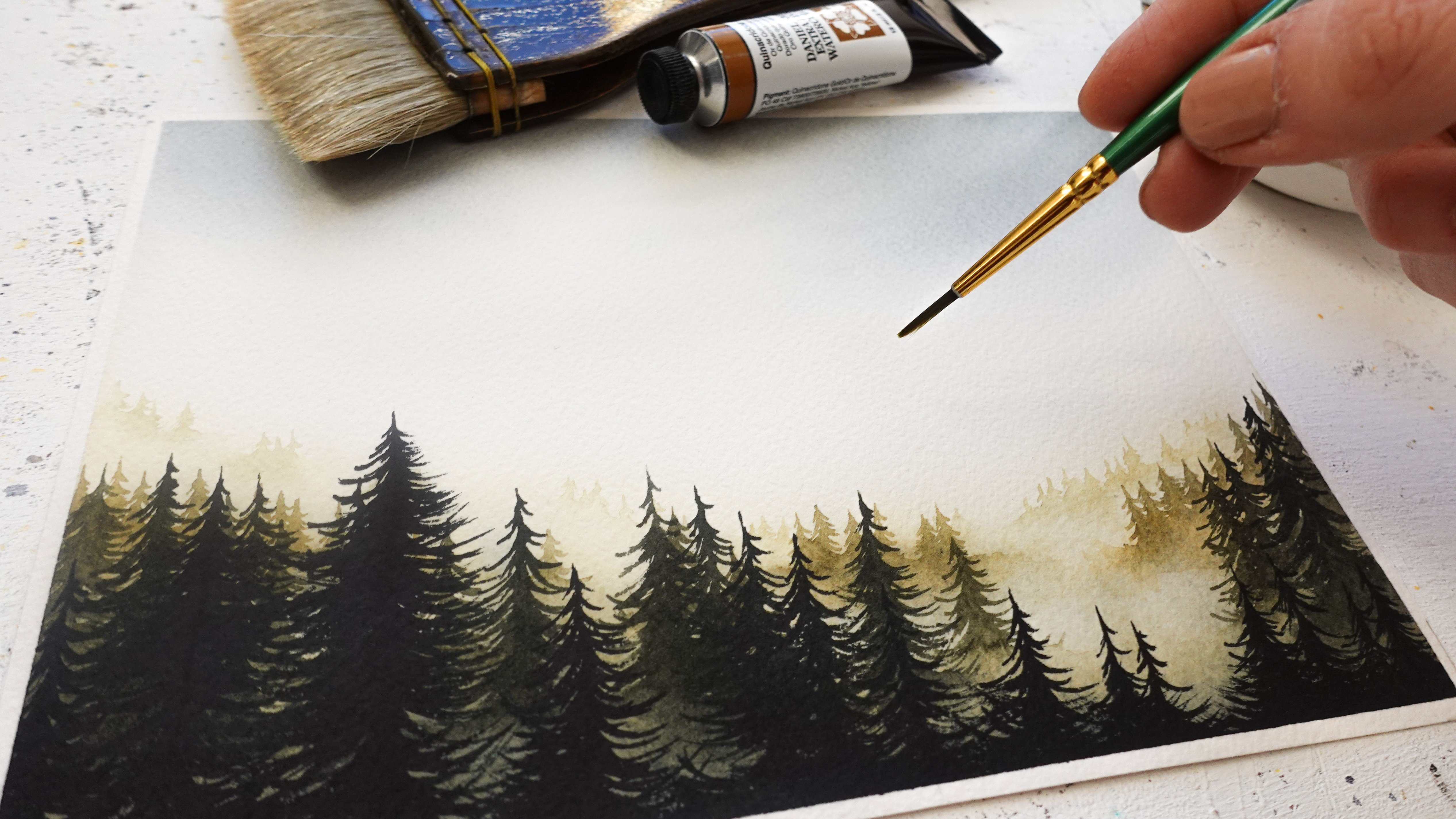
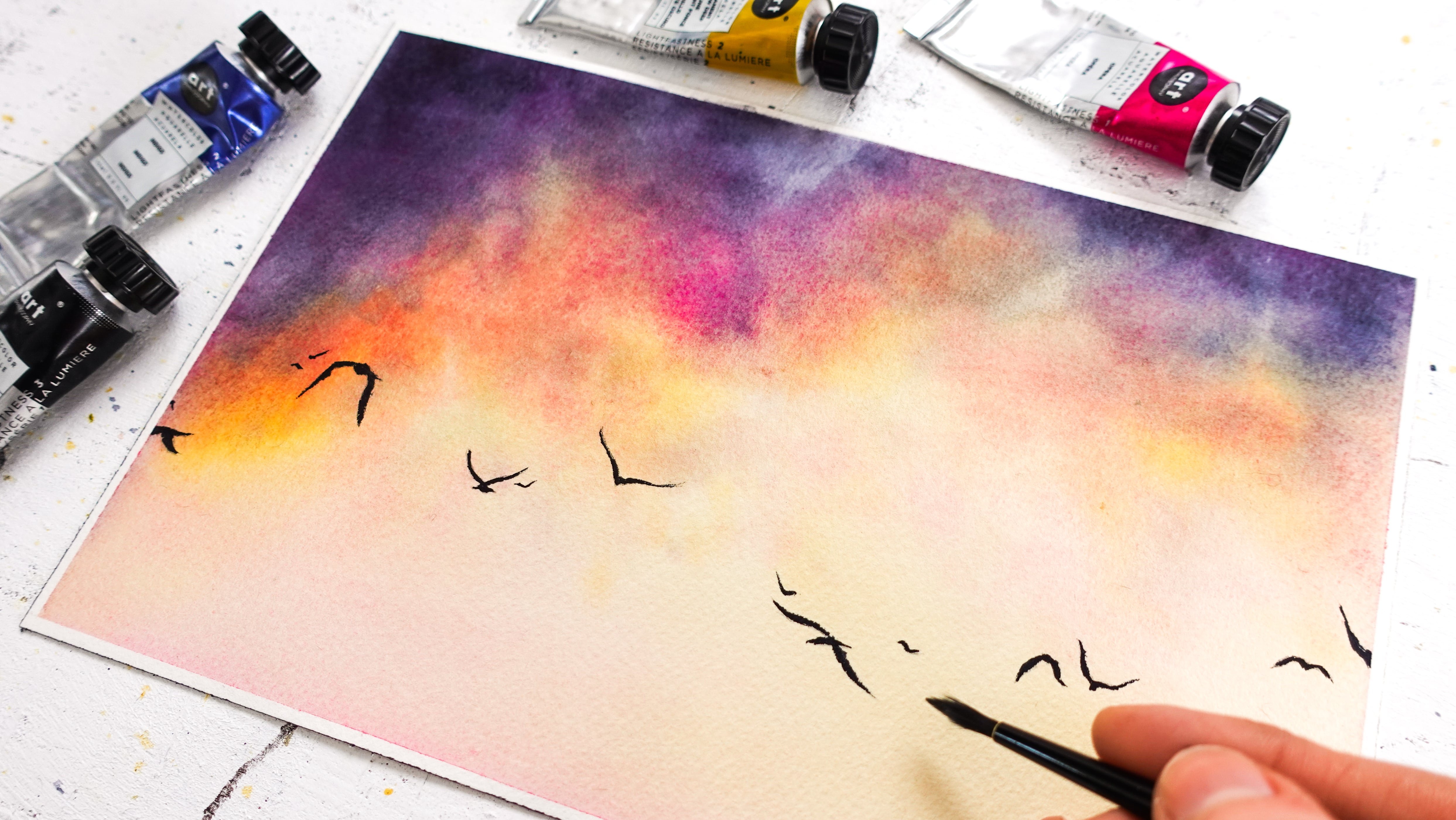
7. Part 3 : Background Painting: [MUSIC] We are ready to paint the background
and I'm going to use a very different technique
from what I usually do. In this class, we're
starting wet on dry, which means we're not
wetting the paper first. I'm applying the golden yellow
mix first and you will see me switch between colors
while contouring the snowman. Make sure the paintbrush you're using here will
allow you to control the scarf and hat easily as
we don't want to take too long so the paint doesn't have time to dry until we're done. I imagine this background, so I'm being very random. I want some blues
to be showing on top and also a lot of
that golden yellow. I overlap a bit of the other
colors on top of those two to create something more
interesting to look at. Don't forget to wrench a
paintbrush in-between colors. One thing you can do to
make it easier is to grab another paintbrush so you have two to work with
unless renting to do. [MUSIC] I had to mix your
paints to be creamy, as I knew, we'll paint on dry paper and in
one single layer. This consistency will help colors dry in a way
that looks deep, vibrant, and doesn't
require any layering. [MUSIC] Towards the bottom, I am adding this dark mix made of blue and brown to
give this background more contrast as this noble low and in the snowman
will be quite light. This is what I showed
you in the exercise. Our painting snow will look white next to the darker colors. Although we could
make do without, this dark shade will help
emphasize this even more. [MUSIC] Now for some watercolor fun, let's put a little bit of water. I like to do with my fingers. This will add even more
magic in the final piece. [MUSIC] I spot a weird area
there that is way dry than the others and since
everything else is wet, I'm going to rewet it right now so it dries like the
rest of the background. I would ignore it normally I'm just being peculiar with it, but there is no right or
wrong way to do this, especially with such a
creative background. It's okay if you get a
few marks and blotches. [MUSIC] Our tree, we went to
our background is done. Make sure you let
it dry completely so we can move on safely. [MUSIC] I'll see you next to paint out bottom part. [MUSIC]
8. Part 4 : Snow Painting: Let's paint this stretch
of snow at the bottom. I'm remixing some of the colors
we'll need and actually, I'm adding a bit of water to them as like the
snow to be painted, but still, look lighter
than the background. Remember the amount of
water added to the paints is helpful to achieve
lighter tones. You should have a mix of blue, golden-yellow, or yellow, and brown plus blue
ready for use. I'm not relying on
the photo very much, so I'm being very random here and I encourage
you to be as well. What we're looking for is
to paint most areas with lighter colors and leave
some spots paperwhite. I start painting the
bottom with Prussian blue, to make it lighter and create a snail-like fact since there
are many shades and snow. I'm wanting a clean paintbrush, then I dab it on a paper towel, so it's not too full of water. I'm softening those blue edges into something much lighter. I'm adding some of that
darker blue shade, whether it's no man's bottom is fasting to emphasize
the ground level there. I add some too at
the very bottom, as with landscape painting, the closer it is to
you, the darker. This will help give that
snowy ground some dab. Now for fun and to show light, I want to add a
little bit of yellow. It is also a nice way to tie top and bottom parts together because we
use the same colors. Make sure to let this dry. Next, we'll be repeating
this on the snowman itself.
9. Part 5 : Snowman Painting: We're ready to paint the
snow on the snowman. Let's use the same colors we
did for the snowy ground. First, I suggest to start with the darkest areas
in the snowman. For me, it's going to
be the left side of it and the ones
beneath the scarf. I paint them first with our watery brown and
Prussian Blue Mix. Then with a clean and
slightly wet paint brush, I pull some of that paint
onto other areas of the body, knowing it will appear
lighter in color because of the water from
the clean paint brush. Let's repeat this elsewhere. Now I'm wetting that
right side a bit, and using some
Prussian blue there so not one part
remains totally white. I'm doing this to tie the
snowy parts together. Let's emphasize the bottom
part in the same way. It will help make it clear
that this ball of snow is resting on the ground and
that's it's separate from him. If you were to only
use blues in the snow, it will be absolutely fine. Adding yellow here is just a
creative choice I have made it to make the
overall looks more cohesive for the background. Let's repeat these
steps on the head. Make sure this is completely
dry before moving on. See you next to add some
shadows to the snowman.
10. Part 6 : Adding Shadows on Snow: In this lesson, we're painting shadows in
the snow so we want to make sure our brown and blue
mix is quite thick again. All you need is to add paints. Let's emphasize those
areas we already identified as shadows
in the previous lesson. I'm still working with two
paintbrushes so I can fade this dark paint
into the painting with a clean and
slightly wet paintbrush. You may leave the paint
as such if you prefer. I like to soften the edges because it looks more
natural for myself, but I've seen it done
differently and it's all valid as long as you
enjoy the process. I'm making one side
darker than the other as the snowman is made
of two round shapes, and if you take a look
at the sphere on Google, there are always
strong shadows on one side while the
other is much lighter, and it's that play of
light and shadow that creates the impression
of a round shape. You can see already
with the head, it's becoming more
obvious that it's round. We could take it
further but this is enough to suggest
a shape, I think. Let's make these areas beneath
the scarf much darker. It will help to make them look separate from the snowman and also reinforce the
impression of realism. Next, we can intensify
the shadows on the body. As I explained in the exercise, this is also a great way to
make our white look whiter. I find a snowy
ground a bit bland, so let's add color there too. I'm using the same
techniques I did with the snowman since
I always have my clean and white paintbrush
ready to soften edges or just then
the paint and paces. It looks good so
let's stop here. Feel free to let this dry now or let it dry on its own and meet me next so we
can start adding details and finish this snowman.
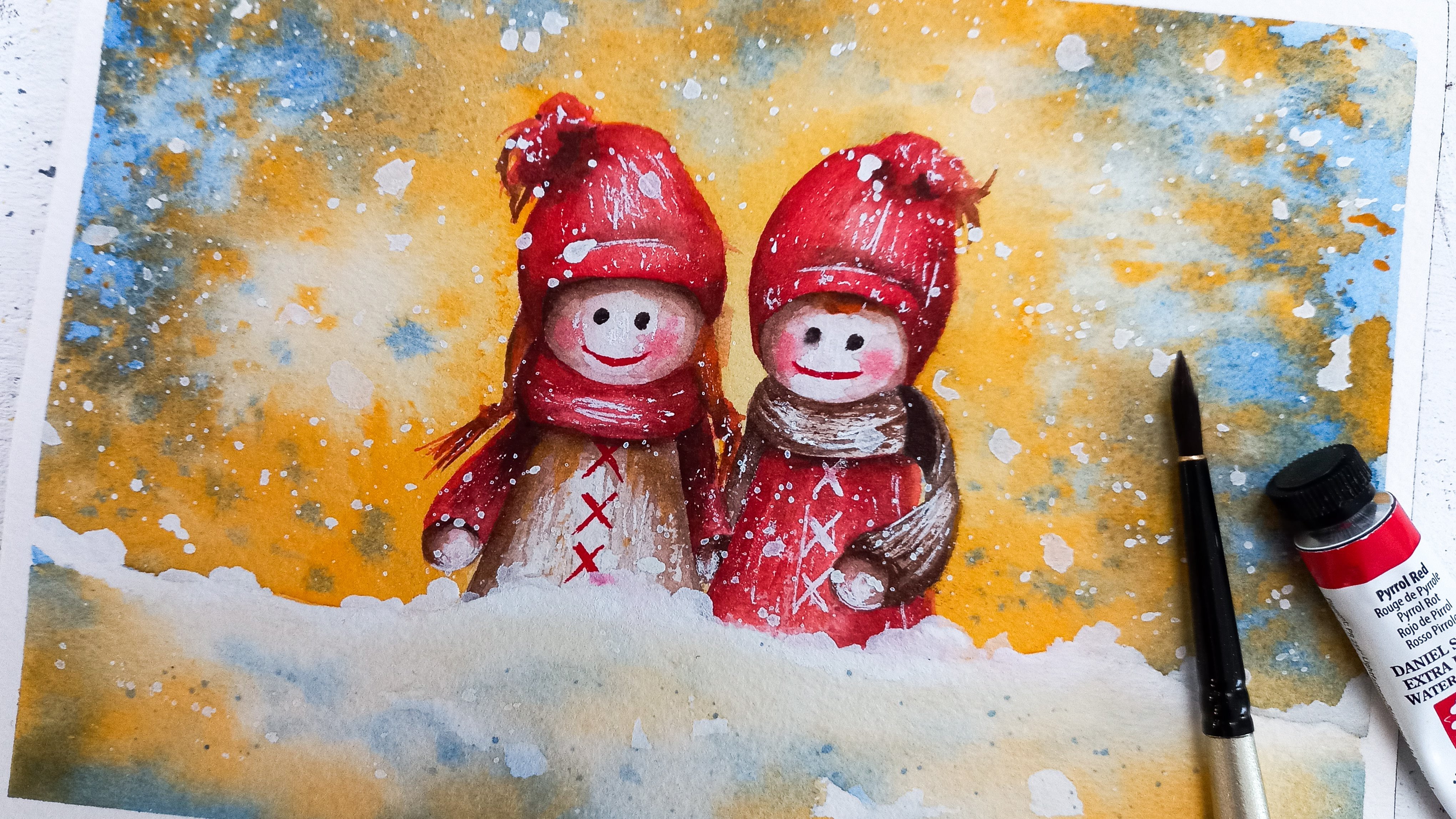
11. Part 7 : Snowman Finishing Touches: We are going to finish this snowman
in this lesson. First, I mix more of the golden yellow mix we
made with brown and yellow. We can apply that on the hat and scarf with a
fine paintbrush. For the fluffy parts of the hat, why not use the same
colors we did for the snow as this
will be white too. I apply all of the same colors, blue, blue and
brown, and yellow. I'd like to add the shadows now, so I'm going to try this. With our brownish mix of burnt umber and a bit of yellow, let's start adding
darker spots in the hat. Again, to make it more
subtle and natural, I'll use a clean and
slightly wet paintbrush and soften the edges
of that fresh paint. Let's repeat this in the scarf, with an emphasis in those areas that need to be
distinguished from others. Like the knot in the scarf
we'll create a shadow so we can see that it's a
separate part of the scarf. If you like, give this scarf a little
bit of texture by tracing some lines
with your paintbrush. Let's emphasize those shadows
a bit more on the hat. You can stop whenever you feel satisfied with how
yours is looking. To create detail and shape, we can use our second version of the blue and brown mix and create some lines similarly
to what we did on the scarf. I take advantage of
this step to strengthen the shadows in the scarf
with that same mix. Because it's nice to be able to reuse the same colors
in one painting, let's now paint the
eyes and the mouth with our thick brown and
blue mix still. This is proof you
can get by with just a few colors
with watercolors. It's difficult at first when
you're new to color mixing. But once you dive into it, it becomes quite fun to
make your own palette. Let's use orange
to paint the nose. I add a little bit of our dark mix in
there for shadow. I decided to add
small branches on the snowman in places
of arms and hands. To make the color look accurate, I suggest to work with a thick mix of blue
and brown still, but add more brown to it so it looks more like
a dark brown now. Notice I soften the part of the branch that
was planted in the snow as this will make
it look like it belongs. My techniques can go a long way. We're getting close to
finishing the painting. Let's meet next to add
some branches all around.
12. Part 8 : Branches and Last Details: Let's paint some branches all around our snowman and then we'll add some detail
here and there. I'd like them to be pretty
thin on my paintings, so I'll be using
my smaller round and pointing paintbrush. We are using the same
mix of brown and blue than that for the sticks
we added to the snowman. Remember there is more brown in that mix than there is
blue and it's thick. Have fun on this part, drawing branches
where you want them. A tip is to start with the
side of the paintbrush, from where the masking tape is. Start tracing a branch and then release
little by little, to end the line with a
tip of the paintbrush. From past experiences, I know how easy it is
to get carried away, so I'll stop here. I think some splatters will
look great on the snowy part, so let's add some blue
to our mix and use that. Those splatters, you want enough water in the paintbrush
for them to come out, but not too much of it so
they don't come out huge. If you're not sure, please
use another piece of paper. With the yellow and brown
mix we made before, let's finish the scarf. I use the tip of my random
pointed paintbrush. Try not to make all
lines the same, it's absolutely fine to
add variety here as to how short or long they
are, their direction. This is the kind of detail
to suggest there is a little bit of wind and add
some life to this painting. With the dark mix
of brown and blue, I'm adding more lines
to create some shadow. If this isn't already dry, make sure it is as
in the next lesson, we'll be adding snowflakes. See you there.
13. Part 9 : Let it Snow !: [MUSIC] In this lesson, we're going to work with white
gouache to add snowflakes. Just like with watercolors, see how much water you need to add so the splatters
come out easily. The gouache mix
should be creamy. If it's thinned with
a lot of water, when it dries, it
won't be very visible. This is why it's important to
add water but not too much. Have fun here too
splattering paint however you feel like. [MUSIC] I tend to stay close to the paper and vary
the direction I splatter in as I don't want the end result
to look unnatural. Sometimes there'll be lines
of splatters coming out, that's why it's
important to change the direction
you're doing it in. [MUSIC] Don't be afraid to
splatter on top of the snowman or its clothing. It's a great thing to do as
it will look more believable. [MUSIC] Another trick with snowflakes
is to add some manually. I like to use this method to
make mine bigger in places. [MUSIC] Now let's add snow
on the branches. I love to do this with
wetter paintings. It looks really beautiful. You can finish some
of the branches with a thick white line if you like. This will help lining
up the painting a bit. [MUSIC] Ready to reveal, so I'm going to take
the masking tape off. [MUSIC] It's looking
pretty gorgeous, quite creamy and magical. Congratulations for
making it till the end. Please share your painting to the project and
resources section of the class so we can take a look and give some feedback
if you like some. See you one last time next
for a few final thoughts. [MUSIC]
14. Final thoughts: Congratulations for
making it until the end. I would love to see your
paintings so please share it with us in the project and resources section of the class. Please let me know
what you thought of this class with a review, and for more realistic
watercolor classes, you can follow me here
on Skillshare to get notified every time I
upload a new class. You can find me on YouTube and Instagram for more inspiration, behind the scenes,
tips, and process. To connect and share
your work there as well, you can use the hashtag
#createwithfrancoise. Thank you so much for taking
this class with me today, and see you in the next one.
 Francoise Blayac, Professional Artist