Transcripts
1. Welcome to Class!: Something deeply soothing and
magical about Missy Forest. Sometimes they inspire me to snuggle up at home
with a good book. In other times I
feel the urge to paint and recreate the
mood with butter colors. Hi, I'm Z and I'm color
artist and teacher. Inspired by nature
and literature, I turned my passions into a blooming art business with over 20 painting classes
here on skill share, a Patrion, a Youtube channel, and workshops that I
run in my hometown. In this class, I'm
going to teach everything that you need
to know to start painting. Misty forest landscapes,
fellow, dramatic and realistic. First, we'll take a look
at the supplies that I use and recommend for
pine tree forest painting. Then we will explore
useful techniques to help you paint these forests
in a realistic style. Finally, I will
guide you through my entire painting process
with our projects. A beautiful misty
pine tree forest. This class is ideal for those who love
to paint the nature. They'll be able to apply my realistic particular
painting techniques to other types of landscapes. All levels are welcome, however, a complete figure
might prefer to take my essential watercolor
techniques class first to learn and practice the foundational
painting skills. Are you ready to take
a deep dive into the world of watercolor,
misty pars painting? Because if so,
let's get started.
2. Class Project: In the class, we're
going to paint a misty pine tree forest
landscape with water colors. First, I'll give you my best tips about
what's supplies to use and where to get inspiration from For
this kind of subject. We will practice the most important skills and techniques. I'll take you through my
entire process in a step by step approach that makes it easy to stop painting whenever
you feel the need to. And then to easily pick
up where you left off. As a beginner and student, I used to feel stuck
before even starting whenever I didn't
have the exact colors that the teacher was using. If that is your case as well, don't worry because I'm
going to show you how to fix this problem in the color
mixing secrets lesson. Don't miss out on that one. Feel free to download a photo
of my artwork as a guide. The reference photo, as well
as the detailed list of the supplies from the
resources section of the class in doubt, you can reach out for
the Discussions tab. When you're ready, you
can snap a photo of your art and download it
to the project section. You're also welcome to share about your painting
process more in depth or ask for feedback or simply just share your
art with the community. We're ready to dive
in. I'll see you next for a quick look at the supplies that we're
going to need.
3. Supplies: In this first lesson,
we're going to talk about the supplies we're going to need to paint misty pine trees. The first thing we're going
to use is water cut paper. This is the paper
that I'm using. It's as it's 100% cotton, it's cold press, and
300 grams/square meter. This is the one that
I love to use with all my paintings because it
retains water really well. That really helps me paint
smooth backgrounds where colors mix into each
other very easily. Now, you can use lose paper
if you have that kind. It will work with the techniques that I'm
going to teach today. We'll be using a six
by eight inch sheet of water paper like
this for the projects. Then you can cut out a few smaller sheets for
the exercises that follow. Here I have about six of them. There are five by seven,
but it doesn't really matter which size
it is just scrap. Pieces of paper will do something I think is
worth pointing out about water paper like this is that your pine trees won't
come out in the same way. Whether you use
this or that paper, it might be worth it to
experiment with several of them. The next thing we'll be
using is watercolor paints. And I like to use
watercolor tubes that I pour into empty pants. But when I got started, I found it was a lot more
convenient to just buy a 12 or 24 sets of paints that were already
poured into pants. Usually you'll find
the main colors that you might ever need to
complete any projects. They're really
convenient to have. When you're more experienced and you know which
colors you like, then it's more convenient. I find to buy tubes and more economical also and just pour
them into your own pants. What's great about most sets
also is that you'll see they have a built in palette for
you to mix the colors in, which is very convenient when it comes to the
colors we'll be using. It's only going to be three today with Creinitor known Gold, indigo, and C Green. All of them from Daniel Smith. But the brand that you're using doesn't matter at all. You
can use anything you like. The colors themselves don't
matter either because the techniques is
really what's going to take your misty
forest to look like, the one that I'm going
to teach you today. All the supplies that
I'm using are listed in the supplies list that's attached in the resources
section of the class. You can find that there. When it comes to the colors themselves that we'll use in the project, there's a whole lesson
that's devoted to that. I'll show you how I mix them and also how you can get
the exact same shades, the one that I'll be using, or how you can replace those shades
with more common ones. When it comes to paint
brushes as light colors, you don't have to
use exactly what another artist is using. You can make do with
a few paint brushes and still get
equivalent results. I could make do with
just two of them today. This one to wet the sheet
and paint the background because it is big enough
to do that. Not too small. Not too large. This is actually a round paintbrushes,
natural hair fibers. I like that it glides
on paper really well. One is wet, I prefer that. But if you have a
synthetic one, it's fine. Then for the trees, we will need a small pain brush
like this one. This is ideal because
you can leverage the tip when it's wet
and it gets sharp. And you can also
leverage the side to go faster at the
base of those trees. Now this is a
synthetic pain brush. I find that this is a
very important factor when it comes to painting
pine trees in particular, because this type here retains a lot less water than the
natural hair paint brushes. And this really helps me control each stroke for the trees. It's also bouncier than the natural hair type and that also makes it easier
for tree painting. We'll need a pencil for
one of the exercises, but there will be no
sketch for the painting. Two water jars are always convenient in
watercolor painting. Usually we'll use one to wet a pain brush and the other one to actually
rinse the pain brush. In theory, we should end up with a clean jar and a dirty one, But in practice, it's
not that easy to do. And if you get the water and both of them a little bit dirty, that's completely fine
if it gets too muddy. However, you can change the
water anytime you like. I like to have a
paper towel nearby. I usually lay my
paint brushes on them so I don't dirty the
surface that I'm working on. They also come in
handy when we need to get rid of an excess of
water from the paint brush. And I'll show you how
that works later. Masking tape is my best friend
for watercolor painting. It helps me stretch
a watercolor sheet here so that it
doesn't move around. When I paint, it's
very convenient. Another great tool is a
heat gun like this one. This is something that you can find with scrapbooking supplies. It really helps dry a sheet
fast rather than wait it out. But you could use a hair
dryer if you want to. That is it for the supplies. So I'll see you next and we'll
talk about where to find inspiration to paint
beautiful misty forests.
4. Finding Inspiration: In this lesson, I'm going
to give you some tips to find inspiration to
paint misty forests. The first thing you
can do is visit frees stock photo websites like
unsplash pixels and Pixabay. Those are my favorite ones. Tape in some keywords like misty forests or
something like that, and you'll get access to thousands of photos
that are free to use. Another great place
for inspiration is an AI image generator,
artificial intelligence. There are many options
paid and free. All you need to do is once
more type in a few keywords, except that this time it
can be a lot more precise. In a matter of seconds, an image will be generated. I love to use this option. When I cannot find anything I like from free stock
photo websites, then you can use
your imagination. And these are perfect examples because I just started
applying color on paper. Everything came together
little by little. Right now, this might look
a little bit intimidating, but you will notice that after painting along with
me in this class, you will be able to come up with your own landscapes if you're going to paint
from reference. A tip for you is to play with a photo editing software
to find a unique layout. You can even use
the rule of thirds, where the sheet is divided into three lines vertically
and horizontally. And that will help you find
the best pot to create a harmonious painting and draw your viewers attention
somewhere in particular, you can also play with a
variety of color combinations. These are examples here. Here I went monochrome
with sepia. Here I mixed different
earthy colors. They're very similar to the ones we're going
to be using today. In this painting, I
wanted to do something a little different
with pinks and blues before reaching this point will be helpful to
know how to actually create a misty effect and I'll show you that in the next
lesson. So see you there.
5. Creating a Misty Effect: In this lesson, I'm going to demonstrate the
main techniques we'll be using to create a
misty effect in our painting. You just need a piece
of paper for practice. A paintbrush, two jars of water, piece of paper, towel,
and some paint. A misty effect will be best created by using the
wet and wet technique. To execute that technique, you want to wet your sheet first and apply
some paint on it. But first, I'd recommend
to mix your chosen color. You can pick anything
that you want. I'll go with green. This is actually a color
called forest green. It's very beautiful
for this landscape. Once your color is mixed up, you want to make
sure you work from a clean paint brush from now
on for more convenience, I'm just going to work with
this one to wet the sheet, and then I'll use this
one to apply the paint. So you want to dip your paint, brush in water like this, you can wet your sheet. I will explain in
detail while we paint together how
I wet my sheet, the best results, the next step is to apply some paint
on the wet area. You can see these edges
here are very soft. Well, when I paint on dry paper, I get some very harsh edges. This effect here is going
to be key to create mist. This could be a misty
area, for instance. Another technique that I use all the time in
all my paintings, it really is part of my cell
is to soften harsh edges. I'm using another sheet of
paper, but if you want, you can use the one we had
before to practice this. This time, we're not wetting the paper first because
you've seen how soft the edges naturally are when paint is
added on wet paper. This means that softening the edges is going to be
useful when you paint on dry and you want to soften those harsh edges that
the paint is forming. For this, we're going
to work with the same paint brush we had before, the one we used to apply paint. And I'm just going to
remix it a little bit. We're going to need
another paint brush. This one needs to be clean. I'm going to wet it.
I know it's clean. It is wet. That's
also important. But you don't want
it to be too wet. You want it to be just damp. That's why I'm going to dab it on my paper towel a few times. I don't want it to be dry
either, Just a few times. It should be just damp. When this is done, you can go ahead and paint on dry paper. I'm going to start
softening the edge by painting here on the white
paper with my wet pain brush. Then I move towards
the painted area. You can see how soft
the edges became. We can do the same here. We can just clean our
paint brush again to make sure we don't transfer
paint over to that area, soak up some of the water
there, and start over. This actually works when the
paint here is still wet. If it's dry, it's going
to be really hard to do. That's why you want to
anticipate this when you paint, you can use the technique. In misty forest landscapes, you start painting the trees. I'm just going to draw one
real quick here to show you. Let's say this is my tree. Now I want to soften
the edge over here to make sure that it
melts into the ground. This is a quick demo,
but you see the point. Then you can add a little bit of paint here and that's it. Another technique worth knowing
when you want to paint. Mist is the lifting technique. In this case, you're
just going to paint on dry paper like this. Let's say I want to create miss over here.
It's not too late. As long as the
paint is still wet, what I'm going to do is
use a clean pain brush. Once more I wet it, but this time instead
of making it damp, I'm just going to remove
even more water from it. It becomes thirsty. This time it's almost dry. This is going to allow
the pain brush to better soak up the
paint from the paper. I press quite firmly
for this to happen. If you see that you're
transferring paint, you can just clean your pain
brush completely and just repeat and accentuate
the misty effect. This is not my favorite
technique because I find that we get some hard
edges from doing that, but it can be
convenient at times. These are techniques
that will be practicing while
painting the project. In the meantime, if you'd
like to feel free to share those exercises with
us in the project section. In the next lesson,
we're going to focus on an important skill, which is how to build depth
in a landscape painting.
6. Building Depth: In this lesson, we're
going to learn how to build deaths in a
landscape painting. This is particularly important in misty landscapes because it will help make the
mist effect even better. The goal of this lesson is to give you an overview of what building death looks like in watercolor and why
this is so important. We will get to
practice this in depth with my full guidance while we paint the
project together. Let's use brown. In the coming lessons, I will explain to you how
I mix my colors to paint. Remember, it's a
good idea to wet the sheet first to
create a misty effect. I'm going to do that
with clear water. I'm going to quickly
wet my paper. I'm going to apply
some paint to show you how to approach a
watercolor landscape. You really want to start
with light colors. That's why I added a
lot of water to my mix. There's still some
pigment in there so that the paint stays
visible when it dries. I'm going to add some
up here for the sky. Now add some down
there for the ground. You can see here the paint is visible, but it's quite light. When it dries, it's going
to be even lighter. What you want to do is
increase the amount of pigment that you add to your
mixes little by little. For example, here I would
go and pick up more brown. I would add it to my mix. This time I would not
add as much water. You can see now how much
thicker this mix is now. Let's say I want to make my sky a little
darker over here, add some paint, maybe my
ground darker over there. You can clearly
tell the difference between the first mix
and the second one. This one is a lot darker. Just imagine that
the horizon line is located somewhere over here. Everything that is close to this line here is going
to be very light. It's going to be very hard for us distinguish any details. And even any clear color colors are going to look desaturated. While everything that
is much closer to us, like the sky over here and
the ground right there, imagine we're standing
in front here, then this is going to
appear darker to us. The closer we get to
the horizon line, the lighter it's going to be. Then we can keep on adding
pigment to our paints. Again, I'll show you
exactly how to do this step by step while
we paint together. Now we can keep
darkening chosen areas, preferably the bottom here, and we can leave the
top as such or add a little bit more color
if you really want to create the moody
sky just depends. But the idea here
is to create some, a gradient between
dark saturated colors and very light ones. Now, I didn't do
that on purpose, but you can imagine a slope
over here, one over there. Next we could imagine painting some trees back there
at some over here, and finally some
dark ones in front. These light areas here
would be the mist. I hope this was useful. And then the next lesson, we'll take a look at how I paint trees to make them look
realistic and elegant.
7. Tree Painting Tips: In this lesson, I'd
like to show you high paint trees for misty, foreign landscapes and give you some ideas for more tree shapes. We're going to
start with drawing the trees because
I find that using a pencil is actually
pretty similar to using a very thin paint
brush like this one. And this will actually
help you practice without any rush fear to ruin
your background. Let's start with
the shape that I like to use in my paintings. I just draw a vertical
line like this. If you're getting
started, you can start adding the main branches. You want them to get longer and longer as you move towards
the base of the tree. When you have this, you can
add a little more to it. I really enjoy making my
lines curvy like this. I find that it gives those trees a little
bit more elegance, but that's just me. You don't have to
make it so perfect. You can add more or
less branches on one side or the other,
doesn't really matter. Then you can even
add other branches that are looking a little
bit up for more realism. I wouldn't overdo it with
this, but it just helps. This is what a tree that
I paint would look like. Now you can go for
a tree that will look a little bit
more realistic, a little bit more detailed. We're going to start with
a vertical line once more. I'm going to go with small
to longer branches again, and now we could add
some baby branches. And then repeats by
adding more branches. Clearly, I'm not as comfortable with this
shape than this one. That's something
you can do. You can see it's quite different. Now if you're looking
for something very easy to execute or perhaps you don't have a
convenient paint brush to use for tree
painting like this one. This one is very
thin and it makes it easy to paint
very fine trees. You could just go for triangles, Trace a vertical line once more, draw a triangle from there. Leave it like that to make
more of a stylized painting. Or maybe why not add a few branches then
paint the whole thing. These are just three
ways to do it. I think that by practicing
and painting more and more, Missy landscapes, everyone will develop their own way
of painting the trees. Now let's look at the
actual technique to paint realistic trees
with water color. Again, don't worry, we will get into this more in
depth and practice. Practice while we paint
the project together. But I think that
this exercise will be helpful since
it's a close up. What you want to do is grab a thin paint brush
like this one, wet it. I'll come to a fine tip. Now you want to
pick up some paint. I'm just going to show you what happens when you just pick up the paint
and start painting. Notice that even when I use
the tip of my pain brush, I end up with a very thick line. If I start painting, there is so much water
in my pain brush that the paint tends
to clump together. You can clearly see it here. I'm going to keep
doing it that way. I added even more water
in my pain brush. Now you can see now how
this is just a shape. We can see the branches,
but nothing more. What you want to
do instead is dip your pain brush in the
paints like we did before. Then you want to use
your paper towel to soak up that excess of paint. I think this is key to paint realistic pine trees
that look defined. Now, let's trace the line like
I did earlier except that this time it's a lot thinner and I have
a lot more control. It's the same with the branches. I can still, I'll show
you, I need more paint. I can still use the
edge here to add more, but I have the option to get very fine lines from
using just the tip. A control and we actually get to decide where we
want definition. I think you all set to
start painting now. I'll see you in the
next lesson and we'll start mixing color to
prepare for our painting.
8. Color Mixing Secrets: In this lesson, we're going
to talk about colors. And I'll show you how
I mixed mine to paint. And also how you can alter
yours if you're not using the exact same chase as I am to end up with
something similar. Let me show you first
what my colors look like. The colors I picked
are rod gold, indigo. The last one is undersea green. In place of runardin and gold, you could use any
yellow that you have. I would stick to warm
yellows like these. Rather than a cool
yellow like this one, which is a lemon yellow. You really want to
stick to something like Indian yellow, hansa, yellow, naples yellow, yellow orange,
something like this. Then for blues the same, you can pick indigo, which is a common color
or any other blue, as long as it's not too
light like this one here. This one is ultramarine. It's a very common
blue in water color. And you also have cobalt blue, which would work really
well for the project. Finally, this is undersea green. You could use any
green that you have. I could be using any of these. If I were to use a very
light green like this one, I would mix a little
bit of blue to it. Any blue that you pick
to make it darker, you see that there are a
lot of ways that you can end up with similar shades
as the ones that I'm using. Optional but convenient
would be to add the color brown or pa,
something like this. That's especially if you
find that your blue is too light and you need something to get
it to look darker, then adding brown into the mix would be a
great thing to do. Now I'd like to do
a quick demo of how to end up with
similar shades as mine. For example, take
the quinodnm gold. It would be this one here. I just added some water on my paintbrush and went
and picked up some color. Just to show you, now, if I didn't have this color
and I wanted to create it, I would pick any warm
yellow that I have. Let's say this
Hansa yellow here. But it could work
with another one. You see how much brighter
this actually is. Then you'd add a little bit of brown PL, something like this. You see right away how both
colors start looking similar. Now let's take green. I'll
be using undersea green. It's a color that I love
and that's so earthy. It's great for landscapes, here it is, let's say now
all I had was a dark green. I'm going to pick here
that parreling green just to show you this is
a lot darker now. I'm just going to add
some yellow to it, the same yellow I
was using before. Here, I add it too much, I'm just going to
add more green. Now you see we're not getting
the exact same green, but it's a little more
similar in the same way. Let's say we have a
very light green. Then what we could
do is add some blue. You can go with the
blue that you're using. Let's say you're using
ultramarine blue. This is a common color that almost every palette
has here already. We do have dark green. I'm adding a little
bit more green and blue to find a good balance. Now, I could even add a
little bit of yellow. That's a little too much. Let's add a little
bit more blue. See already I just added green, blue, and then a
little bit of yellow. You can just
practice in this way to just find the
right recipe for you. That really goes to show how with just a few colors
you can do so much. Now let's say you do not
have indigo and you have ultramarine blue.
It's very bright. Not moody enough maybe
for this landscape. Unless you like that look, I'm going to add sepia to, it could be any brown. And now it's a lot darker. I can keep going, and I didn't show you what my
indigo actually looks like. This is my indigo. You see they're pretty similar
even if you take indigo. But from another brand I
was using, Daniel Smith. Let's use indigo from Seno. It's not even the
same color actually. They're more similar here. The point here really
is to show you that the exact color does
not matter that much. But if that's something
that's important to you and you really want to get
the look that I'm getting, then you can make it happen
with your own colors, even if you're working from
a very basic 12 color set. Before we move on
to the next lesson, we're going to mix our colors. Remember, you can work
from three basic colors or add brown and try and get
similar shades as mine. I'm just going to go on and
mix my qrinogen and gold. I don't believe I'll need a lot, so I'm just going to make
a small puddle of it. What I like to do is start
by wetting my paint brush, then I just dip it into the pan. I reactivate the paint, I deposit some, then I do a little bit of back and forth between the water
jar and the paints. My goal here is to get
something creamy like milk. You don't want to add too much water where
it gets translucent, or you don't want to
add too much paint where it gets a
little bit too thick. You really want an in between. That's what I call
creamy like milk. That will help colors
flow on paper, mix to each other
in a seamless way. The vibrancy will
also be there after the sheet dries because you might already know that
water color is dry, lighter than what they look
like when the paint is wet. This is great. I'm going
to rinse my paint brush now and move on to mixing green. You see how I try
to keep this jar here dirty by just rinsing
my pain brush here. And I just go and rinse my clean pain brush
again in the clean jar. That's why this is so
convenient to have now. I know it's completely clean. I'll need a little
bit more green. I'm going to mix a
good puddle of that. I think this looks great. So I'm going to
rinse my pain brush. Now, I'm going to mix indigo for the sky. We can already create a grayish stone from
that indigo color. I'm going to deposit some here. I'm going to rinse
my pain brush. I'm going to add some
crinodenon gold just a bit. Otherwise, it's
going to turn more a greenish color and
we wouldn't want that. Just a little bit of
cryogen gold green here, which means I add it too much. So I'm just going to
pick up more indigo. Now you can see it looks
more like a gray color. If you're having a hard
time getting yours, you could just take a shortcut
and add brown to indigo. And get that color
may be easier. But you see that if you
add too much yellow, you'll get some green
color. That's it. We're ready to paint now, and
I hope you enjoyed learning about how to mix colors and
how to create new shades. I'll see you in the next lesson to start painting a base layer.
9. Let's Paint! Base Layer: In this lesson, we're going
to paint a base layer from a reference photo that you will find in the
resources section. You'll notice that the outcome does not look quite similar, just because I wanted my landscape to be a
little less moody, maybe a bit more colorful,
but still moody. You can still change anything that you have and just
use reference as a guide. First thing I'm
going to do is tape the sheet onto the surface
that I'm working on. If you're not used
to masking tape, just be careful
when you remove it. Make sure that it
doesn't tear the sheet. When I apply masking tape, I like to press
to make sure that the water doesn't get
underneath the tape. I like to leave a
very small border where you can leave a
larger one if you like. I'm going to use a flat
paintbrush to wet the sheet. This round and pointed
pain brush to paint my sky and block in the
other colors in the ground. Remember that only
one paint brush like this one can do it all. Just wet the whole background
and paint with it. I guess that would experience who also develop some habits. I really love this combo. I'm just dipping my pain brush into my clean jar of water. Again, a nice perk of
keeping it clean if we can, especially for that base
layer where we really want to make sure and preserve some
white areas in the paper. This paper here absorbs
a lot of water. That's why I need to do
a little bit of back and forth and wet my pain brush from time to time
to add more water. And I'm really pushing
the water inside inside the fibers of the paper
to keep it wet for longer, to be able to work
for longer as well. You see I do a lot of back and forth vertically,
horizontally. I try to get all the nooks
and crannies in the paper, and I make sure that
I leave no puddles. Now I'm going to pick up
that paint brush, wet it. I want to start with a little bit of my
Indigo for the sky. Let's start here. I don't already have
a plan for this. Sky can be spontaneous, just trying to give
it a little bit of movement with these strokes. Remember from the
exercise that we worked on previously that
you paint brush, make sure it's not
too full of water and then come and soften some of your edges, pull the paint over. That really helps with creating gradients where
it's darker here. And I managed to get a
lighter version of this blue right there just because I rinse my paint brush and I'm
just pulling paint. I'm just going to
add a little bit. Now I really do this
little by little, I try to get a feel for
what's going on here. I really like that movement. I think I'm going to
leave it that way. I know there'll be more
trees on this side. I want to keep the sky a
little bit higher up here and lower here because trees
will be further down. And I feel free to
paint the sky in a way that you think is going
to look great for you. Now, make sure that your
paint brush is completely clean and pick up a little
bit of cranidine on gold. I might even want to
add a little bit of water because I don't
want it to be too bright. It's a moody landscape. I want to keep it light. I just see that I added some
on top of my landscape here. I'm just going to lift it with a pain brush to remove
it and it's gone. Okay, Now I'm going to
add a tiny bit over here. Tapping the brush
onto the paper. I think it's also
important to make sure that some areas remain
wet as well here, just for the mist
of fat to be more emphasized, this looks great. I'm trying to decide whether
I want to add more or not. But then if we need to add more, we can do that in
a second layer. I'm going to clean
up those edges. So you can see I barely
added any yellow here and now I'm going
to go for green. This time I'm going to
add some at the bottom because the bottom is going
to be so much darker. Now I'm going to add a
patch of it over here. I'm trying to build a gradient
between this area here, which is really light,
and this one here. And that's why I keep tapping my pain brush and overlapping green onto the yellowish
areas in places. I think that looks
nice. So I'm just going to rinse my
pain brush now. Make sure to dab it on paper
towel so it's just damp. And now I'm going to clean
up some of those edges. That's something
that you have to do. I like to do it because again, it helps me get a better region between a more vibrant kind
of green and lighter areas. Now before the sky dries, I'm going to add a
little bit of gray on top to make it a bit more moody against my paint brush. Make sure it's just damp, it's importer, make sure it
stays damp and not too wet. Otherwise, all create looms. You know, if the paint
is drying here then that excessive water is
just going to disturb it. That looks nice. I don't want to use indigo
by itself down here. So I'm just going to go
ahead with the mix I created by mixing indigo
and crinogen and gold, and add it over here
in the darker areas. This really helps to tie in
the sky with the ground. I'm making a few
vertical lines here to start shaping my trees
a little bit so I can situate them trying to decide whether or not
I need to add more. It's not necessary to rush, and that's why I love the
layer approach because you get to just sit back and take a look at your
painting and then come back to it and add to it if
you think that you need to. That's what we're going
to do in the next lesson. But first, let's write
this completely. I can see that my sheet is
dry by just touching it. It's also habit. I know
it's not damp anymore. And look at how already we can see how this landscape
is going to look like, just by the way that we
blocked in the colors. That's exactly what we
want from a first layer. So now we're ready to move
on to the second one. And I'll see you in
the next lesson.
10. The Second Layer: In this lesson, we're going
to work on a second layer. And the goal of
that layer, for me, is to build up the vibrancy
into the painting. For example, over here I
would like more of it. And up there, that's really going to help
build up some depth. Now, something else I love
to do with a second layer, Even a third layer
if I need it is to fix little things
in this painting. There's nothing specific
that I want to fix, but sometimes I'll
have a little bloom here or a little mark
that I don't like there, or a stroke that I want to
rearrange somewhere else. That really helps. I'll be using the same pain brushes
and colors as before. Remember, you can stick
to just one pain brush. I'm going to wet my
flat pain brush again. We won't need as much water as we did for the first layer. Just a little bit. This is
enough I'm going to make sure. And in this pain brush
I was using before, now for the paints,
we want to use a slightly thicker
version of them. For example, you might
remember that I added a little bit of water to
my rinodenone gold mix. This time I'll just use it as such without
adding any water, just so it's a
little more visible. I'm trying to think about the areas I would
like to add it in. Maybe over here, if I
find it's too vibrant, I can just rinse my pain brush, get rid of the excess of water. And pulled paint. I think
I added a little too much, so I'm just going to remove some of it here and
keep it very light again, I rinse my paint brush, I clean up those edges. I pull paint that really helps
me control the intensity. I like the movement here
in combination to the sky. So I'm going to live it that way because I don't
want the sky to try. I'm just going to go ahead and add a little bit
of indigo there. Again, I use the same
strokes as before. Remember yours can be a little different even if you try and do exactly the same
as what I'm doing here, your painting won't look
the same as just how watercolor is just
emphasizing that cloud here. Now I'm going to add
a little bit of gray. You could keep it as
light as what this was. I like to make it a
little bit darker. I'm going to rinse
my paint brush, move the paint around. I like that. It's
very beautiful, so I'm going to
leave it like this. Now, before the
bottom here dries. I'm also going to
add some paints. The edges of the sheets
tend to dry first. We might want to re, wet those through
adding more paints. Again, I start
tracing the trees. I'm trying to find a good place, a good spot for the
bigger tree here. This will be a good
focal point for the painting if you want to correct. Remember, you can always rinse the paintbrush and while
everything is wet, remove it with an
almost dry pain brush, either you use the
lifting technique, with a very dry pain brush, the pain brush is going
to be a little more damp and then you can
just clean up the edges. Just depends on what
you want to do. Let's add a little
more green over here. You can see the paper is
already starting to dry. I can tell because the paint
is not spreading as much. I'm adding a small slope
here as well as over here. It's very subtle just because
the paints a very light, there's more water
than pigment in there. Okay, Now I'm just going
to add more paint. I want to keep this area a
little more white just for the missed effect and I
might change that later. It just depends on
the final outcome. Don't forget, you can tap
the paint brush in places. Really helps with nice
gradients between the white areas and the
more colorful ones. Let's do it here too. I'm adding more paint at the bottom because I know that the trees down
here will be very dark. Might as well just
add some paint now. It will make our job easier
later when we paint them. Remember, you can dry the
sheet and rewet it and pick up where you left off
if you feel that the paint is drying too fast. Now we really see where
we're going a little more. You can already imagine
all those trees in the front and even pinpoint where the trees at
the back would be located. You can really clearly tell the background from the middle ground,
from the foreground. And that's why I'm going to
use the lifting technique. I rinse my paintbrush, make sure it's almost dry. I'm going to remove this just because it
helps distinguish the background from the
middle ground better. This looks great,
so let's try it. The sheet is completely dry, so we're ready to move on to the next lesson and we'll start painting the trees
in the background.
11. Soft & Blurry Trees (Background): We're going to focus
on the trees that are located in the
background of the painting. In this lesson, you can
see that the colors are way lighter in this
area than they are here. That's why we're going to use lighter mixes of
paint over here. And then we'll end
with dark ones there because it's actually
going to be much easier to cover up the trees that
we're going to paint right now with dark paint later than
to do it the opposite way. We're going to work with
a small paint brush from now on to paint the trees. Ideally, when it's wet, you should see the
fine tip here. You can see it's a lot thinner than this part right there. To make sure that the
painting looks coherent, we want to use a similar mix
of paint as the one here. We also want to concentrate
the trees that we're going to add onto
those painted areas. For example, I would not add trees into the white areas here, but instead I would
target the painted areas. We're going to want to add a
lot of water to mixes here. What I'm seeing is a light
yellow greenish paint. That's why I'm going to start with undersea green right here. But I'm going to add a little
bit of crinogenon gold to it to make it more yellow. And then you can
see it's still very strong compared to what
we're seeing here on paper. We're going to
need to add water. We're going to really
thinning that paint. I think this is better now. My paintbrush is full of
paint. It's full of water. Also, we don't want that, especially on tiny
trees like these, because every new area that you paint is going to melt
into the next one. Well, if there's a little
water in your brush, it's going to be easier
for you to place your strokes and the paint is going to stay where you add it. That's why I'm going
to use my paper towel to get rid of the
excess of paint here. Now I just have a little bit of my pain brush and
I'm going to pick up another pain brush to soften the edges on my
trees if I need it. That pain brush should
be clean and just damp. Now I'm ready. I'm just going to
start in this way. I'm right handed, so it's just easier to start left
and move right. But you can do it the opposite way if it's more
convenient for you. This seems light enough to me. I'm just going to keep going. Trees in the background here because they're not supposed
to be that visible. You don't need to try and
make them really detailed, just so we can tell
that there are trees. If you want to make sure
they're not as visible, you can even run your
paint brush on top of it to make them
even more blurry. You can see now we can distinguish there's
a tree back there, but it's very subtle. I'm just going to, this can also pre wet the area here in the
bottom of the slope, so that when we add the trees, they melt into the
painting right away, without us having to
soften the edges. It's important to
try and not space the trees in a similar
way all the time. Sometimes you want
them far apart, sometimes they
overlap each other. Some can be higher than others, as long as it's not
a huge difference. You can keep going like this. Wet the bottom of your
slope and just add some trees by leveraging the tip of the paint
brush, especially here. For those very small ones, you can give a sense
of direction to your slope by just placing small curved
strikes like this, and then still soften
the edge underneath. I'm going to add
even more water back there because I think these
are even less visible. I don't like that area there, so I'm just wetting
my paintbrush. Removing most of the
water, so some of dry, and I'm going to lift
the paints here. And it's easy to do
on such a light area. I wouldn't recommend it on the darker ones because you'll remove some paint and
it will be very visible. Well, here, it's very subtle. I find that this is very
soothing and relaxing because we can really
move at our own pace here while this is still wet here. I'm going to run a slight
damp paint brush over this to make these trees look like they're in
the midst of the more. And there we go. I think I
want to add a few trees down here so we can overlap some more later on top of those and
create a nice effect. This is it for this layer. If you feel like it's still wet and you want to
dry as quickly as you can, I know my trees are
drying pretty fast, so I'm just going to leave like that and move on
to the next part. Well, we'll paint
the middle ground.
12. Defined Trees (Middle Ground): We're ready to
paint the trees in the middle ground with the same paint brushes, same technique, except that this time
we're going to want to add a little bit more pigment to our paint so that the color
shows a little bit better. And that we keep building that. We want to make
sure that the trees are a little bit taller. Let's start with this area here. Actually, let's look
at the color first. A little bit of yellow
again and green. I'm just going to
work with my under. Green can add a little bit of a crinitin gold into it. As long as this color matches the one on
paper, we're good. Now, again, I'm going
to wet the area here at the base and start painting. Tall trees, make sure to get
rid of the excess of paint. Really helps with tracing those fine lines when there's not a whole lot of
water on the paint brush. Now we need to be a little more careful with the way
that we shape our tree. Just because these
trees here are going to be a little bit more
visible in the painting, we want to be careful
and take our time. Here is the first one. You still want to
leverage the tip of your paint brush at the
bottom of the tree. It's easier to use the side, it just goes a little
faster to paint. Don't forget to overlap
your trees a little bit. So some to be close together and others a
little bit farther apart. Here I had two that
were close together. This one was by itself. Now I have three that
are close together. Really trying to
vary a little bit. I think at this point
it's already worth it to try and assess where
your painting is going. I know want to add
a tree right here. I'm winning this area and I'm just going to
tap the brush over here to finish that slope in a way that looks a
little bit natural. There we go, It looks subtle. I wouldn't like for my tree to end the slope abruptly,
That's why I'm doing this. Now, let's do the same here. Same here. We can finish our
slope by just wetting the area and then tapping
the brush onto it. Same on this side. And now I'm going to keep
going over here. And now I'm looking
at this and trying to see if I want to add
something maybe. A tree there just
so it doesn't look too neat over here. I think it looks a lot better. Now, I'm going to dry this now. We're going to add a few
trees in front of those. They'll be darker and taller and it will be a great way to make a transition between the trees in the front
and these right here. We're going to keep working
with our green color. This time I would like to
add a little bit of indigo. I'm still going to add a little
bit of cringing on gold. The goal here is just
to get the paints to be a little darker
than he was before. Here we get to pick the areas where we add those trees just because we don't have noticeable slopes to add them on to. My paint brush is too wet here. I need to remove some
of the pigments. This is really key to keep
control on your trees if you can still see
the trees in the back. When you do this,
you need to make your paints a little
thicker with pigments. I'm going to keep
wetting this area here and add more trees. Remember that with a
lifting technique or just using a damp brush
to clean up some edges, we can fix little things. I'm going to add a few more
of those trees back here. Let's try this now before moving on
to the next lesson and adding the final trees. We're just going to
add a few more here. They are going to look
like they're closer to us. To do this once more, we add more indigo to make
the paints look a little, and make sure we
add enough pigment so that the paint
is also thicker. Make sure also to make
those trees a bit taller, I'd like to add rinden
and gold into the mix. You can see that I removed
quite a bit of paint. I really want to be careful with the tip of the trees here. I'm adding a little
bit more indigo to my mix because I think this
tree is not dark enough. So I'm just going to
go over it again. You can see that now
I'm not afraid to use the age of my pain brush because those trees
are getting bigger. And that's why a
very tiny pain brush will make it very hard
to paint those trees. And you can use the
reference photo as a guide, which is what I'm doing, but I'm not trying to
copy it completely. And here you can
also define a soup. I think that's good
for the middle ground. So in the next lesson, we're going to move on
to the foregrounds.
13. Realistic Trees (Foreground): In this lesson,
we're going to add the trees that are located
in the foreground. We're going to work with
the same paint brushes this time you want to add
more paint to your mixes. We're still working
with Grenadine and gold, green, and indigo, except this time
we're going to add more indigo while still trying to keep that green color to come out a little bit
more than the blue one. Because you'll notice that blue tends to take over very easily. So it's up to you to decide
what look you're going for. Let's start painting with the same techniques
that we used before. You'll notice from looking
at the reference photos that the trees in the
foreground don't need to be taller than
the ones at the back. They can or you can keep them a little bit
lower. It's up to you. I notice that I used the masking tape here
as if it was paper. It helps me shape my tree
a little bit better. As I reach the bottom, I'm going to start
adding more paints and even use the side
of my paint brush. Ideally, we want this
part to be really dark, to contrast with
the other parts, it's nice to let the
branches breathe in places. You can see here trees on the background and that creates
a very realistic effect. I'm going to add a
tall tree over here. I wanted to add this
tree as the focal point, and I think it's
working pretty nicely. I might want to add a little
bit of indigo towards the top of it while still
wet to make sure it pops. Now let's add a few more trees. I'm trying to decide
where it will look. Nice to add maybe
a little one here. Let's add a one over here. Let's make small trees over here that will contribute to the sense of the
lower ground level to be in this area. Remember, it's important
to have some of the trees closer
together than others. Remember, you can ask for help in the discussion stab and also post your project to the project and resources section
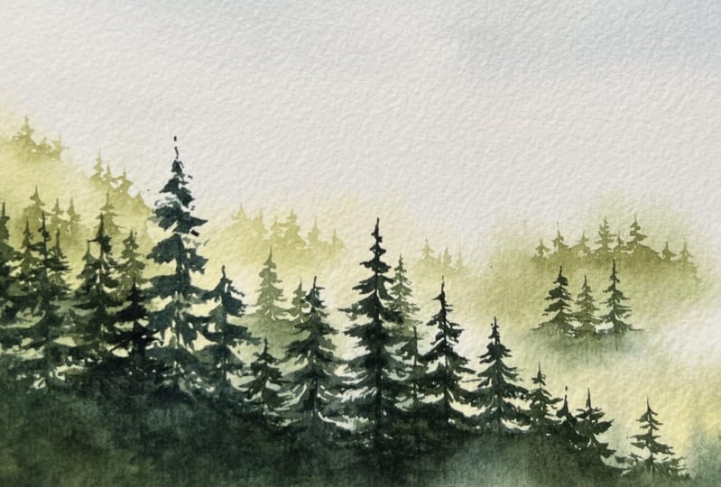
of the class. This is what our final
project looks like with a beautiful sky miss in the background and beautifully defined
trees in the foreground. Let me show you,
if I'm up close, look at how smooth the sky is, how subtle the trees
are in the background, and how much darker these trees in the
foreground actually are. And that really builds depth in the painting
and you can really imagine the mist over here in the areas
that are back there. Before we part, I'll see you
next for final thoughts.
14. Final Thoughts: I hope you enjoyed
learning painting misty forest landscapes
with water color. With the knowledge
and practice that you now have about using
convenient supplies, finding inspiration,
Painting mist trees, building death for more realism
and mixing great colors. You're ready to paint your
own misty forest landscapes. Remember that you can reach out and share your work with me. In the project and
resources section, I also highly encourage
you to leave a review that will help potential students know what to expect
from the class. And it will help me to know how I can improve
my classes even better and for more
Wala landscape painting and what pencil classes. You can follow me here on
skill share and you'll get notified every time
that I upload a new class. You can also find
me every week on Youtube Patrion and my website under the name Painting
and Chocolate. Thank you so much for
taking this class with me today and see
you in the next one.
 Francoise Blayac, Professional Artist