Transcripts
1. Introduction: [MUSIC] This is my hometown. I spent hours walking here, past charming streets
and hidden passages, while daydreaming about
my next art project. Hi. I'm [inaudible] and I'm a self-taught watercolor
artist from Southern France. Since I started
painting consistently, I created no less than
600 watercolor paintings, and nowadays, I teach
classes and workshops, both online and in-person. After exhausting the best
free photo resources, there were times that I wished
I could travel some more, and find inspiration to
make my art more magical. It all changed when one day instead of going on
one of my usual walks, I started painting
in the streets of my hometown by myself at first. Then with a friend, and
even a furry friend. I realized I was missing out on the secret spots and treasures I didn't
even know were there. Tiny streets from another time, and teak doors and whatnot. Since then, I've explored my town with a
different perspective, and in today's class, I'd love to help you do the same because no matter
where you live, I'll teach you ways to
uncover hidden gems and turn the most common thing into
a magical piece of art. First, I'll go through
the supplies we'll need. Then I'll take you on a walk
in my hometown and teach you techniques to actually see
what's around you better. We'll take it further with
a plain lantern sketch that will be quickly turned
into an enchanting one. From there, we'll add
to the magic with a simple yet striking
color palette or paint a base layer, add the shadows and
gorgeous details. This class is for you
if you need a boost of inspiration and
new ideas that can be applied to many
paintings and tweaked to your liking no
matter where you live. While the project
itself might feel more approachable to an artist with some watercolor experience, I believe anyone looking for inspiration will benefit
from this class, and that's because each
lesson is pretty laid back. It doesn't require any heavy water control
skills nor rush, which means you can stop at anytime and pick up
where you left off. What are you waiting
for? Let's get started.
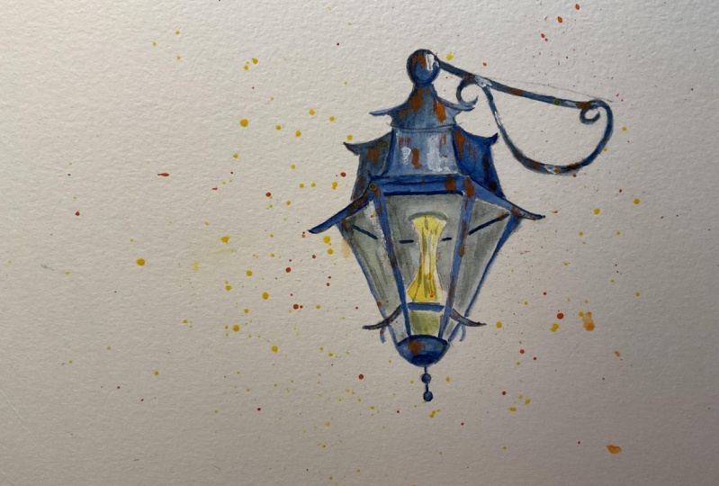
2. Your Class Project: [MUSIC] The class project is
an enchanted street lantern. I used one of my own references, since this lantern can
be found in my hometown. After I show you how to uncover all the nice things to
paint in your own town, we will get started on painting and you will get to
learn how to make a common object
like this one more interesting by
tweaking the sketch, choosing an effective
color palette, and adding certain effects. If you choose, you can very
well just watch the class and pick and tweak your own project using the techniques
taught here. It's totally up to you. No matter what you decide, I will love to see your project uploaded
here in the Project and Resources section and get some feedback about
your creative process. I'm looking forward to see
how you use the strategies I came up with to find inspiration
without leaving home, and feel free to reach
out anytime you need help using discussion
or project tab. Before we get started, note that you can
download the line art, a photo of my painting, a reference photo, and the supplies list in
the resources section. It's time to get
started and inspired. See you next for quick look at the supplies
we'll use. [MUSIC].
3. Watercolor Supplies: [MUSIC] Whether I paint
for fun or practice, I noticed that I always use the same basic
watercolor supplies. They are exactly the ones that we're going to use
for today's project. This is a six by eight
inches sheet of ash paper. It's 100 percent cotton, cold pressed with a
weight of 300 GSM. Even though I always recommend this high-quality type
of watercolor paper, for this specific
project you can go ahead and use any type
of paper you have. We won't be painting
a background or try and get colors to flow and mix together like we would in a full
landscape painting, so I really don't believe
that 100 percent cotton, watercolor paper will make
a big difference here. Other than that, ash is my absolute favorite paper
so I'll be using that. Masking tape will help us keep the sheet from moving
while we paint. It's an inexpensive
construction tool that I think comes in very
handy for watercolor. As an alternative, if you don't have that, you can use scrap-booking wash tape. Is going to be very helpful. We will need a basic
pencil, ruler, and eraser to
sketch the lantern, and anything you already have at home is
going to be fine. For paintbrushes, I
picked these today, but any brand that you
have is going to work. If you need ideas, you'll find alternatives in the supplies list that is
attached to the class. I'm going to be using
this round paintbrush for making splatters. Anything like it you have will do even if it's much smaller. These two black, round, and pointed paintbrushes
will be helpful to paint a graceful lantern since we can trace fine
lines with the tip, so I highly recommend at
least one pointed paintbrush. If you like realistic
watercolor, it's always going to be
helpful to have one. Our color palettes
will be very simple, but you will see in
the color mixing lesson, very effective. If you're new with watercolors, it will get you accustomed
to mixing colors gently. These are our philosophy tubes, and I picked Prussian blue, yellow-orange, and burnt umber. Here are a few alternatives with these colors if you
need inspiration. Don't worry, because
whether you use watercolors in pens or tubes, or whether they're artists
greatest student grade is not going to matter at all. Even the colors you
pick do not need to be completely
similar to mine. These are not the type of
things that are going to affect the process or what a
painting looks like. This is a metal tin I use
to pour my tubes into. I really like its
versatility because of the large wells into which
I can mix my paints. If you want to make it simple, you can use ceramic plates. They work well too when
you're on a budget. Otherwise, any other mixing
tray you have is just fine. We're going to be using
white gouache for highlights and any brand you
have will suit the class. If you don't have
white gouache at all, you can still use
a white gel pen or a white posca pen
instead [MUSIC]. Have a few paper towels ready, may need to soak up extra water and paint from the paintbrushes. If you have a rag, that's fine. Two jars of water are
going to be useful. We're going to be using
one to wetter paintbrushes and one to rinse them. I used a scrap-booking heat gun. It's supposed to be helpful when there are a
lot of wet areas we want to dry so that we can keep working on a painting, but in this class, there'll be a little
water involved. If you want, you can
make do without. Remember that supplies may
vary from one person to another without affecting
the experience. However, at least one paintbrush with a fine tip
and something like white gouache or
white gel pen will help you complete the
project like I did. I'm excited to get started
and in the next lesson, I'm going to show you
techniques I use to revisit my hometown and
find inspiration there. See you next. [MUSIC]
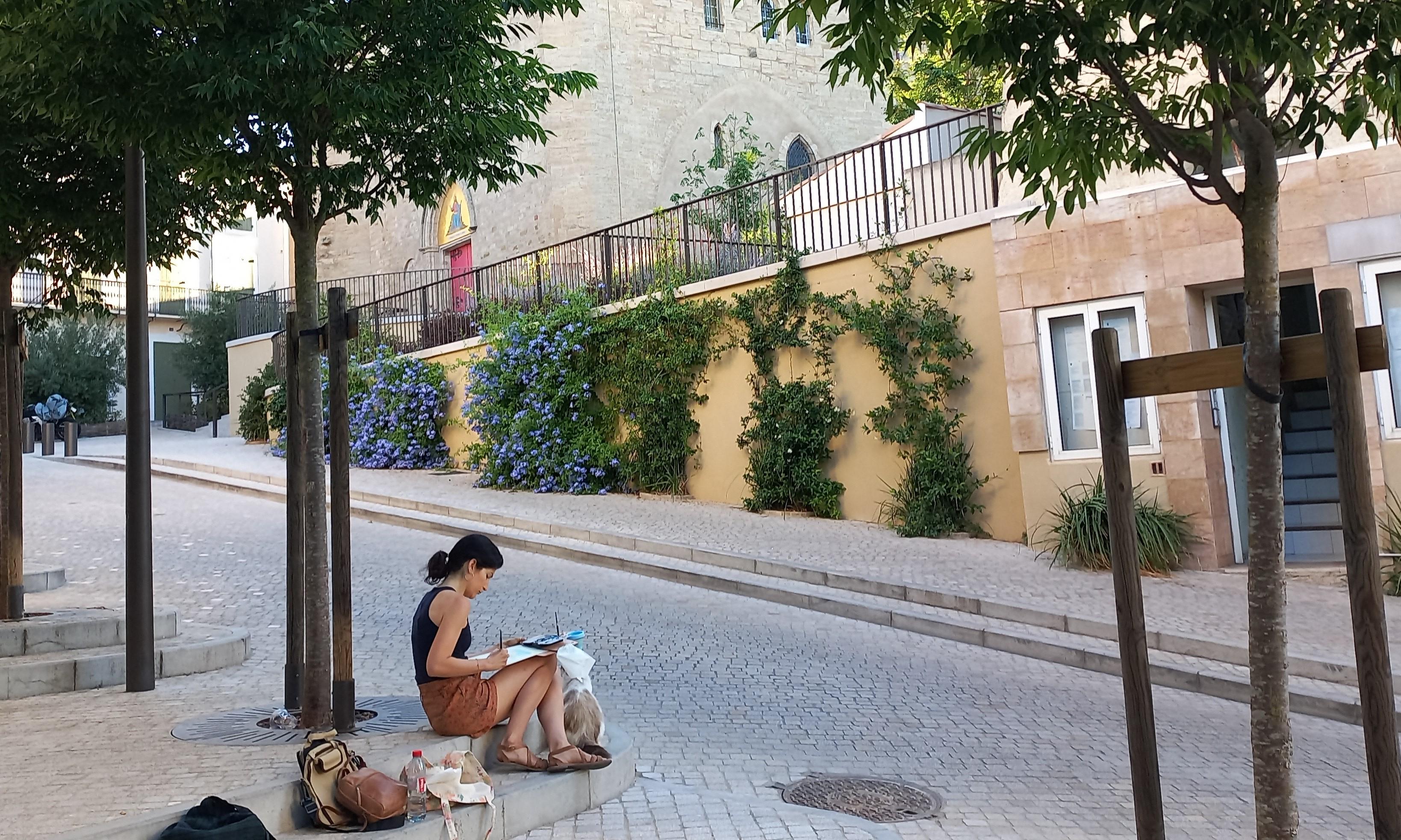
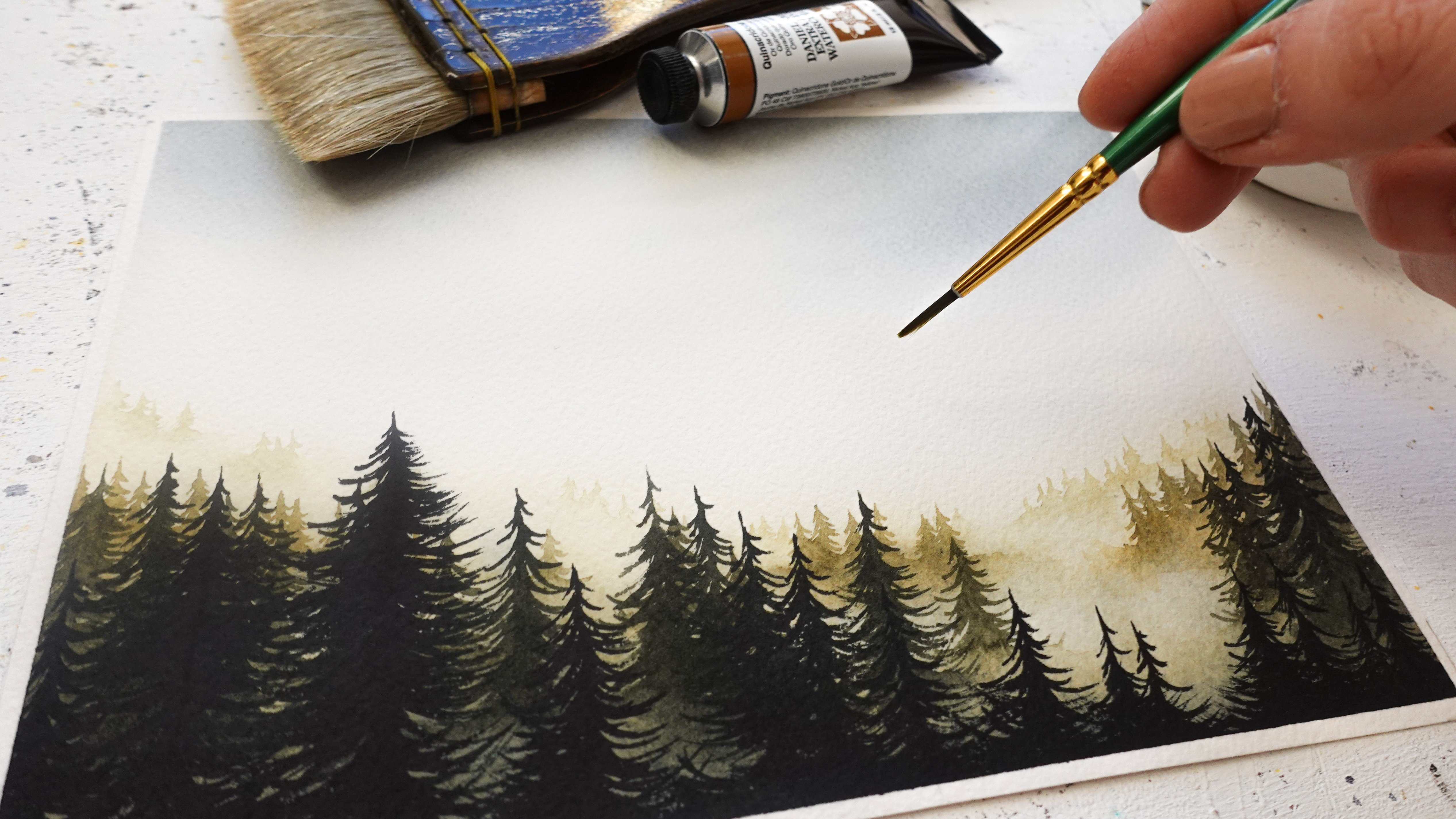
4. Easy Ways to Find Inspiration at Home: [MUSIC] When I started
revisiting my hometown, I noticed there are
three easy ways to train your artist eye and
help your inspiration flourish no matter where
you live and if you're surrounded by nature
or buildings. We will not be uncovering the same treasures from
one place to the next, but I'm pretty sure there
will be a lot of surprises, things you never
knew were there. To give you a little context, my hometown is located in Southern France and
it's filled with historical landmarks such as those ancient
fortifications. But it's by no means a
touristic spot around here. To a local like myself, at first glance it's just another town and there's really nothing magical about it. But I did say at first glance. The first way to revisit
your hometown is to look up. It sounds simple
and yet most of us won't usually pay attention
to familiar surroundings. For example, when
I'm going to walk, I'll be so absorbed
in my own thoughts, I don't even notice
what's around me. You're going to see some of the beautiful things
that I started seeing when I looked up and that really inspired
me for painting. Take these gorgeous lanterns
that inspired the project. A long forgotten castle
I had no idea was there. Beautiful statues
and tattered windows with charms to spare. This is even becoming a little
poetic, don't you think? [MUSIC] Looking up is easy and so is looking down. For instance, look at
these flower pots. This tiny door here, it totally has my heart. It's so discrete. I walked past it several
times and I was looking for it to feature in this
class without seeing it. [MUSIC] If you too have noticed how we
tend to see without seeing or listen without
really listening, then I suggest to look at
what's right in front of you, not once but twice. You might need to add a
little bit more intention for this exercise and I bet you'll come across some
interesting surprises. Maybe some cute handles or surprising houses and structures that almost
look out of place. I walked past this door
dozens of times until I actually took a hard look and noticed how beautiful it is. The broken glass and
intricate designs inspired me very much. I'm a big fan of old
doors and windows, and now I know I don't need to look for photos
online any longer. [MUSIC] I hope you
enjoyed this tour. I'll see you in the next lesson so we can start sketching. [MUSIC]
5. Lantern Sketch : Draw & Stylize: [MUSIC] Let's get our six
by eight inches sheet ready and use the masking tape so we can free up her hand
while sketching. I used this Lantern
as reference. I snapped a picture of it
rather than painting on location because that's how
I like to do it better. There's a slight antique
look to it and it's shape is so pretty that I knew I wanted to paint
it when I saw it, I felt very inspired. The photo itself is not
high quality and colors can seem quite boring at first
glance but as artists, we have a power to transform and enhance anything we like. That won't be a
problem and I will teach you my techniques
to do that in the class. I decided to keep the painting simple and focused
on the lantern. There'll be no background and we will draw on
the right side of the sheet and leave room for splatters and the
metal and on the left. Before we start, remember
there is a sketch that you can download from the resources
if that's easier for you. Once we have the lantern sketch, the painting will be
faster and easier. First, I'm going to use the
rule of thirds by dividing the sheet into three parts,
vertically and horizontally. The rule of thirds
help with giving a photo or a painting
more visual impact. I want to make sure and
place lantern sketch effectively on the sheet. [MUSIC] These are called focal points and you
want to pick one or two and have your
main element there. That's why I'll have
to sketch the lantern on the right side
rather than the middle. Now we want to make sure and
find the top and bottom. The lantern looks like it's centered in that
area of the sheet. It really doesn't
have to be perfect, but it will be helpful. [MUSIC] From looking at my own reference now. I think it's wise to start with the largest glass panel from that lantern structure
because it's quite big and it seems
to be in the middle. How we draw it determines
everything else. If the initial lines are
narrow and spaced out, the lantern will
look long and lean, if they're large and
closer together, lantern will look quite hefty. You can already see how
with simple lines you can transform the
object to drawing. [MUSIC] That bottom part is an extension of
the one we just drew. I keep going by checking
the reference to proportions and I
take my best guess. I don't try to do it perfectly. I just traced a line in between. This way I know where the size of the bottom panel should meet. This also helps to make sure we keep the left and
right parts leveled. [MUSIC] This is the last panel. Let's use the ruler
to see how to keep the top line consistent
with the bottom one. Here, consistent
it does not mean parallel because of perspective, that's why you see me move
the ruler upwards a bit. You'll notice that to
keep things looking symmetrical from one
side to the next, I draw one side first, then I trace a line that
stretches across the lantern, and I used a ruler to make sure the spacing is the same on
one side and the other. This video allows me to
keep my sketch looking accurate without having to
measure each and every part. From here we have
the main structure and an idea of how the
lantern will look. Mine is a bit wider
than the original. Next, we're going to focus
on the top and bottom parts. Erase any distracting lines
whenever you feel like it. This is going to be easier now. Let's draw the top part in the same way we did the
glass panels. [MUSIC] As you can see, I use the
same techniques as before. Here let's move
the line up a bit compared to the bottom one
because of perspective still. [MUSIC] Now we can trace a line
from here and make some measurements to keep
the other side symmetrical. [MUSIC] I decided to tweak our subject into something that
feels more magical, the kind of lantern
you would see in a period and fantasy drama. That's why we'll spend less time here at copying the initial one. [MUSIC] A few lines are missing to complete
the lantern frame. [MUSIC] Now, let's add a
beautiful light bulb just like the one in
my reference photo. You can impact the looks of your drawing or the shape of it. Make it slender or wider depending on what
you're looking for. [MUSIC] Let's draw the metal parts that separate each glass panel. [MUSIC] Notice how we manage to
keep this lantern quite centered thanks to the lines
we traced in the beginning. It's always easier to
work with guiding lines. [MUSIC] Let's finish the sketch
with a steel arm. [MUSIC] We'll be using dark paint for those ornaments so
if it's easier, you can color them
completely like me. I find it helps me
shape them better. [MUSIC] Stylizing the
sketch is optional, but it's a great way
to have fun and turn something plain into a
unique illustration. All it takes is altering
the sketch slightly, for example, you can make
straight lines curvier. We're going to do it everywhere. Why not add small
details like these too? Feel free to be creative here
if you have another idea. I'm going to go
over the main lines quickly now the sketch
is almost finished. [MUSIC] Just an idea want to make
the arm a bit more fun. [MUSIC] Remember that the sketch
should be accurate, but it doesn't need
to be perfect and completely similar to
the reference either. We just needed to be cohesive
in terms of proportions. Don't be afraid to alter
the final sketch to turn a plain object into a more
magical one and that's it. Now we have our sketch. It's time to mix some colors. [MUSIC]
6. Complementary Color Palette: [MUSIC] There is
an effective way to make any painting look beautiful and magical with a
very limited color palette. In the class, we'll be
using only three colors, orange, blue, and brown. A complimentary color scheme is the secret for a limited
palette that works. This is why we will
work with blue and orange because
as you can see, they are opposite
on the color wheel, which is also known
as complimentary. The downside of
complimentary colors is they tend to look
like mud when mixed up together and that's
why I'll show you how to handle it so
that doesn't happen. Let's mix orange first. Mine is called yellow orange, but I find it more
orange than yellow. If you want, you can mix also red and yellow to get
this type of color. We don't need a bunch of our orange mix and let's
keep it quite creamy, which means it's neither
very liquid nor too thick. To make a creamy mix of paint, the easiest way is to alternate between
paint and water at first and then you can
adjust the amount of pigment depending on
the texture you get. Let's do the same with blue. It's better to work with
a bright blue like mine. Ultramarine or cobalt
blue would work here too. But there are many
other color names out there for bright blues, it will vary a lot
depending on the brand. Let's make our mix
creamy as well. This is the color we'll use the most and you will see at first that our lantern will almost look like a
monochrome painting. [MUSIC] Brown is the color that is going to help
us create the shadows. [MUSIC] Let's add blue to it. The more blue, the more of a
dark blue you'll be getting. The more brown, the more of
a dark brown you will see. It doesn't really matter
as long as the color is much darker than our
main blue color. You might ask
yourself why I'll use brown when complimentary
colors are enough. In fact, shadow and highlights
are important as well. Especially if you like to
paint realistically like I do and that's where a
color like brown comes in. Mixed blue, we're
just getting a dark blue or a bluish
brown after all. The color scheme stays the same overall, and
that's all matters. It's the same with white
gouache for the highlights. In the end, we'll
still be looking at a painting that
appears to be blue and orange in colors as shadows
and highlights will melt into it beautifully and
feel completely natural. Remember, a complimentary
color scheme will allow you a great result
with a very limited palette. Make sure to add a dark but also a light color to your
chosen color scheme. Ours will be brown watercolor
and white gouache. We're ready to start
painting the base layer. See you in the next
lesson. [MUSIC]
7. Let's Paint ! Base Layer: [MUSIC] Let's go ahead and grab our two round and
pointed paint brushes to paint the base
layer on this lantern. If you have only one
paintbrush like it, it's okay. You can still use that one and a plain round paintbrush
in combination. We will also be
needing the blue mix. The whole painting process
is going to be laid back and relaxed, so enjoy. Our goal is to apply a coat of blue paint all
over the lamppost. That's why this lantern
won't be technical at all since we're painting
within a shape. The only thing we want to
be careful about is to add paint within the lines
so it doesn't look messy. Hence, choosing a paintbrush
with the fine tip. It makes the job a lot easier. The paint should look
vibrant since we didn't add too much
water to the mix. [MUSIC] If you want to make certain parts lighter, all you need to do is add water. My technique is to wet
a clean paintbrush. In my case, it's that
other black paint brush with the fine tip that I have. Maybe for you it's
a round paintbrush. I make sure it's
clean, I wet it and I dab it on a paper towel
so it's not dripping wet. Then I pull the paint, I just add it on paper to wherever I need to
fill my sketch. You can see it turned
into a lighter coat of paint thanks to the added
water from the clean brush. Look at how much more dimensional this
part is looking now, thanks to that technique, and yet we only used one color. [MUSIC] Don't worry if you get a
few marks and blotches or if it doesn't look as
dimensional, you would like. This is just a base layer. Little flaws can be
easily concealed later on and the 3D effect
emphasized with shadows. That's why I believe
this project is suitable to anyone who
wants to learn it, despite it looking realistic. I noticed that oftentimes realism feels like a
hard effect to achieve. But the truth is with
watercolor in particular, the tough part is to paint loosely because of
the water control. Layers and details,
on the contrary, will allow us to take
our time rather than rushing to being something loose or a background
for instance. [MUSIC] Let's add a lot more water to a little bit of our mix now. To do it, just pour some paint away from your mix
and add water. This is going to
help us paint glass. To look like glass, it needs to be very
light in color. [MUSIC] Let's avoid the
light bulb for now. [MUSIC] While this is still wet, why not add a bit of the dark blue and brown
mix to parts of it? Notice the mix is
very watery here too, so it doesn't come out too dark. [MUSIC] I'll add some of the
creamier mix now to paint the metal parts we
can see through the glass. It's better to do it now
while the rest is still wet so the lines don't
appear too crisp. You can pull some of the
color down and reinforce the glass effect by adding
those darker areas of paint. [MUSIC] I keep going. Notice it's looking a
lot more realistic now when we have color
variations in the glass. [MUSIC] Let's finish the land here
with our plain blue mix. [MUSIC] Since we have an orange mix, why not just use that to make a light bulb look more accurate? The trick here, just
like for glass, is to make sure that that color stays light by
adding water to it. It's a tiny area, so this time I'll
do it straight on paper with my clean paint brush. [MUSIC] It looks a bit strong for now, but don't worry because
we'll be darkening the rest of the lantern next. Remember to add water
to your paint and create a variation
of the main color. Keep anything like glass and the light bulb
light in color. Meet me next at our shadows. [MUSIC]
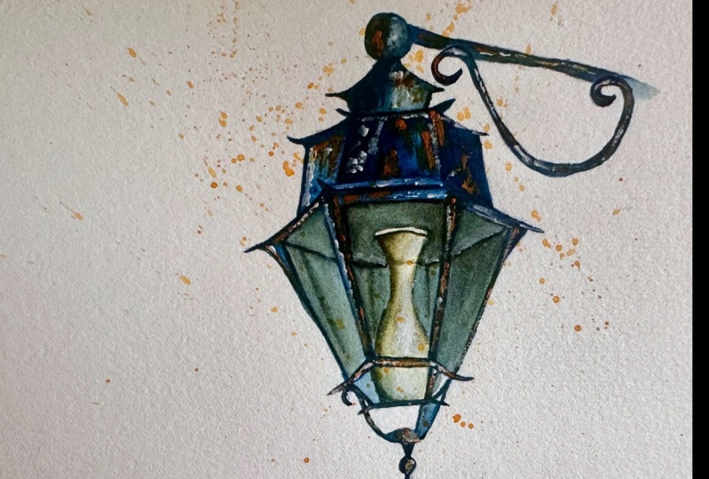
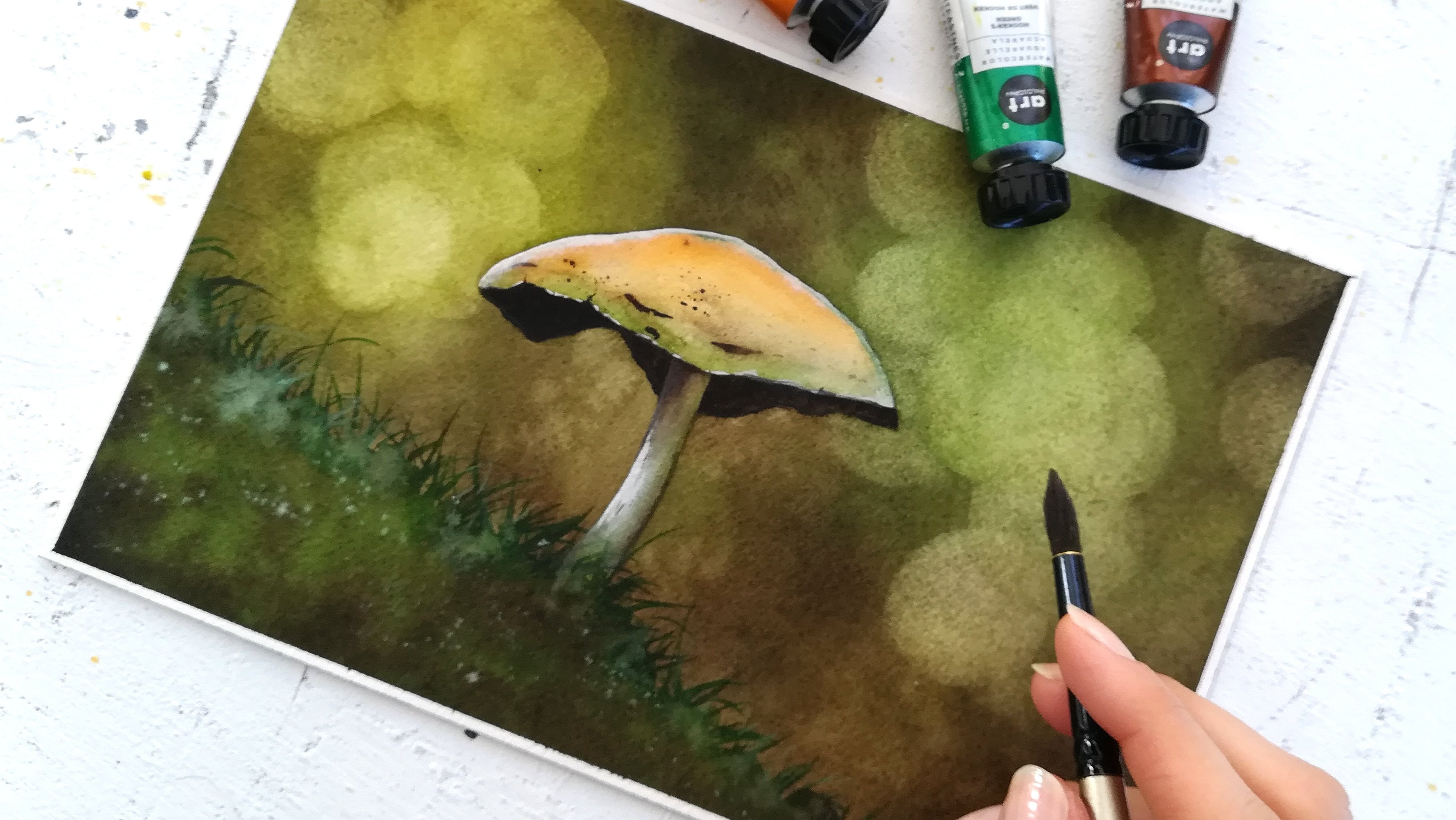
8. Realism with Deep Shadows: In this lesson, we're
going to add deep, beautiful shadows
to this lantern. We will need two paint brushes, a pointy one and another one
to soften the heart lines. We will use the dark mix of blue we made by
adding brown to blue. This involves the same technique from the previous lesson. We're basically applying
pigmented paint and then we use a clean
and damp paintbrush to fade that paint into the previous layer and keep
creating that 3D look. Thanks to color variations [MUSIC] Here, if you
wish, you can add more brown to make
colors even more diverse while keeping
the overall impression of a Blue Lantern [MUSIC] try not to make this side
of the lantern too dark, we applied the first layer that was quite light
for this purpose, to have light areas of blue showing in the
final painting. This is why you
won't see me jumping straight into painting
with a very dark mix. I prefer to build color intensity layer
after layer [MUSIC] The metal part is darker but not as dark as
the white part. That's why I'm using
water to keep it light in places [MUSIC] Now, let's make sure the
right part is dark enough. The thick mix is suitable here, so don't be afraid to add
pigment if need be [MUSIC] Let's keep going [MUSIC] Check out these details, how beautiful they are and how much they stand out
with dark paint. That's why having a dark
color in your palette for shadows is a
game changer [MUSIC] [MUSIC] I'd like to
work on the glass a tad more and remember we need to
keep it light and blurry. Try and not overdo it
there and work with a clean and damp brush
to remove heart edges. [MUSIC] You might notice how blend
light bulb is looking now. This is because we need to add a little bit of shadows to it. [MUSIC] Look at how natural it looks once we add water
from the damp brush. [MUSIC] Let's finish adding the
shadows at the bottom. [MUSIC] I prefer to try this as we'll be adding a beautiful
color next. I want to make sure the
blues don't spoil it, since remember that blue and orange don't look that
great when mixed. This already looks beautiful. It almost feels
like a lantern from the dark streets of London
and a Harry Potter movie. Remember to add shadows
to your painting to make it look more
dimensional and realistic. You can have a bit more brown in places as long as most
of it remains blue. The light parts like
the glass panes and the light bulb need shadows. We're ready to add
texture and rest. See you next. [MUSIC]
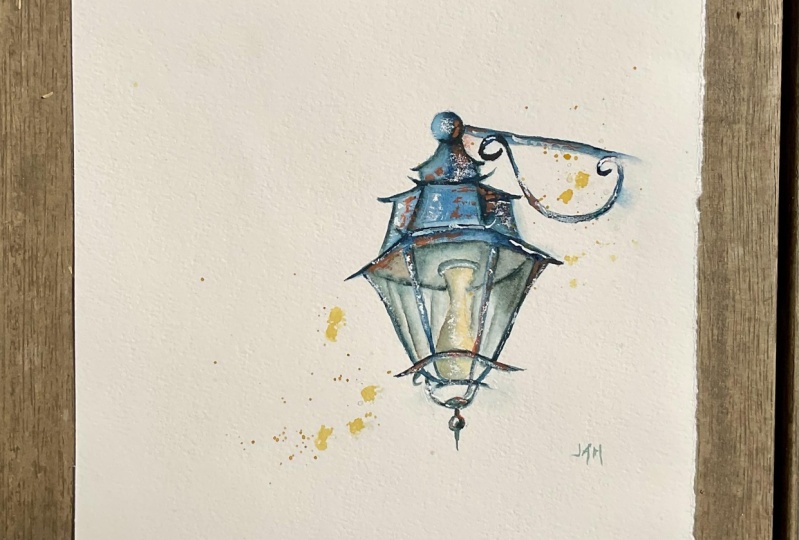
9. Mystery with Texture & Rust Effects: [MUSIC] One paintbrush
is enough to paint texture and our rest of
fact in this lesson. Why not add a little bit of texture with our
light blue mix first? This is best for
the light parts in the painting as it won't
show on the dark ones. To do it, I pick up some of the blue pigment
directly from the pen, as I think the blue mix will
be too watery for texture. Then I run my
paintbrush gently on the lantern and I hold
it horizontally like so. [MUSIC] The cherry on top of the cake here really are the rust and later
the highlights. Let's see what we can do with our complimentary color, orange. First of all, notice that
the blue paint is dry, which means the orange paint
will show on top of it and contrast with it without
ever turning into mud, unless we were to use it
as a light coat of paint, and that's because watercolor
being transparent, the the orange would still
look like mud on top of blue. In other words, orange
needs to be visible. That's why instead
we're going to use it as thick paint right
out of the tube. Not only is that going to pop, but it will also add a lot
of vibrancy to the painting. I'm creating a thin layers
of pure paint here, which gives a light
rusty effect. Like we did with texture, let's wipe the paint brush
on the sheet gently, and hold it horizontally. [MUSIC] For the rust to show
in a dramatic way, especially in those dark parts, we're going to use it as
squash, pure and thick. [MUSIC] Look at how
gorgeous this is. The hardest part is not to
add the paint everywhere. I find this process
so highly satisfying. [MUSIC] Remember you can use your main color for texture, it's most effective
on the light parts. For rust, orange always works. In this case, it is best used as a very thick
layer of paint, which is not something we're
used to with watercolor. White gouache is the last
edition we'll bring, so let's meet next for
the highlights. [MUSIC]
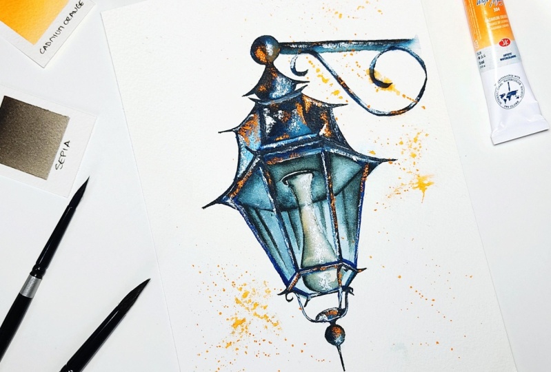
10. Magic with Enchanting Highlights: There are two ways we can use white gouache to create
beautiful highlights. We'll need a round and
pointed paint brushes for that and thick pure paint that comes right
out of the tube. The first way to use gouache is to add a
little bit of water to it so it's easier to
apply than if it was pure. Then add it to the painting. With a clean and
damp paintbrush, we're going to dilute some of the white gouache
and we get some glow overlapping
that dark teal color we created with our
blue and brown mixes. For instance, this part on the top part of the lantern
will be great if highlighted, because it will make that
shape look like a sphere. Let's repeat elsewhere [MUSIC]. Another way to use whitewash for highlights is similar
to what we did when we picked up orange
watercolor out of the tube and applied
it in thick layers. We're doing the same but
with gouache now [MUSIC]. While we were painting
the sharp details that stick out and
that I invented, you might have noticed
there was one that we couldn't paint because
it was too dark to show. That's when white gouache is just so interesting
and versatile. Let's add it there and now the detail appears and
completes the painting. It's interesting
to add highlights, even if they stay subtle to all the metallic parts to help create a 3D effect
to all of them. [MUSIC]. The light bulb will also benefit from that. Add gouache in the
middle and now we can see it come
together even more, like the sphere we painted on top of the
lantern at the beginning. In this top part
behind the glass, we used the water earlier. We'll do the same with white gouache with our clean and damp paintbrush to make
the highlights there looking soft,
almost blurry. You can add a little bit of
gouache too on the glass itself if you'd like to create strong reflections [MUSIC]. Let's finally use
this round brush and orange mix for
the final splatters. It's a good way to let the watercolor effect
shine through, and it also adds interest
to the painting as a whole. Try not to get carried away
here and keep it simple [MUSIC]. I tease my
fingers sometimes to turn regular splatters into larger
watercolor stains [MUSIC]. I hope you enjoyed painting this lantern as much as I did. It was so much fun. I love how magical and
mysterious it looks. Please share yours
in the project and resources section and I'd love to know about your
experience as well. Let's meet one last time
for final thoughts.
11. Before You Go: [MUSIC] Congratulations
for completing this class, whether you went with
my project or your own. Either way, please
share it with me and other students in the Projects
and Resources section. To help potential students decide if the class is
a right fit for them, you may also leave a review and let us know what your
experience has been. I upload a new class every month and I
work with watercolor, one of the pencils
and oil pastels, so if you want to
make sure not to miss out on any of that, you can follow me here on Skillshare and
you'll get notified by email every time a
new class comes out. You can also find me on
Instagram and YouTube for more inspiration and behind the scene and if you want to share your art there as well, you can use the hashtag
create with francoise. Thank you so much for
learning with me today. I'll see you in the
next class. [MUSIC]
 Francoise Blayac, Professional Artist