Transcripts
1. Introduction: [MUSIC] Hi, I'm
Francoise and I'm full-time watercolor
and mixed media artist. I've been teaching
painting for beginners on YouTube, Instagram
and Skillshare. Over the years I
grew a following of art enthusiasts and I started collaborating with
multiple art brands. I paint with mediums that
aren't most known for a realistic style and
watercolor is one of them. What I love about it is it is extremely versatile and
unlike most mediums, it's very easy to combine lots of different
styles and techniques. Achieving realism with
painting or watercolor really isn't as difficult as time
consuming as it may seem. My purpose with this class and all others on Skillshare
is to help beginners who enjoy that style learn the basics for realism
and watercolor. So they can take that
knowledge and create pieces that look more
dimensional and eye-catching. In this class, I'm going
to teach you a very simple and easy to create bokeh technique with
a mushroom painting. This is a type of
effect that may look complex at first
sight and yet you will quickly notice what
this class that all it takes is a few brushstrokes
and key techniques. First, I'm going to
show you what supplies I used to create
realistic paintings, then we will learn how to paint the bokeh effect with
a quick exercise. We will draw a
very simple sketch because that is all we need in order to get into the painting. Then we will mix our colors and start painting with
some background layers, the mushroom and some grass. Near the end of the grass, we will add shadows
and highlights for more realism and finally, complete the painting
with a bokeh effect. If you're not comfortable with water control and mixing
colors with watercolor, you may join this previous
class I made it to help early beginners understand and practice the basic
watercolor skills. Otherwise, let's jump into this class and
start painting this beautiful on a mushroom scene
and it's bokeh background. Let's get started. [MUSIC]
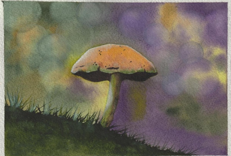
2. About Today's Project: [MUSIC] Today's project
is an enchanting on scenery featuring a mushroom
and a bokeh background. I'm happy to introduce you to the bokeh
factor this painting, as our background
will be quite basic, but still it will allow you
to get more accustomed to color mixing and blending
and layering techniques that are very helpful
in watercolor. The mushroom will be an
opportunity to explore realism a bit more with the addition of some
shadows and highlights. Finally, the bokeh
technique you're about to learn is incredibly fast and easily create and you can easily use it in
future paintings. To make the most out of class before you get
into the painting, I would suggest to go
through the bokeh exercise. It will be a great warm-up. If you need to later
in the class to make the process smoother
and more relaxing, feel free to pause the
videos at anytime. Something I've done as a learner is to watch a video throughout, just so I know what
to expect and I can get into a painting
with more confidence. Feel free to do that as well. Last but not least, feel
free to reach out here in the discussion section if you have anything that
you want to ask. If you'd like to share your project with me
and other students, you can go ahead and post
it to the project gallery. Meet me next for look at the supplies we're
going to need. [MUSIC]
3. Supplies: [MUSIC] In this lesson,
I'm going to show you what supplies
I'll be using and I'll give you some
alternatives to complete your project using what
you already have at home. For paper, I recommend 100 percent cotton
watercolor paper with a cold pressed finish
and a weight of 300 GSM. This information is written
on watercolor paper pads and they are easy to find
online and in art stores. I like to use the Arches brand and I can recommend others
like Winsor Newton, Saunders Waterford, and
Canson L' Heritage. This is how thick this
type of paper is. Cotton fibers hold water really well and makes it
easy to work with. The cold pressed finished,
a bit grainy here, you can see, also helps
with water retention. For this class, you
can grab a small piece for the exercise
and a bigger one, like a 6 by 8 inches piece
for the actual project. Next, make sure to set a pencil and eraser
aside for the sketch. I think basic like this will do. For the paintbrushes, you'll see me use these three today. I work with them all the time. This is a round paintbrush. It's basically
watercolor and it has natural hair fibers which also
helps to hold water well. I don't select
paintbrushes based on the number that is
written on it, instead, I check it's neither
too small nor too big for my paper and
as you can see here, this one will work nicely. The next two are round
and pointed which is not a must but helps for
getting fine details in. If all you have is
one round paintbrush, it will do as long as it's not too big for
painting the mushroom. I'll be using Art Philosophy
watercolor tips today. You're fine whether
you use tubes or pans. I selected green, yellow, orange, brown, and black. The next item you will find
useful here is white gouache. I use it to create
highlights and cool effects. I recommend using masking
tape like this to tape the sheet firmly onto the
surface you like to work on. This way the paper won't
keep moving as you paint and will make
it more agreeable. Have a few paper towels or
a tissue ready as we'll be using them to remove water from the paint brushes and for
the bouquet technique too. We'll need jars of
water, two is great. One to wet, one to rinse. Finally, a heat gun or
hairdryer is very useful to speed-up drying time although it is not
mandatory at all. Don't forget to download
the list of supplies from the resources section if you
like and in the next lesson, we're going to
learn a very quick and easy to do
bouquet techniques. So see you there. [MUSIC]
4. A Quick Warm-Up Bokeh Exercise: [MUSIC] In this lesson, I'm going to show
you how to create a bokeh effect very easily with watercolors
and a paper towel. First let's take this down. This technique we're
practicing is achieved by removing a lot of the paint
off of the paper once dry, in a given area. Be aware that some paints might not be as easy to
remove as others, which means the results
may vary a bit. Some paints, for instance, are called staining, while others are labeled
as non-staining. It's very common to find
this information about each color on the package itself or on the
brand's website. The brands usually grade
each color from 1-4. One being non-staining, it's easy to remove
with water once try, and four being staining, hard to remove
after it has dried. This quick exercise
will let you know right away if your paints are
standing or non-staining, so don't worry
about it too much. All it takes is a quick test. For our test, I'm
going to be using indigo since it's different than the colors we'll be using later. You can use whatever
you want as long as that color has a dark tone, like indigo or
strong green or red, purple, brown, even black. Anything that is not a
very light and soft tone, has to bokeh it
wouldn't show as much. How you apply the paint
is no big deal here. If you get a few marks
or irregularities, it's completely
fine and we're just practicing our bokeh effect. I apply mine quickly
and I made sure to have enough pigment on there so it comes out dark when it dries. [MUSIC] I'm going to dry it quickly with my heat gun. [MUSIC] Now I dipped my
clean paintbrush in water. You want your paintbrush
to be just wet, not soaked and
dripping with water. Now we're going to paint circles and with a clean paper towel, remove the paint, and
that's it really. This bokeh technique
is very easy to get. I found it by accident. Once I was painting and my
background is already dry, I must be painting detail elsewhere that moment
I can't remember. I picked up a wet paintbrush
that was dripping with water and a drop accidentally
fell on the background, leaving a perfectly
round wet spot on paper. I try to soak it up
and remove it and I found out I could get a
bokeh effect this way. This is one of those
happy incidents that you can hear
happening with watercolor. [MUSIC] I'm done. You see how fast
and easy this was. I'll see you in the next
lesson and we will start painting our beautiful
full scenery. [MUSIC]
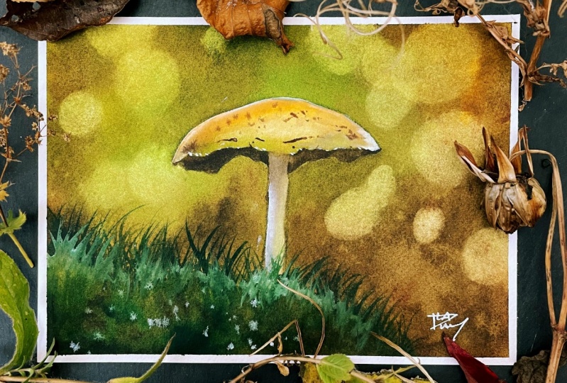
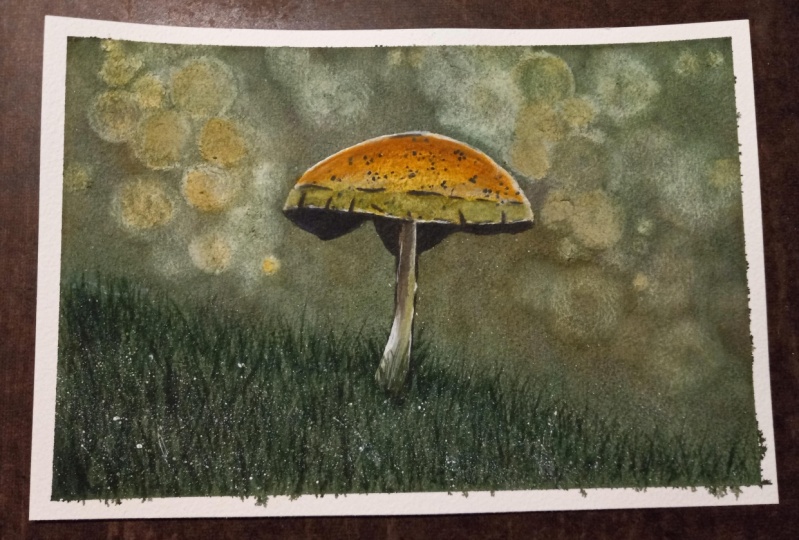
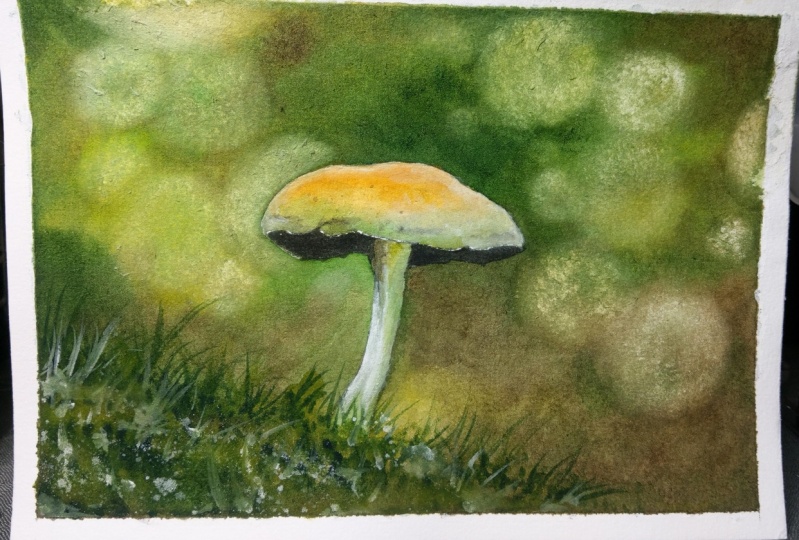
5. Class Project Part 1 : Draw the Sketch: [MUSIC] In this lesson, we're going to paint
a simple sketch. Looking at the reference
photo for this project, you can see the main
subject here is a mushroom, with most watercolor landscapes, and since the sketch is usually kept very simple and
it applies here. All we need to do is
draw the mushroom. First, let's place a line for the grass we can see
in the reference. It will help us
place the mushroom. I make the line head downwards mine is irregular
and yours can be straighter. It doesn't really matter as this will get covered up
with paints later. Is just to see where
the mushroom will be. Next, let's draw the
crown of the mushroom. Try to center it and make it big enough so it's the star
of the painting later. Don't be afraid to
erase if you need to. I usually don't press hard with watercolor sketches as pencil tends to show beneath
light colors. But here really it's
not going to be an issue as the colors
will be quite dark. [MUSIC] We're done with
this quick sketch, so let's meet next to
prepare our colors. [MUSIC]
6. Class Project Part 2 : Learn to Mix Colors: [MUSIC] We are ready to prepare the colors for our painting. I like to use large wells like this to have plenty
to work with. Let's start with the green. I want a paintbrush, pick
up some pigment and add some water to create a
watery mix of paint. [MUSIC] I decided to add
yellow to my green paint as it feels more like an autumn
green in my perception, than a bright lush green wood. Naturally it all
depends on preference, so please feel free and alter
the color the way you like, or just leave it the way it is. The next mix is a darker
version of this green. I would normally just add
to this mix as I paint, but for the purpose of the
class, we'll mix again. It's nice to prepare
all mixes separately. It takes away the overwhelm. With time you get
used to mixing and painting and you can end up mixing different
shades as you go, it's what I've come to do. With this green, we will
add brown and instantly you can tell the difference as
it turns into a dark green. Now let's mix brown as there is a lot of it towards the
bottom of the background. [MUSIC] Finally, let's mix
a darker brown, and this time I'm
adding black to it. Let's not forget orange. We won't use it much, but we still need a
little bit of it. Once all your mixes are ready, make sure they're watery enough, so they get a chance to mix
up well with each other, and I will see you next for our first background
layer. [MUSIC]
7. Class Project Part 3 : Paint a Fall Background – First Layer: [MUSIC] In this lesson,
we're going to paint our first layer on
the background. It's going to help us
fill up the paper with the colors we picked
where we want them. From there, it will be easier
to apply a second layer and paint our mushroom and bouquets
later on in the class. To start I'm wetting the
paper very well to make sure the water has a chance to penetrate the fibers
and the paper. This is why I keep going back
and forth for some time. There are several ways to deal with avoiding the
mushroom when we do that. One way is to use masking fluid and apply it
on the mushroom. You're welcome to do this
if you like it better. Another way is to
avoid it completely to try and not apply
any water on it. Because if we do, the paint
will flow towards where the water is on paper and
that may spoil the mushroom. In this case, what
works well for me is to contour the
main subject here, the mushroom with my paintbrush without getting too
close to the line art. This means there is a small area all around
the line art that is dry. [MUSIC] To make sure and avoid any hint of that later an invisible drying mark. As soon as I'm done
wetting the paper, I apply the paint starting with the immediate edges of the
main subject just like that. This allows the main
subject to be outlined without paint creeping
inside of the drawing. Because all around
it is already wet, that fresh paint spreads
out and later it will blend into the rest of the background easily.
There'll be no mark. [MUSIC] Let's apply our light
green mix towards the top. [MUSIC] Our brown mix can be added in the
bottom part and also overlapped onto some of the green parts to
make transitions between both colors
look more natural. The background and how
you would prefer to paint it is open to interpretation
and preference. The most important thing to keep in mind is we don't want it too light so the book effect shows hence a second
layer we will apply next. I like my paintings
more muted than bright, so overlapping a color like brown that will turn
these green down a bit. But if you love bright tones, I would suggest to keep
more of the green showing. [MUSIC] Don't forget to apply a little bit
of the darker tones we mixed too to bring some nice contrast
to the painting with light and bright areas
and darker tones. If this is not your first
time with watercolors, you might have heard it is better to start
with light colors. This is because the
lighter the watercolor, the easier it is to fix, the thickest, the
hardest it is to fix. This is exactly why I have you started with light
and watery mixes. It helps place the colors on paper while giving us
a chance to correct anything we do easily if we
want to by removing it with a wet and clean brush or by swiping enough with a
paper towel, for instance. How can we make our
colors stand out more when the mixes
are so full of water? Well, we can add a second layer and we will do this next. We can also start adding more pigment in a first
layer like this one. You can choose one or the
other or do both like me here. When I was a beginner and not comfortable
with watercolors, I would paint a
light layer, dry it, paint another one, dry it, and again for a third time. It's a great approach
to take to get started, even if it takes a
little bit longer. Here, because I know my
paper is starting to dry, I am used to it, I like to add pigment
to my watery mixes and keep applying more
pigmented paint on paper. It's going to make this
first layer more vibrant and it will only require another layer and not
three for instance. You can try this if you feel
comfortable and if not, please stop here and dry it, and then start on
the second layer. It's absolutely fine
to do it this way. [MUSIC] I'll show you what
this looks like here to apply thicker mixes and make a background more vibrant when we're just painting
the first layer. You can see my mixes are a
bit creamier from adding more paint and on paper it
spreads out a little less. This will help the
colors show a bit more as they tend to look a
lot lighter when they dry. The more pigment,
the more vibrancy. [MUSIC] I add a little bit of orange here,
is not mandatory. I'm only doing it to have more variety in the
colors I'm using. [MUSIC] Now, this first layer
looks good to me, so I'm going to dry it with my heat gun and if you prefer, you can let it dry naturally. [MUSIC] We're ready to apply another layer to
finish the background. See you next. [MUSIC]
8. Class Project Part 4 : Paint a Fall Background – Second Layer: [MUSIC] In this second
layer of the background, we're going to proceed in the same way we did
for the first one. I wet the paper first and I avoid the immediate
edges of the mushroom. [MUSIC] Then I have
high colors all around the mushroom to preserve the drawing while avoiding a mark where the water
stops in the background, just like we did before. Notice just one thing, how my mixes are a lot thicker than they were at the
beginning of the first layer. This is because like I explained
in the previous lesson, we're working with
more pigment now. We don't need our
mixes to be too watery once our first
layer is already on, since we want the
colors to really show. But sides, is going to be easier for them to show because now all the paper is filled up with paint already
with that first layer. [MUSIC] Quickly, I add
paint to the rest of the background to
keep the paper wet. [MUSIC] Now, I'm going to be adding
more brown and dark brown. Remember, you don't have to
add this much if you prefer your background to
look greener and brighter, it really depends. [MUSIC] In this second layer it's really a chance to
bring some tweaks to your background to make
it darker in places, or maybe more vibrant by adding
more green for instance. [MUSIC] I'm going to add a
few splatters of water with a clean and wet paintbrush
so this creates a bloom effect and it's very
pretty with watercolors. It will add an impression
of texture too. [MUSIC] Let's try
this last layer. [MUSIC] We are done and we're ready to
paint the mushroom, so see you in the
next lesson. [MUSIC]
9. Class Project Part 5 : Paint the Mushroom – Base layer: [MUSIC]. In this lesson, we're
going to paint a mushroom. If you have some leftovers from the mixes we use
for the background, like I do, it's great as it
is all we're going to need. I start with a crown
and I apply orange, then a little bit of brown, and finally a bit of green. [MUSIC]. You can make the colors more
intense if you want by adding more pigment
before this dries. [MUSIC]. Let's make the stem green. [MUSIC]. On top of that, I'm adding some brown. My paintings look
realistic in part because I overlap
colors in this way. When you observe
anything in life, you can take our reference
photo, for instance. It's not just one same
exact shade of a color. There are a multitude
of shades in one spot. I overlap and I layer colors to achieve this
more natural look. [MUSIC]. When this
is completely dry, you can apply a second layer for more realism, more vibrancy. [MUSIC]. Now, an exciting part is going to be to
create a 3D look. Let's add a very thick
mix of brown and black in that part of the
mushroom underneath the crown. I believe it's called the
gills, if I'm not mistaken. I'm not very familiar with
mushrooms in general, so I looked it up. This is going to add
a lot of depth to the mushroom because
the color is so dark. [MUSIC]. A pointed paintbrush is very useful with such work. Notice how the edges
of the gills are irregular even on
the reference photo. This detail contributes
to the realism too. What is nice with painting from reference is you can
learn a lot about how to paint one thing in particular, just
from observation. [MUSIC]. Let's add a little bit of a shadow on the stem
and when it's dry, we'll be ready to move on. [MUSIC]. The mushroom is done, so let's meet next to
paint the grass. [MUSIC].
10. Class Project Part 6 : Paint the Grass: [MUSIC] To paint
the grass, we're going to mix a little bit of the greens and dark browns
we have been working with. We want the mixes
to be quite creamy, as once more, we want the paint to show
here since we already have a base layer where this
patch of grass goes, and we want to cover that
background up in that area. [MUSIC] When adding a light green shade, I make the top of the
grass quite irregular. [MUSIC] While it's still wet, you can get one of your
smaller paint brushes if you have one to
create small dots. This is achieved by tapping
the paint brush on paper and dragging paint from the grass
onto other parts above. [MUSIC] Before it dries, I'm adding a little bit of the darker green and then some dark brown and that's going to cover up that
background underneath. [MUSIC] Now with a tip of a pointed paintbrush, we can start creating grass. When you paint grass like this, make sure to vary the
length, size, and direction. It will look better
and it also will help conceal the
bottom of the mushroom so that the stem looks like it's located behind the grass
that we're painting now. [MUSIC] Well, it's still wet, I splatter some white gouache to create delicate highlights. [MUSIC] Look at how they're spreading,
it's pretty cool. [MUSIC] You are almost done here. Feel free to share
your progress in the project and resources
section of the class. Now let's take care of the shadows and
highlights. [MUSIC]
11. Class Project Part 7 : Add Shadows & Highlights: [MUSIC] In this lesson,
we're going to start adding magic to this
painting with some detail. First, let's work with our dark brown thickness
from the previous lessons. We're going to add detail on
the crown of the mushroom. Not a lot, just enough to
make it look even nicer. [MUSIC] Feel free to add a line to depict a cut
like this on the edges. It's almost nothing but
it looks really cool. [MUSIC] I'm going to splatter some paint here to
add a little bit of texture, something interesting going on, on the crown, and it's
looking right already. [MUSIC] I find the stem likes to shadow, especially the top part
beneath the crown. To avoid getting a harsh line
from adding a shadow there, you can fade the shadow
with another brush, a clean and slightly
wet one will do. [MUSIC] Now the shadows are in. Let's take care of
the highlights. I love to use white
gouache for that. Some people prefer gel pens, or posca pens, but I like gouache more
because you can make it very intense
or very discreet, and it's easy to remove
too if you make a mistake. I'm starting with the crown. Adding the gouache
on top there is going to help correct
the shape a bit, if it was altered
by the background. On the reference photo, I noticed the only part in
the mushroom that looks perfectly smooth is
the top of the crown. [MUSIC] I'm also adding
some white gouache on the right part to
bring more light. [MUSIC] The stem is very dark and does not stand
out much on the background. White gouache will fix that
for you whenever you need something to detach itself a
bit more from a background, like I did for the shadows. I use another brush, a
clean and wet one to fade the edges of my highlights
into the painting itself. It just makes the
gradient look a little better between
bright white, and the color that
was there before. Make sure the paintbrush is not dripping with water
when you do that. You can tap it on
a paper towel to soak the extra water off of it. [MUSIC] We're done.
In the next lesson, we will add our bokeh effects.
See you there. [MUSIC]
12. Class Project Part 8 : Create the Bokeh Effect: [MUSIC] In this lesson, we're going to paint
the bokeh effect to finish this painting. Just like we did
in the exercise, let's paint circles
with water and grab a paper towel to
remove the paint there. [MUSIC] It's coming off really well and
showing a lot and the darker tones in the
background really help with that. I'm going to keep going with small, medium, large circles. Some overlap each
other, others don't. It's a variety we want here. [MUSIC] If you notice your paper is peeling a little bit when
using the paper towel, don't worry, as long as
it's just a little bit. It is the case for me and
I'm not worried as this does not affect the way the painting is
looking in the least. [MUSIC] This painting
is looking truly magical and I'm going to add just a little bit of
gouache on the stem as it still doesn't stand
out enough to my taste. [MUSIC] There, this
is much better. Great job for finishing this autumn scene and
learning the bokeh effect. Please share your
project to the project and resources section
of the class so I can give you feedback
and help you if you have any questions
about the class. See you in the
conclusion. [MUSIC]
13. Conclusion: [MUSIC] Congratulations
for learning the Bookeh effect and
painting this mushroom scene. I'd like to suggest one takeaway for this class and
it is that creating realism and a cool
effect doesn't need to be difficult
even with watercolors. Please post your project
to the project gallery and feel free to ask for
feedback if you need it. You can also leave
a review to let me and others know how
you enjoyed the class. For more realistic watercolor, make sure you follow me here on Skillshare so you can get
notified every time I upload and you can also
find me on YouTube and Instagram where I share
many tips and tutorials. You may also use the
hashtag create with Francoise to share your
project there with me as well. Thank you so much for
taking this class with me today and see you in
the next one. [MUSIC]
 Francoise Blayac, Professional Artist