Transcripts
1. Introduction: [MUSIC] Hello, I'm Rose. Welcome to my class. Today, I'm going to
teach you how to combine loose and realistic
techniques to achieve beautiful
dimension in your works. In my two previous
galaxy classes, I went deep on how to leverage the layering technique to paint smooth and vibrant backgrounds. I also taught my techniques
to create specific shapes. In this class, we're
going to explore a much looser way to paint galaxies with landscapes that still look striking
and realistic. It's going to be very useful
if you're a beginner and you have no idea where to start
when painting a landscape. If you have taken my two
previous galaxy classes, you're going to get
fresh insights and tools to upgrade
landscape painting game. I'll take you through the
supplies we're going to need. Then I'll touch on how loose and
realistic techniques combined will catch you
beautiful landscapes. Finally, we'll dive in
and paint our projects. We're going to paint two striking galactic
landscapes and by the end of the class
you'll be able to understand how loose and
realistic watercolor work. How you can combine both styles to get the
best of both worlds. Grab your paints and let's
get started. [MUSIC]
2. Class Projects: [MUSIC] Let me tell
you a little bit more about the class project. I picked this topic because
I remember feeling so lost at the beginning when I
started painting landscapes. I never knew exactly
what to start with and what technique to use. The good news is, once you understand how to approach
a painting like this, it gets easier, and I'm going to help you
get there today. We're going to use a few
colors for each project, as well as some gouache. We're going to create easy and beautiful landscapes
that look real. If you're very new at
watercolors or maybe you're not comfortable
with water control, for instance, you can very
well follow this class as I will take you through
each step in detail. If you're ready to dive in, make sure that before you
get into the projects, you check out that
part where we explore how powerful creating a loose to a realistic style can be in watercolors and how you can
apply that to your paintings. Please upload your projects
to the Project and Resources section of the class so me and other students can
give you feedback. Now, let's go meet in the next lesson for our talk
about the supplies. [MUSIC]
3. Class Supplies: [MUSIC] Let's talk
about the supplies. Today I'll be using
two sheets like these. They are 6 by 8 inches. You can have them
a little larger, a little smaller. It
doesn't really matter. Mine are Winsor
and Newton paper. It's 100 percent cotton paper, cold pressed, 300 GSM. It's actually great to
retain a lot of water. I really like to use this. Now you can use
whatever you have. For pain, at the minimum, I would suggest you work with
a large round paintbrush like this one and a smaller round paintbrush like that one. That's the minimum. If you
have more choice like I do, you can use another large round paintbrush
that really helps me because I use one for light colors and one
for dark colors. I don't have to rinse
them really well every time I switch
colors. That's why. Now for detail, I love to use the Silver brush Black
Velvet paintbrushes. They're really great because
they have that fine tip. That's really great
to get detail. I use these a lot. You
don't have to though. Now I want to take advantage of this class to show you
how to use a fan brush. This is actually
going to help us create the palm tree
branches and we can very well create palm
tree branches with a smaller brush
like this, or that. Really it doesn't matter
if you don't have it, but if you do, that's great because I'm going to
show you how to use it. Finally, I like to use a
flat brush to wet my paper. Again, you don't
really need that if you don't have it, it's fine. Just use a paintbrush like this one and this will do
just to wet your paper. That's all you need really. For paints, I'm
going to be using the Odyssey set by
Art Philosophy. I actually made mixes out of
the paints that are in there that equal pretty basic colors that you can find in your set. It's totally fine if
you don't have it. I listed all the
colors that I'm using, so whatever you
have, you can do. I'm going to be using
some white gouache. This is actually
ARTEZA white gouache. If you do have maybe a white gel pen or a white Posca pen is
totally fine as well. It's just to get the details. I also need some masking tape. Masking tape I use
it to actually tape my sheets firmly on the surface so they don't
move around when I paint. I also like it because I get those crisp edges all
around with masking tape. That's why I use it. We'll
need two jars of water. We'll also need
some paper towels. Please make sure
to have a few of these ready because
we're going to use them to soak some
water off of the sheet. We're really going to
need a few of those. Then if you're
impatient like me, you might want to
use something like a hairdryer or maybe a heat gun if you have that and this can
help your sheet dry faster. We're not going to do a lot
of layering in this class, but still, for the background, I like personally to dry everything fast so I
can keep on painting, but you can wait it out if
you want and just let it dry. That's it. You know everything
about the supplies now. Let's move on to the
next lesson and learn about loose and realistic
techniques. [MUSIC]
4. The Power of Combining Loose & Realistic Techniques: [MUSIC] In this lesson, I'd
like to explore the topic of combining loose and realistic
techniques with you. The main benefit of doing that is to make a subject standout. I'm going to show you
examples of that. What we're going to do in
this class is actually paint a loose background and then we're going to paint
a subject that's going to be a little bit more
realistic so it can standout. Here for instance, you
have examples of that. Here you have a loose
sky, loose mountains, and here in the front you have the sea and there
is a lot more details. So this really stands out. This is really a good
example of this technique. Here again you can apply
that to anything really. In a forest like this, we have a background
that suggests that they are trees far away there. But we also have more detailed
trees in the forefront. There again, we have
another example of that. A very detailed boat
in the foreground, and in the background we
have a very loose sky, and very loose
mountains at the back. You can see it here again. See how loose that sky is and how loose
those mountains are, and how detailed this little
shed is in the foreground. That's exactly what
we want to do. That's what I want
to teach you today. Just a few more strokes
and you get there. We can apply that to
a portrait as well. See here, I just painted just a brown background and then the face
is super detailed. I could show you
so many paintings, I have a lot of them by now. Here again, see you have very loose mountains
in the background. Look at that cup, it's very detailed but it
wasn't that long. Just a few strokes. You just need a few highlights. Get your shadows right. That's the last one I'll
show you for today. You have a very
loose background, even the sea itself
is pretty loose here, but the rocks in the foreground
is what I wanted to draw attention to that those are
a little more detailed. You can't keep everything loose, keep it mostly loose or
you can go realistic. It's really up to you to
decide and this class is going to help you do
just that. All right. So with that, we're
ready to get started. Let's meet next for our
first project. [MUSIC]
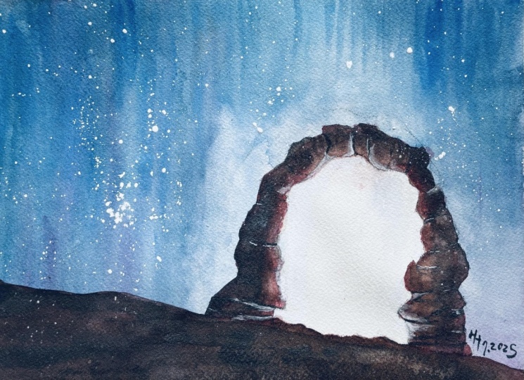
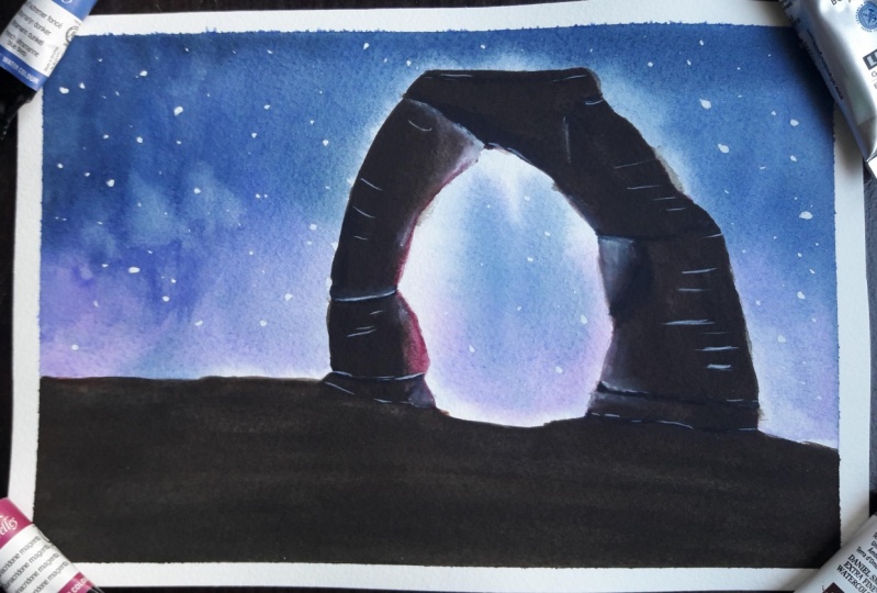
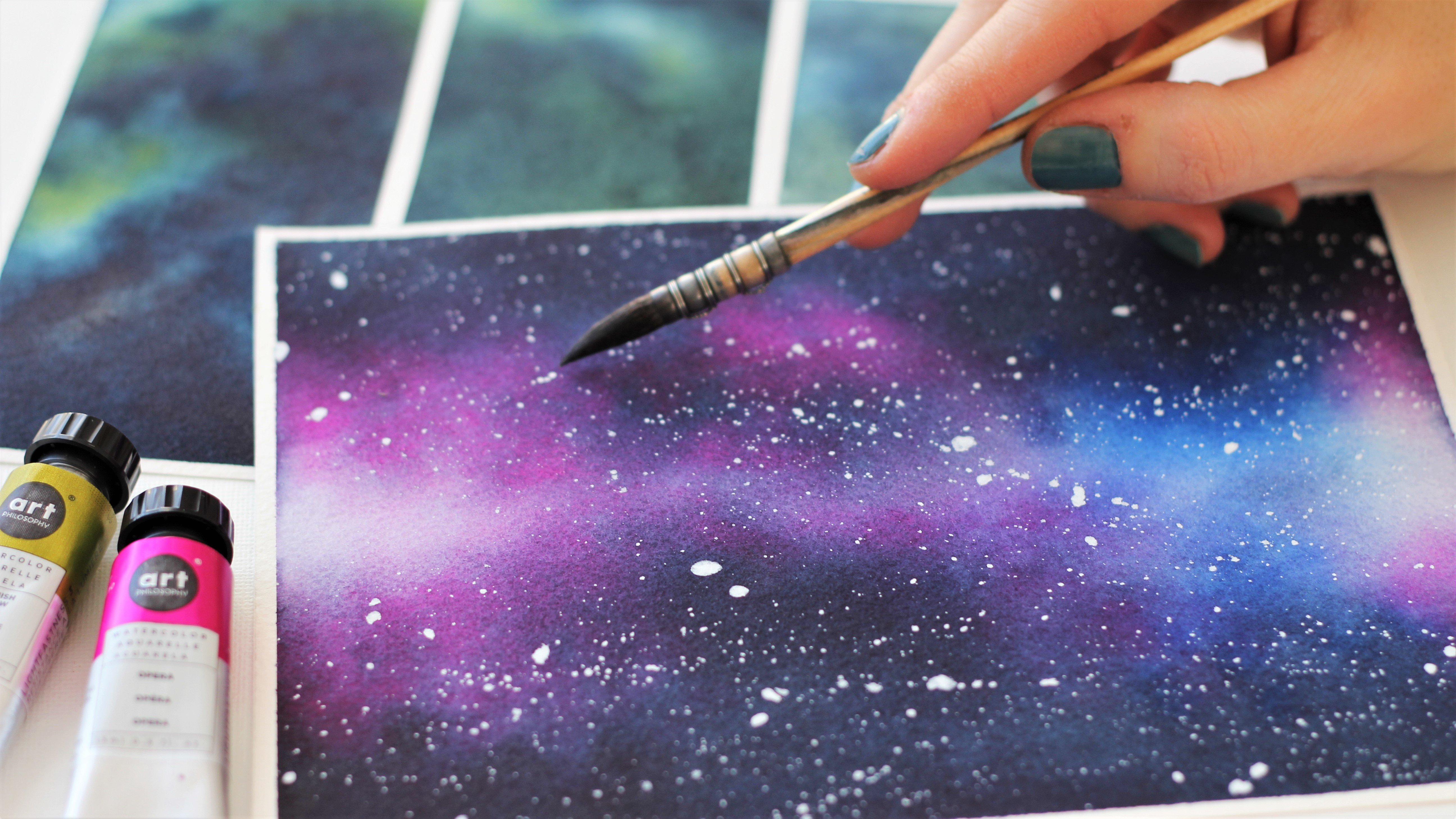
5. The Arch Part 1 : Colors & Sketch: [MUSIC] We're ready to tackle our first project and
it's the delicate arch. It's located in Utah. It is a beautiful monument. We're going to draw this today. First, we're going to
start with a sketch and then I will show you how I mix colors and what colors we need
for this project. Make sure to tape your sheet
to something you can move around because we're
going to need to tilt the paper later
on in the process. It's always useful to
know that ahead of time. First, we're going to
draw the sketch and it's a very easy and simple one. We're just going to
draw a ground line and the arch itself. What I'm gonna do
is actually start here at about
one-third of the page here and we're going to go downwards and we don't
want it to be perfect. We want something
that's bumpy like that. [NOISE] I'm actually going over the line again
because I think mine is not that dark. Now we'll start around
here and we'll stop there. Do not worry if your arch
is not perfect because we will use dark paint to shape it a little
better in the process. If you want it to look natural, it really doesn't need
to be just clean shapes. It's okay if it's irregular if it looks a
little bit crooked. [MUSIC] I'm seeing I didn't make the bottom-right wide enough there. I am just adjusting right away with a pencil and like I said, we can do that again
later with paint. [MUSIC] Now the sketch is finished, let's talk about colors. For this project, it's only going to
be at five colors. I'm going to be using indigo
and purple for the sky. If you don't have purple, you can mix blue
and red to get one. If you don't have indigo
use just a regular blue, just mix a little bit
of black with your blue and you'll get a
darker shade like this one. For the arch itself, we'll use pink as an undertone because we
want the inner sides here to be lighter and we're going to be using burnt umber, it's a dark brown. We're going to be
using it on the edges here and for the ground. We'll also add a little bit
of black to make everything a little darker and make
this arch stand out more. We were ready to mix our colors. Like I said in the
supplies lesson, you don't have to
have the odyssey set to make this project work. If you have just regular
colors, is just fine. You can download
that sheet that I made in the resources section that will tell you all
the color set you can use and if you have the set, the colors that you can mix
to get my exact shades here. I'm going to mix
the sky colors to show you the consistency
we're looking for. But please make sure that
before we get to the arch and the ground that you get the other colors mixed as well. I'm going to use the
ceramic palettes to mix those colors. You can use the wells in
your watercolor set as well. Let's make enough
of that blue shade. We're going to need it to make some parts really
dark in the painting. [MUSIC] I'm making it a bit
darker because the blue that I'm using in that
set is pretty light. That's why I was saying
you can very well use indigo if you
already have that, is perfect color and you
won't even need to mix it. You can see here that I
have something that's rather creamy but
still pretty runny. There's still a lot
of water in it, so it flows well on the paper but there's also enough
pigment in it that it will show because
watercolors always dry lighter than what they appear
to be when they're wet. Now I'll mix a little
bit of purple. I don't need as much, I just need a little bit to make that sky interesting
and not just blue. Purple goes very
well with indigo. Feel free to use any
shade of purple you have. I like to make my own. We're ready and you see
we have a good amount of paint here to paint the sky. Meet me next for a beautiful
loose sky. [MUSIC]
6. The Arch Part 2 : Loose Sky: [MUSIC] We will need to
paint our beautiful blue sky and to manage it, you really need to make
sure that your paper is taped to a surface
you can move around. Then you have paper towels
because we're going to be soaking some excess water off of the sheet as we
tilt the paper, make sure your mixes are
ready, that's very important. You want to make sure
also as you paint the sky that you keep
contrast in mind, keep some white
areas in the sky. We also want some
very dark blue areas and everything in-between. I'm going to guide you
through the process, so don't worry about
the details for now. If it helps to watch the
lesson first just to see what I'm doing and
then do it again with me. Please do that. Otherwise,
let's just start. I'm ready to wet the paper
and I'm going to actually wet everything because
like I said before, the rest of the painting is
going to be really dark, so it doesn't really
matter if there's some blue or purple shade
bleeding onto the ground. I go back and forth
on the sheet just to make sure I get every
nook and cranny of it. For a six by eight sheet like this one and
a loose painting, we don't need to wet the
paper for that long, usually, I'll do it
longer than that. But here, 30 seconds
for me is enough. See what works best for you. Because all we need are for
paints to flow and we're actually going to help the
flow by tilting the paper. That's why prepping the paints ahead of time is a good idea, so I'm dropping indigo
first and I tilt my paper downwards and the indigo is actually
going to flow downwards. [MUSIC] Then I rinse my
brush and I'm going to pick up some purple
and do the same thing. But I'm going to do
it on the other side, and I'm going to tilt the
paper and the other way. [MUSIC] Now see how the paints bleed into each
other, how they meet. There are some white parts there and that's great,
we want it that way. We don't want to cover them up. That's why we don't
need to overdo it. If you want to, you can
add a little bit of black paint to your blue
mix so it's even darker, even if it's indigo, we want it even darker. We're going to add
a little more and tilt the paper again. [MUSIC] Now my sky looks pretty nice. If you want to touch it
up a little bit with a clean and damp brush,
you can do that. Just make the strokes a little cleaner or more like
you want them to be. If your sky looks great, just leave it the way it is. Otherwise, you can
always add some lines. [MUSIC] If you like you can even dumb some of
the water off of this area. Although when it dries, it's not going to
show that much. [MUSIC] See how the watercolor, yes, it's hard because we're
working on the wet paper, but we can always fix things. You can even add a
little bit of purple. Always remember to keep some of those white parts untouched, it will look nicer in the end. It will look like
a glow coming from behind the arch and that's
going to be dramatic. [MUSIC] You can wait for it to dry or you
can go ahead and take a hairdryer and speed
up the process. We're going to add
the stars now, and the reason why I want
to do this is because if we add the stars at
the end of the painting, we might get some
on the arch and I find it easier to do it now, it doesn't matter if there's
a little bit of gouache here and there because
we'll paint with layers. Let's just do it now. Here
is my white Arteza gouache. I need something
creamy like this, but still tiny bit
runny because we want to be able to
do some splatters and see the advantage of
doing it now as we don't need to worry about
spoiling the arch. Try to place more stars
where darkest on the sky, they will show more. When you have a few, you can come back with your
paintbrush and just place a few more by hand, bigger ones. Try to be as random as possible. I know it's difficult. I'm not that random. Trying [MUSIC]. Let's put a few
here. That's good. Let's meet in the next lesson to paint a loose arch
and ground. [MUSIC]
7. The Arch Part 3 : Loose Arch & Ground: [MUSIC] In this lesson,
we're going to paint the arch and the ground. I'm going to use
those three colors, pink, burnt umber and black. I actually made
my mixes already. You can see I made my pink mix. I just added a
little bit of brown to it just to mute it down, but that's my
personal preference. Then I just fix my
brown and black here. Actually my brown and black, I want them to be pretty thick, because what we're going to
do is just apply a thin wash of pink first on the arch
and while still wet, we'll drop the other two colors, one after each other, to make it darker and darker. Because it's wet, the colors are going to melt into
each other very nicely. We have a very nice gradient. I'm actually going to use this paintbrush which
has that fine tip. It's going to be very useful to make sure I make
nice edges here, around the arch. Here we go. We don't need to be super
precise at this point really. Keep in mind you can correct the shape of your arch
if something goes wrong, so don't worry about it. [MUSIC] It's still wet so I'm adding a
little bit of brown. See how easily it spreads. [MUSIC] I'm trying to keep this inner edge
here pretty light. [MUSIC] While I'm at it, I'm just going to do the ground. I need a bigger brush
for that will be faster. [MUSIC] I'm going to drop a little bit of
black here in the front. [MUSIC] I'm making a dark and mixing my brown shade now with a little
bit of black and I'm going to drop this here
while it's still wet. I'm going to do that repeatedly. Little by little, I'm going to increase
the amount of black and I'm going to make my
painting darker and darker. [MUSIC] Look at how pretty
it is already. You can smooth out
some parts here, if you like, with a
clean and damp brush. [MUSIC] Now you can go with black, and repeat. You can adjust the size
here, if you like, to make the shape a little
less clean and perfect. [MUSIC] Try not to cover everything up
with a darker paint. See my pink shade is
not very obvious, but it gives something
extra to the painting, some cool highlights that
are not just a plain brown. That's why I like to
associate those colors. With a light background
that we made, this arch now being so dark, everything stands out and
it looks very dramatic. That's why shadows and highlights are very
important in a painting. [MUSIC] Again, you can smooth
out some parts here. [MUSIC] You see you can lift some paints to start shaping
natural highlights, and then we'll add gouache to make those highlights
more visible. Here you have a loose arch and ground in a few easy steps. Now if you want, of course, you can leave it that way, if that's the look
that you like. What I like to do is add more depth with a
little more dark paint, and then add some highlights. That really makes
the whole thing looks so much more realistic. That's what we're going
to do in the next lesson. So meet me next. [MUSIC]
8. The Arch Part 4 : Shadows: In this lesson, we're going
to work with brown and black to make shadows and increase the depth
in this painting. What we're going to
do is apply them on the edges right here
and on the ground. When I apply brown right there, I'm going to make sure and
fade the edges of it with a clean and damp brush
so there's no harsh line between the layer I've painted
before and this new layer. I'm going to keep working
with this paintbrush. I find it easier for you to get into the little nooks
and crannies there. That's why I love
this brush so much. If you get a chance to get
one that's similar to this, I would highly recommend it, if you like that kind of
detailed work of course. Let's make thicker
mixes of our paints. We're going to go with the
dark brown right away, which means I'm going
to add a little bit of black in that brown
I was using before. I'm going to make
it pretty thick because we already
have a good amount of paint on that first
layer in the arch so we need pretty thick
paint for it to show, we need more pigment. Make sure to get the brush
ready that's going to be clean and damp just
to fade those edges. Again here you can
very well change edges of your arch if they're
not satisfying to you. You fade it like that
into the first layer, and keep going up. Make sure to leave some areas untouched so they stay light. Because remember we
want dark tones, very light tones in the next step when we
add the highlights, but we also want to
keep some mid tones. [MUSIC] I really need to make that ground pretty
dark because usually what's in the foreground
of the painting is a lot darker than the rest. For now we're missing that. If it's still wet, add
a little bit of black now otherwise wait for
it to dry and come back. [MUSIC] Now let's
paint the ground. You can see it's
pretty thick here, almost like a silhouette, except I have more colors. I just wet my paintbrush and here I'm fading
this fresh paint into the first layer [MUSIC]. While it's wet, I'm going to add a little bit of
flack at the bottom. I'm mixing my paints as I go. But really if you don't
feel comfortable with that, make sure to have
large mixes ready. That's what I did at the
beginning for quite a long time. [MUSIC] I'm going to dry this and then
I'm going to work on some small details
with the dark colors. I'm going to use my
smaller pointy paintbrush, and I'm going to add a little
bit of detail here and there to play some
cracks, things like that. I'm using mostly black with
just a little bit of brown. For instance here, we can place a small crack
and lines too, so here look. I'm pretending
there's a gap there. Then you can shape this
rock the way you want to. You can add a bit of
lines here and there, and maybe not too many. But just a little
bit of texture to make it a little
more interesting. Here we're going to
emphasize this area there. [MUSIC] You can even mimic
areas being a little hollow in places by just
adding a little bit of black. You can even work on those edges if they're
not satisfying yet. [MUSIC] Try to keep the shape in mind
here it's not flat. Try to think that
it's a rounded shape. See when I make the lines, I don't make them straight, I try to make them curvy. See I made a little
mistake here, but I'm going to fix it, and we see nothing. I think we're good. I'm
not going to add too much. I don't want to overdo it. That's the risk. Make sure
to let that dry and in the next lesson we're
going to explore the highlights and we'll be
done with this painting. [MUSIC].
9. The Arch Part 5 : Highlights: [MUSIC] Welcome back
to the last lesson of this beautiful arch. So now we're going to use
gouache to make highlights. I'm going to use my
precise paint brushes, but you can also use
just a plain paintbrush, and of course I'm going
to use white gouache. With white gouache, we want something that's not quite pure. We want to add a
little bit of water, but not too much, because if we add too much, when it dries, it
will be very light. So we want to keep
it quite strong. I'm using one paint
brush to apply the gouache and one to fade it. That's very important
at this point. It will make it look so much
more natural if you can fade the gouache into
the rest of the layers. Now, if you're using a
gel pen or a Posca pen, you won't be able to do
that, but that's fine. Just make sure to stay
light on your stroke. Don't put too much, otherwise, it may make the
painting look odd, so just a little bit. So I'm starting to add some
here on the edges like that. What I'm trying to do is place the white gouache by
places are pretty dark. If you remember, we
added a crack here, so I'm trying to make
a highlight next to it to emphasize that crack. [MUSIC] We don't need
highlights all around, it will look a little
bit odd if we did. We already have that light
pink paint we applied before that's taking care of showing us the side
here is lighter. So we just need a few
highlights here and there. The good thing about gouache is that if you make a mistake, it's easy to remove. [MUSIC] Keep in mind the rock is not
flat, it's rounded. Make sure to adapt your
strokes to the shape. [MUSIC] Here we're suggesting that they are two
different stones. That's why I'm making
a highlight there and I'm going to do the same here. [MUSIC] I find it interesting to add something
here since it's so dark, the ground is so dark. So we'll compliment
that area pretty well, make it stand out a little more. [MUSIC] If what you prefer to do is just place
a few strokes without fading them into the first and second
layer of dark paints, otherwise you can
emphasize some of the areas of the arch
like I'm doing here, it's up to you. We're done with this
beautiful paintings. So what I'm going to
do now is reveal it. There we have it, our arch, Delicate Arch in Utah. Look at how beautiful it is, how magical it looks. Everything we did
really add to that, the beautiful sky with a lot of dark areas and light areas. The very dark subject, but strong shadows and
strong highlights. Congratulations for
completing this project. Feel free to upload it to
the project gallery in this class and meet me in the next lesson for the
next project. [MUSIC]
10. Palm Trees Part 1 : Colors & Sketch: [MUSIC] We're ready
to tackle our second painting
and it's going to be palm trees with a vintage
galaxy in the background. First we're going to draw
a very simple sketch, and then we're going to mix
the colors for the sky. I really want the palm trees to stand out in this painting, so we're going to start
drawing the ground line pretty low and it's almost flat, but just not straight. Once again, because we don't
want it to look perfect. Then we're just going to
outline our palm trees. I chose to make three of them because three always looks a little more natural
than just two. Two looks a little bit
too perfect again. Then I'm going to make
another one right there and it's going to be
in the foreground. Then I'm going to make a
smaller one right here. For the sky, I'm going to
mix pink, yellow, and blue. If you have those
colors already, go ahead and use that. Otherwise, if you
want more guidance, you can download my color guide in the resources
section of the class, and in there you'll
find the mixes for my exact sets that I have
from Art Philosophy. You'll also find surjections of what to mix if you
don't have this set. I'm going to go
ahead and mix pink. In my pink, I decided to
add a little bit of orange because I want to give this
galaxy of vintage feel. Again, make sure
that you mix this creamy enough so we can see the color coming through
in that loose background. Since we're only
painting one layer, we really want the colors to
pop, but at the same time, we don't want it too thick
so the colors can mix into each other and actually make
nice gradients together. Let's mix yellow now and in
this one I'm going to add a little bit of
pink this time to make it vintage-like also. Here's just the
right consistency. Finally, I want to
mix blue and I'm going to mix some little
bit of yellow in that one. But I could keep it as it is. It doesn't matter at all. I guess it's just
a plain blue or if it's a blue that you mix
with something else. Although you can clearly see these colors are looking more vintage with the colors
I had mixed into them. We want to mix
quite a bit of blue because most of the background
is going to be blue. We're adding in a little
bit of water so this can flow and mix with other
colors really well. We're ready. Let's meet in the next lesson
to paint the sky.
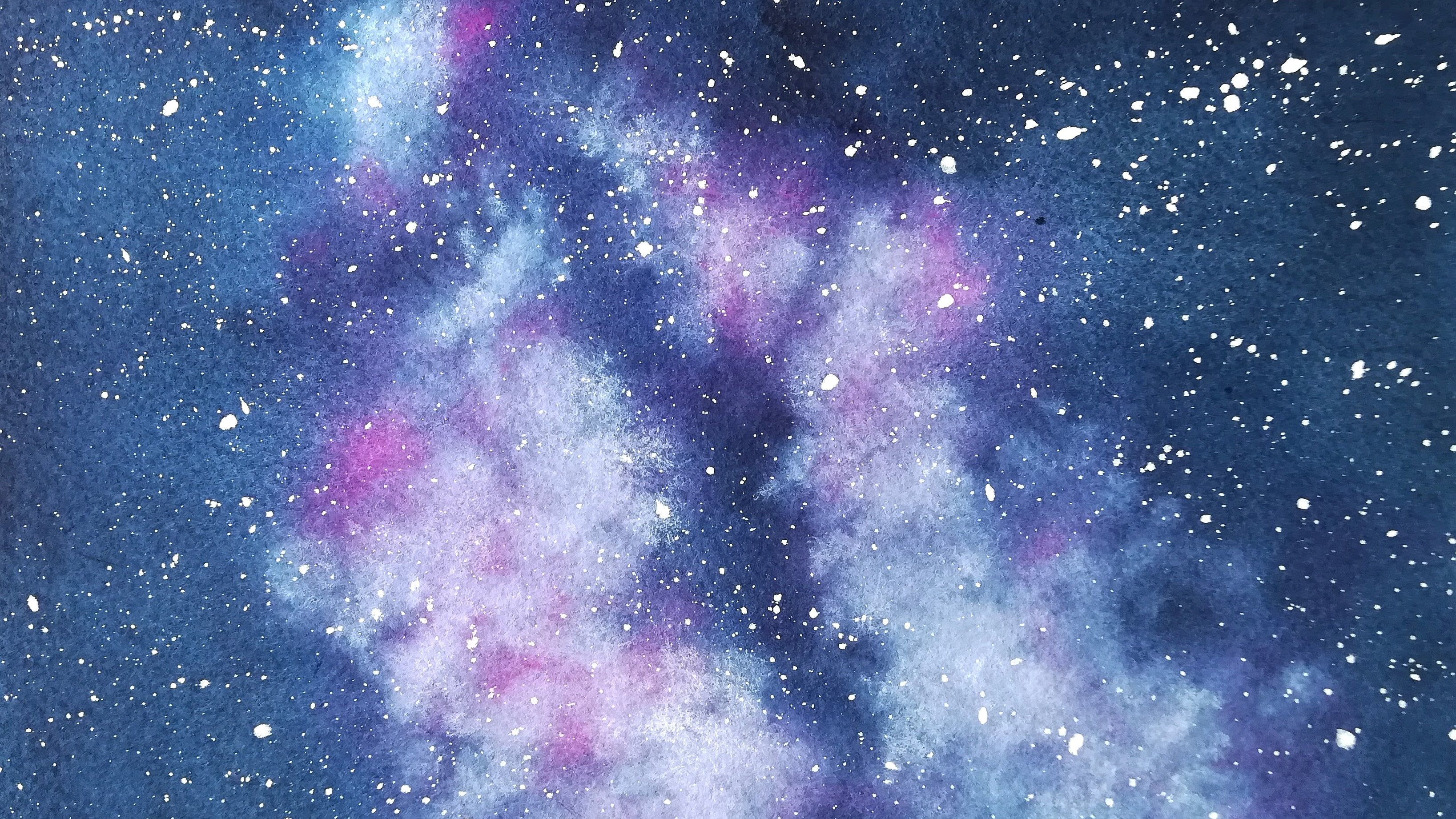
11. Palm Trees Part 2 : Loose Sky: [MUSIC] We're ready
to paint this guys. What we're going to do is wet the paper really well first, then we'll start with
a light colors first, yellow then pink, and we'll add that
little bit of blue, we'll be careful to
leave some white areas. Don't worry, I will
guide you through that again as we go. Let's start and
let's wet our paper. We're not going to be
tilting the paper, it's just going to be a
regular galaxy this time. Again, in this painting, I'm
wetting the whole sheet, and that's usually what you would do when you
paint a landscape, because skies usually are a lot lighter than the
rest of the painting, so mine as well
just wet everything and avoid a harsh line
anywhere in the painting. [MUSIC] We're ready. Now I'm going to
start with yellow, and I'm going to in a diagonal. I'm just going to tap the brush randomly and I
leave some white areas, because whites is going to pop. You can even add
water on your brush if you want some lighter
areas of yellow. You just stretch that
paint that we just added. I'm adding pink and I'm overlapping it in
places on yellow, it looks a lot more
natural this way. [MUSIC] Now let's add blue so we have a full picture. Don't forget to leave
some blank areas. [MUSIC] This is our base. Now we're going to keep
adding a little bit of color, yellow first. Again, I'm just going to tap
that brush here and there, and you can see
here it's running. So I'm going to add a little
bit more yellow so it stays. Because when this dries, we know that with
watercolor it's going to dry a lot lighter. [MUSIC] I added more yellow pigment in my mix because while
the paint is still wet, I want to take advantage
and make it darker. I'm doing the same with pink. We don't need to add a whole
bunch. Just a little bit. [MUSIC] You can touch it up in places with a
clean and damp brush. If you don't like it, you can stretch the
paint elsewhere too. Add more paint. [MUSIC] Now I'm adding more blue. [MUSIC] I rinse my brush and I'm just hoping the
paints to mix together. [MUSIC] We can shape that galaxy a little bit here with
blue you see, [MUSIC] let's brush a little
bit of pink here, into your blue
areas to make it a little more
interesting like this. It gives the painting
a little more variety , and we're good here. I don't want to overdo it. I'm just going to try this now. You can let it dry if you want. I'm going to use my heat gun. Once again, I'm using my
titanium white gouache. [NOISE] Actually going to reactivate this mix here because you can very well use
gouache that has dried. Here, I got something
creamy, it should be enough. [NOISE] Remember that if it comes out of
your brush pretty easily, then that's fine. Otherwise you need to add water. If it comes out too big, then you need to add more paint. It's easier to spray
the stars now, before we actually draw the
trees is going to be pretty hard if we wait until after
we've drawn the trees. I'm going to add a few stars
directly with a brush. This way they stand
out even more. [MUSIC] We're done with this guy. You can see it pretty light. That's actually a good thing
in a landscape because we really want those main
subject to stand out, and in this painting is
going to be the trees. We don't want the
sky to take over and be too dark. We
like it this way. The trees are really going
to pop off the page. Meet me next to mix
colors for the trees, and learn to use a
fan brush. [MUSIC]
12. Palm Trees Part 3 : Mixing Tree Shades & Fan Brush Work: [MUSIC] In this
lesson, we're going to mix the paints for the trees. We're going to learn
to use a fan brush. So remember how I told you in a previous lesson that we really want our trees to stand out. To do that, we really need to make sure they're dark enough, that's why I'm using a brown, which could be a burnt
sienna if you have that, or a burnt umber
would be great too. Then I'm going to be adding
a little bit of black in that brown shade to
make it even darker. I'm also keeping my
black shade nearby in case I want some parts of the painting to be even darker. So what you can do
is just go with any brand that you
have and then have black or gray nearby so you
can darken this brown shade. Here, I'm mixing my
brown and you can see it really looks
like a burnt sienna, so you can use that
or burnt umber, and I'm making it pretty creamy. All the palm trees are going
to be painted with brown, so I'm going to be
adding a little bit of black here in the corner. You can see it turns instantly into
something a lot darker. It's going to allow us
to build a contrast. If I want even more contrast, I can add a little bit
of black right here and everything will be
ready for us to work with. We don't want to use a
lot of that, otherwise, the painting is not
going to look too nice if it's too dark. We really want to
have those shades showing just a little bit of
that to really make it pop. Then we'll add some highlights, and it will be awesome. So now my browns are mixed. Before I actually
paint the trees, I want to show you how
I use the fan brush. So I'm taking a scrap
piece of paper, I'm just going to wet my brush. I think it's funny what it
looks like when you wet it. It totally is different now. When you want to paint a
palm tree branch with this, you would think that you
just need to go this way, but it's not working, it looks kind of weird. So what you need to do, let me just add more paint, what you want to do instead is actually start with a tip, you press like that, and up, there, you release. You see the shape of
the leaves are here. But you really need to press and release at the
end like this. That's why I was saying, you can very well just use a plain paintbrush
like this one, for instance, if you
don't have a fan brush, and you can actually do it with your brush in the same way. I just like this one because I think it's pretty
cool for drawing palm trees and you can get
several leaves done at once, and it looks a little
more natural than if you try to add
them one by one. See how cool it looks? So just remember to always use the tip and not the whole brush. Meet me next to paint
the first trees. [MUSIC]
13. Palm Trees Part 4 : Painting the First Trees: [MUSIC] Welcome back
we're ready to paint the first two trees that are located in the background
of the painting. Now suggests that you take your smaller brush so we can draw some slender tree trunks. They'll be a lot nicer
than very thick ones. Then if you want, but that's not something
you have to do, but if you want to make
it a little more neat, you can also have a brush nearby that's going to be just
clean and damp just to fade the bottom of your
tree right away so that it can melt into the ground a lot better later on
and not leave a mark. I like it better
because it's thinner, so I'm going to use that. We're starting with our
light shade of brown and what I'm going to
do is just press down like this to make
it thicker here and then release as I go up, here I'm going to correct. I'm going to pick up my
other brush and just fade the bottom slightly here. If it's already starting to dry, just go over it again. That's when you want to add your darker brown
here on the edge. You can even add more black
in it if it doesn't show enough and see how it starts melting into the rest and it
looks more natural. You can add a little
bit more at the bottom. Now use that plane shade
of black and outline, just the edge there and
the bottom a little bit. I'm just going to
take this fan brush right away and I'm
going to repeat this. I'm going to start with my
lighter shade of brown and add a little bit of color and a little bit of darker
shades in there. Remember to press down and then let's add some leaves randomly and we can
add a little more. Feel free to draw the
leaves as you wish. You don't have to be
exactly like mine. [MUSIC] Here I feel I might need something there
it's a little bit empty. [MUSIC] When you look
at your painting, see where you need
to add something. I think it looks
really nice this way. Now before it dries, I'm just going to pick up my regular brush and add a little bit of that
dark brown in there. Just a little bit to outline
those leaves that are more. I can even add some branches
why not, darker ones? [MUSIC] I might add a little bit of black of
really a tiny bit there. [MUSIC] I'm going to stop here. I'm not going to overdo it. I am very happy with how this tree is looking
it really looks nice, I love the shape of it. Now I'm going to replicate
that with other trees. I'm not going to draw the
leaves exactly as I did here, but I'm just going
to try and get that shape to complement
the whole painting. Since this tree back
here is going to be in the background a little
more compared to those two, we might want it to
be a little lighter, so we might add a little
less of those darker shades of brown just so it's lighter and it looks
like it's at the back. Again, press down and
release as you go up. [MUSIC] It does look a bit lighter, which is perfect, and we're
going to leave it as such. Notice how this small tree already looks like
it's farther back. This effect is very easy to
achieve with watercolors. The lighter the subject, the more remote it seems to be, the darker the subject, the closer it appears to be. In the next lesson, we're going to paint the
ground, see you there. [MUSIC]
14. Palm Trees Part 5 : Painting the Ground: [MUSIC] In this lesson, we're going to paint the ground. Same principle here,
then the trees. We'll start with a light layer, then we'll add a much darker
layer that will reinforce this illusion of the trees being more or less close to us. Right now, let's paint a
single light layer and include those two trees in it from the base
of the trunks. All we need to do is add paint at the base
as well and fade it into the rest
of the trunk with our clean and damp
brush. Let's do it. We're using the same mix
of brown to begin with. There's no need
to add black yet. Remember to apply the
paint quickly as it tends to dry faster when
the paper is not wet. [MUSIC] Let's add a little bit of a darker mix of brown in places to make it
more natural looking. Again, there's no
need for black yet. [MUSIC] While it's
still wet, let's add paint at the base of each trunk, then we'll use our
clean and damp brush to remove the edges. [MUSIC] I'm going to lift paint there with my
clean and damp brush so that in this layer we
end up with light tones, the ones who are lifting, mid tones, and
slightly darker tones. [MUSIC] Make sure this is fully dry before adding
our second layer of ground. We're going to use the
exact same technique, only our rounds will be slightly darker with
more black in them. This way, this tree on
the left will look a bit closer to us than
the one at the right. [MUSIC] It's looking good. Let's wait till it's dry. In the next lesson we'll
paint the last tree. [MUSIC]
15. Palm Trees Part 6 : Painting the Last Tree: [MUSIC] Let's paint our
third and last tree, and I'm mixing a
little bit more paint. I'm running out of it. I'm going to start here. I just want it to be
noticeably darker. I start here right on the trunk. [MUSIC] The fan brush takes a little while to get used to. But once you know how to
use it, it's pretty fun. [MUSIC] I like the shapes and I'm just going to add
a little bit of black. Remember not to add
way too much black. Otherwise, it will look a little bit somber,
and we don't want that. [MUSIC] Now I'm just going to go ahead
with the ground. Since it's not quite dry here, I'm just going to
do that right away. If you're not sure though, just let this dry and proceed the same way we did
before with the ground. Make sure to fade that
trunk into the ground. I'm adding a lot more black
in my brown shade to make sure that piece of ground really looks like it's a lot closer. [MUSIC] We're just going to
leave it like this. Just keep it simple. Let's meet next to
paint the shadows and the highlights and finish
this beautiful piece. [MUSIC]
16. Palm Trees Part 7 : Shadows & Highlights: [MUSIC] Let's go
ahead with details. There are two different things that we can do to add details. We can add darker
paint to make some of those areas look a
little more realistic. We can also add some
white gouache to emphasize highlights and
make it look more striking. We're going to do
both of these things. I'm going to take some of
my darker paint that I just mixed to paint
that last palm tree. I'm going to splatter it
right here pretty close to the paper because I don't
want to get some on the sky. I want to make some texture
on the sand back there. What we can do also is use
the dry brush technique. Use paint that's very saturated where there's
not a lot of water so that the brush is mostly covered in paint and mostly dry. Then I'm going to remove
the excess paint to make sure that it's not overloaded with paint, it's pretty dry. Then I'm just going to
dry brush up from there, making some cool texture. [MUSIC] I'm using that dry
brush technique to add some texture
to the tree trunks. I'm just making random strokes. It helps emphasize the shape. [MUSIC] I'm done with the darker paint. I'm just going to go
straight to gouache now. We want it to be as
thick as possible, so just add a tiny bit of water. There's already some on
my brush so that will do. I want a few highlights
in the branches, but I don't want too many. I don't want it to look weird. Just elongate the tip of the branches a little
bit with white gouache. [MUSIC] Now what I love to do with gouache, is to make it look like
tree trunks are glowing. I'm just going to add
a little bit here, and I'm going to fade it
with a clean and damp brush. You don't have to take
it all off with a brush, you can leave some
areas untouched. We have a little bit
of texture there too. [MUSIC] I think it's going to look great on this one because this one is so dark, it's really going to
make it stand out more. I'm imagining the light is
hitting this area here, so I'm just going to highlight
the side of the tree. That's why I also lifted
color right there. [MUSIC] I'm not going to add too
much gouache there because I don't want to make
it look like it's been snowing in the desert, but I want a little bit of a highlight, something exciting. [MUSIC] I think we should be adding a
little bit of gouache here too to unify the painting. [MUSIC] Make sure you post your project to the project and resources
section of the class. If you have any questions,
please reach out. Look at how magical
this is looking. Look at what the
gouache is doing here. Look at that texture,
it's beautiful. Before you go meet
me in the conclusion for a few final words. [MUSIC]
17. Conclusion: [MUSIC] Congratulations
for completing the class. I hope you enjoyed painting those two landscapes
as much as I did. Please, share them with us in the project and
resources section of the class and also leave me a review to tell me what
you thought of the class. You can also follow me here on Skillshare to be updated of
all of my future uploads. You can also find me on
YouTube and Instagram. I share a lot of behind
the scenes there, a lot of inspiration. You can use the hashtag CreateWithFrancoise to share your paintings
there as well. Thank you so much for taking
this class with me today, See you in the next one. [MUSIC]
 Francoise Blayac, Professional Artist