Transcripts
1. Introduction: [MUSIC] Hello, my name is
[inaudible] welcome to the second part of my
watercolor galaxy series. I'm a French artist
and I love to create paintings
that look realistic. In the first part
of this series, I went deep on what
goes into creating smooth and vibrant
watercolor backgrounds. I taught my blending, layering, and lifting techniques with one background exercise
and one galaxy project. In the second part, we're
going to use these techniques and practice new ones to
learn how to paint shapes. Feel comfortable
with water control and how to paint a simple
watercolor backgrounds, and you'd like to weave in some detail into
your backgrounds, this class is going
to be useful. Learning this skill
will help you improve on landscape painting. You will better understand
how to incorporate clouds to sky or repulse
to seascape, for instance. To get there, first we'll talk about the
supplies we'll need. I'll explain how to use contrasts and brushstrokes
to paint shapes, and then we'll practice with several projects
that will allow you to make shapes with
all the techniques learned in this
part of the series, and last, we're going to paint several different
galaxy shapes. The milky way, the vortex, the tie-dye, the
nebula, the spiral. By the end of the class, you will understand
how I paint shapes and you'll be able to
apply my techniques, to your own
watercolor paintings. So, grab your paints and
let's get started. [MUSIC]
2. Class Projects: [MUSIC] Painting shapes can
feel a little confusing, even a little intimidating, but when you know
how to leverage the techniques I use for
my galaxy paintings, when you actually try and
practice these techniques, you will realize painting shapes is not as hard as it looks. There are five projects
in this class. They all represent a
different galaxy shape. We will be using
several techniques to get the effects
we're looking for. If you're just
getting started or perhaps you're not comfortable
with how much water, how much paint to use to
blend with backgrounds, I'd strongly encourage
you to check out the first part of my
Galaxy series first, then come back to this class, check out the product,
all about creating shapes that comes
out to the supplies, and finally, tackle
the projects. In your final project, I'll be looking at how you use the two key techniques:
contrast and brush strokes, to create shapes
in your paintings. So please upload your projects
to the Project Gallery here in this class and feel free to reach out
if you need any help. For now, meet me
in the next lesson where we'll look at
the supplies. [MUSIC]
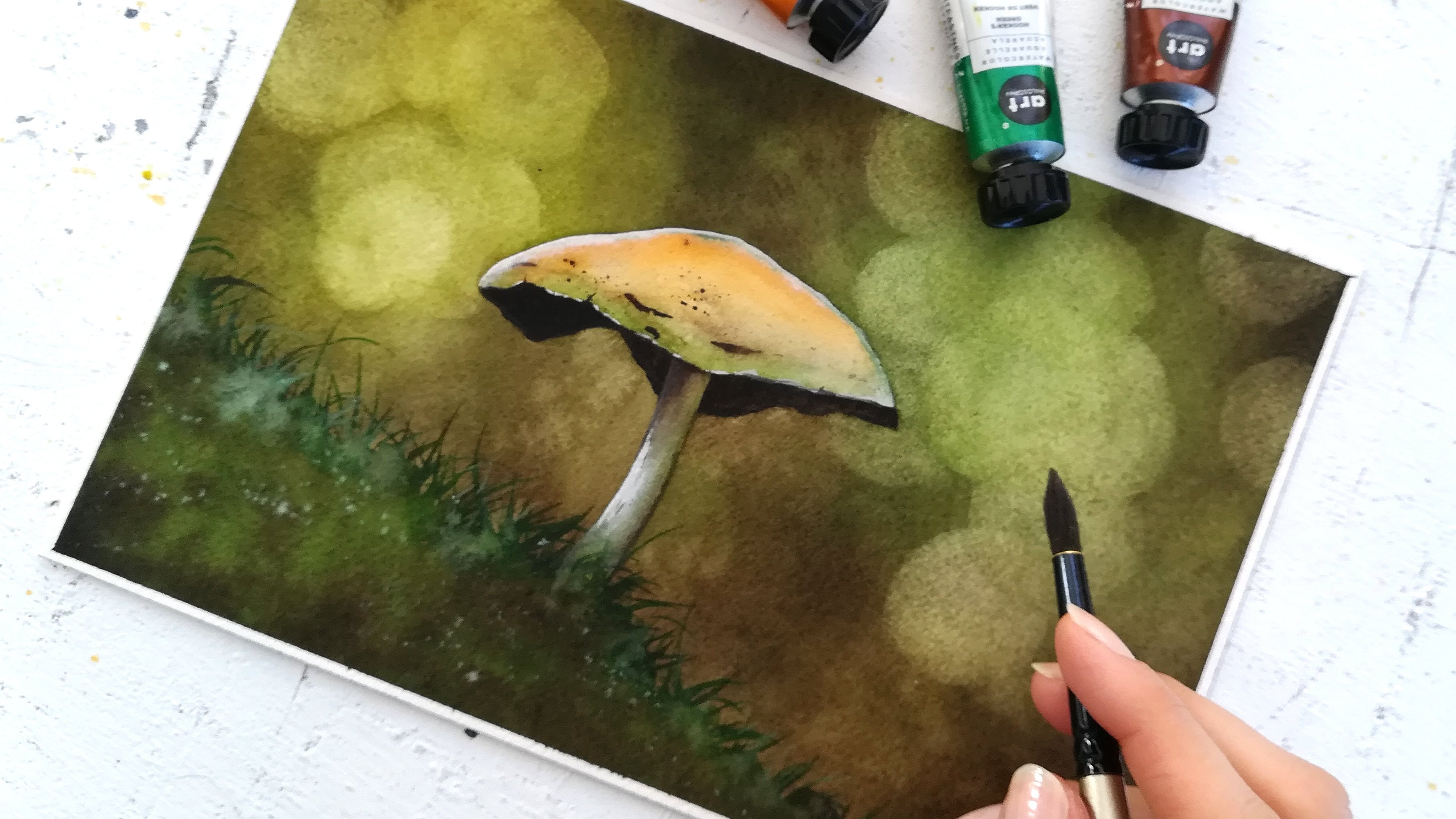
3. Supplies: [MUSIC] For the supplies, we're going to need
watercolor paper. I tend to always use 100% cotton paper, 300
GSM, cold-pressed. You can see the cold
pressed texture there. Cold-pressed cotton
papers work great for backgrounds and landscapes in general since we'll
use a lot of water. Next, we're going to
need a few paintbrushes. I have a lot of them here for convenience and don't worry, you don't need that many. All you really need is a
large one like this one. Large enough that
it will be easy to paint on the size of
paper that you choose. Then you'll need a smaller brush for detail like this one. Now, if you have more choice, you can use like me a bigger brush just
to wet your paper. You can also have a
second large brush. I have two because I use
one for the light colors to avoid to have to wash them repeatedly and to
waste time doing that. You can also use
a paintbrush with a fine tip like this
one for the details. Convenience is really why I have this many
paintbrushes here. But keep in mind
that two of them, a large one to wet and
paint the background and a smaller one for the details are really all you would need. Now, for the colors, I'm using Art Philosophy, watercolor tubes today, you can use whichever brand
you are used to. It's totally fine. The main colors we'll need are indigo for the dark parts, then a blue shade like Prussian blue for the
lightest blue parts. We'll also use opera pink. It's a flashy pink that looks
great on galaxy paintings, and then we'll need a
red and a yellow shade. These two will allow
us to get red, yellow, but also orange shades in the painting since
when we mix them up, they'll turn into
an orange shade. Other common colors you
can use as substitutes are a couple blue in place
of the Prussian blue, and for red and yellow, you can just use orange. That is if you're a beginner and mixing colors seems
intimidating. It's an option, although I'd recommend to go for
both red and yellow. You can also use
any other pink than opera pink, and for indigo, you can use whichever shade
of blue you picked and mix it to a black color
to get a very dark blue. Now, for the
splatters, the stars, but also some of the effects I'm going to use
some white gouache. I like titanium white gouache, it's pretty opaque and it
works well with watercolors. These are all the colors
I'll be using today. I actually put the
watercolors in these half pans and I'll
mix the colors right here. I really like to
recommend masking tape to tape the sheet firmly
on a table like so, it really helps while painting. I also like to have some paper
towels nearby because it's always convenient to remove excess water from
the paint brushes. Two glasses of water also. One to rinse the
paintbrush and another to wet with cleaner water and I'm going to show
you my heat gun. I use that to make layers dry faster and if
you don't have one, a hair drier works fine. Otherwise, you can wait
for the layers to dry. Well, set. In the next lesson, we're going to look
at what techniques can get you specific
shape while getting your paintings to
still look smooth and natural. Let's
meet there. [MUSIC]
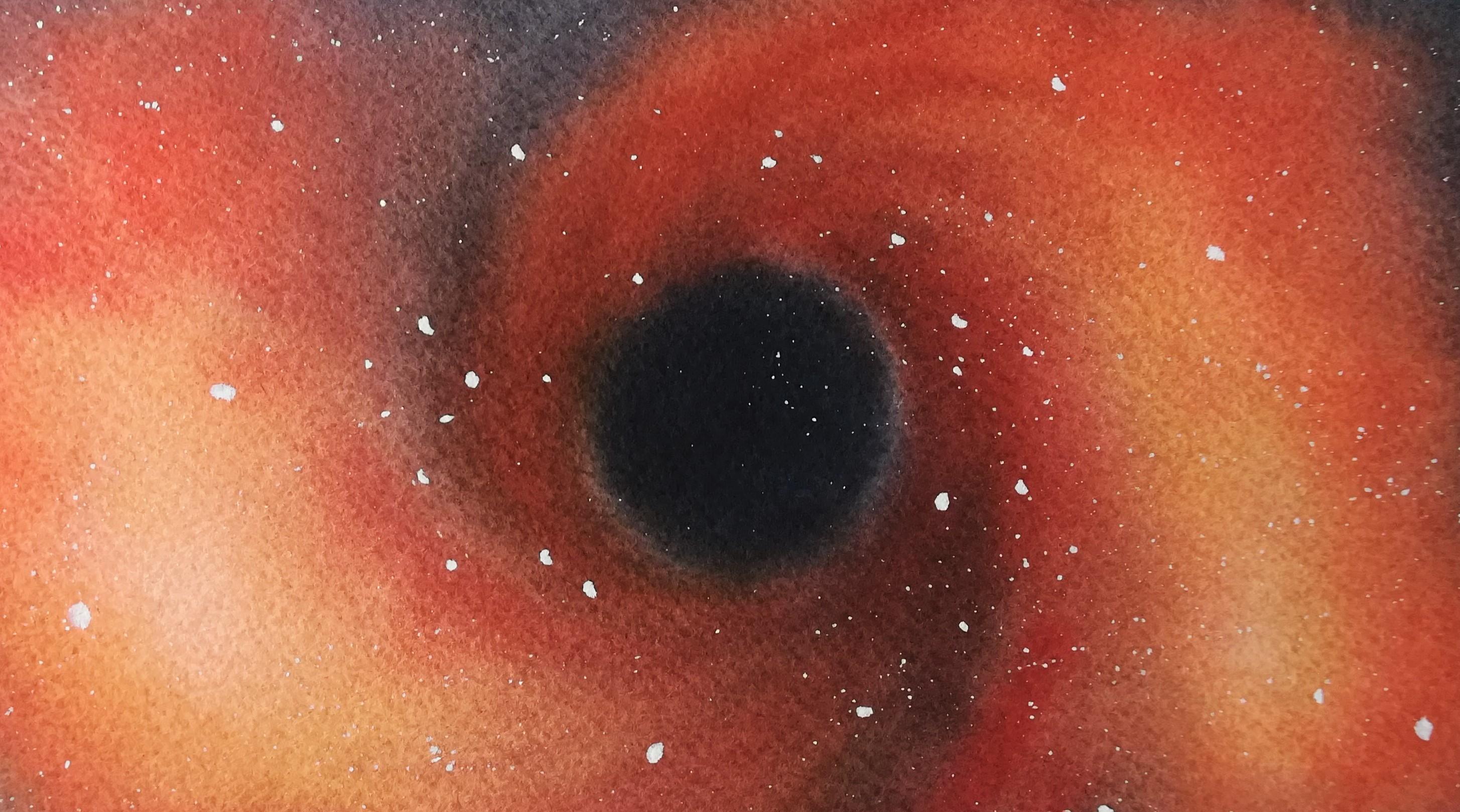
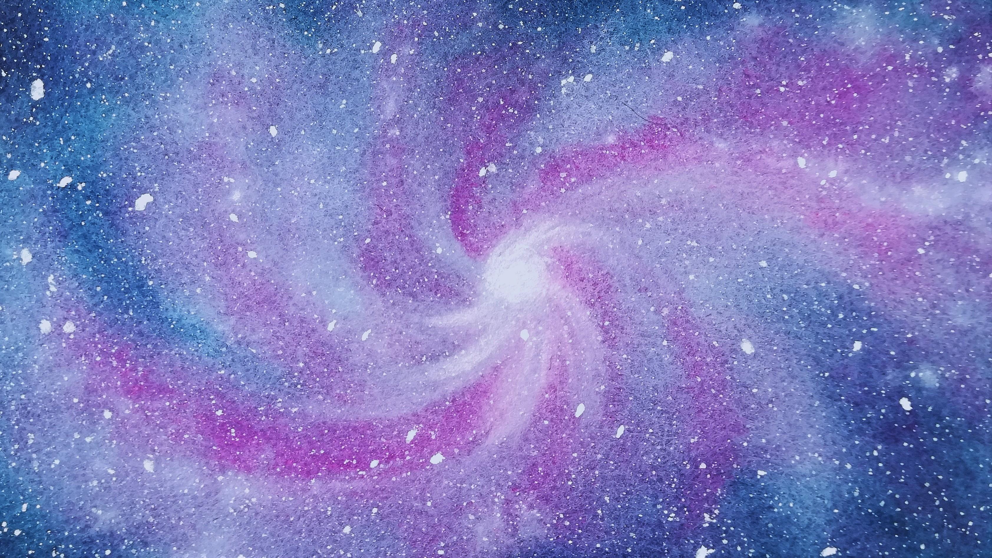
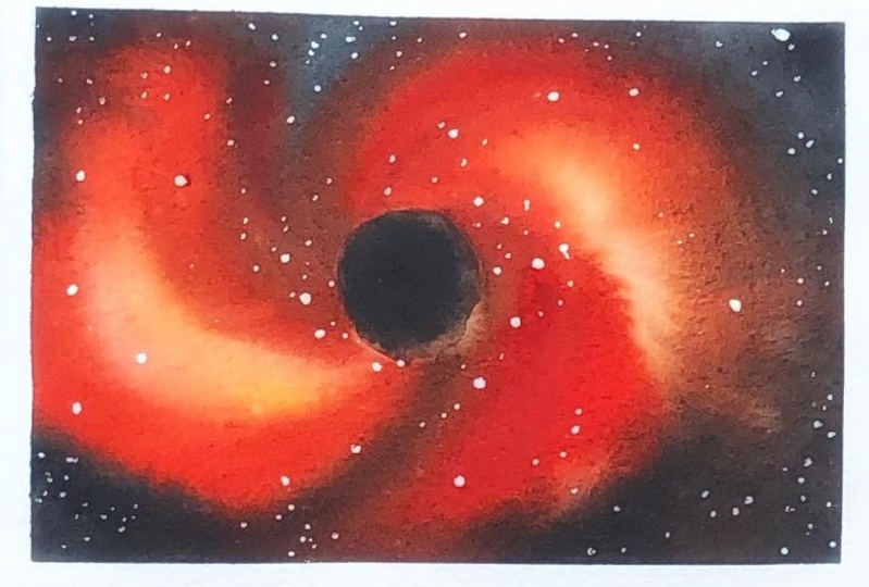
4. Exploring Ways to Paint Shapes with 2 Key Techniques: [MUSIC] To paint a shape and
a watercolor background that blends in while still
looking like it's distinct from the
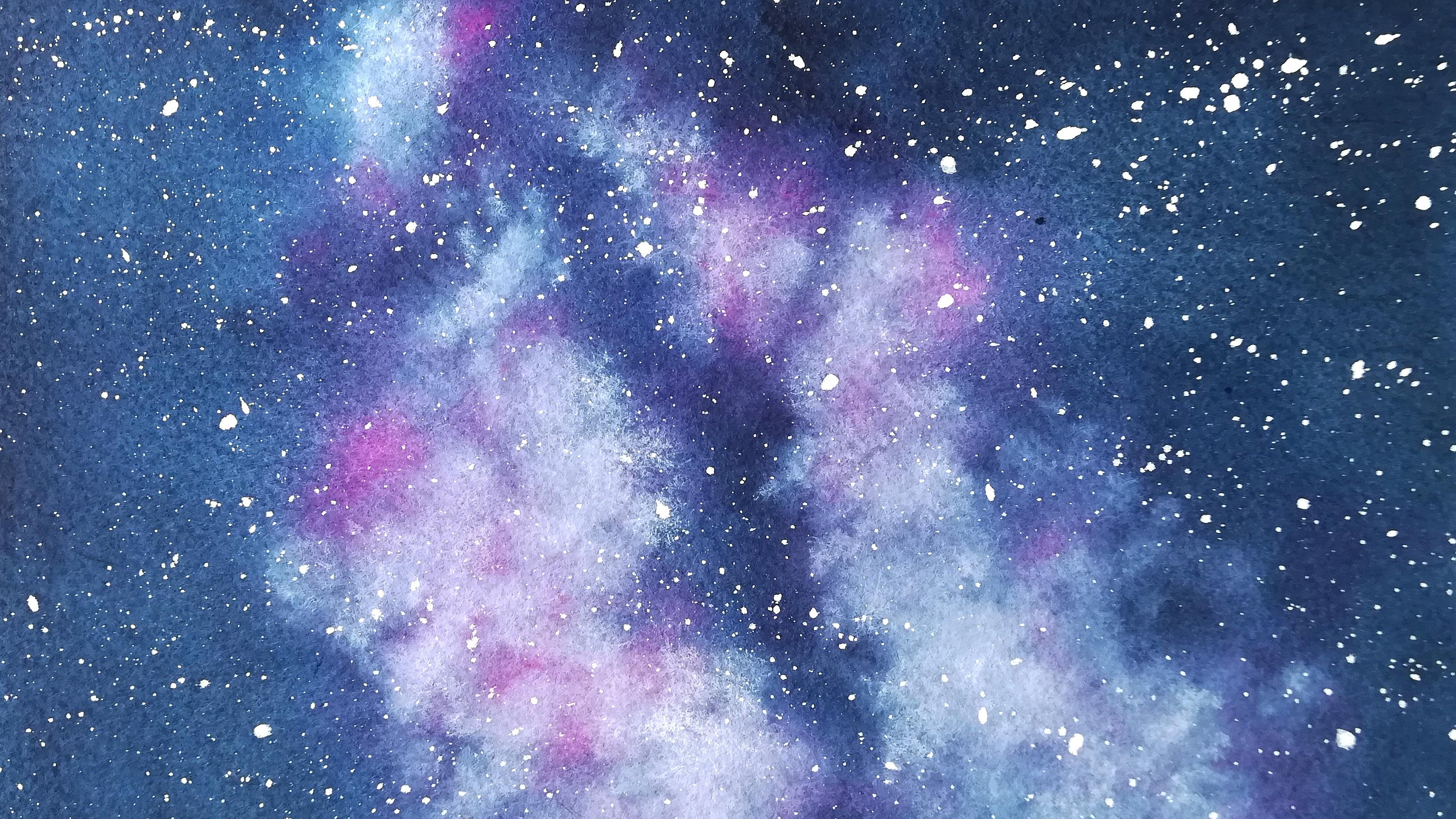
background itself, I use two techniques. The first one is contrast. In this painting, for instance, we can only clearly distinguish the Milky Way
effect from the background because the
background is so dark and the Milky Way is so
light in comparison. Don't worry because
we will explore this in depth with each project, and you get to apply this to several very different shapes to understand how
to tackle this. The second technique,
I combine to contrast to create
shapes is movement. I use specific brushstrokes. Let's look at the reference
photos that inspired all the projects in
this class and you'll understand what I
mean by brushstrokes. For the Milky Way,
we're going to tap our brush lightly with color and white gouache to
create this shape. Because if you look
at it closely, you can see it looks like
just little dots of color. Let's look at the vortex now. We're going to move in
circles and half circles to help paint this vortex in
a way that looks believable. For the tie-dye, we will
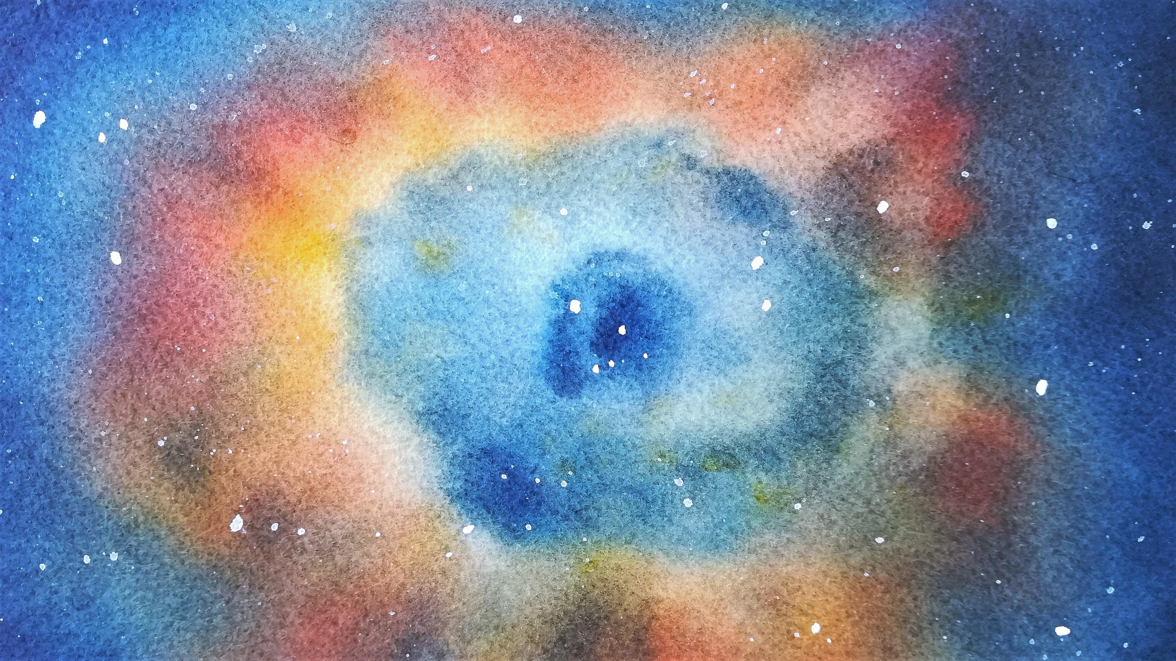
mostly paint lines or stripes, however you prefer to call it. The nebula will be
a combination of tapping the brush here and
there and moving in circles. This one will be best painted using contrast as
a key technique. But we'll use movement
too because that will always give a better effect. Finally, if the spiral, we will use that
spiraling movement, we will create small swirls and we'll pay close attention to contrast as well to make sure it turns out the
way we wanted to. We're going to take each
projects step-by-step, paying the ones you
feel most attracted to and please share those
in the project section. I'd love to see your progress. Meet me next for the
very first project, the Milky Way. [MUSIC].
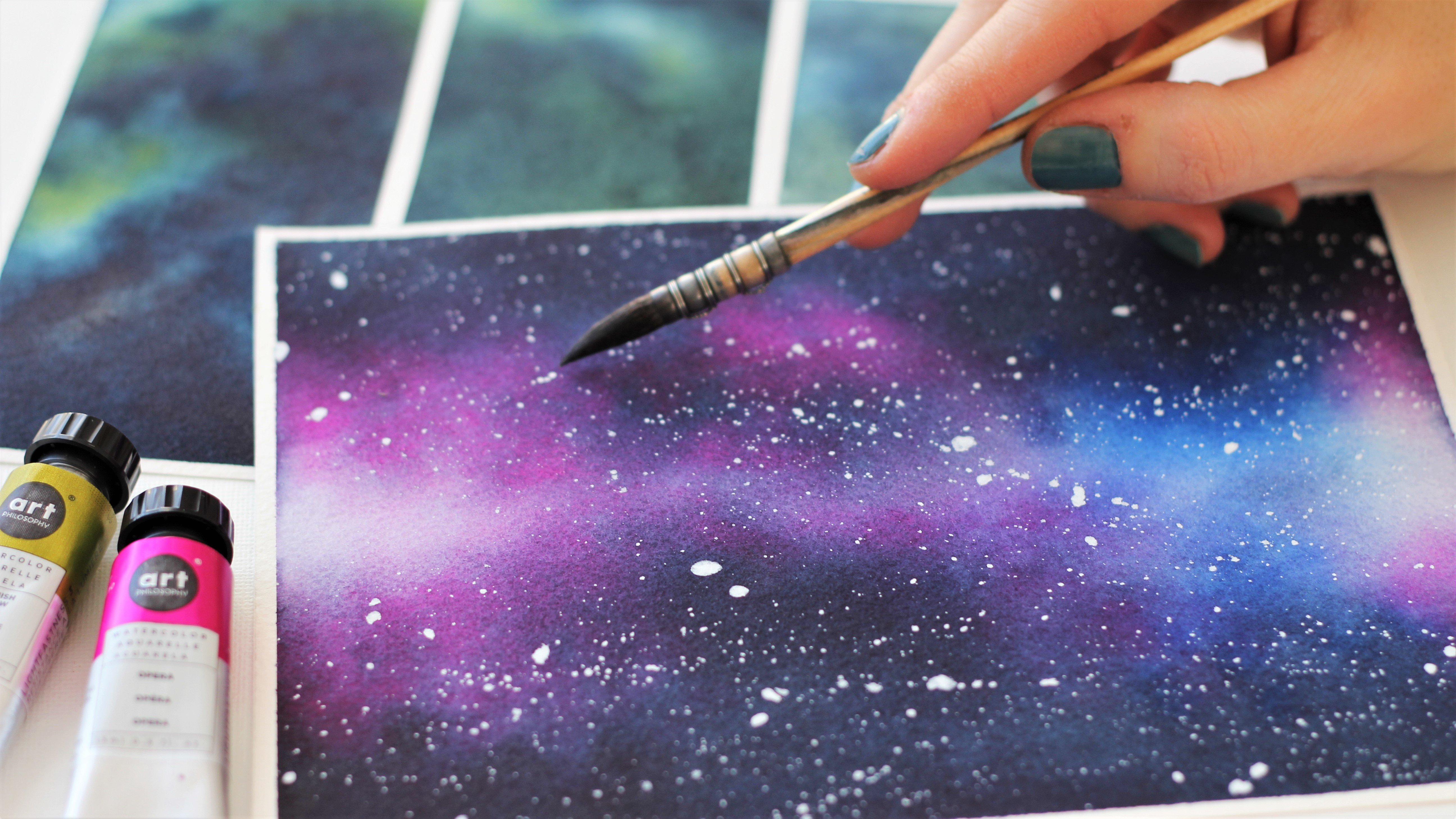
5. The Milky Way Part 1 : Color Mixing: [MUSIC] Let's get started
with our milky way painting. We're going to prepare
our mixes for indigo, Prussian blue, and opera pink. Remember you can very well use another blue shade
and Prussian blue. If you don't have indigo, mix it to a little
bit of [inaudible] We'll need whitewash in this painting for the
milky way effect. I'll be using all of
my paintbrushes here. Again, you don't
have to use as many, use whatever makes you
feel more comfortable. We're going to mix
our colors first. I'll start with the lightest
color, I'll put pink. We want a very runny
to begin with, just enough pigment to place
our main colors on paper. I encourage you to check
out the first part of this galaxy series if you
haven't already since there I explain a lot about how much paint and how much
water we need to paint smooth backgrounds
and I take you through the different stages
in the painting process. I'll remind you of
what we want to do and how for each project
in this class. However, the first part goes more in-depth on the matter with more exercises and a basic
but beautiful galaxy project. Feel free to refer back to
it if you think you need to. I just mix Prussian blue
and now I'm mixing indigo. I always rinse my
brush between colors. That's exactly why to paint, I'll be using a paintbrush for opera pink and one for my blues, it will be much easier
to keep my colors clean and it will make the
painting process smoother. We're done so see you in the next lesson to
start painting [MUSIC].
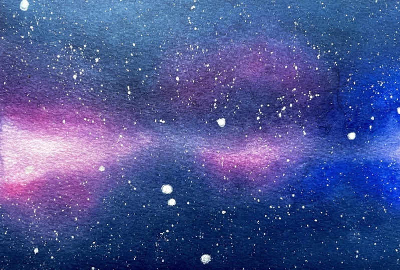
6. The Milky Way Part 2 : First Layer: [MUSIC] Welcome
back for the first layer of this milky way. We're ready to start
now we mix the colors and let's wet the
paper so we can place our base colors on here. I go back and forth like that, and I'm going to do this
for about a minute. One thing I haven't mentioned in the previous class and I
find is a great indicator of how long you should
wet the paper is that once it's very wet, the paper tends to lift off of the surface it
has been taped to. You can tell it soaked
and lost its stiffness. When that happens, it
should be ready for paint. [MUSIC] I'm done now. With one of my large
paint brushes, I make sure it's wet first, I pick up some paint
from my opera pink mix, and I'm going to
paint the milky way very roughly just
to help situate it. I tap the brush and
paper to do that. By the way, you can
download the references in the resources section of the class if you need to look at it while we're painting,
it will help you. I haven't mixed much pink, I'm comfortable
mixing more quickly. Remember you always
have the option to go with larger mixes of
paint right away. Now let's apply prussian
blue in the center. That's going to be
very important to emphasize our milky way shape. Also all around the pink areas. I'm covering the areas where the darkest spots are
with prussian blue, even though I'll paint
with indigo there later. I'm doing this only
because I don't want to give my paper a chance to dry. The quicker you can
cover up your paper with fresh watery paints
at first, the better. Since the background is
made of blue shades only, I can use prussian
blue to maintain the humidity and
add indigo later. I add indigo mainly on the edges and in the
center of the milky way. Our shape looks pretty strange for now and
that's totally normal. Don't worry about
it. It's going to be like this with all of
our projects anyways. What we want in the first
layer is to make sure we leave some of the light
areas completely untouched. While also placing
the darker colors where you can see them
on your reference. To create shapes, we
really want to see the rough shape on paper by
the end of this first layer. It doesn't need to look perfect, it just needs to be there. With a clean and damp
brush like this one, we're going to start and
blend color together. I touched on that too,
in the first class. It's really going
to help you make the colors blend
together smoothly. You'll notice our shape will
look better after this. We're going to repeat
all the steps again, apply our paints,
then blend them. That's when I start using two paint brushes for
convenience, one for pinks, one for blues, and we'll keep increasing the amount of
paint in our mixes now. We want to overlap
this darker pink onto the previous pink areas
and also the blue areas. Let's be careful not to cover up all the light
pink areas either. [MUSIC] Now, I'm mixing more of
my prussian blue shade. We still want running
mixes at this point, but not too runny as we
want to make sure the color does not spread very far in
order to create our shape. [MUSIC] Now let's add some more pigment
to the indigo mix. If you want, you can
take any extra water off of the brush
like I'm doing here. White gouache will help
us later to create the milky way look and
emphasize its shape. But it's also very
important to make this area there in the
middle a bit darker. Gouache is just going to be a way for us to add bright parts of the painting and make it look more like a real milky way. I start blending colors with
my clean and damp brush. The purpose here is to
remove any harsh transition between two colors and it's
already looking a lot nicer. You may use this paint
brush to soak up excess water like I'm doing
there in the top left corner. Let's call this our first layer. We're going
to dry it now. We do have a nice
plain background here. What do you think? It's much lighter than
it looked before, hence the next layers. There are a few marks as
well, but that's okay. We do have a milky way shape
there, so that's great. We're going to keep
building on top of it. Now let's head on over to the next lesson for our
second layer. [MUSIC]
7. The Milky Way Part 3 : Second Layer: [MUSIC] Welcome to Part 3 of this milky way painting
for a second layer now. In this second layer, we'll use white gouache and get it ready
for later in the lesson. Let's wet the paper again. We're going to paint in the
same way we did before. We'll just add gouache this time and we'll
also wet the paper in a more superficial way since we already
have one layer down. Make sure you get into all
the nooks and crannies of it. I'm adding a bit more
pigment to my mix. Remember to do this each time as you progress in the
painting to get colors more vibrant and a better contrast
between them all too. Let's start with this movement. We're tapping the brush on
paper lightly like this and we don't want to cover up all of the light
pink areas, otherwise, you would lose contrast,
like I said before, in the first layer
and it's hard to backtrack with watercolors
once colors are dry. The paper is going to
drive very fast everywhere else if I don't add
any more color fast. I'm trying to get the pink
on there pretty quick. Once we get done with
the blue shades, we will have more time to work, add gouache, and so on. Now, I'm adding Prussian blue. I'm adding more
paint in the mix. I see my paper is
getting close to drying too much on
those edges there. I'm going to apply that
everywhere around the pinks. We can do that. Since indigo
is also a blue shade, it will come on top just fine. After a while, you get used
to taking shortcuts and finding little ways to make painting easier with practice. Watercolor is not so hard
after a while really, it's really worth it to hang in there and
keep practicing. I'm not afraid to overlap a bit. When you use a dark color
like this on a light one, just be careful
not to overdo it. Let's add indigo
now on the edges. I overlap it there
in the middle. Don't forget this section,
there is really important. We're done with that. The
paper should be wide enough at this stage that you can
keep adding comfortably. Now with my other paintbrush, I clean it first. I saw the extra water off and I start blending
colors, just the edges. We really only want to soften the harsh ones for this step. I overlap to make
it look natural, but still, I'm leaving
a lot of pink areas. I'm going to add
more color on there because once I add
white gouache, I don't want to cover it all up, so we're going to color this
first till you're satisfied. You don't have to do as much as me just until you're satisfied. Then you can move on
to the white gouache. See now, doing this gives me some shades of purple
I didn't have a minute ago and that's the color
variety that will make a background like this
look deep with realism. I'll fast-forward this next
part as I am just repeating the steps we just went through
because I will mark color. We apply pink, then
Prussian blue, then indigo, and we blend it
to fade those harsh edges. [MUSIC] Feel free to start adding the
gouache whenever you find a background looking colorful
enough and keep in mind, we'll be adding a bit more
color in the last layer too. It doesn't matter if
it's not perfect now, the shapes should just be
better defined and we should see dark areas starting to contrast nicely with light ones. That's it. Now I'm happy with my background
being accurate enough, so I'm going to add white
gouache to brighten it all up and create
those milky way effects. Let's make sure it
stays pretty thick. We just need a bit
of water. That's it. The water from a
wet paintbrush will do just so we can
mix the gouache. That's really all you need. I don't want it to
spread too far, but if it's too thick, it will leave harsh marks so
I don't want that either. Even though keep in mind that, unlike watercolor, it's very
easy to remove gouache. It's really not something
to stress about. You can still adjust as you go. Something we want
to watch for is to rinse the brush and
pick up fresh paint frequently because you'll
notice that every time you drop it on those dark
colors gets dirty. We don't want too much of that. The best thing to do is
just rinse the brush frequently and come
back with fresh paint. [MUSIC] Right now
it's looking Blache toy normal. Don't
worry about that. We're going to blend those
edges and to the rest with that same technique using
our clean and dumpy brush. I'll just keep tapping
my brush here in those areas to help me
shape the milky way. Now it's time to blend the
gouache into the paints. I'm careful to rinse my
brush off and into damp in my paper towel so it's just
damp because if it's too wet, you would have more
chances of leaving blues on this
drawing background, so just watch for that. If you do see a
spot where there's a lot of pure gouache is
the case here for me, I would recommend
to blend that in because it will show
a lot when it's dry. Look at how much
more beautiful and subtle it is looking
with just that. Let's try this layer. In the next one,
we'll add color and more gouache to polish the
looks of it even better. Remember, you can stop
adding colors and layering now or whenever you feel your painting is
looking good enough. Although adding one
more layer will help you achieve more
depth and realism. We're done with this layer and the shape needs
more definition. It needs to get
darker in the center and the edges as well. I do see some blotches, so you see for me it's not
looking as I wanted to now. Let's meet in the
next lesson and I'll show you how my
third layer helps me fix all of this and end up with a gorgeous
milky Way. [MUSIC]
8. The Milky Way Part 4 : Third & Final Layer: [MUSIC] First, we're going
to wet this painting again, superficially like
we did previously since we have so much
paint on it already. What I like about
doing that when there's a little bit
of gouache on paper, is that we're going to
smooth it out better. It works with watercolors
alone and with gouache, it's a trick that's
even more effective. I even do it sometimes
as a very final step. Now I'm going to repeat the
steps we went through before. The main difference each time is that we add more and more paint. I'm adding pink. You can see here very clearly
that it's going to add color to this painting and that's why I
love a third layer. Once we add darker colors
and a bit more gouache, it's going to be a stunner. I'll speed up the next
steps a bit till we add the gouache since we went
through them before. But as a reminder, I add pink first without
coloring all the light parts, then I add Prussian blue,
and finally indigo. I go from light to dark. I add indigo to emphasize
contrast with the light tones. I blend those colors
together as a last step with a clean and damp brush to fade those harsh
edges between them. [MUSIC] We can see now
that those dark parts look good enough that some
gouache will contrast with these very well
and this time I'm adding a bit of a thicker
mixture of gouache. It's even a bit
too much up here. I'll need to blend it into the other colors
later otherwise, it's going to look pretty harsh. I'll let you follow
along with some music and after that we
will try this layer [MUSIC] It's looking good. Still a bit blotchy so
what I'm going to do, as I mentioned in the
beginning of this lesson, is to wet this again
just to smooth it out. We couldn't have done this before drying the
sheet otherwise, we would have removed all of the fresh paints,
including the watercolors. That's why I dry it first. I'm wetting it with clean
strokes as if you were painting a wooden plank with
acrylics or wood paints. We got to be ready
for some splattering as a very last step. If you look at the
milky way now, you can see that because the
middle of it is very dark in comparison to the lighter parts and also because the
edges are very dark, we really got ourselves a
nice milky way shape here. Tapping the brush
with white gouache enhances that and that's why brush strokes are important because now it's
not just a shape, it's a milky way shape. Let's go add some splatters
in the next lesson [MUSIC]
9. The Milky Way Part 5 : Adding Details: [MUSIC] Welcome back
for the very last step in this painting,
adding some stars. I'm mixing white gouache once more to get a great consistency. You don't want it to be
too watery nor too thick. You'll need to test
it directly as I'm doing here to see
how the stars come out. No stars or tiny ones means
you need to add water. Huge drops mean you
need more paint. If that happens, you can always remove those drops
with the paper towels. Don't worry about that. I tend to see some lines forming when I
splatter like this. I switch direction in
which I do it very often. It's looking pretty good. Let's add a few more stars
directly with a paintbrush. They will look bigger this way. We can also choose
where to place them to add balance
to the painting. I'm done. I'm going to
remove the tape and reveal. It's looking beautiful. You can see the gouache and
the Milky Way itself is more subtle than the stars
and that adds to the realism. Before you move on
to the next project, remember for this specific
Milky Way shape that the key brushstroke is to tap the paintbrush around for
the Milky Way effect. Applying gouache for
the second layer rather than the first
because in the first one, color is still so light, it may not make much
of a difference. Check the consistency of it so it's not too runny
nor too thick. It will spread a lot
of it's too runny and leave harsh bright spots
if it's too thick. Blend it into the watercolor to get that cloudy, dreamy look. Add more of it in another layer to emphasize the highlights
you get from it. Finally, don't be afraid to wet the whole background again
to make it look softer. Great job on completing
this painting. Please share with me in the project section of the
class, I would love to see. See you in the very next
one, the vortex. [MUSIC].
10. The Vortex Part 1 : Color Mixing: [MUSIC] Welcome to the first
part of our vortex project. We're going to go ahead and
mix our colors for this, we'll mix indigo
and red and yellow. As always, I start
with a very light mix. I reactivate the colors
that have dried. We have our three colors, indigo, red, and yellow. It's enough to get started, so see you in the
very next lesson where we'll paint
our first layer.
11. The Vortex Part 2 : First Layer: [MUSIC] We're going to
paint our first layer. I'm wetting the
paper generously. Is just like what we
did for the Milky Way. Raw paper always needs more
water for wet and wet work. [MUSIC] I'm going to be using a paintbrush
for red and yellow, and another one for indigo. I'm starting with yellow
and right away you can see I'm building our
main vortex shape with circular motions and I try to find the
center of the page too. If you don't get it right
immediately, it's okay. Just remember that by the
end of the first layer here, we want to have our
rough shape on paper. [MUSIC] Now with my other
brush and indigo I'm refining the circle
for vortex hole, you can make it a
bit bigger if you like and I'm going to add a little bit of
paint on the edges too. [MUSIC] I have good shape already, so let's add some red now. I added on the edges
of the vortex, I'm trying to keep the
middle there quite light. My circle is fading
away here and if it happens to you too,
don't worry about it. It's going to be so dark, it will be easy to
redefine it good. Now with my smaller paintbrush, I'm going to target
that hole and I make sure to take
excess indigo paint out of the brush just like
this because I don't want the paint to spread outside
of that space too much. I find that for this, circular motions really
help to get the shape accurate and now as I move away, I press my brush
more towards the end of the stroke for the
curve to look thicker. You can keep shaping
the center of the vortex to fit better
if it's not right again, at this stage, as long as your paint is still
wet and still light. [MUSIC] Let's pick up a bit more paint with
a bit more pigment and less water and I'm
adding it on the vortex. If you notice that yellow
and blue make a muddy color, that's completely
normal because they are opposite on the color
wheel and personally, it doesn't bother me
as long as I can get the light colors brighter at some point by adding
paint in the mix. But if it bothers you, then it will be better to use colors that are closer
on the color wheel, like blue and pink, or blue and green for instance. I am adding red on the edges. I'm getting the vibrancy
back and an orange color. Now I'm going to
repeat the steps. First, blend all the
harsh separations, and keep refining all colors till I'm happy with my shape. Stop whenever you're
satisfied with your shape. I always spend so much more
time on the first layer because it's the foundation and a guide for the
rest of the painting. Remember that if the shape is
looking on is totally fine, a little bit of blending the harsh edges will do the trick. [MUSIC] I'm lifting a little
bit of color there. We're ready to dry this layer. We're done with this layer. We have the shape right, but it's still very light
and we need to add color, so see you in the next lesson
for a second layer. [MUSIC]
12. The Vortex Part 3 : Second Layer: [MUSIC] We're going to
paint the second layer in this lesson and intensify colors as well as the overall
looks of this vortex. I'm wetting the paper briefly. There we go. Now, I'm going to add some of
the lighter colors. I'm using a bit more paint. Remember to always add to your mixes a bit more as you go. I'm leaving a highlight
in the middle. [MUSIC] Let's add a little bit of red. [MUSIC] You can see here
it's drying already a bit, so I'm going to apply indigo on the edges quickly so I
can keep working on this. [MUSIC] With indigo, I
redefine the shape of this black hole in the
center, and the swirls. Just like the previous project, indigo is really
important to get the rest of the painting
and brighter colors to pop. [MUSIC] I always overlap colors, that's what will get
you that natural, realistic look,
especially when you blend the colors as
well afterwards. I'm emphasizing the shape of the swirls there
with my red shade. I make those edges a bit darker with red
and yellow mixed up. I still use movement a lot, it really helps in
giving the shape, in particular, the
impressionists moving. If you'd just get
the indigo part and the orange part with a hole in the center but no
strokes to show movement, it won't look as impacting. [MUSIC] I'm working on the edges
of the shape to make them fade into the
indigo area better. [MUSIC] Something worth knowing about is for me when I look
at my camera as I paint, I get to see what my shape
looks like from a distance, and taking a step back works just as well when you
don't tell me your process. Either way, it will help
you a lot to do that. I keep adding more paints
and refining the shape. You may stop when yours
look the way you want it. [MUSIC] You can use like me,
a smaller brush to emphasize the impression of the swirl
with some indigo curves. I don't have a specific sequence
of what colors I apply, what order I apply them in, I just try and assess what
might be missing and I adjust. [MUSIC] We want this dark hole
there to be really dark, so I'm going to
emphasize this now. It's looking good. I could probably overlap a little bit of indigo there on the
edges of the vortex, but we can improve with details in the third layer,
that's what it's for. If you're happy with how
your shape looks right now, you could also head straight
to the stares flattering, final part of this project. Let's try this painting. It looks great what I'm seeing, we'll just need a
little bit more indigo to make it darker, and then maybe refine
the shape here because it looks a bit odd in places. Other than that it's good, and then we can maybe add movement there too, and
it will look great. Meet me in the next lesson
for our last layer. [MUSIC]
13. The Vortex Part 4 : Third & Final Layer: Welcome back for a third and
last layer on this vortex. I'll wet the paper
briefly and in this layer we'll make
the shape more polished, better defined, and with
a stronger contrast. I'm going to add yellow. Remember we need to be
fairly quick once we have wet the paper and
once all colors are there, we'll find for a
few minutes [MUSIC] I'm adding red now
and this is really intensifying the
looks a lot more [MUSIC] With indigo
we'll want to make the edges and the
center a lot darker and then we will
blend colors into each other for nice transitions [MUSIC] Let's add
some movements. A smaller paintbrush is
more effective for that [MUSIC] It's really turning
into a nice shape now. You can really see
how this is a vertex, thanks to the high
contrast and brushstrokes [MUSIC] I'll fast-forward
this part of it where I'm getting my shape as
accurate as possible. At this point, assess with
chores, needs the most. More dark strokes
a darker whole, a big mark color maybe. Adjust according to
what you're seeing [MUSIC] I want to show you now that
you can highlight part of the vortex whole and give it
a cool effect with lifting. It's always a good technique
to use to emphasize the separation between
dark and light very much. I'm lifting a bit on the edge of the whole, not all around, otherwise it might be too
obvious and make it look like the whole and the
rest of the vertex are separate elements. I'm just lifting in
two areas just as an accent you really
ask the painting [MUSIC] Let's try this. Is looking beautiful, let's go ahead and paint the stars in the
next lesson [MUSIC]
14. The Vortex Part 5 : Adding Details: [MUSIC] This is the last
step in our vortex painting. We are going to be adding a
few stars with white gouache. I'm going to try not to have
too many stars in there. It's like that on
my reference photo and it could also mean that on the other side of this
hole there's some void. [MUSIC] That's it. We
want to let this vortex shine so not too
many stars needed, but acts on them
with a few big ones. [MUSIC] I'm going to add a few there to
suggest they're getting sucked into that hole. [MUSIC] We're done. It's ready. I'm happy with it. Let's take the tape off and let's
take a close look. Great job on completing
your vortex. Please share with me any other students in the
project section of the class. Remember, overlap dark colors on the lighter ones for
better color transition. Add small curves to give
an impression of movement. Very dark areas next to light
ones emphasize hollowness. Add more stars in key places
to emphasize movement. Let's tackle the tie-dye shape next. See you there. [MUSIC]
15. The Tie Dye Part 1 : Color Mixing: [MUSIC] Welcome back.
With this painting, we're going to use opera pink or any other pink you have, Prussian blue or any other
blue shade, and indigo. Remember for indigo you can mix the blue shade you will be using with a little
bit of black as well. I'm making more of my pink
mixed and I'm just going to reactivate the other colors and we'll be all set to start. In this painting, there
will be hence pink. But since pink and blue mix
in two beautiful purples, I'm expecting more of
a purplish painting. It'll be up to you to
decide if you want to add more blues or pinks as accents. Feel free to be creative
with the colors as we paint. Meet me in the next lesson
for the first layer. [MUSIC]
16. The Tie Dye Part 2 : First Layer: Let's paint the
first layer to place the colors where we want them and start shaping
this highlight. I was a bit intimidated by
this project when I first tried it and it turned out
to be easier than I thought. Please don't feel
nervous about it. We'll be moving
step-by-step and because we always start with light
colors in every painting, there are a lot of
opportunities to fix mistakes. [MUSIC] Now the paper is wet and the water has
penetrated the fibers. I can feel it has
this lifting off of my mat as I was telling
you in the last project. We can start placing our colors. I'm actually going to mix in a little bit of blue
with my pink right away. Keep your spank if you prefer, it will be beautiful either way. I'll add pink later too to have lots of different colors peeping through
in this painting. Right away, I'm shaping
this tie-dye with these straight strokes that
merge towards the middle. See actually with
just a few strokes, it's already looking
like a tie-dye, so it's not as hard
as one may think. From here we'll just have to add color and watch with
good contrast really. On the left side, I saw my reference photo, there were less
of these strokes. I'm just going to tap the
vapor with my paintbrush here. I'm going to add pink now. Actually I think we will need some of it in
the final painting. You see here that because
I'm using very light colors, I have no trouble
switching things up in terms of what the
base color will be. At this stage, I could
even remove all of the paint with a paper
towel if I needed to. [MUSIC] I'm adding blue now, but I'm not going to cover up all of the pink
areas and that is what's going to make
this tie-dye look cool with a bunch
of colors showing. I'm still using
the same strokes. Let's add indigo in places. Remember that in all of our paintings the darker
tone is really key. That in the highlights is
what will get us our shape. Make sure to merge
your strokes towards the middle and to be
spontaneous with them too. [MUSIC] Let's add some more
color with pink again. I've added a little
bit of paint. [MUSIC] Easily it's looking better. We're going to keep doing this
with the other colors too. They're going to look darker and we're going to
overlap them a bit. [MUSIC] Let's blend all these colors together with a clean
and damp brush. [MUSIC] The fun parts, the highlights with the same
clean and damp brush again. Make sure it's really
clean though, rinse it, and soak up excess water
from it frequently. I'm careful to make those lines merge towards
the middle still. [MUSIC] We're done lifting colors, so let's try this layer. It's looking great,
light but great. Let's meet in the next lesson
for more color [MUSIC].
17. The Tie Dye Part 3 : Second Layer: We're back for a second
layer on this galaxy, and we're going to wet
our background briefly. As always, I start with
our lighter color, opera pink, then we'll
use our blue shades. Notice here how spontaneous yet competent I try
to make my strokes. I find that it helps to start
where the masking tape is. I remember reflecting on being spontaneous as beginner and thinking my background's
always looked better when they were like that. When I didn't overthink
everything in advance. [MUSIC] Let's blend it all in. I also pull a light
of paint from my clean damp brush onto the
lightest parts to overlap. When you lift the paints, don't be afraid to press on the low. Don't worry if your background doesn't look exactly like mine. [MUSIC] I don't want very strong
pinks in my paintings, so I'm mixing a
little more purple. I'll fast-forward this part
a bit as I'll just be adding color and lifting again and
then we'll dry this layer. [MUSIC] We are ready to final layer, so see you in the
next lesson. [MUSIC]
18. The Tie Dye Part 4 : Third & Final Layer: Welcome back now
for the last layer. Let's put the background. I'm going to be adding pink. I'm going to mix it
to blues and also use it alone to create
various shades out of it. We did take a lot
of the paint off in the previous layers to
create this tie-dye effect. So as a final step, we're adding color in the
places that need it and lifting where needed as well and then we'll be
ready for the stars. [MUSIC] I want to show you here how I create a little bit of detail
to polish this tie-dye. If you do have one of these paint brushes
with a fine tip, use it now to make smaller final lines
starting from the center. This will help both with contrast and to make
the shape more obvious. Indigo is really dark now. It will look great next to the last highlights
that we made. [MUSIC] It's time to lift. We're not going to overdo
it since we already have marks that are left
from our previous layers. In the last area, we're using this technique to
accent the painting. [MUSIC] I'm going to play a little
more with indigo and the highlights and
we'll be ready to try this and paint the stars. [MUSIC] We're ready to paint the stars, so meet me in the next
lesson to do that.
19. The Tie Dye Part 5 : Adding Details: [MUSIC] We're ready to
finish this tie dye with some stars. Let's plot a few of them. We don't need a whole lot with such an
interesting background, so we're just going to
stay light on this. I'm also going to add a few
spots directly with a brush. [MUSIC] It's beautiful. I really love how
this is looking, and I love those colors, purples, one of my
favorite ones actually. Let's take the tape
off and take a look. I hope you enjoyed
this painting. Share it with everyone in the project section
if you'd like. It will be my pleasure to
give you some feedback. For the tie dye, remember
to mix and layer whichever color
you want to use in different shades to give the painting an interesting look. Don't be afraid to lift too much as early as
the first layer. Is how layers
overlap each other, that is going to give you a
gorgeous result in the end. Try and stay spontaneous
with your strokes and use paint brushes
of different sizes to paint and lift those streaks. Now let's head on over to our next lesson and project,
See you there. [MUSIC]
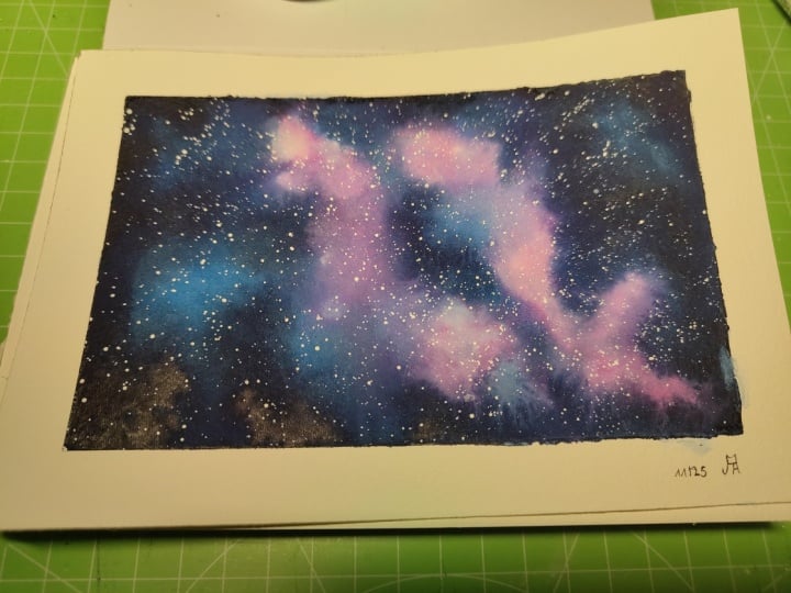
20. The Nebula Part 1 : Color Mixing: [MUSIC] Welcome to the first
lesson for our Nebula. We're going to mix the
colors we'll need for it. We'll be using a little bit of red and yellow as well as
Prussian blue and indigo. I'm just going to reactivate them since they're all dried up. Remember to keep them light. You are always welcome to switch the colors if you
just want to use something else it's just fine. But I will still
recommend to use something like indigo
for the edges because indigo is really dark and it's really going
to give you that look that's going to
help that shape to pop. Yeah, that's a good
one for galaxies. [MUSIC] We're done
so let's meet in the second part for our
first layer. [MUSIC]
21. The Nebula Part 2 : First Layer: We're ready to paint
our first layer. Right away, I wet the paper and as always on a blank
piece of paper, when I know I want
to work wet and wet, I take my time to make
sure the insides of the paper are also
soaked with water. I'm going to start
applying the yellow shade. We're going to shape
some kind of a circle. I tap the paint brush onto the paper and I tried to
keep the shape centered. Now I'm overlapping
red on top of that and we're going to switch and now over
to Prussian blue, get that center colored
and the edges too. This way we can work
a bit longer now, everything has been wet
again with fresh paint. Finally, I apply indigo
and I keep it to the edges to maintain a nice
gradient between my colors. Let's blend those colors now
with a small paint brush. I'm starting in the light areas and I am taking advantage, I'm blending to overlap indigo onto those
yellow and red parts. Let's add more color now
we have a rough shape. We want the edges
here to stay light, so I'm going to add paint
on the outer edge more. Don't worry if you don't
get a very accurate as we can still left
color later on. I'm adding red. It's
too much though, so I'm just blending it right on paper, baking some up to. It's really easy when
you start getting used to watercolors to
fix most mistakes I find that's why
it's worth sticking with it until you feel
comfortable with water, it will get easier in time. You can stop this layer whenever you're on
shape looks good. Don't forget to
overlap colors for a natural look not
too much to preserve those bright yellow
and red areas and also remember to blend all the colors together to make
smooth transitions. I left a bit of color
to refine the shape, and I'm going to add more colors to make my Nebula
look a bit better as I'm trying to end
this first layer was something that doesn't
look out of balance. I'm going to overlap
those bright colors onto the indigo parts
to achieve this, since I already have a
rough shape down [MUSIC]. I'm lifting there and
those light areas to make the center stand
out more and I use movement here and lift as if these edges were curvy to make
them look like so [MUSIC]. Let's try this.
The shape is good. Let's meet in the next lesson
for more color and details.
22. The Nebula Part 3 : Second Layer: [MUSIC] In this lesson,
we're going to add color with our second layer
and some details. A quick reminder, you
can stop painting after the second layer if you are satisfied with what
you're getting. I'm wetting the sheet again to apply more color and as always, I'll gradually
increase the amount of paint in my mixes to
avoid getting blotches. I'm adding yellow,
then I'll add red. My blue is Prussian
blue and indigo, many of the edges of
the sheet for indigo. Then we'll blend all this in. [MUSIC] Let's lift a little
now to act in the separation
between the center of the nebula and
what's around it. [MUSIC] I'm going to emphasize the area
in the middle even more and also the edges
that are right there next to the parts I just
lifted to increase contrast a lot there with very dark
and very light parts. [MUSIC] Let's blend this more
details into the background. It's spreading and I don't like the all-over-the-place
look I'm getting so that's why I'm
trying to smooth things out when I blend the
paints together. [MUSIC] Now I'm lifting paint in places, again because I'm trying to
get very light values to show up along with
very dark values. [MUSIC] Let's try this layer now. We're looking a
bit better darker. Next, we're going to
intensify the colors, especially the
dark ones. [MUSIC]
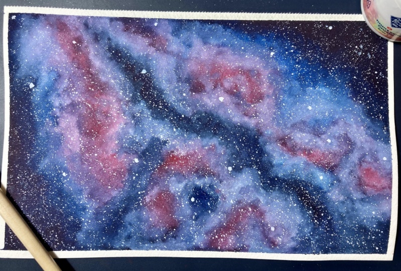
23. The Nebula Part 4 : Third & Final Layer: [MUSIC] In this
lesson, we're going to paint the final layer, emphasize colors and details. I wet the paper briefly
to start adding color, and I start with yellow. I'm going to add red, Prussian blue and indigo, then blend all those colors to soften any visible harsh edges. [MUSIC] Let's add some detail with a fine tip paintbrush to shape the center of
the nebula a bit more. [MUSIC] I'm lifting this part again to make it look like
the center of the nebula. The darkest part is hollow, and I'm going to keep
lifting all around. [MUSIC] I'm overlapping some of the light colors
on the blue parts to make it a bit
more interesting. I'm actually seeing
this from the photo, but you can customize your on nebula in the way you like best. [MUSIC] I keep refining the details. There's no specific
sequence here, I'm just adding or
lifting as I go. [MUSIC] We're ready to add our stars, so let's meet in our last
lesson for this nebula.
24. The Nebula Part 5 : Adding Details: [MUSIC] This lesson
is the final part of our Nebula painting. I'm using white gouache
to splatter a few stars. Remember not to add too much
water to the white gouache, even though you
can always adjust the amount easily with gouache. Too little water
and the stars will be tiny or the pain just won't come out and too much water and your stars will
be really big. I'm going to add a
few bigger stars here and there directly
with the brush. As always, I can't help
but add them everywhere, but ideally, it's better to keep them as random as possible. Also, wide splatters
are so nice. [MUSIC] Let's reveal. I'll show you with
the next painting a little trick to clean up the extra paint that gets
under the masking tape. I'm happy with it.
It looks nice. I'd love to see yours,
feel free to add it to the project section of this
class they shared with us. Remember, the more colors
on the background, the more effective blending with a clean damp brush will be. Dark colors versus light
ones emphasizes 3D effect. Specific brushstrokes can also be used when lifting paints. Keep the stars as
random as possible. It's time to tackle our very last project.
See you there. [MUSIC]
25. The Spiral Part 1 : Color Mixing: [MUSIC] Welcome back
for the painting of our last project, the spiral. We're going to need our
prussian blue and indigo, as well as pink. I'm going to mix pink right now. Remember to keep your mixes
lights to begin with and also feel free to mix
a lot more than I am. You have them ready and all you have to do is add a
bit of paint each time. I'm used to mixing colors. I tend to already know
how much paint to add, what I need in terms
of consistency. As cliche as it sounds, that's really something
that comes with practice. Don't worry if you're
not there yet. Meet me in the next lesson
for the first layer. [MUSIC]
26. The Spiral Part 2 : First Layer: [MUSIC] Let's paint
our first layer and start wetting the paper. My water is not clean at
all as you can see here. Actually, that's okay
because I'm going to cover up all of the sheet with
blue and pink paints. But if I was painting
something different, something like a snowy
landscape, I'll be more careful. Remember the wetting lasts for a while when the
paper is like this. It helps colors blend
really nicely later. [MUSIC] With this spiral, I'm going to start
with blues first. This is because the
spiral itself is a small part of the painting
and if I start with it, it will be tedious
to paint all around. All I'm doing now is
paint a sheet with Prussian blue and I'm leaving a blank
space in the middle. Now, I'm adding a little bit of indigo on the edges
mainly [MUSIC]. Then let's grab a
smaller paintbrush and with our pink shade, we're going to shape the spiral. You can see how
important movement is. You can tap your paint
brush here and there to add pinkish accents and define
the spiral bit more. You see now why it's easier to start applying all the blues first and pink last and the specific painting when
you get started [MUSIC]. Gradually I'm adding
pigment to make mixes and I increase color
intensity on paper. [MUSIC] I keep indigo to the corners of
the sheet mainly. [MUSIC] Again, in this project, blending is going to help a lot. Remember to use a clean
but damp brush to do this. As you blend the spiral with
a clean and damp brush, the shape will fade a bit, but that's normal and okay. We already have a shape down, our center of the
spiral is defined. Now we're using this as
a guide to make colors more vibrant and to accent
the shape more and more. I'm going to keep doing this, adding colors of a bit
more pigment each time. The goal here is in
every first layer for my galaxy painting
technique is to have our rough shape down by
the end of the process. This means you stop
whenever yours is looking satisfying and you move on to the second
layer [MUSIC]. I want to show you here
how much more balanced your painting will look if when you accent the spiral
with a pink shade, you also take advantage to dab your paintbrush
and places on the paper to create a purplish shade all
around the spiral. The transition with Prussian
blue will be less harsh. Having a proper shade there. It will help make this spiral
part of the background. As I'm doing this, I'm still following the
direction of those swirls. It's looking good to
me so I'm going to dry this layer and later
we'll add more details. The shape is looking
great and I like it, so we're going to keep
building on top of that. We're going to add some
details and then we'll have a beautiful spiral so meet me next for our second
layer. [MUSIC]
27. The Spiral Part 3 : Second Layer: [MUSIC] Let's start
on our second layer. We're going to paint more
detail in this lesson. I'm going to re-wet
the sheet fairly quickly since this
is our second layer. [MUSIC] We lost a little bit of a highlight there
in the middle, but that's okay, we can fix it. For now, I'm going
to start with pink, since I already have the
shape and darker colors down. I'm finding it easy now to
go with pink right away. In the first layer, I needed to idle up the center
of the spiral first. That's my way of looking at it. There's no right or
wrong way of course. Whatever feels easier
is the way to go. It's looking pretty elegant. Don't forget the paper will dry fast since we re-wet it briefly. Let's cover up those edges with Prussian blue and we can add
those indigo accents later. I'm leaving the edges and the
spiral untouched for now. That's because I'm
going to add pink and apply it while also blending those harsh blue edges
all around to create a transition between
the pink spiral and the blue background. [MUSIC] The blending here is done with a paintbrush
full of pink mix. Usually when I talk about
blending in Part 1 and so far in the second part
of the galaxy series, I do it with a clean
and damp brush. This time we want to add
pinks wherever there are visible color changes
between blue and pink, to soften them with what will
turn into a purple tone. I overlap this pink
even further around the spiral to keep some balance. What I wouldn't want is a plain pink spiral
followed by a purple area, followed by a blue area. I'm really trying to connect those different parts together. [MUSIC] With a smaller paintbrush, the one I have with
a very fine tip, I'm going to detail
this spiral a bit more. The paint will need
to be a bit more concentrated so it doesn't
spread too far out. We also don't want it too thick so it doesn't leave
a very strong mark. [MUSIC] I am adding accents all around once
more and this is how my spiral is becoming a full part of our
background with this method. [MUSIC] You can leave the paint in the
middle if you like, otherwise we'll just
fix this with gouache. I'm going to do just that
with my white gouache and also accent the edges
of the spiral a bit. I like to add gouache in a second and third layer
on backgrounds like these as we get undertones from the first and second layer
and the third ones. But you could also
consider adding gouache just once
for the last layer, whether for you the last layer is a second or a third one. I'm going to keep
adding and then I'll blend the gouache
into the watercolors, and we'll dry this layer. When blending the white gouache, we're back to using a
clean and damp brush. You will need to
clean it frequently as it will get dirty
from the blue paints. [MUSIC] We're ready for a
third and final layer, so let's meet in the
next lesson. [MUSIC]
28. The Spiral Part 4 : Third & Final Layer: [MUSIC] Here we go
for a final layer, we're almost done with this
project and the class, let's wet the paper quickly. We are going to define
the shape even more in this layer and make
those edges darker. I'm going to apply
all the colors, pink, passion blue and indigo, just like we did in
the previous lessons and then we'll blend these colors into
each other by using our pink paint to create
a purplish transition [MUSIC] Let's act
on the spiral or the fine tip paintbrush [MUSIC] Now let's add some white gouache as we did in the
previous lesson. Notice I'm also creating movement with white
gouache [MUSIC] I keep adding white accents and I'm going to
blend these with a clean and damp
brush into the rest of the watercolors [MUSIC] I love how this is looking, now we're going to dry this and later we'll add some stars. We're almost done, so meet me next for some
splattering [MUSIC]
29. The Spiral Part 5 : Adding Details: [MUSIC] In this lesson, we're adding some stars
with white gouache, and I'll show you
a little trick to clean up uneven borders
around your painting. My stars are coming out tiny, which means if I added a ton
more water to my gouache, my stain next day would come
out a little bit bigger, it will be easier too, but they would also
be more translucent. It's all about
finding a balance to get the looks you're going for. [MUSIC] I'm going to add a few stars directly
with a paintbrush. It's a good thing
to do to make them bigger and wider since
you can use pure paint. [MUSIC] I'll also add just a few
stars around our spiral shapes to axon and the movement of the spirals
even more [MUSIC]. We're done, so let's
remove the tape. I'm going to show
you how I clean up the edges around
the painting. I do have that problem quite
often with wet-in-wet work, layering work like we did
because paint gets under the masking tape with water and my borders
are not quite clean. All you need is
pure white gouache or white gel pen also works. In a minute, you'll get your borders looking
camera ready. [MUSIC] Remember, blending colors
together to achieve nice transitions can
be done with a clean, damp brush, as well
as a specific color. For a delicate accents, try using a paintbrush
with a fine tip. If lifting paint is
not effective enough. In some cases, white
gouache may help. Also, use white gouache to
clean up irregular borders. We are done with our painting. I hope you enjoyed
painting along with me. You may share your
spiral with me and the other students in the
project section of the class. Please reach out with any
questions you may have. Let's meet one more time
for final thoughts. [MUSIC]
30. Conclusion: [MUSIC] Congratulations
for completing this class. Please, before you go, upload
your projects to Projects and Resources
section of the class so I can give you some feedback. If you'd like, you can leave me a review to let me know what you thought of the
class and you can also follow me here
on Skillshare, you'll be updated of
all the future uploads, and the third and last part
of this Galaxy series. I'm pretty active on Instagram and YouTube, you
can find me there. You can also use the #CreateWithFrancoise to share
your work there as well. Thank you so much for watching this class and see you
in the next one. [MUSIC]
 Francoise Blayac, Professional Artist