Transcripts
1. Introduction: Watercolors, they can get so discouraging at first. But just like any other craft, it's always good to remember that you don't have to be great to start, but you have to start to be great. Frankly, having this to the back of my mind when I was starting really helped me being persistent and improve over time. Hi, I'm Francoise. Welcome to the first part of my watercolor galaxy series. I'm a French artist and I find joy in creating dramatic paintings, CELAC, and chanting, and life-like. With this class, I want to take the fear and confusion out of blending several watercolors together. If you're a beginner, you can learn the basics to create beautiful and smooth watercolor backgrounds. If you're a little more experienced but still having trouble getting that smooth look on your paintings, this class is going to help you improve. I find that galaxies are a great place to start for beginners because they're fun. They'll help you practice your watercolor backgrounds, and that will help you get into landscape painting. That's why I picked this topic today. In the first part of this galaxy series, we had a focus on blending and layering, so we can create smooth background that pop, smooth like the surface of the marvel. First, I'm going to touch on how to approach galaxy painting, then I will take you through the supplies that I use to achieve a smooth look. We're going to learn blending and layering. I am also going to show you how to create those very dark and very light spaces while still getting rich and vibrant colors to come out. These features being so typical of a galaxy. Our project is a colorful galaxy painting, and it's going to be a perfect one to practice the skills you're going to learn in this class and apply them to your next watercolor backgrounds. We'll end our painting with some splattering fun and a bonus lesson where I'll teach several creative ways to add the stars. By the end of the class, you'll be equipped with the tool and confidence to create your own galaxies and beautiful colorful backgrounds. So grab your paints, and let's get started.
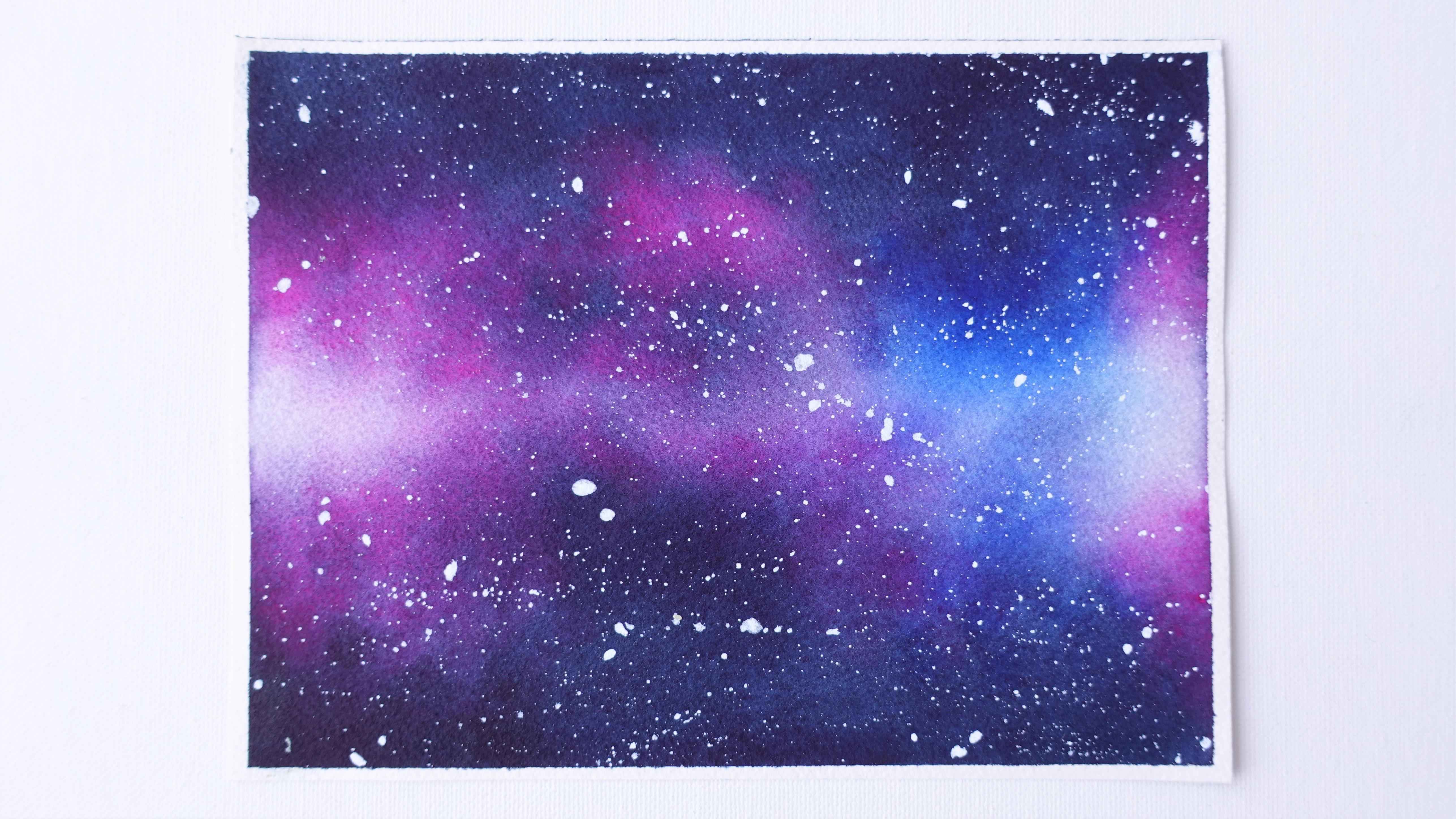
2. Class Project: Our project is one colorful galaxy. I picked this one from a free stock photo website because I think it has everything you would find in your typical galaxy, which is going to be great to work on the basics. Most beginners at the beginning struggle with blending several colors together. Galaxies can get quite confusing because there are so many colors. Some of them are so dark, when they intermix with such light ones, it can get tricky. In this one, for instance, there's a very dark part that will need to blend with much brighter colors. The bright parts are also made of several different colors. We can see spots there that are almost white. That is a lot of variety. The next lessons are going to help you practice bits of what is included in the final project. I highly recommend you go through these first before tackling the painting. It will make the whole process even more fun and enjoyable. In your final project, I'll be looking at the way colors are blending and how you incorporated those dark and white parts into the right ones, and how you added depth with layering. Please, upload your projects to the project gallery so I can take a look, give you some feedback and help you out. Next, I'd like to tell you about the techniques you can use for galaxy painting and the approach that I take to create galaxies in my own style. Meet me in the next lesson.
3. Approaching Galaxy Painting: I started painting with watercolors regularly in the winter of 2019, and I found galaxies really helped me hone in on the basic skills very fast. Water control, blending several colors, mixing colors. There's no sketch. It's a fun and usually a pretty fast and also spontaneous process. Add a lot of colors in there, a little bit of sublattice for the stars, and you end up with a beautiful and magical background. There are several ways to pain galaxies. None of them is best. Everyone will prefer one or the other, depending on style. One of them uses the wet on dry technique, while the one I'll be teaching you today involves the wet on wet technique. I'll explain and show you the difference a bit later in the class. I came up with the full method after practicing and trying to get my galaxies to look smooth and vibrant all at once, because I wasn't able to get satisfying results before that. For instance, I remember the top two things that left me frustrated as a beginner were that my paper was always drying way too fast to work with for over two minutes and I always found my colors looking really pale and boring. The three components I use to paint beautiful galaxies nowadays and we'll elaborate on each one in the next classes with detailed examples are; Specific supplies that do well with water, the wet on wet technique for colors to blend nicely and a smoother look, and the layering technique for more vibrancy and depth. First, let's look at what supplies we'll need to paint.
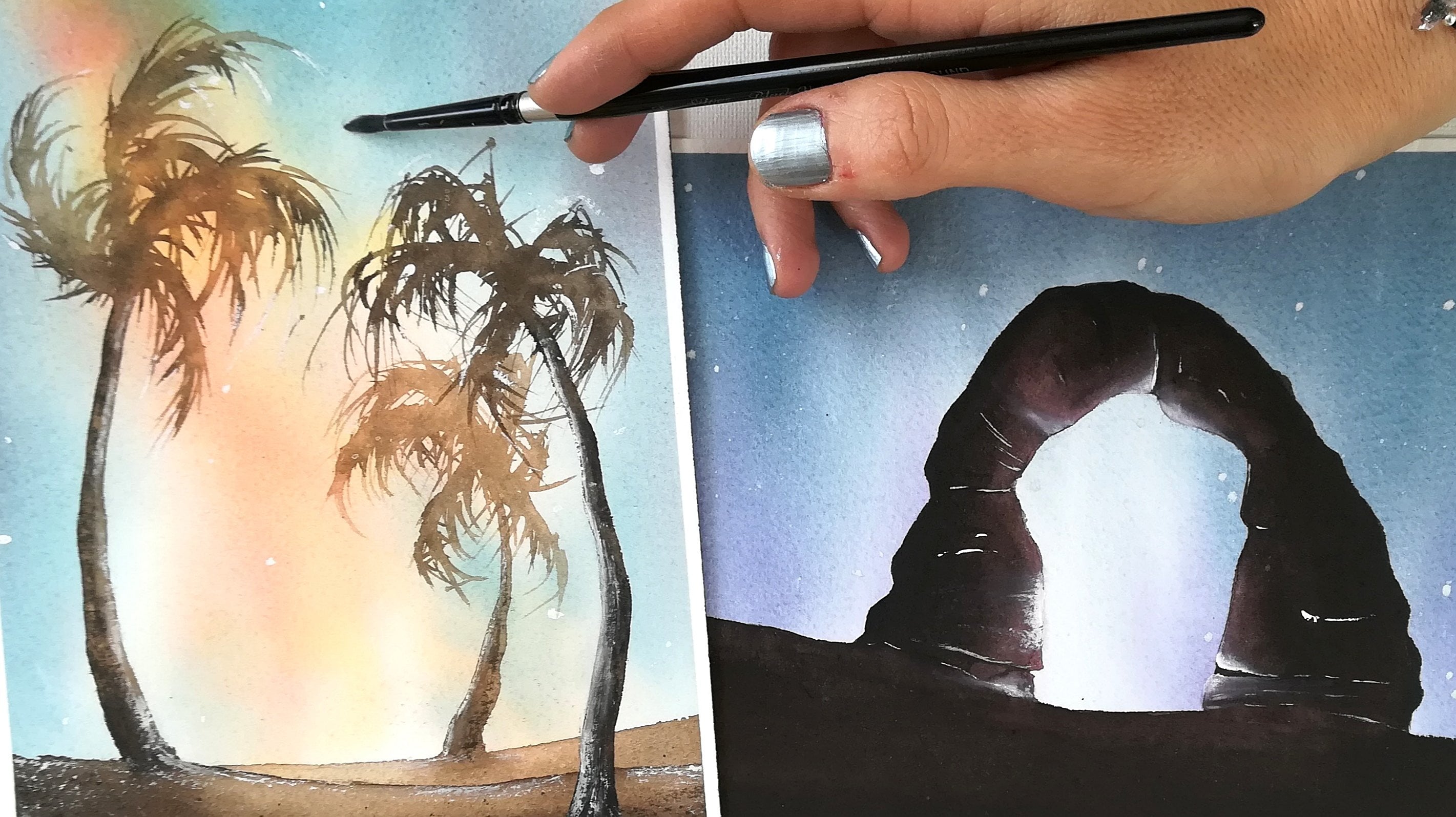
4. Supplies: In this lesson, we're going to look at the supplies we are going to need for the class. Watercolor paper, watercolor paints, water, and one or two paintbrushes are enough. You usually don't need a lot. If you don't have any choice, please get started with what you have. I remember being extremely confused by the wide variety of supplies when I started, especially paintbrushes and paper. For best results that will encourage you to keep practicing, I recommend 100 percent cotton watercolor paper, 300 GSM cold-pressed. This is, by far, the best supplies to try for smooth, beautiful backgrounds. This type of paper holds water very well, which means it will absorb more and stay wet longer. Colors also spread nicer and in my opinion, look better than on some other types of paper. One hundred percent cotton paper can be pricey. What I do is paint on small sheets I cut out of a big pad, and they last me for a while. For a size, I'd recommend you to get started on sheets that are somewhere between five by seven and six by eight inches, unless you use two watercolors and you have your own preferences. A very small size may make it hard to create those white spaces we're going to work on later, and a big size might feel overwhelming. The second supply you will need is a minimum of one round paintbrush that will hold a lot of water. Natural hair fiber paint brushes are known to just that. Brands will specify this kind of information, so you should be able to find one for you. The one I have been using since I started watercolors is a Raphael natural hair fiber paintbrush. The way sizes are labeled with paintbrushes vary so much from brand to brand, so I suggest to look for your paintbrush to match the surface of your paper rather than a specific size number. For instance, here, I know I can cover a lot of ground on my paper easily. If I were to paint on a very large sheet, it will become very challenging and this paper should be too small. This little mishap happened to me before. The same goes for a very small sheet. Now, it's so big, it will become hard to deposit each color precisely enough. It's all about finding a balance between the paper and paintbrush sizes. We will use this one for painting. I would recommend the second one. It's okay if it's totally different. We just want another paintbrush we'll keep clean to help us lift paint off of our paper when we need it without having to waste time rinsing our main paintbrush. The third type of supply we will need is going to be, you guessed it, a set of paints. For brands doesn't matter that much, as long as it's something common for watercolors that you would find at your art store. You can even use paints that come in tubes, pans, or half pans, and even bottles as long as they are watercolors. For the project, I'm using Art Philosophy paints cobalt blue, opera pink, and indigo. For our exercise, we'll add green, and use indigo, and cobalt blue again. Cobalt blue and opera pink will be our bright colors, and indigo will help us get the dark tones into our project. Same thing in our exercise. Greenish, yellow, and cobalt blue will be the brighter colors, and indigo will help us get things dark. I did not mention white because we will be using a technique called the lifting technique. We're not using any paint for whites in this class, except the stars. Don't worry if you don't have white gouache for the stars, I have some alternatives for you in the bonus lesson for painting the stars. Don't forget to have a few paper towels or tissue nearby, and two jars of clear water to wet and rinse the paintbrush. Also, a roll of masking tape is useful to tape the sheets onto your workstation properly. Remember, you don't need a lot of supplies for galaxies. The paper will matter most, I recommend 100 percent cotton cold-pressed paper. The paintbrush also matters. I recommend one that will hold a lot of water.
5. Picking Colors For Galaxies: In this lesson, we're going to explore colors for galaxy painting with three options you can go with if you have no idea what range of colors to use. If you're on a budget or you're not sure what the colors for you, start with the three primaries, red, blue, and yellow, to mix all the colors of the rainbow. I made a PDF file, you can download from the resources section of this class to see how you can mix the primaries to get more colors that will be great for galaxy painting. I suggest indigo to add to the primaries to make your task easier and get those dark parts very dark right away without having to mix a lot of paint. My top picks, the colors I'd get if I wanted to paint a lot of galaxies to get started, indigo again for the dark shade, and for the bright colors, a lighter blue shade like cobalt blue, a bright pink such as opera pink, and yellow and green colors. The basic colors of the rainbow will always be great to have if you don't want to have to mix colors at all. You may add a few dark colors for the dark parts of the paintings, like indigo, brown, gray, or black shade, can be used for those dark areas, mixed or plain. Something about colors you might have noticed before is some colors granulate a lot. I'm going to show you what this looks like. A lot of blues and blacks, some of the greens are known to granulate, and then it will vary depending on what brand you are using. Every brand should have this information available on their website. Take this Daniel Smith color called Lunar blue for instance. See how the pigment clusters together here. It can be beautiful in a painting, but maybe not the ideal look for a typical galaxy painting. Although I've noticed this effect becomes less visible after several layers, so you might get away with it. Something also worth knowing about is some paints lift more or less easily when we wet them after they have already dried once in paper. I'm going to show you this and exaggerate my brush strokes a bit to make it more obvious. I can think of three reasons to paint with lift off. The first is if you wet your sheet, again, even though the paint was not entirely dry. I usually do this a lot as a beginner because I was impatient and I thought I'd get away with it. Also, sometimes the paint looks like it's dry, but the sheet inside is not fully dry. The solution is to use a heat gun or hairdryer on low to try the paint and sheet completely. I do this a lot and I find it really helpful. The second reason is too much insisting and too much back and forth with the brush when we wet paper again after it has dried. I learned over time that when I wet paper a second time, when there's paint there already, I want to do it briefly and gently. Don't worry, we'll practice this both in our exercises and projects. By the end of the class, you'll have a good sense of how to do this. A third reason is that the paint is non-staining. It's a property of the paint that varies within brands, just like granulation. You can also find this information on the brand's website. Here, we have the paint on the right I know won't lift too easily. On the left side, one that does, even if I take precautions with my paint brush. Paints that lift to easily can make layering difficult. I used a layering technique for galaxies so I go with brands I've tried that I haven't had any problems with using most colors, like Winsor & Newton and Art Philosophy. I'm sure there are many others. I tried using Daniel Smith, but the few colors I own seem to lift very easily, so I prefer the other two brands. I'll show you later how to re-wet your paper to avoid this issue as much as possible. Remember, a few key colors are enough for galaxy painting, one dark tone and a few brighter ones. Prefer paints that don't granulate and don't lift too easily. These are small details that will make painting galaxies better and easier, but they're not going to prevent you from painting beautiful galaxies, if not everything's perfect. It's just nice having this knowledge so you know why it's happening and what to do about it. Now, the color selection part is more clear, let's take a look at how to actually pick colors from a reference photo in the next lesson.
6. Painting From Reference: In this lesson, I'd like to show you how I pick colors from a reference photo. We'll be using this one for our blending and layering exercises. We will repeat this small exercise with the actual project later on. By the way, the references I'm using in this class are attached in the Resources section so you can download them there if it's easier. Let's observe this photo. As with most galaxies, there are intense colors opposed to very dark ones. First, identify the bright colors. Here I see blue with green with accents of yellow, that's why I picked a greenish-yellow shade and suggested you mix yellow and green if you don't have one. Also yellow and blue makes green. We can imagine that when our greenish-yellow shade mixes to our blue shade, it's going to add more variety and beautiful transitions with a darker green shade. Next, look at the dark parts. Sometimes it's more bluish, sometimes more black or brownish. Here it's more of a dark blue, it often is, and that's simply why I like to use indigo. If I didn't have indigo here, if I have black instead, I would mix a little bit of the cobalt blue and my black because mixing black to another color looks a lot nicer. It blends better into the rest like it belongs, more than if you were to use black alone. Last, observe those wider parts. You can see clearly they are not that white. My style is a bit on the realistic side, that's why they don't look bright white either in my painting and I'm going to show you later how to get them to look so good, like in the photo, even if they're not entirely white like the paper originally is. On this recent painting I did for instance, you can see the white parts are not bright white but they still come across as such thanks to the dark parts. One more thing, when you find a reference photo that's mostly dark, this one on the left side is, I think it's totally fine to exaggerate the bright colors a bit more. Don't be afraid to make them bright or change things up a bit like I did in the right side. What's great with galaxies is you can completely customize them without it looking odd since galaxies are just colorful background with stars. Remember, white do not have to be truly white to come off as such. So don't worry about them in your paintings, focus on contrast instead and black looks better mixed to one color from the palette. The basics are a lot of information to take in, I know, but don't worry, take it lesson after lesson. We're going to start practicing after we learn how to create whitespaces without white gouache. In this next lesson and with the exercises and the project, it will all come together.
7. Creating White Parts Without Gouache : In this lesson, we're going to learn how to create the white parts in a galaxy painting without using whitewash. Whitewash is common for this Milky Way effect. For those of you who don't have any, we'll use the lifting technique instead. All we need is our paintbrush, although another one is going to be more convenient. Let's explore our options for creating white parts first. A popular way to paint galaxies is with the wet-on-dry technique. This is what I'm showing you right now. It means your paper is dry when you apply the colors. The only water comes from the paintbrush. It's great because the colors stay more vibrant, and it's easier to keep paper white areas. One single layer of paint can be enough for the colors to look beautiful. However, it can be hard to get rid of harsh edges with this technique. It's preferable to paint fast and know what colors you're applying, when and where ahead of time. The colors are also more likely to blend less easily and look like they start and stop somewhere. Blending the harsh edges also requires to come in with a wet and damp brush. This is not the technique we'll be using today because I find it difficult to get smooth backgrounds with. The second way to paint galaxies is with a wet-in-wet technique. This is the one we're going to practice today with the added twist of adding several layers. Painting wet-in-wet means you're going to wet the paper first with clear water, then drop the paint. The paint will in turn spread more or less on that water depending on how thick or runny you paint it. The more water on paper and/or the brush, the more it's going to spread. The least water on paper and/or the brush, the least it's going to spread. What's great about that is that colors blend very easily and the edges look very soft and diffused. The blended colors and soft edges look more realistic for a galaxy if it's a style you enjoy. What's not so great is that when they dry, the colors are quite pale because the paper is wet, they get diluted into more water compared to the wet-on-dry technique, and because the paint spread on paper that's wet, it's harder to keep specific areas paint-free. I prefer the wet-in-wet technique for backgrounds. I like that they look smoother with it. From now on, everything we do will be using this technique. We still have one problem, how do we keep specific areas white now we narrowed it down to the wet-in-wet technique? I'm going to compare two ways to preserve white areas when the paper is wet. Lifting paint versus using masking fluid. I'm going to apply masking fluid on the right side. Masking fluid helps preserve any area from water and paints. It's waterproof. It's convenient, but for galaxies, I find the edges really harsh even more than they were with wet-on-dry technique I showed you earlier. Nowadays, I only use masking fluid for areas that will be painted like a house, for instance, a character. I avoid it for everything that requires smooth blending, even though it's convenient. As you may have guessed by now, lifting paint will be best to create those white spaces in our galaxies. Let's wet the paper on each side and drop some paint all around. On the left, we're going to keep this area here in the center as paint-free as possible since I want to show you the lifting technique there, the one we'll be using in our projects. I dropped the paint and it's spreading. On the right side, it's not going to go past where the masking fluid is. Remember that when we looked at our reference photo, we could clearly see the white parts are not that white. When we work wet-in-wet to create our galaxy, the paint will spread and while it's entirely possible to preserve some paper white areas with this wet-in-wet technique, sometimes, the paint keeps creeping back into the spot we want white. That's not a problem, thanks to the lifting technique. Lifting paint means we'll be removing wet paints from the paper here with a clean and damp brush. The brush will be dry enough that it is able to soak up water from the paper back up into its own fibers. This will help remove paint and get paper white areas to show through in our painting. I just wet my paintbrush and I damped it on a paper towel like this to remove excess water and make it drier. It needs to be drier than the paper for this technique to work. I'm not using a completely dry paintbrush because I don't want a very, very harsh highlight. That's why a damp brush helps remove excess water while preserving a bit of the humidity on paper, and that allows a nicer transition. I'm swiping the brush on the paper so there's some pressure and that excess water and paint that's on the paper is absorbed by the paintbrush. You can repeat this as you wish. If our paintbrush is as wet as the paper is, nothing would happen. If it was too wet, we would be creating a blue. It's important to keep the paintbrush almost dry or just damp and use it while the paint is still pretty wet. Let's see how this looks like there on the right. The edges are pretty harsh there and since we have to wait for the paper to dry to remove the masking fluid, there is no way to smooth those edges out anymore. Just as I explained in the previous lesson, the areas where we lift up the paints are not going to remain extra white. It's the layering technique and the addition of very dark colors that will help to bring white out. It's exactly like the Red toothpaste that would make your teeth look whiter back in the '90s by enhancing the color of the gums. Enhancing dark and bright colors with layering has the same type of effect on those whiter areas of the paper. Remember, the lifting technique works better for realistic artworks. High contrast is what matters. Darker colors will make white parts look whiter. Now, let's head on over to the next lesson and learn about blending so we can start exercising.
8. Avoiding Blending Disasters : Blending colors with watercolors can feel like a disaster sometimes even with the best paper. This gets frustrating when you don't know what to do about it. In this lesson, I'm going to give you all the tools you need to achieve smooth blending with a wet-in-wet technique, when we wet the paper before coming in with paint. That is how we are going to paint our project in this class. With blending wet-in-wet, we'll be able to create soft transitions between colors, it's our goal. I often feel uncomfortable, almost fearful when I started painting because I often used a wet-in-wet technique to paint a background, and there is less control on what the paints do on paper. I know for me it's the fear to lose control and potentially not end up with what I had in mind. Maybe this feeling sounds familiar. I have made tons of mistakes with backgrounds before. Once in a while I still do. Nowadays it happens when I don't think about what I need to do ahead of time or when I rush, and the good news is after you practice and learn the basics in this class you'll know where you went wrong, and you can start over and fix whatever went wrong to do better that second time. If you need additional help, please reach out in the comment section of this class. We're taking a shortcut in this class by practicing with intention. I'll point out the little details about the process so you can get more knowledgeable, comfortable, and confident about blending several colors much faster. First we're going to make sure we're using preferably 100 percent cotton paper cold pressed. If you're not because you don't have any, it's okay but do remember it's likely you would see much better results with it. I want to show you how different other papers look. From left to right, we have wood pulp paper. It's the more affordable and quite common type of watercolor paper you would find. Next, 100 percent cotton, that is a hot pressed finish, it's smoother. I noticed this hot pressed doesn't take water as well as cold pressed even though it's cotton. On the right is our cold pressed paper. Is the type I use almost exclusively and recommend. I'm wetting all three to see how the paint will spread. I can tell the difference as soon as I drop to paint. On wood pulp paper, the paint doesn't flow as well as what I'm used to with cotton cold pressed. The paper is already curling inwards. I believe it is because it doesn't handle water that well. One hundred percent cotton hard pressed is causing the paint to look a bit granular which is strange actually even though I knew the paint wouldn't flow too well. On the 100 percent cotton cold pressed, the paint has spread better without any harsh lines or stains and the color looks more vibrant. I remember that time I was starting out, I had taken a few weeks off painting to travel, and when I came back, I tried with pulp paper after starting with 100 percent cotton paper a few weeks prior. I didn't know much about papers back them. I remember I was appalled by my results and I thought my break had had a very bad effect on the little skills I had gathered before. I ended up figuring out it was because the paper was different. I can't tell you how much better I felt when I started painting on 100 percent cotton cold pressed paper again. Next, we also want to pick our best paintbrush for the job. The ones that holds water the best and feels most agreeable to you if you do have a choice of pin brushes. It's best if it doesn't feel too rigid on paper, if it feels like it glides on it gently. A rigid paintbrush like some synthetic pin brushes could leave streaks on your background and make it more difficult to work overall. Here I'm painting with my natural hair fiber paintbrush, the one that fits me best with backgrounds. You can see how easily glides on paper. Movement is made easy. Here I'm painting with one of those synthetic paintbrushes that feels rigid. Yes, it is smaller but with this one I have to pick up more paint regularly. It holds less water and that's one of the major differences with a natural hair fiber paintbrush. I can feel it's also less easy to paint with because it's so stiff. Remember to check that the size of your paintbrush will allow you to pain comfortably in your paper. Here I have a 6 by 8 sheet of paper and to me it looks more than manageable with this brush size. Something important before we start wetting the paper is to make sure our colors are ready for use. You won't be wasting any time mixing them later. It's important because the paper will dry after you've wet it, so you want to use this time painting and not mixing colors. We're going to mix greenish-yellow, cobalt blue, and indigo just for this lesson. To achieve super smooth blending, I recommend to start very light. This is why I'm adding so much water. This is mostly water with just a little bit of paint. I will add more paints to make it thicker, and thicker, and thicker as we go without rushing. For now I'm trying to make enough to last for my first layer, feel free to make more. That's what I did as a beginner and have really helped. Do not have to worry about color mixing while painting. Now, our paper, a paintbrush, and mixes already, make sure you do have two glasses of clear water near you to wet and rinse brush, and a paper towel if you need to remove excess water from the brush. Remember that fear is natural where there's little to no control. All you need to do is start. You can always start over. Supplies can affect your results. Prepare colors before you start. We're ready to paint, so meet me in the next lesson for our blending exercise.
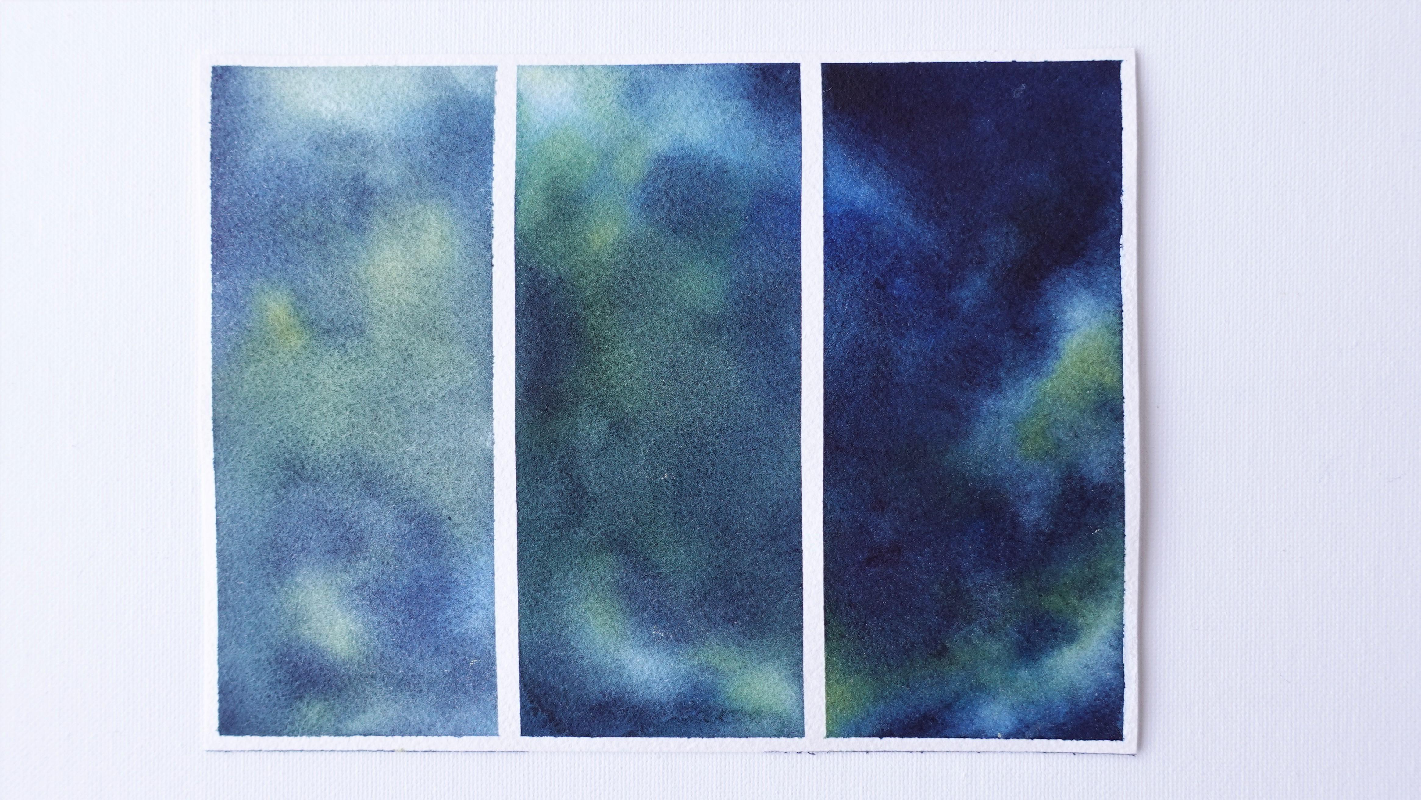
9. Blending Exercise : In this lesson, we're going to paint a quick background for practice. We're going to use the three colors we prepared in the previous lesson; greenish-yellow, cobalt blue, and indigo. Before we get into wetting the paper and applying the colors, you might find it easier to watch this lesson without painting, then come back here, and start painting alone. That's if you think it's more comfortable for you to watch the steps first, so you know what to expect. That's something I'd like to do whenever the wet and wet technique is involved. I feel more relax knowing what I'll be doing ahead of time. I'm separating the sheet into three different parts. We'll paint all three in the same way in this planning exercise and in the layering exercise that's next. We'll layer more or less to show you the difference layers to make on a painting. You may paint all three layers on the whole sheet if you prefer to have another finished galaxy besides our project. If you do though you won't get to see the difference each layer makes. I dip my paintbrush in the water, all of it for a few seconds, even longer if it was really dry. When you take it out of the water, it should be dripping wet like so because this is our initial layer so we'll need a lot of water. We're getting ready to apply a first layer here. Our goal here in this exercise is to blend smoothly. Since this will also be our first layer, we want to place our main colors where you see them on the reference photo and start adding a little bit of contrast to have a solid foundation for the rest of the process. I'm wetting my paper. I start to drop a lot of water on it and I rub it in with back and forth motions. It's a good thing to do a lot of back and forth here because there is no paint yet. The paper is bare and we need to get in the nooks and crannies of it. This step can last for about a minute with a six by eight sheet. A large sheet would take a lot more wetting. That's why this size will be more manageable for exercises and projects. Once I see the water has sinked in, I'd like to add a bit more and repeat. The goal here is to make sure I get the paper wet evenly and also make sure that it is going to stay wet longer because the inside and the surface are both impregnated with water. This is very important for your colors to blend nicely. We want to end up with a nice and even glisten on the paper, like fresh rain on a road but without any puddles. Next, I start to apply my colors. I start with green and I apply it where I see some in my reference. A power tip that will make a huge difference in how long your paper stays wet is to not be afraid to add runny paints like these at the very beginning. Remember we did mix a lot of water in them. That's totally okay because this way we're adding color to the paper, but we're also adding a bit more water. As you may have guess, the more time passes by, the more of the paper will dry and this is going to keep it wet longer. It took me a while to figure this out that wetting the paper alone was not enough. I also know from painting so much that if I add thick paint right away, it will take a lot of the humidity away very fast. There will be less room for adjustments of color. Less contrast if we start dark right away and we'll probably end up with a blotchy background too. So that's really something I stay away from now. I'm doing the same with cobalt blue as I did with greenish-yellow. At this stage, you really want to apply your colors where you want them to be in your final painting. This is very light, but it's going to guide us all the way through. I am adding indigo. Indigo does not look good next to our greenish-yellow because for now we are getting the start and stop look for both colors. You'll see how to fix this in a minute. To make indigo and greenish-yellow blend better even though they're so different, one being very light and the other one dark, I use a clean paintbrush to pull bits of indigo onto the greenish-yellow parts to break that harsh transition down in a way. The water from this clean paintbrush makes my indigo naturally lighter when I pull it over to greenish-yellow, I tap the brush in places randomly and this is how I make both colors blend in better. It looks so much better already here, almost cloud-like. Now I just cleaned and dab my paintbrush to make it just a bit damp to lift those parts where we want the strongest highlights. I clean the brush each time I do this to get rid of the paint that was just lifted. I'm not afraid to repeat this step a few times if the paint drips back in which is the case more on the first layer because of all the water that's on the paper. It gets easier later on in the process. If it's not very accurate yet, it's normal and okay since it's so light. Since the pain spreads a lot, we're going to build on top of this with thicker mixes of paint and we can adjust the placement every time. This is why it's important to start light with the watercolors. Keep in mind the paper is drying little by little even if it still looks wet now. This is why I'm adding a little bit of paint to my color mixes. If I kept working with too much water and not enough paint, my background would stay light, and eventually, all this extra water from the brush would make stains on the drying paper. I proceed in the same way. You can clearly see how my pain is a bit darker now. Notice however that my mixes are still pretty runny. I tap my brush in places for my background to end up with areas that will be more or less light and dark. My paper still holds a good amount of water on its surface I can see. It hasn't set into the fibers yet. So I'm adding the paint and I see it spreading just fine while looking darker. It's exactly what we're looking for. It's important to leave some of those lighter greenish areas uncovered so we get that variety of tones in the painting. Help yourself with the reference photo if you need to, although, with galaxies, you can be more spontaneous. I'm repeating this with cobalt blue now. Now let's add indigo. We're almost done with this layer. I'm helping indigo and greenish-yellow blend once more with my clean paintbrush. Let's add a bit more color to finish this layer with more pigment in our mixes. Look at how greenish-yellow and indigo are starting to make a darker green shade. It brings out the bright greenish-yellow parts even better. The paper is drying even though we can't see it because I know it's going to dry. Now I prefer to stop and call this the first layer. The goal of a smooth blend and placing colors where they belong is fulfilled. When you take it slowly and gradually, like what we're doing now with enough water for colors to flow, you're more likely to end up with a beautiful blended background and avoid blotchy areas or stains and blackness, just like eating, it's better to stop before you're quite full, even if that means having a snack later. Let's lift colors one more time and this layer is finished. It takes a bit of work because it's the foundation. It's the most important one. Once we have that, all we need is increase contrast and adjust colors where we want them. Look at how beautiful this is looking already. Let's not be fooled though, because this is going to dry a lot lighter and that's when layers come in. Let's make sure this is fully dry before moving on to the next step. I'm going to explain why I stopped here and more about layers in the next lesson since blending and layering are closely tied. With this blending exercise, I'd like you to remember that colors spread and blend where there is water. Don't be afraid to start with a lot of water while avoiding puddles. Add more paint gradually. Help nice transitions with a clean paintbrush. Stop whenever colors are not spreading as much. Start lifting colors here in the first layer. Let the paper dry completely. Meet me in the next lesson to learn how to layer and create more depth to this sample painting.
10. Why And When Layer: Now, I'm going to explain what layering can do to improve the looks of watercolor galaxies. Layering on this background means we're going to apply some more paint on top of what's already there. I layer because I find it adds so much more depth and vibrancy. We can see our background has dried much lighter than it looked a few minutes ago. If you look closely, there are a few imperfections on it that layering will help us fix. Also, with layering, I love that I don't feel I have to increase contrast on a painting with a camera after taking photos of the artwork since layering is going to give the painting a natural camera-ready finish. Now, the problem is we can feel confused as to when to stop or start a layer. How do we know when to do this? In my experience, stop whenever you see your colors are not spreading as well anymore, or whenever the paper looks like it's drying. Signs the paper is drying include, apart from colors not spreading much, no more glycerin on the surface or even bumps in the paper. I stopped my first layer before this even happened because I know my limits from repeating this painting several times. I was able to work for a few minutes and apply a good initial layer of colors while the paper was still wet enough for them to spread out nicely. It's a great first layer with a bit of contrast from the thicker but still wet paints we applied, and it's all we need to keep going later. If I hadn't stopped, my paper would have dried enough eventually that the paint would almost stop spreading, that's when backgrounds start looking blotchy like this, they can also look this way if you add a very thick paint, even in the papers very wet. Every time paints can spread enough, whether it comes from the paper drying or your mix being too concentrated, you will see this happening with a wet-on-wet technique. You can try and fix it a bit by wetting the paper briefly after it has dried to smooth out those paints a bit by lifting some, and next, keep working on your background like we did before. Another good reason to stop before the paper dries is you could get some blooms. This happens when you add too much water on a drying paper; the extra water you're adding with your paintbrush pushes the pigment away on paper and forms a bloom. These little accidents are why I find it more effective to take breaks a bit too early with each layer and to plane for three or four lay. Ers overall than try and do everything in one or two layers. I know my background will be smoother and I won't get harsh spots or blooms. Remember watercolors also dry lighter than what they are when wet. Looking at a layer that has dried will allow you to better assess where you're at; if you're going to need to add more color or fix something like make headers darker or add more vibrancy elsewhere. What's great is that layering on wet allows you to fix and improve all or part of the background without leaving any evidence as long as you re-wet all of the paper each time. I'm going to show you exactly how this looks like in our layering exercise, but first remember that layers help keep a background smooth, free from blotches of blooms and that layers increase depth, realism, and vibrancy. In our next lesson, the layering exercise, I'm going to give you a specific layering framework you can use with all your backgrounds.
11. Layering Exercise : In this lesson, we're going to use the background we painted in our planning exercise, and we're going to layer on top of them to compare while following my three layer framework. What we did previously already count as one layer. Let's leave the background on the left untouched. Next, we're going to layer again in the middle and on the right side of the sheet. Then we'll layer one last time only on the right side. This will allow us to compare all three stages and see what layering truly does to a background. You can decide if that's something you want to apply to your future paintings. Let's wet the parts that are in the middle and right side for our second layer. Just like before, the paint brush is soaking wet. This time, however, there is no need to spend time wetting. First, we don't want to disturb the first layer. Remember, no pressure and as little back and forth as possible this time. Also we're increasing the amount of pigment in our mixes. We really don't need our paper to be as wet as it was when we started. Although, remember the paint still need to flow and be a bit runny. This consistency I think will do. I'm adding my greenish yellow. I tap the brush in places. I don't want to cover up all the backgrounds. I want to overlap colors. Overlapping colors that are either light, average or dark in intensity on top of each other in a random way, is what will create the natural depth in the painting and avoid us to end up with perfect blocks of color that start and stop somewhere. I'm doing the same with cobalt blue. Just like before, we can add a bit more paint in our color mixes and keep building up contrast. Is the same process, the only difference is we intensify colors little by little. There is also last one on paper, so both paper and paint hold a similar amount of humidity. Remember not to cover up everything we did before. We want to overlap the darker paints and places and the reference photo can guide us on this. If you are doing this for the first time, repeat this exercise with as many times as you need to feel comfortable. It will help you improve both planning and layering. Don't worry if it feels intimidating at first. It Is completely normal, although we've already done most of the work when we painted that first layer. Now, let's try this completely and compare. It's looking beautiful. I'm not going to add stars here. You can if you'd like, because I think it would look even more striking. You can clearly see here how the third and last background looks more interesting than the other two. What I enjoy with this method is because it can look vibrant with layering without being flashy in the first place. What matters is to have a strong contrast of light versus dark areas in painting to create the vibrancy. We can see here our first layer blends beautifully with a wet-on-wet technique, but it usually is very pale and it lack contrast. The second layer adds a bit more, but it's not operating in its full potential yet. There are always things to fix or improve. A third layer like this one brings out the depth and vibrancy of colors even more. Add some Some and it become sensational. I have layered more than three times before and when I did, I was trying to fix a mistake or get a color to be even deeper and dark. You're the one to decide how many layers you need. I think three is great most times. Remember, wet the paper briefly for a second or a third layer. Add more paints to your mixes as you go. Use your reference photo to spot the light, mid, and dark tones. Overlap the colors for depth and vibrancy. Contrast has more impact than the intensity of a color. Now we understand how to leverage planning, layering and lifting, and how they can help us paint smooth and vibrant galaxies. Let's paint our project.
12. Galaxy Painting Part 1 : Reference And Color Study: It's time to paint our colorful galaxy. Before we start, it's a good idea to mix our colors, especially when working with a wet-in-wet technique. I'd like to take advantage of that to take a look at the reference photo I used in our painting first. When I paint from reference, I look at how I can simplify my choice of colors from what I'm seeing. Here, it's obvious wanting a bright pink and a bright blue to contrast with the dark parts all around. The dark parts are looking almost black to me. But since I'll be using blue already in the bright areas, I'm thinking indigo will suit this well. This is because indigo is a very dark blue. I know it also mixes into beautiful purples with pink, so it will be perfect to smooth transitions with our other colors. We can see a few purples here and there, but we're not going to need purple because, like I just mentioned, pink and blue make purple. So we'll get this color in the painting where the two colors meet. There are very light parts on each side. They can look white, but when you take a closer look, they aren't. Perfect again with the lifting technique, sends or get this effect of very light parts, but not too obvious either. On the photo, contrast between dark and light tones is amazing, even though those small parts are not quite white, which is proof whites don't need to be white. We'll still get something beautiful as long as contrast is there. Let's grab a pink minus opera pink. It's a flashy tone so it's going to be great for this painting. I'm adding a lot of water to it. Remember, it's very important to get a smooth first layer. I just mixed cobalt blue in the same way. This shade of blue is not the most striking one in comparison to my pink, but it's a good basic one to have, and it goes well with opera pink and indigo. Now, let's make a runny mix of indigo and we're good to go. Meet me in the second part for our first layer.
13. Galaxy Painting Part 2 : First Layer: We are ready to start blending and layering our three paints. Remember there is no rash as long as the paper and mixes are very wet in the beginning. If it starts drying, you always have the possibility to stop and kick on later. I know we are a bit impatient sometimes. We want to keep going, keep in mind that you can control your paints and where the painting is going a bit more if you take it slowly. You will get faster and better after just a few galaxies. Besides, I repeated this galaxy a few times before shooting this video. Take it slowly and you'll get there. I'm wetting my paper generously for about a minute. We don't want it covered in a pool of water or small pools of water in places. We want the water to penetrate it first, then add a bit more on the surface for paint to still flow. As I'm dropping pink first, you can see up close how light it is and how it flows. I'm keeping the paper wet by adding this funny mix of paints. I'm not wasting any time, but I don't feel like I'm in a rush either. Try to aim at getting your main colors on paper if you're not feeling confident enough yet. Next, you can dry the paper, wet it again, and keep going. Now let's start applying our shade of blue. Mine is cobalt blue. Indigo now, and by now it's possible the paper is turned into dry a bit already, where we haven't applied any paint. This is why we want to get these colors down on paper within the first few minutes, then we'll be able to keep going. It doesn't look nice yet and it won't for a while. It's totally normal and it's one of those things that can make watercolor so discouraging at first, but once you know there's always going to be an ugly stage as some some it, it's easier to push through. I'm starting to overlap colors, we'll do more of this later. Let's mix a bit more pain into our pink mix. If your paper is still wet enough from the previous paints, it's a good time to keep building this layer up and overlap the various colors to get a nice and natural transition between our colors. Remember, we want to avoid our colors to look like they're starting and stopping somewhere. You can see our pink shade is starting to turn into a purplish tone now because I'm overlapping cobalt blue in places. I try not to cover everything up here. We want those near-white areas to my reference photo, the ones on each side of the painting, to stay very light. You can see as I'm tapping the brush in the paper that there's still a lot of water there. I'm adding a little bit of pigment to my cobalt blue mix and I keep building up a contrast for this layer. It's important because it's already starting to make this part of a painting more vibrant. But since we still have a lot of water there, it will still blend with the other colors nicely. We're now getting a blotchy background with this approach. Let's add indigo. Notice how the top left of the sheet is getting a bit curvy. Corners always dry faster. That's why I hurry and add paint there now while there's still time. There, were good for a few more minutes now. We can start shaping the painting a bit more precisely at this point. It may seem like a lot of things to do for our first layer, that's because the paper was raw. There was nothing on it. First layers are always the hardest ones with every medium. They're the foundation for the artwork. The next layer will be a repeat of this one with thicker mixes. Only we will have our base to guide us and the last part will be faster. We'll build up more contrast still, while increasing depth. I arranged the smaller brush to drag a little bit of indigo from the edges into the lighter areas like we did in our exercises. I do it with a clean and damp brush, not the one I was just using because the paint I'm pulling will be less intense than what's in the other paintbrush. Since I'll just clean water in what I'm using now instead of my indigo mix. When you do this, make sure your clean paintbrush is just damp, not dripping wet. Otherwise, you might get a blue. If you observe the reference photo once more, you can see those tiny dots of darker tones in the bright pink and blue areas. That's what we're painting now. We are done. Before moving on to the next layer, let's lift some paint to highlight the near-white spots even more. The paint on paper should still be wet enough at this point, that is easy to do. There is a little bit of excess water in the corner. Whenever that happens, the lifting technique works just as well. Lift paint a bit too in the middle. By now you can see we already have obvious dark and very bright areas as well as some vibrancy with pink and blue. Something that can be a bit disappointing sometimes, is how light watercolors dry. How easily they lose the vibrancy we're after. Layering is going to fix that. We'll fix small imperfections with it too. Again, don't worry, it will get easier and quicker now since all the nooks and crannies in our paper are filled with paint now. All we need to do is action the colors next. We're done. Congratulations for doing most of the work already. I'll meet you in the next lesson for a second layer.
14. Galaxy Painting Part 3 : Second Layer: We're going to paint the second layer now. It will be a lot easier to increase contrast and vibrancy now. The main shapes and colors are placed. We'll proceed similarly as what we just did. I am cleaning up my colors a bit, my pink got spoiled by the cobalt blue paint. I'm not changing the water yet, but if you see yours is way too dirty to use, you can go ahead and change it. Let's make sure our color mixes are ready, we'll need them as they were towards the end of the first layer. What do we still remember? That's what helps color blend together smoothly, but with more pigment than when we started. We can see here that the paint has dried very light and there are a few visible drying marks in places. That's okay, we won't even see them anymore later. Now let's wet the paper again. This time, notice how little time it takes to wet the paper since the tooth in the paper is already filled with paint. Remember not to do too much back and forth, not to press too hard. I know with these paints, because I've used them before for this, that if I was to swipe a brush twice in the same spot, the paint would start to come off a bit. Otherwise, it's just fine. Let's apply pink. We can already tell it's brightening up the painting a bit since there's more pigment in the paint. Let's continue to tap our brush gently around and later we'll apply each one of our paint as we did in the previous layer. You can stop at any time. Remember the trickiest part is done. I remember I started layering naturally because I always felt frustrated with the looks of a single layer. I wet my paper again and applied more paint to fix this. Over time, I also noticed I was able to control the looks of my painting better. I guess this is how layering slowly became a part of my artistic style. I love about layering that it's so powerful with watercolors, and I love to be able to create realistic paintings that don't take hours or even days to complete compared to other mediums, and yet look just as nice. I think I added a bit too much water here in my mix, so I'm going to mix a bit more paint in it. I'm noticing this because by now the paint should be more concentrated if we want it to become more and more intense. It was too light a few seconds ago. Besides, I don't need it to spread as much as it did. This was another clue that let me know to add more pigment. I can spot it because I've painted a lot of galaxies. You will experience this as well after just a few of them are ready. Sometimes we think it takes ages to make progress, but it really doesn't. It's always a matter of getting started first and foremost. Even though this is still wet, we can see how much more contrast there is and how much easier it is to place it on top of a first layer. Let's intensify those bright colors a bit more before calling this second layer finished. There we go. Feel free to share your progress with the layers in the project section of the class. Next, meet me for the third layer.
15. Galaxy Painting Part 4 : Third Layer: We're getting very close to finishing this project for the third and final layer. Make sure the painting is fully dry before wetting it again. Make sure your mixes are ready too. For this third layer, we are making them thick enough to emphasize our colors even more on paper. The bit rate is still for everything to blend. I've repeated it several times because it's so important face with planning. Lets wet the surface again. That's enough. We can start dropping our colors on there. As you can see, our background is looking beautiful already. But this layer, I want to increase vibrancy and contrast even more. I'm overlapping pink but not everywhere to keep it interesting and looking natural. We're going to keep going. Next, cobalt blue then indigo. Again here, I see my blue is a bit too runny. That's okay. We just need to adjust the amount of paint as long as the paper is wet, you can always correct. It's okay if everything is not perfect during the actual painting process. I still make small mistakes, sometimes big ones if I'm in a rush, what really matters is to be able to identify the problems so you can fix it. Okay. Those education picture. We can see here at the bottom of the sheet that it's starting to dry. That's why the last paints I'm applying on here are very concentrated with pigments. Here we can see those white parts are not white, but still they managed to brighten the whole painting up contrasting with indigo. We are done with our layers. Let's try this now and next we'll add the starts. I can't wait to see what this is going to look like. Look at how deep and smooth this background has become. Let's meet in the next lesson for a little bit of spluttering.
16. Galaxy Painting Part 5 : Finishing With Stars: We've made it to the very last part to complete this project. For the stars, I'll be using titanium white gouache. Don't worry if you don't have any white gouache, the bonus lesson is all about creating stars in other ways. This titanium white gouache is pretty opaque, and I'm actually seeing a difference with another type of white gouache I was using till now. Not a huge difference, but I'm still getting better results with this one. Let's prepare a mix of white gouache. We want as thick as it is when it's out of the tube with just enough water that will be able to splatter paint. Sometimes it's hard to splatter. We tend to struggle with the water to paint ratio with these two. If no paint comes out of the brush, it just means we need a little bit more water. But if big drops come out, it's because there's too much water and we'll need to add paint. Here, you can see how splatters come out. I'm seeing I've got the right amount of paint, although I could add more water to get bigger stars, but since gouache star is very light, I'm going to keep it this way. I'll start directly with a paintbrush later. Try to vary the direction for your splatters. I'm getting straight lines of stars here. That's okay. There are a few, but I wouldn't want too many of these. Here, I'm adding a few bigger stars. This allows me to make them bigger while keeping the paint as opaque as possible. Try not to place those stars too evenly across the painting. I find it so hard to do that. I still get help to add some in every area of the piece and every time it's the same. We're done and it's looking amazing. I'm really happy with how it's turned out and it's really a great way to practice blending and layering with simple but striking colors. I hope you have enjoyed painting this alongside me. Please upload your finished product to the project gallery. I'm excited to see how your painting has turned out. Let's head on over to our bonus lesson to learn how to paint the stars in various ways.
17. Bonus : Several Ways To Add Stars: With this bonus lesson, I want to show you other ways to paint the stars in case you don't have any white gouache. I'm going to start with white gouache to compare it to our other options. I'm fast-forwarding this part where I paint in the background for this experiment just so you see what I did if you want to give it a try with your own supplies, if you have similar ones to mine or even other options you think might be great for painting stars. I went with three plain layers of indigo on there to make sure it's very dark and whatever option we try pops as much as possible. If you don't want to bother painting and drying layers, it's okay. I'm doing it this way to get something to look smooth and looking good for the class too. You, on the other hand, can paint directly when dry to get a darker background faster. It doesn't matter very much if there are any marks or other irregularities since this is just an experiment. For the first one, I'm using white gouache just like we did in the previous lesson to compare it with other ways later. I'm going to add a big star to show you how you can paint those. I use a paint brush with a fine tip for this. This one is a Silver Brush Black Velvet brush. To avoid making a huge and thick line, I make this back-and-forth movement and I try to get close to the paper until the tape of the paint brush touches it, then I just swipe it very, very gently, and I'm going to repeat this all around to make a star. I emphasize the center of the star a bit more here to make it pop more. That's it. Now we are going to use a colored pencil. It's a white Prismacolor color pencil. This type is a bit creamy, so it's easy to deposit pigment on paper and we can control shapes a lot better. It doesn't look as natural as white gouache though. It also looks less white than gouache, it pops less. Now I remember why I got this Sharpie marker in the first place. It looks very much like a colored pencil. Let's try this and see. It looks very much like colored pencil. It feels just a bit thick here, almost like oil pastel in a pencil form and the tip is not as fine and precise even with a sharpener. Now we'll try a Faber-Castell Pitt Pastel. This is soft pastel, so it's great to apply on top of a drawing or painting, but it also comes off very easily. It's dusty. I find it easy to apply and it's a convenient option, although it's still not as precise as colored pencil and not as opaque and bright white as the white gouache is. I'll try oil pastels now. So oil pastel sticks are generally thick. I used them a lot too. I know from using them that you can get bright white highlights if you tap the stick firmly onto the sheet. It can be something to try if that's all you have. It will be hard to draw detailed star shapes with them now. You can clearly see here the marks we're making are less fine than the ones we get with our other mediums, but they do show almost as much as white gouache. Let's try this Gelly Roll by Sakura. I like this a lot as a gel is bright white, it's easy to apply. This would be my next best pick after gouache personally. Based on like that with white gouache, steroids guys are faster to make and the stars look more spontaneous. Done exploring how to paint stars. I hope you enjoy this bonus lesson. Feel free to share your start painting experience in the project in the resources section of the class if you had the supplies to try this with. I'd love to see of new ways you may have come up with. I have a few more things to tell you, so let's meet one last time in the conclusion of this first part of the galaxy painting series.
18. Conclusion: You don't have to be great to start, but you have to start to be great. So congratulations on taking action and completing this class. Please don't forget to put your projects in the projects and resources section of this class, so I can take a look, give you some feedback and help you out. Feel free to leave me a review to let me know how you enjoyed the class, and follow me here on Skillshare to get notified of my future uploads and also the rest of this Watercolor Galaxy series. I'm also on YouTube and Instagram. You can find me there @blayacfineart and use the hashtag CreateWithFrancoise to share your works there as well. Thank you so much for taking this class with me today. See you in the next one.
 Francoise Blayac, Professional Artist