Transcripts
1. Welcome to Class: Hello, everyone, and
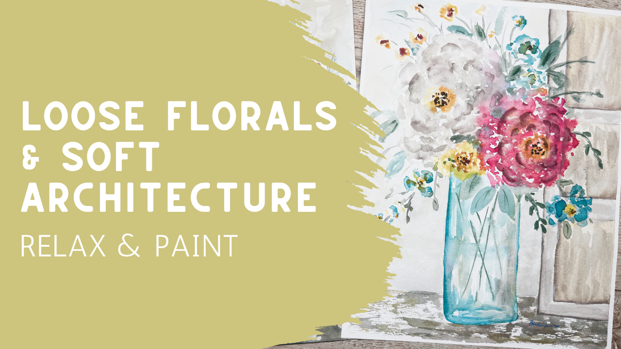
welcome to class. Today we'll be painting the soft atmospheric
floral arrangement with a loose watercolor vase and
a simple doorway background. This class is designed to
feel relaxed, expressive, and approachable while still helping you create
something that feels beautiful enough to frame and display
in your own home. One of the things I love
most about this style of painting is that we're not trying to control every detail. Instead, we're allowing
watercolor to stay soft, airy, and full of movement. Some edges will disappear, some color will
blend unexpectedly, those little imperfections
are often what creates the most beautiful
atmosphere in a final piece. In today's class, we'll focus on building the
composition in layers. We'll start by simplifying the doorway and the
vase shape so that the drawing phase doesn't
feel too overwhelming. It'll be very manageable. And then we'll slowly build
the flowers, greenery, shadows and background using loose watercolor techniques
and a soft transparent layer. Even though this
painting may look a little bit more advanced
at first glance, it's still designed to
be very approachable. If you're newer to watercolor, I encourage you to
focus more on enjoying the process than trying to perfectly copy
every brushstroke. Atmospheric watercolor works
best when you allow yourself the little bit of freedom and
flexibility along the way. And don't forget to sprinkle
in a whole lot of grace. If you've already taken my Companion
atmospheric vase glass, you'll notice that many of these same techniques carry
over onto this project just with a slightly
different composition and a little bit more structure from the doorway background. Go ahead and gather
your supplies, relax, and let's begin
painting together.
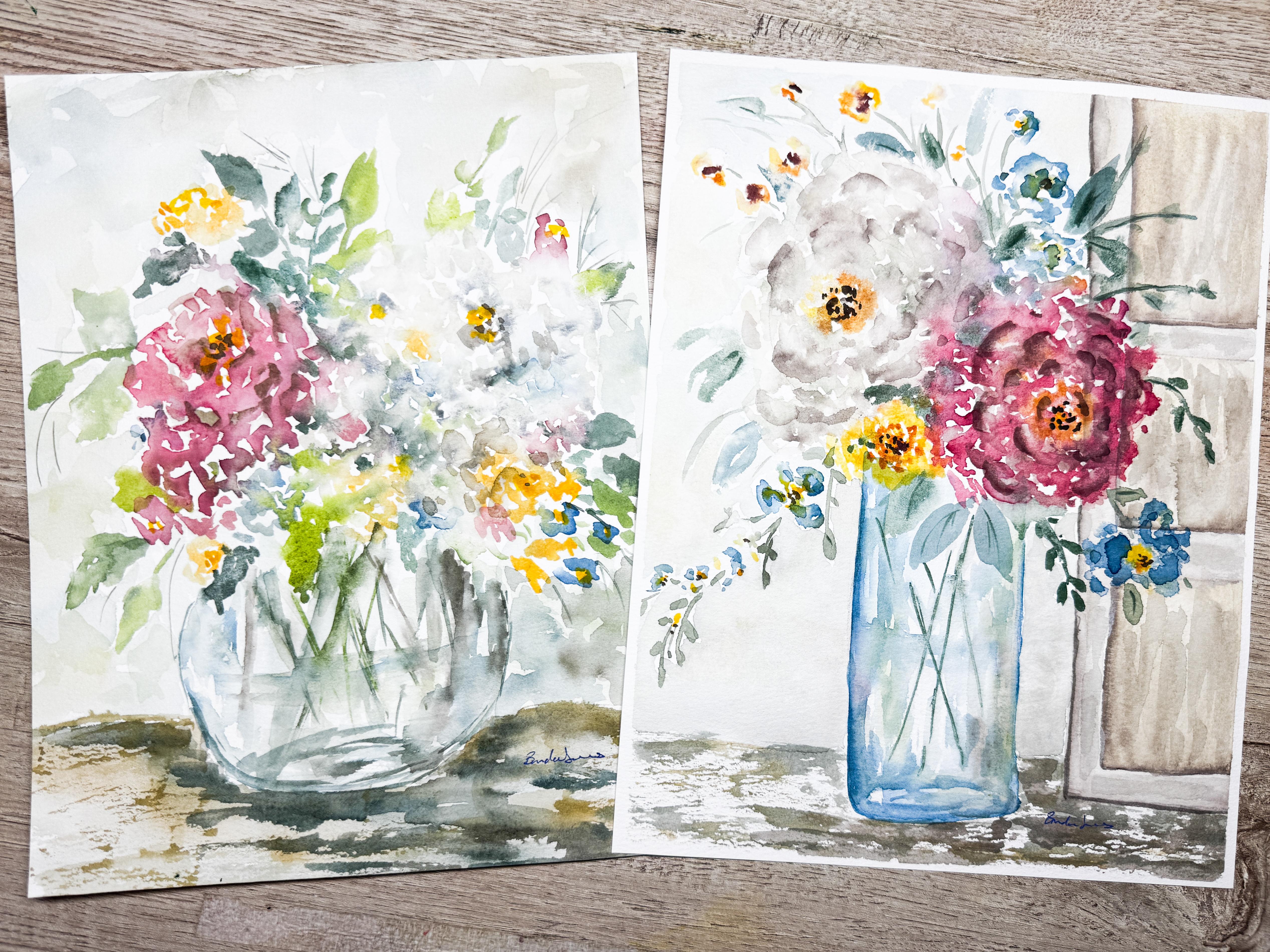
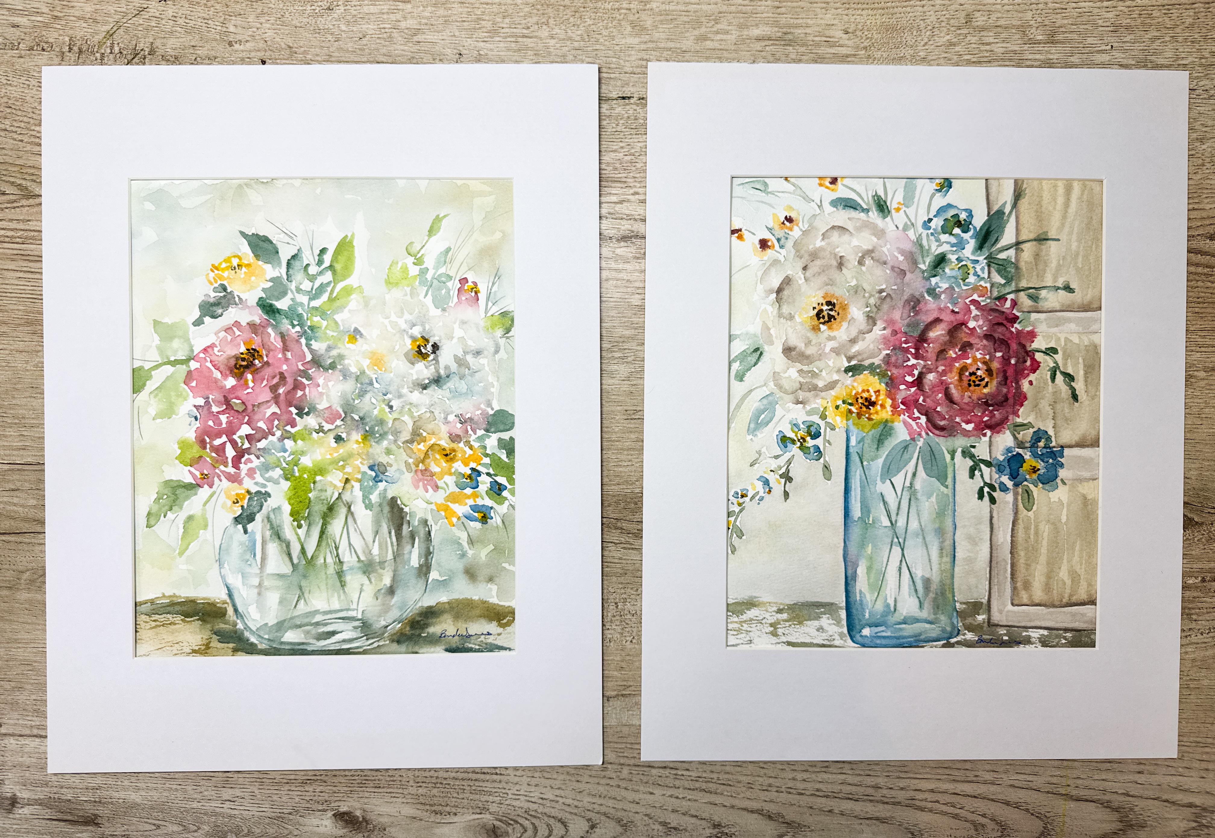
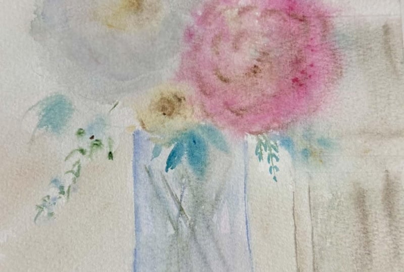
2. Composition, Placement & Soft Doorway Sketching: Today we're going to be painting a companion piece to something that we painted
a couple days ago. Possibly you've already
done this other piece. And today, what we're
going to be doing is something a little bit more
airy, a little bit lighter. We're going to make a
taller vase instead of a round vase and we're going to be putting in a
few less flowers, leaving a little bit more
room for some background. I'm going to be adding in an architectural piece
in the background, like a door or a shutter
over here on the one side. Just because we're not
going to be having as many flowers as we did
in this companion piece, and there's going to be a little bit more
background showing. I do want to have some
interest in that background, and so I'll be adding in
an architectural piece. The reason I am going
to supply this for you and you can find this in
the class project area. You can download this
and if you want to, you can use this in
some carbon paper and you can copy it
right onto your paper. But you don't really need to. I'm offering this to you
as something to help you. But really, the reason that
I'm showing this to you is to let you know how
I do my composition. Now, there are lots
of different ways of doing composition and planning
out your composition. This is certainly
not the only way and there might be better ways, but this is the way I do it. So when I am planning something out and I'm thinking
about it ahead of time, I'm like, This is
what I want to paint. Maybe I've seen somebody
else's artwork. Maybe I was at a store somewhere and something
caught my eye. Maybe I was looking through
a magazine and I saw a beautiful vase sitting on a counter with cabinet
in the background, and that just caught
my attention. So wherever you get your
inspiration from is fine. And then when I see that, I go, I want to be able
to reproduce that. Sometimes I can just sit
down and put it together. For example, this one, all I knew is that
I wanted to have a round bubble glass vase with a whole huge mass of flowers, a simple table and a little
bit of background going on. It's easy and you don't need to really map
that out or plan it. But if you're going to
be doing something that you feel is just maybe outside of your comfort zone or you want to map it out a little bit
more for your composition, this is the way I do it. So what I might do is use a little scrap piece of
paper and sketch it first, you know, carbon just copy
paper from your printer. And I just used a ruler and
made some straight lines. I like to make an oval at
the bottom for my base. I like to indicate where
my tabletop might be. And then I plan out where
about flowers are going to be. I'm not drawing a rose. I'm not drawing a peony. I'm not making a daisy. I'm making circles, big wide circles and some smaller circles to indicate where some
other flowers might go. Then I just put
some little lines in to indicate where some
of my greenery is go. You can see here I didn't
make leaves and say, this is the way this
is going to look or that this one's going
to be one great big leaf. I'm not getting that
detailed on this. This is just my sketch. You can go ahead and
make your own sketch or you can use this one. Or you can just create it
right onto your paper. However, whatever makes
you feel most comfortable. I'm just going to show
you how I would do this. Now that I have my sketch
on a piece of paper, how I would transfer that is I could use a carbon paper and lay carbon paper
down and then lay this down and then
trace it all out. This is not that fancy. This is not that technical. I don't think that's
really necessary, so I'm not going
to do it that way. What I'm going to do is draw out I've
already mapped down, so I taped my paper. This is a cotton paper. I've
taped it down to my desk. I wasn't using it inside
of a pad this time, and so I want to put it
and I want to make sure that it stays flat
because in today's class, we're going to use
a lot of water. If it's not in a pad that's
glued down on all four sides, then make sure you are taping your paper down to a surface. Whether that's a clipboard
that you have or some other board or right
onto your desktop, whatever works for you, I decided to put it right onto
my desktop for this time. Then I also knew that I wanted it to be the same
size as this one, which was an eight by ten, so I mapped it out on here and made it because this is going to be
a companion piece, like I said, I'm
going to be able to frame this one and
then I'm going to be able to frame this
new one that I'm making and hang them up on
my wall next to each other. And so I have it mapped
and I have put tape down to keep me contained
so that when I paint, I make sure that I I'm
going edge to edge, but that I have
not gone too far. So now what I will do is draw out where I think my
tabletop is going to be, and I just looking at this, I can go, well, I want it to be about that far up,
so about there. And then I'm just going to put some loose lines
just not straight, straight it doesn't matter. Just loose lines, very sketchy. And I'm not even
going to use a ruler. I just know that I want
it to be about this tall, you know, about that tall. So I might put a dot
up here at the top and then another dot over here just to indicate how wide I want it. And then I know I
want it to come down here below the line. I don't like my vases to sit on top of the
I wouldn't want to start it up here
because then it feels like it's floating
out in the room. In fact, I kind
of even like when this tabletop comes up the vase even further, more like that. I think that's what I'm going
to do here is I will start my base down in this area and I will
start it with an oval. Let's see how it's an oval here. Then I know that my
line here and my line here needs to match up
with these lines up here. I'm just going to drag my pencil down I'll just drag my pencil line down.
Something like that. When we get into the
actual painting, I can line it up, I
can square it up. But this is just to give me a little concept of
what we're working on. And then I know that I want
to have my two main flowers. Just like on this one,
I had one big flower up here and then one smaller
red one down below. And if you notice, I don't like to have them
right next to each other. I like to have them
offset a little bit. This one comes up a
little bit higher and this one comes down
a little bit lower. So same thing with here. This one is up a little higher, this one is down a little lower. When you put them equal, it doesn't feel quite
as balanced and as a nice composition as if when you have
them off balanced, they don't have to be
drastically off balanced, but just slightly off
balanced, similar to this. So what I will do, I also like to leave the top
of my vase open. I don't usually create
a vase top because I like to have my flowers and my leaves break the
edge of that vase. I'm just going to
leave this open here, and then I'm going to add in a circle that indicates where
this flower is going to be. And then I want this flower
to be slightly higher. And so I will put in
another circle up higher. And they're just circles. We're not trying
to make a flower. We're just making some circles. And then I might want to
have another flower here, maybe another flower there, and then maybe I'll
put a flower in here. You know, we're going to add
some extra little flowers. Maybe we have one
drooping down over the top and maybe another
one coming up over there. Those are kind of
like the details that we don't have to get
real particular about at this point because it's just not time yet
to worry about that. We'll get into that when, um, when we get painting because I'm actually going to be erasing
most of these lines. So then when I'm putting in
my leaves and these lines, this is just to help
me create some flow. You see how some of
the lines come down. So I'm going to have
some leaves coming down, some coming out, some coming up. But I don't like my leaves
to just come straight up. I like them to have some
kind of a bend into them. When you create a bend, you're going to be creating
flow and your eyes are going to be having
an opportunity to move with the painting, so I'll be adding in
a little bit of flow. Maybe I'll put one here and
maybe another one comes up, maybe another one
comes over here. I definitely will want
to have a couple coming down and then maybe a couple
to come out like this. I have a feeling that
this side might be taller and so maybe I have
a couple coming over. And then another
couple that come down. So this is just giving me a rough suggestion of what my
final piece is going to be. And then I also want to
have in that doorway. I also need to plan that. But I'm going to put
this away at this point. It was just to give
me a rough sketch, a rough line so that I have some kind of an idea
as to where I'm going. Now what I want to
have is a door. I'm going to just use
a straight edge here. I want it to come in. I'll probably just do
something similar to this, make a line. But you can use a
roller. You can use another piece of paper. I'm going to come all the way
over against the outside. Actually, I think
I want it to come all the way up to the top. I like it to come
all the way up to where my top of my
paper is going to be, and it's going to
come all the way over to the edge of
my paper as well. So that's the start of my door, and then I think I
want to have it have a raised panel to move
this out of my way. A ruler would
definitely be better, but I need to locate mine. So I'm just going to
be very, very sketchy. I'm going to leave a
little line there. I'm going to come down here and then maybe leave
a little space. Definitely would be
better with a ruler. Come down to about
there. And then this is going to be my
one panel right there. And then this is the
top of the next panel. This will make more
sense when you see it. Like that. Like that. This is the bottom panel. It's a three panel
door, one, two, three. It's going to be
behind these flowers. It's sitting on my
desk, my tabletop. The vase is going to
be on my tabletop, and then the flowers and the vines that are going
to come over the edge. So go ahead and draw yours out first so that you have
some composition going. Go as detailed as you
feel like you need to. I would like for you to be that the door is probably the most detailed by having
the different panels, and this can be as sketchy
as you want it to be. Then go ahead and
erase, use your eraser. This is just a little
eraser bag that I have. It has a little
eraser bits inside. It's very messy, but I
really like using it. It works really well
for watercolor paper. It doesn't scuff up or mar
the watercolor paper at all. It's very gentle, but it
actually works really well, but it does leave
crumbs all over. So I'm going to go
ahead and erase this with my eraser bag. Just to get it so
that it's lighter. I'll be able to still see it. You might not be able to
see it in the camera, but you just erase it as much as you can so that
it doesn't shine through on your final painting because once you put paint
on top of your pencil marks, it's very hard to
get pencil marks up. So, see how many crumbs it leaves all over the
place? That's not paper. That's just the crumbs
from inside the bag. But that's why it works so well. So come on back to
the next lesson, and we're going to get started
right away in painting.
3. Class Project Part A - Building Loose Doorway and Vase: We're going to work
on first is I have my different paintbrushes,
all different sizes. I'll probably use
quite a few of these. Right now, I'm going to start
with my eight inch round. This is a Princeton heritage, one of my favorite brushes. I've already wet
down my palette. This is all Daniel
Smith Watercolor from tubes that I have
put into my palette, and then I spray it down with my water bottle and then it's all activated
and ready to go. At the end of the day,
I just let it dry. I have a lid I can put
on top of this to keep any dust or cat hair out of it. And then it's ready
and it just sits here. I just buy these little
tubes and I squeeze it in. When it gets empty, I just know which colors and
I can refill them. So that's the that's my
paint and my supplies. I, of course, have my
water bottles here, my jars, and I usually have two. I sometimes have three because I like to have some
clean water options. And when I paint, I
use a lot of paint and my glasses get very dirty very quickly and I like
to have my fresh water. I usually have at least
two, if not three. I'm going to start with
my door panel first. Maybe this is a door or a
shutter or an antique cabinet. What we're going to do is down, we're going to work on
the inside this panel, whether it's a raised panel or flat panel, doesn't
really matter. We're going to make this one
and this one and this one. Once that dries, we
will come back through and paint these outside edges, but we don't want to
paint the outside edges until the inside has
completely dried. I'm going to go ahead and wet this down with
my paint brush. I would say, this is an
eight by ten and a size eight is the smallest you would want to be
using at this point, possibly even a
larger paint brush, just because this is a lot of space and you want to make sure that that
is nice and wet. I am working on cotton paper, so it is absorbing
the water nicely. So I'm going to wet down
all three of these and let the speaking of cat
here, there's a piece. I'm wet down all three
before I come back in and put in any color. Just going edge to edge, I'm actually covering up the pencil marks as well with some water so
that I get a chance to really get that covered so that my final
piece does not show those pencil marks because
I have them covered. Don't forget that
watercolor will go wherever your paper is wet, so you do not want to
wet anything outside of the area because that will cause you problems
that'll start bleeding. This paint up here
is my buff titanium. It's one of my favorites. It creates such a
nice, neutral color. See I can just put it
right on there and it just creates a beautiful natural. You can use this for wood tones, you can use it for skin tones. But what I really like it for is mixing with my other colors. So anytime I'm doing something and maybe I'm working
in a vintage style, I like to use my buff
titanium to mix with my other colors so
that it dilutes it. It makes it more muted. The colors are not so strong because I have mixed
it with my buff titanium. If you're looking
for one tube paint, that's probably one that I would recommend. I really like it. Here I am adding
it, first of all, to all my four panels, and then I'm going to
be coming back in. That one just got a little dry, so I'm just rewetting that. Add a little bit more water if you feel like your
paper is getting dry. There's nothing
wrong with coming back in and adding more. Add more water as needed. You don't want to be working
with dry watercolor paint. Um that doesn't create
a very nice look. I'm going to be also adding
in some of this brown. Now this brown is a sepia
color, and I like that. I'm going to be putting it in on these edges right on top of my buff titanium and
we're going to let those just blend here on
the paper itself. I'm only putting it on this left hand side and
the bottom because it's going to be where
my shadow is and that's going to be
creating a nice edge. And we're going to come back up and smooth it out a little bit. You can see that it's getting spider webby. Don't
worry about that. It's still wet. I can
come up there and fix that with my paint
brush in just a second. I just like to get all
three of these done. I paint fairly quickly. I am not somebody who has, like, a lot of concern about making a mistake or
making it wrong. And so I don't mind working quickly if you would rather
just do one at a time, then you go right
ahead and do that. I'm going to start back up here. It's still wet and
now I've rinsed off my paintbrush, completely
rinsed it off, used my cloth that I have here and just dried
it off a little bit, and I can come back
in here and just kind of smooth off some of
those spider webs. I can draw that paint up
into the panel itself. I'm going to bring that down, smooth them out, and draw
it up into the panel. Remember that your watercolor
is going to dry lighter, Watercolor always looks
darkest when it's wet. All right. That has nice shadow edge and it's
starting to bring in some color up into the panel itself gives it a
little wood appearance. If you need more,
just dip back into that brown and bring some
more color up into it. Not too much, but, you know, a little extra really gives
that appearance of wood. If you feel like
you've got too much, you can always just
rinse your brush off, dry it off on a rag, and then come back through
and lift up some of that. But I think that's
looking pretty good. You can always come back
in and do a second layer. So if you feel like after you've done this and
after it's dried, it's not dark enough, you'll just come back in and
put another layer on top. I feel like this needs to have
just a little darker edge. I'm just going to add a little darker edge down
here to the bottom. I might have to put in another
layer once that is dry. Like I said earlier, I cannot
come in and do this panel, the things are in between, because if I go
and wet down this, this is going to bleed out
because this is still wet. So now I have to wait for
this to completely dry. I can just let it dry naturally. I could use a hair dryer,
I could use this heat gun. Personally, I'm just
going to let that dry for a minute and I'm going to come over and
work on this vase. For the vase, I'm going to
grab a little bit of blue. And I'm going to wet that, make it nice and wet. Make sure that you can see that, pull it in lots of water. I want it very diluted. I do not want this to
be a strong paint. I want it to be very diluted
with a lot of water. See how liquidy it is. I don't even mind I
can mix it in with this buff titanium
just to change it up a little bit and
make it even softer. Now I have two puddles. I have my buff titanium blue, and then I have my straight
out of the well blue. So I'm going to come in
and just use maybe the darker blue and I'm
going to create an edge. I'm going to come down
and make this oval shape. Then I'm just going
to draw this down. Now, leaving this
is a glass vase. You want to leave white space. Do not fill this whole thing in with blue paint because
this is a glass vase and we need to give
the illusion of it having um reflection. Sorry, sometimes can't talk
and paint at the same time. What you see here is
I added the blue, and then I just used
water to pull it across, which makes this
area much lighter, which is what I was going for. Then I can add in some
lighter over on this side. I'm just going to create
my edge again because I do want to have a defined
edge to this jar. See why it didn't
matter if my jar that I drew was straight or
clear or perfect. Because once you start
putting in the watercolor, you're just going to
recreate that edge. That was just to help
you make sure that you got it started. I do want to create this
oval at the bottom. I'm just going to
help the illusion that this is a round phase. And then I also want to add
in just a hint of green. I'd like to just add in just a little bit of
green into my vases, which also helps with the understanding
that this is glass. You could add in teal
or little touches of yellow or purple or pink. I would also be really pretty. In fact, I think I
might just put in just a hint of pink
up in here too, because it really is beautiful. Let's see, put a
little bit over here. Because it's almost
like the glass is clear and what you're putting
in here is a reflection. Maybe it's the reflection of the flowers or something
else that's in the room. But I'm leaving lots
of white space. Okay. I think that's the
way I want it for now. Once that dries, I'll be
adding another layer, but it's a good way
to get started. All right. I'm going
to dry this so that I can come back
and finish this door.
4. Class Project Part B - Flower Transparent Layers: Okay, now that this
is dry or mostly dry, I can come back in with my
clean water and my paintbrush, and I'm going to just add in the water
right along this edge. It doesn't have to be perfect. You're just making sure that
there's a little bit of water on your papers. It's just going to help your watercolor flow
a little bit more. So it doesn't have
to be edge to edge. We're just looking
to have a little bit of water on your paper. That'll be really helpful. So we also have to
remember that we're going to be putting some
of our flour on top of this and some of the vines and the grasses are
going to go on top of this. So don't make your
door too dark, or you might have
a hard time laying on your flowers and your
bouquet on top of it. Okay, that's pretty good. Now I'm going to be mixing up because I want
this to be lighter. I'm going to be actually
using some of my white. Now, this white is a guash. I'm just going to be putting
in some white and just using some of that
brown that's already on my palette here, and then I'm just going to be
putting that right in here. I don't want it to be
the exact same color as the inside of my panels, or I might have a hard time seeing a difference
between the two, but I don't want it to just be pure white or it
won't show up enough. We'll come back in here and
add in some other colors, some depth, some brown, just like we did the
centers for the panels. But I do want that
base color just to be White with a hint
of brown in it. Now, you can make yours
whatever color you want to. If you want your panels to be
green, you go right ahead. Just remember that
you're going to be putting flowers on top of it
and so it can't be too dark. I love adding
architectural pieces like this into my
artwork, into my flowers. I feel like it really anchors
things and gives a lot of really great emotion and feeling
and almost like a story. So I do like doing that. Now I'm going to come in
with that same brown. I'm just using my
same paintbrush that had the white on it and just making it just a
little bit darker. And just like we
did here where we added in the outside edge, I'm going to do the same thing, adding in an edge. Kind of like right
over my pencil line. Again, it's bleeding. It's creating the
little spider veins. It's okay. We're
going to come back through and fix all that. But this gives me
some definition, as a little shadow. Straightening out that
line a little bit. Can even add a little bit
up in here, here. Okay. So cleaned off my paintbrush. This is now dry, well, dry because I, you know,
dabbed it off there. And I'm going to
come back in and just kind of smooth out some of those little webby things. And see how it just
takes this from being too white to having
just enough definition. Even add a little bit of
I'm going to just dip into my buff titanium
and just add in some of that warmth just to bridge the colors
between the two. Not much, just a little
bit here and there. You may not have these
exact colors and you can find something similar.
You can make it. A lot of ways you can make
this is just by adding in some white wash to
any of your browns, any of your light
colored, even peach, if you have a peach color, you could create something
similar to this. If what you have is
something like this, inside of here, you're going to be able to find
you have a white, you're going to
have some yellow, you're going to have some peach. Dilute this with a lot of
water on a little plate. Get a kitchen plate out
and dilute it down, and you're going to
be able to create colors that are similar to this. I'm just telling
you what color I'm using because a lot of
people often ask me, what is that color
that you just used? And so I just want you to know
about that buff titanium. It looks like this. Buff Titanium by Daniel Smith. Okay. Now I'm going to
let that dry 100%. I'm going to probably get out my hair dryer and
dry that because I cannot go and put any flowers on top of that while
this is still wet. So your base layer must be 100% dry before you go and put on your
flowers on top of it. I can't even come
down here and do the tabletop because
this area is dry. And so I'm just a little bit on the stuck side at this point, so I want to make sure that I go ahead and dry this off.
I'll be right back. Alright. I am ready
to get started again, and this is now
dry or dry enough. I can still feel there's
a little dampness, but it's mostly dry. So I'm going to go
ahead and get started. I think what I'm going to do
is work on my flowers next. So with these flowers, we're going to be doing
something similar to what we did in
the last class here. Where these flowers are
it's really, really loose. We're not necessarily,
somebody asked, well, what kind of
flowers were they? Well, they're whatever
color kind of flowers you want them
to be. Are they roses? They could be hydrangea, they could be peonies, you know, whatever, some of them could be a different
flower down here. Here's some little
cute little blue ones with little yellow centers. But there's a big white one
here and a big pink one here. And so we're going to
do that same kind of a concept where we're going to get some little
groupings, I don't know. Maybe that's a tulip
up there at that top. Maybe this was a rose and
this was a hydrangea. It doesn't really
matter because what we're doing is just putting down random little
brush strokes, brush stroke, brush stroke, brush stroke, all
different directions. Sometimes I make them in Cs or parentheses shapes like here, here you can see I made a parenthese that way
and a parentheses that direction so that
I have the center. It's not a perfect circle, but it's a C and then a backward C. Then that allows me to have a center of a head where
I can put in a little bit of yellow to indicate
the inside of a flower. So that's what the style is
that we're working on here. The way that we achieved this is I'm going to
use a great big brush. This is a quill brush, synthetic squirrel hair, and I'm going to get this nice
and wet with my water. It's clean brush. And while
it is just it's soaking. Look, it's dripping already. So it's really wet, and I am going to
sprinkle water down on this area where I know I
want to have all my flowers. The reason I'm going to sprinkle water not spraying it
with a spray bottle. I'm not brushing it with a
brush to make it all wet. I'm sprinkling it so that I get big blobs of water and
that is going to allow that technique to happen
where all the flowers just start to blend together and all the colors
just merge together, where it doesn't matter
what kind of flower it is. It's just beautiful. A very loose style of
painting. Here we go. I'm just using my
hand as a way to tap I'm just letting this
splash down onto here. It's okay if it goes in
areas that you're not going to be painting
because those areas are just going to dry. It's okay. I'm going
to come over on top of the door and add some
splashes over there. I know that some of my stems
are going to come down, so I'm going to put
some splashes there. I'm just going to add a
bunch of little splashes. I want to make sure that
you can see that in, um, in this camera view. Do you see how much water? That's what I'm talking
about, big splashes of water. Okay, now that I have my water splashed down on there, you
might want to try this. If you've never
done this before, you might want to try it
on a scrap piece of paper, use the backside of something
that you weren't happy with and put some splashes down and see how it works so
that you are understanding of what you're getting yourself into and what's
going to happen here. So now I'm going to create because this is a companion,
I'm going to use very, very similar colors to what I used in the other one
because I want them to be able to sit next to each other on the wall and
look appropriate. I am going to use
similar colors. And I have my circle, my circle is here and
my circle is here. I think I'm going to make
this one red and this one white just so that it's the opposite of the other one. So I'm going to watch
how I'm doing this. I'm just making little
tiny little circles, using putting my pencil, my paintbrush on the
edge and just coming in, I touches into one of those
little blobs of water, and then I come over here
and I make another one. I'm just creating
these little spots, almost like little
individual flower heads. Sometimes just a half see look at how that water
is just pouring out. That's okay. I'm just going to create this other
one over there. I'm going to start
coming over here. Because it's going
to go on top of this staying in that
general circle shape. Coming down over the
edge of the jar. Remember how I like to
break the edge of the jar. It's not a perfect circle. I'm not trying to
make it perfect. Flowers are not perfect. They're different shapes and so it's not a perfect circle. It's just an about circle. Then I'm going to
come in with maybe a slightly different color of blue I've added blue, now it's just a
slightly different red. I just adding in a little
bit more here and there. Maybe I want to add in
a little bit more of that buff titanium
to make it softer, lighter and adding some of that in over here
on the one edge. So that I have my highlights
and my low lights. Yes, I can see the
door through here. I'm going to trust the process that as I add and build layers, you're going to start
to not see that door. But right now you absolutely can see that door
and that's okay. We're going to be working
on that as we build layers, that door is going
to slowly disappear. So very similar in
look where it's just a little
blobbiness of a flower.
5. Class Project Part C - Expressive Greens & Floral Movement: And now I want to
add in a white. You know what? I'm not
going to do white yet. I have my blue right here, so I'm just going to
go ahead and add in a little blit of blue
in different spots. Maybe this thing up
here was a blue flower. See how I touched the red and it bled right into
it. Totally fine. Love that. Maybe I
want to have a flower dancing up here along the top.
Maybe there's another one. So I am looking for where those wet spots are, and
I'm going, Oh, yeah, maybe there's a flower that's dripping all the way
down here and that's a blue flower all the
way down into this area. Because I can always add a stem that comes down here to
merge in with that one. I don't want to
add too much blue, but I do like to have it in
more than just one spot. So I think I'll add
just a little bit here. Just even little touches. I can see that there's
little drops of water, and so that's why I chose
to put them over here. I'm kind of allowing those drops of water that I made earlier to help me decide
where to put them. I'm feeling this is just
maybe a little bit too much, so I'm using my dry paint brush and picking up some of that. And we might do another
layer of that later. So now I kind of have
my three blue spots kind of made a
triangle out of that. And now I do want to add in a little bit of
yellow as well. Maybe even mix it in with that pink to warm
it up a little bit. Add a little buff titanium, maybe just a little
pink, a little yellow. I'll be adding in
more yellow later, but sometimes it's just
nice to have maybe this flower here
that we said was in the middle and see how they're
all shaped the same way. But once it's all said and done, they're going to be
different flowers. But I'm making
them the same way. Maybe some yellow up here. They're just a little
C, a little curve. Something along that line. So a little dancing up there. Maybe you're going to add
a little yellow over here. Maybe add a little
yellow over here. Okay. This is where it's just
fun. You just get to play around with it, let
it do its thing. I want to get out
some of my white. I'm going to be making
that white flour. I'm just going to
clean up my palate a little bit so that
you can still see that. Um, so I'm going to start
with a little buff titanium. Lots of water, maybe
a little white. Now, see how light that is. White flowers aren't
really white. They have just a little
bit of color because remember a white wall in
your house, it's a variable. Some whites are whiter, maybe your white trim is whiter than your white wall because maybe your white wall has a little yellow in it or it has
a little blue in it. When we are doing white, remember it's not pure white. It's just whiter than
the paper itself. Now, I am touching into the other colors so you can see here I touched
into the blue, I touched into the pink, and I'm even bringing
some of that up into. Because that's what's
going to really give this flower its dimension and its shape because
it's allowed to have some of those other
colors mingled in with it. I'm going to add
that. And they're offset just the way I want it. I'm going to grab just
a little bit of that brown and add that in because we're
going to be adding in a little bit of depth
into these white flowers. It's amazing what a little bit of depth does to these flowers. It doesn't have to be a
lot, just a little bit. You can kind of move this
around. This is very wet. There's lots of water on here because of where
I had splashed it. I can always be just drying off my paint brush.
I'm using my rag. I don't know if you can see
that, but I'm using my rag to if I pick up too much paint or too much water, I
just brush it off. Moving that around. This is where you're
going to have to do your painting because yours
might be wetter than mine, might be drier than mine. Maybe you didn't paint
as quickly as I did. Maybe you painted quicker
and it was wetter. So you have to listen
to your painting and do what you think
is right for yours. I'm even going to grab
a little bit of green. And just add in a
little too much, little bits of green
here and there, because sometimes
with white flowers, it has a little green
hint to it as well. Just move it around. Don't
be afraid to experiment. If you're not sure, get out your scrap paper and try it on a scrap paper and
see what happens. You are going to learn so much more just by experimenting. Am I going to add in just a little This is very
diluted green. I have it and it's just almost
completely white water, but just a little bit of green. I'm just going to add in just
a little bit here and there into even the pink side. Okay. Going to pull this back over here and show you this is the one that
we did the other day. So here's my white flower, and you see how it has the
blues and the pinks and the browns and the yellows
and green colors in here. That's what we are trying
to achieve again over here. Then same with my pink
one, it's very similar. I'll be adding in a
little yellow center. I'll be adding in a little
yellow center here, but I do need to have it
dry a little bit more. I think actually this
one might be ready. So I'm going to be adding
in a little I think I'm going to put a little
bit more yellow here. To maybe indicate that that's where the center
of the flower is. I'll do the same
thing over here. Maybe even pick up a
little orange put it on the backside. Okay. That way, it looks
like the one is facing this direction and this
one's facing that way. All right. I'm going to grab
a little bit more yellow. I'm going to come up in here and add a little
yellow to some of these centers or these other flowers. Okay. Now that that's dried a
little bit, so again, you're going to have
to paint yours and listen to your
painting because if your painting dried differently, you're needing to do yours. Don't feel like
you have to mimic and put the paint
brush down just like I did it because yours is going to be
different from mine. We're just giving you the
idea of what to paint, and then you are painting yours the way
yours is turning out. I would never be
able to paint this exactly the same
way another time. I've tried that. I've been like, Oh, that was really fun.
I'll try that again. Then when I go to paint
it a second time, it doesn't it's never the same. I'm just creating
little blue flowers here and there. All right. I do want to put a
little bit more. This is starting to dry, but it's not completely dry. So I want to add a little
bit more of the pink on top. And I'll decide if it's dry
enough or if I have to wait. I'm going to just
leave it like that. I'll come back and
add another layer. It's really what
this is all about. Just play. Have fun. Add layers. I decided I thought maybe
some of these yellows could use a little bit of a pink up in there. My
paint brush has it. I'll just add a
little bit of that. Before this dries completely, I do want to start adding
in some green because I do like it when my green merges
with some of my flowers. I want to have a stem
that comes out like this. Your stems don't always
need to connect. You can have them you can have them just
kind of free floating. You could even add little
flowers or I mean, leaves off to the sides. Don't add too many stems or leaves that can get it
really distracting. So just before you
put it down, think, is this going to add
or is it just more? Because if it's just
going to be more, then you might want to
reconsider and not add it. So I'm just gonna add in
these little dancing above. See how these just
kind of come up. And see why it wasn't
important to have an exact plan of where you were going to be putting
every single flower. Because we decided
we just go with it and we let the we
let it just flow. So I came in and touched my
wet spots, which is fine. I'm just going to smooth
them out a little bit. I do want to have it
come all the way out here into the doorway. We'll be adding more. I
always like to use different at least three different colours of green when I am painting.
6. Class Project Part D - Stems, Leaves and depth: When you add extra
colors of green, it really gives a lot of depth and dimension
to your painting. If everything was just
this one color green, it would just get
a little boring. Now that I've done that,
I'm going to mix in a little bit of my
blue in with my green so I get this beautiful
blue green color and maybe I'll add
in some leaves. I want to have something over
the top of my vase here. I just create oval shape, maybe add another one there. I put something in there, add a little color, little
definition in between. I'll put another one up here. This is where it's just
fun to just add color. It doesn't even have
to be an exact leaf. It can just be kind of like the shape the general
shape or idea. In even just be a swoosh. See? And then I want to have something
that's a little darker. So this will be my
third color green, and I think I'm going
to just be adding some little leaves off
of some of these stems. It's really wet, so
I'm just going to go ahead and create that
into a bigger leaf. Oh, more depth down in here. A little separation. When you put little green darker green, it almost creates like that, um, um, makes it look like it's defined in between
the two flower heads. Just gives a little
extra definition. Yeah, they're not even,
like, a particular leaf. Like, see how I just did that. It's not even a real leaf. Pushing it away. Okay, I'm gonna be done with
leaves for a second while I um o I say that, and then I go and put
a couple more in. It's hard. Hard to
know when to be done. It's really important
to practice being done. Okay, so I'm gonna leave the leaves alone
for a little bit. I'm going to come down
and work on this base, and then I want to work on
the vase a little bit more. And I actually want
to add a little bit more to the background
around this. And then we also have to do the background behind the leaves, but not until that is dry. So I'm going to come down
and do my my tabletop. I'm just going to be mixing this random color that's
on my palette here, a little green, a little
brown, a little gray. I go to hold my paint
brush on its edge, and I'm just going to make
it real sketchy here. That way we get a lot
of white space showing, which is going to
indicate the tabletop, getting close to the vase, come back in and get a
little bit more paint. R underneath it. Right in there. Let's see how
that's my tabletop. Maybe I want to add
in another color. We'll grab a little um, more of a yellowy color. Again, mixed in with some of the other colors on my
tablet, on my palette. Just to give it a little
extra second color. Okay. Probably will want to add
some more shadow in there, but again, I got to
wait for it to dry. So just be careful
with your layers. This is just adding
in another layer of pink that has a lot of the buff titanium
and even some brown in it. Just adding just a
hint of brown into it, which gives a little
bit of depth. I can do the same
thing over here. I feel like this flower here is just a little
on the weak side, so I'm going to add
some more color, some orange just to give
it a little more depth. The importance. How's yours looking? If you
are not satisfied with yours, what that means is
either it's not done, sometimes we don't love
them in the middle. Sometimes they need to get finished and we have
to just trust the process. Sometimes it means that we
should practice it again. Nothing wrong with doing the same exact painting over
and over and over again. So if yours, you're not feeling like
you're loving it yet, then you might just not be finished and might just need
a little bit more love, or you might need to just practice this a
second time sometime. So I was just feeling
like I could see the door through this a little
bit more than I wanted. So I'm just coming
back through with another layer of my
paint and just adding. It can be a different
color, even, you know, it doesn't have to be
the same exact green. You can just add
in another color. Okay. Okay, I need to put
my stems in here. So I think what I'm going to
do is grab a little green and I'd like to have
them criss cross. I'm going to soften
them because I like to have them look
like they are in water. You can do that while
your vase is still wet, or you can do it like I just did it where now it's
really, really solid. But now I'm just going to
use a clean paint brush and just come back on top of
it and smooth it out, and that's going to
give it that illusion that this inside of water. See how it gets almost blurry. Then I also want to give it the look as if there's
a water line there. I'm going to come
in and use my blue, and I'm just going to create a little curve which is showing that
there's a little bit of water in this vase. You can dilute that, you
can draw it back down. Don't give up on yourself if you are not happy with yours. Just make another one. It's totally fine.
Now I'm going to add in a little bit
more of this base. I get a little bit more blue. I want to define this
edge a little bit more, so I'm going to use
that darker blue again. Just add another layer. Keep going. See what it
looks like when you're done. Just kind of using a
dry brush effect here. Always wet your paint brush back down and smooth it
out, move it around. All right. Um, I think I want to define
this edge a little bit more, so I'm going to use my brown. But you know what? I think I
want a smaller paint brush. I'm going to use more of
a detailed paintbrush. Just a little bit smaller
where I can come in and I'm just going to create
a little base to my door. Almost like it's a
shadow or it's the edge. Jump over those flowers, jump over those flowers, on back up here. All the way up. Now I can use my
clean paint brush, dry it off a little bit, come onto the inside, and just soften that edge. So it's not so stark. Let that just blend out. I do this technique quite a bit. If I'm trying to
define something, I make a stark line, and then I blend it out
with a clean paint brush.
7. Class Project Part E - Details for Flowers and Vase: I think I'm going to do the
same thing with this vase. I think the base needs to have a little bit
more definition here. I'm just gonna come in. And then using my clean paint
brush, just smooth it out. Just on the inside,
not on the outside. I don't want it
blending outward. I want it blending inward. So I'm just using my
wet paintbrush on the inside. Just like
I did on the door. I did it on the inside,
not the outside. If you do it on the outside, then you're going to
have all your bleeding going outwards, which
you don't want. Just a clean, wet paint
brush and bleed it out. Clean wet paint brush, and I bleat it inwards
in in in. Okay. I'm going to completely dry this so that we can work
on the background and then maybe some shadowing. We do the background. I decided that I
really wanted to have some more definition
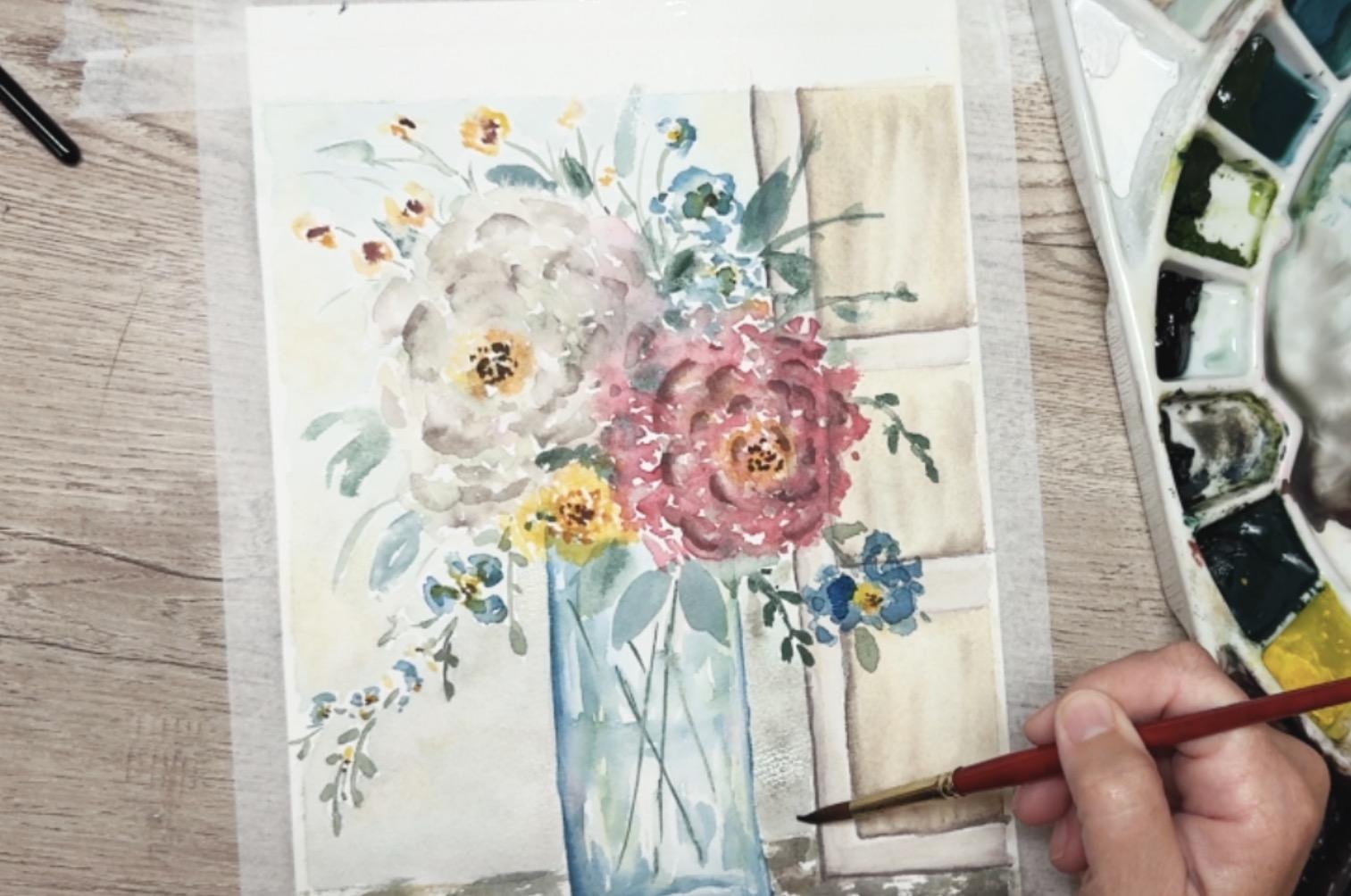
into the centers of these. So using a nice brown
or a darker color, I'm just going to add
in some little dots and some little lines
into these centers just to create just a
little bit more definition into the centers
of these flowers. They don't all need it, but I thought that some of
these just could use a little bit of depth that your eye had
something to go to. Okay. Then I also wanted
to what happens is when you walk away
from it a little bit and you let something dry and
then you come back to it, you start noticing
some things that need it just a little
bit more touch. So this flower that I
had dried off before just needs a little bit
more blue, another layer. To make it feel more important. Same with this one. The yellow had just bled just a
little bit too much. So I'm just adding another layer of blue into some of these. Using the same
technique of just like these little C shapes but just putting
them kind of on top. And then I also want to put another layer of darker,
even darker than that. I'm doing is using that pink, but then adding in just a
little bit of brown and just adding in that other
layer of petals, which just gives a little
bit more definition. Kind of in concentric
circles going out, um and then I'll do the same thing with my white where I just kind of
create a color that I like. And then be a little too bold. Just because it is white, it doesn't really
show up real well. Um, so now I put them on, I'm going to come back
in with my clean brush and just kind of wet them down. Just like we did
with the shadows on the door and the
edge of the vase, just adding water and
allowing that to just blend, putting it on the one side, letting the other side
have a sharp edge, but blending out
on the other edge. This kind of creates a little bit more definition
for my white flour. Okay. If you like yours without this, then don't put it on. You know, you have to
listen to your painting. If your painting is
you're happy with it, don't do what I'm doing. Listen to your painting. Do it the way you want to. Because I'm adding something
doesn't mean you should. It's kind of like a given
for every painting that I do is if you're seeing me do
something and you're like, Oh, what I kind of like
mine the way it is, then please don't do it. Don't follow my instruction to add something or change something if you're
content with yours. Because your brush strokes are different than
my brush strokes. You've painted it differently. You've used more
water or less water. You've put it in
different spots. It's really important that you trust your instincts and not add things just because
another teacher is doing it on theirs. I have ruined more
paintings of mine because I fleed
somebody else's plan, and I should have just
stuck with what I had done. Okay. Now that I've done that, I am going to go ahead
and stop fussing over it. And I'm going to start
adding in some background. Using the palette. So this is my palette and
look at all that color. That's what I'm going to use. On my background
because my background, I don't want to now all
of a sudden shift and use purple lavender or orange. I want to use the same colors that I've been using on here. I want to use exact same
colors as my background. The only difference is I'm
going to use a lot of water. So although this looks
like it's really diluted, it is not diluted enough. I'm going to be diluting it
even more with more water. I'm going to come
in here and add more water right to that green. And you can see how loose that is and it's
almost like light tea. I mean, it is so,
so transparent, that it's almost not even there.
8. Class Project Part F - Atmospheric Backgrounds & Shadows: And then I can come
in and I can add it here and I can bring it up and around some
of these flowers. And then watch what
I'm going to do. I'm going to not
go dip under here. I'm going to dip
back into my water. Now I have more water
and no more paint, and I'm going to
spread this out even further to make it
even more diluted. I'm just going to draw this
down and move this around. You're not going around every single flower or
every single leaf, you're just jumping over it. But do you see how
diluted that is? It is already diluted and
then I'm making it even more diluted by dipping back into my water and moving
it around some more. And then maybe by the
time you get up here, there's just no more color. You're just painting with water. Then I can come over and I can choose a blue and I can dilute this blue the same way with
lots and lots of water. And then I can add in some blue. But look how bold that is. And maybe I don't
want it that bold. So now I can add more
water right here on my paper and just move
it around going around, trying to avoid the flower
heads and the leaves. I'm just going around them. But I'm using lots
and lots of water. If you have to go over them 'cause they're too
tight, that's okay. It's not an end of the world if you touch some of
the other flowers. I'm just saying
you don't need to. It's probably better
if you avoid them. So this is all nice and wet. I don't know come back over. I don't know, I'm gonna even add a little bit of brown to this. Just a little hint of brown. And then it's too much,
so I'm gonna come get my water and mix it
right here on my paper. Add more water. Move it around. I come up next to the vase, move that water around, come down to my tabletop. You can leave some white spots. Maybe even touch in a
little extra brown. Why brown? I don't know.
Maybe it's shadow. Just if you don't like the
brown, don't put the brown. I want you to be relaxed and
just have fun with this. I'm kind of thinking that
maybe this is my shadowy side, but this is the darker side. But, um, I don't fun. Just play. Just go to touch in
some of it in there, and then I still have
to do this area. So I'm going to
come back over and grab a little bit
more that green blue. And just fill that in. So light, incredibly light. The lightest color
paint you can imagine. I was putting a little
bit of brown in there as well just
because I feel like it's maybe between the
vase and the door. Maybe that's a little
darker in there, but it also has some
blue and green in there. Once this dries, you can even add on a second
layer, which is kind of fun. You can just be like, Well,
this is the blue spot, so now I'm gonna add in just
a touch of green, as well. This is the blue side, so
I'm just going to add in just a little touch of Oops, a little too much
on top of my door. Okay, and you know what?
I think I'd also like to have a little
yellow here and there. So I'm just a very light yellow. Mush that around, blend it in. Put it yellow up in here. Okay. Adds an awful lot when you've put in
the background. So soft and gentle
and, um, Alright. I'm gonna wait for that
to dry a little bit, and then I'm going to come
back in and add another color. I feel like this has maybe got a little too brown, so
I'm going to add, like, a little blue or
green down in here, but I have to wait
for that to dry. So I'm going to add
a little shadow. So I'm saying that the sun is kind of coming
this direction. Although now that
I'm looking at it, U I actually I actually think the sun is
coming this way because of my highlights here with my
yellow and the fact that my white peony or my
white whatever this is, is over here, and that's
a little bit brighter. So I'm going to make
my shadow over on this side, which is fine. Just go to add in a little
bit more yellow in here to really help relay that message. Paper towel. Just
a little too wet. Okay. All right, so I want to create a little bit of a shadow
down here underneath. Just using that same technique of laying my paintbrush down, just making that
side a little bit darker as if the vase
is making a shadow. And then I'm going to just put a little bit more
darkness in here. This is still wet, so I have lots of freedom
to come in there. And then I think let's see. I'll just add a little bit more. So I'm just using this
really light wash that I have and just putting
it on top of this door, not solid, just like
kind of in some of the spots just to create
a little bit more shadow. I don't need to do as
much up here because the sun is still shining
up in this area. Just go to add a little bit. Adding shadows really adds
a lot to your painting. So don't to add in your shadows
and to think it through, change your mind,
like I just did. I was originally thinking
the sun was coming this way, but then after revisiting
it and looking at it, I'm like, Nope, it's
all coming that way. So go ahead and feel free to make adjustments
and plan differently. It's your painting, after all. You can do it. You're allowed. Nobody's telling you what to do. Okay. Right. Now, at this point, we
are basically done. If your painting still
needs a little bit more, if you feel like you needed to add something else to yours, go ahead and continue
your painting on. I think I'm going
to be done for now. I might come back through and
do a little bit more later, but all in all, this is pretty much finished. Sometimes I like to add
just a little bit of some lines to some of my leaves. I don't like to do
it to all of them, but I do like to put in just a little definition
into some of my leaves. I hope you had fun with this. Come on back to the last lesson, and we're going to review this and go over a couple of thoughts
and some encouragement, and then we'll wrap this up.
9. Final Thoughts & Encouragement: Thank you so much for
painting with me today. I hope this class
helped you feel a little bit more
confident creating a soft atmospheric watercolor
painting without needing every detail to feel perfect or
tightly controlled. One of the biggest lessons in this style is learning how to let watercolor breathe a
little and allowing softness, fading edges, and
layer transparency to become part of the
beauty of the piece. What I especially love about this project is how
the doorway structure adds just enough balance and framing around those loose
florals while keeping the overall painting calm,
light, and expressive. If your painting turned out a little bit
different than mine, that's completely
okay and honestly very expected with
atmospheric watercolor. This style naturally creates variation from
artist to artist and sometimes the painting we
worry about the most ends up becoming our favorite once
it fully dries and settles. I would absolutely love to see your finished
project in the gallery. You can upload the completed
painting process photos, or even multiple attempts if you decide to
repaint the piece. Watching students develop
their own version of these soft floral compositions is one of my favorite
parts about teaching. If you enjoyed this class, I highly encourage you
to explore some of my other watercolor florals and atmospheric painting
classes here on Skillshare. This class was
intentionally designed as a companion piece to my
Atmospheric Vase Painting class. The two paintings
work beautifully together as a coordinated
watercolor collection. That companion class
explores many of the same loose watercolor
floral techniques, but in a softer, more open composition with a
round glass vase. Have other additional
classes that focus on loose
watercolor florals, soft atmospheric backgrounds, expressive watercolor movement, and transparent glass vases. If you've been painting along
for several of my classes, you're probably
starting to notice how these techniques build on
one another over time. That layering of experience is really where confidence
begins to grow. Finally, if you
enjoyed this class, I'd be so grateful
if you would leave a review and click that follow
button here on Skillshare. Following me is one of the
best ways to stay up to date whenever I release
a new watercolor class, a companion piece, or future atmospheric
floral collections. Thank you again for spending
your creative time with me and I'll see you
in the next class.
 Brenda Jones, Watercolor Artist & Teacher