Transcripts
1. Welcome to Class: Hi, everyone. I'm Brenda,
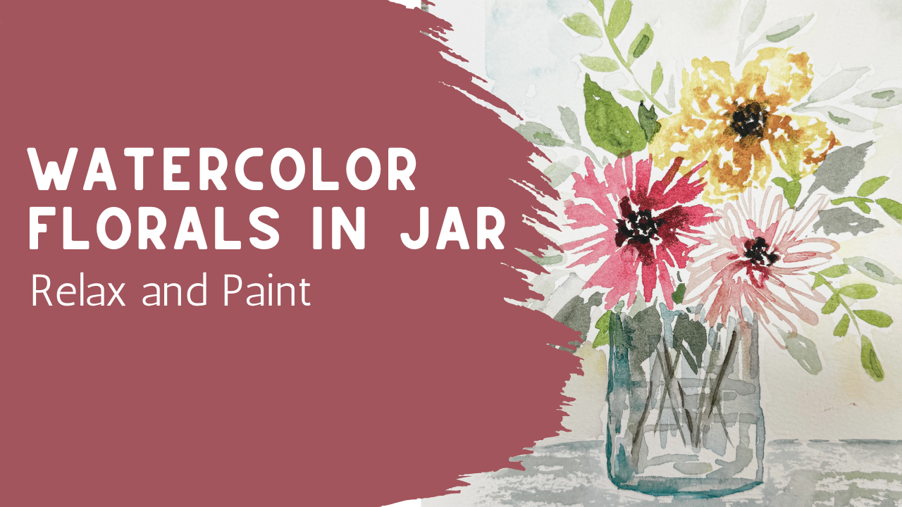
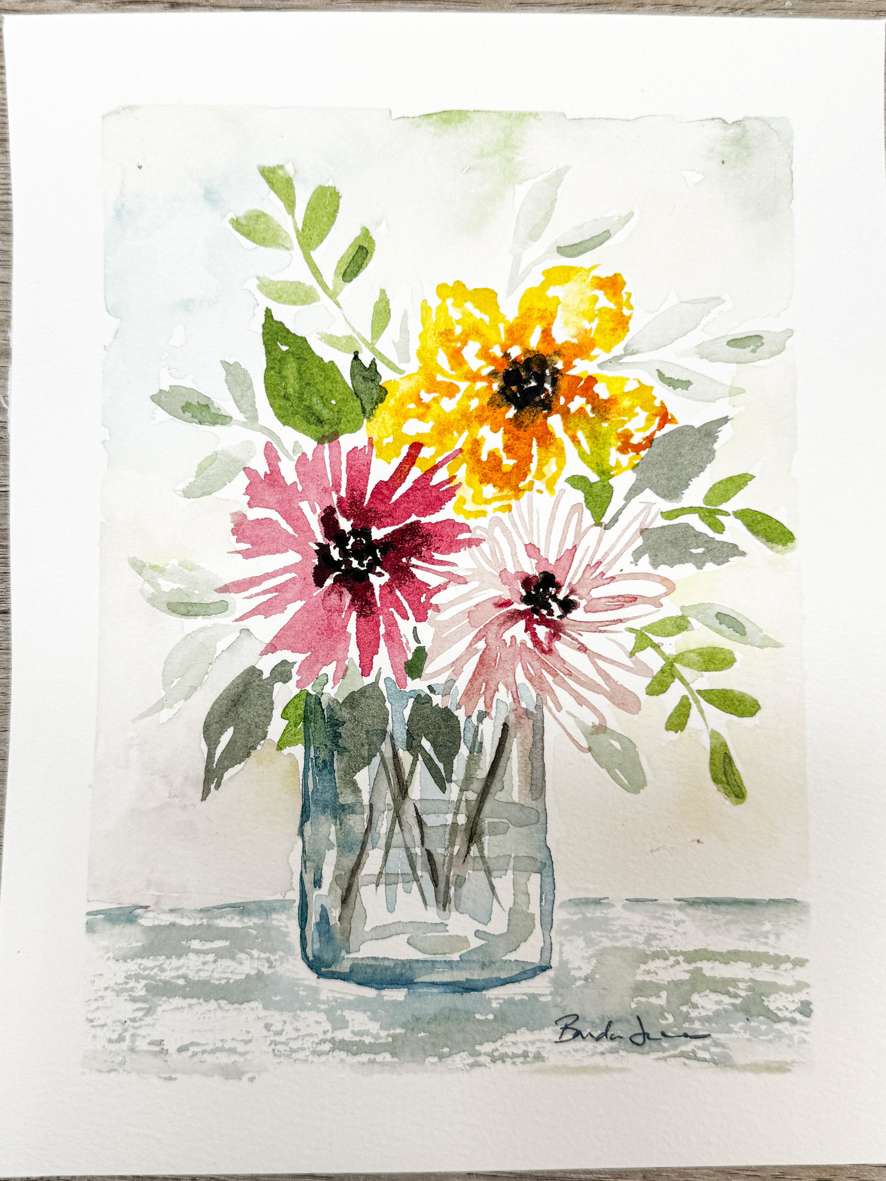
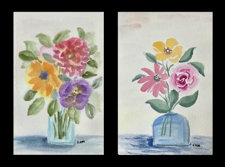
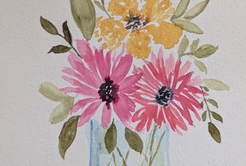
and in today's class, we're going to be painting this loose watercolor
floral arrangement in a simple glass jar using
a very relaxed shapes, watercolor colors and movement. This class is really designed to help take away some of
the pressure that can happen when we feel
like we need to draw flowers perfectly before we
can even start painting. Instead of focusing on detailed
petals and exact shapes, we're going to be working
with loose flower forms, soft blending, layered
colors, and simple placement. One of the things I really love about watercolor is
that it can feel expressive and imperfect
in a really beautiful way. Some of my favorite paintings happen when I allow the paint to move naturally instead of trying to control
every little detail. Today's project is very
beginner friendly, but it's also a great exercise if you already have
some experience with watercolor and you just want to loosen up or practice
a little bit more. We'll be using a very
simple composition with only a few flower heads and a soft glass jar and some light atmospheric
background shapes to help everything feel
connected and airy. I'll also show you how to keep your flowers loose without getting overwhelmed by details. If you enjoyed this
class, next week, I'll be sharing a
companion piece so that you can have two
to hang on your wall. And then later this week,
I'll be also making a larger intermediloral
design that builds on the same ideas in a fuller atmospheric
arrangement. I really encourage you to
try all of them because the smaller piece helps
reinforce the basics, while the larger composition later this week
will push you into experimenting a little bit more and growing outside
of your comfort zone. So gather your supplies, relax, and let's get
started with painting.
2. Supplies, Paper & Framing Prep: Hey, guys, I am so excited
about today's class. I practiced this one
last week because I just wanted to find something
different to do with you guys, and I am in love with it. I went ahead and framed
my piece because I love it so much and I think you're going
to love your piece, too. It's really relaxed. It's a really easy
piece to make, and it has that nice
loose color where the flowers just meld together
and the leaves are there. But you don't have to be
real particular or precise. It's going to be so
fun and really soft, perfect for early summer. I'm so excited to
get going on this. You're going to choose
your own colors. You can mimic mine. I don't care. It doesn't matter. Whatever is going to make you happy is what I want you to do. Now, I'm not going
to give you any line drawing in this class
because you don't need one. This is all going
to be composition that you create out
of your own head, follow along with mine. I'm super excited
to get started, but a few things I
want to go over first. When I made mine, I'm
going to show you mine. This is the one that
I did last week as an example of what I
wanted to work with with you. You can see it's really
relaxed and loose. I consider this a
loose watercolor. I didn't follow any kind
of a specific plan. I didn't draw anything
on my watercolor first. I just said, Well, I want to make a
triangle shaped design, so my composition is a triangle. I did add in a glass
vase down at the bottom, and then I put in some soft
leaves and foliage in there, and then I added in this
really soft background. So we're going to be practicing all those kinds of
techniques in today's class, but I wanted to show
you what kind of like the finished
product was going to be. So one of the things
that when I practice, sometimes I just go and I
use the full sheet of paper. So here's my paper, and this one is from the
Academy watercolor pad, and this is like
a nine by seven. Well, there are very few frames out there
in the world that are nine by seven or
anything even close to that. And so you can't just paint
on this whole sheet of paper and then expect to go out and find a
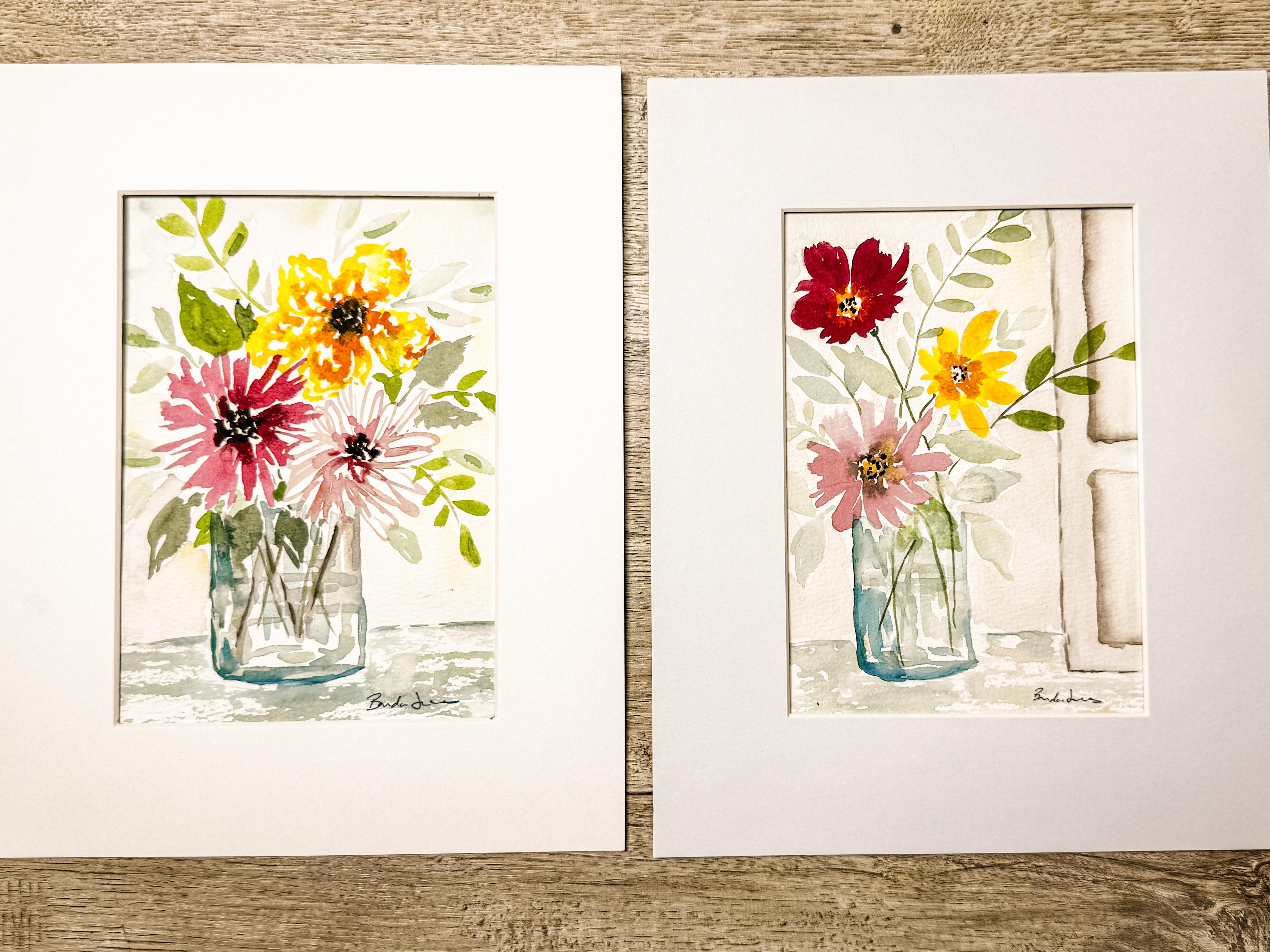
frame that fits it. So, for example, I actually painted this piece
on this paper. And so behind this matting
is the rest of my painting, and you just can't
see it because I had to put at on top of it. I wasn't actually painting this thinking I was
going to frame it. I was thinking I was
painting it just for fun and just
for an experiment, and I wanted to use
the whole page. Once I was done
painting it, though, I loved it so much that
I decided to frame it, and then I decided
it didn't matter. That you couldn't see
the entire piece, that it still looked beautiful. And I just framed it with a mat and just showed the parts
that I wanted to show. So if you ever have that
situation where you've gone and painted it on a
great big piece of paper, and then you want
to frame it and you realize you don't
have the right size, just use your mat
and decide which is the part of the picture
that you really want to show. And then you can make it
happen that way, I'm sure. So if you are planning it,
though, and you're like, I definitely think this is going to be something I
want to be able to hang up. I want to put this
in my baby's room or I want to put this
in my library or, you know, wherever you're
going to be hanging it, maybe it's a gift for somebody. And you know that you're going to be putting it into a frame, what I really recommend is that you have your mat and then you decide which one
you're going to be using and you plan it
out on your paper first. Today we're going to
be doing that because I'm going to be creating
two different pieces, this one, and then a
companion in a future class. I know that I'm going
to want to have two, just like this that I'm
going to be able to hang up next to each other that
are going to be companions. I want to preplan this
next one because I like this color way and this feel so much that I know
that I'm going to want it. What I'm going to
do is I often have just some extra mats laying around that I know are going to work into
frames that I own. That way, I can decide,
do I want to have them be square or do I want to have
them be this rectangle shape? I think for the location
where I'm going to hang it, I want to have a rectangle. I'm going to be using
two of these frames. I have an extra mat here. I'm going to set this one aside. But just so you know, I have a bunch of
different mats, all different sizes,
all different shapes. That way, I can play
around with them and see what they look like before I actually even get started. So if you are going to
be doing it that way, then I highly recommend
that you know the inside dimensions of what
the inside is going to be. Decide if you want it to
go outside of that area. Do you like it that
it goes behind the mat and you can't see
the complete picture, and it kind of
gives that illusion that the painting is continuing. See here, you can
see that the um, the leaves are going behind the matting and the glass
jar is behind the matting. So if you like that look, then when you decide and you map it out onto your
good piece of paper, just make it a little bit
bigger than the inside of your mat and that way your painting is going to
go all the way behind it. It doesn't have to go way behind it like I
did on this one, because that was pretty
much just a mistake. But just go a little bit, maybe a half an inch beyond what your matting size is just so
you can get that illusion. But if you are looking for something that you want
it to be contained within the mat and
you want to make sure that you have a chance to
see the entire painting, you don't want any
leaves going outside and you want to make sure
that your whole jar is shown, then you're going to
want to decide to map it out so that you do not
go behind the matting, and then you might
put some dots, maybe you're using a pencil and you might just
put some dots here, here, here, and here on the corners so that you know exactly where
to stay within. You can then use your tape and lining up with the
dots that you used, you can use your tape to
contain yourself even more and tape down strips, those lines so that
you paint within. I think that makes
sense for you. Just make sure that
when you are painting something that is not
just for practice, that you're not just
practicing brushstrokes and color ways and ideas
and compositions, but you actually want to paint something
that you're going to put into a frame take some time and map out
your piece of paper so that it fits the frame
that you have in your house. But I'm going to go ahead
and get this going. I know that I like my aesthetic, my art look is to have the watercolor kind
of go behind the matting. I prefer it that way, but I know others would prefer
to have it all contained. So that's why I'm suggesting to you that you plan it out
the way you want it. The what I'm going to do here
is I know this is the size. I'm just going to
center it on my paper. I'm going to mark with
my little pencil. I'm making some light
color marks here because I will
need to erase them at some point because I
won't want them showing. But I want to go beyond that. I want to be able to
paint past that mark. Now I'm going to take my tape. And I'm just going to
rip off a couple pieces, and my two marks are here, so I'm just going to
extend it by, like, a half an inch and
know that, yes, those are the corners, but I do want to extend it and allow myself to paint
in this area, too. So, I'm just going to quickly
do this and make my shape. You could also just
use a ruler and, um, draw little lines. Whatever works for you, this is the system that
works best for me. So I just want to
show you how I do it, but there are plenty of ways that you can do it.
There's all different. Every teacher's going to
teach you a different way. This is just what
works best for Okay, so when you have
taped this down, make sure that it is
kind of like reinforced, maybe rub your finger
over the tape. Try not to rub your finger on the watercolor paper itself. The oils from your hands can
affect the paper itself. So when I am rubbing,
I'm just rubbing on the edge of the tape itself, trying not to touch the paper. So that is my paper,
it's ready to go. This is 100% cotton. I have my watercolor here. I've got a great big palette. This is a ceramic
palette that I love. I keep all of my
watercolors in here. It's fresh and ready to go. I have a plastic lid for it. Then when I'm ready to paint, I just use a spray ball
and I spray it down. Before I started filming, I just went through
here and I just sprayed my whole
palette down and got it nice and wet so that it's all activated
and ready to go. At the end of the day, I
just let it dry naturally, and then it's ready for the next time that
I come to paint. I do want to talk a little
bit about my water color. I had a couple of
questions about it. I also just want to
mention that I have two or three different
bottles or jars of water. I use just mason jars. My kids bought me
this little cute one. So use whatever container. You can just use a water glass. It doesn't have to be
anything particular. Something I like to have two or three different clean waters just because as I'm painting, my water does get pretty dirty and I like to be able to
keep rotating them through. My paint brushes, I'm going to get back to my
colors in a second. My paint brushes that I'm using. I prefer the Princeton
Heritage round. These are my two. These are
my favorite two brushes. I need to buy one more. I need to get the size ten. This is a size six,
this is a size eight. I do like to work with a
little bit larger brush. Well, I paint a lot
of loose style, and as you're painting loose, a larger brush is better,
so I do like those. Then I don't actually know
the brand of this one, but I did it comes in a set of there's
five different ones. You can look for this
with the orange handle. This is a rigor brush
or a liner brush, and you can make some
really fun little lines. I'm not sure if I'll use
that one today or not. Then this is just a smaller detail brush that I
may or may not need. So that's my brush
situation for today. I always have a rag with me. Sometimes it's a paper towel. Usually, it's a rag
that I rotate through. I can just throw it
into the laundry, get a little pile of them,
and I can just wash them all. Don't wash them
with your clothes. It has paint all over it and that paint will transfer
onto your clothes. So if you put these in the
laundry, wash them separately.
3. Choosing Paint Colors: I do want to talk
about these paints. With today's project,
lay this down. I'm sorry about the reflection, but let's see if I can set it up here and maybe
you can see it better. With today's
project, you can see that these colors are
really, really soft. Background color that you see
around the edges is very, very faint yellow and
some topi colors. That comes from the
inside of my palette when I've been painting and I get
some leftovers in there. Then what I do is I just use a ton of water and
I dilute that. I'm going to show you, I'm just giving a little pre
warning about this. It's not a specific color. It's not a color that I can say, go out and buy this color because that's just
created out of the leftover paint that's in my palette with a ton of water, mostly water with
just a hint of paint. That's the background color. And then these three colors, the yellow, this pale pink, and this brighter pink
or red is coming from my palette that has
tube paints in it. I have this whole great big
jar full of tube paints. Most of this is going to be Daniel Smith
watercolor paints, and there are a few other
random ones in here, but most of it's Daniel Smith. Um, and that's what I have
over here in my palette is the Daniel Smith
paints and they're all different colors and sometimes
I rotate them through, but I do have a
couple of favorites. The one I want to
introduce you to specifically today is
the buff titanium. Buff Titanium is right
here in this corner. Make sure you can see
that, you can see that. Okay. I also have
some scrap paper. I always have some
scrap paper along. You see how it's just almost
like putty clay color. Now, I didn't actually
use that color in here, but today in the class, I will probably be using some of that because I just
really love that color. What happens is if you mix this buff titanium
with other colors, so we're just going
to mix it here. Just going to make a
little puddle and then I'm going to clean off my brush. I'm going to grab some of this pink and see how
this is a pink here. It's right out of the well. But if I mix it and I come
over here and I mix it with that buff titanium,
drop my paper. Mix it with that buff titanium
and now look what happens. Look at how soft and
almost vintage it is because I have mixed it
with that buff titanium. Now, let me just
show you what that looks like if it's just
straight out of the well. See how different it is. This is this color mixed
with my buff titanium. If there is one color, if you really like that
vintage soft color way, buff titanium might be the color that you would want to acquire. Let me also show you all, let's just do it with a yellow because I want to
show you this is my yellow right out of the
well, bright, happy sunshine. But if I go and I mix it
in with my buff titanium, let's take a look at it here. Look at how much softer this is compared to
right out of the well. Again, it just mutes it
down, tones it down. R is amazing. We're
going to do one more. To add a little bit of buff titanium and then
we're going to use a blue. This blue is really pretty.
I'll show you here. Really pretty blue. I love this blue is
one of my favorites. If I mix it in with
that buff titanium, you need to get a
little bit more. Look at how it's much softer. It almost turns it like a gray. So there's nothing wrong with using the paint
colors that you have. If for today you don't have buff titanium or
something like that, just use the colors
that you have. I'm just showing you
that if you're looking to buy one tube paint, this would be the one Buff
Titanium by Daniel Smith.
4. Practicing Loose Floral Techniques: Okay, as promised,
we're going to go over all these
different aspects in here. These are just scrap pieces of paper that I have things that I've painted on in the past and don't need the front side, so I just cut them up
and use the backside. So on here, I want to talk
about the background. And as I said, it's pretty much just using what's
already on my palette. So from our first lesson where I was just talking
about my colors, I can just use this, which is already on my palette to create this
background effect, and I'm going to show
you how wet down your paint brush and get
it filled with water. Because the main point is when you are making
this background, it is so faint. It is filled with
water and very, very little amount of paint
in there. It's mostly water. As you can see, this is
already fairly diluted paint, and I'm just diluting it
even more with more water. And then when I go to
make this background, I might put down a little spot like this and then I
might rinse off my brush, so now I just have water
on it and I come in and I touch into that color and I just move that
around some more. I'm even diluting
it even further. Then if I want to, I can
bring in a little bit extra and make it a little
bit darker right there. But then I can rinse off
my brush and come back in. And come around and
soften off those edges. That way, that's how
you're going to get all these different
definitions of some areas are darker and
some areas are lighter. If you want to add
in another color, just come in and pick up some of this paint that's
already on here. If it's too dark,
add more water, make it even more diluted, and then you can come in and
add that in right in and around and you can move it around and manipulate
it and blend it. That is how you're going
to create this background. And we today are going to be
adding the background last. It's the last thing we're going to be doing because
we're going to go around the flowers without touching into the
flowers or the vase. We're just going to be adding some background color around it. That is the background. Then as for your leaves, again, we're just going to use the
paint that's already over here in this palette. I make a line, just using the tip of the brush, make a line, and then
I'm going to lay my paint brush down and I'm going to draw it out
and pick it back up. Let's do it again. Going
to lay draw a little line. That little line is
like the little stem. Lay the brush down, draw
it out, slowly lift up. Then when you get up to
the tip of your brush, you can even put a little bend into the tip if you want to. That is going to be your leaf. You can make it. We're just going to make another one here. You can make them wider. You can make them smaller. If I make a long line, I can just push down and
almost make a stamp. See, I'm almost making
a fingerprint stamp and I'm not drawing it out. I'm just adding little
dots off to the side. Maybe that's this or
this stem up here. And then if I wanted to make a bigger leaf like
this one here, and I even have it
angled downwards. I can draw a little line. And then what I do is I lay
my paintbrush down kind of halfway and I
wiggle it like that. If I want to make it wider, I can even wiggle it this direction and can
join them together. So let's just make it again. Make a line and I wiggle it and I can wiggle another side to make
it whatever shape I want. You can leave white spaces, you can fill it in,
however you want to do it. Sometimes my lines, the leaves just get random and I just wiggle it like that. It's not precise. That's not my kind of painting. I don't paint things
that look exactly like a particular style leaf. I just make leaves that are in the general shape because
I paint in a loose style. So that is the style that I will be painting and teaching. So that is my leaves, and now we're going
to move on and talk about the flowers, the
flowers themselves. Okay, so now we're going to
talk about these flowers here and how we're going
to be painting those. I'm just going to use the
same bright teal color. To do this top yellow one, all I did is I used a lot
of water and some paint, and I just kind of made little dots dots in
the shape of a petal. Something like that. That
was this petal right here. Then I just made
another one filled with dots and lines
dots and lines, leaving lots of open space. Then I did another
one. And so forth. Then once this was
maybe I made just make a quick one right here just
to finish up that flower. Now, it doesn't look
quite finished yet, because then what I did
is I will go in and use a second color and add in second color to create
that little darker center. And then also my pinks
are blending in because all this is getting done while everything is still really wet. I just wanted to show
you how it's not hard. This is something
you can do because it's just little dots and lines. Now we're going to move onto this pink one, this light pink, and I'm going to just use that same color just to
keep everything really easy is I'm holding my paint brush about halfway up so
I can lose control. I'm going to also hold my
paint brush vertically. I had a drip that I almost lost, so I dropped that off. I'm just going to
create these lines, sometimes they loop,
sometimes they don't. See? Sometimes they're fuller on
one side, they're loops. Just letting my paint brush
tip just dance along the top. That is how I made
this. Then, of course, we added in a center and of course we added in
some other colors. We're going to get
into those details when we go to actually
paint the piece. I just wanted to show you
the general technique. Then for this little
flower over here, it's a combination of the two. Almost like using the
side of my paint brush a little bit and making
some little lines, leaving the center open. Something along those lines, using the bottom third
of the paintbrush. Then we're going to add
in some other colors into the center
that we will get to when we go to do the
actual class project. We're going to talk about
the vase when we get to it. I just wanted to
kind of show you the general idea of
how we are going to paint this just
so you know how easy it is and that you are
going to be able to do it. So at this point, I'm going to get reset up and get ready to paint
this with you, so get your supplies together. You can go ahead and practice
this on a piece of paper, just so you have some
techniques ready, and then we're going
to go ahead and paint this in the
very next lesson.
5. A Heart to Heart About Starting Over: Before I get started
on the class project, I want to have a really big
heart to heart with you guys. You are going to hear over and over and over
again from me if you upload one of your projects into our project gallery so that I can take a look
at what you've made, I'm going to tell
you every once in a while that it's
fantastic the way it is, and here are some
points that you could do if you wanted to
try it a second time. I will then also tell you that I personally will often make one piece over and over and over again until I find a piece
that I actually like. Maybe I learned something, maybe I changed something, maybe I did different colors, maybe I tried a
different technique, maybe I adjusted something. I will try it over and
over again until I'm satisfied that is
just part of art, it's just part of learning. I wanted to be really
honest with you about this because I want
to show you something. I had painted this
a couple days ago and I really liked it and I
was really happy with it. This is the next class.
This is what I want to do. Then I spent the last hour creating my class
project for you guys. What I did was this piece and I hate it.
I don't like it at all. I have the class almost
ready to publish for you, and as I've been
making it, I'm like, I am just not happy with it. The colors are not right, the outline, the
composition is not right. There's so many things
about this that is not the way I wanted
it to be for you. Is it fine? Sure.
Sure. It's fine. There's nothing
wrong with it, but I'm not excited about it. And this class I am
so excited about. I love this first
one that I did. And when I went back and I tried to make it
again for the class, I made this and I'm just not
satisfied with it at all. So I'm going to re
record this whole class, and I'm going to do it again. I just wanted to show that
to you to let you know that sometimes and maybe
more often than not, one of the pieces that you make you love and the
next one you don't like. Or you don't like the
first one and then you go and you adjust it
and you try it again. I just wanted to be honest and tell you exactly
what happened here. So in this class, I'm
going to do it again. I'm just going to
set that one aside. I've learned a couple of
things from that one, some things that I
didn't want to do, some colors that I
didn't care for. And we're going to recreate this one again and I'm
going to try it again, just like the last time when I painted it that you'll
never get a chance to see. Because I had to abandon
that lesson is that just because I painted
this once doesn't mean I'm going to be able to paint it exactly the same way again. Just like you are going to
be painting your piece, and it is not going
to look exactly like this one or this one. Yours is going to
look like yours. And when you're
all said and done, if you look at it and you say, It's good, but I don't love it, but I love the concept, and I have learned a couple
things along the way. Go ahead and rewatch this
class and do it again, just like I am going to
make it again and try it. Sometimes I have to try a piece several times until I find something that is worthy of hanging up and
putting into a frame. I wanted to just encourage you to accept those kinds of things. I don't look at
those as failures. I look at that as something
that I learned from, and I'm willing to I
think it's worthwhile. I think it's a value to just try it again and
see if I can't make it a better class for you with
a better outcome that both you will be satisfied with and I will be
satisfied with. So with that all being said, come back to the
next lesson where we actually start the new class, and I produce something for
you that I think that you are going to be able to create and be satisfied and happy with. And hopefully you're going
to want to put it in a frame and hang
it up on the wall. Welcome back, and I'll see
you in the next class.
6. Class Project Part A: Building the Flowers & Jar: I took a little break because I was frustrated
with my last piece, and I'm coming back. I got a little drink
and a little lunch. And now I am ready to start
over and do this again. So I'm just using
my spray bottle. I wet down my whole palette and I'm going to let
that get activated. I have my paintbrushes here. We've already talked
about all of that. I have some water, and I'm ready to go ahead
and get started. And for the glass jar, I'll just quickly
show you that here. The glass dr, as you can see, it's just almost a
straight edge here and a straight edge here
behind this glass, you can't see it, but it just goes straight
across at the bottom. Then we just very lightly will be adding in some
insides to that. We're going to get
started with that. I like to do that so that
it shows my positioning, so I know exactly
where to be adding in all of my flowers. I like to keep my
vase open at the top. So that I can actually put
the flowers over the top. Again, here you can see I don't actually add a top to my vase. I allow this to just
be open so that when I go to add in my leaves
and my flower heads, they can break the
edge of the vase. I will do that again.
I know that my, um, center of my flower of my picture is going to be here
in between those two dots. I'm going to choose
something in this area. But I also want
to be able to put a table underneath
it, just a table top. I'm just going to
raise it a little bit, using the tip of my paint brush, I'm just going to add a
little sketchy line here just to show you about where the bottom of that
vase is going to be. Then again, I'm just going to
I'm not drawing this first. I'm just using my paintbrush. And putting in a little edge there and something
similar on this side. I like to round the bottom and I'm just
going to bring it up. Doesn't have to be perfect. I don't have to put
on a top because I'm going to be adding in those
leaves and everything. Now I'm going to I think
what I'm going to do is zoom in a little bit. Okay. So what I'm going to
do here is add in, I have this very
loose watery blue, and I'm just going to be
adding in just a little bit. I'm leaving some white spaces. I'm adding in just a little
arched thing for the base of this flower vase. I'm just adding in just
a little bit of color into this, adding in stripy. I'm leaving white spaces in between because
that's the reflection. If we remember that this is a class vase and so I just
have a little reflection. I'm going to even pick up a little green and
a little yellow. I'm just going to add in just a little bit of that as well, just to add a bit of contrast
to the blue that's there. I'll probably as this dries, I'll be adding in stems and I might be adding in a
little darker blue. But right now while
this is really wet, I'm just kind of
leaving it like that. But you can see that
this is really open. It's very simple. The
lines are not straight, they're kind of wavy and curvy,
and that's totally fine. Now, I'm going to let that
dry and I'm going to go ahead and start putting in
some of my flowers and leaves. And because this is still wet, if I touch into that, the color will bleed into that,
and I'm okay with that. That won't bother
me if that happens. So I'm going to grab a
little bit of this pink, and I'm going to
put a little bit of my color that I reel in my titanium in
here, buff titanium. Get this so that you can
see it a little bit. Okay, so now I have
this ready to go. It has my buff
titanium in there, and I am going to go ahead
and just create this kind of the loopy one and just add some loops and sometimes
they're straight edges, different lengths,
sometimes they're taller, sometimes they're longer,
sometimes they're shorter. But I am trying to keep
that center kind of fairly clear without anything
in the middle of that. I'm just going to
let that start to dry before I add in
any second colors. And I'm going to go
ahead and darken that pink because I want to move
over here to this one, and I'm going to be adding in. I'm just going to make it
just a little bit taller. This one that we
practice wears jagged. It's okay. If I touch into
this pink over there, that'll be fine.
It'll bleed in there. Just pushing out my paint brush, leaving that center open again. And see it's very
sketchy and etchy. I want to keep that center open because I'm going to want to put a different color in there, bring it down into where
I think the vase is, something along those lines. I do like to have my flowers offset instead of
two little eyeballs. I offset them a little bit, and then I'll put my other
one at the top here. Now that this one's starting
to dry a little bit, I'm going to add in just
a bit more of that pink, the darker pink into
here in the middle. Because it's still wet, it
can just bleed a little bit. Not much, but it's just enough to add a
little extra color. I want to make sure
that I have a contrast, which is what I didn't like
about that first one is that this one and this one
became almost the same color, and so I don't want to
make that same mistake. I'm being very careful with this darker color and just adding it in
just a little bit. And letting that one
be a lighter color. Now, this one is
starting to get a dark, a little dry and
I want to add in a little brown and a
little bit of red. I'm just going to
actually mix my reds and my brown together to
create this color, and I'm going to be coming in here because this is starting to dry and just adding in a little
bit of that darker color, even a little bit
into the center. But do you see how I'm
leaving it nice and white? I'm not feeling the
whole thing in. I'm just putting in a little bit and letting that bleed out. I'm going to come
over here and just add the smallest amount, trying not to let it bleed much, but just a little bit, just to give it a little depth. Okay. Now I think I'm going
to add in just a little green because I want to add in some of my buff
titanium to soften it. I want to have a leaf
down here that's breaking that edge so I can
put in some stems, branches, and then I
can just put a leaf right on top of it and see
it's still wet, that's okay. I'm just adding it in here. It little leaf. These little leaves that
we practiced in the lesson before where we can just
add in some little colors. You can even put one up in here. I'm doing that wiggle wiggle. You can even add
another one over here. You can't always
see all the stems. You don't need to be able
to see all the stems. Maybe I'll add one
stem into the vase. Maybe I'll put a
stem over there. You don't have to add
a lot of stems into your vase because if
you add too many stems, it can get really busy. I'll just add in two
or three or four and maybe I'll come back in and
add other colors later. Do you want to just pick
up some of that green? Might come back in
with some blue, got a little carried away. It's okay. I like it. Alright. Now I want to
add in, like, a yellow. I'm going to use my yellow that is clean this up a little
bit. Get rid of some of that. I'm gonna use my yellow that is, like, a golden yellow. It's a nice warm yellow. And I'm going to be adding in this one kind of
flower over here. So that's one petal. See how I'm just kind
of nestling it in with the other ones with the other
flowers. That's one petal. I'm going to leave a centerpiece
there because I'm not going to fill it all the way in. See I'm just kind of making
it kind of really sketchy. Add more water if
I need more water. Leave in lots of white space. Use your imagination. It's about the shape of a petal. And then you just kind
of push your paint brush around. Something like that. See if I can get
in five of these. Bring one more over here. Lots of white space left around. You can reshape it by
coming back outside. That's fun. I like that. Then I'm going to be adding
some other colors in there, and I think I'm going to
be adding in a little bit of a golden orange color, maybe with a hint of brown in it just to mute it
out a little bit. Bring some of that into the
center and let that bleed. Maybe even out here to the tips. Again, leaving lots
of white space. Don't fill it in completely.
7. Class Project Part B: Details for the Bouquet: Lots of room for it to breathe. Okay, I'm liking this
a lot better than that other one that I made
that I had to abandon. And that is just such a
great lesson for you, and I'm sad that it
happened to me because, you know, it's a I always makes me frustrated
when I have to redo my work. But I also realize that it's
what I ask you guys to do, and so I need to do it and
then show you why and how important it is to trust
your instincts and if you think you are onto something and you think
you might really like it, go ahead and redo it. See if you can make it better. Sometimes you have
to practice it and do the same one over and
over and over again. I'm going to find some green. Might even pick up some of that buff titanium and add in just a little bit of
extra color here and there. I see how I'm not really
making it a specific leaf. It's just like branching it out until I like the shape
of it, putting one here. It's a different green. I can
even make one coming down, doing one of those ones that
are like the stamp like I showed you where I just
kind of push it out. We could even have one
coming out this direction. See, I want to balance
it. I want to have my eye coming from
here and coming up. And so now I'm
going to be making one of those same style, um branches of leaves
over here on that side. I kind of create this arch. Alright, so see here
that I am my green is bleeding into my
yellow, and that's okay. I'm just going to
pick up some of it. So I made my paintbrush
fairly clean, and I'm just going to go in there and just pick
up some of it. I don't mind that
it bled into it, but it was just a
little bit too much, kind of like just down in here where I just picked
up some of it. This is starting to
get nice and dry. And so it's not completely
dry. It's still a little wet. So I'm just going to come
in and add in a center. Since it's not completely dry, it'll bleed out a little
bit, and I'm good with that. I'm happy to have it
bleed a little bit. Add just a little
bit more there. This is just a brown
that I'm using. I like to deepen my centers. I do that a couple
different times. As it's drying, I will come back through and
add a little bit more. So now my paintbrush
is just wet, but I've dried it off on my
towel that's next to me, and then I can come in and I can soften some of this.
I can draw it out. If I want to pull it out
into the rest of it. Okay. So now I think I'm going to add in a little bit of
that blue in with my green so that I can
create that kind of a blue really fun shade, but really light because I have lots of
water on here, too. And then I can create all
these really beautiful leaves. And fill it in wherever
I think that I need some color or some texture. I feel like I need something
bigger over on this side, so I'm just going to make
another little grouping. I caution you from
making too many leaves. One of the downfalls is when you get kind of carried away
and add in too many leaves. So just be cautious with that
and don't add in too much. Okay. So I want
to add in a base. Actually, I want to
add in a little bit of another stem
down in here that's maybe a brown just to add
a little extra color. Now, because my vase is dry, and then when I
added that color, it kind of makes it really stand out and it's maybe a
little bit too much. It doesn't look like water. So my paintbrush is now just wet and I dried it
off a little bit, and so now I can just
kind of soften it. I can kind of just come over
and come over on top of it, and that is softening
it and making it look like it's in water. Okay. I also want to give it just a little illusion of there
being some water in here. I'm going to go side to side in a horizontal way and just kind of create that
little line of water. Remember your white spots
are your highlights, so you don't want to
put too much color on it, but just a little bit. That'll dry nice and light
and that'll work out well. Okay, um I think I'll add in some little extra details into some of these leaves. Not all of them, some of them, just a little extra something. Okay. Pretty fun. I like this. This is feeling much more like what
I had in mind. Now, I want to put that vase
that I was talking about. And so my base is going to be
kind of a blue green vase. I'm going to hold my I've added in some color
onto my paintbrush. It's not soaking wet, but it has paint on it. I can show you here that
there's paint on it. But I'm going to hold my
paintbrush on an angle on almost on its edge so
that as I paint across, I'm just touching the
paintbrush onto my paper, which was going to give it a really sketchy look and it's going to leave
lots of white spaces. So I'm just going to come along here and just touch
my paintbrush. And this is creating that
table effect that I want. And you can make this brown, you can make this yellow, whatever color you
wanted to make it. I'm coming up the sides
of the jar a little bit. Then I'm going to
come over and I'm going to grab a second color, and I think I'm just going
to choose a little bit of green and just adding in just a little
highlight of green. Not too much because I
still want to see that um a yellow and I still
the blue and I also still want to see the
white shining through. So I don't want to add too much. That's going to be
good enough for now. But I do want to add
in at this edge. I want this edge
of my vase to be a little darker and a
little bit more prominent. I'm going to just add I have
just a little darker blue. This is my size eight,
I told you before, my size eight is my favorite. I use it a lot. I'm just going to add in a little
bit of extra detail here on this side of the
vase and also at the bottom. Just to give a little
bit more definition. And if I wanted to,
I could come back through and soften
some of that up. You don't have to.
You really need to listen to your vase, your painting and decide what you need to be
doing for yours. Just because I added it
doesn't mean you have to. Okay. I see this white spot right here, that's bothering me. I feel like there needs
to be some color there, some blue for the vase or
something needs to go in there. I'm going to pick up
some of this blue. Just really diluted
with lots of water. I'm just going to put
some of that in here just to mimic the fact that the vases coming
up into this area. Okay. I could have put
an extra leaf there, but I thought possibly it
was vase that was needed. We'll add a little
extra greenery there. Okay. I'm gonna dry this
off with a heat tool. I have a heat gun here, and I'm gonna dry
this, and then we're gonna come back and
add the background. See you in the next lesson.
8. Class Project Part C: Soft Atmospheric Backgrounds: Be adding the background and I wanted to show
you my original. This is the one that
I did the other day. You can see how
very faint it is. It's just the softest, softest color that you can
possibly even achieve. Sometimes it's a little blue
or a little peach or yellow, little green and
yellow over here. So really, really soft. It's just not that dark white. That is what we're going
to be working on next. In order to achieve that, you need to use a
lot of water. Okay? I mean, like, a lot. So I'm going to my paintbrush is clean. I'm just dipping
it into my water. I'm going to come over here
to where my palette is. I want to make sure
that you can see that. I'm just going to
move all this over. Okay. So for you to achieve that look I'm going to use what was left
over on my palette. So I've got all
these colors which are the same colors
that I used in here. Personally, this
is not the time to I don't feel like it's the
time to introduce a new color. So I wouldn't like all of
a sudden add in purple. I'm just going to use
these same colors, almost like using
my dirty palette. I'm going to use my
clean paint brush with lots of water on it. I'm going to come
in here and wet down what's already diluted, but even dilute it even further, and then I can come in and
I can start to fill it in. I'm not filling it
in edge to edge. I just put a little
bit of paint down. Brushing off washing
off my paint brush, coming in with it soaking
wet and just kind of bringing it around and
touching it into other areas. Now, I am trying to
avoid the painted areas. I'm just going around them. But you see how it's
like it's green, but then it's muted as it pulls this way because
I added in more water. Then I could add in more green over here and it's brighter. But then as I touch it and I merge it in with
this spot that was wet, I'm diluting it and moving
it around a little bit. That way, that's
how you're getting your lighter and
your darker areas, lighter and then darker and
different shades of green. Then maybe I'm touching
into a little bit of blue and I'm adding some blue, but then I'm also adding
water and letting that flow together. And merge. I'm just going around
it. I'm not tracing it. I'm not trying to
be making sure that every square section
of white is covered. I'm just adding in some of it, going around some of
the little leaves and some of the little flowers. I can even grab some
yellow and I can put little yellow in
in the background. And if I feel like
it's too much, you dip into your water
and you bring it over. Color that and spread it around. You can even take
some yellow and dip it up into it and
bring it over here. You can just move it to wherever you feel
like you want it. Now I know that my sun is
coming this direction, so I would like this
side to have more yellow than the other side. So I will definitely
be putting more of that yellow and golden
colors over on this side to give the illusion of the
sun coming from this side. So going around them. Sometimes I touch the leaves
that I've already painted. Sometimes I'm just leaving
some white spaces around it. This is just plain water. I'm just going to allow
that to go in and around. Might even bring some
of that yellow up into here because this is still wet so I can bring
that yellow up here. Maybe I feel like I
need a little blue, little touches of
blue here and there. Just be careful because you're yellow and your blue are
going to create green, so nothing wrong
with having green, but make sure it's intentional and that you wanted to have it. And over here, I just want
a little bit more blue, so it's already wet. So I'm just adding in
a little bit more, and maybe I'll spread
it around again. Not too much water because otherwise you're
going to get blooms. But not even a bad
thing if you do. I even going to get
just a little bit of this other darker color that
I used into the centers. I'm just going to pull
that because when I dilute it with all that water, and this is my shadow side. This is a side that's where
I don't have sunshine. So I'm just putting that down to where I'm thinking that
the table ledge is. Maybe just adding in just
a little bit of blue. You're going to
have to decide for yourself what colors go where. You might not want to
put too many colors in, but I think it's pretty. I think it actually
adds a lot to it. And if you feel like
you got too much, you can have a paper
towel nearby and you can even dab it up and you can be like, maybe
I don't like that. You can always soften
it by dabbing it up. I'm liking this one a lot more. Okay. So I think
I'm going to add a little darker edge
to this back edge, but I'm gonna wait for that
to dry. I'm happy with that. Oh, I know what I
need. I need to add in this center just
needs a little bit more. Okay. So I would like to add in a little just a little darker
edge to that tabletop. So I'm going to come in with my blue green color
I've been using. I'm not trying to
really make a line, but I'm trying to just give it a little a little definition. Can even be sketchy, like it's not solid. And now I'm going
to now that I made that on this side of it, I'm going to come
in and touch it every once in a while
just to soften that edge. You know that just softens it, but it gives a
little definition. I can't wait to see
what yours looks like. I want you to upload
yours so that I can see it and we can celebrate your work and then let me know
how many times you had to practice it until you found one that you
were satisfied with. I'm going to call this one done, and I'm going to go ahead
and get this out of the book and get it framed and show you and talk about the finished project in
the next lesson.
9. Final Thoughts & Encouragement: Just finished your loose
watercolor floral arrangement, and I hope that this class helped you feel a
little bit more comfortable letting go of perfection and allowing the
paint to move naturally. One of the biggest
things I want students to learn is that
watercolor doesn't always need detailed drawings or tightly controlled shapes
to feel beautiful. Sometimes the softness, the
movement, the faded edges, and even the imperfect areas are what makes the piece feel
expressive and alive. I hope that this class also helped you see that you
can create something frameworthy without needing a complicated composition
or advanced techniques. Even simple flower shapes and a relaxed watercolor movement can create a piece
that feels calm, light, and beautiful enough
to hang in your home. If your arrangement
didn't turn out quite the way you imagined,
it's completely okay. Loose watercolor really
does build over time, and every painting teaches
you something about water, color, timing, brush
movement, and confidence. Just like me, sometimes you have to paint
it multiple times. Sometimes the paintings
that we learn the most from are not the ones that
we planned perfectly. I'd really love to
see what you created. Please consider uploading your project to
the class gallery, even if it feels imperfect or not quite the way you
expected it to turn out. Seeing different
interpretations is honestly one of my
favorite parts about teaching because every student brings something a little
different to the painting. If you enjoy this
relaxed approach, I encourage you to
continue exploring it. I have more classes
where I'm building on these same loose
watercolor ideas with larger broqus
atmospheric backgrounds, layering techniques, and more expressive
floral compositions. The next bouquet
class especially expands on the same ideas
that we practiced here today, but in a fuller, slightly
more advanced arrangement. If you're ready to stretch
yourself a little further, I'd love to have you continue
with that class next. Then next week we'll add
in a companion piece for today's class just so that you make sure you
have two pieces. Thank you so much for spending time with me painting today. I truly appreciate
you being here. If you enjoyed the class, give it a review and make
sure you follow me so that you are notified for every class that I
published in the future. I hope this class gave
you a chance to relax, experiment a little, and enjoy the process without
too much pressure.
 Brenda Jones, Watercolor Artist & Teacher