Transcripts
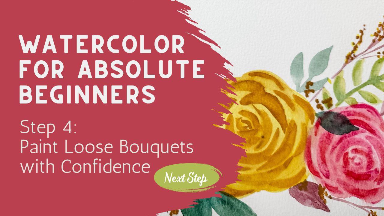
1. Welcome to Step Four: Composition & Confidence: You're just starting out
your watercolor journey, you're in the right place. This class was created especially for the
absolute beginner, no pressure, no perfection, just gentle guidance
and real progress. In this lesson, we'll paint a loose watercolor bouquet
together step by step. You'll see how I begin
with simple shapes, slowly add flowers
and leaves and explain why I place each
element where I place it. We'll talk about composition, color harmony, white space, and how to create
natural movement in your piece without getting stuck in rules or overthinking. If you've ever felt
unsure where to begin or afraid to
mess up the page, I want you to know
you're not alone and you don't need to be perfect to
make something beautiful. This class is all about
building confidence, trusting your instincts, and learning to paint
with ease and joy. Go grab your brushes
and let's get started.
2. What Is Composition? Understanding Balance & Flow: We hear the word composition, it can sometimes feel
a little intimidating, with a lot of rules or formulas, but I want to be really clear. What we're going
to talk about in this class is not about rules. I believe in my whole heart that art is in the
eye of the beholder. You don't need formulas to
make something beautiful. You already have
everything you need. That said, sometimes
we get stuck. A blank page can feel overwhelming and you might
find yourself wondering, where do I even start? That's where a few
composition ideas can help. Think about it like
training wheels. Sometimes we need to lean on them while we're
just finding our balance. But once you feel confident, you can toss them aside
and follow your own flow. In this lesson,
we're going to look at some gentle principles
of composition, how to create balance, how to let your eye move
naturally across the page, and how to use color
and spacing to make your piece feel
light and harmonious. These aren't rules that
you have to follow. They're just tools that you can reach for when
you want them. Let's take a closer look. I printed out a whole bunch of different examples because as I am still learning
about composition, I sometimes find it easier to look at
things in a comparison. What works really well and what maybe I feel
is a little off. In today's lesson, we're going to look at some
of those things. I do want to mention
that most of the pictures that you see
here are AI generated. I didn't want to choose
real artists work to talk about it in any way other
than how beautiful it is. I did go ahead and use AI to generate a lot of these
pieces, but not everything. So the first one I want
to look at is this one. When we talk about composition, you will often hear something
about working in sets of three that threes or
odd numbers five, seven is a good way
to go instead of an even numbers because
when you get even numbers, you sometimes get it to be a
little too even too level. They don't always fill up the page the way you
might want them to. I felt like this was a
really good example of that. Now, personally, I often work in twos and I don't
get too stuck, like I said earlier, they're
not hard fast rules. These are just guidelines,
training wheels. You decide what
you're going to do. But you can see here that with just two flowers that
are the same height, this doesn't create quite
the same composition. Your eye does not flow
across this page. The eye does not know what to land on when
you look at this. But when you look at
this one over here, because they've put in
a third one and that third flower is smaller
and facing away from you, your eye can go here
first because this is the heaviest and then it starts to move across
the page this way. That I felt was a
really good example of something that
you may not want to do versus something that works a little bit better.
Let's keep looking. Here's a good example of several different pieces that actually have really
great composition. As you take a closer
look at this, you can take a look and see
here, there's only two. There's only two instead
of three, that triangle. But do you see how
this one is smaller and it's almost facing
the other direction? Because this leaf is
over here on this side, it allows your eye to flow that direction
compared to this one, we'll put them side by side. Do you see what I'm
looking at and seeing? Then when you look
at these other ones, you can see in here, we do have the three bold ones. But then we can also see
that some of these greens and the extra leaves
are spaced out nicely. You have something on this side and something on this side. You've got some of the
red leaves and you've got some red leaves and you've
got another one down in here. It's really nicely
laid out and spread about where your eye can flow
from one side to the other. Your eye doesn't get stuck
anywhere along the way. This one over here is
another really great example where they have two flowers
looking right at you, where they have these
other leaves where some of this color is very
similar to this blue. It adds in just a touch of that blue and draws
your eye outward. Looking at some composition
that maybe you want to avoid, we're going to take
a look at these two. This one over here on the left, although it is nice, it is compact, but you
can see that there are these two little sprigs
that come out here like this. It's oddly balanced. Maybe we would have
wanted to have a third one that branched out or something that created
a little bit more than just these little almost makes it look like an antenna. And then two little
circles of daisies that are looking straight at you and they're
just very balanced. If they had tucked one
down here and brought one over here a little bit and made them more of a diagonal, your eye could flow
better across the page. Another problem that I see
with this composition is that the heaviest flower is
sitting right at the top. If they had taken that rose and tucked it down here and
swapped it with these, put this one down in here
at the very, very bottom, and really anchored it, given this bouquet a
weight at the bottom, and then allowed
these two to come up here and dance up
here along the top, and maybe putting
in a third one, you would have had a much
better arrangement over here. Well, there's nothing really inherently wrong with this one. It is not my favorite
because we have three different completely
different flowers in completely different
colors and not a lot of cohesion within this
bouquet, this artwork. I also feel like there's
just a lot of leaves, there's a lot of
space in between the vase and where
the flower heads are. Although this isn't terrible, I think this probably could have been done
a little bit better. I'm hoping that that is making
sense here in contrast, it's they had taken
something like this and put this into a
bouquet here into this pot, I think that would
have translated better because you would have had something
anchoring it at the bottom and moving up. But my problem with this one is do you see how heavy
it is at the top? As you look at this, you can really see that the
top of this has the largest flowers
and the bottom of this one is just these
little tiny dainty flowers. If they had reversed that and put these down here
and these up here, I think we probably would
have really liked when we look at different bouquets
that I do like and I like the composition of,
take a look at this. See how they really anchored these down here along the vase. They covered up the
edge of the vase too instead of seeing the
full vase like this one. And it's pretty because it has little extra leaves
down here underneath. The largest flowers are along the bottom with some little tiny dancing
flowers up above, with some leaves
off to the side. It creates great
movement and your eyes kind of start over here and
they work their way over. Really a nice piece. I like this one a lot. This one has a very
intuitive feel to it. This one, you can see
that they're just using the bottom third of the picture if this was the
picture here like that. And the flower
heads are tilting. You can see that this one here is tilting this
direction a little bit, where this one is tilting up that direction a
little bit and these are facing forward and they have some smaller ones and
some lighter flowers. Lots of depth in this arrangement. I
really like that one. If you're into more of
a modern abstract feel, this has beautiful composition. You have a lot of
the darker colors, which really anchors the piece and then some of
your heavier pieces. But then they draw your
eye up towards the top by adding in these
little bubble pieces that come all the way
up towards the top. That just brings in
a lot of lightness. There's a lot of white space
in here that is really, really nice and allows
your eye a place to rest. If the whole piece
was just very, very heavy like this, it might feel a little too heavy and a
little too overdone. But the fact that they allowed for some white space in here, that has really created
a very nice composition. This was somebody's from
the Internet that I found. I couldn't figure
out whose it was. I would like to have given
credit for this one, but I really like this piece. So now that we've
taken a look at all of these ones that have, some are better than others, compositions that we
may like or want to be making adjustments to we're going to be practicing
and putting this into practice along with
the next couple lessons. But I wanted to just give you something to review so that you had some kind of an idea as to why it is what
I'm referring to. But most important
is it is your art. It's not my art. It's not your sisters or your mother's or your teacher's art. This is your art. If you want to make your art like this because
that is your style, and you want to have your
heavier things at the top and your lighter smaller bouquet
flowers at the bottom, because that's your style, then by all means, do it. Your style is not
needing to be my style, and I don't believe that
anybody should be out there telling anybody
else how to do art. So to be honest,
I'm struggling a little bit with
this class because I 100% agree and believe
that your art is yours. But sometimes we get stuck. When we go and we pull out a blank piece of
paper, and we're like, we're going to
start painting and you're staring at this
blank piece of paper, and you have no idea
where to even begin. Where do I even start with this paint brush?
Do I start it here? Do I start it here?
Do I start it here? You have no concept
of where to begin. That's why I'm going to
be doing this class, not to tell you the right way to paint or to the
right way to do art, but to give you those
training wheels so that if you're not
sure where to begin, maybe after this class, you'll have the
confidence to face this blank page and know
exactly what to do. Because you're going
to sit there and say, This is what I'm looking to
make a three flower with some greens and some
stems that come together and I want to
try something like that. Then you're going to
learn how to transfer this over here onto this page. Join me in the next lesson
where we get into the details.
3. Make a Plan & Paint a Flower: Building Confidence with a Mini Composition: Art is not about being perfect, when you are learning
composition like I am, you're going to make a lot
more mistakes than you make in positive art or at
least the things that I prefer in my particular art. I wanted to just show
you a little bit of my own art over the last it looks like probably
over the last year. This is nowhere near as much
art as I have produced. I create a lot of art
in a year's time, but I pulled out
just a few things to show you an example. Here I have four examples of some art pieces
that I really enjoy. I feel like this one
was good because it had some larger flowers
leading up to some smaller flowers along with some lines that
really created motion. I like that one. I also
like what I was doing here. I may have positioned this
one in a different way from my final piece, but
this was a good one. I felt like I liked a
lot of the flow and the way that these
arched and everything. This one was really fun. I
really like the flowers and the colors and adding in these little motion pieces
like these little swirls. This one was something I
made just the other day. It's a little bookmark. And again, it just has a couple. It's very simple, but it creates
a nice little flow here. And then this would be my pile, and you can see it's much
larger because actually, you would talk to
most of the artists. They create more
scrap paper than they do pieces that they want to sell or
hang on the wall. And that's just the way it is because sometimes you
don't really have a plan when you start and you just
play around and you see what happens and sometimes it doesn't really work out for
you. And that's okay. I'm telling you
this because I want you to also play
around with your art. Get out your paper and your paints and play
and see what happens. See, you can learn from every single thing
that you have painted. Even the ones that
you don't like, that's where I learn the most. So when something like this
that I had put together, I was practicing
making some peonies, and I don't like the
composition at all. It's a very triangular. There's no balance,
there's no flow. I should have had a little
bud at the top or something. No one of my pieces that
I'm really thrilled with. I was doing a little
study on making just one large garden
flower garden rose. Again, don't really like
the fact that these two are so balanced
on either side. That's not great composition
for what I prefer. This one I liked where
I was heading on it, but then after I was done, I felt like all of my
weight was over here on the left hand side and
it wasn't balanced. I didn't really
care for this one. In this one, I
felt like I needed to redo it because it
felt like two rows. I had these two down here, and then I had four
up on the top. Not only was it just balanced because it was two
and then four, but it was also
balanced top to bottom, and there wasn't a lot
of flow or movement. You're going to play around
and you're going to find things that you like and things that you're not
so thrilled with. If there's something that
I really don't like, I will cut them up into small pieces and use the
backside as my scraps. So if you've painted something, don't throw out your papers
that you've painted. This is great paper
and it's expensive. Just cut it up and
use the backside, and then you have scrap paper to test out different colors. I just wanted to quickly
show you this just to give you a little bit
of encouragement that if your pile of things
that you don't care for gets larger than the pieces that you do
like, that's perfect. It's normal, it's expected. Go ahead, keep going,
try some more. It's all about experimenting. Just think about if
you're a soccer player, you're going to practice a whole lot more than
playing a game. And it's a lot like that. You're going to be
practicing your scales. If you're a piano player, a lot more hours goes into practice than
into the performance. And this is to be expected
and a really great thing. So go ahead and get out your paints and paper
and give it a try. And I have found
something that I want to paint and I like
the composition of it. And when I'm just
learning how to do composition and
what feels right, I will usually use something
like this and say, Okay, I want the
general feel of this. I'm not going to
copy it exactly. I'm just going to
look at it and say, there's some a
large flower here, another large flower here, and a smaller flower here. If I go, I want it to be
about here, this top one, I might take a pencil
like this and just very, very lightly create a shape
that's similar to a flower, just a round shape. Then underneath it, I might
make another one right there. Then over here to the side, I might make a much smaller one to indicate that it's
going to come over there. I'm going to pull this up closer to the camera so
that you can see it. So these lines are so faint. You can see that I have made a circle here and
made some kind of a circly shape and almost like a triangle shape to indicate that the flower is going to be going
that direction. So that is what I mean by making something
very, very light. I'm not going to be
adding in the leaves or the stems or anything else because I'm going to just let my intuitive painting happen when I go to paint those things. Now, I have my paint
in my palette, and I'm just going to use
this pink I'm going to use a lot of water for this because
this is very transparent. You can see the petals are overlapping on
top of each other. I'm just going to
have a lot of water with just a little bit
of pigment in there. I can even take a scrap piece of paper and give it a
try over here and say, do you think that's
going to work? I can say, I think
that's going to work. That's perfect. I know I'm going to work on
this top flower over here and I'm going to be
making one, two, three, four, five, six, six, five,
six, seven petals, something like that, with a
center at the bottom here. So I know that my
center is going to be down here and
I'm just going to make some petals and just some nice loose
petals. One there. Now they're overlapping, so
I'm going to let that one dry and I'm going to come over here and make another
petal over on this side, to dip back into my paint and maybe add another
one over here like that. I'm going to let this
dry a little bit before I comb back in and
paint the next round. Maybe I'll come down here
and start on this one. I'll make one petal here. Leaving a space in between because that's where my
overlap is going to go. So putting in those, and then I'm going to come
over here and do this one. Make one and two. Okay. Now that I
have my base done, which is pretty much
every other pedal that I was going around and
doing every other pedal, I'm going to let that completely dry or I'm going to
use my heat tool. Whether it's a heat gun
like this or a hair dryer, you could also just
let it air dry, but I like to use a heat tool
to speed up the process, being careful not to move
the paint around too much, and I'll be right back when
it's all completely dry. So this is completely dry now and you can see
here that I have my circle that I made in pencil and I'm not
going I'm not using the pencil line as my indication of where to exactly paint or
how to paint a flower. It's more just a guideline to help me understand where I
want to put these flowers. Good. Now that this is dry, I'm going to go ahead and
put on that second layer, which will be every other
petal that's on top. Again, using a lot of water with just a
little bit of pigment. I'm going to go ahead and paint the next flower petals
on top. Overlapping. Something like that. If you need help with learning
how to make your petals, please go back and watch my other class where we talked about making
petals and leaves. I think it was in class two. You're going to want to go
back there and give that one a try and learn
from that one. What's where I go
into a lot of detail about how to make
this brush stroke. Now that I have those done, I'm going to come over
here and do this one in the middle. Something like that. Rinse off my brush. Then I think what I'm going
to do is add in some of that brown for the center here and it's okay if
it bleeds a little bit. I'm just going to add just
a little bit of this. I don't want it to
bleed too much, though. Maybe it started a
little too soon. Waited for that to
dry a little bit. What I did there is this is a paintbrush that was almost
completely dry and I just lifted it up and just dabbed it and stopped it from bleeding further than I
wanted it to bleed. You can pretty much
always fix a mistake that happens or something that
you wish hadn't happened. This one, see how
that's at the base. I'm going to go ahead and add that in down here at the base. Okay. I do want to finish
this off by adding in just a little bit more
of a petal down in here to indicate that the
petals were continuing. We're going to do
that. That's very, very softly, overlapping
a little bit. A small start of it there, and then it comes down,
picks up about here. Go give it a little
bit of a curve, and then I'm going to bring
in another flower over this direction little this one, see how it has the
base of the flower. I'm going to want to add in some base of that flower there. Kind of do something
along those lines. Sometimes those things kind of come up a little bit higher. Now we're going to
bring this down. Again, arched.
Something like that. Now I want to bring
in some leaves. I really like the fact that
this leaf comes up here. It adds a lot of flow. It really helps your
eye move this way across the page and
working its way up into a leaf that's right up here at the top.
Maybe another one. Maybe one coming up. Then I'm looking at it and I'm saying, I don't want to put in
too many leaves because I know that when you
add too many leaves, it can sometimes get too busy. But I think I do want to
have something down in here. Maybe I'll put off a leaf
over this direction. Then I want to balance it, so I'll probably bring
a leaf off this way. Feel free to turn your page anytime you want to so that
you're more comfortable. It's important that your arm
is comfortable when you are painting. Then I look at it. Sometimes I walk away from it. Sometimes I stand up. Sometimes I go, does it
need something else? Does it need another color? Does it need a squiggly, what is going on here? What does my eye do
what I wanted it to do? I like to have just
some plain mats laying around that I can use so that once I have
painted something, I can figure out where it
would maybe frame best. I can do something like
that and I can lay it right on top of it and check
that out and decide, where should I balance that
when I cut it down to size? So go ahead and find something that you
like, something simple. Maybe it's just petal, this three flowered design here, and give it a try,
see how you do, see what you like, and what you need to change
for the next one. Join me in my next lesson, and we're going to get
right into doing some more because this is such
an important work and things that
you need to learn. I can't wait to see you
in the next lesson.
4. Class Project Part 1: Painting Soft Shapes to Start Your Bouquet: I can't believe it's time
to start our class project, but you've learned
so much already, and I'm so proud of
everything that you've done. I hope you did this project and that you really enjoyed
making this one. If you haven't done it, please
go back and practice this. This is an important things
for you to practice. After you've done it, go
ahead and upload that to the class so that I can see it and I can celebrate your
achievements with you. I know your classmates also want to be able to
see what you've done. It's really good for us to be able to
celebrate one another. I'm going to upload
a copy of this into the class details that you can print out that you can use and put in front of you. I'm going to use this one
for our class project, but feel free to use any of these or any other
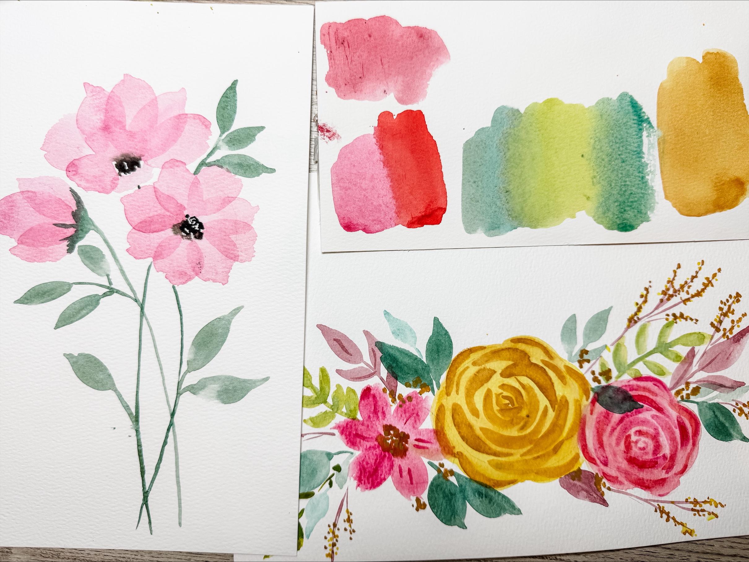
one that you want to. You can do something out of your own imagination if you want to. I have my paint palette
all ready to go. It's got lots of
different colors in here, and I am going to use one
of my pieces of paper. One of these scrap papers that
I had talked about before, and we're going to just practice a couple of different
colors on the back of this. It's something that
I like to do so that I know that I
when I skip started, that I know what
colors I want to use. Sometimes deciding on colors
is the hardest thing for me. So I know I do want to have a
red or a pink of some form, and I think I will be using this same pink that I was
using for the other flower. And so I'll probably do
something like that. I might add in a second
color because I do like to add in extra
colors along the way. I might do something
along those lines. I need to know I definitely need some greens and so we're going to start
with a little green. But I probably want to have
several different greens, I'll probably also
use this green. I really like the fact that this has a blue green in there. I do have a teal here too. I might add in a little teal. It does have this red color for these extra leaves and
I really do like that. I think I might add in just
another red because why not? I just have another
red in there. Do you see that there's
this main color here that is this
peachy cream color? I think I want to
definitely have that color, and I'm not sure that what I
have here is going to work. I might need to get
the other thing out. I guess I could go with
yellow or I could mix it. Sure. Maybe I'll do a blend of those two colors.
That would probably work. To make this rose, I'm going to do it in
the center here towards the bottom half,
very light circle. Then I'm going to create how this flower is just
slightly below. This one is just slightly off. I'm just going to
make a circle here. Then this one again is just over here just off, similar to that. I'm not going to worry
about where the leaves go. The leaves are going to go in in an intuitive way
once we get started. To make a rose similar to this, you basically put down a flat wash using a brush and a lot of water and just
a little bit of pigment. You can even put it into
your paint and then dip your paint brush into
the water to soak it up. Now, it's not a perfect circle. You can see here that
it has a hump and a hump and a hump and
a hump around here. So we're going to be making that similar here with
my yellow as my base. I'm going to make a little hump and then a little hump
and a little hump. I just make these little lumps and bumps all the way around it. Not too precise, very
loose and flowy, gentle little humps there
and here and there. Something like that.
This is going to dry softer and lighter,
which is good. Not trying to make it
the exact same color, but I will be adding
in that other color. Remember, we're going to
be doing a little blend. I started with a light wash
color here of this yellow. Going to just lift
up some of it. Then I'm going to go
ahead and add in some of this pink over here and I'm
going to do the same thing. Just a really light wash. Again, just a little lump going around. I'm okay with these
two touching. This is still wet and I'm going to let those two touch
in just a second. We're just going to blend
those two together. And then this flower is
going to be different, so I'm going to leave
that one alone for now. I'm going to dry this.
Okay, that's mostly dry. It's not completely
dry. I'm going to go on and use a smaller
paint brush. It's around size eight, and I'm going to be adding in
these little details here. I'm going to be using
this other brown kind of golden color. Now, this one is going to have a little bit more paint and less water than our wash it so that it shows up
a little bit more. You can see it's just
kind of circles going around and around with
some little breaks and some little squiggles. I'm going to start here
kind of in the center, maybe up towards the
top a little bit. And make a very thin little
circlesh type style here. Maybe a little
thicker, half sees, making these little
circles that go around to indicate the different layers
of the petals of the rows, making them fatter and thinner. Go ahead and play with this. This is something that is just going to take
some practice. Since we didn't practice
this particular flower, you may need to practice this
a little bit on your own. But it's fairly
simple because it's just this little see shape on top of already the wash. Then
around the outside edge, I might add some extra
little smaller ones. How simple that is very, very easy to make
these same pink, but I'm just going to use
less water and more paint. So it's a little thicker. I'm going to do a similar thing, but I'm going to
start down here with my inner circle and then just make those bigger and wider, little sees, little arches. Using the smaller
paintbrush allows for more freedom in playing with this. Some edges here. It's not perfect. It's
okay. It's just for fun. If you don't like what you've done and you want to start over, grab a new sheet of paper, flip this one over and
try it on the back. While that is drying, I'm going to use this color that I like this
orangy red color. I'm just going to drop some
of that into this area that's already wet in my pinks, just to add that little
wet on wet two tone look. Not into all of it,
just into some of it. Adds a little depth
and interest. I think I will use a size ten brush to make
this flower over here. Using that same pink
that I used for this. This is one of those a four, five petal flower with
a center in the middle. I'm going to leave that
center there and go ahead and make that flower that
we've been playing around with in all of
our different lessons. Feel free to move
your paper around. Do not feel like you have to
leave your paper stationary. I'll add one more in here. I want to add in a
center for this flower. I think I'm going to use this brown because I want
to pull the color across. Go put that into the center and let it bleed
out a little bit. Join me in the next class
when we add in our leaves. M
5. Class Project Part 2: Adding Leaves, Stems & Movement: Okay, in part two of
our class project, I want to come back to these. I was feeling like
maybe this darker color on top of the yellow was just
maybe a little too harsh, and even this pink on top of the pink was just
a little too harsh. And so what I'm
going to show you is a little technique that I like to use to just
kind of soften it. I'm going to use very,
very fresh water. You can see it's just
very clean water with a very clean paint brush, no extra color on it. And now I'm going
to just soften it up by just lifting
it just slightly, just kind of blending
it together. Adding in a little wash
of color white water, clean clear water on top of it, which is just going to blend
it a little bit and give it a little bit more of a
water coolory blended feel. I'm just going to go
ahead and do that across this whole flour. Rinse off my paint brush
and then come over and do the exact same thing for
this pink one. These are dry. These are completely dry, but now that they're dry, I'm just going to come
in and just almost smear it a little bit because
the paint can still lift. I'm just going to just add this little extra
texture that I like to do. You don't have to do it.
If you're happy with way yours is, then
don't do this. I just felt like
they were a little too harsh and I wanted to add a little texture
softening to that. Then I also want to come in to these flowers and add in just a little bit
of added detail. Using the same pink
with a tiny paintbrush, this one's a size eight, and I'm just going to add in some little lines
here and there. And just allow that to create just that second
little layer there. Okay, see how it's just
very, very subtle. The extra details, I put it into these petals and just softened
the roses a little bit. Now I'm ready to
put in the leaves. G to use a size ten brush and I'm going to be putting in
some of these leaves here. I really like the flow, the way that these arch up. I want to be able to create
that when I am painting here. I'm going to focus on the
ones that are curving up right now using
this soft green color. I do something like that. Then maybe I'll
make one over here. This is where you have to you can either copy it
exactly like this or the way I'm doing it
or you can just use your own imagination and your own intuitive thoughts
as to how this might go, putting petals
leaves on top, uh, leaves underneath and behind doing it however
you wish to do it. Really just allowing the flow of the watercolor to naturally
just move along with you. Looking as you look at this, going, do I have it balanced? Does it feel like my motion
is going to be going in the right direction as everything going the
way I want it to go? Instead of maybe putting
that right up on top, I think I'm going to put it
over here because I feel like that is maybe a little out
of place, but I'm not sure. I might regret it. And then I feel like this side
maybe got a little heavy, so I'm going to need
to add something over onto this side, up in here. Again, a little motion upward. Looking at the balance, looking at the composition, seeing how it's all laying out. Adding in extras where I think that maybe
something is needed. Okay. I think what I'll do is add in these
red leaves next. This one's looking like
it's coming from behind. That's cool. Giving that upward arch again. Concentrating on
composition and flow, looking at how the colors
are going together, making sure that if I see
something over on this side, that I'm also seeing it
over on the other side, Sometimes I like to
add in little stems. Sometimes I add things to
them, sometimes I don't. It's a very light touch. Maybe adding in some
veins into the leaves. Some of the leaves are
downward turning, some are up. I think we're going to
leave this one here. Come back to the last part
for our class project, and we're going to work
on the color composition and how we can maybe fix some of the color issues
that are going on.
6. Class Project Part 3: Letting It Breathe with Color & White Space: Thanks for coming back
to the last lesson in our class for this
class project. We've gotten this
far. It's almost dry. I think what I want to do is show you and talk a
little bit about color. So as you can see,
in this project, we have two of this lighter
color, but nothing else. We have some pinks. We have quite a few
different pinks going on. We've got some of
these teal colors, some lighter teal and
darker teal and it's in multiple different spaces
evenly spread out. Your eye flows across the
page almost in an S pattern. So I feel like the layers
are pretty good in color, but there's two things
that are bothering me that I want to fix in
this last lesson. That is one is this thing. It's only two of them and they feel like they're evenly spaced. I think we're going
to need to put off a third in that color. Then the other thing that
is glaringly obvious to me is that there's
only one yellow thing. And we don't have any
other yellow in here. Personally, I like to draw main colors out into the
rest of the project. And what we're going
to do is first, we're going to take care of this and make sure that
we get another one. I think I'm going to be
bringing it down into here just to show that we have a
little bit more of that color in this painting. Makes a little bit
more cohesive. Tucked in there like that. And so I'm going to bring
back my yellow color, and I've got these twigs, which is a perfect opportunity
to create little berries. I'm going to create little tiny berries that
hang off of these twigs. It's just paint on
my paintbrush tip, and I'm just going to add
in tiny little berries. But it pulls that color across
the page in such a simple, easy way without having to feel like you have to add
a whole nother flower. Just adds some
intension and makes it feel like you had really
thought about this and said, Oh, yeah, I want it to put
in some yellow flowers. We're to fill it up. We're just going
to add in a couple little here and a
couple over there. Some of them could be
bigger than others. Doesn't have to be
over the whole thing. I'm going to also go into this darker brown color that we were using for the
center and just go ahead and make a second
layer of little dots so that these dots have more
intension and are bolder. Now, these dots are very wet and so they might blend together
and bleed together, and that is fine with me. I don't have a
problem with that. Creates a really
great look it depth. Tiny little dots. I go on either side of
the little branches. I go straight up the middle, putting them right on top
of the lighter yellow. Now that I added the berries out here on the outside edge, I do feel like maybe they're just hanging out
a little bit too far and I'm going to just bring some of those
berries in closer. I might put some in
here, put some in there. Just bring these berries in
making them very intentional. Okay, so I think that this is going to be done at this point. Go ahead and sign
yours and upload it into the class project
so we can see yours. If you've painted it like mine
on a fool sheet of paper, and then you realize that that's not going to fit into any of your picture
frames or anything, you can always frame
it with a mat. You can take your mat and
you can lay it down and go, Oh, that's going to actually fit perfectly
just like that. Reframe it and just create such a nice way of being
able to see your artwork. I hope you enjoyed this class, I hope you finished it, and
upload a picture of yours. If you want to go back and
watch the other classes, this is the last in this
series. There's four series. The first one talks about
all the watercolor supplies, the paper, paint brushes, palettes, all the things. Class two talks about making
leaves and the flowers. Class three talks about
a wet on wet technique, and then of course, you
just finish class four. You no longer need to consider yourself an absolute beginner. You can just go on
and do a bunch of the beginner classes that I have and other people
here on Skillshare. So many different
classes to learn from, so many talented people. I can't wait to see
what you've done.
7. Celebrate & Continue: What’s Next in Your Watercolor Journey - Please Follow Me: You did it. I hope
you're feeling proud of your bouquet and everything you've
learned in this class. In the whole absolute
beginner watercolor series. If you've been with
me since class one, thank you for coming
along on this journey. If it was your first class, you can head back and check out the full beginners class
series at any time. We start with supplies,
brush control, color blending, and now
in this final class, the composition and confidence. Whether you follow along exactly or let your
creativity take the lead, I'd love to see what you made. Please upload your project to
the class project section. It's a wonderful way
for us to celebrate your work together and
encourage others in the class. If this class helped you or
any of my other classes, it would mean so much if
you left a quick review. Your kind words help
more students find the class and let me keep
creating new content for you. Keep painting and
exploring and remember, you don't need to be perfect
to make something beautiful.
 Brenda Jones, Watercolor Artist & Teacher