Transcripts
1. Welcome to Class: Hi, everyone. I'm Brenda,
and in today's class, we're going to be
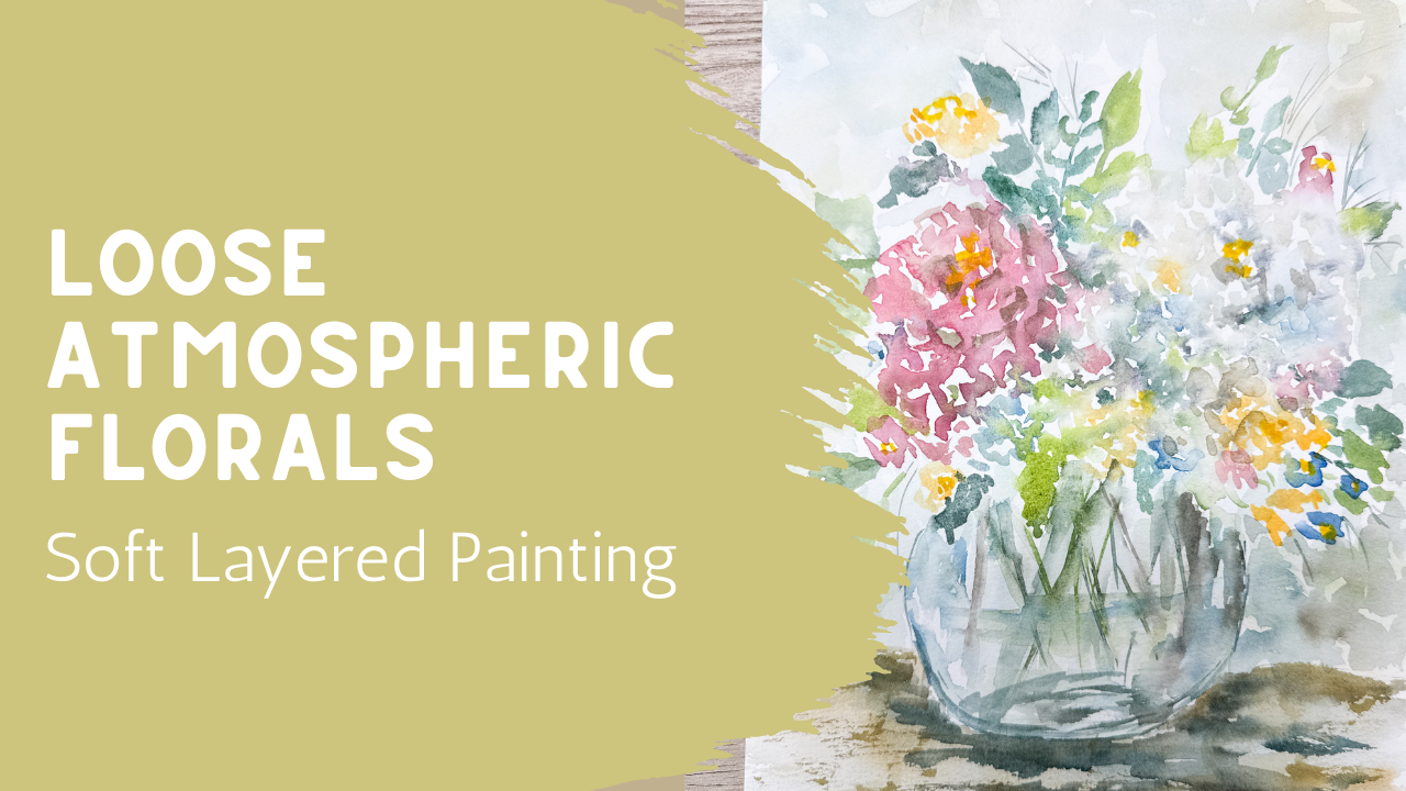
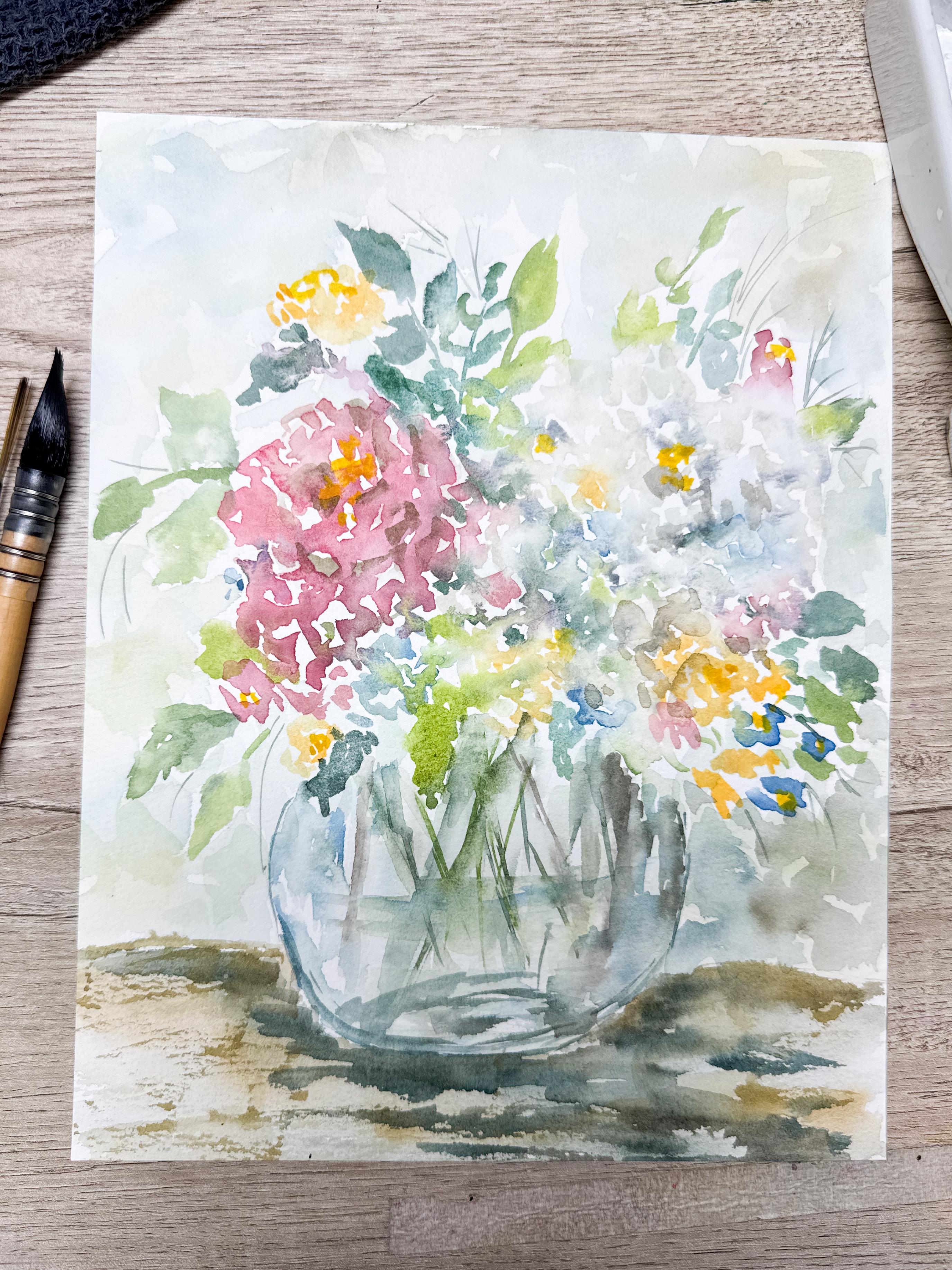
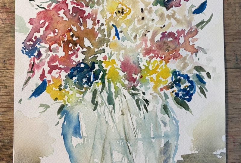
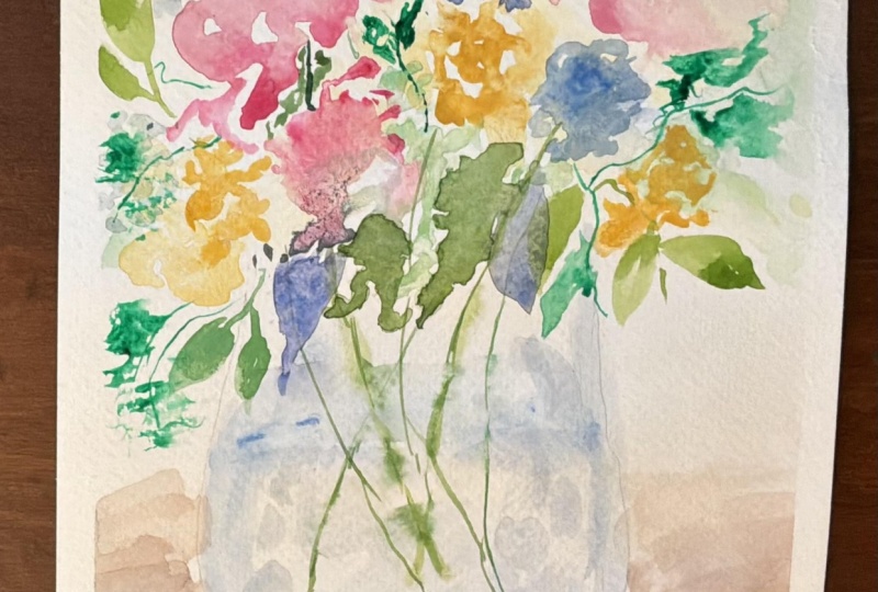
painting this soft atmospheric floral
arrangement in a loose round glass vase using flowing watercolor,
layering shapes, and very relaxed brush movements and expressive with soft edges, fading shapes and
colors that are allowed to blend naturally
across the paper. Instead of focusing on a perfect petal or
detailed flower form, we'll be building the arrangement
through loose layers, movement, value, and atmosphere. Even though this class leans a little bit more intermediate, because of the softer and
more interpretive style, beginners are
absolutely welcome too. If you'd like a
little more guidance before jumping into this
fuller arrangement, I also have other classes available that you could explore these same techniques with fewer flowers and slightly
simpler composition. One of the things I love most
about watercolor is that it doesn't always need to feel
controlled to feel beautiful. Sometimes allowing the
paint to soften, fade, and move naturally is what gives painting its mood
and personality. Gather your supplies, settle in, and let's paint together.
2. Class Project Part A - Water Flow & Loose Bloom Placement: Before we begin, I want
to quickly walk through the supplies and setup that I'll be using
for this project. I'll be using a watercolor
paper that I have marked and taped out to be the standard size frame and
mat that I'll be using. For brushes, I have
a variety here. My favorite is a
size eight round. I will also have a size
six, a rigor brush, and also this great big
brush that I love to use. Before I begin painting, I'm lightly marking out the size and
placement of my vase. I have a gentle cuide
for the composition. I'm not trying to be perfect here with drawing a glass vase. I just want a simple
round shape that gives the bouquet somewhere
to live on my page. Basically a line at the bottom, two lines to indicate the top, two little dots to
make the widest points and then just connecting all
those points with a curve. It's just that simple. Remember that things
do not need to be symmetrical or
perfectly balanced. In fact, some uneven movements are perfect for watercolor. Using my larger brush, I'll begin sprinkling on some fresh clean water across the area where most of
the blooms will sit. I'm using quite a bit of
water here on purpose. This is one of those key
tips to help creating a soft atmospheric movement
throughout the arrangement. As we begin dropping color
into these damp areas, the paint will naturally
spread, soften, and blend into the
neighboring shapes instead of sitting in stiff,
isolated flower forms. In this particular piecing, I don't want every flower to feel separate and controlled. I actually want parts of the bouquet to gently
flow into one another, the entire arrangement
feels connected and airy. You can actually start
thinking of these little drops of flour as the
stage almost like building a soft
watercolor atmosphere before we even fully define
the flowers themselves. And remember, if
the water starts moving unpredictably,
that's perfectly okay. Some of the most
beautiful moments in loose watercolor happen
when we allow the paint and water to interact naturally instead of just trying to
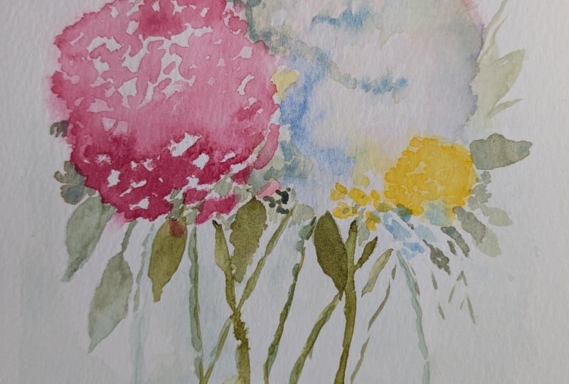
tightly control every edge. Here you can see that I am using several different shades
of the same pink. Some lighter, some darker. Spreading that around in
just a random soft way. Because I'm allowing some of the lighter areas to
take shape there, that will be creating
some highlights for us. The darker areas
are some shadows or just some darker
parts of the flower. I want to make sure
you take notice of how high I am holding
that paint brush. It is at almost top, the top third, in fact. I'm doing that because it
really limits my control. With loose watercolor, it
is ideal if you do not have control of your paintbrush and you just allow
things to happen. It is difficult. It is a
technique you need to practice, but I highly recommend it. You'll see that I'm adding
in a blue color now. I'm putting some here, putting a little bit over there. I'm imagining where extra little flowers might
be peeking in. We're going to be having
two primary blooms, this first pink
one that you saw, and then in a little bit, we're going to be adding in
an almost white flower head. Because I know that's
what's coming, I'm allowing myself to add a little bit of extra
color here and there. Then when we add in that white, it's all going to blend
together beautifully. Now I don't want to
add too many colors. I am trying to limit myself
to just a few colors, maybe different shades of the same color like I did
with the pink and the blue. But I'm not adding in a
bunch of random colors. Pretty much just
going to be pink, blue, and a little
bit of yellow. And then obviously some
green for the leaves. You may be asking, but what
kind of flowers are these? Well, what kind of flowers
do you want them to be? I wasn't actually painting a
particular kind of flower. Maybe they're hydrana,
maybe they're roses. Maybe you see them and you
think that they're peonies. Because I'm painting in such
a light, loose fashion, they can be any color, any flower that you
want them to be. I'm imagining that
I went out into the flower garden and
I picked up a bunch of different random
flowers and I brought them inside to put
into my round phase. Technically, it's a whole bunch of different flowers
inside here. You might take notice that when I'm putting my
paint brush down, I'm making little C
shapes, little clusters. Each one of those
little clusters is considered a
little flower head. Maybe it's a C,
maybe it's a circle. Often it's two parentheses, one facing left and
one facing right. Because I'm making it in
such a loose fashion, I'm going to be able to add
in some extra details into the centers in a little bit
once this starts to dry. Here you're seeing that I am
starting to create the color that is going to be my
white main flower head. That's my favorite
paint, buff titanium, mixed with a little
bit of yellow, maybe a little bit of orange, maybe a little bit of brown. I just randomly mix colors until I like
what they look like. It's very light,
extremely light. I actually also added in a little bit of white
directly into it. If you feel as if your paper
is getting a little too dry, you can always just sprinkle a little bit more water on top. That's going to allow this
white paint to really spread and mingle with the other colors that you've
already added onto the page. Now you can sit and
watch the magic happen. As you are painting, you will notice that that
white that you made, that's almost the same
color as their paper is starting to pick up some
of the other paint colors that you already painted
because you've let your paper be nice and wet and you've been
painting quickly. And that color,
those yellows and pinks and blues
are going to start merging and blending with that really light color that
you've already just added. This is a little tricky. If you don't get
this right away, you might want to
practice it on a sheet of paper where you can practice
and see what you can create. It's hard to paint
something that's white when you have a
white piece of paper. But remember, white
is a variable color, so there's just different
degrees of white. When you add just a
little bit of brown or just a little bit of
yellow, it's still white. It's just not as
white as your paper. I'll be adding in just
the smallest hints of brown or black just to give
it a little bit of depth. I said black, but it's really I think I was
using Pain's gray, which is just a really
beautiful dark gray color. Can you see it? Do you see how that
is starting to form? Now, of course, we don't have any of the rest of it made yet, but that's coming soon, and it's going to
all pull together. This is one of those trust the
process kind of paintings. I'll be mixing up a couple of different greens here
because when I paint, I like to make sure that I use at least three different
shades of green, sometimes lighter
greens, darker greens, or even a bluer green. It really adds so much to
your painting when you add different varieties
of green color and also different
shapes of your leaves. While you're adding
in the leaves, remember that you are
creating a round bouquet, we want to make sure that it is proportionate to the
rest of the bouquet. Some stand out above the top, some come over to the side, some will even drip
down over the edge. We're going to dive much deeper into leaves
in the next video. Join me there and we're going
to continue this lesson.
3. Class Project Part B - Greenery, Glass & Atmospheric Layers: Now that the first layer
of our flowers has started to softly spread
and settle into the paper, I'm beginning to work
on the greenery and the leaf shapes throughout
the arrangement. One of the things I really want this bouquet to have is
movement and variety. I'm intentionally changing
the size, direction, and color of the leaves as I move around
this composition. Some leaves are darker
and more defined while others stay very soft and
faded into the background. I'm also shifting between cooler greens,
muted olive tones, and even a slightly
blue green mixture to keep everything from feeling
flat or overly uniform. You'll notice that I'm not carefully outlining
individual leaves. Most of these are created with just a few relaxed
brush movements and then allowed to soften
naturally into the damp paper. At this stage, I'm
really thinking more about rhythm and movement
than perfection. I also want to avoid
spacing everything evenly, letting some areas feel fuller while others
stay more open. That will help the arrangement breathe and feel more organic. It's hard to know
when you have enough. So be careful with your leaves. This is definitely something
that people can overdo. Before you add a
leaf at this point, consider is adding another leaf here going to add
to the arrangement, make it better, or
is it just more? Remember to bring some
of the leaves down over the edge of where
the vase top would be. We're not actually going to
be showing that vase edge, so you want to fill that
with flowers and leafs. Does your arrangement
have movement? Does it need little
wispy pieces? Would it benefit
from little swirls off to one side or the other? Do you need stems showing in between the leaves
and the flowers? Did you get enough leaves or green spots in
between each flower head to create a
little definition between all the
different flowers that you previously painted? Stand up, walk away from it, let it dry, come back to it. Take another look at
it. What does it need? Or is it perfect
just the way it is? Don't rush this. Take your
time, enjoy it, relax. Have fun with the imperfections. Enjoy the fact that not
everything has to be right. So many areas of our lives
are needing to be perfect, done just right,
arrive just on time. I consider my art, my freedom from all of that, and I hope that you do as well. Now I'm beginning to add some very soft blue color
to the glass itself. I'm using a diluted blue and
green mixture very lightly here because glass
is really more a suggestion and a
reflection of color. One of the things
that helps glass feel really believable is
preserving the white space. Instead of fully
painting the vase, I'm intentionally
leaving many sections untouched to create
highlights and reflection. At the base of your round vase, I like to add a little oval, just to indicate that that is a round vase and that it has a base and that
you can see it. It's a very long oval that
I'll show you here shortly. As your blue starts to dry, you might decide to add
in a little darker blue. You can always add more to
the edges to the center, to the bottom, wherever you feel your painting
is needing it. Just because I put some blue there doesn't
mean you should. Maybe you were
already heavier with your color than I
was when I started. Just because I do something, please listen to your painting and do what's right for yours. Here you can see I
added in a long oval at the bottom to
indicate that I could see through the vase
and that it is round. While the vase is still damp, I'm beginning to add in
the stems into the water. I like angling the stems in different directions so
that the arrangement feels natural and slightly imperfect instead of stiff
and evenly placed. Some stems will overlap, some will disappear, and some remain more visible than others. You don't need to
add too many stems. That's also something
that can get overdone. So be careful not
to add too many. You can always add more. It's hard to take them away. If a stem feels too
dark or distracting, you can always soften it
with a clean damp brush and allow it to blur slightly into the surrounding water area. That soft blurring effect actually helps create
the illusion that the stems are sitting
beneath the surface of the water inside of the vase. Again, this painting is really about softness
and atmosphere. We don't want every line to stay sharp and equally important. As my flower arrangement
starts to dry, I can go back up and add a
little bit extra detail. Maybe darken a couple flowers, add a little bit more green, double check that vase to make sure there's
enough definition. Take your time. Again, walk
away from it. Come back. What does it need?
Maybe it's perfect, just the way it is. I do want to begin to establish a tabletop underneath this vase. I'm going to be using a mixture
of browns, greens, blues, and touches of yellow
to keep the surface feeling layered and
atmospheric rather than flat. I do want the whole
piece to be dry before I start working on the
background and that table. Otherwise, my bground and my foreground will start
to blend together. That's not really the
look I was going for. You can let your
painting dry naturally. You can use a hair dryer, or if you have a heat gun
like I do, you can use that. Don't forget to add in a
water line in your vase. Here I'm just putting in a slightly arched water line with my blue paint
that I've been using. It's not a solid line. It's a jagged dotted line maybe. It just gives that indication that there's water
inside of this vase. Remember to think about where your light source
is coming from so that you can softly suggest shadows underneath
and around your vase. I'm using the side
of my paintbrush, using just some soft colors
here coming up around the edge of the vase so that it looks like it's not
sitting at the very edge. You do want it to come up and around that
vase a little bit. I'll be adding multiple
different colors here, partly to add in definition and shadow and also to add interest. Using greens and blues
and browns and yellows, I'll really be
creating a darker, more maybe moody a tabletop. What will your
tabletop look like? When you use a great
big brush like this, you can really get
some great effects. Laying it down on its side, you can move that paint around
and just allow it to flow. Each time it dries, you're going to be
able to come back in and add another layer and you'll be seeing that quite a bit as we go along
in this project. Now that my vase is more dry, I decided I needed a little bit more definition
with some of those stems. I wanted them to criss cross a little bit more
defined in the center. I'm adding just a few extras. But remember, yours
may not need that, listen to your
painting and only add more stems if your painting
is calling for that. We'll work on all
the extra details in the very next lesson.
4. Class Project Part C - Backgrounds, Shadows & Final Depth: Now that those
earlier layers have had a little bit of
time to settle and dry, I'm beginning to work back into the painting and build some additional
atmosphere and depth. At this stage, I'm really
trying to avoid rushing. One of the easiest ways to lose that softness in a
painting like this is by adding too much too quickly or overworking
every little detail. Instead of trying to
fix the painting, I'm slowly moving
around the composition, looking for small places that
a little bit more contrast, shadow or softness might
actually help guide the eye. I'm beginning by adding a really soft background,
very diluted paint, hitting some of the white spots and adding in some yellow, blue, green, and even a little bit
of pink here and there. I want the bouquet to feel
like it's been surrounded by atmosphere instead of
isolated on a white page. I'm using a very
diluted washes here and allowing some areas to fade
almost completely away. It's important to deepen
the shadows that are on the tabletop underneath
and around the vase. Earlier, we established
that the surface was light, but now we want to create a
little bit more grounding so that the arrangement feels
settled into its seen. I'm layering those muted brown, soft blues, greens
and warmer tones. While still keeping everything
fairly transparent. One thing I'm paying
attention to here is keeping the shadows soft
around the outer edges. I don't want anything
underneath the vase to suddenly feel sharp or heavy compared to the softness
of the bouquet. I'm also watching
where the light source seems to be coming
from and allowing some areas to remain
lighter while others receive a little
bit more shadow and depth. This is often where a
painting starts feeling more dimensional without needing
a lot of extra detail. Now I'm beginning to
add in other layers of softness and shadow
inside the vase itself. Some areas inside the vase will become lighter
and others darker, especially where the
stems overlap or the shadows naturally collect towards the base of the vase. I'll also reinforce
some of those stems slightly while softening
others back into the water. One thing I love
about this stage is that you can
start choosing what deserves attention and what should remain quiet and faded. Not every flower or stem
needs equal importance. Go ahead and add a little bit more detail
to some of those blooms. Maybe a little yellow
centers are needed, maybe a little darker
blue or darker pink, maybe it's perfect
just the way it is and you don't want to
add anything at all. I thought that some of
my blooms just needed another little layer just to
add a little bit more depth. Not much, just a little bit. Remember that even though
we're adding depth, we still want this painting
remain airy and atmospheric. I'm trying very hard not
to overdfine things. Sometimes I place down a stronger color and
then immediately soften it with some clean water so that the edges
don't become sharp. That push and pull
between definition and softness is really where atmospheric watercolor
starts to feel interesting. You'll probably notice throughout
this stage that I keep stepping back mentally
and asking myself, does this area
actually need more? That question is so important in watercolor
because it's very easy to keep adding simply because the paper still
looks empty in places. But often the untouched paper, soft fades and
unfinished feelings are actually part of what gives
loose watercolor its beauty. If your painting still
feels light, airy, and slightly imperfect, that's
probably a very good sign.
5. Final Thoughts & Encouragement: Just finished your
floral arrangement, and I hope this class helped you feel a little bit more confident allowing watercolor to stay
soft, loose, and imperfect. This style of painting
really asks us to let go of the idea that every flower needs a sharp detail or
perfect control. Sometimes the softness,
fading edges, and layered transparency and unexpected blending is actually the things that give watercolor
its mood and personality. Honestly, paintings like this can sometimes feel a
little uncomfortable while you're creating them
because there are moments where everything feels
loose and unfinished. But that's often part of the process with
atmospheric watercolor. The layers slowly begin
connecting together and the painting develops over
time instead of all at once. If your piece turned out
differently than mine, that's completely okay
and honestly expected. Watercolor responds
differently for every person, depending on the water
levels, timing, paper, brush movement, and even how
quickly or slowly you paint. I really hope this
class encouraged you to experiment a
little bit more and trust your own brush movements instead of worrying about
making everything perfect. One thing I always try to remind my students
is that growth in watercolor doesn't
happen because every painting turned out
exactly the way we hoped. Growth happens because
we kept painting, kept experimenting
and kept learning how the water and pigment
behave together over time. I'd absolutely love to see your finished project
in the gallery. Some of the most beautiful
student projects are the ones where personality and exploration began showing through instead
of tight control. If you've enjoyed this
looser atmospheric style, I do have other classes that are similar to this that
I think you'll enjoy. If you haven't followed me yet, please follow me
here on Skillshare. I share new watercolor
classes regularly, all designed to help
students create calm, approachable paintings
without a lot of pressure or perfection. If this class felt a
little bit too difficult, go back and find one of my other vase classes where I break down the process a
little bit more for you. Don't forget to follow
me here on Skillshare and leaving a review helps
other students find my class.
 Brenda Jones, Watercolor Artist & Teacher