Transcripts
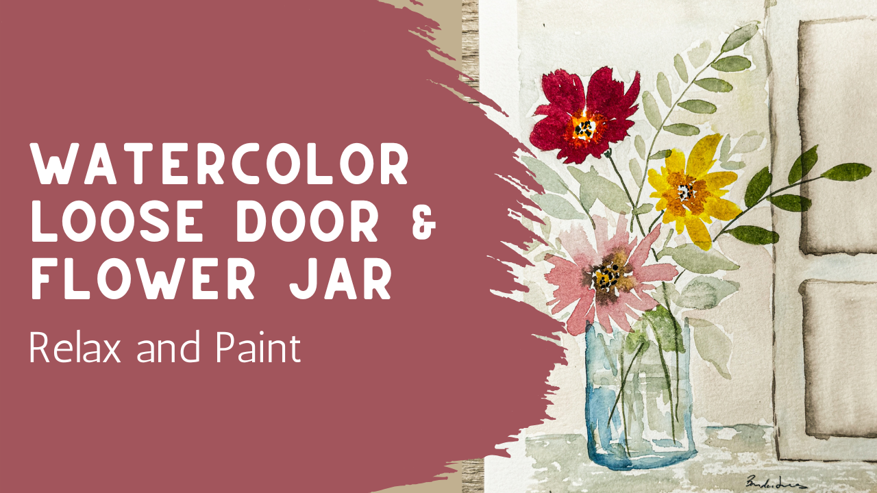
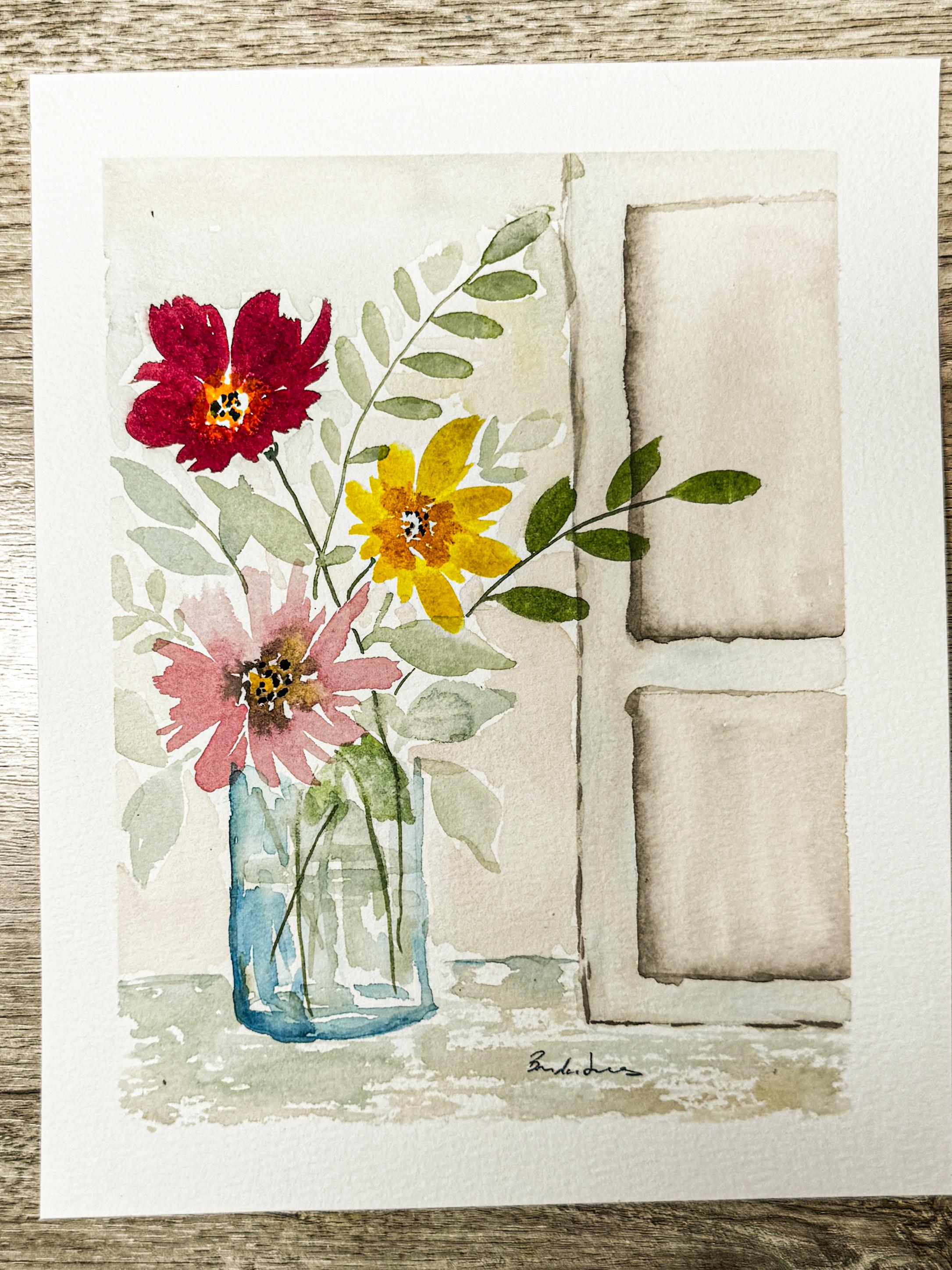
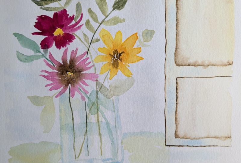
1. Welcome to Class: Hi, everyone. In today's class, we're going to be painting this soft atmospheric
watercolor arrangement with the loose
watercolor flowers, flowing greenery and a
simple doorway background that'll help the entire piece
feel calm and connected. This class is designed
as a companion to an earlier beginner
floral jar class. We're building on many of those same loose
watercolor ideas. But this time we'll
push a little further into
atmosphere movement, layering and composition.
But don't worry. This is still meant to feel
approachable and imperfect. Not creating a detailed
architectural painting here. In fact, I'll show you how to draw a very simple
loose doorway shape that acts more like a structure and atmosphere than
precise detail. The one thing I love most
about the style is that watercolor gets to stay
soft and expressive. Some edges blend, some
color moves unexpectedly, and the painting slowly develops this relaxed layered
feeling as we work. Gather your supplies, relax, and let's get started
painting together.
2. Supplies & Simple Planning: I'm going to quickly
go over my list of supplies and how we're
going to be doing this. Most likely, you're coming over from the last class
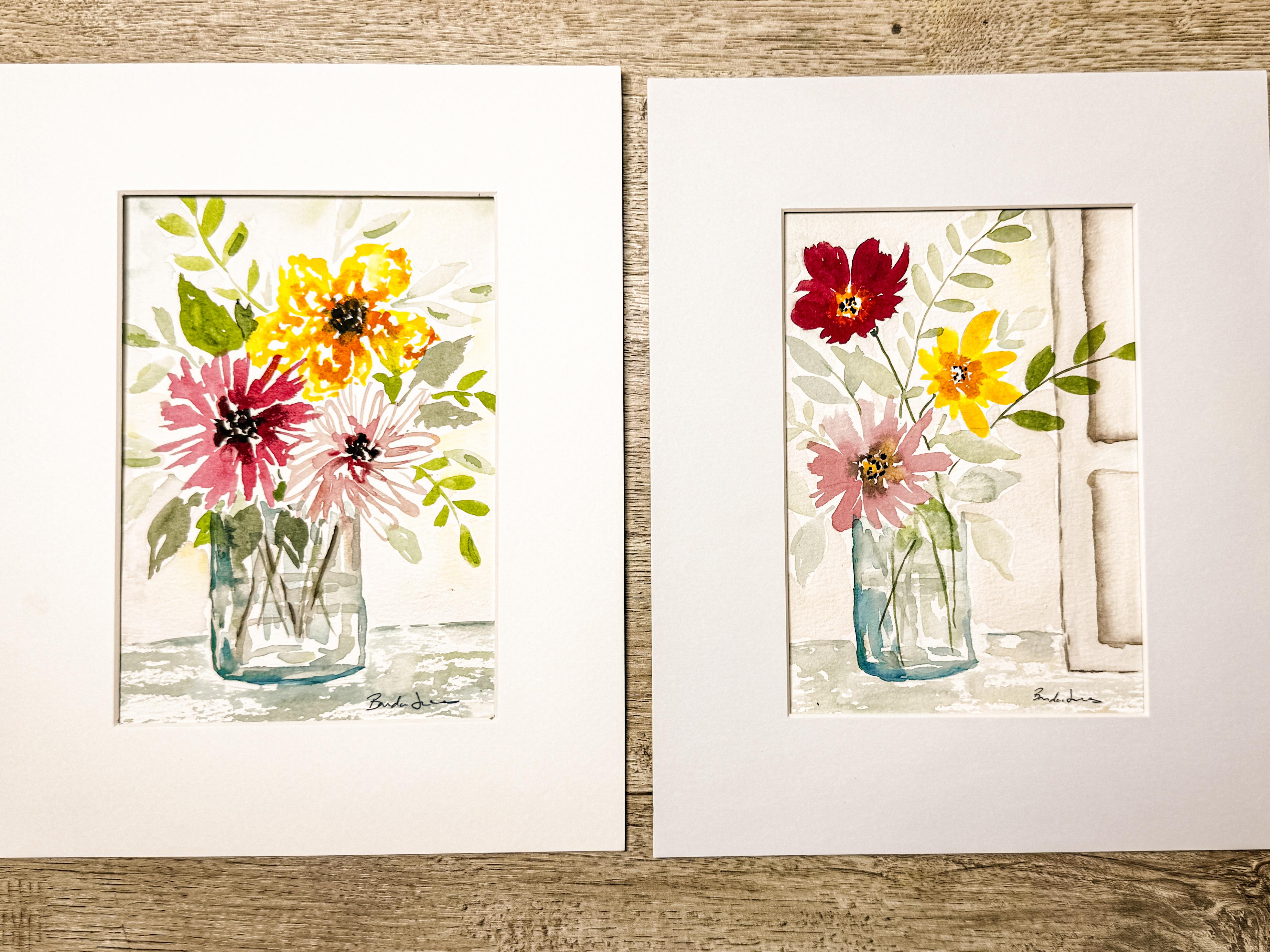
where we talked about, and we painted this one
in our class project, and the same supplies and the same techniques are
going to be used again, but we're going to
be adding onto it, and we're going to be adding
an architectural piece, which is going to
be a door kind of in the background over here
to the right hand side. So just like in this class, I went ahead and marked where I was going to
be having my frame. So I have this mat
and I put it on here, and then I marked with a pencil, the four different
corners so that you can see where my
pencil marks are. And then I went ahead
and added tape, and I added tape just
to the outside edge, about half an inch to an
inch outside the edge of where my corners were
so that when I paint, it goes to the outside edge. Just like on this one that
we made the other day, I made it just a little bit
bigger than my matting, and that way I have
some freedom to decide exactly where I want
to position my mat. When I'm completely finished, I can decide where that
goes because I have painted outside of just the
inside of this mat. So my paper is ready. This is a reminder
is 100% cotton. It's a ten by seven. I am painting within that to
fit the frame that I have. I have some water ready. I've got my paint brushes. I'll probably just be
using a size eight round, but I do have some
other ones available. Always have a cloth because
I always like to dry off my paintbrush or if
I'm going to have a drip, I have a place to
use that cloth. I do like my buff titanium. If I'm going to be
mixing my colors, it really mutes down the colors. Just like when we did this one, I mixed it with some of the pinks and some of the
greens and the yellow, just to kind of, like, tone down the colors so they
weren't quite so bright. So buff titanium is what
I'll be using that, and that is up here in
this little well here. If you see me dipping into
that, that's what I'm doing. I will clean up this palette and spray this down and
get it all activated, and then we're going
to get started. And what we're looking
to do in this class is actually create a
companion for this one. So if you've already painted this and you want to
hang this on your wall, but you want to
have a second frame that is a companion to this, like a matching set, that's what this class is for is so that you can match
it up to this one. And so what I'm hoping is that
we're going to be painting a taller vase with some flowers that are
kind of dancing above. So this one's really
condensed and the flowers are bumped really
up against each other. And then this next one, you'll probably have a little
bit more space with maybe some little stems that you can see where the
flower heads are. Plus, I'd really like to add that architectural piece over here to the
right hand side, as if it was a window
shutter or, you know, an old fashioned, like an antique cabinet or a door or something
else that's over here. So in this particular class, we worked a lot on the
background and how to create this textured
and colored background. And we're going to use that same color suggestions
for part of it, but then adding in an
architectural piece. So, now that we know what we're doing and you have
your supplies, come on back to the next lesson, and we're going
to dive right in.
3. Drawing a Simple Loose Doorway: Okay, so I know that I
said we're not going to really be tracing
anything on here, but I do want to draw
just like the door area. Excuse me, just so that you have a sense for where
it's going to be. But we don't really
need a straight edge or anything because this is allowed to be a little
just loose and casual. So it's just some
straight edges. So if you want to use a
straight edge, that's fine. To tell you the truth. I would, but I can't find my ruler. So we're just going to wing it. Well, unless I do have a random little piece of paper I could use
as a straight edge. Um, so I don't want to have this door coming all
the way into the middle. I only want to have it on
this one corner, this edge. So I think I'm going to
start it maybe about here because I can see where my dots are for the
edge of the frame. I'm going to make
it about square, and I'm going to have it going
from the top of my paper down to about there and then coming across
because that's the base. I'm going to have to
erase this a little bit because I'm making it dark
so that you can see it. Then I'm going to want to have as if it was raised
panels in your door. I'm going to be putting
a raised panel in here. My first panel goes up
here along the top, and then this comes all the
way down to about there. I'm going to jump over and then I'm going to have this
come all the way down. And then I'll bring it across. This is really, really basic. Do you can copy this
just so that you have just a general sense for what a raised
door might look like. See it just has that raised door effect or could
even be a shaker door. That's my door. Very, very
basic, very, very simple. You could make it more
elaborate if you wanted to. I didn't put it on an angle. I'm not doing
anything. I'm probably going to be having some kind of a table base underneath
here. It's fine. Now that I have that, I
am going to erase this a little bit to get rid
of some of those lines.
4. Class Project Part A: Painting the Doorway & Vase: Have this little eraser. It's kind of it has
stuff inside of it. It's almost feels like I
don't even know. It's messy. It creates all kinds of fuzz that drips all
over the place. It's kind of like eraser
bits that are inside, but it erases great. So I can just really gently because watercolor
paper is fragile. You don't want to ruin up
the teeth that's on there. So I have to just be
really gentle with it. But look at how easily that
just erases the whole thing. Yes, it is messy. Leaves all those little
crumbs, but that's okay. I'm just going to
get rid of all that. And then you can see that most
of it is missing and gone, and I'll be able to cover
up the rest of that. So if you've taken
any of my classes in the past where we talk about
doors and architecture, we're gonna be using that
same basic technique, which is we're going to be
wetting down a spot of it, you know, just wetting
down the inside. And for this one, I want to do the painting of the door
first before we go and paint the paint any
of the flowers. I'd like to get
this door painted. Remember that when you went
down your watercolor paper, wherever you have water is where the paint
is going to flow. So if you want to make sure that you are staying
within the lines, then add your water
and make sure that it stays right inside the lines
or cover up that line. But don't paint outside
the lines because that watercolor will flow
wherever there is water. So I'm going to just create
a little bit of a brown, and I think I'm going to add in just a little
bit of a yellow, maybe get this golden color. And I'll be able to add in some water and just kind
of this is going to be mostly a white door
with just a little bit of darker shadow around
the outside edges. So I'm going to be adding in this kind of like this shadow, and then I'm going
to be drawing it out and pulling it to
the other locations. So now that I have that rinsed, I can add some water
to this yellow, which is really not yellow. It's really more
of a golden color. I'm just going to be adding
some of that here too, but very, very faint. Lots and lots of water, and then just letting that flow together with the brown
that I already put on it. Okay, so lots of water. I'll add it down here, too. Now, this paper is still wet because of where
I wet it down first, so this is a wet
on wet technique. And this is allowing me to just kind of let
that flow together, let that brown kind of just merge with that golden
color that I added. Now, if I want, I
can add in a little bit more of that brown just to, you know, spruce it
up a little bit, maybe add some
texture to the wood. This is a wood door. It
doesn't have to have a lot, but I could just
add a little bit. Add a little on the edges. Could even make it a little
bit darker around the edge. So more paint, less water. I can just put in
a little bit extra here along the base because we're saying that
that's where the shadow is, so it's going to
be darkest there. It's paint the paper is still
wet, so it's going to flow. No, I just rinsed off my brush. It just has water on it, but I can soften those
edges draw it up into it. Soften these. Draw
it up into it. Remember that your
watercolor is going to dry lighter than
what you see here. So I can't do the
outside of this door, like the outside frame because the inside is still
very, very wet. So if I went and painted this section right
here where my paintbrush is, that would then bleed into what I just did for the interior, so I have to wait
for this to dry. If I wanted to, I could use my heat gun and I could go ahead and
force this to get dry. But I think what I
want to do is just let that dry naturally
for a little bit, at least, before I go and do this outside
edge of the door. So because I'm giving
it a second to dry, I'm going to go ahead
and move on to my vase. I'm going to be putting
my vase about here, and then I'm going to
be putting my flowers here with some long stems
that are coming up. So this is going to be a
very tall flower arrangement compared to the one that we did the other day that
was short and swat. So I need to get out
some of my blue. Because I'm going to be making
that vase that is blue, and I'm also going
to want some green. I'll probably be
merging together those two colors together. Then I also want some of that
buff titanium and I'm going to be mixing it in with that
green and with the blue. To just soften that blue
color a little bit. Okay. So knowing that I want
to have my vase about here, I'm going to be creating
a base to my vase, and then I'm going
to be creating a edge to my vase and
making it a little rounded. I'm make edge over
here and rounded. And just like when we
made that other one, I'm just going to have
a little rounded edge and a little rounded edge
going this direction. Okay, that's going to
give me my rounded edge, my rounded feel to this vase. I'm not going to be adding
a top to this vase because the flowers are going
to some of the flowers are going to be down over
the edge of that vase, and others will have leaves
or stems coming onto it. And so I don't want
to be covering it completely with a top, like the spout of the vase. Um, if once we have it all done, we decide we want
to add something, we can always add that in later. But now that I have this blue that's on my watercolor brush, I'm going to just add a
little bit more water to it and just kind of come in and add Remember to
leave your white spaces, jump over and just add a
little bit of white here. I mean, you're blue, but leave your white spaces. Your whites are your highlights. So make sure you leave
some white spaces in here. You can see it's just kind of like a little stripy but
not perfect stripes. Now I have my green
on my paintbrush, and I'm just going to add
in a little bit of green. On top of the blue in between the blue where some of
the white spots are. So just go to add a little
bit of that blue there. I'm going to show
this to you up close. Oh, you see that. See I added just a little bit of
blue and a little bit of green and left
lots of white space. Okay. So now I'm going
to be starting to add in some flowers and add
in some flowers, and I'll also add in oh, sounds like it's
going to be storming. So I want to make
some of my green, pick up some of
my buff titanium, add that into my
green just so I have a really nice soft,
beautiful green. And then I'm going to need
a little bit of my pink. But you know what?
This is almost dry. I'm going to actually,
now that I see that, I'm going to let this dry
and I'm going to go ahead and Okay, that's dry enough. It's not completely dry,
but that's dry enough. I'm going to be adding in some of my buff titanium
for around the edges. Actually, forgot. I
need to have that wet. So I'm going to wet
down the edges. This is the frame of the door. If you remember we had
already painted the center, which would be the
raised panel part. And now we're doing the frame, the outside edge, and now I'm going to come in
with that buff titanium. I might even add in just a
little bit of some blue into this just to add some
interesting color reflection. See if I like it. If I do, that's great. And if we don't, then
you'll know not to do it. Sometimes it's just all about
experimenting, right, guys? We just like to experiment. Okay. So I'm going to just grab just a little bit
of blue and just add this hint, so faint. But just a hint of
this blue color. Not necessarily that the
door was painted blue, but maybe it has a reflection from a window and it's getting a little bit of blue
on it from that. It's also just nice to
be a little whimsical. I kind of like that. It's
kind of interesting. Okay, I'm going to let that dry. And now I'm going to come
back over here to my pinks, make some pink up. Add in some buff titanium.
5. Class Project Part B: Loose Atmospheric Flowers: And we're going to
be creating a flower and I'm going to put it all the way down here at the bottom. So this is similar
to how we painted the other one where it's just pushing out, leaving
that center. I'm concentrating on
leaving that center plain. I'm just pushing out, kind of squiggling and
pushing out my paint brush. You can always move
your paint brush if you need to have
a better angle. We're gonna do something
like that one. Different See how they
end at different spots. So end in short, some
ended out longer. Okay, they're not all equal. And I'm going to just
add a little bit of brown to that paint and just drop in some brown it's kind of brown and
pink mixed together. Just to let that
blend a little bit. I'm gonna use some of that
same yellow that we used. I got to put a little bit
of that in here, too. Little two too little too dark. I don't know if you
can hear that or not, but I have thunder
in the background. We're getting a summer storm. Okay, so I'm going to let
that just start to dry. We're going to add
another layer, but that's a good
start for that flower. Now, I think what I'm
going to do is add a yellow flower up here. So I'm just going to add
some of my regular yellow, but this is my warm yellow. And then I'm adding some of that warm golden color just so I have them
next to each other. And I'm going to
add in a little of my buff titanium
into both of them. Now I'm going to
create a little flower up here just a little
bit higher away. I think I need it just
a little bit brighter. And we're going to just
create this little flower. Remember when we are
creating flowers, we don't want all
the petals to be the exact same distance away. Otherwise, they all look like they're facing the
same direction. So if we make one side shorter, it makes it look like the flower is facing
the other direction. So we're just going to
go ahead and do that. Adding in some little extras. So that way, it looks
like it's facing the other way, facing
that direction. And I'm going to add in maybe some of this orange
color right into the center, right around the
outside edge and let that bleed up
into it a little bit. Leaving lots of white space in the center, do not cover it. We're going to let that
bleed and blend out, and then we'll decide what
we're going to do from there. You can help it. You can push it around.
You can stop it. But I'm gonna leave
it like that. And then I'm going to make
another I'm gonna make a um I think I'm gonna
make a lighter pink. Or darker pink. Hmm. I'm not sure. So here's
what I'm going to do. I have this paper
from the other class, I can picture it
here and I can say, do I want to have a
darker pink up here? Or do I want to go even
lighter than this? I feel like I've got a lot of light stuff going on and that maybe a darker one up here might be better,
might be warranted. I might make it more balanced. So let's see if we can bring
in some of that over here. I'm going to add
in just a touch of brown to make it darker. Then I also want to bring in
some of that buff titanium. Using a scrap piece of paper. Now this is where we just play until we get the right color. Yeah, I think that might be it. Add a little bit of brown to it. There we go. That would
be really pretty. Okay. So I'm going
to go and do that. But this time, I
want the flower head to kind of be facing
that direction, so I'm going to be
making the larger flower petals out that way. I'm going to start it
all the way up here. So we're just going to be
pushing those flower petals out a little bit more water. So these are just a bigger
flower heading that direction. And then I'm going to have
some smaller ones over here. It's important to give your
flower heads direction, this one looks like
it's facing that way and this one makes it look
like it's facing that way, but then this one is
looking straight on and you don't want to have all of your flower heads
looking straight on. That gets a little boring. But if you can give them
direction like that, you're going to have a
much better composition. That was what I
was working on by making them shorter
on the one side. Before this is completely dry, I'm going to be dropping in a little bit of yellow
into the center of this, again, leaving white space, but also allowing it to bleed up into that red color
if it wants to. Then I will come back and add another layer once that
is dry. All right. I think that it needs
a floor down here. I think it's going to be
sitting on some a table. I'm going to go back
to this blue that I have and holding my
paintbrush on its side, I can just very gently touch this watercolor
paper to give it a texture like it's sitting on something because
it's not solid. It has lots of white space, and then I can even come in and I can add in a little bit of yellow or pink and add in just a second highlight
color here and there. Just for fun. Experiment with
it. Decide what you like. If you're not sure and
you want to play with it, get out your pieces of paper and play with it
over here and say, well, what happens if I do pink? What happens if I do green
and play with it and see what you like before you go and put it on
your final piece? I'm going to add
just a little bit of a solid edge over here. And let that kind
of just bleed out. Okay. And I think I want to add just a little
bit of a foundation. Maybe it's a shadow down
here underneath this door. It doesn't have to
be a solid line. It can be kind of broken. It could be a broken line might actually make it
look more realistic. So I'm just kind of letting it skip every once in a while. Then I can come back through and on this side, to soften it. Soften that edge. If I feel like I
ran out of water, I can always dip
my paintbrush back in and get it just
slightly damp again, just to soften that edge. Okay. Cool. See how I got some definition
between this and the door. Okay. Coming back
over to my flowers, I'm going to pull
out this brush. This is my rigor brush. See how long and floppy it is. I love this brush. So I'm going to be using
this to create some stems. I'm going to be grabbing
that green again, getting some green going. Let's see. See if I
can get that green and picking up some
buff titanium. I definitely need to refill
some of my greens in here. It's really getting low. But I have enough
in here for now. I just need to refill. I'm going to add some stems. I'm going to have
this stem come from here and come down and it's
going to come into my vase. I'm going to start here. This
is the base of the flower. It's just going to come
down and see how nice and long and that stem can come. I can jump over. I can
bring it all the way down. I can even bring
it into my vase. I can do the same
thing with this one and just have it
come into my vase. And this one I'll
come this direction. Then I think, actually, I want to have another because that's going
to be a greenery. Then I'll put another
greenery piece over here. And then I'm going
to fill in over there with some other items.
6. Class Project Part C: Expressive Greens & Movement: Okay, so I'm going to add
I'm using my size eight. I'm just going to add
some little leaves off of this stem. Do you see I'm just kind of like pressing down,
almost stamping it. I'm gonna do the same thing
over here on this side. It's getting very
dark in my house. I'm making sure that it's the
storm is brewing out there. So we're gonna have to may
have to put a pause on this if I think it's getting
too dark to be able to see. I'm just gonna add
in this other color. This is more of a blue. And I'm just gonna add in
some other leaves over here. Maybe another one over here. And some green. Get
a big leaf there. You leaves, you're
just going to have to decide where you want
to put some leaves. There's no right or wrong. Just don't put in too many. Too many is where people end up feeling like maybe
they made a mistake is if they add in
too many leaves. Just be careful with that. I'm going to add in another
one of this style over here. Maybe one more over
here. That's enough. Okay. Add another stem
or two into my vase. Then I think I want to add
in a little water line. I'm going to use that blue, and I'm just going to draw it across and just create
this water line. That's it. That's all I need
to do for that. Now, do you see where I left this little white spot right
there, this spot right here. I feel like that should be either a leaf or it should
be more blue for the vase. I just don't like it
being just plain. I think what I'm going to do is actually add a
leaf in that area. Just drawing your eye downward. I think that's maybe
a little too bold, I can always use
a paper towel and just kind of blot it to
get rid of some of it. Okay. This is really looking cool. I am liking this. Possibly I would have liked
if this had been over here closer so
that maybe some of the leaves were on top of this. So maybe what I should do is extend cause I was
kind of thinking that maybe the door the flowers were sitting kind of more
in front of the door, and I kind of did
it just next to it. So I'm looking at it and
saying, How can I fix that? And I'm wondering if I couldn't
bring out one of these stems over here and having
something in front of it. Hm. So if I just quickly did
something like this, I can always lay
it out here and I can say, would I like that? I don't want to
make it unbalanced. Because I don't want
to have all of a sudden this side be too heavy. But I also don't really
care for the fact that they're not connected
in any way. So I think I'm going to do it. I think I'm going to find a way to connect
these two things. I'm going to just
draw this over there. And maybe there's a way of balancing it
over on this side. I do like that. I like
having that on top. I'm going to go ahead and finish the centers of these flowers. And I'm just going to add in just a little bit of
more these little dots to make the centers
of these flowers. Dots. Okay. And I think I want to anchor this
base a little bit more. I'm gonna grab a
little bit more blue. It's gonna put a little stronger little stronger
edge on this one side. Kind of like how I did
this frame for the door, anchoring that and just putting a few more lines in
here. Always soften it. Most important thing is that you're just having fun
and that you're playing and that hopefully you
learned something new and you played around with
something that you had ever thought
about doing before. That is what these
lessons are all about is just having fun and
seeing what happens. What happens when you play? What happens when you add? What happens when you subtract? What happens when you, you know, put a vine on top of it? I mean, you got to
play around with it. You won't know unless you
play unless you try it. Okay. I'm going to grab,
first of all, this. It's not completely dry, but I'm thinking
that what I needed to do is just see
what it looks like. Under a frame to see if it's
balanced, and I think it is. I think that excuse me, I think that this side is
heavy enough because I have the two flowers and the
darker side of the blue, and then it's balanced
with this side being anchored with that
architectural piece. I really like the fact
that this green comes over here and actually even
goes behind my matting. I think that's
actually fabulous. I might even drop it
down here a little bit. And remember, since we
painted outside the lines, I have that freedom paint
instead of being no, I'm going to paint within
it, then I would be very, very stuck and I'd be
balanced like this. But instead, I get to
move my frame around and choose exactly where I want to lay down that frame, the mat. The other thing is
that this is my piece from my other class that
we're making a companion for. I'm going to get
this and cut it out, but here you can see that
they're going to be companions. They have the same colors. Everything is similar. So I'm going to come back and paint in the background just
like I did in this one. You can see here you can see here that I did
paint in a background, which I haven't had a chance
to do yet for this one, so I'm going to go do
that in the next video.
7. Class Project Part D: Soft Background Atmosphere: I am ready to put in
my background and what we're going to
do is use the colors that are in here in my palette, and I'm just going to wet
down some of this area behind and around the flowers and the leaves that are
already on the paper, trying not to touch
them too much. I'm going to be adding
in a lot of water to my palette and just making
it really, really diluted. I want to put in some of this
blue up and around here, not touching the leaves, not touching the flowers. I'm just coming around it
just ever so carefully. Kind of adding in a little bit of color just so that
it's not stark white. I don't have to come
in between every single petal or
anything like that. I even can use some
of this yellow. I can come in here with
some of that yellow. I can bring some yellow
up into this area. Just touch it into
the centers around. You can add some of
this brown color. I can bring that over here. If I get too much, I can always just dip into my water and just dilute it
right here on the paper. I like that color, so I'm going to add it again over here. Just dilute it right on the paper with using more
water on my paintbrush. I might even add in just
a touch of that pink. Because it's kind of fun. It will dry lighter, but I don't want to
see it real well. I just adding in
just a touch of pink up here into the top as well
just to bring it through. I might even add just a touch
of that blue down in here. What I am really liking is the blue that I
added to this door. I wasn't sure. I'll be
honest, I wasn't sure. But sometimes those things just work out and I'm
so glad I did it. Okay. I feel like that's
probably pretty good. I'm gonna let that dry. And then in the next video, I'm going to take off the tape, cut it down to size, and
put it with that frame, and I can't wait
to show it to you.
8. Final Thoughts & Encouragement: You just finished your atmospheric floral
composition and I hope this class helped you feel a little bit more confident
combining florals, background atmosphere
and loose structure into one connected
watercolor piece. This class was really designed to encourage you to loosen up, experiment a little bit more instead of trying to
control every detail. I think sometimes we assume
painting needs to be highly detailed or technically
perfect to feel beautiful. But so often it's
in the softness, the movement, and
the atmosphere. That's what makes watercolor feel the most
expressive and calming. If parts of this class felt a
little bit more challenging than the earlier
floral jar class, that's completely normal. This project was
meant to stretch your comfort zone just a little bit while still keeping the process approachable
and relaxing. The one thing I really hope
students take away from this class is that watercolor
growth happens in layers. Sometimes you paint
something that feels easy and confident building and other times you paint things that pushes you to slow down, rethink things or
even try it again. All of that is part of
the process of learning I'd absolutely love to see your finished
project in the gallery, even if it feels imperfect
or unfinished to you. I hope you've enjoyed this
class, and if you did, please follow me here on Skillshare and leave a
quick review for this class so that other students
can also find and enjoy my watercolor classes. I hope to see you again in
another class very soon.
 Brenda Jones, Watercolor Artist & Teacher