Transcripts
1. Introduction: You ever find yourself admiring the main
menu of a website, a unique ta bar in a mobile lap, a fun icon, or a cool
animation of a logo. If that's the case, you are
going to love this course. Everything that is not
printed and appears in a digital form falls into
b and digital design, which is a subset of the broader
field of graphic design. In this course, we
will be covering everything you need to
know about web design, user interface, and
user experience design, screen sizes, file formats, and so much more. We will also dive deep into all the specialized areas within this field like Ab
design, icon design, social media design, presentation design,
digital publishing, motion design, and learn how design systems and banner
ad campaigns work. We will analyze
hundreds of ab and digital design projects to give you a solid
understanding of the important rules and
terms you need to be familiar with if you are
planning to get into the sector. Together with the
exciting class project that I hope you will complete
at the end of the course, you also have the analysis
worksheet and the term glossary to help you practice everything that you've learned. I hope you are just as excited
as I am to get started and dive into the sea of knowledge and beautiful graphic
design examples.
2. Roles in this sector: Similarly to print design, in case you are planning to specialize in web design
as a graphic designer, you will also have to know about a couple of essential terms. These will help you to better communicate with other
professionals in the area, with developers and
also with your clients. But first and foremost, let's try to define what
actually is web design. Although a lot of people
prefers to use this term for everything related to lab
and creating websites, including coding and the
development of them, it is more accurately
use when it refers to the user experience and all the other front-facing
aspects of a website. A web designer would normally
work on the appearance, layout, structure, and
content of a website. A web designer is not primarily responsible for coding a site. However, some knowledge
of HTML, CSS, JavaScript, and other
coding languages can be very useful
in this field. Now in case you want to be very specific and you want to
make sure that no one confuses your role with someone
who is also doing coding. You can also call
yourself a visual designer who's
purely responsible for the aesthetics
of our website, which can include buttons, menus, backgrounds,
and so on, so forth. In this course, we will
also be talking a lot about digital design and the role
of a digital designer. And the main difference between a web designer and the
digital designer is that while a web designer is focusing purely on designing websites, and digital designer
has a broader set of skills and set of
responsibilities, which can include the
design and creation of banners and banner
campaigns and emissions, motion graphics,
interactive elements, videos, and also websites. So there is an overlap between these two roles and it's
always worth clarifying. Whenever you are
applying for a job, what are the actual
responsibilities that they are expecting
you to cover? Now to better understand
the roles within the web designer sector does a couple of additional
terms that can help you. You probably heard of front-end and back-end and they
simplify things, anything to do with the
design and the look of a site would be considered part of the front end development. But this also includes HTML,
CSS, JavaScript coding, search engine optimisation,
accessibility, cross-browser issues
and so on and so forth. And again, as a web designer, you might need to be involved
in all of these things. So anything that relates to the front end aspect of
the development of a site, What's rarely is a task
of a web designer is to handle also back-end
development tasks. So this is more about
database administration, server architecture, security,
data transformation, backup and so on and so forth. Now if you are coming from a visual and graphic
design point of view, this is probably the least
attractive part of web design, but this is obviously also
crucial for things to work. And even if you have a
simple blog, for instance, you would still have to have a content management system
running in the background. So even if it's not handled by a professional that are
still things running in the back-end that are handling all the
data and information that are displayed or the things that the users are
interacting with. There's one additional
term you may have heard, the full stack development, which would include both the front and the back end together. Now, user experience is another
large topic and we will actually be covering it in more detail in a separate video. But in terms of web design, the three essential terms
and tasks that you're required to work on and
improve as much as possible. First of all, is navigation
for which we have menus, buttons, drop-down items, and all kinds of interactive
elements on a site. And while in print design, this is usually a fairly
straightforward thing and quite linear. For instance, of a magazine, you would have the Table of Contents which helps navigation. And then you will have page
numbers on the strands. But besides that,
it's really up to the reader to
actually physically turn pages and to go from
one article to another. Buyer with a website, there are almost limitless options and possibilities or paths
that a user can take. And you as a web designer, has to think about
ways of making sure that the users can find all the navigational
elements easily and that whole experience
on the site will be seamless and convenient. Now there's an even broader
term when it comes to a user's experience with a
side which is usability. And this is something
that includes navigation, but also any other aspects
that makes a site usable. So why navigation focuses more on getting from one
page to another, for instance, usability
would include also the general
layout of a webpage. How large certain elements
are compared to others, or how high the contrast
is between elements. But in general,
it's mainly about removing any possible
obstacles that can prevent the
user from finding the relevant information
that they are looking for. And last but not
least, accessibility is also very important, which makes sure
that people with hearing or visibility
impairments. We'll also be able
to use the site without any frustration
or difficulty.
3. Basic Web Design terms: Now that we've covered
the main responsibilities of a web designer, we can focus on a couple
of additional terms before we jump into talking
about more complex things. Let's start with
something simple. Above the fold is
something that we use to refer to the parts or elements of a site
that would show up at first visible on
the user's screen, whether they are
using a desktop or laptop computer or
a mobile device. And below the fold
would refer to all the additional contents of the page for which users
will have to scroll down. Now even though this would be most commonly
vertical separation in case of a horizontal
navigation within a site, you might also have
above the fold on the left and then below the
fold further to the right. But generally what you
have to always pay attention to is that the above the fold section of your design has to be
already very engaging and informative to ensure
whoever is visiting the site will leave
immediately and they will spend a bit of
time exploring it and hopefully staying long enough to find what they're
looking for. You can consider
above the fold of a site like the shop front, which has to be exciting enough
for customers to actually decide to walk in to the shop or the cover of a
magazine or a book, which once again
has to be exciting enough for users to start interacting with the product and eventually making the
decision to buy it. Now you might be
wondering how can we specify the exact
location of this folder, where the actual
scrolling is starting on the side when there are so
many different screen sizes. This is actually something that we will cover
in more detail when we talk specifically
about screen sizes. But since we are
talking about above the fold and how
important this section is in terms of the retention
or engagement of a visitor. The most common element or component that would
take up most of this above the fold area
is what we would refer to as the header
or hero section. And this information needs to really introduce
the side so it can have the title or
logo, also a tagline, a compelling image
or illustration, navigational elements, maybe testimonies and
any additional proofs or unique selling
points that's worth mentioning straight
at the beginning. Now besides making
this hero section really stand out and engaging, it's also a good
idea to indicate that there is further
content for the down, which will make people
want to scroll down and explore the rest
of the contents. Remember that just
like in print design, the first impression is
extremely important. And that is why it's
so important to get the header or
hero section right? Now, in case of a
complex website, like with Adobe's, at first, it might look like that
the header or hero section is fairly simple and it doesn't
have a lot of elements. But this is just to keep things simple and makes sure
that people find what they're looking for quickly without
overwhelming them. And notice how here in the
main navigational area, besides the logo, we have
these five main categories, so 12345 and then some additional options
here on the right search, the account information,
and a quick access menu, which can take you straight
to a specific tool. But let's see what
happens if we click on, for instance,
creativity and design. Now you see most of the
header area is taken up by this element that we would
refer to as a mega menu, which opens up a lot more navigational options
for the users. Now giving all of
these options at the very beginning
where they've been extremely overwhelming. That is why it was
important to keep all of these hidden under
a single button. Generally, what's
a good practice is to limit the main parts that a user can take from a
header area to around seven, give or take out of which the most important
ones should be placed somewhere in the center, like in this case, manage
your account is probably the most important one
and it really stands out. So it makes us want
to click on it. Then this is probably the
second most important one. And then all the rest of the navigational options
we have up here, once again, categorize and made easier to access through
these mega menu. Another good example is Apple's
site, where once again, we have a very simple design focusing on the product that
is promoted at the moment, giving two main navigation
options to learn more, find out more about the product, or to go and buy
it straight away. And all the additional options that you can find
on the side are all categorized and hidden under these options
here on the top. Now, remember, they
used to be only like four or five elements here, but it just keeps
growing because Apple is doing so much
different things. But still it is a fairly
simple menu to get through. And once again, if I click
on any of these options, like Mac for instance, we will get a lot of additional
options to choose from. Now you probably
already know that the most important
navigation elements of a site or the buttons. And when it comes to
designing a site, There's also a couple of specific terms that
we would use to define a button which most of the time
would have a label, maybe an icon, the background, which could also have
a border around it, depending on the
aesthetics of the site, it might also have
rounded corners, which is defined with
the border-radius. And then to specify the
distance between the icon and the label and the
border of the button, we would refer to as padding. So you would have top, left, right, and bottom headings. And padding is actually a general term that is used
not only with buttons, but almost every element that you would
have on a website, defining the space directly
around the content itself. And what follows
the padding is what we refer to as border, which again is defined
by the four directions. So top, bottom, left, and right. And then finally, most elements
would also have a margin, which you can think of as the negative space or
whitespace in web design. So this is something that is
defined to be kept empty, making sure that there
is enough distance between all the other components
or elements of the side. Coming back to talk a little
bit more about buttons, There's also the states that you will need to be
designing individually. And most buttons would have a normal state or resting state. There's a hover state, which is mainly important on desktop and on mobile devices. But the interactions
are happening by tapping instead of clicking with the mouse and active state when the actual interaction is happening depending
on the button, it can also have lots
of additional options, like the ones that
you can see here. It can have a progress loading focus disabled states as well. And besides the generic type of buttons that we've seen so far, there are lots of
additional types of buttons like checkboxes, radio buttons, switches, choice chips
or multi-select chips. And you as the designer, should always use this whenever
they are most applicable. For instance, with
radio buttons, you would want the user to
select one specific option. Why we check boxes? Users would expect to be able
to select multiple choices. Another common term
that we mainly use for buttons is called
to action or CTA. These actually can mean any
element on the side that will help for the visitors
to make a decision, whether it's about
buying a product or signing up for a newsletter, whatever you decide to use
as a call to action element, it should always stand out and be very prominent on the side.
4. Additional Web Design terms: Now when it comes to referring
to colors in web design, we would use the hexadecimal
codes or hex numbers, which is a base
60 number system, meaning that there are
16 symbols including numbers and letters
to define colors. So for instance, if I sample
one of these colors from this side and I come to the
color picker in Photoshop, you will be able to see this
hex code here at the bottom. So this one, for
instance, is d 27643. But before we try to understand
exactly what this means, there is also an important little warning
here in Photoshop. This little cube refers to any issues for Vab with
a particular color. This is actually not
a web safe color. Now what does that mean? This is actually a very
limited palette of only 216 colors that is standardized and displayed consistently across
every browser. And in case you want to find the closest similar color
that is considered website for you have to do is to
click on this cube and you can see it shifted
slightly to the right. And we can compare the
original selection and this new one to each other. But if we want to see
on the web colors, we can also click on this
option here on the left. And as you can see,
it is very limited because any colors that
I would pick around this area would result in the same values and
the same hex code. So if you keep an eye
on that hex code, no matter where I click
within this region, it's always going to
give us the same code. But if I turn off
the only web colors, we will be able to
move around and see how that hex
code is updating. Now, the good news
is that you don't really have to worry
about web safe colors anymore because it would be a very small fraction of users that might experience any issues with non web safe colors. And it mainly comes down to the screens are monitors
that they are using. And if they are older than, let's say, ten or 15 years. But even though web safe
colors is not important, hex codes are still very
important to understand because that's the way
every coding language would refer to colors. And in case you're interested, the first two symbols within
a hex code will do refer to the intensity of reds out
of RGB than the second set, which is the third and
the fourth symbols, would be the
intensity of greens. And lastly, these two at the end would be the intensity of blue. So these are the RGB or
red, green, blue channels. And when the hex
code shows a 00, that's no intensity, meaning
there's no color used. While if the two symbols that F, F, That means it's
full intensity. So that way you would have
the actual color itself. And since RGB is an
additive color model, when you have all the three
channels empty or set to 0, then you would get
black as the color and value would have all of
them are full intensity, so all three colors
fully visible, then they would add
up being white. Now, don't worry,
you don't actually have to learn any hex codes or how to describe specific
colors with these codes, it's just useful to
know how it works. But most of the time you would
be able to select colors with a similar tool like the
color picker in Photoshop, no matter which
application you are using to design a site. And last but not least, there's just a couple of
additional terms worth mentioning when it
comes to scrolling. First of all, what is a
fixed or sticky element? This is actually
something that will stay on the screen while all the additional details
scrolling up and down. Although this example
is showing a phone, of course this also applies to the desktop
versions of sites. So for instance, on our website, if I'm scrolling down, you can see that the
main navigational area stays visible. So that would be a
sticky or fixed element. Since we are on this side, there's also another
interesting detail here that we can see. This is something that's
called parallax scrolling. When you can see details moving in different
speed on the side. So the actual section about the Pro membership is
scrolling at a certain speed. But the background details or the graphic in the
background of it is, seems to be stationary or fixed. So it almost feels like
there's two layers within the composition and they are
moving at different speeds, is great for creating the
illusion of depth and generally just make
science more interesting. And last but not least, since we are talking
about scrolling, there is also infinite
scrolling with sites like Pinterest where you can scroll down on
the home feed and new pins would just keep
appearing constantly. So it is like a
never ending page. But now that we've
covered some of these essential terms
in the next video, we can focus talking
more specifically about the structure of websites.
5. Structure of a website: Although there are a lot of different types of
websites that are still a couple of terms that apply to pretty
much all of them. One commonly used term
is container or wrapper, which essentially
means whatever holds together the structure or
the contents of a site. So this is a region that
normally has a fixed width, which could be 1280
pixels, for instance. And the height of it, of course, depends on the amount
of content on a page. Most websites are
aligned to the center, which means that to the left and the
right of the wrapper, you will normally
have background, whether it's just whitespace
or maybe a color or pattern. While inside the
container you would have a couple of very
distinct elements, like the header area, which we already covered
in the previous video. And normally the main
navigational menu is part of the header. It can also be two
separate elements, and the menu can be above
the header or vice versa. But essentially these
are the first elements that visitor would see when
they go on her website. And these two together
will take up most of what we consider the above,
fold over side. Further down you will reach
the main page content which can take up the full
width of the container. Or optionally, you
can have sidebar either on the left or on
the right side of the page. In rare occasions on both sides. And similarly, the way we started with the
full width header, we will also end with
a full-width footer, which will normally have
contact information, small sitemap, and a couple of additional links like social
media and so on, so forth. The largest portion of
the site normally is the content area that
we already discussed. And to make navigation
easier and to separate the content
into smaller chunks. When the users are
scrolling up and down, it's recommended to
create distinct sections, or as it's sometimes
referred to, fields that you can
see here as well. The areas that I'm highlighting and each of these sections
should have distinct role. One could be about the
newsletter where people can sign up and receive information
about that particular site. A goodly to analyze
a website and how much sections are used is by simply using the Command or Control minus keyboard shortcuts in any browser
that you're using, it should work, which will
help you to zoom out and get this bird's eye
view where you can see the whole structure
from a distance. So here we can see clearly
that the container or wrapper is aligning all the
content to the center. And there are these
distinct sections separated by color
like here we have this black backdrop or we have the gray one for
this section here. And we also have this
nice gradient line dividing the footer from
the rest of the page. When you're looking at the
site from this distance, you will also notice vertical
alignment between elements. So for instance, we
can see that the edge of these images are aligned. But if I come further down, there's also an alignment
to these components. And the same thing
will be true to the right edge of
these elements. And the two edges
on the left and the right normally defines the wrapper or container
itself or the page width. However, it can be
misleading if you are just concentrating
on the contents, it's always better to take
a look at the full page, like in this case, the main menu on the top or
the footer at the bottom. And with that, we can
see that actually there is also this space on the
left and the right here, which is considered the
margin within the site. So we can see it
here on the left, and we can also see
it on the right side. And that's actually still
something that would be considered part
of the container. Now in terms of the
actual components or building blocks of a site, we would refer to visual and functional elements and a copy, the fonts, the colors, the images, videos, animations, the legal itself, even
the space between the elements would all be
considered the visual elements. While everything
else that is used for navigation or interactions, including buttons,
drop-downs, and the menus would be considered
functional elements. A web designers task
is to make sure that there is a good balance
between these elements. A good website should
always make it clear whether we
are just looking at a purely visual element or something that
also has a function. So for instance, when I
hover over this image, I can see my cursor is changing, which means that when
I click on this, something is going to happen. But besides the cursor change, that was nothing else that
indicated that this is a clickable item that can be a lot of ways of making
things more obvious. So in case of an
image, for instance, that can be a hover effect or there could be
a small caption somewhere here on the image saying click here
to find out more. By in general, remember that good navigation has three
main characteristics. Simplicity, clarity,
and consistency. And we will keep referring back to this throughout this course. But there's also another term
you might come across and that's information
architecture or IA, which again refers to organizing the information
and displaying it on our website in a way that is clear, intuitive, and sensible.
6. Grids, Sitemap, Wireframes and Scanning Patterns: Just like in print design, visual hierarchy is also extremely important
in web design. And one of the main
ways that you can create this hierarchy
is by using a grid. So a website grid
can help to maintain visual or they're within the site and between
the elements. Just like in print design, a grid is made up of columns. Or in case of web design, these are also
referred to as units. For instance, at 12 unit grid
would refer to 12 columns, which is by the way, the most common one used in web design. And here's an example of
this use by BBC's website. Now the spaces
between columns we refer to as gutter and where multiple units are used together for certain
sections within a site, we would refer to
these as columns. So here, for instance, this is a three unit column, or another one here on the left, which is twice as large debts, six unit column and multiple
columns together can form a field which add these horizontal
divisions within a page, which can also be
referred to as S section. This one is one here on the top, and this would be considered
another one, again, in this case made up
of three columns and each column made
up of four units. To go beyond the structure of a single page
within our website, we would normally
use a site map, which is a diagrammatic
representation of all the sections and pages and also the
connections between them. And it is a great
way to visualize the main navigational units and relations within a website. Another very common term and
something that we will keep referring back to in this
course is the wireframe, which again is mainly used in the planning stage of
a site or application, which is simplified
sketch or draft of the final page
structure representing main building blocks like
images or videos of it, rectangles and copy usually with a couple of
horizontal lines. You may have heard of
scanning patterns as well, which in case of web
design also really affects the visual
hierarchy of assigned. Here's a couple of examples of these heat maps where
we can see where the visitors eyes tend to
move and stays for longest. The most frequently
seen areas are in red. And we can immediately
see a particular pattern that is very commonly
referred to as the F pattern. So we can see that here as well. This is true for most of
the sites where there's a lot of information
or copy specifically. While another very
common way of scanning through a page is
referred to as the Z. Z pattern, which similarly
to the F pattern, we'll start on the top left. From here, it would go to the
right and then crossover to the bottom left
side of the screen and then finally go
to the bottom right. We can see in case of this side, it works really well for this scanning pattern
because this is exactly the order in
which the information is displayed and will
make sense for people. So a simplified structure using this scanning pattern can be
where we have the logo to start with or the
name of the company than the sign-up or login
options on the right. Then we have the main
hero image or hero section with some helpful
texts underneath it. And then finally the CTA or call to action
button or link. And the whole idea is by the time someone gets
to this point here, they know exactly
what they're signing up for or what they are buying. It is crazy, But statistically, it only takes 50
milliseconds for an average website visitor to decide whether they are in
the right place or not. So basically that's how long it takes for them to
make a decision, whether they like a page or not. And that is why it
is so important to use visual hierarchy when defining the structure of a site and to make sure that visitors
won't get frustrated. And they will always find
what they're looking for.
7. Screen sizes and Responsive Design: One of the hardest
thing in web design is that the experience of a user is hard to predict
because it can really vary depending
on a lot of factors. But probably most importantly, the screen size of
the device that they're using to
access the Internet. Now, since you cannot
predict what will be the most commonly used
screen size, technically, you have to make sure
that a site is going to work and function properly
on any screen size. And to achieve this, there
are several methods like responsive design
or adaptive design, and we will discuss these in
more detail in this video. First, let's start with
this interesting graph that shows that in the
last ten years or so, there was a huge shift and change how people interact with sites and how now most commonly they would be
using their mobile phones. So more than 50% of the global web traffic is
happening on people's phones. This is why nowadays
most companies would consider the mobile first
web design approach, which is designed philosophy
that concentrate making the user experience the best on the smaller screens,
mobiles first, and then adapt the
design and layout to larger screens as a second step, this approach aligns
really well with Google's search engine
optimization as well, which also favors mobile first design or
mobile friendly websites. For this, there is actually an official Google
online tool where you can type in a URL and after a few seconds you
will get the result. And in this case, I just done
a test with our own site and it came out as a
mobile friendly page. Now there's another aspect
of mobile devices that you have to also keep in mind
when you are designing sites. Some people might actually see the site in portrait format, while others might look at
it in landscape format. And it can get further
complicated when you also consider tablets
or various sizes, which again can have
both orientations. But this graph helps
us to understand that another very
interesting behavior or statistic that depending on the screen size
of a mobile device, the preferred orientation
will change dramatically. And we can clearly see that
the larger the screen gets, the more likely people will be using it in landscape format. While in these smaller sizes, which are the most common
mobile phone sizes, it's more likely people will be using them in portrait format. We already talked about the
mobile first design approach, where we first consider the smallest screen and then
adapt it to larger screens. And although it reverses, the order of priority
is still relies on the same principle as the
responsive web design approach, which again means that the
layout of the site will automatically adapt to the
available screen size. But what's important is that you are always going to look at the same site is just going
to be rendered differently. And most commonly,
the distinction between the different
screen sizes would rely on the breakpoints defined in the CSS
code in a site. And here we can see an
example of a couple of commonly used breakpoints
which referred to the width of the site based
on the available screen size. So 1920 pixels, for instance, would be the largest size that you would need
to design for. 320 pixels is a standard for the narrowest or
smallest screen size. And we can see that when
you are holding a phone, having only this much
space available than the actual content area
would even be less. So it would be around 280 pixels with the margins on the
left and the right side. Now for most mobile devices, you would have these
smaller breakpoints and all of these would use
normally a single column. So the structure would be fairly uniform and you would be just scrolling up and down to access certain
parts of the site. While when you have
larger screen sizes, you will start to be able
to introduce more columns, divisions horizontally
in the side until you get to maybe
three or four columns. Even when you're using your
browser on your computer, you can actually
test a site and how it adapts to different
screen sizes. So we can see when I reach a
certain point without side, it's going to start
shifting the contents. There was a break point so
I can jump back and forth. And we can see between
the two breakpoints how some of the elements
are disappearing. Or the menu here on
the top is getting simplified into a simple
hamburger icon like that. Then if I go further
to the left again, that was another breakpoint. So the two columns are now simplified into a single column. And then even further down here, everything is now
in a single column. And then if I go any further, it just gets closer and closer to what we would see
on a mobile phone. Here's another great example
of a responsive site. Again, if I start changing
my browser width, immediately all the elements are updating and there
was a breakpoint. We can see clearly how
everything is rearranged. And then as I go
even further down, we will have another breakpoint
visible right there. And that's probably
the last one. So again, two major breakpoints. One right here and then
another one right there. What's great about
this site is that it uses these blocks
really well and keeps everything is still
very easy to access and find no matter what screen
size you are using. Here is also an example
of seeing side-by-side the mobile and the desktop
version of the same website. And although usability
should be the priority, and besides
usability, similarity between the different
versions of the site is also important. You want users to get a
very similar experience no matter what device they
are using to access a site. Fluid design and fluid layout is also another term
you probably were here, which means that instead
of referring or using pixels to define the
size of a screen. So for instance, the
width of a site, it would calculate all
the components within the site using percentages. So as the viewport is
getting smaller or larger, the Fluid Layout would
automatically and dynamically adjust
all the values, again using percentages.
8. Adaptive Design and Pixel Density: Now there's also another
big category in web design called adaptive design
instead of responsive design, even though the aim is the same, to make sure that users
can experience a site in the most comfortable way depending on the device
that they're using. But via responsive
design was just adapting a universal design to the
various screen sizes. In case of adaptive web design, that would be completely
unique and independent designs created for various
screen sizes. And the main advantage of
adaptive web design is that it's always going to
improve the site speed. However, it's much
more time-consuming and expensive to develop
a site like this, because obviously
you will have to create multiple versions and also you will have to
maintain and update each of these versions
side-by-side. Now to make matters worse, in case of web
design is not only the screen size that you
have to keep in mind, but also the pixel
density of a device. And don't confuse this with
the resolution of a screen. So for instance, with
this particular iPhone, the resolution of the screen in landscape format is 1136 pixels by 640 pixels at 326 PPI. Pixel density, PPI stands
for pixels per inch, similarly to what
we use in print, where 300 PPI would be considered a high
resolution print, where the original
pixels of an image or printed in such a
density that you won't be able to tell those pixels
apart from each other and you just simply will
see a continuous image. And pixel density again, works in a similar way. The higher this number is, the finer the details
will look on the screen. And in general, it will improve
the viewing experience. Now you've probably heard
of Apple's Retina displays. And these are essentially these higher pixel
density screens. But there are lots of
other standards used for these higher
density screens. And from a web design
point of view, you just have to make sure that there is always a fallback for images that can work for these higher density screens. Now of course, this is only
important for pixel or raster images because in
case of vector graphics, they can scale to
whatever size is necessary without
losing quality. And there is actually a
specific vector file format that is used in web design, which we will be covering in more detail in the next video.
9. Commonly used file formats: The four most
important file formats when it comes to web
design are jpegs, PNGs, SVGs, and gifts. On this board you can
see a great comparison explaining the main
differences between them and a great explanation that
will help you to decide which file format is best for the image
you're working with. The easiest way to compare
these most commonly use phi formats are in web design
is by using photoshops, Save for Web option, which you can find in
the File Export menu. Once you select this one, you will be able to
choose two up here on the top left corner
with which you can compare the original
image quality, the specific file
format or preset that you are going to choose
here on the right side. So in this case, for instance, if I select the
JPEG file format, we can see that the
current file size is still really high. It's almost three megabytes. But by reducing the
actual pixel dimensions, we can already improve that. So instead of having this
over 2 thousand pixels, we can go down maybe to
a thousand pixels width. And by zooming a
little bit closer, we will be able to keep
an eye on the quality. But most importantly, with
the JPEG file format, when you want to change
is this option here, the actual quality setting
that we can set to 0, which will lead to the highest amount of
compression artifacts. So it's basically
these little blocks that we can see
here on the right. But by using the lowest quality, we also get the lowest
possible fire size, which in this case is
less than 50 kilobytes. Now of course, this is
something that you can tweak and find the
best option for whatever you are doing most of the time setting
this around 50 would give you a very
good result where the compression is
hardly noticeable, but the file size
is still going to be radically reduced compared to the original or compared to the highest
quality JPEG setting. The main advantage of using PNG over JPEG file format
is that with these, you will also be able to include transparency
information. And this is actually a
setting that you can see straight away
here on the top. But in case you are using this file format for photograph, you should make sure
that it's set to PNG 24, which means 24 bit depth, compared to PNG eight, which is a more limited version
of the same file format using only 256 colors
or eight bit depth. Now, even with this limited
color version of PNG, the file format would
still be much higher than medium compression jpeg. We can see it's almost twice as much, around 400 kilobytes. Why are we the higher-quality? So PNG 24, it would be
the larger, in this case, that will be 1.2 megabytes, almost ten times as large
as the compressed JPEG. But when it comes
to illustrations of graphics instead of photographs, you normally would want
to use PNGs instead. So here we can see a
JPEG would result in 41 kilobytes using the
50 quality setting. And if I switch to PNG 24, the size of the file will
be exactly the same. However, here we can already
utilize the advantage of having transparency
included in the file, which will make it
easier to use this graphic on top of different
background colors, for instance, on our website. However, when I switch to the lower color depth
option PNG eight, immediately we get a
much smaller file size, so that's only 15 kilobytes. And because there
are no gradients, blur effects, or
photographic details, the 256 colors will be more
than enough to represent the image and give us exactly the same
result what we've seen in the original version. Now, a GIF file is very
similar to the PNG format. Again, it is limited to 256 colors and that's actually the maximum
that you can save. However here you can
go even below that. So we can go all the
way down to two colors, which of course will result
in the smallest file size. However, in this case, we can just go to
maybe eight colors. And just like with P&G here, you can also decide
whether you want the transparency
included or not. When you enable it, it's
actually going to be considered as a color within
the color table. Now one of the main
advantages of a GIF over PNG is that it supports
frame animation. So here's an example of a GIF
file which has 12 frames. And we can actually play
the animation here. And we can also decide
how many times we want this to loop by default
is set to forever. But of course we can
change that easily. And all of these frames
combined together would result in a 32
kilobytes in file size. The best way to study these different file
formats is to save a few examples from
various websites. Open them up in Photoshop. Using the Save for Web option, you will be able to see the settings that were
used when they were saved. We will discuss
Frame Animation in more detail and how to
set it up in Photoshop. Once we get to the banner
design section in this course.
10. SVG, WebP and JPEG 200: Now when it comes to saving SVG or Scalable Vector
Graphics files, it is recommended
to use Illustrator. And from here, you just have
to go to File, Save As. And then from the format, you can select two
types of SVGs. That's the normal or
the compressed version. And in general, the
compressed option will give you a slightly
smaller file size. However, this format is not as widely supported as
the standard SVG. So I'm just going
to choose that. And once I click on Save, we get the additional
options here. There's actually a couple
of different profiles and also more options if you
want to dive deeper into it. But what's most interesting is that when you click on SVG code, it's actually turned into code that can be
used in websites. So it can be copy
and paste it from here directly into
the code of a site. And that will already be able to represent the image
in a browser. And just like with vector
graphics in print design, when you have an SVG file
on a site like this one, the main advantage besides the low file size is that it's completely
resolution independent. So even when I'm
zooming really close, we will always see
crisp and sharp edges. So we will never
see any pixelation. But there's a lot more
you can do with SVGs. You can even include
animation in them. You can also use them for fonts. Here's another cool
example of an SVG file, which includes not only
animation, but even interactions. So I can control the circle and the numbers also follow the
changes that I'm doing. And all of the information
required for this is actually returning the code
on the writing in HTML, CSS, and JavaScript languages. And last but not least,
it's also worth mentioning another file format that is becoming more and more
widely used on websites. This is the WebP format which
was developed by Google. Unfortunately, it's not yet natively supported in Photoshop. But you can find an
official plugin from Google that you will be able to download from the link
listed on the board. Once you install this, you will be able to open web
Py files into Photoshop. But most importantly,
you will also be able to save into this file format. So just to show you
on my computer, I already have this installed. And if I go to the File menu
and choose Save a copy. In here at the bottom, I will find the VAB
p sharp option. So this is going to be the web py file format we can
see here on the top. Once I click on Save, I will get these
settings and I can even see a preview
of certain details. And just like with a JPEG, you will be able to
control the quality. So either saving
something completely in a lossless way or by
using the losses setting, you can reduce the file size. This file format supports both animation and transparency. So in a way, it combines all
the advantages of jpegs, PNGs, and GIF files is widely supported now
by most browsers. So I highly recommend to start using it in web design projects. Just as a final note, it's worth mentioning that there was an attempt to introduce a new standard for JPEG files
called JPEG 2 thousand, which is actually supported
natively in Photoshop, which can achieve
better image quality at smaller file size compared to the original JPEG standards. However, unfortunately, this new standard
didn't really catch on. Most platforms, don't
support its tail. And that is why I would
rather recommend using these original file formats or the new web format
that we talked about.
11. UX & UI Design: You most likely heard of
the terms UX and UI design, or user experience and
user interface design. And most of the time
these terms would come up when we talk about development of an application and online tool, a mobile app. But it can also be referred to in case of web design projects. Essentially, whenever you
are creating something where there will be users
interacting with your product, you have to think about
the user's experience and make sure it is as
smooth as possible. Now, UX and UI designers are
two separate professions, even though they
work together and they have shared
responsibilities. They don't actually have to possess the same set of skills. A UX designer would
be concentrating on strategy, planning, testing, and generally trying to understand the
problem that needs to be solved and find a
good solution for it. While a UI designer would be concentrating on things
like topography, visual design, the graphics, icons, illustration, and color. But most importantly, these two rules are
connected to each other. So the UI designer wouldn't
be able to do a good job without the initial
work of a UX designer. So most of the time the work is starting here with planning. Then at the very end, it can reach the stage of
actual visual designs. One of the best way of
imagining these two roles and responsibilities
and how they can build on top of each
other's work is these five elements of
user experience example, where the work always
starts with the strategy. That's the first
layer or foundation. And this is actually the
most abstract stage. From here, everything is getting more and more concrete
as we are going up each layer after the
strategy, reaching the scope. So these are the
actual requirements the project has to meet. From here, a structure
can be created, then that can be further refined into the skeletons
or wireframes. And then finally, the
design stage comes on the surface level when we're concentrating on actually what
the users will be seeing. Now you might be wondering
within these five layers, that would the
separation be between a UX and UI designers
responsibilities? I would say that the
top two layers is something that the UI designer
would be focusing on. While the bottom
three layers would be more of a UX designers role, but usually there is
always an overlap. So I would say all of
these three layers here in the middle could be
shared responsibilities. Now one thing that's
definitely come in between these two
roles is that both of these professionals will need to rely on design thinking. And this is actually
a term that's mainly used in this field. However, design thinking
can also be applied to any other areas
in graphic design. And it is like a method or
process where you can follow the most important steps in
reaching the final product. So everything is always starting with the design challenge, identifying what is the problem and what needs to be solved. Then comes the empathy phase, which is mainly
about interviews and observing users
doing certain tasks. Then based on these
observations and defining exactly
what the problem is, the ideation can start, which can then
move into creating actual prototypes and then
finally, testing these out. Now in case you want to
get into this field, whether as a UX or UI designer, you have to learn a couple
of essential terms. Similarly to all the other
areas within graphic design. So let's just cover a few
of these in this video. First of a user persona is a made-up fictional person
who is an archetype or user of a product
whose goals and characteristics represents
the larger group of users of the product. Defining these
user persona is in the beginning of a
project, is very helpful. And it is something that
you would refer back to as similar to referring
to the project brief. Once you have your
user personas, you would also come up
with scenarios which would define when and how a
user story takes place. And it is more like narrative, which describes how
this music would behave in a certain
sequence of events. And finally, it's also
important to define the goal or goals of a user, which is the main motivation why this user is taking action. Once they reach their goals, that is when the scenario ends. Now once the user personas, scenarios and goals
are all defined, you can continue exploring
ways of defining the most important functions of your app or tool that
you're working on. One of these methods is
called User Story Mapping, where all the potential
tasks are listed. So it is categorizing all the feature requirements from the point of
view of the user, starting with the
most important tasks that they are planning
to accomplish, and then moving on to
additional tasks or features in the order that most likely they would want to
accomplish them. This is a great way of
filtering out what are the most important features of a product and make
sure that they are really noticeable
and easy to access. We already discussed in a previous video
what wireframes are. So I'm not going to spend
too much time on it. But of course,
these are extremely important for UX and UI design. And this is what we would
normally refer to as a low fidelity overview
of tool or application. The main aim of these simple illustrations
or sketches is to establish the structure and flow of the possible
design solution. Creating user flow diagrams can also be very useful
in the planning stage to understand the actions and in what order the users
who will take them. And depending on
the complexity and scale of the tool,
application or website, these diagrams can also
scale up and end up being quite complex with lots
of various routes. And finally, you
can also combine your user flow with wireframes, which we would simply
just call via flow. And this is a great example. Once again, we can
see the wireframes of each of these pages or screens. And then instead of displaying the actual structure
of the tool, it is concentrating
on the user's flows, so how they are going
through the app and what are the potential next
steps that they might take from a specific
page or screen.
12. UX laws: Besides the basic terms that we covered in the previous video, it's also important
to talk about some of the user experience,
laws or principles. And in case you already watched the Gestalt principles or the design psychology
topic in this course, you will probably recognize some of these rules
because they are in fact the same rules just
applied in a different context. But besides this, there are
a couple of laws that were specifically used for UX design. Let me show you a few
examples of these. So first up, Fitts Law
is about to make sure that actionable items
are easy to access. And in case there are
multiple actionable items, they are not too
close to each other, making sure that users
don't accidentally pressed or click on something that they were not supposed to. Now this is a very
interesting illustration showing that when someone
is holding a phone, which are those regions
that are easiest to access, and in this particular case
is the single hand use. So it's just the use of
the thumb on the screen. And we can see that
right-hand users would have a slightly different region
compared to left-hand users. Most importantly,
these corners would be much harder for a
left-hand user to access, while for our right-hand
users is the opposite corner. But for universal
design, of course, it's always good to consider both left and
right-handed people. So applying Fitts Law, it means that this is the
area where it would be easiest to reach the most
important actionable items. Hicks law is about simplicity, keeping the choices that a
user can take to a minimum. And this example shows
a comparison between two types of remote
controllers and how a very minimalistic design like apples controller follows
the Hicks law really well. But the same principle
applied to a form or interaction on a website
would look like this. Where once again, instead of listing so many
different options, you would have a
limited set of options. And maybe one of them can
already be selected as the optimal outcome or
choice from the forum. Of course, the user will
be able to change this. However, having something
already selected still makes the decision process
slightly faster and easier. Jacobs law is stating
that you should always use familiar scenarios and logic for things that users encounter on
a regular basis. And a good example
is the sign in form, which we can see in a couple of different sites would
look very similar. So I'm just going
through three of these and as you can
see all of them first, we'll start with the fastest or easiest
ways of logging in, relying on an existing account with Google, Apple, or Facebook. And then after this, giving the user
the option to sign in with their email
address or password, followed by the
same exact setup, again, concentrating
on signing in. So that's the main
call to action here. And then additional tasks that the user might require
in case they forgot their password or in
case they haven't created an account yet and
they are planning to sign up. So once again, if I
switch between these, you can see that even though the designs are
slightly different, the general structure is
pretty much the same. Law of pregnancy is
also about simplicity. And in this particular case, it's about using simpler
shapes wherever possible. And this is something
we can see apply the most successful designs. So for instance, avatar images would always be in a circle. Icons would be very
clear and simplified. Functional elements
like buttons would also have simple shape and
even information that is connected is normally
contained or grouped vid as simple visual
item like a rectangle.
13. Additional UX laws: This section of a page from Amazon's website shows two
of the other laws in action, the law of proximity
and common region, which are both
Gestalt principles. So first of all, the Law of common region means
that you should keep the related functions or
features in common areas. So we can consider this grouping here already a common area. But if we look at these
six groups together, this is also forming
common region, which separates these from the ones that we can
see here on the top. So again, we can consider
this as one region. And because these options
are higher up in the page, the text inside them are larger and they also have
visuals inside them. Immediately they
feel more important. So it is going to be
easier for the user to find these most commonly
searched for options. And in case they
need something else, they will be able to move to the next region within the page. And the way the law of
proximity is applied here is by keeping these two groups
further apart from each other. So there is a larger
space created here, even a very subtle division line between these two groups. And another example for the
law of proximity would be menus in case of
Adobe's website, again, we can see that
these options are kept closer to each
other and they are more related compared to
the additional options that we can find here
on the right side. So that big empty space
that we have here is the one that separates these
two groups from each other. Now there's also
Miller's Law that we can discuss here
with this example, which is about dividing
your content into smaller chunks to make it more
digestible for your users. So you want to limit
the amount of options that they need to perceive
at any given time. And we already seen in a
previous video that there's a massive mega menu
that would open up in case we click on any
of these options up here, but those are all hidden
in the beginning. So then we can concentrate on these five options here on the left and the additional
three options on the right. In case of the main
navigational menu, that's eight options for
the users to choose from, which actually perfectly
aligns with Miller's Law, which also states that seven
is the magical number. It is the amount of things that an average person can keep
in their short-term memory. And all the seven
is the average. It's always good to
consider plus minus two. So anything between
five to nine, it should be a good amount
of information to display. Law of similarity is another Gestalt
principle for which we can see a great example here. So similar objects
will always be perceived as related or
connected to each other. And in case of a simple
chatbot or messaging tool, you will always be able
to immediately tell apart the two people taking
part in the conversation. So we have one person here on the left and the other
one on the right. And in this case, the
similarity between these items comes from the color
of these blocks, but also that alignment to
the right side of the screen. And these ones here aligned to the left side of the screen. And whenever you see your
progress being tracked, when you are checking
out, for instance, buying something
online, you will see the law of uniform
connectedness in action. So the lines between
these items, whether they have
some gaps in-between them or completely connected, we'll make sure
that you perceive these details as a single unit. The serial position effect
is also interesting, which means that the
first and the last item of the series is always
going to be best remembered. So in terms of your design, this is where you
should keep always your most relevant
or key information. But besides these most common
laws that we discussed as also a lot of additional ones used in user experience design. And this chart
shows some of them. So feel free to check it
out, it's on the board. But now that we
better understand what UX and UI stands for, in the next video, we will focus specifically on app design.
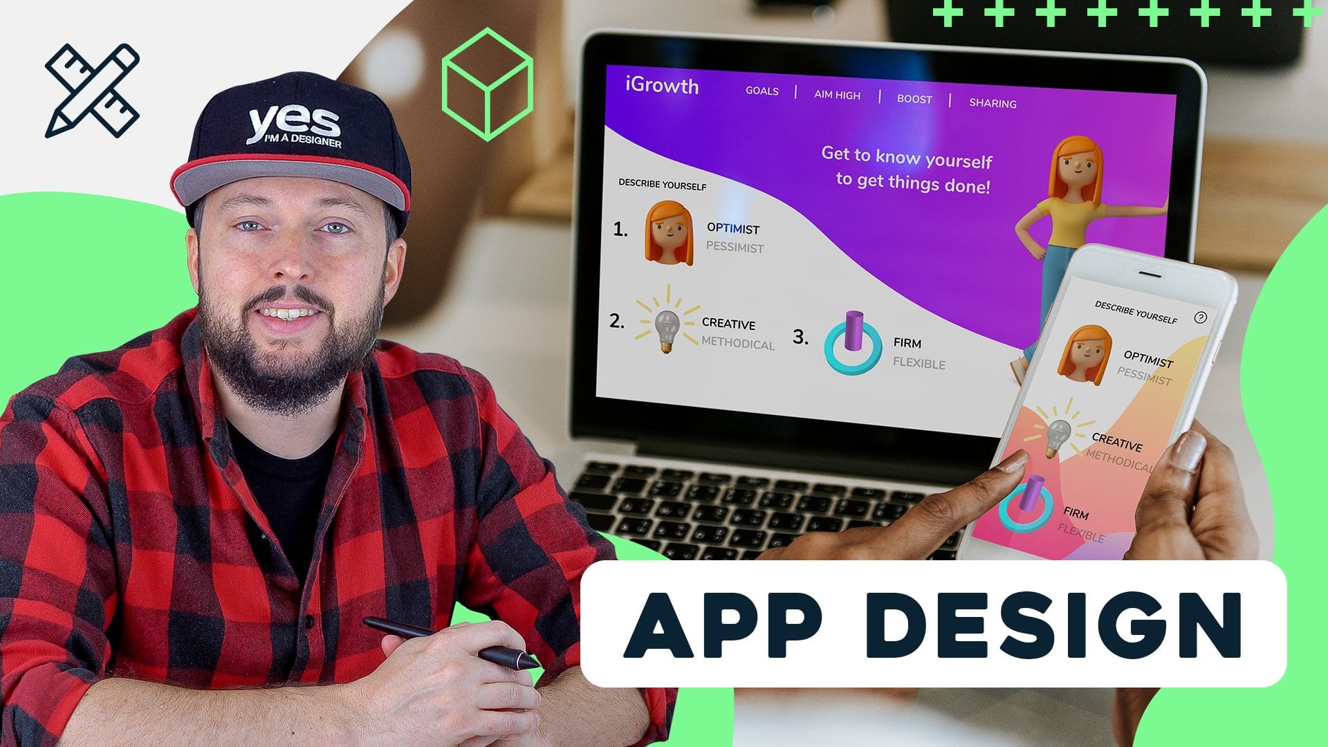
14. App design: He's crazy to think about it, but nowadays you can pretty
much do anything just using your mobile phone without relying on a laptop
or desktop computer. I still remember that
buying something online was really complex and it's something that I
definitely wouldn't have used my mobile phone for. But now this is the
complete opposite. And even banking is something
that I would prefer to do on my mobile compared
to using my computer. And the main reason
for that is because mobile devices and
mobile apps in particular improved so much
in the last couple of years. And especially in terms
of their usability, that they are
actually exceeding, are performing better
than most websites. Now in this video, I
just would like to give you a few examples or interesting things
that an app designer would need to consider
in their work. But of course, this
is a huge topic. And to be able to see
AB design in action, I'm actually going to show
you a specific project from start to finish in a couple of videos
after this one, using Adobe XD app
design projects like usually all other
graphic design projects would start in the
research phase. And this is where it
is easiest to make any changes to your
projects direction. And then receiving
this one to tend to 100th rule for change, which means that you
can either spend $1 at the very beginning in this research phase
to amend the project. Or you wouldn't be
spending ten times more than that if you are already
in the design stage, or even worse, you can
spend a 100 times more than that if your project is
already in development. And this is why it is
so important to first start on a high level planning, which we discussed already
would be a UX designers task. So that's the strategy phase
and identifying the problem. And once all the
important functions and features of an app
are all identified, the user interface
designers can start working on various prototypes. Now, normally they
would start with these low fidelity prototypes, which are simple sketches concentrating on the layout
and structure of each screen. And once these are
tested and approved, they can move on to creating more high fidelity prototypes, which look very similarly
to the final version. But in most cases, they would also already functions similarly
to the final product. So you can consider this as pilot versions of
the final product. These are extremely useful for everyone involved in
the design process, including the client as well. Of course, I most importantly, it is also going to help
a lot when it comes to transitioning from the design
to actual development. So the designers has to pause their work
to the developers. And having a functioning
prototype like this, where the interactions
are all made visible is going to make
everything much clearer. And it can save a lot of
time and money getting everything right in
much less stages. So here's an example of a high fidelity prototype
created in Adobe XD. And this is actually
something that we will take a closer look in the
next couple of videos. But just to show
you how it works, I'm just going to press
Command or Control Enter. And that gives us the final version of
this app in Adobe XD. So here we can already start the interaction and click on
different elements and we can see how it's going to affect all the elements
in the design. We can jump to other pages. We can switch
between these pages. We even have a menu
where we can once again jumped to different pages or screens within the app. And then we can
also jump back to the home screen and there's even a little bit of
information up here. The great thing about Adobe
XD is that you can even test every design that you are doing directly on your mobile device, as long as it's connected
to your computer. And this type of immediate
feedback can be extremely useful when you want to make
things more user-friendly. So you can test out
things yourself as soon as you create something
in the application. Now you may have heard of
software or economics, and this is actually
a specialized field which deals mainly with the interactions of a user when using a software
or application, or in this case, an app
on a mobile device. We've seen a few
examples of usability, and we also discussed
that the areas closer to someone's thumb is going to be ideal placement for primary
navigational elements. By another important, essential thing you need to
keep in mind is that most elements in your design that you
want the user to interact with needs to be
around ten millimeters in size. Anything smaller than that
would be quite tricky for most people to be able
to precisely tap on. It can be extremely frustrating when you can't make
something work. So this is definitely something that every app designer
has to keep in mind. And for this reason, limiting the amount of
options, for instance, on the main navigational area, which we will normally refer
to as tab bar to a minimal. So in this case there's
only three of these. And there's these really nice
animations that of course, in some apps you would see, which can just make
the aesthetics of an app more unique
and more engaging. Here's another great
example of a tab bar applying one of the principles that we've talked about
in the previous video. So we can see that
by only showing either the name of a
function or the icon, we can simplify the interface. And instead of having
eight elements, if there's only four at
each time that we can see. This is a very clever
way of indicating the selected tab or screen
that the user is on. So that's the one
that comes up in written form or the other
state in iconic form. You might also remember Jacobs law was saying
that you should stick to familiar scenarios and
that also applies to familiar icons or formats
of certain design elements. And the hamburger icon for
menus can be considered one of these standard elements that everyone will know how to use. And we'll expect to
see an overlay like this showing up whenever
they are tapping on it. The way that the tab bar or the hamburger
menu will operate. And at peer can all be perfectly recreate it in a prototype
using tools like Adobe XD. And we will see examples
of this shortly. And there's one last very
important aspect of designing for mobile devices compared
to designing a website, for instance, and that
is the use of gestures. Now these became more
so standard than almost every user would expect
to be able to use them. Depending on the type of app. Of course, you can use
these gestures for very specific things or things that users
would normally expect, like pinching or
spreading would be zooming in and
out, for instance.
15. Intuitive tools for web design: Now in case you are
more of a visual person but still interested to
get into web design. One question you might be asking whether you can get a job or whether you can get
into this sector without knowing
anything about coding. And the good news is
that of course you can, and you can even create fully
functioning websites or prototypes relying on tools like Adobe XD examples we've seen
in the previous videos. But there's also
tools like Webflow, which can create and even
deploy fully functioning websites without you having to write a single line of code. Now the Webflow is not part
of the creative cloud, is still going to be a fairly
easy tool to pick up for most graphic designers because of the familiarity
of the interface. Well, we will see this in
action together with Adobe XD used for a web design project in the next couple of videos. Within the Creative Cloud, we also have Adobe Spark, which is a great tool
that you can use to build lending pages
quickly and easily, once again, without
doing any coding. And there used to be
another tool within the Creative Cloud
called Adobe Muse, which was similar to Webflow, but unfortunately it is
now discontinued and Adobe is not developing
it any further. I also like to mention
thrive architect, which is the tool that we're using for our WordPress site. That again is a great
drag-and-drop type of Builder, which makes customizing WordPress
themes and templates so much easier than once
again to rely on coding. So to answer the
original question, yes, you can do web design
without coding knowledge. And by using tools like these, you can get really
far in your projects, maybe even to a final product. However, if you have basic understanding
of coding languages, it will be much easier
to be able to work with developers whenever it is necessary to have them
involved in your projects. So in case you are
interested to see how Webflow can be used
in combination with XD. In the next couple of videos, I will show you an
example of this.
16. Adobe XD + Webflow workflow - Getting started: Before we get started, I just wanted to
show you two sites that were built in Webflow. And they show and highlight some of the cool features
that you can use, like these parallax effects that you will see
further down here, the interactions on
hover and page scroll. And we can see that also this
is a fully responsive side. So when I changed the
size of my browser, it adapts to it. Now, the best thing
again is in Webflow, you can do this without
writing a single line of code and you will see
exactly how it's done. But here's another
really nice side. I'm just going to refresh it so you can see how it loads up. We have some really neat
animations and effects here. And you can see a lot of
things going on here. Cooler facts, really
nice transitions. And then once again,
this is all responsive. And we have some
nice menus here, even cursor effects and
so on and so forth. Now if you go on Webflow side, you can find these
examples in the showcase. But I'm going to start a
new project as I promised. So without any further
delay, let's get started. I'm going to pick the blank side and I'm just going to
call this nature photo. I'm going to create the project. Now here we are in
the Webflow builder. And if you're familiar
with Adobe products, you will find the layout and the user interface
quite similar. So on the left side
we have the toolbar, then we have panels, and we have also
selected here on the top to change
the view between different platforms or
screen resolutions. But I'm going to tell you more
about this as we go along. So first of all, I will show
you in XD what I created. So this is the
visual for the side, the main page of the website. In XD, you can use the
command scroll or Control scroll to zoom in and out quickly and Command
or Control 0, just like in Photoshop
and Illustrator to fit the page or art
board to the screen. So you can see it's a
fairly simple site. We have a header, we have a mean slider on the top and
a couple of things below. Now, I'm going to
make it slightly longer in the actual
Webflow, a project. But for now, this is all
that we need to note in XD when you start
creating your mockups, you can also create prototypes. So create multiple pages
and even trying out how he's going to work when
you switch between the pages. But for now, I'm just going to show you that when
you are ready, you can go into the File
menu and choose Export, All Artboards or batch. Or you can even have
a selection and then export only the selected items. But before we jump into Webflow, let me just show you
one thing here in XD, which also is an
amazing feature, especially when
you're working on these visuals or mock-ups. I'm first of all
going to double-click on the art board and
drag it further down. So we have a little
bit more space here. And let's just say this layout that I have in the
camera and the text next to it is something I
would like to have more off. So I would like to
have a couple of features listed below this. For this, you can use the
Repeat Grid feature in XD. You can press
Command or Control R or click on this icon
here on the right. And that creates a grid from it, which means you can then drag it down and you can
duplicate things as easily as that in
both directions and then just work perfectly
but also horizontally. Now, the best thing about
this is that we can make amends to each of these items without
messing up the grid. So let me show you what I mean. I'm going to zoom a
little bit closer. For example, if I want to change the text on this second item, which would be wildlife
at your fingertips. You will see that it's not changing anything on
top and the bottom. And to replace the image, it's best to drag and drop all three images that
you want it to use. So if I drag and
drop them in here, it's going to update all three
images at the same time. Now the cool thing
about this is that since this is still
a repeat grid, I can select it, adjust the spacing between
them will at the same time, I can also continue adding
more images at the bottom. And notice that it's
going to repeat with the first one in that column. But of course I can make
additional amounts, like selecting the text, double-click on it, and
start moving it around. Notice how it's updating all
of them at the same time, or just simply increase
the size of the text. And without messing up the copy, they are all moving
at the same time. And this is just one
of many things that I love about working in Adobe XD, especially for web design. It is really a rapid prototyping
tool from which you can get started and turning it into a working functioning
website in Webflow.
17. Adobe XD + Webflow workflow - Importing design to Webflow: But I have already
everything prepared so we can just reach back
into the browser. Now, the first thing
that we need to do is to add the header. For this. I am going to click on
the plus sign here. And you can see that we have a couple of pre-built
layouts here, but what we need to start
with is the navigation bar. So I'm just going to drag
and drop that in here. Now, if you start
off without having any sections in your design, that might be a
problem later on. So I recommend to do that first. And obviously you can
do this later as well, because you can drag and drop every element easily from
one place to another. I'm just going to drag
this section and you can see I can use the
navigator as well to decide where this
is going to be or here in the actual
viewer or layout area. So I'm just going to drop
it here on the top and then drag the nav bar
into the section, just like in the layers panel, you can see exactly now
Navbar is inside the section. So now that's ready. We can put our first
image inside this box. There's a very handy
shortcut in Webflow. And if you press
Command or Control E, that's going to give
you the quick fine. And if I just type
in image and then press Enter is going
to place it in already inside that selected
item so we can see it now inside the brand section, we have the image. Now I can choose image and we can just simply drag and
drop images in here, I'm going to use finder and select the image that we need, the logo and just drag
and drop it here. And you can also drag and drop multiple elements or images at the same time and add them into the SAS Library in Webflow. By the way, you can also
switch to that view by pressing G on the keyboard. So you can always
see all your assets or just click on this
icon here on the left, there's also a shortcut
for the Navigator, which is z, or click on
this icon here on the left. So now that we have
the image in place, I can start refining the
spacing and the padding. So what I'm going to do is
to add a margin above it. And notice I'm just simply dragging up and
down these numbers. But what's even cooler is if
you hold down the Shift key, you can increase and decrease
these values all at once, So in all directions. Or if you use the Alt or Option
key dragging up and down, it's going to change the
opposite sides simultaneously. Again, holding down
Alt or Option key, clicking on a number, you can reset it. So I can very
quickly reset these and then still holding
down Alt or Option, I'm just going to increase
the top and bottom margins. And then I am going
to also reduce the size by holding down
the Alt key or Option key. You can also click and
drag left and right on any values and you can very quickly update them
or change them. So now I can just set it
up to probably around 70%. I think that's a good
size for the logo and for the actual
navigation links. I can select the whole menu
and I can continue doing the same thing so
I can move them further down,
something like that. And then of course we can
start changing these. So here I'm just going
to type in magazines. And then I'm going
to select this one. And I think in the
original design, if we go back to XD, the next one is school. So once again, just simply double-click and
start typing them in. Now if we need more navigation
options on the top, we can just simply
hold down the Alt or Option key and
drag one of these, place it where it needs to go. Once again, let's check
the next one is authors. So I'm just going to
double-click type that in. And then we can also do
the same thing by using Command C or Control C to copy and then Command
or Control V to paste. You can see how quickly we
added another one again. And I can just type in one
mole portfolio is for now. Now I'm not going to spend more time on the
navigation bar for now. Let's move on to a more
exciting element, the slider. So for this, I'm going to
again create a new section. So you can see our
first section is here. I'm going to just select it
and create a class for it, which is useful
because then later on we can reuse this
class if you need to. I'm just going to call it
navigation or main menu, maybe, something like that. Now let's create a new section. We go into the ad
options and then drag this section right
here under the nav bar. For this section, I'm going
to use another element. Quickfind is probably the
easiest Command or Control E, type in slider and then Enter. So that's already placed then, now the height four, this should be different. So I'm just going
to find the size. It's up here. So instead of automatic height, I'm going to define
this to be 400 pixels, maybe even bigger, 500 pixels. For now, we can change
this always liter, but that's a good size. And I am going to show you
that here in the navigator. If we open this up, you can already see that
we have two slides. And also here at the bottom, we can see that
now in slide one, I am going to place
in the first image. And the best way
to place it in is instead of dragging and
dropping an image inside it, I am going to use this
background option. So click on the plus
sign and you see by default is going to add
the background image. Then we can choose the image. And once again, from the Finder, I'm just going to drag and
drop one of these images in. Let's just drop in few more. So I'm going to select this one. And then maybe the pelicans as just drag and drop or
three of them in here. Now, out of these, I'm going
to select the first one. Of course, you want to minimize
the size of your images. So if they are really
high resolution, it might take long
for the site to load. But that's actually one of the biggest advantages
of airflow, that if you are hosting
your site with them, the speed is incredible. So the science
loads really fast. It's really well optimized both the code and
the hosting as well. Now I'm going to go
back to the images. Once again, choose Image and
I start with the image one. But it's important that instead
of using it as a pattern, we want to set it to cover. We can also pin the position to the center point or any
points of the image. So if I want to see a little
bit more of the bottom part, then we can pin
it at the bottom. Now I'm going to set
it to the center so we can see the night sky
with the Northern Lights. And I'm going to switch to Slide two and repeat
the same thing. So once again, we
go to backgrounds, choose the image for this. I'm going to choose this
second one, Canyon, and I'm going to set
it to cover and then pin it to whichever
part makes sense. I think this time it's probably good to have
it here on the top. Now, if you want to
add that third slide, the easiest way to do that is
to go to the Settings tab. And then there we can choose Add slide is better to
do it then copy pasting, because if you're
copying a slide, they might get connected. So one of them will be the parent and the
other one is the child. And then you just have to
fiddle around a bit more to divide them or separate
them this way. I think it's faster. So now that we have slide three, we can go back into
the style Options. And then here further down, we go into the image and then
choose a different image, and we choose this one. Once again, it's
already set to cover. It seems we just need
to change the position. Probably Center will
work for this one. Yeah, I like it. Now, the only thing I'm
going to change is to go back to the main
size of the slider. So I'm going to select
the slider and then maybe increase this to 550 pixels. Yes, something like that. Now at any point, if you want to test out how your site works, you can use Command
or Control shift P, shortcut in which
you can test it out. And by default the slider is
not going to move around. So we can only manually switch between the three
images that we added. And of course, depending
on the screen size, we will see different parts
of it in the preview. We can already switched to, let's say the tablet
size in which I can see a slightly different
proportion in the image. And notice that already
the menu switched into a mobile friendly
menu, which is quite nice. You can also see how it's
going to look like on mobile. So we can go back to
the design mode with the same shortcut Command
or Control shift P, or click on the icon
here on the top. So there we are, We are back. And I'm going to select the slider and go
into the settings. And I would like it to
automatically play the sides. So I'm going to just
add that option. And then we can set up all
kinds of other things. Like instead of the
animation type that we had, we can choose fade over, which is quite nice. So let me just show you
this one small we're going to preview and I just
read a little bit longer. And then we will get the feed or we can also see it when
we're switching between them. Alright, so that's all we
needed to do for the slider.
18. Adobe XD + Webflow workflow - Adding animations: Now I'm going to show you
a really cool feature how to add an
animation on the side. That flow has an integration
with a site called Lottie, and you can find this element
here on the left side. First of all, let's just add another section at the bottom. And I'm going to go back
to adding elements, scroll all the way down, and then you will see it here in the media section,
latae animation. I'm going to drag and drop that element into
this new section. And if I scroll a
bit further down, you can already see it here. And to find some
sample animations, we can go to this link, Latif files, and it opens up the website where you will need to create an account
for yourself. And then you can download
these pre-made animations. Now some of them are paid, but there's also free ones. So for example, if I
just type in camera, we can find a lot
of cool animations. And here's one which
is completely free. So all you have to do is to
download this JSON file. Once you download that, you can import the
street into Webflow. And this is the file format
that you need to use even when you are creating something yourself in After Effects. And that's a really
cool aspect of this. Again, an integration between the Adobe Creative Cloud Webflow that it's really nicely
connecting these tools together. If this is something
you would like to learn more about and you
would like to see me creating something
in after effects than preparing it for Webflow. Let me know in the
comments section below, and I will be glad to record a separate tutorial
on this topic. But coming back to the designer, I have this file
already downloaded so we can just add
it to our assets. Here is the file JSON, and I'm just going to
drag and drop it in. Now it's added. I can just replace it with this one and it's
already on the site, but you won't see it unless
you go into the preview mode. You can see at the
moment, it's huge. Now to fix this, we need to have a separate
element within the section. So what I normally do
if I want to constrain an element is either use
a container or a block. I'm going to use
Command or Control E and then type in div. And they've blocked comes up. So now that we have this, we can just set it up so that the animation is
inside the block. Then we select the def block and from the settings
here on the right, we can set up its size. So I am going to use for
the width, maybe 200, and then for the height, maybe a 150,
something like that. And then with this icon here, we can center it. So the DFF block is
now in the center. So let's see the preview
how this looks like. And I think that looks perfect. So that's how quick and easy it was to set up this animation. And we can go back into
the settings and make sure that the animation
keeps playing. So when the animation
itself is selected, we can go to the settings
and just simply choose loop. Now just to make
sure you understand how quick and easy this was, I'm going to replace this
animation with another one. So I just go back
to Latif files. And here's another
one which just shows the aperture and how it's
changing, which is quite cool. If I click on this, once again, this is a free animation
from Latif files. I'm going to download
the JSON file. So now that the
file is downloaded, we can go back to Webflow
and we can go into our assets and just simply
drag and drop the file n. So that is the
aperture File JSON. And then all we have to do
is from the media assets, we can just drag and drop
this into the def block. Can click on Preview animation
here on the right side, and we can already
see it working. So once again, that's how
quick and easy it is to add animations to
your web designs.
19. Adobe XD + Webflow workflow - Scroll animations: Now let me switch back to XD to show you the next
part of the page. I'm going to actually
skip this bit here in the middle
because I would like to focus on this bottom
part where I'm going more into the features
of these magazines. And the first one is about the cameras and gear
tested in the field. So for this, I
would like to start introducing some
parallax animations now just to have something
to be able to scroll up and down and be able to
see the parallax effect. I'm going to add
another element here. In this time, a container. I'm going to use Command
E and typing container. There it is. Just make sure it's not
inside the if block. I'm just going to drag it out. Yeah, there it is. And I'm going to
place an image inside this and choose the image. Let's just choose the magazine. And there it is. Now we can create a new
section at the bottom. So let's go to the
plus sign section and then drag and drop it all
the way here at the bottom. So notice that we can't
add this section inside another section that's
completely normal. Now that we have
our section here, I'm going to use another
element called columns, which will give us the
settings whether we want 234 or any types of columns. I'm going to pick two. And also notice that
we can already set up the size or division
between these columns. I actually would like slightly
more space on the right for this first feature than
here in this left column. So column one, I would
like to place an image. So I'm going to again type
in image, place it in, and then choose the image, and just drag and drop the
camera into our library. And once it's uploaded, we can select it and
it's already there. Now on the right side, I would like to have text, so I'm going to add a
heading first of all. And then I'm going to add another element paragraph using this shortcut really
feels like I'm in InDesign where we have Quick Apply with Command or
Control Return or Enter. Even the shortcut
is almost the same. So I really like this. It feels really natural. Now I'm going to just
make some adjustments for the paragraph. I would like to have some
padding from the right. So I'm just going to squeeze it in a little bit like that. And then I am going to just
type in here Camera tests. It doesn't really matter
what we right there for now. And I'm going to have some
more margin from the top. Then I select the
image and we will also have a margin
from the left. I'm going to make this smaller. So all left drag the maximum
width, something like that. Then from the position,
I'm going to open, float and clear and
choose the right option. So position the element to the right of it in that column. And then maybe I'm just going
to increase the margin a bit more on the text,
something like that. And now we can start adding
our parallax effect. What you need to use
is an interaction. So I select the image, I go to interactions
here on the right. Choose the plus sign on
the element trigger, then choose while scrolling
in view, then choose, Select action and create
a new scroll animation. Now, this is a really
powerful editor where you can create all kinds of cool animations and you can combine multiple
movements as well. In this case, I'm
going to start with a simple move transformation. So select Move. And by default, when you
see underscore elections, when you select
something is going to create a start and an end point. Now, for this to work, you need to define something. For the start point. I'm actually going to
define the endpoint first because this is
where I want it to be. So I'm going to just type in 00 pixels in the x and y values. Then I go back to the start point and I'm going
to move it to the left. So I want it to come
from the left side. And for the y value, I'm just going to
type in 0 pixel ones. The little exclamation
mark disappears. It means that the animation
can work now and we can even test it out by turning this
live preview feature on. So if I scroll up and down, we can see that the
camera is coming from the left into the
side, which is great. But to be able to
see it properly, I'm going to add another
section to the page. So let's just drop
as section here at the bottom in the
navigator, it's easier. I'm going to go into the
options for this and type in 800 so we have more
space to scroll down, select the image again, and then I'm going to go
back to interactions. And by the way, it's good to rename your interactions like this
one by scrolling in view, I am going to select
it and change the scroll animations
name because this is something that we
can reuse if we want it to. So I'm just going to
rename it and call it fade in from left. I'd like to derive
the directions in capitals usually
feed him from left. That's nice. But if I want to
make changes to it, we can just click
on the cog icon. And I am going to add an additional scroll action because I would like
it also to fade in. So I want opacity or
so to be animated. And I would like to add an
additional opacity keyframe. We can also call these. So there's our opacity at 100%. I'm just going to
select it and we can see opacity is a 100%, but it should start
with 0 per cent. So if we turn the
live preview on, this should already work. I'm not sure why this
didn't register. Let's just set it up again. 0, That's it. Now, turn the preview on. Then as we scroll up and down, we can see how that looks like. Now, I actually would like the opacity to start already on, let's say 20 per cent. So if I go up and scroll down, you can see how that changed it. And also I would like the opacity and also
the movement to arrive to its final destination
or end point before it leaves our
viewport or screen. So I'm going to set it up
a little bit further up. So the end point is going
to be around 6070 per cent. So if you check this out, you will see that now it reaches
the center a bit faster. I would say even
earlier is better. It'd be 50, 60%. The movement should be actually before the
opacity or the fade, or very close to each
other, something like that. So now let's test it out. Yeah, that feels nice. So it arrives to its final destination around when it's at the
center of the screen, which I think works really well. And of course you
can add all kinds of different things
like rotation. Again, we just going to
scroll elections, rotate, and then we can set it up so the Z rotation is
0 at this point. So that's again the end point. Then we add the starting
point for rotate. We just add that here and
then drag it to the top and then change the z rotation
maybe slightly to the left. Now once again, if it has
this out, Let's scroll down. We'll see there's
a subtle rotation as well added in there, which is really nice.
20. Adobe XD + Webflow workflow - Out-of-bounds effect with parallax scrolling: Now on the next object, Let's take the parallax
effect even further. I'm going to create a cool out-of-bounds effect
with this image, which we've seen already in XD. Now, what I've done here in
Photoshop is that I prepared already the background and the bird in two separate images. So originally this
is one photograph. But what I've done is
to remove the eagle. And I just have the
background for this. I use content aware fill. And on a separate layer, I separated the bird from the background by
using simply masking. I use the pen tool, drew the path around the eagle. It took some time, but now I
have it completely isolated. So what I am going to do is to save these two
images separately. I will have the background
saved as a JPEG and the bird layer as a PNG because I need the
transparency for this to work. Now, you can do this
in Photoshop very easily by selecting both layers. And you can right-click
and choose Export As. Once you are in there, you can select the
layer that you want to save as a JPEG setup, the quality probably
to 60% usually is a good idea to do and also make sure that
you reduce the size. So in this case, the
scale can be much lower. Probably the width
can be around 600. For this website, I
think that's enough. And you can see already
it's 60 kilobytes. So fi size is always important to reduce
as much as we can. But then we can select the
bird layer and then we can set it to PNG so we
have transparency there. But once again, the
width should be lower. Again, 600 pixel in this
case, should be fine. Now, this is slightly bigger, but we can always try to use the smaller file
size with eight bit. Then it becomes much smaller and I think
it still looks good. So I already have
this saved out. So let me show you how I
put it together in Webflow. So here we already have a
section prepared at the bottom, and I'm going to just
drop a column in here. So I select the section, use the shortcut
Command or Control E, and then type columns. Then I am going to use
the same settings, probably five on the left side, seven on the right. We can already add a bit of margins just so we
separate it from the top. And then on the left side, I am going to actually
add a div block. So once again, we start
typing it in, pasting it in. I use the same shortcut
again for the quick edit. So we have the block in here. The reason I use a diblock because first we need to create a background and then place
the image on top of that. So the book itself
is going to use the background by
adding it from here, backgrounds click on the plus
sign and then choose image. And we will need to drag and drop these images that I saved. So the PNG and the background, so the bird back. So let's just drag and
drop them in here. And I'm going to
select for this block. I'm going to select that bird back which is already selected. It's great. We can just set
it to be a cover. Set the position to center. And then we can go to
the actual size of this. I'm going to set up the
height to maybe 600. Let's just see how that looks. Okay, so that's a
little bit too big. Let's make it 300. And then the width also 300. Okay, that works quite well. I can now align this
to the center of the frame and then maybe add a little bit more margin
here on the left side. I'm just going to do
something like that. Okay, that works well. Now we can add an image
inside this div blocks. So even though we
have an image already inside it that is just the
background of the block, but we can still place
an image inside it. So this is really the trick. So what I'm going to do
is to use the shortcut Command E and then
start typing image. And notice this
will already show up here in the navigator
inside the diblock. So now we can choose our image, and that is the bird PNG. So that's already there. And we can again just adjust
the margin, drag it down. Once again, it feels like
working in Photoshop, moving things around so easily. I love this about Webflow. So I'm just going to set it
up somewhere around there. I think that's good. And now that we
have it in place, we can go to interactions. Click on the plus
sign on the element, trigger and choose
the same option as on the camera while
scrolling in view. Then select the play
scroll animation option. And this time we will create
a new scroll animation. We could use the same one
as we had on the camera. But instead I'm going to create a new one because this will
be slightly different. We'll start with the movement. So I add the movement
and the start point. I want it to be where it is. So I'm just going to
type in 00 for x and y. And then the end point, I'm going to move it further to the right, something like that. That's enough out of bounds. I think I don't want it
to go over the text, which will be on the right side. So that's already good. But we can just move this a little bit higher up,
something like that. And don't forget to add 0 for y. The y value doesn't change, but you still have
to add the number there for the animation to work. Now this is all set up. We can turn on the preview and once
again scroll up and down. We can see how it works. Okay, that's great. And we can add a bit
of rotation as well. So let's choose Rotate. I'm going to put this here so
it can arrive to how it is. So I'm just going to add
z rotation 0 degrees, and then I'm going to add another rotation here in
the beginning where I'm going to set the
rotation to actually, yeah, somewhere, maybe there. Okay. And then the other one can be slightly rotated higher up? Yes, something like this. Let's check the preview again. If I scroll up and down, we can see the nice
movement there. So the eagle is going outside of the frame and also
slightly rotating. Now of course, this is again
just scratching the surface of what's possible
interactions in Webflow. So if you are creative, you can utilize this
and really create some amazing effects
on your web design. And of course, the site
already without me doing anything, is
already responsive. Of course, you can refine the responsive settings
if you go into the tablet size and then the landscape and
portray mobile sizes. And because Webflow is handling all the CSS in the background, if you are making changes
in one breakpoint is not going to affect
the other breakpoints. So just as an example, if I want it to move
these elements around, I can go in and
adjust the margin, move it a little bit up, and then our logo, we can move it further
to the center, in this case,
something like that. And now if I switch back to the desktop size or the tablet, you see not affected at all, but in the mobile size, we can see how nicely
it's positioned.
21. Design systems: A design system is a library of user interface elements and other components that
share a common language. Using a design system can ensure that you can
maintain harmony in case of a larger and
more complex verb or digital project. Now it is not to be
confused with a UI kit or a style guide because
these are usually also part of the design system, which would also normally hold the following main categories. The building blocks,
the pattern library, and the rules which can
make all the elements work. Just to see a few examples
of design systems. Here's Apple's human
interface guidelines. We can start with any
of these platforms, but maybe let's
concentrate on iOS. Within reach, we
will be able to find all the relevant information
that makes sure that most apps on the App Store will feel and behave
in a similar way. So it has categories like app, architecture, user
interaction within reach. If we just jumped to drag
and drop, for instance, we can see this being explained
how it needs to be used, and what is the expected
outcome of these user actions. Microsoft design system
is called fluent, which is also cross-platform. And again, we can find all the relevant
information on this site. Google's design system is called Material Design is three, that's the current or
most recent version, and it highlights a few new
features in this iteration. So it has updated components,
libraries and guidelines, including design for
foldable devices, the implementation
of dynamic color, and things that are
new in Android 12th. But there is also an
interesting term here, design tokens, which is a very common dimension
thing in design systems. These are essentially
the building blocks of a design system. They add the smallest species of style values and they can
define anything from color, typography, spacing,
even animation. Probably one of the
biggest advantages of design tokens is
that they can also record the changes in design system as it
continues to evolve. And atomic design is
another term that is very commonly used when we
refer to design systems. And essentially it means
that you would have the smallest components
considered, the atoms. And these are the simplest
building blocks like a label and input field
textbooks or a button. Why? When you start
combining these atoms, you would create molecules which could be more
complex components. Several molecules together would form an organism which could be a whole section within
a screen or interface. Now just to demonstrate
this in Adobe XD, I have spectrum, which is
Adobe's design system. And this is actually
a free plugin that you can install for XD, but in which we can find that these components like a
button which we can add, which will already have
all the attributes setup. And we can of course
make changes to it. We can find the
different states for it, for instance, and immediately
updates here in the design. We can of course, update
the label itself. And we can also change the color theme
from light to dark, or even switch to
the wireframe mode. Now going back to
the components list, we can find all these other
elements like combo box, which again would have a lot of options here that we can change. Now, as I mentioned, that UI kit would be part of
a design system. And in this case, this is the
cards UI kit for spectrum. And I can zoom closer so we
can see the style and grid of these cards where we have the different orientations
and variations on cards. And it also includes all the
different types of cards, depending where they would be showing up in the interface. And just so you understand
how these cards are used, if I switch to the
Creative Cloud app, immediately we can
see these cards showing up here
within the interface. So this is all defined in the spectrum design system
that we've just seen. Again, the key thing about
design systems is consistency, making sure that everywhere all the elements will look familiar and similar
to one another. Good design system, of course, also allows some flexibility, which means it would leave
room for improvement and allows the system itself
to evolve and get better. And as we've seen with the
examples that we went through, another very important
aspect of a design system is that it has to be
very well-documented. And that means it has to
not only be detailed, but also updated on
a regular basis. Now in case you
are interested to learn more about design systems, makes sure you check out these few examples that I
have here on the board. And as a final note, I wanted to also mention
that nowadays there are also illustration systems which are very similar to a design system, but these focus on actual
illustrative elements, whether they are
static or animated. And a great example for this is the Google Chrome Operating
Systems illustration system, which has a very
specific visual style that again ensures that all the elements will feel related and part of
the same family. Now, since we can
already see a couple of amazing icons here
in our next video, we will be discussing icon
design in more detail.
22. Icon design: Icon design is a
specialized field within web and digital design. And in this video, we will
talk a little bit about the main principles that
are used in this field, and also a few distinct
styles or trends that affected icon designs in
the last couple of decades. And we will also see
an icon template in Illustrator that shows the underlying structure that's used whenever someone
is designing an icon. But first, let's start with the seven key principles
of icon design. Clarity, which simply just
means that the icon has to be very clear and it should
have an immediate read, making sure that
people will know exactly what the
icon stands for. Readability is something that applies even if you don't have any texts or topography
in your icon. It also can refer to
distance, for instance, between elements or making sure that the lines in the
icon are not too thick, not too thin, so they are just the right amount
for a particular size. Icon. Alignment is also important
to make sure that the icon, especially if it's part of
a set, will feel balanced. And like I mentioned in
case of an icon set, consistency is also of
course, very important. So making sure that the icons in this set are all in harmony. Personality in icons
means that they are unique and they can
be easily recognized. Icons, for instance, can be
abstract, quirky, or playful. Again, depending on
what is the tone of the application or the interface that they are designed for? Brevity essentially refers
to simplicity of an icon. So to make sure
that you only use the necessary amount of details
and not more than that. Think of propositional
density in logo design. And last but not least, ease of use can be achieved
by making sure that an icon family or icon set is
organised, well-documented, and also tested in context in
terms of clarity of icons, here is a great comparison, going from clear and immediately
recognizable icons to the ones that are not necessarily straightforward
or more hazy. And these, by the way, are
all icons used on cars, dashboards in terms of brevity, we can also see an interesting
little comparison here. So on the left side we can have the simplest representation
of a house, a single line. And by introducing more details, we can make the design
a little bit more clearer or more recognizable. And this is probably the
ideal amount of details. While if we add
too much details, it is starting to get too complex for an icon
to work effectively. Since we are talking
about brevity, here is a fun throwback to the
Macintosh icons from 1984. And in this case there were
lots of limitations holding back icon designers
introducing fine details. So first of all, these are
all monochromatic designs, and they also have a very limited amount
of pixels to work with. But sometimes
having limitations, like in this case, can
really improve the designs. And I think these icons still work really well and they
can still be recognized. And it's also just a fun
thing that for saving things, we are still using the
icon of a floppy disk, even though these
are long gone and I don't think anyone is
using them anymore. Now we also mentioned
alignment and how important it is to make icons field balance. And here's a great example that actually optical alignment, in most cases, more important
than geometric alignment. On the top, we can see that the left and the
right sides kept the same distance will make a strange final
result in this case. And that's mainly because
of the distribution of values within this triangle here in the center
compared to, for instance, if we have a stop button, which would have a
block of square, that would make the icon
feel much more symmetrical. In case of a play button, you actually need more space on the left side then
the right side. And this is what we referred
to as optical alignment.
23. Icon design techniques and terms: Now there are two
terms that you cannot avoid when it comes
to icon designs. And here's a great
comparison showing how Apple shifted from the original skeuomorphism to the flat design that we
can see on the right side. This is probably the most
drastic or extreme transition, and it happened in
iOS seven in 2013. And even though the icon
has changed since then, they haven't changed as much as between these two versions. Now the original icon family, as I said, was using
skeuomorphism, which we call when a
design is trying to imitate real life object. So a great example of
this is the new standard, which literally is an
illustrated version of a new standard or
the notes app icon, where we actually can see that little torn paper effect in this realistic looking
rendering of a notepad. The key of skeuomorphism
is that it is trying to be photo realistic and it utilizes textures and a lot of details
by flat design, on the other hand, is the minimalistic approach
which focuses on simplicity, readability, and
usability of an icon set. This type of approach relies
more on negative space, 2-dimensional illustrations,
solid blocks of colors, and simple shapes and forms. Here's also another nice
example of how Google shifted from its original
icon set for Gmail, the calendar app, Google
Drive, Google Docs, and Google Meet or
Hangouts through these more simplified
versions of them. And the main thing that
we can see here again is that these icons are
completely flat. They don't even use any
gradients or shadows anymore. And in general, they
are just much more consistent with each other
compared to the original set. If I want to be picky, that's probably only one of these icons that
still stands out. That's the Google Drive icon, which has a different
thickness of these lines compared to the
other icons in the set. Similar to
skeuomorphism, there is also a new trend called
the newer morphism, which falls somewhere in between flat design
and skeumorphism. It's also sometimes
referred to as soft UI, mainly because of
its soft aesthetics. That comes from the
monochromatic color palate, the soft shadows, and the
low contrast details. Here's another quite
extreme example where an on-off button, which is probably
the most important functional element in this app, is almost invisible,
hardly noticeable, but to balance things
out and to make sure that it's still
going to be usable, it takes up a much larger
space in the screen. So it is really a dominant element and
where it is turned on, it actually stand out much more because of the color contrast. Now in case you're wondering how these subtle shadow effect is achieved in new morphic designs. This is a great comparison that shows or reveals the secret. So in case of a
generic design style, you would have
shadows similar to this around the
card, for instance. And if we are imagining
this object from the side, it feels like this is
floating above the surface. While a new morphic card
with feel like it is part of the surface and only stands out
from its slightly, but it is not floating. So it is more like
an extrusion effect compared to the floating effect that we've seen on the right. So after seeing this, when you look at
another nice example of new morphism used in
an app prototype, you can see how these
subtle shadows and that soft extrusion work on
all of these elements. It is a very
interesting side which obviously not only
relates to icons, but also full interfaces, but it's definitely not
the most usable one. Because remember,
contrast is very important in general,
in UI design. When it comes to
designing icons, it can help to have an icon grid which
will make sure that all of the icons and the family will be consistent and
similar to each other. And in case of the App Store, this is the icon grid
that is used in the iOS, or here is the
illustrator template for the Play Store icon. Once again, we have the
grid on the left side. And a few examples here
on the right of how the icons will look like
In the different formats. And to see how these grids
relate to actual final icons. Here's a few of the examples
from Apple's circular icons. So we can see Safari, the clock, the compass, and
the settings apps, and how the diameter of all
of these circular elements rely on the original large
circle within the grid. And in case of
multiple standard out circular features within icons, they would also relate to these other smaller icons that are also set
within the grid. Using icon grids like these can really ensure that you will get the alignment and consistency of an
icon familiar, right? Last but not least, I just
wanted to show an example of an animated icon where the download button transforms
into a progress bar, which then transforms
into a completion icon. So it's almost like
three icons in one, depending on the actual
status of this process. In general, for icon design, Adobe Illustrator is
the preferred tool. However, to create something
like this animated icon, you would also have to use
a tool like After Effects. And we will actually
discuss this in more detail once we get to the motion
design topic in this course. But now that we've covered
icons in the next video, we can talk about banners.
24. Banner ads: Web banners are similar to
posters and billboards. They are the primary online
advertisement tools. The domain purpose to grab a user's attention
and make them want to interact with the banner to get to the advertiser's website, landing page or app in
the App Store in general, the purpose of banners is to generate traffic
for the advertiser. And while in real life, it is hard to measure the efficiency of a poster or a billboard with web banners. It is actually
something that can be measured and tracked perfectly. And one of the most
important results that is measured is called CTR
or click-through rate, which calculates how frequently people would click on an ad. It's important that CTR is a much better way of
measuring the success or the efficiency of an ad compared to simply just
counting the number of clicks, because it is always
relative to how much people have
seen the adverts. So it's actually
the percentage of relation between the amount of clicks and the amount of
impressions that counts. And the reason why
it is important to understand that the performance of webinars is always going to be measured is
because you're, the designer will be
mainly responsible for how successful
that banner can be. Now the good news is that all the design principles
that we covered in print design and
in other topics of this course will also
apply to web banners. And just to mention
a couple of things, color harmony, contrast,
use of negative space, emphasis of certain elements, and bold typography are
just a few of the things that will help you to make banners standout
and perform well. Now when we talk about
digital ad types, banner ads are actually only
one group out of money. So as you can see, there's lots of
other options like video, advertisement,
pop-up ads, paid social apps, native apps that are integrated
into websites, content, or ads that
appear within mobile app. For instance. Although
these other types of ads would require a
slightly different approach, setting them up compared
to creating banners. The reason why we
are focusing on banners in this video
is because these are still the most
commonly used types of advertisement
in digital space. In terms of the size of banners, There's lots of
different standards and names associated to them. And you can see some
of these listed here. But also interestingly,
you can see the amount of times
these are used. So the most common
one out of all of these is this medium
banner format, which makes up 40% of all
banners on the Internet. Then the second
most common one is this narrow horizontal banner, usually referred
to as leaderboard. Equally commonly used
is the vide skyscraper. The more tool format. And then the rest of
the sizes are used much less in comparison to
these first three. Besides the pixel
dimensions of banners and other very important
aspect is to get the file size of them right? And in general, the
lower it is, the better. But most advertisers would have very specific maximum file size that the designer will have
to make sure you meet. Otherwise you abandon
design, will be rejected. So we can see that for the
smallest banner sizes, the actual file size is limited, usually to 50 kilobytes. And that applies to JPEG, PNGs and gifts in case of static banners and in
case of animated banners, There's a couple of
additional ways measuring how they are going to
affect the page load time. Iab actually refers to the Interactive
Advertising Bureau, which created the
universal guidelines for banner advertisement,
for instance. One of these is that the audio by default in web
banners should be muted and it should
only be allowed to play if the user
decides to play it. Another important guideline is that an ad should always be very clearly distinguishable from
the rest of the environment, in most cases, a
website or an app. But there are also other
rules that will apply to the Bednar designs
like that as should never completely cover
the screen of an app. Compared to the static banners, animated banners can be more effective in getting
people's attention. And they can also tell
more complex stories, which might also be essential
in case you can't fit all the relevant information
into a single static banner. The main file types
that can be used to create these animated
banners are gifts, HTML and MP4 video file format.
25. Social media design: For most people's social
media became one of the most frequently
used source of inspiration, news
and entertainment. All of these platforms are
built in a way to get people hooked and want to spend more
and more time using them. And that is why
they also became so effective as digital
marketing tools. It's enough to just look at
these statistics and see the actual existing data and the rest which
is prediction. So this is showing the social
media advertising spending worldwide in billions
of US dollars. And we can also see
the ratio spent on desktop compared to mobile. The darker blue colors are
the ones on mobile devices. We can see that in 2021, the total spent was
already close to 154 billion US dollars. And according to
this prediction, that trend is going
to continue that we've seen in the
last couple of years. Now, the task of a social media designer who
is specialized in this field would include quite a lot
of different things. First of all, it is about
to create designs for the unique needs of each
social media platform. This can actually be
quite a tricky thing, not just because there's just so many
different platforms, but also they are changing
very frequently and to be up-to-date with all the
requirements and best practices, you have to constantly learn new things and adopt
new workflows. Similarly to the other
videos in this course, I'm just going to
focus on a couple of important terms in
this first video. And we will actually use mainly
Instagram as an example. However, most of these
terms will apply to other social media
platforms as well. And then in the next video, we will analyze
YouTube thumbnails and see what makes some of these more effective than others to attract views on this platform. In all social media platforms, you would have a
timeline which shows the post in the order
that they were released. So having the most
recent one on top, one of the important tasks of a social media designer
is to make sure that there is some harmony
between these posts, especially for platforms
like Instagram, where the timeline is all
about images and videos. And to establish the
harmony in a timeline, you will have to rely on
repeated elements and consistency which can be
applied for a typography, colors that you are using. But it's also
important to make sure that there is also a variety. So you want to make sure
that each post stands out so they don't
all look the same. So it is a fine
balance and it can be tricky sometimes you can see how we are using certain elements,
repeating or recurring. But we also make sure that
there is enough contrast and differences for each of
these posts to look unique. Now outside the regular feed
in most platforms nowadays, you would have also stories, which could have
images or videos. But most importantly, these are in the full-screen
vertical format. And you would have
the option to have multiple screens,
like in this case, we use these additional screens for the 2022 design trends. And I can flip
through them here on the desktop or also of
course, on the mobile. And by default,
these stories would disappear unless they are saved. This one that we have here
in the collections section. Now, social media designer is not only responsible
most of the time for designing actual graphics
for the various platforms, but also to analyze the
performance of the posts. As an example, here is the
back-end or the dashboard where we can see the
analytics of your assignment designers
Pinterest account. And there's a couple
of important terms here on the top that would be pretty much the same on
all social media platforms. And these are the main
indicators of success. So first of all, it's
the impressions. And in this case, this is the
total impressions of all of our images are posts on this platform in
the last 30 days. And then impression
just simply means the number of times post or pin. In this case, we're seeing
on a screen of a user. This is already an
important metric, but probably the most important
one is the engagement. And that can mean how
many times people click through a pin or post
or interact with it, whether they are saving
it or liking it. Again, it can vary
between platforms, but in case of Pinterest, it would count the
clicks and the Saves. And similarly to the ratio between impressions
and engagements, you would also have a
larger total audience. People who check out
your pins and alto, which a certain amount will be your engaged audience
who is actually liking, clicking or interacting in
some ways with your posts. Another important
term to know in social media design is
what is an organic post? We simply just means
that it was created and shared without any
payment involved. So it is essentially
not a promoted post. So for instance, if we jump
to our YouTube channel and I scroll all the way
down here to the bottom. The product reviews that I
have were all paid promotions. So I was supplied by
device, by these companies. And in return, I created
the review video. But it is always
important to make it clear in these type of posts or videos that they are not organic and that they
include paid promotion, buy a specific brand. The reason why I mentioned
this is because that's again, another very important aspect of social media designer's
responsibilities. So besides the actual graphics or designs and the analytics, another crucial
task is to maintain a good brand image throughout every action that's taken
on social media platforms. That includes comments or
replies to people's comments, curation of topics
that are covered, and the general tone of voice used in all of the platforms. So as you can see, even though it might seem
at first step as social media designer's job is fairly simple and
straightforward. It's actually quite complex, and there's a lot
more to it than just designing the actual posts. So if you are interested
to learn more about this field,
in the next video, I'm going to analyze a couple of YouTube thumbnails
from various channels, or in case you would
like to move on. In the next topic,
we will be diving deeper into presentation design.
26. YouTube thumbnail design: One of the most effective way to get people's attention is to have a head shot or a portray
in your YouTube thumbnail. So this can be a single person or it can be a group of people. But probably most importantly, you want to get an
exaggerated emotion. So someone with a very
specific expression. Now some YouTubers like
PewDiePie would use liquify filter to distort the face and again
exaggerate the emotion. While others like pizza
McKinnon, or Gezer, pick a snapshot from
that video that is the most expressive or interesting
from all the expressions. But again, probably
the more extreme ones are more effective. So someone being
scared or Shrugged, or someone's angry, or
someone looks surprise, these work usually the best. Now, you don't always
have to establish an eye contact with the
person in your thumbnail. Or that can also help to increase the effectiveness
of the thumbnail. But for example, with
Lou from unbox seller P, he's always a little bit
further in the background, but he's always staring at you. So here the product of course, is in-focus and
Louise out-of-focus. So there's a little bit
of there that we can see. But still he's always
staring and looking at us with a serious face
in all of his thumbnails. But as I said, you don't always have to have
the eye contact. And you can see how well this
works with this thumbnail, Jeremy Jones looking
to the right. And obviously because this
is about the Invisible Man, we expect something
to be happening on that side may be
outside of the frame. Once again, it's a very
smart and good composition, again, mainly focusing
on a headshot. And remember I mentioned
that you can have multiple people in
your thumbnails. Now, corridor crew
does that really well. They managed to fit so many characters in
their thumbnail. So we have gear out here, we have Baby Yoda. They also have the Mandalorian, plus we have all three
of them in the frame. So even though the
thumbnail gives you a very small
space to work with, they managed to fit so
much information in there. And having all of these
faces or headshots makes it really interesting and a lot of people
would click on it. Now of course, you don't
always have to fill up your thumbnail completely
because negative space, like with every design, can help to really
focus on certain areas. And here the game ranks. We always have these
big empty spaces in the thumbnail because they always use the same
expressive body and this guy in the suit, but then they are
replacing the head always the main characters
portray from a game. Now sometimes this results in very interesting thumbnails, but generally this works
really well once again, because of it being a head shot, but they also utilize the negative space
in their thumbnails. And the technique of using
negative space is also very clear here with unbox
therapists thumbnails, a technique that always improves your designs and
helps to make it more engaging and interesting is whenever you can
establish depth. And to create that, one of these techniques
is to use out-of-bounds. A good example for this
would be rostral thumbnail. Just write it above
me where we can see that the pizza is overlapping. The actual final artwork
here on the right side. This is what I'm talking
about, this section here, that overlap creates more
depth and more interests. So we have that nice
layered effect. And also notice that we have a white outline around the hand. I'm going to talk a little
bit more about that, but that's the sticker effect, which essentially
again, is a way to separate the hand
from the background. So creating a
multi-layered composition. And since we're on
this thumbnail, there's also another
detail here, the frame around the thumbnail, which is actually
part of the design. And notice once again that the depth is really wisely used here because the hand is
in front of that frame. So another very subtle
out-of-bounds effect. If you check out our thumbnails, you will see that
we use this a lot. So we both use a frame and we also use sometimes
the overlapping or out-of-bounds effect that
separates or elevate certain details and
make it look like they are coming
outside of the frame. It's coming back to Peter
McKinnon, thumbnail. We can also see this
out of bounds effect. So this is the
original background or backdrop from his video. Then we have the
shoulders coming outside of that and
overlapping the design, which really nicely integrates everything together in
the whole composition. And although it is very subtle, we can also still see
the overlap here. The shoulder just very gently
overlapping the poster. Now having texting
your thumbnails can be very effective again, because a lot of people, when they scroll through, whether they are on
their mobile phone or the error on the computer. They don't necessarily
look at the titles. They would just skim through and look at the visual
as the thumbnails. So having texting
the thumbnail can be a good strategy to get
people's attention. Make sure they understand
what your video is about. However, it does a couple of
things that you might want to consider if you
decide to do this. First and most importantly, try to avoid clickbait. So whatever you type, either in the title
or in the thumbnail, should always be representative of the topic that
you are covering. So don't fool people into
clicking on your videos because if they don't get the content that
they are expecting, then they won't trust
you and they most likely won't be watching
your videos in the future. Another thing that you might
want to consider is not to repeat the title exactly
in the thumbnail. Maybe you can have something
that extends the title. So instead of trying
to fit in everything, you can simply find a title or even add more context to it. Ian Barnard, for example, managed to fit in a very long
tax here in the thumbnail, seven procreate tips
that will leave you speechless in under
five minutes. So that will be very
long for a title, but it actually
works quite nicely. And although he didn't actually use an out-of-bounds effect, it almost feels like the
iPad is out of the frame. And that's just because of
the composition itself. And also another very
smart technique here is an enlargement or increase
of the size of the head. Make it look even more exaggerated and almost like
a comic book character. When it comes to using
texts in your thumbnails, It's good to be consistent
and make it recognizable. For example, IG N is doing
a brilliant job at that. So we can see that they
have a template or a standard that they use
for their composition. So it's always going to
be on the same angle. It will have this
hard drop shadow behind this outline text. And then we will always
have the title and subtitle nicely
separated and divided. And since we are looking at this thumbnail a
little bit closer, I would like to
also mentioned that they've done a brilliant job at adding this red highlight
on the actresses face. That wasn't there originally. This was added because
they are using this red backdrop here. And to create that
realistic atmosphere, they use this Photoshop effect, which makes it look very
professional and cinematic. Similarly to using tax, you can also include
graphic elements, which can again direct the
attention of the viewers. And these can be circles like in this case
with Ms module, or also bigger elements
like this huge arrow here, and even the separation between
the left and the right, this diagonal white
line can be considered graphic element price tags are extremely useful just like
with advertisement in general. Thumbnails as well. He became a very
commonly used element. Pizza MacKinnon is using these price tags here
on the thumbnail on both sides showing
how much he paid on Fiverr for photo editing. And we also have a nicely
integrated price tag here in this thumbnail from cow. And since we are looking at
this a little bit closer, we can see a couple of things that we
already talked about, like the head shot
here on the right, the title or texts to
repeat it in the thumbnail. And a very subtle overlap once again with the
shoulder and the tire, just to establish that.
27. How to make thumbnail images stand out?: Contrast is one of the most
important aspects of design, and it also applies to
YouTube thumbnails. So you can utilize contrast
in many different ways. You can either put
contrasting colors together, contrasting tonal
values together. And you can also create contrast
by using adjustments and filters like sharpening
and saturation. Now, here's a good example
of a thumbnail that was auto-generated
from the video itself. So this is something that you
should always avoid them. Always make sure that you
create a custom thumbnail, instead of relying on the YouTube engine that would generate
thumbnails for you. This is the actual thumbnail on YouTube for the announcement
trailer for season for, for the amazing series called
Last Kingdom on Netflix. And this is clearly just a snapshot from
the video itself. It wasn't designed or created
as a custom thumbnail. So I would like to show you
how this can be improved by introducing contrast
and make it more exciting. The best filter, what
I would normally use is the Camera Raw Filter. But before you would
normally apply this, you should choose Convert
for Smart Filters that makes sure that the layer that
you're working with is turned into a smart object. So then you can use
it non-destructively. I'm going to go into
Camera Raw Filter, which opens up this
separate editing area. Now here what you
would normally want to do is to create almost like a HDR toning effect where you increase the shadows,
increase the exposure. Probably you can go
even further than that, really
exaggerate everything. And then you can
probably increase highlights a little bit
by whites and blacks. You can also drag to
the right or the left, whichever creates more contrast. In this case, dragging it to
the left is probably better. I feel like we can still have a little bit
more brightness here. And for this, I would
use the adjustment brush with which I am going to paint over this darker
part of the face. And then you can see we can selectively increase the
exposure that as well. I'm going to go back to
the additional settings. And once we have the tonal
values, setup correctly, so we can see before and
after I'm just pressing P on the keyboard that already
make a huge difference. And don't forget, we
are always thinking on using a small thumbnail because that's what
people are going to see. We're not seeing
the whole image. So for this small detail, it has to really pop
and be very expressive. And to increase the
contrast even further, we can add also clarity. So that's usually
works quite nicely. We can also maybe add a little
bit of the haze, however, I think in this case
that's not helping, but was definitely
going to help is to increase vibrance
and saturation. So that once again, from a distance you will
see it actually works okay, When we look at it close up, it can be overcooked. And of course I wouldn't
use this on a poster, but for a YouTube
thumbnail, which is tiny, it's these exit
curated adjustments and changes that's
going to make it work. One other thing that
I would normally do is to also add sharpening. So from the sharpen tab and
we can increase sharpening. And once again,
you can go crazy. Normally, I wouldn't
go this far, but because we are
working on a thumbnail, I would normally do this, maybe add a little bit of noise reduction just
so you don't start introducing also a lot of
noise into the composition. But now if we accept
these changes, we can see before and after. Obviously, that's
a huge difference, especially when you look at this in a small size like this. Before and after
massive difference. Last time we talked about the importance of using
headshots in your thumbnails. Also the out-of-bounds
effect to create depth. Now, one effect or
technique that can be very effective to utilize
is the sticker effect, which you can see really well utilized here on
Jess's thumbnail. So that white outline with a subtle drop shadow around it is the one that
I'm talking about. And this is a very
simple techniques. So just to show you
how to do this, let's return to our
last kingdom thumbnail. Here. All I'm going to do is to go to the Select menu and
choose Select Subject, which is going to select
our main character. Now we just need to refine
this selection a bit. So I'm going to use the magic one tool holding
down Alt or Option. I can paint over sections that I don t need
to be selected. And then I'm, without holding down any
keyboard shortcuts, I am just going to select the sword here on the left side. And I think that's pretty much what I needed
in this selection. So now all I need to do is to
turn this into an outline. And the easiest way to do that is to create a separate layer, just the blank layer, and then fill in the
selection with a color. It can be any color. I'm just using Alter
Option Backspace, which is going to fill in
with my foreground color. Then I'm using
Command or Control D to get rid of the selection. By the way, at this point
with your brush tool, you can refine parts
of this selection. So this way I can very
clearly see if there's any overlapping details that were missed by the
selection tool. But then this is
the important part. What you want to do is to add the actual stroke or outline
by using the layer styles. Double-click on the layer
and then choose Stroke. And you will see
that I already have the white color selected with a thick size and the
position set to outside. And I can always increase, decrease the size of phi one. But I'm just going to
click Okay for now. And I can see
there's a couple of details here that
shouldn't be visible. So for this, I'm going to use the eraser tool and just
very quickly delete that. Now that I'm happy
with the result, all I have to do is to
reduce the fill opacity. So reducing that will
keep the stroke visible. Or any layer styles
that are on this layer. And it will make the
actual contents which was that fill color
completely transparent. But to make this thicker
effect work even better, I can then go back into the layer styles and
also add drop shadow, which were separated even
better from the background. We can increase the opacity. Maybe also we can add a little bit more
distance and spread and size to whatever
effect you like. Don't forget, you can
also drag and move the shadow around while you are clicking on the thumbnail. And that's going to
create an even more separated and more
sticker like effect. Another effective composition
that you can utilize in your YouTube thumbnails
is to create a division between the
left and the right side. So it can be used for
before and after, or it can be used to
compare certain things. And we've already seen this used in some of
these thumbnails. But let's just take a closer
look at some of them. For instance, we have a
nice face of here between Beauty Pie and character
from Minecraft, which once again goes
back to using head shots. So we have two very
effective headshots here. But then we also have
this nice separation or division between the
two sides of the frame. There's also a little bit of overlap created or out-of-bounds effect utilized with hands overlapping the details
in the background. And remember we talked about the exaggerated expression
using the liquefy filter. Another example of this
divided composition would be Jesus thumbnail, where we have Jesus had shot as a divider between
two compositions, the one on the left and
then one on the right. Now, the blur effect that
we can see here is also a very common technique that's used to make you want to
click on the thumbnail. So especially if there is a final result or
reveal in the video, that's usually not a good idea to show in your
thumbnail because then people won't be that interested to see
what it is all about. Using blur effect
for that reason can be very effective
in thumbnails, which we can also see
with Peter McKinnon. He's showing the one
on the left side, which was the cheaper design. But then we have a
quite strong blur here on the right side with the
more expensive design, which once again
makes us excited and interested to see what
it actually looks like. And then last but not least, I would like to
remind you not to use the bottom right corner of your thumbnail for
important details because that's where the
timecode is going to show up. So you can see that most of these creators are
aware of that. And they intentionally
keep this section here on the bottom
right completely empty. So once again, we have
an empty space here. Also, IgM intentionally
keeps that area MT. So this is where the time
code would normally show up. The only thumbnail out of all of these where it would overlap. An important information would be Peter McKinnon and it's
because they have the $200 would actually be hard to read because
of the timecode.
28. Presentation design: Presentation design is another
interesting niche within the digital design world in case you want to
specialize in this field. In this video, I'm going
to give you a couple of useful tips that you
should keep in mind. First of all, the main goal of a presentation is to
persuade the audience. And one of the best ways
of doing this is by having engaging slides
in the presentation, but also to rely on
storytelling in case you are the designer
and you are not going to do the
presentation itself. Most likely you will be
provided by the copy that the presenter wishes
to use on the slides. However, you can always suggest the additional
things like a code. For instance, if it works well in the context
of the presentation, and it helps to
engage the audience. When you're designing slides, make sure you don't
overcrowd them. So use plenty of negative space and avoid editing too much text
or bullet points. Make sure that the
presenters have their own copy while
they are presenting. It doesn't have to actually
show up on the slides. Instead, the design and the elements that you're
using in your slides should always tie in with or extend on whatever the
presenter is saying. Similarly to a timeline in
a social media platform, the slides should also
have harmony between them. So there should be consistency
and repeated elements, whether these are
colors, typography, or the style of illustration
or photographs. But in order to keep
the audience engaged, you also have to introduce some kind of rhythm
between the slides. So for instance, you can use stronger or more vivid
background colors for the introductory
slides are slides that divide certain chapters within
the presentation and use brighter background slides for the general contents
of the presentation. Also don't be afraid of cropping certain
elements within slides. So for instance,
here we have all of these floating details in
the center of the slide. While the slide can be much more exciting if things are made larger and having them placed
on the edges of the slide, once again, before
small floating items. And then after
everything made larger, that has much more impact and much more interest
in this slide. So by having these
details around the edges and not showing
every detail from them, will immediately make
the audience more engaged because they
automatically will start filling those
missing details in and imagine what
these illustrations would look like in full. Now, although
PowerPoint and Keynote, or the most known tools for
creating presentations, if you are a professional
presentation designer is better if you are using
tools like Adobe InDesign. And I just have a quick
presentation here as an example. And of course in InDesign
data and lots of useful techniques
and tools like using master or parent
pages as they are now called for repeated
or recurring details. Like in this case, this little
bar here at the bottom, which would show up
on all of the slides. But my favorite tool is actually Adobe XD to create
presentations. And there's even
an amazing plugin called presentation by Adobe, which you can install. And it's completely free. And it will have lots of pre-built templates
that you can use for. In this case, I already started a presentation project and
I chose a specific style. And when I click on slides, I will be able to
choose from all of these pre-made template options. So let's just say I need one with a paragraph and an image. And as soon as I add that, it will appear next
to my previous slide, everything is completely
editable of course, so I can select things, move them around, change the
text, change the images. And I can also access elements
here on the left side, including icons, shapes, charts, illustrations, pictures,
and so on, so forth.
29. Digital publishing: Digital publishing,
sometimes also called Online or E Publishing, refers to the publication of usually long format
documents displayed on the web or on electronic devices like
e-readers and tablets. In this video, we will
go through a couple of important things that you need
to know about this sector. A few terms that you should be familiar with and the pros and cons of digital publishing compared to traditional
publishing. So first of all, here's
an interesting statistic showing the opinion
of people in general about printed books
compared to e-books and which one they would
prefer in specific situations. So for instance, most
people would prefer to have a printed book when they
are reading with a child, while they would prefer
an e-book when they are traveling or if they want
to get a book quickly. And in case of
reading books in bed, the decision is really split
between printed and e-books. One of the advantages of
a digital publication is that it can reach
a larger audience. Because a printed
publication will always be limited to the amount of
prints that were created. While in case of a digital
publication, of course, there is no physical
product that needs to be manufactured
and distributed. The time it takes to get a publication ready
and in the hands of your audience is very faster compared to again,
traditional printing. And of course not
having to deal with printing and
distribution also means that it is much more cost-effective to use
digital publishing, but it is also easier to track the success of publications
thanks to statistics. Similarly to what we've
seen with social media in case of a digital publication
on most platforms, you will also be able to
see important data like the amount of impressions or
publication got out of each. How many people actually flick through the
whole publication, which most of the time
doesn't necessarily mean they actually
read everything, but they just seen all the
contents in the publication. And you can also
most of the time see the average rate time
and most importantly, the clicks or interactions
that people take. Because that's again,
a huge advantage with digital publications
that you can have interactivity included as well. Here's an example of
an online publication. It's a magazine about
nature photography. It's in Hungarian. But we can see
that, for instance, here immediately on
the first spread, we have an advert, which ones I clicked on. It takes me straight to
the advertiser's website. Interactivity in
digital publications can also be used for a lot of other useful things like navigation within
the publication. In this case, we are on the
table of contents page. And here I can easily jump
to any of these articles. Let's just jump
to this one here. So instead of me flicking
through the whole publication, I can get to it straight away. By the way, whenever I come to a new spread on this
particular platform, issue.com, any interactive
element on a spread would be temporarily highlighted like this sponsor's website
here at the bottom. If I again go to the previous page and
then come to this spread, you could see the
little highlights showing up there at the bottom. Another big advantage of
digital publications is that in case there are any
mistakes, for instance, typos that are discovered after the publications
gone live, they can still be
easily amended. And most of the time
it just means to replace a specific
page which will immediately
refreshing show up on every device wherever this
publication is displayed. You can of course produce
digital publications directly from InDesign using a feature
called Publish Online. And here's an example of a publication that I created
a couple of years ago. We can flick through
all the pages. Of course, we would be able to zoom closer as
well if we want it to and pan around or then again, zoom back out and even see the little thumbnails
here at the bottom. In case this is something
you would like to try out, you just have to go to the
export options here on the top-right in InDesign
and choose Publish Online, where you will be
able to publish it as a new document or update
an existing document. So this is what I meant. If you need to update your document after you made
your changes in InDesign, you just have to make sure you select the correct one here and it will be immediately updated with the amended design. There are also a couple of additional useful options here, like you can allow viewers
to download the document as a PDF file in case they want to access it offline or
maybe print it out. And by default there will be a share and embed
options available, which in case you
don't wish to use, you can hide from
the Online Viewer. Now so far we've concentrated on the advantages of
digital publications. But it's also important to
mention that in many cases, a publication would
be distributed both in print and in digital format. So here we can see a
magazine in the background, we see the printed version, and here on an e-reader we
can see the digital version. The reason I'm showing this is because from a design
point of view, this often means a subtle
rearrangement of the content. So instead of relying on exactly the same layout
for these two formats, you might be required to make small adjustments and
rearrange a couple of things. There are actually two
very important terms you should be familiar with. What are refillable and fixed layout e publications or ePubs. In case of a fixed
layout publication, the contents of the pages
will always remain static. It will be displayed exactly the same way
on every device. And this is the option
that is used normally when the publisher
wants to replicate whatever was printed while with a reflow ball
ie publication, the contents will
always be able to adjust to a particular device. And in this case, the
page breaks and amount of pages will really vary between devices and between
the settings that a user would prefer or the
type of device they're using, whether it's a phone, a tablet, or a desktop computer. And by the way, in
this comparison, we can see the five most
common file formats that are used for digital publications
and features available with them
on the right side. And in case you are wondering
what DRM stands for, this actually means
digital rights management, which is a feature that allows the author of n e
publication to have legal control over what the purchaser will be
able to do with the work. So to summarize,
digital publishing can be a very interesting field, especially if you are already familiar with the traditional
publication workflow, since you don't
really have to learn a lot of additional new skills, apart from maybe utilizing
interactivity and understanding how to track the
success of e publications.
30. Motion design: Motion design is another very exciting and
interesting field, which can easily be something
that you transition to from graphic design because
it uses essentially the same principles
and same tools, even maybe with the addition of Adobe After Effects
or Adobe Animate. And the best way to describe
what motion design stands for is that it's a type
of animation which is more like dynamic or
moving graphic design compared to the other more traditional type of animations, like cartoons, motion design is used in
lots of different areas, from advertisement
to logo designs and even interface design compared
to traditional animation. In case of motion design,
most of the time, you would be animating
topography and shapes. And on this board we can see the ten principles
of motion design, which are all different
methods and ways that again, were developed originally
in animation that can make your designs more
engaging and more interesting. Easing, for instance, is a very common technique
that can make the animation feel more
subtle and more realistic. So instead of a very
abrupt change or a very linear and
boring movement, you can have more
smooth movements like these two examples here. So in general, easing is just a way to help the
viewer to understand what's going to happen before an action is
taking its full effect. Dribble is a great platform to explore and be inspired by
motion design examples. So when you are searching
for these projects, I recommend choosing
animation as the main category and then type in motion
design on the tags, which will lead you to
really cool projects. And it will give you a
better understanding of what counts as motion design. This example, for instance, falls into a particular
category within motion design that we
call kinetic topography, which turns letters
and words into characters or actors
of an animation. It's a great way
to make a message more compelling and engaging. And again, to attract
people's attention. So it's again,
something that is very commonly used in advertisement. You might remember when
we talked about icons, I already mentioned that
animating them would fall or so into the
category of motion design. Here's also a couple of simple examples that
even with a few lines, by introducing dynamic movement, you can make things much more
interesting and even tell a whole story compared to a simple static
icon, for instance. So in case you want to
get into graphic design, you will mainly be working with Illustrator and After Effects, preparing your elements
and components in Illustrator and then animating
them using After Effects.
31. AR & VR: Both augmented reality
and virtual reality are opening new dimensions in
the world of digital design. If you are planning to get
into these types of projects, besides using tools like
Photoshop and Illustrator, you will also require some
knowledge of 3D applications because both AR and VR relies on three-dimensional
experiences. Additionally to 3D skills, animation and coding is also important for these
types of projects. But the good news is that even if you have
none of these skills and you are coming purely from a graphic
design background. You can still generate augmented reality scenes by
using the tool called arrow. In the next couple of videos, I'm going to show you
an actual project, how I put it together
from scratch, relying on assets
that I prepared in Photoshop and Illustrator. But before we go there and in case you are new
to these fields, I just want to make
sure that you know the difference
between AR and VR. So in case of augmented reality, you will be using your
mobile device and through the screen of
your phone or tablet, you will be able to see an enhanced version of
your own environment. And as you walk around
holding your mobile device, you will be able to
see different signs of the objects that are placed in this augmented reality world. And of course, the
best use of AR is when you can also interact with these enhanced details that are great examples of AR already used in education, for instance. And the most important
requirement of AR to work properly is for it to
recognize your environment. Now it can be a whole
room or even outdoors. However, it can also rely on a specific physical
object that you need to have for the
AR experience to work. So in these cases, the
interactive experience is tied to having that
physical object. Once you have this object and your mobile
device is pointed at, it is going to
track it in space, and it will align all the
augmented reality details, including the 3D objects, the animations, sounds, and interactivity to that tracked
object in your environment. Another great example
is how it can be used to test out a furniture, for instance, in your own
room to check whether it is going to fit and
whether it's the right size. Because that's actually
also something that an EIR project can
easily estimate for you. Since the cameras on most
mobile devices now can understand distances and the proper scale
of your environment. So an AR project like
this one will be able to accurately display the
correct size of a furniture, for instance, uh, compared
to Augmented Reality, VR doesn't rely on your
actual physical environment. In this case, you
will have to put on a headset or helmet, which is going to place
you in this virtual world. And to experience this world, you will have to just
turn your head around. And in some cases, you can also walk back and
forth as long as there is safe environment
around you to be able to interact with a
virtual reality world. You will also need
controllers in your hand. And besides the obvious and most commonly used examples of games that are actually already amazing creative tools
built specifically for VR, where you can sculpt or paint
or do other creative stuff. From a creator's point of view, both AR and VR are extremely interesting areas
and I highly recommend to try both of these
out for yourself to appreciate the creative
possibilities. So join me in the next couple of videos if you're
interested to see how to use Adobe Aero to create an
augmented reality project.
32. Conclusion: Congratulations on
completing this course of the graphic design
theory series. I hope you found it
useful and inspiring. Don't forget to go through
the glossary of terms PDF, review everything we covered, and if you feel ready, take the quiz to
test your knowledge. Come back anytime to
the references on the millenial boards we used
in this course to help you remember the things we
talked about or define inspiration for your
next design project, please let us know if you felt there was
anything missing from this course or if you have any suggestions on how
we can improve it, email us at info at the
assignment designer.com, and we will get back to
you as soon as possible. We really appreciate
your input and help. Now, it's time for you
to pick your next topic and dive into another graphic
design theory course. Remember, there is no right or wrong order to
complete this series. All the rules we
cover are equally important and
everything is related. But what is most important is getting a good understanding of these rules and applying
them in your projects. I'm sure you will
use what you've learned to create
something amazing. And I cannot wait to see it.
 Martin Perhiniak, Graphic Designer, Illustrator & Educator