Transcripts
1. Introduction: How can you ensure
that people will read the title of
an article first, then the poll code with some
juicy fragment of the story, and only then move
on to the body copy. As a graphic designer, you cannot give your viewers instructions on how to use
your work most of the time. There has to be another way
to make people know what to do and where to find the information they
are looking for. The magical solution
is a visual hierarchy. In this course, we will
cover focal point, entry point, dominance,
emphasis, scale, position, proportion, exaggeration,
propositional density, and everything else that
can help you to make your designs structured
and easy to use. We'll also analyze hundreds of amazing designs from all
areas of graphic design to help you easily
visualize and understand all the terms and rules that
are covered in this course. Together with the
exciting class project that I hope you will complete
at the end of the course, you also have the analysis
worksheet and the term glossary to help you practice everything that you've learned. I hope you are just as excited
as I am to get started and dive into the sea of knowledge and beautiful graphic
design examples.
2. Hierarchy basics: Since graphic design is a
form of visual communication, whenever we design something, the most important thing
or task that we have to accomplish is that our
message has to be clear. We think about speaking, which is obviously the most
common way of communication. We usually refer to someone
who can explain things well. They are concise,
they are clear, they get to the point and
they are easy to follow. Good speakers learn how to
keep the audience engaged and utilizing techniques
like raising their voice at certain points, are keeping longer pauses for dramatic effect may be
repeating words a couple of times or even full sentences for emphasis and varying the speed
at which they're speaking. So sometimes they might
slow down and really spell out a couple of words while the times they will pick up
the tempo and go faster. So all of these, there
are ways that we can use in our speech to keep people engaged and keep them interested in
what we are saying. Because the worst thing
that you can do is to speak or read things up
in a monotone way. So having no variety and not utilizing any of
those techniques that I mentioned earlier. Now you may have already noticed that by describing speaking, I actually already mentioned
a few words that we use in visual communication
and graphic design, like emphasis, Repetition,
negative space, which equals a pause in speech, variety and scale, which would equal to the volume
of the speech. And of course, let's
not forget when a speaker is present. So we can also see them. Most likely they will also be articulating the
things that they're talking about with their hands and maybe even
with that posture. And that again, adds a whole other layer to the effectiveness of
the communication, which once again
will be equal to a dynamic composition
in graphic design, well balanced direction and
movement are all utilized. But the biggest difference
between spoken words or speech and visual communication or graphic design is
as speech follows, a rigid linear structure
where we have to understand each word as they
are coming The one another. So we have no choice
but to process those words in the same
order as they were spoken. While in case of
visual communication, like take this poster
as an example. There is no linear structure, so it is up to the
viewer to decide which information they start reading or start
paying attention to. Let's not forget,
in graphic design, we don't only use words. We also work with images, colors, shapes, and textures. So in case of this
flyer, for instance, what is going to guarantee
that the viewer is going to go through the inflammation
in the intended order, the order which the
client in this case, this bar would prefer and what the designer was
supposed to establish. Because remember, the
designer is almost like a spokesperson for their client. They are trying to communicate whatever the messages and make
sure that the viewers will be able to perceive the information and find
all the relevant than necessary information
they are looking for without any frustration. So by analyzing
this flyer a bit, you probably will think
that most viewers will first try to read
whatever is written here. And why would you think that
while mainly because this is the largest
text on the flyer, but also because it is positioned
on the top left corner, which is for most people
in Western countries, would be the place where
we start reading anything. But besides its
scale and position, what also makes this
element prominent is that this is where we have the higher contrast
within the composition. Now that might be something
that's not obvious at first. But if you think about it, the background color is almost
like a perfect mid tones, so it's not dark,
it's not bright, it's somewhere in the middle. While obviously the text is
the brightest as it can be, it's using pure white. But behind the tax, we have this darker
image of a brain, which is closer to
a shadow if we're talking about the tonal
range of this composition. So that dark purple or blue tint that is used for the
illustration and also on a couple of
additional elements within the composition is the darkest detail
within the composition. And this is the only
area within which it is pad or combined with the brightest detail
in the composition. So we have the brightest
and darkest details together in one place. And that creates a focal point by utilizing the
highest contrast.
3. Prominent details: But there are also a couple of interesting
techniques that makes this detail prominent
within the composition. One of them is fairly obvious, as you can see me creating this rectangle around
this title and subtitle, it forms a perfect rectangle. So even without
framing this detail, we can immediately see a
shape holding it together, which we normally refer
to as grouping or common regions according
to the Gestalt principles. And I could keep
going on digging into additional
details that would justify why that detail is going to be the
most prominent one within the composition. But hopefully by now
you can see that it is clearly an intentional decision that the designer made here, that they wanted that
information to be the first thing that most of the viewers
of we'll look at. So let's say we
agree that this is the first thing that the
viewers will pay attention to. But what actually happens when
they look at this detail? Will they read it? Or maybe they will jump to another detail quickly
within the composition. Now, in this case, it's again, quite interesting
that this title, even though isn't
the most prominent, It's actually not
the easiest to read. And why is that?
Because first of all, we have two words, brain and strain,
divided into four lines. So even though this
is the largest type, it is still far from
the easiest to read. And by having this
tax divided in this particular way when you
pay attention to each line. So we have BR in the first-line
than AIM in the second, then SDR and then Ai. And again, none of these
make any sense on their own. So if someone just quickly
glimpses through these lines, they might not be able to
put together what they are reading compared to if you have at least one of the words in a single
line like brain, that would hugely accelerate the readability of this title. Now of course, the
trivia night is much easier to read even
though it's smaller, since it's in a single line, it's very quick and
easy to recognize, but the whole point of
making the title hard to read is to challenge the viewers a bit and give
them something to think about, which works perfectly well for the theme of
this trivia night, which is all about thinking
and using your brain. But besides the fact is
slightly cryptic way of laying out type
works with the theme of this event will
also make sure that the viewer will not only
look at this detail first, but it will give them that
little bit of a challenge that will keep them looking
at this flyer. Now, since we are
all bombarded with visual information
throughout the day, anything that can hold the
attention of the viewer for at least a few seconds is
already a successful design. So in this case,
the designer and only achieved to make sure that all of us will look at the most important
information first, but also kept us
engaged and maybe even entertained with this little
cryptic topography game. This technique is very commonly
used in writing as well, where a story might start
with an intriguing question. Or even if you think of videos
or articles on the web, click baits work very similarly. We immediately want to find
out the rest of the story. And in case of this fire, after this first bit of
information that they've seen, most likely they will
look at the illustration, which is a fairly big detail and also is quite close to
the title on the left. But after that, it is harder to say what they are
going to read next. But to be honest, at this point, since they are already
holding the flyer and spent a couple of seconds
going through it. They are already hooked
and most likely will remember that there is
this event happening. Any additional
information that they read is just a bonus in a way. But if you are trying to
analyze these elements, so the time and day
here on the top right, the fact that it is free entry, and then these additional
incentives here at the bottom, drink specials and when
thousand dollars cash, we can argue that most
likely this bottom left corner is going to be
the most prominent one. Mainly because of its size, but also once again, because we have the
two highest contrast details next to each other, but also because it is
nicely laid out just underneath the title
that we originally red. Once that vertical reading
direction was established, it's easier to keep the viewer are going
in the same direction. But from here, most likely
they would jump up to the free entry copy because that's the closest
to where they were. And from here, they
will most likely go up to the last bit
of information. And by the time they get there, they most likely
already decided that they are interested
to go to this event. And that is the
perfect moment to provide that bit of
information to them. Because if you think about it, it doesn't make sense to tell anyone when a
particular event is happening before
even telling them why they should go there
in the first place.
4. Prioritizing information : Now that we understand
the importance of visual hierarchy, let's take a look at a couple of other examples and look at other ways and methods for successfully
prioritizing information. We've already seen a
couple of ways that the graphic designers
can highlight a certain detail within
a composition and make sure that that becomes
prominent for the viewer. But even though we
will see these also applied in the
other compositions, there are lots of other
ways that you can again, guide your viewer
through the design. I'm one of these
methods is alignment. So by taking a look
at this example, we can see that all the important and
relevant information is placed here in the center. And we have quite a lot of negative space both on
the left and the right. Keeping the main
visual interests for the bottom half of
the composition. Where we have this
cool paper cut or origami style illustration
of a camp site. But by taking a closer
look at this composition, besides the fact
that once again, we have a very recognizable
rectangular shape holding most of the typography together within this structure, we have also a smaller shape and actual frame that holds together
some of the information. And this is again something
that we would refer to as a group or grouping
the information. And even though at first
glance it seems like we have one central spine or structure
for the information. By analyzing it further, we can see that inside that we have also these
smaller sections, the logo on the top, the title, and the date
here in the middle, this smaller group below it. And then also the actual date at the very bottom in
this circular frame, which looks more like
a sticker or a bench. So Vd in the main group, we have these subgroups
of information. No matter how much information you have to display
in a composition, grouping is always going to help your viewers to be
able to concentrate on smaller chunks of
information instead of being overwhelmed by everything
that they are seeing. So in case of this
music festival, we still have a center
aligned composition. And because of that, it also
feels very symmetrical. But within that, we have the first and most
important information here displayed on the top, which was the name, the location, and the
date of the event. But interestingly, this text is not the largest in
the composition. I would say Kool and the Gang, the name of the band
is the largest. And that's actually
what's most likely most of the viewers will
read first and maybe even a couple of
additional names from around here before
they would jump to the top of the poster and find out about the
information displayed there. And in case of a music festival, what's most
important, of course, is who is performing. And if there are big names
that can be listed, of course, that's going to get people's
attention and that's how you hook them into
looking at your poster. But besides having this
visual hook established here, it's also clearly visible
that this section is separated and establishing
a clear visual group, just like the rest
of the composition, will also have these
smaller groups. And in this case, what these are used for is to help categorize the performers based on the different stages that they are going
to be playing at. And here's an even more
extreme example where we have loads of names, of performers listed
at the bottom. But even so, this composition
is still doesn't feel overwhelming because of
the beautiful grouping and separation of
the information. So in this case, the name of the event that stands
out probably the most than some of
these performers. Then from this point, most likely the
viewers will check out where this is happening
and what's the date. And then if they are interested, they will probably spend a
bit more time looking at these additional secondary
performer names. And then if they are
still intrigued, they can spend some
more time hunting for names that are relevant to them or that they
are interested in. In this larger section
at the bottom, including probably over a 100
of different performance. Grouping is a very
effective way to let the viewers know that they
don't necessarily have to read everything in section to be able to move on
to another section. So even if they just pick a few names from each
of these groups, by the time they get to
the bottom of the poster, they are most likely
either sold that they would like to go to
this event or maybe not. But in any case, at the bottom, they are greeted with the URL, which will lead them to
further information. And also they can start buying
or booking their tickets.
5. Alignment and Grouping: Most of the examples
we've seen so far were center aligned, but also left and right
alignment can equally be useful when you are
establishing visual hierarchy. So in case of this
composition, once again, we can see a clear grouping
here on the top left, then another group
here on the right, and then probably a third
one here at the bottom. But besides the
typographic information, we could also consider
this central part here, where we have these shapes and the capillaries to be
also another group. Now since this is about
the culinary event, the cutlery is obviously
also communicate an important message and even
without seeing actual food, the empty plates are also perfect visual hints about
the theme of this event. I just like before, within
each of these groups, we will find subgroups. So we have here the presented
by section or sponsors, which would be a subgroup
in this first one. And then in the second one, we would have three subgroups. So we have the one
in the middle, which is the date. And then we have these
additional information on the top and below. And there are a couple
of things that are utilized to glue these subgroups together and to make sure
that they are clearly separate from the
other main groups. One obvious technique is
the use of negative space. So we can clearly see that gap between the group
on the left and the right. But then within this group, we can see also that all
the text is left aligned. So that's a common trait that again holds these
subgroups together. And another common technique
is the use of lines. So in this case, that helps to separate the two
subgroups from each other, but also helps to
hold them together. And similarly here on the right, these two lines again help
to separate the subgroups, but also to hold and
bind them to each other. Now clearly, grouping we're
defining the groups in your compositions is very important for establishing
visual hierarchy. But is there a test to
quickly see whether your groups are working the
way that you wanted them to. The answer, of course, is yes. We call it the squint test. And it's as simple as just squinting your eyes
when you're looking at your composition and
checking whether you can still see clearly those
groups that you defined. Now of course, you don't
necessarily have to screen. You can also use Photoshop
and blur out your design temporarily just to be able to test it in this special
way of viewing it. And we can see an example of
this Spotify interface on a mobile phone on the left side without
having it blurred. And on the right side, even though it's blurred out, we will still be able to see the main groups that
are established. So we have one up there, we have another one here, and then we have another
one further down. And even though it's
hard to make it out, we still probably can tell that there is another group
here at the bottom, which is the tab
of the interface, the most important
navigational area. So that clearly has to be a well-defined group when it comes to user
experience design. But no matter what kind of
design you're working on, remember the screen test is a great way of testing and
whether it's established clearly for the
viewer where they can find the relevant information
they are looking for. But there's one other
very important thing we have to talk about when it comes
to creating groups, and that is similarity. Now, this is especially
important when your groups have equal importance or equal
weight within the composition. So in case of this menu, we can see that clearly there is a group for the appetizers. There's another
group for burgers, another one for sandwiches, and finally, another
one for hotdogs. And even though burgers is the largest group and kept in the center
of the composition, the main way how these groups
are kept similar to each other is how their
titles are designed. So they are all using
the same topography, the ad exactly the
same color and same size and same font. And they are also all
centered in the composition. And by having this
similarity establish, these become almost
like anchors between which the viewers
will quickly be able to jump back and forth. Here is another great
example where similarity is used to guide the viewers
through a composition. So once again, we have the smaller groups of the
lamps are the products, their name, their size, and price, and that
keeps repeating. So we have the same alignment. The lamps are in one row. Then we have the title
again in another rule. But all of these
details are always exactly the same in
each of the groups. So the sizes, for instance, are always found in
the same position, but also using the same
size of tax and same color. And just like with the menu, establishing these similarities
here in this composition, It's important
because viewers are comparing these
products to each other. And in order to help them
make a decision conveniently, they are provided with a very
simple and convenient way to jump from one
price to another, for instance, or one
size to another. The more information you
have in a composition, the less likely you
will be able to control exactly the order in which your viewer is going
through that inflammation. But after you established and conveyed the essence
of the composition, which in this case
is quite dominant. It's the word pendants, together with the visual
clue of each of these lines. And then most likely
the secondary inflammation or tagline
stylish products for more than living rooms. And there's actually
a typo here, which I just noticed. The viewers will
be free to explore the rest of the information
in whatever order they wish. So remember as a
graphic designer, you don't have to
continuously hold the hand of your viewers as long as
you provide them structure. And as long as you establish the most important
information at the beginning, you can let them explore
freely and in some cases even have fun with the
rest of the composition.
6. Structure and Order: No matter which technique
or method you are using to establish hierarchy
in your composition, the goal should always be
to create structure and order between the elements
you are working with. There is a great quote that
always comes to my mind whenever I think of order
and visual hierarchy, Victor Copernicus
said that design is a conscious effort to
impose a meaningful order. And this perfectly
sums up the aim and the process of establishing
visual hierarchy, where the designer has
to really spend time and think about
how they can align in a range or the elements
in a way that it is going to be effective and
meaningful for the viewers. So let's just take
a closer look at the three variations or
versions of the same design, starting with this
one here on the left, we can immediately see
that the alignment is centered for
all the elements. And besides the typography, we have two additional elements, the image and this line
here at the bottom. And these are already
used quite effectively, breaking up the flow
of the typography. So we don't get overwhelmed with a lot of texts all at once. First of all, we see the
logo here on the top. Then there is that little
visual intermission or pose using the image. Then we continue
further down with some more texts than once again, there is a visual intermission, this horizontal line that breaks up the flow of
readings slightly. And then we'll finish
up with once again, another group of
information at the bottom. So you can think of this
arrangement also as a good example of rhythm
where we have topography, image, topography,
line typography. So you can see how it
goes back and forth, back and forth, establishing
that visual rhythm. And you can say that by having everything centered
and symmetrical, it also has a very
strong visual balance. But even though this design works and it's
aesthetically pleasing, there is one important
element missing, and that is the order
between these elements, mainly due to similarity between all the elements in terms of their scale and also alignment. The only plausible order that the viewers get when
they look at this is that they start
from the top and then they make their way
down to the bottom. And to better
visualize why this is not the best way of laying
out the information. Just think of the hallway
or entrance to a building. Would you rather
be walking through a narrow and long corridor or be greeted as soon
as you enter with a nice wide, big open space. This rigid vertical flow
that we can see here on the left side is like a
narrow and long corridor, compared to which the
other two examples here on the right are allowing much more visual
freedom for the viewers by increasing the
size of the text for grand opening
and also giving it a more unique
typeface immediately makes this more prominent than
the rest of the elements, but also the image, as you can see from
the original one, got larger slightly and
the logo gets smaller. What this achieved is that
most viewers will now start here in the center
of the composition, and then they will most likely move up and
look at the image. And from there they
might read the logo or maybe they will go down and
read the rest of the text. So by establishing the order to start in the center
of the composition, we are already providing multiple options
for the viewers. So by having the
strongest emphasis, so the most dominant detail in the center of
the composition, the visual flow is not as
linear as it used to be, but that doesn't mean
that the composition is necessarily better
because there is one thing that you
want to avoid setting a visual obstacle in
your composition. And what I mean by
that is that in case they start reading
here in the middle, then they move up to
the image and the logo when they are going to
continue and making their way down to find the
rest of the information. They will again be greeted
by this big chunk of texts, which is what I referred
to as a visual obstacle. In this case, it's
almost like having too many unnecessary doors to be able to enter
that building. So instead, in this last
version of the design, we have a much better solution. The two largest details, the image and the
text grand opening, are almost impossible to miss. And most likely, this is where the viewers will
start their journey. So they will read
the text and look at the image almost
at the same time, and then they will make
their way further down. The good thing is, now
we have the rest of the information really nicely organized here in
two main groups, 12 divided by that
horizontal line. The first subgroup is
inside the circle, and the second one is the
list here on the right. To go back to the analogy
of a building or hallway, we are greeted with
a grand space. And once we entered, we have options to
explore what's inside. We can go either left or right, and none of these
directions are wrong in terms of the importance
of the information. So it is fine if viewers first read why they
should be attending this space or when and where this event is
going to take place. You can say that these
are equally important. And then once they
made up their mind, they can move further down and find out exactly where
they need to go. So if you ever
find it difficult, how you can tweak or improve the visual hierarchy
of a composition. Just remember the analogy
of physical space, like a building, hallway, or a street, whatever
makes sense to you. But think about what would be the most enjoyable
and pleasant way to experience and
explore that space. And to go with the same analogy, especially when you're
thinking about larger spaces, maybe even a whole city. Graphic designer is
almost like a tour guide. You are responsible to guide and show people around and make sure that they can digest the information that you
are presenting to them. Show them the attractions are landmarks in the right order. And also importantly, you have to make sure that everyone in your group stays engaged
throughout the tour. Which means that you
have to really pay attention not to
waste anyone's time.
7. Focal point: Very commonly used in effective strategy by graphic
designers to ensure that they grab the viewer's
attention is by introducing a focal point
in their composition. These are details that
clearly stand out utilizing either a single or multiple
forms of contrast. And the best thing about using focal points is
that not only you can make sure that
people will be intrigued by your design, but you will also know which detail they will
be looking at first, knowing where your
viewers visual journey begins helps you to arrange all the
other elements in the composition accordingly. The interesting thing
about focal points is that they don't have to be in a particular position
within the composition. And also, it is not
required for them to be the dominant element, but to better understand
how they work, Let's take a look at a couple of examples from this board. This event poster is a
great example where clearly the focal point is the I with the red paint
or circle around it. This clearly stands out from the rest of the
monochromatic details. And maybe the only
additional detail that also a scholar or the lips. But since that's also very
close to the focal point, we can even consider these two together being the focal points. And in general, if
you have a face, especially looking
at the viewer, if within your composition, even without
highlighting the eyes, that is going to become
a type of focal point. Because we instinctively always first look into the eyes of someone that we meet and that is almost something
impossible to unlearn. So you can rely on this reflex, but by having this red
paint on one of the eyes, we make that detail
stand out even more. But besides having
the focal point On an obvious
detailed like an eye, that are also additional
considerations here that we can see. One of them is that this
detail is almost exactly on the visual center point or center line of the composition, which is different from
the physical center line, which is something
that we discuss in another topic in this course, essentially the visual
center point is always slightly higher than the
physical center point. And in terms of
horizontal positioning, it is perfectly utilizing
the rule of thirds. So once again, instead of having something exactly in the center, it is slightly off to the left, in this case, using or
utilizing the rule of thirds. So we can see that there are so many deliberate
decisions made here to make this
detailed standout and to be the focal point
of this composition. And by knowing that
most viewers will start their visual
journey from this point, we can think about
what is most likely going to be the next detail
that they will look at. And since this
section here is the closest in position to the focal point that
we talked about. I believe that this is what they most likely they will read next, even though it is rotated
and slightly harder to read because of the vicinity
to the focal point. I think this is the second
detail that they will look at, which is perfect because that's the title of the
play in this case. And from this point,
I am pretty sure they would continue with the title, which is the name of
the venue in this case. And this is obviously a
very dominant detail. It's the largest
typographic element and also in terms
of tonal values, has the highest contrast. So the brightest details
meeting the darkest details, the bold and big letters on
top of the white background. And then from here, again, because of its vicinity, most likely readers
will jump to this text. And then from there, they will go down to the
rest of the information, which is again nicely grouped together forming two subgroups. Now that we consider this
to be the intended orders. So we go from left to top, them to write and then to
the bottom-right corner. It's also interesting
to realize that there is a rhythm applied
to the topography. First we start with
a vertical text, then we move on to
a horizontal one. Then we switch back
again to vertical, and then we finally reach
another horizontal section. So the rhythm is established
by switching back and forth between vertical and
horizontal topography. But to continue with our
discussion about focal point, here is another
great composition for the movie Vertigo
by Alfred Hitchcock. And in this case,
the focal point is definitely this section here, I would say this whole
square and what's inside it. And once again, like I
mentioned in the beginning, the way that it
is achieved to be the focal point is by
utilizing contrast. The most extreme of example is always black and white
next to each other. And that's exactly
what we can see here. And just like in the
previous example, the rule of thirds is
once again utilized. But in this case,
the focal point is placed much higher
within the composition, almost next to the top edge. But the reason why it's placed that is to be able to establish the depth which is crucial
in this composition. So by leading the viewer into this design from this point, we immediately put
ourselves in the place of that character there on
the top of this building. And by the use of
clever perspective, even though it is a very
minimal scene illustration, we can immediately feel
the sense of depth and that uneasy feeling
or vertical that we get when we are staring down
from the top of a building. So remember, focal points
are crucial when it comes to defining the narrative of
your visual storytelling. And last but not least, is
another interesting example. Remember what I said about eyes or a face in a composition. In this case, it's
completely hidden or covered by this gradient block. But by revealing enough
information about the person we can clearly see it's must
be an attractive lady. Not seeing the face makes it
even more engaging because it keeps the viewer guessing and once again
triggers curiosity. A similar technique is
used also in this poster, lincoln, and having the eyes covered up and two
crosses placed on them. But coming back to the
poster in the middle, besides this concealment, which establishes
the focal point, There's also a lot of smart
ways of utilizing contrast, like having a very
rigid geometric shape, a square placed on top of an very organic
shape of a person, but also having the direction of the gradient reversed
compared to the background. So don't forget, focal points
can be extremely useful to capture and hold
your viewers attention.
8. Entry point: In editorial design, entry points serve
a similar purpose, two focal points giving readers visual hooks or anchors
that can guide or navigate them to
important details like the beginning
of the main article or two heading or start of a smaller story within the article compared
to a focal point, which is normally used only
once within a composition. That can be multiple entry
points within a layout. Most common out of all
of them is a drop cap, which is sometimes
also referred to as start cap or initial cap, which is an enlarged letter indicating the
start of a section, paragraph, story, or article. Also similarly, two focal
points drop caps can utilize contrast to increase
their effectiveness. And besides the obvious
dominance of their size or the contrast in scale
compared to the body copy. It can also be contrast
in color and even at different typeface being used again compared to the body copy. For extreme effect,
these drop caps can even be stretched out
like in this case, we have a D that would normally be probably around this size. But as we can see, is
stretched all the way down to align it with the rest of
the columns in this spread. As I mentioned, there can be multiple entry points
within a single layout, and that means you can even
have multiple Drop Caps. And in this composition
they actually achieved visual
hierarchy between these drop caps by having the first one that the reader
is supposed to start with. Larger and more
decorative compared to these other three that we can find further in the story. But besides having the first one clearly the most
dominant and important one that is still
similarity used between these drop caps that keeps them connected
to each other. So there is a relation formed
within these entry points, and that is achieved by using the same typeface and
also the same color. Besides the drop
caps in this layout, even the poor code would be
considered an entry point. Once again, because this is a standout detail that we
want our readers to read. And even if they
start reading this before reading the
rest of the story, it should still make sense
and it would actually entice them or make them interested in reading the rest of the story. In case of more complex
layouts like this, where there's quite a
lot of things going on at drop cap is
very important, once again, to help
the viewer to find where they are supposed
to get started. While in other cases, like with this composition, the entry point or the drop
cap is serving more as a decorative element than something that is
used for navigation. The subtlety of this
layout lies not only in the vast amount of
negative space, but also the low tonal
contrast used on the drop cap, which you can imagine. If it was white, it would stand out way more
than the way it is right now. But that contrast in
color was unnecessary because it's already
dominant in scale, especially having
all that emptiness or negative space around it. And it is always a fine balance. You need to strike
with an entry point and similarly also
with a focal point. Because on one hand you
want it to stand out and make sure that it grabs
your viewers attention. But on the other hand,
you don't want them to be overwhelming and
distracting from the rest of the composition. Non forget that it's not
only a drop cap that can be used as an entry point
in editorial design. So besides the initial
cap or starting cap here, I would also consider
these headings and even these subheadings
as entry points, together with this
highlighted section here on the bottom right, which by having a
different color from the rest of the background, automatically separates this and turns it into
another entry point.
9. Dominance: One of the strongest or most extreme techniques that you can apply in your compositions to control the visual hierarchy. Create a focal point
or starting point in your design is to apply
dominance or emphasis. A dominant element in a
composition is the one that has the greatest visual weight or the one that everything
else is pointing to. So it is almost always
the element that is going to attract the
viewer's attention first. And in certain cases, it can also be used
as a shock factor. For instance, take a look at this composition
where the lag or the foot is clearly
the largest element, but it also has the
highest contrast. Besides its size and contrast, the shock factor comes
from this small character underneath the foot who
is about to be squashed. An illustration like this
in editorial design is a very effective way for
visual storytelling, but also for engaging readers and make them interested
in reading an article. But besides this
illustration being so dominant on this page, the scale of the food
feels even larger because we can compare it to that
small character at the bottom. And the scale of
all the elements in your composition are
relative to each other. And in this case,
the juxtaposition of a tiny character and this giant foot makes an already dominant element
feel even more powerful. Here is another
similar composition. Once again, we have
a dominant detail, this slice of pizza. And although we have
another standout detail which has emphasis on it, The Chili Pepper at the bottom. The dominant detail is still
clearly the slice of pizza. And that is actually
good to keep in mind. And it's a good practice to remember that you shouldn't have multiple dominant characters or details within a
single composition. Because if you are
trying to make multiple details stand
out and be dominant, they would start competing with each other and you are going to reduce the effectiveness
of your visual hierarchy. Now the only thing
that dominance always necessarily have to be using scale or size
in a composition. It can be achieved with pretty much any other
attributes, like color. In this case, for instance, yellow is the dominating color, but the emphasis is actually on this
small character here, which we could also consider
being the focal point. So even though dominance and
emphasis are very similar, they can be used in combination
within the same design, but applied to two
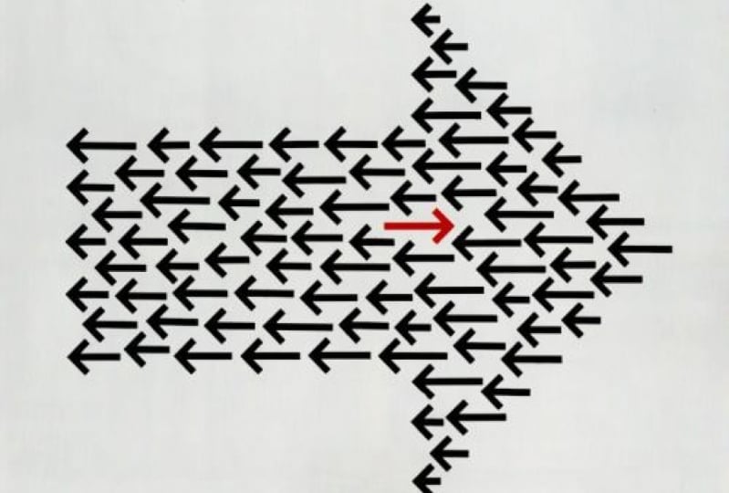
separate elements within your composition. Here is another great
example of dominance and emphasis working
hand in hand. The dominant detail being this arrow that is
pointing to the right. And that stands for the grid
that this book is about, facing all of these other
arrows pointing to the left, forming a pattern
in the background. But besides an emphasis
being on the word grid, there is also another
emphasize detail, The New York Times bestseller
copy here on the top right. I love this example
because it shows well that a dominant detail doesn't have
to always be in your face, something that
really stands out. It is actually
really subtle here because it purely relies
on negative space. And even though
this dominant arrow that is pointing to the right is clearly the largest detail within the composition
divert grid. And that arrow on the top
right stand out much more, mainly because of the
intense red color, which would stand out
even if there were more color used in the
rest of the composition. But it feels even more powerful paired with this
monochromatic palette. Last but not least,
it's important to remember that
dominance is a term outside of graphic
design that is used usually for things that
are quite negative. For instance, it is
not good to have a dominating person
in a relationship. But by better understanding what actually dominance means, we can apply this in our
compositions and we can use the dominant element
as a threat or something that we want our
viewers to be fearful of. And this poster utilizes or
showcases this perfectly by having this motorbike
being the dominant detail, which is seemingly speeding towards this child
in the background. And the French copy
here on the top, I believe means
protect the children, warns us about this obvious
danger that we can feel.
10. Scale: We already referred to
the scale of elements in our composition in the
previous couple of videos. But it's important to spend a little bit more time
talking about it, since it has a huge impact on the visual hierarchy
of your compositions, probably the best thing
to remember is that scale is always relative, as Stephen Bradley said it, a single object
has no scale until it's seen in comparison
to something else. Just consider how this
composition would feel by removing this bolt here in the middle with
the people inside it, seeing these fins
without any comparison, we wouldn't be able
to tell whether it's a small fish or a massive whale, like in this case. But by establishing
this relationship and placing these two elements
next to each other, we immediately understand and appreciate the
difference in scale. The same thing is utilized in
this movie poster where we have our point of
reference as again, a person here on the top. And by the way, human is
always the best way of referencing scale
because that is just something that we
are very familiar with. And in comparison in this case, we can immediately see
how big this shark is. But what's terrifying
is immediately how huge this mouth
feels at the bottom. Now this is clearly
an exaggeration, but a brilliant one. So we have this dominant detail all the way at the bottom, very close to the edge. So we only see a tiny little detail from
that gigantic animal, but by showing only the mouth, which is probably the most
threatening detail of a shark, we let the viewers use their imagination to fill
in the missing details. When you are trying
to emphasize how large something is
within your composition, instead of using an
extreme crop on it, like we've seen with the
previous movie poster. You can also utilize perspective with the kong Skull
Island movie poster, king Kong, the giant ape is set all the way in
the background. And we can immediately sense that vast distance
that is between these hills or mountains in the background and these
people here in the foreground. And similarly how
we can relate and understand the size of a person. We also instinctively understand the distance from objects
thanks to perspective, which is again,
something that we are experiencing every
day in our life. So in this case, even though
King Kong doesn't feel like a huge or dominant elements
within the composition. We still appreciate
and understand how Giant he must be to tower over these mountains or hills
far away in the distance. I also love how in this
composition we can see that even an everyday object at tennis racket can also feel huge simply by the clever
positioning and cropping of it. So in this case, by choosing a viewpoint where it
feels like we are looking upwards to the racket and placing it in front
of this clear sky, it already feels much larger. But because of this
clever cropping, it also starts to look like
the Eiffel Tower in Paris. That visual connotation immediately triggers
our imagination, which will tell us that this is actually a gigantic racket. Here is another
really clever way of utilizing scale and
dominance in a composition, in this case, using negative
space and typography. So we have this large H, which stands for Hamlet, but the white space
or negative space, is also forming a knife, which is of course
very important or integral to the story. Besides the clever use
of negative space, what makes this
composition Also brave is how small they kept all the actual information and how close it is to
the edge of the frame. And I believe the intention
here was that not only this knives is filling up completely the frame
from top to bottom, but also compared to the
topography here on the right, it feels even larger. Again, is the
relationship between the elements or
the comparison of their scale that can make
things even more effective. Here's another really cool
example where dominance and scale is used with typography. So we have the entry point
or the initial letter of the title Forever
fashion cropped to an extreme amount where we wouldn't be able to tell
what we're looking at, obviously without seeing
the title itself. If you ever planning to
use this kind of effect, just remember that
you need to show distinct details of a letter
that can be recognized. And for that serif type faces, we're going to work better. Pretty much all we
see are the serifs, but we can still make out
what we're looking at. Now even though
so far we've been talking about comparative scale, or the fact that you need multiple elements and the
relation between them will help you to establish the scale that actually
clever ways that you can achieve sense of scale even
with a single element. Starting with this awesome
illustration of Hulk. And the way that he is
scale is achieved in this case is that is completely
filling in the frame. And even though it's
just a single character within this composition, the scale of the
character's head compared to his arms and upper body also helps to tell the story that he is
huge and muscular. Another awesome illustration
of Wonder Woman, this case, again, shows
just a single character, but because of the
viewpoint and again, the exaggerated
perspective helps to make her look
gigantic and heroic. But you can achieve sense of
scale even with photography, like with this
brilliant example, where this person is clearly
too close to the camera or close to the viewer to next time that her face
is getting distorted, similar to what would
happen if someone was pushing themselves
onto a glass surface. This again, just proves
that if you are creative, you can achieve not only scale, but even vicinity or
closeness to something, even without including
multiple elements that you can compare
to each other, like with the Skull Island
posterior previously.
11. Position: Besides scale and contrast, position is probably the
most important technique or way that you can emphasize the importance
of an element and establish visual hierarchy
in your composition. The interesting
thing about using position in graphic
design is that it can influence or even determine the perception of an element. And just like with skill
and contrast with position, you can also be very creative and we will see a lot of
interesting examples. But first, let me show you this amazing experiment by the Brazilian designer
naval Atlanta, who conducted that research
with hundreds of people. And they showed them these
simple graphics and questions. Without obviously
the percentages and without giving any context, everyone had to decide. For instance, in this case, who is the prisoner. The circle here on the top, the circle at the bottom. So we immediately can see that
the majority of the people chose this circle here at the
bottom to be the prisoner. But why do you think
that is what you have chosen also
the same circle, I think the main
reason that we believe that to be the
prisoner is because this line here in the
middle seems to divide the space into two
unequal parts. And the space at the bottom is smaller than the space above. But we can also attribute the
fact that more people would choose this at the bottom
to be the prisoner. To the fact that we
normally would place people higher in position or in a
better position in general, to the top and less
successful people below even the hierarchy
in social contexts, we would also think
normally of a triangle, and people on the
top of the triangle are the richest or most
influential and powerful. People at the bottom of
the triangle would be the poorest and least powerful. So simply the fact that
this circle is closer to the top edge of the composition and the other circle is
closer to the bottom edge, also makes us believe
that this circle at the bottom is most likely
the less fortunate one. Here's another example. In this case the question
was, who is afraid. And even though here
the answers were a little bit more split
between the two options, there is still a majority choosing this circle
on the right. So let's just try to
understand this again. Why would people
think that circle on the right is
more likely to be afraid than the one on the left without giving any
context in this case, I believe it mainly
comes down to the fact, again that we have these dark rectangle
here on the right side. In general, the
background is bright, while this rectangle
is much darker, while people in general
afraid of, well, it's the dark or being
alone in the dark. And it seems just
simply by having this circle placed closer to the dark rectangle was
already enough to make this the less comfortable
place out of the two circles. But once again,
just like before, this circle is higher up. So in terms of
vertical positioning, it's higher, that one is lower. So if you're thinking about that social triangle that
I mentioned earlier, this one again is further down, so it feels already
slightly less fortunate. Another very interesting
question was, who is the happiest? And in this case,
instead of two circles, we have three squares. And again, even though the answers were split
between the three of them, the majority chose this
one here on the top right. The second most popular answer
was the one in the middle, and this was the least
selected option. So following the logic from
the previous two examples, we can see clearly that this is the square root that's highest
or out of all of them. But it is also closest to
the right and in general, closest to the edge of
the canvas or this frame. If we are thinking of a room, for instance, and kids
playing inside that room, would you consider the kid
in the corner to be the happiest or the one sitting
in the center of the room. I believe if this context was provided to this illustration, almost everyone
would have chosen the one in the middle
to be the happiest. But I believe there is actually another interesting reason why the one on the top right
feels to be the happiest. And I think because by having not two but three
squares in this case, it starts to feel
more like a chart. And if you think about charts, most of the time
the best position is on the top right coordinator. So no matter what we have
on the two axes, generally, you would want to be on
the top right corner, apart from obviously
some exceptions depending on what
the chart is about. But if you generalize, most charts would mean success. The further along you are and the closer to the top you are. Lastly, one more slide
from this experiment. Who is the singer of the band? In this case, we
have five circles perfectly aligned in the center and also evenly distributed. The circles are exactly the
same size and same color. So visually there is no difference between
them and there is no reason why we would think any of them is
different from the others. But still, the majority of
the people who took part in this test chose the center one to be the
singer of the band. The second most common
answer was this one. So the first circle and
the other three circles are almost insignificant
compared to the other two. And again, let's think
about why is that? This is more about who could be the leader if this is a group, because the singer is usually
the leader of the group, even though it's not
always the case of course, but in case we are
talking about the leader. Most of the time we would
place that in the center, like the way we would
have the judge or so in the center of the courtroom, or the way the
conductor would also be standing in the center
of an orchestra. But we can also understand
why some people chose this circle to be the singer
or the leader of the band. Because for all the
western countries, we always start looking at details and read
from left to right. So in that order, this one here is the first
and this one is the last. So in that aspect, this one here on the left is most likely going
to be the leader. I have the link on the board
if you are interested to see the other slides
from this test. But what we can learn from these results that we've
seen is that the position of visual elements and the vicinity of them to certain details in a composition can hugely influence our
perception of them.
12. Alignment: So as a comparison, let's
just take a look at these three quite
similar movie posters, each of them using a fair
amount of whitespace and having either one or two
people with some topography. Even the size of the people in these compositions
is fairly similar. And the main differences
between them is how they are positioned within the frame and of course also
their posture. Now let's start with
Tom Hanks in terminal. He is placed on the bottom
right corner of the frame and he's clearly facing
toward the edge of the frame. What this tells us is that he doesn't want to
be in this frame. He is looking
forward to leaving. Again, it all comes
down to the fact that we would expect things to come into the frame from the left and leave on the right. And once again, this expected visual flow is something that applies mainly to
Western countries. Because for example,
in Arabic countries where the reading
is right to left, they would also expect
details and elements or even people to come
into the frame from the right and
leave to the left. So it's exactly the opposite
of what we are seeing here compared to this when we look at the poster for the
proposal movie, both of the actors
really close to the left edge of the frame, and especially Ryan
Reynolds character is almost squashed to
the edge of the frame. Now he clearly it looks
uncomfortable and he also wants to live
just like Tom Hanks, but he is coordinated. And why do we have him on the left side and not
on the right side? Once again, because we know that to the right side he would be able to leave because that's the general
flow of things. Again, Tom Hanks
is looking towards the right where he knows the
exit is going to open at 1. While in this case,
Sandra Bullock is preventing Ryan Reynolds
to leave the frame. But now let's take a look
at this third postorder, Mr. and Mrs. Smith's with
Brad Pitt and Angelina Jolie, the outstanding,
opposite each other on the left and the right
edges of the frame. And since they are also
in a very similar pose, it creates a very nice
symmetrical composition. But the most important thing
is that these two characters in this composition feel equal. So there is no
dominant character, like in the previous example. They are even equal in height and they are
both dressed in black, also both carrying a gun. So what does the placement
of these two characters tell us and the direction in
which they are facing. I believe the main thing
that it tries to tell us is that they don't necessarily
want to be together. So they are taking up the furthest two points within
the composition possible, so much so that they
are even slightly leaning a V from each other, not towards each other. So here, this
positioning is mainly creating tension between
these two characters. This is almost like the opposite of what you could achieve in a composition when
two characters are hugging or kissing each other. So you can see the
positioning of your elements in
a composition can really underlying or
emphasize the story. And by choosing the
right position, you can really reinforce and underline the story
that you are telling. Now, you might not
be always able to place a relevant information
next to each other. Like in case of this layout, we have this beautiful
illustration of the landmarks of Barcelona. And then we have the copy
divided into these columns, Each talking about a
particular landmark. But the order of the copy is not following the order
of the illustration. And that is why the
designer have to use these numbers to connect the
illustration to the copy. Compared to that, here is a layout at Table of
Contents in this case, which is highly unusual
but very creative, where we can still clearly
make out these smaller groups. So the page numbers and the
corresponding articles, but it is a little
bit harder to follow the order of them
because obviously again, they are not laid out in
the conventional way. However, there is still a logic. So we are starting with the lowest number here on
the top-left number six. Then we go and make our
way down in this order. Then from here we move on to
the top of the next page. And then once again, we follow a similar order. So going down from the top. And the reason I'm
showing this example is because position, our alignment is very commonly
used in compositions, especially in editorial design, for grouping or arranging
certain elements together and making
it easier for the reader to digest
the information. In this case, the unusual
and almost chaotic placement and scaling as well of these elements at
special interest in trig and in general makes the
composition much more dynamic. So remember, it is not
always about finding what's the most usual or expected
position for something. Sometimes you can
intentionally work against the expectations and choose unexpected
placement for one or even more of your elements.
13. Proportion & exaggeration: Proportion in graphic
design refers to the relative size of your
elements in a composition. And we already discussed
that size is extremely important for establishing
the right visual hierarchy. And proportion is actually
a term that can be used and applied for a
lot of different things. You can consider the
proportions of a character. So relatively the
head, the feet, and the hands are tiny compared
to the body in this case, but we can also compare the
character to the environment. So in this case, this
hanging chair and their relationship
to each other also forms a proportion
in which once again, the character is definitely
more dominant than the chair is not
only perceived that way because of the
size of the character, but also because the
chair is drawn with these very thin lines compared to the thickness
of the character. In case of this banner, we can consider the proportion between the image
and the topography. And from that point of view, the image roughly takes up around 40 per cent
of the composition. While the logo, the texts, and the call-to-action button, which forums
visually group takes up also roughly
around 40 per cent, and the rest is a
negative space. I'm sure you can imagine
that in case of this banner, without changing any
of the elements, we can easily change and shift these proportions to whatever
we think works best. But remember when you're
scaling things up and down, that the general idea is to highlight the important details while also keeping harmony and integrity between
your elements. Of course, there's also another
term that's important to remember and it's a technique that you can apply
in your designs. And it is exaggeration. And this is something
that usually messes with the proportions of your elements and
normally used for dramatic effect and for
catching your viewers eyes. Take this book
cover, for example, where the house is tiny compared to the size of the
flames and the smoke. And by using these proportions, keeping the fire to be the dominant element
in the composition, it clearly gets a lot
of emphasis and pretty much takes over the
cover of this book. Exaggeration in illustration
can be used for much more than just to make something look really big and
something really small. It can also be used to simplify
the shape of something. So to turn forms or shapes into something slightly
more abstract. And that is exactly
what is happening here. So the animal is a
really simplified and the brilliant idea here is that the eye is actually a person. So there's again,
a huge difference between the size or scale
of these two characters. But in this case, instead of having them next to each other, the illustrator came up with this very smart way
of combining them. As you can see, proportions and details are clearly exaggerated. Again, in this case
for dramatic effect. Here's another very
interesting example, this cover of The
New York Magazine, that once again, proportion
plays an important role. First of all, we
have the faces of these two kids really close up. So they are definitely dominant details within
the whole composition. So in terms of proportions, they take up around
90% of the cover. But what's important here is
how discovered relates to the main article
within this magazine, which is about, can you teach racism or an article in
general about racism? And in that sense, this
design is extremely powerful because it is using a roughly around the
same proportion for each of these phases. So the two kids feel equal. But what's extremely clever
is that the distance between the two eyes is almost
exactly another eyes size, which is almost identical
to the same proportion that you get with
a person's face. So even though
here we are seeing two faces and next
to each other, when you are concentrating on the proportions of these eyes and the distance between them, it is similar what
we would get when a single person
is looking at us. I also love the fact that this block of texts that we have here is not set any
larger or wider. It also innovate forums like a barrier between
these two phases or between these two kids. So these further emphasizing that division that is established
with the composition. But remember, what balances
that out is the way that these two faces could also form a single phase by the use
of clever proportions. Another area in graphic
design where proportion plays an important role is how you
set up your color palette. We already talked about
this in the color topic. How important it is
to make sure that you have a good harmony
between your colors. But what's also important is how much of these colors are
used within a composition, just like balancing the
scale of your elements, you can also think of your colors in relation
to each other, and most of the time, instead of using them equally, what will make things more interesting is to think of them similar to how they are
used in interior design. So the 603010 rule
is very commonly used for decorating interiors. And generally what it means is that you should always have a primary or main color that is going to be
dominating the design. And in terms of interior design, this is actually normally a neutral color than
the secondary color. Usually is a complimentary
color to the main color. And the third color is what
we call as the accent color, which is usually
the most vibrant and intense color
in the palette. And you can see
examples of this rule, not only in interior design
but also in fashion design. But as I said, it is
something actually that also can help you in
graphic design projects, but you don't have to
follow it to strictly. For instance, coming back to this banner that
we've seen before, we can see that the
main or dominant color in this case is pink, which is used for
the background. Then the secondary
color is gray, which is used for this monochrome
version of the person. And then as an accent color, we have actually two colors. In this case, we
have this purple, which is used for the
call-to-action button and also these leaves, but we also have a little
bit of yellow at the bottom. Now out of these
two accent colors, the purple is the stronger
one that has more contrast. And that's why it
works to be used for the most important
element in the banner, which is the call
to action button. So remember when you think of the proportions
within your design, it's not only the scale of the
elements that's important, but also the proportions of
the colors you are using. And pretty much
anything else can be considered this way, even, let's say the proportion of images compared to
type on a cover. But no matter what aspect of your design you are
changing or adjusting. Remember that the
proportions are extremely important for striking
harmony and balance. But when you are
using exaggeration, you can also make things out of balance for dramatic effect.
14. Propositional density: So far we talked about
visual hierarchy in terms of more complex designs like
magazine spreads and layouts, book covers, movie posters. But don't forget that visual
hierarchy should also be applied to smaller or
less complex designs, like in case of a logo. And to better understand how visual hierarchy works
specifically in logo design, we need to talk about
propositional density. Here we think of the
relationship and the proportion
between the amount of elements in a logo
and the amount of underlying or hidden
meanings pegged into them. So take this logo, for instance, from Barack Obama's 2008
presidential campaign, which is a brilliant example of how the amount of meanings can far outweigh the
amount of elements used. And we talk about
propositional density, the meanings usually we refer
to as deep propositions. And you can easily remember
that because these are the hidden meanings or
underlying meetings, so they are deep down and
the actual elements that are used in the design we
call surface propositions. And that's also easy to remember because they are on the surface. That's what we can actually see. There is a very simple
mathematical equation to get the actual
propositional density, you just simply have to count how many deep
propositions you can find and then divide
that number with the amount of surface
propositions. So essentially count the number
of meanings you can find and divide it with the number of elements used in the design. So in case of this logo, we can find ten meanings and only three elements
that are used. So the equation is
ten divided by three, which results in a number
higher than three. Even if you can achieve the propositional density
to be higher than one, you are already
doing a great job. But as you can see in this case, there were more than three
times as much meanings as the actual elements. This is of course, is an
exceptionally good example for propositional density. But just to show you
the other extreme here is a logo which is obviously much weaker in terms of
propositional density. And here that number is
most likely below one because there are more
elements than meanings. And without counting it, we can just immediately
see that we have the bald eagle and
the American flag, which basically carries exactly the same
meaning of patriotism. Similarly, we have the text In God We Trust
here at the bottom, but then we also have
the Bible and the cross. So again, three elements
serving the same meaning. Not to mention that
even text is repeated. The Saint Francois county that is written
here on the outside is also visible here on this
tiny map inside the logo. So I'm pretty sure that
even without counting exactly the deep
surface propositions, we can clearly see
that this logo is far less successful compared
to the Obama campaign. But there are lots
of other logos that has a great
propositional density, like the current Airbnb logo, which even though it's just
a simple abstract shape, it actually refers to a
lot of things like people, places, love, and
also the letter a, which is the first
letter of the name. In this case, there are
two surface prepositions, the shape and the text. But we immediately can find that these four deep propositions, so four divided by two. We get two for
propositional density, which once again is a
brilliant achievement and for a brand to be memorable
and for people to be able to
recognize it easily, the effectiveness
heavily relies in the propositional density
for which, as we can see, one of the most important
thing is to keep your elements as simple
or as less as possible. There is a study called
branded in memory, which shows how
different brands are remembered by the
general public. Here, for instance, we can see the Apple logo drawn
from memory by more than 150 people displayed
in a way that we are getting the more
accurate versions as we're getting to
the bottom right. And we have the least accurate
ones here on the top left. So the drawings are
improving as we're making our way down to
the bottom-right corner. And there's also some additional interesting statistics
here at the bottom. Out of which probably the most
interesting one is showing that the actual color of
the logo is gray matter. These are the colors that people use when they were
drawing these logos. Even though most of
the people used gray, There's also quite a lot of people who use black and never, even some people using blue
and red in that drawings. Now definitely the
most important number here is the percentage of how many people manage to draw a near perfect
version of the logo, because that shows
really well how memorable this logo is. And in case of Apple, it was 20 per cent
compared to that. The same exact study resulted in only six per cent for near perfect drawings
for Starbucks. And some really
funny versions of the logo here on the
top left corner. But the best-performing logo in this study was target with Twenty-five percent
near perfect drawings. That means one in four
people managed to draw the logo from memory without
making any mistakes. And even the colors and their
proportions were almost perfectly matching
the actual logo from all of these drawings. Now we can clearly see that propositional density plays a huge role in logo design. But the general
lesson that we can learn from this is
that thinking of surface and deep propositions is something we can also apply
to any forms of design. So even when you are
working on a brochure, a poster, a magazine,
or a website, you should always question
yourself whether you need to add that
additional element and whether it is going to add
any meaning to your design or make it easier for viewers to understand
what they're seeing. So only introduce new elements when they are really important and when there is
nothing already in the design that serves
the same purpose, getting the visual hierarchy right in your designs depends not only on prioritizing
certain elements over others, but also on your
ability to be able to judge which are the
elements that you will really need in the
composition and which are the ones that
you can leave out.
15. Conclusion: Congratulations on
completing this course of the graphic design
theory series. I hope you found it
useful and inspiring. Don't forget to go through
the glossary of terms PDF, review everything we covered, and if you feel ready, take the quiz to
test your knowledge. Come back anytime to
the references on the millenial boards we used
in this course to help you remember the things we
talked about or define inspiration for your
next design project, please let us know if you felt there was
anything missing from this course or if you have any suggestions on how
we can improve it, email us at info at the
assignment designer.com, and we will get back to
you as soon as possible. We really appreciate
your input and help. Now, it's time for you
to pick your next topic and dive into another graphic
design theory course. Remember, there is no right or wrong order to
complete this series. All the rules we
cover are equally important and
everything is related. But what is most important is getting a good understanding of these rules and applying
them in your projects. I'm sure you will
use what you've learned to create
something amazing. And I cannot wait to see it.
 Martin Perhiniak, Graphic Designer, Illustrator & Educator