Transcripts
1. Introduction: What makes learning
about design theory difficult is that
everything is related. It is hard to talk about a single rule principle or element without
referring to others. This is what has inspired
me to put together my most comprehensive and accessible training series ever, covering everything you need to know about graphic
design theory. 20 years of experience applying these
theories in my work as a creative professional and teaching them to students
around the world, has helped me to come up
with a unique approach explaining everything
without ever making you feel overwhelmed. We will analyze and compare
real examples of print, web, and mobile designs
to help you build a mental visual library
of great compositions. By the end of this series, you will be able to recall lots of creative
examples from memory. You will also master how to
analyze designs and learn to ask the right questions when judging your
own compositions. Whether you are a
seasoned creative professional or just starting
out as a graphic designer, you will find the
courses in this series incredibly interesting,
inspiring, and valuable. Boost your confidence by understanding how
to make engaging, clear and effective
compositions. And learn the
language of design in order to communicate
with clients, printers, developers, and
other creative professionals. In this course, we will cover all the guest out principles
including closure, continuity, similarity,
simplicity, figure ground, and so much more. To find out how they can be utilized in graphic
design projects. By understanding
these universal laws of visual communication, you will gain confidence
and find it easier to make decisions throughout
the whole design process. Together with the
exciting class project that I hope you will complete
at the end of the course. You also have the analysis
worksheet and the term glossary to help you practice everything that you've learned. I hope you are just as excited
as I am to get started and dive into the sea of knowledge and beautiful graphic
design examples.
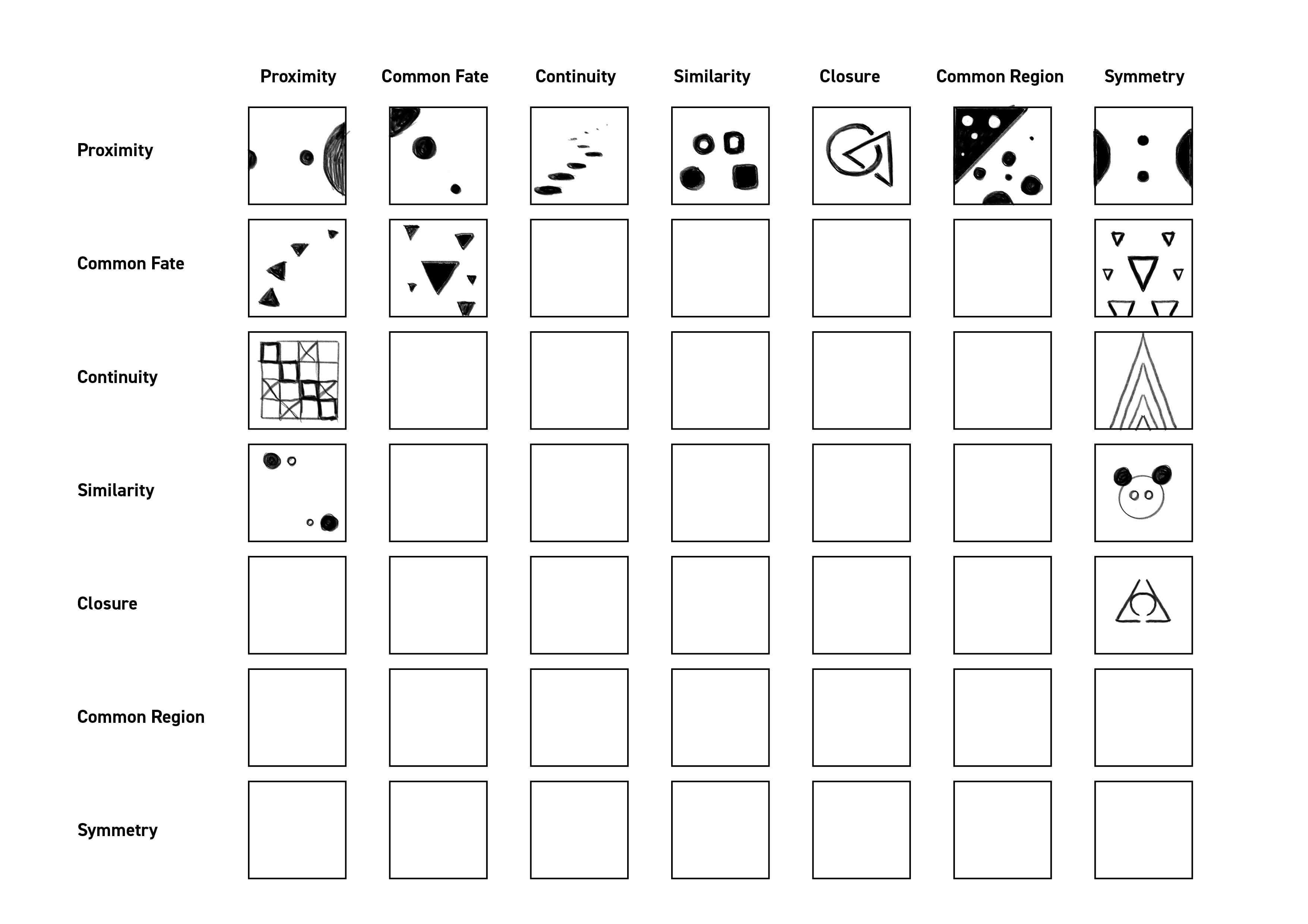
2. What are the Gestalt principles?: I like to think of the
guest style principles as the grammar of
visual communication. Every language around the world relies on grammar
which sets the rules, creates consistency, and make sure that everyone can
understand each other. It's interesting, but
if you think about it, we don't actually
learn in school how to understand things
when we look at them. So visual perception
is almost instinctive. It's something that we
learn as we grow up. And even as a newborn, we already start to process our environment
by looking at it. Of course, at the beginning
of our life we use our other senses more like
touching and tasting things. But as we grow older, we end
up relying more and more on our eyes to understand our environment and to be
able to interact with it. Apparently, almost 50% of our brain is dedicated purely to process the visual
stimuli that we are constantly bombarded
with during daytime. And even while we are asleep, our brain projects images
which we understand as dreams. And I like to think of dreams being some kind of
exercise for the brain. So even when we are
looking at things, it is trying to flex those
muscles that we are using when we are again looking at things and trying to
understand what we are seeing. So coming back to the
guesttop principles and why it is important
to learn about it. Remember I said that we don't have to learn
how to see things. That's completely true, however. As a designer or
graphic designer, we need a better
understanding how people will perceive
the designs that we create to be
able to effectively communicate the message
that the project is about. In this video, I'm
going to give you a brief background where the gestal principles
are coming from. And we will briefly analyze this Unilever logo
on the board just to see how the Gesto principles can be applied to
any kind of design. In the following videos, we will be looking at
all of these principles in much more detail and we
will be looking at many, many examples to
make sure that you understand how to implement
them in your designs. So first of all, guest
principles are actually coming from the
area of psychology. It started by three
psychologists in Austria and Germany in
the early 20th century. And the most important quote
that sums up really well the whole idea behind
gastutism by Kurt Kofka, who said the whole is other
than the sum of its parts. And the word other
is very important, so it's not more
like Aristotle said, but it is something else
or something different. You can see the example of the bicycle when we have all of its parts laid out and when
we have it all put together, even though it's the
same exact components with the right
configuration or assembly, it will be able to
carry us from A to B. It becomes a vehicle. And that is something
we definitely can't say about all of its parts separately or
just laid out like this, only once they are put
together in the right way. And this is a great analogy to think about design as well. Whether you have
typography, images, shapes, colors, contrast,
so on and so forth. You can use all of these things, but if you're not putting them together correctly
or effectively, then your design won't look good or won't get the
attention of viewers. Only when you put everything together in the right balance, the right order or
right hierarchy, that's when you will create
an effective design. There's another important
underlying term used in the guest style
principles called emergence. And essentially what this means is that we tend to look at the entire object before
seeing its individual parts. So again, thinking as
a graphic designer, that means that if you create
a poster, for instance, people will look
at the poster in its entirety before
they start to look at smaller details like people in the poster or the title or
subtitle, and so on, so forth. And why is it important? Because for us designers, we have to always create a pleasing composition or
overall look of our design. But we also have to make sure that people will be able to find all the relevant
information once they spend a bit more time looking
at what we created.
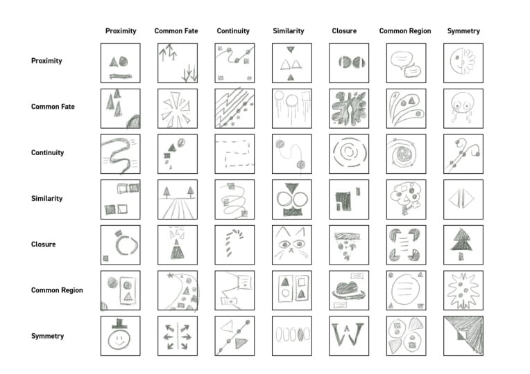
3. Gestalt principles in action: So looking at the current
design of the Uni Liver logo, we can immediately
pick up a couple of the Guestyle principles
that are applied here. Like simplicity, which is also referred to as law of pregnants, which we can see in all of
these little icons here. They are all simplified
almost to abstraction. But if we pay attention, we can still make out and recognize a couple
of things here. Like there is a little e here. We also have a bird, there is a pepper, there is a palm tree, There is a symbol,
which is for recycling. There's another
symbol, the heart, which can be
interpreted as love. But in this context,
it's more likely to indicate healthy products. So why do you think it was
important to apply the rule of simplicity to all of
these icons in this logo? Well, if you think about it, if they were too complex and there were too
much details on them, it would end up becoming too
complex and distracting. And definitely it
wouldn't work as a logo. Unilever is a massive company with so many brands inside it. And to be able to
communicate that complexity, the designer decided to
highlight many aspects of these brands without
them becoming too overwhelming
or overpowering. And this takes us to the other
rule that's applied here, which is called figure ground. Which means that we can look
at something like this shape here as a unified
outline of the letter U. So that is something
that we would understand as the ground or background, and all of the little
icons inside it are the figures or the
foreground elements. The figure ground rule is a little bit more
tricky to understand, so you will understand
it much more once we look at more
examples about it. Now, since there's
so many little icons packed into this shape of the U, there's also a couple
of additional rules applied to make it
aesthetically pleasing. One of which, which is quite
obvious is similarity. So basically that
means that all of these icons feel
similar to each other, so they all use the same color. They all have round edges, so there's no sharp
corners in either of them. And if you pay
attention to the icons, they all seem to be following
the shape of the U. So that is something that
we call common fate. They all feel like going or flowing in the same direction. And another interesting
thing that we can see here is that it wasn't necessary to create a solid
outline for the letter U, for it to look like it's closed. So we perceive it as a close shape even though
it has gaps around it. And that is a perfect example. And use of the guest
style principle called closure symmetry is another
rule that we can see here. So if we have this line
here in the middle, you can see that not only the letter U is aligned to that, but even the text at the bottom is symmetrically aligned
to the letter above it. This helps to create a pleasing balance in
this composition. And if we're looking at the text itself,
here at the bottom, There's also another
rule applied there, which is called
continuation or continuity. Where again, our brain can
easily connect this and understand it as a
single word even though there are gaps
in between the letters. Now this works well
mainly because this looks like a handwritten
text or manuscript. While if this text was set
in different type face, like a Serif or Sunserifont, then it would already cause issues if we had these big
gaps between those letters, especially if these
gaps are uneven. And finally, one other
rule that we can see being used
here is proximity, which in this case connects
the letter mark which we have here on the top and the word mark that we
have underneath it. So the closeness of these two elements and the fact that they are stacked
on top of each other, We'll have to always see this
as a single unit, a logo, even when it's
placed on an advert, for instance, together with
the logos of other brands. So to summarize,
the importance of guest out principles
is that as a designer, you need to be able to
emphasize visual relationships. And you can only do
this effectively by understanding
how your viewers will interpret or perceive the visual information that
you are presenting to them. So I hope you are excited
because now we will take a much closer look at each of the rules in the
guest style principles. And don't worry if you feel a bit overwhelmed at this point. It will all make much
more sense once we go through and analyze the designs
in the upcoming videos, and really concentrate on individual principles each time.
4. Closure: Closure is one of
the simpler rules amongst the Gestalt Principles, which means that
when you look at an image that has
some missing details, your brain can easily and automatically fill
those gaps for you. For this rule to work, it is important that you have
to find the right balance. If you are leaving
out too much or there's too much
missing details, then your viewers might
end up seeing them as independent details and struggle to understand the design. And on the other hand, if you provide too much information, then there won't be any
need to fill the gaps, so your design won't be as engaging or interesting
to look at. Let's look at this illustration
here on the left first, The important visual details here that really help to
understand what we are looking at are these
common details that we can very quickly
understand like the shoes, the skateboard, the
hair and the hand. Even though that everything is highly stylized or simplified, we can still understand them. And once we've seen
these couple of details, this pattern of dots without
a solid outline starts to make sense as being the dress that this female
character is wearing. Pay attention to how there's almost no details for the face, so we can't really
see eyes or the nose. Maybe a tiny little
indication of the ear was enough to understand
what we are looking at. So having some solid
details that are completely filled with
black, like the shoes, the hair, and also
the skateboard, which has a clear outline, is enough to hold
everything together. And once again, to understand that floating pattern that doesn't have any
contour or outline. And you might be
wondering why was it necessary to leave
out the outline? And a simple answer
to that is to make it engaging or exciting to look
at when closure is used. Well, in a design, it usually
challenges the viewer, gives them something
to think about. It's almost like a little
visual riddle that you have to solve in order to understand what
you're looking at. Now in this particular
illustration, there's lots of other
rules as well in play, like motion or movement,
which we can again, see clearly when we look
at the hair, for instance, which indicates a forward motion because we know that long hair would fall down vertically. And when we see hair
horizontally displayed, then we immediately understand that there must be
some kind of motion. Or maybe there is just wind
blowing from the right. Another guest stop principle,
common fate, however, helps us to connect
some of these details together and
understand the motion or the direction of this motion. Not only the hair, but also the leg is stretched
out to the back, and the arm is also
pointing in that direction. So all of these details together helps us to connect
everything and understand that
there is actually a fast forward motion here. Even though that this is a
completely static image. We will talk a lot
more about movement and how we can indicate
it in our designs. Once we get to the
topic called balance, let's take a look at the example of the Johnny Walker logo. Which evolved and
changed quite a lot from the original
illustration, but still managed to preserve the original aesthetics
of the design. So besides the obvious
simplification of details, the most important rule
that helped to make this logo more effective
is the use of closure. Quite a lot of details here
are just floating in space. But again, thanks to their
proximity or closeness, we can very quickly connect
these missing details and understand that we are looking at pants
or trousers here, even though there's
no contour on them. Now it's interesting
that there was another version which
was even more abstract, where even the hand was missing and there was even less
details around the head. But this version probably pushed the rule of closure
a little bit too far. And they left a little
bit too much details out for it to be
easily recognized. And most likely that's
why they decided to change it and bring back
a little bit more details. So this is a great example where we can see how big brands like Johnny Walker is fine
tuning the use of closure. I love the poster of this
movie called The Lobster, where we can see Colin
Farrell hugging something, but we can't really
make out what it is because it's
completely missing. So this is what we would
refer to as negative space. But in this case, it's
more about applying the rule of closure
because our mind immediately tries
to fill this gap and recognize what is
removed from the image. And there are some very
subtle visual clues of the missing detail. If you pay closer attention
to this area here, we can actually see that there
are some details of hair. So that is a great hint
that there is actually a woman most likely who is removed here or a
person with long hair. And remember what we said
about balance or finding the right amount
of details to show and the right amount of
details missing here. The hands are incredibly
important because without them, it would be much harder to understand what we
are looking at. The hands are mainly
needed for us to understand that
there is a hug here. But they also act as
a framing device that really creates that
sense of space or depth. And this composition reminds me of Pantomime, where again, artists just use thin air to describe what they
are interacting with. The logo of the World
Wildlife Fund is also a brilliant
example of Us closure, where we can
immediately recognize the panda bear even though there are some missing details
again around the contour. Thanks to mainly those
characteristic details that are still visible, like the patches
around the eyes and the big ears and all
of these curvy shapes. What further helps
our brain to close those missing details is the
way that this detail here, and also this other
one here on the right, is gradually getting thinner. So it's not a
continuous thickness, but it actually has
a nice transition from thick lines to
thinner, pointy edges. This transition, or gradual
change in the thickness, really creates a motion
or flaw in the design. And it further emphasizes
the shape of the bear. So we can very clearly see those missing details for the
head and also for the body. And I love this funny
example here on the right, which is clearly not the
updated version of this logo, but showing how a polar bear could look like in the
same visual style. But of course, here again, the tuning of closure
went too far. Just too much
details left out for this to really work
effectively as a logo. When we see the two versions
next to each other, of course it's easy to understand what the
image is about, but imagine seeing
this on its own. Well, I'm sure you
can imagine that it won't really work as a logo. There is also a term
called ratification or reification which
describes this whole idea of closure and how our brain
and eyes have the tendency to fill the gaps wherever there's missing
contours or outlines. And although there are so many other really good examples here. Finally I just wanted to
highlight this poster or design where we can see that closure can be used in
an extreme way as well. Where we don't
even actually show any outlines of the
subject of our design, which in this case is this
missing piece of art, which is only
surrounded by details, the three hands and
the text here on the top left corner of
that missing piece. But when you think
about it here, there's actually no outlines
used at all for that detail. So even though it's quite
extreme use of closure, it still works mainly
because all four corners of this rectangular shapes have some kind of detail
that holds it together. Just imagine removing
one of these hands, the composition would
immediately fall apart.
5. Continuity: Continuity is another principle which is all about
connecting dots. Again, this is something that our mind does automatically. So basically we
like to see things arranged in a row or
a line or a curve, and that is just
pleasing to the eye and also easier for
us to understand. That is the reason
why we like seeing trees planted in a
row in a garden, or arranging clothes
in a dressing room in the same order as
we would wear them, having hats on the top and
shoes at the bottom shelf. Even though there's no
real logical reason to place them in this order, it just creates an aesthetically pleasing combination
and helps our mind to connect these items together or the trees that were
planted in a row. It is an instinct for
us to follow a river, a path, or a fence. And that's exactly what we like to see in designs as well. So whenever there
is an invitation, a path for our eyes to follow, we will most likely do so
As a graphic designer, continuity is an amazing tool which can help you to really direct your viewer's eye from one point to another
within your designs. And you can think of it as a similar visual challenge to closure you set
for your viewers. You invite them and
give them something to think about by leaving
some details out, or maybe matching
different things together, but having a continuation
between them before we start analyzing some amazing designs
on this board. Here is a very
interesting example. We see a couple of dots, some of them are red,
others are black. And even though having these colors clearly separate
them from each other, still most people
would look at this or understand it as a straight
and a curved line. Instead of following the
dots by their color, we prefer to follow their shape. Here is a straight line
and here is a curve line. It's much more pleasing
for our mind to connect these dots in this way compared to having a shape like that and another
shape like that. This actually explains or leads to a very important
discovery that abrupt changes are never good in general in
your everyday life, but also in graphic design. For instance, when we look
at this image at first our mind prefers to look at
these two people in this way. While of course, actually
there's a person here on the top and there's
another person at the bottom. Simplifying this,
we can also imagine a triangle here on the top and another triangle
at the bottom. And this is the point where the abrupt change is happening both on the
top and on the bottom. Or here's another example. If we look at these arrows, even though this is a
two dimensional image, we still feel like there is a sense of depth and space here, thanks to the way these
lines are laid out. But more importantly, these
curves here are created with a nice gradual transition from going down here to going up
to the top of that bump. We have that gradual transition in the thickness and
direction of the lines. And the change in these
attributes prepares us and helps us to understand
the change in the direction. So imagine if these lines
were completely straight, and then another line
would appear besides them, it would be much harder
for us to perceive them as continuous lines or to see
the continuity in them. Your job as a graphic designer,
of course, as always, is once you understand
the rule is to challenge it or turn it into a
challenge for your viewers. What makes this
composition interesting is that instead of just
displaying a portray, the designer split it up
into the separate slices. But because they are stacked
on top of each other, our mind can still easily
combine them together. And I'm sure in your head, you are also automatically
visualizing all of these details dropping onto each other and forming
the actual head. Here is another very similar
example where again, instead of seeing
the full portray, we just see parts of it. And what makes this
interesting is really the fact that
we have this ribbon, continuous single line that
forms the whole shape. So we can easily trace it along, you can really see that
it's a simple shape, almost like the skin from a potato that has been
peeled in one piece. And the continuity
of this ribbon, what helps our eye to
connect everything and also what makes the
whole piece interesting.
6. Continuity in typographic posters: An important rule of
typography is legibility. So making sure that people can read whatever is
written in a design. However, titles or larger
text can always be made more interesting
if you are leaving out or covering some
details from them. This design is the
perfect example where the text jungle is written in much larger than
the rest of the copy. And because of its scale and also its high contrast from
the rest of the details, it works and reads
perfectly well, even though there's
quite a lot covered by the foliage details
in the composition. If you pay close attention, you will see every
single letter of the word jungle has some of its parts covered by
overlapping details. So there's something
here on the letter J, there's a quite big chunk
here covered on the letter U. Also, there's
another detail here, another one there, and
another one there. And by the way,
these floral motifs are also using the
rule of continuity. So here is a lovely detail
that goes up and it connects not only the word
book to the word jungle, but also the letters of jungle, which are separated in
these two separate roles. The same branch that
comes up here also has another branch that is
twisting around, the letter U. This is another beautiful
use of continuity. First starting at the
bottom of the composition, then coming up, turning around, and then coming up again. It's twisting
around the letter U and it creates a
sense of continuity, but also adds some
depth to the design. And the same applies to
all of the other details, like this branch here, again, has a nice continuous curve. And our eyes can easily follow these type of curves
and understand it as a single element even though it's divided
by the letter. And similarly, we
understand the letter as one object even though it's interrupted by those
floral elements. This poster is another
brilliant example of how you can challenge
your viewers here. The task obviously is to
be able to read the text, which is again, broken
up into multiple lines. More lines than the
actual amount of words. So it's only three words, but there's five lines. So that arrangement of text
would already challenge the viewers a bit to
understand what the text is. But the viewers are further challenge by seeing
this bell arena here, intertwining or interlocking
into the typography. And if that was not
enough already, they actually even
left out the body, or the central part of the
body of this ballerina, where we would expect to see the white dress that they
would normally wear. But this is where
our mind comes in. And because we understand the proportions of the
human body really well, because we see it all
the time, every day, we immediately understand
that these details here on the top must be connecting somehow to
the legs underneath. For this composition to work, it was very important
to make sure that the distance
between the details here at the bottom
and the details on the top must be the same as
in the original photograph. If they were moved
further away from each other or maybe moved
closer to each other, the whole thing would feel awkward and strange to look at. So to recap, there are three different ways that
we are challenged here. In terms of continuity,
we have to, first of all, connect the
rows of text together. We are also challenged by having quite a substantial part of the text covered by
details of the ballerina. So we have to imagine those missing details
in these letters. And third, we also have that big missing detail
of the ballerina. So the lesson here and what
I'm really trying to get to is that when you
take a single rule, in this case continuity, you can not only use it
once in your composition, but you can have it used
multiple times to really emphasize it or exaggerate it to a point that it's
still recognizable. So remember to fine tune these things and don't
go too far with them, because then you will lose your viewers and they won't understand what
they're looking at, or they will be just confused, and that's never a good thing. So for instance,
with this design, even though there's
quite a lot of details missing
from these numbers, it's still almost
immediately recognizable. And we can read them. And we can also
understand that these most likely are
representing dates. And this composition, just
like the others before, also heavily relies on
continuation or continuity. Our mind will easily be able to connect these details even though there's
gaps between them. Not only the numbers are
using the rule of continuity, but also these shapes
or blobs set in red. Instead of just having
a couple of dots, there are actually
connected pieces here. So we can see a continuation here and also another one here. And also between these two
dots there, you might ask, why was it necessary to
connect these red dots besides making the numbers
more legible inside them? Well, mainly because they are
guiding the viewer's eyes in the direction that these numbers are
supposed to be red. For the dates to make sense, we need to start here on the top left and then go to
this number here. Then we can continue down here. And this line here
actually is also quite important because that's the one that divides the two dates. So again, these dots are
leading our eyes down here. Once we see the dot there, we can go up and finish off reading this number
together with the dot. Without these four dots, again, the whole design would fall
apart and we wouldn't be able to really make
sense of these numbers. So those dots or
full stops are just as important as the
numbers themselves. And now, if you just concentrate on those connected shapes, they really help
you to follow along these important details in the composition in
the perfect order.
7. The Figure-ground rule: One of the most interesting or intriguing gestalt principle has to be the figure
ground relationship. Figure is usually the
subject of the image and ground is the environment
or the background. But it can have a lot of
different interpretations. But the best way to
specify what figure is in a composition is to refer to it as the element
that is in focus. The ground, as I said,
is the background or environment within which
this figure or subject, or focal point is
resting or placed into. The unique thing about this relationship is that
our brain automatically or instinctively tries
to keep the figure in the foreground or expect the figure or subject to
be in the foreground. Here's an interesting example. When we look at this simple
abstract illustration, we would automatically think of those squares being the subject regardless of their color. We would consider
the white square in that black rectangle being
the subject or figure. And the same way we would
consider this black square, again, the figure within the ground that in
this case is white. What we can learn from this
very simplified example is that most of the time, we would expect the figure to
be smaller than the ground. Of course, there
can be exceptions or you can intentionally work against this way of understanding what's the
figure and the ground. There's another
important term worth mentioning when we talk about the figure ground relationship, and that's multi stability
or multi stable perception, which is that strange
experience when you look at something and it keeps
popping back and forth. So in this case, for instance, you can look at this
cube, which by the way, is called the Necker Cube, as this face being closer to you and the rest of the
cube receding into space. But if you look
away and look back, you might end up
seeing this face being closer to you and the rest of the cube again
receding into space. By considering this phase
being closer to us, it's like looking at
the cube from below. While when we consider this
phase to be at the front, we are looking at
the cube from above. This special type of view that gives us a
representation of a three dimensional object in a two dimensional plane
is called isometric view, where all the lines that recede into space are parallel
to each other. Compared to when we see
things in perspective where all parallel lines would
converge in a vanishing point. We will talk a lot more about perspective and
exxonometric views because these are all
very important to understand for a
graphic designer. But this is part
of another topic, so focusing on the figure
ground relationship. Here is another very
interesting example. The Rubin was where again, we have this sensation
of multi stability, where we can look at this
image as a cup or vase. But perhaps immediately
you've seen these two faces
here on both sides. So in this case, our
understanding of figure ground is challenged
because we can't really decide whether the faces are the figure or the
subject or the vase. So if we consider the
faces to be the figure, then we see the black
field as the background. However, if we consider the vase to be the
subject or figure, then it means that
we see it within a white environment
or background. You might be wondering whether multi stability is actually a good thing or not and whether you should apply this
in your designs or not. The answer is that, of course, it can be utilized and it can be turned into a
positive and good thing. But if you're not careful
on how you are using it, it might end up just
annoying your viewers. So here is a great example
of multi stability, where we have
Batman upside down, or the silhouette of Batman and the silhouette of
Penguin or Copa Pot, one of the famous villains
from the DC Comics universe. The reason why this
composition works so well is because
the illustrator or designer really understands how the figure ground
relationship works. So first of all,
just like seeing the smaller object
being the figure, we also normally consider the brighter and more saturated
details to be the figure. Because objects tend
to get darker and more desaturated as they
go further in space. So that's why at first glance, almost everyone would consider
this being the figure. And that is why it was smart to have this one standing normally, so head on the top and
then the body below it. Because that's just simply the natural or expected way that we would see a character
in an illustration. But then the fact that
Batman Silhouette is black, of course, works well with
the character itself, because Batman
wears a black cape. But then again, the fact
that he is upside down works perfectly well with the way he behaves in the story. It is another brilliant example of a minimalist illustration which can help us to understand another term that's
worth remembering. It is called lower region. And this is another one of those instinctive
things where we would consider out of two regions that are separated
by a horizontal line. The lower region to be closer to us or the lower
region to be the figure. So even though there's
not much detail in this illustration and
it's very abstract, we still immediately
can understand that we are looking at
a beach with a boat. So this is our
figure and it's in the foreground while we have the sea and an island
in the background. And remember what we said that the brighter details
are again expected to be closer to us than the darker details that
is also applied here. And thus making it easier to understand
what we are looking at.
8. Additional examples of multistability: Now here's a few examples of achromatic compositions where we have only black
and white details. And all of these posters, again, play with that
multi stability factor. But most likely, you
would first recognize the shapes or silhouettes of the objects
that are in white. So it's the legs here, or the face and the body on this one and the fork
on this third poster. But once you pay attention
to what you first perceived as the background
or these black details, then you can also start
seeing them being the figure. So here we see the hand, also the hand here, and the wine bottles
in this example. In these first two examples, this multi stability was a great way to grab
the attention of viewers and draw their attention to these very important issues, sexual harassment
and domestic abuse. While in the case of
the third poster, it's a little bit less harsh. It's just a very clever
poster that combines the two important details for this topic or event that
this poster was created for. So it is a food and wine
festival and we can immediately see the food which is referred to by using the fork
in the illustration. And then we can see the wine, of course, through the bottles. And I think there is
a reason why they decided to have
the fork in white. I believe there is a way
to follow the same order, the way the title is written. So we have food and wine because we have
the fork in white, that's the first
thing we see, food. And then we see the bottles, which is the second
word in the title, simply just by knowing which
color people will see. First, we already established
the visual order or hierarchy in which people will be interacting
with this design. I love this composition
because it challenges us. And again, it shows
really well how figure ground
relationship can be used to make a design
or illustration, in this case, more interesting. So when you look
at this, clearly, the focal point is the cat. But which cat? Well, this here is the exact same silhouette and even size to what we see here. It is just different
in color and obviously its position
in the composition. But it probably took you a
little bit of time to figure out which one is the cat and
which one is the shadow. And the reason why
it's not immediately obvious which one is
which is because there is only this single line here that suggests the source of light
coming from the top right. And which would explain the shadow to be cast
in this direction. Normally in a photograph or even a bit more
complex illustration, we would have a
lot of suggestions of the light and how
the shadows are formed. While here, it is really intentionally just
that single line, which again, is a great way
to challenge the viewer. The logo of Pittsburgh Zoo is another brilliant example of utilizing the figure
ground principle. Where most likely, first
you will see the tree, but then eventually you will notice the silhouettes
of these two animals, the gorilla and the lion. If you spend a little bit
more time analyzing the logo, you will also notice
these birds here on the top and the fish
here at the bottom. So there's actually one
plant and four animals here, even though at first you most
likely only see the plant. I also love this illustration
of Olimos where again, we are challenged to decide what is the subject of figure
and what is the ground. Because we have an
immediate understanding of the character of
Sheer Khan, the tiger. And you would like
to consider it to be the subject of figure
within the composition. However, soon you will notice
that these stripes are actually representing
a very important story from The Jungle Book, where Mowgli is meeting the snake car and getting
hypnotized by it. So what at first
just seemed like, the stripes on the tiger
becomes the subject or figure, and the tiger itself
becomes the ground. And remember we said
that smaller things instinctively feel
like the figure while here mowgli and are really small compared to the
rest of the composition. So this just further emphasizes that
controversy or multi, stability of deciding which one is the figure and which
one is the ground. I love this
illustration as well. In the background we
have a bottle and the wine or whatever liquid
this is is pouring out of it. Then if we start
following these lines, they lead us to the
interesting detail in the composition where
we have challenged and confused to see that
this might actually be a carpet or maybe
it is a canyon. Here, there are not two, but three different
perceptions that we can switch back and forth
to the spilled wine, the carpet, and the canyon. Similarly to this,
this illustration about monsters ink is also a very smart one where even though there's only
a single use of color, green on this yellowish
background manages to create three layers and make us see the three most important
characters from the story. Of course, it also helps that most Disney and Pixar animations would have very
recognizable silhouettes for all the characters. But still, I love the fact that the head of the little
girl is perfectly aligned to where we
would expect to see that big eye or eyeball
of this monster. And not only that, even
these little horns here also double as the teeth or those big tusks of the monster
sully in the background. So this once again, is
a brilliant example of using that figure
ground relationship. But the same outline represent different things depending on how we look at it
and understand it.
9. Common fate: Common Faith is an
interesting principle that we can use to associate different details and make
them feel like they are connected or they are related to each other if
it's used properly, even if the elements
are different in size or color or shape, they can still feel connected as long as
they're moving in the same direction or they're placed on the same trajectory. This poster is a great example where common faith is utilized, where we can see all of
these people from above. And normally from
this viewpoint, it is very hard to tell in what direction they are moving compared to seeing
them from the side. But because they
end up being more crowded around here immediately, if we feel like that most of these people are moving
in that direction. Now this relies on
our understanding and experience of
crowds gathering. It would normally
mean that people are coming from all kinds of
different directions, but they end up going
to the same place. Think of queuing up at
the stadium or concert. Now what makes this
composition even more brilliant is the fact that
the actual information, both the date, the name, and the location of
this festival is compressed into this
tiny little space on the top right corner. Which is an unusual placement
for the information, because normally we would expect it to be somewhere
in the middle, or maybe here on the top left. But by having the common
faith utilized and these invisible lines all pointing towards that
part of the design, it still manages to be a
very strong focal point. Plus we also get that
feeling or sensation that this festival is really popular and a lot of people
will be attending. This illustration is
another good example of how we can achieve interest by simply placing a couple of floral elements or
decorations around this text. And again, utilizing common fate by having them all
pointing towards the center to make everything in this composition feel
in harmony and united. This poster that tries
to raise awareness about the plastic
waste in oceans manages to communicate
a very complex issue with simple silhouettes
of a couple of objects. So we have a dolphin
here on the right side, and then we have all
this plastic waste flowing into the
direction of the mouth. Meaning that it's a
huge danger that all of this waste is going to end up in the bellies
of these animals. And obviously it will
cause their death. So the common fate in this
case is utilized by having all of these items on
the same trajectory. So even there is some
randomness between them, they all seem to be pointing
towards this one point here. And they also converge from a larger space into that
smaller space here. So we have those two curves
meeting at this point, which is obviously the focal
point of the composition. And by the way, it is a very clever
placement because it is also a rule of thirds
intersection point here. And if you're not
familiar with that term, we cover it in great detail
within the composition topic. And finally, another example
where common fate is used to separate two
different meanings within the same composition. So while we have the
vertical placement or positioning of
these wine bottles, we have the diagonal
placement of their shadows. And these are actually not
the shadows of the bottles, but the shadows of
famous landmarks. Normally, we would look at an object and pair it
together with its shadow. So in that way, we would pair, again, this bottle
with its shadow. In this case, there's
actually more connection or relationship between
the shadows themselves. To achieve this right
way of grouping things within the
composition is once again achieved by having them going in the same direction or
pointing to that direction, while the bottles are all set in a more vertical position, pointing upwards,
helping them again to feel more connected to each
other than their shadows. There's a lot of other
great examples of common faith displayed
on this board. And I would like you to analyze them and try to see how they are utilized and what they emphasize within each
of these compositions.
10. Simplicity: Simplicity is another one
of those principles that's very easy to understand
and it feels obvious. However, there's a
little bit more to it than at first,
you might think. It is actually very challenging for every
graphic designer, especially who's
just starting out to keep that work simple
in most professions. To be honest, the simpler
something has to be, the harder you have
to work for it. This might sound
strange at first, but if you think about it, for something to be simple, it has to really only have the most essential details or information while still being
aesthetically pleasing. When we talk about graphic
design, of course, but this applies to
almost everything, even product design, everything
starts out being complex. And then through iteration, we get to simpler
and simpler versions until there is nothing left
to remove or simplify. A term that also comes
originally from product design is also something that I like
to apply in graphic design. It's called Kiss, which stands for keep it
simple, stupid. Or keep it short and simple. This is a great
guideline that you can keep in mind whenever you
are designing something. So essentially you want
to create something that everyone can understand and their experience with your work, whether it's print or web based, is going to be
seamless and painless. Simplicity in graphic
design can always help you to clarify your
message and allow you to get your viewers attention and their
understanding of your message much
faster compared to when you present them with
more complex designs. Less is more is another thing that we keep on
saying in design. And that's just another way of explaining how important
simplicity is. So even if it feels
contradictory, it's actually true
that by removing elements and complexity
from your work, make it more impactful. And believe me, one of the
most common mistakes of designers who are just starting out is that they
overcomplicate their work. They are trying to introduce way too many elements and
components in their work, which only diminishes
the message that they are trying
to communicate. The difference between
complexity and simplicity in graphic
design can simply just be the introduction of an
additional type phase or one additional color that's not in harmony with the
rest of the palette. So it is very easy to stray from the path of
simplicity and be tempted to add more
and more elements or components in your work. Simplicity, like all the
other guest of principles, has something to do with
how our brain works and how we perceive
visual information. It is generally true to everyone
around the world that we prefer to see things that are
simple, clear, and ordered. That's because we instinctively feel that these
things are safer. When we see a complex
and unfamiliar shape, our brain immediately strives
to make sense of it by breaking it down into smaller
and simpler components. Almost everyone who would look
at this strange silhouette here on the left side would immediately see the rectangle, the ellipse, and the
triangle inside it, even though we don't have
their contours defined. When we look at the logo of
the Olympic Games, again, almost everyone would
immediately see that these are five circles
connected to each other. This, again, feels obvious, but if you think about it, there is no clear distinction
between these shapes and they are completely connected at these intersection points. So we don't actually have any visual information
whether these are really independent circles
put on top of each other. Or maybe this is just a complex
or compound shape that's made up of these larger
and smaller regions. So if I show you the
same exact arrangement of circles in a slightly
different format, your mind, again,
will have to do a little bit of work to figure
out what's going on here. But again, usually it only takes a split second for us to
recognize the circles. And even though it
looks different, we again try to make sense of this and simplify as
much as possible. What we see, you might be thinking that while
simplicity is a good thing, in some things like
jewelry for instance, we like to have complexity. We like to see
intricate details. But when you look
at these ornaments or embellishments, again, most of them can be broken down into simple geometric
forms and shapes. I love celtic crosses, and this is a beautiful
example, again, of something that looks quite complex at first,
but then again, our mind can very quickly find these
simple shapes inside it, so there is a circle. This other detail here can be simplified down to a triangle, or you might be seeing
the section of a circle. In these shapes, there
is a section there, there is another
big circle here, and there's another one here. It is actually made
up of four circles, the one in the middle and three larger ones that
are not finished. Instead, that they are just turning and joining
into each other. But what make these ornaments
more interesting is the fact that there is
also a sense of depth. When this shape, for instance, goes up here, it goes
underneath that smaller circle. But then when it comes back, it's actually on top of it. And the same happens
over and over again. So there is this
intricate interlocking of these four shapes that
we mentioned earlier. Even though it is
a simple design made up of four circles, it's presented in
a way that makes it feel more complex
and intriguing. Another term worth
remembering when we talk about simplicity is Hicks Law, which says that the more options you present to your
user or viewer, the longer it will take for
them to make a decision. Now this law is
very important in web design and UX design, where we can proudly say that we came a long way from having websites that were just really cluttered with lots of
unnecessary information, to sites that are much neater, cleaner, and more organized. So these two examples
were the same site, good, that is original website
and the current, much more simplified
version of it. And not only the site got
simpler, but even the logo, so you might remember this strange cartoon
looking logo which was original and it definitely
stood out from the rest. But now if you look
at their logo, it is much more
simpler and cleaner. I'm not saying that it is necessarily better,
but in general, the site itself feels much more welcoming and
more professional. And that's one very common
way that you would hear people refer to things
that look simple, that they look professional. And remember that
is because creating simple designs usually
takes the most experience. Because you need to be able to select the most
important components. And also have a very good sense of how big they should be, what colors they should use, and where they should
be positioned. As a designer, most of the time, you would have a lot of information that you need
to compress into your work. And it is down to you to
create order and simplicity by organizing things and keeping everything clear for
your users or viewers.
11. Less is definitely more: There's a reason why famous international brands like Apple, Nike, and Target has
very simple logos. Even though they didn't
start out this simple, they ended up being in this purest form that we
can still recognize them. But if you think
about it, if we were to remove any more
details from them, it would be impossible to
connect them to the brand. So even if I were to remove
this little shape here, which stands for the
leaf of the apple, it would look strange and you might not recognize
it straight away. If I were to cut off this
bit of the night logo, or maybe the end of it again, it would look strange and you might not immediately
recognize it. Or if I were to remove the smaller circle
from the Target logo, it would end up being
just a regular circle. So again, you wouldn't
be able to recognize it. Here's another famous logo that started off being
much more complex, and as the brand developed, the logo ended up
becoming more and more simplified while preserving
its original aesthetics. It is a common
practice nowadays that even elements within a logo
could be used separately, and if you can still recognize
it connected to the brand, that means that your
logo is really iconic. A great example is the D
from the Walt Disney logo, or the Red Star from
the Heineken logo. And similarly to logos, when it comes to icons, it's also extremely important
to keep things simple. And even when you would
think that icons are already very simple
or simplified, they can still be made simpler. So this is a perfect
example of that, how all the Google logos were redesigned and made simpler. So from these that we
can see here on the top, we ended up seeing
these ones which are the current icons for the
various Google services. If you look at these
icons closely, you can see that besides
the designers taking of these small gradients
and shadows from the original icons that we
can see almost all of them. In the new version,
everything is made up of the most simple
geometric shapes, rectangles and triangles
with rounded corners. So even when it comes to a more complex icon
like a camera, they managed to simplify
it down to using just a square and a
triangle here on the right. One thing that can
help you to achieve simplicity usually
is consistency. And that's something that
we can also see here. In the original design, all of the icons had some
kind of indication of depth, but they were not really
similar to each other. While the mail icon only had a subtle hint of depth by
having this shadow here. So that folded detail feels like it's a little bit higher up
than the rest of the icon. The calendar icon, for instance, has a lot more depth and
movement in it compared to this. Again, the Google Docs icon, again, compared to the calendar, feels much more flat in
terms of shapes being used. Again, we have quite
a lot of variety here from circles to
triangles to rectangles, so adding more consistency in terms of the
shapes used and also how much depth is used
in these icons made them more simpler and also
more connected or coherent. When designing business cards, it's also a great exercise to try to make them as
simple as possible. And I love how
creative this card is, where instead of having all
the information displayed, there is a single
line of information. And these captions
helping us to see what are the actual relevant
information is for the website, Instagram, e mail, and
so on and so forth. Instead of writing, for instance the Singing Bear
Shop three times, it was only necessary
to write it down once. I love this minimalist
illustration as well, and I feel like even without it, seeing tennis here
at the bottom, most of us would be able to tell that this is about tennis. Or we can see a tennis court. And if you think about
it, it is achieved by only using a couple
of simple shapes. So we have the ball, a circle, we have its
shadow and ellipse, and then we have these
two white lines, one going diagonally this way and the other one
going up that way. And of course, we have two
different colors used here representing the actual pitch
and the area around it. So again, I don't think you
can remove any more detail without making it impossible to recognize what we are seeing. Finally, just two examples
from a company that is famous for their application of simplicity in the work Apple. Here we can see the Apple
card, for instance, which once again has really only the most
necessary information on it and nothing else. Even this banner that is
promoting this card cannot be simpler than this having the name and the icon of the
product here on the top. Then the Description and then the call to Action
Options below it. The card is displayed in
a pure white backdrop, and only a subtle shadow
is indicating depth, which makes it more
inviting and tangible. And lastly, take a look at these three posters
here on the top. Again, these represent
fairly complex stories. We have the two movies,
Truman Show and Interstellar, and the well known fairy tale, The Little Red Writing
Code on the right. And even though the stories have much more complexity to them, these simplified
minimalist designs can still emphasize the most important
information about them. All of these designs use
a lot of negative space, which really makes
the important details highlighted or stand out, like the camera, the
spaceship, and the wall. Remember, less is more. Always try to simplify
your work as much as you can until there are no
unnecessary details left.
12. Symmetry: We already established that one of the best ways of achieving balance in your compositions
is by relying on symmetry. But there's actually
many different types of symmetry that you can
use in your designs. And you can even combine multiple symmetries in
one single composition. In this video, we will
analyze a couple of very creative examples of all of these different
types of symmetries. We will also see how asymmetry can add visual
interest to your compositions. And we will even spend
some time looking at how symmetry is used
in logo design. First of all, why is symmetry universally appealing to
everyone in the world? The main reason for
that is because it appears very commonly in nature, the human body itself and the face is almost
perfectly symmetrical. Even though there are minor differences between
the two sides, all of the components of
the body are in symmetry. So even if we look at the face, we have things
that are centered, like the nose and the lips. While the eyes and ears
that are not centered are exactly the same distance from the center
line on both sides. The same goes for
the limbs as well, like two hands with five
fingers on each side. This particular symmetry we
call reflectional symmetry, or bilateral symmetry,
that achieves the balance and symmetry
by mirroring details. Coming back to the
hands example, you can see it, that's a
perfect mirrored image, the thumbs meeting
in the middle and all the other digits
reflected to the sides. And you would see the same
reflectional symmetry in almost all living organisms, including animals and plants. Just think of trees, that's probably the easiest
one to imagine. Both the roots and also the branches aim to
achieve symmetry. However, depending
on the circumstances and conditions,
like strong wind, always coming from
the same side, can make a tree asymmetrical. Which doesn't mean that it won't be aesthetically
pleasing anymore. On the contrary, it can become more interesting and unique. Now, it is important
that reflectional symmetry in design can be applied not only between the left and right sides
of your composition, but also between
the top and bottom. And even it can be used
in a diagonal format. If you place your center of
symmetry on a diagonal line, then you can have the
reflected or mirrored details in the opposing two corners. Like in this case,
the designer of this poster shepherd fairy uses multiple symmetries
within the same composition. We clearly have that
reflectional symmetry for the face and this
image in the middle. We also have radial symmetry for the elements around
this circle here. But the typography suggests
multiple symmetry lines, so we can place one
here in the middle. And we can see
this shape here on the top feeling symmetrical, even though the
actual characters are not perfectly balanced. But we can also place
another symmetry line here, because once again, we have same amount of text at the
bottom and on the top. But in terms of the
colors used on the text, we can also use a center
of symmetry here, diagonally, because
as you can see, we have white used in the opposite corners and also black used in opposing corners. Just like with every other tool and method in graphic design, when you are applying symmetry
in your compositions, It can be more
interesting once you start combining
different types of symmetries or even combining
symmetry with asymmetry. And notice how the face is
not perfectly symmetrical. Like this line here is not
repeated on the left side. Also, the lips are not
perfectly symmetrical. Even details on the hair
are not symmetrical, while the flowers in the hair are actually using
perfect symmetry. Those subtle details that
introduces asymmetry on the face helps to make it feel more natural because
as we discussed, faces in particular are
not perfectly symmetrical. And if they are made
to look like that, then they will feel
strange and awkward. But in terms of composition, what's great is that we have these asymmetrical
and symmetrical details close to each other. And just like yin and yang that we mentioned when we were
talking about balance, these two opposing
things actually work really well together and
they complement each other. And you can find lots of
other examples on this board, like this poster for
the movie Rogue One, where generally everything is symmetrical apart from
one small detail. In this case, that is
the main character looking towards the left
instead of facing us. But also the title and the text plays an
aligned to the right. And see even subtle things like this person looking towards the left can balance out the fact that we have the
text place here on the right. And the reason for
that is, again, implied space or
implied details. So even though we are not actually seeing what
she is looking at, we imagine that there must be something here
on the left side. And even though it
is out of frame, it still helps to balance out the details
here on the right. If you rely on perfect
symmetry in a composition, it might feel a bit
too static and boring. And that is why, once again, even with the Titanic poster, although the bottom part of the poster is very symmetrical, the faces here on the
top are not in symmetry. We have Kate Winslet
looking towards the right and Leonardo Dicaprio
is looking downwards. Even on this book cover, which feels like us,
is perfect symmetry. If you pay close attention
to some details, especially around
this area here, you will notice that
actually there are some imperfections to achieve
reflection or symmetry. You don't always have to use the exact same thing
on both sides. You can also just rely
on similar objects. And this poster shows
this extremely well. Where we have two completely
different objects aligned to each other, forming a perfect circle, but still being divided
in their center line, which is the center of symmetry. Of course, Wes Anderson, the famous movie director, also loves to use
symmetry in his work. So you will find many
scenes in all of his movies where you can easily place a center of
symmetry in the middle. Besides establishing
balance like this, he also likes to use
the rule of Odds, where you have the subject
in the middle accompanied or framed by two other
subjects on the sides.
13. Special types of symmetry: There is also an
interesting term called translational symmetry. Which means that
instead of just having a mirrored version
of the same detail, you would have
multiple copies of the same object repeated
across a location in space, essentially forming a pattern relying on repetition
and rhythm. But for instance, this poster uses both reflectional symmetry, so we could place the symmetry
line here in the middle. But it also uses
translational symmetry, repeating the same details
on a horizontal trajectory. There is also
another special form of variation of
reflectional symmetry, which we call glide
reflectional symmetry, where the mirrored details are not perfectly
aligned to each other. Instead, they are slightly
shifted from one another. In this case, the glide reflectional symmetry
is used on the hands. Even though they
are symmetrical, they are not aligned to
each other in any way. This particular composition also combines depth and
rhythm really well. We can see that that
curvy yellow line is interlocking with the hands. Sometimes it's behind the hand, sometimes it comes
in front of it. And the rhythm is created by having this overlapping effect, Alternating once it is behind, next time it is in front, then again it is behind, then it is in front, and once again at the end it is behind. And the same thing happens
here on the top as well. Another very common
and effective form of symmetry is called radial, or rotational symmetry,
where most objects and design elements are rotated around a specific centerpoint. And we can spot
these center points very quickly and easily. There's one here, another one right here, another one here, again one here in the
middle, this one, then another one
here on the top, and so on and so forth. It's important that the
center point doesn't have to be in the physical
or visual center. As I mentioned already in another video,
like in this case, we can have the center
point placed here, all the way on the left
edge of the frame. Even if it's in the center
line of the composition, it can be placed further down, not in the exact
center, vertically. Just like with the other
forms of symmetry. You don't have to use
radiosymmetry in a perfect way, although in some cases, like with this pattern, it is used in a way that
all the elements are perfectly repeated and around
the center of symmetry. But you can see great
examples like this poster, where clearly the details
are not identical. Even though the radiosymmetry
is not perfect, we still feel that everything is very nicely balanced
in this composition. When radio symmetry is
combined with perspective, where we have the
strong lines, again, directing our attention to the
center of the composition, the effect of pulling
your viewer into your design can be
further emphasized. I also love in this
particular poster, how the colors are
used to connect the two focal points and
establish unity and harmony. And you might be wondering if symmetrical designs
are pleasing for us. Why would we ever want to use
asymmetry in a composition? The best answer to
that is that it can introduce drama and
intensity, or tension. If that goes well
with the main message or theme of your design, then it will be
more effective to use asymmetry than symmetry. A great example of this is
the fall in Love poster. We all know that
when we are in love, we don't think straight and things can get a
little bit chaotic. So the use of asymmetry for
this topic works really well, just like this poster
for the movie Joker, where the main character is in this
asymmetrical position, emphasizing how unstable
he gets by the end of the movie without
spoiling anything for you in case you haven't
seen the movie yet. And the same asymmetrical
composition works very well also for
this Pixar movie up, where it is emphasizing this
precarious situation of a house floating in the
sky attached to balloons. It is hard to think of anything more out of balance than this. And that is why a perfectly
symmetrical composition, where we would have
the title here in the middle and the balloon
also set in the middle, wouldn't have worked
as successfully. And last but not least, if you look at logo designs, you will also see
symmetry used very often, helping to achieve and
emphasize balance, stability, strength, power, or whatever best applies
to a specific brand. And remember what I said about avoiding perfect symmetry
in certain cases. That's exactly what
you will see in the Starbucks logo
where once again, the face has some differences between the left and right side, because it would feel slightly strange to have it
perfectly symmetrical. And even the Google logo is
not using a perfect circle, so you can see that difference
there on the right side. These subtle imperfections
in symmetry or a shape can always make things
slightly more intriguing.
14. Past Experience: Past experience, also
referred to as isomorphism, is probably the
most subjective one out of all the guest
style principles. It purely relies on the knowledge and interest
of an individual. And it usually works
well when you're displaying something
iconic or famous, like the portray of Bengog, the french fries
from Mcdonald's, or the traffic light, which is the same all
around the world. Similarly to the
other principles, past experience is also a
tool with which you can make your viewers work a little bit harder to understand what
they are looking at. Again, it's like a
little challenge that you set for them. Like in case of the
jazz poster here, instead of showing
an instrument, we are just seeing a couple of socks drying on a radiator. But because of the
way they are arranged and mainly because of
the spaces between them, and of course also the fact
that they are all black on a white radiator
helps us to associate. Reminds us of the
keyboard of a piano. Here is another
brilliant poster where the gravestones are used
to represent death. And even though it is a
Christian custom and symbol, it still would be recognized
around the world, even in non Christian countries. And seeing these perfect
rows of crosses all around makes us immediately
look at the empty space here, which is of course,
the focal point of the whole composition, saying that is the
non smoking area. This text, by the way, is also utilizing the rule
of third placement. And also it is on the
visual center line, which is always just
slightly higher than the physical center
line when you divide an image to a
top and bottom half. We are discussing these rules in a lot more detail when we get
to the composition topic. I also love the simplicity of this poster about breast cancer, which shows just enough detail of these two letters
for us to recognize it. But by having them
concealed by the hand, we can actually read this
also as Beat cancer. Now you might be
wondering, what does this design have to do
with past experience? And if you think about it, breast cancer is one of the most commonly
discussed topics. And there's a lot
of campaigns to raise awareness because
it is something that really can be
avoided if people are doing regular
self examination. So the fact that we hear about breast cancer often
helps us to read this, even when those two letters are almost completely
hidden away. I love these two layout
examples as well. Again, referring to fast food or in particular Mcdonald's, where the actual body
copy and typography is used as an integral part
of the illustrations. On the text, we see the
text used to form a burger, the soda can, and
also the catch up. While here on the
right, it is used as the individual
pieces of the fries, simply just by applying a different color
to the body copy. So remember that you can create very clever designs by relying on the past
experience of your viewers. But you have to be
careful to use items or objects that are widely
known or understood, even when they are simplified obscured or even just
simply referred to.
15. Similarity: Similarity is another
guest style principle, which means that
we instinctively connect objects or elements with similar attributes and consider them as part of the same group. This principle can be
applied to anything, but it works really well
on websites where you have lots of different
products that maybe you want your users to
compare to each other. And once again, Apple does a
brilliant job at doing that. Again, keeping things as
simple as possible and making sure that you can see
not only the similarities, but also spot the differences easily between the products. So between these
three Macbook models, the main difference, of
course, is the size. And by having them placed
perfectly next to each other, we can very quickly see the differences in
the screen sizes. But we can also spot subtle differences like the
bevels being larger here, the notch for the webcam, more noticeable on
these two models. And also the base
of the Macbook. Slightly different
on the larger models compared to the smallest one. So this page, for instance, wouldn't work as well
if we were to align these Macbooks on their
vertical center point. That would mean that
the bottom point of each of them
would be slightly shifted and it would
be much harder to see the differences
in the screen sizes. Similarity can be achieved with a lot of different things. For instance, in this poster, we just had to keep
the text using the same typeface
and the same color. And even though the letters are completely
scattered throughout the poster and even stretch and re size in all kinds
of various ways, we can still connect
them and read these texts fairly
quickly and easily. You have to be careful again
how you use similarity. If you make things too
obviously similar, it might be a little bit
too boring and static. While if you introduce a bit
of variety or differences while still making
sure that people can connect those
details to each other, You can achieve a design that is more dynamic and engaging. There's another term worth remembering when talking
about similarity. It's called invariance, which
means that we recognize similar or familiar shapes in spite of variance
in their color, size, and even rotation. This poster proves
this really well. That even though we are seeing planes stacked on
top of each other, we can also very quickly
spot Christmas tree here, thanks to those
little glowing lights at the end of each of the wings. Just like with all the other
guest style principles, breaking similarity can also be a good way of drawing
attention to a certain detail. And usually this is what we call an anomaly at this
similar element, or an element that stands out from the rest of
the environment. So it is a great way to
create a focal point like this one with the red arrow pointing the opposite direction. Invariance is an important skill that almost everyone has, and you as a graphic designer
can rely on it to make sure that people will recognize
objects or characters, even when they are really simplified into a
minimalistic version, like what we can see
here with these icons. You only need to draw a few
lines in the right order and right proportions to be able to create something like a cat, a poodle, or a flower, a paintbrush, or
even a pineapple. Similarly to how
caricature artist has to spot and exaggerate the standout and unique
features of people to create convincing and
fun illustrations of them. You as a graphic designer or illustrator must also
learn to recognize those most important
details that can still help people to recognize
what you're displaying. Sometimes this might
be hard to achieve, especially when
you have a lot of information that you have to compress into your composition. Like take this example of the
map of the Los Angeles Zoo. Besides all the illustrations
of the animals, there's also a lot of
important signs here, including the refreshment areas and also botanical highlights. But similarity, again, helps to connect these
to each other because all the refreshment
areas are indicated with red squares and all the botanical highlights
with green leaves. It is very quick and easy for us to spot them
within the map, even though it has a lot of additional details
and information. Normally, you would want
your designs to stand out and grab the attention
of your viewers. However, sometimes it can be
more effective or easier for your users if you rely on well known templates or layouts, which is definitely the
case when it comes to creating accounts and signing
into different services. So by now, almost everywhere you would find different
ways of signing in, whether it is using social media or some other accounts
like Google or Apple. Besides manually typing in your email and password,
and almost all the time, you would have to
remember me and forgot your passwords placed
here on the bottom left and the actual sign in
button on the bottom right. So here you can see
the login options for three completely
different sites. And you can see the similarity both in the placement
of the options, the sizing of them, and even the alignment. Similarity can be used
on a micro level, meaning within your design, but can also be used
on a macro level, meaning that you're creating
something similar to other designs that people
are accustomed to using. Even when it comes to the logos
of famous fashion brands, there is a reason
why some of them look so similar to each other. Most likely because they are competing with each other and also trying to achieve the
same kind of aesthetics. Usually you would want text in your logo to be very
clear and legible. And if you told your client that you are
planning to cover up 50% of the type in their logo, they would probably think
that you are crazy. But that's exactly what
happened with the IBM logo. And even though we have
these empty wide gaps within the text, we can still easily
read it thanks to the other guestyle principle we already talked about,
which is closure. But also the fact all of these lines that we can still see are similar to each other, not only in their color but
also in their thickness. And even those gaps
or spaces that were added are exactly
the same size, so there's even a rhythm and repetition within this
pattern of lines. The more we talk about
guest style principles, and the more you
understand about them, the more you will see them
connected in each design. So a successful design almost never relies on a
single principle. It would combine many of
them and make them work together to create something
unique and engaging.
16. Uniform Connectedness: Uniform connectedness is
another guest start principle that can help you to pair
objects to each other. But here, instead of
relying similarity in visual appearance, you use lines, arrows, or other shapes to connect certain
elements to each other. These connecting devices
can help viewers to connect information to certain details
within a composition, even when it's quite
complex and even when the two connected details are
placed far from each other. Flow charts, for instance, wouldn't work without the use
of uniform connectedness. And the same applies
to infographics here. For instance, besides
the line that shows the timeline for the
history of communication, there are also these
smaller arrows to connect the relevant information to each of the dots
on the timeline. Connecting lines
don't always have to point at specific details and highlight important features within a photo or illustration. They can also be just used
to group information. Like in the case of this poster where after
describing something, this line helps us to
go back to the pair. And then another line leads
us to the next information. These lines serve as visual
pathways within the design. And the same applies to
this billboard design, where a simple message, a single sentence
is broken up into four different parts
connected by dots and lines, highlighting how
important it is to get a guide in order
to skip the cues, but still be able to see all
the important landmarks. This layout uses a similar
composition where again, we have the title broken up into three separate words completely scattered around on this spread. And the simplified
and curvy lines of the statoscope
is the only thing that connects them
to each other and helps the reader to be
able to read this title. I also love in this
particular example that the device that used for creating this
connectedness is also intertwining
with the typography. So we can see a very
subtle use of depth. The V, for instance, slightly hiding behind
that black line here, while the E is already
in front of it. Again, the going
behind the black line, while the U is in front of it. And there is even consistency in how all the three words
are slightly cropped. So we have half of
the T missing here, half of the H missing
on the right, and also half of
the missing here. So in this case, besides
uniform connectedness, there is also similarity used to make sure that we can pair these three words to each other. They share the same type phase, but they also have
the subtle depth or intertwining effect
with the illustration. And they are also all slightly
cropped at their ends. Once again, uniform
connectedness wouldn't work as well as when it is combined with the
other guestyle principles that we already covered.
17. Common Regions: Common region is another
fairly obvious guest out principle which states that elements are
perceived as part of the same group if they are placed in the same
closed region. Your task as a designer
is to be able to create these regions
in creative ways, whether by using frames, different background
colors for each section, or just simple
lines for division. On this board, you can see a couple of
traditional examples, but also some unique
and creative ones. So for instance, here
is a layout where we have these lines dividing
the different stories. And besides those
thin division lines, what also helps viewers to recognize where
each of the stories start are the entry points indicated here with
these numbers, which thanks to
their similarity, will immediately lead the viewer from one point to the next. You don't always have
to use devices like lines or frames to create
these common regions. Sometimes it is
simply just enough to use some wide space or gaps. Like here with this
page from a guidebook, we don't need to see
individual division lines between each of these
components because of the gap between the images and the
text already groups them together to each
other and makes it easy to recognize
those common regions. And the only time
a line is used is when it is important
to make sure that we can separate the food and drink
category from the rest. And category, like
always less is more. And a single use of a line
is much more effective than creating a mesh or
grid that would be completely unnecessary
in this layout, even though we have a couple of division lines
between the columns. The main tool that
is used to create these common regions are the
different background colors. And again, the reason
why this design feels elegant and
effortless is because instead of introducing
strong edges between these two regions, or decorative patterns
like wavy lines or zigzags or maybe even an
angle on this division line, it already works
beautifully the way it is when it comes to
user interface design. It is also important to be able to create these
common regions, to group all the
important functions or features together. But again, it's important that the devices or details
that you used to create these regions
should always be secondary and really
faint in the background, making sure that they are not overpowering the actual features
that need to stand out. You can see here, for instance, how subtle these
division lines are. They are not only thin,
but they are very faint, almost the same color as the surrounding
background color. The central area
here is also just a tiny bit darker than the
other regions around it. It would feel too
overpowering if we introduced a stronger
background color. For instance, using the color from the logo here
on this background, you can imagine would be way
too intense and it would create too much contrast from the rest of
the composition. Stronger contrasts on
background details are used only on smaller and more
important elements like these. And last but not least,
like I mentioned, you can be very creative in the way that you
create common regions. Like with this
example from Apple, the Macbooks themselves are the devices that are used
to separate the regions. So the information here
on the left side and on the right side are clearly
not connected to each other, but connected to those
devices next to them. And of course, it also helps that they have
different alignment. While this text here is
aligned to the left, the other one is
aligned to the right. And even simple things like the alignment of text can help to really connect to the right detail
within a composition. Alignment, of course,
is another big topic that we will be covering in much more detail once we
start talking about space.
18. Proximity: Proximity is another
guest start principle that states that we
perceive objects that are closer to each
other to be more related than elements or
objects that are further apart. This is similar to
common regions, but here instead of actually using devices like
frames or lines, you just simply group things together by simply placing
them close to each other. This is a very important
principle that you have to apply in both print
and web design in order to create
hierarchy and guide your viewers through your
design in the intended order. Even though it, again, sounds like a quite obvious
thing to do, it is actually a big topic
and there's a lot more to it. And I believe it makes more
sense to talk about it in context of space and how we
use space in our designs, which is another big
topic in this course. So if you wish to learn about this guest style
principle right now, feel free to jump ahead to
the chapter called space. And once you're done,
you can come back and continue with the
rest of this chapter. Proximity is another
guest start principle that states that we
perceive objects that are closer to each
other to be more related than elements or
objects that are further apart. So this is similar
to common regions, but here instead of actually using devices like
frames or lines, you just simply group things together by simply placing
them close to each other. This is a very important
principle that you have to apply in both print
and web design in order to create
hierarchy and guide your viewers through your
design in the intended order. And even though
it, again, sounds like a quite obvious
thing to do, it is actually a big topic
and there's a lot more to it. And I believe it makes more
sense to talk about it in context of space and how we
use space in our designs, which is another big topic in this graphic design
theory series. So if you're interested
to learn more about it, make sure to check that one out. Similarly to the other
guest style principles that we covered in this course, I am going into great
detail analyzing all the examples that you
can see on this board, but you will also hear me refer to it in some of the
upcoming videos. And of course, you will be
able to access this board to have a good look at these
examples in your own time.
19. Conclusion: Congratulations on
completing this course of the graphic design
theory series. I hope you found it
useful and inspiring. Don't forget to go through
the glossary of terms, PDF, review everything we covered, and if you feel ready, take the quiz to
test your knowledge. Come back any time
to the references on the Miller Not Boards we use
in this course to help you remember the things
we talked about or to find inspiration for your
next design project. Please let us know if you felt there was
anything missing from this course or if you have any suggestions on how
we can improve it. E mail us at Info at Sm Designer.com and we will get back to you as
soon as possible. We really appreciate
your input and help. Now it's time for you
to pick your next topic and dive into another graphic
design theory course. Remember, there is no
right or wrong order to complete this series. All the rules we
cover are equally important and
everything is related. But what is most
important is getting a good understanding
of these rules and applying them
in your projects. I'm sure you will use what you've learned to create
something amazing, and I cannot wait to see it.
 Martin Perhiniak, Graphic Designer, Illustrator & Educator