Transcripts
1. Introduction: Have the most striking photos and illustrations in your work, the coolest typefaces and the
most amazing color palette. But without a solid
composition or structure, everything will fall apart. In this course, we will
cover everything you need to know about the framework
of graphic design, the glue that holds
together all the elements. We will learn about widely
used compositional methods like the rule of thirds, golden ratio,
diagonals, silhuettes, tangents, and so much more. We will also analyze hundreds of amazing designs from all
areas of graphic design to help you easily
visualize and understand all the terms and rules that
are covered in this course. Together with the
exciting class project that I hope you will complete
at the end of the course, you also have the analysis
worksheet and the term glossary to help you practice everything that you've learned. I hope you are just as excited
as I am to get started and dive into the sea of knowledge and beautiful graphic
design examples.
2. Composition: No matter what you're designing, whether it is a logo,
a business card, a poster, or a website, you will always have to
create a composition, which literally
means putting things together or what something is made of all of the
elements that we use in graphic design
and including images, topography, shapes,
colors, and even placeholders need
to be arranged in a certain way to create
a pleasing result. And the good thing
is that most people have a similar perception of harmony and unity between components
that you put together. And it doesn't only
apply to graphic design, just think of
music, for example. Composition is also
another word that we use, both in literature when
it's about composing poems, but mainly in music. Composition is also the process of writing or producing music. And in that case, it's about the arrangement of
instruments and musical notes compared to visual elements that we work
with in graphic design. But don't think that composing
or creating compositions is such a sophisticated
and elaborate process that only artists are capable
of because it is actually something that we all do in our everyday life
almost all the time. To give you a few examples, whenever you put
your clothes on, that is also a way
that you are composing garments and accessories to present yourself
in a certain way. Or whenever you
are making salad, again, you are
choosing ingredients. You are chopping them
up in a certain way. You are adding a
particular source. And that is again, a way
that you're composing food. And even when you are
packing your bags or suitcases for a trip, again, you are putting
together a composition of things that you will
need while you're away. And this is the reason
why I included on this board these three
examples here at the bottom, just to remind you
of these simple, everyday references
that I mentioned. The main purpose of composition in graphic design is to make sure that there is the
right balance hierarchy, or they're an arrangement of all the visual elements
in your work in order to most effectively communicate
a certain message or story. Like I always mentioned, composition won't work
without the understanding and use of most of the design principles that
we covered in this course. So to go back to our references
of packing for a trip, creating a composition without
also relying on balance, hierarchy and unity would be similar to just throwing
clothes in randomly in a suitcase with our first
arranging and folding them neatly or trying to make a salad without chopping
up the ingredients. There's no real way
of categorizing the types of compositions
in graphic design, apart from a simple
differentiation of open and closed compositions. And it is a fairly simple
concept to understand. So in case of an
open composition, the visual flow is
not restricted. So the elements in
your design can easily interact with
their surroundings. And for instance, this, I would definitely consider
to be an open composition. But even this one here, compared to this layout, which uses two blocks of
texts on the two sides, almost forming frame or
boundary for the composition. So this would be considered
more of a closed composition. But let's take a look
at another example, a comparison of two
similar designs. Once again, here
on the left side, we see an open composition. Even though we have a
couple of division lines, generally there is
no visual boundary that would close these
up together via, compared to this here on the
right side on this menu, we have a much stricter
structure that leads to creating a more
closed composition. Another important aspect for
compositions to work is to make sure that there is a
hierarchy between the elements. And it becomes even more
important once you have a lot of information to
display within layout, for instance, for a
composition to work, It's not only about
finding the right place and proportion or
size of the elements, but also thinking about the hierarchy or relationships
between the elements. And that is another big topic that we cover in great detail, including how you
establish focal points, entry points, and utilize scale, position, proportion, and
dominance in your work. The more elements you
need to add in a design, meaning, the more
complex it gets, the more important it
is also to understand these rules and techniques with which you can
create a composition. But the good news is
that you can learn this process on a
simpler designs. And with practice, you will
eventually be able to apply the same techniques on much
more complex projects. Before we move on to
talk about layouts, I just wanted to show these four examples from
famous scenes in movies and TV series showing how
the composition of scenes is also crucial
in cinematography. Whether it is by utilizing
a one-point perspective and placing the main character
in the vanishing point, or by dividing the frame
into two equal sides and using a lot of negative
space, once again, to focus more on the main
character in the scene, are using shape language, and triangles to represent
power and strength. So to summarize,
composition is actually not something that you
have to learn separately. It is always going to
become a natural process. You don't even have to think about it since it is in a way, the combination of using all the other design
principles and rules that we're
covering in this course.
3. Layout: Besides composition,
another term that we very commonly referred to in
graphic design is layout, and it is mainly referred to in the context of editorial design. However, it also
ended up being used in web and UX design. You might be wondering why do we have to talk separately about Liao When we already covered composition in the
previous video. Because there's some people, these two words might sound like the exact same thing or
synonyms of each other. However, there is a
subtle difference when we use the
term composition, we are focusing on
the act of selecting the components or
elements in a design by layout refers to the actual
process of arranging and laying out all of these
elements in a design. And I like to think of these as the two major steps or phases in every graphic
design project. Composition being the first, selecting what we need, and then moving on
to the layout phase where we put
everything together. Of course, you can argue that
while working on a layout, you are still thinking about the composition
of the elements. But that is just my preference
and simplified way of thinking of these two terms
in relation to each other. There are a lot of definitions
connected were used with layouts both for
print and web design. And we will be covering all
of these in separate topics. However, in this video, I would like to concentrate on the general purpose
or goal of a layout. And I believe this quote
sums it up the best way. So I'm actually going to
read this out for you. So perfect letters or ornaments do not make
perfect pollsters. A good layout is much
more important than either perfect lettering
or fancy decoration. The student who can arrange
copy into simple groups and balance these blocks according to their strength
and importance, has learned the secret
of effectively out. So what this means is
that it's not about the amount of visual elements that you introduce in
a work that matters, but how you achieve harmony and hierarchy between
those elements, and that is the purpose or
result of a good layout. So think of the layout
of a CV, for instance, here it is crucial to display all the necessary information
in a very effective way, making sure that the employer will find what they
are looking for. And that is why it is so
important to have structure, creating groups and
common regions, and establishing hierarchy
and unity by reusing or repeating the same style
or formatting of text. So you can think of
the effectiveness of a layout in terms of how quickly your viewer will find what they
are looking for. And for this, something that you have to remember
is that there is something called the
reading gravity. Which means that especially
in Western countries, viewers and readers
tend to start from the top left of a
page or layout, and slowly but gradually make their way down to the
bottom right corner. So this is what we call
the reading gravity, and it relies on the general orientation
of reading left to right. And that is why I mentioned Western countries because
in certain languages, like in Arabic, the writing would flow in the
opposite direction. So left to right. Or in certain Asian countries, it would be vertical
from top to bottom. But without
generalizing too much, Let's focus on the
original left to right, top to bottom reading gravity, which also means that the
primary optical area, which we call the
top left corner, is where you are
supposed to place the most important information, because that's what most
viewers will see first. And then on the other side, the bottom right corner is what we call the terminal area. And this is also quite important because almost every viewer will end up being in here after scanning the
rest of the layout. So you should place secondary but still important information in that terminal area. And in terms of the other
two remaining areas, the top-right corner is much stronger than the bottom left. So this one here we
normally refer to as the VQ fellow area. And the one on the top right
is the strong fellow area. And if you're not familiar
with the word fallow, it actually comes from agriculture and it is used
for land that normally is cultivated but
currently is not being in use or not
being harvested, land or area that is idle. And I love the fact
that how even thinking of agriculture can help us understand how our viewers will experience a design
that we create. So remember to think of
the reading gravity and these four distinct areas
whenever you work on a layout. Last but not least, it's worth mentioning that a layout usually goes beyond the arrangement of elements within
a page or a spread. Because in most cases, especially in print design, you would have to extend
the layout beyond the boundaries of these and think about the layout
of the whole article, or even the whole magazine, or in case of a book, the layout of a chapter and the layout of
the entire book. And the reason why
you need to think more globally when it comes to layouts is because by
repeating certain layouts, you can help your viewers to see structure within a magazine, catalog or a book. So we can see that once again, the same layout is
being repeated. Even if the pages are swapped, viewers will recognize
a pattern and the reoccurrence of
the same layouts. And to help consistency
in case of magazines, certainly outs are usually also repeated not only
within a single issue, but throughout all
the issues published. Just think of the cover that
most of the time would look very similar even if the
main image is changing. But also the table
of contents page in most magazines will have
a very similar layout. And mainly because of
these repeated structures and layout in editorial design, we tend to use templates
or master pages in InDesign that are now
referred to as parent pages.
4. Rule of Thirds: Rule of thirds is a very
commonly used technique in visual arts. So before it was started to
be used in graphic design, it was already applied for
a long time in painting, photography, and
even cinematography. It is a very simple rule
that's easy to understand and also easy to apply
to any of your projects. And there's only a few
things I would like to discuss about it in
this video besides, again, showing some
creative examples, by rule of thirds is used to
align the focal points in designs because that is the best and most common way
of using rule of thirds. But first of all, let's just
understand how it works. So essentially, what you
need to do is to divide up your frame into three
equal sections, both vertically
and horizontally. And these horizontal and
vertical division lines will result in four
intersection points according to the rule of thirds. These are the
positions where it is most effective to
place a focal point. Now you might remember that
we were talking about reading gravity when we were
discussing layouts. And for the same reason that most viewers starts from
the top-left and then gravitate towards
the bottom right of each composition and frame. Even these four
intersections within the rule of thirds are
not equally powerful. So you guessed it, the top left intersection point is the most effective
placement for a focal point because
this is what most viewers will first look at when
they see a composition. And most people not only
tend to look here first, but also keep their eye on this position for
the longest time. According to statistics, that top left intersection point
gets 41% of the attention, followed by the one below it, which is twenty-five percent, and then top-right being 20%. And finally, the last one
on the bottom right is 14%. According to these percentages, we can think of these
four points being the direction or
general direction of viewer's eye movement, which again nicely
corresponds to the reading gravity that
we discussed earlier. Before we look at a few
examples from graphic design, I just wanted to spend some time on these two photographs, which can help us to
understand that not only the intersection points are important when it comes
to rule of thirds, but also how we utilize the lines that are
dividing the composition. So besides placing this board here close to one of the
intersection points, notice how the horizon is
also aligned with one of the rule of thirds
division lines in photography and also an
illustration and graphic design, deciding where the horizon
line is will greatly affect the viewpoint and
perception of your composition. And it is a common
practice to align it with either the bottom or the
top horizontal third line. So here's an example
where once again, the horizon is aligned, in this case to the
top third line. And in this case the focal point would be this girl who is perfectly aligned to this
vertical third line. And even though we
can't see her face, the head is still aligned perfectly to one of these
intersection lines. It is important to mention
that you don't have to be extremely strict about
using this rule. It is more of a guideline. And the general idea is that by moving your subject
or focal point from the center of your composition makes it
more dynamic and interesting. While keeping your
subject in the center of a composition can make
it more idle or static. Of course, there are exceptions like when you want to achieve perfect reflection all or radial symmetry
in your compositions, or when you want to
emphasize stability by aligning everything to
the centre of your frame. But let's see rule
of thirds in action in these creative examples here. First, starting with
this magazine cover. If I align this rectangle that I created to the cover itself, we can see that it is going
to have the focal point, which is naturally the
face of this woman and also the big round hat
that she's wearing full, almost exactly on the
top-right intersection point, besides having the woman
aligned to this vertical third, we also have the main cover line aligned to the other
vertical third line. And it might also
be intentional that this group of text is actually sitting perfectly on the bottom horizontal
third line. One other thing
that we can spot on the skyline or strip here
on the top of the cover, is that the three words
within it are also perfectly divided and distributed
according the rule of thirds, where we have these
little division points align perfectly with the
vertical division lines. So if I move this frame
down a bit and zoom closer, you can see what I was referring to by looking at this
example once again, we can see that the main
title is perfectly aligned or centered to this first
intersection point here, but it's right edge. The g is also perfectly aligned to the second
vertical, third line. So even though this
composition at first might feel a bit chaotic, you can see there
is actually a lot of underlying structure used. Here's a really nice cover
of The New Yorker magazine, which shows New York
completely covered in snow and creating a lot of negative
space or whitespace. But just like before, the rule of thirds, again, is used perfectly here to align the only visible building. And even though it is
not a straight line, but the current
one, even the snow, is aligned to one
of the third lines, similarly to a horizon line, even though we can't actually see that in this composition. This poster of the
movie joker also utilizes the rule of
thirds perfectly where we can clearly see that the
focal point is supposed to be this I reach in a
very smart way is a combination of both
the real person and the reflection of the character that he's becoming in the story. So that duality is represented in this
particular alignment. And if we take our guide
and drag it up here, we will see that it
is almost perfectly aligned with this
intersection point. And like with the
previous examples, even the topography is aligned to the same
vertical division line. Sometimes you can even utilize multiple intersection
points, like in this case, the rabbit is placed on
one of them by the ego, is very close to one of the
other intersection points. And if we connect
these two points, they actually form a diagonal which creates a very
dynamic composition. And in another video we will see lots of creative examples. Again, utilizing diagonals are diagonal arrangement
of visual elements. And last but not least,
here's another poster where almost all the intersection
points are in use. So we have this person's face
on this intersection point, another one here on the right. And then at the bottom
we have the texts covering up the bottom
two intersection points. And I'm not sure whether
this was intentional or not, but even this letter
D is aligned to the left vertical division
line and the text itself is perfectly centered to this bottom horizontal
division line. So remember that
rule of thirds is not a strict structure like a grid in a composition that you must align
your elements to. You can think of it
more like an aid or even achieved that can help you to find the
right placement for the most important
elements in your design.
5. Golden Ratio: Similarly to the rule of thirds, another frequently mentioned
compositional technique is the golden ratio, which is also sometimes
referred to as the divine ratio or
divine proportion. No matter which version of
the term you are using, it sounds pretty significant. And something we should
definitely cover in this course, just like I mentioned about
the rule of thirds is not something that
you must follow. It is again, more like a
guideline or a framework that can help you to create a balanced and
interesting composition. And it is a technique that
even Leonardo da Vinci was already using in his work, both for his paintings, his sculptures, and
even architecture. But the reason why it's
called Divine Proportion, because it can also be found or recognized in
patterns of nature. So here you can see a
few of these examples that is based on this
proportion or ratio. So we can see the
same pattern in how the galaxies
formed in seashells, in storms, and even in plants, Animals, and several
proportions of the human body. Now even though as
a graphic designer, you don't really
have to worry about the mathematics behind
the golden ratio. It's still good to know
that it comes from or based on the Fibonacci sequence, which is not to be confused
with the prime numbers. So to get the next
number in the sequence, you always have to add
the last two numbers next to each other together. So if you are starting with 01, that equals one, then you add one plus one, that equals two. Then it's one plus
two equals three, and then two plus three equals five and so
on and so forth. So that is the
Fibonacci sequence. But to get the golden ratio, you have to divide two numbers next to each
other in this sequence. So for instance,
987 divided by 610, which will result in a
numbered approximately 1.618. And that is the golden ratio. And to be able to utilize
this ratio in graphic design, we commonly use
the golden spiral, which is generated by
applying this ratio, dividing up the frame and continuing to do this
after each division, you will always end up having
the same ratio between these elements until
the spiral end up pointing to a specific
point within the frame. And unlike the rule of thirds, when you are using
the golden spiral, It's not only that point
where this spiral leads to, that can be important, but also the general
trajectory of the spiral and whatever
you align to it. So here are two examples of very famous paintings
where we already have the golden spiral
showing how it's been applied or used to create
these pleasing compositions. One of them is the beautiful
work by the Japanese artists Hokusai called The
Great Wave of Kanagawa. And you can see that the
golden spiral doesn't necessarily have to be
aligned exactly to the frame, so it can even be rotated. And even like this, If an important element
or the subject of the image is going to result in a universally
pleasing composition. I already mentioned
Leonardo da Vinci like to use the golden ratio or
the divine proportion. And in one of his most
famous work, the Mona Lisa, we can also identify the
use of the golden spiral. In this case, both the
starting and end point of the spiral plays a significant
role in the composition. So the starting point
is on the hands and the end point is on
the center of the face. Both of these details can be considered focal points
in the painting. But even along the spiral, we would have details that
are perfectly aligned, like the top of the head, which is tangent to the spiral. And even the arms, if we extend them, would be aligned
perfectly to the spiral. And golden ratio is also
commonly used in graphic design, where you don't necessarily need to rely on the golden spiral, just simply on that
divine proportion or ratio that now we know
it's close to 1.618. And we can find the
same ratio between the two sides of the National
Geographic rectangle, for instance, or
the two radius used for the circles
within the BP logo. And even several details
in logos like Apple and Toyota utilizes again
the same ratio. And like I said, the golden
ratio is not limited to finding the focal point
of your composition. It can also be
used, for instance, to set the proportion
or the ratio between the background
colors within a composition, like in this packaging
design here, or even within a
website or a banner, again, using the same proportion
between the two sides.
6. Golden Spiral: Probably the most interesting
examples we can find our illustrations or digital
art and movie posters. And just like with
the rule of thirds, I have the golden
spiral prepared here, which we will be able to align
and fit onto these images. So starting with this
first image here, I'm just going to
align it to the edges. And you will see that sometimes
you don't necessarily have to use all parts
of the golden spiral. So you can see even though
there is nothing important aligned to the end
point of the spiral. Most of the details
in this illustration, like the shape of these hills on the left and
also on the right side. Even the general flow of
these clouds all follow the invisible structure of the spiral and even
the windmill here, although it is not
tangent to the spiral, the curvature over it is
actually parallel to the spiral, or at least this section
within the spiral. And in this next example, I wanted to show you that sometimes in a
single composition, you can even use
multiple orientations of the golden spiral and have important details of your
composition aligned to them. So in this case, if I keep the
orientation like this, we can immediately see
that there's actually quite a lot of details that
are following this shape, especially around
this area here. So the sheep here at the bottom, even the chicken sitting
on the fence here. But if I select the
spiral and flip it around both horizontally
and then vertically, we can see that actually the
endpoint this way ends up showing are pointing exactly at this person in
the foreground. And just like with
the rule of thirds, Eventually if you're
paying attention, you can develop an eye seeing these hidden spirals
within compositions. Sometimes, as you can see, even multiple orientations
at the same time. Even in concept art for games like Assassin's
Creed, Valhalla, we can find uses of the
golden spiral, once again, leading our eye to important details
like these characters here at the bottom. But just like before, if I flip this spiral
up the other way, we can see that actually
all of these details seal in the foreground
follow this spiral, leads us first to the characters
here in the mid ground, and then also directs our
attention to the background. And just another example
of a concept art. But once again, we have
the characters perfectly aligned to the spiral and that highest peak
in the distance, which is also perfectly aligned to the end
point of the spiral. And it is not a coincidence that most animation movies by Pixar, Disney, and even
DreamWorks would also rely on the golden spiral. So we can see in case of
Kung Fu Panda poster, it perfectly leads
our eye to the foot, which is further emphasized by the radial pattern
in the background. If we move the
spiral over here on the right with the poster up, we can see that all of the characters are
aligned to the spiral. And once again, the spiral is leading our attention
to the title. And the same thing is
happening here with the Finding Nemo imposter or the fish in the
background are aligned to the golden
spiral by nemo is aligned to this particular
point within the spiral. So it's not the end
point of the spiral, but still aligned to an important tangent
within the spiral. And another great example is this poster for the movie Brave. The Cape of the main
character in the foreground has exactly the same
shape as the spiral. And even her posture is
following this flow. But if we continue
going along the spiral, we will see that all the
other important characters are actually aligned to the
end point of the spiral. Believe me, once you start
paying attention to it, you will also start to
recognize the golden ratio and the golden spiral in a
lot of things around you.
7. Direction: Emphasizing a
particular direction within a composition is a very powerful way of making it stand out and make
it captivating. And the general way you can
achieve this is first of all, by picking the right orientation or aspect ratio for your work. So if you are focusing on a
vertical direction or flow, it's better to start with a portray format
instead of a landscape. But besides picking
the right orientation and aspect ratio, you should also align and
arrange all the elements in your composition to reinforce
that intended direction. So in this video,
we will see lots of creative examples utilizing all kinds of
different directions, from vertical to diagonal
and to even random angles. And let's start with some
designs utilizing or emphasizing the vertical
direction or flow. So as you can see, it can be achieved in a lot
of different ways. You can either use typography, like in case of this poster, and have everything aligned in the center of the composition, keeping both the left and the right sides
completely empty. In this case, the
same is used with the Coca-Cola advert and also this poster for the
Poetry Slam night. And besides having
a very smart use of figure ground or
negative space here, with the microphone showing up within the silhouette of a pen. But I think there is
even an indication of books here on the
top of the pen. What I really like about this
composition is how it is utilizing the vertical
direction from both sides. So via the pen is
pointing down and directs our attention to this
part here at the bottom, the microphone acts
almost like another arrow pointing up to the main
title of the event. When emphasizing vertical
direction in a composition, you don't necessarily have to align everything in the center. We can see with this poster, Most of the information can
be aligned to the left. And in this case, to
balance things out, they actually have
a person going out of the frame in a
quite unusual crop. But I think this
works perfectly well with the theme of this festival, which is about traveling. So instead of showing
someone being in the frame, we see this person actually
leaving the frame. So that is a perfect
visual analogy of the process of traveling
vertical direction can also be used whenever you
want to emphasize gravity and showing things
like paint or blood, in this case dripping or to show other vertical motion like rain or even flying superheroes. And even just by
using typography to indicate vertical direction, gravity and things
falling down can also create a very unique
and interesting composition. I also love the fact that
besides this part here, which clearly indicates
that vertical motion, we also have as
small little detail here in the main title, that S letter just about to
drop and fall down as well. So the legibility of the
main title is not suffering, but that's subtle indication, works really well with the
rest of the composition. Simple but clever
solutions like this can easily create
unity in your design. In case of this composition, I love the way that again, a very tool format
is being used, but also the way that the common or usual viewpoint
is turned upside down. And we have these
chairs sticking to the ceiling and the
person holding onto them, which all suggest that eventually this person
is going to fall down. And sometimes even without
showing something, just preparing the viewer
for something to happen can be very effective way of
grabbing their attention. I am going to skip horizontal direction because
that is something that is quite standard and common that we would
see in graphic design. I am going to jump
straight to diagonals, which is probably
my favorite type of visual flow that I like to use in my own work whenever I can. And the unique thing
about utilizing diagonals is that it helps to break away from that
rectangular format that we are restricted to, whether we are working
in print or web design, since both the format of
printed paper and screens are rectangular. So take the Maze Runner
poster, for instance, which once again is within this rectangular
frame or Canvas. However, thanks to the
diagonal orientation of all of these lines and even the main character
and the topography, we immediately have
a feeling that this is not a rectangular
format anymore. So our mind immediately
continues these lines and we imagine a structure beyond
that rectangular frame.
8. Diagonals: But of course, if
you want to utilize the diagonal direction
in your composition, you don't necessarily have
to rotate everything around. As you can see, it is enough
to indicate the diagonals, even with a simple thin line. But of course it also
helps if you are using an image in
combination with that line that can reinforce
the same diagonal direction. But you are also not
restricted to using only a single
diagonal direction. Sometimes it can work
really well if you are using two opposite diagonals
within the same composition, like with this illustration
here with the ski lift, we can see lines defined
by the mountains and then opposite diagonals defined
by the cable for the leaf. The same thing on this poster. We have a very strong diagonal
line here at the bottom, and then another
strong diagonal line defined by the chicken. And even in this case where diagonal direction is used
on a table of contents. Once again, we can see examples of these opposing directions. So we have texts set this
way here and also up here, but then we have the
opposite direction also used by some of the other
texts on this page. And in my opinion, there is
no better way of reminding yourself why is this
diagonal motion or direction so powerful and so
effective than to remember this famous pose from Michael Jackson from
the movie moon walker. So compared to a
vertical straight line in which we would
consider being static, when something is set on an angle to the right
or to the left, it immediately feels like
it is about to fall. And just like that
person that we've seen, stuck on the ceiling
about to fall down the expectation and
us seeing something risky that captures
our attention. And because diagonals also
reminds us of triangles, which in terms of shape
language usually again, represents risk,
danger, hostility. It is also used very commonly in compositions of
action movie posters, like we can see it here with
the black video poster. And we can also see
it here with Fast and Furious or the inside man. And remember, less
is more in design. So even when you are using
directions like diagonals, you don't have to force all of your visual elements to
be restricted by it. For this, a good
example is tenet, where only really the main title is set in a diagonal line. And the rest of these
distinct lines here are actually only slightly rotated. They are still not completely
vertical or horizontal, but also they are not
completely diagonal. You can imagine that
the same composition rotated completely, again, following the same
angle as the title, could be a little
bit of an overkill. And then last but not least, you can also use random
angles in your composition. However, these are usually the trickiest one to make work. And without the use of some underlying
structure like a grid, it is easy to end up
creating something too chaotic for your viewers
to enjoy and understand. And something that applies to all directions
that you decide to use or even any decisions that you make in
your composition, is that no matter what
you decide on using, should always serve the purpose or the message of your design. So in case of this book
cover, for instance, there is a good reason why
some of the characters are upside down or rotated
seemingly randomly. It is because it is emphasizing
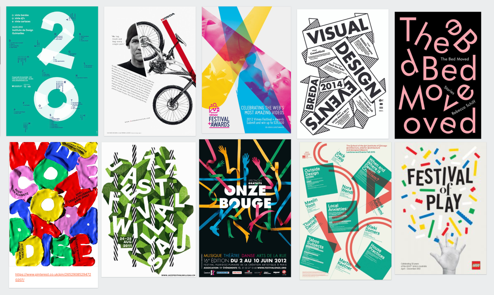
the title, the bed moved. And even though I haven't
read the book and the title doesn't
really mean much to me. I'm immediately intrigued and interested thanks to
this unique design. So remember your choice of visual flow for your composition should always be aligned to
the message of your work.
9. Silhouette: In graphic design,
recognizable silhouettes or outlines of objects can be
used in many different ways, whether they are acting as a
holding device or container, grouping together
multiple elements, hinting at things
in a subtle way or even to activate the figure
ground relationship, one of the Gestalt principles that we cover in another topic. In this video, we will analyze a few very creative work that
is utilizing silhouettes. But we will also learn
what's the difference between a silhouette
and outline, a contour and the profile. So technically, we should only refer to something like
this as a silhouette, in this case, the silhouette
of a bird and within it, the silhouette of a
ballerina or dancer, where a solid shape is used to represent
something without showing any details
inside the shape itself. And the most traditional way
of thinking of silhouettes is to have a black shape
on a white background. And the easiest way to
remember the definition of silhouette is to simply
think of your shadow. It is a dark
feature, less shape, but still can be
recognized that it is connected to you to better understand how
silhouettes work. Here is a great
example where we have a transition between
areas where we can actually see some details within the image
that helps us to identify and separate these two basket players
from each other. By the rest of the image like
the hands, the basketball, and even their legs, don't even require any detail for us to understand
what we are seeing. Whoever came up with
this clever composition must have played
a lot around with various silhouettes
until they found the right ones that they
could use for this advert. In this composition, we can see the combination of
silhouettes and outlines. So the silhouettes again are these shapes that are
filled with color. While these others are the
outlines where we don't have any field detail
inside the lines. And both of these
methods are commonly used in Logo and icon design. And even though they are
very similar to each other, they can still achieve a slightly different
perception in your viewers. You can consider
the main difference between them being
that silhouettes are positive shapes by
outlines or negative shapes. And in this case, these
terms are not used to say they are good or bad, is just simply a way
that we categorize shapes in the way
that they feel space. Here is an interesting example where we can see
the combination of a silhouette of a tree inside
this container, number two. But the number itself doesn't
actually have an outline. So the composition
also relies on the Gestalt principle closure. So our mind has to connect
the missing details or fill in the gaps on the
outline of this number. But the main reason
I'm highlighting this composition is to
show that you don't always have to show the full silhouette of something for it to
be recognizable. The same thing is happening
in this composition. Again, we can recognize
both the bird and the dancer without seeing
all of the details, even when they are
simplified down to merely showing
their silhouettes. Here is another
interesting composition. Where do we only see a small
detail of this trainer? Why the rest of its contour
or shape is only suggested by the silhouette made up of these various colorful
shapes combined. And as you can see, you can even create contrast by
combining sections of an object in full
photographic detail with simple colorful shapes hinting
at the objects silhouette. Another term that is
also commonly used in graphic design and sounds
very similar to silhouette, is contour, which is
better used when you are referring to the
shape of an object. For instance, this
illustration uses a rounded and curvy contour that emphasizes the woman and
sexuality in this composition. Or here's another clever
advertisement where we can see contours and silhouettes
working together. So when looking
at these icicles, we can refer to their contours, which also helped to hint or suggest the silhouettes
of famous landmarks, like the Statue of Liberty
or the Eiffel Tower. So you can see that
these two terms are very similar to each other. There's only a subtle difference
in the way that we use them when we're referring to solutions or details
in a composition.
10. Profile : Another similar term you might
have heard of is profile, which is used specifically
when we're looking at something or someone
from the side. Profile is a very
commonly used term, for instance, in
portrait photography, where of course it
would be focusing on the side view of the hand. A profile doesn't
necessarily mean that we don't see details on the face or on the object
that we see from the side. It is better to remember it
and use it simply just as another word for seeing
something from the side. In this case, this is
the silhouette of a girl in profile view
paired with another image of these
flowers and plants slightly crossing
over its contour. You can see I'm trying to highlight the subtle
differences between these terms and with
a bit of practice and paying attention
to how to use them, I'm sure you will
be able to also apply them all in your own work. And finally, let me highlight a few more compositions using these terms that
we just discussed. So in case of this
last your poster, we have a couple of silhouettes. First of all, we have the
sort here in the middle, which is created with
negative space or whitespace. But we also have
another sword in black which would be
considered positive space. But still, that is
another silhouette. We also have another
silhouette here at the bottom, which in this case, this is a
special type of silhouette, which we normally would refer to as skyline, in this case, showing this fortress
or castle or so, we have the silhouette of
fire here at the bottom. And finally another
subtle detail, the dripping blood
here on this sword. So that is a silhouette
within another silhouette. And you can see that all
of these silhouettes, obviously our illustrations, and the combination
of them and the photographs in the poster can
work really well together. And while the photos are
mainly helping us to recognize these actors and
actresses in the movie. The silhouettes of these objects and architecture tells us a lot more about the story
or the plot of the movie. Here's another great example of a movie poster where
the silhouette of a cross is used in combination with the
silhouette of an oil pump. And if you've seen the film, you know that these are the two opposing themes in the
movie, religion and greed. If it wasn't obvious enough that this is supposed
to be an oil pump. There is actually another
one there in the background. Even though it's quite faint,
it's still recognizable. And the reason I'm highlighting this composition is to
show that sometimes silhouettes are the best way
of simplifying something. And instead of
concentrating on details, seeing only the general shape
of something helps us to concentrate on the real meaning
behind the composition. You can always rely on
silhouettes, of course, unless your subject
is very recognizable, like with this iconic
scene from Forrest Gump, we immediately recognize
what we are seeing also in contexts
of an Apple logo. We also immediately
recognize that this is the profile silhouette
of Steve Jobs. The same thing with
horizontal force. Famous character
Indiana Jones, again, is enough to be implied as a silhouette visible
within this cave. But there's actually
another silhouette within this larger
silhouette in this case. And here's an even smarter combination of two silhouettes. A poster by Olly Moss, where we recognize
the famous character Baba fat from Star Wars, thanks to the contour
of its helmet. But what really makes it recognizable is this
detail here in the middle, which by the way, is also the
silhouette of a building. The Empire Strikes Back movie. So not only we have two
silhouettes on top of each other, but they are also aligned in
this extremely clever way. That is something
similar going on in this Dark Knight Rises poster, where we see the silhouette of the Batman logo in the
background, in the skyline. And the ears on Batman
scape are perfectly aligned where we would see the ears of the
Batman icon as well. So we could continue the
silhouette around them. And we would get the icon or a logo there
in the background. And this is also a good
example to think about the relationship between a
silhouette and the contour. So when you try to define the way we see
Batman in this case, I wouldn't call this a
silhouette because we can see details of his armor
and even his face. It is better
referred to an image where his contour is emphasized.
11. Line: A line is a basic and very
commonly used design element. And the reason why
we're covering it under the composition topic, because it can be used
to emphasize a lot of different aspects
within a composition, like directing the
viewer's eye to add detail within
the composition, like a focal point, or to create structure and add hierarchy by dividing
certain areas. They can also be used
as motion lines and emphasize the direction or
flow of the composition. They can form patterns, they can introduce rhythm, and the list goes on. Even though, as I
said, they add one of the simplest design elements, it is up to you as the
graphic designer to come up with creative ways
in utilizing it. So to start off, here is a
beautiful illustration which uses only lines and they are
even the same thickness, which of course
helps to establish unity and harmony
in the composition. In this particular
example uses lines to form these floral decorations, but also to present
these birds with only their outlines and
some details inside them. And again, another
composition where we only have lines,
but in this case, they are also forming topography besides some details like
the clouds and the sun. And the interesting
thing here is that this composition
works really well, even though there's quite
a lot of missing details. So the lines are not completely closed either on the typography or even on the environment like we have some gaps in the clouds, also gaps on the sun because we have just enough
visual information. It is still not confusing and relying on the Gestalt
principle closure, our mind easily
fields in these gaps, using lines in combination with a photograph can create
a lot of contrast. And in this case,
since these lines almost completely
fill up the backdrop, they also form something
more similar to a texture. And here's an even more
extreme example where at first it seems like these lines are just forming a random texture. But then you can also recognize the text or topography
hidden inside it. And it is quite a common
and effective technique to simplify topography
down simple lines, like in this case,
we have these thick, round kept lines that
form the word thing. And the fact that
we're not only seeing the silhouettes or
outlines of these letters, but the actual shapes, these lines that
they are made of makes this composition
much more interesting. And dynamic. Line drawings are
also commonly used in graphic design projects and
in this particular advert, they are used in combination
with a photograph and by having them overlaid
on top of each other. And the drawing showing the
dangers of eating fast food brilliantly simplifies
and presents the main message of this poster. Lines can also commonly be
used to represent action. In this case, we can
immediately recognize that these three names or
brands were crossed over. And like with everything
in graphic design, even though we're not seeing the actual motion of
them being crossed out, we can imagine it happening, especially because
these lines look like they were drawn with
a crayon or chalk. So the combination of a
simple design element, a line in this
case, with texture, and a bit of randomness, instead of keeping it
completely straight, perfectly suggests what
this issue is about. So remember, don't underestimate the power of a line
in your compositions.
12. Tangents to avoid: In graphic design, since we are working in two dimensions, it is very important
to make sure that elements that we
place next to each other, I clearly separated
when we don't want them to meet
and we should always make sure that it is
established what is closer to us and what is
further away in space. When two shapes are placed
next to each other, the shared line between them
is called implied line. If it is used intentionally, it can create very interesting
compositions using juxtaposition or contrast
between different elements. However, when it is
introduced by accident, we will normally refer
to it as a tangent. And that is something
you most of the time would want to avoid. And there's even another
term that we use for this, which in real life
is a nice thing, but in graphic design, again, is something that
is to be avoided. And that term is kissing, again, coming from two things, meeting or being aligned
perfectly next to each other. Let's take a look at
a couple of examples. Mainly good examples where tangents are used
in a positive way, creating implied
lines, but also see the issue with tangents
introduced unintentionally. So to start off here is
the series of posters. And in each of these, we have two objects aligned
to each other, creating juxtaposition to
emphasize the message, which is words, keel wars. And notice how all of
these posters placed the harmful object
on the left side. Why we have images
on the right side showing vase of communication. And in this case,
these images are not only aligned to each
other in a smart way, but also together, they suggest the original
contours of the weapons. In case of the
grenade, for instance, we have the profile picture of a person on the right side, but the two things
together reminds us of the original
shape of a grenade. And the same applies to all of these other images in even
this microphone is used in a way that it
reminds us more of a missile, then a microphone. So the designer
wanted the first read of the viewer to be a veteran. And only after a bit of
time they will recognize the other object which is
used for communication. There are many other
similar examples to this on this board,
but once again, multiple images are
combined together, revealing only certain
parts of each of them. But the key technique
is to confuse the viewers to see these two
separate objects as one. Before looking at a couple
of other examples when design elements are
aligned purposefully, I want to show you the problem
with introducing tangents. So here is a thumbnail
image that I created for a YouTube video. And on the left side you
can see the actual design. By, on the right side, I created a version of it, but I intentionally
moved things around to produce these unwanted tangents. So maybe pause the
video at this point if you want to find
these by yourself. Because now I'm going to
start pointing them out. So the first one
that we can spot, if we start scanning
the image from the top-left corner is
this one right here. So this circle is placed
exactly aligned to the Illustrator icon
compared to the way I had it originally aligned
further to the right. We also have the same issue
with this circle here, again, tangent to the hat that
this woman is wearing. While again, in the
original composition, I had just enough overlap
between the hat and that sphere to make it obvious that the sphere
is behind the hat. This shape down here is
also tangent to the text, even though it's a
small little detail, there is still feels strange. So we are not sure whether
the text is supposed to be in front of this
shape or behind. And the same issue is
happening right here. Once again, there is a tangent point between the text and that
three-dimensional shape. Even when something like this
detail here that's blurred out is meeting on a
tangent and another shape. It can still be distracting
and confusing for the viewer. But this curve shape even has a third tangent
point with the hat. So there's one tangent there, another one here, and
another one there. Compared to this in the
original composition, it was placed
clearly in front of the hat and away from
all the other elements. So there is no kissing
and no tangents. By now, I'm sure you
also spotted a couple of really bad placement for
these floating 3D objects. And the main thing I want you to remember from this example is even when we are trying to
create some randomness, having floating objects
within a composition, you should still pay close
attention to their placement, making sure that you're
avoiding creating tangents.
13. Intentional tangents: Just like other principles
and rules in graphic design, once you learn how
to avoid tangents, you can come up with clever
and sophisticated ways of introducing them in your composition and actually
improve the way it looks or even improve the
unity in the design. So in this case, we have
this strong diagonal line dividing the two colors
used in the background. And the same line is
also used to divide these blocks behind
the topography. What is a very
subtle detail here is that even these two letters, the y and the a, is also aligned to the
same diagonal line. So there is a tangent between the topography and that division
line in the background. And since it is not affecting
legibility or readability, and also it's not making
the composition confusing. In this case, the tangents
become these subtle, unique, hidden details
within the composition. So instead of considering
these as mistakes, I would rather call
them smart solutions. By now we know that
when you place two things exactly
next to each other, you can create tangents. But the same problem can
happen when you place objects exactly aligned to
the edge of your frame. And that's exactly what is
happening on these poster. So we have this text here
aligned to the right side and even this word care is almost exactly aligned
to the right edge. And if it wasn't intentional and supported by the
rest of the design, I would consider it a mistake. But once you pay closer
attention to other details, like having this code also
perfectly aligned, the dean, the portray, again creating
tangents on both sides. And even this text here aligned perfectly to the headline. So if I were to
continue the hair, that's where it continues and even the other side of
the hair is aligned to the text or the corner of these two letters being
perfectly aligned, again to the outline
of the face. And even this a is almost perfectly aligned
here on the left. So because of all of these
instances of tangents, we can tell that these were all intentional and it can always create a shock value when you
go clearly against rules, even though tangents
are not something that most people
are familiar with, they would still feel that something is off on the poster. And that's exactly what the designer wanted
to achieve here. Because that goes again really well with the story
of this movie. Even the title itself
is contradictory. Even though it
says, I care a lot, the actual meaning of that
in the movie is completely different without me spoiling the film by saying too much. Now of course, seeing tangents on the movie poster doesn't always mean that it was
intentionally introduced. As a graphic designer, it's good to develop a critical eye and looking
at a design always thinking whether something
was intentional or not or whether something
is working or not. And in case of this
poster for taken to, I spotted a few tangents
that I'm pretty sure was not
intentionally introduced. Again, if you want to
play a bit of game, you can pause the video
right now before. I'm going to point them
out to you and see whether you can find more
than what I'm going to show. So the first and
most obvious one is this strange crop of having Liam Neeson had almost perfectly aligned to
the edge of the frame, yet still cropping into
it just a little bit. I can see that they
tried to make him look as big as possible
on the poster, but I'm not sure that this is a good way of doing the crop. And similarly, I wouldn't
have an important detail of this landmark in the background aligned perfectly to
the edge of the frame. Like here on the
left side we have a little bit of
space next to it. But on the right side it
is forming at tangent. But even within the
picture of Liam Neeson, we can find the tangent
gun that he's holding is perfectly aligned to
his leg in the background, which is slightly distracting because this line
looks more like an extension of the gun
almost as if it's shooting, even though it is just
simply, here's lag. One other minor tangent
that I noticed is the alignment of the letter T to the tower here
on the left side, and also some other details like the tip of the a with the album. So after seeing this example, if you haven't already
been doing this yourself, and you can now start
spotting tangents in posters and all
kinds of designs. Similarly to sporting kerning
mistakes in typography.
14. Conclusion: Congratulations on
completing this course of the graphic design
theory series. I hope you found it
useful and inspiring. Don't forget to go through
the glossary of terms PDF, review everything we covered, and if you feel ready, take the quiz to
test your knowledge. Come back anytime to
the references on the millenial boards we used
in this course to help you remember the things we
talked about or define inspiration for your
next design project, please let us know if you felt there was
anything missing from this course or if you have any suggestions on how
we can improve it, email us at info at the
assignment designer.com, and we will get back to
you as soon as possible. We really appreciate
your input and help. Now, it's time for you
to pick your next topic and dive into another graphic
design theory course. Remember, there is no right or wrong order to
complete this series. All the rules we
cover are equally important and
everything is related. But what is most important is getting a good understanding of these rules and applying
them in your projects. I'm sure you will
use what you've learned to create
something amazing. And I cannot wait to see it.
 Martin Perhiniak, Graphic Designer, Illustrator & Educator