Transcripts
1. Introduction Compositing: Compositing is the art of
combining multiple photographs together and making them look seamless, believable
and beautiful. I'm Martin. I have over 20 years of
experience as a graphic designer, illustrator and Adobe
certified instructor. I have worked with
companies like BBC, these knee, Google, ikea, and I cannot wait to share my best
practices with you. This is a streamline
hands-on course focusing on a real
life design project. I will be walking you through everything step-by-step
and you will get all the exercise files
so you can follow along in case you
prefer not to copy me. You can also follow my workflow using alternative
assets provided. Create something
completely unique that you can showcase in your
creative portfolio. I am pretty sure
this course will inspire you to create
something MAC. We will create four unique and imaginative
compositions using Adobe Photoshop with the theme
of nature and exploration, I will be using both the iPad and desktop versions
of Photoshop. You can follow along with
whichever version you prefer. For each of these columns, we will be using
liters, selections, masking, transformations, adjustments, feel terrorists,
and smart objects. Besides all the technical stuff, we will also cover some important graphic
design theory that you will be able to apply in any of your future
creative projects. You can join this course without any prior knowledge
in graphic design, illustration or
Adobe applications. But to complete the project, you will need access to Adobe Creative Cloud and a
desktop or laptop computer, but now it's time
to start creating. So I will see you
in the next lesson.
2. Inspiration Adam and Eve composition : We will be creating
this collage of images. And like always, you
will be able to download the same exact images that
I will be working with. And you can recreate something
similar to my composition. And then the same
board where you will find a stock photos. You will also see some
references or inspiration to show you how creative retouching is used in advertisement. This is a very specialized
part of graphic design. And whoever wants to get into this particular field has to
be very good at Photoshop. Now, for most of
the other projects, we use the combination
of the tools. But this time, all we need for
this project is Photoshop. We will be putting
together these images, masking them out and then using adjustment layers to correct
their colors and relying on smart objects to make
sure we can easily resize images without
losing their quality. For this composition,
I decided not to advertise any
particular product. Instead, I went for the Adam and Eve theme,
which as I said, you don't have to follow
if you don't want to, you can come up with your own
story for your composition. And this is the perfect project to practice visual storytelling, which is a very important skill for every graphic designer.
3. Document Settings, Selections: First of all, let's
start with a document. I'm just going to choose the print category
that I'm going to set 3 thousand pixels for the width
and 3,500 for the height. We will need art boards and the rest of the
settings can stay. And immediately one thing I normally change at
the beginning of retouching projects is to add
a solid color background. So this is the solid
color adjustment layer. And I'm going to work with this gray color so
that 70% brightness. You can use the same or you can work with something
else if you want to. And I normally even delete the
original background layer. This is going to give us a good backdrop on
which we can work. The reason I don't
like working with white backgrounds is that it is easy to miss some details
while on gray normally, you can spot most of the
issues around your selections. So jumping back to the
final composition, I just wanted to show
you that we will be starting with the
people in the image. So we will have Eve and Adam prepared in this
video for the comp. Now in order to be able to work effectively with the images
in this composition, I always recommend saving them
first as Photoshop files. So instead of placing JPEG
images into the comp, It's always better
to use PSD files. Let me just show you
why I normally do this. So if I place in an image like this one and I accept
the placement, then this becomes a smart
object, which is great. That's very useful
because we can always resize it up and down and
we're not losing quality. However, if now I want
to add my selection, so I choose Select Subject and then I mask out this image. Now, the mask is not
inside the smart object. Why is that a problem? Well, because if I
resize this image now and then I resize
it back up again, the quality of the
mosque will suffer. If I Alt click on the mask, will see how blurry
it got because that wasn't stored
inside the smart object. So this is very important. You can see if I just
undo the last two steps, we have a much
nicer cleaner mask, which we don't want to lose. So similarly to the
quality of the image, we also want to preserve
the quality of our mask. And the best way
we can do that is by keeping it inside
the smart object. I'm just going to
delete this layer mask. Double-click on the thumbnail
of this smart object. And if I add the mask here, the same way as I've
done it before. If I want to save this image. And you can see Photoshop
is telling us that we can save this as
a Photoshop file, but now it won't be associated with the
column that we started. So that is why I
recommend not to place in jpegs directly
into the composition. Instead, first, open these images and
save them as PSD files. I will make sure this is set to Photoshop and also
the other one, save as a Photoshop document. And this applies to
all of the images that we will be using
for this project. And now that I have
the PSD versions, I can drag and drop
these into our comp. I will press Enter, Enter again to accept
the placement. And now if I want to add the mask inside
the smart objects, I can do that by double-clicking on the thumbnail and choose, Select Subject and
save that as a mask. And then just go to File Save
to update the smart object. And the eyes you can see
there's no issue saving it now. And when I close the Smart
Objects source document, we will see the mast image already in our main composition. Let's do the same
with the other image. Again. I double-click on it, then go select subject, and then save it as a mask. Maybe we can already refine this bit here using
the brush tool, making sure that the mask is highlighted and black
color is selected. I can just paint over it. And also it's missing detail. I paint over it with white. Now, as I said, don't spend too much time
re-finding selections at the beginning because
you might not use the images that
you've selected. So I'm just going to
leave it there for now. I will save this, close it. And now we have the
two images ready. We will have to make sure that they look realistic
next to each other. They should be roughly around the same size when
you have people. And the best way to make
sure that they match in size is to compare their hands. Because of course, they can be different in height or there is the closest part of
the body that we can use for matching images. Now of course, we
will also have to refine and match color, contrast and even the
light source in the image. But we will come
back to this later. For now, we have these
two images ready. And in the next video, I'm going to bring in all the other images
that we will need.
4. Adobe Bridge, Image Processor: Since we have six more images, I am going to use Adobe Bridge
to speed things up a bit. So in this application, we can navigate to any
folders on our computer, but it allows us
to be able to do a couple of useful
batch processes, like the one that
you can find from the tools menu called
image processor. I selected the six JPEG images. And once I choose this option, I will be able to choose the
save as P as the option and make sure that it's
going to save it in the same location as
the original jpegs. So I can just run this process. And if I go back to Bridge, you can see all of the PSD
files are generated here. Now we can select
all of these images, start dragging them and they use Command Tab shortcut
to switch to Photoshop or old tab on PC. And once you are in there, you can just let go and you
just have to press enter a couple of times
to make sure all of these images are placed in. But the best thing is that all of these are
now Photoshop file, so we can easily go inside them by double-clicking
on the thumbnail. And already here you can see in the tab it's a PSD
file, not the JPEG. So once again, we can start
doing the selections. I will use again subjects
selection, creating a mask. And then I can see a few details here
still not masked out, which we can probably refine
by selecting the image again and then go to
Select Color Range. Then let's click on this
color here in the background. And we can increase the amount for color range to make
sure it covers that area. We can also see a
selection preview with a black mat on here. I think that's done
a really good job. Can just click Okay, and then going back to
the mask selection, we can feel with the black by pressing Alt or
Option Backspace. That's fill with the
foreground color. I will check how this looks. I feel like it looks quite good. We can now just paint over these little details
here at the bottom, which I am again doing on the
mask using the brush tool. With black, I can just
paint over these bits. You can also try to use color
range to isolate the water. But I feel like it's not
a big job to do this. I'm just going to do it now. Once again, this
is something you should only do and spend time on refining selections once you are really sure that you
are going to use an image in your
final composition that might be a
little bit too big. Brush size. Yeah, that looks better. And then just have a little
bit more water left here. I don't necessarily have to keep all those branch details. I can already start sculpting a bit the image as well. I
think that looks good. So let's just save
this document, jump back into our
main composition and we can check how it looks. Yeah, I feel like this tree
will work really well. We can just place it
at the bottom for now.
5. Cloud Selection, Refine Edge: From this image, all
I need is this cloud. But once again,
don't forget First, let's jump into what inside the smart object
that we can make a selection with the
object selection tool and then turn to
selection into a mosque. And then to refine the mask, I am going to double-click
on the mask thumbnail, which takes us into
the select and mask workspace here first, let's use the Refine
Edge brush tool. With this, I can
very quickly paint over any details that
I don't want to see. All of the edges basically, I am painting over
and then also I am turning on the decontaminate
colors option. So this is going
to help me remove any unwanted blue tones
around the edges. And in the output
option is going to need to save this as a new
layer with layer mask. That is because we are using
the decontaminate colors. Let's click Okay, and
we will still have the original image in the
background if you wanted to. But this new version
painted over the edges, just temporarily
turning off the mask. You can see that it really
ruins the image in a way, but it works very well
for the selection. And you will see
once I save this, we jump back here. If I turn off all
the other images, only keep the ones that we have. You can see how well this
cloud is going to work. So it's a perfect selection. Alright, so let me
just put this down here and then continue
with another image. We have the apple. This is a tiny detail, but still I like to keep it as high resolution
as possible. Once again, I'm going to use Select Subject and
then mask this out, save this document, and then
we can already re-size this. Keep it smaller than,
here's another Cloud. Once again, double-click
on it first, then select subject again, turn it into a mask, double-click on the mask, and then with the refine edge, I just paint around the edges. I'm using a fairly
big brush for this. And then with
decontaminate colors, we can neutralize the edges. Click Okay, save this document and we have our second cloud. And you can see already that even the colors of the clouds will need to be adjusted to
make sure that they match.
6. Select Sky, Inverted Mask: But for now, let's continue
with another image. We have the birds
double-click inside the smart object and then
select sky this time, which we can then
turn into a mask. But because we selected
the sky and not the birds, we will have to press
Command or Control I to invert the
colors of the mask. So now the birds are visible. They are white in the mask. But there's a few details
here that we need to fix. First of all, we need
to use the brush tool with the black color and
paint over the edges here. Then I am going to
use the Burn tool with which I will be able to
paint over this part here. Make sure that you have
the range set to shadows. That way you will be
able to remove all of that detail without
affecting the actual birds. But if I zoom closer, you will see that there is
a halo around the birds, which we can also get rid
of it, the burn tool, but it's even faster if you use an adjustment on the mask. And I normally use levels, which is Command or Control L. And here all we have
to do is to just get rid of all of these
very dark details, which are all of those
halos around the birds. So if I click okay, now alt or option
click on the mask. We have the refined
version of them. Sometimes it helps if you duplicate your image
maybe once or twice, to make sure that any
semi-transparent details become fully visible. So let me just show you
if I have one layer, you can see that some of the details around the
wings as see-through. But once I duplicate
this layer twice, they become completely solid. So that's another quick
and useful technique and we can save this
document again, jump back. Now we have our birds. We can order the re-size this. We don't have to
worry about losing quality thanks to the fact that everything is set up
as Smart Objects. And then the last image, my favorite one for
this composition, this really cool
looking cliff or rock, which again, we will have two separate from its background. So let's jump into it
and then choose, Select. Subject does a fairly good job. But then I am going to also use the brush tool and just paint over these few details
here on the left, we will be carving into this a lot to make sure it works
for our composition. But for now, I am going to save this and close the document. And then we can just
re-size it here in the main composition and place
it somewhere to the side. Okay, so that's all the
images that we needed. At this point, I
already liked to name my layers and there's actually a fast way to name
all of your layers. I'm just going to type in
birds and then pressing tab, you can switch to the
next layer that I will call rock than cloud, than Apple, than cloud. Again, there's
three, There's IV. So it's much nicer and neater, easier to find the layers
that we need to work with. In the next video, we
will start to put things together and create
the composition. And even though it is going
to still be in a rough state, we will already start seeing how everything is going to
come together in the end.
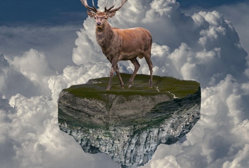
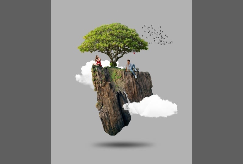
7. Setting up the composition: Probably the most
important detail in this composition
has to be the Ciroc. So I'm going to start with
this and make sure that it's set up in the right
place and the right size, then we can compare
everything to this. So this could be our
reference 0.1 of all, I'm going to use the free
transform tool and rotate this rock to maybe
somewhere around here. I want to have a nice
subtle angle on the top. And instead of using
the tip of this rock, which originally was the top, I will actually have
everything here on this side. And that's the good thing about working with these
images that you don't have to stick to even
their orientation, as long as it was
still look realistic. Let's just move this
somewhere around here and I'm going to
increase the size a bit. Okay, that's close to
what we will need. So now we can start
moving things around. And first of all, and we will have to
make the pupil smaller. So let's just select both of these layers and resize them. And also I'm going to make
sure that they are above the rock layers so we will be able to move them
in the right place. So I will have Eve sitting
here on this side, but I will flip this
layer horizontally. You can do this from the
Edit menu transform, flip horizontal. So this way, she's still
looking back at Adam, but he will be
somewhere around here. And I would like
to have some space between them for the tree. And of course this tree
will have to be bigger. So I'm using again
Free Transform, start increasing the size. Something like that is
closer to what we need, but we also need to make
Adam and Eve smaller. So let me just start
resizing this further. I think that is getting
closer to what I will need. So it gives you enough
space between them. And I will also flip this
tree because I feel like the light source of these
images are more from the left. And it wouldn't be
realistic to have more bright details on the
tree on the right side. And as something that you
should always pay attention to. So to match the direction of
light in your composition. Some images doesn't really have a strong directional
light like this one. But here we will be
able to introduce it to make sure it matches
to the other images. Move this slightly
higher and we can sit Eve slightly
behind these rocks. So it just feels a little bit
more integrated like that. I will actually make
her even smaller. I think that fits
quite nicely now. And then add them can
also be slightly smaller. I feel like that
looks better Now. We can refine this later, but I'm happy with
how this looks. Now let's just move these clouds where they're supposed to be. This cloud should be in
front of the composition, like the other cloud will
be in the background, but similar to before. This will also need
to be transformed. Notice that I even have a shortcut setup for
flip horizontal. I'm using function
for which makes it much easier to flip things
around whenever I need them. So this cloud can be slightly bigger and it should be
under the tree as well. So it's almost completely in the background,
something like that. And notice how I am
using the clouds to add further depth
in the composition. So intentionally
I'm using one in the background and another
one in the foreground. The birds we can use to
balance the composition. So I'm going to place them
here on the right side and the apple will be able to
go or so on the right side. So I will make it
obviously smaller, even smaller than that. Again, we can always
compare it to a person. We can imagine at them
holding this apple. And I think now
it's a good size. And we can draw a stem on it or just keep
it like this for now. I like the idea of having
a single apple there. It makes it more of a focal point and makes
it really stand out. And I intentionally
chose an image for IV where there is a red dress. So that's creates
this connection between the two details
in the composition. And now if we zoom back, we already have a
good composition, but we will have to do some adjustments,
refining some selections. But also I would like to create a more interesting
shape for this rock, even though this triangle
looks cool and we could pretty much leave it
like this if we wanted to, but I prefer to give it a little bit more organic
and unique shape, so we will be doing that
all in the next video.
8. Sculpting the rock layer: So let's do some sculpting
on this rock layer. The way I'm going to do it is by adding an additional mask. Remember that we have a mask
inside the smart object, but now we will have
another mask outside. And the reason why I am okay
with having the mask here, because I know that I won't be resizing this layer anymore. It's already in the place
and size that I needed. When I zoom closer, we can see still very
high resolution. So it is okay now to have
this additional mask here. And with this, we will
be able to give this a general shape that will
work for the composition. So what I would like to do is first carve off a little bit. On this side, I'm
using the mosque and the brush tool with
black color selected. So that looks good. Let's just cut off
a bit more here. Then we will also want to have this shape
coming down this way. And then let's just carve
off this bottom a bit. So let's cut into it here. For now. I'm just going to hide the Cloud so I can see
what I'm doing here. So first, I'm just going roughly around the
edges that I want to create, but then we will refine this. Okay, so let's take
a look at this. So without the mask, this is the shape we had. And with the mask
it looks like this. And then with the
Cloud together, this is how it's gonna look. So I like this. Maybe on this side, I will cut into it a bit more, but we can refine this later on. But the most important
thing when it comes to removing details from images and creating
unique shapes is to think about how it
would work in real life. So what's important is to really pay attention
to some details. Like I can see that there is a crack in the rock face here, so we can utilize that and we
can make sure that there is some detail showing that
if there was rock missing, Let's see here, then
that would most likely be a little bit of
gap under there. So we have following
this line here, I'm just reducing the
size of my brush. And this way, it starts to look a little
bit more realistic. If you go too far
into something, you can always add
the details by pressing X on the keyboard
and painting with white. Let's just bring some
details back here again. And I really like
how this looks here. So I'm not going to
make any changes there, but coming down further, we can start carving
into this a bit more. Once again, let's just try to introduce some details here. I just want to make sure
it feels organic enough. We want to avoid too
much curvy details because it's a rock. So it should be a bit more
sharp around the edges. And there's actually
a better tool to create sharp edges instead of working with the brush tool, that is the Pen tool. Now with the Pen tool, I recommend using the
combined shapes option and set it to path mode and
then zooming closer, I can show you how I
would normally do this. I just create straight
lines like that. Then close it up and then press Command or Control Enter
to make a selection. And then still having
my mask selected, I can just fill
this in with black. In this case because black
was in the background, I use Command or Control
Backspace where you can even use the brush tool and
just set it to black and then paint
over that selection. You can see that this helped to create a little bit
more sharp edges. And then we can go into it with the brush tool
and just refine this a little bit further so it
doesn't look too sharp now. It has a bit of variety. And then here I can go in and maybe just create a
little bit of detail as if there is some cracks showing
up further in like that. But I would like to also
create a few bigger gaps and I think the best place would be around here,
so in the middle. So I'm just going to zoom out a bit just so I can see
the whole thing together. Then I am going to start
masking out this part here. And then we can create a nice gap in here that
might be too much, but I prefer to go
beyond what I need and then bring some details back so we can go
all the way up here. Make it feel like there's
almost a split on this rock, which again, you can say symbolizes the split
between the two genders. So I think that looks
quite nice now, I'm just going to cut
back some more details. And once again, we want to make sure that this feels
organic enough. So we can use both the pen tool and the brush tool to carve a, some details. Same thing here. We want to make sure
this is a sharp edge and then we have some sharp
edges further down as well. So it should really
feel natural. It can again split
this rocket bit here, create a couple
of unique shapes. And you probably can tell
that I love doing this, and I hope you will
enjoy doing it too. You can be, again,
very creative here. If you're working with
the same image is still, you most likely
will end up having a very different result
compared to mine. So feel free to be
creative really. Okay, that looks good. We should also make this
bottom part more interesting. Once again, cutting into a trying to follow the
shape of this rock here. And then imagine this in
three-dimensional shape. Once again. You can carve into it here. Following the shape of the rock. The crack, we can add that. And then maybe we can also introduce another
crack on this side. So I'm just going to
cut into eight here. And let's just follow this line up and then bring
back some details.
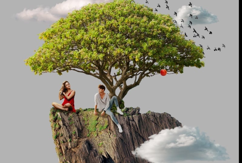
9. Adding depth, refinements: And to make this realistic, we can actually add
some depth here. And the way I will do that is by adding a new layer underneath the rock and then using
the clone stamp tool. I can sample from
maybe this part here, and then just start painting
behind those details. But I feel like we need
this darker parts. So I just changed my sample and then fill
up this part here. And that as well. But that was still
not dark enough. So I'm going to pick
another reference point, maybe something from here. Let's just try this again. I feel like this darker
detail works better. And then let's just add a
little bit more up there. And we can just delete back
a little bit from this. So we still have just a
little bit of gap there. And maybe also here
at the bottom, we can carve into this. Show a little bit of
gap here as well. But yeah, you can
see without this, it would look quite fake. By adding this, we
created a bit of depth. It wasn't necessary here. Maybe around there we
can add the same thing. So I'm just going to
use the clone stamp. And in this case, on this side we can add
a little bit of depth. Okay, that looks good. Now let's check this site here. This definitely needs a little
bit of extra work as well. Let's use the brush
tool and then I'm going to chop this bit off. Like that. Following again the shape of the rock to
make it realistic. Yeah, that looks
more organic now. And here as well, we can go into it where it
separates the two parts. Can again cut into
it a bit if we want to using a smaller brush. I think that looks good. And this part here still
is a little bit vague, but we will have the
Cloud there anyways, so we won't have to spend too much time fiddling
around with the edge. But now that we have
a more interesting, more unique shape, we can still check how it was
before and after. We will also need to make
sure that the colors and the direction of light will
match the other images. So first of all, I am going to place
this layer into a group so the rock is selected and I'm pressing
Command or Control G. And I'll just rename this rock. And inside here, I will
add an adjustment layer. First, I will start with curves, and I'm going to just
drag this up. Now. This is making everything
bright at the moment, but we will make
sure that it will only affect the rock by selecting the group and setting
it to normal blend mode. So instead of the default pass through once we
change to normal, the adjustment now only affects the layers inside
the same group. But I don't want this
adjustment on the whole image. I only want it here to
show up on the left side. So I'm going to
invert the mask for now by pressing
Command or Control I. So that's completely
hides the adjustment. And then using the brush tool, making a big soft edge brush, I will be able to paint
with the white around the edges that I want to
introduce this adjustment. So I really want to focus on this part on the
image left side, make sure that it
matches the light source for the tree and
also for the people. I will also add a bit more
light on this part here. Just again, make it feel like this is our light source
here on the left side, so the sun is somewhere here outside the
frame on the left. We can also add more
light at the bottom here. But then I would like to also use another adjustment layer, color balance, with which we can make colors a bit warmer. Again, Simulating setting sun, this we could use on the
whole image if we wanted to, which now matches the
tree a bit better. But I actually prefer
it again to be in the same place where
we introduced the light. So we can just copy the mask of the curves adjustment layer and drag it over the
color balance layer. So now we can see it only affects those parts
that we painted over. By the way, you can also create a group for
the adjustments. Plays them both
inside that group. And then using the
mask on the group, you will be able to use that single mask for
both the adjustments. Once again, now we
have a group for the adjustments with
a single shared mask. So if I select this mask and
start painting over details, you can see on both introducing the effects of the curves and
color balance adjustments. I'm going to undo this
last step and that just maybe paint over these
parts here at the bottom. Okay, so let's see without the
adjustments and with them, it looks quite nice. And now let's fix
the colors of Adam. So first of all, let's add
an adjustment layer here, Levels and clip it onto
the layer underneath it. So it's only going to
affect the layer, add them, and then I will drag this down just to increase
the brightness of it. It was really dark before, something like that looks
so much better already. It also increase the contrast in the image which
it was lacking. And I feel like this
could already work. Let's just see from a distance, I think this matches much
better already the composition. But I would like to also reduce the intensity of reds and
yellows on this image. For that, I'm going to use
Curves Adjustment Layer and select red and just
drag it down a bit. And then also blue, drag up a little bit. So this is one like
adjusting the white balance. What we're doing here, you can see how much
more natural it looks. But I actually like
that warm tone as well, which we had in the
original image. So what I'm going to
do is to mask out this curve adjustment on
this side of the image. So we will have a little bit of that warm glow
still showing here. It's almost like again, the sun is shining on this side. So we can have a bit of
those details showing up. Again without and width can also turn off both adjustments
and turn them back on. You can see how important
it was to introduce them.
10. Adam, refining the selection: I can also see that there are some issues with my selection. So this is the time when
we should double-click on the Smart Objects thumbnail and then address these issues. We come here to the mosque and
then using the brush tool, I'm just going to use
a hard edge brush and paint along the edges to fix these details that we just come here into those parts. And then I switch
to white to reveal the missing thumb, finger. And then sometimes it's
easier to use the pen tool. To fix these selections. By again, selecting
the pen tool, I can just draw along the edges. Holding down the space bar
on the keyboard, I can move. The anchor point is
that I'm drawing. If I don't place it
in the right place, you can see I can adjust it
while I'm still drawing it. Then we just come up here. Come down. Again. I'm moving it in the
position I needed. And there it is. So all of this can be removed. Command Enter or Control Enter
to turn into a selection. And then using Command
or Control Backspace to fill in with my background
color, which was black. So that looks great. We can use the same
technique here again, just using the pen tool drawing. Go with this and
then Command Enter. And we can use the Brush
tool as well just to paint into the selection with black. Okay, so that looks much better. The same thing we can do here on the left side or just
use the brush tool. Slightly faster but
not as accurate. So we have our selection
removed or improved. Okay, So the hands
look good now, we should also fix
the hair part. So I feel like if
we double-click on the mask here with
the refined tool, we might be able to fix this or by switching back to the
Quick Selection Tool. We can just paint over this bit. Yeah, I can see that
was more hair that were lost on the way. Okay. That's too much now, I'll just undo that last step. There's more parts
here missing from the face that we
should bring back. And then let's just
test this part here. Actually, yeah,
this we don't need. That looks already much better. We can click Okay, and then here with
the brush manually, we can just paint over edge, make sure we get this right. It's important details here. The I and the hair. Yeah, I feel like
that looks good. And then around
the chin as well, we want to make sure that
this is not transparent. So yeah, I feel like
that looks good. Now, let's just save these changes and go back
to the main composition. It's a small detail, but it already looks
so much better. So that was before.
This is after. Again, both the hands and the hair looks much
more realistic now. And I will just come down
to the rock layer and add a new layer just above
it and clip it onto it. Because I would like
to add some shadows here to make sure that
it looks realistic. So I will pick a darker shade, maybe this color, set this
layer to Multiply blend mode, and then using my brush
tool with a soft edge and maybe a reduced
opacity down to 30, I will be able to paint
over some details. So this can be darker. Just under the trainers. Also around here should
be slightly darker. So that way it looks
more realistic. So adjust on his hand should
definitely be darker. And also where he's sitting. I shouldn't be bright
details should be completely
blocked out almost. Yeah. So we can see it's already
starting to look better. That one must be maybe
a little bit too much. You can add some dark
details here behind. And also here. Let's see scar shadow. Remember the light source
is coming from the left. So these parts
would be in shade. Let's take a look.
This was before, and this is after. Definitely integrates into
the scene much better.
11. Eve, adjusting the selection : And with e we will have to
do the same thing first, let's just refine
this selection. So I go inside the smart object and then double-tap on the mask. So let's see what we can do here using the Refine Edge brush. It feels like it's not going
to make a better selection. Or we can check this
with black and white. I normally like to
see it like this, whether it's recovers the edges of the hair better or not, it seems like it doesn't
do a good job there. So I am going to use the Quick Selection Tool
and just paint over. And then holding
down the Alt key, I remove these edges. So this way we have a
better selection around the hair and then we can just
switch to the brush tool. Let's just simply painting
over these parts. That was a mistake. Let's just undo this and
then go back to on white. On black, on white is
probably a bit better. So let's just paint over
this part here a bit more. Lost a bit too much of
the original head detail, and then we can just click Okay, and then here
sometimes what I do is to add another layer like gray, and then I can refine
my mask a bit better. I'm just going to paint
over these bits here. Bit more. There can create a
bit of gap here. The goods selection
is not always the one that shows exactly
what was in the image, but it's more about refining the image in a way that
it will look realistic. So you just want to make sure, of course, that you are not missing any
details from the body. So you want to have a nice
clean edge like that. Again, this part here
needs to be visible. And I think for now,
that's enough refinement. So let's turn off that
layer that we use just to show the issues. And I'm going to
save this, close it. And we can see once again
before the refinements and after subtle but still
important refinements. And then for her, I will also use a levels adjustment layer and I will brighten Hurley
are a bit up again, make sure it's clipped
onto her layer. You can see that it looks
a bit better and we can also add the curves
adjustment or so, make sure it's clipped. That's Alt or Option click
underneath the layer. I feel like maybe there's a
little bit too much green on earlier and we can add
a little bit more blue. So we just had to neutralize that very warm tone that
was there in the image. But similarly to Adams layer, we can again use the mask
on the curves adjustment and just hide these
changes on this side. So she still has a little bit of that glow on the
left side. Okay. I feel like that looks good now. And the only layer
we still need to fix or only part we
still need to fix this, the tree for which again, I'm going to use curves
adjustment layer, make sure it's clipped. Then we need to again,
fix the colors. So I'm going to switch to
red and reduce the intensity of red and increase the
intensity of blues. Yeah, something like that. So let's just zoom back. You can see from a
distance as well that this works much better with
the rest of the composition. It feels more like it's a single image as the whole
point about adjustments that you want to make sure that the images feel like
they belong together. And one quick fix
here for the Apple. I just notice that this should also be turned the other way. So I'm using flip horizontal. So again, it has the
brighter side on the left matching light source
and the direction of it. And maybe we can just move this cloud a
little bit higher. And then we can also
select everything together now and move it
slightly in the middle. And just to finish off, I'm going to add a little drop
shadow here at the bottom. So I'm going to
create a new layer, just call this shadow. And then using the
Elliptical Marquee Tool, I will draw a shape which I will feel with this dark gray that
I have currently selected. I picked that from
the rock and I never like to use completely
black foreshadows. It should always be
sampled from the image. We have that in place, but then let's just move this a little bit
higher and then go to Filter Blur,
Gaussian Blur. And we can crank this up
to quite a high amount. Yeah, something like that. And then what I like
to do is to use the free transform tool and
holding down the Shift key, just squash in a bit the shadow
and then just resize it. And this creates like a bit of perspective for our shadow. So instead of being
completely elliptical, we added a bit of depth. But what I will also do is to
add the mask on this layer. And I am going to
just maybe with 40% in density mask out a bit. On this side, it's
actually going to be better if you use 10%. And they just fade it
out because there's more volume of
rock on this side. So it makes sense to keep
the shadow stronger there, especially here in the middle. And then it just fades out
to both left and right. So that's a bit more realistic. Now, this was without the mask, and this is with the mask. And you can see how simple cast shadow can
ground a composition, even though it is an
imaginary composition with a floating rock, it's still good to
apply the rules that would apply
in the real world. Okay, that is all we had to do. I feel like now we have a very believable composition
or collage of images. And the best thing is that everything is completely
non-destructive. So we are using
masks, smart objects, adjustment layers,
and anything can be adjusted or further
refined at any point. This is definitely the way you should learn to work
with Photoshop, because this will allow you
to be able to come back and make changes after you get
your feedback from the client. And the more smart
techniques and non-destructive ways you created things in the first place, the easier it is going to
be to make those changes.
12. Sketching - Nature Type Comp: First, I always start with a sketch and that's
what you can see here. It's a little bit sped up, but it didn't take more
than five to ten minutes. Now, it's very important not to jump straight into Photoshop. So always gets started with a sketch either on
paper or digitally. In this case, I was
using Procreate, but it really doesn't
matter at this stage. So once you have your sketch, that is going to give you a very good starting point for the rest of the
design process. And he's going to really
help you to focus on those important decisions
that you have to make in the general composition without really spending too much time on the small details that
can always come later. So even though you have to
spend extra time on sketching, it is still going to save you hours later on fiddling around, deciding on the sizing and
placement of your elements.
13. Inspiration - Nature Type Comp: Now for the creative process, even before you start sketching, what's important is
to have inspiration. So you need to be inspired by something and it
can be anything. So, for instance, with
this composition, I was inspired by a squirrel and the robin that regularly
visits our garden. So I keep seeing
them when I look out the window from my studio. And I thought it is a
nice idea to turn them into the heroes of
one of my designs. Also, when I was a child and we went to a forest hiking
with my parents, I always found twigs and played around
with them and created small illustrations
or even layout texts on the ground very similarly
to this composition. So once again, it is
just a lovely memory that I wanted to capture here. But believe me, anything can be used as a source of inspiration. So just really have
an open mind and try to identify those
things that inspire you, the things that makes you
excited and make sure you record them and put some
effort into capturing them.
14. Considerations - Nature Type Comp: Before we jump into
Photoshop and I'll show you the most important techniques
used in this process. I wanted to explain what were the most important
considerations I made throughout the process. So first it was to
keeping it realistic, for instance, trees or was
always grow towards the sky. I want it to make sure that
these twigs or getting thinner as they go higher up and they are
thicker at the bottom. That's just the general
anatomy of plants and trees. I also wanted to make
sure that there is a comparative size match between the two
animals in the comp. The squirrel
shouldn't be too huge compared to the
robin or vice versa. Another important thing is
that branch is very rarely grow in circles or form
like a perfect circle. So I wanted to make sure that all those round characters like the O doesn't
completely close up. It still should be legible, but it should be
still open at 1. And I even changed the a from
a lowercase to uppercase letter because I
want it to limit the round shapes in the text. Another important
consideration was to find that fine balance between keeping things organic
and realistic, but also making sure that
the text is legible. For this, I made sure
that the support thing, twigs and branches are slightly thinner than the actual
branches used for the text. I also made sure that the
copy itself is quite short, so there's not many characters that I have to fit
into this comp. And to keep things organic, I also have to make sure that all the characters
are connected, so nothing is just
floating in thin air. These considerations
were already in my mind when I was
doing my sketch. But of course, the
sketch shouldn't restrict your design process. It's more of a guide, but then you can further improve it and refine it
as you go along.
15. Smart object - Nature Type Comp: Now probably the most
important technique for this composition to work was the use of the puppet
warp as a smart filter. So let me show you
how this works. So here I have this
twig on the left side, and I want to recreate this
one here in the middle. So I'm just going to
hide this for a second. So that's the one
that we will be re-creating and zoom closer. You probably noticed
that there are a couple of stretch pixels here. So I also want to avoid that
and improve it if possible. Let's just hide this
and I'm going to use this other layer here. Now, this layer at the moment
is not as smart object, so it has the purple layer
just so you can see it. I'm just going to call it twig, so we can find it easily. And one of the first things
that you might notice is that it's obviously much larger
than what we need there, but also the color is different
from the other twigs. And that is because I used
color balance to match all the colors because
these twigs that are clearly not from the
same type of tree. So I had to make sure that they match as much as possible. But first, before
we do anything, I would always recommend to convert your layer
into a Smart Object. So I'm going to
right-click here and choose Convert to Smart Object, that is before you start
rotating or re-sizing the layer. But you can already mask it out in case you are
doing it yourself. So you can have the
most that version and then you convert that
into a smart object. Now once it is set up
as a smart object, we can use the free transform
tool Command or Control T. And I'm holding down the Alt or Option key to
resize it to the center point. And I am going to also
change a little bit the proportions because I want the bottom
part to be thicker. Remember I mentioned
making it realistic. I'm going to hold down
Command Option Shift or Control Alt Shift together and start
dragging this bottom point here. And that's the
perspective distortion is probably something
like that will work. I press enter to accept the transformation and now
we can move it closer here. Can also zoom closer. And I think I flipped
this around one, so I'm going to do
that from the Edit, transform and flip horizontal. I have a custom keyboard
shortcut for it, but I just wanted to show
you where you can find it.
16. Color correction - Nature Type Comp: Now that we have in place first, let's start with the
color correction. Since I have it close
to the other branch, we can even zoom
closer just to see it. And then this is an adjustment. If we go to the adjustments, we can choose color balance, It's Command or Control B. And if you want to
use the shortcut, make sure you have the
preview on so you can keep an eye on the
changes while you use it. And by the way, whenever you use an adjustment on a smart object, it will become a smart filter which keeps it non-destructive, which will allow you to come
back to it and make changes. So I want to make
it a bit cooler. It's definitely needs to
have a bit more cyan, probably a bit more
magenta as well, and a little bit more
blue, something like that. Let's see, before and after. Yes, I'm happy with that. Maybe a little bit less magenta. Yep, that works. Click okay, and as I said, this became a smart filter
which we can turn on and off. And if I double-click on it, I can come back to it
and adjust the values.
17. Puppet warp - Nature Type Comp: So now that we have that setup, the next one and most important
one is the Puppet Warp, which we can find
in the Edit menu. But before we do that, I am just going to move this whole thing closer
to where it needs to be. So I'm again using free
transform and just rotating it around a bit and just put
the start point here. So I want to make sure it's already set up
in the right place. Now we can go to Edit
and choose Puppet Warp. And then we have to put
down our first pin, which will be here. It's almost like the joints when you're rigging the
character in 3D. So I put that down there, and then we can put another
one here, another one here. And once you have
three points down, you can already start twisting things and setting
your character up. So I'm going to want to
create that nice round shape. And one thing you want to avoid is to putting these
points too close to each other and also to move them
too far away from each other. So let's say I have
them, please, evenly. And then I start moving
this point up here. That works fine. But if I drag it too far, it will start
stretching the pixels. So you want to avoid
changing the distance from the original pin
locations too much. Moving them around is fine, but just make sure you keep the distance similar to
how it was originally. So I'm going to add another
pin here and again, turn it in there. And that already looks
quite good to me. But here's a couple
of useful techniques you might want to
consider using. If you click on a pinpoint, you can then hold down
the Alt or Option key, which will reveal this
little additional radius around it or control points. And with that, while still holding down the
Alt or Option key, you can rotate the
distortion around the pin so you can further
adjust the details. I think that works
quite nicely there. Let's see this one up
here near the leaf. So with this one, you can see without
moving the pin, I can adjust that
detail quite a lot. I think again, that
works quite nicely. And another useful technique is if you hold down
the Shift key, you can select multiple
points together. Let's say these three points, the ones that turn white are
the ones that are selected. And once you then just simply without holding down in
your keyboard shortcut, start dragging one of the
pinpoints that you selected. You can move them together. So I can have those
three selected and just refine this
part of the branch. I think that works quite nicely. Now, if you decide to remove
one of the pinpoints, you can also use the
Alt or Option key and click on the pinpoint
that will remove it. And most of the time, less pinpoints is actually
easier to work with. So that I think is
fine the way it is. Now if I wanted to maybe move
this point here in a bit, I could add additional
two pinpoints and then individually
rotate that up there. And I think that is probably a little bit
better again, remember, we have to make sure the
legibility of this text is good so we can press enter
to accept these changes. And then the Puppet Warp will
turn into a smart filter. Once again, we can turn it off, turning it back on, and then it's nicely folds
up and we can zoom out, check how it looks
from a distance.
18. Masking - Nature Type Comp: I like it, but to
keep it realistic, we need to make
it look like it's connected to the other branches. And for that, I am going
to add a mask, layer mask. So let's click on
the Japanese flag here on the bottom and then use the brush tool and probably paint over this
section here with black. With black, we can hide
details and then we will be setting it up
so it blends nicely. If you go to file
and delete too much, just press X on
the keyboard with which you will be able to
add those details back. So that's just simply by drawing with white in the layer mask. So I think that
looks quite good. Zoom back. Yeah, I'm
happy with that. Now one thing to
remember is that if you want to go back
and make changes to your puppet warp with a
layer mask outside of it, it might not allow
you to see the pins. So for instance, if I now
double-click on puppet warp, it actually works, but
sometimes it doesn't work. So in these cases, all
you have to do is to just unlink the
mask temporarily. Or what you can also do is to create a group for this layer That's simply by
pressing Command or Control G and dragging
the mask on the group. That way, it is in a way
independent from the layer, but it is still affecting it. If I shift click on this mask, I can hide it and that
will reveal those details. Shift clicking on it again will activate the
mosque once more.
19. Shading - Nature Type Comp: Now the other important
technique that I used here, which made it more
realistic is the shading. Because when I start distorting and turning
these tweaks around, they won't have a matching
the light direction. And that's again, very
important to make it realistic. So if I turn off the
shading layer that I used, you will see it looks
quite flat and we have just not like a cohesive lighting setup
in this composition. While if I turning it back on, you can see that we
have the light source established being on top. And then whatever is closer to the top is
going to get brighter. Whatever is below, like these details here is
going to get darker. So once again, let's
just turn it on and off. It's almost as if I'm turning
on a light from the top. And again, that's just makes it realistic and ties
everything together. Now, for this tweet
that we added here is currently not
showing any detail. But what we are going
to do is to set up an additional layer. So I'm going to add
that empty layer. I'm just going to
call it shading. And then press Shift backspace to fill that layer
with 50% gray. And then press
Command Option G or Control G to create a
clipping mask for this. Now what you see is that because we clipped it onto that layer, the branch is just going to fill it in with the gray color. But what we are going
to do is to also change the blend
mode to overlay. Overlay the gray color will
be completely invisible, but anything brighter
or darker than that is going to affect
the layer itself. And it is a
non-destructive way of using the shading tools, the Dodge and Burn. I'm going to switch
to the Dodge Tool, which I normally use in highlights and exposure
for this technique. And all I have to
do is to paint over the details that I
need to brighten up. So that's what I'm doing here. Just remember again, we're
thinking or whatever it is closer to the top of our composition is where
the light source is. So that needs to be brighter. This detail here again
can be brighter. And then I switched
to the Burn tool. These tools, by the way, you can find here in the toolbar. So with the burn tool, I'm using it in shadows
and set it to 50 per cent. Or you can set it
to 100 per cent if you want to work faster. And the only problem using
this tool in a 100 per cent is that it goes too quickly
to completely black. So like this part here
burns out completely. That's something
we want to avoid. So I'm just going to go
back a bit and I think keeping it 50 per cent
will work better. So this part needs
to be darker a bit. And then just a few details
added here at the bottom. This part needs to
be darker as well. That's again, a
little bit too much, but this is the good thing about using a separate
layer for shading, because even if I go too far, I can always use a gray
color and just simply use the brush tool and paint over that section with a soft edge. I can always spread
that detail out. You don't even have to use
the burn and dodge tools. You can just simply use
the brush tool as well. So for instance, if we make
it a little bit brighter, something like
that, we can use it to brighten up details. And then when we again go back and make it and get darker, we can then add shading
wherever we need it. So whichever you prefer, whether the door
chart, the burn tool, the most important thing, that it is on a separate layer and it's completely
non-destructive. So just so you can see, if I set it back to normal mode, That's how it looks. And if I remove the clipping, this is how it looks. But because we are using it, clipped and set to overlay is going to create
the effect that we're after. So just so you can see, when I turn it off, this is without shading and
that is the shading applied.
20. iPad project - Turtle: In this lesson and the next one, we will combine multiple
images together to create creative compositions. First, we will start making
a selection on this turtle, which will be quite simple with the subjects select option. So let's just choose
Select Subject. And it does a really
good job on here. There might be a few
details that we can refine, but I'm happy with this to start working
because what we will do is instead of separating our selection from this image, we will just turn it into a mosque to keep it
non-destructive. So we would just click on the Japanese flag icon
here on the right, which turns the
selection into a mosque. We can see our thumbnail
here on the top right where the layer is and
everything is ready. So we can actually copy the whole thing
into another image, which I'm going
to do by going to the taskbar and
choose Copy layer. Then going back to
the home screen, I will open up this
other image that I had prepared and I'm going
to paste the layer in. The best thing is
that it comes already together with its layer mask. So if I make this smaller, we can see better
what's happening. I'm also going to rotate
the image around the bed. It gets slightly smaller
and I think around that size will work maybe
a little bit smaller. So the whole idea of this
composition is to make this look like it's a
giant flying turtle. So I'm going to press Done. So now that it's all
set up, first of all, we need to make sure
that the colors match because of course
the turtle was underwater. It looks a bit weird
at the moment. We need to make it look
like it's in the sun. So first, I am going to use
one of the adjustment layers. I think the best one to start with would be color balance. So let's select that one. It automatically
creates the clipping. So it will only affect the layer of the turtle and
not the background, which is perfect for us. So I'm going to increase the reds and also
increase the yellows. And probably that's all we
can do with this adjustment. But then let's add
another adjustment layer. Don't forget, you
have to always select the image which you want to effect and then choose
again, add clip adjustment. And this time I'm going
to use hue saturation. And with that, I am going
to turn on colorize, set the hue probably
a little bit closer to these warm tones
here on the left side. And I think the saturation and lightness is actually
fine the way it is. But of course this is a
little bit overpowering. So I'm going to
reduce the opacity to something around there. I think that looks quite nice. Now, maybe one
additional adjustment withheld because now by
using this latest one, the hue saturation, I feel like the details are getting
a bit washed out, so we are losing a
bit of contrast. And to make sure, again, it matches well the background, we need to also match the
contrast, not just the colors. So I will again select
the image layer, choose Add, Clip the adjustment, and then choose levels. And to increase the
contrast with levels, or we have to do is to drag
up the black point and drag the white point down,
something like that. Maybe a little bit more
on the black point. And it's starting to
look really good. Now I can just go back to
hue saturation and maybe increase the saturation
a little bit there. Or so. Maybe we can go back to color balance and further
adjust these colors. Maybe a little bit less yellow now and a little bit more red, and also maybe just a little bit more magenta,
something like that. So what I normally
do is when I have multiple adjustment layers
is to check each of them. So that effect, turning
them off one by one and checking what I
achieved with each of them. And you can see how important
that levels adjustment was. One other thing that you
can also check is what happens if you change the
order of your adjustments. So putting levels on top of the other two adjustment layers makes a huge difference
as you can see it. But I think it was better
where it was originally. I actually prefer this setup. It works quite nicely and I think it almost looks perfect. Now, there's one last
thing that I want to add here and that is
the cast shadow. To make it really look
like this turtle is flying or hovering
above the beach, we need to create
that nice cast shadow on the beach and on
the water surface. So for this one I'm
going to do is to select the mask which was
created earlier on, and then go into the
additional options in the taskbar and choose
load as selection. Once we have that ready, we can create a new layer. And I will put this layer
above the beaches layer, but below the turtles layer. So here I will generate
that new layer, and I will also
rename this shadow. And then Viola, I have
the selection active. I'm going to use the
eyedropper tool to pick a color from
the background, something that's similar to
the shadows of these trees. And then once we have
the color ready, I will switch to the
paint bucket tool and fill in the selection. And we don't see it yet
because it's under the turtle. But I'm going to tap
the select and use the Move tool to be able to reveal the shadow
that we created. So that looks great,
but don't forget, we need to set this
layer to multiply, to blend well with
the background. So from the blend mode,
we choose multiply. And I will also probably reduce the opacity a bit,
something like that. And then to emphasize
the distance, I'm going to also add a Gaussian blur to
blur out the shadow. You might remember
when we created the cast shadow for the girl
in the previous chapter, I already explained
that the further away the shadow gets from the
objects is casting it, the more blurred out it looks. So for that, I'm going
to use Gaussian blur, and I will probably use
around maybe 20 in this case. I think that looks good. We can increase it even further, but I think that it's
going to work quite well. So I want to make sure
it's still visible, but much more blurred out. So I can now press done and I can just find
a good place for it. Of course, we
should also observe the current shadows
in the background, so that should be
our reference point. But in this case I feel like if I put the shadow this way, might not work the best, but I quite like the way
it looks on the water. So I'm just going
to leave it here. And that's all I wanted to
achieve with this composition. But most importantly,
everything is set up completely
non-destructively. And that means if I want to, I can go really close
and refine my selection. So for example, if I
select the mask that we had created with the
Select Subject option, now we can check whether
it is accurate or not. And I can see around the neck, it's not actually
doing perfect job. So we can refine that by going back to the mask itself and use the brush tool with white painting over
this section here. And then I can use also
the touch shortcut to temporarily switch
to painting with black, which I can remove
these sections. And now once again, let's check the mask and now it
looks much better. And maybe around
the head as well, we can refine it a bit more. So I'm just going to paint
over this section here. Zoom more closer, holding
down the touch shortcut, and maybe making my
brush size smaller just to allow me to
work more accurately. I can refine these edges. And you go, that's all
sort it looks better now. So that's why working
non-destructively and especially using masks
is so important. Since you don't have to refine your selections
at the beginning, you can always do it at the very end once you are
happy with your composition. So this can save
you a lot of time and allow you to experiment with different compositions
and only fiddle around with small details and
time-consuming refinements. Once you are a 100%
sure that you are working with the right
combination of images.
21. iPad project - Floating Island: In the previous lesson, we've seen already how
we can combine images together and come up with
a creative composition. This time we will combine
four images together to create this cool floating
island composition. So to get started, I'm going to select the image which is going
to be our background. And then instead of copy
pasting other layers into it, I'm just going to use
the place options. So select the image icon from the toolbar and
choose Camera Roll. Select the image with the
mountain and the forest. And I'm just going to
make it slightly smaller, something around this size and think it's going to
work, then press Done. And now that we have it placed
here in this environment, we can already start
working with this. But just to make things easier, I will already bring in the other images
that we will need. So I will need the balloon, which we can also make smaller. I'm just using both of my
hands, so we gestures. It's easier to
quickly make things smaller just by pinching it. And then I press
Done, that's there. And then one more
image we will need. And that is the lighthouse. Once again, it can be smaller, reducing size,
something like that. Now, since we have the quick
way of making selections, select subject, I'm
going to already use that here on these
two images on top. So I will go into
Select Subject, which should do a
really good job on selecting this lighthouse. Then I just tap on mask
here at the bottom. Or we can also use the
icon on the right. It doesn't really
make any difference. And then I will just
put this to the side. And then from the layers, I'll select the balloon. Once again, select
subject and Mask. Alright, but what
I will do is to swipe the mosques
to the right so I can see the image
thumbnails and I will actually hide
these two layers. Currently, I will
mainly work with the image where we have the
mountains and the forest. Now to create this
imaginary floating island, we will invert the landscape and move the mountains
underneath the forest. So first of all, we need
to make a selection. And once again, I will
use Select Subject, which most likely will select the majority of the mountains. And I think that's already good. Maybe we can just increase it a bit with the objects
selection tool. I'll just select
this section here, maybe a little bit more of that. And we can also use the quick selection
tool to just paint over this section so we can
include more details. I think that's good. And we don't need these details here on the
right so I can hold down the touch shortcut and remove the sections by just simply painting over it by holding
down the touch shortcut. Now we can turn
this selection into a mask by clicking on the
icon here on the right. But then I will
also need to make a duplicate of this layer, which will be used
for the forest. And to be able to do that, we need to swipe again, have the image selected, and then go into the
additional options, choose Duplicate layer
on this new layer, however, I will swipe
back to the mask and go into the filters and adjustment options
and choose invert, that is going to
invert the mask. So if I move this around, you will see it shows
everything but the mountains. So that is great. But what we need is to
only show the forest. So what I can do very quickly
is to use the brush tool, set the color to white, increase the brush
size two, fairly big, and then just very
quickly paint over the sky and these details
here on the right. So this way we have
the forest on a layer, and underneath it we have the
mountains on another layer. What I'm going to do now is
to use the transform tool and flip the mountains upside
down and then press Done. And now we can just start
aligning things to each other. So let me just zoom
out a bit and then select the forest,
move that down. And I think that's a
fairly good alignment. We can probably make this
slightly bit smaller. I'm just using again, pinching A3 size and
a line press Done. Now to make things easier, I'm going to move the forest underneath the cliffs
layer that way. I can align it a
little bit better. Yes, something like
that will work. I want to make sure
we can still see this tree here in
the foreground. But then now, to
make things easier, I'm going to switch to the
expanded view of the layers. Now I can select the mask for the forest layer and
using the brush tool, I am going to refine the edges. So first I will paint
with black so I can hide the details,
something like that. It's just refine the size around that detailed looks okay. And then here on the
right side as well, we just hide a bit
more of the forest. That the background. Yeah, That's roughly
what I need. I wanted to create an
interesting shape, but then I will switch to the other mask with
the mountains. And I'll start to remove some details here
in the foreground, just so we can reveal a
bit more of this grass. And then holding down
the touch shortcut, I can go back and
forth Removing, adding, just to create an
interesting edge detail here. Yeah, something like that. Looks good. So I will remove a bit more details
here on the left side. And then once again switch to the other mask or so
removed from that. Trying to create a realistic
edge here on the left side, just trying to define
that treeline. Okay, So that looks quite good. We can once again do the same thing here
on the right side. I will just remove a
bit from both layers. And then we'll forget
that working with masks is completely
non-destructive. So we can always
come back and make changes if we don't
like some details. That's the beauty
of working this way and working
non-destructively. I quite like the way
it looks already.
22. iPad project - Island, Lighting: But let's not forget
that we need also a mountain in the middle of
this island, floating island. And that's actually something
that we can reveal from the forest layer by simply
painting over it with white. I can find that detail that we can use
here in the middle. So this mountain detail will be perfect for us,
something like that. And since it's comes
from the same image, it doesn't even need
color correction because it's already
matching the same colors. It is generally a
good idea to try to limit the amount of
images you use in a composition and also try to match the
lighting conditions. So don't try to combine images when some of them were at night, some of them are doing the day, or some are in rain,
others in sunshine. You will struggle a bit
more to combine them. While here you can
see I already have a really good match with both the background
and these details. Especially because
these two layers, the forest and mountains, are regionally from
the same image. So all I have to do up here
is to use the touch shortcut. And then very quickly paint over the sports just to get rid
of that wide detail there. And maybe with a smaller brush, I can refine the
edge a bit more, make it more
interesting thing that looks quite good on the sides, I can introduce some
more details once again, make it a little bit more
believable around the edges. And it's really fun to
paint mountain details. You can really be
creative with it. I think that's fine. And then maybe on
this side here we can introduce a little
bit more of the trees, once again, building
up this terrain. And on the left side, I can remove a bit more of them once more just to create
a more interesting edge. Add a bit more
rocks on this side. And let's see from a distance. Yeah, I think that
looks quite nice. The only thing I'm a little
bit worried about is the left side looks a
little bit weird here. So I'm just going to add
some more Three detail back. And even maybe some
more detail here. Just to balance things
out a bit better. That looks already better. Now we need the lighthouse
and the balloon. So let's turn on
first the balloon, that one is the easy one. We can just simply move
it here on the left side and maybe make it a
bit smaller like that. Now we could always move this behind the mountains
and the forests, which would be also an
interesting composition, just to show you, we can
move with behind it easily. So that could add some additional depth
in the composition. But I actually prefer it
floating somewhere around here. But then let's bring the
lighthouse in the composition. I am going to flip
it horizontally with the transform tools
because I feel like that lighting works better, mainly on the clouds
in the background. I can see that the light source, so the sun is on the right side, plus also the shadows
here on the mountains or these rocks at the
bottom or on the left side. So on the lighthouse,
we should also try to match that
lighting direction. But what we also need to
do is to select the mask, use the brush tool, and just very quickly paint over these bottom
details with black. Now what you can
also do to create a more interesting edge is to switch to a different brush. If you double tap on
the brush tools icon, you will be able to choose all these default brushes that come with
photoshop for iPad. And what I think would
work quite nicely here is the mixed splatter. So let's select that. I will zoom closer and make
my brush size smaller. So when I start painting, you can see how different this looks compared to the
previous techniques. And I tried to replicate
how leaves would look like. So you get a more varied edge, then be the hard edge
brush, something like that. So let's take a look
at it from a distance. I think that worked
quite nicely. Maybe a little bit more
detail here on the left side.
23. iPad project - Island, Integrating layers: Now to make this
composition look more realistic and believable, even though it's
a floating island that we're talking about, we should try to integrate
these layers to each other. Now to make this
work, first of all, I'm going to select
all of these layers. So I'm holding down
the touch shortcut, selected all four
additional layers, and I will put them
inside a layer group. Once the group is created, we can add an additional
layer mask on it. And this is going to be a shared mask between all
the layers inside it. Now you can't have
multiple layer masks on a single layer, but you can have additional
masks by using layer groups. So this way, we could have our individual layer mask and this shared mask on
the layer group. And you will see
why this is useful. Once I zoom a little
bit closer here, I can use the same brush
that we used before. So this is the mix
splatter brush set to black color and probably
a bigger brush size, something like that. I can start painting
over these buttons, details and see how
immediately if feels like the clouds are coming
in front of these details. So I can do a little bit
more here on the right side. And maybe over here, just to create the illusion that this island is really
floating in the sky. Now the reason I use the
separate group mosque or shared mask for this
effect is that it can easily be deactivated
independently from the mask that we have
on the mountains layer. Using this type of
techniques of multiple masks affecting layers can really
make a huge difference, especially once you get to these more complex compositions. Now, let's turn
the mask back on. And to make things
even more realistic, I'm going to include one adjustment layer
for the mountains. So I will select that layer at the bottom and go into
additional options, add clipped adjustments
and choose levels. And what I'm going
to use this for is to add more shadow details because the mount is regionally we're above the
landscape, not below. And since now they are below, they will get less sun. So the shadows should
be much more darker. And generally, all
these rocks should be darker than what we can
see here on the top. So what I will do is to
increase the dark levels and also maybe reduce
the output level to something like that. Let's just see how this
looks from a distance. Yeah, that definitely
looks better. Maybe we can also move this mid point a little
bit to the left side. So this was before. And this is after. Definitely more realistic. But I feel like not everything
needs to be darker. It's still good to show a few highlights
and brightest spots here because they
are still above the clouds so they
should get some sun. So what I will do is to
have the mask selected, use the brush tool. And maybe this time I'm
going to double-tap and go back to the
original hard brush. And using black with
a smaller brush size, we can start painting over some details that might be
a little bit still too big, and also maybe a softer
brush will work better. So that way I can just add some highlights
here and there, especially details
that are closer to the ground level,
something like that. So this side, I think
especially this edge here can be with so brighter because that's where
the sun is at. Even all of these parts here. And I think that's
already much better. And just as a final touch, I am going to add some
additional Cloud details on a separate empty new layer, which will be on top of
all the other layers. So I'm just going
to call this one clouds and switch back to the same brush
that we used before. So it was the mixed splatter and then sample a
color from the clouds. And then start painting
over these details here. Maybe make the brush
a little bit smaller. Yeah, that will work. It's a really cool cloud
brush or it works really well for drawing or painting
clouds as a one cloud there. And then we can maybe have one behind a lighthouse as well. I'm really playing with
the depth here just to build up more depth and to make the clouds
more realistic. I will also sample colors
from the bottom of the clouds in the
background by using the secondary state of
the touch shortcut, I can switch temporarily
to the eyedropper sample, a color like these
more bluer tones. And then I will paint a
bit of blue tones here, just underneath the cloud. And then also the same
for this other one here. So that just adds a little
bit more volume to it, makes it more realistic. But then of course we can
also once again sample a little bit more
brighter details and just go over
it one more time. So this is without one of
the clouds, other cloud. And altogether, if
I hide my panels, this is what we
created by combining four photographs into a
creative composition.
24. Conclusion: Well done for
finishing this course. I hope you had just as much fun going through it as
I had recording it. And of course, don't forget
about the class project. Because remember,
practice makes perfect. I can't wait to see your work, so make sure to submit it. And in case you
like this course, and you would like to
learn more from me, then there's plenty of other courses that
you can find here. Go ahead check them out now. I can't wait to meet
you in the next one.
 Martin Perhiniak, Graphic Designer, Illustrator & Educator