Transcripts
1. About this class: Hi. Welcome to this
delicious design course, where we will be
crafting a bold, vibrant and totally appetizing salad bar menu from scratch. We will be using Adobe
Photoshop, in design, procreate, and even a bit of
generative AI magic with Mid journey
and Adobe Firefly. Whether you are a design
student, freelancer, or just hungry to level
up your creative skills, this project will teach
you how to go from a blank canvas to a fully
polished print ready menu. We will start with the
brief and research, sketch out early
layout concepts, and dive into journey to
generate some of the playful, illustrated elements that will give our menu its unique style. You will learn essential
workflows in Photoshop for image prep and in design
for layout design, including text
formatting, styles, decorative touches
and page structure. I will show you how to design every section of the menu from the Build Your Own salad guide to the beautifully
composed bowls, including ingredients and
nutritional information. You will gain confidence working with typography and hierarchy, using Procreate for hand
drawn illustrative details, masking in Photoshop, smart layout techniques
and in design, and tips on using AI generated images creatively
and responsibly. By the end of this class, you will have your own
multi page menu design packed with personality, flavor, and all the
professional polish you would expect from
a real world project. So grab your sketchbook and fire up your favorite
Adobe tools. This is going to be fresh, fun, and full of design flavor. Let's make something
delicious together. See you in the first lesson.
2. Introduction & Brief: As you can see, I
have B hands open on my screen because we will be using a couple of
inspiration from here. We will do a full design
workflow for a menu design. So without wasting
too much time, I'm just going to go quickly to my collections and
boards, menu design. So I have a few of
them collected here, but I also have a few of the inspiration that we
will be using in Mila. Within the brief, you will find everything that you need to
get started on this project. And I already have a lot of
things here on this board, including the copy or an option for a copy that
you can use for this menu, and also a couple of assets. So if I zoom out, you will see here on the right side
after the inspiration, I actually went ahead and did
a little bit of generation a session where I
tried to create a few images that could
be used for the menu. So this is for a salad bar, and I actually created these based on the copy
that I will be using, which was also
generated by Ched GPT. I just refined it a
bit, but generally, both M Journey and Ched GPT did a really good job of assisting me with coming up
with some assets and obviously just helping
to put this brief together. And I don't see
any harm in using AI for this just
to experiment and just to practice design because even if you have the best assets to
start the project, it still comes down to
your creative ideas, how you put things together, how you create your
layouts, the composition. So you can have the best
assets to start with, but you can still end up
having a very weak design. So that's the main aim here. And I might end up using these. I end up creating some new or maybe using
some stock assets. We'll see how it goes. I intentionally didn't
even do any sketches. So I again, have my
iPad ready here. I just literally have like a wire frame for my
thumbnail sketches. If I decide to do them,
again, I might not, but this is obviously
something that I would normally do for
almost all projects. Do a couple of thumbnail
sketches just to explore how I will place
everything on the pages. I am just going to also show a selection of
work from our students. That was done on another
brief, a similar brief. This was also for a menu design. But this one was for
a fish restaurant or a seafood truck restaurant with the brand name called
Fishman or Fisherman. Someone called it Fishman, which is quite funny as well. But yeah, Fisherman,
was the name. But you can see the
amazing variety and quality of work that we
get from our pro members, some very imaginative
illustrations, obviously some branding
that goes with it. So some students go the
extra mile sometimes, and even though we don't
specify it in the brief, we just ask for the menu, but they obviously get
a bit carried away, and then they continue working on that project and
expand it further, which is always a
great thing to see. Here's another nice
stylish design or this quirky one I zoom
a little bit closer. I love how we have the
fisherman character here and how we can see him fishing out with the hook one part like
that box on the right. Very, very cool
little design there. But yeah, you can see there's some very clever ideas and really nice
functional designs. So one of the things that we
always talk a lot about is, it's one thing to
make a design pretty but it's also very important
to make it functional. And that's also
one of my aims in this workshop that I would
like to focus on creating something functional
where whoever is looking at the
menu will be able to quickly find the
different categories or options that they have, very quickly see the
price differences. And in case of this
salad bar menu, we will have the option for people to create
their own salads. So that also has
to be very clear, like what are the ingredients
they can choose and what's the order in which
they should tell that to the person serving them. So there's a lot
of things that can make customer experience better. So to improve that, the designer can do a lot, and it's mainly about making
the designs functional. Now another important thing to mention here is that
although we will be designing a print menu or
menu that can be printed, it will be in a format that
can also be used on display. So digitally, if there's, like, a big TV or a couple of TVs or screens behind the people
serving in the salad bar, it can also be
used in that form. So both digital
and print format. So I would like to, like, strike a balance for a design and layout that
could work for either. And maybe obviously there might need to be a subtle
changes in, like, text size and stuff like that, depending on what's the format
and what the actual size. But generally, that's also one of the
aims that I want to do. So not just print, but also
think of digital setup. Okay, and mention that if
you check out the brief, you will find the most
important things written here, so details to include. So it needs to be an A four portrait or landscape
orientation, unfolded, double sided print. So essentially, will be two
sides of an A four format. And it will have to include
the following things, the brand name, which
is simply salad bar. But there is also a
cool logan Let us eat. It's quite fun. HGPT came
up with that. It's not me. And also these tagline or moto
options that you can use, which could look really cool
somewhere within the design. There's some really
clever ones here. And then, obviously,
the design has to include illustrations,
and or photography, and you want to make it modern, clean and comfortable to read from a distance
that's important, and you want to divide
the menu into sections. So hierarchy is important
visual hierarchy and create unity
between the elements, so we have to pay
attention to that. And then we have
further down here, we have the menu options. So I created two
or generated two. The first one is a bit
more like a standard one that you would have a
little bit more options in here for salads, and then a couple of
smoothie options. So this is just very, like, standard, bit cliche
type of menu. But then I also created one which is a little
bit more quirky, and it has only five salad
options or signature salads. But then there is also the option to
build your own salad, and then there's the
option to choose the base, the toppings, the protein,
and how to dress it. And there's a couple of
additional things like soups and signs and drinks. And I actually used this brief and used it to
generate these images. So if you go for
the second copy, then you will be able
to use these images. And it is quite astounding how good meat journey is in putting
together the ingredients. So I'm just going to read
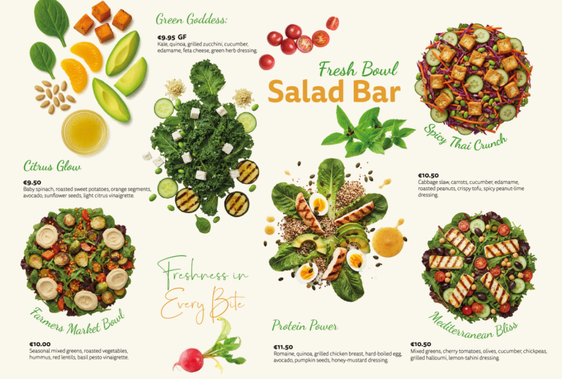
the ingredients for this. So this is the classic
overachiever salad. This is the description of it. You know the type, always crisp, always balanced, always
photogenic, fresh romain, cherry tomatoes,
shredded carrots, cucumbers, croutons, dressed in our signature
house vinaigrette. So, yeah, I mean,
that's perfect. I don't think meat journey
missed any of that here. So I think all the
ingredients are displayed in a very aesthetically
pleasing and appetizing way. But let's see this other one. Kale, yeah, is the name of this. Kale, quinoa, roasted
chickpeas, sweet potatoes, dried cranberries, and toasted almonds with a tangy
lemon tahini dressing. And it's incredible. You can correct me if I'm wrong, but I feel like all
the ingredients are captured perfectly. They all look realistic. They look proportionally correct being next
to each other. That's also something like in the iterations of
generative AI image models, I've noticed that
the proportions of certain ingredients
wouldn't look right. Like a tomato would be it would be smaller
than a berry, right? So, the tomato is just
out of proportions. But in these cases, I think everything
looks perfectly fine. And you can go along and look at the copy and look
at these images, and you tell me what
you think about it, but I feel like
they look amazing. And if you haven't had lunch or depending where
you are in the world, if you haven't had breakfast, I am sorry in advance because these images will make
you really hungry. I just had my
lunch, so I'm fine, but I got hungry, just looking at them when I was
generating them. And look at this, as
well. I had this idea. Again, I'm not sure whether
I'm going to use this or not. But I am planning to utilize circular
shapes for the design. It makes sense because balls, when you look at them, they
are circular from the top. So that's what I thought, even the ingredients and
everything else, I'm trying to display in
this circular fashion, a top view circular setup. So even this avocado tos bytes is arranged
in a circle, again, incredible thing that
mid Journey could achieve and if you are interested about the
prompts that are used, I can show those as well
quickly on my screen. Even the juices or the smoothies are
displayed from above. My favorite ones, these. So the other
different things that you can use or you could choose from when you want to create your own salad
are displayed here. So again, from the copy,
I put ingredients in, and I can just show you
the prompt for this. Let's see, like this one here. You can see the
prompt on the right, top view photo of obviously
all the ingredients, healthy ingredients
arranged into a circle, white background. That's simple, as
simple as it is. And then there is, for
instance, like this, which has a lot
more ingredients, and Mini still managed to pack
them into a single image. Here, I start to notice
the proportion issues like the avocado feels a little bit too small compared
to everything else. Maybe the onions, actually,
onions seem fine. Maybe the red dishes
could be slightly bigger. But still, I think we
can get away with that. But I just jump back to my
board and I can show you, we have the protein
options as well. And then I also tried
to create a couple of interesting illustrations,
more abstract. I really like this
style of illustration. And obviously, it would take hours to do something like this. So for the sake of trying to pack in as much as
I can into this workshop. I generated these already. And if we like this direction, visual direction, we
can go ahead with this. Or, again, even if I
don't go ahead with this, feel free to use these assets. These are slightly different. But yeah, there's another
one here with avocados. I might generate some more
of these if we need to.
3. Research & Inspiration: So one other thing that's very
important and I wanted to mention when you do your
research for a project, I normally like to
divide my research into style references and actual
competitor references. And what I mean by that is
it's important to look for actual designs for very
similar businesses. So in this case,
salad bar menus, it's important to collect those. And you can see some of these examples here are
actually salad bars. But at the same time, you shouldn't limit yourself to concentrate on that
because what's more important or equally
important is to find examples of styles, visual styles that you feel like would
work for the brand. Of course, as a designer, you have the ability to then apply that style to whatever
you are working with, whatever assets you
are working with. So for instance,
and this is why I wanted to explain because I've seen this before that when I look at the
research of someone, one of our students, let's say, would focused too much and narrowed down their research too much on a very specific niche. While, for instance,
in this case, although it's a salad bar menu, but you can find if you just
broaden your search a bit, you can find really cool
examples of menu designs. In this case, this is a um I
believe it's a burger place, sandwiches and burgers, yeah. So you could say it's the
opposite of a salad bar, but the style of it, both the menu and the
branding, I really like. And I can imagine aspects of this being applied
to our project. So this is what I mean
that you shouldn't restrict yourself just
looking at salad bars. Here's another really good
example a noodle bar, once again, very similar. But again, it's more
of a style reference. And here, the menu itself, I don't dig that much. It's a little bit boring, very repetitive to grid, too much focus on the grid. However, I love their branding. The sand nudes is so fun. But yeah, I really like how they've done their display
their food as well. Again, the menu is not
the best but yeah, mainly the branding
in this one, I love. They've done a really
good job with that. I'm trying to find references for aesthetics and direction. Again, this is a little
bit hard to read G NGR juice bar and
sandwiches. I love the style. I love the general
feel and look of it. And I am planning to
incorporate these quirky, slightly naive style
illustrations or hand lettering. But, yeah, again, another
really nice example. And then this one is
quite cool as well. Once again, it's more of a style reference,
but in this case, this is actually a salad bar, very cool menu, very clear
hierarchy looks good. I think there was one
more if I just go back, I believe, yeah, this
is the last one. I added this one as well
because I really like. Again, it's that naive
illustration or, like, almost kids illustration
of child illustration, very basic amateur,
but still works. Because of its consistency and because of the
way it's done. So yeah, even stuff like this, obviously, it's very trendy. A lot of identities
are focusing on these, like, doodle like illustrations. But this goes even
beyond the doodle. This is intentionally, like
I said, very childlike. Like, I don't know
how to say this. Like, all the line
weights are changing. It's very messy and
chaotic, but it works. It works when it's put
together in a nice format.
4. Document Setup: I think it start to get started. By the way, we will mainly
be working in in design, and I can already start
preparing my document there. So I'm going to do a landscape
orientation, A four size. I want two pages 20
margin and six columns. And I will use bleed as well because we are
doing this for print, even though it's
also for digital, but I will use a three
millimeter bleed. Slug we won't need, so
let's just create this. Okay, it worked. So let me
just save this quickly. Let's put it in the
salad bar workshop. Files, and let's
save it as menu. Salad bar. Menu. Good stuff. Gutter is the space
between the columns. It can be used for a couple of different
things in editorial design, but generally, it
would be the space or empty space between the columns. And to be honest, in this case, we might not even
need the gutter, so that's something
that we can adjust later in the layout
margins and columns. So I can always come
back here and I can even set it to zero like this. I'll see how I will
use these guides. Because obviously if I press WD are not part of the design, they are just going to help me orientate and align
things within the design. But generally, I was thinking of utilizing like the left side,
the center, and the right. So dividing the design into three main parts
would be useful, similar to a trifold brochure. And that's why I have six
columns because I might want to divide each of those
sections again in half. I can break it down even less. So we could even go
further and have 12 columns if we wanted
to divide it even more, but we will see how much
of it we will need. And obviously, we
have two pages, and we have a parent page. If we want to have anything
repeated on both pages, we can put something there. So yeah, the margin I use 20
millimeters, by the way, yes. Maybe that's the one that you are asking for the
gutter, I didn't change it. It was 4.2 millimeters, but we can just change
it to 5 millimeters. The only thing if you
change any settings on the option that I just
showed margins and columns, it's important to make
sure that you don't have any of the pages
selected or select both pages and then
change it because it will only apply to the currently
selected page otherwise. So if you have both pages selected and you
change the Gutter, it should update
on both of them.
5. Sketching Concepts: I think it's a good idea
to do some sketches. So let's jump over to my Milne board and
open up the menu. Right, there's the menu. I'm going to put this
here on the left side, and I'm going to have my
iPad on the right side. Okay, so I already
set up my wireframe, like I mentioned before, I'm using an iPad
with an Apple pencil. By the way, most
of the time when I'm creating my sketches, and I use a very simple layout, set up a layer, locket, which is my wireframe, and then within that
I'm going to work. Now, the three things
that we have to fit here Number one, we have five signature salads. So five salads. Okay. Then let's just
move this up a bit. Then we have number two, we have the build your own
salad bar, build salad. Section. And then we have
the soups and sides. So if I scroll down
here, soups and sides, soups and sides, number
four is the drinks. Okay, so these are
the four main things that we have to fit
into the design. I'm going to just change my
color to something different. Yeah, so when it comes
to the layout itself, what I thought I'm
going to do here with my wireframe is
that I'm going to do quickly three variations, and I'm going to do, I'm
just going to write it here. This is going to be the front and this is going to be
the back of the design. Now, in terms of
a digital format, this would mean that we have, obviously two separate screens. I am using a brush
called the Elder brush. I'm not sure who is it from, but to be honest, Procreate
has so many good brushes, and it doesn't really matter. Anything that works for you.
I like this brush because it has the um feel of pencil. So yeah, it's like a six B
pencil, a bit similar to that. It just feels a little
bit more natural. Okay, now, let's
think about this. So we have these five
categories four categories. I feel like one option
could be that we fit the five main
salads on the front, and then we put everything
on the second page. I feel like those five salads have to be really highlighted. They are like the
signature dishes. So let's do one
version like that. First of all, we would have
the name up somewhere here. So menu, we can have
it on the left side, and then we can have if we have the whole space for
just those five dishes, we can come up with a couple of creative ways of doing it. So we could have, like, the boring layout of
having the circles. By the way, if I press
and hold in Procreate, we can create more nice
round shapes like this. So we could create a layout
where we have I mean, all of these elements laid
out more like in a grid. So we can just
duplicate this bit. So we could place them
side by side like that. Now, because we
have five of them, that's already not
perfect for this layout, because we would
have either three in one row and two
in the second row. So it's not like a perfect grid. But we can try to
create it this way. I'm going to see
which one is best. So I'm just going to do
duplicate with there, duplicate. I think we have one more here, and then one more time. Okay. So if we go for five salads displayed with their big images, we could put them in
lots of different ways. This is obviously
just a very quick and standard way of putting it. But we could move them
and make them bigger, be on the sides like
this and crop into them. It might lose some of the
ingredients if we do this, but this could also work
as an interesting layout. And I might explore that
in a separate sketch. But for now, I feel like this is one of the options
that we could go for. And the most important thing here to think about
is if we do this, then how would we add the text? Now, one thing that we
could do is to have the title or the name of each
written in the same place. And consistency is important when it comes to menu design. So think about the functional
aspect of the design. If you have it all consistently
in the same place, it's easier for
people to find them. Now, the ingredients
should be fairly straightforward simply by
just looking at the salads, but because we have this good copy here
in the background, you remember we've seen it like roughly a paragraph
for each of these, it would also be good to find a way to incorporate
that in the design. So this is not something I need to come up with
here in the sketch, and that's also something I
would like to emphasize that your sketches are not for trying to replicate
the final design. It's an exploration, ideation, anything that helps
you to visualize and remind yourself of what you came up with is perfectly fine. It doesn't have to be
resembling the final design. That's the whole point of
creating thumbnail sketches. So don't waste too
much time really refining your sketches
because it's mainly for you. However, if you end up
creating some nice sketches, of course, it's also good to include in your presentation. If you use the project
in your portfolio, it's always good to show where the ideas came from and
your thinking process. But, for instance, in this case, we just switch to a
different color again. And then I feel like the
ingredients could be added maybe on top
of the design. I mean, on top of the circle, running around like this. And the good thing about
this is that it would allow for less
text or more text, depending on how much
ingredients there is in a dish. So what I would make sure is they always start
at the same place. So if it goes a
little bit too down, it might be a little
bit hard to read. So again, thinking of
functional design, I think around 9:00 or 8:00
is where they should start, and then they can keep
running in this direction. So obviously, it's a left
to right reading direction. And by the way, the
title can start at the name of the
dish can start at 6:00 and then keep going up. But going back to this color
that we use, by the way, if you double tap on your now, tap and hold on your
color on the top right, it should switch to the
previously used color. But yeah, so some designs might have the text going further. Just go to make my
brush a bit thinner. While others will have
less ingredients, so they only run up to there. We can obviously fill
up the space here. We can have the motto
written up here. We have a nice space
here for text. I'm just going to make it look like there
is some text there. And then we could
also have maybe a cool little batch here
with the lettuce eat. I'm just going to write
that there lettuce eat. And that could also be in a
circle or like a badge style. And then we can have some
information here as well if we need but I would already fill
in this page quite nicely. And then moving on, I'm going to draw the back of this design before I move
on to the next idea. So let's pick this green one. So the back, like I said before, would be about building your own salad and then
soups and the drinks. So here, if I scroll down a bit, we are now working with
this segment of the copy. I feel like the build your
own salad is very important. So either we can dedicate two thirds to that and one
third to the soups and drinks. So what I think is
divide the page into two thirds where we have this side for the
build your own salad, and on the right side, we
could have the drinks. So I think that's what I'm
going to do on this version. So I will do soups and sides. Book, and then we do drinks. As simple as that.
And then we have the built salad section. Now I'm not even going to go
into thinking more about it, how I want to do it within that because that's
generally already, like, laid out all the
important segments or sections we talked about. So we have number one
on the first page, and then we have the other three on the second
page, simple as that. Okay, now, what other
things can we do here? If I had time, I
would normally do at least five to ten of these. So for both front and back, I would do variations. I'm just going to
do maybe one more because you can already see
what I would normally do. What I will do though is I will borrow one of these circles, and I'll bring it over here. Okay, so I'll bowl a salad bowl, and maybe this time we can explore what happens if
we make them bigger. I'm also thinking yeah, I think big is good. And then let's just see if
I place it being cropped, how would we be able to
fit it in a clever way? If I created a clipping mask, we would be able to
work even faster. I'm just going to
do this quickly. So let's do one there, one here. They could even, like, completely be next to
each other like that. Duplicate. If I have
two at the bottom, like that, I think duplicate. We have space for all of them. And the last one. Notice how I'm trying to also
make sure that I don't crop too much of the elements because I want to make sure that all the ingredients are visible. And if you remember the designs or the images that we generated, they have obviously some
of these images have the ingredients or
specific ingredients in just one corner
of the dishes. So that's clearly
important to keep in mind. I'm just going to
come back here, select these top five of the
images, group them together. Yep. And then flatten them.
Sorry. Yeah, that's the one. And then let's just erase
out these bits here. Again, I am not too worried about making
this super tight. I'm just thinking of placement. So yeah, if I made them big, and that's one thing
that in designing, it works really well,
especially if you have really good images that you want to focus on those images. So scaling things up, making something very big
can work really well. Usually it works well if you can contrast it with
smaller elements. So why I think here we could do I'm going to use this blue color again just to change my color. Obviously, we would have to have the menu written somewhere, and by the way, would
say salad bar menu. I don't have to write
everything down in my sketch. Again, doesn't make sense. What I thought we
could do, obviously, we have a big space
here in the middle, which we have to think
about how to fill. But what I can do is to have a little segment in the
middle cropped out, and that's where we
put the text, right? So that would be
quite interesting. Look at the circles I'm drawing. For some reason procret Yeah, doesn't want to help me out. Okay. Again, we don't have
to do this for all of them, but you can imagine already
that we would just have a white circle overlaid on
the center of these balls, and then we would add the ingredients there and the description and the
name of the dishes. Now, the name of
the dishes could even be further overlaid, having written like
this with big letters. The only issue with that is that we would
have to make sure, again, we don't cover up
too much of the images, but because they
are so big already, they should still have enough space to reveal
what the dish is about. The only issue with
this is that some of the names are quite
long, like this one. So we might need to
simplify this a bit. This one is called the I am
trying to B Healthy salad. So if we were to go with this layout that
might be very long, most of them are actually
quite long, apart from Kalia. With Kalia, it would
work really well. The classic over achiever, that is a little
bit long as well. So for this example, I might have to
simplify the names, maybe give them like a keyword that really separates them
apart from the others. And then the more descriptive title could
be in that bubble. Yeah, so we will see we will
see if it works or not. But why would I use
the center part? Well, we could have the
motto written there. We can also have
some smaller, like, ingredients floating
around these dishes to make it look like it
was on the same table, just laid out next
to each other. I think that would
work quite nicely. And then, to be honest, for the back the only thing that I would think of doing differently is how I
separate the page. So if we think about how the first page was laid
out in these big circles, maybe one thing that
we could do for the second page is to try
to replicate that somehow. So what we could do is perhaps use a big,
like, semicircle. On the top, like that, which is for the build
your salad section. And then for the
soups and sides, we could use a circle. Again, we could think
of doing a circle like this maybe. One section there. Let me just draw this better. Like a segment like that, and another segment there. Again, it goes with the same
style that we have above. And then I will just
write things in here. This is the billed
salad section, soups plus drinks, no soups
and sides, and then drinks. Okay. Yeah, so that's
one other one. And you can see, one of the important things that
I am keeping in mind is I want to have connection
between these elements. So I want to make sure, I mean, the front and
the back of the design. I want to make sure that this, the front and the back, either when it's looked next to
each other, remember, again, it could be on two
displays on the wall, they should really feel like they are part
of the same thing. Again, the same thing
here with this design, we would have to somehow
bring the aesthetics and the the general feel of what we created here
to the second page. And that could simply
just be the colors and the fonts and like the proportions of things
that we are using. But it could be also like an overarching
theme that what I've been doing here of using these cropped circles that appear both on the
front and the back, the really, like, big shapes
that we unify the design. That would be interesting if
we could do both of them, because that, by the way, is also something
that I like to do. I I don't like to settle
too much into one layout, before refining it completely. And it's also good
to do that and present to the client
a couple of options. At least I normally would
do three variations.
6. InDesign & Image Creation: Okay, so let's jump
into in design. Okay. First things first, I will set up my layers. I normally would work with
a layer for the text. Actually, I will do a
background layer first. Then I will create a layer for the text and then finally
a layer for images. Now, the images, in this case, most likely will
be under the text, so that will be the
order of the layers. But many cases, you might
need to end up creating a fourth layer wherever images overlap text if
you ever want to do that. But normally this is the order that you
want to place them. And we will be using
paragraph styles for sure, so I will keep them up here. I will also pop in the character styles because we will be using those as well. The pages we already set up, so we don't have to
worry about that. And I think that's it for now. By the way, it's just worth
mentioning that you can also generate things
directly within in design. You can use generative fill
or the same thing that relies on Adobe Firefly within in design is the
text to image model. I mean, you can see that if we use one of the prompts that
I used in mid journey, just as an interesting
experiment. One of these that I feel like is worked out really
well like this one, we could try this out
and create a frame, making it square format, drop the text in here, and then I'll say generate. I think that's all
I need to set up. So this is the text to image Adobe Firefly feature
within in design. The reason I'm showing
this is because obviously, not all of you have
access to Mid journey, and you can see it actually
did a really good job. It's not bad at
all like this one, in particular,
looks really good. So yeah, they look realistic. In a way, you could
even argue that might be even better than mid journey. So it's surprising sometimes how good firefly can be
while in other cases, how bad it can be, but it's definitely
worth experimenting with it if you need
to generate assets. Although, of course, you
can also look online for stock assets that are actually based on photographs,
real photographs. If that's very important
for the client, you have to obviously
make sure you do that. But what I like to
do is even if I end up using a generated
image in my composition, I can just tell the client that if you like
the way this looks, we can just have a day of
photo shoot with your chef and then do these
actual real photographs laid out in a similar fashion. So I think the amazing thing about generated images
is that it is very useful for your client to
understand what you are after without you spending too much time scouring
the Internet, looking for actual stock photos, which, in most cases, like here, where we needed the specific ingredients
just any ingredients. We wanted these ingredients, these specific greens to be laid out next to each
other in a circular format. That would be very
hard to find almost impossible because
it's so specific. Again, coming back here, if we look at, for instance,
the protein options, to make sure it's exactly
these protein options that we had in the menu, are displayed in a
circular design. I'm almost sure that
you wouldn't find that exact example without you obviously having to put
things together manually, and that could take a long
time, and in the end, a client might change their mind and they don't even
want that direction. So for exploration
and quick iteration, generative AI is brilliant. Okay, so I'm just going to drop this here
on the pasteboard. I just wanted to mention this that we have this
option here, of course.
7. Image Workflow & Masking: What I'm going to do is
to download these images. So first of all, I need
these five images. So I will download
original images, and I will drop these into my other folder
where I'm working. So files, and I'm going to create a links folder
and drop them in there. And I'm actually going
to rename these and I'll call it signature salads. And yeah, I like that. Okay. Now we can drop
them into in design. And in in design, you have this feature called
greedy Pi If you click and drag and then you press right arrow a couple of times, you can place all of them in. I'm just going to place
them in all at once. And then the first thing
we will have to do is to get rid of their
original background. And also, I'm just going
to make sure that these are fitted within their frame. Like that, yeah. So let me
just zoom a little bit closer. Okay. So first quick thing
to do is to most these out. So that is not something that we
currently have in design. It would be actually a
very useful feature, but I don't believe they
have that here yet. Most likely, they
will bring it in. Generative expand is there, so we can expand images, but we can't remove the
background quickly. So for that, I need
to alter option, double click on the image, which will open it
up in Photoshop, and there we have the
removed background option. However, as you can see, it found the edges quite well, but because the ball is so similar to the
background color, it still didn't do a good job. So I'm going to try using
the circular selection. So Elliptico market tool. And let me just redo this. Click and Drag, and then
with the space bar, you can actually even better. Let's just use a shape, the Ellipse tool set to path, and let's just draw this path. And then what we can do is
to align it top and bottom. Like that. Drag this down
a bit here on the top. If there's any details
that come out of the bowl, we can obviously adjust that. But for now, I feel like that's quite
close to what we need, and then we just turn this into a vector mask by command or control
clicking on the mask icon. So that's going to
create a vector mask, and then we just have
to make sure that this is saved as a photoshop file. And then within in design, we just have to drop the Photoshop file version
in to replace the JPEG. Boom. That's it. Okay. There was a subtle difference
in the colors. I believe that's because in
the original we had SRGB, and the new one,
we have Adobe RGB. But anyway, we have now
this one masked out. So let's just repeat
the same thing quickly for these other ones. I'm going to alter option double click
on this other image, withdraw again a path it doesn't have to
be a perfect circle. And then let's just
adjust it to the edges. Actually, before we do this, let's see if the removed
background works here. Now, it still doesn't
we just stick to our path and
vector mask option. Because we are using a PSD file, I am not too concerned
about making this perfect. It's just like a rough shape, and then we turn it
into a mask, safe. You can always
refine this later. That one is done.
Let's drop it back in. Boom. Okay. And then we have to do it quickly
with the other two. And here I can see already that we have a little detail coming out
of the edges of the ball. So that is something
that we have to account for with our mask. Let's see if I can
fit this in here. By the way, if you have a path that doesn't
seem to be working well, you can also go in and use
the direct selection tool and adjust the handles to
fit it even closer. Like here, you can
see, I'm adjusting it like this already looks
more closely fitted. I can also move that
point a bit higher. That one feels in
that space better. So yeah, if I want it
to be more specific, I can do this adjustments
and move that one out a bit. And at the bottom as well, we can fit this a
little bit more in. Hopefully, this is a useful
technique for everyone. But yeah, so what
would I do here is I would first create a mask
from this path, command, click on the mask, and
then I would select the mask and reduce the density so I can see where the leaf
is supposed to be. And then use the pen tool, set it to add or combine shapes, and just simply having
that mask selected. It's important. The mask
needs to be highlighted. You can draw over
that missing part, and I can follow along the shape of that
detail that comes out. And that's it. Just go around it, book, done. And then I will go
back and increase the density, and it looks good. Let's see. Yeah, it looks great. Just showing it close
up to everyone. So it's two shapes
now within the mask. If I go back, there's one shape there and
a big shape behind. All non destructive, obviously, because it's all vector shapes, and it's saved as a mask. So now we come back here, drop it in, pop done, and then I think we
have two more to do that one doesn't seem to have
any shapes outside of it. I mean, any out of bounds details we should be worried about, we
need to worry about. Let's drag this down. Like I said, I'm
not going to spend too much time refining
this for now. Just get it roughly in
place and then poop, save and close close
and drop in here. This was number five. Yep, ready. And then number
two is the last one. Shape, draw and line. And we are done. Oh, sorry. Musk. That's it. Save, close and bring in. Salad too. Okay, cool. So that was a little
bit time consuming, but we still have to obviously
set things up that way.
8. Typography Basics: We will now start
to add the text. So I'm not going to worry about the font choices just yet, I worry about the
placement first. So that's another
thing that you can really waste a lot of time
on choosing the right fonts. I am a firm believer of first setting up a layout is more important where things go, what sizes the text will take, and then think about
the actual fonts. So in a way, I use like
a placeholder text, even though the text itself is actually using already the
copy that we work with, but the actual font
choice comes later. That's almost like
dressing up the text. That's the way I think
about it, anyway. So I like to put the mannequins in place first and
then the dresses. Okay, so salad bar menu. That's our title. Done. Let's
make this bigger. Okay. We can decide how we
want to put this. I'm going to just do it
in two lines for now, and then I will align it to our margin just
to see where the margin is. Yeah, the margin might
be a little bit too big, but we'll see again later
how that works out. I will probably make the
menu already bigger. So let's just have a little
bit more space here. Let's make the menu bigger, and I'm going to
reduce the tracking. And now I'm just going to make the whole thing
a little bit smaller. Okay, that's good.
Whenever you resize text, you can use keyboard
shortcuts in design, Command or Control Shift, full stop to increase
to decrease the size. Alt or option up and down arrow
is to change the leading. And also when you have
things set up the right way, you can also use Command
or Control Shift, drag a corner point to change
the size also quickly. So we have the name up there. Now, if we go back to Milind, I just want to go back to a
copy and remind ourselves, actually, not this one. Remind ourselves, the
slogan was, Let us eat. But there's also these tag
lines tossed with love, dress to impress and always
ready to crunch or a crispy, crunchy wonderland where
every bite is an adventure. Or, welcome to the
wild side of salads, both fresh and totally delicious.
I quite like that one. Welcome to the wild
side of salads. Now, if we are going
for a copy like this, we have to also think
about how we can represent that in
terms of styling. So if we want to
go for a bit wild, we can maybe make
our main typography a bit wild or maybe have some elements that
maybe it's just like hand drawn lines that makes things look a
little bit crazy. I think I'm going
to go for this, and I will emphasize that. Equally, if I went for
another copy where it says dressed to impress
tossed with love. There maybe hearts could
be elements that we would use dress to impress, again, something that
emphasizes dressing up nicely. Here it's more about the
bites, crunch and crispy. So each of these copies
emphasize a specific angle, and that as a designer, you should and you have to
emphasize and play with. Okay, I'm just going to
do space there. Yeah. Already, I will
remove the hyphens from this text to make sure
it won't get hyphenated. I will make it bigger
and then center it for now and maybe make it
something like that. Okay. Now, don't worry about
the font choices. Like I said, it's
just a default font. Mini and Pro looks
really bad or like, really boring. It's not bad. It's a very good font, but it just looks boring
at the moment, but you will see how
much it will improve once we find the right
fonts to work with. But we just want to put
things in place first. That's the most important thing. Where things go is
more important. I'm going to have
another copy somewhere with like tagline or
this other slogan, the let us eat. And this one I will put in
all capitals, no hyphens. So let's just put that
somewhere at the bottom. Um I could always go in here or on the top right. We can find a place
for it later. And then within in design, if someone goes to find more, you should be able to
search for a font. I'm just going to do PhoenixN. Okay, let's just go
into type Adobe Fonts. It's easier online, actually. It seems like it might
not be Adobe fonts. I'm just going to search
for it separately. Let's see if it's
here. Ah, yeah. I found that one. Okay. So we can already have that one ready. But yeah, we'll come back
to fonts later for now.
9. Incorporating design elements: Okay, let's jump
back into in design. So we want to have,
like I said before, these shapes on
top of the dishes, cutting out from them. Probably I want to have
around my space utilized. So I would just change
the color to white. Okay. And then I want to
make sure they are aligned in the perfect center
of the shapes behind them. So I align and align like that. I just use the aligned center horizontally and
vertically option. And then I will make sure
that the same shape is duplicated for each of
these other shapes here. Again, I will align
center center like that. And then if I need
to, I can move these two back where I
wanted them to be. Okay. Now, already, I can
see that in this case, the berries are
getting lost a bit because they were more in
the center of the dish, but they are still
slightly visible, so I'm not too concerned. So I think it's okay for now. Then let me also just
do something quickly. I realize that my text is
not on the text layer, so I just going to select them and drop them
on the text layer, and I will lock
that layer for now. I will also lock my
background layer so that I don't accidentally
put things there. This shape can be on the images layer because it's
connected to the images. So again, I'm going to align these to each other and
then move it back down. Yep. That looks good. Now, here, this circle starts to end up being too close
to the edge of the page. That could be an issue. So what I will try to do is to move this up a
bit, like that. And then this can go a
little bit to the left. Okay. Let's put one
more of these up here. Again, align a line looks good. Then align a line on
that one as well. Boom, boom, and then
move it back up. Yeah, I think the plates
can overlap a bit. Subtle overlap like that looks realistic. I think,
something like that. Again, make sure it doesn't
go too far to the edge. The box, at least that circle has to come down a bit more. I feel like to be
closer to the margin.
10. Text Refinement: Okay. And then I can clog the images now and we
will be working with the text. Certainly, that is an issue that it could look
like doughnuts. But let's see how it will look
once we have the text in. So I'm going to change the text size probably down
to ten points for now, and then let's
bring in the copy. So we have to go back to Monat, and we need the second copy. So let's start with this one. The classic overachievers copy. We have to also remember to
make space for the prices. So first, this one, I will make the text
even smaller like that. Center text would make sense. I don't like center text, but in this case, I
think that makes sense. So I will just
keep it like that. Or we could use actually a
circle for our text. I guess. Again, I don't like
setting text in a circle, but maybe in this case, we can make an exception. So if I use the same
shape that we have here, that white shape, we could actually put
the text inside that. So if I copy this text, and I use my type tool and
click inside that shape, I can just put the
text in there. And then what I would do in in design is press
Commando Control B, B for I don't know, border. You can remember it from that. But that's the text
frame options. Box actually probably
makes more sense. Textbox, and then use
the inset spacing. Probably you want
to increase it up to 3 millimeters and
then click Okay. You want to make sure the text
doesn't have hyphenation, and we're just going to
make the text smaller maybe seven points for
now or eight points. Let's do seven points like that. And then I'm actually going
to do one additional thing. I'm going to align it to
the center like that. I think that looks quite good. Okay. Now, already,
that's one thing that we could apply to all of these circles by creating
an object style. So I go to Window
menu object styles, and then create a new style
while this one is selected. Alter option, click on the
plus sign and then call it small circle textboxes. Called circular textbooks,
apply style to selection. Okay. And then we can select all of these other ones and select
the same style for them. Okay. Clear overrides. Yeah, it should work. And then let's just
use the same copy, and I'm just going to
quickly drop it into each of these just to see if it
worked. Yes, it worked. Now I'm just going to bring
in the copy from Milanat. So we have the second one, the kill, which is this one. Oh, there is
something that didn't get the inside spacing doesn't seem to be
working for some reason. Yeah. I just didn't refresh correctly.
That's very strange. One of the quirks of in design. Never seen that before. But just go to update all
of them quickly. Okay. So, this one is in already
in the right place. We have to get the other one. Caesar you can't resist. Yep. Then we have the
spicy situation salad. Drop that in and then the last one drop
that in there. Okay. Cool. So I'm just
checking the margins. Most of my text is within
the margins, so that's fine. Apart from this one here on the left is a little bit
too close to the edge, but this could be always
moved higher a little bit. Just move away. Yeah. Now it's closer
to the center. Okay. Now, we need
to make sure we have space for the
names of these dishes. And for this, like I
mentioned earlier, we can explore
different layouts. I thought of having the name
overlaid on the image again. So I'm just going to
use another circle, just an empty frame, a circle. And it would be useful to align it with that
other shape behind it. So I would just align
it like this for now, and I will put this
on the text layer. It makes sense to have it there. And to be honest, all of these circles should be on
the text layer as well. So I'm just going to hide this
for a second, this circle. And I'm going to
move these shapes because now we have
them in those circles. They should actually be
on the text layer, yeah. And that circle that
I just created, I want to put on top. For now, actually, I will
just do a separate layer. It will make more sense
separating things. So these will be the salad
names or dish names. Dish names, and I'll put
that circle in there so I can lock this and
the images as well. Okay. Now, this I remember
was called Kill. I have this one selected. And then if I go on to the type on a path
tool here in design, we can just click on I mean
the circle and type in Ke. That's the title on the name. And what I'm going to do
is just choose a font like Hevita is a font that
we like to use a lot. Or Avenir is a good for now, or fat Frank is a
good one as well. All of these could
work quite nicely. I'm going to make it big
and I will set it to white. And so we have to
check whether it's going to be visible enough. And of course, when
you use this feature, you will be able to move the start and end
point around easily. So I normally would set the
endpoint to be the bottom, so that's like 6:00. And then the start point
can be moved around easily. Like, in this case, I feel
like somewhere around here is a good start
because the kale is there. But again, we could go back to the image itself and we
can rotate it around. Just making sure we don't
lose the sauce at the bottom. Yeah, something like that. Now come back to the text and now rotate it around
a little bit again. Yeah, something like that. I feel like if all of the
dishes just have two words, this styling could work, and it could be quite
nice and interesting. We could reduce the opacity of these circles that are
overlaid on the salad. If I go into the transparency of this object,
we could do that. So if I just go to the because you can't
do it with the tint, it has to be the transparency. Let's go into window. Object. Actually, it's
not transparency. What is it called Hearing in design for the
opacity, I forgot. Effects. That's the one. The effects panel. So
having this selected, I want the feel
opacity to be reduced, just to see how it looks. Not sure why it's not updating. Oh, I have the wrong
layer selected. So it's not the images, the text layer, this one. So feel opacity reduced. I mean, it could be a good idea. It would work, but it's going to make the text hard to read. You could always have it
slightly see through, like 90%. But to be honest, I'm not
a big fan of doing that. You will see a bit more of
the food, but like I said, we are not covering up
important elements of the food. We see enough of the
ingredients around the circle. So I actually prefer
to keep it like this because when you look
at this from a distance, I'm just going to make
my screen bigger. Notice how seeing
through the circle, doesn't really add
much to the design. Obviously, you can see
the whole ball now. So it looks a little bit
less like doughnuts, but it just reduces the visibility or
legibility of the text. So in terms of function, this is a disadvantage. So yeah, we could try
other colors as well, but I like the simplicity of
it the way it looked before. So I'm just going to go back to having it fully
filled with white. We can explore different colors. That's actually
quite a good idea. So if we were to have a color
like, I don't know, uh, I like a blue color, and then obviously
the text itself could be white, something like that. That is actually a better idea. I like that more. And of course, we could have something
funky and interesting color. So if I go into, let's just do HSB, we can pick I could even pick colors
from the dish itself, but I'm just going
to pick something like a nice pastely
color like this. I think that's already
working a little bit better. I'm going to keep
it like this for now and we'll come
back to that later. But yeah, this is something that I already like a
little bit more. We could experiment
with different colors, maybe just keep it like that. Maybe make it a
little bit darker. Only thing with this is we probably will need to use the same color for
all of the circles. Otherwise, it can get a
little bit too overwhelming. Or potentially we
could use each I mean, have a pattern,
white green white, green, white,
something like that. And then if the text was
set in green as well, it would create that pattern or continue that
pattern in a circle. I will continue adding the titles on the
names, the dish names. So let me just copy this
text and move it over here. And try to align this
with the other circle. So one circle and then the
crunchy circle, align a line. And then we just lost the alignment in the center of that
frame but for now. I'm going to keep it like
this. I think that's fine. So this one is the
original text here was, if we go back, it was
Caesar, you can't resist. I'm going to ask
Che GPT to help me. Let's just do give this salad ball dish a name made up of two words,
two short words. Give me ten options. Let's see. Okay, Caesar crunch. Caesar crunch is good. Crisp royal is good as well. Hmm toga toss. I think I will go
for Caesar crunch. I think that's quite nice. Yeah. Caesar crunch. Looks good. Now, again, I can
already see that the text will be very hard
to read in this format. So that's again, something
that we will have to address. I can obviously move this
text a little bit higher, maybe align it to the right. We can also check
if we can adjust the image by rotating the image if it gets
any more legibility. You see already here,
it looks a bit better. Legibility. Notice
how that detail that we worried about
before moved up now. But of course, we
could introduce a little bit of drop shadow. I am very keen on avoiding
using drop shadows, but in this case,
I think we could introduce it in a mild way. If you alter option,
click on the drop shadow. You can have refinements on it. I will have zero distance, and I am going to have maybe the size
a little bit bigger. Yeah, something like this. I think that's quite nice. So immediately,
text looks better. So now we can just
turn back the dish even in this direction
or orientation. We can still read it. Yeah,
I think that looks good. And then, of course, this can be saved as another object style. Remember that with in design, whenever you use
opacity setup or an effect like
dropshadow that needs to be saved as an object style, while paragraph style paragraph style just to show you
doesn't include that option. So we have to save this
both as a paragraph style, which we can already do now. I will save it, and
I'll call it dish name, signature dish name or bowl. Yeah, let's just call it
signature salad name. And apply style to selection. Yeah, that's fine. And once
we have saved that one, we can go into styles,
object styles. And I'm going to
put this here in the bottom just so we
can come back to it. And we want to also save this as the signature salad name, or we can just call
it subtle shadow, and we can save it like that. By the way, if I include the paragraph style
within the object style, so in a way, nesting
it in there, it will be easier to apply. Now, for instance, if I
select this one here, I can just choose this
subtle shadow object style, and it automatically also
applies the paragraph style. Just to demonstrate this, if I select that text
and change the font to something else like that, having it selected,
I just choose the subtle shadow object style
and say clear overrides. Why is it not changing? Set it to none, and then that? Hmm. Not sure why it's not apply style
and clear clear or all. Still not doing
it. Not sure why. But I'm just going to go
with both styles saved. Yeah, I was strange. Something I forgot to
set up probably here. But, yeah, that's fine. Let's just put this
quickly up here. I'm going to move the text down, and then We need the
name for this one. So this was the third one. Did I put it in the right
place? The other one? Yes, that's the casar
crunch. That's fine. Kala. And this fourth one was
the spicy situation. Spicy situation, we might
be able to fit that in. Let's see if I move
this down a bit. Yeah, I think that's okay. And it has already the
shadow on it as well. Without the shadow
looks like this. With the shadow looks like that. Yeah, I think it's okay. Looks good. And then we
can have the last one. Now, this one will be
slightly tricky because we need to fit the text at
the bottom of the circle. I mean, it's not that tricky. You just have to be clever
about it, how we do this. So what we need to do
here and I'm going to show this on the side just to make sure it's easy
to see what I'm doing. So the last salad name is called I am trying
to be Healthy salad. I'm going to again, use
Chad GPT and then say, I want just two words for this. These ingredients.
White all bite, power leaf, berry
boost, Zan Ball. I like that. Zan Ball. Let's just call it Zan Ball. Okay. So what I wanted to show, again, this is very strange. Why is it having the shadow of the It wasn't refreshing
the shadow straightaway. So what I wanted to show
here is that obviously, instead of having the text
being upside down like that, we will have to write this
in the other orientation. So what you need to do is to
find this tiny little thing, I will move it in the other
layer just so you can see it. This tiny little thing, which is the center point of the
text and drag that inside. That's how simple it is. You just have to
drag that inside. It's not very intuitive, but that's what you
need to look for. Once again, this is the starting
point of your text here. I'm going to put it on the left, and that's the endpoint of
your text on the right. If I have enough space to see where that little shape
is, that's the center point. That's what you need
to drag inside. And once you drag it
inside of the circle, then you will be able to align
the starting and endpoint. I would normally go for
something like this. Start point and endpoint. And, yeah, I don't know what's
going on with the shadow. I'm just going to turn
it back on again. But what you have to really be careful about using text on a path set in the inside of the shape is that
it can look very messy because all the characters are dragged really
close to each other. So the tracking gets messed up. There's two quick
fixes for this. Either use Alter option key and then press right arrow
a couple of times. And then you can also go in and manually conn things
around a bit more. But what I like to
do also is to use option or Alt Shift down arrow, which is baseline shift and move the text out all the way
outside of the circle. And this way, you can
even reset the tracking. So if I go into the tracking, I can just set it to zero, and we can actually
reduce the tracking by alter option left arrow,
something like that. You see immediately
looks better. I'm just going to increase
the space between the words. And custom track these
characters a bit more. We fresh the shadow, and now we can go back
onto the text, I mean, onto the image, and let's
find a good spot for it. Somewhere like that, it
looks quite good to me. So let's just save the work
that we've done so far. Let's continue but actually, we have one more name
we forgot to add. The classic overachiever.
Well, again, that's a a mouthful. So I will have to ask
Chat GPT to reduce that for us and make a
two word version of it. Fresh fix is quite good. Chill crunch, classic bite. Classic bite, I like as well. Easy leaf even better. They are all really
good. Easy leaf I like. So let's just do that. So let's copy this one. Let's rotate it around
and then easy leaf. Good stuff. Align it a bit more, keep it in the
margin, looking good. Nice. Now, by the way, for all of these, I use
the same paragraph style, which will make it
easy to update this. So if I want to go back and change the font, for instance, to Hevits another
font I often use, you see how quickly we
can update everything. And in this case, if we feel like it's too big, we can also update the size, that's the beauty of
paragraph styles, see how quickly I could
update everything and if we just take a look
at this before and after. So that was the before
and that's the after. I feel like this font is
definitely more legible. So when compared to this one, This one is more legible, especially in this format. So I might actually
stick to using this one. The other one has a little
bit more character, though. So I mean, in these cases, another thing that I
often do in in design is I actually create a
variation paragraph style. So it's just a quick way of
switching back and forth. If I go to save this one, actually, let's just
go back to that one. So I duplicate this style. And I call it V two, or I can, let's
just call it V two. And then I go back and
change it to Hats. And I believe it was
how much was it? Probably 28 points. So if I have all the
dish name selected, I can now very quickly
switch between the two. The only issue here
is obviously because we use the different baseline
shift on one of them. That's going to get messed up. So I'm not going to do this. It's just complicates
things a bit. In case we didn't have
it that way set up, it would be easy to
switch back and forth. But I'm going to go with
the second one for now, so it test and just
reduce the size to there. And let's see if it
fits everywhere. Maybe this one needs to
come a little bit down. Not the ideal angle
for it to be red, but yeah, for now,
it should be okay. And then just update the
shadows on all of them. Okay, now, before I forget, I will also change this shape here to the
same color as that. Which what I want to do
is save this as a swatch, let's just do this
save at two swatches, and then we can select it
from the swatches easily. It was this one.
And then the text was set to white for now. Now, it would be important to choose the font that we want to use for the text,
the body copy.
11. Pricing Text: And let's not forget
about the price. So that's also something very important we have
to make space for. So the price is
just one of these. Let's do this first 1999. Okay. So I'm going to do just
a price for now in a box. I feel like it
would probably make sense to have it either
at the bottom or above. For now, I'm just going to
put it here at the bottom. And for this one, I think it would make sense
to use the same font just in either the green or black. For now, I'm going
to keep it black. And I'm still not set on
this font, by the way. I'm just thinking out
loud for the moment. So that could be a price. Again, if I switch to the
other font Fat Frank, let's see how the numbers
look on that one. That definitely looks
better on the numbers. I like the numbers
on this one better. So for now, I'm just going
to keep it like that, and then let's do a white
version of it as well, just so we can see and this kale was what was
the price on that? Kale 1099. Mm hmm. Okay, I can already see one issue would be that if
we keep the text centered, it's gonna leave a big
gap here on the top. But what we could always
do is to put maybe spice level there
on the top with little like spice
or chili icons. I think that would be quite good because like this fourth one
is definitely very spicy. It could be a useful thing to
indicate for these dishes. So that's all nutritional
icons like it includes nuts, and I think that's
very important. So it would be useful
for that space. But so far, it's
coming together. The decimos could be
raised in the price. We can set them to, like, superscripts like that, and we can also bring them a bit closer with tracking
or curing like that. For now, I'm just going to keep it like this because I mean, it can be subscript as well. It just goes a little
bit too deep by default, but it can be obviously
increase higher. We can, of course,
also just make it smaller simply like that. Reducing the size
might be enough. Actually, that's probably
the best way of doing it. I think I did two
steps going down, and I would probably increase the tracking a bit,
something like that. I think that looks
better. There's a lot of stylistic options
we can do there, and I agree it's
worth exploring, but just going to keep
it like this for now,
12. Font Selection: And I'm going to continue
choosing a font for this. So one font that I recently
started using quite often is, let me just see if
it's saved here. Yeah, it's the mascalero. It's quite a nice font. It's a seri font. It might be a little
bit tricky to read in this regular format. But if we choose bold, I feel like that
looks quite nice. It works quite well
with this text. But let's see maybe demi
bold will be enough. Not bad. Not bad. I'll just zoom closer just so
everyone can see it better. I will replace this
with the semicolon. I think it looks
better that way. I think this font
probably can go down to 6.5 in size because it's
quite a bold big font. Yeah, I think that
looks quite good. A little bit too much contrast
between the serifs and, like, the thicker
parts of the text. That's my only concern
for small text. That's the only issue
that we could have here. I'm going to see if this is
a paragraph style anyway, and I'll call it let's
call it description. Signature dish description. Yeah. So that's one option. Let's do a duplicate of this, duplicate this style
and call it V two. Let's see another
variant on that. So keeping it open like this, we can look for another font. I think another font that I could think of from the top of my
head would be din. And let's see with
dinvious it's a very nice, easy to read SunseFont we could probably use the
regular version of it. Maybe Italic. Now
Italic is hard to read. Demi might be good as well. Yeah, Demi is still good. So let's just click on
that. Let's click Okay. And then now you can
see what I meant when I create two separate
paragraph styles, how easy it is to
switch between the two. And we could actually test
this on all of this text. So if I select all the
circles, actually, we will have to have
different style for the green one because that will have
to be set in white. But at least for these three, I think I had the
wrong thing selected. So the dish names is logged. This text is selected, that one, this
one, and this one. So they are all
using that or that. So from a distance, these are the two
options. So that's one. I hate the fact that we can't undo in the full
screen preview mode. I just have to switch
back and forth. I feel like I'm going
to go with the DN. I actually probably
prefer that more. Although it would be good to
have a nice contrast between the sensory font on the name on the dish name and then having a serif font on the description. But I just feel like it's more legible
having the din version. I'm going to go with the
din, but I'm going to create another paragraph
style duplicate, and this should be based
on the version two, and I'm just going
to call it white. And I'll change the
color of the text to white and then update the style. It's not letting me redefine
the style, but why. Okay. I'll go in manually
then character color white. Okay. That's it. And then for this
one, as well, Oops. That's the wrong one. Just have to tidy up my layers
a bit there. Okay. But now, let's think
about choosing the font for the salad
bar menu taxi on the top. Obviously, it would
make sense to use one of these funds that
we are already working with. Currently, we are actually
using three different fonts, although the fat frank and the heavy test
looks very similar. So we can get away using a different one if we prefer
the numbers on one of them. Ideally, you would want to end up using a single font for that, but we could still introduce a different font for the more stylistic details
like the main text. And I can't remember. I think it was called Phoenix, that font that
we've seen before, which might not be available here because we installed it violin design
was already open, which is also annoying
sometimes doesn't update. Actually, maybe I have
to analyse there. It's probably not going to work, but for now, let's just explore. If I were to use this, most likely would have it
set in two separate frames, so I can experiment
with it a bit more. Salad bar menu. That R is very hard to read, the lowercase R, so I probably replace that with
apitR. Let's see. The N is also quite
hard to read. The U is very hard both
in capital and lower as looks like an N,
which I don't like. So, maybe like this, it's better. Yeah, that's fine. Let's look at the S,
lowercases. That's fine. Upper css and the B.
Yeah, that's fine. Okay, so it's not bad
but not the best font. I'm not 100% happy with
this font, but for now, we can just explore if we were to use
something like this, we could obviously use
the color that we already settled on or at least started
using for the backdrops. Either the menu can be
that or the salad bar, probably that one makes
more sense to use this color on salad bar menu. And we could have a
little bit of an angle maybe on the menu like this, align it together, and then roughly align
it to our margin. Or we can drag it more here to fill in this
space a bit better. I'd see this in large size. Yeah. Not bad. Not bad. I'm not a big fan
of the N and the U. That's my main concern
with this font. So let's just explore
one additional option. I am going to just simply
duplicate these two. I'll group them together,
duplicate, copy, and paste and close the original one or
hide, sorry, not close. Let's move it up here. Okay. So of course, we could use Havits which we already established on the
text, the title. Or maybe what we could do. Since I like the salad bar, maybe just the menu
needs to be in havits. That way, it's a nice
pairing of these two. Let's see. Just need to
reveal a bit more of that. But in this case, I probably would want
to keep it straight. And maybe this one can
be on an angle a bit. Mm. Yeah, maybe
something like that. Not sure about the angle. Maybe the whole thing can be on an angle because otherwise, there's just that uncomfortable negative space between the two. I think both of
them needs to be on an angle if I want to go
for that angle option, slightly diagonal
variation on it, or we can have it
going a bit right. This one Mmm looks a
little bit better. Feels in the space a bit better, and potentially this
could be moved a bit to the right as well,
something like that. Yeah, so that's option
one or option two. Yeah, you can even
overlap the two on top of each other.
Could work as well. The salad bar could be overlap, like if that was set on
top, that's quite nice. But for now, just for functional
design and legibility, I'm going to keep it separate. I'll rename the if it lets me. Design is not, it is. Title one, Title two, just so I can easily come
back to it and rename it. I mean, find it. Alright. And then
let's not forget to change this also to Din
here in the middle. I don't think the Phoenix
would work on this one. I'm just going to try, but I have a feeling that it
will be very hard to read, although that has
the most character. Doesn't have any dash lines. So I'm going to just
use a full stop there and make it bigger. Let's see. Just quickly styling it up so we can have a
better idea of how it would look like and maybe
have an angle on it. It would be good to
have a different angle than the title. But for that, I would have to move the dishes around a bit. F now, I'm just going to
make this a little bit smaller and see if
I can fit it in here actually just keep it like the same angle for now at least just a subtle
angle like that. So the main question is, is that legible enough? Welcome to the wild
side of salads, both fresh and
totally delicious. I think it's legible enough, but I don't like the way it is sitting centered
there in the center. I think what we need to do is to have this separated
into two text frames. And then have a slightly
different angle like this. I think that's already
a little bit better. And maybe what we
could do is the totally delicious could
be even more emphasized. So bold, fresh, and then
have a totally delicious. We could test this
in all capitals. Let's see in all capitals. I think it looks quite good. And that can be, again, black, to have that variation, or maybe this word
can be green again. And then a capital I
mean, an exhumation mark. Yeah. I think that's
quite nice and we can just move things
around a bit. Yeah. Not perfect, but not bad either. Yeah, so it has a rhythm,
black, green, black, green, same font that we used and introduced
on the title. So there is unity, a nice contrast to the more structured
general layout of circles. I wouldn't force having
a circle again here. However, for the Let us eat, I think we could use the circle. So maybe using the same font that we already
established here. I'm just going to
do the Let us eat, probably eat in black. And lettuce in green. And then this could
be put on a circle. I'm just going to do
a quick circle here, an empty circle frame like that, and then just copy this text and put it on the thing with
the type on a path tool. I love how in design always shifts the text
around left the line. I'm going to keep
this one as well on the pasteboard just in
case I change my mind. And I'm conscious of the fact that this text is
very close to the edge. So maybe what we can do
instead of having it on a single path is
to copy this text, take it out, duplicate
this circle, and hide the other one for now. Put the text put that
text in there, huh? Put that text in
there. That's it. And then use the baseline shift. Something like that.
It's not perfect, but for now, I think
that will work, and the whole thing can be
a bit on an angle as well, and maybe we can make
it slightly bigger. I don't know why the text size is not resizing when I do this, and now it's resizing. That's. Probably doesn't have to be too big, something like that. Okay, let's take a look at
the whole thing together. Again, I don't like
the U in the letter. This bit I don't like, but not too bad. This part is a little
bit hard to read F and the R. In some cases, I would manually draw
over these details and refine it in a final design if I'm using a hand
letter text like this. You can always obviously
customize the design, but I think it's looking okay.
13. Decorative Elements: I would move on to the next page and try to do as
much as I can there. I'm obviously aware
of the fact that I didn't put all the prices in, but like I said, these
are more minor details. And by the way, one additional thing that
could look nice here is just some scribbles and some little details
that we draw. Now, drawing within in design is not something
that I recommend to do. So if you ever end up
doing something like this, I recommend doing it
in Photoshop instead. So just a quick thing I'm
going to show here is that if I export this into Photoshop, or even in Procreate,
actually, I would do this. I will export this
onto my desktop, salad bar menu, yes, export. And then I'm going to add
drop it onto my iPad. So let's just put that
in there quickly. Salad bar menu. Yeah. And then add drop to iPad. And then I'm going to
switch back quickly to my iPad on the screen, as well. I'll just put this into Procreate just so
we can all see it. So Mm mm mm gonna bring up my iPad. Procreate. And then there it is. So, what I would do
on a separate layer, I will lock this one. And on a separate layer, I make sure I use
the same green, and I'm going to
use the same brush that I used before I think
would work quite nicely. So to add a bit more character, I would start doing things like little leaves like this
that looks could be leaves, could be something else. Just adds a little bit of
more character to the design. And then we can also
do some I don't know, maybe zigzag lines could work. Yeah, I think zigzag
lines will be nice. Following the shape
of these dishes. And I'm intentionally doing it a bit wonky because I want to get that slightly childlike scribbles doodles effect that we've
seen in some of the examples. We can also do I'm just going to do some additional
lines here like that. That is quite nice.
And then what else? Maybe we can do black as well, a few details in black. We could use some funky lines. I think that's what I'm
doing here already. Maybe I'm thinking of something that would
be easy to represent, but not too complex
and not too specific. I mean, if we do little circles, it could work because we have
so many circular elements. If I do little circles, and if we have enough of them, that could work quite nicely. Almost as if little ingredients are thrown around the design. I'm varying the shapes
and sizes a bit. Let's just do a bit
more of this color. A few more leaves
here and there. This will be very rudimentary, but you can imagine it being developed with a
little bit more time. Can't expect these
to look amazing. But just as a sense of style, Again, the big circle, I don't think it's necessary. Probably that's it for now,
I wouldn't go further. We could always
add more details, but I think, again, if we just look at this
without and with the details, I think it adds a layer of interest and
liveliness to the design. And what we can do is we can export this without anything. So with transparency from here. So we just go to share
and there's a PNG. And then I'll put it
onto my computer, and then it should work. But I'm just going to drop
this onto the desktop, salad bar workshop files, and then I'll just rename it, doodles, and put it
in the Links folder, and then drop it into in design and put it
on the background. I think for this, the background
layer will be perfect. So let's just try to
place it in like that. There it is. Good. Yes,
we are looking good. Let's look the background. And let's do a full
screen preview. Okay. So that's the
front of the layout. Now, once again, small
little details like the nutritional icons or spice level icons could be
added here to add more detail. There could be a little bit
more like the legend can be added there on the top of
what those icons mean, which would make
the whole thing a little bit more professional. We could have some
additional information in these empty spaces.
14. Back Layout Design: Since I worked on
the other sketch, I'm just going to bring
it up quickly again, we had our other sketch here. Just bring it back on my iPad and then show it to everyone. So if you recall, we had this as the back
layout for this version. I'm just going to focus on the connecting
second page for this. So here I'm going to work
in the background first, and I'm going to
establish the backdrops. So first of all, I will use a circular shape
and zoom out a bit. And I want to create
a big circle, which will go at let's just fill this in
with a color for now. Let's use that green
that we created before. You can put that on the bottom
there. That's one shape. We would have
another shape here, and then we would have an
even bigger shape on the top. But I will make sure it's a perfect circle.
Something like that. And I'm not even
bothered if it's not aligned perfectly
in the center. I actually would make it clear that it's
not even aligned, and these are also not perfectly symmetrical because we
didn't have symmetry here. So we have an asymmetry, and I want to have that unity between the front
and the back of the design. So yes, I want to keep that asymmetry going in here on
the second page as well. And for now, I just keep
these shapes the same color, but obviously we would want
them to be looking different. So this top one would be
the build salad part. And for this, I am going to
bring in the images now. So let's bring in those
images from Manate. We jump over to the ones
that I already created. So I feel like the
build your salad, and definitely I
want to use these. I probably will go with
this one for the toppings, I will go with let's
go with this one, and for the protein, I
will go with that one. These three, I'm
going to download, and I will drop these into
my other folder again, salad bar workshop,
files, links. I will actually
drop this in here just so I can access it quicker, and then let's
rename this quickly. Rename, these are the toppings. And let's bring these in
quickly to in design. And actually, before
we even do that, I'm going to open them
in Photoshop first. Let's see if remove
background works here. It still doesn't work well. So I'm going to see if I can
use the select color range. See if I can isolate
it. Not really. Let's try the Quick
Selection tool. Actually, we can start with
select subject and then use the Quick Selection
tool to refine the selection a bit and
add the missing details. And this one here
as well, again, I'm not too bothered about doing this to
professionally now. That's fine for now. As the mask we have, maybe just paint over
these parts quickly. I'm pressing or option
key on the mask. To access the mask itself. So as one's done, let's do this.
Remove background. Okay, that's fine. Let's save
this, remove background. Okay, the only part here, I'm using my brush, paint back the
cheese, save this. And then we have
the three images. So drop the PSD files into
indsign onto the images layer. Uh in design. One, two, three. Or if we go back, we can use the greedy
fi feature again, just split it up into three. I use the arrows on my keyboard. That way, at least they
are the same size. Okay. Yeah, that looks good. Good. And then we can this is the first thing
people have to choose. This is the second thing
people have to choose. And then the last thing they will have to
choose is the dressing. So for the shape behind, I think we could just use a black but with a
very low tint value. So like a subtle gray shape because these
images are so nice, they stand out enough, just going to make them
slightly bigger as well. And I intentionally
overlap and come out of the frame like that. And then I'm going to
start borrowing things from the first page,
like the text. So I will do this copy I
will use for the sections. So this copy, which we had
here was build your own salad. I don't think we
have to say bar, build your own salad. Again, I would probably
go with varying the not sure if you
need these dishes. Build your own salad. So forwards Mm hmm. More leading we
need space there. And then I would
probably, again, combine the two styles of text, just like in the front. So I would use that
Phoenix text on this part. There is Phoenix.
I'm just going to market favorites so I
can find it easier. Yeah, I mean, in the first page, yeah, I think that's good. Build your own salad, can make this text bigger. And again, in this case,
this will be green. And it's really high time I deleted all the
unnecessary colors. I really bugs me when we
have in the Swatch s panel, we have colors that we
are not even using. So you can go in and
drop down menu and just select all unused
and then bin them. That's been planning to
do that for a long time. And then let's do that. Okay. Yeah, something like that. I think that looks quite nice. Maybe this one can go a
little bit even higher. I quite like that. We can even have a bit of
curning here, separating them. This one can come
a bit further out, so it doesn't overlap. You know, you now would use
the capital R like before, that lowercase R
doesn't look nice. And we can potentially have
a bit of angle here as well like that with
your own salad. Not sure. It feels very unbalanced
at the moment. Maybe if this goes on the
same line and make it smaller Let's see if this is lower case. Yeah. I'm not going to worry
about it too much now, but yeah, it would require
a bit more refinement. For now, I'm just going
to keep it like that. And we can quickly add the
keywords inside these circles. So the first one
would be the greens, I think it was called, or
base toppings protein. And for that, I will just use the same font, this
heavitas font. So let's just add base toppings. Longer word, it
doesn't fit as well, but maybe we can just
divide it into two lines. Mm. I won't look that good. It has to be smaller like that. And then protein. I think we just have to use the same size on the
first word as well. So let's just copy this here. Base. I'll just call it greens. That way, it's a
little bit better. Okay. Obviously, we would
have more copy here, so we would have this copy
the feeling creative, which we could add
with the other font, this one that we've been using. I'm just going to
drop it in here. And let's see how it looks. Uh, Feeling creative customize your perfect ball
of leafy goodness. So this could be probably feeling creative could be the color that we've been using. And then this whole text
can be up here on the top, and probably it can be a
single line. Like that. That's just the instruction. And then there could be more
explanation of how it works. And of course, yeah, like here, it could actually explain
all of this with the text. I'm just going to copy
this and before I forget, let's just put use this. Actually, I can just use a text frame and then use
the description version two, left aligned increase in size, and then I'm just
gonna do for now. I'm gonna do a list and steps like this and a
quick formatting here. I'm going to have between
the paragraphs, some space. So there's this between paragraph option,
maybe 4 millimeters, and we can have a highlight
added on the instructions, the choose your base,
pick four toppings. Those can be using a
simple character style. I'm just going to
set up a character style, call it green. Use the character color green. Okay. Come back here, create a new style for this, call it build salad text. And then within that,
I'm going to go into nested styles and add the
new nested style green. And I will say up to and
not word, but a character. And that's the semicolon. And you see, it's already
working. Click Okay. Done. Maybe just in
the character style, I go back and I update
the font family to bold. Let's see what's the
thickest version of din? It's Extra bold. Okay, so we just go in
here, basic formatting. It's actually
easier if we choose din and then we can
just choose Extra bold. Done. Okay. So let's go back, see this in full screen. And importantly, when you
are using a paragraph style, in this case, let's go into
bullets and numbering. We want to have a new list, List one, and then we want to continue from previous
number that needs to be set up. That way we have the actual
numbers written there. I will probably make this
feeling creative bigger. And just put the text
back here, customize. Feeling creative can probably be havita just to have
two different text. I mean, fonts there might feel a little bit too
strong, too powerful. Yeah, actually, I prefer
it in the original format. I'm just going to make
it slightly bigger, feeling creative, and then
the text can come down here. Maybe this text can be slightly
smaller or maybe we can just make it a bit
more via like that. And then I'll rotate
this a bit. Okay. And then the build your own
salad can be much bigger. Okay. So once again, it is coming together. We can see how things
are coming together. Our front layout, the
front of the layout, I feel like is
working quite nicely. Like I mentioned, a couple of
little details ingredients. I mean, like the
legend can help. But overall, I think we got the style quite nicely set here. And then we can
already see how it could carry on to
the second page. We would have the
soup and sides, according to my sketch on the bottom left and
the drinks on the right. We could just quickly pop in
some of those images there. Let's see if I can find them. So we have maybe this
avocado toast bytes. It's a very nice image. Let's just drop this
in there quickly just so we have an idea of
how it would look like. I will, let's see,
remove background. How is it working? Not bad. Yeah, I can live with that. Let's save this and then
put it into the links. This is sides. And then we just have to
drop it into in design. And once again, the
shape behind it, this would go on
the images layer, but the shape behind it
could be different color. It doesn't have to be this
green or maybe the same green, but with a lower tint
value like that.
15. Soup & Sides: So to move on, let's just use the same copy that
we have up here. I'm just going to
duplicate this, and let's just pop it here on the side for now just so
we can see it better. And I'm going to use the copy that I generated in Chet
GPT for this section. So this is the soups and sides. I'm going to select this
and then drop it in here. It should remember the
settings that we used, but I'm going to adapt
this a little bit. So first of all,
I'm going to change to bullets instead
of number list. That's something we can
find here in in design. And then I am going to use the switch between
the character style and the rest of the paragraph by using the
semicolon separation. And I think it's going
to make sense to press Shift Enter just to
create a soft return. Because if I press
Enter, obviously, it's going to create
a new bullet. I want to avoid that. So that looks good. Then let's do the same
thing here as well and put the semicolon like that. Semicolon shift na. And that looks
quite good already. Okay. So now we can
bring this over here. And of course, you could save a version of this as
a paragraph style. So it was the Build salad text. I could create a new style
based on this, Alter option, click on the new icon, and then it's based on
the Build salad text, but this is going to
be the other options. Yes. And then click Okay. And I'm just going to press W
just to see how this looks. I feel like somewhere there, it could work quite nicely. But when I see my margins, I want to actually stick
to my margins and notice how I'm going to keep my bullets outside of the margin area. But probably this can come a little bit further down
something like this, just because I'm aware of
the fact that we will need the name or the title for
the section or the subpad. And we can move this over here, maybe just turn it around a bit, just so we have more space. Yeah, that looks good. I didn't want to overlap these elements,
these two images. Now, I don't want things like the three
pieces to be separated. And for this, there is a
very simple technique. Just have to go into the
character styles panel, create a new style while
nothing is selected. And then I'm just going
to call this no break. It doesn't need to be
based on anything. And under the basic
character formats, you just want to
turn on no break. Once you click Okay, now we can select what we don't
want to be separated. And in this case, these
three pieces and the price, we don't want to be separated, so I'm just going
to say no break. The same thing here,
I'm going to put no break on that way that always stays together
no matter what I do. So of course, if there is space, it can go up one
line, as you can see. But then immediately as soon as there is
not enough width, it's going to separate
it and move it down. Now, one thing I noticed here
is that for some reason, we don't have enough space between these elements
here or these paragraphs. There should be 4
millimeters there, but I'm just going to add this
quickly individually here. So I'm going to
increase that to four. And let's just double
check our margin again. Yeah. So we probably want to drag this out a little
bit more to the right. Actually, we don't
have much space here. So we might need
to drag this up. I don't want to go
more than two lines over the original margin. But yeah, that is
looking quite good. Now, since we have
this image here, which has eight slices or pieces of these
toasts or toasts, I'm just going to change
this in the copy. Instead of four, I'm
going to type in eight. And then let's just
duplicate this text up here. I'm going to bring it down. And the title here
is soups and sides. So we can probably use
the same format, right, soups and there is no ensign
in this font, unfortunately. So I either have to
write it down like that. Or we can use that other font, which should have
an ensign. Yes. So soups and sides. I think this is a little
bit better like that. Now I'm going to make this
one a little bit smaller, something like that, and maybe push it this
way a little bit. Now, let's see if I
change this total P, maybe Capital O, capital U, Yeah, that is still something
that I'm not happy about. But this is probably
a little bit better, and maybe we can have a little bit more spacing
between the two. I mean, you can overlap
these two if you want to, but I'm just going to keep
it separate like this, and I'm going to give it a
little bit different rotation. Not too much rotation is needed, something like that.
Just a subtle. Angle like this. And again, I'm trying to stay close to my margin or
at least utilize it. So I'm going to use the
percent to be there, and then the S can go
outside of the margin. Maybe this can go up a
little bit like that. One thing here that
I would want to avoid is to have a
tangent created. So for instance, this P, aligning perfectly
to the circle in the background would be
not nice or like the S, stuff like that I want to avoid. I'm always making
sure that I have a confident overlap between the elements like
this is looking good. So let's go back a bit. Maybe it can go even a little
bit further down, like.
16. Drinks: Now, since we have
this already here, I'm just going to move
it here on the right. And on that side, it's simply
just going to say drinks. So for this, we will just use that first font and
type in drinks, and D is probably
going to work well. But we can check if we
want to use R. Yeah, I think that's a little bit more legible. So let's just do this. I am going to move it here, and we can adjust the color of this because it's a bit
too dense at the moment. I'm going to change that soon, but first we can also
bring this text over here, and then let's drop
the copy in there. Can we have three options? Let's just drop it in, and then I'm going to select
this in the background, reduce the tint value on it. Something like that. So it's still darker than
the one on the left, but not as dark
as it was before. And then let's just do the
same treatment again here. So I put the semicolon,
shift return, and then drop the semicolon
in there, shift return. And then I feel like
that is looking good. Now, of course, we could make these bullets more
interesting as well. So we could create
unique bullets, illustrative bullets
if we wanted to. But I'm going to keep it
more simple in this case, and I'm just going to set
it up like this for now. I feel like if we move the
text here on the left and put the drink on the
right and then have the text here might work better. But we will know
better once we bring in the image that I was
playing to use here. I already made a massa
version of this lemonade. And just to go with the theme of seeing everything from above
and this circular shape, I think this is going
to work quite nicely. We can probably
make this bigger. I'm going to use command
or control shift drag. And we don't have to see all the elements
for this to work. I want to also fill in that
gap there on the right, and then let's just
move the text, turn this around a bit, see what works best here. Maybe the lemon can
be at the bottom. Yeah, that looks quite nice. Okay. Well it down
a bit as well. I would prefer if the drink is going out of this
boundary a bit, but that way, we might need to turn it this
way a little bit. Mm hmm. That's not bad. Now we just have to
squeeze the copy in. Yes, that's nice. And the word drinks can have a bit more
space there like that. And then potentially these
can also go up a little bit. So if I just move
this one up here, the greens, let's just make a little bit more
space down there. That I think works
better overall. Mmm. And then the drinks can be slightly on a
different angle as well. Like that. Maybe
it's a bit too much. I will keep this almost
straight like that.
17. Extra information section: Now, obviously, the
biggest problem here at the moment
is that we have quite a big empty space here in this section
and also here. So that's the area where
additional information could go. And for now, I'm
just going to put some placeholder copy
here on the text layer. So let me just lock
everything else, create a frame and this one, just create that frame, and it should be
not on the dishes, but on the text layer. And then let's make
this text smaller, maybe eight points or
even seven points, and then just use the type fill with placeholder text option. And let's make this
light like that. Probably even smaller. It could be like five points. And then let's just do it again. Type, fill with
placeholder text. Um we can have a
paragraph in here. Let's just delete
a little bit that. That could be used
for placeholder copy. And we could actually use this image to have a
text wrap around this. Now the way we do this is we
go to Window Manu text wrap and choose the wrap around
object shape feature. But in this case, we want to use the Alpha channel instead
of same as clipping. So it will recognize the
boundaries within the image. We just want to create an
offset like 3 millimeters, and that's looking good. So if I select this text
and do something like this, you can see how it's going to align itself around that text. So I'm just going to set
that copy up like this. No one important thing if
I just come back here to the text wrap is that we want to have only
the left side used, or you can say largest area. That's going to avoid having those tiny little
details separating. So notice this if I say left side or both
right and left side, that's when we see
this separating. But if I choose largest area, that's going to avoid having
those small text separating. And for this text shape
to work even better, we can even use justified with
last line aligned to left. Text. Yeah, that is looking
already much better. From a distance as well, that looks quite nice. So this could be used for information about
the ingredients like nutritional advice and warnings about nuts
and things like that. So I feel like that
looks good already. We can just go in and say
fill with placeholder copy, so have a little
more text there, and we can just have
another paragraph, drag this down a bit. It can even overlap outside. But now we have a very
nice shape around here. I think that works
really nicely. So let's see this
in full screen. Yeah, I like that. And I
feel like on this page, we just lost that text
there, the title, and the reason for
that is because there is obviously it's
overlapping the image. It's too close to the image, so it's trying to wrap
itself around the image. But to avoid that, we can select that text frame and press Commando Control B, B for box, and then we can
just turn on Ignore text wrap. And C came back. We can also do the
same thing here, ignore Text Rap just to make
sure it won't affect those. I guess we can also
do it on this one. Just to be on the safe side in case we start
moving things around, and the rest, I think is fine. Okay, this page looks good now. I'm going to just save my work. Let's go back on the first page. You will probably
notice that I edit the prices here for
all the other salads. But now if I compare to the
main differences that we don't have the hand drawn
details on the second page, that's something that I'm
going to still add there.
18. First Page Icons: First, I want to finalize this first page with
some additional details. So one thing that I wanted
to add here is the icons, which I have the place for. So I'm going to jump
into Illustrator and notice that I also prepared
these two little icons. So the chili, which is
going to be used for the spiciness level and the nuts to show whether
it contains nuts or not. Now, the best thing
to do is to use these as actual Illustrator
files placed into in design. But sometimes if you
want to save time, you can also just copy paste vector graphics from
Illustrator into in design. But if you do that, there's one important thing
that you want to make sure that you first
expand any parts. So if you use stroke, width on your elements. You want to avoid having to
deal with that in design. So you just want to go
expand, click Okay, and then you can even use the Pathfinder Unite option to create a single compound
object from this. The same thing here,
object, expand, Okay, and then unite.
And that should work. Okay, now, let's see if I
copy this and jump over here, I can drop it in and we
will see how this looks. Let's just reduce the size, command control shift, drag. Yes, that looks good. And you will see why I prefer to use these small
icons in this way. So just simply paste
into in design. By the way, if I
go into my links, you will see that this one doesn't even show up
there, so it's not a link. It's completely
embedded in here, which is an advantage. And also the good thing is I can actually change its
color. Like that. So it works still
like a vector object, similarly to how we would
change it in Illustrator. But what I'm going to also do is to create a text
frame for the icons. You will see why I'm
going to do this. So I will go into
the text layer. I believe, yeah, that's going to be the
best place to work. So I'm going to log
the dish names, and I'm going to create
a text frame here. Actually, I will
call this one icons. So I'll just create
a new layer for them and lock everything else. Okay. So here, I will create a new block or text
frame just like that. And then I'm going to
select this image, which I believe is on
the wrong layer now. So let's just move that up. So I cut this, that's Commando Control X and then paste into this box here. Now, it's too big, of course, so we will have to
make it smaller. But essentially,
once you do this, it's going to work as
a character in text. But the text size
changes won't affect it. So if I select this and
change the text size, that's not going to affect it. Instead, we have to manually select it and resize it
to the size that we need. Okay, that looks good. I just noticed that we probably
lost an element there. Yeah. Now I have the
right selection. That. That's good. Okay, now I bring
back this shape here and try to align
it with the circle. If I have my smart guides
turn on, it might be easier. So I go to View Grids and
Guides, Smart Guides. So now if I start dragging it, it should help me to see
where the center point is. That's good. Okay. Now, this
is what I wanted to achieve. If I just copy and paste, I can increase the amount
of spiciness here. So we will probably have maybe three chilies is
the spiciness level, the highest spice level. And we can decide whether
we want these to be red. I feel like it would make
sense for them to be red. So I'm going to add a new color. In the swatches, and
I will introduce red. But this red I will make sure is a bit darker red,
something like that. I don't want it
to be too bright. Yes. And we can just assign
this to that object. Make sure it's
completely turned red. And let's take a look at
this from a distance. Yeah, I feel like it looks good. Probably the icon itself is
still a little bit too big, so I'm going to make it smaller. Again, that's just
like the proportions of all the elements together. I don't want it to be
too big and dominant. But this is looking nice. So this one is probably
a single chili, and then we will need a special break character
here that's Shift tab, which is the right indent tab. You can also go into type, insert special character,
other right indent tab. And what this can do, I'm just going to copy
this here on the right. That no matter how much
text or in this case, icons you have in a text frame, they will always be on the
left and the right side. So as you can see,
this is a great way of setting up like the end and
start point of a text frame. But I'm going to replace
this, of course, here, so I will
just delete that. And I am going to jump
back into Illustrator, select our knot icon, and then bring it in here. It's a gigantic knot. So let's just make it smaller. Let's go closer. Okay. Like that. I obviously want to
align to this other one. And ideally you would
want to measure that the thickness of the lines is going to be perfectly aligned. I feel like something like
that is going to work. And this probably can be black, or maybe we can reduce
it down a little bit, so the tint can be reduced. So it's more like gray. Yeah, maybe gray is good. And I'm going to cut this again, select that part in the
text and then paste. Okay, so that looks good. Let's zoom out. And
let's see it like that. Now, we need to
decide, of course, how are we going to handle this? So normally what I would
want to do is if there is a chance of any nuts
showing up in the ingredients, then this would turn red, or it would turn
completely black or something that would make
it obvious that it's there. Now, in this case, we can
make it even more faint, so it's grade out. And it means that there
is no nuts in it. Potentially, we could
also simply just remove the nuts icon if we don't want
it to be showing up there, yeah, I'm not sure which
one would be better, but probably we don't want
it to show up at all there. Yeah, I think that's
a better setup. I actually went ahead and
asked Chad GPT to tell me which of these salads would contain nuts or
likely to contain nuts. And it's only the kale, yeah, the one that is going
to have almonds in it. So for that one, we can have this setup, and I'm just going to
move this over there. So this whole frame
that we created here, we can drop over on this one. And then I already see the issue of the colors
clashing a bit here, so we might need to
update that swatch. But for now, I'm going
to just do it like this. And the spiciness
level on this one can be a single chili, I guess. Again, I have Ched GPT
helping me out here. Yeah, all of them would be the same spiciness
level by default. But this contains nuts as well. So what I'm going to do here is to set this to maybe white. So that way, it's very obvious. And then I am going to
have this color updated. So if I just double
click on this swatch, I want a color
that's going to work well on this background. So yeah, we maybe want to
have something like that. That looks quite good here, and we can check how
it looks on white. Yeah, it looks good on
white and on green. So you want to create
a color that has enough contrast on both of these variations,
both backgrounds. And then all I'm going to do here is to just reduce
the distance between the two and align it back to the center of the circle and then maybe move
it up a little bit. Okay. This looks good. Yeah. So it shows
the spiciness level. Now, sometimes you might want to move and
adjust a little bit. Instead of using the actual
physical center point, I feel like this
feels more centered, and then we can also do
the same thing here. But like I mentioned before, I think it's just confusing if we have a knot icon in there. So instead, I'm just going
to align this to the center. Let's Command or Control
Shift C. And then we can use the same thing
on all these other ones. So let's just drop
one more up here. Again, align in the center, and this one should
be centered as well as the text element underneath. Yeah, that's aligned
to the center, nice. And then we can again just
duplicate this over here, align to the center
point of that shape. This should be aligned
too. Maybe tia. And in this case,
because this is the spicy situation salad, we can just copy and
add four chilies there to make sure that
shows more chilies, and then maybe this cesar crunch can be again, one, like that. Let's align this as
well to the center. Nice. And then this one, I feel like is not aligned. Now it's in the center. Maybe here we can also
add two chilies. Why not? And then I'm just going to
extend this to both sides. Holding that altar option key. You can extend to both left and right side
at the same time. Okay, so we have our
little icons placed in. And whenever you use
icons on a menu, it's important to have a legend to show what they actually mean. So I'm just going to use
this text frame that we already have here that
includes both of them, and then drop it up
here on the top. Just move it up here. Okay. And in this case, I'm going to change
this to black, just so we can see it. And then I am going to
put this into two lines. And then maybe at
the space there, at some break between them or space between them
by using leading. And I just simply write spiciness level and
then may contain nuts. And I think the text can
be black in this case, just to follow the same setup. And then we can just use
a tab also tab here. And then having this selected, I just go to type my new tabs, and then we just put
the tab in here. So that goes exactly
where I want it to. Yeah, that looks good. And then now I'm
just going to select these images or icons and just
adjust them a little bit, so I drag it down to be aligned to the center
of these lines. Okay, that looks good. And yeah, we can probably make this a little bit
smaller. Like that. And also, maybe we can
just use a Italic. Yeah, Italic is fine. Mm hmm. That looks good. I just want to
mention that this is also outside the margin area. But for smaller
information like that, we can use that section.
19. Finishing Touches: Now, of course, we
have more space to place it maybe here
if we wanted to. But there's actually
one additional thing that I wanted to
do here as well. We still have some more
information that I thought would be interesting to place in, like the calories, the protein, amount of protein, and whether it's
for vegetarians or not and whether it
contains gluten or not. Now, these could also be
represented with icons. So that's the option. We
could introduce more icons. But I thought I want to show you another way that
we can do this. So if we want to use
more copy for this, we could actually create
an additional shape. And I am going to use a new layer once again for this just to make things easier. So this is going to be
the more info layer. And then I'm going
to actually draw the frame and then
later align it. I will hold down the Shift key
and create a bigger shape. Now, if you hold
down the space bar, you can also move it around,
something like that. When I move this around, I can align it with the smart guides on to make sure it's aligned to that center point.
That looks good. And then using the
type on a path tool instead of typing
inside the circle, we will be typing on the circle. So I will just type there. And then the first thing that
I want to do is calories. So this one is the easy leaf. The names are wrong here, but I know that was the first
one that's 320 calories. So I will just type
that in 320 al. Normally it's written
like this, KCL. I'm just going to
change the size of this text down to
maybe ten points, and I want it to be, maybe
Demi is going to be good. Let's take a look at
this from a distance. Yeah, I like that.
Looks quite nice. I'm not sure whether we want
it to be in green or black, but for now, I'm going
to keep it like this. And then I'm going to use this separator character
to add more information. Then the next information
is the protein in grams. I would just type protein six G, another
separator character. Maybe this can be a
lowercase and say proteins or just protein
probably sounds better. Then I can just write Vigan
and then contains gluten. Okay, let's take a look
at this from a distance. Yeah. I like that. And just to go with our
theme of green and black, what I will do here
is I am going to change every second
segment to black. So I start with green, then black, and
then black again. So it's an alternating pattern. And I will actually make this shape as well or that
separator also black. I think that way
it works better, yes, has a nice rhythm to it. And then we just have to copy this whole frame over to
these other shapes here. So if I get closer, let's try to align it and
I move it. There it is. If it's too close, we can obviously make this
shape slightly bigger. We just have to hold down
all the three modifier keys. So command option shift on Mac or control all shift on PC. And drag it out a little
bit to properly here. Let's take a look.
Yeah, that looks good. I'm not going to
change the text. I just want to make
space for everything, so the text can always
be changed later. I'm just going to
rotate it a little bit here. That looks good. And then let's create
another copy of this and align it with this other
circle right there. Let's turn it around
and by the way, when I resize these circles, the text size gets affected. It's very hard to notice it, but it does get affected. So that's just something
that we will have to fix. And yeah, I want to make
sure it's perfectly aligned. But in this case, the shape of the dish or that salad bowl
is a little bit distorted. So I'm going to move
this circle down a bit. Again, manually adjusting
sometimes can help. In this case, I just use
the arrows on the keyboard. Yeah, like that is good. My drawing might need to be updated here just to
make sure it fits, but it still looks quite
good and easy to read. And so in case of the text
to make sure it is the same, I would just go back and adjust them and set them to ten
points, all of them. Again, we could use
paragraph styles for this to assure that
they set up correctly. But for now, I'm just going
to keep it like this. And then let's just
duplicate this shape again, having the frames visible, I can move it and align it
there to the center point. And here we need to set up the end and starting
point manually. So we have to move
the start point down here and the
endpoint down there. Or we can just move the endpoint closer to
where it actually ends. And that way, we can find
the center point easier. So this is the center point. Let's drag that inside
the circle like that. And then we can just
keep dragging that until we have the
alignment that we need. Or, of course, don't forget you can also just rotate the circle. And again, we need
to make it slightly bigger I'm using the arrow
keys as well to adjust it, and then that looks good. So it curves from left to
right, like we need it. But instead of
curving on the top, now it curves at the bottom. And, yeah, again,
let's not forget to change the text
size to ten points, go down, and then finally, we have this one here. Well, here it would
be a little bit hard to squeeze in the
information on that side. So most likely we have
to put it on the top. And in that case, we can just come
back to these icons, and probably we can just
put these on the same line. So instead of two lines, what I'm going to do
is put this up here. And set it up like that. Now, the tab, we can remove. And instead of tab, we can just rely on
maybe two spaces. That's not the ideal
way of doing this, but again, I'm just going to
set it up quickly like that. Okay. And then let's just have another one of these
circles brought up here. Align it first of all, to get as close as we can and rotate where
it needs to be. And then let's adjust it
manually, drag it up a bit. So we are aligning it to that
curve and it looks good. I didn't change the size on it, so that should still
be ten points. Great. Now, let's save this
and let's take a look at it. Yes, I'm happy with all the information
that we have here. So you can see that
things are getting busier the more details
you are adding. But still, I feel like it
has a very good hierarchy. It's very clear
where things are. So if I'm interested in
one of these salads, I can very quickly find the important information or
the relevant information. And there is consistency
between the five images. So there is always
the information in the same place using the
same textile as well. And this repetition assures that we have a very
clear visual hierarchy. Now, like I mentioned, the last bit here is that I would do a little
bit of sketching here, and then we can call it a day. But since you've already seen
how I do this on my iPad, I'm just going to speed
things up and show you a time lapse instead. I
20. That's a wrap!: And that's a wrap. You just completed the salad
bar menu design class. I hope you had as much fun working on this as I did
putting it together. Now it's your turn. Take what you have
learned and complete the class project by designing
your own two sided menu. You can follow the same
concepts or create something completely
different a juice bar, a dessert menu, or
whatever inspires you. When you're done,
don't forget to share your project
here on Skillshare. I always love seeing
your creative work, and I will be
checking in to leave feedback and celebrate
your progress. If you enjoy this class, make sure to check
out my other classes here on Skillshare from editorial design and vector Illustration
to poster design, photoshop tricks, and using generative AI in
your creative work. You so much for joining me. And until next time,
keep designing, keep experimenting, and most importantly, stay
creatively curious.
 Martin Perhiniak, Graphic Designer, Illustrator & Educator