Transcripts
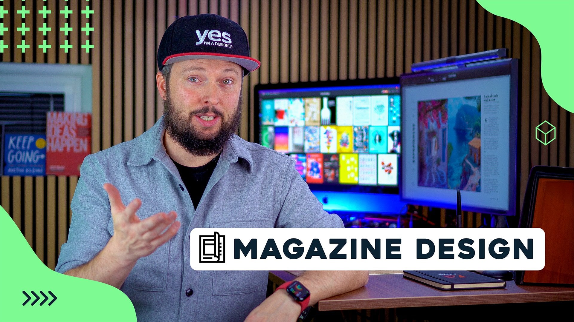
1. About this project: H. Designing catalogs in Adobe InDesign can be one of the most challenging and
repetitive editorial workflows, making it crucial to learn
how to use automation. In this project,
we will dive into the most useful
automation techniques InDesign has to offer, Data Merge and XML Import. To get started, we will warm up by working on a real
travel catalog, where I will guide you through some advanced typographic
features that can drastically reduce the time
it takes to update content. After that, we will explore some real world
catalog examples and discuss the key
considerations that every catalog designer
must keep in mind. Then we will start our
project from scratch, building three different
layouts step by step. First, we will design a
layout with a single entry, followed by a spread
featuring four entries, and finally, a spread
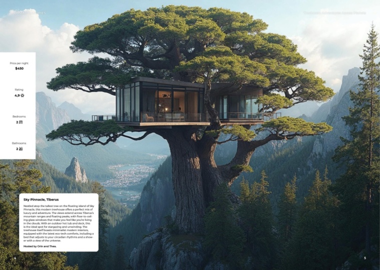
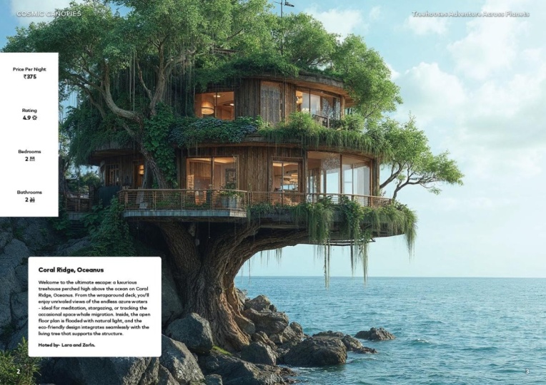
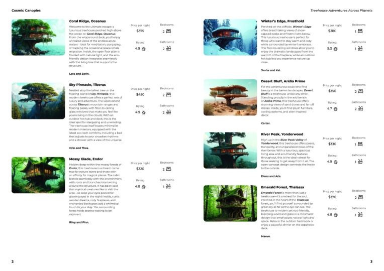
listing over eight entries. For this course, I created a fictional catalog
called Cosmic Canopies, showcasing the best and quirkiest treehouses
from around the world. And even from alien planets. Using Midjourney and Magnific, I generated over 50
stunning tree house images with descriptions
generated by ChatGPT, ensuring that this project
will keep you engaged. By the end, you will have
a deep understanding of both Data Merge
and XML import, along with other advanced in design features.
Let's get started.
2. Travel Catalog - Analysis: For our main catalog project that I prepared for this course, I thought it would be a good
little exercise and warm up to look at one of the catalogs that I
worked on in the past, where I was mainly asked to help improve the way
they use in design, to make it more efficient, to work with their copy, and to be able to get their
catalogs updated faster. And if you want to follow along what I'm going to do here, you will find an extract
of the main catalog. So I'm not sharing the
original complete catalog, just some pages of it, but you will be
able to go through all the changes that I'm
going to do in this exercise. Now normally when I'm asked to improve the workflow of a team, the first thing I
do when I open up their in design file is to check the Paragraph Style panel. That's one of the first
things that I do, and a great way to
identify how deeply they understand and
utilize the features in in design is to
check their body copy. Because that's
supposed to have a lot of smart formatting solutions. And if we check it in this case, I can see it's not based
on anything, that's fine. But then this style
setting section is very thin. There's
not much things here. It's just simply defining the font, the style of the font, the size, the color, and then a brownie point
goes for using the baseline. So apart from that, there's
not much else there. Let's just check maybe
the chapter title. Again, I'm not expecting much after seeing the body
copy paragraph style. Yeah, again, pretty
much the same. It just has alignment center and all caps additionally
to the previous one. And essentially, this is the complexity for all
of the paragraph styles, and this is one thing that we are going to improve and fix. And the next thing I normally
check is the margins. It's good to know whether
they are using column guides. And yes, indeed, they
are using six columns. And of course, they have their custom margin setup,
which is great. And I can have a quick
look at these columns. So although they have three
columns on most of the pages, there are actually pages
where they would be utilizing those additional
columns like here, the first column is skipped
and columns two, three, four, and five are used to hold the text that we can
see here in the middle. As we can see column
guides they are actually utilizing,
which is great. And we can just
double check that the baseline grid
is indeed in use. So we can see the baseline grid right there and the
text is aligned to it. This is obviously
something that we are using also in our projects. And then next thing I normally
check is the text flow. So how many frames
are used on a page? And if I just go to this
page, for instance, we can just check that
there is a frame here, no tax flow, another
frame, no tax flow. These are individual icons floating around,
nothing connected. That line is also
just floating around. Then this is in a single
frame. That's great. And there is a text full
finally, which, by the way, is easier to track if we have the view extras show text
threads option turned on. So when I'm in a normal view, I can see that this text is threaded between the
three text frames. So one, two, three, and
then it ends there. So it doesn't
actually continue to the next page, which is fine. However, it is questionable whether this is the best
way of doing things, having three completely
independent frames, and even the alignment of the frames we can see
already here is not perfect. However, they are
using baseline grid, so that's actually going to fix that alignment issue there. But still, these should be set
up as a single text frame. Actually, all of this
that I have here, even including that
box at the bottom, could have been handled
in a single text frame, divided into three columns, and then all of
these things should have been set up
as inline objects. So this group, for instance, if I cut that out and I create a new paragraph
here, drag this down. I can just paste that in there. Now that it's pasted in, we can just highlight
and use the space before option to set it up exactly where
it's supposed to go. So see already, we eliminated one unnecessary text
frame that they had. But with the right usage of all the features I'm
going to show you here, this, like I said, could have been done with a
single tax frame. So instead of one,
two, three, four, five, six, seven, eight, nine, they originally
had separate tax frames. And even this one actually
was created with two frames. So more than ten
frames could have been done with a
single tax frame.
3. Travel Catalog - A single text frame with 3 Paragraph Styles: Let's take a look at
the first example, which I have in the original
catalog on page 76. So we can see if I show this in full screen that within
these excursions, there's, like,
smaller excursions or trips like this one,
sailing to icebergs. Then we have this
settlement cruise. Then there is another Ford that can be visited
here on the right side, and then a city walk
and so on and so forth, and notice how these blocks of text next to the images
are always the same. So they always start with
a heading or subheading. Then we have the copy. Then there is a rule or line, and then there is
the prices section, which describes also the
duration and a couple of other important information like when these trips are available. So these definitely are repeated elements
throughout the catalog. And if we go to maybe another page that is a similar
setup like this one here, again, we can see
the same formatting. So once again, the
excursions pages or spreads will always
use the same format. It would definitely make
sense to spend some time improving this because
right now this is again, using multiple text frames
instead of a single one. So we have one, two,
three, four frames. So we can combine these all together into a single
frame, first of all, and then we can also create a connection between the styles, which will help to
automate things. One thing I notice for all
of these excursions is that this text is always
a single paragraph. So if we just check
the story editor, there is no paragraph
break there. We can also just double check with this one here
on the left, yeah. There's no paragraph break, and that's actually
something that we can double check
with the team. I remember that
they confirmed that there's never a paragraph
break in there, which is very useful for us
because that makes it easier to set this up as a chain
of paragraph styles, which we start with this one, then goes into the next style and then goes into
the next style. Within this paragraph,
I would expect that this was set up
as a character style, but it's actually
not showing up here. If I select these arrows, they are using a
character style, but I believe that's just
simply to color this red. We can just double check this. If I go here, edit red, that is just simply
a coloring style, but at least they use
the style for it, which means that
they already thought about perhaps updating
that in the future, and that would make it easier to obviously update all
instances at once. However, these could have
been done as a nested style. So what I'm going
to do here, again, just double check if
we go into this one. Yeah, there are no net
styles currently being used. So what we will do first of all, is I'm going to move this
image to the left a bit or just crop it so we can
then create a duplicate. So I'm going to duplicate this and keep the original
version on the left, and I'm going to use this
new version on the right, so I'm going to cut this
text out of this frame. I'm going to drag this out
and paste the text in here. Reason I keep that version on the left is because I want to make sure that I'm using the
same spacing and same size. So then we can drag
this down a bit, and I'm going to delete
this line because we will recreate that with
a paragraph rule. And instead, I'm just
going to cut this text out and paste it in
after this paragraph. Okay? So I made sure that I don't have any
empty line breaks. So I only have one
paragraph break here and another one there. That's all we need.
And now I am going to set these up as
new paragraph styles. For this, I'm going
to create actually a new folder as well or group. We can just put this all
the way at the bottom. I'm going to call this Fix. And then let's have that
first one selected. Hold down Alter option, click on Create New Style. And I'm not going to base it on any existing styles because I just want to
avoid any conflict. So I'm going to choose
either basic paragraph or no paragraph style, and I'm going to call this
one heading or subheading. Again, it depends on
the base structure, what would make more sense. And I'm going to
make sure that it's applied to the selection. So we can click Okay, and let's just drop this
into our fix style category. Now, let's select this
other paragraph right here, we can see this is using the body copy without
any overrides on it. So I'm going to again, create a new style
based on this. I will say base this
on no paragraph style, so there won't be
any connection. And I will call this
excursion body. Al Style to selection.
Click Okay. Let's drop it in here. And then finally,
the prices section, I'm going to again,
create a new style for. I will set it to be based
on no paragraph style, and I will choose the name for this type in price section. Again, applies Style
section is on, so that's all good. But because we've done that, notice that we actually remove some of the
formatting here, like the capital
stack is removed now, and also the arrows are
looking a little bit thinner, but we will fix this soon. So I'm just going
to make sure that this new style price section
is also placed in here. Now, first of all,
we should set up the chain or connection
between these styles, and that is by using
the nextile feature. So I will start with
the subheading. And from the next
tile drop down, I choose this excursion body, and then let's click Okay. And then I go into the body, and for that, I use
NextylePrice section. So it's leading from one to
the next and then click Okay. Now, what this means is that
if I select this text here and I just change
it to something completely different
like hotel name, then if I then apply
the subheading and all the next styles by right clicking on
that style and choosing, apply the name of the paragraph
style, then next style. Then it will be able to reformat it back exactly the
way it should be. And even better if you
create an object style. So for instance, in this case, this text frame can be selected, create a new object
style and call it excursion text frame. As long as this option here under the paragraph
styles is turned on, saying apply next style and obviously starting
with the first one, then it could even be applied straightaway by
using that object style. So I'm just going to
undo this one step, and I'll show you
once again if I change this to something
completely different. Now having this
one selected here, I can just click on that object
style and see immediately the object style triggers the first paragraph
style that we set up, which is the subheading,
and that one triggers the other
two paragraph styles, the excursion copy or body, and then the price section. So it's really like a chain
of the styles that we set up. And in this case,
we can consider these three paragraph styles all nested inside that object
style that we just created. Now it's time to fix the rule that we are
missing at the moment. I can do this now
just simply by going back to the price
section, paragraph style, and I can go into
the options here, paragraph rules, and we want to use the rule above,
which is great. Then we want to actually
use the same color. I think it's already using
the right color for us. Using text color, actually. That's not the one that we need. We need this one. It was text color because the red arrows were already there, but we shouldn't rely on that. I think the thickness might be slightly thinner, like 075. Actually, it seems like
they are using one point. It's hard to see at the moment. But instead of column width, we want this to be set to text, and we want to use
the right indent. I'm just going to
increase that a bit until we can
see it updating. So there we go probably
around that much. Not sure how long this is, but of course we
can refine this. Let me just set it up for
22 millimeters for now, that's close to it. So no matter how much
text we have here, it will always be
indented to make sure it looks similar in
size to the one on the left. And then, of course,
we also want to have spacing between this paragraph
and the one before it. So I'm going to say space before and that
should push it down. I'm going to use 2
millimeters for now. But then going back to
that paragraph rule, we also want to have an offset. So I'm going to
keep increasing it up until it seems like
it's in the right place. Probably they use
around this much space. And then going back to spacing, we can increase the
space before further. And the reason why we have to go much higher is because
of the baseline grid. So you don't see this updating
straightaway because there is a baseline grid in
use, which is right here. So align to grid all
lines that's active. And now if I just click Okay, I feel like the main reason
why we don't have the text in the same position as on the because our text
frame is wider. We can easily check that by checking this text
frames width here. So the width is this 47.7. So we can select
this and just paste in the width to make sure
it's the same and already, we can see the text flows
exactly in the same way. And by the way, we can
just double check how wide this is and we can
align it to that other rule. So they are actually
using 0.75 thickness. So I can come back to
that paragraph style, price section and refine
that rule that we use to 075 and then that right
indent that we were using can be reduced a bit until we match the original distance. And if I want it to be
even more accurate, matching it, I could set
it up even more refined. But I'm going to go with
15 millimeters from now. I think that's close enough. Okay, so let's zoom
back a bit and we can remove that extra
line from there. And now all we have to fix
is just this part here. So I'm going to first of all, remove this red character style. I will set it to none. So this paragraph should be completely as
it's defined here. And it's not using
any character styles. And what I'm going to do
is to highlight the text here and create a paragraph
style based on that. I will alter option click on
create new character style. And what I'm going
to do is to check the formatting of
this text here. So it's defined in a paragraph style called
bolt copy upper case. But we can see it is using
or capitals, obviously, medium formatting, and it is
using this BSS text color. And I believe that's all the
settings that we need there. So I can just recreate
this here quickly. I'm going to use
medium all capitals, and the color is
already the right one. Yeah, so that's all we need. This should be saved
as a character style, so create new style. We can see that the
only things recorded are the differences from
the paragraph style, and I don't need the applied style selection
in this case, because we will be nesting this. So I will call the prices from just makes sense
to use it like that, and then let's click Okay. And I just create
a separate group for these fix styles that I am proposing to the client and then I just need that additional
style for the arrows. I'm just going to check that's also using exactly
the same settings. But on top of that, it's
also using that red color. So I'm just going to use
this word here again, change it to red and save a new paragraph
style based on this. So now it says medium, all caps and that color, and I'm going to call
it red arrows or maybe price section arrows and then save it and
drop it in here. And then having this
paragraph selected, I can just clear all
over with this icon. So it goes back to
how it should be. And now I can right click and
choose Edit price section, and then I can go into Drop Caps and Nested Styles category, where we can start with
a new nested style. And first, I will start with
the price section arrows. And if I click away, that will already be applied because it considers these as a single word because there's no space between the two
arrows. So that's already good. Then we add another
as this style, this time is the prices from, and then notice how it automatically continues after
the arrows are applied. So the second word in this case, is becoming our second
character style. But instead of through here, I'm going to say up to, and what I want to
see is not a word, but a column instead. So I'm putting that
character in there, and it basically
is going to stop the character style whenever
the column first appears. And that's exactly what we need. So it's already working
perfectly. I can click Okay. And we can see that instead of having these four
separate elements, now we have a single text frame, and the whole thing
is also automated. So just to demonstrate
this to you, if I mess this up completely by setting it
back to basic paragraph, you can see if I just
extend the frame. That's how it looks
at the moment. And then if I clear the
overrides on my object style, Boom, it's all done
with a single click. And I can even just to
make it even smarter, I can right click on
this object style, and I can go into the text
frame auto size option, choose height only anchoring the top edge of the
frame, and click Okay. And you see even
that extra space that I included in
there is now removed. So once again, just
to demonstrate this, I remove the object
style from this, set it back to basic
paragraph style. I increase the frame just so
we can see what is in here. Again, let's just
completely set back everything to the original
basic paragraph style. So now I select the text frame, and I'm going to click on excursion text frame,
and it's all done. Even the height of the
frame snaps onto the text.
4. Travel Catalog - Inline icons: Second little exercise I wanted to show you
is on this page. But on this page, there's actually a lot
more we could fix. So similarly, what we've
learned in the previous one, if you wanted to, you could automate a lot of
additional things here. But what I wanted to focus on is this section here
with the icons. Now, I notice that these icons are actually not
placed in a table, so the spacing between
them is random. I don't think they used any special way of measuring
the space between them. It's probably just eyeball. So yeah, that's
something that can be fixed already in the way
that we are going to do. But the biggest problem here is that they
are not in line, so they are not part
of a tax frame. Now, because here
they are using, again, independent tax frames, what I'm just going
to do is to have them placed into
this tax frame here. And just like before, just so I can compare the
before and after, I'm going to make some space, drag this tax frame down a bit. Like that, and then I'm
going to duplicate all of these to the right.
Let's bring them here. And instead of just
using these three icons, I'm going to jump back
to the first spread where there is a key
for all of the icons. So these are all
the available icons that might appear
in that section. So I'm going to
copy all of these. Of course, we don't
need their description, and let's just select
them all, copy. Then go back to the
page where we were. And I'm going to paste these
here on the pasteboard. Now, when I have them
here on the pasteboard, we can actually see that there are some differences
between them. Some of these icons are grouped, some of them are not grouped, but I'm not going to waste
time on fixing that. For now, let's just
accept that these are the finalized icons that
they want to work with. And first of all,
what I'm going to do is to create a tax
frame for them. And then cut the first
one and paste it in here, then cut the next one, paste it next to the other one, and then just continue
doing the same quickly. Cut and paste, cut and
paste, cut and paste. I'll speed this part up. So here we have all of the
icons in the same text frame. And because they
are inline objects, I can already use the text
frame to wrap these around, and it's working
perfectly as expected. I can have them all in a
single line or like this. And what I would actually do is to have them
in a single line. Listed like this. This is actually something
that we could keep here on the pasteboard for all
the pages if we wanted to. We could have it placed
somewhere convenient, like here on the top, from where we could
easily select them. And what I'm going to do
is to double click inside, copy all of them. Or if you know exactly
which ones you want, you can even just highlight them and paste them into the text. But for now, I'm just going
to copy all of them come back down here and I'm
going to delete this tree, extend that text frame and then add a line break and
paste these icons in. Now, we can see that the size of the icons is actually
different here, and that's something
that we can fix and align to our placeholder icons. So if I bring it down here, we can try to align
it to this other one. So let's just make it
a little bit bigger. And I just noticed that
they are missing this icon. This wasn't in the first spread. Let's just see again, Did I
miss no, it wasn't there. So that's actually not defined
here in the beginning. Maybe it's defined
further in the catalog, but I'm going to just
fix that as well. So I'm going to copy this
and paste it in here. And I'm going to try to align the size of these
other ones to this. I'm using command
and shift keys or control shift to drag them and
make them similar in size. I believe this can be slightly taller than
the other ones. We can keep them the same size. Again, I'm not sure what's
the best size for them, but for now, I'm just going to keep them roughly
the same height. Okay, this should be the
same height as well. This one to be much
smaller, to align it. This one and finally, this one. Alright, so now one
additional thing definitely worth
mentioning is when you are resizing these icons
that are using lines only, there will be inconsistency
in the line strength. That's again, something that
you want to definitely fix. And that's why it's important to set things up already
in Illustrator to make sure that they
are the correct size before you bring
them into in design. But like I said, I'm
not going to waste too much time talking
about this here. So I will just select
this paragraph, delete those icons,
just delete them, and then now copy
these placeholders in, and I'm just going
to drop it in there. And then we can just
drop this frame out of the page onto the
pasteboard. All right. So we have our icons ready, but we only wanted to use
a few of these icons here. So we want to have the camera, the little cabin,
and the mountains, and I want the order of
them to be different. So I just highlight the
mountains and paste it there and see how easy
it is to move them around once they are
part of the copy. Now for these icons, we actually don't want
to use baseline grid, so that's something that
we are going to change. But first of all, I will set up a paragraph style
for them, new style. Shouldn't be based on anything. And it actually doesn't
need any of these settings, so I will reset this two
base and I'm going to call it icons or large icons and
apply style to selection. Let's click Okay. So we will
improve that style soon. And while we are here
in the dialogue box, we can already fix a couple of things like the indense spacing. So we want to have more space before it's actually already says align to grid none because we reset
the style to base. So we removed that
feature already, which is useful in this case, because we want to position it exactly how it was
there on the left side. Feel like that's closer. Then to have the spacing
between the icons, we want to use the
tracking feature, so we can hold down Shift key, increase this a bit faster. And we can just try to
find a good spacing. I feel like 500 is close
to what they used, and it's a nice even number,
so let's just go with that. And then let's not forget about the rule that
we have below. So we just put that in quickly. Rule below on. We want to use the same red color
that was used before. And I remember that it was 075. And this time, I'm going to keep the width on column because the text will really
vary depending on the amount of icons
we will have here. And they actually prefer to
keep this line consistent, so it doesn't
relate to the icon. So it has to be set
to column width, but the right indent, we can control, and with that, we can define how much
space we want for this. So I would just set it to
30 millimeters from now, and then we can change
the offset as well. So we want to have this spaced
out probably around there. Okay. So let's just click Okay. And the best thing to
do is to already assign this paragraph style to that placeholder that we
have here on the top. So if I just select
this whole text frame, I can click on large icons
and see immediately, we get the spacing between them. And if I ever need to adjust the size of things
like this camera, for instance, I can
easily do that. And then just to see
how it would work, if I copy all of these icons onto another
page, this instance, where we need the car
and the mountains, I can just delete the
unnecessary elements, create some space here, and then paste these icons in. C just highlight the
things that we don't need. So we needed the car
and the mountains. We don't need these and we just have to move the
car before the mountain. And it's done. Now, this is
already an elegant solution. However, what I
advised the client for this project is to turn
these icons into a font. And that way, they
would be able to use characters on the keyboard
to type with these icons. So when you create a font from the icons, you could
have, for instance, the car on C, the mountains, on M,
and then literally, you can just type them in, and they would appear
in the right formatting because of the paragraph style, but it would be so much
easier to handle them as glyphs instead
of inline objects. And these two improvements
that we've done here, I remember the client told me already saved them days of work. And that is just for
this particular catalog, but they actually have
dozens of catalogs. So once the same features are implemented throughout
all the catalogs, it ends up saving weeks of work. And the main takeaway
I want you to get from this is that although you can do everything in
a raw format, by raw, I mean having
everything just set up the most simplest Everything
is in separate text frames, and although there are styles, they are not connected to each other and so on and so forth, when it comes to having
these long documents, like a catalog, it's
definitely crucial to utilize as much as possible of in design's
smart features. Otherwise, you will waste so much time having to
manually update everything, and not to mention
the fact that you will be more likely
to make mistakes if you are not relying on these smart connected styles
that we created here. When you utilize these more advanced features in in design, it takes longer to set
up in the first place, but it will save you a lot
of time in the long run, and it will also assure that
you won't make mistakes. I hope you found this
warm up exercises useful and feel free
to play around with these extracts from
the original catalog and see how much more
improvements you can introduce. And when you are ready,
you can either move on to the next video
where I'm going to show some additional examples
of existing real catalogs. Or if you're eager to get
started and learn about the smart ways of handling
catalogs in in design, you can jump straight
to our project.
5. Inspiration - Catalogs: I collected lots of
references when it comes to product catalogs
throughout the years since I've been working
as a graphic designer, out of which I chose a few
very good examples that you can also find in the reference
folder for this project. And in this video, I would
like to show you some of these and talk about
certain aspects of catalog design that will be useful when we start
working on our own project. First, I would
like to start with an interesting antique example, product catalog from
Ericson from 18 86. That's a very old publication. And yeah, it just
shows really well that a catalog has been in use
for a very long time. And essentially catalogs
worked already in a similar way that they
work in present day. So we have illustrations
to show the products. We have the description,
the prices. And then we have also maybe some
additional graphics here, and that's actually
the last page. So that's 24 pages,
this catalog. Now, already from this, we can see one of the
most important aspects of a product catalog, and that is consistency
throughout the catalog itself. So consistency is key
because users would browse through the catalog
and they expect to find the same information
in the same places. So in this case, we can see the prices would be always
formatted the same way. If we move between pages, we can see, again,
the information is displayed the same way. Let me jump back and
see a little bit more up to date or
more modern example. Like, this one is
great by John Deer. We have these replicas or
toys of their tractors. And after the cover page, we can see a nice table of contents here
on the left side, and then we already see some of the products on the right. And if we zoom closer to these, we can already see
that there will be information that will be repeated throughout
all of the products. So we have a code, another SKU code as well. Then we have the
scale or ratio to the original size of the
product one to 16, the name, and then we can also
see the age grade, when is it becoming available, and then we have some additional information
below it here. And just to see the consistency that I mentioned
at the beginning, we have the same
exact information, same exact formatting as above. So that is helping viewers to be able to find
what they are looking for and to compare
products with each other because that's also obviously a very important
part of a catalog. It's not just to find
the information, but to be able to make
an informed decision of which product is best
suited for the customer. We can go through these spreads. Here, we have a
lot more products, but still very easy to find
what we are looking for. All the information, again, is repeated in the
exact same way. We can see again eight
products shown on this spread, and I notice how we
have information about the section here on the
left and on the right. So in this case, this is
the prestige collection. These running
headers on the left and the right are
indicating that. And so if I go to
the next spread, we are still in the same one, but then the scale
is changing here. So it's not only telling us
the name of the collection, but it also tells us the scale
of these products, which, of course, for replicas
is very important, and then we can go through. I like also the way they are mixing up the
layout slightly. So for instance, here we have
a large image on the right. Then we have this featured image on the left on this spread. There's also a combination and variety in the type of
images they are using. So some of the images would show the product in the
actual environment, someone using them,
while others would just focus on the product
with a blank background. But even the
background is changing between gray, white or yellow. And sometimes we would also see the packaging in these
boxes that are edited here. And let's just move on
to additional pages. And from now, it's essentially just repeating everything
we've seen before, maybe a couple of
additional bubbles. Did we get these sticker like design elements to show
what's new in 2024, which is also quite nice. It grabs the attention. And then we get to
pages where we have a lot more products with a
little bit less information. So here we have ten
products on the left side, and we have six products
on the right side. So it has a good variety of how many products they are
showing amongst these preads. After this, it essentially just continues in a similar fashion. We have more like
collection replicas here, which are displayed together. It just continues on like that. The actual catalog
is 80 pages long. Now here's another
similar catalog. This is by Lego. We have the table of
contents on the left side, and then we have
a hero image that introduces this product
category called dreams. So we can go and see
that on the next page. Beautifully designed
catalog, by the way. I love how they
display their toys. Obviously, they are really good at it and it's
an amazing brand. I'm sure whoever is designing this catalog
is having a lot of fun. Or they might be bored
of seeing all of these toys all the
time. Who knows? We can see that
even the style of the formatting changes slightly between the different
age groups. So the demographics will define slightly how
the layout is looking. Here, it's a much cleaner
and more simpler layout compared to the previous. Which is for older kids. This is for the youngest
audience, the Lego Duplo. We can see these products. Then we have PAPA Pig, which is a brand that recently
joined the Lego family, and then we can move on and we will reach the four
plus age group. And this is really
nicely displayed again as a running head here
on the right side, and that is just
something consistent throughout the whole catalog. So we will always know
where we are if we take a quick look on the right
edge of the spread. It's also worth mentioning that the main Lego logo is consistent
throughout the catalog. It's always there
on the top left. So as I go through the catalog, we can see the sub brands
like Ninjago or City, Marvel. They keep changing,
but they are still in that consistent location. So it makes it
easier to find it. Now it's Star Wars the classic. Disney and so on and so forth. Beautiful catalog,
really nicely designed. Amazing imagery, great
use of typography, highly recommend to spend
more time analyzing it. And now as a harsh contrast, here is a catalog for personal
protective equipment. This obviously has a
completely different tone. It's more mature and
more professional, especially because it's about
safety and protective gear. So we have the information about the different icons that they are using
here at the beginning. Which will be used
throughout the catalog. That is a key for the viewers to be able to identify
what they are looking at. And then the table of contents is also great here on the right, again, reinforcing the icons
that are used for these. So there's a lot of pages. It's over 500 pages
for this catalog, and then we can see
the actual contents. Then we reach the
first category, eye protection, which has its
own mini table of contents. And then we can see
some main information here or introduction
and then comes some additional guide on what to look out for
when you are choosing the products here and a lot of information here at the
bottom in this table. Now, that's again,
very common amongst catalogs that you would have these extremely complex tables. In our project, we will
also have a table, but it will be much
simpler than this. But essentially the same
techniques will be used for more complex tables
like these that we will be covering like using cell styles and table styles and the various
formatting options to change the orientation of
the text within the table. Finally, here's
another beautifully designed product
catalog by Purdy, professional painting tools.
We have a nice cover. We have the table of
contents on the right. Already, there is a
color key here to be able to find the type of
bristles and materials, and then we can move on
to the actual pages. An additional guide again, highlighting the various
brushes from stiff to soft the color
codes that they are using for it just zoom a
little bit closer to this. So a nice little
infographic here and some explanation on
the different handles and the terms used for it. Notice how they are using the bold formatting
for the first words. That's actually something very easy to set up in in design, and we will be also using
it in this project. By using a nested
character style within a paragraph style. And then here on this page, we have another example
of a nice table, very sophisticated, very simple. I like how there is
no outer boundary. So it's just floating in space, but it has just that
very thin headline to divide the columns
and the rows and, of course, also the header row that we have
here on the top. As I skim through
this catalog, again, you can see how important
it is to be consistent. They are using the same style. It's very easy to
compare the products and really find what you're looking for quickly and easily. It's 68 pages. So there's a lot of
products to go through, and they are using their
color coding here on the top. So in the footer
area, it's again, very easy to find the
category that you are after. And each of the larger sections or chapters of the
catalog are broken up by having these large image and some introduction
copy at the bottom. These type of high
impact interruptions are very important to break the flow and the
repetitiveness of the catalog, and of course, it again,
helps for navigation, so the customers can quickly find what
they are looking for. And again, we have
another infographic, but then the general style is going to be very similar
to what we've seen before. But of course,
these are rollers, so they look slightly different. Then we have the prep
and cleanup section, again, very similar style
but different tools. And it just continues on and on. It's pretty much the
same layout after this. But what we can tell
already is that it definitely would
make sense to have a page like the one on the right setup
as a parent page, which would allow consistency, and it would serve
as a template for all of these category
starter pages. But it would also definitely
make sense to have the table styles and
sales style setup and potentially to link
these tables with the product images and description because
you definitely want to keep these
groups together. So most likely this is anchored
to the table, and again, this is anchored to the table, and that would be
the same format throughout the whole catalog. So unlike the other
projects in this course, for this catalog project, I actually have
this big library of references that I highly recommend to spend some
time going through, again, to find inspiration, to learn about
catalog formatting. And then when you are ready, you can start the next lesson where we will be setting up the document for our
catalog project.
6. The assets we will work with: Alright, so first of all, I want to show you what we will be creating
in this project. And just a final warning, things will get technical
in this project. And I'm going to try to show everything in the
simplest way possible, but there's a lot to cover. It's really not for
the fainthearted. So if you don't like
complicated things, this might not be the best
project to start with. Maybe work on the other ones first before you do this one. However, if you like challenges and if you love automation and see things happening automatically once
you set things up, then you will actually
love this project. So here's one of the examples
that we will be using. You can see I have a couple of elements here if I zoom
a little bit closer, we have a table here, some parent page
elements on the top, left and right, and then we have another text frame
here at the bottom. And in the background, which might not be
visible properly, we have an image frame as well. Now, in this particular example, we will be using Data Merge, and I'm just going to
preview the first page, how it will populate
all this information. And I can actually switch
between these pages already right here in
the Data Merge panel, and we can see how all
of this is going to be populated from a CSE file. And I can zoom closer. You can see how all
the information is pulled in from that file. So it adds the required numbers in the table, and
then of course, it adds the copy right here, and also everything is already coming in in a formatted way. So this is looking
great, and by the way, this document would
probably be close to 100 pages long once it's
actually generated. But let me just jump over to
another example, once again, same Data Merge feature, but this time used for four
records on a single spread. And we can see this
in full screen, really nice way of displaying
these next to each other. So whoever is going
through this catalog, will be able to take a
better look at this. And once again, if we are
using the Data Merge panel, we can go through
the spreads and see exactly how everything
is going to look like. And then finally, we
have another example, again, using the same images. But this time, instead
of using Data Merge, we will be using the XML
import feature and tags. You can already see the XML structure here on the left side. Currently, we only
have one entry here. Now, if I go to the
file menu and choose Import XML and choose the file from the
exercise file folder, it's going to ask me a
couple of questions. We will deal with these later. I'm just going to say, Okay, but what will happen
now is that it's going to populate my document
with all of this, and it's going to generate the
necessary amount of pages. This time, it's more of a list format where
we have, once again, the left side and
the right side, but in a little bit
more compact weight, so we can display even
more than four records. So on some pages,
this might end up being eight records like here, we have four on the left
and four on the right, depending on the length of them. And then here we actually
ended up having nine, again, because there's some shorter descriptions
there at the bottom. We will compare Data
Merge and XML Import and learn exactly when
to use each of them, what are the pros and cons
for each of these workflows. And in the end, we
will even see examples of combining these two
features together. But we will take everything step by step without
overwhelming you. First of all, I just wanted
to explain where the idea of this catalog came
always loved tree houses. I actually built one
myself when I was younger. But my friend, we went
up into a mountain, decided that we would
build a treehouse there, and we spent months building it, kept going back, took so much
building materials with us, and eventually turned into something more like
a shelter that was built into the mountain
than on top of a tree. Because it was in the forest, we can consider it
still a tree house. And the inspiration
for this project came from looking at Airbnb. I saw some incredible
tree houses here. So there's actually a category
to look for tree houses, and you can see some
beautiful ones. And, of course, for
a site like AirbnB, you have a lot of information
for each of these out of which the
most important ones are listed straightaway, the rating, the
location, the host, and when it is available next
and the price, of course. So I thought this would
be a really good material to use as a catalog. So create a tree house catalog. But to make things more interesting and
unique, I thought, why not use generative AI
for creating the images. And that way, I can even create tree houses that feel like
they are out of this world. So this fictional catalog
that we are creating could offer not only locations
on our planet, but even on other
distant planets. And you can see I used Magnific
to generate these images. Now Magnific has mystic
version two, currently, that is a new feature where you can actually
prompt right here. And if I select one of these, we can see my prompt is
right here on the top, ultra realistic photo of a modern treehouse on top of a rocky mountain in Yosemite, built into the side of a vertical wall of
El Capitan showing the entire building and surroundings in
autumn. Very specific. And I feel like the
prompt adherence is brilliant here in Magnific. That's one of the reasons
why I like to use it. But also, in general,
it just creates really exceptional
detail in these images. Now, for most of these images, these are the additional
features that are used. So creative detailing,
I set to 100%. I had realism on, and I used the Illusio engine. Other great thing about
Magnific is that by default, it generates two K images. So the resolution is already
looking really good. As you can see, I can zoom
in and see these details. But if I need it even
more resolution, all I have to do is
to upscale this. So what I can do is click here, say, Rue final image. But first, we have to switch to magnificUscaler,
and do that again. It puts the input
image in there, and then we can choose
the scale factor. We can go extremely high
resolution if we wanted to. I'm just going to
double the resolution, and it tells us here at the
bottom that the final size will now be twice as much
as what it is currently. Of course, Magnific is not free, so it's costing these credits
here, but that's fine. I'm just going to keep
everything the way it is. Maybe I'm just going to copy the prompt and
put it back here. And yeah, let's just
see if I upscale this. And after around a minute of waiting time, we get the result. I'm just going to zoom in now. Get closer to this part
here in the image, the building, and let's
compare before and after. So that's before
and that's after. You can see how much extra
detail it can generate. And of course, there
will be strange parts like this one here.
Doesn't look good. Also that part there looks
a little bit strange, but it actually fixed some of those details in the
magnified or upscale version. But generally, all the
textures and even details inside the building just
get so much more interest. And we can see this also
up here on the tree Again, before and after, it just
does an amazing job. And we can even have a look at the mountain in the background. Once again, a lot more detail is added with the
magnified version. So, yeah, Magnific is definitely my favorite tool to use
when it comes to AI images. And then to actually create a
database from these images, which includes all the necessary information like description, location, price per night, and host and so on and so forth. For this, I actually
use ChatGPT. So I fed ChatGPT
a table template, which had these
columns prepared, and then I attach the images, and I asked ChatGPT to generate content based
on these images. And that's how I
got the database. Of course, there was a lot of refinement and tweaking on this. But without ChatGPT
and Magnific, I don't think I would have
been able to put together such an exciting and complex
database from scratch. I am planning to create multiple template
databases like this one, so you will be able to practice the techniques that we
learn in this project and apply it to other type of service or product
based catalogs.
7. Database terminology: While we are here in Excel, I wanted to also make sure
we spent some time on some of the important terms that we will be using
throughout this project. First of all, the database itself is what we can see here. So we have all the information
stored in one location. And for instance, if this was a database for a supermarket, they would have all their
food products here listed, and they would have all
the necessary information in each of the columns. The great thing about having
a database, of course, is that you can feed
a website from it. You can also feed print projects like this one from
the same database. And whenever
something is updated, as long as there's
automation in place, it should immediately and automatically update
everywhere else. Now, each row within
the database, we refer to as a record. So this is a record of a particular product or service
or location in this case, while each of the
cells or contents of the cell we
refer to as entry. So within a record, we have several entries. And the columns themselves
can be referred to in different ways depending on
which workflow you are using. When we use CSV files
for data merge, we normally refer to
the columns as fields. While in an XML workflow, we would more likely refer to it as elements or attributes. I'm just going to
show you quickly a text file example which can also be
used for data merge, where we have the original
columns from our database defined here in the first
line. So each of these fields for which the
corresponding entries are in the same
order listed below. So this is one record here. Then here's the next record
and so on and so forth. Of course, I can also
just triple click to quickly find them because they are separated by line breaks. And between the
entries, these commas as you can see, between
each entry, we have commas. Those are called delimiters. They act as the separators
between the entries. And depending again on the
data source that you're using, it could be either a comma or a tab or some other
special character. And because commas are also used within entries, for instance, in this text here, you can see, we have a couple of sentences, and there's definitely a
couple of commas inside. There's also a need for something that we
call text qualifier, and that's actually these
double quotation marks right here and also where this
entry starts right there. So these double quotation
marks at the beginning and the end of an entry
groups the text together, making sure that it doesn't get separated by the
commerce inside it. Now, jumping back
into in design, the data Merge panel
is definitely going to be a key area where
we will be working, and I'm going to give
you a proper tour later. But for now, what's
important is that you always have to
choose a data source, and that is going to be
displayed here on the top. So that's either a
CSV or a text file. In this case, that's a CSE file, which has a table
structure compared to the free flow tax
structure of a text file. And the list that we see
below the data source, we refer to as data fields. And these are the ones
that have to be placed inside these placeholders
like frames. So for instance, that
data field location is placed here. This one is another data field,
the description. And notice how I have some
static text here, hosted by, which repeats for every record, and that's what we
call static content. So something that doesn't
change between the entries. And there's actually more of this static content
right here. Again, like the bedrooms, rating, and even these icons,
they don't change. They are static
content right next to the placeholders of
our data fields. But instead of boring you any longer with the technical terms, let's get started with our
first example where we will be building from scratch
the exact same layout that you can see
here on my screen, where we will have a single
record from our database on an entire spread within our product catalog
and in design.
8. Single record layout - Setting up the image placeholder: For our first example, I would like you to
start a new document, and we will be working
with the default A four size portray format. It's important to have the
facing pages turned on, and I like to start
with page number two, and we can start with
two pages as well. We should also set up
three millimeter bleed for all edges. Because we will have the image completely filling the spread. And in these cases, we have to make sure that
if this goes for print, we are covered,
so the edges will turn out fine in
the final print. And I think that's all
we need to do for now. Of course, we can
have the preview on, just so we can see this
in the background. And yeah, that is looking good. We can hit Create. Now, as a first step, we can already get our
data merge panel open. You can find this
in the Window menu under utilities, data Merge. And by the end of this project, you will be familiar with
most of these things here and also some additional things that you may have never
seen in design. So I'm excited to show
you all of these, but this is the
data Merge panel, and it actually gives you already a little
bit of a tutorial. So if you just read this,
it explains that first, you need to select
a data source, then you drag your data fields from this panel onto the frames. Which are your placeholders, and then you create the
merge document at the end. So it's actually a very
simple three step workflow. But of course, we will go
much deeper than that. First of all, let's click on the panel menu and choose
Select Data Source. And the one that you
will need for this one is the TreeHouses CSV file. So we will click Open, and it immediately brings
in our data fields, and it even shows
that the image is actually an image while
all the rest is text. Now, this is actually
important to mention that if you ever have
images in a database, you should always
use the tsign at the beginning of
your column name. So the field that
we have here on the top should have that
at sign at the beginning. And then you will need to
include the location or path to that file in relation to where the
CSE file will be stored. So in my case, if I look
at my file structure, you can see that the
CSF file is right here, and sitting right next to
it is the images folder with all of these images that I have prepared
for my database. So when you look at
this in the background, it basically means that compared
to the data source file, the SCV, we need to go first
into the images subfolder, and within that, this is
what we are looking for. It's very important to be
accurate with the file naming. I always suggest the most
simple file naming format possible with numbering at the end and also make sure to use always the
same image format. So even mistakes like not including an E in the
JPAG depending on how the files were named can
cause a problem once you are using data Mage so just like for every
type of automation, you have to always pay attention
to the smallest details. But since I use the
at sign properly, it automatically
recognizes that that field is going to be an image
type field instead of text. And let's not waste
any more time. Let's test this out. So I'm
going to use the frame tool. And I'm just going
to draw a frame, and then I click on image
here in the Data merge panel. Notice how immediately
it updated the frame. So if I just go back,
that's an empty frame, and now it became a
placeholder for a data field. If I zoom closer, we can see the description of the data
field showing up there, and that is looking really good. Now, if I want, I can already preview how this is
going to look like. And that is looking great. However, I wanted
this image to be completely filling the spread. So what I will do is
to drag this all the way to the top left
corner of the bleed, and also we go all the
way on the other side. And now I can just
test this out. If I use fill frame
proportionally, this is how it's going to look. Now I can check the next page, and what you will notice is that the fitting of the
images is not perfect. So if I go back to
the first page, even that is now not filling
the page proportionally, it's fitting the
image proportionally. So it will have a little bit of gap on the right and the left. Now, this is something you
can actually fix easily. You just have to go into
the panel menu from data Merge and choose
content placement options. And there you can
change these features. So instead of fit
images proportionally, we want them to fill
frames proportionally. You can also choose to
center within the frame. And of course, link images is always a good
idea to have on, and then we can just click Okay. And then once we turn off the preview and
turn it back on again, see automatically
updated, and now it does a brilliant job already
filling in the images. Now if I wanted to only include the images without any text, I could already generate
a document based on this. By clicking on this,
icon here in the data Merge panel called
Create Merge Document. So let's test this out. If I click on this, it's going to ask me which
records do I want, whether I want all of them
or just a single record, and I can even specify
which one if I wanted to, or I can also choose a range. So it gives me the
option of all of them, which is 55 records. So out of that, I can type
in maybe one, two, five. Comma and then maybe 20
to 55, for instance, just like specifying pages
when you are exporting a PDF, this works exactly the same way. But I'm going to
stick to all records. And because we are using
a facing page format, it actually doesn't allow
us to change this feature, the records per document page, but we will come back
to this later for now. I just want to see
a quick result. So I'm going to click Okay, and then keep an eye on
the pages panel. Which is going to be populated
with all the records. So in design is just
telling me, by the way, that there was no overset text generated while
merging the records. And that's quite obvious because we haven't actually
imported any text. But yeah, we can see all
of these spreads created. We have over 100 pages, and I can just zoom out and see all of these
spreads created here. Beautiful. So the important
thing here that we can learn is that every time you create a merge document
using data merge, it's going to create a separate
new untitled document. It's not going to affect your original source
file, which is great. That almost serves like a template which
won't be affected. So this is a completely
independent file, and we can decide to
save this or not, in this case, because this
is not a final version. I just used it as a test. I'm going to close it, and I come back to my
actual source document because we still have to
populate our other data fields.
9. Single record layout - Text placeholders: Now, let's just go in
order and let's set up the location for which I
will need a text frame. Now, as soon as I start to have overlapping elements
within a design, I like to also
start using layers. So in this case,
I'm going to call the original layer where
we have our image, image or images, and I'm going
to create a new layer now, and I'm going to call it text. Now, on this new layer, I'm going to create a new frame, and by the way, while
we are working, we can also lock
our image layer, so I don't accidentally
move that frame around. So I'm going to use
the type tool on this new layer and I'm going
to create a text frame. It doesn't matter what
size it is for now, I'm just going to
create it like that. And within this one, we will be storing a
couple of things. First of all, we will have
the location and once again, I'm just going to zoom
a little bit closer just so you can see better
what's happening here. So having the text
frame selected, I double click inside it, and then I just click on
location in Data Merge panel. That adds already that first placeholder
within the layout. Then I'm going to press Enter. That's a line break
to separate this. From the next element, which is going to
be description. So another data field is added. And by the way, notice how these little numbers
are appearing here. Immediately as soon as we have a placeholder for a data field, it tells us on which
page they appear. So the image is associated with page number two because
it overlaps the spread, while these two I have on the
right side at the moment. That's why it's
saying three there. And after description, I'm
going to press Enter again, create another line break, and then I'm going to drop
in the host as well in here. So that is looking quite good. So far, I'm not going to
format it at all now. I'm just going to
keep it like this. Maybe one thing that I'm
going to do is to assign a fill color for the
container or frame itself. I go up to the swatches, choose this fill option, make sure that the
container is selected, and then I choose paper. Now, we won't really see
any difference right now, but this is just filling
in the frame with white. So if I move it
here, you can see how it looked before and how it looks after
when we assign that. So it fills it in with white. That's going to help
us to be able to read the copy even when the
image is behind it. So now that is ready, we can hit preview
in Data merge panel. And look at that. We already have the image in the background and we have
the location on the top. Then as a new paragraph, we have the description, and once again, as
a new paragraph, we have the host's name. And we can probably already start formatting
this a little bit. So one thing that
I wanted to have is some corner radius
on this frame. So the way you can do
this is by clicking on the little yellow square
and then start dragging it. And I'm just going to set
it up for 3 millimeters, and by default, it's
using round corners. But this is actually
something you can also access from
the Options bar. In case you don't
see the options bar, just go to the Window
menu and choose Control. It's actually
called Control bar. It used to be
called Options bar. But yeah, so we have this
also available there. You can decrease the amount, and you can also change
the corner radius style. I'm going to keep it rounded, and one additional important
thing to do is to have some inset spacing so to keep the text away from the
edges of the frame. If you press Commando Control B, that's for the text
frame options. And here you want to make sure preview is on so you
can see what you're doing, and I'm going to increase
this to maybe 5 millimeters. That's going to
create a nice offset from the edge of the frame, and that works nicely.
We can click Okay. So if we zoom back, we can
see everything in context. And once again, we can just use these arrows to toggle through all of the records and we can see how it looks.
It's looking great. But I noticed an issue, and I wanted to make
sure I mentioned this because it can
be very annoying when it happens that
some of the characters don't render properly
here in design. So Winter's edge, the
little apostrophe. Turns into this strange code, and that would
appear actually many times throughout the catalog. So what you need to do to fix this is to make
sure whenever you save a CSU file that you use
the right formatting for it. And that is actually
something that you can do in even the most simplest
text editor applications. I'm using a little
bit more advanced one called Es CSU Editor. I just to show you,
when I save this, what I need to make
sure is that I use the UTF 16 nIicode
text encoding. So instead of eight, this
is what you want to use. So once I do that,
I can save this. By the way, we can see here, we can even customize what
the field separators should be and also what the
field escape rules are. So remember when we talked about delimiters and text qualifiers, these are exactly
those features. So I'm just going to save this and overwrite the original file. Then let's just close this. And jumping back into in design, I'm going to zoom
closer to our text. All I have to do now is to go to the data Merge panel
menu and notice that there is an option here
to update the data source. Now, this is extremely useful. So if you make any changes
to your CSV or text file, you can just update it, and then it should
automatically fix itself. We just have to
click Preview again, and then the text now
renders perfectly. So we have the
apostrophe sign there, and also within the text, it looks perfectly fine. One thing that I'm going
to fix already here, and that's going to be saved
into our paragraph styles, once we set them up, is
to have no hyphenation. I'm going to select
all the text, and I'm going to go to the
paragraph formatting controls and turn off hyphenation. So that's just something
I like to do at the very beginning because
sometimes I forget, and then I only notice it
later on in the workflow. So now I can just double
check text is looking good, and now we have roughly half of the data fields
already in our layout. So that is a good progress. I will come back to
formatting these later. For now, I would like to add
the additional information, which actually will
go into a table. So let's create a table now. I'm going to go
to the table menu and choose Create Table. And for this particular layout, I would like to have four
rows and one column. Now you can already assign a table style to this
right here in this menu, which is always a good idea. So I'm just going to choose
that new table style. And I will just call it table style one for now.
And I'll click Okay. And then we have to
click Okay again. And then the table is
loaded into a cursor. If I just click somewhere, it's going to
generate it and fill the available space
within the margins. But if you want to
be more specific, of course, you have to
click and drag instead. Unfortunately, if you
undo the last step, you have to go through
the settings again. I'm just going to choose that style once
more. Click Okay. And then I am going
to do a click and drag and roughly define
the area that I need. We can obviously
refine this later, just like all the
other information. But this is going
to be our table. And then in the first draw, we can probably put the price probably the most important
one people want to see. Then the second one
can be the rating. I think that's also
very important. And then can come the bedrooms and then can come the bathrooms. So these will show the
number of each of these. And if I zoom closer again, I can show in the preview
how these look like. Now, we can't
really see them yet because there is no
backdrop for our table, but that's actually something
we can fix very quickly. So I'm just going to move this here just so you can see it. We need a sale style
to define that. And this is actually something I have already opened
here on the right. So we need sale styles, and the table style
is already there. If you don't know where
these panels are, it's from the
window menu and you will find them on the styles. So there's sale styles
and table styles. And don't get confused, although there is a type
and tables category. This is not where you will find the styles
relevant for tables. It's all grouped together
within the styles category. So once you have these open, within the cell styles, you can define a new style. So that's what I'm
going to do here. I'm going to create a new style, and we can, I guess, just call it sale style one. I'm going to, let's just call it sale style one without
any spacing in it, and then I can double click
on the table style one. And then for the body rows, I would like to
assign Sal style one. Right? Let's click Okay. So now the two things
are connected, I can go back to the
cell style itself. And here I want to
have a fill color. So I go to strokes and fills. And for the cell
fill, I choose paper. Now, as long as you have
the preview option on here, you will already see this
appearing in the background, and for now that's
all I wanted to do. So I'm just going to click Okay. It's a basic thing that
we already started defining the styles
for this document. It's going to help us later on. But now we can see the result
that if I preview this, we can actually see these
numbers much better. So we have the price on the top, the rating, bedrooms
and bathrooms below. And we can see the next page, and we can see how
these numbers keep updating. So that is nice. It's working perfectly. And the good news is that if we look at the
Data Merge panel, now all of our data
fields are in the layout. So everything has a placeholder. Now it's time to stylize them.
10. Single record layout - Setting up Paragraph Styles: First of all, you will need
the Paragraph Styles panel for this part of the workflow. So make sure you open it up from Windows styles,
paragraph styles. I'm going to keep it
here on the right side. And this is definitely a panel. You should keep an eye out
for throughout the work that you're doing in design no matter what kind of
projects you do. And to make things
easier for now, I'm going to even
just drag it out here to display it better. So we can see right next
to what we are doing. One of the first things I would
like to do is to turn off the preview just so we go back into seeing things
just as a structure. And first, I would like
to format the location. So I have that selected, and then the font
that I'm going to use here is called Monsera. I'm going to use the
normal version of this. So I'm just going to go down
here and actually will use the bold version of Monsera and I will use
ten points on this. And then for the description
and the host, actually, we can both select these
and already choose Monsera. I'm just going to
choose regular, and then I will change
the size of these as well down to eight points. But the host, I will
actually set back to medium. Oh, maybe it could be even bold, but I think medium is going
to work quite nicely. Alright, so that
is looking good. Now let's give it a try
and see how this looks. Yeah, that looks good in terms of hierarchy.
It looks nice. The medium might need a
little bit more strength, so I might just use semibld that's very
subtle difference, but definitely helps
to separate it. And then, of course, we will have to save these
as paragraph styles. But one thing that I'm going to change first is the leading. So for the description, I'm going to use
11 points leading. And then I'm going to use
also space before and after. So for the description, we can increase the space
before to 3 millimeters, and space after again can
be maybe 3 millimeters. I think that's looking good. I like the way that looks. So now we can save these
as paragraph styles. So when you select tags, you can either use the Paragraph Styles
panel and hold down Alter option key and click on the plus sign when
you create the style, or on the next one, I'm going
to show you the other way. I'm going to call this according to the data
merge data fields. So this is called location. Let's just be consistent naming our styles exactly the same way as the data
fields are named. It's less likely you
will make mistakes if you do I'm going to select
the description part. I will now instead of going
through the panel menu, go up to the paragraph
formatting controls and click on this little drop down and
choose new paragraph style. So there's another way to
access the same feature. So this should be
called description. Again, the same way as before. It's not based on anything, so my styles won't be
connected to each other. Here, I'm not going to
do based on styles just to reduce the complexity of an already quite
complex project. I'm going to click
Okay. That's done, and then let's do the
last one right there. I'm going to go through again, creating a new style for this, and I will call this one host. Okay. Now you just have to double check that
whenever you select these, they should show up both here in the paragraph size panel and also in the
data merge panel. So they should have
no plus sign on them. They are defined exactly the way they are shown
in the layout. So that is looking very good. Now what we need is
some static content. And if I turn off the preview, it's probably easier
to do it there. So in front of the
host placeholder, I'm going to type
in hosted by space. Then the data field comes
in to fill this in, and then after that, we want the full stop. So this turns into a sentence. If I turn on the
preview again from data Merge, now it
looks much better. So instead of just a name, now it says hosted by
Vsper in this case. But we can check the next page. That one is hosted
by Sienna and Luca. If we take a look at
this from a distance, it looks already much
nicer than before. Our formatting is
working very nicely. Our static content, that little
text that we it as well, blends perfectly in with all the dynamic text that is
coming from the data source, and our styles are
working as expected. Now we have to do the
same for the table. So let's go closer to the table. And the first thing
that I would like to do here is to highlight
the whole table. Now, you can do this
by double clicking in either of the cells. And then when you see
your cursor flashing, you can hover over the
column in this case. And then just click that
will select everything. And while it's selected, you can change the vertical
alignment of the text. We can set this up to be
center that's going to help. But then I also want the text to be horizontally centered. That's just a normal alignment, which we can do with
Command or Control Shift C. That's great. Now it's
perfectly in the center. And for formatting
the text here, we will be using a style again. But first, I also want to put some static elements in here. So I'm going to turn off the preview just so we can
see everything properly. Now, for the price per night, I'm going to press Enter, and before my placeholder, I will type in price. It actually would make sense to type in per night, as well. That's quite important
information. And this one we
can already format and save as a new
paragraph style. So again, I am going to use
Monser just like before. But this time, I'm
going to use light, and I will reduce the size
down to probably ten points, or it can go down
even to eight points. Yeah, I think that looks good, and it's time to now save it. I'm going to call it
table header text. I think that makes sense, and we can make sure applied
situs selection is on. You can click Okay, now we
can just copy this text, go to the next cell, and before the actual
placeholder for rating, I just copy this text in and change the text on it to rating. And again, copy this
here and then place it in front and say number
of beds bedrooms. Let's just write
the whole thing. Copy this and then put it down there, number of bathrooms. Okay. So that should already work if we
check with the preview. That's page one, page two, and so on and so forth,
looking already better. But of course, we can
refine this further. The placeholders themselves
have to be style as well. We can start off by using
the table header text style, but then I'm going to make
some changes to that. Maybe we can set
these to be bold. And also bigger, maybe they
can be ten points in size. And we can also have
some space between the header text that we specified earlier and
the placeholders. So I'm going to use the paragraph formatting
controls space before maybe 2 millimeters. I think that will be enough. Now, there is a plus sign
next to the paragraph style, meaning that there
are overrides, and I'm going to create a new style based
on this selection, and I'm just going to
call it table text. Now, this can be based on
table header text if you want, but I'm going to just
choose no paragraph style. That way, it's again,
completely independent, so it shows all of the
formatting options here. Yeah, that is looking
good. Let's click Okay. And now we can just apply
the same thing here as well. So that's table text, table text, and table text. And there's actually one
additional static element that we need to place in,
which is very simple. So right before the price
per night placeholder, I'm going to put Shift four, which is the sign,
US dollar sign. You can, of course, change this to any currencies that you want, but I'm going to use US Dollars, and we can check
the preview now. It's looking so
much nicer already. And the formatting is
great, and of course, everything is nicely hooked up, so it's working perfectly. So let's turn off the preview. Now one additional thing
that I would like to do is to get rid of the strokes
around this table. We just want to keep
it completely blank. So no separation
between these elements. And the way we can do
that is by going back to our cell style you might recall
setting that up earlier. So there's a sale style which is connected to the table style, which is connected
to this table. So if we go to see style
strokes and fills, we can set the weight to zero
point Walla that's gone. Sell fill is still
there. Of course, we will keep that intact,
so we can click Okay. And just like before,
we can test this how it looks with the preview
looking very nice. I feel like this is
going to be great. One thing maybe that
I'm going to change here is to change
the static text. Instead of number of bedrooms, I'm just going to say
bedrooms and bathrooms. I think it's very obvious
what these represent here. So we're just reducing the copy that makes it easier
to read everything. I think that is
looking quite good. And there's one additional thing I wanted to include here, and that's to add some
anchored or inline icons. So for the rating,
I would like to see a star sign for bedrooms, a bed and bathrooms a bath. We already have these prepared in the exercise fis folder. But before we do
that, I would highly recommend to save your work
if you haven't already
11. Single record layout - Inline icons and refinements: Now that it's saved, we
can bring in those icons. So what I will do is use Commando Control D
on the keyboard, and then from the images folder
from your exercise files, you can find these
three SVG files. They are vector files, both BD and star. Let's open them, and then you can click and drag to
paste them in one by one, or if you use the right you
can place them in together, just press the
right arrow twice, and then when you let go,
it should populate this. It's called the greedy
five feature in in design. Don't worry about their size because we will specify that. Now we can set these. It's set the first one. And I'm going to make sure that the width and the
height is connected, and I'm going to change the
width to 5 millimeters, and then I will
choose field frame proportionally. See
how that looks. We zoom a little bit closer. Actually, we need fit
content proportionally, or what we can also do. Going to check how big this is. If we come closer here
in the text, bathrooms. It's probably still a
little bit too big, so I'm going to reduce the
width to 4 millimeters. And then what we want
to use actually, is the fit content
proportionally, making sure that the icon
is completely showing up. Yeah, that is looking
much better already. And now we can do
this is to cut this. That's Command X or Control X, double click inside the text just after where the number is, and then paste with Command
V or Control V. There we go. We have our first inline icon. Now I can just press
space between these two. I can even use older
option left and right arrows to add more kerning between
them if we wanted to. And then if you
highlight your icon, you can highlight
it just like text. You can use baseline shift
to adjust it vertically. That's Alt Shift up
and down arrow on PC or option shift up
and down arrow on Mac. I just needed to
drag it down just ever so slightly like that. Now, what I like to do is
to copy this together with its space to the other places where I want to see my icons. So first, we just put in
the same icon everywhere. The rating can go
in there as well. And then we will be updating these with these other icons. Now, you can either
select them from here by clicking on their
CenterPoint and then copy. And then we go to bedrooms, and then we can choose
edit paste into, which is Command, Option V on
Mac or Control Alt V on PC. And that's going to
update the icon, and you will just have
to choose fit content proportionally again to fix it. Or you can also just select the frame and press command or Control D on the keyboard and bring in the same
image once again. And that way the fitting
won't be affected. So that is looking quite nice. We can actually
delete these to here. We won't need them anymore. Yeah, I feel like
this is working well. Let's zoom out a bit. So we have now all of the
relevant information here. So let's just test
the other pages, lovely stars and
bedrooms, bathrooms. And notice how they obviously update and move left and right, depending on the numbers that
are displayed next to them. That's the amazing thing about inline images or
graphics in design. That is looking lovely. The left part is
looking good as well. But there is one
additional thing here on this description part or this main text frame
that I wanted to change. And there's another feature which I would like
to introduce here. It's called auto size
for text frames. You can access this from
the text frame options, that's Control or Command B. And within the text
frame options, it's called auto size, and you just want
to make sure that the height only
option is turned on. In this case, you probably want the bottom edge of the
frame being anchored. That means that, for instance, if I position the
text frame here, if there's more text, it's just going to
continue growing upwards. So the height will change, but the bottom edge is fixed. If I want to do
it the other way, I can fix the top
edge of it, as well. So it's completely up to you, but in this case, I feel
like that makes more sense. And we can click Okay. Now, if you want, of course, you can save this as an object
style to make sure that it's easy to apply on other
frames in case you have them. So this is something
you can do from the control bar here on the top. You can click on this icon
and choose new object style, and I'm just going to call it textFrame and applies style
to selection already, so it's connected, and
we can see it up here. So that is looking good. And once again, if we test this with the additional pages, if there is more text, let's just go to spread
where there's more text. You can see already slightly adjusting up and
down there you go. So between these three pages, there will definitely change between the height of the frame, and each time it's
nicely adjusting without the bottom edge of
the frame moving around. That's auto size for you. There's a longer
text example here. We can take a look at this in
context of the whole page. Let's just drop the
paragraph styles in here. Again, let's test this out between the pages
looking really nice. Now, what I would
actually do is to keep the table also on the left side. I think it just makes more
sense to keep it there. Somewhere there, we
can also make sure that it's put all the way
on the bleed like this. But when you do
this, notice that it doesn't feel scented anymore, and that is because don't
forget we have the bleed, so we just sacrifice 3
millimeters of this table, and that makes it not balanced anymore
when we look at it. So what you can do is to
compensate for that is to put an space before
each of these lines. That's command Shift
M on the keyboard, and we can here as
well, and by the way, you can find this in the type menu insert whitespace space. Space is wider than space, so you can decide which
one you prefer to use. I feel like space is quite good. And in case you forgot
where you use them, you can either go to the
type menu and choose show hidden characters.
There you go. There's our space,
or you can also use Command or Control Y to
see the story editor, where, again, you can see
all the inline elements. Can see where the
rows are separated, and we can also see our space
special character here. I'm just going to come back
to the layout editor and copy these in there and there and there and there and to more and now
it's looking good. So if we look at it
from a distance, it definitely feels
more balanced now. But we also made sure
that the bleed is correctly set up with
this table element. And in terms of the full spread, I feel like the positioning of everything is looking good. These two elements that we have here are not taking
up too much space. They are quite close
to each other. So whoever is looking
at this catalog can get a quick glimpse at all the necessary information
all in one space, and then they can still enjoy a wide close up view
of the image itself. And the good news is that
we are almost ready. Now we just need to set up some other additional
static elements like the header information and
page numbers in the footer, which we normally call
folio in magazines. And the best way to set these up is to use the parent page.
12. Single record layout - Parent page setup: First of all, I'm
going to turn off the preview just so we can
see what we have so far. And I'm going to go to the
parent page because we originally chose a
facing page layout is also a facing page setup. So we have the Verso
and rectal sides or left and right sides. And I'm going to start with
the folio, the page number. Now for this, I'm going
to use the type tool, come down here on
the bottom left, and I'm going to place a text frame right
there on the margin. I will use the type menu, choose Insert special character, markers current page number. And then we can stylize this. We can probably use one
of the existing styles. Let's see, maybe the table text. Yeah, table text is looking
good or even the location. I think that's even better. Yeah, that's great. Location is going to work well. However, I'm just thinking about this now
because we will have a full spread image
in the background. We probably want
this to be white. So I'm going to change
this color of the text. I go to the field color, choose text formatting,
and set it to paper. But then to help legibility, I will also introduce
the effect on this. I'm going to add
the drop shadow. And if you alter option, click on the drop shadow
icon in the control bar, you can adjust the settings. So I'm going to go
down to zero distance. Size of the shadow
can be 1 millimeter, and the opacity can
probably stay on 75%. Now, if you want
this to be stronger, you can increase the spread. As you can see, that
really makes it thicker. Maybe something like that, and maybe we can tone
down the opacity a bit down to 20%
somewhere around there. All right. Let's click Okay. I feel like that looks good, and of course, we can test
this on our actual page. If you turn on the preview, we can see the image behind. Now, in this case, because
the image is dark, it doesn't really matter. But if we find an
image that's brighter, maybe another image where
there's a brighter detail. Yeah, like here, we can see that it's still
legible, sort of. Yeah, I think it's
still legible. It gets a little bit lost, but it's not too bad. So we can jump back
to our parent page, just double click there, and then we can move this
element on the right side. So we can duplicate this, place it on the right, and I'm going to just
write align it. That's Command or Control Shift R. Same formatting,
just write align. By the way, you can
also save these as paragraph styles
if you want to. I'm just going to keep
them as is for now. I'm not going to
overcomplicate my styles. And let's just use the
same setting up here. So I duplicate this
once again, actually. Yeah, I duplicate it and
place it there on the top. And we can maybe align this to the margin like that
just outside the margin, and then we can maybe have a
little bit more space here. And for the text, I
already have it prepared, what I want it to paste here. It's called TreeHouse
Adventures across planets. There we go. Yeah,
that's looking good. Once again, we can test
this out on an actual page. On text, it looks
actually really nice. And perhaps here we can change
the formatting slightly. I think the bold looks
a little bit too thick. So we can change that to medium, and perhaps we can have
a bit more tracking. That's option right arrow
once I think is enough. So just to spread the
letters out a bit, let's just check how that looks. Yeah, it's looking very nice, subtle, but still legible. And then we can go back
to the parent page, and let's just duplicate this, move it on the left side, right there, and then we
can align it to the left. In this case, that's command
or control shift. L. And for the actual name of the brand that
we are building, I wanted to use cosmic canopies. I think it's quite a clever name for these cosmic treehouses. So, yeah, I think
that looks good. Maybe this one can be in all capitals just to
signify that a little bit. Yeah. Cosmic canopies.
Yeah, that looks nice. Let's just check it on the page. Beautiful, nicely aligned,
everything to the margins, outside the margins, both
the header and the footer, and everything else looks good. Now, of course, these
are static elements, so they won't change when
we are using data merge. So if I just come back
here and change the pages, we can see how these look across the whole catalog consistent. They are always in the same
place. So that's great. The good news is
that we are ready to produce the final
version of this. So stop previewing it and actually turn it into
a merged document. So like I showed earlier, that's the icon that we
will have to use for this. Create merged document. We want all records
to be included. I don't need any alerts
normally for missing stuff, but for now, I'm
going to keep it on. And yeah, that's
all we need to do. Just double checking
under options, make sure you have the field
frames proportionally on, and both of these options on, and then you can click Okay. Remember, this is going to be generated as a
separate document, a brand new document, which you will need to save. There's text, so there's no overset text generated,
which is great. There's no errors. I can see
it in pre flight as well. And we have all of our
lovely spreads here. I can jump to any of them, and they all look beautiful. Some of these generated
images are crazy. I love them. They
look really cool. Right. So we are done
with our first example. That's all we had to do here. So once again, just to
review what we've created, we have a template, this original in design
file that we can use. So in case we have more entries
that we need to generate, we can just come back to
this and then regenerate the whole thing again from scratch because
everything is now set up, the styles are saved. Everything is in
the right place. The data source is set up. In case there's more
data coming in, we just have to update the data source as
long as that file has been updated already and then create the new
merge document, which will result in
the updated version. So even though it
takes time to get to this point, from now on, anytime we have to work with the same database and we have
to produce the same layout, it's literally going to take
only a minute or two to get things ready and then just
hit publish and we are done. So that's the biggest
gain by using automation like data
Merge and XML input. That takes longer to set up, but then in the long term, it's going to really
save a ton of time. So you can give yourself
a tap on the back because you already completed the
first example in this project. Now it's time to move on to a slightly more
complex layout and see how we can build that with the things that
we've learned so far.
13. Four record layout - Adapting the record layout: Good news is that
for this example, we will be able to
use pretty much all of the things that
we already set up. And I would actually
advise to save the existing template that
we created as a new version. So it already has
everything included. So we can just go
to File Save As, and I'm going to
call it number two, and I will call it four
dash records layout. And then save it. Now for this, first of all, I'm going to go back
to my pages panel, unlock the image layer because we will have to resize
the image frame. I will make it smaller. Probably somewhere
around this size, we can tweak it later, and we will have to
move things around a bit like the table
will move here, and the text frame will
move here as well. We can zoom a little bit closer. And there's actually
one thing that I would like to do also is to separate the host
from this text frame. I'm going to cut this out, Commando Control X and
then move this text frame. Here and then just create another text frame and paste in that placeholder text with
the static content as well. So hosted by, we
can align it there. The image can come down
maybe somewhere around here. The table can move
on the right side, and then the location
can go somewhere here. And if we zoom back a
bit, most importantly, we want to make sure
that there will be enough space two of
these on the same page, and don't forget
that this text is going to increase in height. So once again, we specify
the bottom edge to be staying in place and
it's going to grow upwards. So most likely this can
come up around here, and I think that's
going to work fine. So without changing
our data source, I'm just going to double
check how this looks. And yeah, it's
looking quite good. Maybe one thing I'm
going to do is to reduce the distance between
these entries here, so the height of the cells can be updated
in this example. So I'm just going to do that by double clicking in the table. Then click here on the top. To highlight all the cells. And then from the control bar, you should be able to find the height option,
which is this one. So if I start reducing this, notice how it works like an accordion and it's
collapsing it down, maybe up to there, something like that should work. So I want to make sure there's still enough space between them. And then for this text frame not to have too much
space at the bottom, I'm just going to select
it and double click. So it snaps onto
the table nicely. Yeah, that's looking good. Maybe this can come
up a little bit. I like this subtle overlap. There. So it connects the
image and the text together. That's just a very
subtle indication that they belong together. And by the way, this image can probably be a little bit bigger, maybe come out all the way here, and then that text frame
can go down to there, maybe a little bit further down. Yeah, that is looking good. This is the cool thing
is that once you have your formatting and style setup and also your data
source connected, you can preview
these changes very quickly without having
to do much work. So we adjusted our layout
very quickly in this case, and I like the way this looks, and we can even test this out with different
versions of it. So yeah, it's looking good. I like it. That's
looking good, too. And, yeah, we can turn
off the preview now. Because what we are going to do next is to change
the data source. Now, why is this important
and why is it necessary? So far, we've been
using this CSV file, which looks very similar
to the original table. So we have the
columns corresponding to each of these data fields that we are using in in design. But the main problem with
this is that if we want to use multiple entries on the
same page or same spread, In Design is going
to keep loading the same record until it
moves on to the next spread. So let me show you this just
so you are aware of it. So if I select all of this and duplicate it
down here below, so let's just say we want it to be aligned maybe somewhere
around there, right? So now we have two
instances on the same page. If I turn on preview, you will see
straightaway that it is exactly the same content on
the top and on the bottom. Now, if I move these
on the right side, so on the other
side of the spread, I can even keep the preview on. If I duplicate this, it's going to be the same issue. So it's just going
to populate each of these placeholder instances
with the same exact record. And that is one of the
annoying limitations of data match that I
can't specify that I want these to be alternating or changing or moving
through the CSV file, so to change between
the records. And I don't understand
why there is no simple checkbox
within data merge, which would allow us to
automatically move to the next record once it's been utilized in one part
of the spread or page. But unfortunately, like I said, that's just a limitation,
and it doesn't matter even if you
group things together. Let's just say I
group these together. You see, it's still
not updating here. So if I group these
ones as well together, unfortunately, that's
not fixing anything. I'm going to go back to having these two or
maybe even just one, and I'm going to update
first the data source. So I come up here and
choose Select Data Source. I design is going to
warn me that this might mess up my data fields
and the placeholders. You will have to
insert them again, but that's fine.
I'll click Okay. And the one I would like
you to use this time is called TreeHousesF
record groups. So this is actually a text
file format because I just found it easier to format
a text file this way, and I'll show you
how this looks. First, I will just bring it in. And straightaway, what you
will see here is that we have four times as
many data fields. So instead of just one set, we have now image one, location one, and then
here's the next set, third set, and the fourth set. So each of them are
named accordingly. And if I open up the text
file, this is how it looks. So in the first row, I specified four instances
of all of the fields. So all fields are specified
four times of course, including the numbering, so it's consistent and the order of
them is consistent as well. And then of course, these paragraphs will be much thicker because they
will hold four records. So there's only a line break after four records
of information. And that essentially is all the information that
goes into a single spread. So there is only commerce
between these because that's how it's
specified here on the and then there
is a line break, and then we move on to the
next set of records, again, four, and then another four
and so on and so forth. So that's the way
this is set up. Now, of course, this is again, something you can do with a
CSV file if you wanted to. I just wanted to show
a text file this time that you can work with
the text file just as well. In some cases, this might be easier to create depending on the formatting
automations that you are using when you are
exporting your database. But right now, I have
that text file in place, but the connections
need to be updated. So my placeholders are not going to work unless
I update them. So first, let's start
with the image. Instead of image, this
should be image one. Then price per night
should be price one. Then rating should
be rating one. Number of bedrooms
should be bedrooms one, number of bathrooms,
bathrooms one, and then we have location one, description, one, and host one. Now I can see the numbers here, which means that this record
placeholder group is ready. I am just going to test this
out by pressing preview. Let's see how that
looks. It looks good. One thing that I want
to make sure is that this text frame goes
behind the table. So in the layer s panel, that should be at the
bottom. That's correct. And this one is on top of that, and the host is all
the way on the top. That's fine. That's not going to overlap the other elements. I just wanted to do this because some of these text
frames might be quite tall and I don't want this text
to overlap the table, while there will always be
a little bit space here. So we should be able to display
the text in a good way. I think the first one
is the longest text, and then the rest is going
to be slightly shorter. So as long as the
first one fits, the rest should fit as well. Yeah. So this is
looking really good.
14. Four record layout - Setting up placeholders for the additional records: Now it's time to duplicate this. So use the same format
that we have here, and I will actually have
exactly the same setup here on the bottom right corner. Now, I'm not grouping
these together because I like to keep
them in separate layers. Normally, I would
group stuff together, but because I want to keep the separate structure
of image and text, that way, you can't really
group them together. But yeah, now we
have two of them. And before I'm going to
change the placeholders, I'm going to create another version of this here
on the left side as well. But this one, just to give
some visual interest, I'm going to swap around. So this way, the table
moves to the left. The image moves to the right, and the host can also
move to the right. I change the alignment to
right, command, control, shift. R and then move the
text here to the left. Yes, that's looking good. By the way, you can
preview this because now the placeholders
are working, even though they
are only utilizing the first record from
this data source, but we can already see
how this is looking. Yeah, I like how this feels. So it's more dynamic having some change between the top
and the bottom of the page, and we can then do the same thing here on
the top right corner. So for that, we can just copy
this and paste it up there. So align it. And once again,
let's just test this. I'm just going to go
into full preview mode. And yeah, this is
looking really good. I think everything
is nicely placed. It has some dynamic
interest to it, and it's easy to read and find
the relevant information, especially because
we will have them always consistently
in the same place. So I am happy with this. I am going to now update
the placeholders. So that's something that we can do by zooming a
little bit closer. At this point, you can
decide whether you want the order of the
records to go one, two, so top and bottom, and then go to three and
four on the next page. Or you could go one,
two, three, four. It's completely up to you. And that's the good thing
about data merge that is very easy to set it up
the way you prefer. And I'm going to keep
the preview on just so you can see things
updating already. So I'm going to go to the
one here at the bottom. I will actually use this
as the second record. So that's going to be the order. This is going to be image two. Then I want this
one at the bottom, the host to be host two. Then I want this
to be price two, this one to be rating two, and that's actually
exactly the same. It didn't update. That
was just strange. This one should be bedroom two, then this one should
be bathrooms two. Again, those didn't change, but I think we will see the change here
with location too, and then this should
be description two. It is looking good. Now, the only issue
here is that the way we set things up is that this table is in front
of the text frame. And while on the top, there was space for them to clash in a way or
overlap each other. Here, the text or the location text is in
the way of these elements. So they are
overlapping each other and that's not
going to work well. So we have to make more space. So for this bottom part, we probably will have
to go back into editing the table again and we just
have to reduce it further. So we have to squeeze them a
little bit higher like that. And if you want consistency
between your tables, I advise you to do the
same for all of them. So here I set 20
millimeters for the height, and that's actually something I'm going to do here as well. So let's just be consistent
20 millimeters and also here. For this table 20. And then let's be consistent with our bottom
right one as well, select it and choose
20. All right. Nice little accordions
are working perfectly. Yeah, that's looking good now. So if I turn off the preview, I can actually
double check that I see number two everywhere here. So it should be two, two, two, two, two,
two, two, and two. So all of them are number
two. That's perfect. I'm going to just speed
things up here because I'm going to do exactly the same
thing on the right side. So I will just
select the image and choose Image three and
move on doing this. I actually usually prefer
to do it this way, updating the placeholders while not previewing the entries. But you can choose whichever
way you want to do this. Just make sure you update
everything before moving on. Alright, so I am
done with both of the number four elements
and number three elements. I'm just double checking. Everything seems to be updated. And the best way to test this, of course, is to
turn on preview. And if you've done
everything correctly, you shouldn't get any
errors or warning, and you can test this out. This one, the fourth
one should say Winter's edge frostold and this one should be
called mossy Glade dor, and this one is
skyinacle Tiberius, and that one should
be the coral ridge. Now let's just look at this
from a distance, full screen. Yeah, I am happy with
everything, how this looks. One thing I spotted here
that I want to fix is to have the run of the
text frame corrected. So that single word
there at the end, I would consider a run
and also this one here. This is something that we can easily fix with a grab style. So we can do this right now
before moving any further. So this is going to be
for our description, paragraph style, which
we can bring up. It's right here. But we will also need a character
style for this to work. So we need to open up that panel and choose new character style. And then I normally
just call this no break, double click on it, and then choose basic
character formats, turn on no break. That's all you need to do there. And then from the
description paragraph style, we need to go into grab style, create a new grab style, and choose no break. So apply the no break
character style. And then what you want to
type in is a full stop. Then in curly brackets, 15, and then $1 sign at the end. And if you click away,
this should already work. There you go. Now we have at least 15 characters
in the last line, and that's the number
that you can change here. If you want more than that, you can type in, let's say, 20 and so on and so forth. But that's a quick fix, and now it should work on
all of these text frames. So if I go to the other ones, yeah, they all look good. So yeah, that was a quick
little fix there for the text. And once again, let's just take a look at the whole spread. Looking really good,
I'm happy with this. So I think we can generate
our next document. Maybe just one final fix
the parent page elements. They don't need drop
shadows on them. They should be
just set to black. So what I'm going to do is
to go to the parent page, select everything on this page, and then go to the text
colors and choose black. And then what we can do here
in the top, left and right, we can take off the drop shadow and also on the bottom,
left and right. Of the drop shadow. So that
should look better now. If we go back again, see this in full screen. Yeah, that's looking
much better already. So yeah, like I said, now we have everything ready. We can save this
file the way it is. Once again, without the preview, this is the template
that we created, and I can just close
maybe my layers and these so we have a
little bit more space here just to review
what we created. So we have placeholder
groups for all four of the records that are grouped together in this
data source version, and that allows us to populate the spread with four
different records. Then on the next
spread, obviously, it's going to move
on the next four, and we can test this out if we click on Create
Merge document. We will be using
the same settings. Feel frame proportionally still there because we duplicated
the original document. We want still all
records to be used. And once we click Okay, it's going to create a new document, keep an eye on the pages panel as it's going to appear there. So we should have
less spreads this time because we obviously are using four records on
each of the spreads. So we have almost 30 pages here, and the last
placeholder is actually empty because we
have 55 records, and I intentionally
did it that way, just so you can see what
happens if there's not enough records to populate a more complex spread like this. So, of course, in these cases, you just have to manually
come in here and delete whatever
is not necessary. So that way, we have a
nice layout and we can, of course, go through
the whole document and see how this looks. We can also see it
in full screen. And of course, while you are
using data merge preview, it might take longer to
see the generated spreads. While here, once you have
a document that is ready, it's much faster to
go through everything and take a proper look at
everything that you created. So once again, you deserve
a tap on your back. You're done with the second
example of this project. Time to move on
the third one now, where we will try to fit even
more records on a spread.
15. List layout - Adapting the record layout: So far, we completed
two layouts. The first one, had a
single large record covering the whole spread. Then the second time, we created four records on a spread, four different records,
important to say. But what if we need to fit
more records on a spread? So maybe we need to fit
around eight of them. That's probably the limit
what we can do with the amount of information
we need to display. So for this, we need to come up with a different strategy. But I think the best thing
to do for this is to start off with a new document. But this document can be
based on our second example. So this document right here, I'm going to save
it as a new file. I will call it number three, and I am going to
call this list. I think that name describes it really well what
it's going to be. So I'm going to save it
and I just click Okay. And turn off the preview, and we can already delete most of the things from here
because we won't need them. We will only need
the first section, and we can also update
our data source. Again, select data source to be the CSV file that we used
in the first example. So we updated that,
but don't forget that these placeholders are
called slightly differently. So these will have
to be changed. And by the way, if you are doing multiple versions
of your layouts, it might be worth
thinking ahead already if you wanted to use
image one, image two, image three, so on and so forth, to also call those
accordingly in any other format or version of your database or
exported database files. But what I'm going
to do is to just quickly update these right here. So I'm going to have this image updated and the price,
just like before, then the rating, bedrooms, bathrooms, location,
description, and host. It doesn't take long to fix
this. I am happy with that. Now the next important
thing we have to do is to adjust the size of the frame. I'm just going to resize this. If you hold down command,
the control shift and drag, you can keep the aspec ratio, or you can just change it randomly because we
are using field frame proportionally with data merge that's going to fill
these frames no matter what aspect ratio they are I'm just going to resize it for now
roughly like that, keep it here on the left side, and then the text
box that we use for the location and description
can come here in the middle. Now, I will change the
or size option that's Commando Control B from the bottom edge to be fixed to the top edge to
be fixed this time. And I will click Okay, maybe an additional thing. I won't need inset right now because it won't
overlap the image. It will be sitting
next to so zero in set and the or size is
anchored to the top. Still height only is the
feature we are using there. No corner ID is needed. We can remove that as
well. Set it to none. We can place this and align it with the other
frame right there. We can select them,
align them to their top edge.
That's looking good. And then this time, I
would like the host to be included in the text frame. So it doesn't need to be
a separate text frame. So I just move that
right in there, and we can already preview this how it looks now, straightaway, what I notice is that if I
were to use this format, our table is going to
be still too tall, even though we already squashed it and tried to
fold our accordion, it's still not going to work, so we have to tweak it slightly. Most likely, what we will
need to do is to set up a two column layout instead
of a single column layout. And this is actually
something fairly easy to do. So all you have to
do is first of all, increase the text
frame just so there is more space for your cells. Then double click
inside the table. Go to the table menu and
choose Insert column. And then, in this case,
I will use right, so one column on the right
of the existing column. That's looking good.
And now we can just copy the contents of this
cell up here on the right. So a price rating, and then comes the bedroom, those in there and
the bathrooms. I'm just copy or
cut and pasting in. And then I can select these, right click and delete row and that should leave
us with only two rows. And if I double click on a
corner point of my text frame, it will adjust itself to
the new table format, and that is looking
good, but it's too wide at the moment. So what we need to do is to
highlight the whole table, double click inside of the
cells and then click on the top left corner that
highlights the whole table. And while this option we use
for the height of the cells, there's also an option for
the width of the cells. So I'm just going to
reduce this down, keep reducing it down until we can't go any further without the
text being affected. But even that,
having the text in two lines is not a big deal. Ideally, I would want
to keep it like this. But I feel like it's okay to go a little
bit even further. Let's just squash it in
until it's an issue. And I actually just
noticed that we have these spaces in this text frame, which was placed there because we had to adjust for the bleed. This is actually something
you can easily fix. If you highlight
all the texts here, just press Commando Control F. That's for finding
and changing things. So here, if you look for spaces, you want to look for spaces, and you want to change them to nothing that will remove them. If you say change all, you should find eight of
them, click Okay, done. That's a quick and easy way
of eliminating the spaces. And yeah, that is looking
already much better. Now, in this case, we don't
want these to overlap. So let's just drag this
out here on the left. That's why it's good
to have this in one frame so everything
updates nicely. This one can be
aligned in a way that the price will be
close to this line. We can use the rulers, that's Commando Control
R, drag this down, just place a guide here, and then we can align the
price to be close to that. That's the topmost element
within this table that can be aligned with the top edge of the location and the image. Yeah, this is looking very good. This can be maybe dragged out a bit more
towards the right. This. And yes, I feel like
this is looking good. If we wanted to, we could still adjust the width of
these even more. So we can squeeze them in now that we have no space in there, I can go up to this point without being too
squashed, in my opinion. So now we can just
adjust the text frame again and drag
this to the right, holding down shift key, so it's not moving up and
down just to the right. So we have even more space
here for our text frame. And we can maybe even go
all the way up to here, so it looks to
each other because there's still some
spacing in between them. Yeah, this is
looking quite nice. Now, to be honest, the spacing of this probably
can come down a bit. Now I'm thinking
about it a bit more. I think it might look
better that way, but for now, let's just
keep it there on the top. We'll see which one
works better. All right. So the good thing is that we have this setup and it's already hooked up and working
with our data source. So whenever I do this, it's going to keep updating. Now one thing that I see
straightaway is that I would want this image to
be a little bit smaller, so it's not so
close to the text. And also, I want to bring back the corner radius on the image. So let's put the same three millimeter
corners right there. That is looking nice. Once again, let's just see
this on a couple of instances. Lovely. Looking really good. All right, I'm happy with this. I turn off the preview,
zoom back a bit, and I just noticed that this needs to be updated a bit there. Let's just preview this again. Yeah, it's looking good. It's a good idea to keep a bit more space
vertically for your table. So the text frame allows for a bit of movement if necessary. That's obviously a
non printing detail, so you don't actually see
that in the final design, but allows a little
bit more space there for overset text. That is looking really good. Once again, turn
off the preview, see the structure of
everything up here. I can see that the price might be moving up and down
when it's populated. So yeah, that's just
changing because of the text being much longer for this placeholder
for that data field. But that should be okay, yeah. That's looking good. Alright.
16. List layout - Data Merge with Multiple Records: So now that we have
all of this ready, we actually don't have to
change anything else for now, but that will be a
big important thing that we will have to change,
and you will see why. So if I now say, I want to turn this
into a merged document, so create merge document, notice how it still doesn't allow me to change this feature called
single record. And that's a big problem
because if I say all records using this
layout, I'll just show you, what will happen is that
it's just going to create these big spreads completely empty or almost
completely empty, just with that single entry on each page on the
top left corner. And that's obviously not
what we had in mind. So this is obviously
going in the bin. That's not going to work. And the reason for this, and this is something again, another quite annoying
limitation of data merge, is that it doesn't
allow multiple records feature to be used on spreads. Again, I don't know
why that's the case. There must be a technical
explanation for that. But what you need to do, and this is the workaround
to fix this is to go to your document setup and take off the facing
pages feature. You also want to
set everything back to one and one page numbers. Bleed can stay on. That
doesn't affect anything, and then you can click Okay. And since our pages will be generated with the
single page format, we also have to update
our parent page, which is still a
facing page layout. That's just something
you have to do manually. I'm just going to move
that header across. This text frame can
be deleted and we can just delete that right side
of the parent page spread. So let's just choose Delete
parent page and click Okay. So now we just have
a single format and you can decide
where you want the page number to be on
the left on the right. It doesn't matter in this case. I will just go back here. But more importantly, now we
are ready to use data Merge, so we can use the
merge document option. And alla, the multiple records
option became available. So so far we've been using
the single record option, but now we can choose
multiple records. And these little icons here try to represent and
explain what's happening, but it's so small, it's
hard to see essentially, instead of having the
same exact record repeated on the page
a couple of times, which sometimes can be
useful, in this case, we want to have
different records generated using the
same placeholder. And under the multiple
record layout section, you can decide
whether you want to create rules or columns. In this case, obviously,
we want rows, so it's a vertical
listing format. If you preview these settings, you can actually see how
this is going to look. And it is looking quite good. However, we want to have a little bit more space
between the entries, right? So that's something
you can do with the space between rows option. I'm going to hold down the
Shift key and increase this value maybe 10 millimeters.
That looks fine here. But the second and third entry probably still a little bit
too close to each other. So maybe let's go
to 20 millimeters. But this way we end up having only three entries on the
first page. That's not ideal. So let's just go back to 19, 18. Let's keep going down. Maybe all the way down to 15, we can go and is
still comfortable. I mean, like the entries
or the records are still separating from
each other quite nicely. And we can just double check
this on the next page, looking good, looking good. Yeah, I think they are all
going to work quite nicely. So let's just double check the options before
we click Okay. Feel frames proportional
on Link and centers on that looks
all good and maybe just worth mentioning
that you can actually limit the pages per
document if you wanted to, and you could even
divide documents. So if you have lots of entries, can generate multiple
documents with data merge, which is quite useful, but I'm just going to turn that off. And also, remember,
in the last example, we created some blank elements. Those can be automatically be removed with this feature
if you wanted to. But now I'm just
going to click Okay, and let's see how
this turns out. No overset is being
created, which is great. And we can just preview this. Yeah, looking good. I like the formatting of the table on the
right, nicely aligned, everything, and some details might maybe overlap the margins
at the bottom sometimes. But generally, we will have four entries or four
records per page. And then on this last page,
if you take a look at this, notice how it didn't generate an additional anti
element there. That's just simply because
it ran out of records. So this is how it looks, and this is where we reach
the limitations of what can be done effectively
with data merge. So the main issue
I'm having here is the rigid spacing
between the records. So we had to specify exactly how much space we
want between the records, but it doesn't feel equal. And that is because these
text frames vary in height. So if I go to here,
for instance, it feels like there's a
lot of negative space here compared to the space
between these two records. So if I was doing this manually, I obviously would select these elements and move them up a bit just to
balance things out. Maybe this one can move
up a little bit as well. So you can even group these
things together again and then have the groups
distributed equally on the page. So if we select these, we can use distribute
vertical centers, and there you go that feels
already much more balanced. And of course, this
can be done manually, but if you are talking about 1,000 pages long
document or catalog, that would be very annoying, especially if you have to keep generating new ones
every day or week. So that's definitely not ideal. The other issue is
that the components of each of these records
are not connected. So there is no
connection between them. If I move this text frame, the others won't follow it. That's also not ideal. Again, you can manually group them together if
you wanted to or maybe group them before
you run the merge feature, which might cause
issues, but again, it's not ideal the way they are connected or not connected
to each other at this stage. But most importantly, each of the records are in
individual text frames. So there's a lot of text frames. If you think about it,
there are 55 text frames. So there's a text frame
for each of these entries, and they are not connected. So it would be very hard to
make changes for all of them, especially if you
don't have the style set up in the first place, but there's just no flow
between these frames. Just to show you a
workaround for this, it's not going to fix
the main problem, but it's just interesting
to know about it. There is actually a script
which is included in the exercise files that you can add to your in
design scripts. So what I'm just going to do
is to close this document, go back to the original
template that we prepared, and before running
the data merge here, I will open up this panel from the utilities
called Scripts. When you have that selected, you can see that
under my user group, I have this inline merge script. Now, the way you can install the script for yourself for
it to work in in design, all you have to do is
to come to this folder here and choose
reveal in finder or explorer by right clicking on it that will open
up that folder on your computer and just copy this file from the exercise files folder and
place it in here. As soon as you do that,
it's going to show up here. And then once you do that, all you have to do is to
select that text frame, one in the middle, and then
double click on this script. It's going to ask you for a separator between the records, which you can just
use the line break, the original one that
is going to be there. And then if you click on Run, what will happen is that
it's actually going to generate all
of these records, but they will come in
in a single frame. As you can see, it's
been set up like that. Now, there's an overset
text at the bottom, but you don't have to worry
about that at this point. Just wanted to show you that once you start
using scripts, you can overcome some of the weaknesses of
certain workflows like data Merge.
And improve on it. And of course, if you
are good at coding, you can create your own scripts, and you can make in design even more powerful than
what it is by default. But I'm not going to
go into scripting. Don't worry, because this course is more for designers
and not developers. So if you are a
developer, that's great. You probably will be able to make use of scripting in design, and it's good to know
where you can find it. But what I would like to do is to actually have a
better workflow. Where we will be able
to create a list, but without the weaknesses
that we identified here. So I'm actually going to undo this last step because I
will be using this layout, but we will be updating
it and adapting it for the XML Import workflow. So to summarize what
we've done here is that we pushed the data merge
workflow to its limits. We tried to squeeze in more
entries on the same page. And although it is working, it has its weaknesses
as we discussed. So to be able to
do this properly, we have to learn
about XML Import. Before we do that,
I have a couple of additional things that I
would like to show you.
17. GREP Style for treehouse descriptions: Before we jump into
the XML workflow, I wanted to take a break and
why not take a grab break? Grab is one of the
other features that's quite
complicated in design, and I thought we could look at a really cool thing
that you can do. And that's again, favoring
designers like myself. Who is not into coding, and I don't really like to wrap my head around complex
expressions and languages. And grab is a language,
a coding language. And there's two things
we can use it for. First, we can use it
for find and change. So there is a grab option here. You can find specific
things within documents, but you have to know these special characters
and definitions. That you have to place in here. And based on what you
are searching for, you can change that to
something specific. Again, that can be a grab code, but you can also use this
for whatever you find with that grab expression
to change the format and apply either character
style or paragraph style. So this is very useful. However, the way I
prefer to use grab, and we've already seen an example for this
in the description, paragraph style, is to
apply certain logics, like to make sure
that the last line of a paragraph is not too short. That's the run. We already
eliminated that earlier, but we will be creating
a new style here. I'm going to click
on New crap style for the same part of text. And I'm going to choose apply a new character style once more. And this I normally
just call highlight. Now, it shouldn't be based
on anything, so I say none. And the only thing I want
this to be is to turn the text into maybe bold italic and nothing else
needs to change. Let's click Okay,
so that's good. However, at the moment, it's not applied to anything. And the easiest way to
understand how grab works is if I just type
in a capital H here, see how immediately
the first capital H in this text is updated. Or if I put a lower KC, then all the lower KC
text is going to update. Going to zoom a little
bit closer just so we can see it right there. We can see it, and then here
as well, we can see it. But of course, that's not
what I wanted to achieve. So I go back to the description, grab styles, and we will have to change this to
something more useful. Now, what I had in mind here
to use this highlight for is to highlight wherever
the location is mentioned within
the description. In this case, that's
Winter's edge, right? But of course, there's
other examples. If you just move
to the left side, I'm sure there will be
something there as well. So yeah, Tiberius would be here, or Sky Pinnacle is another one. So there's two instances already here that should be recognized. And now the question is, how can we specify that the style that we created should be
applied to these? Now, the obvious choice
is that we are looking for capital letters, right? But we want to avoid
capital letters at the beginning of sentences. Unless they are also locations. So it's starting to get a little bit complex
to define this. So for now, let's
just concentrate on any sentence case
words that appear not at the beginning of
sentences or paragraphs. So how do we define this? So, this can be quite tricky. The good news is, I already
have this prepared. I'm just going to
drop it right here. And that's that simple code
that you can see there. If I click away, there you
go, it's already working. So with a bit of knowledge of grab or a lot of
knowledge of grap, you would be able to understand
what this Gibberish is. I'm not going to waste time
on it because like I said, this is not a coding or a developing course.
It's about design. Instead, I'm going to show you a very cool way of
utilizing chat GPT. To be able to come up with
these grab expressions. So here we are in Chat GPT, and I'm just going to paste the text in here that I
wanted to ask as a prompt. So can you create an in
design grab definition for finding any sentence case word not at the beginning
of a sentence? And probably it's
worth mentioning, I want to use this within
a paragraph style. That's important because there can be differences between how the fine change graph
works in in design compared to nested grab
in paragraph styles. So once you do that, Chet GPT is going to be able to explain
this really well to you. So it's going to give you
the code straightaway, but it also gives an
explanation of what each of these elements
within the code do. So it's a brilliant way to understand how these
things are built. And then it even tells you
how you can apply this. It gives you pretty
much like a very neat, short tutorial on
how to do this. And then you can just
copy this code and paste it into in design and
see if it works or not. Now, to be honest, it
doesn't always work, so it's not like a
completely magical solution. Will still have to go back
and forth a couple of times until Chet GPT
refines the code, make sure it works
with in design, because in design is very picky about the expressions
that are created, which might work in other
applications, but in in design, it has to tweak it and refine it slightly until
it's going to work. So yeah, just don't get
your hops up that is going to be immediate
straightaway. And even now, this looks slightly different to the
code that I was using. So let's just jump
back to in design. My one is slightly longer, but as you can see,
it works perfectly. I can just close this
dialogue box and move to another instance to see
how it looks, yeah. Even when there are three
words next to each other, it still works fine thanks
to the sentence case words. However, we can
reach examples where the first word in the paragraph or sentence is also part
of the location name. So in this case, Highland Rock. Only having rock highlighted
is not going to look good. So this has to also
be highlighted. So remember, in our
current grab expression, we are avoiding the first
words in every sentence, but we can add that additional logic to the
same grab code by adding this vertical line
character and then pasting in some additional code which
I prepared using Chen G PT, and now it's fixed. So it got even longer
now the grab code, but the most important
thing is that it works. We don't have to
understand why it works. Spent time analyzing
this to understand it, and I actually had
to tweak the code myself manually to
make this work. But in the end, you can get
to this much faster by using an AI tool like Chet GPT or maybe other tools that
you prefer like Cloude. But most importantly, AI
is really good at coding, understanding
expressions and code. So if you're not
familiar with it, it's going to help you a lot, both in understanding and coming up with the
right expressions. And using graph
expressions can open up a lot of automation
for your text, and I highly recommend testing it out and using it
for things like this. This code, I will be including
it in the exercise file, so you will be able to just copy it from there if you
want to try it out, and I will have it explaining exactly what each of
the elements are. But for now, I just
wanted to show you that we can add here, and obviously we can test this out and see
it on all of them. Even here, once again, the starting text or words are part of the location or
describing the location. And maybe the only
thing here I can see is that river desert is not fully highlighted because this is not a capitalized word. Maybe that's something
I can fix in the text, or again, there might be a way to come up with a grab
expression for that. But I didn't want to waste
too much time on this. This is just one of
those refinements or small tweaks that's
worth mentioning. Of course, we will
be able to use the same grab expression in all of the different variations
of this catalog layout. But now it's time to
learn a little bit about the XML import feature and all the additional terms that we should familiarize
ourselves with.
18. XML terminology: Before we jump into using
the XML Import feature, I wanted to show this template that I prepared and
that you can open up as well and check out where
I will be able to explain the most important terms that we need to
be familiar with. So first of all, what you will need to open up
whenever you work with XML files in design
is the structure pane. This is something you can
find from the view menu. And once you open it, it will
show up on the left side. You can assign a
keyboard shortcat. I believe this is the default keyboard shortcat
Command Option one, or control option one, so that will show or hide that pain. It's not a panel. It's called a pain, which
XML can be a pain sometimes, so I think it makes sense. So if we look at
this, first of all, we have the root element, which in this case,
I called catalog. Once we click on
the little arrow, it can twirl down. First, it shows this
line in the XML file, which I'm going to talk
about a bit later. But then we have
another element, and this would be called
a parent element, the story within which we have another child
element, the BNB or tree house. And under that, we have additional
child elements, the BNB image, the B&B table, and the B&B text. And within the text, we also have additional
child elements, and also within the table, we have these additional
child elements. So even a simple layout like
this can already look quite complex when it's displayed
as an XML structure, but it's key to have this setup correctly
and to make sure that this corresponds with the
actual XML file itself. Now, while in data Merge, we were using data
fields and placeholder with X amount Import, we have to use another
panel called tags. And this is again
something you can find in the Window menu
on the utilities, you can open up tags. And as you can
see, in this file, I already have this
amount of tags. And if I go to the panel menu or drop down and choose
Select all unused tags, these are actually all used. So there is no unnecessary
tags here or element names. So these are all in use, and we can actually see this
highlighted in the text. So for instance, this
one is the host. We can see the tag there. If I double click
inside the text, it will also highlight
the corresponding tag. If I click here,
I can see that's the long description,
location, is location. And then if I select the image, we can see that's the BNB image. And if I select the table, that's the BNB table. Within the table, this
is the price tag. There's the bedrooms tag, bathrooms tag, rating tag, and so on and so forth. And I can even highlight
the cell itself. Which is also tagged, this is C three, because everything is
positioned within the XML file. So you can see in the structure within the table parent element, we have another element
for the table itself. And then within the table, we have these elements
for each cell, and then within the cells, we have the actual elements for the data that is coming in, the price, bedroom,
so on and so forth. Now, I am going to
zoom back a bit, and I can show you some additional
options that you might come across while you are
using the XML feature, and you might be
wondering what it is. So, for instance, from
the text panel menu, you can find Load DTD, which is going to open up a separate menu for
looking for this file. Now, DTD is a set
of rules that you can use to validate
your XML information. And this is something
that whoever is handling the database should
be able to provide to you. So that's something that you can save as a template and reuse. In our case, we are not going to complicate things with that, but it's worth remembering that this is where
you can find it, and then you would be able to validate your XML
structure based on that, which you would be
able to do from this structure pin drop down. So as long as there is
a DTD loaded already, you will be able to
choose validate from root element or just
validate selected elements. And one final thing before
we can actually get started is that when you use the import XML feature from the file menu, or this is something
you can also access from this drop down. So whenever you do that and you select an actual XML file, there is an option here
called apply XSLT. Now, this is for
formatting your XML file. And again, this is something
that's more complex. You need to know again another language to
be able to do this. Someone who is into code can easily create this, and potentially you
can use AI like Chet GPT to generate
XSLT files for you for specific task to format
your XML information in the way that is
going to work well for the layout that you
are creating in design. But I'm not going to go
that deep because, again, this is even more
advanced than just simply understanding how data
merge and XML Import works. Now that we covered
these essential things that we need to know
for this new workflow, the XML workflow,
in the next lesson, we will get started with
a blank new document, and we will set up
everything from scratch, just so you can
see exactly how I built this template that you've
seen here in this video.
19. Assigning tags and setting up the layout: The new document that I would like you to create
will be again, facing pages format, portray, and A four signs like before. But I also would
like you to set up the primary text frame
option for this, and you will see
why we need this. The pages can be set to two and the start page can
also be set to two, and perhaps you
can already set up the columns which we will
be using in this case, so that you can
just set to three, and I feel like the rest of the options can stay the same. Bleed, if you want to you
can keep it on or off. For now, that's fine. Let's just click Create. So here's our new document. And notice that even though
I said I want two pages, it actually only
created one page. And the reason for
that is because we are starting off on the left
side of the spread. So if I add a new spread here, it's, of course, going
to create it for us, but it started off with this
single frame because we have that primary text frame option used when we created
this new document. Essentially means that in
the parent page or spread, we already have a text frame both on the left
and the right side. And if we go to the view
menu and choose extras, show text threads,
we can actually see that these two frames are already connected
to each other. So that's going to be very
important as we go along. And, of course, that's
the frame here as well, already prepared for us, where we will be able to
paste in the content. Now, this text frame
I actually going to reduce in size and make smaller. And if I just press
Command or Control B, this actually doesn't
need columns, so I will set it to
one, click Okay, and just drag it in, so I keep it here in the
middle, just like that. So right now, it's
hard to see it, but this is what we wanted
to create for our text. And we will have an
image on the left for which I can already
create the text frame. That's where we will
have our image, and we will have a
table on the right. But the table we can
actually bring in from one of our
previous compositions. And the best one would be
that data merge example where we were attempting to create
a list that's going to work. So this I'm just going to copy and bring into this new format. And then we can just place it
here on the right side for now and we will deal with
formatting it later. And, of course, we will
also have to update the placeholders because XML works differently to data merge. Instead of data fields and
placeholders, we have tags. For now, what I'm just
going to do is to remove this and just
simply have price here, can just have rating there. And then we can have bedrooms in here or beds even can
just call the beds, and then we can have bods
written on that side. For now, this should be okay. However, maybe we can just change the width of
these cells a bit, just so it fits
everything in nicely, and then we can just drag this right inside
the margin. Alright. Like I said, this is useful
because this brought in some useful information like the styles that we
were using here. Whenever you copy
text frames that are already using styles from one in design
document to the next, they also travel together,
which is very useful. But of course, notice that
within our tax panel, we currently only have the root. And if I show the structure
on the left side, once again, from view structure,
show structure, it doesn't show anything else apart from
the root element. Now within the text frame, I know I'm going to have the location, then
the description. I can also write
this in quickly, and the host is going to make sure it's
spelled correctly, although it doesn't
really matter because it's just a placeholder. But there we go. So those are in place. And I guess at this point, we can already import
a simplified XML file. So we go into import XML
from the structure pane, and I prepared one that just
has a single record in it. And this is how it looks
just so you can see so we have the structure here
with the root element, which will be called catalog, then the first
element called story, then a child element, B and
B, and so on and so forth. One important thing to mention
here is that I included this attribute right here
in the root element, and this is a code that
you can reuse every time that you are using
XML important in design, because this will
allow you to use these aid attributes to stylize things like
the table right here, aid table, applying
the cell style, or we have the eight
paragraph style description, applying that and another one
name, so on and so forth. So these can be very useful. But again, I'm not going
to spend too much time explaining how an
XMI file looks like. Instead, we will
see how it works. So if I jump back
into in design, we have this treehouse
single dot XML, which I would like
you to import. And for the import options, these are the ones I
would like you to use. Maybe you can turn on do not import contents of white
space on the elements. That's also useful.
Besides that, the rest doesn't have to
be turned on for now. So let's just click
Okay. And what you will notice
in your tag panel that all the tags for
the elements will show and then also
here on the left side, we have that structure that
we've seen before with the child and parent
elements nicely populated. So that is looking good. But what we need to do
just like with Data Merge, is to actually assign the
tags to the placeholder. So we have our image
frame here on the left, that is supposed to
be the B&B image. So I'm just going to assign it. Notice how immediately
it's also colored yellow, just like the color of this
tag to be able to see this, you will have to go to the
view menu and choose show tagged frames and show tag markers are also
useful to turn on. So this way, you
will be able to keep track of where your
tags are assigned. For the location, I'm going
to just select that line. I will assign the location
tag, and immediately, you see there's a green
marker appears on the whole text frame
because that's now assigned to
the story element, which is one of the
main parent elements in this database. For description, I want to
use the long description tag. That's how I defined
it in this XML file. Then for the host, I want to use the host tag, and then we can move
on to the table. So first, I'm just going
to select the whole table, and I say that this is
actually the table. Then I'm going to
select the whole frame, and the frame itself should
be called BNB table. So the frame is the BNB table. Within that there's
actual table, and then the cells
individually can be named. So this one should be C one. This one should be C two. Then the next one
should be C three. And it's important you highlight the whole cell when
you assign these tags. And if you've done it correctly, you should be able to see this showing up here
in the structure. Now notice that there is an
empty shell of an element, this BNB that comes from
the original XML import. This is something
that we should use. But first, we have to delete
these duplicates here, so I can select these three and just press backspace on
the keyboard to delete it. And then I come back to my
text frame and highlight all three of these elements
that we created here. And these actually
together should be considered the B and B text. And notice how that
automatically groups them together here in
the structure as well. And now we can
select all three of these main components
or elements, and we can drag them into
the B and B. Element. Because if you recall, that was the original structure story, then BNB and then within that, we have the three main
elements, B&B image, BNB table, and BNB text. So once again, that's exactly
what we can see here. So now it's probably time to save this style the
way we set it up. I will call it 04 list XML. And then if we zoom back, we can already
test it out how it works by going into
the import option. So import XML. And now instead of choosing
the single record XML, choose the one
called TreeHouse O. So this includes all
55 of the records. And let's open this. Again, I'm using the
same settings as before, and I'm going to click Okay, and we can see that it managed to import most
of the information. So we have the image,
we have the price, the rating, the
bets, and the bots. But the actual main element, the location, description, and host is not showing up yet. So there is some
connection issue there. So we have to analyze
what's different in the XML file and why it hasn't
been linked up properly, even though we have
already the text in place.
20. Fixing the XML structure: Now, whenever the XML
import doesn't work out, it's always recommended
to go back one step, so just undo that last import and double check that
everything is set up correctly. Most importantly, you want
to make sure the order of your elements mirror
exactly the structure that you have in the XML file. And when you compare
the file that we created and the XML structure
from the single entry one, it's easy to see that the BNB
image is lining up nicely. But then here, first, we have the BNB table and not the text. So that's something that
we will have to change. And the order of things
you can easily change in the structure here
directly within InDesign, you just have to drag
things up and down. And when you drag
it up and down, just make sure you
don't drag it directly over the name of an entry, but more towards the right. That's when the
little line appears, and this way I can
change the order. So now table is the second
and text is the last. So we can test this out now. Let's just do the Import again. I actually have a keyboard short get assigned to Import XML, and I will choose all again. Let's click Okay and
see what happens. We see immediately just
simply by changing the order, that fixed one issue here. So this is looking good. It came in the right place
where we wanted it to be. And the information
goes there as well. However, we have to fix a couple of issues
here in the table. But for now, it seems like the first record at
least has been imported. And although all the other
entries are also in here, they are just not
showing up yet. That is because first we have to fix a couple of
additional things. First and foremost,
we have to turn the image and the table
into an anchored object. And the way you can do this is by selecting the image frame, and click on this icon here. So if you click and then drag, you can place inside
the text frame and place it right in
front of the location. And then we can select the
table and do the same thing. Again, there's that little icon, drag that and drop it in here. Now, to be able to
see this properly, you can also turn on an additional extra here
from the view menu. It's the show anchored
object control. So notice how I have these two frames
selected or this one, it tells me where
things are going to. But what's more useful
if you double click inside the text frame and
press Commando Control Y, you can actually see these anchored object
icons within there. And what you actually want
for this to be at the front, before the location name. So all the way at the
beginning, right there. So first is the anchored
object, then the location. Then after a paragraph break, it's the long description, and then after another
paragraph break, it's the host. You can actually see
the hidden characters. If you go to the type menu, just choose show
hidden characters. So you can also see this
paragraph breaks here, and that's looking good. And what the anchoring
means is that if I were to move the
text up and down, both the image and the
table is going to move together with that paragraph
where the location is. So that's going to be a
reference point anchor, that's where both of these
elements are connected to. And this generally is
a very good technique to learn whenever you
working in design, even when it's not XML Import. Using the anchoring
can be very useful in newspapers where
you want images to move together with a
specific part of the text, and of course,
also in magazines. It's a great way to move certain elements that
correspond to specific part of a flowing text that
might be threaded throughout multiple
pages, multiple spreads. So this way, you can always
keep them tied to each other. In some cases, when you add too many elements or
shift things around, like introducing
anchors, it can happen that things get too complicated
to make changes to. It actually turns out
to be easier to remove all the elements
from the structure. So select the main story element and just press backspace. Now, what you would
want to do here is to untag all the elements. So you still have all
the details here. You just have to re tag them. And first, I would start by
selecting the text frame, which should be
the story element. Within that, all
the copy that we have here should
be the BNB text. Then we have our image, which should be BNB image, and we have the BNB table. And then all of these
three together should be grouped into a new parent
element called B&B. So you just have to right click New element B and B is going to create
that structure for you. And now this corresponds
to the XML structure. So we can just go in
and change the copy. First of all, this should be
just simply saying location. Highlight that and
assign that tag, which will go inside
the B&B text. Then this one here, I'm just going to
call it description. Again, highlight that,
choose long description, and then these here
are the hosts or host, and we can highlight
that and assign host. Now, same way here in the table, I am just going to
highlight the word price, which should be
assigned to price. And this host cell, by the way, should be C one. So within C one,
we will see price. Then within C two, this cell should be selected, highlight it, say C two, C three and C four. And then the rating should be just a placeholder
for rating. Then the beds, again, shouldn't have the
number in there already, simply the beds should
be assigned to bedrooms. Baths shouldn't have
the number in there, just simply the
bathrooms tagged. And at this point, I'm
just going to double check and my table
is the right order, so the C one is the price, and C two is actually bedrooms. So I have price, and underneath, I have the rating, again, something that I have to fix. So I'm just going to
copy the contents of this cell down here and then copy the bedrooms on the right or cut it out
and paste it in here. So that should fix the order. So C one is the price
C two bedrooms. Let's see, C one,
price C two bedrooms. And then we can
see the structure now C three should be rating, and C four should be bathrooms. Okay, so that's working now. So the whole structures
being fixed. It should be all corresponding
to the XML file, and now we can do another test. So I'm just going to
zoom back out a bit and import the main XML file. So XML all and let's
see what happens. It is going to take a while
because we have 55 entries. But as you can see, we have
populated a couple of pages. I didn't fill up
all of them because there's actually quite a lot
of overlap happening here. So there's still a
lot of things that we will have to fix until
this is going to work. But it's getting there. We at least now have everything populated the way I imagine
all the images came in, all the relevant copy came in. So I'm just going to
undo this last step and go back to before
having all those entries. It's always good to clean it up. And of course, you can see how things were
populate it if you want to analyze it and understand
what is going wrong. But I'm going to show
you this how to fix it. So first of all, if I select my anchored image and
right click on it, there's an option for the
anchored object right here. And what I like to
do is to keep this within the top and bottom
column boundaries. So it's not going to go
beyond that, which is useful. Then we want to also
make sure that the X is relative either to the anchor
marker or the column edge. I'm just going to use
column edge here, and I will set up
the anchor objects reference point to be
the top left corner. Now I can click
Okay, and I can move it back here where
I wanted it to be. And I will do the same
thing with this one, right click and choose
anchored object options. Again, I will use
the top left corner. We can use the keep within top and bottom column boundaries and relative to column
Edge or anchor marker, again, whichever
you prefer to use. I will just use
column edge again, and I'm going to paste it
here on the top right corner. Now I'm actually going to remove the column guides
from my parent pages, so I will select those go to
lay out margins and columns. I'll set this to one. I don't actually
need to see them. And in this original text frame that we have the
primary text frame, I will also set the
columns to be one, and the other one
should be also one. This is by the way, Command or Control B to set it to one. It's not necessary
to be set to three, and this one actually
can be wider. So I wanted this to have
a little bit more space, or maybe later we can refine the composition
to have the image taking up a little
bit more space but just by refining
the anchoring option, I feel like we will
get a better result. And I'm just going to
remove this number here. Again, that's not necessary. Just ended up from
the original import, and I feel like everything
else is looking good.
21. Additional corrections to the XML structure: At this point, it's
probably worth saving your file and
do another test. So we can import the XML, again, the one with all the records, and let's see what happens. And the main issue
what I can still see happening is on
the second page, instead of just using the middle column
for the text frame, it actually takes up
the entire spread. Of course, that is because
within the parent page, I forgot to change the
size of these text frames. So that's something that
we will have to fix. We can go back and
undo this last step, and let's just check the size of this text frame here
that we ended up using. Maybe we can change
the text frames here to something that's a
little bit easier to remember, like 70 millimeters like that. And I'm just going to
move the tax frame there. Also, let's just set the X 210. So 110 and 70, that's easy to remember. Going to adjust these
two anchored objects, which obviously keeps
updating whenever I mess with that tax frame, the main tax frame
in the middle. Because these are
anchored to it. So once again, 110 and 70. Let's do the same thing here. So select this text frame, and we want to change
this to 110 and 70. The width is going to be 70. Now, the position of it
is actually not 110, but it's 110 plus 210. That's 320 because remember
this is on the right side. So the reference point is the top left corner
of the spread. So this way, it should be in the same place on both sides. And the one on the left, we
can change to 110 and 70, okay? So that's looking good. Now let's give this a try again. So we import the XML. It's very important that
the parent page setup is, again, the way that you want the whole document
to be populated. And by the way, this is
the common workflow, and I wanted to record this. I intentionally make some
mistakes on the way. Some of them are
not intentional, but it's very common
that you have to go back and forth until you
refine your template, and you really want
your template to be saved because you don't
want to mess it up. Lose it by populating it
and then actually not having a blank template
that works with your data. So that's going to be
a very important step. We will be saving a template. But as you can see, there's
a lot of back and forth until you refine and
get things working. Even though there is
a good connection now between all of our elements, the layout is still not perfect. But with the parent
page being fixed, things are looking
much better already. So if I just press W or Shift W, we can see that the pages were generated
actually really well. There are some overlaps between the images, which I expected. That's something that
we will be fixing soon. But generally, everything
is looking much healthier. Now we just have to
get the styling right, which will include
also the spacing between these paragraphs. And to be honest, we are pretty much almost there. So don't forget, I'm going to undo this last
step to go back to our single record version,
which is our template. I feel like now it's time to fix the styles of the text here. And to save time, we
can actually import these from existing documents. So if you go to the
Paragraph Styles panel and click on the drop down, you can choose load
paragraph styles, and we can use one of
our previous ones, maybe the one that
we created for the other list version where we were trying to use data
merge for this format. So let's just click Open. Then we can see that
we have a couple of things here that
will be imported. So we have the host,
the description, the location, and the no break. Yeah, these can all come
in. Let's click Okay. Now notice that I already had a host description
and name here, and these were actually
imported by the XML, because if you
recall in the XML, I had these attributes
written down. So we had the paragraph
style called description, another one called name, and another one called host. So one thing that we can do is to undo this loading
the paragraph styles. And when I do it again, so choose load paragraph
styles from the previous file. So what I can actually do here is to select the host that's currently an empty style that was just imported
by the XML file. Right click and
choose delete it. And then it's going to ask
me what to replace it with. And I want to use the
other host and click Okay. And then we just have to make sure that this is
a lowercase host, written exactly as it's
referenced from the XML file. Now, the description style, again, this one is
the one that's empty. So we can delete
this, delete style. And assign the other
description to it, and then we can just update it. So we can just have lowercase
D. And then finally, the name can be deleted, and that should be using the
location paragraph style, and then that should be just renamed to be name in this case. Again, it's slightly
inconsistent between the data merge
and the XML file, but that's just a quick
fix here that we updated, and you can already see
these looking much better. And unfortunately,
with XML Import, we don't have that
convenience of quickly previewing things like we've done with data merge. Here, we have to go through
that step of actually importing the whole database to be able to see how things
are going to turn out. But before we do that, I just
wanted to make sure that the host paragraph style or
the name paragraph style, whichever you want
to use for this has some spacing applied to it. I think actually it
would make sense to use it on the host,
which is the last one. So if we go inside
that style definition, in the indense spacing, we want to make sure that there is enough space after this. So maybe 3 millimeters to separate the records
should be enough. And let's just click Okay. I think for now, that's
enough refinement. It's also good not to
make too much changes between attempts of
importing the XML file. Otherwise, you won't really
be able to tell what's improved the result and
what's need still fixing. So I'm just going to do
another import, again, not the single one, but the
version. Let's click Okay. And after this, although
things are looking better, there's still a couple
of issues like the host and the name of the locations
are merged together. So there's definitely
something we have to separate with a line break. Then I notice that
the corner radius is not applied on the images yet and we also don't have
our grab style showing up, even though it's already in
the description, I believe. Oh, no, in this one, we
don't actually have it. So that's just something that we have to add manually again. That way we will have the
highlights showing up here. But also, we have
to make sure that character style is imported. So we will just have to do that after we undo this last step. Yeah, I feel like most of the other things
are looking good. So again, I undo this last step, and hopefully this is going
to be our final refinement. So after the host, that should be
actually a line break. And it's actually
important to check this. If I press Commando Control Y, we have to see this in the
story editor as well that the B and B ending
or closing element should be after this
line break element. So I just put that here. So that's the ride structure
that I wanted to see. So this way, the B&B element, which is holding one
record from the database, also includes that
last line break. That's important to be able to separate the two
paragraph styles, the one we use for the location and the one that we
use for the host. So notice how this little marker is now showing up
here at the bottom, so that includes the
line break as well. This was a very important
step. We couldn't miss this. So now this is
going to be fixed. Then let's try to remember what was the other things
we wanted to fix. We wanted to have round corners here set to 3 millimeters.
Let's just check that. Yeah, that's looking good. And then we can also bring
in that character style, like we mentioned earlier. So let's just load
character styles. We can load it from that file
that we created earlier. I believe it was in
the four records layout that we
created that style. So there is the highlight. I'm just going to
turn off no break. Only a highlight needs to
be brought in from there. Let's click Okay. So
now that is in place, and then we can make that
connection for the description. We just have to go back
and get that grab style. Let's just copy this massive
code that we have here, and then let's just
jump back here. Double click on
description, grab style, new grab style, highlight
and drop that in there. So that's nicely
prepared for us. We don't actually see
any results of that yet, but it's going to work
once we update things. And let's save this
and import our XML. Hopefully, the final test before the final
template creation. So let's just do not the single, all of them open using
the same things again. Click Okay. All right, so let's take a look at this. We just go back a bit. The page is looking nice. All the other spreads are
generated accordingly. And if I just come back here,
let's take a closer look. The styling is perfect now. There is a good spacing
between the records, and already you can see that instead of having
aesthetic spacing, like that rigid structure that we had with the data merge, here is just beautifully flowing exactly the same three
millimeter spacing between the records, which looks much
more professional.
22. Creating a template: However, I noticed
one major problem, and that is the host, in some cases, might be separated from the record,
the rest of the record. So we get these orphans
or widows in some cases, and that's something
that we should definitely connect
to each other. Now, on this version, I can show you how this
works, how to fix. So what you need to use is the keep option within
the paragraph styles. So what you want to do
is for the description to have the keep option
turned on keep with previous. This is going to
make sure that it connects and stay together and doesn't get separated from the location or name
style in this case. But you also want
all the lines to be kept together within
that paragraph. So you don't want the
description to be separated. And notice how straightaway, if I turn this feature off, there's one that has the text separated
between two spreads. Once this option is
turned on, that is fixed. So these two settings
we will have to do for the description
paragraph style, but we will also have to do this for the host paragraph style. Again, keep options and
then keep with previous. And notice how immediately the top option or the top
instance is fixed now. So that is never going to
separate from the description. And this way, we get a perfect
alignment on this spread. So just have to
remember to fix this. Once again, I'm going to undo
the last couple of steps until we get back to seeing
the single record layout. So let's go back there.
Alright, perfect. Now we can fix this once
again, like we've done before. We just did the
rehearsal for it. But now I'm going to do
description, keep options, keep with previous,
keep lines together, all lines in paragraph. Click Okay, and then
the same for host, keep options and
keep it previous. Now, you can also turn on
the keep lines together, but all of these are
only one line of text, so that doesn't really matter. So we can just click Okay, and that should be it. So now what we have
here is something that we can save as a template, and you don't have to worry
about the image being in here or that you have maybe additional information in
here because that will be updated or replaced once
the XML Import happens. So this is a perfect time
to save this as a template. You go up to the file
menu and choose Save as, and then you go into the options here on the format
and choose template. So I'm going to
save it like this. And then if I go to File Open and choose
the template file, the main advantage of using
it like this is that it automatically creates an
empty untitled document, so there is no danger of overwriting your
original template. So this is going to make
things much easier, and we can just double check. There is one entry here. But if I go into the Import
XML feature, again, choose all the full database. Then now one additional feature that I would include
once you get to this stage that you
are starting to use a template is to use
the create Link option. So that is going to
link to the images. So if the image is update, it will also update
in your catalog. That's definitely a
useful option there. And we can just click
Okay and wait for our final version of
this XML example. It's exciting and nerve wracking at the same time whenever I use the import feature because I always expect
something to go wrong. But hopefully, we've done everything right and we
fixed all the issues. We got through all
those hurdles that it always just happens whenever
we use this workflow. So you can definitely
see that XML import takes even longer than
setting up than data match, but it can be used for much more complex layouts and you can include
more logic in them, depending on how you
build your XML files, it can be even more advanced
than what we see here. Things are looking
good. Of course, I could further
tweak this by maybe moving everything down a bit so they are not so close
to the top edge. And, of course, we don't
have any parent elements. So like the page numbers and
the headers could be added. But because we've
already on those, I don't have to repeat it. Instead, let's just
take a look at this in full screen and see if
we can spot any issues. I can see that the
alignment here with the table is not
perfect. It's just has to again be
tweaked slightly. Maybe we can refine how
the anchoring works there to make sure it doesn't
get separated like that. But besides that, things
are looking good. Here, I can also see a bit of an overlap
between the images. We probably need
to have a little bit more spacing
between the entries. I feel like that's still something that needs
to be fixed to avoid these overlaps and
to generally make sure that each of these
records stand out. So they don't feel
so blended into each other because right now it's a little bit too
dense the layout, so we can have definitely
a bit more space there. Or maybe we could
increase the leading on the text just to space things
out a little bit more. But overall, I think we've done a really good job and don't forget that this is a template, so we can just easily switch
back to the template. Make the changes here
and then go to file open template separately as an untitled document
to create your tests. So you don't have to now
repeat those changes twice. You can just do it
within the template. To make sure that you
understand what I mean, I'm going to keep this untitled document
open as a reference, just so I can remember
what was going wrong. So one of the things I want to do is to have a little bit more spacing between
these two elements or each of the records. So I come back here,
go into the host style and then indense
spacing and space after maybe we can increase
it up to 6 millimeters, could be even more
if we wanted to. For now, six, I think,
should be enough, and we can just save
the template file, so that updates the
template itself, and then we can go to file open, or even open recent you can use and then choose
the template, which will create another new untitled document where we can again just import all of the
records as the XML file. The create link is
definitely again, a useful option to turn and then after
waiting a little bit, we should be able to see the
results of these changes. But most importantly, having the template file
created makes it much easier to do these changes and update things than the way
we were doing it before. Okay, so here's the result. Now we have more space
between the records. That's looking
definitely better, a bit more spaced
out in general. Now, this specific record is still a little bit too
close to the other one, and that is because this is
probably the shortest entry. So maybe the text needs to be a little bit longer
for this to work well. Or we just have
to make sure that the space after is maybe ten points to account for
even instances like this one. But overall, I think all the
other ones are looking good. There's another very
short one here. Again, that is
overlapping still. So yeah, we definitely
have to go up a bit more. There's another overlap there. But, yeah, I feel like
maybe with ten points, we would be in a
safe zone already. And of course, this is something
that you can again test in this generated
version of the document. So we can go to a
page like this one. And if I go to description, we can just test this out, go to intense spacing, and actually not
the description, the hosts the one
we want to update. We just go up to 10 millimeters, and it should update
everything accordingly. Some images got lost in
the process like that one. I'm not sure why that happened, but 10 millimeters seemed to have fixed this problem here. And I feel like that's
the shortest paragraph. So most likely 10 millimeters
would be enough for all of the other
entries or records. Yeah. That's all I wanted to
show you about XML Import. And I know it's complicated
and time consuming, but believe me, it's a very
useful skill to learn. It really is going to take your in design skills
to the next level. And especially when you work on complex catalogs
or publications, this can save you a lot of time, even if you just use it on
certain parts of the document, maybe not to populate or
generate the whole document. And that's actually
something I'm going to talk about in the next video, which is briefly
how we can combine the results of multiple
generated documents.
23. Combining layouts: Now, before I show
you how to combine multiple documents that we
created in these examples, there's just one final thing
that I forgot to mention, and that's how to map tags to style from within in design. So if you are not using the style definitions
within your XML file, you can actually go to
the text panel and go to the panel menu and
choose map tags to styles or map styles to tags, whichever you prefer.
So if I click there, you can see there's options
here to choose from. Table can be assigned to table style one and
so on and so forth, the cell can be assigned
to the cell style one. You can do the same
thing for everything. However, if you remember
from within the XML file, you can use these attributes, the eight attribute to call
on to a specific style. Like, in this case,
I'm calling or assigning the cell
style called cell, or in this case, there is
a paragraph style name assigned to the
location by default, or here for the description, I have the description
style assigned, and for the host element, I have the host paragraph
style assigned. So I didn't have to do these connections manually
within in design, it automatically
assigned the styles based on the definitions that
I created in the document. It's just important to remember that you either do
it from the XML, which obviously can save
time for complex documents, or you can do it through
the text panel and again, map the tags to
styles or vice versa. Either of these
techniques are good, so you can use
whichever you prefer. Going back to the results of the merged documents with our data merge technique,
we have the one, if you recall,
which has all 55 of the records generated or populated onto these
full spread layout. Then we have the four
records per spread. Again, we have all of these created here, and then
we have our list, which we created
with the XML Import, which definitely works better
than using data merge. And when you get to this point, you can start combining
these documents. So for instance, maybe
from this document, I would like to move the first three spreads
into the other document. All I have to do is to right
click and say move pages, and then I want to
specify the destination let's put it in the
large image version, and let's put it at the
start of the document. So if I click Okay, we can
just jump to that document. And obviously, this will
show up nicely here. So if we look at this
now next to each other, that's the first three spreads, and then we move into
the full image view. So that's how quickly and
easily you can start combining these results from the
various automation examples that we went through. And as long as you are using consistent parent styling and paragraph styling between
the different versions, and also importantly, you are using the
same page size, then you should
be able to fairly quickly merry these
different results together to create something like
a hybrid where you're utilizing all the different
layers that you create. With this project,
I can say that we really covered data
merge quite in depth, and I feel like
we already got to the limitations of what's
possible with that feature. While with XML Import, we really just started
to scratch the surface. There's so much more
impressive and complex things you can do with this
workflow if you master it. But all I wanted to
show you through this project is how
these two workflow, although similar, there's still quite a lot of
differences between them. And I want you to be able to confidently choose
one over another, depending on the type of
layout that you require.
 Martin Perhiniak, Graphic Designer, Illustrator & Educator