Transcripts
1. Introduction: [MUSIC] Have you always wanted
to learn how to paint? The acrylic medium is a
great place to start. Welcome to my course, introduction to acrylics
and the painting process. It's the first in my
beginning acrylic series and the very first course that I have here with SkillShare. My name is Bridget Miller and I live here in Salem, Oregon. I'm a professional
decorative artist and I've been in the trade
for nearly 30 years, and in recent years,
I've been sharing my skills with others,
just starting out. Throughout my years as
a freelance designer, I've painted everything
you can think of from advertising and holiday
decor on window storefronts, to detailed realistic
murals created to fool the eye and
everything in between. I enjoy using my skills to partner with others in creating something that enhances a space and brings joy to
them and others. I also enjoy sharing
my knowledge with others who have a
desire to learn this trade. Or maybe you just want a
fun and rewarding hobby. I'm a certified
painting instructor with the Grumbacher
paint company. I teach face-to-face classes
that are dissociations and craft stores like Hobby Lobby and
Michaels craft stores. One of the main
concerns I hear from my beginning students is how overwhelming it can be to learn this discipline with so
much information out there. I designed this course with
a very beginner in mind, scaling back that
information overload and just concentrating on the essentials
of painting with acrylics while using a simple, easy-to-follow step-by-step
painting process. This will give you a
jumping-off point. Over time with practice
and repetition, you'll feel more
comfortable to add and tweak the process and
make it your own. In doing this, you'll begin to develop your own creative style. In this course, I'll go
over materials you'll need and how to set up
your workplace. Then we'll dive
right in and paint a project using my process. I will demonstrate in detail every step and
you'll be able to paint the project with me pausing and replaying as needed, or you're welcome to
watch me paint first. Then when you're ready, re-watch and paint
along with me. At the end of the course, I'll give you some options on finishing and framing
your artwork. Then I'll explain how to upload
a photo of your project, so you can get feedback from me and others who
have done the same. I'm excited to get to you
on your creative journey. Without further ado, meet me in the next
section where I'll go over the course project in more detail and we
will get you started. [MUSIC]
2. Course Project: [MUSIC] In my experience, the best way to
learn is by doing, especially when it
comes to painting. It's a little like learning
how to drive a car. I can tell you about it. I can show you how to do it. But when you get
behind the wheel, that's when you learn the skills to really get where
you want to go. That's why I made this
course project-based. It's my way of getting
behind the wheel and onto your destination
straightaway. It's the way I prefer to learn. [MUSIC] The project that we'll be creating together
is a painting I designed from a photo I snapped
of a gorgeous sunset on an Alpine lake where my
family and I enjoyed camping. If you'd like to
use the photo for color reference or inspiration, you'll find that under
the Projects and Resources tab
beneath this lesson. You can download
it if you'd like, along with the traceable sketch, a list of painting terms,
and a materials list. You may already have around the house some of the
materials listed. I'll go over every
step in the project, giving you tips and tricks
of the trade along the way. You'll learn to
blend a gradient, mix primary colors to
make secondary colors, layer to add depth and texture, create perspective with color and size and a whole lot more. At the end of the
course, you'll have a beautiful painting to display for yourself or give as a gift, not to mention an enormous sense of accomplishment from the
skills you've learned. After you've finished
your project, you'll snap a photo of it
and upload it by clicking the Create Project button under the Projects
and Resources tab. It's there I'll be able to give you feedback on your project and you'll be able to
see others' projects and comments as well. For me, that's the best
part of the course, where we get to see
each other's projects and interact with each other. Without further ado,
let's get started. In the next section,
I'll go over the materials list in
detail. I'll see you there.
3. Materials: [MUSIC] In this segment, I will talk about
the basic supplies you need to paint with acrylics and the
specific supplies you'll need for the
course project. First up and most important
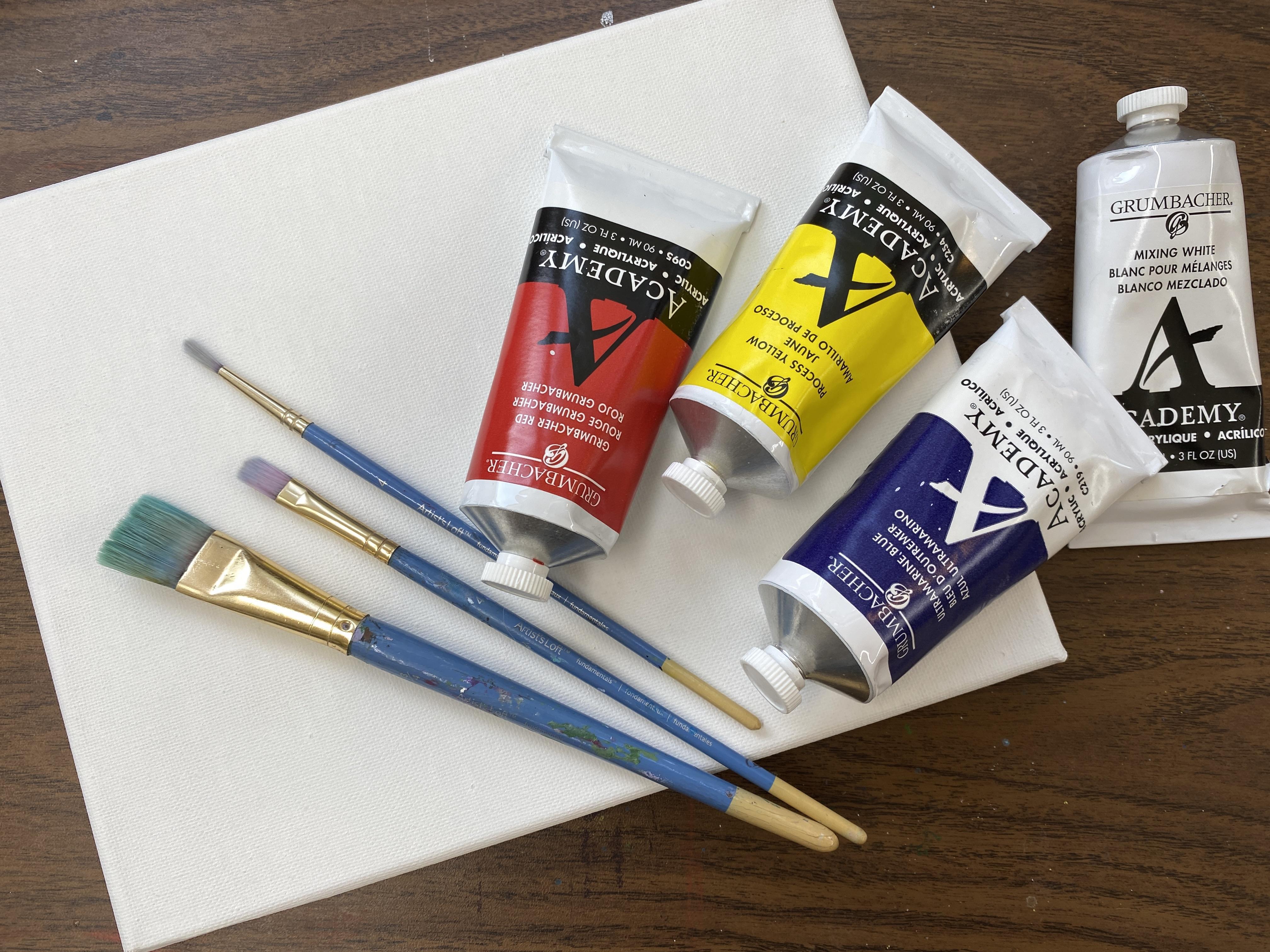
is your acrylic paint. Acrylics come in a
vast array of colors. However, to start with, you really only
need the primaries, which are red, blue, and yellow, and a tube of white. From the primary colors you
can make all other colors. I'll explain more about that in an exercise
later in this course. The best paint to use for fine art is heavy body acrylics. They mix easily and they have more pigment
than craft paint, making the colors more vibrant. They have a buttery
consistency which allows you to create texture and
painterly brushstrokes. They were created to mimic oil paints like the
master painters used, but they're
water-soluble, so they clean up with water instead
of harsh chemicals. Once dry acrylics are permanent. I recommend starting with a
set from a well-known company like Golden, Liquitex
and Grumbacher. The sets have everything
you need to start and they cost less than purchasing
the tubes individually. These companies have been
around for a long time, they know their business. I'm a certified art instructor with the Grumbacher
paint company, and I really like their paint and how they cater to artists. You can contact them directly if you've got any questions
or concerns about their paint and if
there's an issue with a particular batch,
they will replace it. I've heard from
other artists that Golden and Liquitex have good
customer service as well. Most often you'll find
acrylics in metal or plastic tubes and
sometimes in jars. They are non-toxic
unless the pigment used is toxic like
cadmium and cobalt. However, as long as they're
not ingested and the area where you're painting
in is well ventilated, you shouldn't have any problems. However, if you have
sensitive skin, I would recommend
wearing gloves. Now I'll go over some of the surfaces that you
can use with acrylics. Most commonly for fine art, you see canvas panels. But acrylics can be
applied to wood, paper, walls, and
ceramics as well. For the course project, I recommend using
a 9 by 12 canvas either stretched around
a frame like this one, or a canvas board like this. This one has a nice feature on the back that helps you
catalog your artwork. You could also use
watercolor paper like this one from Strathmore. It's a 140 pound, which is pretty thick and you could use thicker
than this if you like or you could use paper expressly made
for water mediums. This one's a cold press paper by Canson and is very thick. Several of my students use
these pads because they take less space and they can keep all their lessons together
in chronological order. This paper is so
thick that you can actually practice on both sides. If you're on a budget
that would work and get twice as much
out of your paper pad. Another nice feature about using paper is that it's easier
and less expensive to frame. Many of the frames
that they make for photographs can be
used for your art, but you do you, it really
comes down to how you want your finished
piece to look in the end and the budget
you have to work with. If you decide on canvas and you purchase it
at a craft store, it will likely be pre primed, one or two coats,
sometimes three. If it's not primed, you will need to prime
it yourself with a couple coats of
white paint, or gesso, which is a chalky
white paint that works as a barrier to prevent the acrylic medium from going right through the
porous canvas width. It would also be a good
idea to coat the surface of your watercolor paper if you choose to use that to paint on. However, the Canson acrylic
pad paper does not need to be coated because it
has a special gelatin sizing in the paper, making it ideal for
acrylic painting. Now let's talk about brushes. For beginning acrylics, I recommend three
brushes to start up, a three-quarter inch flat, a half-inch filbert brush. This is one that looks a
little like a fingernail. It's flat and it has
rounded corners. Then I also recommend
a number 4 round. If you can't find
a filbert brush, you could also use a
half-inch flat brush instead. These are all from
Artist's Loft. I don't recommend Artist's
Loft brand paint, but for brushes,
they're just fine. They all have short handles and that's fine for
smaller artwork. You may want to go to a longer handle for larger works of art. Another good brush to have in your art box is a
number 2 liner brush. This one's from Princeton. If you're on a budget, just get the first three
that I mentioned. Make sure when you're
purchasing brushes that they are made for acrylics. Brushes for watercolor and
oil paint will not work. Synthetic bristles are the best. They hold up to
the paint better. When we get to the
course project, I'll demonstrate the
uses for each one. Now I'll talk about
paint palettes. When you're just starting out, an inexpensive
plastic palette like this one or a paper plate
will work just fine. You might even
have some on hand, but as you paint more and more, you may want to invest
in a stay wet palette. Acrylics dry fast and a stay
wet palette keeps your pants moist so you'll be
able to work with them longer and you'll
have less waste. I like this one
from Masterson's. It's a shallow box with a
very tight fitting lid. It comes with a sponge and a special palette paper that
can be changed as needed. They come in two sizes,
small and large. You can also make your own
stay wet palette by using a shallow plastic or glass container with
a tight-fitting lid. Instead of a sponge, you can use blue disposable shop towels or paper towels and
parchment paper. Most of my students switch to a stay wet palette eventually because it saves on paint and in the long run that can
make it more economical. Another option is a
peel off palette. This one has an airtight
lid so your paint stay moist and when you're finished
with your paint session, you let it dry and the
paint can be peeled off. For the course project, a paper plate will be
just fine and cleanup is ascent when you can just toss it in the trash
bin when you're done. There's a few other items
you'll need to get started. You will need at
least one container of water to wash
your brushes in. I like to use two
containers so I can wash my brushes out in one and the other I try to
keep clean so I can use that water
to thin my paint. If I use my dirty brush
water to thin my paint, I'll risk changing the color. Glass containers are great because they don't tip as easy. Some artists use
a large container so they don't have to change
their water as often. This is my favorite and
the one I use most often. It has the two sections that I like and it's made of plastic. It's easier to tote around what I want to
paint on location. It also has ridges
on the bottom of one side to make it easier to wash the paint
from the bristles. On the other side, a
raised section to rest your brushes to prevent bending the bristles while
they sit in the water. For sketching or
transferring my design, I use sidewalk chalk
or white chalk pencil. Make sure you do not
inadvertently grab an oil pencil because those are for oil paints only and will not
work for acrylics. Another must to have is a
blow dryer or hairdryer. This one goes from way back, I think it's from the '80s
during my big hair days. Some of the techniques used in acrylic painting require
the service to be dry, and this will speed the process. I use a toothbrush
to spatter paint. I find that it works
better than a paintbrush. Lastly, you'll need a rag or paper towels to blot excess water or paint
from your brushes, clean off your hands, and wipe paint or chalk from
your canvas to make changes. Some optional materials would be carbon paper for
transferring your design, maybe a tube of mars
black paint for details. You could also use a
spray bottle for keeping paint moist and masking tape for straight lines and to hold your watercolor paper down if that's the surface
you've chosen to use. In the end, we'll be using water-based varnish for
protecting your artwork. I use DuraClear Gloss
Varnish from Deco Art. Also gloves to protect your hands and apron to
protect your clothes. You may want to use
a tabletop easel. I use a lightweight aluminum
one made by Studio Designs. I also use a palette knife
for mixing paint and applying paint to the
canvas at times, a ruler. Lastly, this nifty color wheel for referring to when
you're mixing colors. For framing your artwork, you'll need double-sided
tape or a glue gun and a ready-made frame like
this one from Studio Decor. [MUSIC] Now that we're squared away on the
materials you'll need, let's talk about how to set
up your workplace maybe in the next section
where I'll show you my creative corner and give
you suggestions for yours.
4. Setting Up Your Workplace: [MUSIC] There's a few things you may want to consider when
setting up your workplace. Let me start by taking you into my creative corner
of the world where I create paintings for lessons just to give you a little
peek into my setup. I'm blessed to have
this dedicated space that my hubby gifted to me. He actually designed
it into his plans for his own workshop and office space that he
built in our backyard. My area is a storage area
above the office space. It has north light
windows behind here, and some fluorescent
lighting above. My husband also refurbished this antique light table
he found at an auction, which is the perfect size
for my tabletop easel, stay wet palette, extra brushes, water, rag, and paper towels. I also have this
nifty little chair. I got a few paint drops on it, so I threw some more
paint on to give it a modern graffiti vibe. I'm not sure that's working,
but it works for me. I don't worry about
the floor because I use this space just
for my messy creating. Here's some extra storage space, and Elvis is in the house. I created that for a theater
production awhile back. I don't use this
area for videotaping because it works
better for me to keep that setup separate. That's an old table
behind this area. Here's a snapshot of that setup. I paint flat to better
present the lesson. The setup is basically
the same other than that. I always placed my
brushes, palette, water, blotting towel on my right, and my canvas and
paint on the left. I'm right-handed,
and I don't want to be crossing over
my artwork with paint or water when reloading
or washing my brush out. When setting up your workplace, you may want to consider
these next 10 things. Number 1, try to find a
dedicated space so you won't need to get
out your supplies each time you get
the urge to paint. Secondly, try to have
everything you need at your fingertips so
you don't have to get up in the middle
of a paint session. I don't have a water
source close by, so I cart a pitcher of water
and some extra containers out to my work area so I can
change my water as needed. Three, time is valuable, so try to keep organized
and have a consistent setup each time you paint so you can make the best
use of your time. You don't want to
be searching for stuff when you can be painting. Number 4, plan ahead
to limit interruption. For you, this might
mean maybe turning off your phone notifications
or letting your family know your
paint schedule or schedule your daily painting practice when the
children are napping. Have extra consumables on hand so you don't run out
in the middle of a project. Six, try to set up near a window for natural
light if you can. Artificial light changes
the way you see, and will affect your color
choices while painting. Seven, if you're working in
your kitchen or family room, make sure to protect
your surface and your floor because acrylic
paint is permanent when dry. Eight, be choosy
about your seating. I like my old office chair because it has wheels
making it easy for me to back up when I need to
see my art from farther away. I also like that it has
a little cushion to it, and it supports my back. Nine, don't use a coffee mug or a tea mug or anything with a handle for a water container. I know many artists
who have accidentally taken a sip of their
dirty brush water, thinking it was their beverage. My mom's an oil painter. While I was little,
I ended up in the emergency room because I drank her turpentine solvent
used to clean her brushes. I remember thinking
it was cocoa. Last but not least, consider listening to
music while you paint. It can be great for
focus and creativity. Well, I hope this
will help you set up your space to create, because once you're set up, you'll be ready to practice on a regular basis to
grow your skills. You'll also be ready
for the course project. Before that, let me
show you how to mix paint in the next
section. See you there.
5. Paint Mixing Exercise: [MUSIC] Hi there. In this section I'll demonstrate
some basic paint mixing. You can download the diagram of this exercise under the
projects and resources tab. Remember earlier in the lesson when I said you only needed three colors and white
to make all the colors? In this exercise, I'm going to show you how that can happen. With your three primary colors, yellow, red, and blue, you can make secondary colors, like when you mix yellow
and blue, you get green. Red and blue make violet and
red and yellow make orange. In addition, from all
these new colors, you can make a third tier
of even more colors by mixing one primary with an
adjacent secondary color, you get a new color, a tertiary, which is a third color. In this case yellow-green, or I like to call it lime. [NOISE] For these colors, your primary mixed
with your secondary would give you blue-green. With these two, you would
get [NOISE] blue violet. For these two, you would
get red violet and so on. This would be red orange. All the brands of
paint mix differently, so it's best to use the paint you have
even if you mix brands, try one of these
wheels and you'll know what you're going to
get when you mix them, because they will be a
little bit different than mine if you're not
using the paint I'm using, this would be yellow, orange. Now you're probably
wondering, where's the black? If you mix blue and about half as much red and a little yellow, you will actually get black
and I will show you that. Now in different amounts, if you add more red and yellow and a little bit of
blue, you'll get brown. I will show you those and I will also show you
when we add white. Let me put some paint on the palette and we're going
to have some fun with paint. [MUSIC] We'll start by making green using my two
primaries, blue and yellow. A lot of yellow and a
little tiny bit of blue. Blue goes a long way because it has a lot of pigment in it. I've got a green, maybe
a little more blue. I've got a green then
wash your brush out very, very well and blot
it on a towel. Next, I'll mix blue and
red, and I'll get violet. Again, just a little bit of
blue and a lot more red. [NOISE] Mix that out. [NOISE] A little bit of red and, a lot of yellow will
give me orange, like magic when
these colors appear. [NOISE] Now let's mix the primary with the secondary color and get our tertiary
or third color. A little bit of the green
with yellow and we get our yellow-green [NOISE]
which I like to call lime. Our green with a little bit of blue, we get our blue-green. [NOISE] A little tiny
bit of blue with our violet [NOISE] and a little bit of red
with the violet. [NOISE] Here I'll probably have to make a
little more violet. [NOISE] There we go. You get your red-violet. [NOISE] Red and orange will make a red-orange. My orange with my yellow will
give me a yellow-orange. That's all your primaries,
secondaries and tertiaries. You can keep on going and
make a lot more colors. [NOISE] Now to make our black, you're going to use a lot of
blue, a little bit of red. I call this a colorful black because it uses all the colors, a little tiny bit of yellow. That's going to give you a
very nice colorful black. To make brown, [NOISE] you
use a little bit of blue, a lot of red, and yellow. Little more blue. [NOISE]
That gives you brown. You just keep on [inaudible] it until you get the
brown that you want. Now let's see what happens
when we add white. Squish out a little color. [NOISE] It only takes a little bit of the hue to
tint it with the white. Another tip to know
is if you don't want to ruin your brushes, if you want them to last longer, you'll want to mix with a palette knife
instead of your brush. Now I'm not too
worried about it. These aren't expensive brushes, and for me it just saves
time to mix with my brushes. But to make them last longer, it's best to keep the
paint from getting up here in the ferrule
of the brush. Because the more paint
that gets up in here, each time you try to wash them, a little of that paint residue
remains and after a while, your brushes play out. I can show you what that
looks like and they start looking pretty shabby. I do save my brushes for certain techniques that
are rough on brush. Don't throw any old brushes out. Let's add some white and
mix some more magic happen. We're going to
make some pastels. A little tiny bit of
color, a lot of white, will give you a very soft
yellow, very light yellow. We'll do the same with
the other two colors. [MUSIC] I've tinted all the primaries, and that's how you make
your colors lighter. Now let me talk to
you about value. Value is how light
or dark a color is. Painters use value
to give objects form or to make them
appear three-dimensional. Here I have my darkest color
black and my lightest white. When I mix or tip my black, by adding white, it gets a
little lighter each time. This creates a value
scale or a gradient. It's a smooth transition
from one color to another. [MUSIC] You can also do this value blending with two
different colors. In this example, I'll create a gradient from red to yellow. This information
is what I consider the most important concept
to understand in painting. Especially if you want to
paint in a realistic way. There's a lot more that
I could share with you on paint mixing
and color theory. But for now, this basic
information will get you started. Meet me in the next section, and I'll demonstrate value in much more detail. See you there.
6. Value Demonstration: [MUSIC] All objects have form. It's their
three-dimensional shape. In order to paint something realistically as it
looks in real life, an artist needs to override
their brain and truly observe with their eyes are
seeing. Let me explain. Let's have a look at this
red block on my desk. I have a lamp post by shining on my block and it's
distorting the color. Your brain knows the entire
block is red, uniformly red. But when your eyes
really observe it, the light source is actually
distorting the color. Where the block is
getting direct light, the red seems more pink, and where the block is not
getting very much light, the color appears darker, maybe like a maroon red. These are changes in value. To make an object appear
to have dimension, you'll need to use at
least three values. I'll paint the block
to demonstrate. I'll start by
drawing a sketch of the block on heavy paper
made for acrylic painting. Before painting
anything, I consider where my light source
is coming from. In this case, it's
the lap on my desk. Then I observe the changes
in color that this creates. My block is red and where the light is
hitting it at the top, it's a light red or
pink and at the back where it's shaded and the
light can't get to it as well, it's a dark red, maroon, or maybe
even a burgundy. On my palette, I'll squeeze
out my three primaries, white and a little
bit of Mars Black. Using a half-inch flat brush, I'll start mixing
my black first. Remember from the paint
mixing exercise earlier, I used all three
primaries to make black, a lot of blue, about half as much red, and a tiny amount of yellow. That's my colorful black. You can also use a tube of Mars Black if you
have that handy, I make my black first because
as you learned previously, you'll need white to tint to
color to make it lighter, and you'll need black to a shade of color
making it darker. In my painting process, I usually start with
the dark values first. Here I'm mixing some red with my colorful black to make it dark red for the shady
side of my block, using a half-inch flat brush and use it on the broadside to cover large areas and on its edge to give me a nice
clean line on my block. Then I rinse my brush out, blot it a little
on my paper towel, and grab some red straight from the tube to paint my
middle value on my block. Next, I add white to tint that red and make my lightest value, and then paint the
top of my block where it's getting direct light. Lastly, to further the illusion of three-dimensional
on a flat surface, I'll add a little white
to my colorful black and add the shadow that
the block is casting. You can use Mars Black instead of mixing your
black if you'd like. But I prefer the colorful black. I feel like it
blends better with my other colors because it
has those colors in it. As a new artist, I would try both and just see
which one suits you best. You could even use your blue
to make your red darker. The key is just to have at
least three distinct values, and that will make
your subject look 3D on a flat surface. Now, I'll demonstrate this with a more organic subject like this lemon on
my kitchen counter. I'm using a pre-primed
canvas board. Again, I'll be using all three primaries plus
white to create my values. Yellow, red, and blue
are my primaries, and then a little bit of white, and we're going to go
ahead and paint a lemon. If I had this lemon
on my counter, my windows right here, that's my light source, and it's shining on
my lemon. Lemon here. There's my lemon, and the lemon being in the way of my
light source is going to be casting a shadow
onto the counter. Let's go ahead and
paint this in with our three values
to give this form. If I painted it all yellow, it wouldn't look 3D. I'm going to go ahead and start painting by mixing
my black first. I got my black mixed. To make the darkest
value on the lemon. I'm going to use yellow, the color of the lemon, and mix it with my
colorful black. You could also use Mars
black if you have that. I'll go ahead and
put my darkest value where I see it on the lemon. The median value is
the color yellow. I'll paint that in, again using the broad side of my flat brush for
the larger areas and using it on his edge to give my lemon a nice clean edge. Over here, as you can
see in the photo, there's a little bit of
light yellow on this side. That's because this window is shining on my
lemon right here, and it's casting a shadow here. It's also hitting
the countertop here, and there's reflective light hitting the lemon right here. If you've ever been in
a boat and the sun is hitting the water and it's
reflecting on the boat, oftentimes you'll see a
watery look on your boat. That's what's happening here. Except there's no movement. But you can see
that there's light from this countertop
reflecting up onto my lemon. I've got my dark value and my immediate value and now I'm rinsing out my brush and I'm going to go into my white and a little bit of yellow
paint in the light value. [MUSIC] You can make it more pronounced if you see it differently. You can put more dark here. Make a dark green for
the stem. That in there. I also see a little
bit of dark here, and a little bit of
dark right there, [NOISE] and a little more dark here. This gives you a lemon form. Now with my number 4 round, I'm going to clean
up the edges to make them look a little
bit more blended. I move the brush
over the area where one color meets another
until they blend. It's easy to do when
the paint is still wet. [MUSIC] To add to the illusion, we could also add the shadow. I'm mixing a little of all the colors to make
the shadow color. Add more and blend
that out. I feel like I got a little carried
away on my shadow here, so I'll draw this completely and then show you
how to correct that. In the picture it doesn't show the shadow on this area here, so you can just paint
that over like that. Acrylics are opaque, so anytime you want to
remove a line or an area, you just paint right
over the top of it, just like I'm doing. It's like using pink to erase. You get the idea, maybe
blend this a little bit. I'm using the flat side of my brush to do a
little blending. I'll also blend this
shadow a little bit more. That looks pretty realistic. [NOISE] So let me show you now with a little bit
more challenging object, let's move to a flower. This is a blue hydrangea blossom that I have growing in my
backyard in the summer. I always use reference
photos when painting because it helps me observe
and study my subject easily. The only better reference
would be to paint on location or from a still-life
that you set up yourself. I'll start this demonstration by sketching the basic shape of my flower directly onto my 8 by 10 pre-primed stretched canvas. The light source is
the sun this time, and it's coming
from the left side. As you can see from the photo, the lighter side is here. The medium values are in
the middle of the flower and the darker values are more
towards the bottom right. I'll load my palette with
blue, white, and red. We'll start this study
by blocking in with paint the entire flower
with my three values, light, medium, dark, starting this time with the side
closest to my light source. This becomes the background for the layers of petals
that I'll do next. We're now using my half
inch filbert brush to make my darkest value here, I'll add a little red to my
blue to make it dark purple. Next, I'll mix three
separate color values on my palette for
painting the petals. I have a dark value, a medium value,
and a light value. In the median value, I added a little red to mix in with the blue to make
it more of a lavender, because I see a little
lavender in the flower. Now I'll give it
a quick dry with my blow dryer to prepare the
service for the next layers. I've got my values
here, ready to go, and I'm going to start
drawing in some petals. I've got my dark, and now I'm going to put
in some mediums. I'm just using the actual shape of the brush to make the petals, and I'm not trying to
recreate exactly the photo, but just the feeling
of this flower. I tap where I want the outside of the
petal to be and then I pull with my brush rapidly towards the middle of a
flower to make one petal. Each individual
little flower within this blossom has four petals. I'm also extending some
of the petals past the initial circle that I
created on the background. I'm still using
the medium value. I adjust it to
make it lighter or darker to show against
the previous layer. While I'm painting these petals, I'm making certain
that I don't cover all the dark values that I established in the
initial blocking in step. If I do, I can pop
them in a little bit. But it's a lot harder to get those darks in
there if you don't start first and then layer. Again, put him in there again, but it's easier to do by
layering from dark to light. Now I'll put in the light
values and [NOISE] brush out, and I'll get
some more white. I'm going to make
a lighter value, so I've got the dark
and I've got a medium for several medium values
because I'm working wet on wet, it actually mixes and
makes other values. Now I will add petals that
are this lighter value. I'm concentrating the
lightest petals on the side where my light
source is shining on them, creating that 3D illusion. I'm also careful
not to completely cover the previous
layers of petals. Each layer I paint
less and less. [MUSIC] I'm going to go ahead and
add a little more lavender to give it smart color. I join these in pink
and white and blue. Sometimes one blossom will
have all those colors. Then to highlight, I'm going to add white straight
out of the tube, and just here and
there I'm going to tap onto the petals where
I think the light would be hitting them and just highlight just to make them
pop a little bit more. I also like to pop in on my Grumbacher set a
different blue altogether, which will add to
the dimension and depth of the realism
using color. This is a beautiful blue
color process cyan, and when mixed with
the ultramarine blue, you get even more colors. [MUSIC] Now you can see that
this flower looks 3D. [MUSIC] Then with my detail brush, [NOISE] I'll mix blue and
red to get a dark purple. I can get the center of
some of the flowers in. Here I just tapped
the loaded tip of the brush in a few centers
of the individual blossoms. There's no need to do all of
them, just a few will do. While I have this
color on my brush, I'll make a few darker petals on the shady side to enhance the contrast and values
a little bit more. One last [NOISE]
detail. I'll highlight the centers of the
flowers with pure white. [MUSIC] Well, I hope this helps
you understand value and how important it is to
painting realistically. [MUSIC] Now let me recap what you've learned so far through the painting
demonstrations. Primaries are yellow, blue, and red and with these
colors and white, you can mix all other colors. Why it is used to tinted color, making it a lighter version. Black can be used to shade
or create a darker value. Value is how light
or dark a color is and is used to
give objects form. Of course, there's a lot
more to acrylic painting, but this will get you
started for sure. Now, let's get you in
the driver's seat. Meet me in the next
section and we'll start Step 1 of the
course project. See you there. [MUSIC]
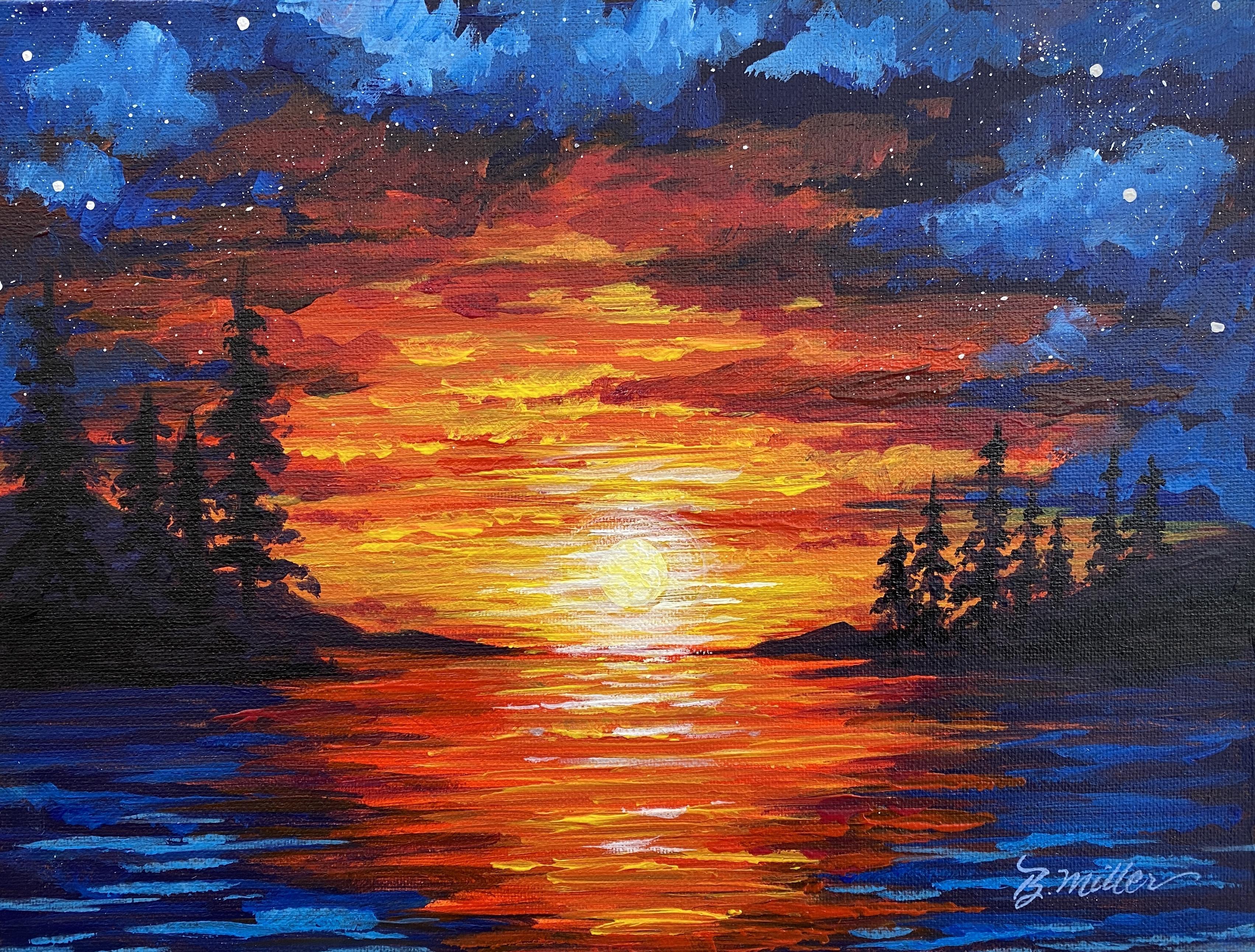
7. Underpainting: [MUSIC] At this point, you should have your materials and your work area set up, and you should
know the basics of paint mixing and have
an understanding of how value is used to create the illusion of 3D form
on a flat surface. Now you will be able to
put what you know into practice with the
course project, where we'll paint this
beautiful sunset over Waldo Lake here in my
little part of the world. This project will help you apply the skills
I've demonstrated to you and introduce you to
the process of painting. Every season artists that I know has a creative process and my goal is to have
you learn mine so you'll eventually
develop your own. This in time will
actually help you develop your own
artistic style as well. Let's start with step
1, underpainting. Underpainting is
the first layer of paint that you apply
to the surface. It's usually gray or
a middle-range value. Underpainting is important
for several reasons. Firstly, when you start with
a mid-value or a mid-tone, it helps you gauge your
light and dark values, making it easier to give your painting dimension
and contrast. Secondly, if you miss a spot, you won't have the
white canvas showing. Three, it's another layer which will make your
surface smoother. If you purposefully
let it show through, it will give your artwork a
visual continuity in color. Some of my students
comment that they think it's a waste of paint. If you agree, you can
definitely skip this step. But in my opinion,
I feel like it gives an art piece a
more professional look. Here's a couple painting lessons I've done in the past where you can see the underpainting
that I use showing through. Here I let it show in the path and in some of the
flowers and the foliage, and in the little cottage. Here behind the trees, it gives it an extra glow. Here's a dog portrait
where you can see the underpainting
behind the dog. Now let's start painting
this first step. I'm going to use
my mixing set from Grumbacher's and a 9
by 12 canvas board. I'll load my palette with my three primaries and then
using my largest brush, the 3/4 inch flat, I'll mix a little red
and a little yellow. You'll mix an orange. [NOISE] This is a mid-tone. It's not dark as the red or light as the yellow,
but it's in the middle. This is what I'm going to
use for my underpainting. Now, orange isn't the only color you can use for underpainting, but because the picture that I'm doing has a lot of orange in it, I chose that as my
underpainting because that's the color that will peek through if I don't paint in a spot. Go ahead in take in
your large brush, and using large broad stroke, cover the entire canvas. Don't worry if brushstrokes show because most of this
will be covered. The key to acrylic painting is really layering,
layering, layering. You're just can do
a lot of layers, like I demonstrated with the hydrangea blossom. There
was a lot of layering. If it starts feeling
like it's not covering well or if it feels like it's just not
moving well on the canvas, add a little bit of water. I'm going to paint
the edges too, just in case my frame at where those little
edges will show. If you're using a
stretched canvas, I would do the same thing. I would paint the edges. Definitely paint
the edges if you're using a gallery wrapped deeper canvas because those
do not require framing. Unless you paint
the sides separate, a different color altogether, the sides will show,
so you'll want to make the design go all
the way around. I'm going to go ahead
and turn my canvas over and paint the
remaining area. Then I'm going to let this dry. Now, if you do
have a blow dryer, you can speed up
the drying process by using your hairdryer. [MUSIC] As soon as this
is completely dry, we're ready for step 2, which is transferring or
sketching your design. Meet me in the next section and we'll get started on that.
8. Transferring the Design: [MUSIC] In this step, if you already feel
comfortable at drawing, you're welcome to sketch
the design directly on the the canvas with pencil,
charcoal, or chalk. Or use the traceable
sketch that I provided. If you'd like to use
the traceable sketch, go to the projects
& resources tab, and it will be located on the right side of the
course description. The simplest way to transfer your design is by
using carbon paper. [NOISE] Lay that down on your canvas and then your
traceable sketch over that. A couple of pieces of tape to
hold it where you want it. You don't want it slipping
halfway through your design. [NOISE] Then using
a sharp pencil, trace the design and check it to see if
it's coming through. [NOISE] If you use
colored pencil, I'll be able to see
where the red line is. So I know if I've gone
over that area or not. I don't trace very often. I prefer to sketch directly on the canvas with
chalk but many of my students do not want to draw so they use the traceable
sketch that I provide. If you don't want to
purchase carbon paper, you can make your own
transfer paper by blackening the backside of
your sketch with graphite. Then turn it over on your
canvas and trace your design. If the graphite line doesn't
show on your underpainting, maybe you chose a darker color. You could use chalk instead of graphite on the back
and then trace. Then you'd have a white
line to use as your guide. If you know how to sketch, you can just do it the
old-fashioned way and draw in your design [NOISE]
using a pencil. [NOISE] Or if you'd rather, you can use chalk and
chalk is easier to wipe off and cover with paint. I recommend using chalk and just sidewalk
chalk works fine. Or you could also use a chalk
pencil for a thinner line. [NOISE] [MUSIC]. That's
all there is to it. In the next step, we'll go over how to block in
your dark values. I'll meet you in
the next section.
9. Blocking In the Dark Values: [MUSIC] For this step, I'm going to start
with my darkest color, which is black, and block it in. Now, blocking in means to lay in the color in areas
without detail. Just the general idea of where the dark color is
is blocking in. Later, with each next layer, I'll be refining more. At this stage, I just need to get the general idea
of where the darks are. Just like when I was
doing the blossom, I painted the area in its entirety first with the dark colors and then
I laid in the petals. That's what we'll be doing
here on this lake escape. I'm going to go ahead and mix in my black because
that's what I see as the darkest color
in the clouds and then also reflecting
on the water here. I'm going to go ahead
and make the black. I use a lot of blue,
a little bit of red, and just a tiny bit of yellow. That gives me a nice dark black. That's my colorful black. I'm going to add that where
I see it on the sides here. I'm going to use
fairly long strokes, and I'm going to taper them as they come into the
center of the painting. Now, I wouldn't
worry too much about this particular stage because we're going to put more
paint over the top and, like I said, refine it more. Just get the general idea
of where the dark is. Don't worry about that orange underpainting
peeking through, it gives it a really
nice painterly look. I'm just referring to
the painting as I paint. On my sketch, I came
in a little bit here. [NOISE] It doesn't
have to be too exact because every single
sunset is different. Every time you paint it, it's going to turn
out different. Just the general idea, the general feel of
what it was like that day is all I'm
really looking for. I'm painting over the trees and I will revisit that later. They are probably
darker than this, so we'll add that later over
the top of all my layers. It's a lot easier than
trying to paint around them. [MUSIC] I'm going mostly horizontal
with my strokes. [MUSIC] This is your horizon line here. Make sure you keep
that very straight. [MUSIC] Straight across. I use the edge of my brush perpendicular to my canvas to make that very straight line. Make a little more black. [MUSIC] Make a little bit more. [MUSIC] A lot of practice
making that colorful black. [MUSIC] Bring my horizon line
just a little bit lower. I like things compositionally to be broken up into thirds. Sometimes it looks better
than if some things broke up in halves. I'm going to bring my
horizon line down to here. I'm going to wipe out a
little bit of the color here because I don't
want to go this far up, so I'm going to go ahead and
wipe a little of that off. Adding a little water to my brush while the
paint is still wet will help me wipe the
paint off with a paper towel. There we go. Then I'll put
my orange back on here. There we go. That gets me
ready for my next layers. Meet me in the next step and
we'll put in medium values. [MUSIC]
10. Adding the Medium Values: [MUSIC] Hi there. We're going to get to doing
the medium values now. I also call medium
values bridge colors. Bridge colors get you from your darkest values
to your lightest, from one to the other and
there's a lot of mediums in detailed artwork and there's less mediums when you're
doing a looser artwork. That's one thing
that you'll just have to decide for yourself. How detailed or how many values you want in-between your
darkest and your lightest. There's no right or wrong. It's just personal style. Go ahead and add white
to your palette. I'll go to my ultramarine
blue and that is actually one of my
mediums because it is a lighter value
than my darkest. I can use that straight and almost covering my
black but not quite. I'm going to use the
corner of my brush in a circular fashion
because these are clouds. This brush technique
will give the clouds a puffy
cumulus cloud look. Now, if I work fast enough, I will be able to
mix wet on wet. That's when my paint is
wet on the surface and I'm adding wet paint to
it and in doing that, I can get other medium values so I will demonstrate
that for you. You can already see
that this is looking more 3D just in the little
that I've done already. Don't forget to repeat, the blue down here in the water. Water is reflecting the sky so you want to
repeat it down here. I'll have to add some more blue. I'm using my brush horizontally. Now I'm going to add just
a little bit of white to the blue to make a lighter value and you just decide how much
lighter you want to go. If you have two blues
in the set of paint, you could add two
different blues. It's just entirely up to you. Using the corner of my brush, in like a circular fashion, I'm just going to
add a few swirls that's going to give
me a cloudy look. [MUSIC] You can see how easy it is to blend on
the canvas, wet on wet. You have to work pretty quickly. [MUSIC] I got a little
lighter value here. I can just add few of
the lighter clouds, a couple up here and up in here and right here and just blend it as
much as you'd like. Some people like a
little bit of a line to show and other people like it more blended so
the more you work with it, the more blended it will be. The other thing you can do is completely
change our brushes. You can go to your filbert. In the filbert, if you use that, in the same manner, you can
get a lot of neat swirls. Then on the water, we're going to get a little
bit of a reflection. It's going to be
straight lines for waves because this
particular lake gets pretty choppy
in the evening. I'm going to get a few
waves going in here. Now, to get the illusion of
depth in addition to color, getting that illusion of 3D, I'm also using size. With the water, I'm
going to put small, tiny lines close together, closer to the horizon line and
as they come closer to me, to the foreground,
they're going to be further apart from each other. This will give you
the illusion of depth because we're working
on a flat surface we want to create 3D and this
is one of the ways you can do it in a lake scape. I'm just using my
brush perpendicular to the canvas and wiggling a little bit to make
it look like waves. I could also switch my
brush to my large brush, and also I could use that on the edge and wiggle
it a little bit. That'll give me waves. Try it a bunch of different ways and see what you like best. You don't want it to be uniform. This is water and it is not uniform so don't
get too perfect. If you want to change the
color just a little bit, make just a slightly
different blue. You can add a little bit of yellow and add a
different blue in there. It'll turn it more green. That's the bridge colors
for the sky area. Now I'm going to rinse out
my brush and I'm going to start on the bridge
colors for my sunset. I'll start with red and I'm going to move
right into this area here with my large brush and I'm still moving
the brush horizontally. Some of that background is already the color of the sunset so I'm going to go
ahead and leave that. I'm going all the way down to the horizon line
and into the water. [MUSIC] Don't worry too much if
you pick up the color, the blue, if you
pick up too much, go ahead and rinse
your brush out. But if you pick up a
little, it's okay. But getting a little bit of
these other colors mixed in, he's okay because that's
just going to help it blend and have fun with it. It's fun to mix colors
right on the canvas. I'm going to mix a little bit of blue and red together here and just make that a little more softer and here little softer and I'll rinse my brush
out a little more yellow. I'll mix that with the red
and make a little bit of orange and then I'll
mix that in here. I don't have to be
too exact in covering the background here because I've got that nice
underpainting. [MUSIC]. I'm just wiggling my brush to make more cloud-like formations. It's also mixing
with the background. That's just where the sun
is catching the edges of those clouds and as it
moves down in the horizon, these lines, just like the
water will get shorter. As it moves up, they'll get farther apart. That'll give you the
illusion of depth. I also paint smaller clouds at the horizon line and
gradually make them larger as they come to the top of the painting. [MUSIC] You can see I'm just
getting a little paint on the edge and tapping it. I'm working fairly quickly
and I realize as a beginner, it'll be difficult to
do this, this quick, so feel free to pause the
video lesson and work on this a little slower if
you'd like and then don't be afraid to try this over and over again to get it right, or at least to get it
where you'd like it. It does not really any right, it's whether you like it and it looks like what
you want it to look like. Let's put some yellow in here. This is just one of
the bridge colors. As you can see, I'm
getting lighter and lighter and lighter
with each color. What's happening in
the sky is being reflected into the water. If you prefer to draw the whole
background and do this on a dry background, that's
okay too. [MUSIC] I'm just tapering
the edges here. I'll glide across
with the edge of my brush and as I'm
ending my stroke, I come up from the canvas
and that tapers the stroke. I'm going to move
to my filbert brush and I'm going to go back into my cloud area and just here and there now that I have these
colors further along, I'm going to add
one more lighter value to the cloud area. [MUSIC] It just makes it a lot more 3D. I'm rubbing the brush
on the canvas in a circular motion and it's
giving me a smudgy cloud look. I'm just tapping
a little bit with my filbert brush in the places I want to
see more light color. It's very dramatic scene. Then using that same color, I always add it to the water. I'm very gently gliding over the canvas just with
the very tip of the brush. One a little bit more, more dark purple in here so I'm just going
to come back in and add a little bit more
of the dark purple. I mixed red and blue together. It's more of a red, violet. Little smoother transition
from this color to this color. There we go. Here too. See that in the picture. I'm going to put a little
more of that in here. [MUSIC] I want it to be painterly. This isn't meant to be the exact scene that
I photographed. It's just meant to be a feeling that I had
while I was there. If it starts feeling
like it's not moving very well on the canvas, dip your brush in a little water and that might
get it to move a little bit better for you. I think I need a
little more blue here. I just want to make sure this is triangle shape and then it goes into another
triangle shape here, everything converges into this horizon line
in what they call the vanishing point
where the sun goes down, be the vanishing point in this picture and everything in the picture points to that. Let me make a darker color here. Put in some of these. Some
of the land in there. There we go and maybe some
of the land this way. That'll be the land
on both sides. Again, I'm just going
to taper it and then there might be some land
coming this way as well. I'm going to use
colorful black for that. Those are the medium values. In the next section, we'll work on the light values. See you there. [MUSIC]
11. Adding the Light Values: At this point you've painted all your dark values and your medium values
or bridge colors. Now we just need to add our
light values in this picture, it's rather dramatic in
the colors that I chose. Pretty much a primary
painting with all the primary blue,
red, and yellow. So there's not a lot of pastel, so there won't be as
many light values in this particular painting. I'm going to go ahead and
start with my filbert brush, and I'll start in
the cloud area. I'm just going to lighten things just a little bit further, I`m going to mix a little blue and a little white, a
little bit of yellow. Here I'll lighten these
clouds a little bit more to add some more contrast. If your paint set comes with other blues like
civilian or cyan, this can be a good place to
add that in if you'd like. And I'm just going in a
circular motion with my brush. Then I'm going to add a little
bit more white to my blue. A little lighter,
tested it on there, I need to go just a
little bit lighter. Then if I want more blending, I just move it around
a little bit more. If I want it less blended, just pop it on
there and leave it. Now I'm going to
rinse my brush out. And go into my red, add a little bit of blue, just going to make
that red violet color. So every color that
I have on here, I'm just going to lighten one more value up
from where it was. Mountains, then I'll rinse my brush out
and then I'm going to add a lighter yellow, and mixed with a little
red and a little white, and then I'm just going to
add that where the sun is, and I originally had
my sun up in here. Now that I've moved my
horizon down a little bit, I think I'm going to
put my sun right here. Now, normally I wouldn't put it right smack in the
middle of my painting, but that this is going
to be my focal point. So I'll go ahead and
put it right there. Wipe that off a little bit just to see where I'm out here. I like that, that looks good. I like using chalk because I can see where I'm at and then
wipe it off if I need to. Now here I had drawn
pencil earlier when I was showing you how to
sketch your design. So I will take that
out with paint. If I had done that in chalk, I could just wash it off. So I'm going to want
to make most of my light area around the sun. So let me go ahead and
remove this sun by mixing that color, a
little bit more red. And I'll just use my filbert
brush mixing orange, and then I'll take
that out of there. It makes a little more
yellow with my red, and I just see a little
bit more of that. So I'll just put a little more
paint over the top so you can see that, there you go. It`s important to know
how to fix something that you decide differently on. Now I'm going to
move up in value. And then I'm going to move
to my smallest brush, which is my number four, round, and I'm going to mix
light yellow, white, and yellow, and I'm going to draw in
my sun, with the paint. As I move up in value, I also apply the paint thicker. Then I'm going to bring it
out a little bit out to the side while it's still wet, and I'm stabilizing my
hand on my other hand, to keep from shaky, then
I'm going to dry it. The way you can make
the straight lines is to use a palette knife, this is just a plastic one. You could have a more
durable metal one, and all you do is
mix your yellow and white together for the
reflection in the water. Then you get a little
bit of paint on your palette knife and just
run it across your painting. That makes nice straight lines. Get a nice bead, and then run it along here, it
takes a little practice. You could also use the palette
knife in the sky as well. Here I'm tapping on
the flat side of the palette knife and pulling the paint
to where I want it. Try these techniques
to see what you like. Always know that
you can change it. This will help you
develop your style. As long as the
background is dry, you can wipe off
the strokes if you decide that it doesn't
look right to you. It's really important
that you experiment when you're new to this, so you can find out
what works for you. That's our light values. Now, meet me in the next
section and we'll finish our artwork with some highlights and details. See you there.
12. Adding the Highlights and Details: [MUSIC] Here is where
we are right now. In this next step, I will be adding
the darkest value, black and my lightest
value white. I'll need to reload a few
colors on my palette. My canvas is completely dry, and I'm going to
start with the trees. Now you can just wing it and put them in if you feel
comfortable doing that. Or you can chuck them in, resketch them in using sidewalk
chalk or chalk pencil. This is entirely up to you if you want to skip
this step, that's fine. I like having a plan, so I'm
going to sketch them in. You can also reuse your traceable sketch if
you want to do it that way. I just start with lines. I make them different heights. I put some close together
and some far apart. Here, I'll put them
a little closer. Remember this is
just washes off. If there's any chalk
that you do not cover with paint after
it's completely dry, you can wash it off
a little water. That'll give me a lot of trees. You could even put in the detail if you wanted. But I don't. I just start with
the lines and then I use the brush to do my detail. But it's up to you how
much you want to put in. This is where I want my trees. Let's go ahead and make a black. I'll make my colorful
black with a lot of blue, a little red and a little
tiny bit of yellow. Once you have that color, you can put in your trees if you want to practice on
a paper plate first, I would definitely try it out if you've never
done trees before. I'll show you how to
do these trees with a large blob brush and the
half-inch filbert brush. I start with a line, it doesn't have to be
perfectly straight, and then I tap on both sides
with my brush and wiggle, gradually widening the
tree as I move down. That usually gives me a tree and then I just thicken
it up where I need it. By tapping color in with
the corner of my brush. You could do a
different type of tree. These are the kind they
have at Waldo lake, but you could also do
this kind of tree. On this one, I tap on either
side and pull into the line or the trunk using the very edge of the brush
to make the branches. Again, I widen it
as I move down. Here's a more dense tree. You can choose one type of evergreen or a combination
that's up to you. What I would avoid doing is
making the trees too uniform, keep them organic and uneven
to be more realistic. Try to avoid this. Although you could
start there and then make it look a little more organic by filling in in a bit. But you don't want to
make it too perfect, could even skip some
areas there, there we go. That could be a tree. That's how you do it with the big brush. Let me show you with
the filbert brush. Again, you just start with
a line and then tap on both sides and
you've got a tree. These are in silhouette so
they're very dark because the light source is behind
the trees in this scene. You won't be getting a lot of
highlight on the branches. They are going to
appear black or this very dark colorful black. That's a few trees. Definitely
practice on a paper plate. If you feel uncomfortable, just go into your canvas. I'm going to stay with this
brush and put in my lines for my trees and go ahead
and tap them in. [MUSIC] Use the brush you feel
comfortable with. You're going to have to
definitely experiment with your brushes
to get a feel form. Now with my smallest brush, the number 4 round, add the smaller trees. Again, I just tap on both sides. [MUSIC] Your trees. You could pop in a little bit more
color if you wanted. I'm going to put a little
yellow here and there. Just peeking out from the trees. It's so pretty when
you're there at the lake and you can see the
sun through the trees. It's just breathtaking. Now I'm going to rinse that
brush out and then back to my small brush again and white. You could leave the
sunlight this if you want or if you want
it a little more highlighted you can
add white, like that. How much you add is up to you. You can do it to do
it on the outside. You can make the
whole thing except the very outer edge yellow. In addition, you could add a little bit of white out here. You can just add it as
strokes with the very tip of your brush or you could get this completely dry and do a
technique called dry brush. I'll show you that
as soon as I dry it. Let's put just a little bit of highlight on some
of these waves. Maybe some over here. Here I'm adding white
everywhere that I feel the sun would
be lighting it. My background is dry. Always know that if you
think you've added too much, wipe it off and give
it another try. [MUSIC] Well, I have that
color on my brush. I'll then add a few little stars on the very tip of my brush. I have quite a bit of paint
and I'm just going to tap on my canvas and that will
give me a little star. Now, if you'd like to add
constellations of stars, grab your filbert
brush and go into some white and make it pretty runny. Not too runny, but here again, you might want to
try it on a sheet of dark paper or a palette before going directly
to your canvas. Also, before I start, I make sure my background
is completely dry so I can wipe everything off if it doesn't come out like
I want the first time. Now that your artwork
is completely dry, go into white and you
can try some spatter. All you would do is gently grab the bristles of your brush. You can see the little
spatter hit the canvas. I'm going to reload. That's
how you get more stars. The other way you can
do this is to grab an old toothbrush and put
it in the white paint, and then also pull back on
the bristles and then let go. That does it like
nobody's business. There we go. That's another
way you could do it. You can do both or
you can do just one. I got it in some areas
I didn't want it. I've got a moist break here and I'm just going
to take it off the trees. There's just a few areas. It looks a little too contrived, so I'll get that off of there. We want to keep it more in
the blue area, like that. There's a couple of
places I see that my trees got a little light. I used too much water. I will put another layer of
black over these trees. I'll demonstrate a couple
more techniques you can try. That will wrap it up. [MUSIC] Now I'm going to
get it completely dry before I show you
the next techniques. The first technique
I want to show you is an alternate way to make dots or spots or stars. That would be to use
the back of your brush. Sometimes this is
just a great tool to make a perfect dot. I have a little bit
of white paint here. I'm just going to dip
the back of the brush, the wood side in the
white paint and then I could add perfectly round
stars to my canvas. I usually have to
reload every time, I'll show you that real fast. It's another way
of making stars. Another technique I
wanted to show you is if you take your filbert
brush and load it with just a
little bit of your white and then wipe
most of the paint off, you can give your son
a little bit more of an aura with what I call
a dry brush technique. Gently in a circular fashion, go around and
around your sun and you'll see more and more
of the white appear. If you like that, keep it. If you don't, you could
wipe it off real fast. I usually dry it and do that a couple of coats until I
get it where I want it. [NOISE] Here's the second coat. That's where we're at. You could add more or
less of that if you want, make sure the background
is completely dry before you try this technique.
Have fun with that. Now we're at the conclusion of the highlights and
details step the process. Next, in the next segment, the very last step, I'll demonstrate how to protect your artwork. I'll
see you there.
13. Protecting Your Art: [MUSIC] For the last step in
my painting process, I'll go over a couple of
ways to protect your art. The first way that I will
demonstrate is to add a protective coating which
becomes a barrier to prevent scratches,
dirt, and fading. There's many different
products you could use to protect your artwork. Some come as aerosols and
some you apply with a brush. Some prevent fading from direct sunlight and others
just protect from scratches. I like DuraClear from DecoArt. It's a polyurethane varnish that adheres terrifically
to acrylic paint. It's non-yellowing
and it dries quickly. To apply a protective
coating on your artwork, I first make certain that my artwork is dry and
that I'm completely finished and will not be adding any more paint or
making any changes. Don't forget to sign your work, I usually sign on the bottom right using a number
two liner brush. Here again, if you
want to make changes, have a moist cough handy
so you can wipe it off immediately and give it another go until
you're satisfied. This takes practice. Writing with a paintbrush is very different than
a pencil or a pen. Take it slow and make
sure the paint is thin enough to move
easily on the canvas. After I've signed it and
I'm completely finished, I then get my 3/4
inch flat brush in the varnish and I brush it onto the canvas slowly and evenly, making sure to cover
the surface completely. It will look milky
white at first, and when it dries, it
will be completely clear. As long as it's
dry to the touch, you can add another coat. For me two coats is
usually sufficient. When you're finished
with the second coat, wash the product
out of your brush immediately with water
and dishwashing liquid. Another good way to protect your artwork is to
frame it straightaway. I like using ready-made frames
because I can do it myself at a fraction of what it would cost to have them custom framed. I purchase my frames from the local craft shop
and I usually take my art with me to make sure I can get a frame that
compliments my art. For a stretch canvas, one that is wrapped around
a frame like this one, I usually use a
shadow box frame to make it look like those
fancy float frames. This little bird was
painted on a wraparound, stretched canvas
and needs a frame. I'll demonstrate my
do-it-yourself framing with this. I take the frame completely
apart and I clean the glass first
outside and inside. Then I put everything
back together except for the fabric
backing and the backboard. With masking tape, I mark where I want my
artwork centered. Then I apply hot
glue to the back of my canvas and quickly set
it on the fabric backing. Pressing down firmly
for a minute or two. After that, I gently peel the tape and put the frame
back together again. [MUSIC] For the course project, if you recall, I used
a thin canvas board. For this artwork, I use an 11 by 14 inch photo frame
with a mat included. I like this one
from studio decor, but you could just as easily use any ready-made frame for
photography or artwork. These frames come
in standard sizes that photos come
in like 8 by 10, 11 by 14, etc. Sometimes I plan my
artwork knowing this, that way I don't have
to custom frame. Like the last frame, I take it completely apart
and then wash the glass. I then set everything
aside except for the mat. Then I center my artwork
using tape as a guide, leaving an inch
around all sides. I then affixed double-sided tape on the back of my canvas. Turn it over onto
the front side of the mat board and
press down firmly. Then you can gently
remove the tape. After this, I put the
frame back together. Now the glass on
these frames do not protect your artwork from
fading in direct sunlight. You still must coat with a clear coat that
has that feature or replace the glass with a
special conservation glass, that you can get
in a frame shop. Now it's completely finished
looking as well as very well-protected and ready to hang on your wall for
you and others to enjoy. Congratulations. You're now finished with the project and you're
ready to upload it. In the next section, I'll
show you the steps to upload your project to
share with me and others taking this
course. See you soon.
14. Conclusion: [MUSIC] First of all, thank you for taking my course. I know it was a lot of
information to take in so give yourself a pat on
the back just for finishing. To summarize, the three main
takeaways of this course are knowing how to
mix primaries to get secondary and
tertiary colors, how to use values to create
form and the illusion of 3D, and how a simple step by step
artistic process can aid in painting more efficiently and help you develop your
own creative style. If you can remember these things and put them into practice, you're off to a great start
as an acrylic painter. I can't wait to see how your
course project turned out. Don't forget to upload
it for feedback. Also, if you do the
paint mixing exercise, feel free to upload that
to the gallery as well. You can find the gallery under the Projects and Resources tab. On the right you'll see the
green create project button. Click that and
once you're there, you can upload your photo,
title and description. Once your project is uploaded, it will appear in the
student project gallery. It's there that you can view other projects that have been
shared and comment on them. I really encourage
you to do this. It's a great way to grow
and learn and be inspired. On that note, I hope this course has left
you content with your result and motivated to
build your skills further. If you'd like to continue in
my beginning acrylic series, make sure to follow me
here on Skillshare. If you follow me,
you'll be the first to know when my next
course is available. I will also be able to
send you information and updates to help you
on your creative journey. You can also check out
what I'm up to on YouTube, Instagram, and Facebook
if you'd like. One more thing, this
is my first course on Skillshare so take in the
time to leave a review would mean a great deal
to me and others who are deciding if they want to invest their time
in this course. Thank you so much for
taking my course. I can't wait to see what
you [MUSIC] accomplished. Let me know if you
have any questions, I'll be here to help you. Until next time,
creatively B you. Before you leave, check out the bonus
section where you'll see how some of my students
handled this lesson. Bye for now. [MUSIC]
15. Bonus: [MUSIC] I've added
this bonus section because I thought it
would be inspiring and motivating for you to see how some of
my other students have handled this lesson. [MUSIC] I'm a visual learner and I find that viewing finished
paintings in galleries, museums and in my
own students' works inspires me as a teacher
and as an artist. [MUSIC] It also gives me ideas
as to how I'd like to proceed in my
own creative work, so I hope this does
the same for you. [MUSIC] Enjoy this small gallery of art, then go out and make the
world a better place, one brush stroke at a time. You've got this. [MUSIC]
 Brigitte Miller, Artist | Creatively B