Transcripts
1. Introduction: Welcome to another class in my beginning acrylic
series where I teach the ins and outs of
painting with acrylics so you can grow your skills
one project at a time. In this class, I'll guide
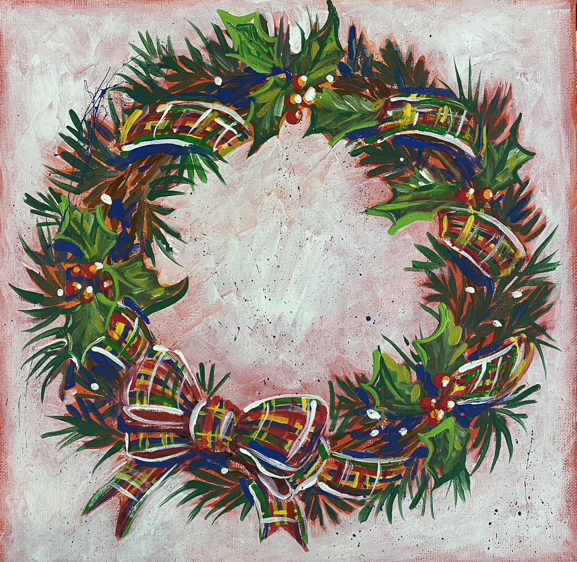
you step by step to paint this festive Christmas wreath to add to your decor for
the holiday season. If we haven't been acquainted, my name is Bridget
Miller and I'm freelance decorative
painter in my trade. I use the acrylic
medium primarily and now teach others what
I've learned over the years. Them started with this
wonderful medium, which in my opinion, is the perfect medium
to start with. As a beginner painter, acrylics are very versatile, they adhere to most surfaces. They clean up with
soap and water. They're nontoxic and they're relatively easy on
the pocketbook. In this class, I'll be
using acrylic craft paints, which are the least
expensive on the market. However, any acrylic paint
will work for this course. This course is designed for the very beginner that wants to learn how to
paint with acrylics. However, if you're a
more seasoned painter looking for a fun project, this would also be
a good fit for you. I will demonstrate step by step how to paint this
Christmas wreath decor, teaching you tips
and tricks along the way to build your skills
further with this medium. You can paint along
with me each lesson, or you can watch
through and then paint the class
project on your own. Once you've completed
the wreath painting, I'll then ask you
to upload it to the gallery as your
class project. It's there. I'll be able
to view it and give you input and answer any
questions you may have. Other students in the class will also be able to
view your project. And we can all encourage each other in our artistic journeys. With all that being said, join me in the next
lesson and we'll get started painting with
acrylics. See soon.
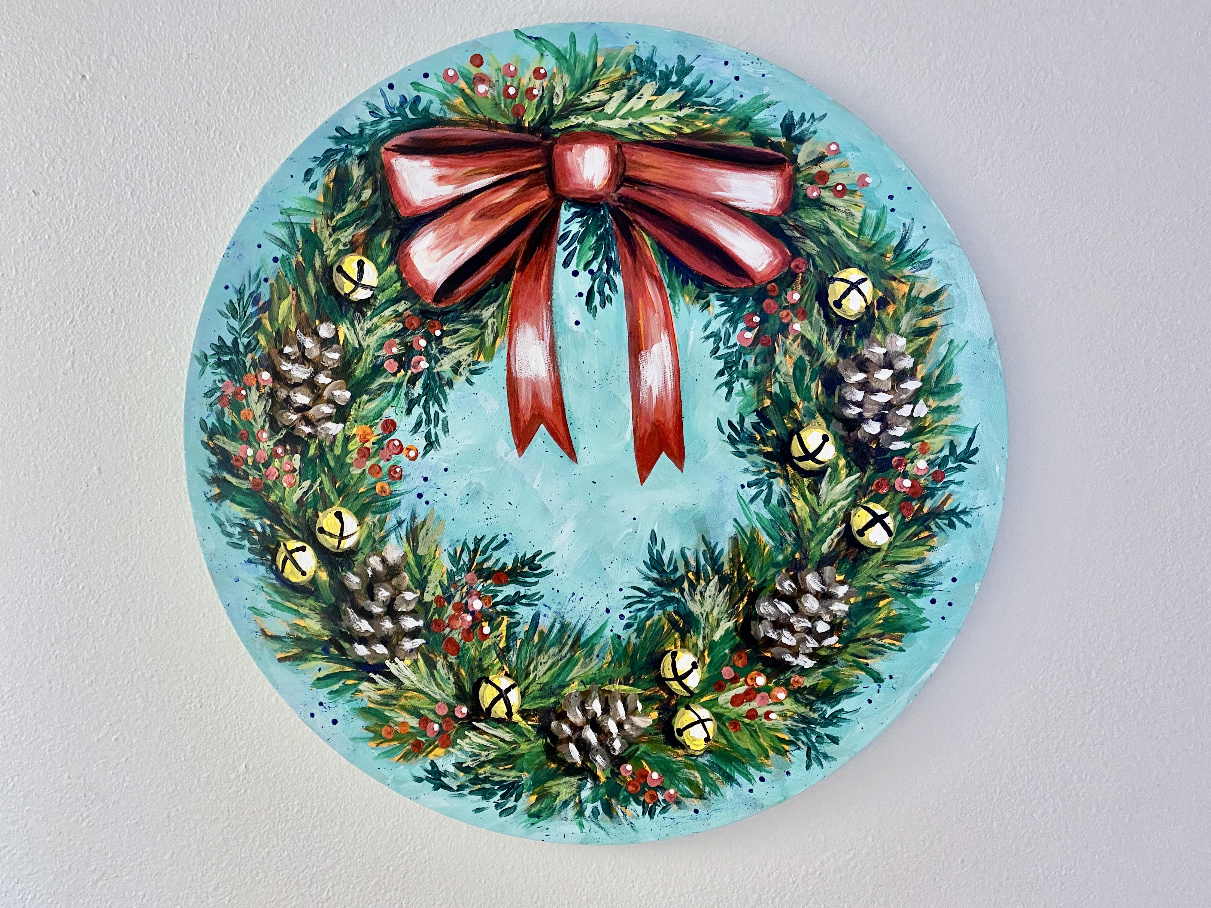
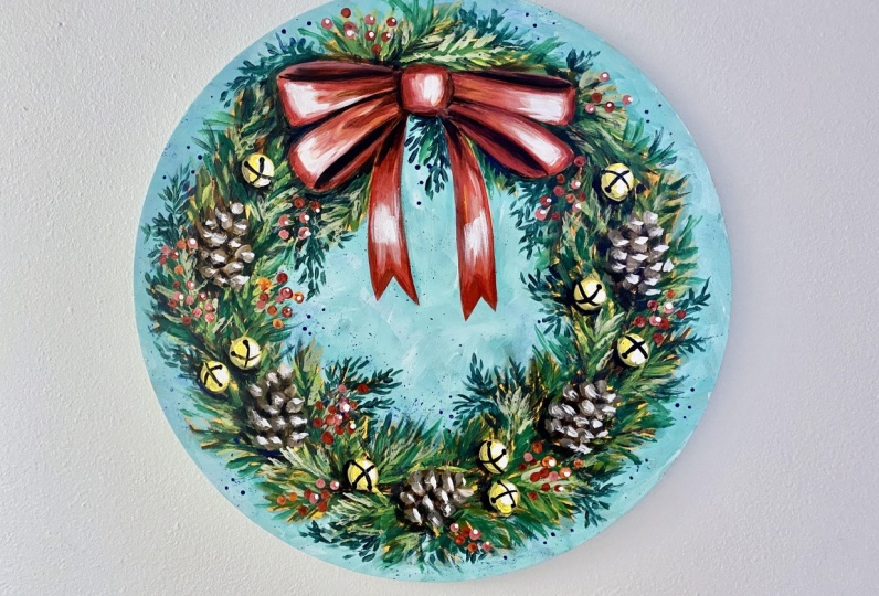
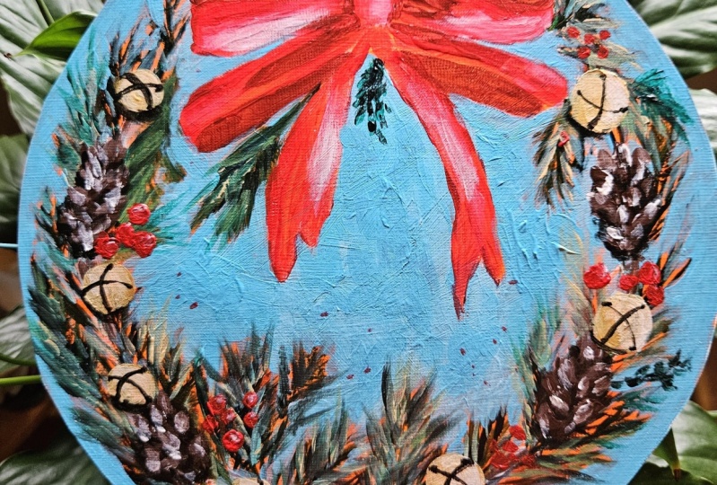
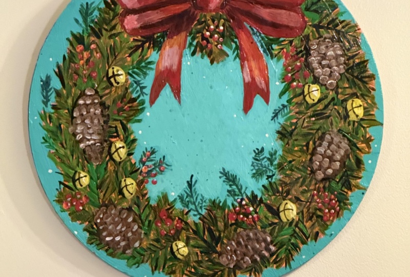
2. Class Project: For the class project,
I'll take you step by step to create this
festive Christmas wreath. First, I'll show
you how to prepare the canvas and
sketch the design. Then I'll demonstrate each
element of the design. Lesson by lesson, we'll paint the foundational
greenery, the background. And then add ribbon pine
cones, bells and berries. You'll learn how to mix
a variety of colors, which brushes to use. How to use values to create
dimension and some fun, extra techniques to
level up your work. You're welcome to follow along
with me pausing as needed. You can watch through
and paint on your own. Once finished, you can add a
photo of your art piece to the Submit Project
area under the Project and Resources
tab below the video. Once your project is uploaded, I'll be able to see your wreath. And I can give you
feedback if you'd like. I look forward to
seeing your project and getting to know you as you
learn how to paint with me. Now in this next lesson, I'll go over the
materials you'll need for this class. See over there.
3. Materials: For materials, you'll
need one canvas. Choose any size you like. The rounds come in
many different sizes, but the wreath looks great
on a square canvas as well. Just keep in mind that if you
choose a smaller surface, you'll need to use smaller brushes for the design elements. I'm using a 20 inch in diameter. Next you'll need
paint. I'm using craft paint for this class. However, if you'd like to use artist quality heavy
body acrylics, those will look very
nice and the colors will be much more brilliant
than craft paints. For specific paint colors, I'll be using black,
purple, dark blue. Ocean Breeze, which is
an aqua blue color. Green, apple green, which
is a brighter green, Bright yellow, orange,
red and white. Oh, and brown. Also, for a palette, I'll be using an
uncoated paper plate. I would have some extras
on hand so you can practice before you commit
to your final piece. The uncoated paper plate surface is very close to
the canvas surface. They make for a great
practice surface. I'll be using sidewalk
chalk for sketching. The brushes I used for the project are a
34 inch flat brush, a two inch flat brush, 12 inch filbert, or sometimes you'll see
it as a number eight, a number six round, a number three round, and a number one liner brush. These are just the ones I use, the brushes that work for you. If you'd like to use exactly
the same brushes as I did, I use a variety of brands, mostly artist loft brand that you can get from
Michael's crafts. But my number one liner brush is a Princeton and my
Filbert is a low cornel. I'll also be using a number two pencil
eraser to add berries. In a stamping technique, you could substitute a dowel for that or the end of a
pounce brush handle. Anything that'll stamp
out a nice round dot, you'll need some water
for rinsing your brushes. I like this old
container because it has two
compartments and I use one half for rinsing my brushes and the other half I
keep my water clean. If I need to add a little
water to my paint, I can use this clean
water to thin it. Paper towels for blotting my brushes and removing
paint from the canvas. A hair dryer acrylics are
known for drying fast, but if you want to speed
up the drying even more, a hair dryer comes in
handy in lesson number 12, which is step nine. In the process, I'll show you some finishing details where
if you choose to do those, you'll need a toothbrush
at the very end. For the very last step, I'll demonstrate how to apply some clear coat to
protect your artwork. For that, I use Deco Arts
Duro clear by Americana. It's a gloss varnish. There's a variety of clear
coat products to use. Just use one that's available
in your area or online. You want to look for something
that's non yellowing, something that dries
clear and water based. I also make sure it protects
for indoor and outdoor use. I've made a handy list of these materials for
your convenience, and you can download
a copy by clicking the Projects and Resources
tab below this video. Now, once you've gathered
up all your supplies, meet me in the next lesson
for our first step to painting your Christmas
wreath decor. See as soon.
4. Step One - Underpainting: The first step in the
class project is to underpaint your canvas
with this orange color. Underpainting as a
first step is optional, but I almost always do it
because of these four reasons. Number one, it immediately
covers the white. So in the subsequent
layers of my design, if I've missed an area instead of the white
of the canvas showing, I have this beautiful, warm orange peeking through. Sometimes a lot of it show
and sometimes just a little. But I always feel like the
final looks more finished. When I include this step, don't fret about brush strokes showing most of this
will be covered. However, I would paint the sides because
those little edges may show depending
on how you frame it. The second reason to
have this orange, or any midtone hue as your underpainting is
that while I'm painting, this background will help me
gauge my values as I paint. The values are how light
or dark your colors are. Knowing how light
or dark to make your colors helps with contrast, giving your artwork
more dimension. Thirdly, this extra layer
of paint will smooth out your surface a
little more and make finer details easier to achieve. Lastly, this color
peeking through, we'll give your artwork an
overall continuity in color, giving your piece a very
pleasing cohesiveness. And I feel it looks a lot more professional and
finished looking. In the end, after you've finished painting
the entire canvas orange, blow it dry with a hair dryer, or wait 30 minutes for
it to completely dry. In the next step, we'll start
the greenery. See there.
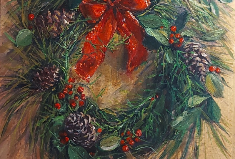
5. Step Two - Greenery: For this step, I
found some photos on line of wreaths that I like, so I wouldn't have to rely
on my memories for accuracy. I also have a couple trees in my yard that make wonderful, real wreaths and swags. I cut a couple pieces to use as reference material to
create this class project. I included these photos in the resources area
of this class, so you can use them too. Painting from real
life is ideal. Using photographs is the next best thing when
you want to paint realistically to
create the greenery, I start by sketching with
chalk onto my dry canvas, a large circle, about
4 " from the edge. I'm not concerned about
it being exact because my subject is organic and very
forgiving in that regard. The chalk will not
interfere with the paint, and if it's not completely
covered by paint, in the end, when your painting
is completely dry, you'll be able to remove
any chalk residue left over with a moist cloth. This simple sketch just
helps guide me as I paint. I draw where I want, my
individual evergreen sprigs and the big red bow, and I also place the pine
cones before I start to paint. Now, if you need
help with the bow, I have a sketch that I did
that you're welcome to use. You can download it from the resources area and
then transfer it to your wreath by using carbon
paper or graphite paper. I do not teach
sketching courses, but there's many teachers
here on skillshare that do. One that I highly recommend
is Victoria Mico. She has a class called How
to Draw Anything That is superb for beginners and anyone who wants to brush up on
their drawing skills. She great teacher. After I have the basic sketch where I want my main elements, I begin the painting process. I start with my darkest
color, which will be black, or you could use dark purple
or even a very dark blue like if you're using artist
quality heavy body acrylics. Using my 34 inch flat
brush on its edge, I make lines where I want each sprig and then I add
the needles on each side. You could also just paint
the needles if you like. You can work out from
the stem or start on the outside and pull
in. That's up to you. I find that if I start my stroke coming from the stem outward, the individual needles
become more tapered. If I start on the
outside and pull in, the needles look less tapered and look a little
thicker on the ends. Do what you prefer
and have fun with it. Experimenting on some
uncoated paper plates that mimic the same
feel as canvas will help until you find
the method that suits your taste and then
you can move to your project when you
feel more comfortable. If you prefer a round brush, I find a number six works well for the size
canvas I'm working on. As you end your stroke, pull away from the
canvas and you'll get a nice taper just like 34 inch flat you
can brush out from the stem in towards the stem. Try both methods to
see what you like best after you've added an even amount of
dark evergreen sprigs with your dark color
switch to a medium green, and add more sprigs in
between the dark ones, filling in the blank areas. At this step, try not to get two carried away and cover
too much of your darks. You'll need to leave a lot of the darks for your piece to look three D at the end and
have to add them back in. Once you've filled
in the greenery with the medium green color
evenly throughout the piece, dry your artwork with
a hair dryer for a few minutes or allowed to hair dryer
for about half an hour. To give our greenery
more dimension, we'll add a lighter value using the same brush strokes and whichever brush you prefer to lighten the value
of your medium green, Add white or yellow,
or a little of both. In this step, again,
I'm filling in, but I'm not completely
covering the previous steps. Now if you like this look, you can call it done right here. Or if you'd like
even more greenery, you can add dark cedar
sprigs here and there, just grab a dark color. And then with little
short strokes, you can just add different
little branches and come out from other evergreen
here and there. Just to give it a little
bit different look from other type of evergreen, I'm using my 34 inch flat, but you could also use
a number six round. This completes the second step. Join me in the next
lesson and I'll take you through the third step which
is the reverse back ground. Meet you there.
6. Step Three - Background: Welcome back. In this step, we'll cover most of
our underpainting. Make certain that
all your layers so far are completely dry. I'll be using craft smart
ocean breeze color. But any color you'd like will
work for this background. As long as it's not too dark, the value should be
about the same as your lightest color
in the greenery. I'll be lightening up my
main color with white as I go to give my background a loose, very expressive quality. But you're welcome to paint
it one color if you'd prefer that not use
multiple values. Using my 34 inch flat brush, I'm going to paint
the entire background with my ocean breeze color. I use the flat side of my
brush for the open areas. And I use the edge to cut in between where my
greenery and where my ribbon will be leave as much of the orange
background as you'd like. I will also paint the edges of the canvas as I don't
plan to frame this piece. And I think it looks better, like much more finished
with the edges painted. After you paint the first coat, add another coat of paint. While your first
coat is still wet. This second coat should be
a lot lighter in value. Add a lot of white
for this coat. I don't cut in as close
to my greenery this time. Repeat this step one more
time and then you're dead. Don't forget to paint
the edges again. With that done, now you're
ready for the next step. Meet me in the next
lesson and we'll paint the red ribbon. See su.
7. Step Four - Ribbon: Hi there. For the red ribbon, you'll need black, red,
orange, and white. I'm also going to use
a two inch flat brush. I'll start with the
darkest color as I like to paint from dark
to light in value. Remember, value is how light
or how dark a color is. I'm mixing some black
with a little red to make a very dark,
maroon, red color. Using my two inch flat brush, I'll fill in all the recesses of the ribbon areas
with this color, Using my reference
photo to guide me. I use my flat brush
on the edge for lines and the broadside
to fill in larger areas. Next, I switch colors to straight red and I'll fill in all the other
areas of the boat. Then dry it completely with a hair dryer or allow it to
dry for around 30 minutes. Then I clean up my
lines a little bit and add at more red. Over the top, craft paint
is not the highest quality. You may need two coats, depending on the
brand that you use to get it to completely
cover the layers beneath it. Here I dip my
brushing orange and for some additional
dimension and interest, I'm adding this color where the light is
highlighting the ribbon. Now I've made a very
light pink paint mix by adding a lot of white to red. And I'm highlighting
a little more to show that there's a
sheen to the ribbon. Dry it completely
again and meet me in the next lesson and I'll show
you how to paint the pine. Got. See you soon.
8. Step Five - Pinecones: Hello again. In this step,
I'll be using black, brown, and white to add these
pine cones to the wreath. If you don't have brown,
you could also mix orange with blue or
mix a little red, yellow, and blue together. My darkest value will be black, my mid tone will be brown. And then I'll lighten
the brown with white for my lightest value to give my pine cones a three
dimensional appearance. I found some reference
photos online at Pexels.com and I also found some pine cones
in my backyard. As I have a couple
evergreen trees, the Pacific Northwest,
where I'm from is very well known for its vast
evergreen forests. It's also where most
Christmas trees are grown. As usual, I'm starting
with my darkest color, which in this case is black, with a little brown mixed in. And I'm adding
that to my wreath, where I want my pine cones. The pine cone shape is oblong with a slight
point on one end. Next, I mix a little white with my brown to get a lighter brown. And using a half inch
filbert brush paint onto my oblong shapes
in a manner that resembles the pattern I
see on these pine codes. The shape of the brush aids. In making this look, be careful not to cover all the dark brown from
the previous step. Next, I mix a little
more white into that mixture to make
an even lighter value. And I highlight the
pine cones further by tapping a little of that color onto each previous
stroke that I made. That's it for pine cones. Now we're ready
to add the bells. Meet me in the next lesson, and I'll show you that
step. See over there.
9. Step Six - Bells: For the bells,
you'll need purple, yellow, white and black paint. And I'll also be using a two inch Filbert brush to
add the bells to the wreath. I start with a
yellow ochre color. For my darkest value, I mix a tiny amount of purple to bright yellow
to get this color. The first step in making
the bell is to make a round shape with this
yellow ochre color. I make this round by making a half circle
counter clockwise, and then another half
circle clockwise. And these two strokes
complete the shape after you paint as many
bells as you'd like, dry them completely,
and we'll add the midtone value,
which is bright yellow. For this step, I'm
imagining that my light source is at the right, so my bells will be shinier on that side that's
catching the light. So I'm only adding bright yellow on the right
side of each bell. Now I've added a lot of white paint to my
bright yellow paint. And I add this lightest value to my bells to make them appear
shiny and three dimensional. For more contrast, I
switch to my number six round and add
my darkest value, which in my case is black. But you could also use dark
purple or dark blue as well. I add this color on the
left side of the bells and pine cones as if
they're casting a shadow. This makes my pine
cones and bells stand out more and appear as if
they're protruding a bit. Adding to the three D illusion, then I dry completely
before moving on to the next step to add the criss
cross opening on the bell. I will use my darkest color again and switch to
a number one round. I also add a little water to the paint to make
it flow easier. The lines are slightly curved to give it a
round appearance. I use my photo for reference. There are times
when my line gets wobbly or just
doesn't look right. If that happens to you
before the paint dries, wipe it off with a
moist cloth and then dry it and then you can
give it another try. All right, those are the bells. Now for the next step,
we'll add some more green. So I'll see you in
the next lesson.
10. Step Seven - More Greenery: This step is optional. If you like your wreath as is, feel free to skip this step and move on to
adding the berries. However, if you want to add
and refine the greenery, I'll take you through
the steps to do that. Here you'll need black, blue, green, and
yellow for brushes. You'll need a number three
round and a 34 inch flat. The first color I'm using
is a dark blue green. I mixed a little
black with blue and green using my number three
round and my reference photo, I'm adding a little
sprig here and there, add some more
interesting textures and colors to my wreath. For this breaststroke, I dab
short marks onto the canvas, mimicking loosely the pattern
in the sprig of evergreen. In my reference photo here, you'll see that I've switched my 34 inch flat and I'm adding some lighter green
paint mixtures to give the wreath
some added contrast. I'm using the same strokes as I did in step two
for the greenery, making sure that I
don't completely cover my previous
layers of paint. I'm just highlighting
a little bit. Now I've dipped into some
green paint to fill in any areas that look empty or that need another
green to add interest. Okay, now we're ready
for the next lesson, which is adding the red berries. So I'll see you very soon. I just couldn't resist that pun.
11. Step Eight - Berries: Hello again. For this step, you'll need red, orange, and white paint and a new
number two pencil with an unused eraser or a small
dowel for applying the paint. I'll start with
red and my eraser, end of my pencil in the paint. Then perpendicular
to the canvas, I press lightly everywhere I
want a berry on the wreath, I then dip into orange or an orange red mixture
and add more berries. I group them together
in clusters, just like they appear in the photo references,
even overlapping some, I vary the amount of berries
in each cluster and I place them fairly evenly apart from each
other on the wreath. I then add a little
white to my mixture, and I paint a few more berries to give them a more
three D appearance. Now we're almost done. In the next lesson, we'll
add a few more details, then we'll move on
to the last lesson.
12. Step Nine - Details: The wreath is beautiful as is. However, I like to add little details to give
it a little more op. I'll show you those
here in this lesson. The first thing I
do is a technique that's fun but
messy, spattering. You'll need a dark paint
color like dark green, black, dark blue or
purple, and a toothbrush. I add a little water to my
paint so it's not too thick. If it's too thick, it'll
fling large batter. And if it's thinner,
the spatter will be I dit my tooth brush in
the thinner paint mixture, then I pull back on the
bristles and let it go. The paint flings off the brush onto the
canvas everywhere. It can be difficult to control. I have a moist cloth handy and I remove any spatter
that I don't want, leaving only the
marks that I do, like you need to do this
quickly before the paint dries. Next, I assess the
values of my colors. I ask myself if there's any areas that could
stand out more. By bumping up the
contrast in the ribbon, I add a little more white to highlight where the light
is reflecting off of it. Then I also darken the recessed values further to make it stand out even more. I do the same thing to my pine cones and
bells and berries. You may not need to do this
if your values are correct. I just feel like mine need to be bumped up to make things
stand out a little more. This will help the entire wreath look more three dimensional. Here I'm adding a
few uniform dots of dark blue here and there. Again, this is optional
for this technique. I use the wood handle of my
brush to make the tiny dots. By dipping them in any
color that you like, and then dotting the canvas. I usually make three
to five little clusters in several areas. I feel it gives a more
organic feel to my wreath. Next, I do the same technique using white to some
of my berries. The highlighted ones will appear to be more
forward of the rest, adding to that three D illusion after I've added these details dry completely before adding
my protective clear coat. If you have some
thick areas of paints like where your spatter
or your dots are, make sure to dry
them thoroughly. These thicker areas take
a lot longer to dry. Sometimes I've had it where just the surface
part is dry and it can still smear if just underneath that
surface is still wet. Once your wreath painting
is completely dry, you can apply your
protective coating. If you're using Deco Arts, duro, clear gloss varnish like I am. You'll need two or
three coats waiting until it's dry to the touch
between your applications. If you're using a
different brand, make sure to follow
the instructions for your product
as they can vary. I use a large flat brush
dedicated to this task. And I paint slowly with long, deliberate criss
cross brush strokes to coat the product as
evenly as possible. Don't forget to paint the edges. This protective coating
will give your painting a beautiful sheen and protect your artwork
from scratches, making it much more
durable over time. Okay, now you've
completed this course, your class project. Good job. Meet me in the next
lesson and I'll wrap everything up with the
conclusion. See you there.
13. Conclusion: Hey, thanks for joining
me in this class. I hope you learn a lot and you come away
with a project that you can proudly display in your home for this
wonderful festive season. Each class in this acrylic
painting series will go over some of the
same brush strokes and techniques and color mixes. And I'll introduce
you to more as well. Follow me here on Skillshare
for more classes in this beginning acrylic series by following me
as an instructor. You'll be the when I roll out new classes in this
beginning colic series. You can also find me on Youtube. My channel is called Creatively. I'm also on my
Instagram and Facebook. The links are on my
Skillshare profile page. When you upload your project, let me know if you
have any questions. I check every day and I'd
love to hear from you. You could also let me
know your thoughts about this class by
leaving a review. It's helpful to
know how I did as an instructor so I can improve
my skills in teaching. And in turn, better help you understand and build your
skills as a beginner painter. Well, that's a rap, have a great holiday
and I hope to see you again soon in the New Year
for some more painting.
 Brigitte Miller, Artist | Creatively B