Transcripts
1. Intro: Hi there. Welcome to my acrylic painting series where in this class I'll
demonstrate how to paint a study of snowy trees from a reference photo step by step
if we haven't met before. I'm Bridget Miller. I'm a
decorative painter by trade at. I'm an instructor for those
who would like to learn the ins and outs of
painting with acrylics. Further own fulfillment or to become an artist
for hire like me, over the years I've hone
my skills with workshops, classes, old fashioned
book learning, and mentorship with
other artists. I've learned a lot over
my 30 year career. And I'm bringing it to you in this series one
project at a time. You'll learn by experience,
just like I did. And with each study, you'll learn more and
more painting theory, process methods and techniques
with hands on application. Each class in this
painting series gives you more and
more practice. And you end up learning, with my guidance skills to build your own
style as an artist. Each class will be a painting
study of one subject. The painting you create in class is your assignment
or class project, and I'll ask you to submit it
to the student gallery for evaluation or just for your
own record of achievement. This series is for beginners and really anyone that
wants to know more about painting with
the acrylic media. I recommend practicing regularly when you're first starting out. And these studies in my series will enable you to practice
technique and learn theory simultaneously making for a more enjoyable experience in learning if you feel like you'd like to
learn more of the basics. Before diving into this
practice study series, I recommend taking
my introduction to acrylics and the
painting process. You can click on that link under the about section or go to my profile page
and find it there. If I've piqued
your interest into learning this versatile
medium with me, meet me in the next lesson and I'll give you more details
on the class project. I'm excited to see
where you'll go with this painting is much
more fun together. So let's do this see
in the next lesson.
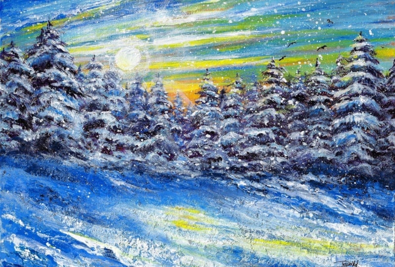
2. Class Project: For the class project, I'd like you to paint these snowy trees by
following along with me as I demonstrate step
by step or watch through. And then paint on your own. I'll be demonstrating
on a 912 canvas board. But you're welcome to
paint your project on a stretched canvas or wooden
plaque, or even paper. That's up to you, bear in mind that you'll need
to prepare your surface. If it's not a pre
primed canvas like I'm using for instance on wood, you'll need to seal it with
primer made for wood to prevent oils from the wood from seeping through over time. If you choose to use
watercolor paper, a couple coats of
Esso or latex paint will make it less porous and more ready to accept
acrylic paint. Any size you choose for
your class project is fine. Just adjust your brush size to accommodate the size of
your chosen substrate. Once you complete your painting, upload it to the
student gallery for everyone including me
to see and comment on. It's a wonderful way
to encourage each other while learning
the skill of painting. To upload your project, click on the Projects
and Resources tab. Below this video to the right, you'll see a blue
Submit Project box. Click on that and then
press Upload Image, choosing your image to upload. Then you can move the slider to enlarge and click on the
image to adjust the position. Then press the green
Submit button. Once it's uploaded,
you can title your project and write a
description for your project, describing your
process and whatever you'd like to say to others
taking the course and me. You can also add more
images if you'd like. If you just want
to keep track of your projects and
don't want to share, you can also check the
box to keep it private. Once you're finished, press the green published box and
voila, your project uploaded. Just like that, you'll
receive a certificate of achievement and you'll
be able to keep track of your progress
on your profile page. I'm really looking
forward to seeing your project and
discussing it with you. This is a valuable part
of the learning process, so I hope you take
advantage of it. Plus, it's super fun to see
what others in the class have done and read the
comments on your artwork. Next, I'll go over the
materials you'll need for the class project.
See over there.
3. Materials: For your course project, you'll need to gather up some materials before
getting started. To save time, I created a materials checklist
for you and you can download it from the
Projects and Resources tab under the video
of this class. And then you're welcome to
skip this section if you like. For the class project, you'll
need a surface to paint on. I'll be using a nine by
12 inch canvas board. You can use a stretched
canvas as well. And like I talked about
in the previous lesson, acrylics adhere very
nicely to paper and wood. Just make sure to
prepare your surface for acrylic painting before
starting the class. You'll also need
some acrylic paint. Any acrylics you already
have will probably be fine. I wouldn't purchase more
just for this class. However, if you want
the exact results that I'm achieving in my demo, I will be using the Liquitex professional brand heavy
body acrylics paint set that comes with black, green, blue, red,
yellow, and white. From this set, I'll be
using the three primaries. Ultramarine blue,
yellow, light Hansa, tall crimson and titanium white. I will not be using black
or green for this course. I'll also be using Cirilian blue that I stole from my
Windsor and Newton set. If you have a different set
or need to mix and match, I do it all the time
and I've never had any trouble with the medium not blending together well
with other brands. For brushes, you'll need
a 34 inch flat brush, a two inch Filbert brush, a number six round brush, and a number one liner brush. These are all synthetic brushes designed for acrylic paint. Stay clear of watercolor brushes which are too soft for acrylics. Some optional tools
are a palette knife. I'll be showing you some
techniques using this tool. I'll also show you how to make a perfect little circle with a 34 inch pound sponge and some spattering
techniques with a toothbrush. These are optional, but
it's fun to try these out. In addition, you'll
need a palette. I'll be using paper plates. It'll also be a good idea
to have several on hand, as I also use these to practice my techniques before
painting on my project. Some additional supplies are a container for water for
rinsing your brushes. I like using this nifty
container with two sides. Because I wash my brushes out on one side and the other side, I keep the water clean. If I need to add
water to my paint, I won't be using dirty water. I also use paper towels or
a cloth to wipe messes, blot my brushes, et cetera. Chalk just regular
sidewalk chalk for sketching a hair dryer to speed the drying
time between steps. If you want to protect
your art piece from dust, scratches and fading
from the sun, you may want to coat it
with a clear protectant. I use Dura clear by
Deco art frequently, but they make others that
are also very suitable. Once you have
everything ready to go, meet me in the next
lesson and I'll demonstrate the first
step. See soon.
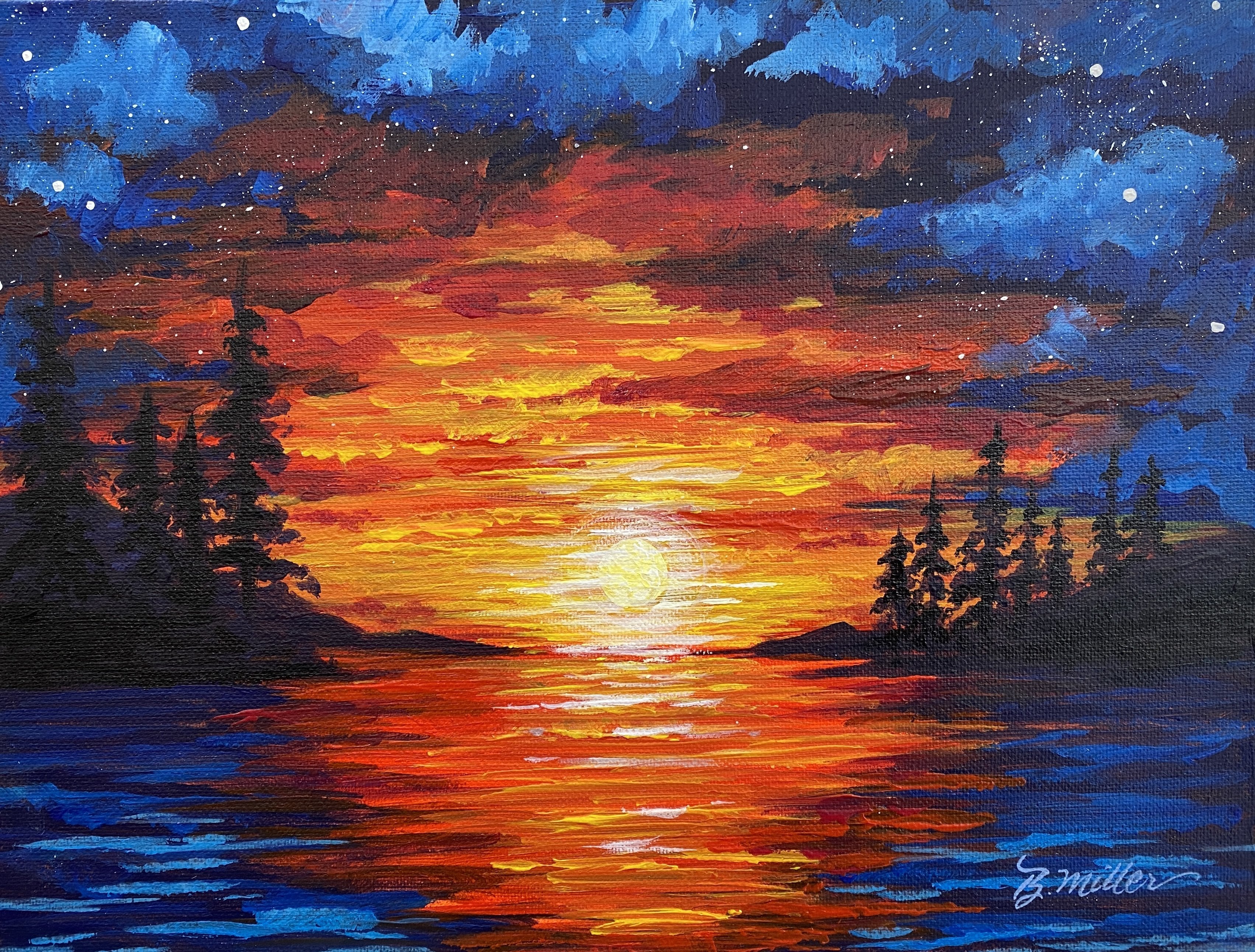
4. Underpainting: The first step in this
painting is to paint the entire surface
with a mid tone color. You don't want to paint
with too dark or too light, because this mid tone
color will be used to gauge your darks and
lights as you paint. It's also the color
that will peek through any areas
that are missed, either purposefully
or accidentally. Instead of the white
canvas showing, you'll have a beautiful hue that complements
your final design. I chose a warm orange hue to offset the cool blues
from the snow in the sky. Orange complements
blue very well. You can choose your underpainting
colors by looking at the color wheel if your final design has a lot
of reds and warm colors. If you look opposite
the color wheel at the colors,
complimentary color, that is usually a very
good color to use as an underpainting orange
is my go to color, but I do like to switch
it up once in a while. If you want to know more
about why I underpaint, you can go to my introduction
to acrylic course. And in lesson seven,
I go over it in more depth for this step. Mix red and yellow to make orange and cover
the entire canvas. Don't fret about brush stroke showing or it being streaky, as most of this will not
show in the final design. You can mix the colors together using your 34 inch flat brush. But it is better for your
brushes to mix your colors. With a palette knife, you
don't get paint stuck high up in the bristles of your brush and wear them out faster. If your paint doesn't
move well on the canvas, add a little water
onto your brush or split some directly on your
palette with a spray bottle for a more finished
looking end result. Paint the edges if you choose to frame your
piece at some point, depending on how you
choose to frame it, the edges may show and it
looks better to have them painted after you've painted the entire canvas with
paint dry completely, like blowing it dry
with a hair dryer, or waiting for 20 to
30 minutes to air dry. In the next lesson, we'll
paint the sky see over there.
5. The Sky: In this lesson, we'll paint
the morning sky using yellow, serilian, blue and white. Mark off your canvas in
thirds using the chalk. This will help guide you to keep all your trees on the
same level later. Also, compositionally,
breaking up your design into thirds is
more pleasing to the eye. However, if you choose to make your painting
more about the sky, bring your tree line
down further on the canvas and make your sky two thirds of
the painting instead. Let's start by mixing white and Cerilian together to
make a light blue. Using your 34 inch flat brush. Make sweeping marks across
your canvas at the top, leaving some of the
underpainting showing. Next dip into serilian. And while your paint on
the canvas is still wet, make some more streaks of color, more toward the top, still leaving a little orange to show. Then dry it completely. Next, using white, make some more streaks with
a sweeping motion, again, more toward the top
left side of the canvas. Then dry it again. The
reason I dry it completely each time is because
sometimes I don't want my colors to
mix on my canvas. If I don't dry it ahead
of time, they will. You may get colors
you don't want. After you've rinsed
your brush out, we'll add some yellow and a toward the upper left
side of your canvas. Sweep this color just like
we did the blue and white. I really like the painterly look that you achieve with
the pellet knife here. I'm going to add a
little bit more white, then I'll dry it again. Now I'll add Serilian to add more dimension
to the top of my sky. I'm going to go ahead
and scrape it on with my pellet knife again because the background
is completely dry. Have a moist cloth handy just in case I'd
like to remove some. I want to make sure I have
control of. I make my marks. I like the idea that the palette knife marks that aren't as easy to
control the marks, are so much different
than a brush that I really like to add them
for that painterly effect. But I also like to be in control of how much I want of this look. I'm going to wipe just a little off just to
control it more. If you don't want this look,
stick with your brush. And feel free to add as
much color as you'd like. The more you work
it with your brush, the more it blends. So it'll be a softer blend, but I like this painterly look, so I'm going to stay
with the palette knife. Okay, now I'm happy
with where it's at. I'm going to dry it completely, and then we'll move on
to making the trees. So meet me in the next section and we'll start that. See there.
6. The Trees: Hello again. I like to work from dark to
light when I paint. So in this lesson, I will show you how to paint the
shadows in the trees. Before I paint the highlights, which will be the snow, let's start by adding ultramarine
blue and natal crimson to the plate that we're
using for a palette. When I mix these
colors together, I get a beautiful, deep violet. If you want your color
to be even darker. Oddly enough, adding
a little bit of yellow will turn this
mixture almost black. I call it colorful
black because it uses all three of
the primary colors, blue, red, and yellow. If you've never
painted trees before, let me demonstrate one
method that I use that I actually learned from Bob
Ross when I was very young. I used to watch his shows
instead of cartoons, I use my 34 inch flat brush. And after loading my brush
with my violet color, I use the edge to
make a guideline. Then I on either side with my loaded brush to add branches. The overall shape of trees in this painting
are triangular. However, there is
different types of trees in some forests. You can also change
the angle of the brush for whatever type of tree
that you want to make. When you feel confident
in your brush technique, go to your project and add
as many trees as you'd like. Refer to the reference
photo as needed. I'm using the reference
photo only as inspiration. I'm not trying to paint the exact scene that you
see in the photo. For the main trees,
I paint a guideline, then I add the branches. Overlapping is just fine. I'll delineate with different
hues in each added layer. Again, working from
dark to light values. Here I add a little
serilian blue and a little white to my violet. And place some trees in between the main trees to look like
they're in the distance. This change in
values will create more distance or depth
in the landscape. Here I'm adding
lower branches on all the trees to
bring them all down, even on my sketched
in chocoline. Next, I add a little titanium
white to my palette. With serilian blue and the violet mixture
I've been using, I make a mixture and
add the same types of branches with this color to the trees that are
closer to the viewer. I also think about where the morning light would be
shining on the branches. For the darkest shadow
color in the foreground, I mix a little ultra reine blue with some of my violet mixture. And using my 34 inch flat brush, I make sweeping brush
strokes diagonally towards the right to make it appear that the trees
are blocking the sun, now that all my darkest
hues are painted in. In the next lesson I'll demonstrate how to add
the snow. See you there.
7. The Snow: In this lesson, we're
adding snow. A lot of it. I'll start with my two
inch filbert brush and mix some titanium white into my violet mixture that I was using in
the previous lesson. This color is a very
light violet blue. Not white like you'd
think snow would be. I'm referring to my reference
photo occasionally, so I can mimic how the snow settles on the evergreen
tree branches. As you can see, with gentle
tapping with my loaded brush, I can add this lighter hue to each branch that I made
in the previous lesson. I'm being careful not
to cover all the darks because I need those to show the recessed areas of the trees. I also tap in some serilian
blue because I think it makes the landscape look more like the landscape in
my reference photo, using the two blues together
looks very cold and icy. Occasionally, I'll turn
my brush when I need to paint a bit of a
vertical brush stroke to add a little
height to a tree. The Filbert brush,
in my opinion, is the most versatile
brush there is. And as you use it more and
more, you may agree with me without wincing my brush. I'm adding some
Cerilian blue and ultramarine blue
to the snow color. And adding this to
the foreground in between the shadow strokes
from the previous lesson. Now switch to your 34 inch flat and with diagonal strokes, sweep the canvas to emulate drips of snow in the foreground. Now I'm adding more
white to my brush. And using the wet
on wet technique, I'll use the same
brush stroke to cover the closest foreground area
with these drifts of snow. Okay, I'm happy where it's at, so I'm going to give it a
thorough dry with a hair dryer, or let it dry until
it's dry to the touch, about 20 or 30 minutes, depending on the temperature
where you're panting. In the next lesson, I'll
demonstrate a couple ways to add the morning sun and the
beautiful surrounding glow. Meet me over there to
begin that lesson.
8. The Sun: Hello again. In this lesson
we're going to add the sun. The easiest way to add the sun is to use
the Filbert brush. And don't fret about
making it perfectly round, Just dab it on the size
that you would like. I'm using titanium white
straight from the tube. That being said, if you want
it to be nearly perfectly, you can use your very lightly
and sketch it in first, then paint it in while
I'm painting in the sun. I'd like to explain why I'm
placing it in this spot. Painters and photographers
use the rule of thirds grid to create the most pleasing
composition for the viewer. The rule is to divide
your composition into thirds vertically
and horizontally. And then place the
areas of focus or the focal point where
the lines intersect. When you're painting studies, you needn't worry about
this rule too much. However, when planning a
more involved artwork, it's a good idea to
consider this rule. Here's a portrait or vertical composition with
the same rule applied. Another way to paint
the sun is to stamp it with the round
sponge stencil tool. Joanne, a student in my
intro to acrylics course, used this method for the
sun on her course project and shared this tip with me and I thought
it was brilliant. She said she got this idea
from Ian Harris on Youtube. Thanks for sharing that, Joanne. Another way to paint in
the sun is to stencil it. The classic way, if you have a circle cut out the
size that you need. One more way is to
use a bottle lid. If you can find the
size that you want, dip it in, paint and stamp it. Then paint it solid using
your filbert or round rush. Now that you have your
son, let's get it completely dry and then
add the next step. For this next step, I'm going to use a dry brushing technique. I'm going to add a small
amount of white to my Filbert brush and wipe almost all of it off on a cloth. I want very little
pigment on my brush. I then add it to
my dry surface in a circular brush
stroke around the sun. This will give me the
transparent look that I desire. Repeat this as many times as necessary to achieve
the look you want. Another technique to achieve the transparent effect is to place the paint
where you want it. Then using a slightly
dampened cloth, wipe off some of the paint until it becomes
more transparent. You must work
fairly quickly with this technique as acrylics
dry very quickly. Here I'm using the cloth with the paint residue to wipe on a little paint on
the very outer area. Do what looks good to you. In the next steps,
I'll demonstrate some final details
to wrap this up. I'll see you in the next lesson.
9. Final Details : In this lesson, I'll demonstrate some final details
that are optional. You may not need to do any of these if your painting
is where you like it. I'm adding a little
more seriliuan blue to my palette because I'm going to add
a little more of this color to the trees
and the foreground. I mixed it with a little white, so it's not as dark as my darkest value
in the foreground, but it's also not as light
as the lightest color. It's right in the middle,
more of a mid tone. I'm putting a little more of this color in the trees as well. After this, I dry it completely, then I grab a little
white still using my Filbert brush and just tap in a few highlights on the ends of the tree branches just to show where the sun might be
glistening off the snow. Now I'm going into
straight serrilian blue and I'm just going to tap in a little bit more of this
color underneath the branches. I feel like I have
a lot of darks in the trees and a
lot of highlights, but I need a little bit of the medium value with
the SerilianI'm. Going to add a little bit more. You may not need this at
all on your painting. You'll have to assess
it for yourself and see if you need it. And if you like that look, I'm going to add a
little bit more of the Serilian in the
foreground as well. Now, mixing my red and
my ultramarine blue, I'm going to make
that very dark purple once again and add that
underneath my trees. I'll also add a little of this color here and
there in the forest. If I need to add more
contrast here again, you may not need to
add more darks to yours where I lost some
of my background trees. I'll go ahead and add them
in with this color as well. Using the same color. I've switched to a
number six round to add a little bit more detail. Omit this step if you like a looser look to your paintings. Now I'll add a little
white to that mixture and add snow to the
details I just put in. Now with titanium white, I'm going to lighten
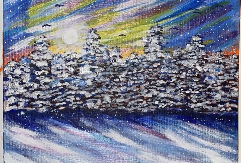
the foreground just a little bit more now. At this point it is finished, So feel free to upload your piece to the student
gallery right now, or you're welcome to meet me
in the next section if you'd like to see some other options
for this snowy tree study.
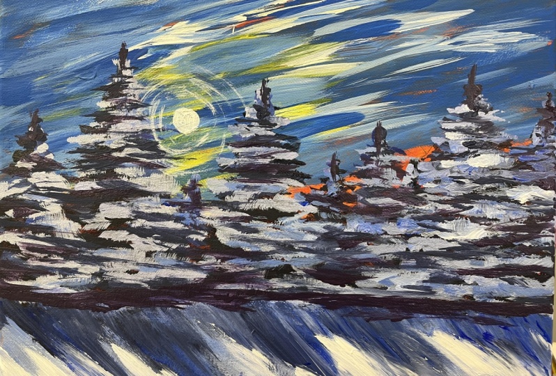
10. Adding Other Elements: In this lesson, I
wanted to give you some other options to make
your study uniquely yours. First up, I will show you how to make some birds
in the distance. These will add more life
and movement to your piece. I will be using the
liner brush and the darkest value
on my palette and I'll demonstrate
my bird technique on a paper plate before
adding to my canvas. Brush stroke
resembles the letter M with the sides of the letter
pulled out on both ends. I add a little more
water to my paint and use just the tip of my brush
to get a very fine line. It gets easier the more
you practice, trust me, once I load my brush, I wipe a little bit of it on the paper plate till I
get the line that I want, and then I move to my canvas. You don't want too much paint on your brush or you
won't get a fine line. I'm not happy with this one. I've got a little paper towel
here and I've moistened it. And I'll just go
ahead and remove it. Since my painting is dry
except for the bird, I'll give that bird another go. It may help to
brace your hand on the surface to prevent
a wobbly stroke. Now, dry completely before
adding the next element. If you'd like to
make it look like it is snowing in your landscape. You can do this
with a toothbrush and titanium white paint that has been thinned
a little with water. Make sure your
surface is completely dry and dip your
toothbrush into the paint. Then pull back on the bristles, and let the paint spray onto the canvas and everywhere
around it as well. This pattering
technique for adding snow makes me want to
belt out that song. Let it go from the Disney
animated movie called Frozen, if there's an area that's
more heavy or go have a moist cloth or
paper towel at the ready so you can wipe
it off before it dries. If you'd like heavier snow, turn your brush around
and tap the wood handle end into the paint and
perpendicular to your surface, dots, everywhere
you'd like more snow. Once you have as
much as you'd like, draw your surface completely. And I'll demonstrate
one more option for you before we conclude
this lesson, Sun rays. To make it appear as if the sun's rays are coming
through the trees, I use chalk to draw guidelines. Use a ruler if you'd like
to get them straight. Any chalk left over can be wiped off after your
surface is dry. Then using the dry
brush technique, like when we encircled
the sun with transparent white
in less than seven, we'll load a little white onto the Filbert brush and
then remove most of it. Then follow your chalk line repeatedly until you see
what looks good to you. If your paint looks too opaque, have a moist cloth
ready and just swipe the line until
it softens the stroke. Repeat this until you
achieve the desired result. To achieve straighter lines, use your entire arm, and not just your wrist. Ah, that sun really warms
up this piece nicely. Well, that's all I have for you this lesson and the class. So now it's your turn to shine. Upload your finished project
into the student gallery. I can't wait to see
your take on this. Meet me in the next lesson for the conclusion and other
info. See you there.
11. Conclusion: Thank you for painting with me. I hope you learned a lot
and had some fun too. Each class in this acrylic
painting series will go over some of the same
brush strokes and techniques and color mixes. And I'll introduce
you to more as well. Follow me here on
skill share to be the first to know when I
publish a new class, expect at least one per
month going forward. Let me know how you
did by uploading your project to the
project gallery. I'm looking forward to
meeting you through your art. If you want more classes
by me straight away, you can subscribe to my Youtube channel called Creatively Be. And you can also
catch up with me on Instagram and Facebook. The links are on my
Skillshare profile page. Before I let you go, if you
have an extra minute or two, I'd love to hear what you
thought of this class. You can leave a review under the review tab below this video. It's very helpful to
know how I can help you learn more about
this wonderful medium. Well, that's a rap. Thanks so much, and
I hope you join me again soon for another
study in acrylics.
 Brigitte Miller, Artist | Creatively B