Transcripts
1. Introduction: [MUSIC] Hi there. I'm
glad you're here. Welcome to my acrylic
painting series where in this class
I'll demonstrate how to paint a peacock butterfly step-by-step. I'm
Brigitte Miller. I'm a decorative artist
and I've been in the business since 1991. Lately, I've been
sharing my skills with in-person and online
classes to anyone who would like to
learn how to paint for their own enjoyment or to become a professional
painter like me. Although I'm not formally
taught, through the years, I've honed my skills through
many college courses, workshops, and alongside great
mentors like my own mom, who is a professional
oil painter. I grew up watching and learning
the skills of painting. I'm bringing this
experience to you in this acrylic painting series so you can learn the same way. Each lesson will be a complete
study of one subject. You will learn to observe, plan, and create one
painting each lesson. The painting you create will
be your course project. I'll ask you to
upload a photo of your painting to
the project gallery and I'll address
any questions or issues you have in
the discussion area. This series is intended
for beginners and beyond. The classes are really for anyone who wants to learn
my method of painting and enjoys not only the
theory like how to make a specific color or this is the brushstroke
to use for daisy petals, but the classes
are also for those that want to get to
the full picture. A painting study is just that. It's the rendering of a
subject to better understand it and it's a great
way to practice. Some artists paint many
studies to prepare for a more involved or a larger
more complex piece. That's my aim for you. We'll sit virtually side-by-side and I'll show you techniques and share tips with you
along the way that will help you not just learn
the skills of painting, but also the valuable skill
of LEARNING to paint. Each class in this
series will be complete. You will not need to
take any prerequisites. However, if you've never
painted before ever, or if it's been a very long time and you want to
brush up on the basics, you may want to take
my introduction to acrylics course in my
beginning acrylic series. There's a link to that class in the description
area of this course and you'll find
that when you click the About button
below this video. When it comes to
learning how to paint, as you may know, acrylics is a great
place to start. They're easy to use, relatively inexpensive,
and incredibly versatile. They dry quickly, which makes it easy to layer and fix mistakes, and they also adhere
to almost any surface. Jump into this class for
more hands-on information and I'll help you
learn the ins and outs of this fabulous medium, one project at a time. Meet me in the next lesson for more details on the
class project. [MUSIC]
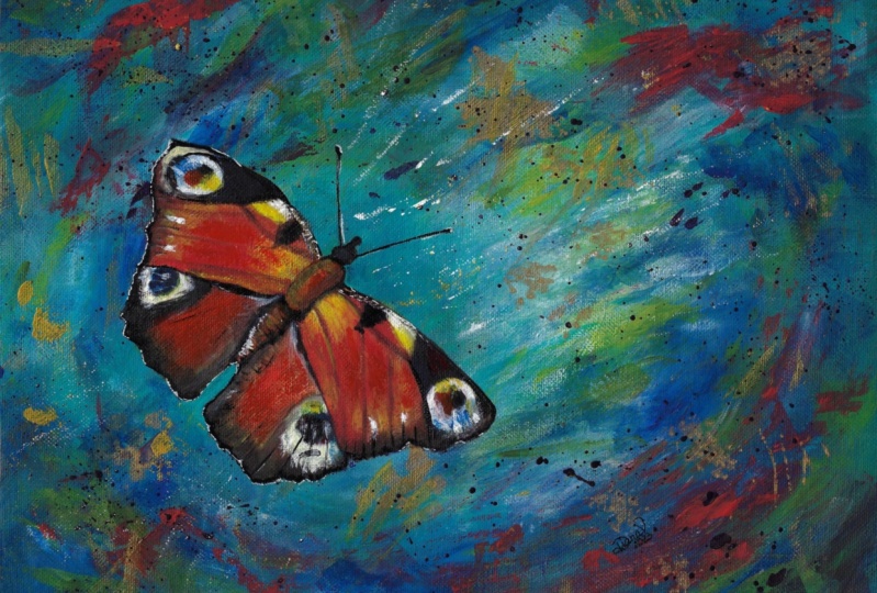
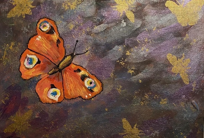
2. Class Project: [MUSIC] For the class project, you'll follow along
with me to create this study of a
peacock butterfly. First, I'll show you how I plan, research, and sketch
the initial design. You can sketch the design
if you feel comfortable, or you're welcome to download my sketch that I provided
in the resources section. We'll start painting the canvas with the first step
which is underpainting, and then I'll show you how
to paint the background, introducing you to several
fun abstract techniques. that will build into
our main subject, the peacock butterfly. At this stage, I'll show
you how to transfer your butterfly sketch
or the one I did, which I provided for you under the Projects and Resources Tab. Once the design is
transferred to your canvas, you're ready to paint
your focal point, which is the butterfly study. We'll block in the first layer, then add details step-by-step. I'll then demonstrate
how to sign your work and wrap up with a budget-friendly
framing idea. To get the most out
of this course, you can watch this
course all the way through and paint on your own, or you can watch and paint along with me pausing as needed. When you're ready,
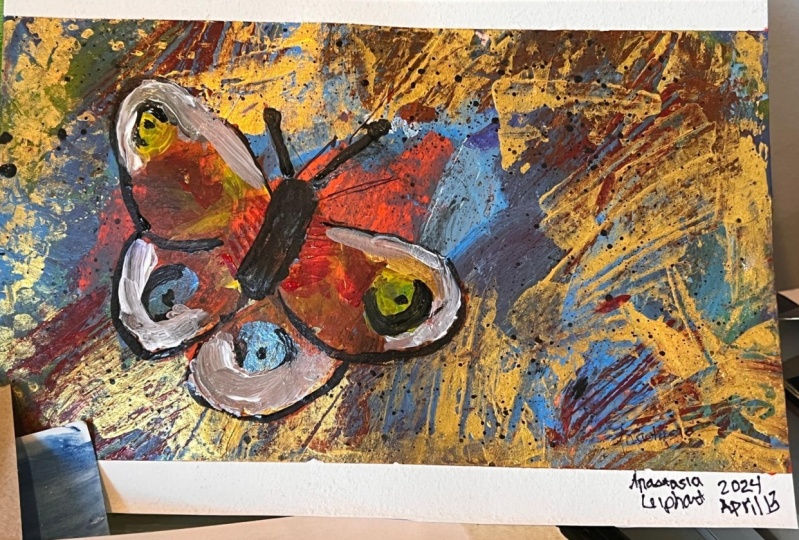
snap a photo of your painting and add [Photo Click!]
it to the project gallery. If you've never
done this before, go to the Project and
Resources tab below this video and click the green "Create Project"
button at the right, then upload your photo
for the cover photo. In the body area, you can add text and add
more photos of your process, or you can show me where
you hung your painting, or anything else you'd
like to share with me and anyone else
that's taking the class. Then press the green "Publish"
button at the top right. I'll be able to address
any questions or concerns you have once
you upload your project. You'll also be able to see other students projects from this class and comment on those. It's the best part of the class, especially when you
see the feedback on your class project. You can also do me a kindness and leave a review
for this class. It'll help me to know
your thoughts on how I did and how I can better help
you learn about acrylics. One more thing, if you have a suggestion for a future class, let me know anytime under
the discussion tab, I'd love to hear your ideas. If I use your idea, I'll give you a shout
out in the class. Uploading your project is an important part of
learning process. I can hardly wait
to see how you do. In the next section, I'll
go over the supplies you'll need for the class project.
See you there. [MUSIC]
3. Materials : [MUSIC] For your course project, you'll need to gather
up some materials before getting started. To save time, I created a materials checklist for you and you can download it from the Projects and Resources
Tab under the video of this class and then you're welcome to skip this
section if you'd like. Many of the items on
the materials list you may already have
laying around the home. You'll need one nine by 12 canvas board or paper
made for acrylic painting, like Canson's Acrylic Paper. You'll also need one set
of heavy body acrylics. I'll be using LIQUITEX
Classic Set. For one of the
background techniques, I use a Liquitex Soft
Body gold paint. However, any gold acrylic
or craft paint will work. If you don't care for shimmer, you could omit it all together. You'll need four
synthetic brushes. I use Artist's Loft brand
from Michaels Craft Stores. You'll need one, one-inch flat, one quarter-inch filbert, one number 3 round, and one number 1 liner. [MUSIC] You'll need
a paint palette. I just use two paper plates. A container for water for
rinsing your brushes. I like using this nifty
container with two sides because I wash my brushes out on one side and the other side, I keep the water clean so if I need to add
water to my paint, I won't be using dirty water. A sharp number 2 pencil, white sidewalk
chalk, a hairdryer, which is actually optional. It's to speed the drying time. [NOISE] Paper towels. I like these blue shop towels that I've seen auto mechanics use because they're more durable and they seem
to be lint-free. A ruler will be handy. For some interesting
techniques on the background, you'll need a
toothbrush and you're welcome to use recycled
one, that's fine. You'll also need a pallet knife. Something to scrape
paint with like an old credit card or a vinyl
scraper if you have one. For the final technique
on the background, I'll be using this old
wallpaper stencil. however, you can use
any stencil you have or anything like decorative
stamps or even bubble wrap. It's just something to add interest to your
background design. If you choose to sketch
your own design, you'll need some drawing paper, tracing paper and as an option, you may need a pair of scissors. Under the Projects
and Resources Tab, I have downloadables for the Traceable Sketch
and reference photos. Lastly, if you choose
to frame your project, you'll need an 11 by 14
photo frame with a mat or a decorative backing paper and to clean your frame's glass, you'll need glass cleaner. I use Windex brand and
the lint-free cloth. You'll also need
some sticky putty, gallery quality is best. Once you have your
materials handy, meet me in the next section
and I'll demonstrate how to underpaint your
surface. See you soon.
4. Underpainting- Step 1: [MUSIC] Hi there.
Let's get started with your blank surface
and a clean palette. I'll be using a 9" x 12" canvas
covered pre-primed board, and then I'm also going to use an uncoated paper
plate for the palette. In this step, I'll be using
yellow and red for my colors. I'm mixing yellow and red, which are primary colors, and I'm making orange, which is a secondary color. If you'd rather mix with a
palette knife at this stage, that will be easier
on your brushes. I'm just going to
use my brush to mix. [MUSIC] I'm going to cover
the entire canvas with this medium orange
color that I'm making, and I'm going to use my
three-quarter inch flat brush for the entire step. You'll see I'm using a
crisscross brushstroke. I'm not really concerned with the painterly strokes
being uneven. This is just the undercoat. It won't show very much, so it's just going
to cover the white, and you won't notice the brushstrokes when we
put the next layers on. This underpainting is going
to make my canvas smoother, it's also going to completely take the
white out right away, that way if our other
layers miss a spot, the white of the
canvas won't show through. It'll also help me gauge the next colors in the next
layers that we'll be doing. If you have the
white of the canvas, it's going to be hard to know how dark or light a color is. You'll see that as you
go through this process. [MUSIC] Lastly, the
underpainting will peek through in areas
throughout your piece. It will give your art a
visual continuity in color that adds to the overall
look of your art piece. You'll be able to decide
how much or little you want your underpainting
to show through, as we add the layers
in the next steps. [MUSIC] Here you can see
me painting the edges. If you've got a
wraparound canvas that has a little bit
more of sides to it, you may want to completely
paint the sides, or in this case, the canvas board, if you paint those little edges. Depending on how you frame it, those edges may show, so spend a little extra time
finishing off those edges. After you've completely
covered the canvas, dry it with a dryer or let it dry for
about half an hour, and then we'll put
the next colors on. See you in the next
lesson. [NOISE] [MUSIC]
5. Background - Step 2: [MUSIC] Hello. For
this lesson in step 2, you will need to load your palette with
the primary colors, blue, red, and yellow,
and also white. If you don't want to mix your green and you have a tube handy, you can add that to
your palette as well. The Liquitex classic set
that I'm using has green, so to save the time of mixing, I'll use their green. But if your set doesn't
come with green, go ahead and mix your primaries, blue and yellow, and
you'll get a lovely green. For step 2, I'll be using the same exact brush as step 1, it's my three-quarter inch flat. However, you can use any brush that you're comfortable with. This is just my
go-to brush for one I like to go over large areas. I'll be mixing colors as I go. There's no need to mix
your colors ahead. But if you're more
comfortable having all your colors mixed
before you start, you can watch me
mix and then mix your colors before
watching again, and then you can use
those pre-mixed colors for these next steps. You need to do what
feels good to you. I've been painting a long time, so it's fun and relaxing
for me just to mix as I go. It's a way to paint
like intuitively, especially for these
abstract backgrounds. I'll take you with me step-by-step
as we create this one. The first color I'm blending and adding to my background
is a turquoise green. I use a little blue and
yellow to make the green. If you have green, go
ahead and add that too, and then I add a little white until I see the color I want, I want to make quite
a bit so I can cover almost the entire area. The underpinning was
criss-cross strokes. This time I'm going to use the long strokes
and I'm going to mix the colors directly onto the canvas using what I call
a wet on wet technique. That's where I put the paint on the canvas and while
it's still wet, I work in some
other colors making sure I do not blend completely. But I layer the strokes
next to each other to keep them mildly and expressive. At times, if I'm not able to move the paint around easily, I'll add a little water. [MUSIC] To add depth, I add white to lighten my color. Then I add a lot more blue and red together
to make a dark purple. That uses my dark color. I have to work
quickly so the paint doesn't dry before I can
mix it onto my canvas. I just move the paint around
until I see what I like. I am leaving a
small area of blank because later that's where I'll add the peacock butterfly. Have fun with making your marks and just see what happens. It's fun to just play with the paint and experiment
with the colors, and experiment with the different
brushstroke techniques. It's a great way to get
to know your medium. [MUSIC] Here's where you get to
decide how much of the orange underpainting that
you want to show through on your final piece. You'll see there is some
missing areas on mine. Most of it's covered. You can let a little marsh
peek through if you'd like. For me, it's easier to pick up my canvas and paint holding it. I don't do this with
large canvases. I use an easel and I don't think that it matters
one way or another. Just do what's
comfortable for you. Some of my students use easels and some of them like to
pick it up like this. Most of them
probably use easels, so try an easel and then also try what I'm doing here and just see what
works best for you. For more depth, I'm adding this dark blue with a
little bit of red, so it's mix a dark purple. [MUSIC] For some
added interests., I'm going to add red, not a mixed, just
red here and there. I'm also going to
grab a little yellow, mix it with some of my green, and put in just a few
strokes of green. This just adds interest to me, so you can do the same or you can try
something different. Just show me what you like by doing what
resonates with you. Now at this stage, you can
leave the background exactly like this or while
it's still wet, you can blend it
a little more by moving it around a little
more with your brush. That'll give it a softer look. It's just entirely up to you. I'm going to give you
some additional options in the next lesson, and then you can
decide from there if you want to do more, so meet me in the next
lesson and I'll show you a few more techniques that will add interest
and expression, and then we'll move on to the more realistic style of painting when we
start the butterfly. I'll meet you in
the next lesson.
6. Techniques - Step 3: [MUSIC] Hello again here I have the first layer
of my background. I would like a few more colors added to add more interest. I'm mixing a yellow, orange
and adding it to the canvas. Now because my
background is still wet. It's mixing probably
more than I'd like with the other colors. I'm going to fully dry the
background with my hairdryer. Then I can add my colors
to a dry background. [NOISE] Through the
magic of editing, I now have it completely dry. I'm mixing some more yellow, orange and then
giving it another go, this time with a dry background. I do not want my color to mix with the
background this time. I can have clear color. [MUSIC] I'm adding
the color with my three-quarter-inch
flat brush and just randomly almost
putting it evenly. Again, you just
have to decide how much you want this color and
just put it here and there. Then once I have it on
and it's still wet, then I take a shop towel. It doesn't disintegrate
as easy as a paper towel and I wipe some
of it off so it's sheer. [MUSIC] Then I add some red
and a little bit more yellow. Just here and there place it on the canvas just to add a little more
interest and texture. You can skip this part. At this stage, I
know it looks messy, but it will all make sense as
we go through the process. It's very painterly as you
can see here in the close-up. [MUSIC] Before I add my
next texture technique, I want to make sure
it's completely dry. I speed this up by
using my hairdryer. [MUSIC] Another way
to add texture and interesting marks is to
use a scraper or a sponge. I have several here. I'm going to use this
white plastic scraper. I think it's used
for applying vinyl, but it works great for the scraping technique
that I'm about to do. I think if you used
a credit card, that would do the same thing as this little
scraper that I have. Now I'll make another mix
of turquoise and add a little white and use this to make some
marks on my canvas. Again, I realize
this looks messy. However, bear with me, and you'll see that
it will add depth and interest and it will make more sense as we
add more elements. At this stage, just enjoy experimenting and
discovering what you can make happen
with this medium. There's really nothing you
can do wrong at this stage, which makes it very liberating. [MUSIC] Here I'm mixing a
yellow into my turquoise, and I'll add that color with
my three-quarter-inch brush. [MUSIC] Don't forget to clean your tools while the
paint is still wet. It's a lot easier than trying to scrape that
paint off later. Here Here I'm using
a soft cloth to wipe off some of the paint just to soften the edges of
some of the marks. [MUSIC] Another
great tool to make interesting marks is
your palette knife. With mine, I'll add some bold expressive marks using red straight
from the tube. Gently dragging
the palette knife across the canvas
and let it catch on the tooth of the service to make unique barks that are
impossible with a brush. [MUSIC] Each time that
you add a new technique, make certain the last marks
you made are completely dry. That way if you decide you
don't like the new marks, you can just wipe them off with a moist cloth and
give it another go. [MUSIC] For this next technique, I'm going to use an
old stencil that I used for a wall
design years ago. Any stencil or decorative stamp can be used for this step. I've even painted on bubble wrap and use that to add
a pattern design. Get creative. Look
around the house. There's lots of things
you might have laying around that could
work for this step. I like to add a
little shimmer or glitz to also create interest. This soft body paint
from electrodex is iridescent gold and will be
perfect for my background. Any acrylic craft or
stencil paint will work. I just had this on hand and I like the
color with the blue. This is what I'll use. You can apply it
with a soft cloth, a towel, a stencil
brush, or a sponge. Just by dabbing the color
evenly over the stencil. Being careful not to
change the position of the stencil until you're
finished applying your color. [MUSIC] Every once in a
while, check underneath and see if it's looking
the way you like. [MUSIC] I'd like a
few more points of the design to be
on my background. I'm going to add
a few more here. [MUSIC] Sometimes it
takes two layers for the gold to look as
shimmery as I'd like. [MUSIC] What that color
already on the sponge brush. I'm going to add
it here and there on the back of the canvas to marry up the stencil
color with the background. [MUSIC] For the last textural
element on this background, I'm going to use a toothbrush and add a splatter technique. [MUSIC] I'm adding black
paint to my palette. I'm adding a little water
to the black paint to thin it down to make spatter, your paint viscosity
needs to be thin. It will be easy for
the toothbrush to fling it off and
onto the canvas. Use gloves as this technique isn't good for your
manicure at all. Your paints viscosity, your type of toothbrush, how you pull back on the
bristles of the brush. These all play a part in how
your technique will look. If you need to practice on a paper plate or
some other surface until you get the hang of it before adding this technique
to your background. [MUSIC] Also, make
sure your background is completely dry. If you want to make a change, you'll be able to wipe
off this batter and try again until you're
satisfied with your results. [MUSIC] Now you
can draw it as is, or you can dab it with a soft cloth and change the size of the
drops if you'd like. I'm going to mess
around with it until I like it and then call it done. [MUSIC] I like how
this turned out. Now that the background
is complete, we can move on to the next step. [MUSIC] Meet me in the next lesson and
I'll show you how to add the butterfly.
See you there.
7. Plan, Sketch, Transfer - Step 4: Hey, there. In this lesson, I'll show you the full
process of planning a design, sketching your study, and the transferring of your
image to your surface. But for the course project, you're welcome to use my
sketch as I've included a PDF under the projects and resources section
of this course. Just download a copy and
enlarge or reduce to suit yourself and trace the design using the same method that
I'll be using in this lesson. Many of my in-person students
want to paint but are not interested in
the entire process of designing and sketching. I've included the
information for those that would like to use
their own sketch or perhaps would like to
use a different type of butterfly or subject altogether. They might find the
entire process useful for their own individual
future projects. I'll keep it brief though so we can get to the painting
part straight away. [MUSIC] When I first envision a painting as
an idea in my head, I sketch out tiny
thumbnail sketches to work out all the
details on paper. I mostly think about
where I want my study, the main subject, in this case, the butterfly, what size, how many would look good to
give the most visual impact. I think about the story
I want to tell visually, like where do I want my
viewer to look first? Even though this is
just a lesson for learning the skill of
painting and acrylics, I'd like it to be more
than just practice. I want it to be
pleasing enough to proudly hang on your wall
when you're finished. This all takes planning. My goal is when you're
finished with the project, I want you to view it as not only a beautiful work
of art adorning your home but also a representation
of a journey of learning and experimenting
and achieving. The image of the butterfly is a metaphor for transformation. What better way to symbolize
embracing a new skill? [MUSIC] These are all the
things that are going on in my head as I'm creating
lessons for my students. [MUSIC] Once I decide the
best composition, I research images from
copy-free sites like Pixabay, Pexels, Unsplash, or my
own reference images. Once I settle on my subject, I sketch a more
detailed study [MUSIC]. Sketching my subject
is a way for me to observe and learn more about it. It's why it's called a study. When I know more
about my subject, I'm able to paint it more accurately when I
get to that part. [MUSIC] Once I have my sketch, I use tracing paper to
edit and finalize it. [MUSIC] I then use the tracing paper image to find a pleasing placement
on my painting. Sometimes this requires cutting
the image down to size. [MUSIC] [NOISE] Once
I choose the best placement for my study, I add sidewalk chalk
to the back of the illustration and place it on my surface
chalk side down, tracing over with a
very sharp pencil. [MUSIC] Check to make sure that you're
pressing hard enough with the pencil to
transfer the image. Now that I have the image
transferred and I have a guide, I'm ready to begin
the painting process. I have my reference images
for color nearby on my computer and I also have
a color copy print out. I've included the reference
photos that I'm using for this project in the projects and resources
section of this class. You can download those or just view that on your
monitor as you paint. My color copy isn't
very accurate so I like to use my old iPad
for color reference. I also like to zoom in so I can see more detail as needed. Next up, I'll
demonstrate step-by-step how to paint the peacock
butterfly. Meet me there.
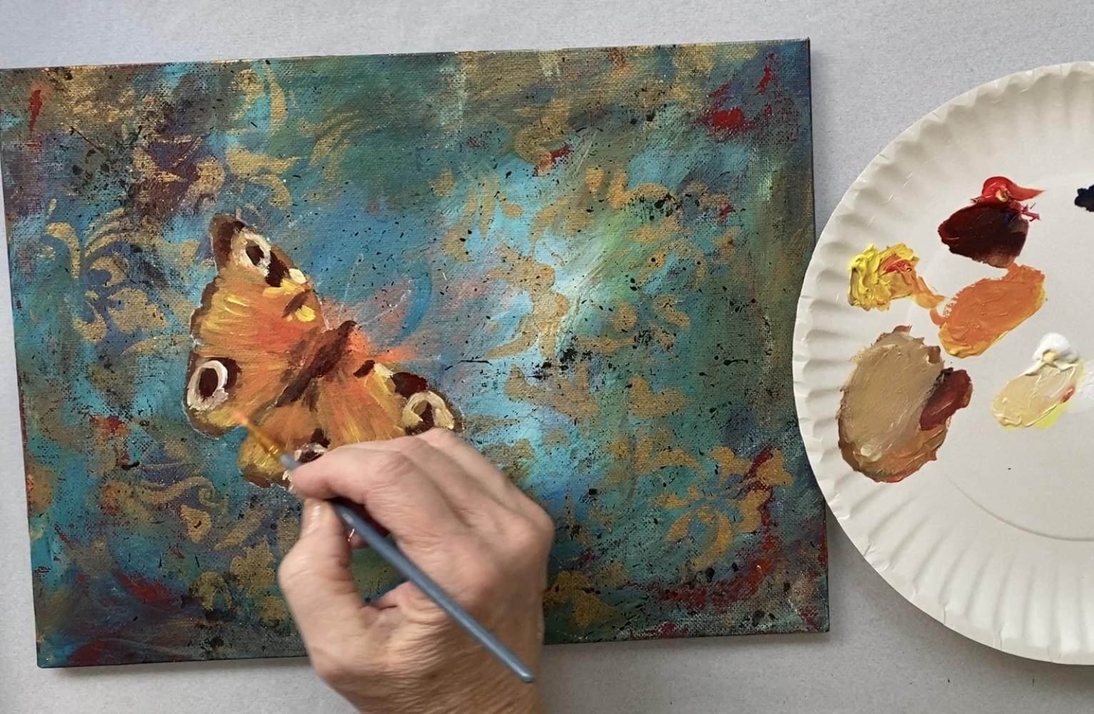
8. Painting the Butterfly - Step 5: [MUSIC] To start, you'll
need a small amount of the primary colors, blue, red, and yellow,
and a little white. Using a one-quarter
inch filbert brush, or you could use a
palette knife mix an orangey rust color
by adding a little red to the yellow and
then tiny amounts of blue to tone down the orange
to a more of a rust color. If you like brighter colors, just omit the blue and go
ahead and make an orangey red. [MUSIC] Using the flat
side of your brush, fill in the large mid-sections
of the butterfly wings. At this stage, I'm only applying a thin layer as I will be adding more layers
as I progress. [MUSIC] To give the
wings more dimension, I add a little bit of
red and a little yellow, just a few brush strokes. [MUSIC] I'm using a wet-on-wet technique and as I
put the color on, I mix it with the
previous layer of color. [MUSIC] Next, I add a small amount of
blue and red to the rest mixture to
darken it in value, and then I use the edge
of my brush to tap in the edges of the wings. [MUSIC] This is the blocking in stage where I paint my entire subject with
the first layer of paint. Using my reference
photo as a color guide, I add a small
amount of yellow to my resting mixture to lighten
it a little in value and then I add that to the
edges of the wings in a zigzag brush technique to make it look like the pattern in the wings that I
see in the photo. For the butterfly's body, I mix a little more red and blue and add it to
that rust color, again, darkening it in value. [MUSIC] The body is
larger at the top and tapers towards the bottom. [MUSIC] Don't forget to
add the little tiny head. I'm also adding this
color to the edges of the wings and on either
side of the body. [MUSIC] If your body needs
to be a darker value, add more blue until your
color is almost black. Add this everywhere you see dark using your reference
photo as a color guide. [MUSIC] When using
your filbert brush, use it on the side to
paint more of a line and flat when you need
to fill a larger area. [MUSIC] Now change to your Number 3 round
brush and mix a light yellow using
white and yellow. You can also add
a tiny amount of red for a more realistic color. [MUSIC] Add this
around the eyes using your reference photo to
guide the color placement. [MUSIC] If the color
you're putting down is mixing too much with the color that's
already on your canvas, you can completely dry your
butterfly and then paint. Sometimes when you're painting
wet paint to wet paint, you get a little color
mixing that you don't want. The best way to avoid
the mixing and getting a different color is to dry it completely first and
then add your new color. [MUSIC] Now, without
cleaning out your brush, go ahead and mix that color with the rusty brown color you originally had and it will make a beautiful color for
the edges of the wings. [MUSIC] I'm not sure this is quite bright enough
for my taste, so here I'm making
a yellowy orange, leaning more toward
yellow than orange, and I'm going to make that
a little more pronounced. I'm going to use zigzag motion to create that
texture that's in the wings, using the edge or
the very tip of the brush to create
that same texture. [MUSIC] You can
see me starting at the outer part of
the wing and pulling in and up and it
tapers the stroke. Then I add a little red to
that yellow mixture that I made and it turns it
a little more orange, and I'm just blending that
yellow into the center where the wings are and just working here with my brush
so it blends it more. [MUSIC] Here I'm using
straight yellow right out of the tube to add some
of the yellow areas. If you look very closely
at the photograph, you'll see that there's
bright yellow near the top of the wings. I'm taking artist license and doing it a little bit brighter. I feel like having more
contrast makes it more 3D. Here I'm filling in any areas where the background still shows through and I'm also cleaning up the edges so
they follow my guide, my chalk line, a little bit more accurately. [MUSIC] Now I mixed a very dark red by just adding
a little bit of blue to my red and I'm going to use
this as a shadow underneath the wing to separate
the two wings and also on the edges of the wings, so they'll stand out
from the background. [MUSIC] For the blue that you see in the center area of the eyes, I'm mixing blue with a
little tiny amount of white and just tapping that
color in each eye center, again, using the reference
photo as my guide. [MUSIC] I also see a bright red, so I'll tap that in as well. [MUSIC] Next, I'll enhance the red color in the center
of the wings by adding pure red [MUSIC] and moving around a little bit
to blend it softly. Here I'm making black by
mixing a lot of blue, half as much red, and a tiny amount of yellow, until I see the
paint turn black. I call it colorful
black because it's created by using all
three primary colors. If you don't want
to mix your black, go ahead and use a tube of
black if you have that. [MUSIC] Using the
tip of my brush, I tap and dab, and gently add this black to every place on my canvas where I see the
color in the photo, mimicking the pattern
as precisely as I can. [MUSIC] This darkest
value will create the contrast I need to make this flying creature look
as if it's landed on my canvas for a
brief rest and will soon take flight for
its next adventure. [MUSIC] Now I'm switching
to my smallest brush, a Number 1 liner brush. I'm adding a little bit of
water to thin the paint. [MUSIC] I'm also going to use this ruler to stabilize my hand. I don't want to be shaky and
this will help me position myself exactly where I need to be to get a perfectly
lined stroke. [MUSIC] I use this brush
perpendicular to the canvas, as I pull to where I
want my stroke to go. I'm adding these
black details to everywhere I feel I
need more contrast. [MUSIC] This will make the
butterfly appear more 3D. [MUSIC] I'm also
adding the pair of antennae that are
usually straight, but I'm going to give
them a slight curve. At the very outermost
tip they're a little thicker so I'll
add that detail as well. I just tap at the very top and pull towards
the stroke I just made. [MUSIC] Here I'm just
outlining the wings slightly more and you can see how much it
brings out the butterfly. [MUSIC] Now for those of you that like
a lot of detail, meet me in the next section and I'll show you even more. [MUSIC]
9. Adding Extra Details - Step 6: [MUSIC] At this stage, you
could easily call it done. However, adding a
few white highlights adds to the contrast, thus making the butterfly
stand out even more. [MUSIC] Here I'm adding pure white with my
number one liner brush, to all the areas on my butterfly that need to be highlighted, using the color
photo as my guide. I want enough detail to
make it very realistic, but also still remain painterly. [MUSIC] Now, I mix yellow
with a tiny amount of red and add that near the eyes. [MUSIC] In this class I've been showing you here, how I interpret the image I see, and when you paint this, it'll be your translation. We all see differently
with everything really, and that's what makes
life so interesting. [MUSIC] When you
finish your project, upload it to the
create project area, and we'll all be able to see each other's interpretations
of the same subject. [MUSIC] I'm going to call this done. Dry it completely then meet
me in the next lesson, where I'll give you some
tips on how to sign your artwork. See
you there. [MUSIC]
10. Signing Your Artwork - Step 7: [MUSIC] Everyone who
paints a painting should sign their work. Your signature is
your brand and it identifies your work
as your own original. It's your mark of ownership. Like your signature
on a document, use the same one
on every painting. Make it legible
so people will be able to identify
you as the artist. Also choose a color that
complements your painting. Here I mixed a little blue with white just to
make a light blue. I used my Number 1 liner
brush to write mine and I thin the paint a little with water so it glides over
the canvas with ease. If you make a mistake, quickly wipe it off with a moist cough and dry the canvas before you
give it another go. Just like how I did the
antennae on the butterfly, using a ruler will help
steady your hand if you're shaky and give you a better
angle to position your brush. Consider how your
artwork maybe framed. If your signature is
too close to the edge, it may be obscured by
sometimes the frames. Probably the most common
place you see signatures on art is on the bottom right,
like I'm doing here. However, if that doesn't
seem like the best place, signing on the left
is a good place too. It takes a lot of practice. There's some days I
have to wipe it up multiple times before I
get it looking right. I like the challenge
of writing with a brush, but if you don't, using an acrylic or oil paint pen works really great
for acrylic paintings. Some of my students like
to date their paintings. I would just suggest putting the full year next to your name. Claude Monet did this. He was very famous,
just a thought. Once I dry this completely, it'll be ready for a frame. Meet me in the next lesson
and I'll show you an easy, budget-friendly framing
idea. See you there.
11. Framing Your Artwork: [MUSIC] A great way to protect your artwork
and give it the treatment it deserves is to
frame it straightaway. I like to frame a
great deal of art so I find affordable
ways to do it myself instead of having a
professional custom framer do it for 10 times
as much expense. Now if I'm giving my art as a gift or I intend to
show it at gallery, of course, I'm going
to spend the big bucks and earn it up for a
more quality frame. But just for me, these pre-made photo
frames will do just fine. For a nine by 12 Canvas an 11 by 14 photo
frame works great. I just bring my
painting to the store, usually a large craft store
like Michaels or Hobby Lobby, where they have a
large selection of pre-made frames available, and many times they even offer 50% off when you're purchasing
a regular-priced item. I then select the frame
that looks best to me. In this case, I wanted something traditional to go with the
antique-looking colors and also to go with the realistic classic
painting style of my focal point,
the butterfly. If it doesn't come with a mat, I look for a pre-made mat board. If they don't have
a mat board that's complimentary to my art piece, I usually inquire to
have one custom cut for me because they usually have a framing department
in those large stores. Many times they even cut
it while I wait or while I browse the store for more
art supplies I don't need. Once I have what I need, I just take it apart and
then clean the glass very well with Windex
and a lint-free cloth. [MUSIC] Then I have fixed my art
to the background or to the custom-cut mat board
with sticky putty. Try to find the kind
that's expressly for gallery-quality artwork as
you do not want to have any solvent-based putty to
affect your artwork over time. I use removable putty
because I change all my artwork and
do not want to permanently fix it
to the background. Also, if I get it
a little crooked, I can remove it and reposition
as many times as I need. If you want to make
it more permanent, you can use a hot
glue gun instead. This putty also
works for hanging it directly on the wall
without a frame. I do this sometimes when
I just want to hang it temporarily until I
have a frame available. [MUSIC] After it's securely on the mat board or
the backing paper, I put it all back together
and it's ready to hang. As a side note, many of my beginning students feel as if their artwork isn't worthy of a frame but I tell them that's
a bunch of hooey; frame it anyway.
Here's the reason. To me it's like putting on a suit to a very
important interview. You may feel like you
don't have the experience, but your goal is
to look the part; same with your art.
What's the harm in it? If you use the putty like I did, you can always switch
out your painting each time you take a class
and improve your skills. Well, I hope at
this point you're holding your finished
piece and you're deciding where to hang it for
maximum enjoyment for all who have the
privilege of seeing it. Finishing is a feat in of
itself, so congratulations. Meet me in the next section
and I'll wrap it up. [MUSIC]
12. Conclusion : [MUSIC] Thanks for being
here and giving this a go. I hope you had a lot of fun and learned a bunch
of new things. Each class in this
acrylic painting series, we'll go over some of the same brushstrokes and techniques, and color mixes and I'll
introduce you to more as well. Follow me here on
Skillshare to be the first to know when I
publish a new class. Expect at least one per
month going forward. Let me know how you
did by uploading your project to the
project gallery. I'm looking forward to
meeting you through your art. If you want more classes
by me straightaway you can subscribe to my YouTube
channel called Creatively B. You can also catch up with me
on Instagram and Facebook. The links are on my
Skillshare profile page. Before I let you go if
you have an extra minute or two I'd love to hear what
you thought of this class. You can leave a review under the review tab below this video. It's very helpful to
know how I can help you learn more about this
wonderful medium. Well, that wraps it up. Until next time happy
painting. [MUSIC]
13. Blooper!: [MUSIC] Sorry buddy, I'm not sure they wanted
to do that technique, plus it would have been nice to know if you were going to
show me that a head of time. I'll have you paint a
different picture next time.
 Brigitte Miller, Artist | Creatively B