

The 10 Principles of Design Every Beginner Should Know
Whether you’re making a poster, a website, or a logo, these ten design principles will help your work feel clear, intentional and powerful.


No matter how many design tutorials you watch or how many tools you download, your designs won’t ascend to the next level until you understand the fundamental principles of design. After all, a firm grasp of these core concepts is what truly separates good design from great design.
By learning these principles, you’ll gain the ability to create designs that are not only visually appealing but also functional and purposeful. Ahead, we’ll break down essential principles like balance, contrast and alignment so you can avoid common mistakes and gain the confidence to tackle any project. Plus, you’ll find a wealth of real-world examples and practical tips you can use to start improving your designs today.
Why Design Principles Matter
Design principles are essential for beginners because they provide a framework for creating effective designs. While design elements like lines, shapes and colors are the fundamental building blocks, design principles are the guidelines that dictate how those elements should be used and arranged.
Think of it like this: elements are the ingredients in a recipe, while principles are the instructions that tell you how to combine them into a delicious dish. Knowing what ingredients to use is a great start, but understanding how to combine them is what makes a meal come together.
Similarly, without a grasp of design principles, it can be difficult to achieve a cohesive, professional-looking result. You might have a good idea of what you want to create, but lack the foundational knowledge to execute it effectively. This can lead to hours of frustration and subpar results.
Design principles can also help you avoid reinventing the wheel. That’s because many common design problems already have established, effective solutions. By applying proven principles, you can quickly solve composition and layout issues or guide the user's eye without unnecessary guesswork, all while sidestepping common beginner mistakes.
1. Balance
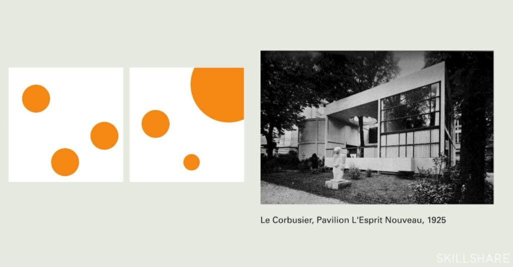
The principle of balance is about distributing the visual weight of elements within a design to create a sense of equilibrium. Think of visual weight as the "heaviness" of a design element—a large, dark or complex element has more visual weight than a small, light-colored or simple one. Balance helps a design feel stable and organized, whether it’s symmetrical or not.
Instructor Insight:
Graphic Design Basics: Core Principles for Visual Design
“Symmetrical layouts are inherently stable and balanced and that's why designers, for centuries, have gravitated towards centered layouts,” says teacher Ellen Lupton.
But at the same time, “nature is full of asymmetry. A mountain has balance even though its volumes are irregular,” as co-teacher Jennifer Cole Phillips points out. And in design, balanced asymmetry is possible too.
Real-world examples:
- Apple logo: This logo is a classic example of asymmetrical balance. Its circular shape is visually heavy, and the "bite" taken out of the right side is balanced by the leaf on the top.
- Nike logo: In Nike’s asymmetrical logo, the forward-leaning shape creates a sense of movement and speed.
- Audi logo: With its four interlocking rings, the Audi logo is a powerful example of symmetrical balance.
How to improve balance in your designs:
- Use the rule of thirds: To implement the rule of thirds, imagine your design is divided into thirds by two horizontal and two vertical lines. Placing key elements or focal points at the intersections of these lines—or along the lines themselves—will create a more balanced composition.
- Leverage negative space: Don't underestimate the power of negative space (more on that later). It acts as a counterweight to your design elements, preventing your layout from feeling cluttered.
- Think like a scale: When arranging elements, mentally picture them on a seesaw. If one side feels too heavy, consider adding visual weight to the other side to balance it out.
2. Contrast
Contrast is all about using opposing elements to create visual distinction and interest. It's how we differentiate between elements on a page, making certain parts stand out and guiding the viewer's eye. Contrast can be applied to different aspects of a design, from light and dark values to colors, sizes and styles.
Real-world examples:
- Coca-Cola logo: The classic Coca-Cola logo’s bright white script stands out dramatically against its rich red background.
- Adidas logos: Both the three-stripe and trefoil Adidas logos use contrasting colors and crisp lines to make an impact.
- The New York Times’ title: This publication's masthead uses strong typographic contrast. The large, ornate typeface and font of "The New York Times" contrast with the simple, clean sans-serif fonts used for headlines and body text on the page.
How to improve contrast in your designs:
- Use the color wheel: When choosing a color palette, look for colors that are opposite each other on the color wheel (in other words, complementary colors) to create a striking effect.
- Vary size and scale: Try making essential elements in your design significantly larger or smaller than the surrounding elements. For instance, a big, bold button will stand out against smaller text.
- Mix and match fonts: Experiment with combining fonts, like a bold, sans-serif heading with a thin, elegant serif body font.
3. Emphasis
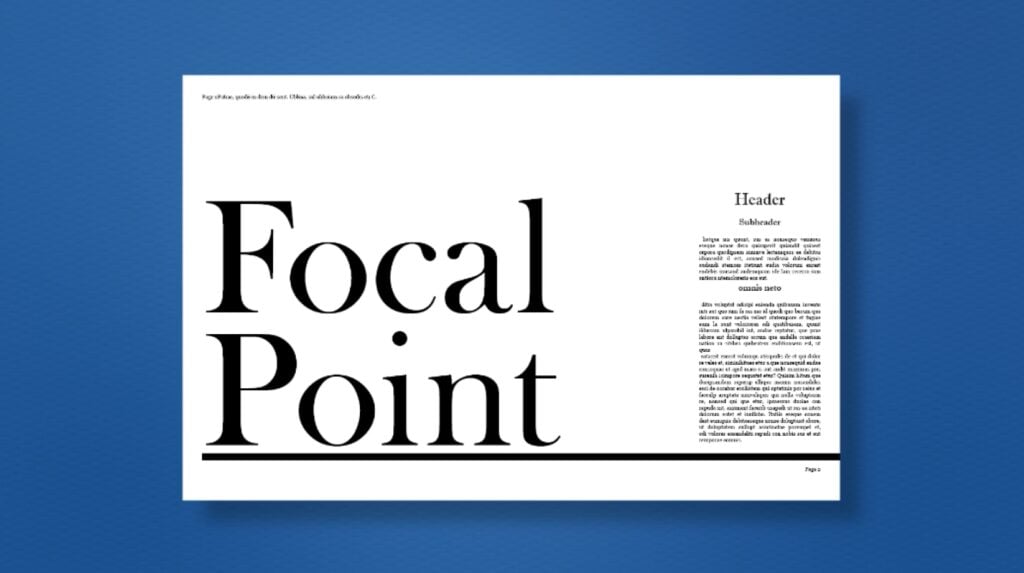
The principle of emphasis is the creation of a focal point—an area or element that immediately draws the viewer's eye and stands out from the rest of the design. Think of it in terms of interior design: When you walk into a well-designed room, a beautiful fireplace, painting or chandelier can act as a focal point and take center stage. Likewise, in graphic design, a focal point ensures that your audience understands what's most important at a glance.
Instructor Insight:
Practical Graphic Design: Craft Beautiful Documents with Adobe InDesign
“Your focal point could be as simple as an eye-catching image, a large form of simple typography or a bold graphic that makes a statement,” says Top Teacher Kyle Aaron Parson.
But “without a visual focal point, your design may fall flat and can be easily missed and quite forgettable.”
Real-world examples:
- Retail ads: In ads for sales, the word "SALE" or the percentage off (e.g., "50% OFF!") will almost always be significantly larger, bolder or a different color than the rest of the text.
- Website landing pages: The "call to action" (CTA) button on a website's landing page (such as the “Sign Up Now” or “Buy Now” button) is often a contrasting color, larger size and prominently placed.
- Movie posters: These posters typically emphasize the main character or a key scene through size, lighting and placement. The hero of the film will typically be the largest figure on the poster, with a striking expression or pose to grab the audience's attention.
How to add emphasis to your designs:
- Manipulate size and scale: Make the most critical element larger than the others. A big, bold headline will stand out from the body text, and a large image will dominate a page.
- Use contrast: Employ a high-contrast color, texture or shape to make an element pop. A bright red button on a gray background will instantly become the focal point.
- Strategic placement: The placement of an element can create emphasis; centering an object or placing it in an unexpected location can draw the eye.
4. Hierarchy
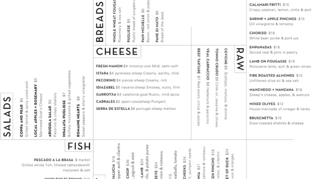
Hierarchy in graphic design refers to the arrangement of design elements to convey their order of importance. It guides the viewer's eye through a composition, ensuring they see the most critical information first and can easily navigate the rest of the content. Hierarchy is also a prime example of affordance, a critical aspect of design that guides user behavior—in this case, by silently indicating to users which words they should read first.
Real-world examples:
- Newspaper layout: A newspaper is a masterclass in visual hierarchy. The main headline is the largest to grab your attention, and the subheadings are a smaller size and different weight, while the body text is the smallest and lightest.
- Book covers: On most book covers, the title is the most prominent element, followed by the author's name and possibly a tagline.
- Website navigation: On many websites, the main navigation links (e.g., “Home,” “About Us,” “Services”) are clearly visible at the top of the page.
How to improve your designs’ hierarchy:
- Vary font size and weight: Make your headlines and titles significantly larger and bolder than your body text, and use subheadings that are somewhere in between.
- Employ contrast and color: Use a contrasting color to highlight essential elements, such as a CTA button or crucial word.
- Establish a reading order: Use a logical arrangement to guide the eye. For example, if your target audience reads from left to right and top to bottom, place the most critical information at the top or in the upper-left corner.
5. Proportion and Scale
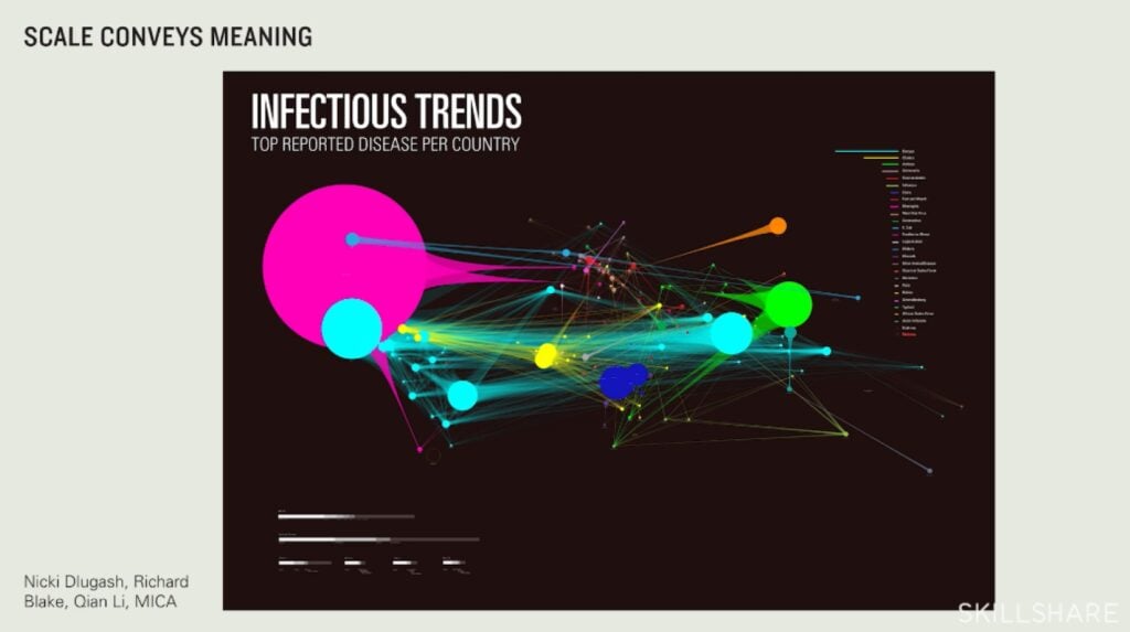
This principle refers to the relative size and visual weight of different elements within a design. Scale is the size of an object in relation to other objects in the design, while proportion is the relationship between the parts of a single object or a group of objects. By manipulating these two concepts, you can create a sense of harmony, establish a clear focal point and guide the viewer's eye.
Real-world examples:
- Car advertisements: Car ads often use scale to make the vehicle appear larger and more imposing. By placing the car closer to the camera and using a wide-angle lens, photographers can emphasize its size and power.
- The Pepsi Logo: With its red, white and blue sections, the Pepsi logo adheres to a specific proportion that is both visually pleasing and easily recognizable.
- Website layouts: The size of a website’s hero image or banner is an example of scale in layout design. A large, high-resolution image at the top of a page commands attention and sets the tone.
How to incorporate proportion and scale in your designs:
- Establish a visual hierarchy: Use scale to make the most important elements of your design stand out.
- Use the golden ratio: Consider using the Golden Ratio (1:1.618) to determine the dimensions of your design elements. For instance, if you have a main content area, you could create a sidebar or secondary element that is approximately 62% of its size.
- Embrace variety: Avoid making all elements the same size; instead, use a variety of sizes and shapes to create a more interesting composition.
6. Alignment

Alignment is the principle of arranging design elements so their edges line up along a straight edge. This creates a clean, organized look and establishes a tangible visual connection between elements. Conversely, a deliberate break from strong alignment can be used to draw attention to a particular element.
Instructor Insight:
Things Organised Neatly: Design Principles & Simple Vectors in Illustrator
“Alignment allows our eyes to see order, and we, as humans, love order,” explains teacher Sarah Parkinson-Howe. It’s “basically just lining things up.”
Real-world examples:
- Magazine and newspaper layouts: These are perfect examples of strong alignment. Text and images are arranged in neat columns and rows for optimal readability.
- Apple's user interfaces: The icons on a Mac or iPhone are aligned in a strict grid. This simple, consistent alignment makes the interface feel cleaner and easier to use.
- Business cards: A well-designed business card often uses alignment to organize contact information in a tidy manner.
How to improve your designs’ alignment:
- Use a grid: Start your designs with a grid to help you place elements and ensure they are consistently aligned.
- Align text and graphics: Make sure your text aligns with the images or shapes around it. For instance, if you have a caption under a photo, align the two together.
- Break the rules intentionally: While alignment is crucial, don't be afraid to break it for a specific purpose. For example, you could misalign a single element to draw more attention to it.
7. Repetition
Repetition involves the consistent use of the same or similar design elements throughout a work. It’s a powerful tool that helps unify a design, creating a sense of consistency, rhythm and cohesion. Repetition also plays a crucial role in building brand recognition, since a consistent visual identity can become familiar and memorable to an audience.
Real-world examples:
- Google app logos: Google’s redesign of its app logos is a prime example of repetition. All the logos (e.g., Drive, Gmail, Maps) use a consistent four-color palette and a similar rounded shape.
- Target ads: Target consistently uses its logo’s bullseye motif in its advertising and in-store signage. This repeated visual element makes their ads instantly recognizable and builds brand awareness.
- Websites: Most professional websites repeat elements like their primary navigation bar, brand logo and footer across every page. This consistent repetition ensures the user always knows where they are.
How to add repetition to your designs:
- Repeat visual cues: Use the same visual cues for the same type of information. For example, make all your headlines the same font and size, or use the same icon style for every button on a website.
- Build a pattern: Repetition can be used to create patterns and textures, such as in surface pattern design. By repeating a simple shape or element, you can create a background or subtle design that adds visual interest.
- Keep it varied: Don't be afraid to vary the size, color or placement of a repeated element to create emphasis or a sense of movement.
8. Negative Space
Also known as white space, negative space refers to the empty area surrounding and between the elements in a design. Rather than being wasted space, it's a crucial design component that allows your composition to breathe while highlighting important elements.
Instructor Insight:
The Basic Principles Of Graphic Design
“White space acts as a divider between design elements and helps us find relevant information,” says teacher Tamari Chabukiani. “Cluttered design can be highly distracting and confusing for the viewer. Just as it's hard to find an object in a cluttered room, in a cluttered design it's hard to find the information you're looking for.”
Real-world examples:
- FedEx logo: The FedEx logo is famous for its clever use of negative space. The arrow hidden between the "E" and the "x" forms an arrow, which reinforces the idea of speed and forward movement.
- NBC logo: This TV network’s logo uses the white space between the colorful teardrop shapes to form the outline of a peacock.
- WWF logo: The World Wildlife Fund logo uses the negative space within black shapes to form the iconic panda.
How to use negative space in your designs:
- Don’t be afraid of emptiness: Leaving room around your elements gives them space to "breathe" and helps them stand out.
- Group related elements: Use negative space to visually group related items together and separate them from unrelated ones.
- Create a focal point: A generous amount of negative space can frame a key element and draw the viewer's eye directly to it.
9. Movement
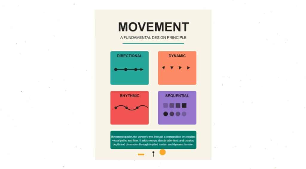
The principle of movement refers to the way a designer guides the viewer's eye through a composition; It's the path the eye follows when scanning a design. In a still image, a sense of motion can be created using lines, shapes and patterns that suggest direction and speed. And in animated GIFs or short videos, actual movement can grab viewers’ attention in a snap.
Real-world examples:
- Nike logo: The iconic Nike "swoosh" is a powerful example of implied movement. The curved, diagonal shape suggests speed, fluidity and motion.
- Godiva logo: The Godiva logo features a figure of a woman on horseback, with the woman’s hair and the horse’s tail streaming behind them to suggest movement.
- Google Doodle: Google’s playful Doodles are often animated to celebrate holidays or historic events.
How to incorporate movement in your designs:
- Use diagonal lines and curves: Diagonal line patterns and curves create a sense of energy and motion, contrasting with the stability of horizontal and vertical lines.
- Create a visual flow: Arrange elements in a way that naturally leads the viewer's eye from one point to the next.
- Incorporate animation: For digital designs, try using subtle animations or GIFs to draw attention to key elements.
10. Unity and Harmony
Finally (and most importantly) is the principle of unity. It's the culmination of all the other principles working together to create a single, cohesive and visually harmonious design. In a nutshell, unity ensures that every element in a design feels like it belongs and serves a purpose.
Real-world examples:
- Coca-Cola’s brand identity: Every element of Coca-Cola’s branding, from its signature red and white color scheme to its unique script font and bottle shape, reinforces themes of nostalgia, joy and refreshment.
- Apple's ecosystem: Apple's products and marketing materials use a consistent aesthetic of clean lines, minimal design and a limited color palette. This ensures that everything feels like part of a seamless, unified ecosystem.
- Spotify’s user interface: The Spotify app uses a unified design with a dark theme and a vibrant green accent color. This simple and consistent visual style provides a clear hierarchy, creating a harmonious user experience across devices.
How to improve your designs’ unity:
- Create a style guide: This is the most effective way to ensure unity. Define your color palette, typography, image style and other key elements and stick to them.
- Repeat elements: Use repetition of colors, themes or font styles to create a visual rhythm and connect different parts of your design.
- Check for cohesion: After creating a design, step back and examine it as a whole. Do all the elements seem to belong together? If not, adjust accordingly.
From Principles to Practice
Design principles are the foundation upon which all great designs are built. By understanding and applying concepts like balance, contrast, hierarchy and unity, you can move beyond simply arranging elements on a page and start creating work that’s intentional, beautiful and effective.
Ultimately, mastering these principles will not only improve the quality of your designs, but also change the way you see the world. You’ll begin to notice color and alignment in everyday logos, the balance in architectural photos and the clear hierarchy of a well-designed menu. By training your eye to see the principles in action all around you, you can continuously refine your skills and grow as a designer. Begin by applying them to your next project, and watch as your work transforms.
Related Reading
Carrie Buchholz
Carrie Buchholz is a freelance writer who lives in Northern Colorado with her husband and dog.
Try Skillshare for free! Sign up for a 7 day free trial today!
Get Started- Unlimited access to every class
- Supportive online creative community
- Learn offline with Skillshare's app


