

Affordance: The Silent Signal That Divides Art and Design
Some things beg to be pushed. Others just want to be seen.


As we move through the world, we’re often guided by signals we rarely stop to notice—handles that ask to be pulled, buttons that beg to be pressed and spaces that silently shape our behavior. These cues are all examples of affordance: the visual and spatial hints that suggest how an object, interface, or environment is meant to be used. But beyond its practical utility, affordance also offers a powerful lens for rethinking how we engage with visual culture.
What if affordance could help us draw a line—however blurry—between art and design? While design typically relies on clear, intuitive cues to guide user behavior, art often operates in ambiguity, withholding or distorting those same cues to prompt reflection or subvert expectation. Ahead, we’ll explore how affordance functions not just as a tool for usability, but as a framework for interpretation that can help us see the everyday and the extraordinary with new eyes. From museum galleries to mobile apps, and from Norman doors to conceptual installations, we’ll look at how affordance reveals the difference between what’s meant to be used and what’s meant to be seen.
What Is Affordance, Anyway?

Affordance refers to the qualities or features of an object, environment or interface that suggest how it can be used through visual and tactile cues. It’s the silent language of design, and serves to shape our behavior without a single word. When we instinctively know to flip a light switch up and down, or tap a button on a screen, that’s affordance at work.
Origins and Evolution
The concept of affordance has its roots in psychology, but over time, it has been embraced and redefined by designers across various disciplines. Here’s how affordance has evolved over the years:
- 1960s: James J. Gibson, an ecological psychologist, first introduces the term affordance. In his book The Ecological Approach to Visual Perception, he later defined affordances as the actionable possibilities an environment offers an animal.
- In the 1980s, Don Norman, a cognitive scientist and usability expert, adapted the concept of affordance for design in his 1988 book, The Design of Everyday Things. He focused on perceived affordances—in other words, those that are visually and intuitively apparent to users. This shift made affordance a core principle in human-centered design.
- Today: In UX/UI design, affordance continues to transform, especially with the rise of touchscreens, gesture-based interactions and ever-changing design trends. UX and UI designers are constantly challenged to make digital interfaces that are easy to navigate and self-explanatory.
Visual and Spatial Signals
Affordances operate through visual and spatial cues. These cues help us instinctively understand what something wants us to do. For example:
- Shape and contour can indicate grip or placement. For instance, a mug handle that invites you to hold it.
- Color and contrast can suggest hierarchy or interactivity. For example, a brightly colored button stands out more than neutral-colored ones.
- Placement and orientation can guide movement. Think about how a bench facing a path suggests sitting and watching.
- Texture or material can signal use or avoidance. Case in point, a soft cushion versus a hard metal surface.
These signals often operate beneath conscious awareness. Instead of being intentionally noticed, they’re design’s way of speaking directly to our instincts.
Everyday Examples of Affordance in Action
Affordances are everywhere, quietly directing our attention and shaping how we move, click, grab, swipe and explore, whether we’re physically moving through space or simply navigating our smartphones.
For example:

Understanding these affordances and how they work isn’t just useful for designers, though. It’s key to understanding how we engage with the designs all around us and identifying when they do (and don’t) work.
How Affordance Differentiates Art from Design

One of the most compelling ways to distinguish art from design is through the presence—or intentional absence—of affordance.
After all, design is functional at its core. It seeks to be used, navigated, touched or understood in a specific way. If it’s visually appealing, that’s great, but it’s not strictly necessary.
Art, on the other hand, often asks viewers to pause, reflect and interpret without offering clear paths for interaction. In this way, affordance becomes a subtle but powerful differentiator between the two.
Design: The Invitation to Act
Great designs are fluent in the language of affordance. They tell us how to interact with them, ideally without us even realizing we’re being guided.
Here are some prime examples:
- Smartphone interfaces: Buttons that glow, bounce or respond to touch provide visual feedback (and sometimes even haptic feedback) and invite physical interaction, even on a flat glass screen.
- Armchairs: With their plush seats, high backs and cushioned armrests, these chairs signal that they’re made to be lounged in for extended periods.
- Kitchen tools: A ladle’s shape and size indicates that it’s meant for moving large amounts of liquid, while a knife’s sharp edge clearly communicates that it’s meant for cutting.
These objects are easy to use and interact with not just because we’re accustomed to them, but also because they clearly convey the type of action they “want” users to perform.
The Norman Door: When Affordance Fails
Coined by the researcher, author and professor Don Norman, the term “Norman door” describes a design failure you’re likely already familiar with: doors that look like they should be pushed but actually need to be pulled, or vice versa. These moments break trust between the object and its user, and also highlight just how much we rely on visual and spatial cues to guide us.
Norman doors are more than merely frustrating (though they certainly are that); they also expose a gap where affordance should have been. In doing so, they highlight the crucial role affordance plays in successful design.
Art: The Question of Interaction
By contrast, art often suspends affordance or even denies it entirely. For instance, it may appear usable, but it should be resisted. Or it may suggest interaction, only to subvert it. Alternatively, it may offer no functional cues at all and simply ask to be observed or questioned.
- Duchamp’s Fountain: A urinal removed from its context and displayed as art confuses affordance. Is it meant to be used, looked at or both? Is it even a serious piece of art? The affordance of the object clashes with its new role as a sculpture.
- Donald Judd’s minimalist sculptures: Large, boxy and industrial, these works resemble shelving and storage boxes, but aren’t intended to be used as such. They resist use despite their appearance, and exist purely to be looked at.
- Yayoi Kusama’s Infinity Mirror Rooms: These Instagram-famous installations consist of mirrored rooms filled with lights. They’re immersive and sensory-rich, but the interaction is highly controlled. Guests are allowed to look, walk, and take photos, but not sit, lie down, or touch.
Design Wants Action; Art Creates Friction
In this light, affordance becomes more than a usability concept and transforms into a philosophical tool. Where design leans into affordance to guide behavior, art often resists it, and challenges us to confront our assumptions about what an object should do. Where design simplifies, art complicates. Where design answers questions, art creates them.
That’s not to say one is better than the other, though—art and design just serve very different purposes (or at least they typically do). Affordance is simply a tool that can help us recognize whether we’re looking at a designed product or a work of art, and how to proceed from there.
Intent vs. Perception

Affordance lives in the tension between what a creator intends and what an audience perceives. This relationship, whether it’s harmonious or strained, complicates the boundary between art and design.
The Designer’s Intent: Clarity, Usability, Purpose
In design, intent is often easy to read, especially if we’re looking for it. That’s because designers create with function in mind, and aim to guide the user toward a specific outcome. Ideally, affordance serves as a bridge between the object and the user, and makes the intended action feel natural or even inevitable.
For example:
- A handle implies pulling.
- A plus sign in an app suggests adding something.
- A hollow button with a subtle drop shadow invites a tap.
In the world of design, success occurs when the user’s perception aligns with the creator’s intent.
The Artist’s Intent: Ambiguity, Provocation, Discovery
In art, intent can be far more open-ended, or even intentionally hidden. An artist might use the appearance of affordance to provoke curiosity or unsettle assumptions, without offering a clear or consistent path to interaction.
For instance:
- A sculpture that looks like a stool but is too fragile to sit on.
- A painting embedded with objects that seem touchable but aren't.
- A video installation with no clear "start" or "end" point.
Here, the gap between intent and perception isn’t a flaw, but is the point of the artistic work. In this way, misalignment becomes a form of expression, not a failure of design.
When Perception Overrides Intent
Despite a creator’s best efforts, perception can take unexpected turns. Think of a user who misinterprets a website’s button as being decorative rather than clickable, or a museum-goer who mistakes a utilitarian-looking sculpture for a piece of furniture.
These moments reveal just how subjective affordance can be, and how powerful our own mental preconceptions are in shaping what we think things are intended for.
This is especially important in a world where visual cues are layered with cultural context, personal experience and evolving norms. What “looks intuitive” to one person might be confusing or even misleading to another, especially if those people are from different countries or generations.
Affordance May Be a Shared Language, But It’s Not a Universal One
Ultimately, affordance sits at the crossroads of creator and viewer. It offers a visual and spatial language, but not everyone is fluent. The designer hopes to be understood, and the artist might hope to be questioned. Both rely on perception, but they each have very different expectations, and might achieve varying degrees of success.
Recognizing this tension helps us better appreciate not just how things are made, but how they’re received. It also opens up space for experimentation, especially by those who deliberately operate in the liminal zone between design and art.
Artists Who Blur the Lines
Some of the most compelling creative work exists in the gray area between art and design. There, affordance is not simply followed or denied, but manipulated. These artists and designers intentionally play with our expectations, and excel at crafting moments that confuse, delight or challenge our instincts about how we’re supposed to interact with an object or space.
By bending or breaking the visual cues we rely on, they force us to pause and reconsider what we think we know about use, function and meaning.
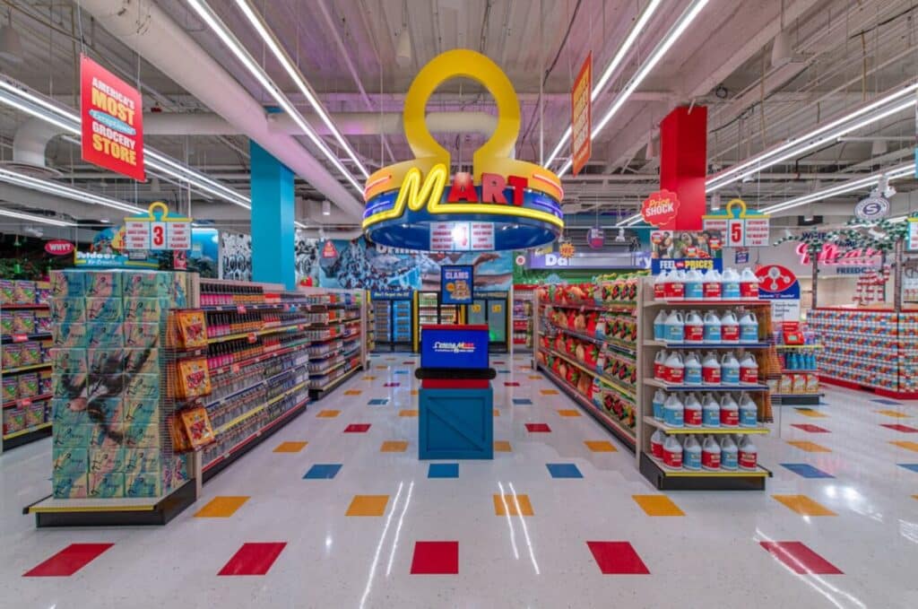
Meow Wolf’s Omega Mart: An Immersive World That Begs to Be Explored
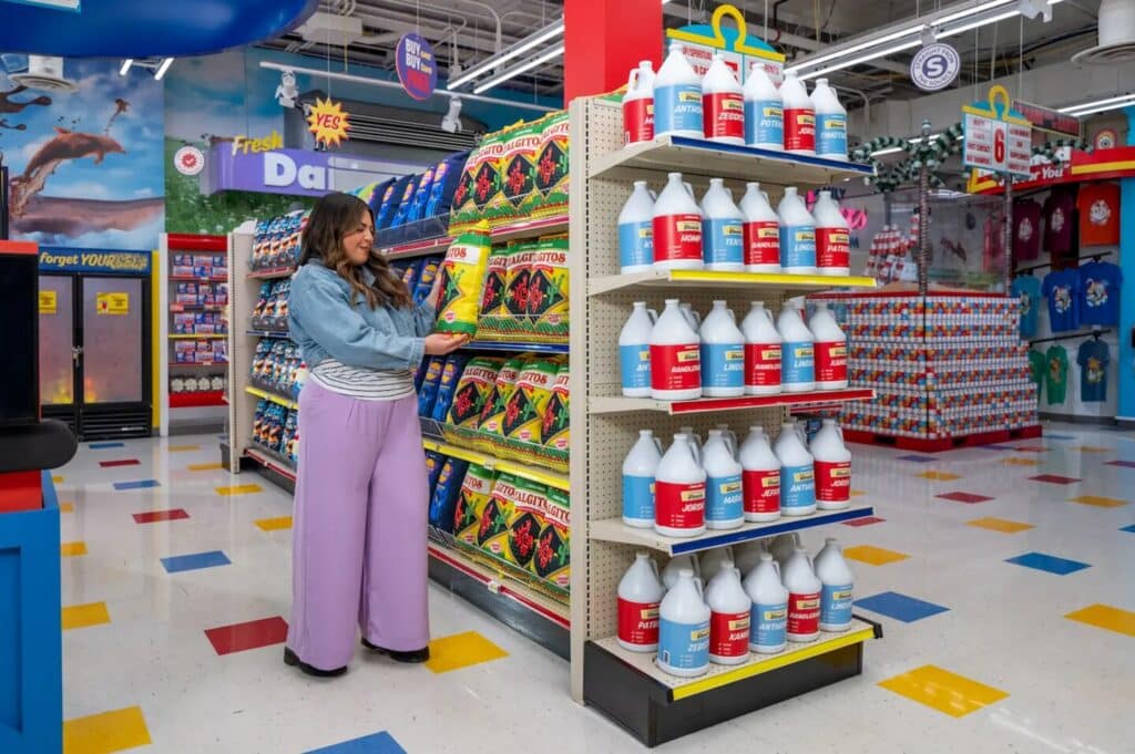
Meow Wolf’s Omega Mart in Las Vegas is a surreal supermarket-turned-art installation where every product, shelf and freezer door hides a deeper narrative. At first glance, the space affords familiarity—aisles, signage and checkout lanes—but those cues quickly dissolve into something surreal. A door marked as a janitor’s closet might open to a room filled with giant mushrooms; a winding hallway lined with soda bottles could lead to a paranormal-themed gas station.
Affordance here is layered: the environment encourages interaction and welcomes touching, but it also misleads and subverts, turning passive viewers into active explorers. Meow Wolf’s work blurs not only the line between art and design, but also between fiction and reality. In this art installation, affordance is used as both an invitation and an illusion.
Joris Laarman: Furniture As Nature (Might Have) Designed It
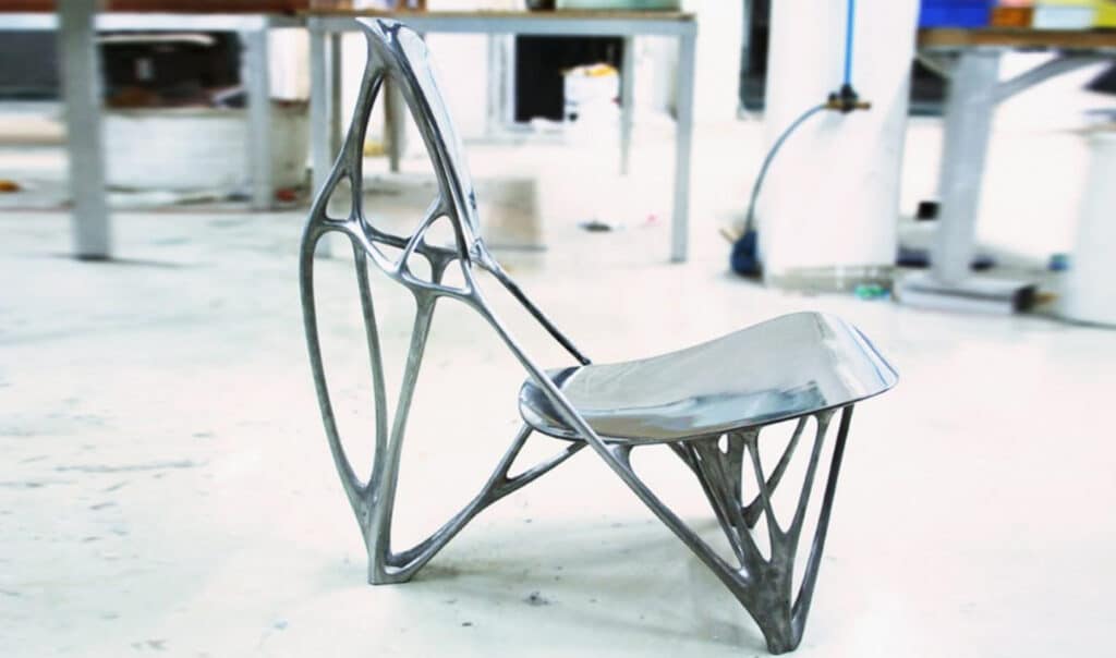
Designer Joris Laarman creates algorithmically generated furniture that looks simultaneously functional and alien. His Bone Chair, designed using principles that mimic the behavior of real bones, suggests ergonomic seating—but its organic curves and sculptural presence also resist easy use. Is it meant to be sat in or simply admired? The affordance is present but complicated, and actively invites second guesses.
Jeppe Hein: Interactive Art That Pushes Back
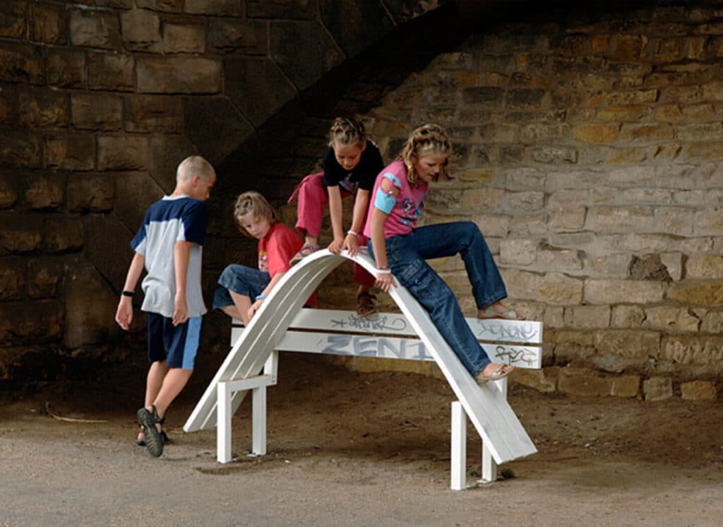
Artist Jeppe Hein creates whimsical installations that invite play. In them, mirrors create winding labyrinths, and lampposts curl and twist as if they were made of string. Perhaps his most famous works, Hein’s Modified Social Benches look like standard public seating at first glance, but twist, bend or tilt in ways that make sitting a creative act.
Perhaps most importantly, viewers are permitted to use the benches, but may find it difficult (or even fun) to do so. In that way, Hein invites interaction but subverts comfort, and gleefully toys with the line between function and absurdity.
Erwin Wurm: Sculptures You Can Become
Artist Erwin Wurm’s One Minute Sculptures invite gallery-goers to physically interact with his works by awkwardly touching (but not properly using) furniture, balancing fresh fruit or standing under a comically oversized hat.
Here, affordance is reimagined as performance, and members of the public are given the opportunity to become a sculpture for a few moments. In these sculptures, objects afford action, but only in strange, nonsensical ways.
A Practical Guide to Reading Affordance in Everyday Life

Once you start noticing affordance, you can't unsee it. It’s simply everywhere, from the shape of a coffee cup, to the layout of a crosswalk, to the placement of a museum object label. It quietly shapes our behavior, often without us realizing it.
Now, you can try looking at the world through a new lens by considering not just what things are, but what they seem to be asking of you. Are they inviting touch? Demanding movement? Denying access? Or simply presenting themselves to be looked at and considered?
Start by asking yourself one simple question: “What is this object asking me to do, and why?”
By doing so, you’ll reframe the world around you as a visual conversation. Here’s how to apply it across different environments:
At Home: Functional Familiarity
Look around your kitchen or living room. Notice how certain handles, knobs and textures practically explain their use:
- A soft cushion asks you to sit or lean.
- A drawer pull invites your fingers.
- A handle signals holding.
Now consider whether anything is confusing, and notice if there are any objects that resist your expectations. Those moments could signal a breakdown, or possibly an intentional absence, of affordance.
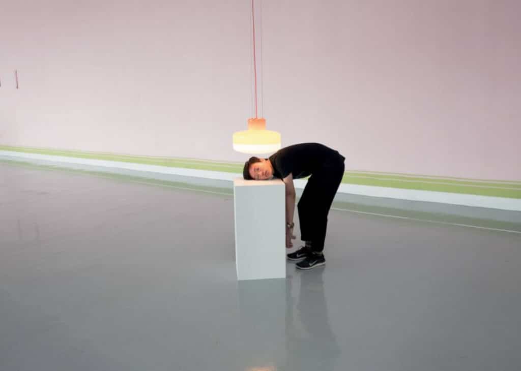
In Museums and Galleries: Observation or Action?
When viewing artwork, affordance often shifts:
- A chair might look usable, but if it’s placed on a pedestal, you’ll know not to sit on it.
- A video installation may include cushioned seating that invites you to sit down and watch for a while.
- A rotary phone might invite you to pick it up, only to play a recording once you do so instead of letting you dial any numbers.
The next time you’re at a museum or art installation, ask yourself: What feels instinctive? What feels forbidden? What might happen if I interacted with this differently?
In Digital Interfaces: Touch, Swipe, Tap
Affordance can make or break digital design. The best user interfaces guide without needing instruction. In an ideal world:
- Buttons should look clickable.
- Scrollable areas should feel open-ended.
- Icons should suggest their function (a trash can, a plus sign, a gear).
But as skeuomorphism has given way to minimalism, many interfaces have become more difficult to use after being stripped of their real-world references.
If you ever feel lost in an app or website, try to determine what affordances are missing.
In Public Spaces: Navigating the Built World
Urban design is full of subtle (and not-so-subtle) cues:
- A bench without a backrest discourages lingering.
- A fence or barrier denies movement.
- A ramp invites wheelchairs, strollers and walkers
Many public spaces can be “read” this way; think architecture that funnels your movement, or signage that catches your eye upon entering a room.
Use Affordance as a Creative Tool
Understanding affordance isn’t just about noticing what works or doesn’t in the world around you—it’s about unlocking a powerful creative strategy. Whether you’re designing a product, crafting an interface, building an installation, or creating conceptual art, affordance gives you a lever to shape the experience.
You can use it to guide, confuse, invite, resist, surprise or delight. The choice is yours.
- If you’re a designer: Affordance is your shorthand for clarity. A well-placed cue, whether visual, spatial or tactile, can make your work feel intuitive, elegant and even invisible.
- If you’re an artist: Affordance is your tool for tension. By playing with or subverting expected cues, you can invite the viewer to feel the boundary between function and fiction.
- If you’re a creative of any kind: Affordance offers a new vocabulary that’s instinctual and powerful. It allows you to communicate without words, to direct attention and behavior through form alone.
And no matter what you’re creating, the question isn’t just “What should this look like?” It’s also, “What should this ask someone to do?”
Related Reading
Carrie Buchholz
Carrie Buchholz is a freelance writer who lives in Northern Colorado with her husband and dog.
Try Skillshare for free! Sign up for a 7 day free trial today!
Get Started- Unlimited access to every class
- Supportive online creative community
- Learn offline with Skillshare's app


