

Layout Design: Everything You Should Know
Want to take your designs from good to great? Unlock the secrets of effective layout design by exploring key elements, core principles and expert tips.


Layout design is a fundamental aspect of graphic design, with a profound impact on how information is presented to an audience. A well-crafted layout can captivate, inform, and engage viewers, while a poorly designed one may leave them confused, frustrated and disinterested.
Here, we'll explore the key elements, core principles, and essential tips for mastering layout design, and shed some light on the importance of this sometimes overlooked art form in the world of graphic design.
The Basics of Layout Design
Layout design is the art of arranging visual elements on a page or screen in an aesthetically pleasing and effective manner to convey a message or tell a story. It encompasses the organization of text, images, shapes, lines, and white space to create a cohesive and visually appealing composition.
Whether it's used to create a magazine spread, a website, a poster, or a social media graphic, layout design plays a pivotal role in ensuring that the content is not only visually pleasing but also easy for readers to understand.
Key Elements of Layout Design
Effective layout design relies on several key elements that work in harmony to create a compelling visual narrative.
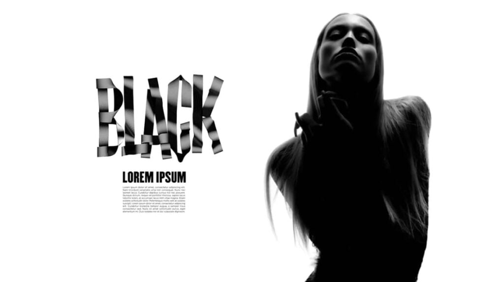
1. Text Elements
Text is a fundamental component of any design, and how it's presented can significantly impact the overall aesthetic and effectiveness of a layout. Text elements include:
- Fonts: Certain fonts can evoke different emotions and set the tone for your layout design. For example, a serif font such as Times New Roman can convey a sense of tradition and formality, while a sans-serif font such as Helvetica might suggest modernity and simplicity.
- Typography: Typography encompasses various aspects like kerning (adjusting the spacing between characters), tracking (adjusting the spacing between groups of characters) and leading (adjusting the spacing between lines of text). Proper typography ensures legibility and readability.
- Size: Text size determines hierarchy and emphasis. Larger text often signifies headings or important information, while smaller text is typically used for body content.
- Line and letter spacing: Proper line spacing (traditionally referred to as leading) and letter spacing are essential for readability. Well-spaced lines and characters make text easier to read and more aesthetically pleasing.
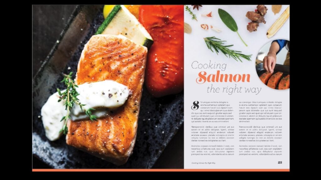
2. Images
Images are a potent tool in layout design, adding visual interest and helping to convey messages effectively. The placement, size, and selection of images are critical for creating a balanced and appealing composition.
Images contribute to layout design through:
- Visual impact: Images have the power to capture attention and engage the viewer. Whether it's a photograph, illustration or graphic, the choice of visuals should align with the design's purpose and message.
- Size and placement: The size and positioning of images in a layout impact the overall visual balance of the page. Larger images may be used as focal points, while smaller ones can complement text or other design elements.
- Consistency: Consistency in image style, such as using a similar filter or color treatment, can tie a layout together and reinforce the layout’s overarching theme.
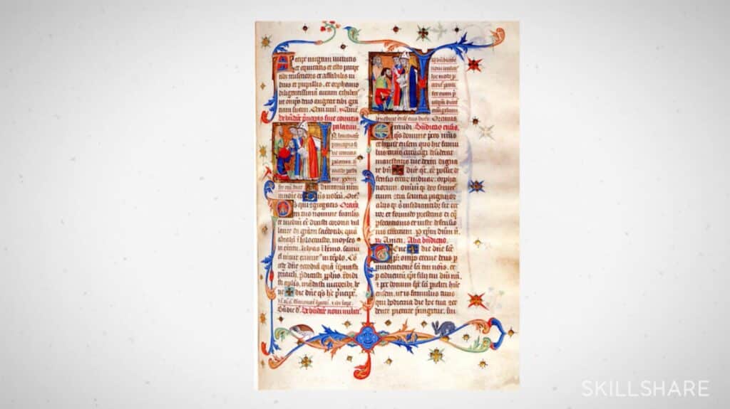
3. Shapes
Shapes serve to create structure and emphasis within a layout. They can be both functional and decorative. Specifically, they add:
- Structure: Geometric shapes can be used to create a grid or framework for the layout, thus organizing content in a visually pleasing (but still functional) manner.
- Emphasis: Irregular or custom shapes can draw attention to specific elements or areas of the design. They can also be used to highlight key information or create visual interest.
- Unity and cohesion: Repeating shapes or patterns can create a sense of unity and cohesion in a design. This helps tie different elements together and give the layout a more harmonious feel.
4. Lines
Lines are endlessly versatile design elements that can serve various purposes in a layout:
- Guidance: Lines can be used to guide the viewer's eye through the design. They can direct attention to focal points, or separate content into logical sections.
- Division: Lines can act as dividers, helping to distinguish different parts of a layout such as columns of text or groups image.
- Flow control: Curved and diagonal lines can suggest movement and dynamism, influencing the flow of information and even conveying a particular mood.
5. White Space
White space, often referred to as negative space, is the area around and between design elements. It plays a crucial role in layout design:
- Visual breathing room: White space provides room for the eyes to rest and prevents the layout from feeling cluttered or claustrophobic.
- Clarity: Adequate white space ensures that elements are not overcrowded, making the content more comprehensible. It can also help to separate different pieces of information, reducing confusion for the reader.
- Highlighting key content: White space can be strategically used to draw attention to key content like headings or calls-to-action (CTAs).
Core Principles of Layout Design
To create effective layout designs, graphic designers follow a set of fundamental principles. These include:
1. Alignment
Alignment ensures that design elements are arranged in a consistent and orderly manner. It creates a sense of structure and helps make the design more visually appealing.
2. Balance
Balance is the distribution of visual weight within a layout. Achieving balance ensures that no single element dominates the design, promoting harmony and equilibrium.
3. Hierarchy
Hierarchy establishes the order of importance within a design. It guides the viewer's attention to the most important content first and helps convey the intended message effectively.
4. Proximity
Proximity emphasizes the relationships between elements by placing related items close to each other. This creates a sense of cohesion and helps the viewer make connections between different types or sections of content.
5. Contrast
Contrast involves using differences in color, size, shape, or style to make specific elements stand out. It adds visual interest and can be used to highlight important information.
6. Repetition
Repetition involves the consistent use of design elements throughout a layout, which helps to create unity and reinforce the overall theme.
Essential Tips for Mastering Layout Design

To excel in layout design and boost your graphic design skills, consider these essential tips:
- Start with an inspiration collage to gather design ideas: Collect visuals, colors, and fonts that resonate with your project to kickstart your creative process. (Hint: Apps like Notion can be ideal for organizing your ideas.)
- Align your design with the content and target audience: Ensure your layout matches the message and appeals to the intended viewers.
- Use templates and grids to structure your layout effectively: These tools provide a framework for a well-organized design.
- Create attention-grabbing contrast with color, typography, shape, and balance: Contrast draws the viewer's attention and adds visual interest.
- Select typefaces that match brand identity and pair fonts for cohesion: Consistency in typography is essential for brand recognition.
- Utilize white space to enhance visual interest and avoid overcrowding: White space gives your design room to breathe and improves readability.
- Be open to experimenting with design rules for fresh and innovative layouts: Sometimes, breaking the rules can lead to innovative and captivating designs.
The Importance of Layout Design
Layout design is nothing short of crucial in the realm of graphic design. It serves as the bridge between content and audience, determining how information is perceived and interpreted. A well-executed layout design not only enhances visual aesthetics, but also facilitates effective communication.
So whether it's for print or digital media, mastering layout design is a valuable skill that can make a world of difference in the field of graphic design.
Don’t know a layout design guru who can help you develop your skills? No problem. With Skillshare’s top-tier layout design classes, you can learn from expert designers anytime, anywhere.
Carrie Buchholz
Carrie Buchholz is a freelance writer who lives in Northern Colorado with her husband and dog.
Try Skillshare for free! Sign up for a 7 day free trial today!
Get Started- Unlimited access to every class
- Supportive online creative community
- Learn offline with Skillshare's app


