

Typography: A Letter Perfect Introduction
From the first fonts to modern calligraphy, typography has come a long way and continues to evolve. Learn more about its history, terminology and uses.


Words are all around us—they help us communicate with each other, learn new information, consume entertaining content, and even make decisions about what to buy. It's not words alone that hold all this power, though. It’s also how they’re designed and arranged. In this article, we’ll introduce you to the art of typography. If you’re looking to get into graphic design, learning about typography is one of the best places to start.
We’ll go over what typography is, why it’s important, a brief history of typography, a few basic concepts and terms you need to know, as well as how to apply this knowledge in your graphic design projects.
By the end of this guide, you’ll be well on your way to creating beautiful and effective text-based designs or maybe even designing your own typefaces.
What Is Typography?
Typography is the art of working with text. Whether it’s text in a book, magazine, website, or on a poster, someone has to select an appropriate typeface and font and arrange the text in the most eye-catching way possible.
Typography is what transforms text into a visual medium—something that serves a purpose and conveys a message. Graphic designers do this by manipulating the way text appears on the page, using different typefaces, font sizes, styles, weights, and colors.
Why Typography Is Important to Graphic Design
Typography is one of the most important components of graphic design. Most graphic design projects have some sort of text in them (and some have nothing but text), so knowing how to lay it out is a crucial skill for designers.
Imagine reading a magazine or browsing a web page where every piece of information is contained within one big block of text, and every single letter looks exactly the same. You would simply get lost or quickly lose interest.
To avoid this, designers use typography to transform simple text into a more effective vehicle for information.
Below are just a few reasons why typography is important in graphic design:
- It creates a strong visual hierarchy, so readers know exactly where to look to find the information they need.
- It presents information in a more legible, easy to follow, and visually appealing way.
- It creates a pleasant experience for the reader.
- It helps create a mood, evoke feelings, and influence the way the reader perceives the information.
- It helps establish a consistent brand identity.
Typography History
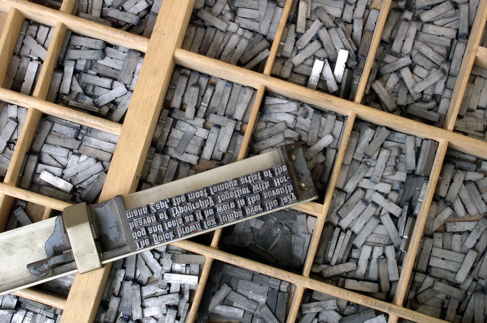
Before we knew how to mass print text, everything was handwritten. Books had to be copied by hand and, as literacy increased, this model quickly became unscalable.
The first mass printing techniques emerged in 9th century China. They involved chiseling an entire page of text onto a wooden block, applying ink, and pressing paper against it. Of course, this was still very inefficient, since a new wooden block had to be carved for every page.
By the 11th century, Chinese inventor Bi Sheng created the first movable type where each character was engraved into its own block. In order to print a page, blocks just had to be arranged in the right order. The process was later refined by Choe Yun-ui in 13th century Korea.
The concept of movable type came to Europe in the 15th century, when German inventor Johannes Gutenberg created the printing press. He crafted letters out of metal and coated them with ink to make printed pages.
Gutenberg created the first typeface to mimic handwritten calligraphy. Today, this typeface would fall under the Blackletter category (which we’ll talk about in just a moment). The first book printed using this technology and typeface was The Gutenberg Bible.
Since then, more and more typefaces were developed in the interest of saving time, money, and space on the page.
Of course, while typography originated as the process of arranging metal letters in a printing press, today it’s all about arranging text on the screen for both printed and digital applications.
Typography Basics
Before we dive into how to actually use typography in graphic design, let’s take a look at a few fundamental concepts, typeface classifications, and typography terminology.
What’s the Difference Between Typeface and Font?
What we often refer to as “fonts” are actually typefaces, and while most people use the two terms interchangeably, there is a concrete difference.
A typeface is a set of letters, numbers, and punctuation marks that share common design characteristics. For example, Arial and Helvetica are widely used typefaces.
A font, on the other hand, is a more specific set of glyphs within a typeface. These sets differ by size, weight, and style. For example, “Helvetica Regular 11 points” is a different font from “Helvetica Regular 12 points” or “Helvetica Bold 11 points”.
Typeface Classifications
Because there are thousands of typefaces in existence, they are categorized by their most distinguishing characteristics. This helps designers quickly find what they’re looking for and properly combine typefaces in their designs.
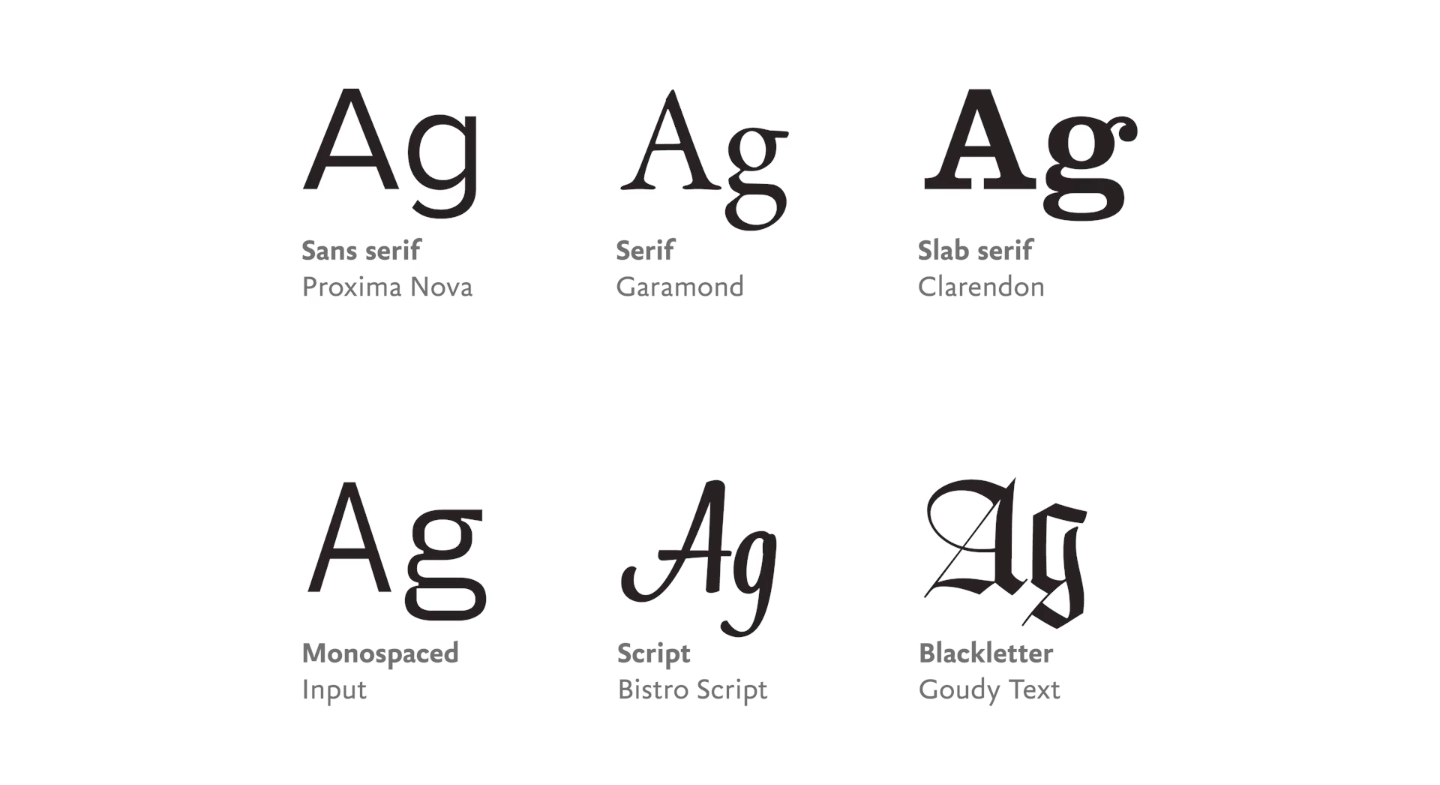
Typeface classifications aren’t standardized, so different sources will list their own variations, but the most common ones to know are Serif, Sans Serif, Blackletter, Script, Monospace, and Decorative.
These categories can be further broken down into typeface families—groups of typefaces that not only belong to the same classifications, but share many of the same design elements, historical background, style, or applications.
Serif
Serifs are small embellishments added at the ends of strokes in letters or symbols (they’re sometimes referred to as “feet” because that’s what they resemble). A serif typeface is any typeface that includes serifs. These typefaces have a formal or classic feel to them, so they’re often used in books and magazines.
Serif typefaces can be further categorized into different families, such as Humanist/Old Style, Transitional, and Modern Serif.

Sans Serif
“Sans” means without, so sans serif typefaces don’t have serifs. They have a modern, more minimalist feel and are often used in web publications because they’re easier to read on a screen.
A few examples of sans serif typeface families include Grotesque, Neo-Grotesque, Humanist, and Geometric.
Blackletter
Blackletter typefaces are reminiscent of handwritten calligraphy. They are the oldest category of typefaces and can be characterized by thick black lines and ornate designs.
Script
Script typefaces resemble handwriting and can be characterized by connected letters, fluid strokes, and intricate loops. These typefaces can be hard to read when used in large blocks of text, so they’re usually reserved for embellishing headlines and titles.
Decorative
Any specialty typefaces that don’t fall under any of the above categories are considered decorative or display typefaces. They usually have their own style and unique design elements. Like script typefaces, they work best with short titles and logotypes (logos made from letters or words).
Monospace
Another way to categorize typefaces is by the spacing of the letters. Most typefaces have proportional spacing—the space between the letters varies, depending on their width.
With monospace typefaces, the space between the letters is constant. In other words, each letter occupies the same amount of space. These typefaces were traditionally used on typewriters and are now generally used to display computer code.
Typeface Anatomy
You already know about serifs and the role they play in serif vs. sans serif typefaces. However, there are many other elements that make up letters and symbols in each typeface.
Whether you’re designing something on your own or working with another designer, knowing these typography terms and having the proper typography vocabulary will help you effectively communicate your ideas and find exactly the right typefaces for your project.
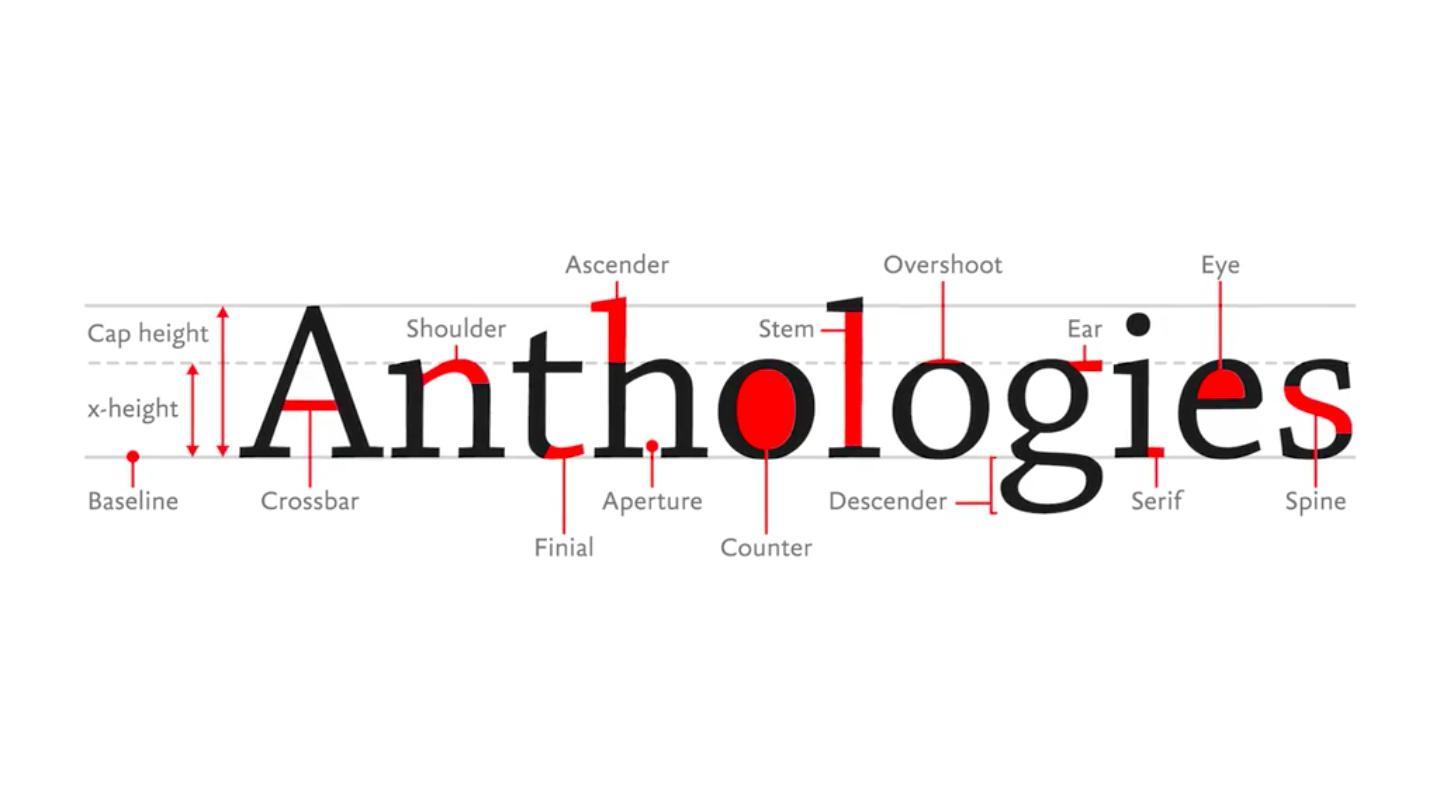
Letter Baseline
The baseline is an imaginary line on top of which most of the letters sit.
Mean Line
The mean line is an imaginary line that marks the top of most of the lower-case letters (it’s marked with a dashed line in the illustration below).
Cap Height
The cap height is an imaginary line that marks the top of the capital letters.
x-height
x-height is used to measure the distance between the baseline and the mean line. In other words, it measures how tall or short the lower case letters are.
Letter Stem
A stem is a straight vertical stroke found in any letter.
Letter Spine
Some letters, such as the letter “S”, don’t have any vertical strokes. Instead, they have what’s called a spine.
Letter Crossbar
A crossbar is a horizontal stroke, such as the line in the middle of the letter “A” or “H”.
Letter Shoulder
A shoulder is a curved stroke found on top of letters such as “n”, “m”, or “r”.
Letter Terminal
A terminal is any stroke that doesn’t end with a serif.
Letter Finial
A finial is a tapered or curved end in letters like “c” or “e”.
Ear
An ear is the small stroke that extends from the top-right corner of the letter “g” in some typefaces.
Letter Descender
A descender is any part of a letter that extends below the baseline. Letters like “p”, “y”, and “g” have descenders because they fall below the bottom of most other lowercase letters.
Letter Ascender
An ascender is any part of a letter that extends above the mean line. Letters like “t”, “k”, and “d” have ascenders because they extend above the top of most other lowercase letters.
Counter
A counter is the partially or completely enclosed area inside letters like “o”, “b”, and “p”. The enclosed area inside the letter “e” is specifically called the “eye”.
Letter Bowl
A bowl is the stroke that creates a counter.
Aperture
Aperture refers to the size of the opening in a partially enclosed counter.
Overshoot
Round or pointed letters tend to extend slightly above or below letters with a flat edge, giving them the impression of being the same height. An overshoot is the degree to which they extend beyond the baseline, mean line, or cap height.
Typography Spacing
The negative spaces in typography are just as important as the letters. In order to create an effective design that’s easy to read and pleasing to the eye, you need a good balance of both.
Below are a few important spacing terms you need to know.
Line Length
Line length is the width of a block of text, usually measured in characters per line. 55-65 characters per line is considered to be the optimal line length—anything longer than that will likely be hard to read or look too small relative to other design elements on the page.
Typography Leading
Leading is the distance between two baselines. In other words, it determines the vertical spacing between two lines of text. Optimal leading should be about the same point size as the font, though it may need to be adjusted depending on the typeface’s x-height and the size of its ascenders and descenders.
Typography Kerning
Kerning is the process of adjusting the spaces between individual characters. Most typefaces with proportional spacing don’t need to be adjusted, but there are a few circumstances, like when designing logotypes, when a slight shift in spacing can help achieve a better balance of perceived negative space between pairs of letters.
Typography Tracking
Tracking is another process that has to do with adjusting spaces between letters, but it works on all spaces simultaneously. Using tracking, you can increase or decrease the amount of space that an entire word takes up, without changing the font size.
How to Use Typography in Graphic Design
Much of graphic design revolves around choosing the right typefaces and setting them in a way that’s legible, inviting to read, and pleasing to the eye. More importantly, it’s about using typography to transform words into design elements that serve a purpose, send a message, evoke emotions, and tell a story.
How to Choose and Pair Typefaces
With thousands of typefaces to choose from, how do you select the right ones? Start by thinking about their function in your project, as well as the overall mood or personality of your design. Does it need to be ornate or minimal, loud or soft, formal or casual, classic or modern?
You’ll likely need two or three typefaces for any given project—for example, one for your heading, one for subheadings, and one for the main body of text. Avoid using more than three different typefaces, which can make your design look cluttered.
When pairing typefaces, think about how they would complement each other. For example, you can use a serif typeface for the heading and a sans serif one for the main body. This would provide just enough contrast in your design and let each section stand out.
Design Considerations
Once you’ve selected your typeface(s), there are lots of other decisions you need to make in order to create an effective design. Here are some things to consider:
Hierarchy
Text-based designs rarely have just one block of text. At the very least, you’ll have a title, but you might also have a subtitle, multiple types of headings, and other elements that need to stand out.
Organizing all these elements in a way that makes sense will make it easy for the reader to find the information they need.
To create a hierarchy, take advantage of different typefaces or fonts within one typeface—for example, some text can be bold, italic, have a larger size font, or a different color.
Be sure to choose typefaces and fonts that provide enough contrast, but also complement rather than distract from each other. Most importantly, stay consistent with your hierarchy throughout the entire project.
Color
Color is a great tool for adding an atmosphere and personality to your designs. When selecting colors for your text, pay attention to how they interact with the color of your background, colors within any photos you’re using, and other design elements.
To take full advantage of color as a tool, consider taking a class on color theory—knowing just a few basic concepts will help you create designs that serve a specific purpose and clearly convey your message.
Alignment
Your text can be left or right aligned, centered, or justified. Use a grid and guides to make sure everything—your text, images, and design elements—is lined up properly, and the distances between objects are all equal.
Negative Space
We’ve already talked about line length, leading, kerning, and tracking. In addition to making sure everything within your blocks of text is spaced correctly, pay attention to how different elements are spaced on the page. This means allowing enough room for margins, and not overcrowding the page with text and objects.
How to Create a Typeface
If you have very specific design needs or simply wish to dive even deeper into the world of typography, you may be interested in learning how to create your own typeface.
The process involves sketching out designs for each character, using a program like Adobe Illustrator to create vectors, and using software like Glyphs to turn the vectors into a typeface.
If you’re curious to know more, be sure to take the class Build a Better Font: An In-Depth Guide to Creating Fonts, where you’ll learn the exact step-by-step process for creating your own typeface.
Use Typography in Your Own Designs
The best way to learn typography is to practice it, so open up a design program and start playing around with typefaces, fonts, and blocks of text. The more you do this, the more you’ll get a feel for how letters work together. You’ll find your own style and workflow, discover your favorite typefaces, and perhaps even be inspired to create your own.

Learn How to Arrange Type for the Web
How to Look at Type: Fundamentals of Web Typography
Sayana Lam
Sayana is a musician, writer and graphic designer based in Toronto, Canada.
Try Skillshare for free! Sign up for a 7 day free trial today!
Get Started- Unlimited access to every class
- Supportive online creative community
- Learn offline with Skillshare's app


