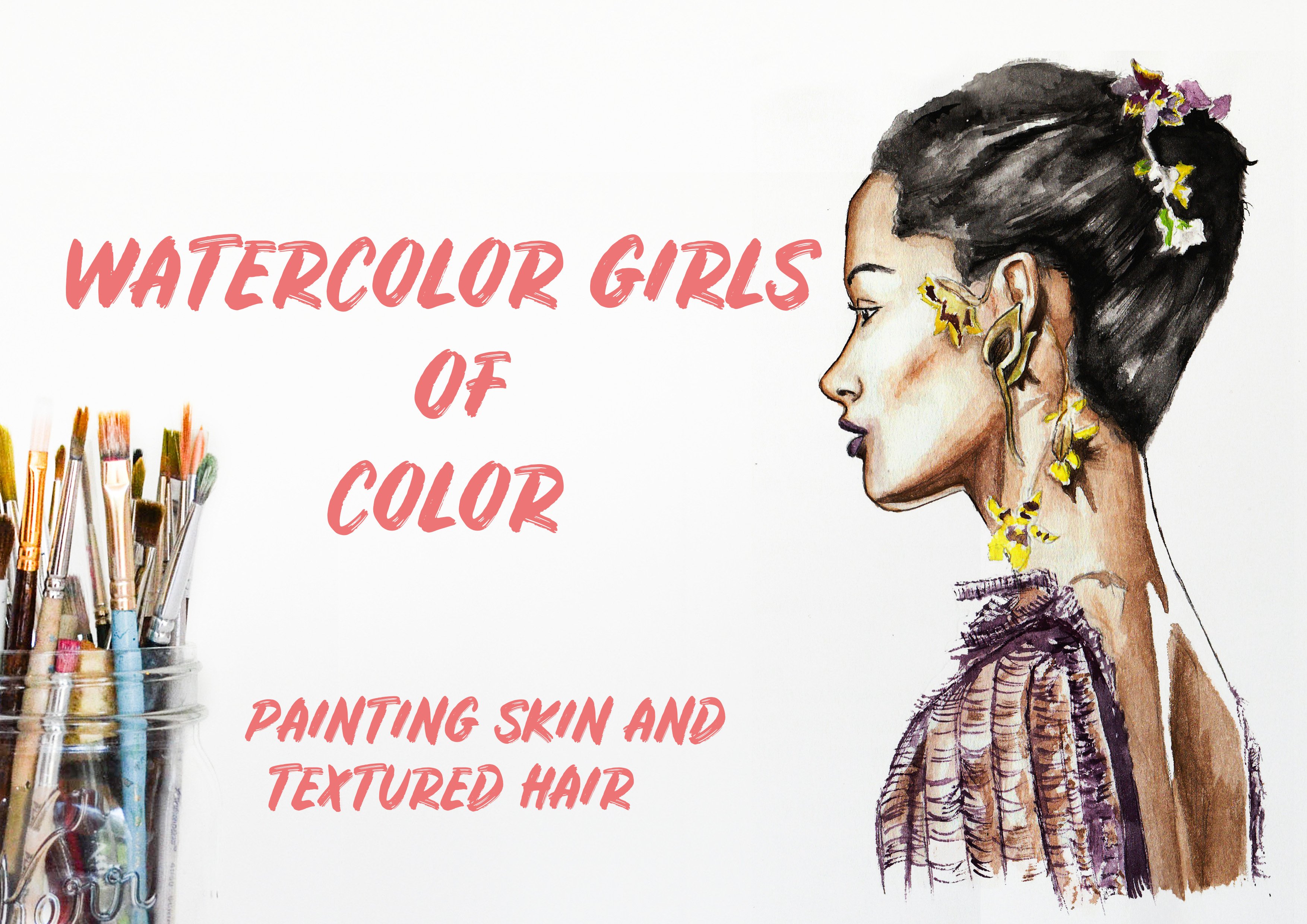
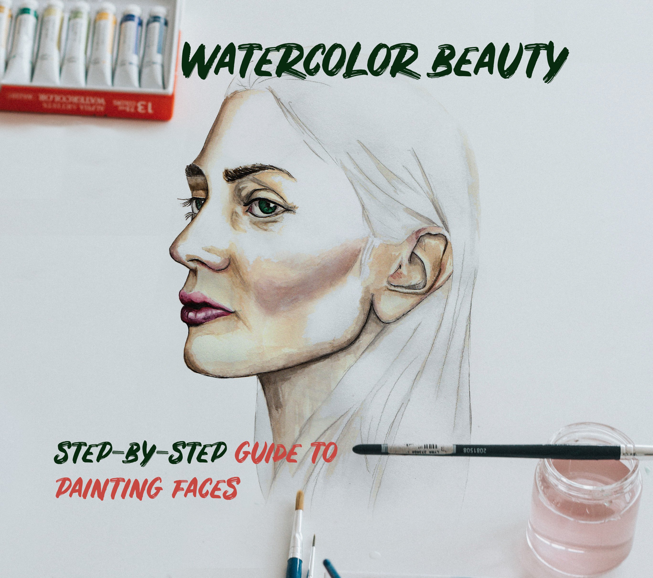
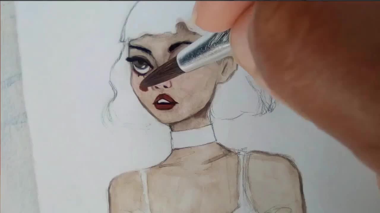
Transcripts
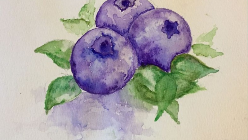
1. Intro: Hello, everyone. And welcome to the second part off. What a color Summer fruits For this class, I'm gonna be demonstrating how to paint illustration of blueberries when she going to need as, ah, pencil on a razor. What a color, said brushes, running from small to large, clean water and some watercolor paper. Let's get started.
2. Painting A Blueberry: So this is the purple that I'm going to be using. It's a pretty dark color and the green. I am going to start by painting with the purple and I am using a medium sized brush. Medium sized brush is perfect because it's large enough to absorb a lot of water. Because, for illustration, we wanted to be very watery. Every time you apply, you're pains you wanted Teoh full off water. If your paint is not easily a naturally just spreading onto the page, you're not adding enough water. So for you first wash you wanted to be very war tree and pretty lights. I'm adding most of my color on my top left sides, and I am also dabbing the paint onto the page, just dabbing onto the page as the paint naturally just spreads and flows onto the page. So very, very war tree, and I'm placing a little bit of more color on the bottom, and then I blend everywhere else sets the first wash admiral color for the shadow. So when you want to add, um, shadow, you, of course, will apply paint with less water and then you go back in and you blended outs with With, um, you go eat up your brush in water and then you go back in your blended. That's how you'll apply your shadow. And now I'm gonna add some blue. I'm adding dark boots. Add, um, just a variation and my color for my fruits. It makes illustration or my administration stand out, Maura Fare difference colors in the fruits. I'm using a dark blue. He really did not need to paint a very realistic blueberry. This is an illustration, and an illustration is also interpretation of How do you see blueberries? So it's really up to you, and I'm placing blue around this top parts and done the bottom, and I just let that sort of bleeds onto the rest off the fruits. What I basically want to do is I want him. I want to the purple to come through from beneath the blue instead of mixing a blue and purple. Then I'm adding more color on the side here. And of course, before, when you start illustration, you want to have an understanding of what your shadow is and when your light is, and for me, I feel that my light is going to come from the top. So my the top of all of my blueberries will be lighter. And then the darkness will fall in the bottom and on the sites.
3. Painting Detail: now we're gonna move, aren't you the second blueberry? I stopped by just blending out on the side over here, keeping it very ward ST So the aim of this class is just a simplified painting. Fruits. You can achieve a really good illustration with using very minimal detail. I'm going to paint the center over here, the top the top part off the off the fruits, and I'm painting it with blue first. And then I add the purple and you want the two colors to bleed into each other, almost as if you're painting with ink. This is the This is the goal that we want to achieve and then go back in and add more color , more paint to the site off thumb of the first, right next to the first blueberry that we painted a new once. It's very one tree, and again, you are just you just dabbing your brush onto the page very softly, and, you know, if you have added enough water, if you're pains just runs easily, then I'm gonna paint over here on the top Red bull color. And if you're not sure how a blueberry supposed to look, just look up a picture online. See? Have a reference. But really again, you. We're not painting something realistically and painting a painting, an interpretation off how we want to see blueberries. So how do you How would you like your blueberries? So, look, do you want them to have a little bit of green in them? Because if you do, you can. Everything is open to interpretation. This is an illustration, and all you just need to keep in mind is just apply the paint as watery as you can. I mean, you just repeat the process, and if you using two or three different colors, have the colors bleed into one another. Have the colors were very runny? So you have If you let safe using a red, it's show on your picture, the red sort of running or bleeding into the purple. And if you want to use purple, you can just use this blue that I'm using instead of the purple. It really is up to you. All I want to show is just the technique, this pleading technique, because I think it creates a pretty interesting looking illustration, and it's also very easy for everyone to follow.
4. Leaves: now we're gonna move on to our leaves, and I'm starting with the screen that I showed you earlier and is I call it an evergreen green when I mean. But what I mean by evergreen as some the green that she's seen forests is what they call an evergreen green evergreen basically mean. It's always green and them starting by applying this green, and I stopped by playing the paint on the base of them of the leaf in the name gets lighter as I moved towards the tip. This makes it easier for control. So that's I. Or you don't get lost with, um, with where to place your paints. You don't want the whole leaf to be one shade. You want to mix your tones here. I've added a mustard green, and I greeted that by adding yellow. Soon my lights green and a little bit of brown. If you don't have, um, different types of green in your what a color palettes, you can create greens, and how you create a green is by mixing blue and yellow. And if you want to green to be dunker, you add just a little bit of more blue or dark blue. Or you could add a black. And if you want to green to be more brown more or see, I should say you add brown. If you wanted to more lime, you add yellow, so try and use a minimum of three different greens for your leaves with water color. And he wants your watercolor illustrations to stand out. Used different different shades of the same color group. That is how you make a watercolor illustrations stand out, and it's really great if you can have a different shades that you pick to run into each other on the page and I'm going Teoh, apply my awash with shadow, and I'm just using the same purple that I used for the fruits just below the blueberry and around them believes, and I'm just going to start pretty lightly. And then I will add more paints later on, probably when I'm finished. You don't want to start by adding a very strong wash for the shadow, because I will make it difficult to remove if you feel like it's too dark you want, always start lights and then just build on it as you go along
5. Adding Depth: Now grab your razor and rub out all of your pencil markings before you continue and everything I have demonstrated so far, I am now going to repeat that process again. Here I am painting with a blue because I once any effects that will come when the illustration is dry, you have the purple. It will be coming through from underneath the brat, a need the blue, and it will give a really cool color effect to its. So you definitely want to do layers instead of mixing the blue with the purple. First apply the purple and then going top with the blue. It's work in certain areas. Give them give the illustration of sort of blue sheen to its and I'm just dabbing long Teoh the page. I'm adding more color, more paint and shadow and for me again, the lights coming from the top. So most of the shadow is going to be on the bottom and on the sides of the blueberries. Be aware of where your light is coming from is the light is coming from the left side. That would mean that all a few shadow would be in the center, where all the blueberries, meats and on the left, on the right side, off the of the blueberries. If the light was coming from the front, most of you shadow will be, of course, with the blueberries meets in the center and on the top off the last blueberry that will have most of the shadow. So and if you're not really sure how lights and shadow placement works again, just look up a picture off. Not even just blueberries. It could just be grapes. So you just haven't understanding off how light works. And even if you don't get the lights right is still going to be fine, because this is this is not a realistic interpretation. This is your picture, your illustration, your interpretation of how you want it to look. Replacement of life just helps you figure out where to plot, where to place most of your painter to have the deepest colors and so forth. Then I just blends. And this is the results. I basically just repeat the process over and over and over, just layering. And so I was, until I reached a point where I was absolutely satisfied with my illustration. Thank you again for your support and take care
 Sharon Mapuvire, Anything Is Possible