Transcripts
1. Intro: Have you ever wondered what goes into making
a good-looking, interesting, attractive
sketch on spread? Of course not, who thinks that? But since I mentioned it, you are thinking
about it, don't you? Hi, my name is Fati, but everybody calls me Fap. I'm a watercolor artist. Is this really necessary? This is my fifth
class and people have heard this so
many time already. What? Oh, there might be new people? Okay then. Hi, new people. Please call me Fap. I'm a watercolor artist,
sketch journalist, master procrastinator,
and alumni teacher. I've been painting with watercolors for
over a decade now. I painted for brands as
well as for individuals, but two years ago, I started making online courses and it became my
passion ever since. My last two classes
were staff bit and I'm so proud of myself. If you want to go back
a little further, I was a copywriter, but maybe let's not go there. I tend to complain a lot. Moving on, this is
my second class about sketch journaling. My very first class
was about this topic, but I love suspenseful buts. But in this class you are
joining me for a ride. I'm taking you outside. You will see sketch journaling
in its original place. In coffee shops, I will apply all the
knowledge from my first class and complete a full spread
from beginning to the end. This is the spread. Here it is by the way, this is what we are going to make. There'll be my narration
the whole time and I will discuss and explain every creative decision
along the way. You will understand the why as well as the how in this class. I will show you how
I pencil sketch at line art, paint with
watercolors, add titles, writings, and little touches at the end to bring the whole
spread together. By the end of this class, you will have everything to
start your sketch journal, or if you already have one, you will have the
tool to level it up. This class can be for any level. If you're a beginner, come for the basic skills like pencil sketching
or line drawing. If you are more advanced,
come for learning how I add the final touches
to elevate the page or the artistic mindset
to see through. If you are super-advanced, come for the sights and
coffee shops from Warsaw and join me for a
drawing session. There is something for everyone. During the class, I will
go from place to place and depending on time or mood, I will tackle a
part of the page. I specifically kept everything
in chronological order so you can really see how
a page is really created. It's not always so perfect. First finish all
the pencil sketches and then the line arts. No, it doesn't work like that. You do what you can
in this busy life. Sometimes you only have
energy to add a little title. Another day you are drawing and painting the centerpiece. With this class,
you will get to see the real process in real places rather than a class
fully taught through and executed in the studio
in perfect lighting. I can't wait to take you
on this ride with me. So let's take a quick look at the class project
and the materials. Let's jump right in. See you there. Jack, good to see you, buddy. We will wrap it up for today and the next video we will
start from tomorrow morning. Come back early, 6:00 AM sharp.
2. Class Project: After this class, you
will be able to create your own sketch
journals and Jack, no. Not know you idiot. Hi. Your class project, should you decide to
accept it is to create a spread with the same layout
as I use in this class. This way, we can have a look
at each other's spreads and see how the other students use the same starting point in other creative phase and ended up with totally
different results. It will be fun. I encourage you to share your
progress as we go. For example, you
finish your sketch, take a closer photo
of the sketch, take a photo of the full spread, and share those two images
with a few words underneath. When you finish
your line drawing or painting or titles,
you'll do the same. Because once you create your class project in the
class project gallery, you can go back and
edit your class project and add more
writings and images. This way, you'll have
a full progress of your spread documented and I will have a chance
to give you feedback. Also, I now feature every single student project
on my Instagram account. I appreciate your hard work and I want to share
them with the others. I mention your Instagram
account and everything. To be featured on my
Instagram account, share your projects with me. Now, let's talk about the materials you
need and get to work. How was the checking
together, though? Do I look good?. This time it was good that you arranged my
hairdresser before. But when it's in the
middle of the shoot, it looks a bit funny. Do you remember in
the previous class that my hair was like this long and then this long and
let's not do that again.
3. Materials: So the materials. Let's mention the
obvious ones first. Something doesn't feel
right, oh, the hoodie. That's better, isn't it? Because the yellow hoodie
was from the Class number 2. Materials, let's mention
the obvious ones first, we will be traveling a lot,
so we need a backpack. What else in that backpack? You need a sketchbook,
pencil, eraser, waterproof pen, a brush,
watercolors, and water. Wait, I think I can
do that better. There it is. This is my sketchbook. I use this brand. It's called army. It's 108-gram watercolor
paper inside. I like it so simple. No branding, nothing on it. It's just black on the
outside and beautiful. I said, just any pencil, this is not a special
pencil is just a pencil, it goes in my backpack. There is my backpack on the
right bottom corner you see? Any erasers that we need? This are erasers. This is nothing special. Just an eraser goes
to the backpack. This is something special. It's a kneaded eraser. You can form it into any shape. I've been using
it for years now. Apparently, it's
also really good for this kind of animation. Goes to the backpack. These are my waterproof pens. Faber Castell, 0.1,
0.2, 0.3, 90 percent of the time I use 0.1. Here are the brushes. There is number 12, number 3, and flat heads for
covering bigger areas. My favorite watercolors
can say Tambi, is that the name? They are very vivid and I
really like using them, but they're a bit
on the big side. This set. If I want to take that site, it barely fits my backpack. A good old jar. Your mom would make a jam in it. Use for keeping water. Good old paper towel
from the kitchen. Always useful for picking up some extra paint
and scrap papers. It's very useful for
checking out typography if checking a workout
or checking out the colors combinations
you want to use. This is a phone holder. Here's an example here, because I like watching
YouTube videos while painting and drawing. This is another phone holder, but this is for recording. It gets a bit higher than
the other one you saw. As you can just see, you
can record both ways, vertical or horizontal. It's always with me. This is my other set, St. Petersburg Watercolours
that I think quite nice. I've been also
using it for years and it's smallish
to take it with me. Banana. It's always useful. Water, so we're going
on a bike trip, always take the water. I also use it for painting. No shoes. I'm going to put on my feet. We don't need it
in the backpack, not my desk lamp. Jack. We need to stop this. I don't need to test them. I'm going to coffee shops. They have lights, there. Not the Monstera. check I stopped the video. Check. I said I could do it better. So that's it for the materials. Now we can jump right in. We will start from our first
stop, Waszyngton cafe, a beautiful cafe I found on the other side of the river
in Warsaw from where I live. We are going to draw and paint. This is actually the
topic of this page. I'm going to show this
exploration of mine. We are going to sketch
the first main image from the cafe and this title. See you there.
4. L01 Waszyngton Cafe: There it is Waszyngton Cafe. I'm getting closer and
closer with my bike. Here it is from outside. It's called Waszyngton because this street is
called Waszyngton. It has beautiful interiors and delicious puddings
and coffee as well. This is an espresso tonic. Let me take a bite. I'm getting ready. This is the layout
we're going to use. This is actually from
the first class. Here is the first class. Jack, stop the video. Jack, could you look where
you stopped the video? Anyway, I just wanted
to show how much changed since the first video. On the left is the first, on the right is the
fifth, this class. A lot has changed. Here I was drawing this layout in the
first class to show what the
layout is actually. Then later, here I
was out on the day. I want to draw and
paint something. My topic was explored, and I was doing
an exploration by going to this coffee shop. I'm going to use
this ready layout and draw this scene I
have in front of me. On the left you can see
the, what is it called? Reference image. That's what's called, reference image. I'm sorry for that. I'm actually not keeping
this in front of me and drawing from it
because as you can see, I'm actually eating and
drinking in the meantime. I take a photo and then I continue
drawing from the photo. This way, I find it much easier because I can get on
drinking my coffee and enjoying my drink and my scene is not changing
as I keep moving things. So I take a photo and draw
from the phone usually. I have two phones with me. I didn't get rid of my old phone because it was already
recording still very well even though it was
getting slower. Here is me taking a
sip from my coffee. I'm using my old
phone for recording and current phone
for taking photos and using as a reference or if I don't need a reference, sometimes I use it
to watch something or listen to audio books. As you can see, I'm trying
to look at the lines. There's lots of depth
and perspective here. I drew lines so that the tables will be in
order like it shows there. I use guiding lines for that. But other than that, I'm just trying to do what
I call relative lines. I draw something like
the table and the glass and then I look what's
next to those lines. Let me take a bite. Delicious. Then I look at what's
next to the lines I just drew, like the glass. There are the seats
going back further and then there's the
door to enter the place. Next to it, there
are the tables. I try to go one by one and
when I run out of space, that's why I draw these boxes. It helps me out when
I reach those lines. That's how much
I'm going to draw. Even if my original reference
photo was capturing more, I just stop there and then I don't have a problem
like running out of space or anything because my
main object started here. This is Rondo Daszynskiego. Throughout the class, you will
have little mental breaks. Then I will take you
someplace in Warsaw and show you like I promised
that I will take you out and show sites of Warsaw. There will be little
breaks like that. In the next ones, I
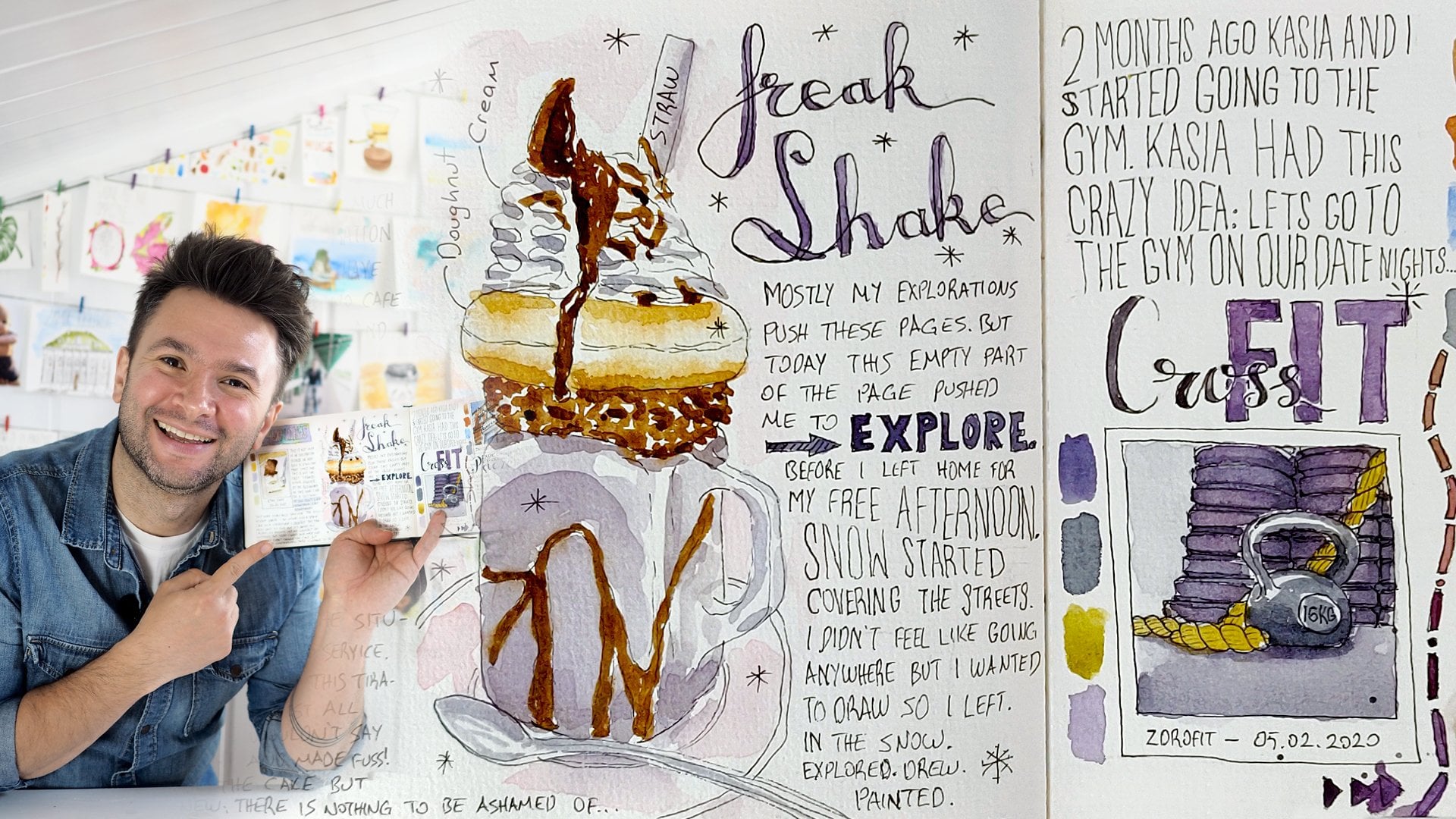
will try to be quiet. This is done. I'm now drawing the first title, and I named this because this title page was left empty
after I did my first class and I continued
making other pages. This was left in the middle
and now I'm in the future. Let me take a sip of my coffee. I decided to call
this page a page from the future because now
I'm in the future, but now it's actually the past. You know what I mean. In here, I use three
different fonts. The first one is like a cursive
and in the first class, I show all of these different
writing techniques. How we can actually
achieve a good title with three simple fonts. With the writings, it's usually good to use three different fonts and
what you want to emphasize, I write it in big bold fonts
like the future in that. The first one, a page, I wrote it in cursive
and what I do is that, again, you can find this typography lesson
in the first class. I make the down strokes thicker
by getting an extra line. When I paint it you can't
see those extra lines, but it looks really stylish. In between them,
a page from the, I wrote those down with very
simple elongated shapes. I use this writing a lot. It's my normal
handwriting, actually, I just made it a bit longer and it looks contrasting to the big bold font
comes afterwards. This is how I constructed it. We can see more actually how it's going to
come together later when I put the ink in. I'm showing you the place again. I just like this place. It's just so beautiful. Now we will move on to the
small aspects of my layout, they're little circles. Those little circles are putting tiny elements from my
exploration to the page. In here, it's very useful. I looked up the
place's logo for you. You can see it on the
left is a reference. It was a bit intricate. This W, and 9, and 6
going into each other. It's always a good practice. The logo always carries
some meaning that if you're in a place or if you are using a certain
brand for the first time, logo is always easy and
impactful way to go. First, I'm drawing
the numbers 9 and 6. Let me take a sip first. I'm here in a coffee
shop after all. Then I do the W behind it. Like I always say, just follow the lines like
drawing a normal scene. Here, I'm also looking
at where the lines go and then follow
it with the next. Here is the sketch done. I'm showing myself and
what we have here. I have a photo bomber
for the first time. I see you, you sneaking
into my photo like that. Here is the result of today, the sketch from the
cafe and the title. The rest is still empty
and the logo we sketched. Here's another shot
from that day. Throughout the class,
I will try to show you before and after
progress at every lesson. This is it from Waszyngton Cafe. The next topic will be Local
cafe in my neighborhood. There is a very cute cafe
and I will see you there.
5. L02 Lokal Cafe: [MUSIC] That's my favorite corner, and that's me and this is the little jam we have in our neighborhood,
I love this place. I usually like drinking
black dripped coffee, it's lighter and so pleasant. This is where we
left last time in Washington Cafe is before. I'll show you place
a little more, and now we will
put the line art. I will use my
Faber-Castell Ecco Pigment waterproof pens, my favorite. I always start with
drawing the outer edge, but because I ran out
of space with my title, I just went in. That wasn't actually
an artistic decision that I will make the E overlap my first image. Just ran out of space and I couldn't squeeze
them any further. But at the end of the
day, I like how it looks. I make my layouts look like
little Polaroid photos, and then I add a bit of writing underneath them in the
little gap you see there. Again, I forgot the same word, reference photo, here it is. I'm going to draw the lines and my sketches are not super
detailed, still quite detailed. Let me take a sip
from my coffee. They are not very detailed, but they are not
very loose either. I can definitely follow just from this sketch without
looking at the photo, but it always helps, because sometimes especially
the way I did this page, there's been so much time in between it's difficult to
remember some details, and looking at the photo
actually helps when you are bringing the fine details
with the line art. For example, how
this chocolate was sitting over the dessert with a bit of an angle and
with the texture over it, it really helps to see
these kind of things, so always keep your
reference photo handy. I'm having trouble to
remember this word. As you can see here, my main object is the dessert and the coffee, and my glasses. I started with those, once I put them in, I
feel like the rest, even if it's not perfectly
in place, it will be fine. I'm going with those first. The pudding as you can see, it's like a very simple circle, and the more will
come with painting and putting the shadows, it will show how
nicely round and shiny that part will
come with painting and that'll be a little mistake
too, but we'll see. As you can see, I'm
doing the glasses now. I'm eating a bit
of a cookie here, here in the coffee
shop after all. I'm doing the extra lines, and you can see immediately the glasses pops
out of the page, and it becomes like 3D because I'm adding
this one extra line even though it's not perfect, it's not parallel lines, by adding this extra line showing the depth
of the glasses, it really helps bringing
it out of the page. That's done. Now, I'm
moving on to the table. That's easy, and I will
draw the tables and the chairs into the distance
actually after them. There are also after these
sets of tables in front of me by the window there
is more sitting area, but it's almost not
visible and gets blurred, and I'm not going to worry
so much about them and I will also paint it in this way that it will
be mostly dark and black in that areas because
you can't see much there. I'm drawing, in the
image, it's very blurred. But originally there were three bulbs hanging
from the ceiling, you can see if you
look at the ceiling. Now I'm drawing those
and then from there following the window
line and then following the ceiling
above the door. Like I said, this is the way
I do these relative lines. I draw something and then look what's next to it
and draw the next thing. This is how I delivered
the perspective. This is your little mental
break, and we are back. Now the line drawing is done. Let me put some
coffee for myself. Now we're going to
move on to drawing the lines of the first title. I explained before
that there are three different
forms in here and just I guess the most tricky one here is the cursive
writing and just follow. Look, I'm going to draw very simple cursive here now, but when you draw
the downstrokes, a secondary line on
the downstrokes, it suddenly becomes much more stylish and this is the trick, and then you paint a darker
watercolor over this. You won't see these extra
lines and it will look like with a pen you
just drew that. Coffee is delicious here. This in-between very
simple elongated letters I use this a lot in my writings, a page from the future. This actually bold font that
I wrote future word in is actually the same
elongated shape as the previous one,
but just in bold. This also nothing crazy. Actually, I would say there
are two different types of fonts and one of
them is in bold. A page from the future
and now is in the past. Now, of course, let me eat my cookie, take a sip of my coffee, and you can see my setup
here a little bit. I'm recording with
my second phone and this is where we are. I don't know why I didn't
remove the pen from there. Go away pen, go. Thank you. This is where we are
now and we're going to draw the logo now. Look at this place, it's so cozy to be inside, I love it. Now we are moving
on to the painting. Like I said, the painting
will help a lot. It's round and shiny shapes because you
can use highlights, shadows, and that's where the
magic is with watercolors. Here, I will try to
leave a nice whitespace that will be the highlight and this was very important for this painting but I'm showing
you the real life, yes. What happened is, do you see the brush that
I'm not using up there? I knocked down that
brush and it just rolled over my paper and
this highlight I'm showing you here just got completely deleted because
the brush rolled over, picked up some paint, and just painted over it and
I lost my highlight this way. It's still okay, but
these things happen. Now, I'm painting the drink. I really like that this drink
is orange and if you look closely, there's bluish-greenish
color to this glass, and you can see the light
coming through the window. I'm trying to leave a
bit of whitespace for those highlights and
mix green and blue there and I like
how it mix up with orange and brown I'm
using for the drink. I'll take a sip of my
coffee, delicious. I went on to painting a bit
of the window there as well, and this is the orange peel, I'm painting and I'm
letting it blend in a bit. It's okay, but I
think I need to pick up because I didn't want to lose this bluish-greenish color
to the glass I had there. The top layer of the
coffee is the froth, is a lot much lighter than the rest and that's
why with a dry brush, I pick some of it. If you are quick about it, you can always pick up some of the paint you apply
to your page. I'm also trying to
leave a highlight like a white line on the straw, so this will show actually
it's a shiny metal. Highlights are very important and I call this painting
without painting with watercolors that you leave a whitespace and
that's actually gives a very important
information to the observer that this thing you are
looking at is actually shiny. As you can see with the
chocolate, there are little triangles I didn't paint, those are to show that this thing actually has
a texture, it's not flat. Now I moved on to the
interior side paint, the column, and again I'm showing you
the Lokal Cafe here. Isn't it so cozy? I'm letting it blend in
over there to the blue, I painted over the window
showing outside colors. I don't worry too much
about these things. These things will get a bit more hidden when we
put more color in and I actually welcome these mishaps and
I even allow them. I don't even know in this
case it's a mishap because I'm letting it happen and sometimes I'm doing
it on purpose. Now, I'm painting my glasses, I love these glasses and
they got broken this summer. I'm now adding, while my glasses are drying, I moved on to the
window again to paint. You can see some of
the greenery outside, I'm diluting those and now I did the same thing
for the back window because you can also see the trees through the window, so I add some blue
and green over there. When you see my brush is not in the image and outside
doing something, usually I'm mixing up colors and picking
up paints this way. This is the first
layer of the painting, I leave it here because I think I needed
to go or something. This was a off day for me, I was painting outside, and here's the close up. This is at the moment very flat because there'll be
much more shadows added to that later. That's it for Lokal Cafe and
the next stop will be PPC. See you there.
6. L03 PPC: It's April already. Here's me enjoying spring going everywhere by bike. That's my favorite. Here it is PPC. It's actually called
[inaudible] . It's a nightmare to spell. I mean, Polish is very
difficult, let's not go there. It's a very difficult language. But the place is beautiful. Unfortunately, this place
does no longer exist, but while it existed, we really enjoyed going there. It was like a second home to us and we felt like in
our own living room. We are back to our painting. You remember where we
left from local cafe. Like I said before,
I'm not going to worry too much about the
details in the far corner because everything
blurred together. I'm going to do the
same with my painting. I'm not going to try to put all the details I
see with my eyes. But like I see from the photo, those details will
be blurred together. Instead of using a
very dark black, I choose to use a little of
purple mixed with black here because I like the
contrast it gives, and sometimes only using
black is a bit cold and dark. I like the purple. Especially in here, I
have browns and oranges and I like the
contrast it brings. Since this is a painting, you can paint whatever
the colors you want. I usually stay true
to the reality. Here is me in PPC, again, drinking the same drink
actually, espresso tonic. That's my favorite in the
summer at some level. Now I'm doing the light bulbs and where they come
out from the ceiling. In the photo, you can see
three of them coming out, three black bulbs, but one of them is
hidden in the photo. This is because I
do relative lines and as I put the big
lamp on the ceiling, there was no more space for
this cable, and so be it. This is still good enough. Again, this is not fully black. I'm actually putting the
shading on the ceiling because of how the
windows are situated. It's not fully white, even though actually everything
is painted white in here. You need to give this
shading here that when you start painting
for the first time, seeing with your own eyes, the wall is actually
painted white, but you are going to
put darker gray for it. It feels almost
counter-intuitive, but if you look actually
without the context, just look at the spot, you can see that it's not white. Nothing is actually
fully white unless the light coming from the sky, and even that is
broken white, bluish. Now I'm painting this
lamp from the ceiling. This is your mental
break for 10 seconds. Isn't Warsaw beautiful? You should really visit if
you have a chance one day. It's a beautiful city, especially in summer
or springtime. But autumns are beautiful too. Sometimes we have
snowy white winters. I'm painting the seats
on the right-hand side. I do like their colors. How do we call this color? I don't know. I don't want to get stuck
again for 10 seconds trying to remember the name. If I remember, I'll tell you. Teal? No, not teal. I'm painting the windows. This is a very old school, very thin metal windows. With those, because they
are not in the foreground, I don't go into too much detail. I just put a bit of dark colors for those windows and that's it. There are some white
unpainted spots you can see. I like them this way and I recommend you not
try to paint everything. Leave some white here and there. They work as the highlights and the texture,
and that's okay. Now I'm putting the
shadings to these chairs because they are curved. One of them is
curved towards me, the other one is
curved away from me. The first shade is on the right and the second shade
is on the left because my main source of light
is on the right-hand side from this big window. Adding some more shades. Shades are so underrated. It's actually so
important to add shades. It's not so much work, but it brings so much
to your paintings and it makes them pop, so always add shades. Over there, there were
some hanging plants. For those, I just drew
some flying middle leaves. I'm adding two different greens and some yellows to
give the feeling. When they all mixed up together, it will give the
feeling of this place. I have to tell you it had
such delicious cakes, you wouldn't believe. Back to the painting. At the back, you can see there are those
three light bulbs. Also, other lights in the cafe are reflecting from the window, so I was adding those as
highlights on the window. Now, I don't remember
what I'm going to do. I'm adding shading
to my glasses. Again, shading is so important and it makes the objects
in your paintings pop. It gives a context. Before, it was actually
floating over the table, but now it's actually sitting on the table
as you can see it. After applying some
darker colors as a shade, I make it blend so it doesn't
look so sharp and strong. Here is the final painting. There's a close-up to it. I really like that there's
pink in the foreground and then there are
the browns and blue from the windows and purple. Everything works very well
in this painting for me. Do you like it? Now, this is it for PPC. We will come back here again, but our next stop is my
studio for a little time.
7. L04 My Studio: Here's me on that day, I was very calm even
recording some videos. Darry introduce very new
thing to me at the time, as you can see, I
was having fun. I'm in the studio,
as you can see, everything is now from the
top and lighting is perfect. I'm going to draw this image
on the right-hand side, on the right page. You didn't see the
sketch of this because, I should tell you this, I
took my son for a playdate and he fell asleep, and as I was waiting
for his friend and his friends
fathers to arrive, I had half an hour and it was in a shopping mall and I just
sit down and do the drawing. I didn't have any
special situation to record even the
good lighting to it. That's why I don't have the
sketch for this recorded. But we're going to
draw the lines now. You can see on the left
the reference photo. It was a beautiful
coffee machine, they got there, this
is golden white. Now I want to capture this since this page was about my
exploration of this coffee shop. It's really fun to draw because it has lots of lines and
angles I can follow. But in the meantime, it's
a bit of a round shape. I was trying to
give this feeling, this logo of a little
line there was beautiful, but it was too small. I made it a bit bigger than it is to be able to give
those details that it was standing and
behind the shield and holding it with
one pole, very sweet. All those paper marks on the left on the
top of the coffee, and we are in my studio,
there is also coffee. I make really good
coffee at home. Don't think because we
are at a coffee shop, I'm not drinking coffee. There are those I
think grinders on the other side of the coffee
machine, I'm drawing those. Later I realized this
perspective is a bit off. But like I always say, don't worry about,
because as you can see, those machines are
going a bit towards up. But when I looked at the
shelves I drew behind them, they are going down because that's how the perspective
supposed to go with. Like I said, it doesn't
matter that much. I like my images this way, and if you are like
me, you want to draw, but you can't draw perfectly, just do it like me, don't
worry about it too much. I'm trying to draw the things
on the shelf at the back, not with great detail, I'm just looking at it and try to give the general
shape of things there to make. My purpose here is to show that this store
shelves are full, not exactly what's
on those shelves. I drew that line
logo as you see. Now actually this
is the logo writing and I drew this liner icon. The drawing is done, I'm going to show you this
real I made, I really enjoy. Hey. Yes. What are you doing? I'm working. It doesn't look like you were. I'm working. Are you sure? I promise you I'm working. This is how I really feel sometimes that
when I do my work, I'm drawing and painting, because I really
love doing this, sometimes it's really feels like it doesn't look
like you're working, but I am working, I promise you I'm working. I'm actually working
many more hours than I used to as a copywriter
back in the day. I had lots of time to play PlayStation in the
office spectrum somehow. Now we move on to, I
guess I could say, the main image it
became of this spread and the Palac Kultury. This is arguably the most iconic and famous building in
the central of Warsaw. That was actually my point here, with the title later,
I'm going to say. Every roads lead
to Palac Kultury. Actually Palac Kultury means, by the way Palace of
Culture and Science. Here is me in my studio drawing. In this building, wherever I go for a bike trip, I end up passing there and I
really like looking at it, taking photos of
it, and drawing it. I thought it would make a
good addition to this trip because this was an exploration
of this coffee shop. But I was actually
also on a bike trip, and I pass this
building as usual, and I want to add on this page. As you saw, I drew simple boxes, because I'm looking at the
building with an angle, I drew three cubes standing
on top of each other, and then I started
adding the details. This is sketch, I'm
doing it roughly, and not with great detail. Here's your 10
seconds mental break. Now, we're back. This is the stage we are in. On the right-hand side
line drawing is done in the middle Palac
Kultury sketch is done. Where will we go from here? We will continue delivering the line art of Palac
Kultury drawing. Now I'm looking at the
details more closely as I move on to line art. But as you can see, this building is beautiful and it has very
intricate details. Especially those spiky
things after every, let's say, layer of the cake, because this is also called
Stalin's wedding cake, because this was done by the
Russians for Polish people. Not really for Polish people, but anyway, you will check the
history by yourself later. I don't want to say
something wrong. But it's a bit of a sore point to this building in Warsaw, but I still like looking at it. I'm drawing them roughly, I'm trying to give the
general feeling that those ends are
standing out spiky, and I'm drawing simple
shapes to do that, but not with great detail. What am I looking here? This is my usual look. Where's my pencil? Where's my pen? Back to drawing. The trees, again, I'm
going to try to give the feeling of the tree, I'm not trying to draw
every single leaf. This is an impossible task
if you want to do that way. I covered the general area of how it covers the building
from my perspective, and then later with paintings
it will more come to life. This building has
lots of windows, and for those windows if you see I try to add an additional
line on the left because again, from
where I'm standing, to show those windows have
not a single rectangle but it has a bit of a
depth into the building. By adding this additional line, it gives this feeling of
texture on the building. As you can see, I keep adding these
extra lines on the left, and on the right-hand
side of the building will add those lines on
the right because again, from where I'm standing
this how the depth shows. This building has
so many windows. Many years ago, I went
on the viewing terrace it has a very good
view of the city. We always said that
we'll go there but we never made it since. It was my first trip to also, I think like 10 years ago. But as you can see now none
of my lines are perfect and I'm not drawing
anything with great detail. But I'm looking at how
many windows there and how many gaps, and I'm trying to draw and
fit them in as much as I can, and you can see look at the bottom half of the
drawing now and the top part. Let me take a sip
of my coffee there. The building starts
to come alive. With these drawings
especially architectures, the more details you add, the better your buildings
your sites will get. Even if those lines
they seem not perfect, they are not parallel, they are touching each other where they are not supposed to. When you add more details it gets more and more realistic. I actually really
like this style more than very realistic
drawing of the place because if I want realistic I have a
camera I can take a photo. This is a drawing. Now I'm coming to the end and drawing the top
of Palac Kultury This was the highest
building in Warsaw until recently they built
a new tower called Varso. But it's still the most
beautiful in my opinion. Here it is. This is the end
result of our page. This is the stage we're in now. I added two sketches
and line drawings done. That was something. Here's your 10 seconds
mental break, Vistula River. I will be quiet. By the way, not in one day, these are happening in like three days in five
days timeline. I'm going to draw, I decided that I should
draw myself because I was on a bike trip and
I should draw myself. This photo is from the morning of the day
I went to Washington, and I was taking my son
to school with my wife, and she snapped it. I thought I could use
this as a reference photo to show myself on the
road for this page, so that's what I'm doing. I'm not going to
draw him because he wasn't actually part of
this 30 kilometers bike trip where I ended up going
to Washington Cafe. But I use this image as a
reference to show on this page, I was traveling by
bike, and this is me. Here I'm trying to show the perspective of
the road ahead of me, and I drew myself on the bike. I started from the child seat behind me because that's
the biggest object. Let me take a sip from my beer. Of course it's not a beer, I don't drink beer
during the day, it was a box for socks
I got as a present. I'm adding the line drawings. Again, I drew myself here
with relative shapes. First, I drew the child seat because that was
the biggest object, and from there I drew
the wheels of my bike, and my legs, front wheel,
and moved upwards. Like I said, relative shapes. I draw one thing and look what's next to it
and draw that thing, and then complete the
whole drawing this way. After this sketch
with line drawings you can see it's
coming more to life, you can see the shape of my leg. My feet is facing forward and my hand is reaching
out to the handlebar. I also like this because I'm not particularly good with
drawing peoples and faces and I found a picture
of me from behind, so I don't have to
worry about it. In the second class
I was talking about this avoiding
your weaknesses, and this is something like that. I do what comes easy
for me to be able to keep moving forward
and improving my art. Adding some grass,
drawing the tiles. As tiles go away from me they are getting
smaller and smaller. This is another real I make. I made this real. It was a bit mean to
myself like, "Oh, there's no work on this side, oh, you put the
ink in, good job." Later I decided to
turn this into a class and I stopped making those. That's it from the studio. Next stop will be the PPC again, and see you there.
8. L05 PPC Again: I told you that
this place was like a second home to us for a
while, while it lasted. It made beautiful,
delicious coffee. That's why you
could see me making these stories and
reels when I go there. I was so excited to be there, but it's all gone now. But we will always have
these videos to remember by. I'm in PPC again. This time, I'm going to
tackle my last image, last painting, last box
to fill in my layout. I decided I would do
the menu board behind the espresso machine
we see on the right. Remember this time,
reference photo I did. Again, I open this
photo on my phone. Actually, you can
see it over there, just above the image, just above the sketchbook. You can see my phone
screen I'm drawing from. The box I have is horizontal, so I use my phone
screen as horizontal and enlarge the image thinking that how much
I'm going to feel this rectangle gap I
have in my layout. Then this really
helps me actually what will go into this
box and how much. I can see this much of
the coffee machine, so I draw that much
of the coffee machine and then I know where the
menu board is going to stand and how much of this neon
writing is going to show. This place was also a
stationery shop, by the way. It was really good. Anyway, back to drawing. I did a quick sketch to see the general shape
and perspective of the menu board and the
coffee machine there, those were the most important
items of this painting, and then I moved on
to line drawings. I forgot to draw my box, so I'm going back
and doing that. The tolerate shapes, polarity picture-shaped
box is drawn, and now I'm back to drawing
the coffee machine. Coffee machine is
in the foreground, so I'm adding the
details of that. For some reason, I went up there drawing the neon lamp a bit. Back to the coffee cups on the
top of the coffee machine. Those standing on top of
each other, as you can see, I'm just adding a few lines
and it gives the feeling. Again, I'm not going
into details there. I just need to give a
feeling of this place. Back to the menu board. Menu board, this
is a bit tricky. This was a decision
I had to make. It's black with white
writings and white lines. It's really difficult to
do that with watercolors, if you're going to paint
the whole thing white but leave tiny lines white. I decided I'm going to do
all the lines and writings black and I'm going to make the board not as
black, a dark gray. This will give the feeling
of this dark board, but the writings will be
still in black but readable. We will see at the end if
I was right with this. With writings again, I can't actually see everything
from where I was sitting. I'm just giving
little scribbles. Oh, this is your 10
seconds mental break. This is Nowy Swiat,
beautiful street. We are back. This is the stage we're in. The line drawing is done
on the top right corner. We will move on to painting. Here's me mixing the color
for this board, a dark gray. Again, I added inside
a bit of purple, not to make it fully black. I really like this effect. You can also use
it for yourself. This board is black in the front but white or silver on the side
and at the bottom as well. But the bottom it has a shadow, so I also painted
dark straight away. Again, I'm doing the same thing I told you about the
window painting. I'm not feeling
everything fully black. I'm leaving a bit of white,
is happening still there, so it gives the feeling
of the menu board with those white lines
and white writings. I made the shadowing a bit
less harsh at the bottom, even though in the
reference photo you can see there's a
very harsh light there. Excuse me, my voice
is breaking a bit. I drew those neon lamps only partially visible
in this image. As you can see,
this coffee machine has a bit of a
bulging on the side. It's not too flat, but round. I'm trying to give this
roundness with a bit of shadow, darker at the bottom and
lighter towards the top, and those golden details on it to hold the coffee
cups on the top. I'm making the wall behind,
even though it's quite, a bit darker because there's actually brighter
light in front of it. For the light to show white, I made the wall behind
it a bit darker. I left a bit of a shine
on the handle for the steam of the
espresso machine to show that it's
actually a round shape. What else is there? Yeah, the coffee cups. I'm drawing them again
and painting them. I let them dry and went back and put a bit of shadow because where they stand
close to each other, it gets a bit darker and I
want to give that feeling. This is me in this PPC
place, by the way. There was a beautiful
photo spot there. Back to the page. As you can see, this top right corner
image is painted now. The coffee cups are standing nicely in the
foreground, popping up. I'm moving on to another
smaller title that I drew, Me on The Bike drawing. Fabxplores, this is a hashtag. This is actually my topic for this sketch journal, Fabxplores. I put my explorations in here and I always use this
hashtag somewhere on the page, Fabxplores. Underneath is the name of
the coffee shop, Waszyngton. Over there I'm watching
Saturday Night Live because for this I don't
need a reference photo. I used only two fonts for
this, Fabxplores Waszyngton. Not that one with
the assignment. Not the Washington we know
from the United States, but this coffee shop. Because in the main image I use some pink and soft
brownish colors, when I do the titles I
try to bring that out from the main image so they
are matching to each other. That's why I'm using this lilac and pink with a bit of beige. I'm going to let them bleed
out of the title of it. This way, again, it
makes it more blending with the rest of the page. Later when I bring in
writings in those spots, it will have these
swashes underneath and of course, a little
bit of splashes. This was the logo, if you remember,
from the first day. I'm adding the colors on it, and it's just black
and white anyway. As you can see, first time
I'm using a small brush because I felt like in here
things needs to be visible, otherwise, it will
turn into a mess. Because this is not
an image you would recognize straight
away by knowing it, but it's something specific, the W and nine and six. I'm using a small
brush to make sure that I'm putting the
details correctly. We are back to the main title, a page from the future title. Again, this is the
color actually I used for the sits by the
window on the main image. I'm bringing it to this
title as well, like I said, so they will be all
speaking the same language, they will be all
matching each other. I made it fade
towards the bottom. Put the color on the
top of the bold letters and made it fades
towards the bottom end. Like I said, dark color
for the cursive letters so it actually looks like
you drew it with a brush. Again, I'm making the colors
blend out of the title to make it blend in with
the rest of the page. Over there, my phone screen was messing up with
the white balance, that's why I removed it. After adding a bit of splashes, you can see on the left
and in the middle, Fabxplores Waszyngton
title it looks beautiful. This is a close-up,
Fabxplores Waszyngton. Some splashes went over the painting as
well, which I love. This is the logo and
this is the main title, A Page From the Future. Again, some splashes
over the main image. This is it for PPC . Next up, again, will be studio. But after that, I promise you we'll go back
to coffee shops.
9. L06 My Studio Briefly: We are back in the Studio. You can see I'm making coffee. Like I said, just
because we are not in the coffee shop it doesn't mean that I'm not
drinking coffee. My choice of coffee at
home is usually Chucks. Here is me in my Studio
and this is where we left. The Title 1 is painted, A Page From the Future,
Fabxplores Waszyngton painted. We have unpainted two images and also a gap for a big title. Today, I'm going to paint
this image of me cycling. You can see I have my phone\ with the reference photo
on my right-hand side. Here I was telling you how
I use the scrap paper. I try out some colors and
see how they're going to mix up and decide which
ones I'm going to use. You can see on the top I'm using my temperatures book
watercolor set. I have a dark blue top. In here, in this
lesson in the Studio, I'm going to lay the colors. Here is me. Come on, draw. I'm going to lay the
first colors and first layers and later
I will put the shadows. It's going to look more
flat after I finish. Later in the next session, in a coffee shop that will be, you can see it will
more come to life. I'm adding colors. There's not much going on here. Let me take a sip of my coffee. Delicious. There is only a bit of blue, each color on me, and my helmet and
then the grass. Other than that, my bike
is gray and black and the pavement is gray and the
fences on the left are gray. There is not much going on. Again, with the grass,
as you can see, I'm not making big blob. Here is your mental break. This is Park Gorczewska. Very close to my home. Back to the Studio. As you can see, the grasses, I'm not making it one
big blob of green. I'm putting bit by bit with the tip of my brush
to give the feeling and leave a bit of
white in-between because this gives the
feeling of texture. It's difficult to
see in the photo, but when you look at grass, you can actually see lots of shades in between the grass and also shining highlights from it. This imitates this
texture feeling. I'm adding a bit
of a bluish sky. Again, I didn't
do one blue blob. It's a bit of more
colors in one place and less color in one place. This gives the feeling
of the sky being cloudy. That's it from the Studio. This was a quick drawing. Next up will be Vincent, and we will continue
with the bike.
10. L07 Vincent: Welcome to the end of June and we are going
to Cafe Vincent. Here is me out on the streets
cycling again, so happy. That's the best one, cycling. Here's Vincent, this place has delicious stuff you
will see in a second. I'm walking in. Look at all that
bakery and sandwiches, and focaccias, cinnamon
rolls, delicious. This is the outside seating and it's summer at the time, I was drawing. Here's my setup. They have tiny tables,
it's not easy. Here's where we left. Like I said after the
first layer in the studio, it's rather flat, so I'm going to add some shadows to this painting to finish. I'm making some black
mixed with blue and adding some shadows
to my painting. You can see the reference
photo on the left and I'm adding harsh shadows because it was a sunny day. I'm adding some
shadows to my leg and the details of the
child seat behind me. The fence on the
left-hand side of me, I'm just going to draw some
lines getting narrower and narrower into the
distance and that's it. I'm not going to go
into any more detail. I'm adding more darker
colors among the grass. Again, this helps with the
feeling of this texture of the grass rather than making a little big blob of green. At the edges, I'm making these blades of
grass sticking out, so it also gives the
feeling of depth because it covers the
edge of the pavement, it covers the edge of
the wall, and the fence. You can do this with
your small brush to give the feeling of the
grass and the texture. I'm adding a bit more
blueness to the sky. It was a cloudy day that day. Again the sky is not open blue but something more was
going on on the sky. It looks a bit more
clouded this way. Here is the end result. As you can see, it became much more
dynamic, the painting. Me going to the distance. Fabxplores Waszyngton
title underneath. This is my setup again. Again, I'm showing
you the Vincent. On the top there are
those swirly things they're called Monaco, delicious, and the
bread from this place is also really good. I'm not going to show the
reference photo for this one. You can have a look
quickly for five seconds because I decided
it's too boring. I'm going to do my own colors for this one so go with me here. I'm putting a bit of
blue sky but I want to make it look like a
bit of sun setting. I thought there will be some
purplish-yellowish colors in the sky like
there are clouds. I imagine the sun is
hitting from the right, that's why I added light to the right-hand
side of the building. To the left, I'm adding this purplish-maroonish color to the left side of the building, which wouldn't see the sunset, so it's darker there. I'm letting these
colors also bleed into the sky to really give this
beautiful sunset feeling when you see all
colorful and beautiful with yellowish and warm colors. This is the first wash
to give the feeling of sunset and here's the
general look of the page. The page is really coming
together at this point and close up to Palac Kultury. I'm trying to play not too
much with these colors. I want them to do
their own thing. Here is 10 seconds
mental break for you. I chose those three men working on the side of
the building assuming you might also you can appreciate your own work maybe
a bit more today. I let this layer dry. Like I said I was trying not to play too much with the brush. I wanted the colors
do their own thing, blend into each other
without much of my help. I let the water work and now I'm adding some
color to the tree. For this, because now my imaginary sunset is
hitting from the right, I put darker green colors on the left-hand side of the tree and there are two branches
from the tree I imagined. On the right-hand side, I put
lighter green and yellow. As you can see, I
was telling you, I'm not going to try to draw
all the leaves from the tree because that is an
impossible task. As you can see
with the painting, this kind of making quick
leaves, it really works. Now I'm adding more shade to the building to
give the texture again because this building is really not a flat building at all. All the surface of this building always goes in and
out, up and down, and by adding the shadows I'm trying to bring this
a bit into the painting. I think it's going really well. Now, I'm also adding some
shades to the right-hand side even though it
received the sunset, still there are
those window seals that goes inwards from the
surface of the building so they also need shadows. I use blue for those because there were actually
windows reflecting the sky. I thought I would use blue for those windows at the bottom
on the right-hand side and adding a bit more darker
green shadows to the tree and a bit more splashes, a bit of blue, and a bit of red. I'm making light coming
out of the street lights. Probably it's not
dark enough yet but I thought it will
give a good feeling. I would just want to do that. I didn't paint inside the light because usually that's
the brightest point and outside of it there's
a yellow haze coming out of it so that's what
I tried to do there. After a bit of more splashing, I feel like this one is
competing with the first image. Even I think it became the
main image of this page. I'm very pleased with it. Here is the close up to the
details and the overlook. This is from Vincent and next up will be Process
Kawki. See you there.
11. L08 Proces Kawki: After a long bike trip, it was my goal. After some 47 kilometers, I found this coffee shop
called Proces Kawki. Here it is, right behind me. Beautiful inside, very good
atmosphere, very cozy. It had upstairs, downstairs, so many places you could sit. I got my favorites. Let's place the tonic. I tried to show myself, got shy. I'm usually like that
in the coffee shop, it's not easy to record for me, but I did this much. I got shy and put
the camera down. But you saw me there. We're going to paint today
this final image we have left of the espresso machine
from Washington Carver. I started with the
golden logo and the line from the
espresso machine. There's a cup on the
top of the paper cup. I also painted golden. Now probably I'm mixing
some paints on the site. Since we're not in studio, I'm not able to show everything. That's also part of the reason I wanted to do this
class this way to show the real side
that I'm outside and not everything is perfect. I don't have all my tools, but I do what I can. Again, as you can see, I left a bit of a gap there because if you look at
the reference photo, that leg of the coffee
machine is actually banded and it's shiny and I want to give this shiny feeling
and I left the highlight. Same goes with those
vertical milkers. Those cups they
use to make milk. Again, I'm applying the paint little by little with
the tip of my brush. I don't make a big
block of black. This helps with separating the items standing
next to each other and gives texture to them. Now I mix some black and I am painting
those shelves standing behind the counter. Again, I'm trying to apply
paint little by little and leave a bit of white in between
them, white gaps. Because when you look at
this metal structure, you can see where
the metal bends, there is always a
bit of a shine. I'm not obsessing over it and I'm still using the
big brush on purpose so I'm just applying the
paint little by little. I think I talk too much. I'm adding the paint little
by little and leaving little gaps between them and
not obsessing over them. Now, I'm adding the shadow under the coffee machine because
it is standing quite high with those big black legs and I want to separate
from the counter. This counter is so beautiful
up-close that it has these colorful stones
in it and I will try to replicate that with paint
as well in a second. After the first layer of shadow, I decided it needs to be
a bit deeper this shadow, it looks much darker
and I did some work. Now I'm picking up some
colors and randomly. Of course, I'm still looking
at the reference photo, but I'm not trying to
make it exactly the same, just to give the feeling. Similar colors I pick
and put on this counter and try to replicate
this beautiful texture we see on the reference photo. The top of the
counter, I put shadow. It wasn't fully dried yet, but I don't worry
too much about it. Normally, that's not
very visible anyway from where I was sitting
because it's almost eye level. Now I moved on to the menu
boards behind the counter. As you can see, there's a
bit of green in this black. Here's your 10
seconds mental break. This is Swietokrzyski Bridge. Try to read that one. When I'm applying black, there is always a bit
of additional colors I put to break down
this black a bit. At the moment, there's
a bit of green inside, as you can see on
the right-hand side, top right corner of the screen. Adding the shadow to
the espresso machine and the grinders next to it. After applying the shadow
with a clean brush, I pick some of it and
blend it into the white so that it's not
so harsh because it has a very gentle
feeling to it. It's a very slight curve
on the coffee machine. Mixing up some yellows to
paint those coffee cups. Now actually I realized I used a darker color than the
other image above it, that it was more yellow. But again, don't worry
too much about it. In those shelves
behind there were lots of yellows
going on and I treat them like a blurred
background image and I will just apply the
colors on them and move on. I'm not going to try to draw every single bottle
on those shelves. I'm trying to do
this also roughly and leave some white gaps behind and it helps with the
feeling of the image. Again, here, the
most important thing is the coffee machine and I think we delivered the
details of that pretty well. The back wall there's
a bit of shadow on it so to make the coffee
machine actually pop, I put more shadow there
under the menu board. Now I'm drawing the
items on the shelf. I'm adding whatever color
I see on the shelves. I roughly add to it to give
the feeling of the place. There is a milk carton that I chose a little
pinkish red for this. On the shelves, I remember
there were packages of coffee and some accessories to
make drink coffee at home. There's the
golden-looking milk jug. Now, as the top of
the counter is dried, I'm adding some extra colors on the top to help
with the texture. I realized there is a black
rim to the coffee machine and I'm adding that now. I think we are almost done. I decided the menu boards
needed to be a bit more black here because here it's
not the main object. On the above image, it's the main object and we
want to be more visible. Here is just a black
stain on the wall and the main object is
the espresso machine. I think a bit more shadow to
the cake stand over there and filling the gaps between the items on the shelf. I think it will be almost over. Here is the final image. Again I forgot reference photo. This is my setup and the
final image you can see. The final stage of our painting. Here's the close-up
photo of our painting. This is it from Proces Kawki. Next stop will be
not a coffee shop but at Park Sczesliwicki. See you there.
12. L09 Park Szcesliwicki: [MUSIC] This park is beautiful. It has two or three lakes, bridges over dam, it looks beautiful
with the sunset. In the park that I had a free afternoon and I
think after a doctor visit and I was on the bike and I had my stuff with me and I found these stone tables they
have it just by the lake. It was a nice warm
day and the sun was setting and I
decided to sit down and continue my
sketch journaling. There is the lake
right in front of me. [MUSIC] It's a beautiful
spot to set camp and paint. Here's this stage we are in right now after the last time. My surroundings, my bike
is right next to me. On this side trying not to
show the bin right next to me. This is the stage we are in. All the images are in place and one title is left
about Palac Kultury. That's what I'm going
to tackle today. First, I'm going to show
you how I use scrap papers. Before I go into making
a title typography, I put down what I have in mind and see
if it's going to work. For the place I
need to fill it in and as a typography,
how it's going to look. I decided to go with the same. Every road leads
to Palac Kultury. But clearly, this is not
working because it's too long, Palac Kultury. I want to write Palac Kultury in bold because that's the first
thing I want to be seen. I decided to try another way. Every road leads to I'm going
to use these arrow marks to block it out and then Palac Kultury
has an abbreviation, PKiN, Palac Kultury i Nauki, Palace of Culture and Science. I decided to go
with that because it will fit better in
this space I have. Now I'm going to sketch
it onto my page. I'm using this font for the
first line of the typography. It's a very simple capital letters font but on the left-hand side
of every letter, I add an additional
line and it looks thicker and this gives
a very old-school look. I wrote this way
and in the middle, I changed my mind. Later, I decided to go with cursive to add contrast to this. The bottom will be bold, on the top there are
capital letters. I decided to go with
cursive in the middle. I use these arrows to match it to the left and right so it
will look more like a block, my typography, and fill
this space I have. At the bottom, I divided
the space to four because I will put these
four letters, PKiN. It's good to check out
where you're going to put your letters because when you have
a letter like i, it doesn't take as much space. If you just divide it to four, it's not going to work out. Because the letter i takes
much less space than the other letters so you
should be mindful of that. I put P, K, I and N in a very blocky font. The bottom I decided
with my handwriting, write the long version
Palac Kultury i Nauki. This is a view from the park. There is actually a
hill and on this hill, all year long, you can do
skiing and snowboarding. You can see someone
is going there. During summer, there is a artificial grass
and water surface. In winter when it snows, you can just do on the snow or they do
artificial snow as well. There is also pulling this
park, it's a beautiful park. I'm going to draw with my 0.1. You can see probably better
now what I meant by adding additional line to the left of every letter with this font. It's a very old school looking font this way and
very easy to make. You can always use this
one and create roads. I'm drawing in my arrows. This will be also good
these items when I paint, it will also give much interesting
look to my typography. Every road leads to, like the last time I'm writing normal cursive and
then down-strokes I'm making them thicker with my pen and when I paint,
it will look beautiful. It will look like a real
handwriting with the brush. Leads to and two more rows. Now the big one. That the needle of the Palac Kultury
School tower was coming into my typography and I
actually like it how it looks. I think it works very well. PKiN. At first writing letters in block might feel difficult
but after a few tries, when you do a few mistakes, you will see what didn't work and it will start
getting better. It just needs a bit of practice. For the bottom is my
own handwriting in capital letters but I'm doing the same trick
with the first line, I'm adding an additional
line but much more informal. This also gives a
very different look than just normal handwriting. This is your 10
seconds mental break. Also, skyline from
Lazienkowski Bridge. It's difficult to be
quiet in these moments. I just want to tell you so
many things about more so. Now it's time to paint. I'm mixing some paints. I'm using a similar
color that I used. I actually picked from
the original painting these orange reddish color. I will use that and
also a bit of magenta. I tried them on a
scrap paper to see how they're going to mix up together
and now I'm going to go. For the first time, I'm
using this reddish orange. [LAUGHTER] I don't have a name for it because I
mixed it up a few colors. I used the same color on the arrows as well
but the bottom half, it will be another color. I'm using this magenta on
Palac Kultury writing. Again, the bottom will be
a different color here. That you saw my paint came
down too much more than I wanted and I picked some
of it up with my brush. To do that, you just write
on your paper towel and then pick up the excess
paint that you don't want. I'm making it bleed
out as usual. That's my usual trick so that it blends into the page rather
than just using letters. I decided to go with
some blue at the bottom of abbreviation of course, Kultury, PKiN to complement to the blue
we have it from the sky. Because we already had a watercolor wash behind
the sky above the building, it makes it also a
much more interesting. I use the same blue to color where it leads to and
I made some splashes. If you notice that I made this splash while the
paint is still wet, the one on the paper so this
gave a watercolor wash look. Once it's dry, you can
do another splashes. This way you will
have very certain, precise dots that's
will stay on your page. I like doing splashes
while my paint is still wet and then
once it's dragging. Let's have a look. This
is the final look. I wanted to be a
bit more messy and impactful this title and
I think I succeeded. Every road leads
to Palac Kultury. This is my setup. There is another look. I think it works very well. It's a bit contrasting with
the oranges and yellows from the painting of the building
and it pops out of the page. That's it from park
Szczesliwicki. Next stop will be
Moko-Tuff. See you there.
13. L10 Moko-tuff Cafe: Today we are going to
cut off a coffee shop I visited first-time six
years ago, seven years ago. It's been around for some time
and it's very nice inside. Here it is. Let's go in. There are arts on the
wall that you can buy and it's filled with lots of
plants and very cozy inside. You can see here and it's perfect for what
I'm going to do today. This is me after a hairdresser. I'm checking out my hair, once a month I got for
hair cut and after that, I usually have an off
day that I'm on the bike and I go to coffee shop
and draw and paint. I'm getting ready making
cool intro starting. My glasses are so dirty, I'm going to clean them first. The whole charisma went away. Maybe now. It's a bit better, I
think, not perfect. I think it needs
soap and hot water. There's my pen 0.1
Faber-castell. Today I'm going to
feel the writings, and writings are a big
part of the layout, it really brings
the page together. I'm using here my
usual handwriting. I'm not doing anything
special with it, but this is one
trick I mentioned in the first class as well. Instead of writing how you
usually do with a lowercase, I write all caps. This slows down
you're writing a bit because you are not used to writing all caps
all the time and makes your writing a
bit neater than usual. You can use this trick too and then I try to
think ahead a bit and if I'm going to
write lots of words, if there's going to be
a big body of writing, I tried to break it down
with some highlighted words. Usually, for those, I pick a different font and make them bigger
as well in size, and later we will see as well. I also highlight some words
with watercolor as well. Just using a highlighter, I just put a bit of a
watercolor wash over them and you will see that later. I highlighted on this part, the way this works is when
someone looks at your page, an observer looks at your page, the first thing, they see, a page from the future
on this bike trips. Immediately they have an idea, or this page is
about the bike trip. That's why we use
highlighters and big body of words usually feels like, I'm not going to read,
this is too much. Imagine you receive a very
long WhatsApp message and I'm usually like, I don't have time for this. Let's take a sip from my coffee. Do you like coffee? Back to writing. Another trick you can do, in here I'm making my usual
writing a bit elongated and makes it look
more interesting. You can change the
height of your lines so that the whole
writing will look more interesting this way. The more I write you will notice I do first line is taller, the second line is shorter, and then the third
line is taller again, and fourth line is even taller. It gives a more
interesting look. What I'm writing here is
no consequences to you, you can read it if you want to. But usually, I try to
write down few things about my experience
and my explorations. Thinking that what
I would like to remember when I'd get this
page in a few years or what I would like my son
to read in 20 years time when he discovers
these sketchbooks his father painted and drew. I write down a few things
about what I was doing, what I saw, what I experienced, how I felt like. This is my setup and the place that's hosting
me today, Moko-tuff. I'm very happy to be here. This is your 10
seconds mental break of Palac Kultury I Nauki. Isn't it gorgeous? I thought I should put a shot of Palac Kultury I Nauki
because as you know by now, every road leads to
Palac Kultury in Warsaw. You saw this stage we are in and I will continue
with the writings. That's my goal for
today's outing. I really like
especially wrapping the writings around the images. If there's uneven space, I make the letters go all
the way next to the image. If I have a triangular space, I fill it with writing, I don't make a big
block of writing, but I wrap it around the image. You can see Palac Kultury
I Nauki at the bottom. I have a triangle space and I just keep writing there
and filling it with writings and I really like
how it looks overall when you look at page when you have
this kind of writing. Here, another
triangle space I have and here I'm even
actually talking about the layout I have. Then I'm writing here are
two shots from the cafe, which I really like. Also, my really layout was
asking for two small shots, so I pick this. I mentioned before, I make my layout like a
little polarized photo, so underneath them, I can actually write the date and few words about the image, usually the place or
whatever it is about. I'm using the same technique
by adding additional line to the left of the letters to
make it look more interesting. Second, of September 2021. More than a year ago now. The white Espresso machine, and look, the moment I
add this extra line, the writing looks much
more interesting, and you saw how easy that was. This is where we are. Here's a close look to the
final stage we are in. The drawings, paintings, titles, everything is coming
together beautifully. Yes, and my coffee
is almost finished. Here's the final look. I think this layout
works very well. I can't wait to see what
you guys will come up with. That's it for Moko-tuff. The next stop and the last
stop will be Etno Cafe and we will add
the final touches. See you there.
14. L11 Etno Cafe: This is another beautiful cafe. There are more than one
spot throughout Warsaw. Here is me, cycling
to the place, and it's always
beautiful inside, and very good coffee as well. You can see my wife over there, working on her Instagram. Bags of coffee, and that's me. Hi. I'm setting up here, and my wife is helping me
with a bit of shooting. She's showing you
how I'm setting up. My phone stand is ready, my recording phone is
ready, and here's me. My pencil box, and today we're going
to finish this page. I'm erasing some pencil marks, and then I will get to work. I'm starting with writing
under the first image I forgot when I was in Mokotow,
Waszyngton Cafe, Warsaw, and I made
a mistake with the date instead of
2021 I wrote 2022. Mistakes happen, guys. The sooner you accept
that, the better. Again, I'm making
my usual trick. This is my favorite trick
to do with writings. Adding an additional
line on the left. I just showed you, I didn't have my water
containers on this day, and I am using water
from my water brush. It's filled with water,
and when you squeeze it, water comes through the brush, and you can use it to paint. But between the colors, it gets difficult because you need to wash it into
your paper towel, everything, and then
pick up the next color. But I made it work, and here, I'm using my small brush, and I'm highlighting words with watercolor like I told you. Adding a bit of color
to the corner so that it looked a bit dull
in that corner. I wanted to make it
more interesting. Again, using similar
colors that I used before, this reddish-orange
color, but much lighter, with much more water
for highlighting so it will be still visible. I drew a box around one and made the underlying
on the other. These are the ways I
break big body of birds, here's my coffee, and my little tart, yum. We're in a coffee
shop after all. Highlighting continues. I highlighted that 14
kilometers from home, and bike trip again, and again, I use the same trick to add
another line on the left. What else can a guy ask? Then I'm using my
water brush here to add some blue on this page, I'm using blue to highlight. Here as well I found
a spot empty in here. I'm again referring
to the layout. I like filling all
the empty places with lots of writings. Here I found another
space, an empty space. Fill it with writings right now, and I decided to make
it a little title. This space, because
it's triangle shape, is actually helping me
with the topography. Cycling, and coffee, which is what the page is about. I'm going to use two
colors to decorate it. Of course, blend
it into the rest. Here's your 10
seconds mental break. Warsaw skyline from a
tram on Gdanski Bridge. We're back in Etno Cafe. I'm adding more color
to the corners, but I'm adding to the corner, and then with more water, I make it fade out
into the page. More highlighting, and a bit
of splashing here I think. It's going to take place. Splash, splash, splash yes. As you can see, I don't worry. If I'm splashing over the
pictures as well it helps. This is the splashes too, they help to give this
loose watercolor feeling. Here I'm adding more
color to the corners, and fading into the
page; towards the page. I'm using my water
brush as you can see. But I'm not going
over the box of image so that it actually
stands out from the page. Let me take a sip
from my coffee. What would I do
without coffee shops? For finishing touches, I also
like to add little icons when I have space
to do so in here, again, the topic of the page, like bike tours, coffee. Here's a closer look. These things fill the space. Like when someone
looks at your page, there are so many
things to look at, and I really like that. Later, I decided
this title needed a bit more help with the pen because the paint was
covering the lines too much, and I decided it
needs more contrast. I decided to add extra line on the left to make it more 3D. I gave it more depth this way. You can also do that
with your own writings. Here's a closer look. Here there is a little space I decided it's a menu
board of a coffee shop. I will add little
cups of coffee. Here's a closer look. Again, very simple drawings
like little icons. This is it. We are at the end, the page is complete. I'm very pleased with it, it looks very interesting. That's from place to place. That's it from Etno Cafe, and the next is Conclusion Cafe. I will see you there.
15. Conclusion Cafe: Well done. You made it to the end. How was it? It's been quite a journey. We've been in seven different coffee shops in my studio for a brief time and in a
beautiful park at sunset. In total, 390 days
passed over a year. But this shouldn't scare you. In total, I spend maybe
10 hours for the spread. This page could have been
done in a free afternoon if I had the time
and energy to do so, but that never happens. Probably it will be
the same for you. That's why I wanted to show you this side of sketch
journaling, the real side. It usually happens when
I get out of the house, you should find your
own rhythm to it. I have 20 minutes, I do a quick sketch. I have an hour, I
tackle my main object. But all the effort
you put collects in one place and at the
end, it's beautiful, meaningful, and full of memories and you are better at your
art than you were yesterday. This is what sketch
journaling is about. Have art practice, have memory keeping
all gorgeous. I hope that seeing
my process from beginning to the end
will inspire you to make your own pages and give you this
incredibly useful habit. If there is one thing you will
remember after this class, I hope that will be "Fab is an awesome teacher."
No, I'm joking. I hope that one thought will be "I do what I can
and that's plenty." You add what you can
to your sketch journal and even if it takes a
year to complete a spread, at the end, you'll
be happy to have it. Now, the usual stuff. Don't forget to follow me. I'm awesome, blah blah blah and I love
having you around. Follow me on Instagram
for a daily dose of me. It's for free. Share your progress with me and the others. Don't wait until the
page is finished. Don't make me come after you. You can always reach me through discussion boards and
also leave a review. Leaving a review
is the best thing you can do for a teacher. Not buying flowers, not bringing apples,
leaving a review. As always, thank
you for joining me on this slide, I
really enjoyed it. See you on the next one. Bye. Jeff, do you
want to say bye? No. Come on. He's upset because I didn't take him to all
the coffee shops. I told you why. It's meet time we
discussed this. You always bring it up. No, I'm not having a fight. I'm just saying. What? No, I'm not ashamed of you. I always talk about you. People love you. Conclusion video, take one. Jack conjugate one
of those things. I would really like to do this, select in front of the camera. You need a sketchbook, a pencil, eraser, a water polish. I don't know what
water polish is. This is the first sentence. Jack, I'm stuck on
the first sentence. Have you ever thought? Have you ever wondered
what goes into making a good look? Good to go. Good to go to go to. Almost interesting, attractive sketch
journal script. Script. Script. Maybe I wanted to say split,
sketch journal spread. Lots of sounds in the
sketch journals script. Okay, Let's take one more time. Sketch journaling spreet. Almost. I painted for brands as
well as for individuals. But two years ago, pandemic started and
everything went to ship. This is a spread
because we spread it. Spread. This is a page. Spread. Explain every creative
decision along the way. Maybe. That's correct, but maybe I should say
with more confidence. Now, let's take a quick look. This is like a tongue twister. My list. Let's take a quick look. Let's take a quick look. Camera one is recording, but can't focus on me. Come on, don't do this to me. I'm here. Face to face. Look it's still me. I'm just putting the glass on. My camera gets confused
when I have the glasses on. It's focusing on my head. Now. What are you doing? No focus on me. Not on the wall. Idiot. My wife makes delicious cinnamon
rolls you should try. Let's put our hoodie on. The hoodie. Let's do the clap. Clappy clap. Should you decide to accept it? The camera. Should you decide to accept it? Let's see if I will be
able to match this. We went through one sentence in five minutes. Really good. That was close. Right, Jack? I think I did it on
my Instagram account. Not in, on. That's it.
 Fatih (fab) Mistacoglu, watercolor storyteller